UPDATE: problem solved, see below.
I wonder if NSIDC actually looks at their own output from day to day? I know that sounds harsh, but the reality is that bloggers keep finding their errors and pointing them out to them, while at the same time the head of NSIDC Dr. Mark Serreze refuses to apologize for his comment “I have yet to lose any sleep over what is talked about in WattsUpWithThat or any other similar blog that insists on arguing from a viewpoint of breathtaking ignorance.“
Last night I published NSIDC’s April Sea Ice Update along with an NWS report about record Bering Sea Ice. Simon F. was first to spot it within minutes.
Simon F. says:
There appears to be another glaring error on the NSIDC page about arctic sea ice. Look at these two images: http://nsidc.org/data/seaice_index/images/daily_images/N_stddev_timeseries.png & http://nsidc.org/arcticseaicenews/files/2012/05/Figure2.png – How come one practically touches the mean and the other never gets close?
I figured I’d wait until morning to see if NSIDC fixed the issue themselves. Nope. Let’s look at those graphs.

http://nsidc.org/data/seaice_index/images/daily_images/N_stddev_timeseries.png
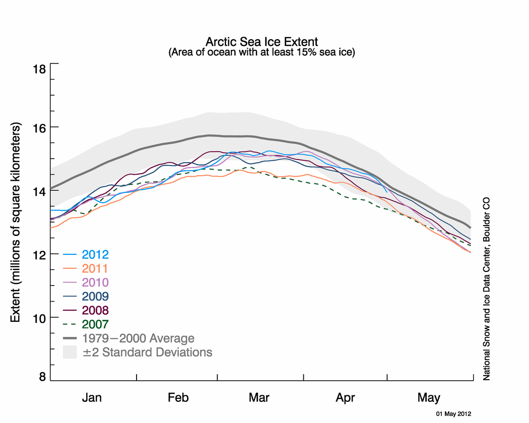
OK, nothing wrong with this one. Note how the sea ice kisses the normal line. NSIDC alludes to this in their April Summary saying: Arctic sea ice reaches near-average extent in April

http://nsidc.org/arcticseaicenews/files/2012/05/Figure2.png
Hmmm….the blue line no longer kisses the normal line.
Since these graphs have the same scale, doing an overlay is easy.

It seems the average line has shifted. WUWT?
Why do bloggers keep having to point out NSIDC’s errors in their public presentations to their scientists? This is the second time in a month such errors have been spotted by bloggers, prompting NSIDC to do a correction last month.
NSIDC fixes their Arctic Sea Ice graphing problem
NSIDC’s oops moment – uncoordinated changes make for an interesting 24 hours
And of course the first time we pointed out a glaring error, that the satellite sensor failed, I was told it wasn’t worth blogging about.
Errors in publicly presented data – Worth blogging about?
NSIDC pulls the plug on Arctic Sea Ice Graphs
No good deed goes unpunished I suppose.
UPDATE: 9:15AM PST
I’ve heard from Dr. Walt Meier at NSIDC, and they are working to fix the problem. He sends his thanks for spotting the problem. – Anthony
UPDATE2: 2:30PM PST.
This came in earlier today at 12:32, but I was busy with other issues. The problem has been solved. Walt Meir writes:
We’ve corrected the image.
Thank you again for bringing it to our attention. It’s always good to have multiple eyes on things like this since we’re not an operational center and don’t always catch things, especially when we’re busy with other responsibilities.
Here is the corrected Figure 2 image:

UnfrozenCavemanMD says:
May 4, 2012 at 6:34 pm
In your heart of hearts, do you think you are just as quick to catch an error in your favor as you are to catch one against it?
==============
hogwash……
A few weeks ago they were just caught doing the same thing……called out on it……they had to correct it.
No one that produces that graph does not know where the blue line is when they start….and does not take a second to see where the blue line is when it’s over…think about that….what’s the point of producing this product if you don’t check it
Especially when it’s historic that it’s hitting the ‘average’ line….and everyone had just raised hell for them doing the same thing before
The grey error envelope has been shifted uo by about 0.2 deg, as well as the dark grey average line. In fact, there are changes to several of the records, including 2 changes in early March 2011. Not big changes, but indicative of an unannounced revision.
errata: In my comment May 4 7.34 pm, plese delete “deg” and replace with “units”.
Please delete comment after “there are several changes”. The forensic analysis method is sensitive to the order of graphics layering and picked up an occasion point where one data line crossed another. My apologies for making a mistake.
See, it’s not hard to apologise for making a mistake.
I think there was an agenda. Can’t make a political point if the blue line touches the normal line. More post-normal science, imo.
Graphing errors aside, I have a question: eyeballing the (corrected) chart, and with only slight exaggeration, all years graphed are below the 2 standard deviation grey area until near the end of February, then most begin creeping up into the “normal” zone.
What is unusual about ALL the last six years that makes ice extent extremely low in Jan & Feb, and less so later in the year?
OTOH, there is clear evidence of artistic licence when the grey ‘average’ curve is examined more closely. In one version, there is an upwards bump in the average curve, a speed hump, when the blue line was approaching it. Then as we go off the overlay graph below, the prior separation of the grey average curves comes together from about 0.2 units to about 0.1 units separation. Who was playing with Photoshop? This is supposed to be an average that ended in year 2000, so why is it changing now, in 2012, not just absolutely, but relatively, earlier and later than the last observation?
http://www.geoffstuff.com/Speed%20Hump.jpg
Answer does not satisfy. They tried to Hoodwink again and we nearly fell for it. These guys are all crooks (maybe HI is right). You have to be on CONSTANT guard. Its ridiculous. Have had it.
Shevva says:
May 4, 2012 at 8:47 am
The only other place I’ve seen GOD complex’s like climate science is in my local hospital and they do actually save lives there.
—————————————————-
Shevva, it is best to stay away from hospitals, people die there.
Can’t see how it could be a ‘simple error’.
The easiest way to create a graph these days, and the way it is almost exclusively done, is to input a set of numbers, NOT draw it freehand, or make it in photoshop.
And …. the only way to get a different graph under that usual scenario is to input a different set of numbers.
In biological sciences there is the rule of blinded analysis. When you perform analysis on data they are anonymised so you dont know which group or series they belong to. This has become standard practice since everyone understands perfectly well the realities of human nature and the subconscious biasing of data toward a desired outcome that will ALWAYS happen.
I dont know if it is possible to apply blinding to this sort of data. Since everyone in professional career climate science is an AGW activist, then if the analysis is not blinded, one can assume that there is always a shift in favour of warming. There should even be a correction in the opposite direction to compensate for it.
UPDATE: 9:15AM PST
I’ve heard from Dr. Walt Meier at NSIDC, and they are working to fix the problem. He sends his thanks for spotting the problem. – Anthony
The problem was, someone caught them fiddling the books, the question is, how stupid do they think people are?
A real cynic would think they didn’t want to produce a graphic with the current data touching average. Now that current data has dropped significantly below average, it is ok to release the graphic.
Looks bad, but I still believe it is more likely shoddy QA + confirmation bias than it is conspiracy. Conspiracy is gaining though 🙂
It seems if NSIDC had a single technical person take ownership of these graphs (this is MY work and I’M responsible for it both before and after its published) then obvious quality assurance problems would be driven to a minimum and they wouldn’t need to run an organizational fire drill every time a problem cropped up. On the other hand, ownership of the global warming issue already exists at much higher levels, the data itself seems secondary, and perhaps they just don’t want to give low level technical people ownership power over the actual data.
Dr. Walt Meier at NSIDC – Please provide some explanation as to why these “mistakes” are always in the pro CAGW support direction and are never caught and corrected internally. Someone IS responsible – so some personnel disciplinary or corrective action should be applied. Surely, portraying NSIDC as incompetent is not part of NSIDC mission. Should the NISDC funding be transferred to WUWT for quality control functions? Something has seriously gone wrong and it is not the instrumentation. What is exactly being done to correct the organization? GK
I wonder how long it would have taken them to spot their error themselves?
Like some other poster said earlier.. There is absolutely no way this can be blamed on incompetence anymore. If it was just a bunch of mistakes, then why does it always favor global warming agenda? Why don’t they ever make a mistake the other way?
The other responsibilities excuse is getting thin. If they weren’t so intent on finding “signs” of Armageddon, they would have the time to do the important work of being about the business of reporting the raw data, and whatever statistical averaging they want to do and present, accurately and with due diligence.
Pamela,
You make a good point. There has to be a lot of pressure to see in current data the threat of future CAGW. Even those who so ardently believe in CAGW, the current standstill must be disturbing, if only because it gives credence to what the skeptics say. There is a great incentive to find prior errors that increase historical ice levels and decrease current ice levels. Any visualization that increases the apparent loss – like shifting averaging periods or comparison years – must be received warmly and with less than critical review. The CAGW narrative has a lot riding on it.
The best example I have for this forced-conclusion is the UK Met Office and its current drought forecast as the wettest month in 100 years came upon them. Where is the distress greatest, at the top, where CAGW rules (and justifies their existence) or at the base, where the data is gathered and pulled together into a suitably threatening view?
Working in the software industry, revision control, validation, and release management are significant areas with their own specialized expertise. It would behoove them to hire a product/release manager that has this skill set. It makes a large difference in a product’s quality and perception.
Currently, they’re doing an unintentional crowd-sourced validation. Given the terrible treatment of the crowd by some of the beneficiaries, better treatment or better QA is in order.
Now, there’s a great title/heading for a continuing WUWT series!
Starting in Feb 13, expecting to take 4 months, estimating volume in ice ridges. No support, on foot, dragging a sledge. Someone making book on him ever being seen again?
That rule of thumb is way past its “Best By” date wrt Climate Science.
Fool me once …
Fool me dozens of times, and I must be brain-dead.
I collect stamps. I have on my desk a release sheet for a new stamp issue. It is signed by the Managing Director of Australia Post, the top person in one of our larger enterprises. No new stamp can be released without his signature. The buck stops with him. This is not simple. Some stamps have marks from other bodies such as the International Olympic Committee, who safeguard their 5-ring logo zestfully. There have to be checks that a person shown on a stamp is named correctly. That an image has not been copyrighted. It’s not hard to envisage the care that has to be taken.
I’ve shown above that in this case the NSIDC graph has been manipulated, probably by hand, for a reason that is easy to speculate as misleading, when that data was supposed to be fixed in stone since year 2000.
If this had been a graph for certain financial transactions, such as the performance of a listed stock, I’d imagine the boss would be facing charges of making a false utterance, or the worse form, that it was done with intent to deceive. It’s easy to speculate that this line manipulation was probably a calculated, malicious fraud. The absence of a proper response from where the buck stops, indeed the seeming absence of a sign-off mechanism by the chief, simply makes the organisation appear to be untrustworthy from now onwards.
It might be interesting for people to check the grey graph to see if has wandered or morphed in shape in years gone by. That would be a normal, prudent response by an interested person. (I’m not an ice watcher).
Brian H says:
May 5, 2012 at 5:53 pm
Thanks for your thoughts, Brian. So your theory is that idiots only make one mistake, and as a result if there are a half-dozen mistakes, that means idiocy is not an adequate explanation?
Man, you must have some low-budget idiots where you come from. Idiots around here can make mistake after mistake without breaking a sweat.
Look, Brian, I’m far from an idiot, and I’ve made a bunch of mistakes. But that doesn’t mean I’m trying to fool people … it just means I’m human.
Here’s one main problem. A lot of these organizations and individuals have been caught by the change in the rules of the game. They are still acting as though they aren’t under the microscope. NSIDC is an example. They have yet to put in the safeguards appropriate to the amount of scrutiny that their results will be under. Five years ago, the NSIDC’s mistake might never even have been noticed. Now, it’s big news.
For another example, for years Phil Jones was quite happy keeping the temperature records at the Climate Research Unit at UEA. But that was before they were being used for billion-dollar decisions. At that point he was way out of his league, the records were in a mess, and when I sent in the first Freedom of Information Act request, he panicked because he couldn’t lay his hands on all the records, and he started lying about it.
The initial mistake wasn’t due to iniquity, but to inability.
However, as in many situations from Watergate to Bill Clinton and Monica to “Fast and Furious”, the real problem wasn’t with the original action, but with the coverup. Phil Jones failed badly in that regard. Rather than admit the records were in a mess, he covered it up, he lied about it, and he continues to lie about it to this day.
And that’s where I give Walt Meier high marks. He has never attempted to cover up any error committed by his folks. He has been clear about it, has admitted responsibility, and has fixed it promptly. I’m not sure what more you could ask, other that what I asked above, which is how the error happened.
Finally, you say “fool me a dozen times …”
Are there folks out there looking to fool us? Most assuredly. Far too many of the AGW superstars are clearly victims of Noble Cause Corruption, they’ll happily stretch the truth and distort the facts and never think twice about it. So you are wise to be cautious.
But not all errors are deliberate. Not all mis-statements are intentional. The ancient human ability to seize defeat from the jaws of victory, to make errors where you’d swear none could possibly be made, is deservedly legendary.
So my point is that each case is individual, each person is individual, each organization is individual, and that while assuming bad motives may be correct, it may also be 100% wrong.
So even if you’ve been fooled a dozen times, don’t assume the worst. Don’t assume the best, either. Don’t assume anything at all.
The thirteenth time may be deliberate, but it also may just be another dumb error, the kind you’ve kicked yourself a dozen times for making … I’m saying, each event is unique, don’t make assumptions.
All the best,
w.
Why don’t they just upload raw numeric data in csv format or something along with docs to a public versioning repo like github and be done with it? There are millions of folks out there who could do a better job of data processing & visualization, this resource could easily be channeled into a GPL’d open source project.
It is also much easier to keep track of version changes that way and exploit the vast crowdsourced debugging capacity.
Last but not least, it is the cheapest way to get rid of some of the workload and improve their PR image at the same time.
I look forward to the time when a whole PDO cycle of data exists and then an average for a whole PDO cycle can be used.
Doesn’t mean that different PDO cycles would have the same average, but it would at least give us the warm cycle and the cold cycle factored into the average…..