UPDATE: problem solved, see below.
I wonder if NSIDC actually looks at their own output from day to day? I know that sounds harsh, but the reality is that bloggers keep finding their errors and pointing them out to them, while at the same time the head of NSIDC Dr. Mark Serreze refuses to apologize for his comment “I have yet to lose any sleep over what is talked about in WattsUpWithThat or any other similar blog that insists on arguing from a viewpoint of breathtaking ignorance.“
Last night I published NSIDC’s April Sea Ice Update along with an NWS report about record Bering Sea Ice. Simon F. was first to spot it within minutes.
Simon F. says:
There appears to be another glaring error on the NSIDC page about arctic sea ice. Look at these two images: http://nsidc.org/data/seaice_index/images/daily_images/N_stddev_timeseries.png & http://nsidc.org/arcticseaicenews/files/2012/05/Figure2.png – How come one practically touches the mean and the other never gets close?
I figured I’d wait until morning to see if NSIDC fixed the issue themselves. Nope. Let’s look at those graphs.

http://nsidc.org/data/seaice_index/images/daily_images/N_stddev_timeseries.png
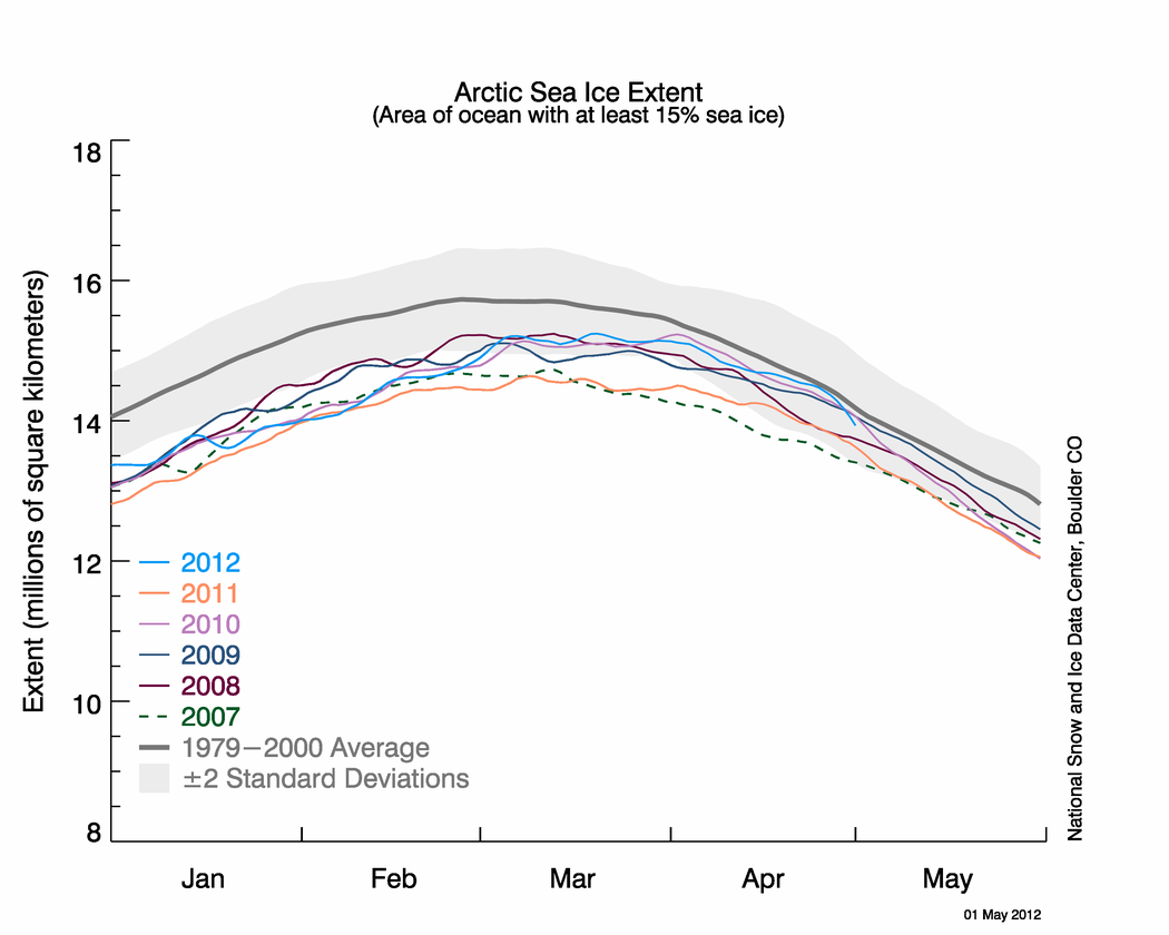
OK, nothing wrong with this one. Note how the sea ice kisses the normal line. NSIDC alludes to this in their April Summary saying: Arctic sea ice reaches near-average extent in April

http://nsidc.org/arcticseaicenews/files/2012/05/Figure2.png
Hmmm….the blue line no longer kisses the normal line.
Since these graphs have the same scale, doing an overlay is easy.

It seems the average line has shifted. WUWT?
Why do bloggers keep having to point out NSIDC’s errors in their public presentations to their scientists? This is the second time in a month such errors have been spotted by bloggers, prompting NSIDC to do a correction last month.
NSIDC fixes their Arctic Sea Ice graphing problem
NSIDC’s oops moment – uncoordinated changes make for an interesting 24 hours
And of course the first time we pointed out a glaring error, that the satellite sensor failed, I was told it wasn’t worth blogging about.
Errors in publicly presented data – Worth blogging about?
NSIDC pulls the plug on Arctic Sea Ice Graphs
No good deed goes unpunished I suppose.
UPDATE: 9:15AM PST
I’ve heard from Dr. Walt Meier at NSIDC, and they are working to fix the problem. He sends his thanks for spotting the problem. – Anthony
UPDATE2: 2:30PM PST.
This came in earlier today at 12:32, but I was busy with other issues. The problem has been solved. Walt Meir writes:
We’ve corrected the image.
Thank you again for bringing it to our attention. It’s always good to have multiple eyes on things like this since we’re not an operational center and don’t always catch things, especially when we’re busy with other responsibilities.
Here is the corrected Figure 2 image:

The only other place I’ve seen GOD complex’s like climate science is in my local hospital and they do actually save lives there.
Has anyone bother to check the Antarctic ice extent to see if there have been any adjustments there, too?
I can’t tell for sure which way the average line moved. On the overlay chart, the top average line appears to be better centered within the gray area than the bottom averaged line. If this observation is correct then the earlier average line could be the culprit. Further, the lettering on the graphs is not the same size so resizing has been used on one of the graphs while doing the overlay. I suggest you redo the comparison, Anthony.
This does not in any way excuse the snottiness of Dr. Mark Serreze. He is sans le doute a panty waist.
This is not incompetence, its a continuous attempt to defraud and mislead the public. The ice graphs ALWAYS go down when an “adjustment” is made. All these guys will have to account for using public monies to mislead the public.
The average line has shifted up for no reason I can think of other than it was getting too close to the normal line for comfort. Can’t be a more recent timeline average update or the average line would have gone down. Seems like a change done on purpose and if so shame on you NSIDC. Thanks for confirming for us that science is no longer important any more in your department.
Speaking of screwed up graphs; have you noticed cyrosphere today’s Arctic ice comparison chart dates are not working correctly. http://home.comcast.net/~ewerme/wuwt/cryo_compare.jpg
What is it about climate scientists? They keep getting CAUGHT messing with data to misrepresent what is happening in reality. It’s like the whole lot of them need to be fired. I”m not sure that I mean that metaphorically at this point.
There is simply no excuse for this type of “mistake”, assuming it’s a mistake at all. You see it begs the question if it’s really a mistake.
This is why science is suppose to be reproducible… so that others can verify the results to ensure they are done correctly or at least in a reasonably justifiable manner given the circumstances. When reproducibility is lost it’s no longer science.
I ask that NSIDC cough up the source code for their graphing system and the actual data feed (assuming they haven’t already) and let us review their code and plot our own graphs. They are publicly funded so they have no excuses to hid behind. In necessary a Freedom of Information Request for all versions of their source code, binaries, and data feeds plus any documentation to be provided on an ongoing basis. Whenever a change is made the new source code should be posted on their web site at the time the change is implemented.
Open Public Science needs to be the rule rather than the exception. If they want trust and respect then they as scientists need to provide the means to verify their work, their data, their graphs, their conclusions, their math, their assumptions, etc. If they fail to do so they are not following the scientific method nor are they honoring the people who pay their bills and wages.
Oh, Steven Goddard also has an article about this here (beating you to it Anthony [;)] ):
http://stevengoddard.wordpress.com/2012/05/04/nsidc-naughtiness-returns/
drobin999 wrote:
Do we really have to have the WUWT snotty meter pegged at 10 on every post? Relax folks, this isn’t an evil plot to pull the wool over anybody’s eyes.
REPLY: Do you really have to make “snotty” comments that add nothing to the debate of the issue at hand? Nobody is forcing anyone to click on the meter. I can’t help it if readers like what I write about.
I can if you wish enable comment ratings, and then we can see how you comment fares. – Anthony
drobin999’s style is all the rage in blogtrolls. Volokh.com has a particularly bad infestation. You won’t get anything substantive out of them because they don’t have anything. Just more ad hom.
Some of them are paid professionals. One particular group uses dial-up services in Virginia to cover their tracks.
2 points
Has it not become exceedingly obvious that “WUWT Review” has far surpassed “Peer Review” and will only grow to make nearly obsolete what has become pal review.
Who would argue that outdated “Peer Review” is more effective than the instant global review by the limitless skilled critiquing WUWT provides.
In our rapidly advancing tech world the image of a few chin rubbers pondering a paper in isolation is quickly becoming a picture of a horse and buggy era.
Second point- Has there been any “errors” which falsely displayed far too much sea ice?
Imagine if this latest error moved the normal line in the opposite direction and showed Arctic sea ice surpassing normal by a hefty amount.
Is it unreasonable to suspect that it’s probably happened many times but remarkably always gets caught before being released. “Oh that can’t be right. We better look at that some more”.
Tot up the time you have spent. Charge it at a realistic rate like $60/hour and send them the bill.
Then just publish the invoice here.
Too many people have been taken us sceptics for granted, and far from crediting our hard work, have either been part of the lynch mob to have us locked up as “deniers”, have egged on others, or perhaps worst and stood by knowing it was happening and said nothing.
As I said send them the bill, it is time they paid up!
Adjustments of past temperatures weren’t enough, so now they adjust current sea ice. Memes rule over reality and science goes missing. If we do get a Grand Minimum it will be fun to see them try to adjust that out of existence.
If there was a death spiral of Arctic sea ice would Serreze lose his job? There wouldn’t be much for him to do then would there?
pwl says:. “You see it begs the question if it’s really a mistake”
There was a labour aparachik in the UK who on 911 said: “a good day to bury bad news”.
Is this a red rag to the sceptic bull? No?
So, why do I feel like some great oaf looking at a fluttering rag?
Sad that positions of power are held by untrustworthy individuals. . Only a fool continues to allow themselves to be lied to.
REPLY: I don’t know that they are “untrustworthy”, and I think generalizations like that should be reserved for people like Joe Romm, Mike Mann, Bill McKibben, and Dave Appell who have in fact proven themselves as such.
I think NSIDC simply has a case of bureaucracy blinders, as do many similar government organizations. – Anthony
I’m constantly amazed at how tone deaf guys like Serreze are in situations like this. The public’s belief in CAGW is way down and ever increasing numbers of people believe the alarmists are a bunch of idiots yet we still see mistakes like this still occur. And when they occur instead of being thankful for having the error pointed out we see instead an outburst of emotional bluster and venom.
Just how did this guy get to be head of the NSIDC anyway? Did he win a competition for the longest pony tail?
Hummm, I wonder if the IRS would let me underestimate my taxes or if a publicly held company would be permitted to under/over estimate revenue on a regular basis without penalty ?
Ya think!
http://500motivators.com/plog-content/thumbs/motivate/me/large/402-facepalm-your-doing-it-wrong.jpg
I’ve heard from Dr. Walt Meier at NSIDC, and they are working to fix the problem. He sends his thanks for spotting the problem.
There is absolutely no excuse for this.
NSIDC know perfectly well that lots of people watch their graphs on a (dare I say) almost obsessive day-by-day basis. And yet on their main page http://nsidc.org/arcticseaicenews/
the two contradictory graphs are there on the same page, one at the top and one about half way down. It will be interesting to see what excuse they try to come up with.
JFD says:
May 4, 2012 at 8:55 am
I can’t tell for sure which way the average line moved. On the overlay chart, the top average line appears to be better centered within the gray area than the bottom averaged line. If this observation is correct then the earlier average line could be the culprit. Further, the lettering on the graphs is not the same size so resizing has been used on one of the graphs while doing the overlay. I suggest you redo the comparison, Anthony.
Look at where the average line intersects the y-axis. It has moved up about 0.2 million kilometers squared. So has the grey SD squared area. The 2012 line has not moved up, nor has the 2007 line (although that’s a bit harder to tell).
What is truly amazing is that the government has so many breathtakingly stupid people like Serreze in charge of these agencies. You would think that with their overblown salaries and pension plans that we could get some decent quality employees in there, but apparently it is mostly morons who work for our [SNIP: Let’s not go there. -REP] government.
So if there were no bloggers could it be assumed NSIDC would find and correct their errors? Personally I see no reason to trust one thing these folks present to the public and by association, other scientists using their data.
Well done for spotting their error, but I have to say I’m with the people saying turn down the shock-o-meter. Point it out, sure, but less of the adjectives.
If “climate” is supposed to be the long term 30 year average, why does NIDC only calculate the 20 year instead of 30 year average? i.e., from 1979-2000 rather than from 1979 to 2010?
To hide the increase?
My theory is that they have two teams trying to adjust the data with different methods. The members of the teams are not allowed to see the output of their algorithms. Both teams get as input the same measurements (satellite photos).
As amusement for the public, the webserver chooses to display one of the results randomly.
The team that manages to compute the lower summer sea ice minimum gets a pay rise.
Then it should be just as easy to find errors not in favor of the AGW meme. What is the ratio? Really, can they be counted on one hand?