Guest post by Bob Tisdale
This post is a continuation of my post Tamino Once Again Misleads His Followers, which was cross posted at WattsUpWithThat here. There Tamino’s disciples and his other followers, one a post author at SkepticalScience, have generally been repeating their same tired arguments.
The debate is about my short-term, ARGO-era graph of NODC Ocean Heat Content (OHC) data versus the GISS climate model projection. This discussion is nothing new. It began in with Tamino’s unjustified May 9, 2011 post here about my simple graph. My May 13, 2011 reply to Tamino is here, and it was cross posted at WUWT on the same day here. Lucia Liljegren of The Blackboard added to the discussion here.
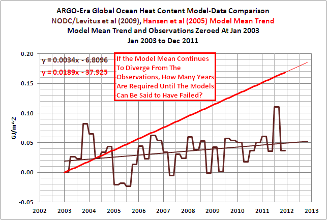
A graph that’s similar to the one Tamino and his disciples think is fake is shown in Figure 1. It’s similar but different, sort of a short-term OHC model-data comparison Modoki. We’ll get back to it.

Figure 1
First, let’s discuss…
…THE BLATANTLY OBVIOUS ERROR IN TAMINO’S RECENT FAILED CRITIQUE
Tamino’s recent failed critique is titled Fake Predictions for Fake Skeptics. Some people have noted that a fake climate skeptic would be an anthropogenic global warming proponent, but we’ll move on from the implications of that.
Tamino linked to the NODC Ocean Heat Content webpage as the source of his data. There, the NODC provides a spreadsheet of their global OHC data (here). Tamino presents a few preliminary graphs and observes:
Note that there’s a decided hot fluctuation in 2003. So we’ll “predict” the time span 2003 to the present, based on data from 1993 to 2003.
His next graph (my Figure 2) is identified only with the heading of “Ocean heat content 0-700m”. It includes a linear trend that Tamino claims is “based on data from 1993 to 2003”. The length of the trend line is assumedly based on the same period as data. But the period of his trend line does not include the “decided hot fluctuation in 2003.”

Figure 2 (Tamino’s 3rdgraph)
Tamino’s next graph, my Figure 3, includes an extension of his linear trend. In addition to the heading, the graph identifies the red trend line as “fit 1993-2003”, but his “fit 1993-2003” still does not include the “decided hot fluctuation in 2003.”

Figure 3 (Tamino’s 4rdgraph)
In the paragraph after that graph, Tamino states:
We can see that observations don’t follow the prediction exactly — of course! The main difference is that during 2003, the observations were hotter than the prediction. For that time span at least, the oceans had more heat than predicted.
He reinforces that the 2003 data is warmer, yet he and his disciples fail to observe that the 2003 data is not included in his “fit 1993-2003”.
The NODC clearly marks their quarterly data in the spreadsheet they provide here. The Global OHC value at 2002-12 is 6.368768 [*10^22 Joules], and the value at 2003-12 is clearly marked 11.6546 [*10^22 Joules]. But the data included in Tamino’s trend does not include the 4thquarter 2003 data at 11.6546 [*10^22 Joules].
If you’re having trouble seeing that, Figure 4 is similar to Tamino’s graph with the hash marks included. It shows the trend based on the period of 1993 to 2002.

Figure 4
And Figure 5 gives you an idea what Tamino’s graph would look like if he had actually included 2003 data in his trend.

Figure 5
Animation 1 compares the two. (You may need to click on it to get the animation to work.)

Animation 1
How could Tamino and his disciples have missed such an obvious mistake? Some of you might even think it wasn’t a mistake on Tamino’s part, and that his disciples purposely overlooked that blatant error. I’m sure you’ll have a few comments about that.
HANSEN ET AL (2005) OFFSETS THE OHC DATA
A recent comment noted that the observations-based dataset in Hansen et al (2005) was not NODC OHC data, that it was the OHC data based on Willis et al (2004). I never stated that I was providing Willis et al (2004) data. My OHC update posts have always been about the NODC dataset.
My Figure 6 is Figure 2 from Hansen et al (2005). Note that the data starts at about zero watt-years/m^2 in 1993. And my Figure 7 is Figure 3 from Willis et al (2004). Note that the Willis et al data starts at -1 * 10^8 Joules/m^2 at 1993. Hansen et al converted the data, which is not in question since I’ve done the same thing, and Hansen et al have offset the data, which I have done also.

Figure 6
HHHHHHHHHHHHHHHHHHHHHH

Figure 7
Mysteriously, Hansen et al can shift the data without comment from Tamino, but when I do it, it’s interpreted by Tamino and his disciples, and by those from SkepticalScience, as a fake graph.
THE BEST WAY TO COMPARE THE MODELS TO THE OBSERVATIONS-BASED OHC DATA
Obviously, the best way to present the GISS Model-ER projection for Ocean Heat Content would be to use the actual GISS Model-ER data. The RealClimate annual model-data updates here and herepresent the Model-ER data. But the Model-ER OHC simulations are not available in an easy-to-use format like at the KNMI Climate Explorer. If it was available, all of this nonsense about my shifting data, my misrepresenting data, etc., would disappear. Why?
I have stated in comments at WUWT that I would use the ensemble mean of the Model-ER data and the NODC OHC observations for my future model-data comparisons. I’ve also stated I would use the base years of 1955-2010 to avoid the possibility of being accused of cherry-picking the base years.
Why? I presented this in a June 14, 2011post. And that post has been linked to all OHC updates since then.
Figure 8 is a graph from a 2008 presentation by Gavin Schmidt of GISS. It includes the OHC simulations of the Model-ER for the period of 1955 to 2010, which is the model data shown in the RealClimate model-data posts. It also includes the older version of the global NODC OHC data.

Figure 8
If we:
1. replicate the ensemble mean data of the GISS Model-ER,
2. replace the older NODC OHC data with the current version, and
3. use the base years of 1955-2010 so that no one can complain about cherry-picked base years,
Figure 9 would be a reasonable facsimile of the long-term comparison from 1955 to 2010. Notice where the ensemble mean of the GISS Model-ER intersects with the data near the ARGO era. Sure looks like 2003 to me. Figure 1 at the top of this post confirms how closely the GISS Model-ER would intersect with the NODC OHC data at 2003.

Figure 9
That graph in Figure 1 looks familiar, doesn’t it? It sure does look like the ARGO-era graphthat Tamino and his disciples dislike so much.
MY OFFER
In my January 28, 2012 at 6:18 pmcomment at the WUWT cross post I wrote the following:
I offered in a comment above to use the base years of 1955-2011 for my short-term ARGO-era model-data comparison. That way there can be no claims that I’ve cherry picked the base years or shifted the data inappropriately. I do not have the capability to process the GISS Model-ER OHC hindcast and projection data from the CMIP3 archive. So I cannot create the ensemble member mean of the global data, on a monthly basis, for the period of 1955 to present. But some of you do have that capability. You could end the debate.
If you choose to do so, please make available online for all who wish to use it the Global GISS Model-ER hindcast/projection ensemble member data on a monthly basis from 1955 to present, or as far into the future as you decide.
I will revise my recent OHC update and reuse that model data for future OHC updates. That way we don’t have to go through this every time I use that ARGO-era comparison graph as the initial graph in my OHC updates.
Fair enough?
Any takers?
CLOSING
I know the trend of the OHC data is not the model mean, but for those who are wondering what Tamino’s NODC OHC graph might have looked like if he had actually included the 1993 through 2003 data in his trend AND then compared it to the period of 2003 to 2011, refer to Figure 10.

Figure 10
And if he had lopped off the data before 2003, because it isn’t presented in the graph that he complains about so much, the result would look like Figure 11.

Figure 11
Peter says:
If you can’t justify why we should ignore the data from prior to 2003, then you are cherry picking data. That is exactly the point. In science you try to look at all the data you can – at least that’s what I was taught. This analysis is based on a subset of data cherry picked out of a larger data set.
You are evidently one of those unfortunates who has been trained to use “cherry picking” like an ad hominem. You call names at other’s reasoning, thinking you have refuted it. That is not the case.
The justification for picking ca 2003, if you dont like the reason Bob gave, is that ca 2003 represents the beginning of a change that continues through an important period of time. The significance of that period is marked by the change in trend, the length of the period vs the variability of the data, and the fact that the period is one of substantial interest – namely the present. This is all implicit in the argument that you ignore by calling “cherry picking”.
JJ, with respect to your point, you are correct – the slope is much less if you use 2003 as a start year. And it might be more if I use 2001 as a start year. Or less if I use 2010 as the start year. It would be a huge slope if I just looked at 2Q11 to 3Q11!!! I can pick any start period and any end period I want and come up with a different slope. What makes that different than this analysis from Mr. Tisdale?
If you will ponder what you have just presented, perhaps you will arrive at the answer to your question on your own. You have all of the information you need, you just need to not let other people do your reasoning for you, by filling your mind with simplistic notions of “cherry picking”.
The point is, we have lots of data on OHC, so why would one choose to ignore a large part of your data set? Perhaps it is because you doubt the veracity of data that doesn’t fit your preconceived notion of what the data should say.
If your child comes to you and says “Daddy, I feel sick” do you want to know what her body temperature averaged over her seven year lifetime is? Averaged over the last month? The last week? Or do you put your cheek to her forehead to find out what it is right now? Significant information is gained by paying attention to the data that are important, and “ignoring” what is not. Change is often a marker of importance. If you are not looking at all relevant subsets of the data, you are not using all of the data.
OHC trend is much flatter than modeled for the last 10 years. OHC value is lower than modeled for the last 15 years, and the disparity is increasing. These facts are unquestionably important. The only question is whether or not they are currently sufficient to constitute an outright falsification of the models, and if not, how long would they need to persist before that became the case. That question is being avoided, with ruses which include calling “cherry picking” ignorantly.
Nick:
I don’t think that is a very honest assessment of why the models can’t capture short-period variability. This unwillingness on your to honestly state the limits of the models really undermines your credibility at times.
On the subject of whether or not 2003 is included then a look at the graphs seems to point clearly to the fact that the figures that the original projection was based on terminated at the transition from 2002 to 2003, that is, excluded 2003.
However, whatever the range of data, what I believe this is yet another example of the stupidity of using linear trends for any attempt at climate prediction. Sooner or later this will result in absurdity. In this case Bob has shown clearly that it is sooner, and most of the debate is about semantics.
Peter wrote:
” The point is, we have lots of data on OHC, so why would one choose to ignore a large part of your data set? Perhaps it is because you doubt the veracity of data that doesn’t fit your preconceived notion of what the data should say.”
Because it’s actually two different data sets melded together and the data set circa 2003 becomes vastly more accurate (although far from perfect). So of course it is interesting to look at different data sets that attempt to measure the same thing. What is more interesting is that you know this already, so why the rhetorical tactic of pretending you don’t know this I wonder?
Peter says: “If you can’t justify why we should ignore the data from prior to 2003, then you are cherry picking data…”
You’re recycling the same old argument. Hansen used 1993 to 2003 to show the models performed well during that period. I start my ARGO-era period to show that the models haven’t done as well since then. It’s as simple as that, Peter.
Nick Stokes says: “I think your Fig 8 is the place to look for a model/OHC comparison. The runs were designed for that purpose, and you can easily add the recent years obs. Gavin’s presentation is here.”
I agree that the model data is the place to look. I just wish it was online at the KNMI Climate Explorer so I could present the modeled OHC on an ocean-basin basis and on a zonal-mean basis. The model simulations should look as bad as SST. And thanks for the link, but I included it in the text of my post.
You continued, “Their runs were to investigate the effect of ocean model on the calcs, and show they used Russell, which runs hot here, and Hycom, which runs cold. You’ve chosen to emphasise the Russell model…”
The Russell ocean model, as far as I can tell, was used in Hansen et al (2005). Russell is one of the authors. Also Hansen et al (2005) refer to their “coarse resolution” ocean model which should be Russell ocean. Again, as far as I can tell, the Russell ocean model uses larger grids than HYCOM—coarser resolution. Further, the Russell ocean model is used by Gavin in his annual model-data comparisons. One would conclude then that the GISS Model-ER was preferred by GISS.
Choose the appropriate time period and anything can be claimed.
To choose the upward part of a cycle will ‘prove’ warming. You need the whole cycle to prove anything.
The ARGO buoy system is a good way to find all sorts of facts about the oceans but there are not enough of them. Each one has to look after around 210,000 cubic Km of water. This will give fairly wide error bands.
Bob Tisdale says: February 1, 2012 at 2:10 am
” Further, the Russell ocean model is used by Gavin in his annual model-data comparisons. One would conclude then that the GISS Model-ER was preferred by GISS.”
Not in Gavin’s presentation – they plotted both, to give a range of variation, they said. I would conclude that they expected one to be at the high end, one at the low.
Carrick Talmadge says: January 31, 2012 at 6:08 pm
“Tamino can also project forward the models without comment from Nick Stokes and crowd too. When you do it, however, it’s an error.”
You can always extrapolate to see what happens. You can extrapolate the observed data too. Because the GISS-ER model and the data agree in the range to 2003, you’ll get much the same line.
The error is in the inference, which was that the model was wrong because the extrapolation didn’t look good. All you can deduce is that the post-2003 OHC went in a different direction. That no more invalidates the pre-2003 model results than it invalidates the pre-2003 data. And that’s all that were used here.
JJ says: “Quote of the month? I’m honored”
I posted it as “Comment of the Week” since it was applicable to the week-long discussion of Tamino’s critique. If it hasn’t been a week, it seems like it.
http://bobtisdale.wordpress.com/2012/02/01/the-comment-of-the-week/
Regards
JJ: “If your child comes to you and says ‘Daddy, I feel sick’ do you want to know what her body temperature averaged over her seven year lifetime is? Averaged over the last month? The last week? Or do you put your cheek to her forehead to find out what it is right now? ”
I think the analogy should be a bit more complicated. Something like “daddy am I still sick?” You might say well, last time we checked your temp was 102F, and now it’s 99.5, so I think you’re getting better. But you wouldn’t think they’re really better unless the temperature stayed down (even in the afternoon when fevers go up, or after the acetaminophen was fully out of her system). Id imagine one day of your childs temperature fluctuations is probably like 20 years of ocean heat content. You do want to know what it is now, but also the long arc of the “illness.”
JJ: “The only question is whether or not they are currently sufficient to constitute an outright falsification of the models, and if not, how long would they need to persist before that became the case. ”
I think the reason people think “cherry-picking” is that if you look at the start point of Bob’ graph in context of more years of data, it’s clear that he starts at an anomalously high point. Kind of like having a kid whose fever is going from 99 to 103 every day, and you check it today and say, “ah my last check was 103, and my first check today is 102, we’re getting over this!”. It may not be a deliberately picked cherry, but it still is an anomalously hight start point for a trend. If you start the trend 6-12 months earlier the trend is quite different, even though just about the same percent of the data came from ARGO. Which is why, titillating as it might seem, Bob and your suggestions of being near model “falsification”, whatever that means, are off base.
By the way, it’s far less cool to be a “disciple”, than a “minion”, so you guys definitely are winning on the name your opponent game.
I left a handful of comments on SkepticalScience over the last week but quickly understood it was intelectually equivalent to attending a UFO convention.
The AGW self referential hive-mind cannot be deterred from its assault on reason.
Nick Stokes says:
February 1, 2012 at 3:14 am
“You can always extrapolate to see what happens. You can extrapolate the observed data too. Because the GISS-ER model and the data agree in the range to 2003, you’ll get much the same line.”
Wrong answer, bud. You can extrapolate *AND* see what happens but not extrapolate *TO* see what happens. Observation trumps model. Always. Have a nice day!
Utahn says:
“By the way, it’s far less cool to be a ‘disciple’, than a ‘minion’…”
True. But I consider myself one of Anthony’s henchmen. A henchman has more gravitas than a disciple or a minion. You don’t mess with a henchman if you know what’s good for you. Nobody wants to get henched… ☺
JJ, the problem with your logic is that is that it ignores things like measurement error that cause noise or uncertainty in the data record. And because there is noise in the data you need to look at a long term record before you can draw conclusions about the rate of change.
Try this experiment: fill a pot with water, put it on the stove, and turn on the burner. Measure the temperature after 1 min, 2 min, 3 min, etc. until it begins to boil. Then plot a graph. Perhaps your readings increase by 2 degrees in the first minute, then 3 degrees in the 2nd minute, and then 2 degree in the 3rd minute. After 3 minutes, do you conclude that the rate of heat increase is slowing? Obviously not because there is some measurement error. Now think about the size and complexity of the body of water we are trying to measure and the inherent weaknesses in measurement accuracy. That is why you need a multi-decade record of data before you can draw conclusions about the rate of change.
I tried to leave a post on “Open Mind” but was moderated into non-existence. In that post I simply stated that Bob’s original post was showing the divergence of the slopes between the model predictions and the actual readings. I was not rude in any way, yet my post was not accepted. What kind of open-mindedness is that? Lesson learned for me I suppose.
Nick Stokes:
That wasn’t the argument you were making the other day. A new day a new contradictory argument.
Once again you undermine your own position with this weaselly language.
As to didn’t look good, why didn’t it “look good”. Does that have anything to do with the completely meaningless offset that is only important as visual candy? (The only meaningful comparison is in whether the trends agree.)
Here’s Tisdale’s projection showin the full region. It “looks” fine to me.
IMO, you’re just being mini-Tamino, dutifully defending every word that come blathering out of his mouth as if it were gospel. That’s too bad, because you’re actually a lot smarter, and better trained, than him. You should be laying in to him, like you did Judith Curry.
It’s an unfortunate fact that Tisdale corrects errors, when the criticisms are sensible, and Tamino bans the blogger when his errors get pointed out.
(Tisdale IMO still has a long way to go, but he does have a strong point about your and others hypocrisy in your criticisms at this point.)
Smokey: “You don’t mess with a henchman if you know what’s good for you. ”
Nor a minion, usually, but if you’re a disciple, you’re just asking to be messed with!
The ironic thing about Tidasle’s extrapolation (which we’re left wondering why it doesn’t “look good”, unless maybe he used too garish of a color or something), is that the comparison that Tisdale did, in shifting the offsets so they match in 2003—
That’s really the correct way to visualize two curves, if what you are trying to assay is whether the trends agree or not. What Tamino did was actually to obscure the amount of disagreement between the two curves.
That said, I don’t think Tisdale did a perfect job (people rarely manage perfect even in peer-reviewed manuscripts), and hope he continues to show the willingness to adapt to constructive criticism.
Maus says: “That said, if we grant the point that Tamino meant [1993,2003) then he cherry-picked *out* the date that he’s scolding you as having cherry-picked *in*. “
There is no cherry-pick on my part. I explained the reason for 2003 in my first response to Tamino back in May. And if you’re not aware, 2003 wasn’t the “cherry” year when I started the model-data comparisons; 2004 was. In that time, the NODC made corrections to their dataset and that altered the data in 2003 and 2004.
Additionally, there’s no reason to grant Grant any latitude. I can think of no climate change-related papers where the end year did not include all months of data during that year. Foster (Tamino) and Rahmstorf (2011) is an example. The title of the paper is “Global temperature evolution 1979–2010”. The last sentence of their abstract reads, “The adjusted data show warming at very similar rates to the unadjusted data, with smaller probable errors, and the warming rate is steady over the whole time interval. In all adjusted series, the two hottest years are 2009 and 2010.”
If Tamino and Rahmstorf did not include 2010 data in their analysis, they could not have made any claim about the adjusted temperature in 2010. In his recent post, Tamino either made a mistake or he tried to pull a fast one. Take your pick.
corporate message says: “Is there a difference in kind when describing some data vs describing a time span the data was taken from ? Is a difference created if the data comes in quarterly vs all at once per year…therefore ‘spanning’ the period’ ?”
LazyTeenager was getting creative, as was at least one person at Tamino’s blog. There are no climate change-related papers that I’m aware of where the end year did not include all months of data during that year. Further to that, Tamino set the precedent for himself with his Foster (Tamino) and Rahmstorf (2011) paper. The title of the paper is “Global temperature evolution 1979–2010”. The last sentence of their abstract reads, “The adjusted data show warming at very similar rates to the unadjusted data, with smaller probable errors, and the warming rate is steady over the whole time interval. In all adjusted series, the two hottest years are 2009 and 2010.” They had to have included 2010 temperature data in their analysis; otherwise they could make no claims about 2010 temperatures.
Here’s a link to the paper:
http://iopscience.iop.org/1748-9326/6/4/044022/pdf/1748-9326_6_4_044022.pdf
And here’s a link to Tamino’s post about the paper. It contains a link to the data he used in the paper, and it runs through December 2010 (2010.958 on the spreadsheet).
http://tamino.wordpress.com/2011/12/15/data-and-code-for-foster-rahmstorf-2011/
No worries Bob, the alarmists are jumping ship faster than you can say: “Is that my reputation being flushed down the global warming toilet?” They’re wrestling over the life vests at this very minute, sit back, enjoy the show, let time and empirical evidence prove them wrong (again).
Bob, if Grant Foster ever produces a graph that isn’t misleading, that would be news worth reporting.
John Greenfraud says: “No worries Bob, the alarmists are jumping ship faster than you can say…”
Not all of them, though, John. I’ve got one hanging onto the ship’s railing over at my place…
http://bobtisdale.wordpress.com/2012/01/28/tamino-once-again-misleads-his-followers/#comment-3419
…who’s rehashing and rephrasing worn-out, tired-old arguments that I’ve replied to here, there, and everywhere over the past few posts.
LazyTeenager says:
January 31, 2012 at 2:40 pm
He reinforces that the 2003 data is warmer, yet he and his disciples fail to observe that the 2003 data is not included in his “fit 1993-2003”.
—————–
Tamino is following a standard practice of using an inclusive-exclusive time range. In other words 1993-2003 should be interpreted as a time range beginning at the start of 1993 and ending at the start of 2003. In other words the range excludes the year 2003.
So why did he omit the 2003 data in the 1993-2011 trend? And, by the way, why did he keep the 2011 data in the 1993-2011 trend… by your argument he should have left it off.
I mean, he just dropped a year of data IN THE MIDDLE OF THE TREND. How do you justify this?
Please help me out here and correct me if I’m wrong. The data splice occurs in 2003. Tamino built his trend without using 2003 data. Had he used 2003, he would have had to combine older data plus the first year of ARGO data to calculate his trend. That doesn’t seem legitimate. I agree however, since two distinct data sets are being compared, slopes should be the issue and that is where Tamino apologists are all wet.