Guest post by Bob Tisdale
This post is a continuation of my post Tamino Once Again Misleads His Followers, which was cross posted at WattsUpWithThat here. There Tamino’s disciples and his other followers, one a post author at SkepticalScience, have generally been repeating their same tired arguments.
The debate is about my short-term, ARGO-era graph of NODC Ocean Heat Content (OHC) data versus the GISS climate model projection. This discussion is nothing new. It began in with Tamino’s unjustified May 9, 2011 post here about my simple graph. My May 13, 2011 reply to Tamino is here, and it was cross posted at WUWT on the same day here. Lucia Liljegren of The Blackboard added to the discussion here.
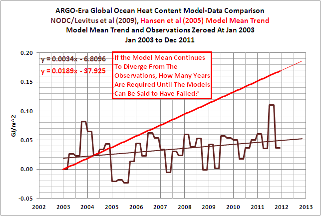
A graph that’s similar to the one Tamino and his disciples think is fake is shown in Figure 1. It’s similar but different, sort of a short-term OHC model-data comparison Modoki. We’ll get back to it.

Figure 1
First, let’s discuss…
…THE BLATANTLY OBVIOUS ERROR IN TAMINO’S RECENT FAILED CRITIQUE
Tamino’s recent failed critique is titled Fake Predictions for Fake Skeptics. Some people have noted that a fake climate skeptic would be an anthropogenic global warming proponent, but we’ll move on from the implications of that.
Tamino linked to the NODC Ocean Heat Content webpage as the source of his data. There, the NODC provides a spreadsheet of their global OHC data (here). Tamino presents a few preliminary graphs and observes:
Note that there’s a decided hot fluctuation in 2003. So we’ll “predict” the time span 2003 to the present, based on data from 1993 to 2003.
His next graph (my Figure 2) is identified only with the heading of “Ocean heat content 0-700m”. It includes a linear trend that Tamino claims is “based on data from 1993 to 2003”. The length of the trend line is assumedly based on the same period as data. But the period of his trend line does not include the “decided hot fluctuation in 2003.”

Figure 2 (Tamino’s 3rdgraph)
Tamino’s next graph, my Figure 3, includes an extension of his linear trend. In addition to the heading, the graph identifies the red trend line as “fit 1993-2003”, but his “fit 1993-2003” still does not include the “decided hot fluctuation in 2003.”

Figure 3 (Tamino’s 4rdgraph)
In the paragraph after that graph, Tamino states:
We can see that observations don’t follow the prediction exactly — of course! The main difference is that during 2003, the observations were hotter than the prediction. For that time span at least, the oceans had more heat than predicted.
He reinforces that the 2003 data is warmer, yet he and his disciples fail to observe that the 2003 data is not included in his “fit 1993-2003”.
The NODC clearly marks their quarterly data in the spreadsheet they provide here. The Global OHC value at 2002-12 is 6.368768 [*10^22 Joules], and the value at 2003-12 is clearly marked 11.6546 [*10^22 Joules]. But the data included in Tamino’s trend does not include the 4thquarter 2003 data at 11.6546 [*10^22 Joules].
If you’re having trouble seeing that, Figure 4 is similar to Tamino’s graph with the hash marks included. It shows the trend based on the period of 1993 to 2002.

Figure 4
And Figure 5 gives you an idea what Tamino’s graph would look like if he had actually included 2003 data in his trend.

Figure 5
Animation 1 compares the two. (You may need to click on it to get the animation to work.)

Animation 1
How could Tamino and his disciples have missed such an obvious mistake? Some of you might even think it wasn’t a mistake on Tamino’s part, and that his disciples purposely overlooked that blatant error. I’m sure you’ll have a few comments about that.
HANSEN ET AL (2005) OFFSETS THE OHC DATA
A recent comment noted that the observations-based dataset in Hansen et al (2005) was not NODC OHC data, that it was the OHC data based on Willis et al (2004). I never stated that I was providing Willis et al (2004) data. My OHC update posts have always been about the NODC dataset.
My Figure 6 is Figure 2 from Hansen et al (2005). Note that the data starts at about zero watt-years/m^2 in 1993. And my Figure 7 is Figure 3 from Willis et al (2004). Note that the Willis et al data starts at -1 * 10^8 Joules/m^2 at 1993. Hansen et al converted the data, which is not in question since I’ve done the same thing, and Hansen et al have offset the data, which I have done also.

Figure 6
HHHHHHHHHHHHHHHHHHHHHH

Figure 7
Mysteriously, Hansen et al can shift the data without comment from Tamino, but when I do it, it’s interpreted by Tamino and his disciples, and by those from SkepticalScience, as a fake graph.
THE BEST WAY TO COMPARE THE MODELS TO THE OBSERVATIONS-BASED OHC DATA
Obviously, the best way to present the GISS Model-ER projection for Ocean Heat Content would be to use the actual GISS Model-ER data. The RealClimate annual model-data updates here and herepresent the Model-ER data. But the Model-ER OHC simulations are not available in an easy-to-use format like at the KNMI Climate Explorer. If it was available, all of this nonsense about my shifting data, my misrepresenting data, etc., would disappear. Why?
I have stated in comments at WUWT that I would use the ensemble mean of the Model-ER data and the NODC OHC observations for my future model-data comparisons. I’ve also stated I would use the base years of 1955-2010 to avoid the possibility of being accused of cherry-picking the base years.
Why? I presented this in a June 14, 2011post. And that post has been linked to all OHC updates since then.
Figure 8 is a graph from a 2008 presentation by Gavin Schmidt of GISS. It includes the OHC simulations of the Model-ER for the period of 1955 to 2010, which is the model data shown in the RealClimate model-data posts. It also includes the older version of the global NODC OHC data.

Figure 8
If we:
1. replicate the ensemble mean data of the GISS Model-ER,
2. replace the older NODC OHC data with the current version, and
3. use the base years of 1955-2010 so that no one can complain about cherry-picked base years,
Figure 9 would be a reasonable facsimile of the long-term comparison from 1955 to 2010. Notice where the ensemble mean of the GISS Model-ER intersects with the data near the ARGO era. Sure looks like 2003 to me. Figure 1 at the top of this post confirms how closely the GISS Model-ER would intersect with the NODC OHC data at 2003.

Figure 9
That graph in Figure 1 looks familiar, doesn’t it? It sure does look like the ARGO-era graphthat Tamino and his disciples dislike so much.
MY OFFER
In my January 28, 2012 at 6:18 pmcomment at the WUWT cross post I wrote the following:
I offered in a comment above to use the base years of 1955-2011 for my short-term ARGO-era model-data comparison. That way there can be no claims that I’ve cherry picked the base years or shifted the data inappropriately. I do not have the capability to process the GISS Model-ER OHC hindcast and projection data from the CMIP3 archive. So I cannot create the ensemble member mean of the global data, on a monthly basis, for the period of 1955 to present. But some of you do have that capability. You could end the debate.
If you choose to do so, please make available online for all who wish to use it the Global GISS Model-ER hindcast/projection ensemble member data on a monthly basis from 1955 to present, or as far into the future as you decide.
I will revise my recent OHC update and reuse that model data for future OHC updates. That way we don’t have to go through this every time I use that ARGO-era comparison graph as the initial graph in my OHC updates.
Fair enough?
Any takers?
CLOSING
I know the trend of the OHC data is not the model mean, but for those who are wondering what Tamino’s NODC OHC graph might have looked like if he had actually included the 1993 through 2003 data in his trend AND then compared it to the period of 2003 to 2011, refer to Figure 10.

Figure 10
And if he had lopped off the data before 2003, because it isn’t presented in the graph that he complains about so much, the result would look like Figure 11.

Figure 11
Ouch. Granted, that will leave a mark, and foster ill will with some operatic warmist…
Thanks, Anthony.
Great post Bob, Sir!
And far more eloquently stated and ‘restrained’ than perhaps Tamino deserves….
Bob Tisdale said @ur momisugly January 31, 2012 at 1:53 pm
Thanks, Bob 🙂
*pops popcorn* as I wait for the Tamino faithful to appear
He reinforces that the 2003 data is warmer, yet he and his disciples fail to observe that the 2003 data is not included in his “fit 1993-2003”.
—————–
Tamino is following a standard practice of using an inclusive-exclusive time range. In other words 1993-2003 should be interpreted as a time range beginning at the start of 1993 and ending at the start of 2003. In other words the range excludes the year 2003.
So Tamino made no mistake and his followers made the obvious interpretation without even noticing the mental effort required.
——————-
Tamino was making a point that it is not legitimate to exaggerate the difference between graph trends by introducing arbitrary vertical offsets or using reduced time ranges. Particularly if the reduced time range includes outliers.
Bob has missed the point and has gone off on a tangent of his own.
I don’t get it, Bob. Your posts and explanations are clear enough for this dumb ol’ engineer and the couple of times in the past when I didn’t ‘get’ something, you clarified your point; once in a comment and once you actually edited your post for a clearer exposition.
Hang in there. All I’m seeing from the complaints of detractors is that they are trying to get you to make your point so clear (“How clear is it?”) that no one can see it any more!
Can I take a shot, Bob? (Here goes anyhow.)
See Figure (pick a Figure, any Figure, past several Tisdale posts). Note where the model trend does not match observations. Ask yourself, “What’s a reasonable conclusion when a model doesn’t match observations?”
Okay. Done.
Another way to put this. 1993 to 2003 was used to build a prediction model. 2003 to present is data which can be used to test that prediction model. What is the R^2 of the predictors versus the observed during 2003-current?
I asked this at Tamino’s site but was moderated.
You’re a gem Bob. I never fail to learn something from your posts. Tamino getting involved is just the entertainment factor that makes learning fun.
School kids should have it so good.
Tamino has no valid points of contention.
The folks who believe strongly in AGW are trying to mask the issue. Since 2003, there has been a growing divergence. They should be happy for the data splice in 2003. Imagine if XBT data had continued to be used?.Oh man……….the divergence would be so huge that you could drive a couple of Unit Trains through it instead of a Mack Truck.
So a linear regression for the period of 1993-2003 leads to a very different interpretation than a linear regression for 1993-2002. Apparently one additional year makes a big difference. What does that say about the uncertainty of trends in short, noisy time series? Somehow this point doesn’t seem to sink in, so maybe this post can be a lesson for some. Sure, the 1993-2002 trend *by itself* is no more valid an estimate than the 1993-2003 trend, but we do have more data. A better estimate – the trend for the entire 1993-2011 period – happens to match the 1993-2002 trend pretty well in part because the 1993-2002 period does not start or end on any noticeable outliers. Clearly though, 10 years is not enough time to constrain the uncertainty in the OHC trend.
Just noticed the thread title:
“Part 2 of Tamino Once Again Misleads His Disciples”
Shouldn’t it read:
“Part 2 of the Continuing Saga of Tamino Misleading His Disciples”?
Just wonderin’.
Tamino’s site is all about agreement – it is impossible to serve kool aid to someone who only wants a tall cold glass of clear thinking…
Bob was making the point that observations are not following the models. Tamino and his followers dislike this fact of life and decided to go off any make their own straw man.
LazyTeenager says:
Tamino was making a point that it is not legitimate to exaggerate the difference between graph trends by introducing arbitrary vertical offsets or using reduced time ranges.
Tamino’s point is inapplicable. The vertical offset is not an issue, unless the absolute magnitude of the divergence is the topic that the graph is intended to illustrate. It wasn’t. Bob spoke only of the comparison of slopes. His graph is appropriate for that discussion. It is not misleading.
Tamino’s post is misleading. He presents graphs that are only relevant to the discussion of the absolute magnitude of the divergence. That was not Bob’s point. Bob’s point was the comparison of slopes, and Tamino did not present the relevant slopes in his post. Doing so would have made Bob’s point, and Tamino’s irrelevant red herring, quite clear.
Grant Foster is smart enough that he doesn’t need to erect strawmen to conquer. It must be the overall deficiency of his position that causes him to do such things, huh?
OHC for the last ten years is proceeing on a much flatter trajectory than previously. And flatter than the model runs predict. That was, and remains, Bob’s point. He is absolutely correct about that, as this post and the two previous demonstrate. His question was, and remains, how much longer can this divergence persist before the model worshippers come down from the hill and perform the virual equivalent of the “Great Disappointment” response? It is a good question. You guys should answer it, rather than trying to distract from it.
Because when you attempt to distract from it, as Tamino has done here, you end up doing two things: 1) You look desperate, grasping at straws from which to construct sparring partners, and 2) you end up forcing guys like Bob into examining things that don’t turn out well for you. In his original post, he was not talking about the absolute magnitude of the OHC divergence, only the slopes. Off topic complaints forced him to address the former, and look what he found: Fig 9 above shows that in addition to being way off predicted slope for the last 10 years, the absolute value of the OHC has been below model predicted values for the last 15 years.
Add that to Bob’s question above.
Thanks, JJ. I was ready to point out the obvious strawman (offsets are irrelevant when comparing trends – indeed, starting both at the same point is the only way that even makes sense) and you beat me to it. As for the silly inclusive/exclusive argument: it does not support any “defense” when one point makes that much of a difference. Duh.
Mark
Hi Everyone!
If Open Mind allowed for comments to discuss/debate articles from that site, WUWT probably wouldn’t have to publish an article to provide a dissenting view.
But there it is.
Open Mind and other Pro-CAGW sites just don’t allow for intelligent discourse and proper debating.
So be it.
The thing that gets me is, is that WUWT allows for such types of discussions(mind you civil), giving rise to dissenting Con-CAGW views, yet these posters defend websites that censor.
Period.
So, those of you that support those websites and/or their views, why don’t you go to those websites and ask/demand they show the same courtesy and transparency.
Otherwise, your opinions here are but a tool to muddy the waters.
If you support CAGW and comment here to defend your right to free speech and do nothing about the censorship from other websites, you should be ashamed of yourself.
You want to be heard.
We want to be heard.
You want freedom and change.
We want freedom and change.
The next time you feel obliged to speak your mind here, remember this:
Skeptics don’t have that same freedom.
You call us deniers to our face and behind our backs.
For years you laughed and ridiculed skepticism.
Now that a growing majority don’t believe in CAGW or their views, you come here and mock the process, knowing we don’t have the same privilege.
You want us to respect your opinion, demand open discourse from you trusted friends at Real Climate and Open Mind and the like.
But until then, you are but a tool of the worst sort.
Unfortunately, those that agree with closing debate do not care whether you respect their opinion. They are interested only in whether you accept it (agreement is not even necessary) along with the consequences and, ultimately, are willing to use force should you refuse. It is, and always has been, about control.
Mark
The problem is still this “ARGO-era” concept. If I understand what Bob is saying, it’s something like this: in the 4th quarter of 2002, only 49% of the readings were from ARGO buoys, so that data is garbage and we ignore it. But in the 1st quarter of 2003, 51% of readings were from ARGO buoys, so that data is good and we start tracking ocean temperatures from there. To me that raises lots of questions. What is it about the ARGO readings that make them “better” than the old sources? If “better” just means greater accuracy, why does that mean the older data is garbage? (To make an analogy, it’s not like the technology went from sundials to atomic clocks overnight. A thermometer in 2002 was not that different than one in 2003.) And how do you address the fact that much of your 2003-present data is “contaminated” with data from these low-quality older data sources? It looks like Bob is deliberately choosing a starting point that happens to best make his argument (that ocean temperatures aren’t rising). It looks like he is starting with the graph he wants to show and is choosing the data to show that graph. This “ARGO-era” stuff is a mighty thin justification for what he is doing to these graphs. I’m just saying that’s how it looks.
Peter says:
It looks like Bob is deliberately choosing a starting point that happens to best make his argument (that ocean temperatures aren’t rising). It looks like he is starting with the graph he wants to show and is choosing the data to show that graph. This “ARGO-era” stuff is a mighty thin justification for what he is doing to these graphs. I’m just saying that’s how it looks.
For the sake of discussion, assume that is true. It remains that for the last 10 years the slope of the model prediction is way off the slope of the observations. Also, for the last 15 years the observations are below the model prediction, and the disparity is growing wider faster more recently. How long can this persist, before the Modelites reinterpret the ETA of the Second Coming of the Heat?
Here in the Great South Land as many of your observant readers will know, except for Andrew Bolt there is vitally no media discussion of the great debate between the warmists and the contrarians. However an interesting wild card has recently been dealt. Gina Reinhardt, one of the worlds richest women has bought a swag of shares in the media group Fairfax
(publishers of the Sydney Morning Herald and the Melbourne Age, both very warmist). This will enable Mrs Reinhardt, a vehement contrarian, to obtain a seat on the board. Her influence on the board of Chanel 10 TV got Andrew Bolt a half hour current affairs program. Cheers from a soggy Downunder.
Sorry Bob.
I don’t mean to detract from your efforts but surely, you’ve already spent too much time on this idiot Foster!
I think most reasonable people can see that aligning in the y axis can give a different perspective, it’s a trademark of their con!
Get back to explaining ENSO, the PDO & suchlike!
LazyTeenager says: “Tamino is following a standard practice of using an inclusive-exclusive time range. In other words 1993-2003 should be interpreted as a time range beginning at the start of 1993 and ending at the start of 2003. In other words the range excludes the year 2003.”
I have to admit, LazyTeenager, that was pretty creative. That was your best attempt to misdirect yet.
Now, if “inclusive-exclusive time range” is “standard practice”, why is it when I Google “inclusive-exclusive time range” in quotes, I get only one return, and that return is your use of it on this thread?
When someone lists start and end years of a dataset or subset, they’re stating that it includes all of the data during that period.
Peter says: “The problem is still this “ARGO-era” concept. If I understand what Bob is saying, it’s something like this: in the 4th quarter of 2002, only 49% of the readings were from ARGO buoys…”
Please quote chapter and verse where I have ever stated or inferred something to that effect. You’re reaching.
Peter says.
Well sort of peter, except that before ARGO, we weren’t really looking at ocean temps, therefore, not looking at the largest energy sink on Earth!
Try telling me atmospheric temps are significant now!
DaveE.