By Steven Goddard,
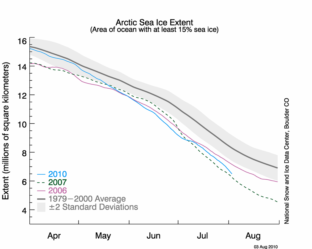
NSIDC published their sea ice news yesterday, and this one is definitely worth a read. Yesterday I pointed out that the graph below seems to be inconsistent with other data, including NSIDC maps.

http://nsidc.org/images/arcticseaicenews/20100804_Figure2.png
The problem is that the 2010 curve appears too close to 2007. Other data sources have the spread much larger, and NSIDC’s own maps show a larger spread. The area of green below represents regions of ice present in 2010, but not present in 2007. As of today, NSIDC maps show 10% more ice in 2010 than the same date in 2007.

Walt Meier from NSIDC responded with this remark :
4. Our sea ice maps are not an equal area projection. Thus one cannot compare extents by counting grid cells – this is probably the reason for the 7.5% vs. 3% discrepancy. Steve has been alerted to this issue in the past, but seems to have forgotten it.
What Dr. Meier seems to have forgotten is that pixels further from the pole in a polar map projection represent larger areas. Thus a correction would slightly increase the discrepancy, not decrease it. Sadly, DMI stopped updating their graphs two days ago – so I am no longer able top do comparisons between DMI 30% concentration and NSIDC 15% concentration. Their most recent graph shows 2010 well above 2007, and close to 2006.

Another data source – JAXA. The gap between 2010 and 2007 has been decreasing in NSIDC 15% concentration data, but has been increasing in JAXA 15% concentration data.


———————————————————————————————————————-
The next item which caught my attention is the discussion of multi-year ice.
Older, thicker ice melting in the southern Beaufort Sea
This past winter’s negative phase of the Arctic Oscillation transported old ice (four, five, and more years old) from an area north of the Canadian Archipelago. The ice was flushed southwards and westward into the Beaufort and Chukchi seas, as noted in our April post. Ice age data show that back in the 1970s and 1980s, old ice drifting into the Beaufort Sea would generally survive the summer melt season. However, the old, thick ice that moved into this region is now beginning to melt out, which could further deplete the Arctic’s remaining store of old, thick ice. The loss of thick ice has been implicated as a major cause of the very low September sea ice minima observed in recent years.
The blink comparator below shows the changes in multi-year ice between the end of March and the end of July.

The multi-year ice has largely survived the summer so far. Pixel counts show that ice greater than two years old has dropped by 11%, and ice between one and two years old has dropped by 4%. (These numbers are slightly low because of the distortion described above.) Most of the ice lost has probably been transported out the Fram Straight near Greenland, rather than melted in situ. The ice in the Beaufort Sea has split and moved north and west.
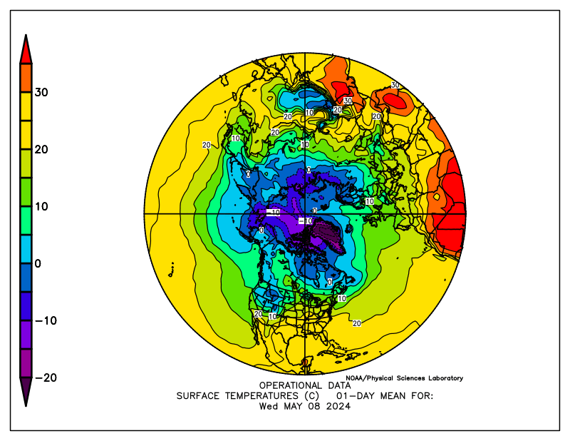
What about the future? The remaining multi-year ice in the Beaufort Sea is largely contained in areas which have dropped below freezing, and are forecast to remain below freezing for the next two weeks. The image below blinks between multi-year ice and current temperatures. Blue indicates below freezing temperatures.

The NCEP forecast below shows freezing temperatures over the ice for most of the remainder of the Arctic summer.

http://wxmaps.org/pix/temp2.html
It appears that the vast majority of the multi-year ice will survive this summer – just as it did in the 1970s and 1980s. The language in the NSIDC article seems to indicate that something fundamental has changed. I don’t see much evidence of that. In fact, given the large amount of 1-2 year old ice, we should see an increase in the amount of MYI next year.
Ice age data show that back in the 1970s and 1980s, old ice drifting into the Beaufort Sea would generally survive the summer melt season. However, the old, thick ice that moved into this region is now beginning to melt out, which could further deplete the Arctic’s remaining store of old, thick ice. The loss of thick ice has been implicated as a major cause of the very low September sea ice minima observed in recent years.
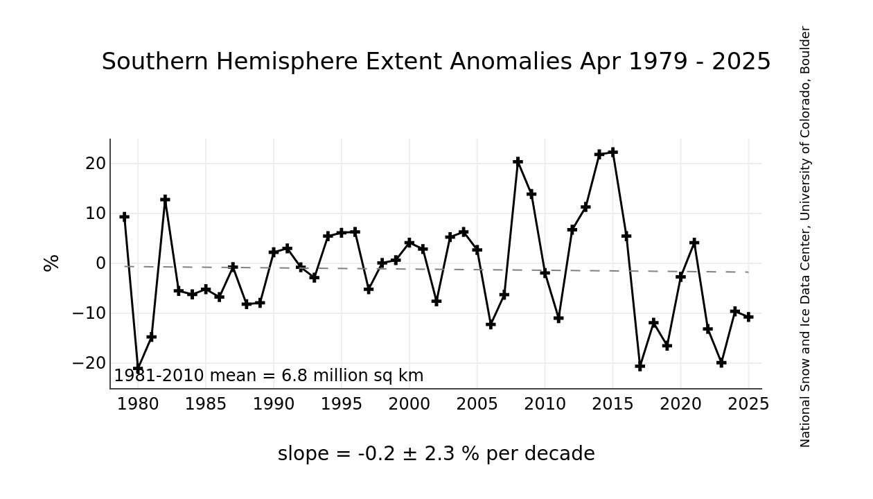
And no mention of the record high ice extent in Antarctica.

http://nsidc.org/data/seaice_index/images/s_plot_hires.png
I have alerted Dr. Meier to most of these issues by E-mail.
Discover more from Watts Up With That?
Subscribe to get the latest posts sent to your email.
Keep ’em honest, Steve. Thanks!
I don’t think temperatures of around freezing above the surface of the ice (in summer) are the most important. I think that what goes on below the ice gets the upper hand in summer. It melts away from below.
Just a hunch.
Did he return any of your inquiries?
I’ll admit to not having as much time as some out there but if there is one thing I’ve noticed with alarmist papers and reports, is that in many cases the conclusion in the text is not well supported by the data presented. Unfortunately it seems scientific opinion is considered just as valuable these days as raw numbers. Dark days for science….
Billy Liar
Please propose a physical mechanism whereby the water heats underneath compact ice.
At least they can’t claim the NWP opened up.
Same post as before until Dr. Meier answers:
Also quite misleading is Fig. 1 Part1 of ice age distribution: 1985 jumping to 2008, 2009 and 2010. Over the past 3 years the variability of distribution is quite significant. Therefore juxtaposing a snapshot at 1985 out of context, without showing the variability then simply occult the processes that lead to yearly transformation of the Arctic ice.
Let’s notice also that the multiyear ice on these images is considered 5y + and not 20y or 50y. Therefore, if Arctic ice was so stable in the past, where has 50y ice gone Dr. Meier? It is likely it has been melted and recycled in an ever dynamic Arctic. Thus presenting 1985 as a supposed representation of the Arctic Ice of the past -i.e. stable- and the evolution since as a abnormal situation -i.e. AGW induced changes- is misleading at best.
Steve is wrong, pixels away from the North Pole represent smaller area than pixels at the North Pole. This is because the area is displayed larger whilst the pixel density is constant, thus less area per pixel. However, the difference is small and I would not think should account for the difference between 3% and 7.5%.
When your mandate is to give nothing but an alarmist perspective, you give nothing but an alarmist perspective, right or wrong!
Eric Flesch
Pixels near the pole are perpendicular to the “camera” – so are seen as their correct area. As you move towards the equator, the earth curves away, each pixel area covers a much larger area of the earth’s surface.
So pixels further from the pole represent have to be weighted more than pixels near the pole.
David Davidovics
I have always found NSIDC personnel to be extremely responsive and helpful.
As much as I appreciate and enjoy your postings Steve, lots BTW, I think your analysis and logic give succour to your opponents whose expertise at dissembling and distortion, necessitated by their need to survive, has been endlessly honed.
Numbers matter, that’s indisputable, but when the numbers that matter have been massaged and mutated beyond recognition, they become meaningless. Noise has become signal and belief trumps observation when facts threaten pre-determined agenda.
You, utilising scientific methods of transparency and disclosure, lie open to critique and accusations of error by your critics who cheerfully quote chapter and verse to prove you wrong. These same critics shout foul when historic, non unprecedented, examples are proferred. Previous low-ice states, admiralty records, sub-mariner snapshots are either ignored or dubbed as forgeries.
They ignore our ascent from the LIA and claim that that climb is ill-portuned unprecedented and
proof that what has proven good for Man is planet killing.
In all good faith I love what you’ve done but I suspect that your approach wooshes over most peoples heads.
Keep the analysis but prefix it with a simple strap-line such as “we’ve been there before folks”
Excuse me for being direct.
stevengoddard says:
August 5, 2010 at 6:37 pm
Billy Liar
Please propose a physical mechanism whereby the water heats underneath compact ice.
In the same way that air moves over the surface, (warm) currents move underneath the ice?
See p472 of N N Zubov’s seminal 1943 work ‘Arctic Ice’.
http://www.archive.org/details/arcticice00zubo
Billy Liar
The Arctic Ocean is stratified. There is a thick layer of cold water underneath the ice, which does not mix with the warmer water below. If it did, there wouldn’t be any ice in the Arctic.
RoyFOMR
I am well aware of how some people distort what I write, but the cool thing about the Arctic is that September is only a few weeks away.
Ultimately the visible satellite imagery will decide who is correct.
stevengoddard says:
August 5, 2010 at 6:37 pm
Billy Liar
Please propose a physical mechanism whereby the water heats underneath compact ice
steve, ever been in a mine shaft under ground? is it warm or cold?
Why is it everyone assumes it is cold water on the bottom of the ocean?
Is the center of the earth frozen? or molten?
just saying ……
Tim L:
As I understand Steve, he is saying that the stratification (or cold layer beneath the ice) protects the ice from the heat you are referring to – or for that matter warm water pulsing through from the Atlantic for instance (at least mostly).
It is getting so I don’t know who to believe anymore. Everyone’s data is so conflicted. DMI shows good 30% concentration. Ice area looks good. It’s just a mess, really.
I completely agree with your assessment that the NSIDC graph does not correlate with the map, and appears to under represent the actual ice extent. Glad you wrote a piece to point out the obvious.
Why the splitting hairs over pixel size and the fixation with 2007 as a single point of reference? Take a look at the big picture: 2010 is well below the ’79-2000 average. Its called ‘climate’, not ‘weather’ for a reason … the long period behavior (average over several years, trends) is the message.
It is interesting that NSIDC sea ice extent data was acceptable back in early July when levels were heading slightly back towards average, now that is no longer the case, there are suggestions something is wrong with NSIDC methodology.
Steve, you seem to be assuming that the NSIDC polar map is as a photo taken directly above the North Pole at an infinite distance, so that longitudes are displayed as shorter away from the pole. I would assume it to be a polar projection with static longitude scale, i.e., if it was extended to the equator, the equatorial lands would be far too large. If my reading is right, you are weighting the pixels in the wrong direction, thus doubling the error beyond if you did not weight them at all. That would indeed account for the gap from 3% to 7.5%, so I suspect this is what is happening.
Billy Liar says:
August 5, 2010 at 6:21 pm
I don’t think temperatures of around freezing above the surface of the ice (in summer) are the most important. I think that what goes on below the ice gets the upper hand in summer. It melts away from below.
Just a hunch.
_________________________________________________________
If I am reading the map correctly it looks like there is not much heat left in the sea to do much melting either. Unfortunately the graphs are anomalies and not direct temp.
Arctic Oscillation:
http://www.cpc.noaa.gov/products/precip/CWlink/daily_ao_index/ao.sprd2.gif
The North Atlantic is not exactly in a warming mode either:
http://www.cpc.ncep.noaa.gov/data/teledoc/nao.timeseries.gif
stevengoddard says:
August 5, 2010 at 7:29 pm
RoyFOMR
I am well aware of how some people distort what I write, but the cool thing about the Arctic is that September is only a few weeks away.
Ultimately the visible satellite imagery will decide who is correct.
________________________________________________________________
Unless of course the satellite imagery goes off line until after November 15………
Mark says:
August 5, 2010 at 6:51 pm
When your mandate is to give nothing but an alarmist perspective, you give nothing but an alarmist perspective, right or wrong!
Alternatively, when your mandate is to give nothing but an anti-warmist perspective, you give nothing but an anti-warmist perspective, right or wrong.
The skeptic questions, the anti-warmist accuses.