By Steve Goddard

Satellite data vs. normalised surface data during the 1998 El Niño
A few days ago I discussed the amplification of satellite temperatures relative to surface data. And Dr. Roy Spencer posted a very helpful description of the root cause.
(1) It is well known, and widely published, that year-to-year surface temperature anomalies are magnified with height, This is due to moist convective transport of heat from the surface to the atmosphere by evaporation and precipitation; It’s been seen in radiosonde data before there were ever satellites.
(2) It is similarly well known that this heat transport takes some time to occur, especially on large space scales (e.g. the tropics) with a 2 month or so average time lag between peak surface temperatures and peak tropospheric temperatures in the case of El Nino/La Nina.
The magnified warming with height is the same effect as the so-called “hot spot” that is expected with *long-term* warming, but which the satellite data do not seem to support so far. Some think this is a big deal, others not so much, and still others think is an artifact of errors in one or more of the measurement systems.
Had-Crut shows this same amplification in the current El Niño (seen below) with positive ENSO months consistently amplified in RSS relative to normalised Had-Crut.


GISS also uses surface temperatures, so it should so the same pattern as Had-Crut. And during the 1998 El Niño it did, but since then has been tracking RSS quite closely with no evidence ENSO effects. During the current El Niño, normalised GISS is running almost identical to RSS. Both have increased by 0.7 degrees since the bottom of the last La Niña.

Perhaps GISS has moved their thermometers up to 14,000 feet, per Dr. Spencer’s description? The graphs below show a steady divergence between GISS and Had-Crut since 1997.


GISS explains the difference with Had-Crut this way: “A likely explanation for discrepancy in identification of the warmest year is the fact that the HadCRUT analysis excludes much of the Arctic ….. (whereas GISS) estimates temperature anomalies throughout most of the Arctic.” In other words, they “estimated” the bright red region across the top of their 2005 map below, which heavily skewed their data towards warmer temperatures.

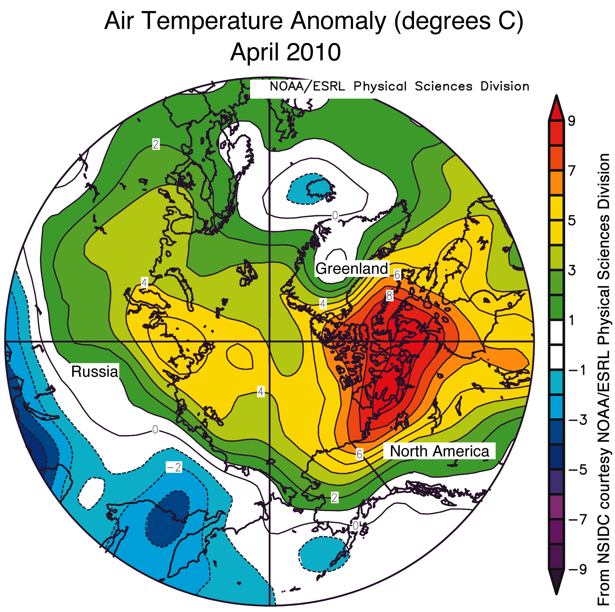
Below is the GISS 1200 km anomaly map for April, 2010 :


GISS estimated that the entire region above 80N was 4-8.6 C above normal in April, and using their “estimated” dark brown areas – GISS forecasts 2010 to be the warmest year ever.
Not surprisingly, GISS shows 2010 (so far) as being the warmest year ever, whereas Had-Crut (table below) has 2010 in the number five position for January through March.

GISS Arctic estimates appear high relative to other data sources. DMI showed most of April less than 4C above normal.

http://ocean.dmi.dk/arctic/meant80n.uk.php
Similarly, NSIDC showed the area above 80N generally 3-5 C above normal in April.

http://nsidc.org/images/arcticseaicenews/20100504_Figure4.png
Conclusion : GISS data vs. satellites does not show any El Niño amplification at 14,000 feet, and in fact appears to have found a mid-troposphere “non-hot spot.” This would seem to nullify the idea that CO2 is causing the observed warming. I personally don’t believe that and consider it more likely that the GISS Arctic data temperature estimates are too high, heavily skewing their global temperature estimates towards the higher temperatures. The fact that GISS El Niño temperatures are not muted relative to satellite temperatures is strong evidence they are incorrect.
Disclaimer: All normalisation uses only shifting, not scaling – so please don’t take the discussion there!
As for the calendar year, it is likely that the 2010 global surface temperature in the GISS analysis also will be a record for the period of instrumental data.
James Sexton says:
May 17, 2010 at 8:05 pm
“….In the mean time, 1984 is here, the electric utility business has created an IEEE comm protocol called Zigbee where I can communicate and manipulate your appliances. Nice. WATCH THE OTHER HAND!!!!!”
__________________________________________________________________
So is this why there is a big push for people to “upgrade” to new appliances? I know my water heater is electric company manipulated but all the rest of my appliances are not. No wonder the government wants to make “upgrading” to the new energy efficient standards part of selling a house!
They did something similar in Massachusetts with septic systems in 1994 -no water 10 ft down. A house had to be inspected before a sale, if the house did not pass the sale could not go though AND the house was condemned, leaving you homeless. Most homes (90%) could not pass. The water table on the east coast is more like 2-4 ft down not 10 ft. I was lucky, I lived on a hill and had my septic checked in the middle of a drought. I also dug the hole down hill from my septic system and convinced the guy a four foot hole plus six feet of elevation was equal to the ten feet specified. He took the money gave me the pass and we all walked away happy. Easy money for him and no danger of flipping his rig. (I flipped my riding lawnmower a couple times on that @ur momisugly#$! hill and a neighbor was killed when his tractor flipped)
Some people are protesting that GISS closely matches satellite data. That is exactly the problem!
Per Dr. Spencer’s explanation, satellite temperatures should be rising faster than surface data.
To me it looks like a more accurate explanation would be “GISS makes up numbers for much of the arctic… . Which leads to a higher average temperature because our made up numbers are wildly higher than any measured values in the region.”
@ur momisugly SimonH
“The response must instead be strictly apolitical and critically scientific in nature. To give credence or lend importance to anything other than this is to damage the dispassionate nature of the scientific method and thus compromise the integrity of traditional scientific processes in appearing to validate the notion of post-normal science – a thing we cannot afford to do.”
Simon, I can appreciate your point of view, however, much like Pandora’s box, the lid has already been opened. Each time the advocacy “science” tells us of our impending doom, there has been a “dispassionate” response and has shown their alarmism to be baseless, from Mann’s hockey stick to Amazon deforestation. Yet, the advocacy continues on. It will not stop. Dispassionate responses proving the wrong application of science isn’t working. It hasn’t worked for over 20 years. Now the bugs will eat us because CO2 somehow magically depletes plants of nutrients and lizards will die because they don’t thrive in warm climate. If we respond to that bit of Orwellian doublethink with factual and accurate discrediting without ramification to the people behind the doublethink, they will remain undeterred. The reason is, dispassionate science doesn’t deter or prohibit political advocacy. It is an important step to counter this totalitarian attempt, but it isn’t the counter that will extinguish their fire.
stevengoddard says:
May 17, 2010 at 9:33 pm
JJ
Look at Greenland. GISS shows the entire island 2-5C above normal. NISDC and RSS show the interior of the island below normal.
http://www.remss.com/data/msu/graphics/tlt/medium/global/ch_tlt_2010_04_anom_v03_2.png
Fudging a couple of degrees in a 0.01 precision measurement is pretty awful practice.
The grey area in the middle of Greenland means that RSS don’t cover it because it’s too high to give reliable measurements.
Where have I heard this before?
(paraphrased) We are looking for [insert name of what is being difficult to find]. We know it must be there because some folks who we think are smart said it was there, and we agree. So by Gawd we are going to do something about it because the risk of it being there, even if it turns out to be wrong, is greater than the risk of not looking for it (maybe it’s under this table…no…not there either).
Be careful what you preach. Some idiot group of people will come along after you and use your same logic, to the same futility.
Whatever, they are gone from the record…) so the surviving station (yes, that’s SINGULAR) is at Eureka Canada. Nicely situated on the coast with water all around. You know, nice MODERATING water that clips the lows. Water that takes a bunch of years to warm up during a PDO warm cycle and infiltrate past Alaska… Then they use it to fill in missing data up to 1000 km away then use THAT data to make up the grid boxes up to 1200 km away. You only really need one hot station that way. Much easier than finding a bunch of hot stations in the Arctic….
Surrounded by the same water that makes up most of the Arctic, such a ‘moderating influence’! Certainly doesn’t “clip the lows”, clips the highs maybe. By the way it’s in a PDO ‘cool’ phase that the warm water ‘infiltrates past Alaska’.
@James Baldwin Sexton
You say you’d have to see some real science. The WG1 section of the IPCC AR4 document has 11 chapters of real science. If you’re serious about being sceptical about AGW, and we all should be, then this is the material that you need to be sceptical about. You can find it all here
stevengoddard says:
May 18, 2010 at 5:52 am
richard telford
The choice of base period has no impact on the slope, and normalization corrects for it.
If you remember back to 7th grade geometry, the formula of a line is ax+b. The value of a is independent of b. a is the slope, b is the offset (i.e. baseline.)
You would have done well to remember that when posting about the lapse rate on Venus.
Phil.
RSS shows most of Greenland blue (below) or black (normal.) NSIDC shows the interior of Greenland normal or below. GISS shows Greenland hot.
Politics does strange things to science.
Consider AIDS. It was initially thought to be a “gay” disease and that highly politicized segment of society began and prosecuted an extremely effective campaign to ensure that people with AIDS were in no way discriminated against as gays already suffered form some extreme discrimination already. As a consequence AIDS was treated as a political problem rather than one of epidemiology for which you can blame the politicians who put enormous pressure on the scientists to treat AIDS differently from other contagious diseases with the results the world now experiences.
Global Warming/ Climate Change has also been politicized in such a way as to guide science in a particular way that benefits politicians. This has resulted in the whole thing being portrayed as a left/right conflict when in fact that is not the case except insofar as many with a left / liberal bias see it as a perfect hammer with which to bash away at corporates, capitalism and business in general. Those on the right see a movement that wishes to destroy civilization as we know it and the antics of many of the supporters of CAGW simply reinforce that view.
I suppose the politicization of science is nothing new but I do believe that many of us on this site are simply trying to add to what we know without preconceptions as is evidenced by the many who make reference to their visits to CAGW sites across the web. Add to that the often very critical responses and very testing questions raised about the positions expounded by the contributors here and it is obvious that our skepticism is based on our , expanding, understanding of the topic.
Plus I think that we all want “truthful science” not “political science” and this site seems to have that.
@James Baldwin Sexton
May 18, 2010 at 6:27 am
I do understand your frustration, and I promise that I find it all equally frustrating. But the net worth of what you’re advocating is to take up the political fight and drop the fight for the integrity of sciences. I’m afraid that’s a proposition that I find untenable.
The sceptics’ strongest, most powerful weapon against the AGW proponent is their OWN scientific endeavour. That they find it necessary to hide declines, fiddle with station data, conveniently lose station adjustment meta-data, cherry-pick lines of evidence, truncate, splice and smooth.. these instances of fudging are our weapons.
That their standards fall below those demanded in the “real world”, that their enquiries are whitewashes, that their high priests run computer models as if they were scientific experiments and that their product is no more to be depended on than a $9.99 Lottery Number Predictor or an astrological chart.. these are our weapons.
That their climate experts predict earthquakes and volcanoes because of 0.5C/century global temperature trends, that they declare UK snow to be a thing of the past, that they attribute the loss of islands in river deltas to rising seas, lizards dying out and caterpillar population explosions to climate change.. these are our weapons.
In the fullness of time, nobody will argue that we had the lesser arsenal. But if we surrender the thing we have, that they don’t have – the value and integrity of dispassionate science, free from corruption and compromise – we will have smashed all the weapons they’ve gifted to us, and will have nothing to throw at them but our own faeces. ;o)
” Nigel Harris says:
May 18, 2010 at 7:54 am
@James Baldwin Sexton
You say you’d have to see some real science. The WG1 section of the IPCC AR4 document has 11 chapters of real science. ”
Plus, it has fairytales!(about glaciers) Snippets from Climber magazines! Ominously sourced statements about rainforests! Bargains Bargains Bargains! Come back for the forthcoming AR5, now with an entire working group directed by Roland Emmerich!
stevengoddard says:
May 18, 2010 at 8:36 am
Phil.
RSS shows most of Greenland blue (below) or black (normal.)
Not according to the map you showed, see detail below:
http://i302.photobucket.com/albums/nn107/Sprintstar400/GreenlandTLT.jpg
” DirkH says:
May 18, 2010 at 9:10 am
[…]
Plus, it has fairytales!(about glaciers)[…]”
Oh, sorry, i see you only talked about WG1 of AR4. Hm. Sorry, no fairytales about glaciers, no Climber magazines, no pole dancing ladies in WG1, but- actually it’s the highlight of the entire AR4: It’s 100% done in the computer! Yes, Ladies and Gentlemen, an entire WG full of non-verifiable computer projections! Come and see!
DirkH says:
A shorter DirkH would be: “I haven’t actually read the AR4 WG1 report and know not of what I speak.”
I too am curious about this… can anyone elaborate?
E.M.Smith says:
May 18, 2010 at 12:57 am
Wren says: One month doesn’t tell you much. It might be more revealing to look at the differences between the Arctic measurements by GISS and those by DMI and NSIDC over time.
GISS is always high in the Arctic. It NEVER has even a modestly close to normal Arctic. Just because they have no temperatures measured there, that’s no reason to doubt their imaginings, though… /sarcoff>
If you find GISS is consistently high, I wouldn’t think the anomaly would be effected.
It is the ANOMALY that is found to be consistently high. It is in STEP3 that GIStemp creates the anomaly and it does it by comparing present thermometers (sparse and mal-placed as they are) to 6 x as many thermometers in the past and from different places. So the anomaly is an ‘inter instrument’ anomaly not a ‘same instrument’ anomaly. (Rather like asking if your car now goes faster by comparing it to a different car in the past…)
======
Perhaps we have different things in mind.
An anomaly is a measure of change. If I am measuring temperature trends (1) on the sunny side of my house, and (2) on the shady side of my house, I would expect the sunny side to be consistently warmer than the shady side. However, over time I wouldn’t expect one side’s temperature to change more than the other.
That’s why I asked if the Arctic measurements by GISS and those by DMI and NSIDC differ over time, since they are like on the same side of the house.
Phil. says:
May 18, 2010 at 9:34 am
stevengoddard says:
May 18, 2010 at 8:36 am
Phil.
RSS shows most of Greenland blue (below) or black (normal.)
Not according to the map you showed, see detail below:
http://i302.photobucket.com/albums/nn107/Sprintstar400/GreenlandTLT-1.jpg