By Steve Goddard

Satellite data vs. normalised surface data during the 1998 El Niño
A few days ago I discussed the amplification of satellite temperatures relative to surface data. And Dr. Roy Spencer posted a very helpful description of the root cause.
(1) It is well known, and widely published, that year-to-year surface temperature anomalies are magnified with height, This is due to moist convective transport of heat from the surface to the atmosphere by evaporation and precipitation; It’s been seen in radiosonde data before there were ever satellites.
(2) It is similarly well known that this heat transport takes some time to occur, especially on large space scales (e.g. the tropics) with a 2 month or so average time lag between peak surface temperatures and peak tropospheric temperatures in the case of El Nino/La Nina.
The magnified warming with height is the same effect as the so-called “hot spot” that is expected with *long-term* warming, but which the satellite data do not seem to support so far. Some think this is a big deal, others not so much, and still others think is an artifact of errors in one or more of the measurement systems.
Had-Crut shows this same amplification in the current El Niño (seen below) with positive ENSO months consistently amplified in RSS relative to normalised Had-Crut.


GISS also uses surface temperatures, so it should so the same pattern as Had-Crut. And during the 1998 El Niño it did, but since then has been tracking RSS quite closely with no evidence ENSO effects. During the current El Niño, normalised GISS is running almost identical to RSS. Both have increased by 0.7 degrees since the bottom of the last La Niña.

Perhaps GISS has moved their thermometers up to 14,000 feet, per Dr. Spencer’s description? The graphs below show a steady divergence between GISS and Had-Crut since 1997.


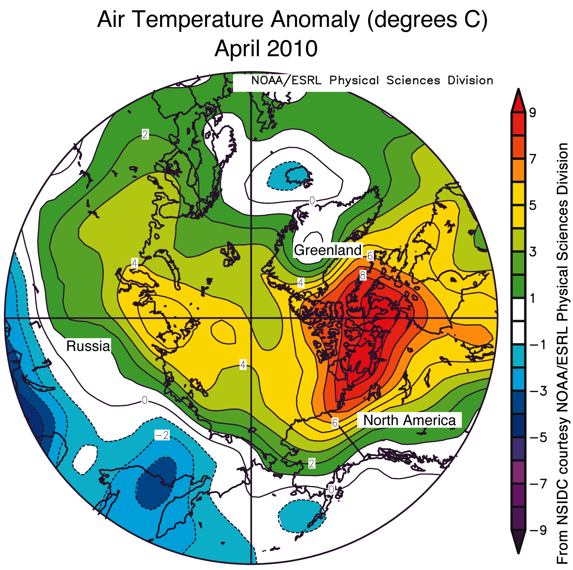
GISS explains the difference with Had-Crut this way: “A likely explanation for discrepancy in identification of the warmest year is the fact that the HadCRUT analysis excludes much of the Arctic ….. (whereas GISS) estimates temperature anomalies throughout most of the Arctic.” In other words, they “estimated” the bright red region across the top of their 2005 map below, which heavily skewed their data towards warmer temperatures.

Below is the GISS 1200 km anomaly map for April, 2010 :


GISS estimated that the entire region above 80N was 4-8.6 C above normal in April, and using their “estimated” dark brown areas – GISS forecasts 2010 to be the warmest year ever.
Not surprisingly, GISS shows 2010 (so far) as being the warmest year ever, whereas Had-Crut (table below) has 2010 in the number five position for January through March.

GISS Arctic estimates appear high relative to other data sources. DMI showed most of April less than 4C above normal.

http://ocean.dmi.dk/arctic/meant80n.uk.php
Similarly, NSIDC showed the area above 80N generally 3-5 C above normal in April.

http://nsidc.org/images/arcticseaicenews/20100504_Figure4.png
Conclusion : GISS data vs. satellites does not show any El Niño amplification at 14,000 feet, and in fact appears to have found a mid-troposphere “non-hot spot.” This would seem to nullify the idea that CO2 is causing the observed warming. I personally don’t believe that and consider it more likely that the GISS Arctic data temperature estimates are too high, heavily skewing their global temperature estimates towards the higher temperatures. The fact that GISS El Niño temperatures are not muted relative to satellite temperatures is strong evidence they are incorrect.
Disclaimer: All normalisation uses only shifting, not scaling – so please don’t take the discussion there!
As for the calendar year, it is likely that the 2010 global surface temperature in the GISS analysis also will be a record for the period of instrumental data.
stevengoddard says:
May 17, 2010 at 9:33 pm
Maybe the next battle cry will be to “Save Greenland”. Saved from what is TBD.
I have to keep reminding myself that these are Anomalies, not Absolute temperatures.
The latest UNISYS for Sea Surface temperature shows the El Nino to have evaporated and a finger of colder water starting to thrust up toward the Arctic to the East of Greenland.
One can’t say that one of these things is wrong and the other quantity is correct.
The different methodologies just measure slightly different things. And the seemingly qualitative disagreements in the conclusions is itself enough to show how unimportant and questionable the warming trend is.
2010 will likely be very close to 1998 in its temperatures – according to both teams. I would bet 50:50 that it will exceed the warmth of 1998. We will see. There’s still nothing remarkable about either answer.
It seems clear that the tropical troposphere data in particular show a slower warming trend – and it’s the best indicator of the greenhouse warming which therefore seems to be low according to the data. The surface, polar etc. warming trends may be faster but they can be less nicely linked to global effects such as the enhanced greenhouse effect.
So the experimental data don’t support a fast trend derived from CO2.
stevengoddard says:
May 17, 2010 at 9:36 pm
Wren,
There is significant divergence between GISS and Had-Crut over the last decade.
http://climateinsiders.files.wordpress.com/2010/05/gissvshadcrut1.jpg
======
I wasn’t referring to that divergence. Is there a divergence between the Arctic numbers by GISS and those by DMI and NSIDC?
Conspiracy theory for 2010:
1. Make sure you maximise the temperature uplift due to El Nino – important for Mexico.
2. Ensure the BP oilspill is as bad as possible to make the public hate oil companies and, hence, their product.
3. Use the two situations to ensure a deal on ‘global warming’ this summer.
4. Pronounce Al Gore the reincarnation of Jesus Christ.
Thanks Steve for these correlations, they are invaluable. It’s too much to keep up without them.
The extrapolation over the pole is incredibly dodgy. You had a post about it a few months ago. It’s only “verification” is with data from the few collection stations at merely relatively high latitudes, and all at similar latitude. To claim it is even valid is enough of a stretch. To claim it is superior to other products takes real cojones.
Disclaimer: All normalisation uses only shifting, not scaling – so please don’t take the discussion there!
At least some of the anomalies you are discussing have different base periods. Many of the results you present are probably an artefact of this.
Steve,
The story is that Hansen et al claim the climate is unstable; that a few extra ppm of CO2 will push it off a cliff. Runaway positive feedback from water vapor would take over. (Tho, you’ve gotta wonder how any humid day didn’t do this already)
Yet the El Nino of 1998 seems to be direct evidence that this isn’t true. It dissipated quickly. It didn’t lead to further warming. If heat is “trapped” in the troposphere, why did it so quickly dissipate? It’s in the Trophosphere! , Doh! not there! okay then, it jumped into the oceans? Argo says no. Deep in the oceans? No. I know! It’s in the arctic, hiding under the ice! Damn, stupid increasing ice cap! Melt Dammit, MELT!
Pefectly agree in what Dr. Roy Spencer said. There should be some amplification in troposphere against the surface during hot phases of Nino.
I would like to add a little bit more information: the “hot phase” in troposphere is better related to all the tropical oceans (ex. 20S-20N) then only the Nino zone.
http://translate.google.it/translate?hl=it&sl=it&tl=en&u=http%3A%2F%2Fglobalwarming.blog.meteogiornale.it%2F2010%2F05%2F16%2Foceani-tropicali-e-troposfera%2F
It’s in italian language, I hope the google translation it’ fine.
Steve,
Dealing with such small differences over such large areas of inherently noisy data is not easy and there is a fair probability of artefacts.
On your second graph, I took the RSS red cuve and counted the number of peaks. There were about 58, depending on what was admitted. The time span from 1997 to month 4 of 2010 is about 160 months, giving a peak every 2.8 months approx.
Earlier, I had done some work on subtracting 1997 temps from 1998 temps, month by month. The type of graph that resulted, not once but often, was like these 3 examples:
http://i260.photobucket.com/albums/ii14/sherro_2008/uahocean.jpg
http://i260.photobucket.com/albums/ii14/sherro_2008/MAWSON.jpg
http://i260.photobucket.com/albums/ii14/sherro_2008/MeekaJ.jpg
It does not take much imagination to see a cyclicity at times with a period of about 3 months. In the first graph of UAH data, it is more visible at mid latitudes and less certain from sparse data at poles.
Have you seen cyclicities like this in data before?
Wren says: One month doesn’t tell you much. It might be more revealing to look at the differences between the Arctic measurements by GISS and those by DMI and NSIDC over time.
GISS is always high in the Arctic. It NEVER has even a modestly close to normal Arctic. Just because they have no temperatures measured there, that’s no reason to doubt their imaginings, though… /sarcoff>
If you find GISS is consistently high, I wouldn’t think the anomaly would be effected.
It is the ANOMALY that is found to be consistently high. It is in STEP3 that GIStemp creates the anomaly and it does it by comparing present thermometers (sparse and mal-placed as they are) to 6 x as many thermometers in the past and from different places. So the anomaly is an ‘inter instrument’ anomaly not a ‘same instrument’ anomaly. (Rather like asking if your car now goes faster by comparing it to a different car in the past…)
Oh, and they cherry pick the baseline to a cold phase of the PDO, so we can’t get back to it for 30 years after about 1980… which would be, oh, NOW. And it’s getting cold all over the planet. But don’t worry, they also re-write the past data to be colder, so that will keep the warming trend intact, even as it’s snowing all over the place. No Sarcoff… straight facts. We had a winter storm warning in April with snow. In California. You know, California April when it can be 90 F but we had 60 F instead?
http://chiefio.wordpress.com/2010/04/11/winter-storm-warning-in-california-in-april/
From Here:
http://chiefio.wordpress.com/2010/02/02/giss-benchmarking-the-baseline/
You will find a nice little chart that compares the GISS baseline to “all data”.
http://chiefio.files.wordpress.com/2010/02/gissblvt_1200km_anom0112_1951_1980_1880_20091.gif
Which has a nice light blue Arctic. Nothing like using a nice cold period with a nice cold arctic as your baseline. Pretty much guarantees a nice pink / red arctic unless you’ve had a cold PDO phase for a decade or three…
Which is a partial answer to :
Robert of Ottawa says: How come Northern Canada is sooo hot?
The other part is that they deleted the really cold inland stations ( Oh, I’m Sorry, they don’t like the word “deleted”, how about “dropped”? “Just Left Out”? Couldn’t quite find? Misplaced? Whatever, they are gone from the record…) so the surviving station (yes, that’s SINGULAR) is at Eureka Canada. Nicely situated on the coast with water all around. You know, nice MODERATING water that clips the lows. Water that takes a bunch of years to warm up during a PDO warm cycle and infiltrate past Alaska… Then they use it to fill in missing data up to 1000 km away then use THAT data to make up the grid boxes up to 1200 km away. You only really need one hot station that way. Much easier than finding a bunch of hot stations in the Arctic….
Oh, and Anthony has found a BUNCH of northern stations where they screw up the reporting and forget the M for “MINUS” on many of the below zero temps, making them positive. So it warms a whole grid box, it’s not like anyone would notice…
James Sexton’s important post above has gone unchallenged (and also unsupported). Is this what WUWT is really all about? Is the drive to question AGW entirely politically and ideological motivated? Does it have anything at all to do with genuine scientific scepticism? We deserve to know!
I have two remarks on the divergence between GISS and Hat-Crut.
1. The surface above 80 N is 1.5% of the surface of a hemisphere. There is a gap of 0.2 degrees C between GISS and Hat-Crut, only as a consequence of the fact that Had-Crut does not cover the Arctic region (See graph GISS minus Had Crut). This means that the temperature has to warm up to a large amount only in the Arctic to reach this result. If my calculations are right, the rise of temperature in the Arctic has to be 65 times the global rise of temperature to reach the same result: (100% x 0.2 (global temperature gap) = 0.015 x 0.2 x 65 (situation with only temperature rise above Arctic region)= 0.2) to explane the gap of 0.2 degrees. This is contrary to the facts.
2. Nowadays GISS makes much efforts to let know the Arctic temperature but there are hardly weather stations. So, there is a large backlash to play. The question is if GISS always have given a honour place to this region or only recently.
Things are clear: only the agency that can prove, year after year, that the global temperature is warming, has a great market value. Much toleration is permitted to reach that goal. GISS is making the difference.
When some lone person plots US temps, they dont see a global warming. When you plot some AUS stations, there is now Global warming. No warming in New Zealand. No warming in the UK.
But suddenly, when the global temp is plotted….there suddenly IS a warming?
Very strange. Makes me wonder whether the warming is global at all? Maybe there is a local hot BLOB wandering around the globe, elluding us every time we try to find it?
Now the BLOB is over scandinavia apparently. Approx +20C over northern Norway, resulting in several deaths. The snow is melting rapidly.
Unsupported, here.
I’m not here for affirmation of my socio-political viewpoint, I’m here for the science and to deepen my understanding of the current state of climate sciences. I’m also here for the occasional jest, Josh’s cartoons, alarmism exposés etc.
My personal politics are aside from the science, and so I get my political affirmation/confrontation fixes elsewhere. It is my personal belief that a core function of the scientific method is to ensure that science and politics remain distinct. One of the reasons WUWT is so useful to me as a reader is that the site assists me in maintaining an understanding of, and an eye on the exact location of, that line in the sand over which science should never step.
So no, James Sexton’s reasons for visiting WUWT are not my reasons. They’re very different. His personal reasons may be valid – politically, I dare say there is much that is useful political ammunition to him here – but he is not correct to extrapolate that we are all here for those same reasons.
Nigel Harris said on May 18, 2010 at 1:14 am:
There’s really not much there to challenge or even comment about. People come to skepticism by numerous paths. Here’s a common one:
1. Trust government to do what’s right (as we are taught to think at school).
2. Get let down/betrayed by government.
3. Come to the realization/conclusion/acceptance of the true nature of government, as in that it is run by humans who therefore will more likely look out for their own interests rather than “the faceless masses.”
4. Become suspicious/skeptical of the motives and actions of government, always questioning and seeking verification of the validity of their reasons/justifications/excuses.
Government is supporting CAGW, warning of the dire consequences if government doesn’t take on additional control over people and businesses to combat it, which also includes assorted means of ferrying more money away from people and businesses and to government who will spend it “for the good of the people.” Thus there is skepticism. A very large chunk of the viewers of this site are political skeptics who came looking for info on the science behind CAGW, they wanted to research whether it really is the major problem that government claims it to be. They come, they see how shaky AGW period really is, then lots of people stay for the articles, and the comments.
“Is the drive to question AGW entirely politically and ideological motivated?” Not entirely, but I would wager it largely is. The 1960’s liberals were skeptical of government. The 1980’s conservatives were skeptical of government. It comes from both sides of the political spectrum. And AGW, namely CAGW, has become politicized and is being wielded by government for the purposes of politicians. It is a political issue, political skeptics are involved. Why should this surprise anyone?
Really, if AGW had remained a scientific issue that hadn’t been politicized, Mann and a few others would have been shot down with some critical peer-reviewed papers and spent the rest of their careers still stinging from the rebuke for their lousy methodology. But it didn’t stay scientific, it went political. Thus you have scientific skeptics attacking CAGW “science” who want to see proper science done, and political skeptics attacking a political target. Needless to say, political skeptics exist in far larger quantities than scientific skeptics.
One good thing from the fight, this site and others have shown that you don’t have to be a “climate scientist” with an advanced degree to be a CAGW skeptic, and by extension a science skeptic as well. Political skeptics are finding themselves “cross-trained” by the debate. “Appeals to Authority” are going by the wayside. As the printing press brought knowledge to the people, now the internet brings another major social shift with massive amounts of information readily available. Authority is dying, claims need to be backed up, actions need to be justified, and the internet is filled with those ready to question practically anything with the knowledge the internet provides.
A half century ago, liberal protesters were insisting that people should question authority. Nowadays, with
global warmingclimate change we are told to stop questioning and accept authority, to believe and do whatever authority wants us to. And people wonder why there is so much political-based skepticism directed at AGW?@Nigel Harris
Is the drive to question AGW entirely politically and ideological motivated?
No, the AGW suggestion is politically and ideologically motivated. You have it backwards. I could be wrong, but then, I’d have to see some real science involved in the AGW proposition. To date, I can’t find any. Well, there is some really good coding in some modeling.
@ur momisugly Nigel Harris
As I stated earlier, I don’t care whether we’re warmer or colder. In other words, I don’t have an investment in the outcome. When E.M. Smith correctly shows the lone surface temp in the north is improperly positioned, nothing happens. No correction, no apologies, no response, except to say the law of averages account for the indiscretions at one particular site. Only, it isn’t just one. Go to the other side of the globe, say Darwin in Australia. There, as an example, we see the “adjusted” data in no way reflects the reality of the real data, quite the opposite. Again, no correction, no apologies. New Zea land? We find the same. In fact, every where we look, we find improper manipulation of the record, improper manipulation of the models, improper manipulation of the populace. From tree-rings to polar bears to historical records to melting glaciers, all are improperly manipulated to panic mankind. Yes, there is political motivation in the discussion. One doesn’t have to look to far to find it. One just has to open his eyes.
I would definitely concur with James’ assertion, here. A principle propellant of the AGW and CAGW hypotheses is derived from political motivation and the resulting science is thus advocacy-based. This results in an anti-scientific climatology/environmental science product, where the message precedes, drives, steers and ultimately dictates the scientific conclusion.
Where I think James and I deviate, certainly based on his earlier comment, is in the reaction and appropriate response to that political advocacy. The only appropriate response to the contamination of the scientific process, to my mind, is to identify the political contaminant appropriately as scientific error. The response to political advocacy in scientific research cannot be counter-political expression.
The response must instead be strictly apolitical and critically scientific in nature. To give credence or lend importance to anything other than this is to damage the dispassionate nature of the scientific method and thus compromise the integrity of traditional scientific processes in appearing to validate the notion of post-normal science – a thing we cannot afford to do.
James Sexton says:
May 18, 2010 at 3:54 am
@Nigel Harris
Is the drive to question AGW entirely politically and ideological motivated?
I agree with James, the science is being abused and used as a tool/weapon by the world’s governments and especially the UN.
It provides the ultimate tool to increase taxes, if those pushing Global Catastrophy really beleived it and were realy worried, do you think that would be Flying millions of miles between them every year?
Would they really be that irresponsible?
OK, maybe they would.
UAH doesn’t show January to Febuary 2010 as being warmer than the same period in 1998.
http://i599.photobucket.com/albums/tt74/MartinGAtkins/JanTOApr-UAH.png
I doubt UAH will show 2010 as being warmer than 1998 for the full year. 1998 was very warm but not just because of the strong NINO 3-4 but also a strong AMO albeit out of sync. Look for were the AMO and NINO lines cross both now and 98. NINO 98 was dead after the fifth month this one is now finished so AMO calls the shots.
http://i599.photobucket.com/albums/tt74/MartinGAtkins/AMO-NINO.png
This April AMO is 0.478, April 98 was 0.332 but rose to 0.414 in May.
AMO is cooling but it’s a volatile index and only shows a casual relationship to NINO.
http://polar.ncep.noaa.gov/sst/ophi/nwatl_anomaly_ophi0.png
http://polar.ncep.noaa.gov/sst/ophi/nepac_anomaly_ophi0.png
Steve Goddard: The greatest disparity between GISTEMP and HADCrut since 1997 occurs in the Southern Hemisphere. The following is a comparison graph of GISTEMP with 250km smoothing, GISTEMP with 1200km smoothing, and HADCrut for the Northern Hemisphere, from 0-90N. The difference in linear trends between GISTEMP with 1200km smoothing and HADCrut for the Northern Hemisphere is 0.076 deg C/Decade.
http://i41.tinypic.com/sfuhxs.png
Next is a comparison of the same datasets but for the Southern Hemisphere, 90S-0. The difference in linear trends between GISTEMP with 1200km smoothing and HADCrut for the Southern Hemisphere is 0.136 deg C/Decade, almost twice the Northern Hemisphere difference.
http://i39.tinypic.com/73krc9.png
If we look at the same datasets without polar data, the comparison of the Northern Hemisphere (0-65N) shows that HADCrut has a slightly higher trend. Curious.
http://i41.tinypic.com/12152xg.png
While in the Southern Hemisphere without the polar data (60S-0), the GISTEMP data with 1200km smoothing has a significantly higher trend, 0.065 deg C/Decade.
http://i39.tinypic.com/ajs2kl.png
BTW, if you’d use the KNMI Climate Explorer for your data, you wouldn’t have to shift data to align them. For anomalies, the KNMI Climate Explorer uses 1971 to 2000 as base years for all datasets.
http://climexp.knmi.nl/selectfield_obs.cgi?someone@somewhere
Steve Goddard says:
That is pretty rich, Steve, given that it is you who doesn’t seem to have really absorbed what Spencer is saying. And which, by the way, I had already said much of in that previous thread…before Spencer weighed in… in my comment http://wattsupwiththat.com/2010/05/14/satellite-temperatures-and-el-nino/#comment-390405 building on a brief statement by timetochooseagain . I guess if Spencer hadn’t essentially stated again in different words much of what I had already said in my comment, you wouldn’t have believed it and would still not even understand those basic facts.
As for your other statements:
I said that I was unsure what the coverage of the article is with RSS but that picture you link to is such that it does little to resolve the question. And, what RSS does not cover in the arctic, I believe they don’t attempt to extrapolate whereas GISS does. Now, I don’t know how good that extrapolation is but it does little to resolve that question if you compare it to data that does not attempt the extrapolation at all.
Saying that the frequency of El Nino’s and La Nina’s in the ENSO fluctuations ***MIGHT*** change somewhat in response to global warming is very different from saying that these fluctuations are caused by it. And, of course, this still doesn’t address the fact that your implication that the tropical tropospheric amplification is a prediction specific to the mechanism of CO2-caused warming is WRONG, WRONG, WRONG.
And this somehow contradicts my statement: “Technically speaking, the amplification occurs in the tropical troposphere. It can still be seen somewhat in the global data but it tends to be modulated by the other areas where such amplification does not occur. (And, I believe in the polar regions, you tend to get the reverse: more warming at the surface than at altitude.)”?
richard telford
The choice of base period has no impact on the slope, and normalization corrects for it.
If you remember back to 7th grade geometry, the formula of a line is ax+b. The value of a is independent of b. a is the slope, b is the offset (i.e. baseline.)