By Steve Goddard

Satellite data vs. normalised surface data during the 1998 El Niño
A few days ago I discussed the amplification of satellite temperatures relative to surface data. And Dr. Roy Spencer posted a very helpful description of the root cause.
(1) It is well known, and widely published, that year-to-year surface temperature anomalies are magnified with height, This is due to moist convective transport of heat from the surface to the atmosphere by evaporation and precipitation; It’s been seen in radiosonde data before there were ever satellites.
(2) It is similarly well known that this heat transport takes some time to occur, especially on large space scales (e.g. the tropics) with a 2 month or so average time lag between peak surface temperatures and peak tropospheric temperatures in the case of El Nino/La Nina.
The magnified warming with height is the same effect as the so-called “hot spot” that is expected with *long-term* warming, but which the satellite data do not seem to support so far. Some think this is a big deal, others not so much, and still others think is an artifact of errors in one or more of the measurement systems.
Had-Crut shows this same amplification in the current El Niño (seen below) with positive ENSO months consistently amplified in RSS relative to normalised Had-Crut.


GISS also uses surface temperatures, so it should so the same pattern as Had-Crut. And during the 1998 El Niño it did, but since then has been tracking RSS quite closely with no evidence ENSO effects. During the current El Niño, normalised GISS is running almost identical to RSS. Both have increased by 0.7 degrees since the bottom of the last La Niña.

Perhaps GISS has moved their thermometers up to 14,000 feet, per Dr. Spencer’s description? The graphs below show a steady divergence between GISS and Had-Crut since 1997.


GISS explains the difference with Had-Crut this way: “A likely explanation for discrepancy in identification of the warmest year is the fact that the HadCRUT analysis excludes much of the Arctic ….. (whereas GISS) estimates temperature anomalies throughout most of the Arctic.” In other words, they “estimated” the bright red region across the top of their 2005 map below, which heavily skewed their data towards warmer temperatures.

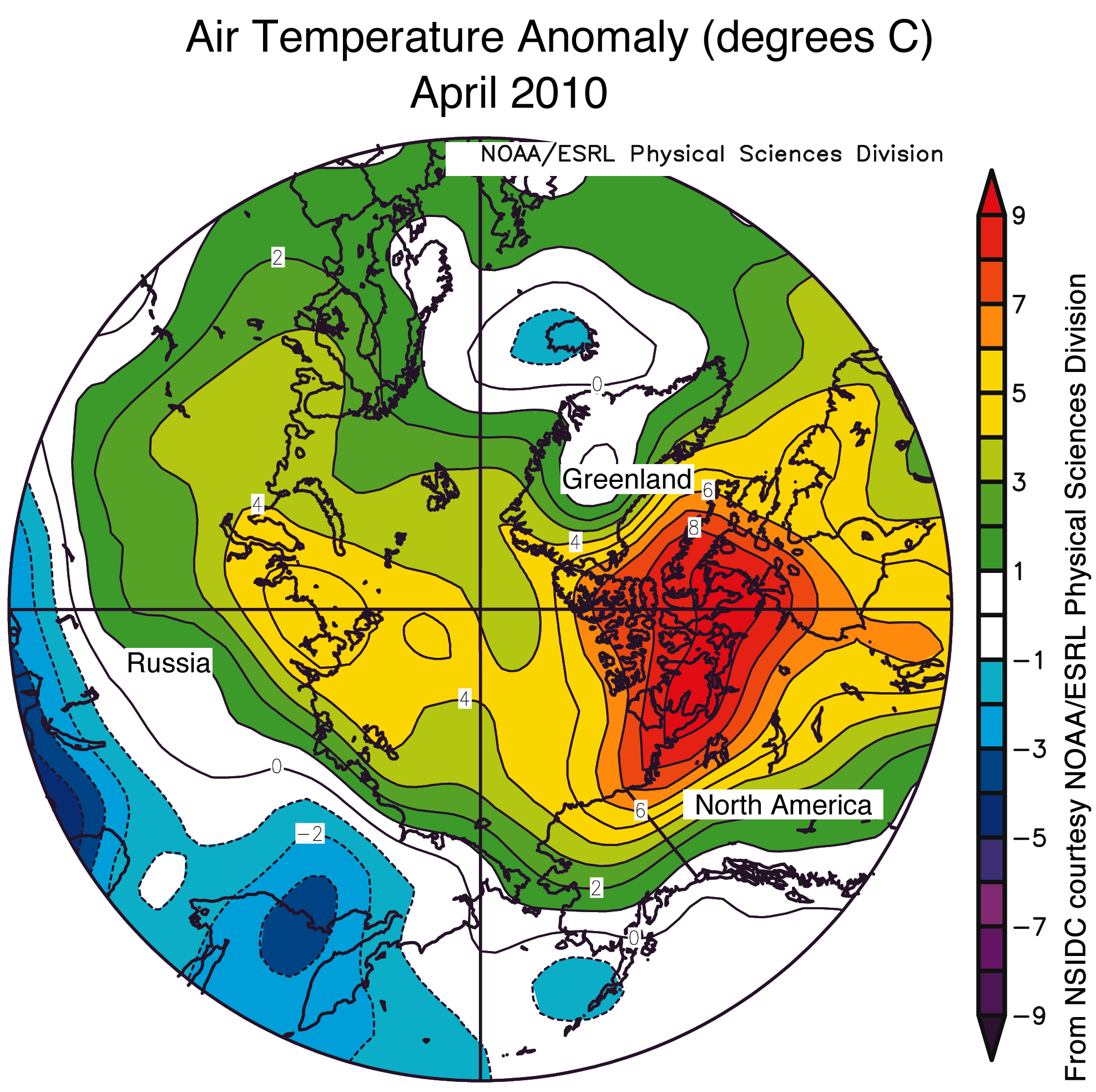
Below is the GISS 1200 km anomaly map for April, 2010 :


GISS estimated that the entire region above 80N was 4-8.6 C above normal in April, and using their “estimated” dark brown areas – GISS forecasts 2010 to be the warmest year ever.
Not surprisingly, GISS shows 2010 (so far) as being the warmest year ever, whereas Had-Crut (table below) has 2010 in the number five position for January through March.

GISS Arctic estimates appear high relative to other data sources. DMI showed most of April less than 4C above normal.

http://ocean.dmi.dk/arctic/meant80n.uk.php
Similarly, NSIDC showed the area above 80N generally 3-5 C above normal in April.

http://nsidc.org/images/arcticseaicenews/20100504_Figure4.png
Conclusion : GISS data vs. satellites does not show any El Niño amplification at 14,000 feet, and in fact appears to have found a mid-troposphere “non-hot spot.” This would seem to nullify the idea that CO2 is causing the observed warming. I personally don’t believe that and consider it more likely that the GISS Arctic data temperature estimates are too high, heavily skewing their global temperature estimates towards the higher temperatures. The fact that GISS El Niño temperatures are not muted relative to satellite temperatures is strong evidence they are incorrect.
Disclaimer: All normalisation uses only shifting, not scaling – so please don’t take the discussion there!
As for the calendar year, it is likely that the 2010 global surface temperature in the GISS analysis also will be a record for the period of instrumental data.
Oh come on, Steve McIntyre told us last night we should just accept what looks like manipulation as just “standard practice” since we don’t know the intentions of those involved.
So just just go read an amusing book, say, “The Hockey Stick Illusion” and unwind.
So what if they’re getting high at GISS. 😉
Steve,
I have some doubts about your analysis of the data but I will focus on what I think is the most egregious erroneous statement here:
Well, I am glad that you don’t believe it but this statement is already wrong or questionable on so many levels:
(1) As Roy Spencer explained, the “hot spot” is expected to occur quite generally as a result of moist convection in the troposphere. It has nothing to do with the cause of the warming.
(2) At any rate, here you are not talking about amplification of the long-term trends. You are talking about amplification of the fluctuations due to ENSO. Who would claim that these fluctuations are caused by CO2?
(3) As I recall, the satellite data may exclude some of the polar regions too (although RSS and UAH may be different in this regard also), so this may affect your analysis over the times that you are looking.
(4) Technically speaking, the amplification occurs in the tropical troposphere. It can still be seen somewhat in the global data but it tends to be modulated by the other areas where such amplification does not occur. (And, I believe in the polar regions, you tend to get the reverse: more warming at the surface than at altitude.)
“As for the calendar year, it is likely that the 2010 global surface temperature in the GISS analysis also will be a record for the period of instrumental data.”
Hey, let it go, it’s just standard practice. And James Hansen’s had a lot of standard practice since 1988.
Funny how James Hansen ‘believes’ global warming is real yet still has to work the data (1934, 1998). Pretty clear he doesn’t believe in it or he’d know he could let the data speak for itself……I’m just saying.
Your slip is showing Jim.
How come Northern Canada is sooo hot?
Steve, I did a post on the GISS divergence earlier this year. There is a shore ice amplification effect in the way that GISS uses extrapolations from shore stations to cover all of the Arctic.
http://wattsupwiththat.com/2010/01/29/diverging-views/
One month doesn’t tell you much. It might be more revealing to look at the differences between the Arctic measurements by GISS and those by DMI and NSIDC over time.
If you find GISS is consistently high, I wouldn’t think the anomaly would be effected.
Ok, so, sat temps show convective heat transfer 2 months late. One temp reading entity obviously is over estimating or under estimating the temps. Depending on which one you prefer to believe. Dr. Spencer says.”…same effect as the so-called “hot spot” that is expected with *long-term* warming, but which the satellite data do not seem to support so far. Some think this is a big deal, others not so much, and still others think is an artifact of errors in one or more of the measurement systems.”
Yeh, that’s a big deal. Either the sat data supports real observed temps or it doesn’t. Of course, figuring out what the REAL observed temps vs extrapolated, manipulated, and estimated temps is an almost impossible task for an average truth seeker such as I, with a real life job. I’m tending to believe the sat temps don’t really reflect ground temps. If the math formula takes over one chalk board to illustrate, it’s probably bs. I’m not talking about the proof, I’m saying E=MC2. Which is still debated in some circles. You know, I don’t care if it is warmer or colder. Well, I’d prefer warmer. I’m just not feeling warmer. BECAUSE ITS COLD!!! We can talk about surface temps that are manipulated or we can talk about sat readings extrapolated into temp readings with convective properties(that we can obviously quantitate the up and down motion of heat with all the particulate involved) or we can all be grown ups and say “You know, we don’t know. They jack with the surface temps so much that it is impossible to know whether the earth is warmer or colder. Further, the tropospheric temps aren’t a true reflection of the surface temps.” In the end, it doesn’t matter anyway. Warmer is better. History bares that out.
In the mean time, 1984 is here, the electric utility business has created an IEEE comm protocol called Zigbee where I can communicate and manipulate your appliances. Nice. WATCH THE OTHER HAND!!!!!
I don’t see what the big deal is, so long as the method of extrapolation is consistent. Even assuming your assertion is correct, any biases should cancel out. When it’s warm near the arctic but cooler over the arctic, the extrapolation would lead to a warm bias. But when it’s cold near the arctic but warmer over the arctic, the extrapolation would cause a cool bias. And if you and Anthony are correct, we should start to see cold anomalies breaking out across the globe.
Robert of Ottawa,
Maybe it’s the urban heat island effect – oh wait…
@JJ
“I don’t see what the big deal is, so long as the method of extrapolation is consistent. Even assuming your assertion is correct, any biases should cancel out.”
No, that’s not correct. First, biases are not consistent. Each carries their own unique value and weight. Secondly, methods of extrapolation even consistently applied are only useful if they are correct.
Something has been bugging me about these global temperature maps for some time now: That rectangular display they give (HadCrut, GISS and others) is clearly NOT an equal-area projection. Rather, it inflates the area around the poles quite dramatically.
Presumably the monochrome squares that appear in the coarser colourings are the temperature grid cells. Each cell commands an equal portion of the world map, but this does not map grid cells to equal area cells on the sphere. On the surface the procedure exaggerates the significance of anomalies in the polar regions. When this is combined with the apparent manipulation by interpolation and the reduction in monitoring station data used in these regions, it would seem to be a potentially massive source of bias.
Can anyone say definitively whether these pixilated rectangular grid cells correspond to the actual grid cells used on the globe? Or are these rectangular pixels merely an artifact of the way the data is being displayed?
JJ
Look at Greenland. GISS shows the entire island 2-5C above normal. NISDC and RSS show the interior of the island below normal.
http://www.remss.com/data/msu/graphics/tlt/medium/global/ch_tlt_2010_04_anom_v03_2.png
Fudging a couple of degrees in a 0.01 precision measurement is pretty awful practice.
There are pretty much no constraints of estimating temperatures where there basically are no stations with actual surface measurements. We used to call that “dry lab”.
In any event, the population and economic and agricultural areas in the NH have had a winter and spring that can’t help the credibility of some agency declaring it the warmest ever. Who you going to believe, the agency or your own lyin’ eyes.
Wren,
There is significant divergence between GISS and Had-Crut over the last decade.
http://climateinsiders.files.wordpress.com/2010/05/gissvshadcrut1.jpg
JJ, “cold anomalies breaking out across the globe.”
California is breaking out in a cold anomaly.
http://sowellslawblog.blogspot.com/2010/05/may-2010-colder-in-california.html
and for April: http://sowellslawblog.blogspot.com/2010/04/coldest-april-ever-in-california.html
Same for March.
Joel Shore,
You asked “You are talking about amplification of the fluctuations due to ENSO. Who would claim that these fluctuations are caused by CO2?”
http://www.ucar.edu/communications/quarterly/winter97/connection.html
Joel Shore,
Who has better coverage of the Arctic?
GISS:
http://climateinsiders.files.wordpress.com/2010/05/giss_4_2010_250km.jpg
or RSS:
http://www.remss.com/data/msu/graphics/tlt/medium/global/ch_tlt_2010_04_anom_v03_2.png
You might note too that the tropics are included in GISS, Had-Crut, RSS and UAH global temperatures.
Joel Shore,
The fact that you don’t understand something does not make it an “egregious erroneous statement.”
stevengoddard says:
There is significant divergence between GISS and Had-Crut over the last decade.
……………………………………………………………………………………………………………………
Ahh, find a distraction that will make you forget the emotions you feel from looking at that graph. Let the government govern, regardless if it uses “estimated” information to form its policies that govern you, or not. It’s all six of one, half a dozen of the other. Diverging, not diverging, what difference does it make? Everything is gray.
Be a serf, and like it.
My understanding is that UAH ALSO doesn’t measure the high latitudes… so what to they do to normalize that area? Do the exclude it? Or also extrapolate it in some fashion?
Either way, itz the same issue in my mind… the high latitudes have the most variability and the tropics the least. So, to study climate and figure out what’s driving what…. we just pour the data on in the low variability areas while taking a total guess at the high variability areas. Only makes sense if you inhale.
Why re-inventing the wheel by blog scientists when the difference between surface and satellite measurements is described here by so-called scientists:
http://www.climate4you.com/GlobalTemperatures.htm#Comparing%20surface%20and%20sattellite%20temperature%20estimates
Bottom line: the differences in the long term trends are negligible.
I thought about it some more and I think that Giss is correct. I think this for several reasons:
1. It really messes up the warmists when a skeptic picks the higher temperature reasing, they’re never sure how to respond to that.
2. If enough people support GISS then Hadcrut has to defend themselves and explain why they are right and GISS is wrong.
Confused warmists and hadcrut explaining why their lower temps are the right ones…would be a good day in my mind.
If ye love wealth better than liberty, the tranquility of servitude better than the animating contest of freedom, go home from us in peace. We ask not your counsels or your arms. Crouch down and lick the hands which feed you. May your chains set lightly upon you, and may posterity forget that you were our countrymen.—-Samuel Adams.
Some may differ in that point of view. I don’t. For me, this embodies the reason why I’m here. Most that follow this website, knows or rather should know, this is why we’re all here. It isn’t whether we care we’re warmer or not. It is the FREEDOM of life which is being threatened. One of the few freedoms left is to be secure in our own homes. Free to do as we will. We should not believe for one minute people believe we will all drown should the icecaps melt. They know we won’t. We know, like they know, the wonderful adaptability of mankind. At what cost are we willing to pay for the presumed catastrophic doom predicted? What is more catastrophic than the enslavement of mankind?
He who is void of virtuous attachments in private life is, or very soon will be, void of all regard for his country. There is seldom an instance of a man guilty of betraying his country, who had not before lost the feeling of moral obligations in his private connections. ————Samuel Adams.
According to the map for 2010 the central part of Argentina shows a cooling anomaly of only -0.2ºC. Actually, April has been a quite cool month with about a full -2ºC cooler than the baseline. I live there, and keep a detailed database.
May is getting much more colder than last year, almost as cold as 2007. Last night fell the first heavy snowfall in our nearby sierras (1400-2000 m), and for tomorrow the forecast is widespread frosts. Unfortunately, 2010 winter looks as it is going to be as bad as 2007 when it snowed in Buenos Aires after 80 years.
Those people at GISS for sure have a very sharp pencil form making “homogeneization” adjustments…
davidmhoffer,
Satellites have much better Arctic coverage than GISS
http://climate.uah.edu/
http://www.remss.com/data/msu/graphics/tlt/medium/global/ch_tlt_2010_04_anom_v03_2.png
http://climateinsiders.files.wordpress.com/2010/05/giss_4_2010_250km.jpg