 Since we’ve been talking about IPCC’s “Africagate” recently, it seemed like an opportune time to point out what sort of GISS station adjustment goes on in data from it’s nearby neighbor island. Welcome Verity Jones first guest post on WUWT. FYI for those who don’t get the implied data munging title, “Munge” is sometimes backronymmed as Modify Until Not Guessed Easily. – Anthony
Guest post by Verity Jones
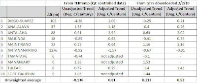
This started out as a discussion point following E.M. Smith’s blog post Mysterious Madagascar Muse. The gist of the original article centered around the availability of data after 1990 in the GHCN dataset and the NASA/GISS treatment of temperature on the island. Well Madagascar has a bit of a further story to tell. I had offered to plot a ‘spaghetti’ graph of the temperatures from the ten stations used on Madagascar, and this has proven interesting as an example of how data is adjusted and filled in by GISS.
To start, the annual mean temperatures plotted on a graph (Figure 1) show clearly the differences between the stations – Antananarivo is high altitude and relatively cool, with a cooling trend; of the other stations, some have cooling trends, most are warming. Also noticeable is the very sparse data after 1990. Note the darker blue data for Maintirano, of which more later.
With such temperature differences between sites, obviously you cannot just average the temperatures. This is what it looks like if you do (Figure 2), and it clearly does not work as an average temperature for the island.
Normalizing each of the temperature series by calculating the mean temperature for that station for the baseline period of 1951-1980 allows plotting of an anomaly-based ‘spaghetti’ graph (Figure 3). This shows what looks like warming-cooling-warming climate cycles very clearly and it is possible to fit a third order polynomial trendline though the averaged data. I’ve seen this again and again for data I’ve plotted around the world (incidentally these were for WUWT regular TonyB).
E.M.Smith finds seven other rural stations within 1000km that may contribute to homogenization. They also show cooling to about 1965-1975, then a warming trend. This is lost from the homogenized data.
One final thing. Even the patchy data stops in 2005, so after this date Madagascar too gets ‘filled in’ data from elsewhere – it seems from the rural stations up to 1000km away – again. And even the stations used to ‘fill in’ have patchy data – many have a gap then ONE DATA POINT in 2009. Note that there was no data for 10 years prior to 2009 in this station.
This is unbelievable. Rather than give a lot of plot examples, check the station hyperlinks below for yourself:
| Ile Juan De N | 17.1 S | 42.7 E | 111619700000 | rural area | 1973 – 2009 | ||
| Dzaoudzi/Pama | 12.8 S | 45.3 E | 163670050000 | rural area | 1951 – 2009 | ||
| Iles Glorieus | 11.6 S | 47.3 E | 111619680000 | rural area | 1956 – 2009 | ||
| Ouani (Anjoua | 12.1 S | 44.4 E | 111670040000 | rural area | 1963 – 1984 | ||
| Serge-Frolow | 15.9 S | 54.5 E | 168619760000 | rural area | 1954 – 2009 | ||
| Ile Europa | 22.3 S | 40.3 E | 111619720000 | rural area | 1951 – 2009 | ||
| Porto Amelia | 13.0 S | 40.5 E | 131672150004 | rural area | 1987 – 200 |


Chas (06:12:39) :
That does look useful – thanks!
Mike Rankin (16:39:21) :
Good find – that is a potentially useful site, although getting data by month is slow.
Ron Broberg (20:35:16)
Great. I did not include them individually for the sake of brevity. Now I need to ask what you have done – are these from the same straight GISS records I used, or GHCN V2.mean or…? Are you able to run GIStemp?
I’ve run GIStemp, but the charts above are data scrapes from the GISS GIStemp station_data site. I’ve charted the “metANN” column. I’ll put together a bigger post later. I’d like to quantify the different effects of the data truncation and the homogenization temp adjustment. I’d also like to understand what’s causing the data truncation, since that also appears in Darwin. And, third, I’m going to want to recreate the data in DS1 and DS2 because I like the idea of adding the recent 15 years of wx data from WU to fill in for the recent patchy data. OTOH … I do have a full time+ job … so much to do … so little time 🙂
Ron Broberg (06:59:21) :
I’d also like to understand what’s causing the data truncation…
As I understand it, GIStemp homogenizes non-rural stations by comparison with rural ones – any non-rural station that does not have three IIRC matching rural reference stations is not used or the portion for whcih there is no match is not used.
I do have a full time+ job … so much to do … so little time 🙂 Ditto