From Jo Nova a look at how the MWP looks when other data is used, not just a few trees in Yamal.
These maps and graphs make it clear just how brazen the fraud of the Hockey Stick is.

Click to enlarge
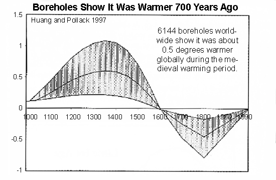
It’s clear that the world was warmer during medieval times. Marked on the map are study after study (all peer-reviewed) from all around the world with results of temperatures from the medieval time compared to today. These use ice cores, stalagmites, sediments, and isotopes. They agree with 6,144 boreholes around the world which found that temperatures were about 0.5°C warmer world wide.
What follows is a sordid tale of a graph that overthrew decades of work, conveniently fitted the climate models, and was lauded triumphantly in glossy publication after publication. But then it was crushed when an unpaid analyst stripped it bare. It had been published in the highest most prestigious journal, Nature, but no one had checked it before or after it was spread far and wide. Not Nature, not the IPCC, not any other climate researcher.
In 1995 everyone agreed the world was warmer in medieval times, but CO2 was low then and that didn’t fit with climate models. In 1998, suddenly Michael Mann ignored the other studies and produced a graph that scared the world — tree rings show the “1990’s was the hottest decade for a thousand years”. Now temperatures exactly “fit” the rise in carbon! The IPCC used the graph all over their 2001 report. Government departments copied it. The media told everyone.
But Steven McIntyre was suspicious. He wanted to verify it, yet Mann repeatedly refused to provide his data or methods — normally a basic requirement of any scientific paper. It took legal action to get the information that should have been freely available. Within days McIntyre showed that the statistics were so flawed that you could feed in random data, and still make the same hockey stick shape nine times out of ten. Mann had left out some tree rings he said he’d included. If someone did a graph like this in a stock prospectus, they would be jailed.
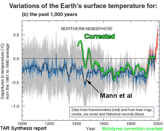
Astonishingly, Nature refused to publish the correction. It was published elsewhere, and backed up by the Wegman Report, an independent committee of statistical experts.
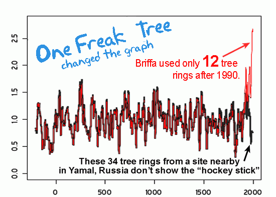
In 2009 McIntyre did it again with Briffa’s Hockey Stick. After asking and waiting three years for the data, it took just three days to expose it too as baseless. For nine years Briffa had concealed that he only had 12 trees in the sample from 1990 onwards, and that one freakish tree virtually transformed the graph. When McIntyre graphed another 34 trees from the same region of Russia, there was no Hockey Stick.
The sharp upward swing of the graph was due to one single tree in Yamal.
Skeptical scientists have literally hundreds of samples. Unskeptical scientists have one tree in Yamal, and a few flawed bristlecones…
…
Climate models don’t know why it was warmer 800 years ago.
The models are wrong.
The so-called “expert review” is meaningless. The IPCC say 2,500 experts review their reports, but those same “experts” made the baseless Hockey Stick graph their logo in 2001.
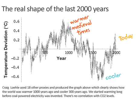
Craig Loehle used 18 other proxies. Temperatures were higher 1000 years ago, & cooler 300 years ago. We started warming long before cars and powerstations were invented. There’s little correlation with CO2 levels.
Sources: Loehle 2007, Haung and Pollack 1997, See co2science.org for all the other peer reviewed studies to go with every orange dot on the map. McIntyre & McKitrick 2003 and 2005, and update, Mann et al 1998, Briffa 2006, read McIntyre at climateaudit.com, see “ClimateGate”, and Monckton “What Hockey Stick” (Science and Public Policy Institute paper)
This is Page 8 & 9 The Skeptics Handbook II. 20 page PDF
I know a similar graph went up a couple of days ago around the web. The skeptics Handbook II was published on Friday Nov 20.
ACKNOWLEDGEMENTS: Thanks to Craig Idso of CO2science.org for his fabulous collation of research and his Medieval Warming Project which is an excellent resource, try the animated map! A big thank you to John N for his work in helping to create the map.
Sponsored IT training links:
Get real 642-374 question for real success. No need to go through dozen of books. Just download 70-291 study pack and pass your RH202 in single attempt.
“The Wels is Europe’s largest freshwater fish, capable of reaching over 200lbs and attacks on humans have been reported across Eastern Europe from Russia to Poland through the ages right up to the present day.”
http://www.itv.com/presscentre/rivermonsters/ep3wk49/default.html
Jeremy says: “There are three reasons why the Wels catfish are growing so big in this river, it’s a mixture of man made and natural. For a start you’ve got three of these huge dams and it just means there’s so much more water, more space for the fish to live in. On top of that, this water is hot. The fish being a cold blooded animal can just feed and grow for more months of the year than they do in Eastern Europe and in Berlin.”
http://media.photobucket.com/image/wells%20catfish/pause4thought/bigcats2.jpg
It would appear that a warm climate makes for bigger catfish.
What to do now when the bull dust blows over?
I suggest we start by asking more questions, and finding additional answers to compare, to give us a greater gathering of knowledge, to evaluate the hypothesis skeptically, while figuring out better questions, to ask for the next set of trials.
Diversity of thought into additional areas of knowledge, gives a more rounded vision, allowing for the formation of more complex answers, and resultant better focused questions. If you can then present data, in a format that is visual enough, that it shows the balancing of several forces at work, as they really do, it would make finding the solution easier.
From a viewpoint of how the assemblage of parts seamlessly fits together,the only thing you have to do, is to watch the (short but seemingly) endless stream of (every 15 minute) infrared and/or vapor satellite photos animated, (after fixing the jumping around of the originals, due to lack of foresight, that they might be useful some day), and synchronized by 27.32 days periods, to see the repeating cycles.
To set up five tiled windows, in the first show day #1 through #27 sequentially, then as they continue on in the same stream, the cycle of the first 27 days continues anew in window #2, synchronized by Lunar declination to #1. Till they spill over into window #3 stepping in phase with the other two, #4 the same idea gives you the four basic patterns of the Rossby wave 109.3 day cycle, of global circulation, that then repeat but seasonally shifted.
In window #5 then would be the first repeat of window #1 in the same phase of the same pattern, and should look a lot like window #1. As the progression through the total series, proceeds, when you get 6558 days into the five stacks, a 6th window opens and the original day #1 in window #1 opens as #1 in window #6. As the series progresses on, real data can be viewed, in the real interactions going on.
This would give you a look into the cyclic pattern that develops from the repetitive interaction of the inner planets, and tidal effects, caused by the Lunar declination, phase, perigee/ apogee cycles.
By adding a sliding ball, vertically moving up and down a +-30 degree scale bar (referenced from the Equator), on the side of each tile space, that shows the plot of the current Lunar declination for the time of each frame. Which will allow you to see the shifts in the Lunar declinational angle’s effects, as the 18.6 Mn signal progresses.
By adding another slide bar of +-30 degrees (with the heliocentric synod conjunction with Earth, as the zero reference), at the top, of each tile you could view each outer planet as we pass them, as color coded discs labeled, J, S,U, N, shifting from left to right. From viewing this progression of the outer planets, the merit of their influences, can then be seen in the additional surges in ion flux as they go by. You can watch the changes in the normal background, of the global circulation driven by the moon and inner planets, affected by the outer planets.
By adding in the surface maps for the past historic temperatures, dew points, precipitation, types, and amounts, as overlays onto the IR/VAPOR photos, the patterns will be abundantly clear to 10 year old school kids. At the same time, generating a good long term forecast, set of analogs to base the models upon.
Once the amount of additional angular momentum, and the process of it’s coming and goings can be clearly seen, it can then be measured, it’s effects calculated, and incorporated into the climate models, as a real quantized feedback. thereby giving us a much better picture, of the interactions, of all of the parts of the puzzle.
All of the necessary data is in the archives, and free to use, to those that have the where with all, to assemble the real truth, be it inconvenient or not. I will probably spend the rest of my life, trying to do it alone, out of my own funds, as I have done so far.
For application in Quake sightings, and subsequent formulating hypothesis and developing forecast parameters, you could substitute, or add (if your video resolutions is good enough), intensity quantified dots on the surface of occurring quakes (play with color coded shift and fade out time, to see time shifts etc.) and a corresponding moving open circle, showing the moving location of the earth/moon center line.
Slioch (01:55:07) : Incidentally, there is reasonably good agreement between the four temperature series, NASA GISS, HADCRUT3, RSS and UAH, You can be sure Hansen, Jones, et al work very hard to make their data look real enough to match the satellites. All they need is the general curve shape, and to lower the past temperatures, get rid of those pesky rural stations and count on UHI to yield their carefully calculated results.
@Slioch (01:55:07) :
The graph in question covers a period of about 2,000 years. If you look carefully at the graph, you can see ticks every hundred years. The data that is plotted ends somewhere between the tick for 1900 and the tick for 2000, so I don’t think that the graph is misleading. Your focus seems to be on the handwritten labels. Specifically, it seems you are taking issue with the label “today” (which I take to mean the end of the plot) as having a difference of about 50 years with the end of the graph (1949? to 2000?), which is a difference of about 2.5% with respect to the range of the whole graph. That appears to be what we are discussing.
Slioch:
It was not my intention to offend you by adding emphasis.
Slioch:
The point of my statement was that the bulk of the paper was concerned with proxies and was not based on GISS. I would strongly disagree with you that Dr. Loehle “updated” the proxy data using GISS. I took the single sentence comment that I quoted to be a comment at the end of the paper, prefaced with the very important caveat that the proxy data and the GISS anomalies were not “strictly comparable.” With all due respect, this caveat should not be disregarded. Furthermore, I think it would be completely inappropriate to graft the instrumental data onto the end of the proxy data, as was done with the hockey stick graph, et. al. and Dr. Loehle was correct in not doing so.
Furthermore, Dr. Loehle smoothed the Gistemp data with a 29-year smooth, whose midpoint ended in 1992. Dr. Loehle specifically states that the 1992 midpoint of the 29-year smooth contains data from “1978 to 2006,” so it would be completely inappropriate to update it further from 1992 to 2006, as you would need Gistemp data from 1992 to 2020 to continue the 29-year smooth to a midpoint of 2006.
Slioch:
Proxies are not thermometers, hence Dr. Loehle’s caution that the 2 are not “strictly comparable.” What is unusual about Dr. Loehle’s paper is that he restricted himself to proxies that had been calibrated to temperature and were thus expressed in degrees C. I don’t believe that Dr. Loehle tried to do any due diligence to determine how accurate or reliable the temperature calibrations were. I believe he just accepted them at face value, but I cannot be 100% sure of that. However, Dr. Loehle’s paper is very unusual, if not unique, in that all of this proxies were calibrated to temperature. More often, that is not the case. For example, tree ring proxies may be expressed in dimensionless standardized units based on width or they may be based on density. One of the issues with climatology is that changes in certain proxy properties are assumed to faithfully reflect changes in temperature, but these assumptions haven’t always been confirmed experimentally, so I would agree with Dr. Loehle that proxy records are not strictly comparable to modern instrumental records, but that is separate and apart from the issues I raised with GISS.
Specifically depending on GISS to compare the present decade with the thirties, given what E.M. Smith’s work is revealing, is where I urged you to be cautious. As I said before, these developments are very recent and would have been unknown to Dr. Loehle in 2007 and 2008 and I would surmise were probably unknown to you when you first commented in this thread. However, I don’t believe it is fair for you to characterize my caution as you have.
For example, look at http://chiefio.wordpress.com/2009/11/07/gistemp-ghcn-selection-bias-measured-0-6-c/#comments. I quote:
Dr. Loehle’s smoothed global data anomaly rise from 1935 to 1992 was 0.34 degrees C. Although, these two numbers (0.6 C “Selection Bias” and 0.34 C smoothed rise) are not directly comparable, the magnitudes of the two are such that there should be a strong presumption that E.M. Smith’s questions should not be considered to be trivial as you seem to imply in your generalizations about “those who refuse to accept AGW.”
Slioch:
This graph covers the period from 1979 to 2007, so it is not helpful in comparing the present decade with the thirties. Unfortunately, RSS and UAH don’t go back to the thirties. That leaves GISS and HADCRUT3. According to the CRU emails (please forgive the lack of a specific reference), most of the land temperature data for HADCRUT3 comes from GHCN, which is also used by GISS. That means that the thermometer issues raised by E.M. Smith about GISS may also be applicable to HADCRUT3. Furthermore in Gistemp, “Hadley CRU provides historical sea surface temperature anomalies that are merged at the very end, as an option” (http://chiefio.wordpress.com/2009/11/09/gistemp-a-human-view/). So, GISS and HADCRUT3 may not be truly independent temperature series that could serve as a crosscheck on each other.
Phil (12:47:15)
So, you “don’t think that the graph is misleading” which claims temperatures “today” to be more than 0.6C (0.341c + 0.29C) COOLER than the best estimate we can make shows them to be?
Your comment about the time being “2.5%” different is utterly irrelevant. It is again another smokescreen. We are talking about the Y axis, temperature today, remember?
Other than mikef (08:23:57) :
Who said, “Guys…lets not ‘Do A Phil’ here…….Sliochs comment, if true, blows this whole thread out of the water.”
No-one has acknowledged that the Jo Nova article was feeding you misinformation on the MWP.
As an infrequent visitor to this site, I was puzzled by mikef’s reference to “lets not ‘Do A Phil’”. Have you just demonstrated what he meant?
Over and out.
History is not going to be kind to these people at all.
At some point they will be asked to produce more than their programs and raw data – which they could hide, or change. They’ll also be asked for the exact methods used to produce their published charts and graphs. That’s an extremely complex signature — like fingerprints — ones they won’t be able to duplicate with alternate methods.
What kind of “science” seeks to HIDE data and methodologies? What kind of science publications allow scientists to publish under these conditions? Damn them ALL (Nature, Science, Mann, Hansen, Jones et al) for keeping ANYTHING secret or hidden. IT WASN’T YOUR PRIVATE HOBBIES. YOU WERE PAID DEARLY! Did you really think it would last?
Time to come clean, and cough up some inconvenient facts. Don’t worry about the artificial Green Energy gravy train you’ve created. They’ll all rationalize why it’s still all viable and well and good for the earth DESPITE your obfuscation and deceptions. Who knows, they might even succeed in getting modified caps and taxes imposed — but they’ll have to do it for different reasons.
Conclusion…
Sadly I have to admit, at this time I’ve not seen a sustainable rebuttal, so Sliochs comment holds true, this thread is poorly presented and misrepresents the position.
Of course within error bars the whole thing is angels on the head of a pin, and the point is we can’t really say for sure that the MWP is much warmer than now, if at all, though we can prob say its much the same. This arguement is enough to dicredit “unprecedented recent warming”.
Look…we don’t like it when the NYT etc put out an obvioulsy stupid account of polar bears drowning etc, so we should hold ourselves to the same degree…it does mot help the “hold on, this AGW thing is not actually certain” cause if we turn into the same people as the alarmists.
Integrity is the key…maybe an editorial on the Jo Nova graph perhaps is needed (‘cos we always moan when the msm never corrects thier bad stuff). Sorry Anthony…!??
Re the borehole data, it’s unfortunate that the top article doesn’t mention the fact that Hunag and Pollock (what about Shen?) themselves have repeatedly pointed out that their own 1997 data cannot be used to assess the relationship between the MWP temperature and cureent temperature. As Huang Pollock and Shen (HPS) state, their 1997 analysis misses out the 20th century, and the data really only addresses the surface temperature up to the endo of the 19th century/start of the 20th. This is due to the concern that the top 100 metres of the borehole depth might be contaminated by non-climatic influences.
HPS have been working in this area for years and it’s curious that the top article would report on an analysis that the authors themselves have stated is misapplied when attempting to address the relationships between MWP and 20th century (let alone current) temperatures. Why show data that’s 10 years old without considering what’s been done in the intervening years?
In fact HPS determine that analysis of borehole temperature data indicates that the MWP was a little over 0.5 oC cooler than late 20th century temperatures [*]. In other words the borehole data is pretty much consistent with all of the other well-established temperature reconstructions in the scientific literature, namely that the MWP may have reached temperatures equivalent to the global temperatures in the middle of the 20th century, but well below current temperatures (by 0.5 oC, or 0.5-0.7 oC if one considers only the N. hemisphere which is the source of much of the paleodata….
S. P. Huang and H. N. Pollack P.-Y. Shen (2008) A late Quaternary climate reconstruction based on borehole heat flux data, borehole temperature data, and the instrumental record Geophys. Res. Lett. 35, L13703, doi:10.1029/2008GL034187
I can’t see that it really matters whether the MWP was a little lower or a little higher than today. I was quite a long period and I would guess that there were fluctuations during that time.
What seems to me to be important is that it clearly existed and there has been a warming trend for ~150 years which will probably peak at some point.
The clear issues for politicians is that:
1) This is not an unprecidented phase in our recent climatic history.
2) The current warming trend started long before we were pumping large amounts of CO2 into the atmosphere.
Is there some one who can help me with a statistical problem as regards temperature? When one takes two periods and says that there “statistically” different or not, how is this calculated from a quasi-continuous signal. What are the degrees of freedom of the estimate? I’ve come across this problem quite a lot in signal analysis and there are ways to estimate DoFs and reduce the signal to a set of uncorrelated obserations (one simple method is resanple on the basis of the zero crossing of the auto correlation function) and this has quite a marked influence of significance. I generally use Monte-Carlo methods where possible to model the process. With Climatic records built from proxies, which are relatively error prone and not regularly sampled in time, this seems quite difficult.
Just back briefly to say: thanks mikef.
With respect to foinavon’s observations concerning the borehole paper HPS 2008, the abstract states:
“The reconstructions show the temperatures of the mid-Holocene warm episode some 1–2 K above the reference level, the maximum of the MWP at or slightly below the reference level, the minimum of the LIA about 1 K below the reference level, and end-of-20th century temperatures about 0.5 K above the reference level.”
The reference level was the global average temperature 1961-1990.
In other words they find the maximum of the MWP was about 0.5C below today’s temperatures.
see: http://www.agu.org/pubs/crossref/2008/2008GL034187.shtml
This result is roughly similar to that of Loehle discussed above with respect to the MWP and refutes the (mis)information provided by Jo Nova above. (Loehle’s proxies may be expected to be more sensitive to short term temperature changes than borehole measurements and therefore more likely to pick up temperature peaks (or troughs) of short duration.)
Hi Slioch. Well, I’m hoping you’re wrong, and the MWP will turn out warmer rather than colder, but so far you’ve made a good case. Our side should err on the side of caution when there is doubt. We’ve got a winning hand, but we can lose by overplaying it. all we need is for there to be more exposures and an independent investigation of everything. That will come about if we keep the discussion focused on our strong points, namely the misbehavior of the team and its allies, and their possible biasing of the data, not on arguable interpretations of the data.
I like the low-key, minimalistic claim by RC Saumarez:
“The clear issues for politicians is [are] that:
1) This is not an unprecedented phase in our recent climatic history.
2) The current warming trend started long before we were pumping large amounts of CO2 into the atmosphere.”
@mikef (06:03:47) :
I think that this thread has been steered away from the main point (“Jo Nova finds the MWP”) to the side issue of whether the MWP was warmer, cooler or the same as the present. The main point of this post (i.e. that the hockey stick and related reconstructions incorrectly tried to erase the MWP and LIA out of climatic history) has not been refuted.
RE: Huang, Pollack and Shen (2008) (HPS 2008)
(http://www.geo.lsa.umich.edu/~shaopeng/2008GL034187.pdf)
Dr Loehle apparently uses only one borehole proxy: Dahl-Jensen et al., 1998, apparently collected in Greenland. There is a reference apparently to the same proxy in paragraph 20 on page 4 of HPS 2008. So it would appear that this proxy was used in both papers. In Dr. Loehle’s paper, he apparently tried to use many types of different proxies so that (I would presume) issues with one type of proxy would have a limited effect on the reconstruction as a whole.
However, I was intrigued by the point that the top 100 meters of the borehole depth might be contaminated by non-climatic influences. HPS 2008 say that, to avoid this issue, the proxy reconstructions need to be truncated at the end of the 19th century. However, HPS 2008 manages to compare the MWP with late 20th century temperatures. How was this possible, if the proxy reconstructions were truncated at the end of the 19th century? So I studied HPS 2008. Here appears to be the explanation of how they were able to do so (from paragraph 14 on page 3):
HPS00 appears to be a proxy reconstruction going back about 500 years done by them in 2000 and truncated at the end of the 19th century.
What was the source of the instrumental record “(land only)?” From the same paragraph on page 3:
So, once again, it would appear that a modern temperature record has been grafted onto a proxy reconstruction to “compare” the MWP to the late 20th century.
So why exactly were the proxy reconstructions truncated at the end of the 19th century? From paragraph 8 on page 2:
Sound familiar? The tree ring data was truncated in 1980 and 1960 for the hockey stick because it also apparently was “affected by non-climatic signals” (paraphrasing).
Further from paragraph 9 on the same page:
Doesn’t sound very different from what Jo Nova and Dr. Loehle did.
There seems to be a widespread misunderstandig about CO2 effects that should be corrected: The radiative effects of anthropogenic CO2 started with the emissions, not at some later time, say 1945. As the radiative effect increases with the logarithm of CO2 concentration, an exponential rise in CO2 only gives a linear rise in radiative forcing, and just comparing concentrations may easily lead to wrong ‘intuitions’ about what is going on.
For example, the rise from 280 to 300 ppm CO2 had the same radiative effect as the rise from 388 to 416 ppm. With zero feedbacks, I think it should be about a 0.1 deg C temperature rise. With the widely assumed 3 deg/doubling feedback, the rise would be about 0.3 deg C. This means that, a priori, one cannot disregard the contributions from early CO2 emissions to the LIA recovery. It is of course possible to say the radiative effect is smaller, the feedbacks are actually negative etc – but it is not possible to use the LIA recovery as evidence for that without a detailed analysis.
SNRAtio (00:24:29)
You may find the following of interest:
http://bartonpaullevenson.com/Correlation.html
I am but a humble physician, who have been dealing with logic and statistics for some 35 years, so I obviously have no idea of what I am talking about. But….if we have historical records indicating that you could grow grain in Greenland (and the name was not given for false advertising) until sometime in the 14th century, it would stand to reason that the temperature was somewhat higher than today. At the same time there is no current rush to grow temperate crops in Greenland. In the bronze age (danish) people appear to have been using much lighter clothes (Egtved Pigen etc), which would suggest the average temperature was a bit warmer than today – although you could claim that vikings were always more hardy than contemporary persons. I am still looking for their SUV’s or other polluting implements.
Bottom line – If you want me to take you seriously, you have to document to me what the real change is – above and beyond the natural and for us -so far – unpredictable change in climate.
I must admit that I find the correlation between sun-spots and temperature on earth much more convincing, than anything that has been promulgated by the climate ‘scientists’ so far.
By the way I do resent the idea, that it is a question of what you believe. I was brought up to think of science, not as a religion, but as a falsifiable attempt to describe the world we are living in. – and preparing myself for having my favorite (pet) superstitions revoked.
I am still trying to find out what little I know.
peace
hejde
One should never confuse the academically enlightened with facts that may pollute the purity of their prejudices.
I’m curious as to where the water will come from that is supposed to raise the sea level by, apparently, anything up to 6metres as claimed by various people. My understanding of ice is that it displaces its own volume of water already. Therefor if all floating ice melted, including the polar ice cap, it would not raise the sea level by one milimetre. Only land based snow and ice could affect sea levels. To have a 1 metre rise in sea level the equivalent of 3 metres of ice covering the entire land surface of the world would be needed. Have I got something seriously wrong here or have the doomsayers missed an obvious point?
So how is this being presented?
http://www.skepticalscience.com/Was-there-a-Medieval-Warm-Period.html
Sorry for the delay, but I handled the questions on my site. There is only one of me 🙂
People have lost the big picture in the details. Everything Slioch says (and others) doesn’t change the main points one iota, even if it was definitively correct, and it isn’t.
The main points:
1. The Hockey Stick was fraud. It bears no resemblance to literally hundreds of other studies which all agree in the main with each other and which are backed up by artifacts from archaeological digs as well.
2. The MWP existed – and no large models produce it, because CO2 was low then and they all exaggerate the effects of CO2. Ergo, the models are wrong about the past. They are wrong about the future.
3. The Little Ice Age was real – and the world was warming for a century at the same rate it is now, even before SUV’s and coal fired power stations. CO2 was not the driver.
4. Nit-picking on the difference from 1934 – 2000 using a different method of temperature measurement (thermometers) than what the other hundreds of studies use is not a serious blow to the other studies, indeed it’s a blow to the GISS dataset. We already know there are many many reasons to question the GISS version or the GHCN versions (Darwin, China, Russia, NZ…) It’s the divergence problem again. If the other studies show that the world has not warmed much since the 1930’s, maybe the surface thermometers (or the database of those records) is the real problem? Not that that was a point I was making in this post. My point was that the other records fit together reasonably well. The two standout sets that bear no resemblance to all the rest are Mann and Briffa, and for other reasons, (statistical analysis, missing data sets, one sigma-8 tree in Yamal etc) we know these graphs to be scientifically bogus.
Whether the MWP was 0 degrees warmer or 1 degree warmer doesn’t change the fact that the Hockey Stick was wrong, and the models are also flawed.
Having said that I still think it was warmer in the MWP and the “0.5 degrees” is reasonable.
There are hundreds of proxies that suggest it was of this rough order or even more. The boreholes suggest it was. (Craig Idso also tells me he has another 500 papers to enter into his database, and the trend looks similar, and he thinks the MWP was probably 1 degree warmer, see my update.) Plus we know europe was warmer, and Greenland was – (from bones in Permafrost, grapes in England, etc etc etc). Loehles graph was the icing on the cake.
Obviously the amount of warming is up for debate. But really, why would anyone assume that GISS is exactly right when other data disagrees? Anthony himself has shown there are problems with 89% of the station sitings.
Huang and Pollack make this mistake when they “debunk” their own earlier work. See my second update http://joannenova.com.au/2009/12/fraudulent-hockey-sticks-and-hidden-data
“Huang’s reasons for discounting his earlier work essentially say “my new graphs match the IPCC better”, but since ClimateGate blows away the pretense that the IPCC is a reasonable source of info, and that Mann, Briffa and all their derivatives are meaningful, I think we can discount Huang’s reasons.”
I studied paleo-climatology (ie. past climates) at uni only 2 years ago. I think what you are all getting confused about is you think that the presence of the MWP ‘debunks’ the global warming theory. In actual fact it supports it.
The medieval warm period did happen, no scientists or palaeo-climatologists deny that. BUT the MWP and the little ice age can both be explained by changes in the way the earth rotates around the sun. These changes happen in cycles, known as the Milankovitch-Croll cycles.
http://en.wikipedia.org/wiki/Milankovitch_cycles
They’ve been known about for ages, and are also the cause of the past ice ages. The difference with the CURRENT warming is that it is the only warming that CANNOT be explained by the Milankovitch-Croll cycles. This means that it has been induced by us. In addition to that, the RATE of warming is increasing.
Please, before reading these sceptics websites, go to an unbiased one. Or even better, go read the journal articals yourselves, and make your own conclusions. I don’t know any single scientist or anyone who has studied past climates who would argue against global warming. Do not assume that they don’t know what they are talking about, and don’t assume that they don’t know about the MWP!!
[REPLY – We have past posts on the Milankovitch Cycles, in case you didn’t know. Those occur over thousands of years and I have never seen the MWP ascribed to any of them. Which of the three (four, if you include Inclination) was responsible? Usually the MWP is correlated with grand solar minimums, but no direct causal link has been established as of yet. And as for “bias”, you’ll find less of it here than on almost any other site, including Wikipedia. And very few here dispute global warming. We question the amount, the metrics, the methods (esp. recently) and the cause(s). ~ Evan]