
We’ve been lectured time and again about the importance of having climate science work come from peer reviewed papers, saying that the work of dedicated amateurs has no place in climate science unless the work rises to publication/peer review level.
Yet that doesn’t seem to apply for United Nations science publications. Of course just one look at the front cover at left tells you its more about selling than science.
The cover image pulls at heartstrings, making the world appear as if it is running out of time before turning entirely into an inhospitable desert. That is an extreme view in my opinion.
Steve McIntyre’s blog discovery of UNEP’s folly bears repeating, because it shows the sort of sloppy science that is going into “official” publications.
This is much like the NCDC CCSP report just over a year ago where they used a photoshopped image of a “flooded” house.

In this case, the United Nations simply grabbed an image from Wikipedia that supported the view they wanted to sell. The problem with the graph in the upper right of page 5 of the UNEP report is that it itself has not been peer reviewed nor has it originated from a peer reviewed publication, having its inception at Wikipedia.
And then there’s the problem of “Hanno” who is an anonymous contributor. This is simply his/her artwork and interpretation. We don’t have any idea who “Hanno” is, nor apparently does UNEP.
Yet UNEP cites the graph as if it was a published and peer reviewed work as “Hanno 2009”. Yet UNEP doesn’t even get the year right as the graph was created in 2005:

But as Steve McIntyre shows us, this graph from “Hanno” is just another variation of Mann’s discredited Hockey Stick based on questionable mathematics, outright errors such as data inversions, and dubious or excluded proxies that may not reflect temperature change at all.
From Climate Audit:
The UNEP CLIMATE CHANGE SCIENCE COMPENDIUM 2009 on page 5 uses the following graph from Wikipedia (not the IPCC Fourth Assessment Report):

CO2 concentration and mean global temperature during the past millennium. CO2 levels (blue line, lefthand axis) are given in parts per million, temperatures (red line, right-hand axis) in degrees Celsius. Source: Hanno 2009 Page 5
Hanno is the pseudonym for a Wikipedia contributor. The graphic itself compares CO2 levels from Mauna Loa and Law Dome ice core to a splice of the HAdCRU temperature index and the Jones and Mann 2004 reconstruction (dominated by Graybill bristlecone chronology).
The latter splice is, of course, the splice that Mann has informed us is never done by responsible climate scientists, further informing us that the allegation that such splices are done is disinformation by fossil fuel companies.
No researchers in this field have ever, to our knowledge, “grafted the thermometer record onto” any reconstrution. It is somewhat disappointing to find this specious claim (which we usually find originating from industry-funded climate disinformation websites) appearing in this forum.
========
I’ve done some additional review and here is what I’ve found about “Hanno”
First here is the Wikipedia source for the image:
http://commons.wikimedia.org/wiki/File:CO2-Temp.png
The following 4 pages on Wikimedia Commons link to this file. UNEP likely got it from the first page during a Google search.
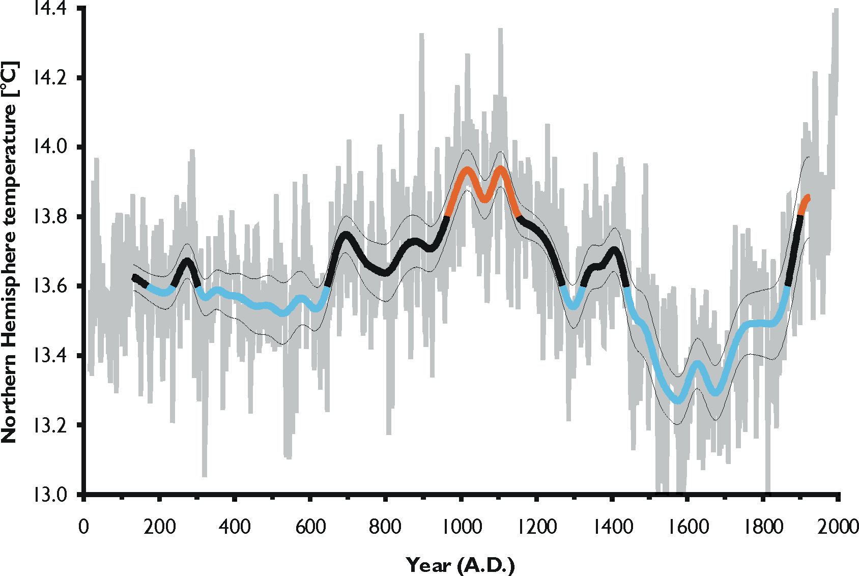
UPDATE: From a Climate Audit commenter “Feedback”: Hanno is also the author of a non-hockey stick graph that can be found in the Norwegian Wikipedia article about the Migration Period (Norwegian: Folkevandringstiden) that shows a more Lamb-like relationship between the MWP and the current warm period:
Source is said to be:
Source: graph drawn by Hanno using data published by A. Moberg, D.M. Sonechkin, K. Holmgren, N.M. Datsenko, W. Karlén, and S.-E. Lauritzen (2005, Highly variable Northern Hemisphere temperatures reconstructed from low- and high-resolution proxy data. Nature (London), 433, 613–617). Temperatures for the last three decades of the 20th Century were taken from P.D. Jones, D.E. Parker, T.J. Osborn & K.R. Briffa (2005, Global and hemispheric temperature anomalies – land and marine instrumental records. In Trends: A Compendium of Data on Global Change. Carbon Dioxide Information Analysis Center, Oak Ridge National Laboratory, U.S.
http://no.wikipedia.org/wiki/Fil:NH_temperature_2ka.png
So apparently “Hanno” contradicts himself with his own set of artwork.
UPDATE2: The Wiki “Hanno” user page is interesting. Thanks to commenter “Dr. Spock”.
Discover more from Watts Up With That?
Subscribe to get the latest posts sent to your email.
Hanno!
http://translate.google.com/translate?hl=en&u=http%3A%2F%2Fno.wikipedia.org%2Fwiki%2FBruker%3AHanno
It’s a disgrace to deceive the public like that.
Thanks for publishing this.
Deceiving the public has happened before and we can learn from our history.
http://www.ecofascism.com/article20.html
http://factsnotfantasy.blogspot.com/2009/09/making-law-ignoring-science-taxing-via.html
I’ll say here what I said at CA: that is the most rediculous temperature reconstruction I’ve ever seen. It is so absurd, it really is insulting.
These are temperature graphs, in wide use until mid 1990s, also quoted by IPCC in their early publications.
http://www.vukcevic.talktalk.net/GraphA-B.jpg
Graph A was created by climatologist Hubert Lamb to represent the temperature variation of Central England over the last 1100 years. Graph B shows changes in regional temperature (Europe and eastern North America), compiled by R. S. Bradley and J. A. Eddy.
Graph A uses combination of thermometer readings for the last 300 or so years, and records of growing seasons before then to infer temperature. It was first published in 1965 and has been updated several times since.
Graph B published in Earth Quest in 1991 is heavily biased towards the North American temperatures.
It’s pound the table, argue the law time with these alarmists. They have to save their tax scam, now that Obama has signed on, one way or the other.
The ‘lies’ have it.
Comment 26 to Steve McIntyre’s discovery shows a much more accurate graph by the same Hanno. It’s interesting that the IPCC chose to use Hanno’s absurd hockeystick misrepresentation instead of this one.
“September 25th, 2009 at 2:29 pm
Interestingly (?), Hanno is also the author of a non-hockey stick graph that can be found in the Norwegian Wikipedia article about the Migration Period (Norwegian: Folkevandringstiden) that shows a more Lamb-like relationship between the MWP and the current warm period:”
REPLY: I had added that graph to the post about the same time you were typing. – A
At this point, with Copenhagen coming up and all, they’re more focussed on dramatizing. This though will only undermine their credibiliity.
Well..the silver lining is it was Hanno and not Hannibal!
Here’s more on Hanno
http://translate.google.com/translate?hl=en&u=http%3A%2F%2Fno.wikipedia.org%2Fwiki%2FBruker%3AHanno
The scary part is, that this “data” will be accepted by the masses.
Once again, this shows that wiki is baseless as a place of factual reference. If any article has reference to wiki then it is safe to assume it is not reliable and should be dismissed as such.
Another reason that I object to this figure, aside from the splicing data/hockey sticks, is that it displays CO2 concentration and not rate of CO2 accumulation. The rate is dependent upon many different factors, both geophysical and biological. One interesting correlation is that the year to year change in CO2 concentration varies with the ENSO and tropical lower troposphere temperature. Several reports have pointed this out, and IIRC has been discussed here.
The paragraph in the UNEP report describing of the flux of CO2 in and out of the atmosphere is so simplistic and incomplete to be laughable.
Gotta run to work……….
Hanno’s probably a german national. At a guess, “Hanno” might even be short for Hannover.
Looking at DrSpock’s link, there are quite a number of references to Germany and North Germany in particular. But the giveaway is Hanno’s phrase ” It can namely be some time between each time I visit “. A common error by german speakers to adopt “namely” where they would use “naemlich” in German. As they don’t transalate, the sentence looks fine to Germans, but odd to native english speakers.
OT. Is it anything wrong with the DMI polar temperature site at the right column? (just below the sea ice graph) it gives me a 404 not found error every time I click.
http://no.wikipedia.org/wiki/Fil:NH_temperature_2ka.png
So apparently “Hanno” contradicts himself with his own set of artwork.
Well, almost. The clue is in the filename: NH_temperature
I agree that the MWP is more global than Mann’s graph indicates, but strictly speaking, Hanno isn’t ‘contradicting himself’, as the Mann style graph is global temperature, and the other is Northern Hemisphere.
Either way, the UN has it’s trousers round it’s ankles.
Again.
My son has been told he must not use wikipedia for school work as it is unreliable.
Jordan (11:16:28)
Not a bad guess, he is german/norwegian Hanno Sandvik formerly Pichl.
He is a biologist and specialises in seabird ecology,
http://www.bio.ntnu.no/users/hannos/engelsk.htm
Jordan: “But the giveaway is Hanno’s phrase ‘It can namely be some time between each time I visit’. A common error by german speakers to adopt “namely” where they would use “naemlich” in German.”
The error is Google’s, and the original text was in Norwegian. The link is a machine translation.
If it supports “the agenda”, then it must be “truth” or at least “truthy”. If it is counter to “the agenda”, then it is the stuff of knuckle-dragging neanderthal “skeptics”. See how easy that is? The “fake but true” stuff is vital to “the agenda” and will be supported to the very end.
A couple of Google searches points this way:
http://www.bio.ntnu.no/users/hannos/engelsk.htm
Apologies if it is not the correct Hanno.
Wikipedia sales have become flat are need to boost numbers.
Remember this quote from Michael Coulter in Australian newpaper The Age?
“There is not, now, much value in arguing about the science of climate change. Even if it’s wrong, enough people now believe it that it may as well be right.”
Someone at UNEP must have read this, taken it to heart and then tried to demonstrate that even if a graph is purely made up, enough people now believe in man-made climate change that it may as well be published, peer-reviewed science.
The Norwegian http://www.forskning.no/ (=”reasearch.no”) has an article in 2005 called “Kan du stole på Wikipedia?” (“Can you trust Wikipedia?”)
http://www.forskning.no/Artikler/2005/desember/1133429879.66
In the article, Hanno is mentioned as “Dyktig Wikipedia-forfatter” (“skillful Wikipedia author”)
LOL HANNO 2009! This will be cited as scientific evidence in the future alongside youtube and wikipedia users girlpowerfan1987, greenman9610, mymomrules696969, downwithcapitalism and bleedingheartliberalheartsblackbabies. The new phase of the Enlightenment will be anonymously social generated content! 15 year olds of the world unite!
Hanno (Sandvik) has a web page here (in Norwegian):
http://www.bio.ntnu.no/users/hannos/index.html
He apparently is a scientist at the Institute of Biology at the Technical-Natural Science University in Trondheim, Norway, and there is even a picture of him. He is not as anonymous, after all.
For those who don’t understand Norwegian: Forskning means Research, Publikasjoner mean Publications (most of them with English titles), Vita means CV, and Medlemskap means Membership(s).