One of the most popular global warming feedbacks is considered to be changes in the extent of polar ice. The story goes that as the ice melts, more heat gets absorbed in the ocean, leading to higher temperatures. Today we test that theory.
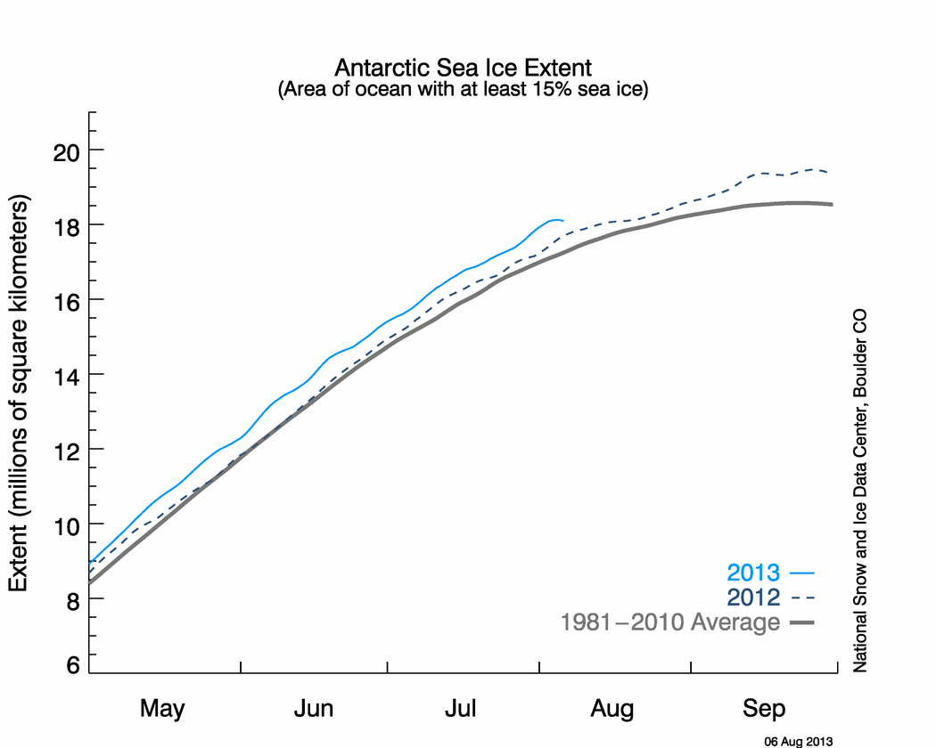
According to NSIDC, Antarctic ice extent is nearly 20% above normal, as seen in the graph and map below.


If the theory is correct, the large amount of excess ice should be cooling Antarctica – and that is exactly what we see happening. Temperatures in Antarctica have been running persistently below normal, as seen in the maps below.


There is just one problem with all this. The effect is exactly opposite of what has been predicted by global warming modelers. Antarctic ice is increasing and temperatures are cooling.
I thought everyone knew Global Warming causes global cooling?
Thom Hartmann on Air America:
“…What we are seeing in this cold, that has me trapped in my house here today, is that, what we are seeing is a symptom of global warming. But you wouldn’t know that from the crazies on the right….”
Scroll down to “Lib Radio Host: Record Snows and Cold Caused By Global Warming”
http://newsbusters.org/
>Polar Vortex is increasing and this is thinning and spreading the sea ice?
Thompson, Solomon and Gillet have published extensively on this. A science literature search will turn up many papers (try annular mode, antarctic oscillation), or alternatively read the IPCC reports. This work goes back nearly 10 years, and is explains why the MSU shows a broad cooling trend at high southern latitudes. It also explains the massive warming of the Antarctic Peninsula (which lies north of the polar trough).
Given that this is not new, why is it not know to the sceptical experts here?
BTW Arctic sea ice is important for albedo because it survives (or at least used to) through summer. The Antarctic ice melts almost entirely in summer.
“” Justin Sane (20:11:45) :
“Open ocean absorbs much of the the sunlight, whereas ice reflects it back out into space”
Does it make it to outer space, or does the teeny tiny amount of CO2 deflect it back to earth again? “”
Justin, you have to be a little careful here. See what you excerpted about sunlight being reflected by the ice.
“Albedo” reflection is always solar spectrum energy, and at least air mass 1 spectrum (sunlight that has been through the atmosphere once. Now arctic or antarctic ice reflection is much worse that air mass 1, becaue of the oblique passage of the sunlight through the atmosphere; so it has travelled through much more than one atmosphere of gases, and is going to go back out through much more than one air mass, but not as much as coming in. why not? Well the incoming sinlight is a nearly colimated beam, with about 0.5 dgeree angular divergence, because that is the angular diameter of the sun.
But the refelcted light is highly scattered, and a seat of the pants guess would be that the reflected light is roughly Lambertian about the specular direction, which is a fancy way of saying the intensity likely falls off as the cosine of the angle from the path it would take off a lfat mirror (the specular direction.
In any case bottom line is that it is the sunlight spectrum that is being reflected back into space, and CO2 has very little interraction with more than 99% of the incoming solar spectrum.
The capture action of CO2 is a mix of the weak near IR tail of the solar spectrum (,1% of the total energy) plus the 14.77 region of the earth emitted IR spectrum. Since the polar temperatures are a lot cooler than the global mean, the peak of the IR spectrum emitted from the polar ice regions is somewhat longer than the 10.1 microns appropriate for the global mean temperature. On the other hand, because the polar atmospheric temperatures are much lower than the global mean, the Doppler broadening of the CO2 absorpition spectrum is less.
So you need to keep separated the albedo reflection, which is solar spectrum energy, and the IR greenhouse absorption, which is in the 5-50 micron wavelenght range.
The reflection coeffiient of snow and ice are not as high as people seem to think. Water has a refractive index of about 1.33 so the Brewster angle is 53 dgrees, which means that the reflection coefficient off water is nearly constant from zero degrees incident angle (normal to surface( out to 53 degrees, and beyond that (towards grazing incidence) it climbs rapidly up to unity.
So any surface melting of ice in the Antarctic sumer, is going to make the surface glassy, and very low reflectance.
Fresh snow, is full of voids, that sunlight can penetrate into and get captured as in an anechoic chamber, and snow that is only a few hours old, has even lower refelctance. The reflectance of snow gets down to the 40% range quite quickly. There’s a lot of backscatter off snow as well, which is one of the things that contibutes to teh snow “white-out” that skiiers are familiar with.
One of the things that I don’t think (from what I’ve been reading and hearing) is correctly handle is the “lake effect” snow that will occur near open ocean water (warm) in cold air.
We are told that when sea ice is replaced with oppen ocean due to melting, that it will absorb the sunlight and create a positive feedback melting.
But once that warmer sea water is freed from its ice coat, the abilty to evaporate lots of moisture (comparatively) should lead to plenty of snow available to dump on nearby land.
Just where do you imagine all those miles deep ice sheets on Antarctica came from, if it wasn’t lake effect snow.
The evaporation of all that water vapor puts a bunch of latent heat out of the oceans up into the atmosphere with the water (around 550 calories per gram) and when that vapor turns to snow, that latent heat is dumped out inot the atmosphere ( which is why the snow forms and of course you have to toss in anopther 80 calories per gram latent heat of freezing, so the formation of lake effect snow to be dumped on Antarctica or the north polar ice, transfers a huge amount of energy into the upper atmosphere, and once devoid of water vapor, and sometimes CO2 as well, the heat loss to space can be considerable.
I haven’t thought too much in detail about the problem posed here, or the claims that Hansen has made here and there, so I won’t comment.
But overall, I would still say we shouldn’t be looking at either pole to figur out how much global cooling is going on; I would go to the noonday deserts of Arabia, and North Africa to see where the heat is really streaming off the earth. Which just point sout the absurdity ofeven computing a mean global temperature. Not much of interest is going on at any place that is 59 deg F.
Of course thats just my opinion; I haven’t doen any observations to verify that; but I’m sure there is plenty of data available to look at (well it’s not available to you or me.
“” david (23:55:17) :
>Polar Vortex is increasing and this is thinning and spreading the sea ice?
Thompson, Solomon and Gillet have published extensively on this. A science literature search will turn up many papers (try annular mode, antarctic oscillation), or alternatively read the IPCC reports. This work goes back nearly 10 years, and is explains why the MSU shows a broad cooling trend at high southern latitudes. It also explains the massive warming of the Antarctic Peninsula (which lies north of the polar trough). “”
David,
I can’t say that I understand any of what you just said, since I haven’t read anything about the Antarctic, since the Scott expedition.
But surely there must be some less esoteric way to explain the warming of the Antarctic peninsula.
For example, on all the maps I’ve seen, most of the Antarctic Peninsula where the Larsen B ice shelf was before it broke up, lies north of the Antarctic circle, which means that part never sees 24 hour darkness, so there is available sunshine every day.
Also , just to the north of the Antarctic Peninsula lies a big land mass called South America, and every day, the south Pacific and Atlantic oceans slosh back and forth through that narrow gap, including a lot of fairly tropica surface waters that propagate down there from the equatorial regions. Indeed that westward flow out of the Atlantic, bores straight in on the Larsen B ice shelf; ansd since those waters are exceedingly rough by anybody’s standards, you get a lot of water driven under those ice shelves by wave action which constantly stresses the ifloating ice sheets.
So to me it is a miracle that they don’t break up all the time.
All that noise about the more recent wilkin Ice shelf that broke off a piece, never said word one about the adjacent piece of that ice shelf, that borke up around 50 years ago, and has grown back again like they always do.
To me, there’s no mystery about Antarctic peninsula warming; other than the mystery of why it is as cold as it is, sticking right up there above the Antarctic circle into the warmish (relatively) southern ocean..
But I’m not a skeptic expert (either one of those things) so I can’t answer yourt question on why those folks don’t know about all this.
I know the graph only goes back to 2002 which is why I said ‘lowest recorded’. The fact the graph goes back to 2002 didn’t stop you and other posters commenting on ‘fastest recorded freeze’ earlier this year did it.
Sorry Pamela you are totally wrong, even one of the posters above acknowledges it is 10% lower than average, it is also much thinner so this summers melt could certainly be well above average.
Ric Werme (13:58:29) :
“…
That’s not a Mercator projection, in fact, it’s not a projection at all, just a cartesian plot of latitude and longitude and is the most common sort of climate map we see. I see no reason to take Basil to task for referring to that sort of a map.”
OOPS, thanks — mistake acknowledged, is neither MERCATOR nor a projection. But not taking Basil’s furthering of propaganda to task is as much BS as Basil’s pretentious, “Note the red across Antartica.” We’ve been through this before, most recently with the giant Northern Russia hot spot, when GISS blew their “October is … highest anomaly” call some weeks ago.
As you mentioned, climate study institutions commonly use such (area-distorting) maps; however, such practices should not be excused in this propaganda filled debate, just because it’s a “COMMON” practice! Use of the “Sinusoidal Equal Area” as you suggested, or perhaps Mollweide (my preference), or some of the Asimuthal projections have preference arguments.
Given the sparce station coverage at the poles (and the real potential for bad siting/relocation of stations in times of tight budgets), the continued display and perpetuation of such area-distorting icons by AGW-invested institutions and their followers should be discouraged. At the very least an “area-distorted” DISCLAIMER should be used to balance the propaganda.
“Nasa ducks dive under Greenland ice”
http://news.bbc.co.uk/1/hi/sci/tech/7780200.stm
and vanish
Steven, thanks for answering my question.
I would make the argument that so far Antarctic ice gain has had a larger effect on the radiation budget of the earth, than has ice loss in the Arctic.
Fair enough, but does that mean that it wouldn’t really matter much if the Arctic would be free in summer? I’m not saying you are implying this, but I think that’s what most people would interpret from your article.
BTW, the 2008 Arctic Sea Ice Extent looked to go beyond all previous years when suddenly it a made right turn (literally): http://www.ijis.iarc.uaf.edu/seaice/extent/AMSRE_Sea_Ice_Extent.png
And NSIDC: http://www.nsidc.org/data/seaice_index/images/daily_images/N_timeseries.png
Could there be something were wrong with the data and if not, what could cause this? Maybe it’s not so interesting as we will just have to wait and see what the Arctic sea ice will do next summer (no point in saying anything about it now unless you’re involved in some form of betting), but I still thinks it looks kind of weird.
I’d like to point out again that Hansen predicted major albedo loss for Antarctica (Fig 2-4) and people who claim otherwise are perhaps misinformed.
If I understand correctly he said this in 1984, almost 25 years ago. Hasn’t he changed his view after that because of all the improved science and accumulation of knowledge?
mccall,
What’s with the judgmental animosity here? It was a simple question, in good faith. Steven’s map was a one day map, with the dominant hue in the Antarctic being blue. I went to the same web site Steven used, saw that I could run a 365 day map, and the dominant hue was now red. I wasn’t accusing Steven of cherry picking, I was asking how he’d answer a charge (which you know a warmer would make) that he was. And he understood my point, and gave a good answer.
End of story. Nothing more to see here.
Chill, baby, chill.
I haven’t been following “artic ice thickness” measurements but I have been studying the satellite photos, graphs and artic ice extent measurements on both the IJIS and UIUC sites for several months. It seems to me, as a layman observer, that the current Artic ice expansion is 1) not that different from satellite photos for the same time period back in 1980 (which is the usual timeframe for side by side comparison on the UIUC site) and 2) that the expansion is being held back by warm ocean currents.
I reach that conclusion based on a couple of observations. First, the refreezing of areas where those currents aren’t dominent such as between the islands north of Canada and Hudson Bay was pretty close to the 1979-2000 mean. Second, the areas where ice has lagged are in areas that are influenced by those currents such as east of Greenland. I think it’s worth noting that the ice expansion on the western side of Greenland (e.g. Baffin Bay) is actually greater now than in 1980.
Correction, Baffin Sea. I apologize to any Baffin’s I may have insulted by not editing my post before I posted it.
I did a quick calculation on the Arctic Ice by Sea: http://www.bnhclub.org/JimP/jp/A_ice1208.JPG
As far as I can see ice areas are 100% normal. The Seas that have less than normal ice area are the ones affected by the AMO.
Does anyone know anything about the Okhotsk Sea? I would have expected it to be gaining more ice with a positive PDO and the extremely cold temperatures in Russia.
Woops–Negative PDO
Nevin,
I think it is safe to say that an ice free North Pole in September would have little impact on the earth’s SW radiation balance, because there is essentially no incoming SW radiation. The sun is only a few degrees above the horizon, and well below the critical angle of air over water.
No doubt climate modelers have backfitted their theories to match observational evidence. yet we still hear an astonishing myriad of contradictory information from official sources. Antarctica is warming, Antarctica is cooling, ocean currents are warming Antarctica, ocean currents are cooling Antarctica, the WAIS is going to collapse, etc.
BTW – NASA “disappeared” their Antarctic cooling map sometime during the last couple of weeks.
http://earthobservatory.nasa.gov/Newsroom/NewImages/Images/antarctic_temps.AVH1982-2004.jpg
This is what the page used to show.
http://commons.wikimedia.org/wiki/File:Antarctic_temps.AVH1982-2004.jpg
No matter how they try to package it, no one was forecasting an increase in Antarctic ice, and few people in the press are even aware that this is happening.
BTW – I know several climate modelers, and have conversed with a few more electronically. Wonderful and smart people, but perhaps lacking a bit in objectivity or willingness to correlate with empirical evidence at this point.
Received by e-mail from Dr. Walt Meiers at NSIDC
“Hi Steven,
Thanks. A couple thoughts.
The albedo of course does have an effect on the solar radiation. However, the relative impact is smaller in Antarctica than in the Arctic. There are two reasons. First, the sea ice is mostly first-year, or seasonal, ice – ice that grows and melts each summer. So while the albedo may speed up or slow down the melt, ultimately, you end up with a relatively small ice pack by the end of summer. Second, the sea ice edge is governed substantially by the location of the polar front – where the col Antarctic regime meets the warmer mid-latitude ocean waters and atmosphere. The location of this front really dominates how far the ice edge grows or retreats. There is also the effect of ocean heat, which is more important in the Antarctic. The cooler temperatures may be related somewhat to the presence of sea ice, but it’s a complex system. It’s probably more likely, due to the issues above, that the cause and effect are reversed: the cooler temperatures are helping to keep the ice around.
On another note in regards to temperatures. First, there has been warming in parts of the Antarctic, most notably the Peninsula region. I just saw a talk yesterday at the AGU meeting that indicated that all of West Antarctica has warmed over the past several decades and even East Antarctica may have warmed a bit. Now, it may be cooler at the moment, but it’s really the long-term trends that count. Long-term trends are generally fairly small in Antarctica (with the exception of the Peninsula’s large warming trend) and there is cooling in at least some of the higher elevation areas of East Antarctica. These trends are not inconsistent with climate model projections which show a delayed and slower warming trend than much of the rest of the globe due to the unique geography of Antarctica. Some of the early climate models did indicate there should be greater warming than is seen in Antarctica, but as models have improved, that is no longer the case.
walt”
Patrick (10:39:57) and Ed Scott (15:10:34))
1. When I look at the credentials of John P. Holdren (BS/MS M.I.T in aeronautics/astronautics Ph.D. from Stanford University in aeronautics/astronautics and theoretical plasma physics), I find it hard to believe that his private technical view would not be that CO2 can’t be more than a bit player.
2. That his public views are that CO2 is a major boogey man doesn’t jive with his technical background unless:
a) He has made the great trade off that the ends (save the Planet/stop industrialization, etc)) justify the means. The means being a “little” white lie about CO2.
b) He has not really delved into the GCMs/Climate physics since there was not much going on (with GCMs at least) when he was in school in the 1960’s, so maybe he never touched on it and is really just trusting the modelers, whose results agree with his probable hippie (not meant as an insult) transition to Ecology.
c) Cognitive dissonance? After all most of his time since 1970 seems to be with Ecologists and Nuclear Arms Control folks)
3. If (a) is true, then he will probably be better prepared to adjust his recommendations to Obama so both are not embarassed when (if?) the truth comes out about the little CO2 white lie. In a sense this might be the best “option”.
4. If (b) or (c) are true, then we could see some interesting political wranglings as they will likely fight the truth to the bitter end and may be more likely to enact economy devastating policies. If you like soap operas, it might be more fun to watch the fallout from these ‘options’.
5. BTW did anyone notice that MSNBC identified him as a physicist and Yuval Levin by his current active position as a professor of environmental policy?
Does anyone have any idea what’s going on here? JAXA seems to show the Arctic freeze as completely stopped for the last week!
http://www.ijis.iarc.uaf.edu/en/home/seaice_extent.htm
I can’t see any comparison in any earlier years of this anomoly. You would think the warmists would be all over this, but as far as I can see no one has mentioned it…
Look what I found:
http://www.spaceref.com/news/viewpr.html?pid=27239
“… seas could rise rapidly if melting of polar ice continues to outrun recent projections ….Many scientists are now raising the possibility that abrupt, catastrophic switches in natural systems may punctuate the steady rise in global temperatures now underway …”
They link to this paper:
http://www.climatescience.gov/Library/sap/sap3-4/final-report/default.htm
Jim Powell (06:55:54) :
Does anyone know anything about the Okhotsk Sea? I would have expected it to be gaining more ice with a negative PDO and the extremely cold temperatures in Russia.
Really, in a negative PDO the Okhotsk Sea would be warmer than normal.
http://jisao.washington.edu/pdo/
404!
No matter how they try to package it, no one was forecasting an increase in Antarctic ice, and few people in the press are even aware that this is happening.
What increase?
David says:
Wow, did I miss something? I could have sworn that there was still ice in the arctic last summer and that the Antarctic ice did not almost all melt over summer.
Basil (05:21:32) :
“…
What’s with the judgmental animosity here? It was a simple question, in good faith…
Fair enough, you have my apology. And I will add to the cherry-picking (without distortion), citing Paul Ward’s:
http://www.coolantarctica.com/Antarctica%20fact%20file/science/global_warming.htm
Note: these graphics are also pre-“disappeared” copies (referring to):
Steven Goddard (08:14:57) :
“…
BTW – NASA “disappeared” their Antarctic cooling map sometime during the last couple of weeks.”
We’ll see if the primary source agencies continue to disappear good graphics, while continuing (or worse, increasing) the use of high distortion graphics…
BTW – NASA “disappeared” their Antarctic cooling map sometime during the last couple of weeks.”
We’ll see if the primary source agencies continue to disappear good graphics, while continuing (or worse, increasing) the use of high distortion graphics…
NASA didn’t ‘disappear’ that graphic:
http://visibleearth.nasa.gov/view_detail.php?id=17529
REPLY: Thanks for pointing out that link, which finally resolves to this URL:
http://veimages.gsfc.nasa.gov//17529/antarctic_temps.AVH1982-2004.jpg
The point is that this graphic was removed from that server in my original URL.
http://earthobservatory.nasa.gov/Newsroom/NewImages/Images/antarctic_temps.AVH1982-2004.jpg
Which is part of the NASA “Newsroom”
The one you cite is a completely different server, perhaps even at a different NASA facility.
The antarctic graphic has come under attack recently by those that disagree with it. So why then should it be removed rather than either updated or with a caveat attached? As we’ve seen with the NANSEN sea ice graph recently, changing things with no notice is not conducive to building trust, nor is it good practice. – Anthony