A Guest Post By Steve Goddard
In my most recent article in The Register, and also posted here on WUWT, I incorrectly speculated that NSIDC graphs appeared to show less growth in Arctic ice extent than had actually occurred. My calculations were based on counting ice pixels from Cryosphere Today maps. Since then, I have had further discussions with Dr. Walt Meier at NSIDC and William Chapman at Cryosphere Today, to try to understand the source of the problem. Dr. Meier has confirmed that counting pixels provides a “good rough estimate” and that NSIDC teaches pixel counting to CU students as a way to estimate ice extent. William Chapman has confirmed that the projection used in CT maps is very close to what it appears and to what I had assumed it to be. It is an astronaut’s view from about 5,000 miles above the north pole.
What I have learned
In 2008, CT and NSIDC maps show excellent agreement – as can be seen in this video which overlays an August 14 NSIDC map on top of the August 14 CT map. The borders of ice extent are nearly identical in the two maps. (The videos show overlays of the two maps.)
The discrepancy occurred in August, 2007, when agreement between NSIDC and CT was not so good. The equivalent video from August 15, 2007 shows that the CT map was missing a significant amount of low concentration ice on the Canada/Alaska side. I have since confirmed from AMSR maps and NASA satellite photos that the NSIDC map is probably more accurate than the CT map.
The reason that CT provides their side-by-side image viewer is apparently to encourage visitors to make a visual comparison of two dates, which is exactly what myself and others here did when we observed the discrepancy vs. NSIDC graphs. The human brain is quite good at making estimates of relative areas from images, and pixel counting is nothing more than a way to quantify what has already been observed. Since writing The Register piece I have made adjustments to the CT pixel counts for map distortion, and as I expected that makes the discrepancy slightly larger.
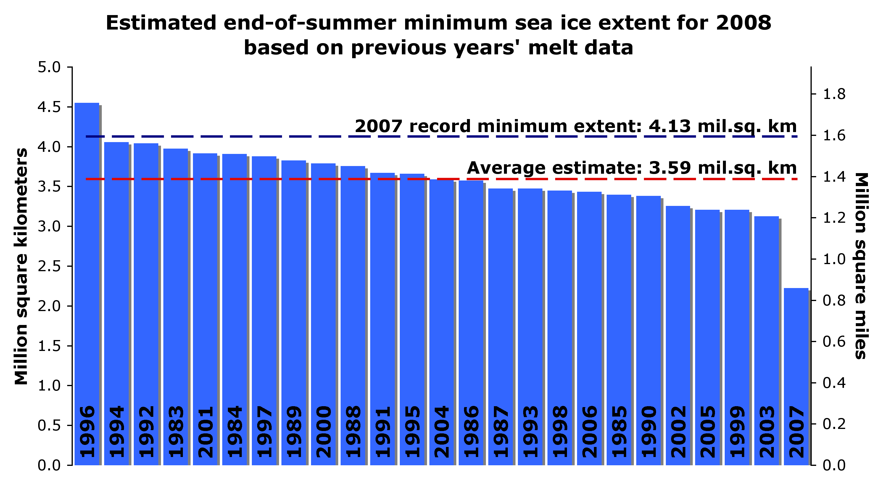
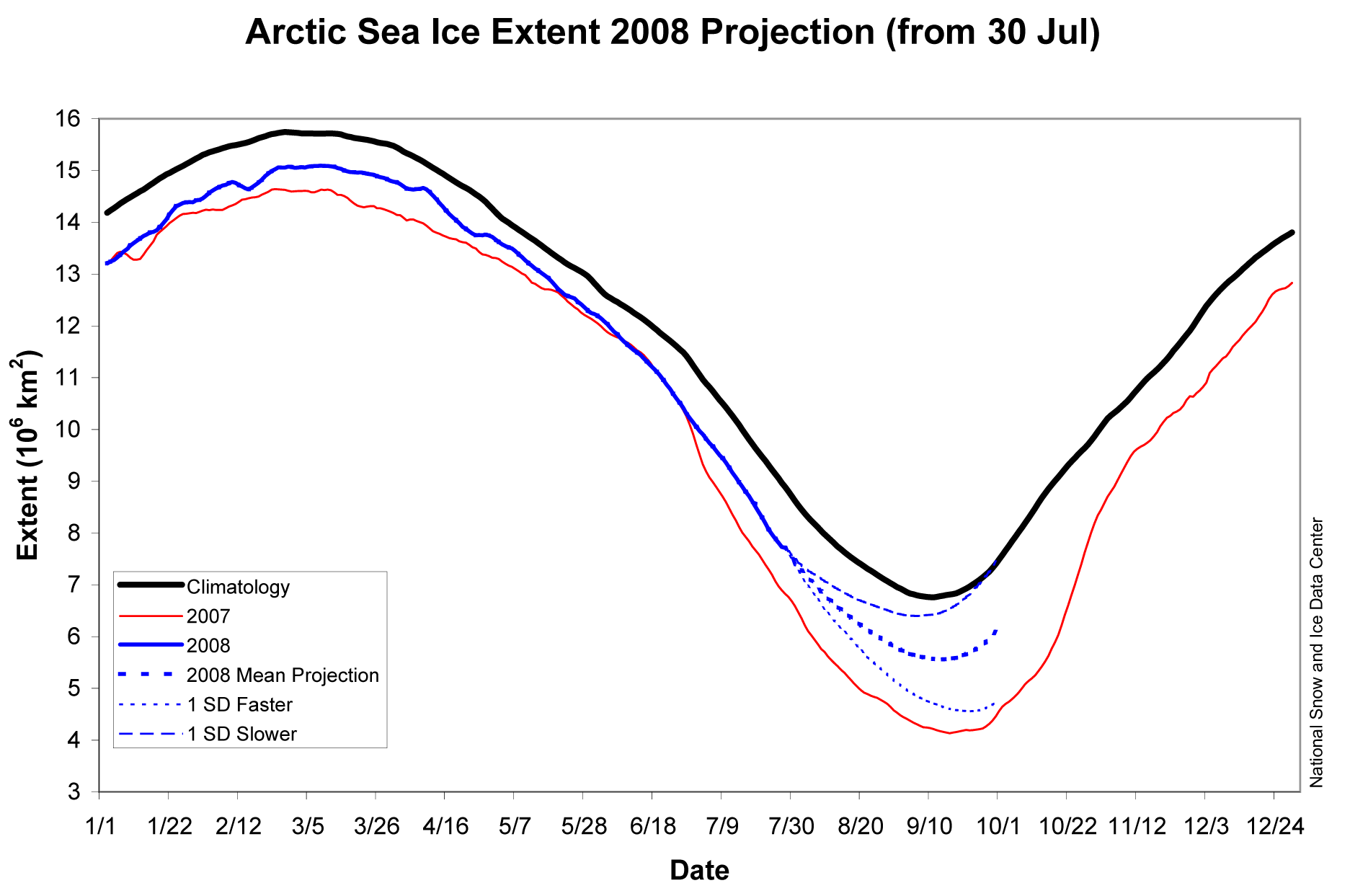
Because CT maps showed less ice in 2007, the increase in 2008 ice extent appears to be much greater. There is little doubt now that the NSIDC reported ice growth is absolutely correct. But wasn’t the ice supposed to shrink this year due to an excess of “thin first-year ice?” In May, NSIDC’s mean forecast (based on previous year’s melt) was that Arctic ice extent would be 13% lower than last year. (NSIDC has more recently posted on their web site some reasons why they believe the May estimates didn’t work out.)

Click for a larger image

Click for a larger image
Secondly, while Arctic ice is well below the 30 year mean, it is above expectations and nowhere near gone. NSIDC graphs show Arctic ice extent at greater than 70% of normal – hardly a six sigma event. As of August 1, NSIDC was even considering a possible return to normal extent this summer. If not for a few weeks of stormy Siberian weather, the map (and story) would be quite different today.


Click for a larger image
Is it possible that the 30 year satellite record coincidentally represents only one leg of a waveform? Greenland temperature records would hint at that. If you examine only one leg of a waveform, you will absolutely come to the wrong conclusion about the long term behaviour – just as some did during the 1970s ice age panic.

Click for a larger image – original source image from NASA GISS
Is there cause for concern? Perhaps. But unfortunately much of the press coverage has been little more than science fiction so far. How do we separate the science from the fiction? Dr. Meier has graciously agreed to answer that question (and others) in my next article.
One thing we can state with a degree of certainty, is that there likely will be more multi-year ice in 2009 than there was in 2008. This is because the 2008 melt season is ending with more ice area than 2007. Barring asteroid impact, after the winter freeze there will be (by definition) more multi-year ice than what we started with this year. Any ice which survives the summer will be classified as multi-year ice in 2009. If next year is cool like this year, is it unreasonable to hypothesise that ice extent will again increase? Or are we on a non-linear trend which will lead to ice-free summers and a collapsing Greenland ice sheet? Hopefully Dr. Meier can help sort this out for us.
By Sept 27, 2008 it is likely that the route could be frozen over.
How can AGW explain the present low level of Arctic ice when it is only a return to the conditions of the 30’s?
Latest from the Canadian Ice Service showing the Parry Channel route still blocked.
http://ice-glaces.ec.gc.ca/prods/WIS56CT/20080901180000_WIS56CT_0003950692.gif
JP Rourke asked.
Jeff: Who has suggested we have crossed the ‘tipping point’? And besides, there is still enough variability in weather both above and below the climate trendline, for temporary reversals to occur, even after the tipping point is reached. (In any event, I don’t think we have physically reached it yet)
I agree completely, there is certainly enough variation to mask a tipping point. I was just pointing out these widely printed news articles based on an interview with Mark Serreze. You are not the only one to ask who says we have already tipped. I wrote this on my blog
http://noconsensus.wordpress.com/2008/09/03/who-says-weve-already-passed-a-tipping-point/
Jeff, thanks for the reply.
I do recognize that Mr. Serreze walks very close to the line; and it’s easy to see how his words can be interpreted to mean exactly what you said.
However, whatever sensationalized words he might use, it always puzzles me why it would be the skeptics that extend it even further – so that “death spiral” becomes “death”, and “is tipping” becomes “passed the tipping point”.
I am not splitting hairs here… yes, he is ‘raising an alarm’; he no doubt feels that it is his responsibility to do so… but there’s already too many alarmists and ‘infotainment’ media exaggerating what he’s said in the past (“ice-free North Pole” becomes “ice-free Arctic”, for instance), why add to it?
If somebody says “OMG we’re past the tipping point, all is lost!” then I will certainly join you in calling it B.S… but when someone is trying to show why we should be ‘alarmed’ without saying “we’re doomed”, why do you say they’re telling us “we’re doomed”?
http://www.dailytech.com/Arctic+Sees+Massive+Gain+in+Ice+Coverage/article12851.htm
The kayakers give up.
Who was the brains of this bunch?
http://polardefenseproject.org/blog/
In my understanding, this year something strange is happening with SSMI (NSIDC and Cryosphere Today) sea ice data.
Why the difference between NSIDC (SSMI) and IARC/JAXA (AMSR- E) data is bigger this year? In previous years, they were in good agreement (negligible difference) but in the minima of 2008, the AMSR-E sensor sees 230.000 sq. km. more than NSIDC does.
nsidc amsr difference
2002 5,59 5,65 0,06
2003 5,94 6,04 0,1
2004 5,72 5,78 0,06
2005 5,40 5,31 -0,09
2006 5,80 5,84 0,04
2007 4,15 4,25 0,1
2008 4,52 4,75 0,23
http://www.ijis.iarc.uaf.edu/en/home/seaice_extent.htm
ftp://sidads.colorado.edu/pub/DATASETS/seaice/polar-stereo/nasateam/final-gsfc/
PS: I downloaded the NSIDC´s SSMi data in 2006.
2007 and 2008 are completed with the data offered at their “news and analysis” site.