A Guest Post By Steve Goddard
In my most recent article in The Register, and also posted here on WUWT, I incorrectly speculated that NSIDC graphs appeared to show less growth in Arctic ice extent than had actually occurred. My calculations were based on counting ice pixels from Cryosphere Today maps. Since then, I have had further discussions with Dr. Walt Meier at NSIDC and William Chapman at Cryosphere Today, to try to understand the source of the problem. Dr. Meier has confirmed that counting pixels provides a “good rough estimate” and that NSIDC teaches pixel counting to CU students as a way to estimate ice extent. William Chapman has confirmed that the projection used in CT maps is very close to what it appears and to what I had assumed it to be. It is an astronaut’s view from about 5,000 miles above the north pole.
What I have learned
In 2008, CT and NSIDC maps show excellent agreement – as can be seen in this video which overlays an August 14 NSIDC map on top of the August 14 CT map. The borders of ice extent are nearly identical in the two maps. (The videos show overlays of the two maps.)
The discrepancy occurred in August, 2007, when agreement between NSIDC and CT was not so good. The equivalent video from August 15, 2007 shows that the CT map was missing a significant amount of low concentration ice on the Canada/Alaska side. I have since confirmed from AMSR maps and NASA satellite photos that the NSIDC map is probably more accurate than the CT map.
The reason that CT provides their side-by-side image viewer is apparently to encourage visitors to make a visual comparison of two dates, which is exactly what myself and others here did when we observed the discrepancy vs. NSIDC graphs. The human brain is quite good at making estimates of relative areas from images, and pixel counting is nothing more than a way to quantify what has already been observed. Since writing The Register piece I have made adjustments to the CT pixel counts for map distortion, and as I expected that makes the discrepancy slightly larger.
Because CT maps showed less ice in 2007, the increase in 2008 ice extent appears to be much greater. There is little doubt now that the NSIDC reported ice growth is absolutely correct. But wasn’t the ice supposed to shrink this year due to an excess of “thin first-year ice?” In May, NSIDC’s mean forecast (based on previous year’s melt) was that Arctic ice extent would be 13% lower than last year. (NSIDC has more recently posted on their web site some reasons why they believe the May estimates didn’t work out.)

Click for a larger image

Click for a larger image
Secondly, while Arctic ice is well below the 30 year mean, it is above expectations and nowhere near gone. NSIDC graphs show Arctic ice extent at greater than 70% of normal – hardly a six sigma event. As of August 1, NSIDC was even considering a possible return to normal extent this summer. If not for a few weeks of stormy Siberian weather, the map (and story) would be quite different today.


Click for a larger image
Is it possible that the 30 year satellite record coincidentally represents only one leg of a waveform? Greenland temperature records would hint at that. If you examine only one leg of a waveform, you will absolutely come to the wrong conclusion about the long term behaviour – just as some did during the 1970s ice age panic.

Click for a larger image – original source image from NASA GISS
Is there cause for concern? Perhaps. But unfortunately much of the press coverage has been little more than science fiction so far. How do we separate the science from the fiction? Dr. Meier has graciously agreed to answer that question (and others) in my next article.
One thing we can state with a degree of certainty, is that there likely will be more multi-year ice in 2009 than there was in 2008. This is because the 2008 melt season is ending with more ice area than 2007. Barring asteroid impact, after the winter freeze there will be (by definition) more multi-year ice than what we started with this year. Any ice which survives the summer will be classified as multi-year ice in 2009. If next year is cool like this year, is it unreasonable to hypothesise that ice extent will again increase? Or are we on a non-linear trend which will lead to ice-free summers and a collapsing Greenland ice sheet? Hopefully Dr. Meier can help sort this out for us.
As a understand AGW models, the first domino stone to fall is the ice cover of the polar sea. The albedo reduction will cause warming in the neighboring continents and cause the permafrost areas to shrink.
Now we have almost ten years of data showing much less ice cover, and consequently, significant albedo reduction should have occured already. Or was that reduction offset by cloud coverage over the open areas. more evaporation, more clouds? Are there indications of a warming trend in Sibiria, northern Canada and Alaska different from the global trend of the last ten years? Do the permafrost areas shrink, and at what speed?
When we have come close to a tipping point, we should see precursor effects.
On 25 Aug the NSIDC graph showed a major downturn in the amount of ice, suggestive that the melt might catch up with last year’s melt in approx 10 days. Since then the rate has moderated so much so that on 30 Aug there was a major upturn shown, suggestive that melt has virtually ceased. A couple more weeks of melt probably remains before we’ll know for sure the verdict on this year’s melt. Then it’s on to the new winter season where we can compare the new refreeze to the last refreeze. The real driver in all this is the amount of warm water entering the Arctic from the Atlantic. Fluctuations in this value have more influence on sea ice melt/refreeze than air temps.
Werner,
As I understand it you are correct. But the IPCC is very politically motivated, supporting scientists who consent above others. It seems possible to me that the ice would be an easy one to hype when things melt during what may still be a normal warming process, this would generate more money.
Certainly the argument about albedo makes sense but so does AGW. It is possible after all. I might suggest that the very high heat content of the water would result in a very small reaction to the albedo and have a minimal impact on ice cover unless it went on for many years. I think that is reasonable also.
We really don’t know these answers so claiming a tipping point has been reached seems irresponsible to me.
sod,
If last year was lowest and this year is second lowest, then of course there has been an increase from last year. That is basic primary school mathematics.
The 30 year trend is clearly downward.
your article and especially your headline give a completely different impression.
will we read another article about this year perhaps being the greatest LOSS of sea ice? (i just eyeballed your graph..)
shouldn t your article have mentioned the la nina event this year?
Taking the last, first:
Leon: You do your own argument a disservice when you overstate your case – there was not a ‘major upturn’; there was a notable reduction in melting, but there is no way you can call it “up”. On top of that, if you’ve been following the charting closely, you’ll notice that oftentimes the day following has a ‘correction’ for the previous day; since this has happened to both increases and decreases, I suspect it’s some kind of smoothing function. Take a chill pill! (hey, maybe it will help reduce melting even more ! 😉
Jeff: Who has suggested we have crossed the ‘tipping point’? And besides, there is still enough variability in weather both above and below the climate trendline, for temporary reversals to occur, even after the tipping point is reached. (In any event, I don’t think we have physically reached it yet)
Mike Bryant: echoing didjeridust, I guess, how can you say with a straight face that 1 year makes a ‘trend’?
Bill Illis: Pugh has a support ship he will sleep on every night… this may be more of a stunt than a ‘significant event’, but he’s not an idiot. And, he’s not actually expecting to get to the North Pole, this year. I suspect he’ll may pulling this off every year until he does, it appears mostly to be more for generating publicity. A good question though would be that, if he does make it into and through fairly significant pack ice, what of the support ship?
Steven Goddard: you say “NSIDC is actually showing a flat extend trend, as of a few days ago”… Really? What graph are you looking at? I see one day of ‘flattening’, yesterday… that is it. You’ve made several more mistakes: 1) One day does not make a ‘trend’; 2) see what tomorrow brings, the next day often ‘corrects’ the previous (probably a smoothing function); 3) ‘Potentially’ ANYTHING could happen… Yes, ‘potentially’ the melt could suddenly stop… ‘potentially’ the world could end (CERN ssc)… ‘potentially’, a new minimum record could be set… but none of those are likely. What is most likely would be a slowly reducing melting trend until sometime between Sep 10 and Sep 30, with a minimum extent of around 5% to 15% above the record last year (approx 30% below the average), so it will still be about 20-25% below the average…
@Jimmy (& Anthony who replied with good ammo for the Wired piece)
I just spent a few minutes looking through the comments to the Wired article in Jimmy’s link. Author Loretta is under quite a barrage of skeptical comments about it already, and people are cheerfully tossing in links to charts and graphs and skeptic blog pieces.
Lately whenever I’ve come across an AGW article in some major-media newspaper or magazine site, the comments sections almost always contain many more skeptical comments than supportive ones.
Formerly just “Dan”, but I got tired of being cowardly. 😉
REPLY: Dan Lee, welcome to the light. – Anthony
Will it refreeze earlier than last year and regrow to the same extent? I believe it will. That means that the overall extent at maximum would be on the upswing again. It’s just a hunch mind you.
As an anecdote that may turn out to be a trend, many counties in Oregon are once again under a weather watch for unseasonably cooler temperatures with frost and freezing possible. All of the old time loggers in the area predict a heavy frost in the valley in just a couple of weeks.
Just watched the ITV news in Uk, our intrepid adventurer Pugh, is shown paddling some “50 miles” on his way to the Pole, but as the camera pans around, he appears to be just a few hundred metres from the shore of Spitzbergen. The reporter points out “he still has some distance to go!” This is the drivel served up to us here in England. How do they get away with it?
JP Rourke,
You win… it’s not a trend. Well, maybe a very, very short trend…
Jeff Rourke,
I measure and track CT concentration maps every day, and read the NCEP predictions every day.
There was a large area of low concentration ice near Wrangell island which dissipated earlier in the month, causing a steep drop in extent. Over the last four days, there has been almost no change in extent, and some new ice seems to be starting to form in the Canadian Archipelago. Temperatures are below 0C in most of the the Arctic Basin. The flat bottom to the graph is real, and it is quite likely that extent will be 15+% above last year by mid-September. One thing I have learned from this exercise is that in 2008, the detailed CT maps and the NSIDC graphs track together in lock step.
One thing people seem to have forgotten is that there was some very warm weather at the pole in September, 2007 which caused extent to continue to drop several weeks longer than normal. This will likely have a big impact on the September extent plots.
Dinjeridust:”Greater extent in 2008 than in 2007 which was a record low ”
Record low for the years 1979 to 2007. Roger Maris had the home run record longer than that!
I wonder what satelite photos of the Artic would look like from 1930 – 1940.
Does a wetter Arctic (less ice, more open water) mean more snow for the NH in the subsequent winter?
I wish i could see the satellite photo for May 18, 1987, when the three US subs surfaced in a watery North Pole. For some reason, Cryosphere Today doesn’t have it. Check the “compare two dates”, maybe you can find it.
[…] Arctic Ice Growth, 2008 – How Much? A Guest Post By Steve Goddard In my most recent article in The Register, and also posted here on WUWT, I incorrectly […] […]
Carlo, welcome to the world of clutching at straws. The fact is, there is more ice this year than last year.
Pierre, I bet we never hear the follow up to that piece o’ ‘ganda.
I have, as wallpaper and screen-savers, a collection of pictures of nuclear submarines at the North pole. Heh, I just like those dive machines in Canadian waters 😛 Here is my favourite:
http://www.john-daly.com/polar/arctic.htm
Page down and there it is.
BTW I think the familly of John Daley should be applauded and celebrated for keeping his site going. It costs money; they do it in honour of him.
The other thing about floating sea ice is that sometimes when it is gone, it did not melt, it just got blown somewhere else. Floating ice has a tendency to stack up at a barrier of some kind when blown consistently in one direction. I’ve noticed that as the melt season progressed, the extent of thick ice grew, indicating that ice was being blown together towards and piling up against Greenland. A measure of the extent of thick ice from year to year may also provide information about how ice extent grows and recedes. Yes? It is possible that seasonal ice was blown into and stacked up with perennial ice, which means that it now becomes perennial ice as well. I wonder how thick the thick ice was last year, and the extent of it, compared to this year, at minimum.
Mike Bryant (16:13:20) :
I wish i could see the satellite photo for May 18, 1987, when the three US subs surfaced in a watery North Pole. For some reason, Cryosphere Today doesn’t have it. Check the “compare two dates”, maybe you can find it.
Really, take a look at the CT daily photos, you’ll see a small black disk, this represents region around the pole which the satellite can’t see because of its orbit! So you’re not going to see your subs, even if that weren’t so you’d still be out of luck because the imager used then used 25km sq pixels.
So, JP Rourke:
Pugh has a support ship he will sleep on every night… this may be more of a stunt than a ’significant event’, but he’s not an idiot
So, you are saying the man is a fraud.. I agree.
Rain… in Louisianna! OMG!!!
A voice on the radio declares: “obviously, this is a very fluid situation”.
Honest. You can’t make this up!
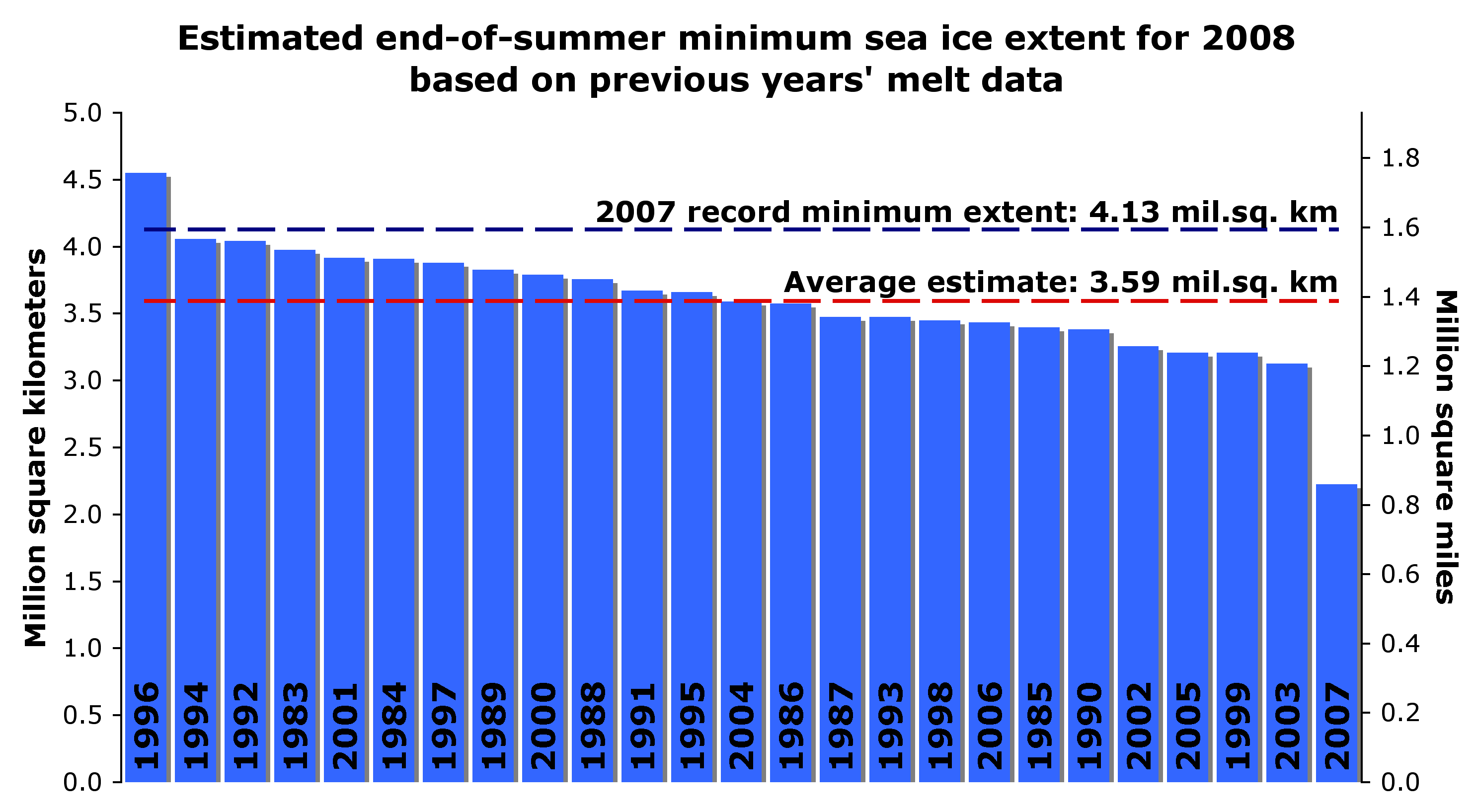
Can someone please explain the blue bar graph? I can’t make sense of it.
This one:
http://wattsupwiththat.files.wordpress.com/2008/08/ddw82wws_12fcrjggfn_b.jpg
I can understand the dashed blue line & the dashed red line, these are the 2007 minimum extent and the average of some estimates for the 2008 minimum extent. The blue bars are clearly ordered by height and labeled with the year, the height being something related to ice extent . Since 2007 is the record low and 2007 shows the smallest bar this makes sense.
What does the hight of the blue bar mean? Does it have a physical meaning? For instance, what does ~2.3 million square kilometers have to do with 2007? It is not the ice extent minimum since this would make 2007 have the same height as the dashed blue line. It cannot be difference from the average because the 2007 bar would be the largest.
How do the heights of the dashed lines relate to the height of the blue bars? Aren’t they graphed together for comparison?
Thanks,
Lyman Horne
Phil I don’t want to see the subs or the North Pole. I only want to see the picture.
Jumping the gun again Steve!
We know from official US Weather Bureau records that it was possible to sail as far as 81N latitude in ice-free water, during a similar warm period in 1922.
This was a ‘similar warm period’, then explain why that summer a us/canadian expedition to Wrangel Island in the Chukchi Sea could not be resupplied because it was inaccessible by sea due to pack ice (only one, an inuit woman survived rescued in Aug 1923), no trouble this year! A couple of years later a soviet expedition was similarly cut-off for three years until finally rescued with great difficulty by a soviet ice-breaker on Aug 28th after battling through dense ice at a rate of a few hundred metres/day!
So while ice had receded at one end of the Arctic it had done the opposite at the other end!
One thing we can state with a degree of certainty, is that there likely will be more multi-year ice in 2009 than there was in 2008.
With a very low degree of probability actually, the current ice area (3.239) is almost back to last year’s value. (Had you actually shown today’s sea ice plot that would have been more apparent). Extent may or not surpass last year’s value all that will mean is that a very similar area of ice will be spread out differently this year, all it would take to give a low value would be to blow the emerging multiyear ice back into the central Arctic.
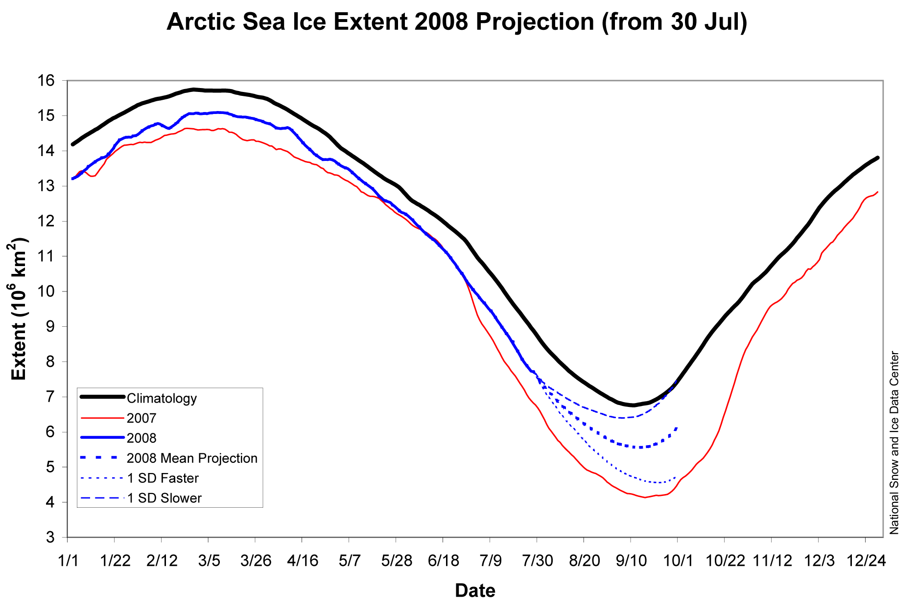
By the way overwriting your caption over the JAXA graph without clearly indicating that you did it, and describing it as 2008 Forecast Minimum’, something NSIDC never called it, is sharp practice. (the only reference to a forecast on the site you took fig 4 from gives a 59% chance of exceeding 2007). Have you contacted JAXA/EORC for permission to use their graph as agreed to by you when you used their site?
http://www.ijis.iarc.uaf.edu/en/sitepolicy.htm
Can someone please explain the blue bar graph? I can’t make sense of it.
Thanks,
Lyman Horne
Try accessing the NSIDC site where Steve G took it from (without a link) here:
http://nsidc.org/arcticseaicenews/2008/050508.html
Why all the focus on the arctic? If it is global warming shouldn’t both poles be affected? I note the sea ice graph above showed only the north while the south was available on the same page but was not quite as convenient. Until and unless the southern hemisphere starts acting like the northern hemisphere, I’m gonna chalk up any short term (in the climate sense of short) trends in sea ice to ocean currents and other factors (pollution reduced albedo, volcanic activity) rather than GLOBAL warming. Here’s Antarctica:
http://nsidc.org/data/seaice_index/s_plot.html