
Update 2: Reader Jesse Michael forwarded me this animated image above, which does a better job than the flawed NASA image or it’s replacement I found below. It takes about a minute to complete the whole sequence, patience.
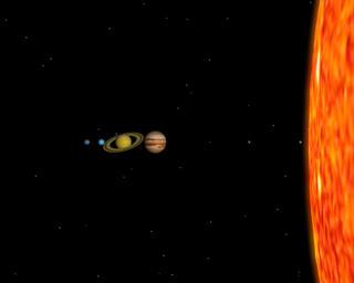
While looking for something else, I came across this image from the NASA visualization website. I located the hires TIFF image and annotated it as seen below. I also made a desktop wallpaper out of the TIFF file for those interested. It reminded me to remind you all about perspectives, so here is some perspective on size, solar luminosity, and on our planetary energy budget.

Click here for a larger (TIFF format without annotation) image from NASA
Click here for a desktop wallpaper image (1280×1024 JPEG)
UPDATE: It appears that the NASA provided image above , the source of which is from this NASA page, unbelievably, is wrong. As reader Erik points out, the sun is too large. I initially had some misgivings about the solar size also, but figured NASA wouldn’t possibly botch such a basic comparison. Shades of the Hubble mirror fiasco.
Here is another image from NASA JPL that appears to be correct:

Click for larger image from JPL
Note: image above is L-R mirrored for comparison to first image.
Note that distance is not to scale, but planetary and solar size is. To get an idea of distance scale, read this excellent example from Kitt Peak Observatory.
A few factoids:
- It would take about 109 earths to equal the width of the suns diameter (Sun=1.39 million km Earth=12,700 km)
- Over 1 million Earths would fit inside the Sun’s volume
- The sun has a total luminosity output of 386 YottaWatts
(386,000,000,000,000,000,000,000,000 watts, some background here and here)
- The total luminous energy output received by earth from the sun is 174 PETAWATTS (174,000,000,000,000,000) watts.
- A 0.1% increase in luminosity dumps an extra 174 trillion watts (174,000,000,000,000) watts into our planetary energy balance.

Data source for graph: http://www1.ncdc.noaa.gov/pub/data/paleo/climate_forcing/solar_variability/lean2000_irradiance.txt
Note: In the graph above, the low flatline from 1645-1715 is the Maunder Minimum, a period of virtually no sunspots, where the historical reports from the northern hemisphere tell a story of dramatic climate change: harsh winters, cools summers, crop failures, famine and disease.
From the abstract referenced above: “Estimated increases since 1675 are 0.7%, 0.2% and 0.07% in broad ultraviolet, visible/near infrared and infrared spectral bands, with a total irradiance increase of 0.2%. “
So its not just 0.1 %, it is 0.2% which translates to a 348 TeraWatts global irradiance increase.
Now lets put 348 trillion watts into perspective:
Hurricanes: the heat energy released by a hurricanes category 1-5 equals about 50 to 200 trillion watts or about the same amount of energy released by exploding a 10-megaton nuclear bomb every 20 minutes.
Katrina, released about 200 trillion watts over its life cycle.
Now imagine double that amount of extra energy being added to earth’s atmosphere every second by small increases in the suns output that have been documented to exist. That’s what the increase in solar irradiance is doing. Since 1675, after the depths of the Maunder Minimum, we’ve seen an increase in solar irradiance of about 2.5 watts per square meter.
Climate modelers say that the extra CO2 equates to a forcing of about 2 watts per square meter, which totals about 1.12 Petawatt (1,120,000,000,000,000 watts). The problem is, they can’t always recreate that reliably between all of the different models out there, with the positive and negative feedback mechanisms, and other variables involved. There’s disagreement on the total contribution. A lot of it. Nonetheless they seem all to agree that CO2 makes some contribution, and that’s likely true. But compared to the sun, I believe it’s minimal.
Now lets look at us: 13.5 TeraWatts is the average total power consumption of the human world in 2001.
Compared to solar variance, do you think we could change the planets atmospheric energy balance with that if we squeezed all the power we made that year together and radiated it into our atmosphere ?
What is very clear though, when you look at history, and the graph above, is that our earths atmosphere and resulting climate is extremely sensitive to variations in solar output. The sweet center point seems to be about 1365 watts per square meter of irradiance…what we consider as “normal” climate. Take 1.5 watts/sq. meter away, and we get significant cooling, harsh winters, cool summers, and increases in ice and glaciers. Add 1.5 watts,/sq. meter and we get hotter summers, mild winters, and melting of ice and glaciers.
Now irradiance aside, as it’s only one component, there’s also the chnage in the suns dynamic magnetic field and solar wind, which according to Svensmark, which modulates the number of cosmic rays that enter our atmosphere (I think there may be some possible effect also due to modulation of the earth’s magnetic field), which modulates the number of clouds that form, hence changing the net surface irradiance. Plots of changes in the suns magnetic field line up very well with climate change.
Here is a little more on perspective and our place in the universe:
There’s a tendency to view ourselves, our endeavors, and our accomplishments as the pinnacle. Yet, compared to whats in our solar system, whats in our galaxy, and whats in our universe, we are but a mere speck in the vastness of time, space, mass, and energy.


That was an awesome post! It’s great to learn lots about perspective. 😀 Thanks for posting this!
Hey Tony,
I just had an epiphany reading It dawned on me there might be some crucial understanding about TSI that all the AGWers have in all likelihood overlooked.
Stratosphere temperatures in the Post-Pinatubo era fell, and fell quickly, evidently from aerosols attacking the ozone layer. The presence of ozone warms the stratosphere (it also warms the surface as a ground-level pollutant). And since 1993 the stratosphere has warmed slightly (JunkScience, 2005).
http://junkscience.com/MSU_Temps/Stratosphere1278-1204.gif http://www.globalwarming.org/node/835 http://www.junkscience.com/MSU_Temps/Stratosphere.html
Milloy shows a sudden & market -0.6 degrC drop in temperatures in the stratosphere quite evidently due to Pinatubo’s ozone-destroying effect. That’s nearly +2 w/m-2 hitting the upper troposphere that the ozone layer hasn’t been trapping in the stratosphere.
With that would have come a much much higher level of UV hitting the ground. Evidently this has indeed happened, SO2 did deplete ozone from the stratosphere:
http://www.sciencemag.org/cgi/content/summary/295/5558/1242
http://climate.envsci.rutgers.edu/robock/robock_res.html#vol
http://www.sciencemag.org/cgi/content/abstract/299/5615/2035
Response of a Deciduous Forest to the Mount Pinatubo Eruption: Enhanced Photosynthesis.
But with that would be extra air-warming UV hitting the upper troposphere. An inverse cooling effect was shown with less UV hitting the upper troposphere during the Little ICe age from lower UV (from loss of sunspot faculae) hitting the upper troposphere. This lower-UV effect from TSI was modeled by Drew Shindell in 2001 to have caused the LIA.
For the past 16 years since Pinatubo the stratosphere has remained relatively cold to the extent that it has only warmed slightly (also contrary to AGW theory, BTW), so were it not for the -0.33 W/m-2 (-0.1 w/m-2) average drop in TSI, coincidentally starting in the early 1990’s, the upper troposphere would still be taking the full brunt of extra ozone heating. That leaves us still with an extra +1.6 w/m-2 hitting the upper troposphere which right there would make for a tropospheric forcing of +0.5 degrC (rule of 1.0 degrC =’s 3.3 w/m-2).
That’d be a lot of extra heating in the upper troposphere & would add one more variable to explain the warm decade of the 1990’s. That we’re still in a post-Pinatubo era of a much-cooler, yet slightly warming, stratosphere may speak well to the rate of ongoing ozone recovery.
If lower UV can cause a little ice age, higher UV can cause a little heat age.
I’m still downloading Robock’s powerpoint slide on this, I can’t read the full body of his presentation to see what he says. I see no mention of this question anywhere online…
Has anyone discussed this possibility before?
Tom in Florida:
Not really. There are three ways that heat is carried: 1) conduction 2) convection 3) radiation.
Conduction requires physical contact so is out of the picture in the GHG scenario. Greenhouses, bed blankets and car windows work by limiting convection. However, Earth can’t lose heat to space by convection. It can only be radiated away so “greenhouse effect” is a bit of a misnomer.
Consider that spacecraft keep themselves warm by the use of thermal blankets. These are designed to reflect IR and prevent its radiation into space. It’s that shiny gold stuff you see in many photos taken by astronauts. Oddly enough though, one of the major problems in spacecraft design is getting RID of heat. The blankets are more commonly used to protect equipment exposed to sunlight from further heat buildup by reflecting the light away.
Most anything that blocks heat flow is analogous to a blanket in my book.
What you’ve describe is exactly how a greenhouse operates. However that can lead to the wrong picture — for one, that car would have one heck of a bright infrared signature caused by escaping infrared. Opening the window doesn’t allow “accumulated infrared” to escape. The escaping energy in your closed car scenario (or in a greenhouse) is taken away by airflow. It’s important to realize that radiation is the only mechanism that is important WRT Earth’s heat content.
On a somewhat different level, both analogies work insofar as they give a picture of energy in with impeded way out.
???
I said (in toto): “Think of it as a blanket. A blanket keeps you warm by preventing the loss of heat. You also need to realize that the incoming and outgoing energy differ in wavelength.”
I’m not sure how your statement follows from mine.
I believe the latest thinking on the current status of the Milankovitch cycles suggests that Earth is in period of relative stability in terms of the orbital conditions which lead to ice ages.
So we are 10,000 to 15,000 years (or more) away from ice age Milankovitch conditions.
I note the 100,000 year ice age cycle only goes back about 750,000 years and before that the ice age cycles were closer to 41,000 years so things can change over time.
Anthony,
Can’t you correct the article
– it’s pretty meaningless to discuss Petawatts, 1% here, 2% there when the article contains statements like:
“Katrina, released about 200 trillion watts over its life cycle.”
I mean, come on, Mr Watts, wot is a Watt?
What is the difference between energy & power?
– it’s kinda basic to this discussion
REPLY: Watts is energy over time, note that it says “over its life cycle”.
Note similar references (in watts) to hurricanes in general, the gulf stream, and the atmosphere here:
http://en.wikipedia.org/wiki/Orders_of_magnitude_%28power%29
Sure I could explain it in “joules” but then 90% of the readership would have no understanding of it. My job here is to help people understand scale, using units unfamiliar to the majority won’t help.
Anthony,
LoL! Don’t worry I know what a ‘Watt’ is!
My questions were rhetorical
Watts = Joules per second
– ‘over its life cycle’ is meaningless in this context then
– ‘average’ or ‘peak’ or ‘rms’ would be more meaningful here
REPLY: OK. well if you can come up with something that the general reading audience could understand easily feel free to suggest it.
Something like:
“Katrina’s power output was about 200TW during it’s most active period”
(I’m not an expert on hurricanes, so I don’t know how you define it’s start & end)
So imagine the effect of the power two Katrinas being added to the atmosphere continuously for 11 years…….
🙂
Anthony: “Sure I could explain it in “joules” but then 90% of the readership would have no understanding of it. My job here is to help people understand scale, using units unfamiliar to the majority won’t help.”
Then maybe it would be best to use kilowatt-hours. Saying Katrina used N watts over its lifetime makes as much sense as saying a car used N mph over its lifetime instead of saying it lasted through X miles of travel.
Anyway you raise some interesting points
– over the last 100 years the average power output of the sun has increased by 0.1%
– and if we accept a 1 degC temp rise over the same period
– this is 0.3% increase (from absolute zero)
– so these figures are at least of the same magnitude, so it seams reasonable that at least some (and possibly, as large proportion) of the temp increase can be attributed to the increase in the Sun’s power output
Also, according to your graph, the min-max variance over the solar cycle has doubled in the last century (or 50 years)
– so this might contribute to inceased variability in the climate.
I have a question about TSI
– what proportion of the TSI is in the heat-causing frequencies?
– i.e. infra-red
– the visible light increase & ultra-violet won’t contribute to heating
– so it the variance/change in solar output evenly spread across the spectrum, or is it more at some frequencies than others?
re: myself (above), on post-Pinatubo ozone loss possibly adding to the hot troposphere temperatures of the 1990’s:
Graph of ozone drop in post-Pinatubo 1990’s
http://omsriram.com/GlobalWarming_files/GlobalWarming2.jpg
Anyone know where there are data on UV levels & temperature trends for the upper troposphere during the 1990’s?
Phil
Visible Near-IR does indeed causing heating in the oceans and soot particles.
Likewise UV heats the upper troposphere as well, and during solar minima the absence of UV-emitting sunspot faculae leads to a cooling of the troposphere. Drew Shindell modeled the direct effect of the Maunder Minimum’s loss of UV-driven heating on the upper troposphere in precipitating the Little Ice Age. The total TSI decrease is controversial, but the effect is indeed known, if not widely discussed.
“- what proportion of the TSI is in the heat-causing frequencies?
– i.e. infra-red
– the visible light increase & ultra-violet won’t contribute to heating
– so it the variance/change in solar output evenly spread across the spectrum, or is it more at some frequencies than others?”
I think you might be misinformed Phil. Infra-red being the heat-causing frequency isn’t quite correct.
Any light energy that can be absorbed by a material will emit heat/re-emit light energy at a lower frequency.
You can see this when you look at different coloured materials.
ie
white doesn’t get as warm because it doesn’t absorb visible light.
black gets very warm because it absorbed the spectrum of visible light.
I think the misunderstanding occurs because we have heat detectors that measure infra-red radiation.
also, look a microwave oven. It uses microwaves (lower frequency than infrared) to excite water molecules and create heat which cooks food.
Lambert, Dave,
Thanks – pardon my lack-of-thought!
DAV is still scribbling on about greenhouses and autoglass, despite my last posting.
See if I care. Here’s ‘Greenhouse Effect, Part II’:
When a photon of solar irradiance reaches the Earth a number of things might happen to it:
1) Like most of its colleagues it may pass through the Earth’s atmosphere and whack into the Earth’s surface.
It may be a very lucky photon and be **reflected** off some water or the plane of an ice crystal at the correct angle (‘sea-glint’) and go shooting back out into space. Next stop: Mars or the Crab nebula…
It may also be a lucky photon and be sent back into space as a result of surface albedo (not quite the same as geometric reflection).
Most photons arriving at the surface are not lucky and get absorbed, that is they increase the temperature of the absorber, which in turn will cause the absorber to emit more energy at a lower wavelength (Planck’s Law, again). Don’t sit on the sidewalk in shorts in midsummer.
2) Some photons are only half lucky. They interact with molecules, very small particles and aerosols and suffer **scattering**. Scattering doesn’t change the ‘wavelength’ of the photon, it just bats it out again, usually in a different direction (I simplify: this process is not a kind of internal reflection inside the molecule).
Scattering depends on the wavelength of the incoming photon and the size of the particle. (The interaction of different kinds of scattering is famously responsible for blue sky, although most of the explanations of this I have read are as cracked as those for the greenhouse effect.)
A scattered photon may go straight back out into space; it might even suffer further scatterings, or just hit the surface at a different point than it otherwise would.
3) Some photons are **absorbed** by molecules or particles. The energy of the photon raises the temperature of the absorbing molecule. The increase in temperature may cause it to emit radiative energy at a lower wavelength (Planck’s Law, yet again), although the temperatures found in the troposphere (-50°C at the top) or the surface layer (normal air temperatures) will clearly not toast bread.
Some molecules, particles and aerosols (a.k.a. greenhouse gases) absorb photons better than others. They also have their own preference for the wavelength of the photons they absorb, but for this discussion this is not terribly important: energy is energy.
In short, greenhouse gases and other absorbers absorb solar irradiance before it gets to the Earth’s surface. They therefore WARM THE ATMOSPHERE AND COOL THE SURFACE.
Whether there is a net gain in the overall energy absorption of the Earth as a result of the presence of atmospheric absorbers is a tricky question. Over a black asphalt road, for example, if an atmospheric absorber doesn’t swallow the photon then the road probably will; over a glistening layer of new snow the photon that got past the absorbers on the downward path will have a fairly good chance to take another white-knuckle ride back out through the atmosphere again.
That’s it.
(Anthony: unless this contribution shuts everyone up could we continue this subject on a more appropriate thread?)
Caveat – I can’t stand “Coast to Coast AM” and consider what is discussed there to be mostly rubbish.
However, maybe there is something to 2012.
My thought is, the “something” is not “the end of the world.”
More of a mode change. And in many ways a subtle mode change. However, the change imparts a sort of momentum change – a subtle but powerful thing.
Something in between the Maunder and the Pleistocene, in terms of impact. That’s my bet.
“Not really. There are three ways that heat is carried: 1) conduction 2) convection 3) radiation.”
Someone forgot the water planet caveat. Doh!
Listen to Peter or lose your audience.
Bill Illis: 64.8! Oooh, ooh, put out a suicide watch at GISS and Austin. Call for lidocaine and oxygen!
Has anyone noticed that the planets are almost unbearably beautiful? I am sure there is a perfectly satisfactory neo-Darwinist explanation for this since that theory (given enough time), can explain everything. But if I though about it, it would spoil everything.
I think I’ll stick with YOU KNOW WHO.
Yes…the diagrams of planets are astonishingly beautiful. Can’t figure out why though! Visual graphics almost beat the real thing! LoL
Ken,
Cheap shot but I left an opening so you score. But you are correct, they are almost as beautiful as the real thing. On a related note, have you ever seen a diagram of a tropical fish or a tropical bird that comes even close to the real thing?
Andrew. To put the suns irradiance into perspective. I live at in Brisbane at approximately the same latitude as Tampa Florida. Here in this part of area of Australia we have the highest incidence of skin cancer in the world. So why doesn’t Tampa have a similar problem? I would say – without being definitive – that the majority of Tampas inhabitants have fair skin through having a European background just like the folk here in Brisbane. Perhaps one factor for the difference is that we have summer when the Earth is 147.5 million kilometres from the sun (January 3rd in 2009), and Tampa has summer when the Earth is at 152.5 million kilometres from the sun (July 4th this year). This means that the sunshine is approximately 6.47% stronger here in Brisbane. So when I am lying on the beach in summer, there are ~88 more watts per square metre around me than for when someone from Tampa lies on their beach in summer.
Andrew. Please excuse the Grammar in my last post, it is winter here and we are so far from the sun that my fingers are falling off!
REPLY: No problem – stay warm. – Anthony
Hi,
Probably a bit late, about the perspective and scales I keep in my bookmarks a link to a flash animation that goes scaling down from the universe to a proton. Really good.
http://www.nikon.com/about/feelnikon/universcale/index.htm
Gorka Ion.
AB: How much time do you folks spend outdoors? On this side of the Equator, we’re mostly couch potatos, watching the tube and playing video games. Don’t get sunburned that way.
In Colorado, at 2000+ meters above sea level, we get a lot more from that big orange thing as well. Flatlanders who nap in the sun learn the hard way.
Perhaps you could try some hot tea, a cinnamon stick, a spoonful of honey and a shot a Apricot brandy. Keep you warm until the ics caps melt…:)