Guest Post by Bob Tisdale
This post provides an update of the data for the three primary suppliers of global land+ocean surface temperature data—GISS through February 2015 and HADCRUT4 and NCDC through January 2015—and of the two suppliers of satellite-based lower troposphere temperature data (RSS and UAH) through February 2015.
INITIAL NOTES:
For discussions of the annual GISS and NCDC data for 2014, see the posts:
- Does the Uptick in Global Surface Temperatures in 2014 Help the Growing Difference between Climate Models and Reality?
- On the Biases Caused by Omissions in the 2014 NOAA State of the Climate Report
GISS LOTI surface data, and the two lower troposphere temperature datasets are for the most recent month. The HADCRUT4 and NCDC data lag one month.
This post contains graphs of running trends in global surface temperature anomalies for periods of 14+ and 17+ years using GISS global (land+ocean) surface temperature data. They indicate that we have not seen a warming slowdown (based on 14+ year trends) this long since the late-1970s or a warming slowdown (based on 17+ year trends) since about 1980.
Much of the following text is boilerplate. It is intended for those new to the presentation of global surface temperature anomaly data.
Most of the update graphs start in 1979. That’s a commonly used start year for global temperature products because many of the satellite-based temperature datasets start then.
We discussed why the three suppliers of surface temperature data use different base years for anomalies in the post Why Aren’t Global Surface Temperature Data Produced in Absolute Form?
But first, let’s illustrate how badly the climate models used by the IPCC simulate global surface temperatures in light of the recent slowdown in global surface warming.
MODEL-DATA DIFFERENCE
Considering the uptick in surface temperatures this year (discussions linked above), government agencies that supply global surface temperature products have been touting record high combined global land and ocean surface temperatures. Alarmists happily ignore the fact that it is easy to have record high global temperatures in the midst of a hiatus or slowdown in global warming, and they have been using the recent record highs to draw attention away from the growing difference between observed global surface temperatures and the IPCC climate model-based projections of them.
There are a number of ways to present how poorly climate models simulate global surface temperatures. Normally they are compared in a time-series graph. See the example here. In that example, GISS Land-Ocean Temperature Index (LOTI) data are compared to the multi-model mean of the climate models stored in the CMIP5 archive, which was used by the IPCC for their 5th Assessment Report. The data and model outputs have been smoothed with 61-month filters to reduce the monthly variations.
Another way to show how poorly climate models perform is to subtract the data from the average of the model outputs (model mean). We first presented and discussed this method using global surface temperatures in absolute form. (See the post On the Elusive Absolute Global Mean Surface Temperature – A Model-Data Comparison.) The graph below shows a model-data difference using anomalies, where the data are represented by GISS global Land-Ocean Temperature Index (LOTI) and the model simulations of global surface temperature are represented by the multi-model mean of the models stored in the CMIP5 archive. To assure that the base years used for anomalies did not bias the graph, the full term of the data (1880 to 2013) were used as the reference period.
In this example, we’re illustrating the model-data differences in the monthly surface temperature anomalies. Also included in red is the difference smoothed with a 61-month running mean filter.

Figure 00 – Model-Data Difference
The greatest difference between models and data occurs in the 1880s. The difference decreases drastically from the 1880s and switches signs by the 1910s. The reason: the models do not properly simulate the observed cooling that takes place at that time. Because the models failed to properly simulate the cooling from the 1880s to the 1910s, they also failed to properly simulate the warming that took place from the 1910s until 1940. That explains the long-term decrease in the difference during that period and the switching of signs in the difference once again. The difference cycles back and forth nearer to a zero difference until the 1990s, indicating the models are tracking observations better (relatively) during that period. And from the 1990s to present, because of the slowdown in warming, the difference has increased to greatest value since about 1910…where the difference indicates the models are showing too much warming.
It’s very easy to see the recent record-high global surface temperatures have had a tiny impact on the difference between models and observations.
See the post On the Use of the Multi-Model Mean for a discussion of its use in model-data comparisons.
GISS LAND OCEAN TEMPERATURE INDEX (LOTI)
Introduction: The GISS Land Ocean Temperature Index (LOTI) data is a product of the Goddard Institute for Space Studies. Starting with their February 2013 update, GISS LOTI uses NCDC ERSST.v3b sea surface temperature data. The impact of the recent change in sea surface temperature datasets is discussed here. GISS adjusts GHCN and other land surface temperature data via a number of methods and infills missing data using 1200km smoothing. Refer to the GISS description here. Unlike the UK Met Office and NCDC products, GISS masks sea surface temperature data at the poles where seasonal sea ice exists, and they extend land surface temperature data out over the oceans in those locations. Refer to the discussions here and here. GISS uses the base years of 1951-1980 as the reference period for anomalies. The data source is here.
Update: The February 2015 GISS global temperature anomaly is +0.79 deg C. It increased (about +0.04 deg C) since January 2015.
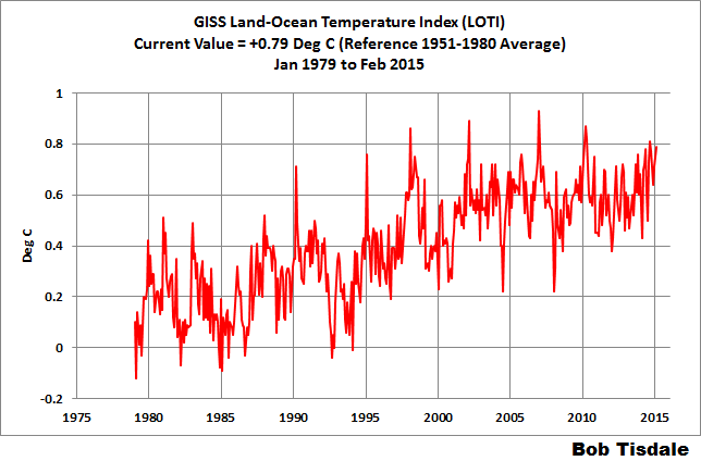
Figure 1 – GISS Land-Ocean Temperature Index
Note: There have been recent changes to the GISS land-ocean temperature index data. They have a noticeable impact on the short-term (1998 to present) trend as discussed in the post GISS Tweaks the Short-Term Global Temperature Trend Upwards. The causes of the changes are unclear at present, but they likely impacted the 2014 rankings.
NCDC GLOBAL SURFACE TEMPERATURE ANOMALIES (LAGS ONE MONTH)
Introduction: The NOAA Global (Land and Ocean) Surface Temperature Anomaly dataset is a product of the National Climatic Data Center (NCDC). NCDC merges their Extended Reconstructed Sea Surface Temperature version 3b (ERSST.v3b) with the Global Historical Climatology Network-Monthly (GHCN-M) version 3.2.0 for land surface air temperatures. NOAA infills missing data for both land and sea surface temperature datasets using methods presented in Smith et al (2008). Keep in mind, when reading Smith et al (2008), that the NCDC removed the satellite-based sea surface temperature data because it changed the annual global temperature rankings. Since most of Smith et al (2008) was about the satellite-based data and the benefits of incorporating it into the reconstruction, one might consider that the NCDC temperature product is no longer supported by a peer-reviewed paper.
The NCDC data source is through their Global Surface Temperature Anomalies webpage. Click on the link to Anomalies and Index Data.)
Update (Lags One Month): The January 2015 NCDC global land plus sea surface temperature anomaly was +0.77 deg C. See Figure 2. It dropped a very small amount (a decrease of -0.01 deg C) since December 2014.
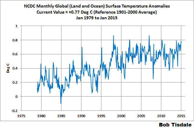
Figure 2 – NCDC Global (Land and Ocean) Surface Temperature Anomalies
UK MET OFFICE HADCRUT4 (LAGS ONE MONTH)
Introduction: The UK Met Office HADCRUT4 dataset merges CRUTEM4 land-surface air temperature dataset and the HadSST3 sea-surface temperature (SST) dataset. CRUTEM4 is the product of the combined efforts of the Met Office Hadley Centre and the Climatic Research Unit at the University of East Anglia. And HadSST3 is a product of the Hadley Centre. Unlike the GISS and NCDC products, missing data is not infilled in the HADCRUT4 product. That is, if a 5-deg latitude by 5-deg longitude grid does not have a temperature anomaly value in a given month, it is not included in the global average value of HADCRUT4. The HADCRUT4 dataset is described in the Morice et al (2012) paper here. The CRUTEM4 data is described in Jones et al (2012) here. And the HadSST3 data is presented in the 2-part Kennedy et al (2012) paper here and here. The UKMO uses the base years of 1961-1990 for anomalies. The data source is here.
Update (Lags One Month): The January 2015 HADCRUT4 global temperature anomaly is +0.69 deg C. See Figure 3. It rose (about +0.06 deg C) since December 2014.
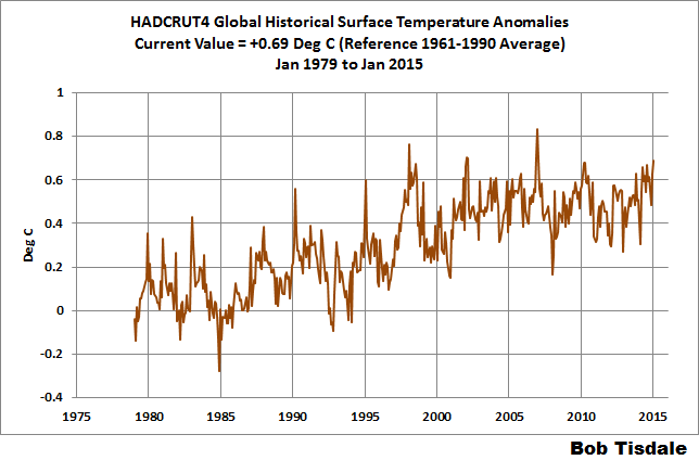
Figure 3 – HADCRUT4
UAH LOWER TROPOSPHERE TEMPERATURE ANOMALY DATA (UAH TLT)
Special sensors (microwave sounding units) aboard satellites have orbited the Earth since the late 1970s, allowing scientists to calculate the temperatures of the atmosphere at various heights above sea level. The level nearest to the surface of the Earth is the lower troposphere. The lower troposphere temperature data include the altitudes of zero to about 12,500 meters, but are most heavily weighted to the altitudes of less than 3000 meters. See the left-hand cell of the illustration here. The lower troposphere temperature data are calculated from a series of satellites with overlapping operation periods, not from a single satellite. The monthly UAH lower troposphere temperature data is the product of the Earth System Science Center of the University of Alabama in Huntsville (UAH). UAH provides the data broken down into numerous subsets. See the webpage here. The UAH lower troposphere temperature data are supported by Christy et al. (2000) MSU Tropospheric Temperatures: Dataset Construction and Radiosonde Comparisons. Additionally, Dr. Roy Spencer of UAH presents at his blog the monthly UAH TLT data updates a few days before the release at the UAH website. Those posts are also cross posted at WattsUpWithThat. UAH uses the base years of 1981-2010 for anomalies. The UAH lower troposphere temperature data are for the latitudes of 85S to 85N, which represent more than 99% of the surface of the globe.
Update: The February 2015 UAH lower troposphere temperature anomaly is +0.30 deg C. It dropped (a decrease of about -0.06 deg C) since January 2015.
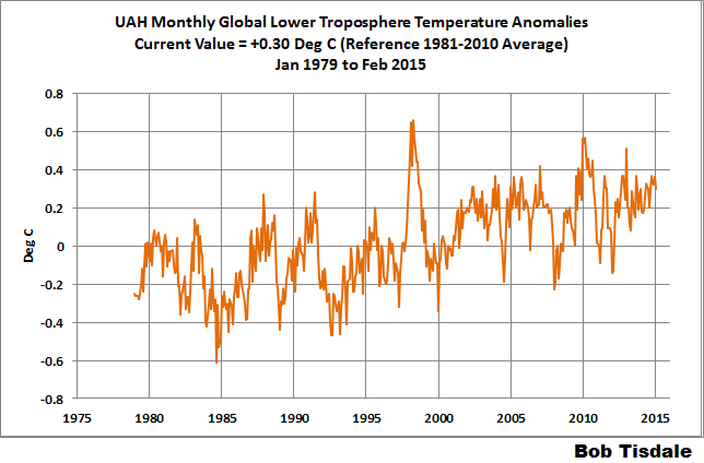
Figure 4 – UAH Lower Troposphere Temperature (TLT) Anomaly Data
RSS LOWER TROPOSPHERE TEMPERATURE ANOMALY DATA (RSS TLT)
Like the UAH lower troposphere temperature data, Remote Sensing Systems (RSS) calculates lower troposphere temperature anomalies from microwave sounding units aboard a series of NOAA satellites. RSS describes their data at the Upper Air Temperature webpage. The RSS data are supported by Mears and Wentz (2009) Construction of the Remote Sensing Systems V3.2 Atmospheric Temperature Records from the MSU and AMSU Microwave Sounders. RSS also presents their lower troposphere temperature data in various subsets. The land+ocean TLT data are here. Curiously, on that webpage, RSS lists the data as extending from 82.5S to 82.5N, while on their Upper Air Temperature webpage linked above, they state:
We do not provide monthly means poleward of 82.5 degrees (or south of 70S for TLT) due to difficulties in merging measurements in these regions.
Also see the RSS MSU & AMSU Time Series Trend Browse Tool. RSS uses the base years of 1979 to 1998 for anomalies.
Update: The February 2015 RSS lower troposphere temperature anomaly is +0.33 deg C. It dropped (a decrease of about -0.04 deg C) since January 2015.
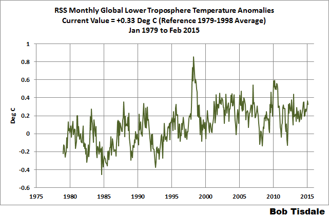
Figure 5 – RSS Lower Troposphere Temperature (TLT) Anomaly Data
A QUICK NOTE ABOUT THE DIFFERENCE BETWEEN RSS AND UAH TLT DATA
There is a noticeable difference between the RSS and UAH lower troposphere temperature anomaly data. Dr. Roy Spencer discussed this in his November 2011 blog post On the Divergence Between the UAH and RSS Global Temperature Records. In summary, John Christy and Roy Spencer believe the divergence is caused by the use of data from different satellites. UAH has used the NASA Aqua AMSU satellite in recent years, while as Dr. Spencer writes:
…RSS is still using the old NOAA-15 satellite which has a decaying orbit, to which they are then applying a diurnal cycle drift correction based upon a climate model, which does not quite match reality.
I updated the graphs in Roy Spencer’s post in On the Differences and Similarities between Global Surface Temperature and Lower Troposphere Temperature Anomaly Datasets.
While the two lower troposphere temperature datasets are different in recent years, UAH believes their data are correct, and, likewise, RSS believes their TLT data are correct. Does the UAH data have a warming bias in recent years or does the RSS data have cooling bias? Until the two suppliers can account for and agree on the differences, both are available for presentation.
Roy Spencer has recently updated his discussion on the RSS and UAH differences in the post Why Do Different Satellite Datasets Produce Different Global Temperature Trends?
Also, in the recent blog post, Roy Spencer has advised that the UAH lower troposphere Version 6 will be released soon and that it will reduce the difference between the UAH and RSS data.
14-YEARS+ (170-MONTH) RUNNING TRENDS
As noted in my post Open Letter to the Royal Meteorological Society Regarding Dr. Trenberth’s Article “Has Global Warming Stalled?”, Kevin Trenberth of NCAR presented 10-year period-averaged temperatures in his article for the Royal Meteorological Society. He was attempting to show that the recent halt in global warming since 2001 was not unusual. Kevin Trenberth conveniently overlooked the fact that, based on his selected start year of 2001, the halt at that time had lasted 12+ years, not 10.
The period from February 2001 to November 2014 is now 170-months long—14 years. Refer to the following graph of running 170-month trends from February 1880 to November 2014, using the GISS LOTI global temperature anomaly product.
An explanation of what’s being presented in Figure 6: The last data point in the graph is the linear trend (in deg C per decade) from January 2001 to February 2015. It is extremely low (about +0.04 deg C/Decade). That, of course, indicates global surface temperatures have not warmed to any great extent during the most recent 170-month period. Working back in time, the data point immediately before the last one represents the linear trend for the 170-month period of December 2000 to January 2015, and the data point before it shows the trend in deg C per decade for November 2000 to December 2014, and so on.

Figure 6 – 170-Month Linear Trends
The highest recent rate of warming based on its linear trend occurred during the 170-month period that ended about 2004 2006, but warming trends have dropped drastically since then. There was a similar drop in the 1940s, and as you’ll recall, global surface temperatures remained relatively flat from the mid-1940s to the mid-1970s. Also note that the mid-1970s was the last time there had been a 170-month period with a global warming rate that low—before recently.
17-YEARS+ (213-Month) RUNNING TRENDS
In his RMS article, Kevin Trenberth also conveniently overlooked the fact that the discussions about the warming halt are now for a time period of about 16 years, not 10 years—ever since David Rose’s DailyMail article titled “Global warming stopped 16 years ago, reveals Met Office report quietly released… and here is the chart to prove it”. In my response to Trenberth’s article, I updated David Rose’s graph, noting that surface temperatures in April 2013 were basically the same as they were in November 1997. We’ll use November 1997 as the start month for the running 17-year trends. The period is now 213-months long. The following graph is similar to the one above, except that it’s presenting running trends for 213-month periods.

Figure 7 – 213-Month Linear Trends
The last time global surfaces warmed at this low a rate for a 213-month period was about 1980. Also note that the sharp decline is similar to the drop in the 1940s, and, again, as you’ll recall, global surface temperatures remained relatively flat from the mid-1940s to the mid-1970s.
The most widely used metric of global warming—global surface temperatures—indicates that the rate of global warming has slowed drastically and that the duration of the slowdown in global warming is unusual during a period when global surface temperatures are allegedly being warmed from the hypothetical impacts of manmade greenhouse gases.
COMPARISONS
The GISS, HADCRUT4 and NCDC global surface temperature anomalies and the RSS and UAH lower troposphere temperature anomalies are compared in the next three time-series graphs. Figure 8 compares the five global temperature anomaly products starting in 1979. Again, due to the timing of this post, the HADCRUT4 and NCDC data lag the UAH, RSS and GISS products by a month. The graph also includes the linear trends. Because the three surface temperature datasets share common source data, (GISS and NCDC also use the same sea surface temperature data) it should come as no surprise that they are so similar. For those wanting a closer look at the more recent wiggles and trends, Figure 9 starts in 1998, which was the start year used by von Storch et al (2013) Can climate models explain the recent stagnation in global warming? They, of course, found that the CMIP3 (IPCC AR4) and CMIP5 (IPCC AR5) models could NOT explain the recent halt in warming.
Figure 10 starts in 2001, which was the year Kevin Trenberth chose for the start of the warming halt in his RMS article Has Global Warming Stalled?
Because the suppliers all use different base years for calculating anomalies, I’ve referenced them to a common 30-year period: 1981 to 2010. Referring to their discussion under FAQ 9 here, according to NOAA:
This period is used in order to comply with a recommended World Meteorological Organization (WMO) Policy, which suggests using the latest decade for the 30-year average.

Figure 8 – Comparison Starting in 1979
###########

Figure 9 – Comparison Starting in 1998
###########

Figure 10 – Comparison Starting in 2001
For those who want to get a rough idea of the impacts of the adjustments to the GISS and HADCRUT4 warming rates, refer to the July update—a month before those adjustments took effect.
AVERAGE
Figure 11 presents the average of the GISS, HADCRUT and NCDC land plus sea surface temperature anomaly products and the average of the RSS and UAH lower troposphere temperature data. Again because the HADCRUT4 and NCDC data lag one month in this update, the most current average only includes the GISS product.

Figure 11 – Average of Global Land+Sea Surface Temperature Anomaly Products
The flatness of the data since 2001 is very obvious, as is the fact that surface temperatures have rarely risen above those created by the 1997/98 El Niño in the surface temperature data. There is a very simple reason for this: the 1997/98 El Niño released enough sunlight-created warm water from beneath the surface of the tropical Pacific to raise the temperature of about 66% of the surface of the global oceans by almost 0.2 deg C. Sea surface temperatures for that portion of the global oceans remained relatively flat, dropping slowly throughout most of that region, until the El Niño of 2009/10, when the surface temperatures of that portion of the global oceans shifted slightly higher again. Prior to that, it was the 1986/87/88 El Niño that caused surface temperatures to shift upwards. If these naturally occurring upward shifts in surface temperatures are new to you, please see the illustrated essay “The Manmade Global Warming Challenge” (42mb) for an introduction.
MONTHLY SEA SURFACE TEMPERATURE UPDATE
The most recent sea surface temperature update can be found here. The satellite-enhanced sea surface temperature data (Reynolds OI.2) are presented in global, hemispheric and ocean-basin bases. We discussed the recent record-high global sea surface temperatures and the reasons for them in the post On The Recent Record-High Global Sea Surface Temperatures – The Wheres and Whys.
Could we have an updated, version, of the difference between the models and the data for each dataset, please? Preferably in the form of simple graphs with a line for the mean for the models, with shading for the spread of the models, and a line for the dataset, plus a note for how long the “pause” has lasted in each dataset.
Damn! I’m the first, and I use it for a boring comment like that instead of something frivolous and entertaining.
How about this quote? Seems to fit in with “climate science” to me.
“Not only can no one predict the future, we don’t understand the present – and there isn’t even any certainty about the past.” – Harry Browne
Frivolous and entertaining, like this? (Old Joe forgot to put in the <sarc> tag)
http://thehill.com/policy/energy-environment/234853-biden-climate-skepticism-like-denying-gravity
Well here’s a start…
This graph is great but usually when I see a graph like this it seems the model projections always start around 2005, so you only have 10 years or so of projections. I’d like to see what the models were projecting starting in 1990 or so. You’d have 25 years of model data, and, if as is likely, the models were far off for most of that time, it would be clear evidence of bad models. Has anyone seen a graph like that?
democritus, there are many. Here’s one:
http://www.drroyspencer.com/wp-content/uploads/CMIP5-73-models-vs-obs-20N-20S-MT-5-yr-means1.png
Thanks.
MikeB,
Your chart appears to stop at end of 2012.
MikeB, Thank You! for including a vertical line that indicates the In Sample versus Out of Sample date point. When considering the value of models it is absolutely key to know what portion of the record is being predicted without knowing the required answer ahead of time. “Hindcasts” have very limited value in determining the skill of a model.
It is precisely because of this issue that drug trials etc. are done using “double blind” protocols. Knowing the preferred answer ahead of time greatly increases the chances that “curve fitting” or “overfitting” will occur, however unconsciously.
Since the pause began, the “settled scientists” have been busy moving the goalposts to keep the discrepancy from growing too large, and to the extent that they do that, it means the models become un-falsifiable.
Only by being absolutely clear about the dates where the modelers had the required answers in front of them, versus the period where they are making an actual prediction, can we get any real idea about the skill of the models.
I have been trying to validate the yellow graph model on page 2202 of this NCEP paper that I found on NOAA’s site below. I had trouble posting a picture.
http://www.cpc.noaa.gov/products/people/wd51hd/vddoolpubs/2014_2185-2208_JClimate27_CFSv2.pdf
It appears to show global cooling until 2020.
@MikeB
here’s a more up-to-date version of that figure
http://www.climate-lab-book.ac.uk/wp-content/uploads/fig-nearterm_all_UPDATE_2014.png
“Updated version of IPCC AR5 Figure 11.25 with HadCRUT4 (black) global temperature time-series. The CMIP5 model projections are shown relative to 1986-2005 (light grey). The red hatching is the IPCC AR5 assessed likely range for global temperatures in the 2016-2035 period. The blue lines represent other observational datasets (Cowtan & Way, NASA GISTEMP, NOAA NCDC, ERA-Interim, BEST)”
from http://www.climate-lab-book.ac.uk/comparing-cmip5-observations/
i think the best starting point is hansens testimony to congress in 1988 –
http://jonova.s3.amazonaws.com/guest/evans-david/hansen-1988-a-b-c-scenarios.gif
where we are following somewhere between scenario a and b, yet even c is way too hot.
more recent model updates have done nothing for the skill of the model, they still fail at the same rate as the 1988 model, so the models ‘learned’ nothing from the real data they use for hindcasting.
RoHa says: “Could we have an updated, version, of the difference between the models and the data for each dataset, please?”
Sorry. I don’t have the time.
But the data sources are linked in the post and the model outputs are available here:
http://climexp.knmi.nl/selectfield_cmip5.cgi?id=someone@somewhere
Cheers.
@Bob Tisdale
see my post above 🙂
For RSS, the pause is 18 years and 3 months. For UAH, the pause is 5 years and 11 months. For both GISS and Hadcrut4, it is less than a year.
Regardless of the stoppage in global warming the models are alarmingly wrong. ++
@Sun Spot
“Regardless of the stoppage in global warming the models are alarmingly wrong.”
What evidence do you have for that statement? The observations are within the 5-95% uncertainty range of the model projections
http://www.climate-lab-book.ac.uk/wp-content/uploads/fig-nearterm_all_UPDATE_2014.png
Bevan, sorry but no. Top to bottom, the models are way off.


The fact that the surface record is ever adjusted, continuously cooling the past, year after year, is simply inexcusable.
Roy Spencer just did a post on changes to the US corn belt, 2014 to 2015. There is not reason to go back and continually change the past, but they do, time and time again, rewriting history. TOBS is not relevant in the least here.
Other adjustments to the past just keep happening. No explanations, they just keep happening, ever flattening the 1940 high, and lowering the gradient on the cooling until 1979…
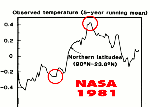
Here is 1981 N.H. NASA, compared to 1999
Here is Global, 2002 vs 2014
And here is proof that it is still happening, changing the deep past, no reason given, it just keeps happening.001 degrees at a time, month after month, as this Bill Illis comment demonstrates…
http://wattsupwiththat.com/2015/03/06/can-adjustments-right-a-wrong/#comment-1877173
“Here are the changes made to GISS temperatures on just one day this February. Yellow is the new temperature assumption and strikeout is the previous number. Almost every single monthly temperature record from 1880 to 1950 was adjusted down by 0.01C.
I mean every freaking month is history suddenly got 0.01C colder. What the heck changed that made the records in 1880 0.01C colder.”
http://s2.postimg.org/eclux0yl5/GISS_Global_Adjustments_Feb_14_2015.png
Bill continues….”GISS’ data comes from the NCDC so the NCDC carried out the same adjustments. They have been doing this every month since about 1999. So 16 years times 12 months/year times -0.01C of adjustments each month equals -1.92C of fake adjustments.
Lots of opportunity to create a fake warming signal. In fact, by now it is clear that 1880 was so cold that all of the crops failed and all of the animals froze and all of the human race starved to death or froze to death and we went extinct. 135 years ago today”
To verify for yourself what Bill posted, go here….http://wattsupwiththat.com/2015/03/06/can-adjustments-right-a-wrong/#comment-1877500
The Baseline has changed. All baselines continue to change. The surface record at this point is nothing more then FUBAR.
Look at these two RSS maps, one from 2014, one from 1998. 1998 was clearly and easily warmer then 2014. UAH also confirms this as well.
@Bevan. Well, it looks to me like observations are just barely within the 5-95% range — literally at the edge — although the uncertainty of the observations stretches outside the range. Furthermore, observations have dipped below the range in the past. Not sure that graph supports the performance of the models like you seem to think it does.
Well done. I consider we do not appreciate the heat capacity of the oceans. It is a true solar energy battery.
http://www.ospo.noaa.gov/data/atmosphere/radbud/gs19_prd.gif
Interesting that the rates are higher if you start
in 1998 rather than 2001. Kind of puts to rest
the idea that 1998 is a cherry-pick to make
the pause look longer.
Shouldn’t that be 2006?
Corrected. Thanks, Chris.
I keep seeing a graph like Fig 11 over the years.
All showing a step change in global temps around 1998 from -0.1 to + o.2. A change of 0.3 deg.
I can’t see how this is possible. To change the temp of the earth by 0.3 deg in 1 year and then maintain it for the next 15 years.
The amount of energy involved is mind boggling.
Far easier to fake the figures.
Got that in one!
Over and over and over again I repeat the same question. Could someone give me an answer?
Here goes….
If today, with satellite observations and a global spread of digital calibrated thermometers, the three main sources of temperature data diverge by as much as 0.04˚C….how can ANYONE seriously claim to have any idea of what the temperature was in 1880 when only a fraction of the earth’s surface was under observation?
Perhaps someone might be able to answer this easier question. How many angels can dance on the head of a pin?
Hi Charles, I can’t give an answer to this question, nor do I think anyone else can. I would think that the only way this data could be used is by comparing like for like, I would imagine there were temperature records for most of the major cities on Earth, but the location and circumstances of the thermometers would have to be identical, which in my view is impossible. For example, the city where I live (Newcastle upon Tyne, UK) is a great deal bigger now than it was in 1880, motor cars were rare then, they are not now, air-conditioning and central heating plus more buildings will increase the “heat island effect” The Met office weather station may have been moved from the city centre to Newcastle Airport, which didn’t exist in 1880.
In my opinion the only accurate temperature measurements can only have taken place since 1979, from satellite data. Plus of course all the old data has been “updated” to show that GW is happening as the models almost predict.
Now, angels dancing on the head of a pin? PASS!
Charles,
“Proposed for your consideration.” (HT: Rod Serling) The December 2014 changes to the surface temperature anomalies produced by the three major sources, based on subsets of the same temperature data, “adjusted” and, in some cases, “infilled”, were as follows: NASA GISS +0.06C; NCDC +0.12C; and HadCRUT +0.15C. Each and every datum collected globally in the month of December was available for inclusion in the anomalies produced by these three sources. Each source selected from the available data, “adjusted” that data and, in some cases, “infilled” for non-existent data. Since all of the same data were available for analysis, the factor of 2.5 (0.09C) difference between the three monthly changes to the reported anomalies is solely the result of the selection of data to be included and the “adjustments” and “infilling” introduced during the processing of the anomalies.
The change in the global temperature anomaly therefore might have been precisely 0.06C, or 0.12C, or even 0.15C; or, it might have been some other value, possibly within the range of the three reported anomaly changes; but, also, possibly not. The actual anomaly in the data remains unreported.
As laughable as I find the two decimal place “precision” of the reported anomalies and their monthly changes, the three decimal place “precision” of the decadal trends is even more laughable.
I have a similar question. If we looked at only the data that has been in existence from 1880 to now, what does the trend look like?
Ever hear of a “SWAG”? Me neither. Large aggregate annual numbers like “Gross Domestic Product” or “Global Mean Surface Temp.” are mostly useless anyway, unless they are used to compare them with the previous mostly useless numbers from prior years or to make suicidal Gov’t policy decisions at the national or supra-national level. That’s why for the more hardcore enthusiasts of mostly useless numbers, like myself, the modern record begins with the satellite era: no splicing allowed. And it’s not just “anyone” that’s claiming to “know” the GLOBAL temperature in 1880 it’s orgs. that used to have serious scientific cred like NOAA and NASA issueing “hottest month” press releases. I’m all cried out.
“unless they are used to compare them with the previous mostly useless numbers from prior years”
…and that is only true if the ceteris paribus assumption is valid. That assumption is highly questionable over a 30+ year period.
The Southern Oscillation Index just popped positive:
http://www1.ncdc.noaa.gov/pub/data/cmb/teleconnections/soi-5a-pg.gif
This could signal a turn toward La Niña inception.
I see the ENSO Meter on the right-side nav bar dropped with this week’s update. Lessee, the data I use is at http://www.bom.gov.au/climate/enso/nino_3.4.txt and thisyear’s lines are:
20150105,20150111,0.37
20150112,20150118,0.49
20150119,20150125,0.50
20150126,20150201,0.39
20150202,20150208,0.48
20150209,20150215,0.42
20150216,20150222,0.43
20150223,20150301,0.66
20150302,20150308,0.48
20150309,20150315,0.33
Hmm, that 0.33 looks to be the lowest since last summer:
20140623,20140629,0.53
20140630,20140706,0.39
20140707,20140713,0.32
20140714,20140720,0.20
20140721,20140727,0.04
20140728,20140803,0.20
20140804,20140810,0.23
20140811,20140817,0.17
20140818,20140824,0.32
20140825,20140831,0.38
20140901,20140907,0.31
20140908,20140914,0.48
Spring must be coming! (Congrats Boston – you broke your full season snowfall yesterday.)
Thank you for this post. I look forward to it every month.
And thank god for UAH keeping the others somewhat honest.
I know it’s fun watching the RSS temperature fall, but I don’t trust them. I expect any day they could make a big announcement saying that they have found a flaw in their methods and now can show catastrophic warming.
They’ve already started to mention possible satellite orbital problems from 2002-2004. If they reduce the temperature for that period, the trend from 1997 (start of the pause) would become more positive.
The most striking thing is the differences between the SAT data and the thermometer data.
I find it really odd that RSS and UAH dropped whilst the Thermometer data when in an opposite direction.
I think you need to look at the RSS/UAH vs which Thermometer. A lot of the “Thermometers” are based at airports or inside urban areas but the satellite is measuring the entire area. Where I live this can be a 5-6F difference or more. We have one official site in our area which is always colder than the rest, especially during the Spring and Fall when the air is dry and the days are shorter. But it doesn’t show in the official record of the area.
correction – unofficial site in our area
IIRC, the satellite measurements lag or lead the surface measurements by a few months.
Thought SG, P Homewood, Mahorasy and R Spencer have shown already that none of the surface records are reliable or have been fiddled to show warming. In any case the graph above from Spencer shows no trend since 1980 really. So 35 years flat is probably more accurate and realistic.
What chart’s that Eliza? The trend in UAH since 1980 shows statistically significant warming at +0.123 ±0.068 C/dec: http://www.ysbl.york.ac.uk/~cowtan/applets/trend/trend.html
Actually the RH graph (R Spencer) above shows no trend whatsoever from 1975. So 40 years flat, The whole AGW thing is an enormous scam
Eliza,
I’ve asked you before, but what graph are you referring to please?
UAH is one of the strongest warming data sets we have, surface or satellite, since 1980.
Not mentioned by Bob though perhaps of interest is that the last 12-month period was the warmest consecutive 12-month period in the entire GISS record. March 2014-February 2015 was +0.71C above the 1951-1980 average.
Cherry-pick much, David?
How can you cherry pick the last 12 months? You can cherry pick the last 13 or 14 or 10 or 11 to make some point, but the last 12 is just the last year.
I ‘cherry picked’ one consecutive 12-month period from a record that contains 1611 possible candidates. Then again, it was the warmest of all of these candidates; so it sort of drew attention to itself. At least it drew my attention.
A big race, say a marathon, might have 1611 contenders; but for some unclear reason people tend to focus on the winner.
And how does it compare to, say, the 1850-2015 average?
Obviously it would still be the warmest.
What is so magical about 1951-1980? Was that a time when the climate was considered optimal for life on Earth? If the global temps fell below the 1951-1980 average, would we be doomed by cold? A cynic might believe it was chosen because it was the lowest 30 year period in the modern record and makes political points for left-wing politics.
RH -exactly. It is the coldest period in the living memory of most living people. Interestingly if you divide it into two equal halves and use them as baselines, then plot the same charts, you get two different results and the baselines don’t agree either. It is cherry picking, of course.
Why not pick 1920-1950? It is the last ‘pre-big-industrial’ period so is a reasonable and justifiable choice. Why would anyone pick as their baseline a portion of the record that is within the sample period during which the effect they claim to be measuring, occurred?
You don’t measure the distance from New York to Los Angeles by using the average position of New York to Memphis as the ‘starting point’ unless you are trying to make New York appear to be closer to Los Angeles than it really is. Of course if you wanted it to appear farther, you’d use the average of New York to Halifax.
Obviously they checked both periods and picked the reference period that produced a ‘supportive’ number for their ‘narrative’ otherwise known as the the ‘message’.
The core conclusion one ‘should’ draw is that mankind is now in complete control of the planet and thus responsible for any and everything that occurs upon it. This is, naturally, only understood by Olympians whom all should revere with sacrifice.
Don’t think there’s anything so much ‘magical’ about it. It’s just a 30-year reference period. You could make it 1981-2010, or any other 30-year period you like.
The result would still be the same. The 12-month period March 2014- February 2015 would still be the warmest consecutive 12-month period in the GISS record.
David R said: “Don’t think there’s anything so much ‘magical’ about it. It’s just a 30-year reference period. You could make it 1981-2010, or any other 30-year period you like. ”
Really? So, when the temperature drops below the average of the last 30 years, you would be okay with that? Or, as global temperatures drop, would you become more insistent that the magical years be used as a baseline? That’s rhetorical, I don’t expect an honest answer.
The surface record is deeply flawed.. http://wattsupwiththat.com/2015/03/15/february-2015-global-surface-landocean-and-lower-troposphere-temperature-anomaly-model-data-difference-update/#comment-1884182
R.H., I can tell you the answer to your question….”What is so magical about 1951-1980?”
It is like a woman, always changing…
RH said 15, 2015 at 5:13 pm
“Really? So, when the temperature drops below the average of the last 30 years, you would be okay with that?”
_________________
Why wouldn’t I? It doesn’t make the slightest difference to the *trend*. All that changing the anomaly base achieves is to move the zero line up and down.
Changing the anomaly base would alter all the figures, but it wouldn’t alter the fact that the last 12-month period, March 2014 to February 2015, was the warmest consecutive 12-month period in the GISS record.
The 30 year “classical” climate cycle was used for a long time before it was codified by the WMO. http://www.wmo.int/pages/prog/wcp/ccl/faqs.php says
The NCDC has sort of moved on to 1981-2010, http://www.ncdc.noaa.gov/data-access/land-based-station-data/land-based-datasets/climate-normals/1981-2010-normals-data says
As for why 1951-1980 remains so popular, the main reasons are:
1) A lot of work references that period.
2) It shows a lot more warming than comparing to 1981-2010.
Some people have “successfully” transitioned to 1981-2010, e.g. Roy Spencer and UAH, e.g. http://www.drroyspencer.com/2015/03/uah-global-temperature-update-for-feb-2015-0-30-deg-c/
Most temp study are variances against a 30 year mean. If that period was one of the coolest of say the last 90 years, there’s a good chance you will introduce a warm bias. The reverse is true if the that 30 year interval covered a very warm period – you will automatically introduce a cold bias. Perhaps that is why NOAA and NASA are constantly cooling past decades. They will always maintain a warm bias in their already adjusted data sets.
Most of GISS’s warming occurs in places where there are no reporting stations.
It’s the ‘Catastophe’ part of CAGW that really needs to be laid to rest once and for all. Failure of models, failure and fraud over tree ring proxies, Mediviel, Minowan and Roman periods warmer than today, Cattle in Greenland and grapes in Scotland 1000 years ago. It all adds up to hysteria over nothing. I wouldn’t mind the rest of the bad science, if we could just expose the ‘catastrophe’ bits for the fraud they clearly are!
(Yawn). So the real data does not match the models. Absolutely shocking.
Ya just gotta wonder how long the emperor can wander around with no clothes.
Actually, it is the “adjusted” data which does not match the models. In addition, the real data does not match either the “adjusted” data or the models.
“Much of the following text is boilerplate.”
Mr Tisdale, I make a plea. Your posts tend to be long and including boilerplate text on the off-chance that someone new might read to post detracts from your message. I venture to suggest that the number of newcomers reading each post could be counted on half the fingers of a Yakuza’s hand. It will help the clarity of your posts if you simply have a link to the background material stored elsewhere and say “For those new to the concept of global surface temperature anomaly data the explanation is here”.
David, I really don’t think so. There are new people on this site all the time. They come and go and I think it important to provide Mr. Tisdale’s boilerplate at every opportunity. While most of us have read it before and skip through it, others will be informed. That is the value of this site.
I prefer the recent change in layout. It is easy to skip the boilerplate in each section by heading to the update at the end of the boilerplate.
It looks like the models are doing a GREAT job
“The greatest difference between models and data occurs in the 1880s. The difference decreases drastically from the 1880s and switches signs by the 1910s. The reason: the models do not properly simulate the observed cooling that takes place at that time. Because the models failed to properly simulate the cooling from the 1880s to the 1910s, they also failed to properly simulate the warming that took place from the 1910s until 1940. That explains the long-term decrease in the difference during that period and the switching of signs in the difference once again. The difference cycles back and forth nearer to a zero difference until the 1990s, indicating the models are tracking observations better (relatively) during that period. And from the 1990s to present, because of the slowdown in warming, the difference has increased to greatest value since about 1910…where the difference indicates the models are showing too much warming.”
Look at your figure 00.
The earth’s average temperature is about 15C. And the maximum error we are seeing is around .2C
that’s less than 15% off. even 25% off would be a stunning feat given the complexity of the climate.
Mosh,
The 0.2C error is less than 1.5% of the ~15C global average temperature. However, the total warming in question is less than 10% of 15C.
On the other hand, the 0.2C error is about a 25% error relative to the “adjusted” temperatures.
Mosher, nearly all of the model/observation comparison is a HINDCAST. I.e., the modelers had the required answer in front of them when they made the model. Under such circumstances it is not difficult to get good agreement.
The only comparison that really counts is the out of sample comparison. For that we only have about 10 years of data, and the model/observation trend has been diverging for essentially that entire period.
15% drift, becoming 25% drifting to 40%…and so on. Stunning would be taking the earth’s temp in real time as well the oceans temp. We’ll get there eventually.
S.M., are we now using a GAT vs the anomaly method? It looks to me like the models are about 50% to 150% off. (Top to bottom throughout the atmosphere.

Look a model projections made during the last 25 years and compare them to the actual recorded temperatures at specific intervals of the model’s original forecast. That is how you verify model performance over time.
Are there any other sources of satellite temperature measurements , eg from France . India or China , all of which have satellite launching capabilities.
I am not disputing the US measurements , but the comment that some of the data is about to be “corrected” does tend to unsettle one.
I just wonder why people seem to think that an adjustment to RSS that might bring it into better agreement with all the other global temperature data sets, including UAH, would be evidence of some sort of conspiracy.
At the minute we have 4/5 data sets pointing in one direction since 1998, and 1/5 pointing in the other. Why would it seem so odd that the 1/5 set discovered a processing problem? To me, that seems much more likely than believing that all the other data sets are wrong or involved in some sort of subterfuge (especially considering that UAH is one of the group showing continued warming).
I think even Roy Spencer has commented in the past that RSS is over reliant on data from a particular satellite MSU that UAH no longer trusts.
This needs to be watched closely, and scrutinized. Trillions of dollars, the monetary validation of a global governing body, global policy, all are at stake here. There is plenty of room for conflicts of interest add to that its a hot button debate on the scale of abortion. Whatever comes out of all of this we want to make it very difficult to be swayed by rhetoric.
RSS is not the outliner when compared to 1998, and since. Both UAH and RSS show 1998 far warmer then 2014.Both show several years warmer the 2014.

The surface estimate, after much adjustment to the past, shows what 2014 at .003 degrees warmer then 1998 and 2010, and NASA claimed a 34% probability of 2014 being the warmest year ever.
Both RSS and UAH show 1998 about.3 degrees warmer, making a virtual certainty, by NASA’s own standards, that 1998 was warmer then 2014.
This method is much better then trend lines to disparate base lines, which are all relative. You can create whatever you wish. See here UAH becomes the odd one out
woops, here is UAH shown as the odd man out by choosing trends lines verses warmest years.
http://www.woodfortrees.org/graph/hadcrut4gl/from:1987/to:2016/plot/hadcrut4gl/from:2002/to:2015/trend/plot/hadcrut3gl/from:1987/to:2016/plot/hadcrut3gl/from:2002/to:2016/trend/plot/rss/from:1987/to:2016/plot/rss/from:2002/to:2016/trend/plot/hadsst2gl/from:1987/to:2016/plot/hadsst2gl/from:2002/to:2016/trend/plot/hadcrut4gl/from:1987/to:1997/trend/plot/hadcrut3gl/from:1987/to:1997/trend/plot/hadsst2gl/from:1987/to:1997/trend/plot/rss/from:1987/to:1997/trend/plot/uah/from:2002/to:2016/trend/plot/uah/from:1987/to:1997/trend
Both RSS and UAH have 1998 as the warmest year on record, and 29=014 as considerably cooler then 1998.
Yes, but there’s no doubt that UAH tracks much closer to the surface data sets than with RSS since 1998.
The trends can be checked here (all deg C/decade with 2 sigma confidence interval): http://www.ysbl.york.ac.uk/~cowtan/applets/trend/trend.html
GISS: 0.079 ±0.116
NOAA: 0.056 ±0.110
HadCRUT4: 0.064 ±0.111
UAH: 0.072 ±0.197
RSS: -0.037 ±0.191
Since 1998 only GISS has warmed faster than UAH. RSS is the only data set that shows cooling. Just because UAH and RSS agree that 1998 as the warmest year to date doesn’t mean that they have been in agreement with one another since.
It clearly means that both show several years warmer then 2014 including 1998.
Trends are relative o themselves, and the period selected,,,
http://www.woodfortrees.org/graph/hadcrut4gl/from:1987/to:2016/plot/hadcrut4gl/from:2002/to:2015/trend/plot/hadcrut3gl/from:1987/to:2016/plot/hadcrut3gl/from:2002/to:2016/trend/plot/rss/from:1987/to:2016/plot/rss/from:2002/to:2016/trend/plot/hadsst2gl/from:1987/to:2016/plot/hadsst2gl/from:2002/to:2016/trend/plot/hadcrut4gl/from:1987/to:1997/trend/plot/hadcrut3gl/from:1987/to:1997/trend/plot/hadsst2gl/from:1987/to:1997/trend/plot/rss/from:1987/to:1997/trend/plot/uah/from:2002/to:2016/trend/plot/uah/from:1987/to:1997/trend
Do not use anything but satellite data after 1980. GISS-LOTI, NCDC and HadCRUT collaboratively show non-existent warming in the eighties and nineties. I exposed it five years ago in my book “What Warming? Satellite view of global temperature change” but nothing happened – they just kept boldly pushing their nonexistent warming until it became an integral part of AR5. The eighties and the nineties also happen to be another hiatus period like the one we are living through right now but you do not know it because it is covered up by the fake warming from these three peeudo-scientific morons. Satellite data are free of this fakery and they do not have any trace of cooperative computer processing either that ties these three fakers together.
How about the effect of the Southern Hemisphere Magnetic Anomaly on GCR’s and ENSO?
Evidence for cosmic ray modulation in temperature records from the South Atlantic Magnetic Anomaly region, E. Frigo, I. G. Pacca, A. J. Pereira-Filho, P. H. Rampelloto, and N. R. Rigozo
http://www.ann-geophys.net/31/1833/2013/angeo-31-1833-2013.pdf
Abstract. Possible direct or indirect climatic effects related
to solar variability and El Niño–Southern Oscillation
(ENSO) were investigated in the southern Brazil region by
means of the annual mean temperatures from four weather
stations 2 degrees of latitude apart over the South Atlantic
Magnetic Anomaly (SAMA) region. Four maximum temperature
peaks are evident at all stations in 1940, 1958, 1977
and 2002. A spectral analysis indicates the occurrence of periodicities
between 2 and 7 yr, most likely associated with
ENSO, and periodicities of approximately 11 and 22 yr, normally
associated with solar variability. Cross-wavelet analysis
indicated that the signal associated with the 22 yr solar
magnetic cycle was more persistent in the last decades, while
the 11 yr sunspot cycle and ENSO periodicities were intermittent.
Phase-angle analysis revealed that temperature variations
and the 22 yr solar cycle were in anti-phase near the
SAMA center. Results show an indirect indication of possible
relationships between the variability of galactic cosmic
rays and climate change on a regional scale.
Earlier paper:
Geomagnetic modulation of clouds effects in the Southern Hemisphere Magnetic Anomaly through lower atmosphere cosmic ray effects
Luis Eduardo Antunes Vieira and Ligia Alves da Silva
GEOPHYSICAL RESEARCH LETTERS, VOL. 33, L14802, doi:10.1029/2006GL026389, 2006
http://mtc-m16.sid.inpe.br/col/sid.inpe.br/mtc-m16@80/2006/08.02.16.40/doc/grl21625.pdf
From the introduction:
In the eastern Pacific a high variability is observed in
atmospheric and oceanic parameters associated to ENSO
phenomena. Coincidently, it is observed in the same region
a decrease in the intensity of the geomagnetic field, the
SHMA. The magnetic anomaly, also known as the South
Atlantic Anomaly (SAA), is a region of low intensity
magnetic field in the tropical region over the Pacific and
Atlantic Oceans and the South America. It is caused by the
eccentricity of the geomagnetic dipole and the presence of
multipole perturbations that give rise to a series of phenomena
in the southern hemisphere, that are important to the
physics of the magnetosphere and ionosphere [Asikainen
and Mursula, 2005; Lin and Yeh, 2005; Pinto and Gonzalez,
1989a, 1989b]. As a consequence of the temporal evolution
of the flow in the Earth’s core that sustains the geomagnetic
field, it is observed a westward drift (approximately
0.2 yr1) of the SHMA [Pinto et al., 1991]. The GCRs
flux depends on the magnetic rigidity, and as expected, in
the tropical region it is observed higher GCRs flux in the
SHMA. GCRs are responsible for the ionization in the
lower atmosphere below 35 km and are the principal
source of ionization over the oceans [Harrison and
Carslaw, 2003].
As has been posted above, the brightness anomaly maps comparing 1998 to 2014 are a joke.
1998 was so far warmer than today that its hard to even put into words.
At least 3 times warmer globally. As you would expect when you have an El nino that big.
I notice that on both UAH and RSS they are unchallenged, and will be until the next warm PDO.
All the other datasets are just noise, and everyone knows it.
how do the gore warmerz explain this?