Guest Post by Bob Tisdale
This post provides an update of the data for the three primary suppliers of global land+ocean surface temperature data—GISS and NCDC through December 2014 and HADCRUT4 through November 2014—and of the two suppliers of satellite-based lower troposphere temperature data (RSS and UAH) through December 2014.
INITIAL NOTES:
For discussions of the annual GISS and NCDC data for 2014, see the posts:
- Does the Uptick in Global Surface Temperatures in 2014 Help the Growing Difference between Climate Models and Reality?
- On the Biases Caused by Omissions in the 2014 NOAA State of the Climate Report
GISS LOTI and NCDC surface data, and the two lower troposphere temperature datasets are for the most recent month. The HADCRUT4 data lag one month.
This post contains graphs of running trends in global surface temperature anomalies for periods of 14 and 17+ years using GISS global (land+ocean) surface temperature data. They indicate that we have not seen a warming slowdown (based on 14 year trends) this long since the late-1970s or a warming slowdown (based on 17+ year trends) since about 1980.
Much of the following text is boilerplate. It is intended for those new to the presentation of global surface temperature anomaly data.
Most of the update graphs in the following start in 1979. That’s a commonly used start year for global temperature products because many of the satellite-based temperature datasets start then.
We discussed why the three suppliers of surface temperature data use different base years for anomalies in the post Why Aren’t Global Surface Temperature Data Produced in Absolute Form?
But first, let’s illustrate how badly the climate models used by the IPCC simulate global surface temperatures in light of the recent slowdown in global surface warming.
MODEL-DATA DIFFERENCE
Considering the uptick in surface temperatures this year (discussions linked above), government agencies that supply global surface temperature products have been touting record high combined global land and ocean surface temperatures. Alarmists happily ignore the fact that it is easy to have record high global temperatures in the midst of a hiatus or slowdown in global warming, and they have been using the recent record highs to draw attention away from the growing difference between observed global surface temperatures and the IPCC climate model-based projections of them.
There are a number of ways to present how poorly climate models simulate global surface temperatures. Normally they are compared in a time-series graph. See the example here. In that example, GISS Land-Ocean Temperature Index (LOTI) data are compared to the multi-model mean of the climate models stored in the CMIP5 archive, which was used by the IPCC for their 5th Assessment Report. The data and model outputs have been smoothed with 61-month filters to reduce the monthly variations.
Another way to show how poorly climate models perform is to subtract the data from the average of the model outputs (model mean). We first presented and discussed this method using global surface temperatures in absolute form. (See the post On the Elusive Absolute Global Mean Surface Temperature – A Model-Data Comparison.) The graph below shows a model-data difference using anomalies, where the data are represented by GISS global Land-Ocean Temperature Index (LOTI) and the model simulations of global surface temperature are represented by the multi-model mean of the models stored in the CMIP5 archive. To assure that the base years used for anomalies did not bias the graph, the full term of the data (1880 to 2013) were used as the reference period.
In this example, we’re illustrating the model-data differences in the monthly surface temperature anomalies. Also included in red is the difference smoothed with a 61-month running mean filter.

Figure 00 – Model-Data Difference
The greatest difference between models and data occurs in the 1880s. The difference decreases drastically from the 1880s and switches signs by the 1910s. The reason: the models do not properly simulate the observed cooling that takes place at that time. Because the models failed to properly simulate the cooling from the 1880s to the 1910s, they also failed to properly simulate the warming that took place from the 1910s until 1940. That explains the long-term decrease in the difference during that period and the switching of signs in the difference once again. The difference cycles back and forth nearer to a zero difference until the 1990s, indicating the models are tracking observations better (relatively) during that period. And from the 1990s to present, because of the slowdown in warming, the difference has increased to greatest value since about 1910…where the difference indicates the models are showing too much warming.
It’s very easy to see the recent record-high global surface temperatures have had a tiny impact on the difference between models and observations.
See the post On the Use of the Multi-Model Mean for a discussion of its use in model-data comparisons.
GISS LAND OCEAN TEMPERATURE INDEX (LOTI)
Introduction: The GISS Land Ocean Temperature Index (LOTI) data is a product of the Goddard Institute for Space Studies. Starting with their January 2013 update, GISS LOTI uses NCDC ERSST.v3b sea surface temperature data. The impact of the recent change in sea surface temperature datasets is discussed here. GISS adjusts GHCN and other land surface temperature data via a number of methods and infills missing data using 1200km smoothing. Refer to the GISS description here. Unlike the UK Met Office and NCDC products, GISS masks sea surface temperature data at the poles where seasonal sea ice exists, and they extend land surface temperature data out over the oceans in those locations. Refer to the discussions here and here. GISS uses the base years of 1951-1980 as the reference period for anomalies. The data source is here.
Update: The December 2014 GISS global temperature anomaly is +0.72 deg C. It increased (about +0.06 deg C) since November 2014.

Figure 1 – GISS Land-Ocean Temperature Index
Note: There have been recent changes to the GISS land-ocean temperature index data. They have a noticeable impact on the short-term (1998 to present) trend as discussed in the post GISS Tweaks the Short-Term Global Temperature Trend Upwards. The causes of the changes are unclear at present, but they will likely affect the 2014 rankings at year end.
NCDC GLOBAL SURFACE TEMPERATURE ANOMALIES
Introduction: The NOAA Global (Land and Ocean) Surface Temperature Anomaly dataset is a product of the National Climatic Data Center (NCDC). NCDC merges their Extended Reconstructed Sea Surface Temperature version 3b (ERSST.v3b) with the Global Historical Climatology Network-Monthly (GHCN-M) version 3.2.0 for land surface air temperatures. NOAA infills missing data for both land and sea surface temperature datasets using methods presented in Smith et al (2008). Keep in mind, when reading Smith et al (2008), that the NCDC removed the satellite-based sea surface temperature data because it changed the annual global temperature rankings. Since most of Smith et al (2008) was about the satellite-based data and the benefits of incorporating it into the reconstruction, one might consider that the NCDC temperature product is no longer supported by a peer-reviewed paper.
The NCDC data source is through their Global Surface Temperature Anomalies webpage. Click on the link to Anomalies and Index Data.)
Update: The December 2014 NCDC global land plus sea surface temperature anomaly was +0.77 deg C. See Figure 2. It [is] rose (an increase of +0.12 deg C) since November 2014.
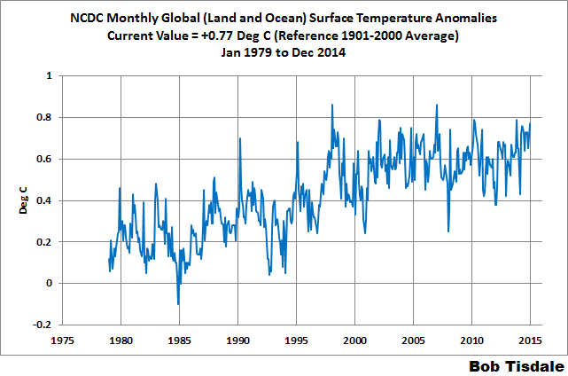
Figure 2 – NCDC Global (Land and Ocean) Surface Temperature Anomalies
UK MET OFFICE HADCRUT4 (LAGS ONE MONTH)
Introduction: The UK Met Office HADCRUT4 dataset merges CRUTEM4 land-surface air temperature dataset and the HadSST3 sea-surface temperature (SST) dataset. CRUTEM4 is the product of the combined efforts of the Met Office Hadley Centre and the Climatic Research Unit at the University of East Anglia. And HadSST3 is a product of the Hadley Centre. Unlike the GISS and NCDC products, missing data is not infilled in the HADCRUT4 product. That is, if a 5-deg latitude by 5-deg longitude grid does not have a temperature anomaly value in a given month, it is not included in the global average value of HADCRUT4. The HADCRUT4 dataset is described in the Morice et al (2012) paper here. The CRUTEM4 data is described in Jones et al (2012) here. And the HadSST3 data is presented in the 2-part Kennedy et al (2012) paper here and here. The UKMO uses the base years of 1961-1990 for anomalies. The data source is here.
Update (Lags One Month): The November 2013 HADCRUT4 global temperature anomaly is +0.49 deg C. See Figure 3. It dropped (about -0.13 deg C) since October 2014.
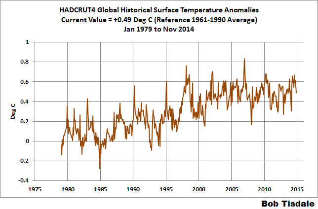
Figure 3 – HADCRUT4
UAH LOWER TROPOSPHERE TEMPERATURE ANOMALY DATA (UAH TLT)
Special sensors (microwave sounding units) aboard satellites have orbited the Earth since the late 1970s, allowing scientists to calculate the temperatures of the atmosphere at various heights above sea level. The level nearest to the surface of the Earth is the lower troposphere. The lower troposphere temperature data include the altitudes of zero to about 12,500 meters, but are most heavily weighted to the altitudes of less than 3000 meters. See the left-hand cell of the illustration here. The lower troposphere temperature data are calculated from a series of satellites with overlapping operation periods, not from a single satellite. The monthly UAH lower troposphere temperature data is the product of the Earth System Science Center of the University of Alabama in Huntsville (UAH). UAH provides the data broken down into numerous subsets. See the webpage here. The UAH lower troposphere temperature data are supported by Christy et al. (2000) MSU Tropospheric Temperatures: Dataset Construction and Radiosonde Comparisons. Additionally, Dr. Roy Spencer of UAH presents at his blog the monthly UAH TLT data updates a few days before the release at the UAH website. Those posts are also cross posted at WattsUpWithThat. UAH uses the base years of 1981-2010 for anomalies. The UAH lower troposphere temperature data are for the latitudes of 85S to 85N, which represent more than 99% of the surface of the globe.
Update: The December 2014 UAH lower troposphere temperature anomaly is +0.32 deg C. It’s basically unchanged (a decrease of about -0.01 deg C) since November 2014.

Figure 4 – UAH Lower Troposphere Temperature (TLT) Anomaly Data
RSS LOWER TROPOSPHERE TEMPERATURE ANOMALY DATA (RSS TLT)
Like the UAH lower troposphere temperature data, Remote Sensing Systems (RSS) calculates lower troposphere temperature anomalies from microwave sounding units aboard a series of NOAA satellites. RSS describes their data at the Upper Air Temperature webpage. The RSS data are supported by Mears and Wentz (2009) Construction of the Remote Sensing Systems V3.2 Atmospheric Temperature Records from the MSU and AMSU Microwave Sounders. RSS also presents their lower troposphere temperature data in various subsets. The land+ocean TLT data are here. Curiously, on that webpage, RSS lists the data as extending from 82.5S to 82.5N, while on their Upper Air Temperature webpage linked above, they state:
We do not provide monthly means poleward of 82.5 degrees (or south of 70S for TLT) due to difficulties in merging measurements in these regions.
Also see the RSS MSU & AMSU Time Series Trend Browse Tool. RSS uses the base years of 1979 to 1998 for anomalies.
Update: The December 2014 RSS lower troposphere temperature anomaly is +0.28 deg C. It rose ([a decrease] an increase of about +0.04 deg C) since November 2014.

Figure 5 – RSS Lower Troposphere Temperature (TLT) Anomaly Data
A QUICK NOTE ABOUT THE DIFFERENCE BETWEEN RSS AND UAH TLT DATA
There is a noticeable difference between the RSS and UAH lower troposphere temperature anomaly data. Dr. Roy Spencer discussed this in his November 2011 blog post On the Divergence Between the UAH and RSS Global Temperature Records. In summary, John Christy and Roy Spencer believe the divergence is caused by the use of data from different satellites. UAH has used the NASA Aqua AMSU satellite in recent years, while as Dr. Spencer writes:
…RSS is still using the old NOAA-15 satellite which has a decaying orbit, to which they are then applying a diurnal cycle drift correction based upon a climate model, which does not quite match reality.
I updated the graphs in Roy Spencer’s post in On the Differences and Similarities between Global Surface Temperature and Lower Troposphere Temperature Anomaly Datasets.
While the two lower troposphere temperature datasets are different in recent years, UAH believes their data are correct, and, likewise, RSS believes their TLT data are correct. Does the UAH data have a warming bias in recent years or does the RSS data have cooling bias? Until the two suppliers can account for and agree on the differences, both are available for presentation.
Roy Spencer has recently updated his discussion on the RSS and UAH differences in the post Why Do Different Satellite Datasets Produce Different Global Temperature Trends?
Also, in the recent blog post, Roy Spencer has advised that the UAH lower troposphere Version 6 will be released soon and that it will reduce the difference between the UAH and RSS data.
13-YEARS+ (167-MONTH) RUNNING TRENDS
As noted in my post Open Letter to the Royal Meteorological Society Regarding Dr. Trenberth’s Article “Has Global Warming Stalled?”, Kevin Trenberth of NCAR presented 10-year period-averaged temperatures in his article for the Royal Meteorological Society. He was attempting to show that the recent halt in global warming since 2001 was not unusual. Kevin Trenberth conveniently overlooked the fact that, based on his selected start year of 2001, the halt at that time had lasted 12+ years, not 10.
The period from January 2001 to November 2014 is now 168-months long—14 years. Refer to the following graph of running 168-month trends from January 1880 to November 2014, using the GISS LOTI global temperature anomaly product.
An explanation of what’s being presented in Figure 6: The last data point in the graph is the linear trend (in deg C per decade) from January 2001 to December 2014. It is basically zero (about +0.02 deg C/Decade). That, of course, indicates global surface temperatures have not warmed to any great extent during the most recent 168-month period. Working back in time, the data point immediately before the last one represents the linear trend for the 168-month period of December 2000 to December 2014, and the data point before it shows the trend in deg C per decade for November 2000 to November 2014, and so on.

Figure 6 – 168-Month Linear Trends
The highest recent rate of warming based on its linear trend occurred during the 168-month period that ended about 2004, but warming trends have dropped drastically since then. There was a similar drop in the 1940s, and as you’ll recall, global surface temperatures remained relatively flat from the mid-1940s to the mid-1970s. Also note that the mid-1970s was the last time there had been a 167-month period with a global warming rate that low—before recently.
17-YEARS+ (211-Month) RUNNING TRENDS
In his RMS article, Kevin Trenberth also conveniently overlooked the fact that the discussions about the warming halt are now for a time period of about 16 years, not 10 years—ever since David Rose’s DailyMail article titled “Global warming stopped 16 years ago, reveals Met Office report quietly released… and here is the chart to prove it”. In my response to Trenberth’s article, I updated David Rose’s graph, noting that surface temperatures in April 2013 were basically the same as they were in November 1997. We’ll use November 1997 as the start month for the running 17-year trends. The period is now 211-months long. The following graph is similar to the one above, except that it’s presenting running trends for 211-month periods.
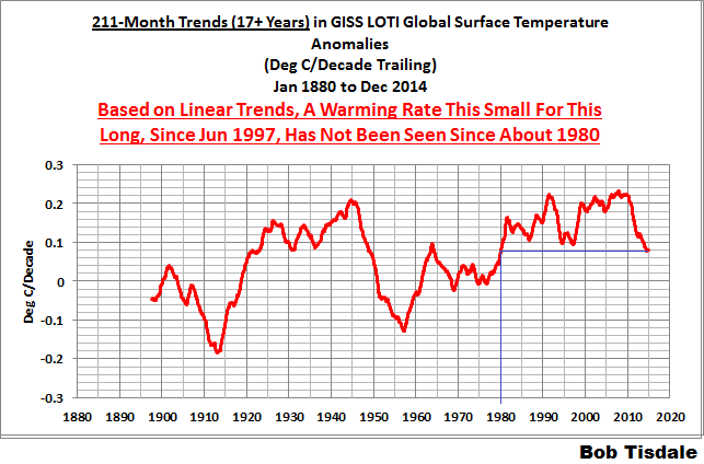
Figure 7 – 211-Month Linear Trends
The last time global surfaces warmed at this low a rate for a 211-month period was about 1980. Also note that the sharp decline is similar to the drop in the 1940s, and, again, as you’ll recall, global surface temperatures remained relatively flat from the mid-1940s to the mid-1970s.
The most widely used metric of global warming—global surface temperatures—indicates that the rate of global warming has slowed drastically and that the duration of the slowdown in global warming is unusual during a period when global surface temperatures are allegedly being warmed from the hypothetical impacts of manmade greenhouse gases.
COMPARISONS
The GISS, HADCRUT4 and NCDC global surface temperature anomalies and the RSS and UAH lower troposphere temperature anomalies are compared in the next three time-series graphs. Figure 8 compares the five global temperature anomaly products starting in 1979. Again, due to the timing of this post, the HADCRUT4 and NCDC data lag the UAH, RSS and GISS products by a month. The graph also includes the linear trends. Because the three surface temperature datasets share common source data, (GISS and NCDC also use the same sea surface temperature data) it should come as no surprise that they are so similar. For those wanting a closer look at the more recent wiggles and trends, Figure 9 starts in 1998, which was the start year used by von Storch et al (2013) Can climate models explain the recent stagnation in global warming? They, of course, found that the CMIP3 (IPCC AR4) and CMIP5 (IPCC AR5) models could NOT explain the recent halt in warming.
Figure 10 starts in 2001, which was the year Kevin Trenberth chose for the start of the warming halt in his RMS article Has Global Warming Stalled?
Because the suppliers all use different base years for calculating anomalies, I’ve referenced them to a common 30-year period: 1981 to 2010. Referring to their discussion under FAQ 9 here, according to NOAA:
This period is used in order to comply with a recommended World Meteorological Organization (WMO) Policy, which suggests using the latest decade for the 30-year average.

Figure 8 – Comparison Starting in 1979
###########

Figure 9 – Comparison Starting in 1998
###########
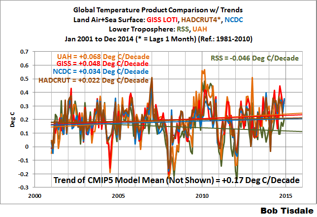
Figure 10 – Comparison Starting in 2001
AVERAGE
Figure 11 presents the average of the GISS, HADCRUT and NCDC land plus sea surface temperature anomaly products and the average of the RSS and UAH lower troposphere temperature data. Again because the HADCRUT4 and NCDC data lag one month in this update, the most current average only includes the GISS product.
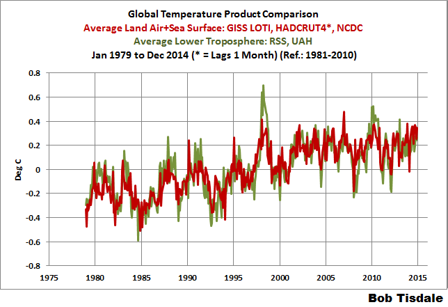
Figure 11 – Average of Global Land+Sea Surface Temperature Anomaly Products
The flatness of the data since 2001 is very obvious, as is the fact that surface temperatures have rarely risen above those created by the 1997/98 El Niño in the surface temperature data. There is a very simple reason for this: the 1997/98 El Niño released enough sunlight-created warm water from beneath the surface of the tropical Pacific to raise the temperature of about 66% of the surface of the global oceans by almost 0.2 deg C. Sea surface temperatures for that portion of the global oceans remained relatively flat, dropping slowly throughout most of that region, until the El Niño of 2009/10, when the surface temperatures of that portion of the global oceans shifted slightly higher again. Prior to that, it was the 1986/87/88 El Niño that caused surface temperatures to shift upwards. If these naturally occurring upward shifts in surface temperatures are new to you, please see the illustrated essay “The Manmade Global Warming Challenge” (42mb) for an introduction.
MONTHLY SEA SURFACE TEMPERATURE UPDATE
The most recent sea surface temperature update can be found here. The satellite-enhanced sea surface temperature data (Reynolds OI.2) are presented in global, hemispheric and ocean-basin bases. We discussed the recent record-high global sea surface temperatures and the reasons for them in the post On The Recent Record-High Global Sea Surface Temperatures – The Wheres and Whys.
Very low solar activity. The position of the polar vortex similar to those during the last glaciation in North America.


Gail Combs says:
January 18, 2015 at 5:57 am
What people forget is the Wisconsin Ice Age glaciers did not cover the entire Northern Hemisphere. The past configuration of the ice sheets follows the ‘polar vortex’ pattern we are now seeing. A warm Alaska and California therefore mean nothing. In other words the current weather patterns are the same as were seen during glaciation aka COLD.
I think that a warm California/Alaska is important, as it is a hallmark of a cool period in the NH. I noted that before when looking through long term graphs.
Typo:
…Update: The December 2014 NCDC global land plus sea surface temperature anomaly was +0.77 deg C. See Figure 2. It is rose (an increase of +0.12 deg C) since November 2014….
“it is rose” is ungrammatical…
[Changed. Thank you. .mod]
Typo corrected, Dodgy Geezer. Thanks.
A rose is a rose is a rose.
Bob,
Thanks for your continuing careful analysis.
One problem or misunderstanding on my part in the section-
Under RSS Lower Troposphere where you write-
Update: The December 2014 RSS lower troposphere temperature anomaly is +0.28 deg C. It rose (a decrease of about +0.04 deg C) since November 2014.
I don’t follow what you are saying.
Typo corrected, Doug Allen. Thanks.
Bob Tisdale look at the pressure in the stratosphere. AO index drops.
http://www.cpc.ncep.noaa.gov/products/precip/CWlink/daily_ao_index/hgt.ao.cdas.gif
Please see the forecast. ?w=640
https://stevengoddard.wordpress.com/2015/01/17/gaia-responds-to-gavin/
How long you are going to accept taxfunded propaganda from NOAA GISS etz. If adjustments are not enough, they’ll put heaters to thermometers.
Oh yeah, like THAT would happen!
Next, you’ll probably try to tell us that somewhere they used lights at night to create “solar” electricity.
Geez, you must think we are stupid or something.
/sarc
Dodgy Geezer & Doug Allen, forgot to say, sorry about the typos. My excuse: insufficient coffee.
Cheers.
I guess that’s better than too much Jack Daniels.8-)
Hey, sometimes what others would consider too much Jack Daniels is a good thing in my book!
The trend of below-normal temperatures is likely to continue right into the start of February as blasts of arctic air frequent the Northeast and Midwest.
http://vortex.accuweather.com/adc2004/pub/includes/columns/newsstory/2015/650x366_01180949_patternintofebruary.jpg
ren, thank you. It seems the same as last year or perhaps worst. Of course this will not be seen on msm. Also does anyone know how the effected States- Provinces are doing in regards to fuel and snow clearing supplies. Last year the stories of shortages were splashed across msm, but this year not a peep…
michael
Whenever I see these temperature time series plots I wonder where are the error bars?
For example, given the difference between the UAH and RSS series, one would expect the systematic error estimates to be visible on the plot.
Figure 00.
Looks like the five year running average is very good.
The differences are astonishingly small for a system as complex as the climate.
If you ask how close a model had to be to be useful..
I’d say simulate the earth and get an answer that is correct to within . 5c and you’ve got something good enough to set policy and raise taxes on dirty coal. You’ve got a model useful enough to support a decision to go for nuclear power in big way
Figure 00 shows success.
Only works for decisions impacting on the in-sample period (basically the 20th century) regrettably
The models are obviously not a success, Stephen, when the climate science community is generating excuses for the difference.
Oops, that should read Steven, not Stephen.
And further, based on the 5-year averages, the divergence grew to about 0.18 deg C since around 2000.
What would be an acceptable difference to you? Who is making excuses?
Bill 2, you really don’t care about my opinion, so why do you ask? Apparently climate scientists aren’t pleased with the divergence because they’re writing papers trying to explain it (making excuses): volcanos did it…the missing heat’s hiding in the oceans….it’s the extended solar minimum…it’s the AMO…it’s the PDO…the IPO…too many La Ninas…stronger trade winds…etc.
Regards
So says the computer illiterate who does not know the difference between Windows ME and Windows 2000.
http://www.populartechnology.net/2014/07/nasa-and-usgs-does-not-know-difference.html
Hi Steven, good afternoon, If you think its good enough to “go for nuclear in a big way” I’m game. When do we break ground? Can you get the President to wipe out his pen for an executive order to start the construction? Alas, he is not taking my calls…As for “dirty coal” and taxes, no need to bother, Congress has better things to argue over. It will be moot anyway, once the Nuke plants are built. We can mothball the coal fired ones as equal generating capacity goes on line. Until then, burdening our coal fire power supply is irresponsible. They are necessary, think of them as a root canal that you really need. Please respond, I appreciate your input on this.
If this statement is true then computer models should never be used to set any policy let alone raise taxes.
Computer models can be programmed to get whatever results that you want.
At least in the climate context, I can’t stand the things. I can’t understand researchers’ manic obsession with ’em. I’d rather just have the actual measured data from past to present and leave the future possibilities in the hands of experienced weather forecasters (who pretty much have done a fair job over the decades past). I’d like to gather every one of these climate models (and their code) and ship ’em off to Lerwick to burn at Up Helly Aa.
“I’d say simulate the earth and get an answer that is correct to within .5c and you’ve got something good enough to set policy…”
Most of these models are about 20 years old or less and have been projecting warming of about .23C per decade, or about .46C the last 20 years, and you figure that if it is within .5C it’s close enough?
Anything from a slow global cooling to Al Gore’s scariest predictions would fit inside those parameters.
+ or – 110% is accurate enough?
How can you use a margin of error on a projection that includes the null hypothesis (nothing at all is going to happen). The null hypothesis would validate the models’ projections????
Put another way, a 20 year old model that projected a .1C per decade DECREASE in global temperatures and projected that we were going headlong into an ice age would stil be within .5C of the actual temperatures at this point, would that be good enough to set policy on?
You’ve set a margin of error so wide that virtually any result will fall within it.
I think I can see a pattern developing here….
Steven
Many here will welcome your support for nuclear, myself included.
Thanks Bob, very much appreciated!
The equatorial upper ocean has passed into cold anomaly. ENSO data patterns suggest possible La Niña development. That will challenge the creativity of the climate data editors, although I’m sure they’re a talented lot and well up to the job.
Thanks, Bob.
You offer us a wide and detailed look at the data.
http://motls.blogspot.com/2015/01/noaa-nasa-2014-was-probably-not-warmest.html?utm_source=feedburner&utm_medium=feed&utm_campaign=Feed%3A+LuboMotlsReferenceFrame+%28Lubos+Motl%27s+reference+frame%29
This says it all and brings out the points I have been making which is this year is by no way the warmest year..
This is a simple argument, it is not the warmest if you use satellite data,
http://dailycaller.com/2015/01/12/satellite-data-says-2014-actually-wasnt-the-warmest-on-record/
http://news.heartland.org/newspaper-article/2015/01/17/2014-was-not-warmest-year-record
The satellite data is not manipulated like the data from GISS/NCDC. There data like AGW theory is nonsense. All political as Dr. Spencer pointed out.
15 years ago Dr. David Viner, a climate modeler in the UK, said:
“Children just aren’t going to know what snow is,” and that snowfall will become “a very rare and exciting event”.
In 2004 Viner said “Unfortunately, it’s just getting too hot for the Scottish ski industry,”
He was right. The models were right. I feel ashamed ever to have doubted his brilliance or the models.
IMAGE FROM 17 JANUARY 2015 – Daily Mail
http://i.dailymail.co.uk/i/pix/2015/01/17/24C8AAD300000578-2914486-image-a-68_1421502818667.jpg
And here is more on the doomed Scottish ski industry according to Dr. Viner. I am humbled.
If we accept that the climate models are correct, that the tropical lower troposphere is warming 1.4 times faster than the surface, and that the satellite measurements are correct (esp. since they are corroborated by the radiosondes) then this cold should come as no surprise. The surface data are just way inconsistent with the computer models and reality. Instead of showing warming, the data should be showing cooling.
The next El Niño will make this already shaky argument collapse entirely.
What about the current El Niño? I sure hope you’re not holding a Fiskars axe in any of those hands that you are waving about 😉
Look to the right side of the page and you’ll see the El Niño index meter. It says neutral.
That would be sometime in 2018 by my reckoning.
WMO El Niño/La Niña Update
4 December 2014
Current Situation and Outlook
Steady warming of the tropical Pacific Ocean over the past two months has resulted in ocean surface temperatures reaching weak El Niño levels.
http://www.wmo.int/pages/prog/wcp/wcasp/enso_update_latest.html
I noticed the slight uptick in the ENSO in the last few days. My personal best guess from last year was for a peak around this April on the ENSO. Then a steady cooling leading to a La Nina late next year.
Next up is a La Nina, not el Nino.
That will challenge the models.
The monthly global temperature charts are interesting. GISS chart in Fig. 1, none of 2014 months is warmest. Four higher temperatures are recorded between 1998 and 2010. The warmest month in 2014 is only 5th warmest overall. RSS chart in Figure 5, 2014 months are not even close to being warmest. There are many higher temperatures between 2001 and 2006.
Gavin is desperate to claim ‘warmest’ so he averaged the 2014 months and forgets to mention the warmest year claim has 62% probability of being false. Garbage. In empirical sciences, at least 95% confidence is the standard.
http://www.dailymail.co.uk/news/article-2915061/Nasa-climate-scientists-said-2014-warmest-year-record-38-sure-right.html#ixzz3PEkKQ4Fr
Gavin’s confidence interval is only 38% vs. at least 95% scientific standard. Such claims are common in pseudosciences.
Sent to a few friends:
There have been recent announcements that “2014 was the warmest year evah”!!! This claim is easily proven false – it is nonsense.
The best temperature data for planet Earth is derived from satellites launched since 1979. The satellite data is reported by two organizations, UAH and RSS, using slightly different data and thus yielding slightly different results. Both UAH and RSS report that 1998 was by far the warmest year in the modern data record, and 2014 was nothing special. See the two graphs below.
The satellite data is vastly more accurate than the Surface Temperature data, which is measured by irregularly spaced surface weather stations dotted across the globe, often poorly maintained and susceptible to substantial false warming bias.
There is also significant data that indicates 1934 was warmer than 1998, at least in the USA, and that globally the Medieval Warm Period, and the Roman Warm Period were both warmer than today.
In summary, the warming that was observed from about 1975 to 1998 was nothing special, and previous warmer periods tend to disprove that increasing atmospheric CO2 is a significant driver of global temperature.
There has been no net global warming for about 17 years, despite increased atmospheric CO2. It is apparent that the impact of increased atmospheric CO2 on global temperature is insignificant – too small to measure.
It is also apparent that natural temperature variation greatly exceeds the impact of increased atmospheric CO2 on global temperature.
Humanity suffers greatly when the Earth cools, as it did during the Little Ice Age from about 1350 to 1850. Populations in some Northern countries declined by up to 30% due to cold and starvation.
It is obvious that fears of global warming are badly misplaced. Humanity does much better is a warmer climate, and much poorer in a cooler climate.
Even today with our modern technology, the Excess Winter Mortality Rate* in Europe ranges from about 10% in Northern Europe to about 30% in Southern Europe where they do not properly adapt to the cold.
So where do we go from here? In 2002 I (we) stated in an article published in the Calgary Herald that global cooling would resume by 2020-2030. This prediction is still looking probable, because Solar Cycle 24 is a dud, and Solar Cycle 25 is also expected to be very weak. At this time, I am uncertain whether this cooling will be moderate or severe.
Regarding our prediction of global cooling, I sincerely hope to be wrong. In any case, adaptation is the answer, and it would really help if our society was focused on the real problem (global cooling), not the imaginary one.
For humanity AND the environment, it is obvious that warm is good, and cold is bad.
Best, Allan
* Excess Winter Mortality in Europe: a Cross Country Analysis Identifying Key Risk Factors
http://jech.bmj.com/content/57/10/784.full
Table 1 – Coefficient of seasonal variation in mortality (CSVM) in EU-14 (mean, 1988–97)
CSVM 95% CI
Austria 0.14 (0.12 to 0.16)
Belgium 0.13 (0.09 to 0.17)
Denmark 0.12 (0.10 to 0.14)
Finland 0.10 (0.07 to 0.13)
France 0.13 (0.11 to 0.15)
Germany 0.11 (0.09 to 0.13)
Greece 0.18 (0.15 to 0.21)
Ireland 0.21 (0.18 to 0.24)
Italy 0.16 (0.14 to 0.18)
Luxembourg 0.12 (0.08 to 0.16)
Netherlands 0.11 (0.09 to 0.13)
Portugal 0.28 (0.25 to 0.31)
Spain 0.21 (0.19 to 0.23)
UK 0.18 (0.16 to 0.20)
Mean 0.16 (0.14 to 0.18)
************************************************************************************************************
http://wattsupwiththat.com/2015/01/18/december-2014-global-surface-landocean-and-lower-troposphere-temperature-anomaly-model-data-difference-update/
Figure 4 – UAH Lower Troposphere Temperature (TLT) Anomaly Data
Figure 5 – RSS Lower Troposphere Temperature (TLT) Anomaly Data
Hi Bob. The temperature data from these three primary suppliers has been monkeyed with and shows warming where none exists. That means practically all of that graph, including the eighties, nineties, and the twenty-first century. I discovered that from comparing their data with satellites and even warned against it in my book but nothing happened. They just continued it into the twenty-first century and are still showing fake warming. It has gotten so bad that in their graphs the `2010 El Nino shows up higher than the super El Nino of 1998 which is impossible. I originally spotted the problem in HadCRUT3 but found quickly that GISS and NCDC are equally involved. They collaborated in this fakery because their data sets have identical computer footprints. You can see these computer traces clearly in your Figure 1. They consist of sharp upward spikes at the beginnings of most years but not all. They look like annoying noise but they are not noise because all three data-sets have them in exactly identical locations.Just create Photoshop layers of them and compare them to one another and to layers created from UAH and/or RSS data. Photoshop lets you play with layer visibility and you will quickly catch on to what is going on. Just a few examples from your Figure 1. .Taking three of them, 1990, 1995, and 1998 are all easy to see. The first two of them each raises local temperature by 0.4 degrees Celsius. The one in 1998 hugs the side of the 1998 super El Nino and also adds a phony temperature rise of 0.1 degrees Celsius to that well-known peak. There is more, and you will find them easily since I know you can use graphs well. The vast majority of users have been trusting these temperature vendors to deliver a genuine product when these vendores in fact want nothing more than to show a dangerous warming. One example of their work is the stretch of the eighties and nineties, before the arrival of the super El Nino. I proved four years ago that there was no temperature rise there, just ENSO going up and down. I worked with satellite data but that is not what they show. Their graph has an upward slope there which used to be called the late twentieth century warming then.
The most interesting thing on the global temperature map currently is the persistent cold anomaly around Antarctica.
In Table 6, it is a tad bit cooler today then it was in 1900-1904.