Guest Post by Bob Tisdale
UPDATE: There was an error in the November 2014 update of the ERSST.v4 sea surface temperature data supplied by NOAA. It impacted the data presented in this post. It was not Nick Stokes’s or my error. It was simply NOAA working out the bugs of updating a new dataset. Things like that happen. As opposed to rewriting this post, I’ve replaced the illustrations with gif animations showing the incorrect data (upon which this post was based) and the correct data. That way the comments on the thread will still make sense, because they were referring to the erroneous data.
(Oops, forgot to note: Subsequent to the correction, KNMI added the new ERSST.v4 dataset to the Monthly observations at their Climate Explorer. The corrections in this post use the data from the KNMI Climate Explorer.)
Thanks to Kevin and Nick for finding the problem and advising me of it.
# # #
In the post NOAA Is Updating Their Sea Surface Temperature Dataset, we introduced a new dataset from NOAA, their ERSST.v4 data, which is an upgrade of their ERSST.v3b dataset. It’s important because ERSST is the sea surface temperature component of the NOAA NCDC merged land + ocean surface temperature data. In this post, we’ll expand the introduction and present a quick look at the data.
NOAA has recently published two papers detailing their new ERSST.v4 Extended Reconstructed Sea Surface Temperature dataset.
- Huang et al. (2014) Extended Reconstructed Sea Surface Temperature version 4 (ERSST.v4), Part I. Upgrades and Intercomparisons, and
- Liu et al. (2014) Extended Reconstructed Sea Surface Temperature version 4 (ERSST.v4): Part II. Parametric and Structural Uncertainty Estimations.
The papers are paywalled, but I bought both to confirm a few things I suspected. (Merry Christmas to me.)
NOAA has posted its new ERSST.v4 data online, and it can be found easily through Google. NOAA includes ERSST.v4 sea surface temperature-based ENSO and PDO indices here. They also include the monthly global data in ascii format from 1854 through 2014 here.
I do not have the capability to deal with the monthly data in that format. (And I also prefer to download data through the KNMI Climate Explorer so that people can easily replicate my work.) But I wanted to present graphs of ERSST.v4 data in a post, so I turned to someone who comments regularly at WattsUpWithThat and who most people would not consider a climate skeptic, Nick Stokes. On this matter, Nick Stokes is as close to an independent third party as I can think of. Nick was more than happy to examine new sea surface temperature data, and he did so for the period of 1960 to 2014. (Thank you, Nick, for your assistance.) Nick also downloaded ERSST.v3b data in the same ascii format and created time series data for two latitude bands (globally and 60S-60N) so that we could confirm his methods against the data available through the KNMI Climate Explorer. Thus, what is reported in this post should be a correct representation of the ERSST.v4 global data.
SHIP-BUOY BIAS CORRECTIONS IN ERSST.v4
In the ERSST.v4 Part I paper, Huang et al. (2014) write (my boldface):
5.3 Ship-buoy SST adjustment
In addition to the ship SST bias adjustment, the drifting and moored buoy SSTs in ERSST.v4 are adjusted toward ship SSTs, which was not done in ERSST.v3b. Since 1980 the global marine observations have gone from a mix of roughly 10% buoys and 90% ship-based measurements to 90% buoys and 10% ship measurements (Kennedy et al. 2011). Several papers have highlighted, using a variety of methods, differences in the random biases and a systematic difference between ship-based and buoy-based measurements, with buoy observations systematically cooler than ship observations (Reynolds et al. 2002; Reynolds et al. 2010; Kent et al. 2010; amongst others). Here the adjustment is determined by (1) calculating the collocated ship-buoy SST difference over the global ocean from 1982-2012, (2) calculating the global areal weighted average of ship-buoy SST difference, (3) applying a 12-month running filter to the global averaged ship-buoy SST difference, and (4) evaluating the mean difference and its STD of ship-buoy SSTs based on the data from 1990 to 2012 (the data are noisy before 1990 due to sparse buoy observations). The mean difference of ship-buoy between 1990 and 2012 is 0.12°C with a STD of 0.02°C (all rounded to hundredths in precision). The mean difference of 0.12°C is at the lower-end of published values of 0.12°C to 0.18°C (e.g. Reynolds et al. 2002; Reynolds et al. 2010; Kent et al. 2010). Although buoy SSTs are generally more homogeneous than ship SSTs, they are adjusted here because otherwise it would be necessary to adjust ship SSTs before1980 when there were no or very few buoys. As expected, the global averaged SSTA trends between 1901 and 2012 (refer to Table 2) are the same whether buoy SSTs are adjusted to ship SSTs or the reverse. However, the global mean SST is 0.06°C warmer after 1980 in ERSST.v4 because of the buoy adjustments (not shown) and there are therefore impacts on the long-term trends compared to applying no adjustment to account for the change in observational platforms.
Figure 1 presents the difference in global sea surface temperature anomalies (reference 1981 to 2010) between ERSST.v4 and ERSST.v3b for the period of 1960 to present. Due to the volatility of the difference, I’ve also smoothed it with a 12-month running-mean filter. There are many reasons for the differences between the two datasets (different corrections, different references for quality control, etc.), but the period after 1980 is definitely warmer in the ERSST.v4 data than in the ERSST.v3b data. That would, of course, confirm what Huang et al. (2014) noted: (1) the new ERSST.v4 data have been adjusted for ship-buoy bias and (2) those adjustments lead to a higher long-term warming trend in the ERSST.v4 data.
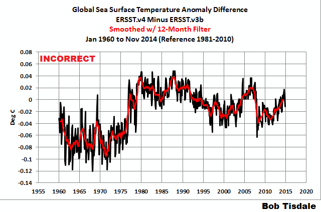
Figure 1
So HADSST3 is no long the only sea surface temperature dataset that’s corrected for ship-buoy bias.
SATELLITE-ERA COMPARISONS
But how do they compare during the satellite era, which has been the focus of my ENSO research and model-data comparisons over the past few years? See Figure 2.

Figure 2
ERSST.v4 has a slightly lower warming rate than the ERSST.v3b data. And as shown in Figure 3, the global sea surface temperature trend of the ERSST.v4 data is comparable to (very slight less than) the Reynolds OI.v2 data.

Figure 3
And if we compare the ERSST.v4 and Reynolds OI.v2 data excluding the polar oceans (60S-60N), we find the ERSST.v4 data has a slightly lower warming rate. See Figure 4.

Figure 4
Some people will find that surprising, because the ERSST.v4 data excludes satellite-based data.
ERSST.V4 DATA USES REYNOLDS OI.V2 DATA FOR QUALITY CONTROL AND AS A BASIS FOR INFILLING THE PAST
In Huang et al. (2014), under the heading of 4.3 SST quality control and SSTA quantification, they begin (where “STD” is “standard deviation” and “QC” is “quality control”) (my boldface):
The SST data are first screened using a QC procedure checking the differences between observations and first guess SSTs from ERSST.v3b. Those observations are rejected when they deviate from the first guess by more than 4 times STD. In ERSST.v4, the monthly SST STD is calculated using the weekly OISST.v2 from 1982 to 2011.
The use of the Reynolds OI.v2 data in the quality control procedure is further mentioned in the next quote.
The Reynolds OI.v2 data are being utilized to “train” the computer program that infills missing data over the full term of the new ERSST.v4 data. The method NOAA uses for infilling is called Empirical Orthogonal Teleconnections (EOT). Under the heading of (d) Spatially complete data to derive EOT patterns, Huang et al. (2014) write:
Monthly SSTs derived from weekly 1°×1° gridded OISST version 2 (OISST.v2; Reynolds et al. 2002), which is based on in situ and satellite observations, are used between 1982 and 2011 in ERSST.v4 to derive SST STD on a 2°×2° grid in the QC procedure and to derive EOTs.
NOAA APPARENTLY STILL CONSIDERS REYNOLDS OI.V2 DATA TO BE “A GOOD ESTIMATE OF THE TRUTH”
In Smith and Reynolds (2004) Improved Extended Reconstruction of SST (1854-1997), the authors stated about the Reynolds OI.v2 data (my boldface):
Although the NOAA OI analysis contains some noise due to its use of different data types and bias corrections for satellite data, it is dominated by satellite data and gives a good estimate of the truth.
We discussed this years ago. It is the primary reason I use Reynolds OI.v2 data in my monthly sea surface temperature data updates, in my ENSO research and in model-data comparisons. Obviously, a sea surface temperature dataset that’s “a good estimate of the truth” should be the dataset of choice in any discussion of sea surface temperatures over the past 3+ decades, the satellite era.
Now NOAA is using Reynolds OI.v2 data for quality control of ERSST.v4 and for EOT training for the infilling of that new dataset.
After ERSST.v4 replaces ERSST.v3b as the standard NOAA long-term sea surface temperature product, I’ll update the detailed introduction to all datasets. I started to write that post over the weekend, got into it a good way, but I realized I was getting the cart before the horse. We don’t yet have a final ERSST.v4 product.
Who knows? If the new ERSST.v4 data rearranges annual rankings in the 21st Century of the combined NOAA land+ocean surface temperature product, NOAA may change the ERSST.v4 data like they did the ERSST.v3 data.
Thank you again, Nick.
Cheers Bob and Nick,and a merry Christmas to you both. The season of good will among men is starting early .
[Snip. Sockpuppetry not allowed. ~mod.]
rooter, it’s nice to see you’re still trolling here at WUWT.
We’ve been through this before, and the fact that you’re repeating yourself simply broadcasts to everyone here that you can’t grasp the simple fact that a prolonged weather event in the North Pacific caused the record high sea surface temperatures in 2014. Most everyone here understands that, because we discussed it numerous times. For example:
https://bobtisdale.wordpress.com/2014/08/16/on-the-recent-record-high-global-sea-surface-temperatures-the-wheres-and-whys/
and:
https://bobtisdale.wordpress.com/2014/11/19/axel-timmermann-and-kevin-trenberth-highlight-the-importance-of-natural-variability-in-global-warming/
Just in case you want to repeat all of your nonsense from the last time, see my replies starting here:
http://wattsupwiththat.com/2014/12/17/researchers-find-northeast-pacific-surface-warming-1900-2012-caused-by-changes-in-atmospheric-circulation-not-manmade-forcings/#comment-1815924
I have no need to repeat myself for your entertainment.
Enjoy your holidays, rooter.
Adios, troll.
How would it even be possible to have record high sea surface temperatures in a particular year without there being one area that was warmer than the others, and for the proximate cause of that warmth to be a prolonged weather event?
Your argument on AGW seems to me to be like someone claiming that retail price inflation doesn’t exist because this year’s increase in retail prices can largely be explained by a sharp increase in the price of widgets, and as everyone knows, the widget price rose because the cost of labor increased and because of exchange rate effects on the cost of raw materials. There’s simply no role for this ridiculous “inflation” theory.
[Snip. Sockpuppetry not allowed. ~mod.]
Unless every square inch of the ocean warms at the same rate, AGW is falsified?
Nigel Harris, my posts clearly explain why, for the first time in 16 years, sea surface temperatures in 2014 exceed those in 1998. If there hadn’t been “retail price inflation” for 16 years, wouldn’t you be interested in knowing what caused a curious spike in 2014?
And, in addition to the contribution of the AMO in the North Atlantic, we (1) already know the 2000s are warmer than the 1990s because of the warm water released by the 1997/98 El Nino, and (2) already know the 1990s were warmer than the 1980s because of the warm water released by the 1986/87/88 El Nino, and already know the 1980s were warmer than the 1970s because of Pacific Climate Shift of 1976, which caused the sea surface temperatures of the entire east Pacific (from pole to pole) to shift upwards almost 0.2 deg C.
Enjoy your holidays, Nigel.
[Snip. Sockpuppetry not allowed. ~mod.]
Bob, you do not seem to make any mention of the approximately 0.7°C difference in temperatures before 1977 shown in Figure 1, or did I miss it?
A C Osbourn, the approximate 0.07 deg C difference (not 0.7 deg C) was the correction for buoy-ship bias.
Cheers.
Bob, I’m a little bit puzzled. Your 12 month smoothing graphs, seem to my eyeball to be quite coincident in time with the unfiltered data.
I’m used to low pass filters having a delay time that is of the order of the upper cutoff frequency time constant, so I sort of expected the red curve to be delayed from the black in your first graph.
So what am I missing ??
Isn’t ersst old English for “once upon a time.” ??
george e. smith, are you used to smoothing that’s trailing or centered? In my graphs the smoothing is centered unless noted otherwise.
Going by the 1960 to 2014 difference between V4 and V3b, they have increased the warming trend again as we would have expected since they do this with every new version of the data and in every monthly update as well. We should wait and see what the pre-1960 changes because they are probably all “cooling adjustments”.
The ENSO data provided is substantially different than previous values. There is now a warming trend of 0.048C per decade in the Nino 3.4 index (while it was 0.0C per decade previously). The Nino 3.4 index is “now” responding to global warming. Most of the changes are in the pre-1950 period.
They should not be adjusting the ENSO values because now all kinds of correlations with the climate will be undone. I would note that noone has made such large changes to the ENSO values before because of its importance and long history of actual measurements and relationships with the SOI/rainfall patterns etc.
Bill Illis says: “The ENSO data provided is substantially different than previous values. There is now a warming trend of 0.048C per decade in the Nino 3.4 index (while it was 0.0C per decade previously).”
Over what time period, Bill? I looked at the ERSST.v3b and ERSST.v4 versions of the NINO3.4 data starting in 1900, and both had warming trends, but the ERSST.v4 NINO3.4 trend was lower. I didn’t save the graph, sorry.
One can compare these Nino 3.4 values to the Kaplan SST values back to 1856.
http://iridl.ldeo.columbia.edu/SOURCES/.Indices/.nino/.EXTENDED/.NINO34/T+exch+table-+text+text+skipanyNaN+-table+.html
I don’t think changes of -2.0C or +1.5C’s should be allowed, nevermind the change in the overall trend..
http://s1.postimg.org/hp7blk8vz/Kaplan_minus_ERSST_V4_Nino_3_4.png
Thanks, Bill. Yup, Kaplan NINO3.4 SSTa have a negative trend from 1900 to present, ERSST.v3b and ERSST.v4 have a positive trend and HADISST has basically no trend. If we average the Kaplan, one of the ERSST, and the HADISST NINO3.4 SSTa, there’s no trend.
I have to say this year’s peak looks dodgy to me. For example it is the same year that saw record Great Lakes ice, a recovery in Arctic ice, record Antarctic ice, record northern hemisphere snow cover. Bob, you tell us, is that all compatible with record global sea temperatures?
In the Unisys sea surface temperature chart (don’t know its relationship to NOAA charts), it shows a 6-degree temperature anomaly between Iceland and Greenland, where satellite data shows sea ice.
I wonder what Steve McIntyre makes of it?
Bob-
Just hang on to the article so you can do a scan and replace for .v5, .v6., and .v7 when they come out. They will all show a cooling pre 1960 and a warming post so when the next la niña forms and the warm pool off Alaska cools they can keep us all worried.
Seriously, why have we gone through so many versions of this data anyway? The real problem with all these datasets is trust, and no one can trust anything anymore. Even you are comparing adjusted values to another set of adjusted values (to a fraction of a degree).
My suggestion is to change the Y scale on your chart (figure 2) to -1 to +1 and the plot will show just about what it should to the eye.. flat.
Bob
What assumptions underpin the adjustment?
Do they consider that ship’s data records SST too warm, or too cool, and why do they conclude this?
In particular, how do they consider ship’s sample ocean water temperature?
richard verney, there have been numerous studies over the years that document the differences in the temperatures (absolute) depending on the sampling method. Ship inlet temperatures are normally warmer than sea surface temperatures measured by buoys.
Bob
But ship’s inlet is drawn typically some 3m to 10m below the water line, so ship’s inlet is not measuring SST but rather ocean temperatures at depth.
I set out below a plot a general of ocean temperatures from SST through to about 10m depth. The first plot (a) is the night time temperature profile, and the second plot (b) is the day time temperature profile.
http://disc.sci.gsfc.nasa.gov/oceans/additional/science-focus/modis/MODIS_and_AIRS_SST_comp_fig2.i.jpg
It will be seen from this plot that SST is somewhat cooler than the initial layer through to about 50 microns. Thereafter, there is a material distinction between the night time temperatures profile and the day time temperature profile.
The night time temperature profile shows that ocean temperature remains constant from about 1mm through to about 4m, whereafter it begins to cool. May be at about a 7m depth, it is much the same as SST, but at a deeper depth, ocean temperature is certainly significantly cooler than SST.
The day time temperature is very different. Even below 1mm, it rapidly cools. Water drawn from 3m below the surface will be very much cooler than SST, and water drawn at 10 m depth even cooler still.
So my question is how is this taken into account?
Every ship draws a different draft and is therefore sampllng ocean temperatures somewehere between 2m to perhaps 20m below surface (althogh 3 to 10m will be typical depending upon the laden condition of a vessel and how it is being ballasted and trimmed) and not SST.
How is the data from ships divided into daytime reporting and nightime reporting? after all the temperature profile of the ocean is very different between day and night.
It seems to me that without extensive information, and a very high degree of quality control, one cannot make a reasonable adjustment to take account that ships are fundamentally sampling something other than SST.
Seawater “surface” temperature measured from ship cooling intake appears to be more complicated. For example, this reference:
http://www.brighthubengineering.com/marine-engines-machinery/41043-procedure-of-sw-pump-sea-chest-cleaning/
notes two sea suctions:
“The system consists of usually 2 sea suctions. One is high and the other is low sea suction. These act as a gate so that sea water enters the engine room through pipelines & valves in a controlled manner.”
To further complicate the matter, the seawater being drawn in at any specified depth would only apply if the ship were dead in the water in a calm sea. A moving ship (or sea) would cause turbulent mixing of the seawater near the hull, so the sea suction would be a mixed sample of the sea water and its temperature gradient.
Keith says: “I have to say this year’s peak looks dodgy to me. For example it is the same year that saw record Great Lakes ice, a recovery in Arctic ice, ridiculously resilient ridge . Bob, you tell us, is that all compatible with record global sea temperatures?”
Everything should run hand in hand. The record high global sea surface temperatures were caused by a prolonged weather event in the eastern extratropical North Pacific. There are a number of things associated with that weather event, including the “blob” (hotspot in the sea surface temperatures there which is the primary cause of record high global sea surface temperatures), and the “ridiculously resilient ridge”. The ridiculously resilient ridge has been said to have shifted the polar jet, bringing cold temperatures to the Great Lakes–thus your “record Great Lakes ice”. One would think it was likely that the ridiculously resilient ridge also contributed to “recovery of Arctic ice”.
We discussed the record high sea surface temperatures a number of times.
https://bobtisdale.wordpress.com/2014/08/16/on-the-recent-record-high-global-sea-surface-temperatures-the-wheres-and-whys/
and:
https://bobtisdale.wordpress.com/2014/11/19/axel-timmermann-and-kevin-trenberth-highlight-the-importance-of-natural-variability-in-global-warming/
and:
https://bobtisdale.wordpress.com/2014/12/04/did-enso-and-the-monster-kelvin-wave-contribute-to-the-record-high-global-surface-temperatures-in-2014/
Cheers
[Snip. Sockpuppetry not allowed. ~mod.]
Again, rooter, you’re wasting your trollish time here by boringly repeating yourself. You haven’t the slightest idea what’s being discussed or has been discussed here at WUWT.
See my reply to you
http://wattsupwiththat.com/2014/12/17/researchers-find-northeast-pacific-surface-warming-1900-2012-caused-by-changes-in-atmospheric-circulation-not-manmade-forcings/#comment-1815924
Once again, good-bye, troll.
[Snip. Sockpuppetry not allowed. ~mod.]
My trouble with this is that the data keepers are quick to adopt Cowtan and Way’s increased global warming adjustment because of undersampling of the polar amplified temperatures (HadCrut 4, etc.) in the global average temperatures, but happily eliminate higher latitudes than 60N and S. Why isn’t the Arctic sea surface temperature an annual average, whether there is ice or not? Its averages about -25 right now and about 5C in the summer. Hey its part of the surface record and it would engulf Cowtan and Way’s estimates.
Also, has no one noticed the ‘official Arctic SSTs themselves have peaked and are declining since 2005? I’ve been asking here if it isn’t time to analyze this record. They give a warming trend of 0.323K per decade as their support for Arctic warming and its now down near 1980 levels. The trouble with this linear is that
ftp://ftp.ssmi.com/msu/graphics/tlt/plots/rss_ts_channel_tlt_northern%20polar_land_and_sea_v03_3.png
even if it stays at 1980 levels for another 5 years, the linear will still be, perhaps 0.25K uptrend per decade! These guys are quick to use short term data when they want to hype (announcing prematurely 2014 as the hottest year of the last couple of millennia, knowing they will have to ‘revise’ this later). but use linear tricks to “hide the decline”. Bob, why don’t you take this graph and analyze it like the global. Perhaps you even have the data to give us an average tempreature of the the two polar regions higher thatn 60 lat.
Merry Christmas “Saint” Nick! May you have a wonderful year, and oh yeah, You too Bob! 🙂
Wishing I was in a nice boat on a warm tropical sea somewhere fishing or loafing….
Bob,
Formation of ice releases energy. The increases in average Arctic and other regional ice would be expected to slightly raise the temperature. I do not know if this is a large enough contribution but should be considered.
Leonard, excellent question, I have raise this before and wondered how significant ice formation/melting relative to other factors. Fo0r the most part it seems to be ignored. I assume that much of the heat would go into the water versus the air but that might not be correct. It seems to me that ice increase or decline is likely a tempering effect on the global temperatures during warming or cooling. The question is how significant an impact is it actually and why is it ignored?
the heat is released upward into the dark night sky. Freezing of sea water takes place at ~ 271.5 K. The air or the ice layer above is much colder than that typically in the arctic when ice is forming. The water is slightly warmer below the surface. So by the 2nd Law of Thermodynamics, the heat is conducted up through the ice layer as the water ice interface freezes, then the ice radiates heat away as IR into the cold sky. It cannot warm the water below.
I don’t get the obsession to infill missing information and then include it as data. Perhaps I need to do this exercise myself to prove how valuable it is.
Dave,
You might feel a little more inclined to do it if your future paychecks depended on it…. Just sayin’.
It looks very much that the ‘pause’ has stopped and global warming has resumed, regardless of whatever excuses people would find to explain why it has not…
Yes, I guess if you squint and cherry-pick enough it has.
Warmer is bettter than colder… I hope you are right!
“Hasty generalization is an informal fallacy of faulty generalization by reaching an inductive generalization based on insufficient evidence”
Yes, YOU should know.
The pause is still going strong for the satellite records, but not the others.
The real question is why has the warming paused for such a long period while CO2 levels continued to increase; thus raising the question of how much is warming linked to CO2 versus other drivers.
Leif is this warming any different than other warming during the Holocene and much higher temps of the Eemian etc? If not then what do you think has caused this post LIA warming? Thanks.
‘data have been adjusted for ship ‘. remind me how much accuracy there actual is over ‘ship based biased ‘given the number of ships and variations in measurements?
Or are we once again we are being treated to models layered on models
And although ship based sounds good , in pratice you looking at shipping lanes to and form major ports which means the vast majority of the sea has no or little ‘ship based coverage’
Therefore , once again we are treated to the approach of using one grain of sand form one beach to represent all gains of sand form all beaches because this approach is at least ‘better than nothing ‘
I wholeheartedly agree. In engineering school we learn how to handle data, and in “Climate Science” they cheerfully, daily, repeatedly break ALL the rules about handling data. “Data have been adjusted…” over and over, generating information we simply don’t have. How many angels CAN dance on the head of a pin??? Inquiring minds want to know…
The answer is that ship’s data is very inaccurate, and materially it is not measuring SST.
Ship’s draw their inlet manifold water temperature from an apperature well below the unladen water line. However, a ship will rarely be completely unladen since even when not carrying cargo, the ship will have on board bunkers, stores and other constants. Further, the vessel will usually be ballasted and usually trimmed to the stern. All of this alters the depth at which the inlet water is drawn. The depth is evben more fundamentally altered once the vessel takes on board cargo.
Typically, a ship’s inlet water is drawn some 3m to 10m below the water line, so ship’s inlet is not measuring SST but rather ocean temperatures at a depth of somewhere between 3 and 10m. that is quite a difference, and this difference becomes particularly materail when one considers how oceans behave during the diurnal cycles..
I set out below a plot a general of ocean temperatures from SST through to about 10m depth. The first plot (a) is the night time temperature profile, and the second plot (b) is the day time temperature profile.
http://disc.sci.gsfc.nasa.gov/oceans/additional/science-focus/modis/MODIS_and_AIRS_SST_comp_fig2.i.jpg
It will be seen from this plot that SST is somewhat cooler than the initial layer through to about 50 microns. Thereafter, there is a material distinction between the night time temperatures profile and the day time temperature profile.
The night time temperature profile shows that ocean temperature remains constant from about 1mm through to about 4m, whereafter it begins to cool. May be at about a 7m depth, it is much the same as SST, but at a deeper depth, ocean temperature is certainly significantly cooler than SST. It should be born in mind that many vessels will be sampling water from a depth well below 7m below SST.
The day time temperature profile is very different. Even below 1mm, it rapidly cools. Ocean temperatures are cooler than SST cnce a depth of 30 about cm has been reached. Water drawn from 3m below the surface will be very much cooler than SST, and water drawn at 10 m depth even cooler still.
It would appear likely that the adjustment between buoy temperatures and ship temperature data is just cobbled together without a proper analysis being undertaken as to what each is measuring. It seems likely that the adjustments are hiked up because this is the gate keeper’s bias, not because a detailed analysis of the data demands such an adjustment.
It seems to me that without extensive information, and a very high degree of quality control, one cannot make a reasonable adjustment to take account that ships are fundamentally sampling something other than SST.
Richard Verney,
Your data needs a temp. scale. I believe that the two plots are on separate and much different scaling for temp.
Has the ship hit the fan?
By their own admission, data collected today is 90% buoy and with buoy’s with precision temperature measurements. They then adjust that good data with spatially biased, lower resolution, ship data.
Congress: “Tell me again, NOAA, why we paid for that state-of-the-art pristine buoy network if you find it necessary to adulterate it with temperatures that are SHIP?”
Stephen: It’s 6 of one, half a dozen of the other. You can shift the buoy data up or the ship data down. There are few years of buoy data to contend with, so that’s why they adjust buoys relative to the ships.
knr,
Do you approve of Bob T’s post please?
Bob:
Thanks as always for your interesting and informative posts. I’m curious about the adjustment decision however.
If the trend in ship vs. buoy data collection continues we will eventually reach the point if we haven’t already where total buoy data points are many times total ship data points. At that point if you continue to adjust buoy data to match ship data isn’t the tail wagging the dog? I don’t suppose ship data points will ever drop to zero, but if the imbalance becomes great enough, isn’t the argument used above to justify not adjusting the ship data — because there is not contemporaneous set of buoy data — just going to come back around and bite you in the rear? That is, how will NOAA continue to justify adjusting the buoy data to match the ship readings when, relatively speaking, they have so few to go by?
Also, how does the location distribution of the ship and buoy data compare?
auto-correct error above. For “NOAH” please substitute “NOAA”.
Alan Watt, Climate Denialist Level 7 says, “If the trend in ship vs. buoy data collection continues we will eventually reach the point if we haven’t already where total buoy data points are many times total ship data points.”
Buoy samples already outweigh ship samples by roughly 10 to 1.
Alan Watt, Climate Denialist Level 7 says, “At that point if you continue to adjust buoy data to match ship data isn’t the tail wagging the dog?”
It’s 6 of one, half a dozen of the other. You can shift the buoy data up or the ship data down. There are few years of buoy data to contend with, so that’s why they adjust buoys relative to the ships.
I’m not getting that. Aren’t the buoys more accurate than the ships? So if you change the buoys to match the ships you are making them more inaccurate.
Bob Clark
I would agree that shipping lanes may not be representative of the ocean as being a very blobbly, globby movement of multilayered gyres, current meanderings, and the stored heat that is carried along. These systems sometimes pool up, sometimes spread out, and even speed up, or slow down, on different short and longer term time scales and locations.
Thus it would be reasonable to speculate on the non-homogeneity of shipping lanes, as well as moored and drifting buoys when compared to the entire ocean breadth and depth. In addition, satellite orbit drift must always be considered. However, ultimately, none of these measuring systems have been used routinely to identify the source of any anomaly. They all leave an unspoken question. Where does the change in heat come from?
There are few in the accepted rank and file publishing peer reviewed climatologists who are considering this question with any but “drank the cool-aid” bias.
“Adjusted,” “Infilled,” and “Extrapolated” values are NOT data…!
…but it _IS_ data! Data they create to keep the “big lie” going.
Definition Time: Propaganda is information that is not impartial and used primarily to influence an audience and further an agenda, often by presenting facts selectively to encourage a particular synthesis, or using loaded messages to produce an emotional rather than rational response to the information presented.
[Snip. Sockpuppetry not allowed. ~mod.]
rooter, you overlooked that fact that Reynolds OI.v2 also use bias-adjusted satellite data, so there’s very little infilling. Once again, rooter, you’re showing your ignorance or your willingness to mislead or both.
[Snip. Sockpuppetry not allowed. ~mod.]
If you read Dr. Svalgaard’s comments you may remember that the sunspot cycle is responsible for + or – 0.1 degree Celsius.
Last year or two 0.1C rise in the SST (see Fig. 2) is exactly what is expected from rise in the solar activity since we are currently approaching SC24max.
No, the sunspot cycle variation from min to max is of the order of 0.07C for an average cycle and less for cycle 24. And there is no such thing as ‘exactly’ in this business. Furthermore the SST increased 0.4C since the minimum in 2008. Not due to the Sun at all.
I love you guys! (Vukcevic and lsvalgaard)
Higher SST is due to increased insolation, Leif, because of reduced cloud albedo, this shown by the cloud data.
Also, there is data which shows a stepdown in stratospheric temp. with both El Chincon and Pinatubo, both.
This can be interpreted as a leading to an increased insolation.
SST is not affected by the GHE, the sea surface being opaque to IR.
The late warming trend circa 1980-97 can be explained in terms of increased insolation, with solid data to back this up.
To the contrary, as Dr. Svalgaard points out the TSI for the SC24 has been considerably higher than what sunspot count (or F10.7 – microwave flux, the SSN’s equivalent) would suggest, ergo: solar warming would be also proportionally higher.
http://www.leif.org/research/TSI-not-following-SSN-F107.png
If the “Pause” is over it’s only because the Cooling has begun.
Some more light reading for you Bob. Merry Christmas http://www.nature.com/ngeo/journal/vaop/ncurrent/pdf/ngeo2321.pdf
Why don’t they just say ENSO?
Thanks, Andrew. This’ll make a worthwhile post.
I am reminded of this old Don Martin Cartoon: In the delicatessin… “Don’t ‘exactly one pound ‘ Me, you thief. I can see your FINGER on the scale!
http://pencilholder.files.wordpress.com/2011/06/completely_mad_don_martin_p045.jpg
(I tried to paste the cartoon, had to settle for a link.)
A little O/T but not by much: … ocean acidification research fraud
http://junkscience.com/2014/12/22/marita-discusses-an-ocean-acidification-research-fraud/
Gow reliable the guy is when he presents no data and no reference source.
Ask him.
Maybe you can follow the links too ? http://www.americanthinker.com/blog/2014/12/evidence_discovered_that_ocean_acidification_scare_may_be_as_fraudulent_as_global_warming.html
Bob,
Thanks for alerting me to ERSST v4, and for this post. Glad to have been able to help. I’m keeping a maintained set of monthly data here; I’ll add global ERSSTv4 and add a data download facility, which should keep it up to date.
Thanks for your help and the link, Nick.
Thanks for the link, Andrew !
More wriggly lines.
So is the sea boiling hot or not? And the small furry animals in my mind want to know whether pigs have …
[trimmed, off-subject. .mod]
Thanks to Richard G for posting the Don Martin cartoon “I can see your finger on the scale”. Much of the data from NOAA and other government and grant-funded entities have a finger on the scales. Indeed, they seem to be scripted right out of a Mad Magazine from the 60s.
I’ll say this for MAD. They may have been your typical NYC leftists, but they made an honest and persistent attempt to poke fun at both sides. Sometimes their biases crept through, but only occasionally and only a little. They really and honestly tried.
Sometimes they were just plain wrong (e.g., their “then and now” series), but they were always in there pitching and they were no worse with spitballs than most, and better than some.
Surface Marine Observations by ships of opportunity were intended to provide data only for synoptic analyses–not for scientific climate variability studies. Being taken 4 times daily in constantly varying locations on the oceans, SMOs provide very tenuous basis for constructing unaliased time series at any given patch of ocean even when the data coverage is dense. Such density is available only in well-traveled sea lanes.
That NOAA should take such tenuous constructions as the basis for adjusting buoy data obtained at fixed locations stands the data reliability question on its head. It’s symptomatic of the propensity for manufacturing indices to suit a politically predetermined narrative.
But I wanted to present graphs of ERSST.v4 data in a post, so I turned to someone who comments regularly at WattsUpWithThat and who most people would not consider a climate skeptic, Nick Stokes. On this matter, Nick Stokes is as close to an independent third party as I can think of. Nick was more than happy to examine new sea surface temperature data, and he did so for the period of 1960 to 2014. (Thank you, Nick, for your assistance.)
THANK you, Bob! And thank YOU, Nick.
This is what comes of getting both sides together to look at AGW and its associated issues. This is what I have been banging on about for all these months.
“Although buoy SSTs are generally more homogeneous than ship SSTs, they are adjusted here because otherwise it would be necessary to adjust ship SSTs before1980 when there were no or very few buoys”
YGBSM right? We’ve deployed built for purpose more accurate, more precise instruments, We then adjust that data to match the not built for purpose, less precise, less accurate predecessor, because we don’t like the answer? It’s like adding atmospheric distortion to Hubble images to make them consistent with ground based imaging.
It could be a perfectly good world to live on except the data suggests that it isn’t.
Having ACCURATE sea surface temperatures is very important because of the connection of warm sea surface temperatures with the development of hurricanes. The lack of strong, category 3 and above, Atlantic hurricanes that made U.S. landfall over the last few years led me to wonder if perhaps the seas in the Atlantic were cooling.
See the discussion in this post on the TalkWeather.com forum:
Why the lack of Major U.S. Landfalling Hurricanes?
Started by zinski1990 , Jun 28 2014 03:47 PM
http://www.talkweather.com/forums/index.php?/topic/60362-why-the-lack-of-major-us-landfalling-hurricanes/
However, the reports I’ve seen suggested the Atlantic sea surface temperatures were warming. Therefore I was surprised when I found this article after a web search:
Liam Dutton on Weather
Friday 22 Aug 2014
Why is the 2014 Atlantic hurricane season so quiet?
“Sea surface temperatures
“One of the main requirements for a hurricane to form is for sea surface temperatures to be 26C or higher. This provides a fuel source for the storm to grow and become more powerful, drawing up tropical moisture into the atmosphere.
“However, this season, sea surface temperatures have been below normal in the central Atlantic ocean by around 1-2C in places.”
http://blogs.channel4.com/liam-dutton-on-weather/wp-content/uploads/sites/27/2014/08/atlantic_sstanomaly_NOAA_wp.jpg
“So while the water is still warm enough for storms to form, the potential supply of energy for any storms to thrive upon is reduced.”
http://blogs.channel4.com/liam-dutton-on-weather/2014-atlantic-hurricane-season-quiet/
This exemplifies how dismaying it is that we don’t have accurate and reliable large scale temperature data. We can never be sure because of how politicized has become the global warming debate that every time scientists perform their temperature “adjustments” if they are really making the data more accurate or just making it to fit their own idea of what the temperature should be doing.
Another interesting possibility to explain the hurricane mystery is suggested by the fact there have been strong hurricanes that formed in the Atlantic the last few years but they have veered off before making U.S. landfall. Then perhaps it’s just that the temperatures off the east coast of the U.S. have been lower than usual the last few years during the prime hurricane season.
For instance see this graphic showing Atlantic temperatures off the U.S. east coast:
http://www.ospo.noaa.gov/data/sst/contour/usatlant.cf.gif
However, this graphic is just showing the current, late December, temperatures. I need to see the temperatures during the hurricane season of August and September if anyone knows how to locate those on the noaa.gov site.
Bob Clark
Why would anyone have confidence in the temperature data published by US government agencies when people have been warned enough times about the role of government agencies in corrupting the data, for example, as explained in the following announcement on US TV:
What justification does NOAA give for cutting down the number of thermometer stations from 6,000 to 1,000?
Also, there are so many private professional and amateur meteorological stations throughout the world such as in TV and radio stations, and schools and universities, couldn’t they average these hundreds of thousands of measurements to get very localized measurements throughout the world?
Bob Clark