Guest Post by Werner Brozek Edited by Just The Facts:

In the above graphic, the green line is RSS from 1990 with a mean of 12 which means that you continually see the average of 12 values. It has been offset so that the average red height equals the average green height. The red line is GISS with a mean of 12. If HADCRUT4.3 could be shown, it would be similar to GISS. And if UAH, version 5.5 were shown, it would be similar to RSS.
Note the spikes in both the red and green lines in 1998 and 2010. Then note where the red (GISS) line is at the end relative to the 1998 and 2010 spikes. Since it is almost in the same place, there is a very real chance that GISS will set a record, but if not, it will certainly be in the top three in a statistical tie. Something very similar could be said for HADCRUT4.3 except I expect it to end up first or second.
Now note the green (RSS) line at the end. It is way lower than the green spikes in 1998 and 2010. At the moment, RSS is in seventh place and there is no realistic chance that it will end up anywhere else except for sixth or seventh or eighth place. The same could be said for UAH, version 5.5. However I would also like to add the following. Dr. Spencer provided very interesting additional information with his November update.
It shows that the value on November 30 is about 0.18 C below the average of 0.33 for November. I have no idea what has happened since and I realize this applies to version 5.6 only, however due to the way the numbers can vary month to month, I can not rule out that UAH version 5.5 may not end up as low as ninth or tenth.
I realize that the year is not over yet, however once you have the averages for 11 months, then there are real restrictions on how much December can still change things. For every 0.12 C that the December anomaly is above or below the 11 month average, the yearly average will only go up or down by 0.01 C. Furthermore, with the ENSO meter showing what it does, there is unlikely to be a huge spike in December in either direction.
The UAH, version 5.5 average after 11 months is 0.201 and the record is 1998 at 0.419. If we assume the December anomaly will not be more than 0.12 C above or below the present average, then UAH, version 5.5 should come in from sixth to eighth. However, as I mentioned above, due to the low start in December, it may even be ninth or tenth. April 1998 had an anomaly of 0.662. No monthly anomaly came close in 2014 with the largest being 0.279 in June.
The UAH, version 5.6 average after 11 months is 0.267 and the record is 1998 at 0.419. If we assume the December anomaly will not be more than 0.12 C above or below the present average, then UAH, version 5.6 should come in third or fourth. April 1998 had an anomaly of 0.663. No monthly anomaly came close in 2014 with the largest being 0.365 in October.
The RSS average after 11 months is 0.253 and the record is 1998 at 0.550. If we assume the December anomaly will not be more than 0.12 C above or below the present average, then RSS should come in from sixth to eighth. April 1998 had an anomaly of 0.857. No monthly anomaly came close in 2014 with the largest being 0.351 in July.
The GISS average after 11 months is 0.67 and the record is 2010 at 0.66. If we assume the December anomaly will not be more than 0.12 C above or below the present average, then GISS should come in first or second. However, when one considers how old GISS numbers jump around every month, I will not rule out third. When considering error bars, it would probably be more accurate to say that 2014 will be in a three way tie for first place. GISS is unlikely to set an all time monthly record in 2014. January 2007 had an anomaly of 0.92. The highest GISS anomaly, at least so far in 2014, is 0.81 in September.
The HaADCRUT4.3 average after 10 months is 0.565 and the record is 2010 at 0.555. November is not out yet, however I do not expect to see the average being below 0.555 when it does come out. I expect HADCRUT4.3 to be either first, second or third by the end of the year. Hadcrut4.3 will likely not set an all time monthly record in 2014. January 2007 had an anomaly of 0.835. The highest HADCRUT4.3 anomaly, at least so far in 2014, is 0.669 in August.
The HADSST3 average after 11 months is 0.482 and the old record is in 1998 at 0.416. HADSST3 will definitely set a new record in 2014. The previous monthly record was July 1998 at 0.526. The five months from June to October all beat this mark. The highest was 0.644 in August.
In the sections below, as in previous posts, we will present you with the latest facts. The information will be presented in three sections and an appendix. The first section will show for how long there has been no warming on some data sets. At the moment, only the satellite data have flat periods of longer than a year. The second section will show for how long there has been no statistically significant warming on several data sets. The third section will show how 2014 to date compares with 2013 and the warmest years and months on record so far. The appendix will illustrate sections 1 and 2 in a different way. Graphs and a table will be used to illustrate the data.
Section 1
This analysis uses the latest month for which data is available on WoodForTrees.com (WFT). All of the data on WFT is also available at the specific sources as outlined below. We start with the present date and go to the furthest month in the past where the slope is a least slightly negative. So if the slope from September is 4 x 10^-4 but it is – 4 x 10^-4 from October, we give the time from October so no one can accuse us of being less than honest if we say the slope is flat from a certain month.
1. For GISS, the slope is not flat for any period that is worth mentioning.
2. For Hadcrut4, the slope is not flat for any period that is worth mentioning. Note that WFT has not updated Hadcrut4 since July and it is only Hadcrut4.2 that is shown.
3. For Hadsst3, the slope is not flat for any period that is worth mentioning.
4. For UAH, the slope is flat since June 2008 or 6 years, 6 months. (goes to November using version 5.5)
5. For RSS, the slope is flat since October 1996 or 18 years, 2 months (goes to November).
The following graph shows just the lines to illustrate the above. Think of it as a sideways bar graph where the lengths of the lines indicate the relative times where the slope is 0. In addition, the upward sloping blue line at the top indicates that CO2 has steadily increased over this period.
 - 1979 to Present")
When two things are plotted as I have done, the left only shows a temperature anomaly.
The actual numbers are meaningless since the two slopes are essentially zero. No numbers are given for CO2. Some have asked that the log of the concentration of CO2 be plotted. However WFT does not give this option. The upward sloping CO2 line only shows that while CO2 has been going up over the last 18 years, the temperatures have been flat for varying periods on the two sets.
Section 2
For this analysis, data was retrieved from Nick Stokes’ Trendviewer available on his website <a href=”http://moyhu.blogspot.com.au/p/temperature-trend-viewer.html”. This analysis indicates for how long there has not been statistically significant warming according to Nick’s criteria. Data go to their latest update for each set. In every case, note that the lower error bar is negative so a slope of 0 cannot be ruled out from the month indicated.
On several different data sets, there has been no statistically significant warming for between 14 and 22 years according to Nick’s criteria. Cl stands for the confidence limits at the 95% level.
Dr. Ross McKitrick has also commented on these parts and has slightly different numbers for the three data sets that he analyzed. I will also give his times.
The details for several sets are below.
For UAH: Since June 1996: CI from -0.016 to 2.245
(Dr. McKitrick says the warming is not significant for 16 years on UAH.)
For RSS: Since December 1992: CI from -0.018 to 1.761
(Dr. McKitrick says the warming is not significant for 26 years on RSS.)
For Hadcrut4.3: Since May 1997: CI from -0.015 to 1.146
(Dr. McKitrick said the warming was not significant for 19 years on Hadcrut4.2 going to April. Hadcrut4.3 would be slightly shorter however I do not know what difference it would make to the nearest year.)
For Hadsst3: Since December 1994: CI from -0.007 to 1.723
For GISS: Since February 2000: CI from -0.043 to 1.336
Note that all of the above times, regardless of the source, with the exception of GISS are larger than 15 years which NOAA deemed necessary to “create a discrepancy with the expected present-day warming rate”.
Section 3
This section shows data about 2014 and other information in the form of a table. The table shows the five data sources along the top and other places so they should be visible at all times. The sources are UAH, RSS, Hadcrut4, Hadsst3, and GISS.
Down the column, are the following:
1. 13ra: This is the final ranking for 2013 on each data set.
2. 13a: Here I give the average anomaly for 2013.
3. year: This indicates the warmest year on record so far for that particular data set. Note that two of the data sets have 2010 as the warmest year and three have 1998 as the warmest year.
4. ano: This is the average of the monthly anomalies of the warmest year just above.
5. mon: This is the month where that particular data set showed the highest anomaly. The months are identified by the first three letters of the month and the last two numbers of the year. Note that this does not yet include records set so far in 2014 such as Hadsst3 in June, etc.
6. ano: This is the anomaly of the month just above.
7. y/m: This is the longest period of time where the slope is not positive given in years/months. So 16/2 means that for 16 years and 2 months the slope is essentially 0. Periods of under a year are not counted and are shown as “0”.
8. sig: This the first month for which warming is not statistically significant according to Nick’s criteria. The first three letters of the month are followed by the last two numbers of the year.
9. sy/m: This is the years and months for row 8. Depending on when the update was last done, the months may be off by one month.
10. McK: These are Dr. Ross McKitrick’s number of years for three of the data sets.
11. Jan: This is the January 2014 anomaly for that particular data set.
12. Feb: This is the February 2014 anomaly for that particular data set, etc.
22. ave: This is the average anomaly of all months to date taken by adding all numbers and dividing by the number of months.
23. rnk: This is the rank that each particular data set would have if the anomaly above were to remain that way for the rest of the year. It may not, but think of it as an update 55 minutes into a game. Due to different base periods, the rank is more meaningful than the average anomaly.
| Source | UAH | RSS | Had4 | Sst3 | GISS |
|---|---|---|---|---|---|
| 1.13ra | 7th | 10th | 9th | 6th | 6th |
| 2.13a | 0.197 | 0.218 | 0.492 | 0.376 | 0.59 |
| 3.year | 1998 | 1998 | 2010 | 1998 | 2010 |
| 4.ano | 0.419 | 0.55 | 0.555 | 0.416 | 0.66 |
| 5.mon | Apr98 | Apr98 | Jan07 | Jul98 | Jan07 |
| 6.ano | 0.662 | 0.857 | 0.835 | 0.526 | 0.92 |
| 7.y/m | 6/6 | 18/2 | 0 | 0 | 0 |
| 8.sig | Jun96 | Dec92 | May97 | Dec94 | Feb00 |
| 9.sy/m | 18/6 | 22/0 | 17/6 | 19/11 | 14/9 |
| 10.McK | 16 | 26 | 19 | ||
| Source | UAH | RSS | Had4 | Sst3 | GISS |
| 11.Jan | 0.236 | 0.260 | 0.508 | 0.342 | 0.68 |
| 12.Feb | 0.127 | 0.160 | 0.305 | 0.314 | 0.43 |
| 13.Mar | 0.137 | 0.213 | 0.548 | 0.347 | 0.70 |
| 14.Apr | 0.184 | 0.251 | 0.658 | 0.478 | 0.71 |
| 15.May | 0.275 | 0.286 | 0.596 | 0.477 | 0.77 |
| 16.Jun | 0.279 | 0.346 | 0.620 | 0.563 | 0.60 |
| 17.Jul | 0.221 | 0.351 | 0.543 | 0.551 | 0.49 |
| 18.Aug | 0.117 | 0.192 | 0.669 | 0.644 | 0.74 |
| 19.Sep | 0.186 | 0.205 | 0.593 | 0.574 | 0.81 |
| 20.Oct | 0.242 | 0.274 | 0.613 | 0.528 | 0.76 |
| 21.Nov | 0.212 | 0.246 | 0.483 | 0.65 | |
| Source | UAH | RSS | Had4 | Sst3 | GISS |
| 22.ave | 0.201 | 0.253 | 0.565 | 0.482 | 0.67 |
| 23.rnk | 7th | 7th | 1st | 1st | 1st |
If you wish to verify all of the latest anomalies, go to the following:
For UAH, version 5.5 was used since that is what WFT uses.
http://vortex.nsstc.uah.edu/public/msu/t2lt/tltglhmam_5.5.txt
For RSS, see: ftp://ftp.ssmi.com/msu/monthly_time_series/rss_monthly_msu_amsu_channel_tlt_anomalies_land_and_ocean_v03_3.txt
For Hadcrut4, see: http://www.metoffice.gov.uk/hadobs/hadcrut4/data/current/time_series/HadCRUT.4.3.0.0.monthly_ns_avg.txt
For Hadsst3, see: http://www.cru.uea.ac.uk/cru/data/temperature/HadSST3-gl.dat
For GISS, see:
http://data.giss.nasa.gov/gistemp/tabledata_v3/GLB.Ts+dSST.txtTo see all points since January 2014 in the form of a graph, see the WFT graph below. Note that Hadcrut4 is the old version that has been discontinued. WFT does not show Hadcrut4.3 yet.

As you can see, all lines have been offset so they all start at the same place in January 2014. This makes it easy to compare January 2014 with the latest anomaly.
Appendix
In this part, we are summarizing data for each set separately.
RSS
The slope is flat since October, 1996 or 18 years, 2 months. (goes to November)
For RSS: There is no statistically significant warming since December 1992: CI from -0.018 to 1.761.
The RSS average anomaly so far for 2014 is 0.253. This would rank it as 7th place if it stayed this way. 1998 was the warmest at 0.55. The highest ever monthly anomaly was in April of 1998 when it reached 0.857. The anomaly in 2013 was 0.218 and it is ranked 10th.
UAH
The slope is flat since June 2008 or 6 years, 6 months. (goes to November using version 5.5 according to WFT)
For UAH: There is no statistically significant warming since June 1996: CI from -0.016 to 2.245. (This is using version 5.6 according to Nick’s program.)
The UAH average anomaly so far for 2014 is 0.201. This would rank it as 7th place if it stayed this way. 1998 was the warmest at 0.419. The highest ever monthly anomaly was in April of 1998 when it reached 0.662. The anomaly in 2013 was 0.197 and it is ranked 7th.
HADCRUT4.3
The slope is not flat for any period that is worth mentioning.
For HADCRUT4: There is no statistically significant warming since May 1997: CI from -0.015 to 1.146.
The HADCRUT4 average anomaly so far for 2014 is 0.565, but this is after only ten months. This would rank it as 1st place if it stayed this way. 2010 was the warmest at 0.555. The highest ever monthly anomaly was in January of 2007 when it reached 0.835. The anomaly in 2013 was 0.492 and it is ranked 9th.
HADSST3
For HADSST3, the slope is not flat for any period that is worth mentioning. For HHADSST3: There is no statistically significant warming since December 1994: CI from -0.007 to 1.723.
The HADSST3 average anomaly so far for 2014 is 0.482. A new record is guaranteed. 1998 was the warmest at 0.416 prior to 2014. The highest ever monthly anomaly was in July of 1998 when it reached 0.526. This is also prior to 2014. The anomaly in 2013 was 0.376 and it is ranked 6th.
GISS
The slope is not flat for any period that is worth mentioning.
For GISS: There is no statistically significant warming since February 2000: CI from -0.043 to 1.336.
The GISS average anomaly so far for 2014 is 0.67. This would rank it as first place if it stayed this way. 2010 was the warmest previously at 0.66. The highest ever monthly anomaly was in January of 2007 when it reached 0.92. The anomaly in 2013 was 0.59 and it is ranked 6th.
Conclusion
Here are my projections for final rankings in 2014 for six data sets.
UAH version 5.5: from sixth to tenth inclusive
UAH version 5.6: third or fourth
RSS: from sixth to eighth inclusive
GISS: First, second or third
HADCRUT4.3: First, second or third
HADSST3: First
Discover more from Watts Up With That?
Subscribe to get the latest posts sent to your email.
….keep your eye on the pea
How about a summary in English? I’m not a scientist. I’m just someone very interested in the climate debate. Could you translate?
Yes, I asked for just such a thing on Bob Tisdale’s piece earlier today. I very much hope that Anthony will ask contributors to put a summary of what has been said at the end of every piece. Some of us just haven’t the time, nor the knowledge to take in some of the info provided. It’s always the best thing about a science paper, that you can read the ‘conclusion’ or ‘abstract’ at the bottom. It summarises the Paper and is very often easily understandable.
What say you, Anthony?
Many people claim that 2014 will be the hottest year on record. And according to some data sets that measure temperatures on the ground, such as Hadcrut4 and GISS, 2014 is indeed about 0.01 C warmer than 2010 after 11 months, the previous warm year on these data sets. However we also have temperatures being measured near the ground indirectly using satellites. These satellites indicate that we are no where close to a record this year and that 1998 will still remain the satellite record high year.
GSS 1/10 of a degree warmer than 2010.
But isn’t the measurement error at least that large?
That should be possibly 1/100 of a degree warmer. And the measurement error is about 10 times larger at around 0.1. And if the top 10 are within 0.1 of each other, it would be more accurate to say we have a 10 way tie for first place.
The “average” is not a measurement. It is a number that represents a set of numbers. It is different than a single measurement.
Don’t confuse an average of a set of measurements with an individual measurement.
There isn’t much to translate, the data are what they are, and the title pretty much sums up the post.
There is a quite precise conclusion at the end. However, I tend to agree that in longer posts it would help the readers to have a summary at the beginning.
Look at the green line in the first diagram. Is it higher now (2014 on the bottom scale) than it has been before?
Answer: No. It was clearly hotter in several years dating back to 1998.
Most summaries I have found, especially at warmist / alarmist are as follows :
Hope this helps.
Great CAGW summary there gary! Where have you found this gem?
For ConTrari;-
http://wattsupwiththat.com/2013/06/19/hump-day-hilarity-big-kahuna-warmy/
It took me a few minutes of trying to get the right search terms to find this gem. I finally used “global warming spoof heap warmy” and found a reference to Bishop Hill :
http://www.bishop-hill.net/blog/2013/6/19/here-come-de-heap-big-warmy.html
I probably originally saw it at this site, WUWT.
So where de hell de vind go ??
This article is a forest of impenetrable jargon. There are no meanings of definitions in the alphabet soup
When any article is written, the writer, rightly or wrongly, generally makes certain assumptions about the reader’s prior knowledge. This may correctly apply to most, but not all readers. If this is one of the first articles you have read here, then I agree that it could be very confusing. Subconsciously, I assumed that you read Bob Tisdales excellent post here:
http://wattsupwiththat.com/2014/12/16/november-2014-global-surface-landocean-and-lower-troposphere-temperature-anomaly-model-data-difference-update/
He gives all kinds of references for new readers. As he says: “It is intended for those new to the presentation of global surface temperature anomaly data.”
So I would suggest reading his post first. Then mine will be a piece of cake to understand.
Since both satellite datasets show long periods with a slope of zero increase in temperatures, and all other datasets lack any such period, it begs the question what adjustments are being made to these other temperature datasets.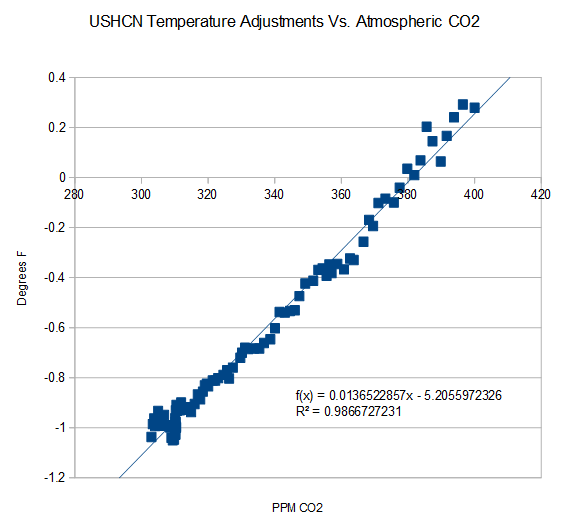
At least for the USHCN network, the adjustments made to the temperature series are in almost perfect correlation with atmospheric CO2 levels, what about the rest of the datasets?
A likely example of Noble Cause Corruption from the data caretakers at GISS, CRU, and NOAA.
NCC was originally identified in law enforcement, as it enables moral justification of the end result (catching criminals) justifies the means (using illegal police tactics to gather evidence or confessions). ut NCC is almost certainly alive and well in the ranks of many governmental and NGO climate science establishments and their public-funded bureaucracies that they feel must protect and defend annual budgets and more funding for new studies, in a era of declining ability of governments to fund discretionary research.
Hi KTM, This is an interesting graph – could you please cite where you got the USHCN adjustment data? Thanks. (also: you might be interested in looking up what “begs the question” means 🙂 )
Thanks for the history lesson, at least my usage is cited as modern vernacular.
The graph was produced by Tony Heller, and a more expansive discussion can be found at his blog.
http://stevengoddard.wordpress.com/2014/10/02/co2-drives-ncdc-data-tampering/
That is a beautiful little piece of work by Tony Heller @ur momisugly Real Science. Really frightening. I´m Glad you reminded me.
Seems the divergence between Satellite and ground based is growing.
I would say the adjustments in terrestrial based measurements are growing.
Is the GISS cooling the past getting obvious? Appears to be around 2004 where temps go from cooler than RSS to warmer and stay there. Something to watch perhaps. The satellite records must be giving GISS and HADCRUT indigestion, as they set at least SOME limit to how much meddling can be done.
Posts like this certainly shine the spotlight on things and we are being noticed on WUWT. See an earlier post of mine here:
http://wattsupwiththat.com/2014/10/05/is-wti-dead-and-hadcrut-adjusts-up-again-now-includes-august-data-except-for-hadcrut4-2-and-hadsst3/
In it, Tim Osborn of the University of East Anglia (UEA), Climatic Research Unit (CRU) made two responses.
I suggest that a summary, with little in the way of actual numbers, be included in articles of this type. The article is very very heavy on numbers and graphs, but would benefit from a wrap up in mere words. It was/is very difficult for me to develop a high-level overview.
Urge you to always include a few sentences, e.g. “Executive Summary” upfront.
Does my comment above help at:
http://wattsupwiththat.com/2014/12/16/no-records-highs-possible-in-the-satellite-temperature-datasets-in-2014-now-includes-november-data-except-for-hadcrut4/#comment-1815523
“It shows that the value on November 30 is about 0.18 C below the average of 0.33 for November. I have no idea what has happened since”
I have recently been calculating the global daily for NCEP/NCAR. It showed a drop during the mid-November N America cold. But it also showed a cold spell from about Nov 24 to Dec 10. That is surface temperature, and could put a dent in the Dec monthly average, as it did for Nov.
Thank you for that! I note that after 13 days in December, it is 0.014 lower than November, but the numbers are up lately. It does not look as if there will be a huge surprise with the December numbers.
In section 2 you detail the presence (or absence) of periods of zero trend ending with the latest observation.
In section 3 you find the longest period for which the 95% CI includes the possibility of a zero trend.
At the end of section 3 you say
But NOAA’s statement was
So I think it is your section 2 that is pertinent to the NOAA’s infamous “15 years” statement, not section 3.
At the end of section 3 you say
That statement is actually at the end of Section 2, just before Section 3 starts. However rows 8, 9 and 10 of the table reviews these times in Section 3.
If I was going make a summary paragraph, it would be this:
In a warming world, on short timescales (i.e. years), we would expect (in general) to see recent years with higher temperatures than the years previous. This is true regardless of the source of the warming. All satellite datasets agree we are in a warming trend since 1970, the beginning of the satellite record. Despite the recent years’ grouping of high temperatures, the satellite trend for all satellite datasets is generally flat for about the last two decades. The grouping of warm years is consistent with an overall warming trend and in no way alarming. The differences in magnitude between the grouping of warm years is on the order of tenths or hundredths of a degree Celsius.
My summary sentence:
The expected result of a world in a warming trend would be a group of warm years, and this past year adds to that grouping in the midst of a flat trend near the high water mark of the short satellite record.
Hope that helps. I’m sure they will be ripped to shreds. 🙂
Hottest year ever?
Try COLDEST year ever measured by the USCRN.
http://www.ncdc.noaa.gov/temp-and-precip/national-temperature-index/time-series?datasets%5B%5D=uscrn¶meter=anom-tavg&time_scale=12mo&begyear=1986&endyear=2014&month=11
What was the coldest year globally?
I’ve seen 1909 and 1911 mentioned.
Obviously this is since 1850, but is it before or after adjustments? For Hadcrut4.2, it was 1911 at -0.553. A quick way to find out is to plot the series you want with a mean of 12, then see where it is lowest. See:
http://www.woodfortrees.org/plot/hadcrut4gl/from:1850/mean:12
Thank you. However keep in mind we are talking about global numbers and not just the United States. However being the coldest year in the United States recently makes it rough for US politicians to try to convince people there to make sacrifices to combat global warming.
“keep in mind we are talking about global numbers and not just the United States”
True, but that point cuts both ways. It is important to remember that USCRN is essentially alone among the records in that no “adjusting” is done. It is state of the art technology, and is probably the most trustworthy of them all. That record shows this as the coldest year in its database.
If this were global, it would be more significant. On the other hand, all of the other data bases could use this to see how their United States readings compare and use this as a yardstick to see if their global numbers ring true.
Yes
But one would hope that the quality of data coming out of the States is better and more accurate compared to temperature measurements taken in other parts of the world, especially those in poor and/or developing countries who spend less time on essential maintenance and quality control.
But more material is that climate is regional, not global. It does not matter if the global temperatures are up, if this is not occuring where the majority of people live. It is where people live and the impact on their day to day lifes that will dictate whether they are concerned about Global Warming/Climate Change, and the public in key countries are losing interest and this will impact upon whether it can be maintained as a political vote winner. Once it is seen to put off voters, politicians will quickly ditch ‘the Cause’
One should not under-estimate the importance of what the US data set says..
>> Many people claim that 2014 will be the hottest year on record.
By their language they do give themselves away.
What is ‘HOT’ about 14.5C or whatever the hell it is ?
When I talked to some one at Tim Hortons this morning, I asked if he had heard this could be the warmest year on record and he said he did. When I told him that it is just one hundredth of a degree above the 2010 temperature, he just laughed. He had no idea it was this little.
Of course I mentioned that is not the satellite sets which show no records since 1998.
Indeed.
You also sated “If this were global, it would be more significant.” in regard to the US alone from the unadjusted data. However it is well documented that the US is bumped up with up to 30% of the stations filled in from surrounding data, despite local records being available. (links available)
Also, as you mentioned, the satellite sets show 2014 as nowhere close to 1998, We have had cool T around Antarctica with record sea ice, as well as the recovery of sea ice in the arctic.
So we have record SH sea ice, recovering arctic ice, record early ice in the great lakes, record NH snow cover, average satellite data, only as high as they are due to warm SSTs, and ever more adjustments to the surface data sets with a changing baseline… http://stevengoddard.wordpress.com/2014/12/13/how-gavin-hides-data-tampering-with-a-baseline-shift/
IMV, the pause is still on.
Agreed. It’s like ‘oceans turning acidic’.
Well, Antarctic sea ice is drifting out of the standard deviation again.
How does Dr. Spencer get up to the satellites to read the thermometer ?
From:
http://wattsupwiththat.com/2014/12/03/onward-marches-the-great-pause/
“The satellite datasets are based on measurements made by the most accurate thermometers available – platinum resistance thermometers, which provide an independent verification of the temperature measurements by checking via spaceward mirrors the known temperature of the cosmic background radiation, which is 1% of the freezing point of water, or just 2.73 degrees above absolute zero.“
With a BIG “telescoping” ladder. 😉
He Jump !
Werner, thanks for this post. I always like seeing your summaries of where the data is at.
Thank you!
“Record highs” are meaningless, and deceptive, when ALL measurements are made during a warming trend.
.
All uptrends have records highs.
.
If there were no record highs, then we’d be in a downtrend (given that Earth is not in thermodynamic equilibrium)
All surface and satellite measurements were made in what appears to be a warming trend since the mid-1800s.
.
The terms “record high”, or hottest year ever” are both propaganda terms … because 99.99% of Earth’s 4.5 billion-year history has no real-time average temperature measurements at all.
.
For example, assume scientists began estimating the average temperature of Earth in 1880 by averaging temperatures in several dozen nations. One year later, in 1881, assume they found the average temperature had increased one degree. Then the temperature remained steady for the next 133 years through 2014. Scientists could then claim in 2014, without lying, that 2014 was the “hottest year ever” … even though those words would hide 133 years with no warming at all.
.
That extreme example shows why saying 2014 is the “hottest year ever” , or the temperature is at a “record high”, is deceptive propaganda, used to hide the fact there were no real time measurements of the average temperature during centuries when the temperature was unusually cool (Little Ice Age from 1300 to 1850, based on climate proxy studies), and also used to hide the fact that Earth has had no global warming at all for the past 12 to 18 years.
And even if we agree that the “hottest year” is since 1850, unless it is at least 0.1 higher than the previous record, we are just within the error bars. At the moment, Hadcrut4 is 0.01 higher, GISS is 0.01 higher and Hadsst3 is 0.07 higher. So in all cases, it would be more correct to say 2014 will come in as a statistical 5 to 10 way tie for first place.
Say we look at current warming period thay goes back to mid 1800s. That is say 165 years. We can then ask question of what percentage all 165 year periods going back a few million years has earth ever had temps rise that amount or more. This gives a simplistic understanding of if we live in an exeptional warming period or not.
There are no accurate GLOBAL average temperature data before 1979.
.
Therefore the answer to your question is unknown, and unknowable.
.
I do know geologists claim there were several ice ages with more CO2 in the air
than today — up to 20x more CO2 for one of those ice ages.
.
Of course their conclusions did not come from playing climate computer games, so what do they know?
“If there were no record highs, then we’d be in a downtrend”
The vast majority of the US record highs were set in a ten year period form the 1930 to early 1940s.
The last time I looked 47 of the 48 contiguous US states had their record highs BEFORE the year 2000, with most in the 1930’s and a some in 1998.
.
Pretty strange numbers for the alleged global warming in this century.
.
Maybe someone forgot to “adjust” the data to make those pesky hot 1930’s go away!
N Hem temps spiking after huge pacific inflow , was very moist air that put a big dent in the dry Cold pool of arctic air in a large area of Canada. Looks like it made it all the way into the Arctic by Greenland.
Warmest ever looks like it may now be true with GISS after this spike in NHEM?
Only way I can post this latest map fom wxbell.
https://mobile.twitter.com/NJSnowFan/status/544987199557492736
Even if that global “curve” stays flat for the rest of the month, Hadcrut4 and GISS will set a new record in 2014 assuming that is a good guide.
bear in mind that the diurnal cycle contamination in the UAH and RSS satellite datasets suggests they are underestimating warming in the lower troposphere (Po-Chedley et al., 2014)……..so the absence of a new record may be because the current data are biased cold.
http://journals.ametsoc.org/doi/abs/10.1175/JCLI-D-13-00767.1
The site you give talks more about trends than about record years. I cannot judge if it is correct with regards to slightly wrong trends. But even if it is correct here, there is no way that 2014 could be hotter than 2010. They are so far apart that a small trend correction would not change things.
Not sure why Werner didn’t add UAH v5.6 to the top graph since it’s the current UAH set and is available at WoodForTrees.
I’ve added it here, along with trend lines for all 3. All are offset to the UAH base line of 1981-2010 for fair comparison, per the instructions in the notes section of WfTs: http://www.woodfortrees.org/plot/gistemp/from:1990/mean:12/offset:-0.29/plot/rss/from:1990/mean:12/offset:-0.10/plot/gistemp/from:1990/mean:12/offset:-0.29/trend/plot/rss/from:1990/mean:12/offset:-0.10/trend/plot/uah/from:1990/mean:12/trend/plot/uah/from:1990/mean:12
In terms of trends at least, UAH is in much better agreement with GISS than it is with RSS over that period.
Actually it is version 5.5 that WFT shows. Check this out and when clicking on “raw data” the November anomaly is shown as 0.212:
http://www.woodfortrees.org/plot/uah/from:2014
This agrees with: http://vortex.nsstc.uah.edu/public/msu/t2lt/tltglhmam_5.5.txt
But it does not agree with the following that shows 0.329:
http://vortex.nsstc.uah.edu/public/msu/t2lt/tltglhmam_5.6.txt
Of greater concern to me is that Hadcrut4 is not up to date at all. Hadcrut4.2 stopped in July and Hadcrut4.3 has not yet been updated on WFT.
Sorry Werner, you are right.
Even so, would agree that UAH, both version 5.5 and 5.6, is in better agreement with GISS than with RSS since 1990?
Yes, both versions of UAH are closer to GISS. But even here, both versions show a flat period of about 6 years and both will keep the 1998 record. In contrast, GISS has no flat period worth mentioning since it is only a few months. As well, it may set a record this year.
And then they try to tell us the world is in thermal equilibrium!
Joe Bastardi @BigJoeBastardi · 17m17 minutes ago
Why do other objective,finer grid temp measurements, say this is not warmest year ever. NCEP CFSR shows cooling pic.twitter.com/0Fxl4xDYUo
Their attention grabbing headlines can only convey so much information. And if people do not read further, they may get the wrong impression.
Reblogged this on Centinel2012 and commented:
The only real question is do we have Accuracy and precision and I think the answer is no — so beating small differences are meaningless to my way of thinking.
In my opinion, the graph that I show just before the Appendix starts would clearly support your position. It illustrates the situation that a person with one watch always knows what time it is, but the person with two watches is never sure.