Guest essay by Jan Zeman
To err is human, for messing up consistently one needs a computer. -New proverbs
Because there was a lot of publicity around the Cowtan and Way 2013 paper I decided to look into the issue.
I was not much interested in their methods (since I’m not much interested in methods of data torture, besides they have already been scrutinized by much more knowledgeable people), but rather in the following questions:
- Where did they obtain data such data that would support a “two and a half times greater” rise of global temperature anomaly “trends starting in 1997 or 1998” in their “hybrid global reconstruction” when compared to HadCRUT4 global temperature anomaly data-set?
- What such data really show and whether such data agree with other data or not?
Because the main rationale of their analysis seems to me being that there is some missing coverage for the HadCRUT4 global temperature anomaly dataset “with the unsampled regions being concentrated at the poles and over Africa” and that it is the alleged reason why the HadCRUT4 data-set is purportedly biased, first what I have looked for was whether there actually are other data covering the regions and what trends one can find there.
Tropics
For starter let’s see a comparison of HadCRUT4 and satellite lower troposphere data for tropics:

(I note that I chose trend period exactly October-October to avoid potential disputes about the seasonal variations and cherry-picking. The data and calculations are available here)
What we immediately see on the graph is that the HadCRUT4 trend 1997-present for tropics (30S-30N) is flat (but it is slightly rising for globe ~0.046°C per decade). We also see that both the UAH (the data-set Cowtan and Way likely used for their “reanalysis“ of the HadCRUT4 data-set) and the RSS satellite records show descending temperature trend in the 1997-present period for tropics. Only satellite data which show a rising temperature trend in tropics is UAH lower troposphere-land.
But since the UAH data-set shows the descending trend for tropics when the oceans (covering ~70% of the tropical region) are included, it is clear, that the satellite data-sets including the UAH for the tropics as whole clearly do not show warming in the tropics for the period. So they hardly can in a consistent way contribute to change the flat HadCRUT4 tropics trend into a rising trend for the period.
We can therefore immediately conclude that if Cowtan and Way used the UAH tropics-land data-set to anyway do so, it would be absolutely inconsistent, directly contradicted not only by the another satellite data-set (RSS), but by the UAH satellite data-set itself – which doesn’t show warming in tropics as whole for the period in question, moreover it shows visibly a cooling trend for tropics. So to take from the UAH data-set only the land data showing the warming, mess up the official data-set (showing flat trend for tropics and warming presumably somewhere else) with them, allegedly correcting its alleged bias, it would be clearly a sign of a bias on their side to put it extremely mildly.
In any case a hypothesis, that the UAH satellite data-sets somehow can change HadCRUT4 trend in tropics into a rising one for the period 1997-present is therefore not only contradicted by the RSS satellite record, but it is directly falsified by the UAH lower troposphere temperature anomaly dataset for tropics itself, because it shows descending trend there.
The divergence
Recently in the article written by Steven McIntyre he showed, that the Cowtan and Way hybrid global data start to markedly, one could say “hockeyschtickly”, diverge from the HadCRUT4 global data in about ~2005. He showed it well on this his picture:

The graph shows that it is in about 2005, where the Cowtan and Way data start to show a quite consistent divergence from the HadCRUT4 data – before they show a negative trend and then quite suddenly a positive one. Good to note here, that one of the two authors even participated in the discussion below the McIntyre’s article at the Climate Audit, but he didn’t objected it. Similar break-point for both Cowtan and Way data-sets is shown by Bob Tisdale here, and he notes what it has likely to do with the polar amplification.
It is clear from the graph the divergence most likely is the chief source of the rising trend in their global hybrid data-set purporting to tackle the bias in the HadCrut4.
There was another article written about the possible origins of this divergence in their datasets, so I will not repeat once written. And since the tropics do not show a warming trend – as I have shown above (- and I note that in the period since 2005 the HadCRUT4 data-set shows for tropics 30S-30N the relatively impressive downward trend of -0.134°C per decade – which is hard to beat with infilling poor coverage with invented values in the polar regions, simply because the 30S-30N is exactly half of the Earth surface area, while both polar regions combined less than 10%!), let’s have look at the other region where they claim low coverage causes a bias in the HadCRUT4 – the polar regions – and see what really is going on there in the period of the divergence. Because it has possibly broader implications than just falsifying Cowtan and Way 2013 results.
Polar Regions
Let’s first see what show the lower troposphere satellite data for the polar regions:

(used data and calculations available here)
What we see on the graph is that since the 1997 there is rising trend both in Arctic (steeper) and Antarctic (less steep). However this trend clearly have stopped in the Arctic before 2005 in both the satellite datasets, while it continued rise in the UAH dataset for Antarctica.
Let’s see why:

Again as in the tropics the land record in the UAH data-set shows much steeper slope than ocean record – which shows almost flat trend in the UAH.
It very much seems that the UAH data-set for the Antarctica land is contradicted by the RSS dataset.
Are there other data-sets which would support the rising trend in UAH data since 2005?
Quite to the contrary – there are other which contradict it.
First, there are the data from the Antarctica surface stations. I took the data from GHCN for them, I have made a sample of 20 surface-stations (all Antarctica surface-stations available at GHCN which are not missing more than one year data since 1997 and have data to present) and I have plotted their temperature mean with trends:

(used data and calculations available here)
From the above graph it is quite clear that although there is a rising temperature trend since the 1997, there is no rising temperature trend after 2005 measured at the surface stations in the Antarctica. The majority of them show a descending trend in the period and especially those further in the Antarctica inland (e.g. slopes for some of them: Amundsen-Scott: -1.56°C, Byrd station: -1.25, Vostok: -1.08°C) .
So is there actually a warming trend in the polar regions since the 2005?
As I have shown most definitely not in the Arctic. No data-set we have looked at shows there a warming trend since 2005.
But is there a warming in the Antarctica? The UAH data-set (although contradicted by the majority of the Antarctica surface-stations especially those in inland and by the RSS data-set) shows a warming both for land and ocean there.
Can we further contradict the UAH data-set, not just for the land, but the ocean too? I think we can very well.
Sea ice
There actually is a data-set, which very well covers the polar and sub-polar regions. It is not a temperature data-set, but it has a lot to do with temperature. It is the NSIDC sea ice index data-set and it covers the polar regions with daily cadence, extremely rarely missing coverage and with no major issues (-at least since 1988 – in 1987 there is a discontinuity) – because the sea-ice is unlike the surface temperature actually very well sensible by the satellite instruments. So let’s have look what it shows:
 |
(data with calculations are available here)
We can immediately see on the graph the monthly global sea-ice extent recently reached the highest level since 1999. Also the southern sea-ice extent – in the region which is allegedly warming according to the UAH and Cowtan with Way – reached not only higher level than in the 2005, higher than in the 1997, but it very recently again reached likely the all time high in the history of the satellite sea ice extent measurements since 1978 – which oddly went unnoticed by our climate watchdogs. (And as I look into the NSIDC daily sea ice data – available here and I do a small extrapolation – if Cowtan and Way can why not me just for fun – over the one remaining month, it looks to me very likely also this whole year sea ice averages will be the highest since 2003 and possibly even since 1999 – if you don’t believe just look carefully at this graph from UIUC.)
Mind also the trends in the above graph (which have periods exactly global minimum-to-minimum and maximum to maximum using the resolution of the daily data from 2005 global minima and maxima to 2013 minima and maxima) – both are rising.
But it is not temperature which is rising there, it is the sea ice extent. And it really doesn’t much look consistent with the Cowtan and Way global warming trend allegedly due to alleged warming in the polar regions.
Water usually doesn’t freeze on hundreds of thousands square kilometers areas upon a warming.
Grace to NSIDC we can also compare the maps for both hemispheres yearly maxima. Here it is for Arctic, mind the numbers:

We see that the yearly maximum area and extent were higher for Arctic in 2013 than in 2005. Which further confirms both the RSS and UAH satellite data for lower troposphere temperature anomaly in the Arctic, although it should be definitely mentioned that the Arctic sea ice still shows a descending trend in the period 2005- present. Nevertheless this trend has more than twice less steep slope than in Antarctica for the sea ice extent and more than half less steep slope for the sea ice area. So there is the observed net gain in the global sea ice trends of about 1.5 million square kilometers per decade for the sea ice extent and about 1 million square kilometers per decade for the global sea ice area.
I would very much think that if we speak about the global temperatures and their trends, we must also consider global not hemispherical trends which indicate them, and especially in the case of an oceanic phenomena as is the sea ice, because there is very uneven distribution of the ocean over the globe and the Arctica sea ice is also unlike that around Antarctica quite very constrained by the surrounding land as we see on the above map and subjected to currents from south on the side of the Atlantic.
Here is the comparison for Antarctica:

(Source here)
Even we can question whether the rising global sea ice trends have statistical significance, there quite clearly is no descending global sea ice trend since at least the 2005 (where the Cowtan and Way data start to diverge from the HadCRUT4 to presumably other direction than sea ice implies). Such descending trend (or at least flat) on the other hand one finds in (nearly) all official data-sets for the global temperature anomaly – including the UAH global data-set for the lower troposphere – the trend looks to me perfectly flat, but actually it shows a rising trend: +0.09°C together with HadSST2 and HadSST3 which show even +0.3°C …per thousand years… (I note that in my opinion the very slightly rising SST trends are right and caused by the current solar cycle maximum).
Closing remarks
It very much looks that the trend break-point in the Cowtan and Way data is itself a result of a bias, and miserable failure, likely when trying to account for the positive polar amplification – the problem is that most likely in times when there is quite likely a negative one.
It very much looks there quite is no reason to believe there is a warming trend in the global surface temperatures at least since 2005 – and even much less because of a bias in the global surface temperature anomalies due to the allegedly insufficient coverage in the tropical and polar regions.
In fact the global sea-ice data supported by multiple other data-sets give quite a very compelling evidence to the contrary.
And data is what counts in the science, which has the method based on the falsification not a confirmation bias. If the data don’t agree with a hypothesis it is in the overwhelming majority of cases the hypothesis which is falsified, not the data.
In this case the extensive real data quite falsify a hypothesis literally based on no data (which are invented to make such hypothesis possible) moreover clearly postulated to significantly change the outcome of the real official data-set (whatever we maybe think about the Hadley Center, CRU and MetOffice at least it is based on real measurements and with still relatively conservative approach without infills when compared to other global data-sets as NCDC or GISTEMP LOTI*) and moreover for such purpose with quite clear intent to cast a doubt about the current at the very least flat if not a cooling global surface temperature anomaly trend.
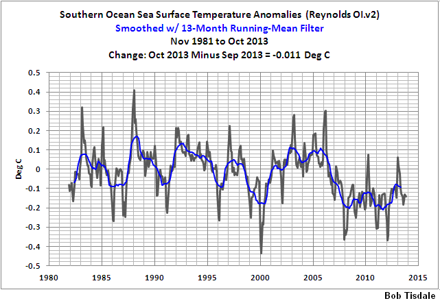
Will we believe that while the ocean somewhere cools (-as Bob Tisdale shows for southern ocean – see the footnote – and there is virtually nothing else there than ocean between the Antarctica and the 60S) – which looks quite confirmed by the rising sea ice extent there and while the tropics cool too with quite impressive rate and moeover we do not find a rising temperature trend in Arctic in any of the two satellite datasets – will we really believe there is a warming trend? A warming somewhere (maybe in Antarctica and around, and most likely not) somehow able to change the whole most likely flat or descending global surface temperature anomaly trend into a warming one – moreover with a “hypothesis that warming has accelerated…four times as likely as the hypothesis that warming has stopped“? Or we will rather take it as for other reasons than a global warming overheated Cowtan and Way computers dream?
To put it differently: Besides the data, isn’t the pathetic effort to manufacture a global warming trend using HadCRUT4 dataset and cherrypicked satellite data perhaps to allow the CAGW meme persist a little bit more, deliberately or not, the best sign of cooling?
————————————————
* If one wants to brush up on how it relates to the sea ice I recommend the final note from Bob Tisdale’s article here, which, to make this bit shorter, I allow myself to point out just one sentence from: “GISS masks (effectively deletes) sea surface temperature data anywhere sea ice has existed.”
I also note that he also shows quite consistent temperature decline for southern ocean SST from yet other data-set (Reynolds Ol.v2) – see his graph here – from here.
I hate seeing trend lines where the data show huge swings compared to the trend. The next 10 years always give a different impression.
I heard once there are lies, dam lies and then there is statistics. I never could figure out why lying about dams was so bad, but I think I got the point. Anyway, I read a report recently about people who don’t believe global warming is going to end the world unless we do just what the ones who know best tell us. I think the word for those people who don’t believe is “deniers”. Anyway this report said that statistically being a denier is correlated with being a creationist. Another one I read a while ago said that being a denier is correlated with being a conspiracy theorist. It was true because statistics said it was. Then I remembered the one that said statistically there was a 97% consensus that climate scientists believe global warming is going to end the world and all. Well that seemed really cool and the headlines on the reports of the studies sounded like the truth was out there, I mean it was just settled and if you were a denier of that then you were just a nut.
Now, I am really into the climate thing, okay, and I just always wanted to do something to contribute to climate science. Not the icky part, the part about physics and chemistry and isotopes and measuring and observing stuff, for that you have to be an honest to goodness Qualified Climate Scientist (QCS). I know that. I thought maybe I could do the part about how true climate science is, like how people believe it, you know, using statistics.
So I asked a friend of mine who is for real a Qualified Climate Scientist if he thought I could do the part about consensus. He said, sure, as long as I stayed away from the hard part and just did consensus it would be okay. He said the guy who did the 97% thing just had a bachelor’s degree in physics, and even though that guy isn’t a Qualified Climate Scientist, it was okay for that guy to do consensus stuff. My friend said lots of the people who do the consensus part are even just engineers, or economists, or psychologists, so it is okay to do it as long as you use statistics. My friend knows I have at least a bachelor’s degree in physics so he knew I could do it too.
I thought, Great! I told my friend I was so excited about doing climate science.
But he said, no, no, no! If I tried to do climate science, not just the consensus part, then that would be dangerous. He said I should just do safe, consensual climate science. So I said okay, I will. He told me I would be okay just so long as I made sure to be safe, to use statistics whenever I did consensual climate science.
I was so excited. I went back to my computer to do some safe, consensual climate science, but when I got there I just kind of stared at the computer. I thought okay, what now? So I called my friend up and asked him. He said I needed data. So I said okay, how do I get data? He said it is easy for consensual climate science, all you have to do is google, no messy instruments or lab things. I said great, thanks, and hung up.
So first, by googling, I found this site: http://www.isidewith.com/poll/965637 . It asks people “Is Global Warming a threat to the environment?” Yes or No. I thought cool, that’s just what I want. I clicked on the results for different political parties and the numbers (statistics!!) are:
Party % Yes %No
Democrat 97 3
Republican 16 84
Libertarian 36 64
Green 97 3
Socialist 97 3
It was so fun I found another web site (by googling!) here: http://www.gallup.com/poll/158978/democrats-republicans-diverge-capitalism-federal-gov.aspx that asked Republicans and Republican Leaners (RRL) versus Democrats and Democrat Leaners (DDL) if they liked different stuff like socialism and all. So the numbers (more statistics!!) were
Group Percent Positive toward Socialism
DDL 53
RRL 23
So now I thought how cool would it be to find out the correlation between liking socialism and believing global warming is a threat to the environment. So I combined the numbers (statistics!) like this
Party % Like Socialism %Yes GW is a threat
Republican 23 16
Libertarian 23 36
Democrat 53 97
Green 75 97
Socialist 100 97
I had to fill in the numbers for Libertarians and Greens who liked Socialism because the Gallup poll didn’t ask them, just DDLs and RRLs. But I knew just how to do it because I had read a story about a paper about Kriging climate data. Not being a QCS, I don’t know exactly how it works but I think it is like filling in data you don’t have with what you think it should be. So I figured Libertarians are kind of like RRLs so I put in 23% for them liking socialism. Then I figured Greens seemed like halfway between Democrats and Socialists, because I read the UK Guardian sometimes and that’s just how it seems. So I filled in 75% for Greens liking Socialism. I don’t think it is exactly Kriging, so I call what I did blitzfitzkrieging, which I think means lightning fitting attack or something in German.
So, I put the numbers in Excel and did a correl(%Like Socialism,%YesGWThreat) and wow, the correlation is 0.85 between believing in GW and liking socialism. That’s really high, I think. I remember the creationist study had just 0.25 correlation between “deniers” and creationists and they said that was significant. I was so excited because 0.85 was like so much higher than 0.25 it just has to be true, I mean it is really settled. Next I needed a title for my study so first I thought “Belief in Global Warming is Correlated with Belief in Socialism at 0.85.” But then I noticed that the titles used by the guys who did consensual climate science were a lot shorter, so I just shortened it to “Global Warmists are Socialists.” And it is so cool because the statistics say it is true.
Consensual climate science felt so good I just couldn’t stop. So I noticed that 97% of each of Democrats, Greens and Socialists believed in global warming being a threat. And then I noticed, like wow, the 97% consensus study got that same number, 97%. So I did a little blitzfitzkrieging and figured the guys who did the ratings for that study were either Democrats, Greens or Socialists and did a correlation between what they believed at first and what they got from their study and OMG, the correlation is 1! I tried to think of a title for my little study on that and after shortening it I figured it should be “Consensus Raters get Results They Believe Already.”
I called my QCS friend and told him my results and he said I was doing just great. I told him I was going to keep doing consensual climate science every chance I get. He said great and just make sure I was doing it safely. I said I sure am, I am using statistics every time.
The Cowtan and Way 2013 paper should not have been published. The methodology of this paper is so bad that a 2nd grader would trash it. How this ever got through only shows the total lack of knowledge and attention in the climate science community anymore.
What garbage.
How about an unbiased look at the globe as a whole, through both of the satellite-based indices of global lower troposphere temperature?
RSS has a barely below-zero 17 year 1 month linear trend if start date is chosen at a 1996 time shortly before the century-class El Nino spike. I have yet to identify a linear trend in UAH ending at last reading with a complete hiatus being in existence even half that long. Anyone who can find such a thing, please get back to me!
An old joke from under communism: “The future is certain; it is only the past that is unpredictable.”
Cowtan and Way failing comparison to satellite data like RSS is quite relevant, and Cowtan & Way follow in a long series of repeated revisions of temperature history, turning the actual double-peak in the past century into more of a hockey stick, as in http://img176.imagevenue.com/img.php?image=81829_expanded_overview_122_424lo.jpg . If someone was naive enough to trust such revisionists, they would have to essentially believe the past is essentially greatly unknown and going to change again in the future, as again and again and again it has been drastically changed in activist publications (although publications made prior to the CAGW
movement’s existence are consistent in contrast, without the grand dishonesty movement and motive).
What F.A.H. noted is illustrative of much of the root of the problem:
From how ideological alignments work, if the Democratic Party was aligned with X, that would guarantee tens of percent of the population wanting others to believe in X just about almost whatever X was (in this case global warming). Someone can be a Democrat and not support X; it just isn’t common, though. Thus it will take a while for support for global warming claims to drop below a third to half of the population, although large enough future global cooling (not talking about subtleties in datasets but too much for people not to directly notice) will eventually overcome that.
Send the 97% here http://classic.wunderground.com/cgi-bin/findweather/getForecast?query=59427
On Friday when the high is -9F and the low is -23F I wonder if there is a fisherman in the alarmist bunch that will cut a hole in the ice on Mission Lake.
The paper is question is now publicly available at Cowtan and Way 2013 – it would be worth reading the material prior to a discussion such as this.
One of the notable aspects of their hybrid method is that UAH trends are completely irrelevant to their calculation. They use the spatial correlation of surface and satellite temperatures and the offset between them, calculated independently for each month of observations, to extrapolate the spatial pattern of surface temperatures over regions with only satellite data. Re-evaluating the spatial correlation on a monthly basis, as they note, removes any constant or time-varying bias between the two data sets. Therefore the UAH trend discussions in the opening post are not relevant.
The sub-Arctic is warming faster than the global mean, the Arctic as observed by UAH is warming faster still, hence the addition of that region to HadCRUT4 has a higher global trend than just infilling the missing regions with the global mean temperature. Simply kridging the surface temperatures (interpolation using covariances determined for the data you do have) does better than assuming missing regions have the global mean, and the hybrid method does better yet – all as validated using hold-out tests, and using independent data such as the IABP/POLES Arctic buoys. Criticism of the methods would have to address the validations as well – that hasn’t been done here.
What mins, pliz?
This article is littered with omitted words, jumbled phrases, and the like. Get a proof-reader, next time.
@ur momisugly F.A.H. ….ROFL
Brian H;
The writer’s first language is clearly not English. If you read past the translation errors, there are many good points made in article.
F.A.H.
What an excellent essay.
What I find most interesting about the data presented is that for the tropics, hadcrut is essentially flat, but both RSS and UAH show a slightly negative trend. If we assume a negative trend in the tropics, and consider that energy flux is not directly related to temperature, but the fourth power of T, we could easily have a situation where the global average temperature trend is positive, but the energy balance of the planet is negative.
The article was quite interesting also.
davidmhoffer, I was thinking the same as I read through the article. It is possible. There would be little admittance of that imbalance if it ever happens. Pencils would whip.
They stitched together multiple data sets each collected by very different means and processed by very different methods, none of which show the trend individually, but only show it when stitched together? The obvious conclusion is the stitching process of disparate data sets is to blame for creating a spurious signal.
Henry Clark made the comment: An old joke from under communism: “The future is certain; it is only the past that is unpredictable.”
With all the historic data ‘homogenisation’ manipulation and torture, plus the certainty in predicting Thermageddon the day after tomorrow, this has to be the rallying call for alarmists. This comment is so apt in describing climate science, as it is practiced today, it has to be repeated:
“The future is certain; it is only the past that is unpredictable.”
I think this truly shows that just because a paper has been “peer reviewed” does not make it right. This has been a point of my discussion with Warmists. Most are convinced that being peer reviewed somehow makes it correct and incontestable. Sadly, no. To consider it correct, the results must be reproduced. Peer reviewers do not have time to do that. Reviewers only check the basic maths and methodology. That’s it.
The unfortunate aspect of the Cowtan and Way 2013 paper is that it is a computational, statistical result, predicated on infilling of data in regions with limited direct observational support. It can be argued that the “assumed” Arctic and African data cannot be disproved as there is no contradictory observational data. Of course, it can’t be proved either for the same reason. It is just a result.
Alas, because it was a Peer Reviewed study, it is popping up all over the The Internet, in blogs and opinion pieces as “proof” that The Pause is a myth.
it appears to me that , the first conclusion to draw from data reconstruction is that the error bar are underestimated or worse there can be a bias in the data.
Data lost is lost.. one step further and you are not able anymore to give an error.
Bottom line they knew that the lack of warming was a ‘real problem’ for their careers , they therefore went out to prove in fact there was no lack of warming ‘ and did whatever it took’ to pull this off .
The idea you can take weather data from one area and spread it by some ‘statistical magic ‘ over a much wider area is frankly hilarious and defines good science and common sense . Given , for example , that even two valleys next to each other can experience different weather depending on wind direction.
During last summer the CET daily max rose above its 20 year average, but now its trend is on the down slope again with the November’s Tmax fractionally below the average. The CET daily min for November also fell below the 20 year average.
http://www.vukcevic.talktalk.net/CET-dMm.htm
Compared to the 2012 November, the trend doesn’t bode well for forthcoming CET winter; my previous ‘observation’ that this winter may not be as cold as the previous two, may well prove to be wrong even before the winter proper has started.
KR says:
December 3, 2013 at 9:33 pm
—————————————
Nice try, but it won’t wash. No way, now how.
What Cowtan and Way should have done is very obvious to most. Instead of trying to justify their infilling of data, they should have validated their method.
The procedure is simple.
Instead of trying to infill data just for the sparse regions, they should have used a random algorithm to drop data from dense regions of surface data. Create 10 different global data sets and do a a Monte Carlo run infilling globally with their satellite data method.
Why wasn’t this simplest of checks done?
Well, we all know that. Every meteorologist knows that when you have widely divergent results from a Monte Carlo run, you have no predictive ability. And in the case of SKS climate propagandists Cowtan and Way, it would have shown their technique was utter tripe.
CO2 is a radiative gas. Adding radiative gases to the atmosphere will not reduce the atmospheres radiative cooling ability. The future of science, democracy and the genuine environmental movement depends on the end of the AGW inanity. Get out of the way.
F.A.H. December 3, 2013 at 8:14 pm
Brilliant! Simply brilliant. That gave me a good laugh! Thank you.
Jan Zeman: “I was not much interested in their methods (since I’m not much interested in methods of data torture, besides they have already been scrutinized by much more knowledgeable people), but rather in the following questions: “ … What such data really show and whether such data agree with other data or not?”
Your gymnastic on trends on average hemisphere temperature data of about 290 K is just mathematic gymnastic, but is senseless. All data show a similar temperature function over time with the same temperature frequencies of similar amplitudes in a range of 1 K, which is a precision of about 0.3 % for the same object.
Not such gymnastic can give answers to the basic question, what nature or geometry of temperature frequencies can explain the hemisphere or global temperature function in the past, because there is no reason, why the temperature frequencies should be different in the future.
Please see to this matter my comment here:
http://wattsupwiththat.com/2013/11/23/the-ipcc-goes-for-video-bling-and-cgi-enhanced-doom/#comment-1487084
V.
Jan Zeman,
Hmm, that’s interesting. It appears for some reason that the difference curve between the CW2013 hybrid and HadCRUt4 shows a remarkable resemblance to the UAH tlt anomaly curve for Africa 30N-30S, 19-33E, roughly covering the African gray area in HadCRUt4:
http://i1172.photobucket.com/albums/r565/Keyell/UAHtltAfrica_zps8f083c55.png
The funny thing is, the RSS tlt anomaly curve for the exact same region looks fundamentally different and is all but flat (even goes ever so slightly downhill) from 1997 to 2013:
http://i1172.photobucket.com/albums/r565/Keyell/RSStltAfrica_zps7815ebfe.png
Also, like you pointed out, neither RSS nor UAH show any upward trend for the region 82.5-60N post 2005. Rather the opposite. Theirs are pretty much equal to that of HadCRUt4 (same time, same region). Same goes for GISS’s 1200 km product which apparently covers ALL of the Arctic with its extended smoothing procedure. If anything, the trend for the region 90-60N from 2005 to 2013 is MORE down than the equivalent trend of HadCRUt4. So where is that ‘extra’ Arctic heat that HadCRUt4 is allegedly missing supposed to hide?
Antarctica? Not much warming going on there since 1997/98 (60-90S), not much heat hidden at all. Neither in GISTEMP 1200 km, in Reynolds OI.v2 (SSTa), in RSS tlt (60-70S) nor in UAH tlt (60-82.5S). And especially not since 2005 (rather downhill again, strongly so for the Southern Ocean).
So, UAH tlt Africa central N-S axis. That must be where CW2013 found the missing heat of HadCRUt4. Too bad (?) they didn’t have the time or resources to cross-check with RSS tlt.
“The future of science, democracy and the genuine environmental movement depends on the end of the AGW inanity. Get out of the way.”
Well said Konrad.. It is WELL PAST time that this myth was destroyed.. and the funding stopped.
Once the funding stops, people like KR can get on with their lives (without climate funds) and stop trying to defend the indefensible.