Guest Post by Steven Goddard
We are all aware that Arctic ice extent has increased over the last two months, and is now about one million km2 larger than it was in 2007. But where has the ice growth occurred? I generated an image which makes this easy to visualize.

http://nsidc.org/data/seaice_index/images/daily_images/N_timeseries.png
In the composite image I prepared below, green colors represent 2010 ice that was not present in 2007, and red colors show where 2007 ice existed on this date but is not currently present.

A couple of interesting items.
- There is excess ice in the Baltic Sea, due to the cold winter there.
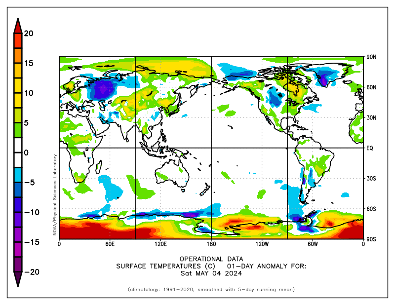
- There has been a lot of cold air over the Bering Sea and Sea of Okhotsk (as seen below) causing excess ice on the Pacific side.

http://www.esrl.noaa.gov/psd/map/ANIM/sfctmpmer_01a.fnl.25.gif
Discover more from Watts Up With That?
Subscribe to get the latest posts sent to your email.
But it’s “statistically insignificant” (with sarcasm)
“It really shows what’s been going on in the Arctic – it’s falling apart.” LOL
The fact that we can have so much more ice in 2010 than in 2007 but still have “red” areas where 2007 had ice when 2010 does not evidences further the inpact of wind, flow and many other factors. This kind of analysis, while quite basic, adds a lot to the bigger picture and general understanding of our oh so complex climate.
Just want to send a big thank you to all those contributors as well as the commenters that provide links to useful info.
As the tide of information reverses toward healthy skepticism and scientific review and rationality, we can breathe a collective sigh of relief and get back to the “real” issues at hand.
When will the average be shifted to take into account the recent low ice levels of the past few years? Or is it a running average that already does that?
Considering that this was an El Nino year, the fact that ice increased seems signifigant. What’s going to happen during the next down turn? We’re going to smash through that average.
Mike Sander (11:30:40) :
“The fact that we can have so much more ice in 2010 than in 2007 but still have “red” areas where 2007 had ice when 2010 does not evidences further the inpact of wind, flow and many other factors. This kind of analysis, while quite basic, adds a lot to the bigger picture and general understanding of our oh so complex climate.”
That depends what the red represents.
If you think red in term of hot, you’re wrong.
This kind of fluctuation was known, and published in peer reviewed journals in the 80’s. Funny how reasoned research gave way to scary gray paper stories about warming.
Hmmm…. I see those red blobs in Greenland and Antarctica are still hanging around.
I still find the ice melt alarming.
Well, at least I feel it is alarming.
Well, no, I mean I feel like it should be alarming.
Ok, so it’s not alarming, but if it were alarming we should play it safe and do something about.
So in order to do something, it has to be alarming.
Therefore it is not only alarming but it is an urgent matter nearing a tipping point which must be addressed with sweeping policy changes.
Along with a lot of money for additional research.
Now I’m really alarmed. No, really, I mean it.
Oh never mind.
It appears the stable minded skeptics have been show some wrong forecasts. The Met Office has the newest most powerfull, wizz bang computer and is forecasting too warm 9 of 10 years. They of course are wrong 10 of 10 years.
It may not be too late for humans to go back to ice houses and save on mechanical refridgeration.
Steve,
Very helpful “one stop shopping” to have you provide this snapshot…thanks.
PJB said:
“we can breathe a collective sigh of relief and get back to the “real” issues at hand.”
——
What are those “real” issues you’re referring to?
The sea ice in the Baltic Sea is not represented on the Cryosphere Today’s website.
I’ve always found that to be odd.
One cold summer and it’s all over for artic sea ice melting. The alarmists will have to call it “arctic ice change” and say things like “the last 10 years are still the smallest extent on record” and in private say things like “it’s a travesty” and so on and so forth.
I still don’t understand why arctic ice melt is a bad thing. A northwest passage would save a lot of time and fuel in shipping. There’s thought to be a lot of currently inaccessable, unknown size oil fields under the ice. Large new fishing grounds would open up. Arctic ice melt doesn’t even raise sea level. What’s not to like?
Steven Goddard,
The NOAA SST chart shows the current El Nino SST in the zero range. Is this due to excessive smoothing or are El Ninos the norm for the mean?
Maybe you all should go back to basic math classes and learn the difference between surface area and volume.
REPLY: Maybe you should learn not to jump to conclusions.
Do not forget that the red-blue representations of temperature variations are arbitrary as they are based on the temperature chosen for neutral. Red areas of polar regions can still be ridiculously cold, just not really ridiculously cold. To a great extent, if it is frigid, ice stays frozen.
So, when you see big red regions over Canada during January 2010, this does not begin to indicate that temperatures are warm, just not as cold as other regions.
Great bias can be injected into these graphics just by the choice of where to base the color scales.
The other thing that’s odd is this statement from NSIDC:
“Meanwhile, temperatures over the central Arctic Ocean remained above normal and the winter ice cover remained young and thin compared to earlier years.”
Sea Ice appears to have very little to do with air temperature as the temperatures are well below the freezing point for salt water. How do they know its thin?
Pamela Gray (11:43:50) :
This kind of fluctuation was known, and published in peer reviewed journals in the 80’s. Funny how reasoned research gave way to scary gray paper stories about warming.
So it is all natural variation.
There’s nothing unusual happening. And anyone who takes some time and does their homework will find that out.
Cyrosphere Today show the global sea ice anomaly near the zero line (normal)
http://arctic.atmos.uiuc.edu/cryosphere/IMAGES/sea.ice.anomaly.timeseries.jpg
Since 2007, the global sea ice anomaly has been undergoing larger fluctuations than the previous 10 years. It is now headed back up since that change.
Steve is showing us where the gains are.
Question is: will the N. Hem. continue to be the recipient or will it be the donor of future changes?
If the cooling in the earth continues and Arctic Ice continues in this general direction then we should see a record amount of ice in a few years.
If we knew how much ice there was at the North Pole during the Medieval Warm Period and also during the Little Ice Age, both which happened in the last 1000 years, then we would see that nothing at all unusual has been happening in North Pole Ice. It’s all in the ballpark of normal.
“We are all aware that Arctic ice extent has increased over the last two months, and is now about one million km2 larger than it was in 2007. ”
Jolly good. So we have more ice than 2007.
Do we have less than 1927 ?
Is it more than 1845 ?
Is comparable to 1703?
(random dates)
I suggest that to extrapolate Arctic ice from circa 2000 to 2010 is like extrapolating daylight from 0845 to 1120 and deducing there will be no night.
An extrapolation is only valid where it includes a full cycle,
(Though I may be corrected)
Where have all the sunspots gone?
Living in Sweden it is quite obvious that our winter conditions to a large part is dependant on NAO. A strong NAO means winds from the southwest and the Atlantic and “green winters”. A weak NAO (as this year) means winds from north – northeast and cold winters. The difference in average temperature is quite a few degrees C. You wouldn’t notice a few 10th of a degree’s change in “global average temperature”. The correlation between temperatures in Northern Europe and the Artic is thus obvious. From our regional perspective that means that you can not say anything about mean temperatures without taking both areas into account. Which also means that you can not produce any meaningful average tempeature plots of say the time period 1850-2000 because we do not have any data for the Artic for the majority of this period.
A quite interesting ICE battle will take place in the next 10 days.
As Mr Goddarrd illustrates, the area west of Novo Zemlja this year has ice, unlike 2007. The ice especially NW of Novo Zemlja froze very late this year and is likely to be thin.
But!
A cold wave is underway for the area, starting 13 april and so far has no end before pronosis ends 19 april. So maybe the thin ice is going to make it ok anyway, perhaps even thicken in the period 13-20 april.
Here the prognosis 19 april:
http://www.klimadebat.dk/forum/vedhaeftninger/is19april.jpg
Here follow the cold in the area start arround 13 april:
http://www.meteociel.fr/modeles/gfse_cartes.php?&ech=180&mode=1
http://www.meteociel.fr/modeles/gfse_cartes.php?&ech=180&mode=1
http://www.meteociel.fr/modeles/gfse_cartes.php?&ech=180&mode=1
Why won’t anybody show that chart with the “average” calculated for the period 1979-2009?