From NOT A LOT OF PEOPLE KNOW THAT
By Paul Homewood


Once upon a time there was The Pause.
For a decade and a half, global temperatures stopped rising, an embarrassment for climate scientists. Even the Met Office published a long study in 2013 into the possible reasons.
But while one team at the Met Office were scratching their heads, another was busy at work eliminating the problem.
After all, if the data does not support the theory, you simply change the data.
The Met Office’s Hadley Centre, in conjunction with the disgraced Climate Research Unit at the UEA, had for years published their global temperature series known as HADCRUT3. They regarded it as the gold standard of datasets.
But just a year after the Met Office’s paper on the pause, a new version was rushed out, HADCRUT4, which conveniently removed that pause.
By 2014, when HADCRUT3 was formally replaced, the new version had added about a tenth of a degree to warming since 2000.

https://www.woodfortrees.org/data/hadcrut3vgl/from:1990/plot/none
https://www.metoffice.gov.uk/hadobs/hadcrut4/data/current/download.html
But the Met Office did not stop there. In 2021 they had another bite at the cherry, replacing HADCRUT4 with HADCRUT5. The new version added nearly another tenth of a degree:

https://www.metoffice.gov.uk/hadobs/hadcrut5/data/HadCRUT.5.0.2.0/download.html
Put all three series together, and we can see how most of the warming since 2001 is the result of adjustments to the data:

The Met Office claimed there were valid reasons for changing their datasets. They would, wouldn’t they?
But I am certain that if they had set out looking for ways to reduce warming trends, they would have had no difficulty justifying that either. After all, they could have started by excluding the effect of UHI from their data.
The Central England Temperature is the longest continuous temperature record of direct measurement.
The record starts in 1659. The first hundred years had average increase of 0.54C. The second hundred years had a very small upward trend of 0.04C. The third hundred years went up 0.58C.
The last 70 years is rising at a rate of 2C/century.
If you look at the increase in June solar intensity across the NH in the past 500 years you would expect gradually accelerating warming. The acceleration not quite as fast as the last 70 years have been reported but still upward. Just the reduction in permanent land ice and increase in woody biomass ensures the warming trend will be maintained until the land ice advances down/south again. And that is only happening on Greenland a nd a few northern slopes near the Arctic Ocean.
There are real climate changes occurring based on shifting sunlight and these changes have been occurring for a long time. The Viking colony on Greenland lasted 500 years but failed about the time the June solar bottomed over the NH.
Climate change did not start in 1970 or 1850 or 1659. However the peak sunlight over the northern hemisphere did bottom around 1500. And sunlight drives the climate.
Are you certain that the mid-to-late 20th Century warming in the CET series is not due to UHI? I believe the temperature series from the Valentia station in Southwest Ireland, which is pristine, shows little or no warming for this period.
Definitely not. The acceleration should be much less based on the satellite data. I am certain Hadcrut have their finger on the scale and there would certainly be UHI effects in any region with England’s population density.
My key point is that the CET shows a long upward trend in temperature. CET provides longer historical proof of temperature rise than the ocean tidal data, which started the upward trend well before 1970.
Land runoff is trending down despite atmospheric water increasing. I would not recommend installing wind turbines along coastlines to slow down ocean-to-land air advection. Possibly the worst thing anyone could do for local climate unless they want to create deserts.
You mean like this.
Yes. there does seem to be a population based warming in CET.
Population growth in the UK has been basically linear since about 1800
The first 100 years from 1659 also exhibited a warming trend. Essentially the same rate as the period from 1859 to 1959.
Don’t have population data before then., but I think we can assume it was steadily increasing.
The recent slight surge seems to be related to sunshine hours.
According to NASA CERES we’ve had a 2.5% increase in solar energy since 2000. Older data shows another increase in the 1990s. Your graph correlates well with the AMO.
The attached provides a global perspective. It shows how OLR and SWR has changed latitudinally since CERES has been operating..
There are two regions where OLR has reduced – over Antarctica and just north of the Equator. The only places where SWR has increased is where OLR has reduced.
SWR reduction is greater than OLR increase so Net heat uptake. Apart from two very small regions, the trend of more sunshine being thermalised is global.
And OLR is doing the complete opposite of what it is supposed to be doing according to the GHE..
Oh dear , someone doesn’t like actual data showing that Sunshine is the cause of warming..
So sad. !
Just another trendologist trying to prop up their lies.
And falling flat on their face. !
“If you look at the increase in June solar intensity across the NH in the past 500 years”
There is no increase.
It is fiction based on incompetent sunspot counts that are not accurate proxies for top of the atmosphere TSI as accurately measured by satellites since the 1970s
CET is three local land temperature stations with about 16 changes of equipment since the beginning. Not accurate for a GAT proxy
Clearly no idea of the Earth’s axial precession around the sun. It has nothing to do with sunspot numbers. It is how Earth presents to the sun. It is always changing due to orbital geometry. Climate is always changing. June sunlight over land in the NH bottomed around 500 years ago. It has been increasing ever since. And will continue to increase until perihelion aligns with the boreal summer solstice in 9,000 years time.
This link shows how boreal summer solstice solar intensity at 55N has changed over the last 20,000 years and will change over the next 10,000 years.
http://vo.imcce.fr/webservices/miriade/proxy.php?file=http://145.238.217.34//tmp/insola/insolaout4oY3qE&format=text
Peaked at 523.7W/m^2, dropped to 479.27W/m^2 and will peak next at 497.35W/m^2.
Orders of magnitude higher than the imagined increase from the CO2 “greenhouse” nonsense.
“June sunlight over land in the NH bottomed around 500 years ago. It has been increasing ever since.”
Not according to this …
and this ….
“Evolution of the insolation during the Holocene. A. The annual mean insolation at 80°N (black curve) and the annual mean insolation difference between 80°N and the equator (blue curve) with separate scale to the right. B. The monthly mean insolation at 80°N.”
Total insulation has decreased (not increased) by a mere 1.5 W/m2 in the last 2000 yrs.
You are only looking at 65N and for summer. The picture is more complex. The peak temperature is related to the June sunlight. And land response is greater than water. That is why I wrote June sunlight over land.
Your simple chart is just for one latitude. You need to look at all latitudes and the land area in each latitude. The peak temperature is driven by the peak solar but the land temperature lags the sunshine by 4 weeks.
Using annual averages for a single latitude does not give you much insight.
You will find that the temperature at any location on the planet is highly correlated with the top of the atmosphere solar EMR. Land responds faster and more than water. In fact you can get correlations above 98% for temperature just taking three regions. Global land excluding Antarctica. The NH oceans and the SH oceans. The land responds 7.9X that of the SH ocean, which is about half the NH ocean but all are highly correlated provided you time shift for the phase lag.
More details here:
Heat_Response
“One of the foremost advances in Earth science occurred in the 20th century with the revival of the theory of orbital forcing of the late quaternary glacial cycles, known as the Milankovitch theory.1 The theory postulates that changes in caloric summer half-year insolation (or Northern hemisphere summer insolation [NHSI]) at ∼65° N latitude, a region critical for initiation of glaciers, in response to cyclical changes in the Earth’s orbital geometry (eccentricity, obliquity, and precession) drive the rhythmic growth and retreat of the Northern hemisphere (NH) ice sheet (the sensu stricto theory). The waxing and waning of the ice sheet, in turn, are hypothesized to incite ancillary changes in other parts of the global climate system via various forcing and response/feedback mechanisms”
IE: 65N is important as it is the latitude which passes over greatest extent of landmass, and hence most responsive to summer insolation.
https://www.ncbi.nlm.nih.gov/pmc/articles/PMC9637977/#:~:text=The%20theory%20postulates%20that%20changes,and%20precession)%20drive%20the%20rhythmic
Not as important as other factors.
The water that forms the ice comes from the oceans so it is the lower latitudes that are important for the atmospheric water. Regions like the Gulf of Mexico, the Mediterranean and Pacific off Japan are important for the atmospheric water uptake that will eventually get to the land as snow.
We are already seeing advancing permanent ice extent on Greenland and early season snow fall has a strong upward trend.
Getting ice onto land is energy intensive. The heat comes from the tropical oceans. So all land in the NH is important because when it gets more sunlight, the oceans lose less heat through advection to the land. Land runoff is declining in all months but May.
The most significant observable trend is the increase in atmospheric water, which is increasing over oceans at an average of 0.4mm/decade but as high as 1mm/decade just north of the Equator. That is a big change already but really just the start.
“The water that forms the ice comes from the oceans so it is the lower latitudes that are important for the atmospheric water.”
I thought we were discussing solar input into warming? ( melting of ice sheets). We know that Milankovitch cycles drive the glacial/interglacials. And also that the NH is key in that regard, specifically around 65N.
https://tc.copernicus.org/articles/5/219/2011/tc-5-219-2011.html#:~:text=The%20observed%20trends%20in%20SCE,the%2089%2Dyr%20period%20analyzed.
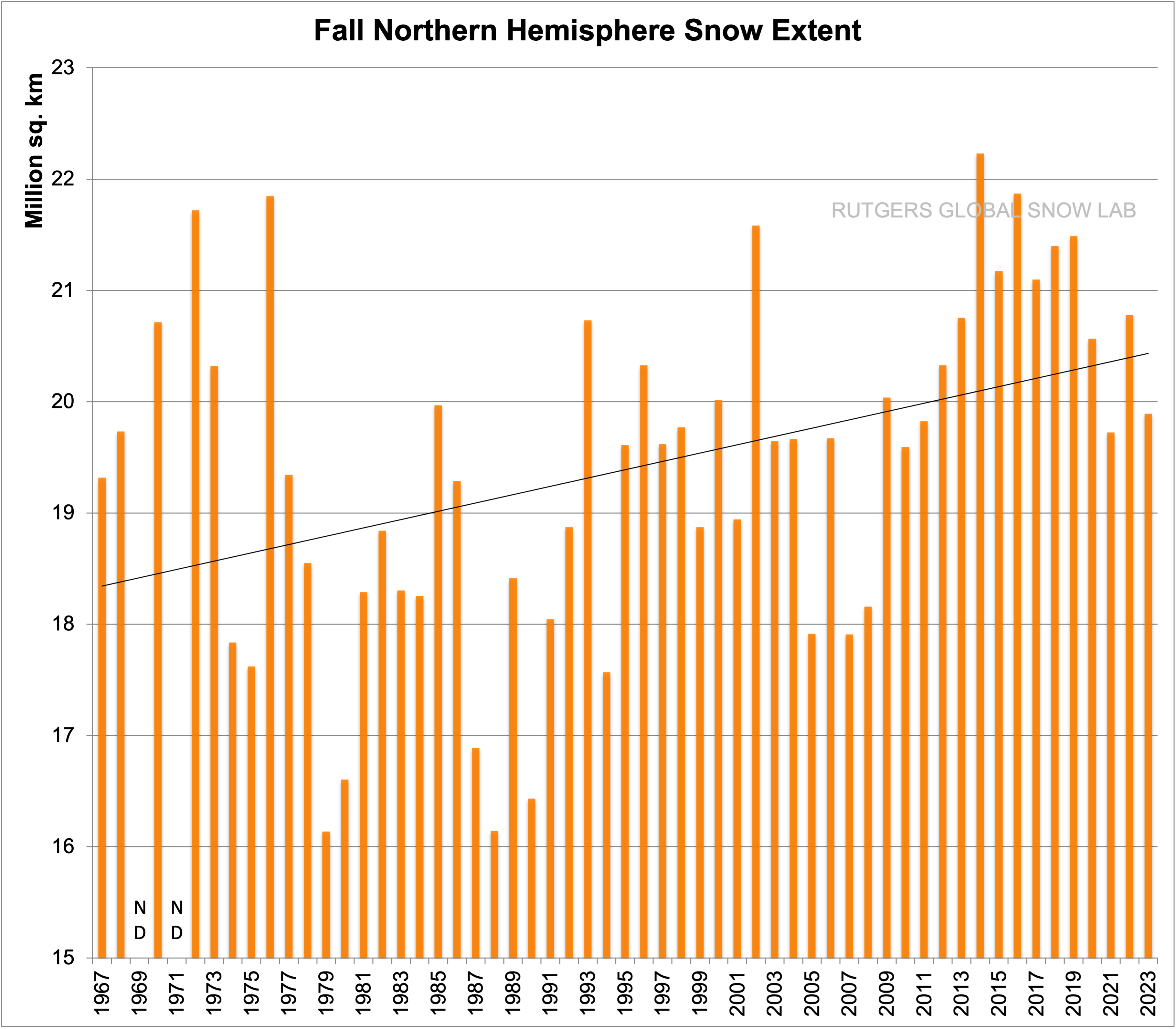
Fall snow extent is increasing for the same reason that Spring snow cover in decreasing. Warmer (and therefor moister) air.
Interior land cools rapidly through the Autumn and precip falls as snow as the greater precip water meets the rapidly cooling land. Warmer Arctic waters around the Russian/Siberian coast also is allowing earlier/greater snowfall there.
The opposite occurs in Spring with quicker warming of land and snow melt with the interior penetration of warmer/wetter air.
“We are already seeing advancing permanent ice extent on more as snow. Warmer Arctic waters around the Greenland and early season snow fall has a strong upward trend.”
Yes at altitude we are, and that is expected as again warmer/wetter air will give greater snowfall there (Greenland plateau) for a few decades yet. That does not however outweigh the melt at the noses of greater advancing glaciers as the ocean warms.
But the warming has only just started. It has 9,000 years to come.
Once ice forms, it becomes difficult to melt. We are already observing the advance on Greenland despite the ocean getting warmer apart from the small region where calving is keeping the water cooler.
Antarctic is getting a lot more intense sunlight than Greenland. It is down from its peak 3,800 years ago but it did not melt even then. .
The ice flows down hill. All the high ground along the arctic coast will gain ice and it will advance down. There are already northern slopes near the Arctic coast that have gained permafrost.
See level falls closely aligns will rising solar intensity at 40N per attached. The snowfall eventually trumps the melt. Already evident on Greenland.
The area of the NH oceans reaching the 30C SST limit is increasing at 2.5% per decade. It is currently at 10%. So in 160 years expect half the ocean area of the NH to be hitting 30C. That puts up around 86mm of water in the atmosphere over half the ocean in September. A lot of that will find its way to land as snow. The snowfall will be too great to melt. It will start on the mountain tops and work down to the valleys. The land will not get much warmer than 0C so not much melt happening.
It is the way it has happened in the past 4 cycles and will be the same this cycle.
Simple question: How many times were thermometers replaced with newer technology and when were those installed?
Doesn’t even have to be newer technology. All instruments degrade as they age.
Just replacing old equipment with new equipment of the same type, can result in changes in the data being recorded.
Story tip.
Sam Cottle wrote an article on Medium.com but the teaser in the email sent with links to new articles is all we get because clicking it gets
410
This post is under investigation or was found in violation of the Medium Rules.
What rules? What did Mr. Cottle write that Medium found objectionable?
The Origins of a Scientific Failure: Man-Made Climate Change Debunked.
Few scientific sources are more credible than NASA, though we’re all prone to error. We’re misguided if we…
https://medium.com/@cottlesam/the-origins-of-a-scientific-failure-man-made-climate-change-debunked-0631d946aeb1
The Medium website depends on subscriptions. The majority of subscribers are well paid elite working for government or reliant on government largesse.
It would be unacceptable to subscribers to read anything that indicates they are being scammed or are part of the scam.
They can’t stand the truth.
GISTEMP is a similar story. The graph below is six years old and should be redone to see if Dr. Gavin Schmidt’s group has produced further increase to the 1950-1997 trend.
You can get that trend here
Trend from Jan 1950 to May 1997 is 1.045 C/Century
A link to some blog called Moyhu that I never heard of before.
The graph in my 10:45 post shows the source as GISTEMP Most of the Internet Archives Way Back Machine links to past GISTEMP files come up:
ForbiddenYou don’t have permission to access /data/update/gistemp/GLB.Ts.txt on this server.
It’s just ever so nice that government climate scientists fix it so we can’t see what they are doing.
Moyhu is my blog. It’s jut a simple regression calc.
The regular place for GISS data is
https://data.giss.nasa.gov/gistemp/tabledata_v4/GLB.Ts+dSST.txt
Giss will provide historic data, and graphs, here
https://data.giss.nasa.gov/gistemp/history/
Your 2nd link doesn’t explain why the data in your 1st link changes several hundred entries every month. So far In January there were 544 changes and 321 in February. Last year, 2023 averaged 316 per month.
And as I’ve told you repeatedly if you change the gio.py file to output more than 2 decimal places you’ll see that values for every month change on every update. You’re seeing few changes than what really happened because you are only looking at 2 decimal places. One reason this happens is that GHCN is still loading in observations from the past.
“..GHCN is still loading in observations from the past.”
_____________________________________
Isn’t that ever grand.
Gio.py file? Whatever hoop that needs to be jumped through to get all the meaningless decimal places, I’m not going to be jumping through any time soon. .
Yes. We want as many observations as are available entered into GHCN and/or ERSST. Digitizing hand written records takes time.
That’s the python file that creates the GISTEMP output file. It rounds the floating point number to 2 decimal places and multiples by 100. You can change it to output the entire IEEE 754 value.
That’s fine, but you’re underestimating the changes by not doing this.
GHCN is still ADJUSTING measurements from the past, is what he meant to say.
Anyone that uses GISS (et al) for any sort of “climate change” indicator is either a scam-artist or very ignorant of its origins.
It is made up from every changing urban contaminated sites, junk, infilled, and just plain fabricated never-was-data.
Its only possible purpose is climate propaganda.
Then that is poor programming practice. Python can be used to do scientifically accurate analysis, but the programmer has to have the integrity to ensure the code is preserving the raw data accuracy and not “adjusting” the output.
JamesB_684, That’s the not the issue.
Deliberate mal-adjustments ARE the issue. !!
Even if 100% of that trend actually existed and was being caused by CO2, it’s still a big, so what?
What’s the trend on this chart from 1950 to 1997?
It looks like a cooling trend to me.
Now that Mann’s hockey stick farce has been utterly falsified…
12:35 here… https://www.youtube.com/watch?v=VDBmdUrDQFs
I don’t care about no damn GAT. (not that I ever did) There is NOTHING out of the ordinary happening.
GAT = Global Average Temperature
Is there some reason people use UDAs, do they think it makes them look smart or what?
YBYA
Sorry, there is a more immediate problem with Mann’s hockey stick. It is only about the NH. There we should have had cooling up the 1970s, if the IPCC position on warming GHGs and cooling aerosols was correct. Something like this..
If you compare this to the hockey stick graph, you will see the “self evident” warming in the first half of the 20th century. Sure, but it NEVER SHOULD HAVE HAPPENED! Cooling aerosols outran mediocre GHGs by a huge margin in the NH.
Here, as in many other instances, “the science” is self contradicting.
https://greenhousedefect.com/the-holy-grail-of-ecs/a-cross-check-to-manns-hockey-stick
They set the ‘reasons’ out in a free-to-read, peer-reviewed scientific paper so that anyone, including Paul Homewood, can invalidate them using the normal scientific process, rather than singing to the choir on conspiratorial blogs.
None of the global surface temperature data sets has a statistically different warming trend than the UAH satellite data set featured on the side-bar here, which is supposed to be the ‘gold standard’.
In fact, over the past 15-years UAH has a faster global warming trend than any of the surface data producers.
Never mentioned.
Check AIRS (after 2003, on gistemp/maps). 0.14 deg lower trend than the normal GISS sources.
Comment says:”…normal scientific process,…”
This humorous even coming from you. The “normal scientific process” is not used by climate science, such as giving all your data so others can replicate your findings.
I’m still amused that there isn’t an ISO Quality Standard being applied to the methodologies and practices of producing global averaged temperatures constructs.
Sheesh, if you want to get a cleaning contract for a government office you have to have ISO9000 certification.
Cleaners are more quality assured than climate “scientists” it would appear.
There’s a similarity between cleaners and climate “scientists”. They both work to get rid of things the people who pay them don’t want to see.
Then you self-proclaimed ‘skeptics’ should have no problem identifying these failings in HadCRUT5 and highlighting them to the publisher of their paper.
Nobody seems to have managed to do that yet.
Paul Homewood seems to be unaware that the paper even exists.
Maybe, now he knows, he will read it and come to the rescue?
Again that juvenile cherry-picked use of two very strong El Ninos to show warming in the atmosphere, that has much less thermal inertia than the surface
You are just incapable of understanding anything but your mindless propaganda.
One thing that strikes me is that they start with their previously corrected data sets and apply their improved correction process to those instead of starting with the original unadjusted data. On the surface, that seems like it’s going to double count to me.
Did you read the paper I linked, the paper written by the publishers of HadCRUT5 and that Paul Homewood appears to be unaware exists, where they say most of the changes are due to increased data sources, especially from the Arctic, rather than from adjustments?
You didn’t, did you?
More selected junk data… more data to warp and mal-adjust.
The publishers of the HadCRUT5 paper eagerly await your considered rebuttal..
They’ll be waiting a good long while, I suspect.
I hadn’t, I’d only skimmed it but I’ve read it a bit more now. And yes it’s less a reanalysis and more simply combining datasets. There are some interesting choices made. I like that they try to account for island measurements vs SST not bleeding into each other. Same for ice. But the percentages seem odd choices.
Good for you that you read through it. More than most here attempted. That includes the author of the above article, who appears to be oblivious to its existence.
You mention it all the time. But you never mention why you compare tropospherical data with surface data.
That’s a point that could equally be directed to WUWT, yet I never see you or anyone else do it.
Even if the average temperate goes up by a few degrees this does not mean we are having climate change with looming catastrophic consequences. If a polar region were to change for a significant length of time to a continental climate or a desert to a semi-desert or savanna, we could describe this as climate change. We have not seen this happening in modern history. But if it were to happen, humans would simply adapt.
Do we even know if there was a change like this in one climate zone that all other climate zones would experience significant changes? Perhaps we will have the answers with a couple of centuries or even millennia of recorded data and observation but our understanding of the complexity of climate is limited. I predict if humans are still carefully studying climate in 2100 that they will be even more amazed at the complexity.
Why are climate alarmists not engaging in a serious discussion of the complexities of weather and climate? Perhaps it is because they would end up destroying their narrative?
Most of “global” warming is occurring in the high northern latitudes in January. It has gone from brass monkey territory to just effin cold.
The oceans are retaining heat in the region of the Ferrel Cells. These are high precipitation zones. So obviously ocean heat retention due to steepening of the thermocline rather than anything to do with CO2. Oceans CANNOT “uptake” heat from the surface to abyssal depths in decades. These circulations take, at minimum, hundreds of years.
You might get better understanding from reading this:
Heat_Response.pdf
This seems like an article written several years ago
The alleged pause is gone and the warming trend since 1975 resumed, with 2023 allegedly OVER +1.5 degrees C, warmer than 1850. Not that anyone really knows the GAT in 1850
The most important adjustment, by far, was the elimination of almost all the global cooling in the 1940 to 1975 period, back in the 1990s. Missed by the author.
The adjustments shown here are most likely in addition to the initial adjustments to the raw data, included in the original announcement to the public
We know that surface temperatures are biased because adjustments continually favor the CAGW narrative
But the CAGW narrative ONLY requires a warming trend after 1975 to support the narrative.
The UAH statistic would work if HadCRUT and NASA-GISS statistics did not exist
CAGW predictions are NOT based on any historical temperature trends
CAGW is a new imaginary climate.
CAGW is hysterical, not historical.
As I mention above, over the latest 15-year period the UAH satellite data set has a warmer best-estimate warming trend than any of the global surface data sets.
So if the surface data are being adjusted to look warmer, then are we to assume that Spencer and Christie at UAH are at the same game, only worse?
You are cherry picking a 1/3 subset of the entire 44 year UAH database to prove a point that is contradicted when using the entire UAH 44 year dataset.
That is lying, in my opinion
The point I’m making is that it seems very unlikely that global surface data are deliberately being adjusted upward when they’re not even warming as fast as the satellite data in recent years.
This chart shows UAH and HadCRUT5 over their joint period of measurement. HadCRUT shows fractionally more warming but both trends are within one another’s uncertainty margins. So if HadCRUT is being deliberately adjusted upward then they’re not doing a very good job of it.
The RSS satellite data set is warming even faster than the surface data since 1979.
Are you driving a battery car yet, Nail?
No, petrol.
And if you can find a post of me advocating any of that ‘green living’ stuff you’ll be doing well.
RSS deliberately uses “climate models” and all the worst sea temp data to try to make RSS match the farcical surface data.
Poor guys… they just couldn’t hold their scientific integrity together.
RSS doesn’t measure sea surface temperatures. It measures temperatures in the lower troposphere, including above the sea surface. So do UAH.
They disagree with one another on details (less so in recent years) and their trends are within each other’s error margins.
Thank you. Now you can stop comparing surface data sets with satellite date sets, as if it means anything. Unless of course, you like comparing apples to oranges for some reason that escapes everyone else.
Right; would you kindly make that point when WUWT updates the monthly UAH satellite without clarifying that it is not representative of surface data?
RSS deliberately uses “climate models” and all the worst sea temp data to try to make RSS match the farcical surface data.
Poor guys… they just couldn’t hold their scientific integrity together.
You are making a big case out of a tenth of a degree difference.
Now, which data set is more accurate, the UAH data set or the HadCRUT 3, 4 or 5?
Right after 1998 hit the hottest temperature since the 1930’s, the climate alarmists were thinking that their predictions of continued CO2 warming were correct, but the temperatures did not continue to warm, they started cooling.
So the temperature data mannipulators started manipulating the temperature data and managed to get something like 10 years between the years 2000 and 2015, where they proclaimed each successive year was hotter than the previous year. Every year we had to hear about the “hottest year evah! from NOAA and NASA Climate.
Below is the UAH satellite chart. NOAA and NASA Climate found about 10 years from 2000 to 2015, that they proclaimed to be the “hottest year evah!”. See if you can find any years between 1998 and 2015 that were hotter than 1998 on the UAH chart.
NOAA and NASA Climate could not be proclaiming “hottest year evah! using the UAH satellite chart.
According to doonman, above, they are not comparable, because one is satellite and the other surface. I disagree with him, as apparently you do; but I don’t see you challenging him.
Your own chart shows that the warming since 1998 is consistent with the long-term trend in UAH, up to and following 1998.
I can find 3 years warmer in UAH than 1998 since 1998: 2016, 2020 and 2023. Or am I only allowed to stay within your selected range of years?
Looking very much like 2024 will add to the growing group of years that are warmer than 1998.
It’s almost like there is global warming.
TFN: “According to doonman, above, they are not comparable, because one is satellite and the other surface. I disagree with him, as apparently you do; but I don’t see you challenging him.”
I guess I missed his comment. I would just tell him that the weather balloon data correlates at about 97 percent with the UAH satellite data. The weather balloons measure the temperatures from the surface to the upper atmosphere.
TFN: “I can find 3 years warmer in UAH than 1998 since 1998: 2016, 2020 and 2023. Or am I only allowed to stay within your selected range of years?”
Yes, you should stick with the timeframe I was referencing. I’m talking about climate change fraud here, on the part of NOAA and NASA Climate, not the UAH temperature trend.
TFN: “Looking very much like 2024 will add to the growing group of years that are warmer than 1998.
It’s almost like there is global warming.”
Unless you look at the Big Picture which would include the temperatures prior to the satellite era (1979).
The current warmth has not exceeded the warmest temperatures in the 1930’s, at least not in North America. We still are not at the “hottest year evah!”.
And warming happens during a portion of the weather cycle. The temperatures warm for a few decades, and then they cool for a few decades and then it repeats. At least since the end of the Little Ice Age.
We are on the third such cyclical upswing in temperatures since the Little Ice Age ended. Temperatures rose from the end of the Little Ice Age to the 1880’s, then the temperatures cooled through the 1910’s, then the temperatures warmed from the 1910’s to the 1930’s, and then the temperatures cooled to the 1970’s, and then the current warming began in the 1980’s.
After the last two warmings, which were equal to today’s warming, the temperatures cooled for decades afterwards.
So what do you think is going to happen this cycle? Will CO2 make the temperatures continue to climb, or will a cooling set in like it did in the past? We’ll just have to wait and see.
All Climate Alarmists have is guesswork.
Climate realists have the temperature history
Just think: If we were back in the 1930’s with our modern ideas about CO2, the scientists of the day would think, yes, CO2 must be driving these hot temperatures. And some of them would probably have been very sure of themselves about their CO2 theory.
And then the temperatures cooled by about 2.0C from that highpoint in the 1930’s to the lowpoint of the 1970’s.
Those climate scientists, in this scenario, promoting CO2 warming, who were so sure of themselves, got a rude awakening. I wonder if that will happen this time?
C’mon man!
As TFN admits – he’s only lying to make a point.
What you do not realise is that the warming in the UAH data is occurring in the region of the Ferrel cells. Two lobes that also align with the ocean heat retention. And obviously nothing to do with CO2.
Clearly something the the CO2 demonisers do not what to know let alone advertise.
You’d need to take that idea up with UAH. They publish their data as ‘global’.
And UAH shows warming ONLY at El Nino events.
Do you have any evidence of human causation for those El Nino events?
Or are you admitting that the slight warming is totally natural .
The UAH data start in Dec 1978 and cover numerous ENSO fluctuations.
ENSO is an oscillation, in that it does not add or subtract heat from the climate system over the long term. It just swishes the available heat between the ocean and the atmosphere.
Therefore, ENSO does not explain the observed global warming trend in UAH, or all the other global temperature data sets, since Dec 1978 – no matter how much you wish it to be so.
“The most important adjustment, by far, was the elimination of almost all the global cooling in the 1940 to 1975 period, back in the 1990s. Missed by the author.”
I agree.
The fact that the bogus Hockey Stick chart only shows a 0.3C of cooling from the 1930’s to the 1970’s is proof that the Hockey Stick chart is bogus. The cooling from the 1930’s to the 1980’s was more like 2.0C.
Would climate scientists be wringing their hands over a New Ice Age coming if the temperature drop was only 0.3C? Of course not.
The Temperature Data Mannipulators and their bogus Hockey Stick chart erased all the warmth of the past in order to promote the Human-caused Climate change narrative, which claims we are experiencing unprecedented warmth today.
Here’s the U.S. regional chart for the period (Hansen 1999). It shows about a 2.0C cooling from the end of the 1930’s to the end of the 1970’s. This is what had climate scientists of the period excercised about the cooling possibly continuing and taking us into another ice age. They would have laughed off a 0.3C cooling, like is depicted on the Hockey Stick chart. The bogus Hockey Stick chart is the BIG LIE of alarmist climate science.
Below is the temperature profile the climate scientists of the 1970’s were looking at:
TA: “The fact that the bogus Hockey Stick chart only shows a 0.3C of cooling from the 1930’s to the 1970’s is proof that the Hockey Stick chart is bogus.”
Nobody is coming to the defense of the Hockey Stick chart. That’s because they know a temperature cooling of 0.3C from the 1930’s to the 1970’s is ridiculous. Therefore, they know, or should know now, that the Hockey Stick chart is bogus and does not represent reality.
And the climate alarmists won’t defend it. That’s how you know it’s true.
It is ridiculous to think that climate scientists in the 1970’s were worried about a 0.3C cooling. Would anyone today think a 0.3C cooling was significant? Of course, they wouldn’t. Would anyone today think an 0.3C cooling was bringing on a New Ice Age? Of course, they wouldn’t.
The bogus, bastardized Hockey Stick chart does not represent reality and the 0.3C cooling it shows, 1930’s to 1970’s, is proof.
Will there be a defense of the 0.3C cooling from the climate alarmists?
Don’t hold your breath waiting. They can’t defend it. That’s why there’s silence from them.
The Climate Alarm rules are few and simple.
That is it.
You missed The Big One
There are no CAGW data
CAGW is a fantasy climate that has never happened before.
There can not be dats for somethig that has never happened.
Without data there is no science
CAGW predictions are not science
They are climate astrology
I love it when you talk like that! 🙂
CO2 levels have been much higher in the past (7000ppm) than they are now (420ppm), yet no runaway greenhouse has occurred.
And if we burnt all the coal, oil and natural gas currently available, all at one time, it wouldn’t raise the CO2 level much above 800ppm, so we aren’t even close to a runaway greenhouse and couldn’t get there if we tried.
6- If anyone asks, deny that you changed the data.
7- Finally, claim that the fudged data doesn’t change the results.
The differences between the datasets are not due to changes in the adjustments, rather, they are due to a significant increase in the density and coverage of data in HadCRUT4 compared to HadCRUT3:
And an inclusion of most of the Arctic region in HadCRUT5 compared to HadCRUT4:
As always on WUWT, the conspiracy theory trumps all reason. It doesn’t matter what perfectly sensible explanations there are for the differences, it doesn’t matter that those explanations are laid out publicly in meticulous detail in peer reviewed papers available to everyone, it doesn’t matter that not one single person on this website can actually point to any error, fraud, or flaw in the updated datasets, all that matters is that the changes ever so slightly increased the trend (bringing HadCRUT more in line with other datasets from major orgs, no less), and that means it must be a grand conspiracy.
OK I’ll start with this –
the whole notion of a “global average temperature” is a nonsense construct with zero application to anything that occurs anywhere in the world at any time.
HadCRUT is a gridded global dataset, so if you feel weird about the idea of using the global mean temperature anomaly as a metric, you can simply work with the gridded product instead.
But that aside, I maintain that the global mean temperature anomaly is quite a useful metric indeed, as it can discern between major global climate states, such as glacial periods and interglacials, and track the transitional periods between them. So it is extremely useful as a base metric to understand how the planet’s energy balance is shifting.
‘…I maintain that the global mean temperature anomaly is quite a useful metric indeed, as it can discern between major global climate states, such as glacial periods and interglacials, and track the transitional periods between them.’
How do we ‘grid’ temperatures for periods when there were no thermometers?
That’s a broad question, and paleothermometry is a huge and mature field of science with a large body of literature. Depending on the density of a proxy network, you can produce a gridded proxy dataset, but often you will produce some other form of analysis – e.g. a regional, hemispheric, or global dataset.
All good. But how to explain, then, that large numbers of proxies from around the world that clearly indicate significant temperature variability during the Holocene have been ignored / suppressed in favor of ‘reconstructions’ based on limited and questionable proxies, e.g., strip bark pines, that portend to show no variability until the onset of widespread fossil fuel consumption?
I’m not aware of individual proxies being suppressed, but individual proxies contain signals related to local, as well as global, hemispheric, or regional, conditions. This is why networks of proxies are typically combined to produce reconstructions that represent the common underlying signals of the proxies, and why most modern reconstructions combine multiple proxy types instead of relying on a single proxy.
So you make-up and cherry-pick data, to show what you want it to show.
You are talking fanciful gibberish again.
Frank, such obvious rational questions as yours are legion when it comes to analysing the probity of a “global average temperature” construct.
It’s just mucking around with spreadsheets, plugging numbers of dubious origins and provenance into cells, and calling the end computations “THE Science“
Had Crud uses data from GHCN.
This data is from a changeable and massively contaminated urban, airports and other sites.
It is TOTALLY UNFIT FOR THE PURPOSE OF ANY INDICATION OF CHANGING CLIMATE
Temperature is an intensive property.
”Intensive properties cannot be algebraically added or subtracted.”
As such they cannot be averaged or given a mean.
This is a common trope around these parts, but nobody parroting it actually knows what it means or why they’re saying it, it’s just fodder for a credulous audience of fellow contrarians. It is perfectly possible to average intensive properties across different systems, such as temperatures across regions of the earths surface, and derive a meaningful metric that can track changes in the state of those systems or regions. As said above, the global mean temperature perfectly correlates to the advance and retreat of continental ice sheets, giving scientists an exact 1:1 metric for determining changes in the global climate state.
if you can’t address this fundamental inconsistency in the position you’re espousing, there is nothing more to debate on the topic. The global mean temperature anomaly is a useful thing to calculate.
One local weather station’s hourly temperature readings might be useful to get a feel for how variable conditions there can be.
But what relevance or applicability has a construct that adds all the readings together, then divides that value by the number of readings taken, and then doing the same thing for a station 100k away, and then adding the 2 averaged values together and dividing that number by 2?
I mean, it’s just something an 8th grader would boast about –
“Miss, miss – look what I did!”
The thing being tracked is the deviation of temperature from the regional climatology. How much the climate of different regions are changing over time is directly comparable. As noted above, the global temperature anomaly perfectly correlates to the advance and retreat of ice sheets, and even other climate variability like ENSO, and even large volcanic eruptions. It is indisputably a valuable metric to track.
“fundamental inconsistency in the position you’re espousing,”
You have never addressed the fundamental fact that the surface data is highly urban contaminated and is totally unfit for the purpose of indicating global temperature change over time.
The “global mean temperature” calculated from tainted surface data has ZERO purpose except propaganda.
‘It is perfectly possible to average intensive properties across different systems, such as temperatures across regions of the earths surface, and derive a meaningful metric that can track changes in the state of those systems or regions.’
Yes, it’s possible. No, it’s not meaningful. The issue is supposedly the trapping of heat by CO2. Temperature anomalies can’t tell you that.
‘As said above, the global mean temperature perfectly correlates to the advance and retreat of continental ice sheets…’
Substitute ‘glaciers’ for ‘continental ice sheets’ and you might want to reconsider. See various IPCC-approved temperature reconstructions for details.
Observing a change doesn’t tell you what is driving the change, and no one has ever said otherwise.
I don’t think I’ll make that substitution, but thanks for the suggestion.
‘Observing a change doesn’t tell you what is driving the change, and no one has ever said otherwise.’
Good.
‘I don’t think I’ll make that substitution, but thanks for the suggestion.’
A bad attempt at humor on my part. I was only trying to convey that it is not unusual for the IPCC to tout millenial scale temperature ‘reconstructions’ that are inconsistent with known advances and declines of sea ice and alpine glaciers.
Whenever “intensive properties” get thrown into the mix here, I’m reminded of the Sovereign Citizen youtubes that crack us up late at night. . “I don’t need no stinkin’ license plates. I’m not engaging in commercial activity. I’m a traveler“!
‘As always on WUWT, the conspiracy theory trumps all reason.’
As you may know, the term ‘conspiracy theory’ has very negative connotations and is often utilized by parties seeking to stifle inquiries into policies or events that run contrary to what a ‘consensus’ holds to be true. While there are certainly ‘nutters’ in our midst, a cursory review of the COVID response clearly indicates that the term was repeatedly used to disparage many claims that were subsequently validated.
From this layman’s perspective, the continual adjustment of (very) past data to compute a meaningless metric to support a narrative that uniquely and vastly benefits and empowers the holders of that narrative deserves all the scrutiny that can be brought to bear.
Science depends on scrutiny, so I agree with you in that regard, but disagree that the metric is meaningless, disagree that the metric is computed to support any “narrative,” and disagree that the “narrative” benefits the scientists working on these problems in any unique or profound way that doing any other science would not.
Also, as I said above, the differences the post is highlighting in the HadCRUT dataset come not from changes in the adjustments, but from more data being added to the analysis. Having more data is good, even the WUWT diehard conspiracists should agree with that.
‘…disagree that the metric is meaningless, disagree that the metric is computed to support any “narrative,” and disagree that the “narrative” benefits the scientists working on these problems in any unique or profound way that doing any other science would not.’
My goodness. The ‘metric’ is presumed to be based on temperature measurements that were and are spatially and temporally sparse. The ‘metric’ is only computed to support a narrative that the Earth has warmed since the widespread use of fossil fuels, and will continue to do so dangerously if the use of such fuels is not substantially curtailed. And, finally, the scientists computing the metric and supporting the narrative are paid by those, who, as I noted above, are uniquely and vastly benefitted and empowered by progressing the narrative.
‘Having more data is good, even the WUWT diehard conspiracists should agree with that.’
More data is good, but not if it’s adjusted to conform with a narrative that is not supported by evidence.
This is sheer conjecture. The metric is computed so that scientists can observe how the earth’s climate state is evolving. And the notion that scientists are simply being bought and paid to commit fraud is quite absurd – the methods are freely published in academic literature. Show us the fraud. And the raw data are freely available, anyone who wants can obtain the data quite easily and compute their own estimate of global temperature change. Show me the global temperature estimate from people you believe are completely untainted by public funding.
I do always find it interesting how easily the contrarian set think people can be bought. A bit of projection of their own ethical fortitude, perhaps? “I could easily be bought, so everybody can easily be bought.”
‘The metric is computed so that scientists can observe how the earth’s climate state is evolving.’
Alan, we’re talking about many billions of tax payer dollars (and pounds, Euros, etc.) here. Would we have expended this much treasure and diverted so many resources just to compute GATs for the last century if it wasn’t supportive of the CAGW narrative?
Would those who benefit from implementing the societal and economic changes ‘dictated’ by CAGW spend a single dime to adjust any of the data ‘sets’ if one could just routinely sample unadjusted data from any of many rural data stations and expect to see warming?
‘I do always find it interesting how easily the contrarian set think people can be bought. A bit of projection of their own ethical fortitude, perhaps?’
Again, look at COVID. We don’t even need to infer bad intent to see that, when push came to shove, those who benefited from the ‘consensus’ response consistently locked arms against anyone that questioned that consensus.
NASA and the Met Office do an enormous amount of earth science research, so, yes, they absolutely would still be engaging in initiatives to understand and monitor the earth’s climate.
And, again, the raw data are freely available to anyone, show me a rogue scientist or group of scientists who has produced an independent surface temperature analysis that contradicts those from NASA and other major research orgs. The Berkeley Earth non-profit (founded by climate change skeptics, no less) did an independent analysis and they arrived at the exact same conclusion as NASA, Hadley Centre.
If there’s this gigantic worldwide conspiracy to defraud the public, where is the fraud? Nobody here can say. Nobody can produce the “right” answer that shows the others to be lies. They can’t point to any methodological flaws in the multitude of publications on this topic from Hadley (I doubt anyone in this thread crying fraud has ever even glanced at the papers).
‘NASA and the Met Office do an enormous amount of earth science research, so, yes, they absolutely would still be engaging in initiatives to understand and monitor the earth’s climate.’
You’re attacking a straw man argument of your own making. Let’s agree to a basic principle that all resources are scarce. So yeah, they would still be researching earth science, but would they really be devoting so many resources to support the CAGW narrative if solid, i.e. unadjusted, evidence to support it were readily available? Why not spend more on, say, better weather forecasts?
‘If there’s this gigantic worldwide conspiracy to defraud the public, where is the fraud? …’
You cover an enormous amount of ground in this paragraph. My response is simple – you can’t create data that doesn’t exist. If series are contaminated by UHI or otherwise impaired, they can’t be used regardless of processing.
You might be surprised to learn that these agencies can work on multiple things simultaneously. Weather forecasts are being improved all the time, often using insights gained from advancements in computational climate modeling. There is no research being done to “support a narrative” – that is a contrivance of your own making – so I disagree with the fundamental premise.
That simply isn’t true, since this processing can, and has been rigorously shown to, remove such biases. So the question to you is again, where are the independent temperature estimates from the contrarians? Where are the publications demonstrating how everyone else has got it wrong?
‘You might be surprised to learn that these agencies can work on multiple things simultaneously.’
I’m sure they can. The point is that given limited resources, they’re diluting how much effort they can devote to less politicized research.
‘[W]here are the independent temperature estimates from the contrarians?’
I wouldn’t call them ‘contrarians’, but here you go:
https://www.nature.com/articles/s43247-022-00539-x
Personally, I don’t think the fact that a scientific subject has become a political hot button issue should deter scientists from conducting research into it. I also don’t believe it has diluted their efforts in the slightest – these scientists are incredibly productive within their fields and highly respected for their contributions. I understand where your bias is coming from – you dislike the politics – but you should recognize that it is you who is injecting political bias into the conversation.
The study you cite isn’t talking about urbanization bias, they are stating that cities are warming faster than rural areas. This urban warming is a real component of the evolving global surface temperature. When scientists talk about urbanization bias, what they refer to is the possibility of sampling this urban warming in rural parts of the network, which is, again, a statistics problem, and one is that is largely solved.
‘When scientists talk about urbanization bias, what they refer to is the possibility of sampling this urban warming in rural parts of the network, which is, again, a statistics problem, and one is that is largely solved.’
And how, exactly, would one sample urban warming in a rural part of the network? It’s not a statistics problem – if an instrument ‘senses’ the effect of urban warming, it cannot be ‘uneffected’, statistically or otherwise. Including such affected measurements into the gridding process just adds a warming bias to the GAT ‘metric’, which I guess is desirable in some quarters.
By the way, I owe you a response on the USCRN / nCLIVDIV similarity of results. Per Wiki:
‘In 1997 the World Climate Research Programme convened a meeting to determine the state of the art of climate research around the world. One of the principle conclusions of that meeting was that the global capacity to measure major climate variables such as temperature, rainfall, wind speed and direction, was INADEQUATE to inform efforts to confront the emerging issue of climate change.’ (emphasis mine)
I’ll buy that.
Again, urban warming by itself is not a bias – it is a real cause of warming. The surface of planet earth is warmer because of human cities than it otherwise would be. Including such stations in the surface temperature estimate is not only warranted but necessary to get a picture of how the earth’s temperature is changing over time.
The bias arises because we are using stations to represent not just the area in their immediate vicinity, but all of the area in between the station and the coverage of its neighbors. Thus an urban station, with a correctly recorded urbanized temperature trend (along with the background regional climate signal), might be spread over non-urban area. This is what homogenization procedures are designed to adjust for, and research has shown that they are very effective.
No one would disagree with this assessment. The hodge-podge collections of weather stations cobbled together to form the historic observing networks were not originally intended for long-term climate observation, they were intended to provide local weather information. That is precisely why scientists have to do so much work designing all of the adjustments that have to be done in order to compile regional or global temperature indexes. That changes in the US with the creation of the US Climate Reference Network, so going forward we do have a pristine climate observing network free of systematic bias, and we can use it to compare to the bias-adjusted network to see how well scientists’ efforts fare. And the answer is: they do a really good job.
‘That changes in the US with the creation of the US Climate Reference Network, so going forward we do have a pristine climate observing network free of systematic bias, and we can use it to compare to the bias-adjusted network to see how well scientists’ efforts fare. And the answer is: they do a really good job.’
I hope so. But as the ‘pristine climate observing network’ has only been fully operational since 2008, we really need to give it some time to see if that really is the case.
‘Again, urban warming by itself is not a bias – it is a real cause of warming. The surface of planet earth is warmer because of human cities than it otherwise would be.’
Ok, I get it now – the idea is to monitor the effect of GHGs AND the effect of urbanization on Earth’s GAT. Does that mean that in addition to doing away with fossil fuels, our prospective Pol Pots intend to march all of us off into the countryside when we hit 1.5C or so?
The idea is to monitor change in the GSAT, not to attempt deconvolve various components of the change by driving force. That would be putting the cart before the horse. All changes that affect GSAT are captured – from long term forced change, to warming due to land use change, to short term internal climate variability like El Niño.
The things we don’t want to capture are spurious signals related to, for example, changes in the composition of the station network, changes in observing practices and instrumentation, or urbanization bias. So scientists develop approaches for detecting and removing such non-climate related trends. These are the adjustments, much aligned on this website, that have been shown time and again in peer reviewed studies to be very effective.
“And, again, the raw data are freely available to anyone, show me a rogue scientist”
Well, I guess that is me. I do calculate a global average using unadjusted GHCN data, as anyone could (but sceptics never do). And I get the same results as GISS.
‘And I get the same results as GISS.’
Nick,
I don’t think anyone here doubts your programming skills. The issue, aside from the meaningfulness of a global temperature anomaly, is, of course, the quality of the input data. This is GHCN according to Wikipedia (*):
‘V4 is currently made up of 25,000 land-based stations…’
That’s a lot of stations! Any issues with any of them, e.g., UHI, NR, changes in equipment, coverage, etc.? Are any of the readings adjusted? If so, how?
‘This also helped eliminate the previously unsolved issue of homogenization which plagued the previous versions.’
Hmmm. I seem to recall that there was nothing to see here, just move along re. homogenization. Some detail here would be nice.
‘Additionally, V4 accounted for previously large issues, such as uncertainties, differences in scale, as well as the aforementioned homogenization.’
Same as above.
(*) I know the canned response, but please keep in mind that Wiki is notorious for it’s conformity to CAGW alarmism.
The point is that GHCN V4 issues two data files together. One is adjusted (homogenised), one unadjusted. They are in similar format. The unadjusted means what it says. It comes directly from the thermometers.
I use GHCN V4 unadjusted, which has no homogenisation. It makes essentially no difference, at least in this century.
‘I use GHCN V4 unadjusted, which has no homogenisation.’
Good. But that still leaves serious problems with uneven spatial and temporal coverage and UHI, no?
Dealing with uneven spatial and temporal coverage is a standard part of working with geospatial data. The solutions to these problems are well understood. UHI isn’t a serious problem, not at the global scale. Most of the planet is covered in water, not cities.
‘UHI isn’t a serious problem, not at the global scale. Most of the planet is covered in water, not cities.’
UHI IS a serious problem if you can’t cull the affected thermometers from your gridding process. Yes, most of the planet is covered in water, which is obviously not where any of GHCN’s highly touted 25,000 land-based stations are sited. Both of these issues (UHI bias and lack of spatial / temporal coverage) are problematic in terms of determining GAT anomalies.
You don’t want to “cull” thermometers in urban areas from the network, because in fact urban warming is a real phenomenon. Urbanization bias is essentially a sampling problem – stations in urban areas need to represent change common to the urban area as well as the surrounding non-urban region. This is the problem that homogenization solves.
But, again, even if UHI is left unaddressed, it is a small issue for the global mean, because land-area is just 30% of the globe’s surface, and only a tiny fraction of that land area is urban.
Yes, they are potentially problematic, but they are essentially solved problems. And they aren’t that large as problems go. Urbanization is small and restricted to land areas, as noted, and for most of the world we have far more station records than are actually needed to compute a robust global mean estimate (I’ve seen Nick and others show that you can get a very good estimate of the global mean with something like 90 stations).
‘You don’t want to “cull” thermometers in urban areas from the network, because in fact urban warming is a real phenomenon.’
The real (read political) drive to measure GAT is to drive home the narrative that CO2 emissions, aka fossil fuel usage, is roasting the planet. It is therefore dishonest to include UHI-affected stations.
‘This [UHI] is the problem that homogenization solves.’
The problem with homogenization, and why it’s beloved by CAGW alarmists, is that it doesn’t eliminate UHI, it ‘spreads’ it around, thereby imparting a warming bias to rural stations that have no trend or even exhibit cooling on an unadjusted basis. It’s like Nosferatu, everyone says it’s fixed or is not used, but it’s always there lurking in the background.
‘I’ve seen Nick and others show that you can get a very good estimate of the global mean with something like 90 stations.’
Sounds impressive until one remembers it’s just math. Nick could probably compute an estimate with 10 stations, but what would that honestly tell you other than Nick is good at math?
Not at all, this is nothing more than your own prejudice showing through. Scientists measure the GAT to understand how it is evolving. That means just observing the changes, using good sampling procedures and trying to reduce systematic bias. The part where we identify what is driving the observed trends is left to other areas of science.
This is a myth, oft repeated with no substantiation. Significant amounts of peer reviewed research show that homogenization is effective at eliminating non-climatic biases from the surface station network (see, e.g., Menne et al. 2009). Just look at the US network – the full, bias adjust nClimDiv network, comprised of some 10,000 stations, is perfectly aligned with the unadjusted Climate Reference network, a smaller station network specifically designed and maintained to be free of any source of systematic bias:
If the bias adjustments were not working as intended, these series would be seen to diverge. Either that, or the adjustments don’t work, but the bias is so insignificantly small that it is utterly imperceptible.
It’s all just math. We have a finite set of observations meant to represent a continuous surface. If you do your sampling carefully, you can minimize the number of samples needed to be truly representative. For the earth, for temperature anomalies, that turns out to be a pretty small number of samples indeed, and we have tens of thousands.
As a matter of fact, the ‘adjusted’ data in those two series are warming more slowly than the ‘pristine’ data.
So they do diverge (not statistically significant); just not in a way that WUWT likes to highlight.
It’s quite funny, really.
That’s impossible. You can’t calculate from two different time based data sets, one with “adjusted” data and one without and obtain the same result.
I don’t think your definition of the meaning of “same” is correct.
They aren’t different time based. There is a set of raw data and a set which is that same data, adjusted. You can choose which you use.
And WUWT chose to use the raw data, which is posted monthly on the side-bar here, and which is currently warming faster than the adjusted data.
You really couldn’t make this up.
“The metric is computed so that scientists can observe how the earth’s climate state is evolving”
HADCRUD is a fabrication that is massively contaminated by urban warming and agenda-driven mal-adjustments..
It is totally unfit for the purpose of observing how the earth’s climate state is evolving.
If the best you can do is red thumb, without countering the FACTS of the parlous state of surface station..
You LOSE. !
As I said…. You Lose. !
After all the evidence, do you still DENY that surface sites are totally unfit for “climate” purposes !!
Really !!
WUWT insist that the CRN data is ‘pristine’, whilst the adjusted ClimDiv data are biased towards warming and should not be trusted.
Yet, over their joint period of publication, the CRN data are warming faster than the adjusted data.
Do you see the problem here?
“ Having more GOOD data is good,”
HADCRUD is a fabrication that is massively contaminated by urban warming and agenda-driven mal-adjustments..
Adding more badly contaminated data probably makes it even worse.. on purpose.
It is totally unfit for the purpose of being used as an indicator of changes in the planet’s surface temperature over time.
As usual, AJ condones DELIBERATE data mal-adjustment so long as it supports the AGW scam.
What’s in it for you AJ to continue to support the scam.?
Gibberish..
HADCRUD is a fabrication that is massively contaminated by urban warming and agenda-driven mal-adjustments
It is totally unfit for the purpose of being used as an indicator of changes in the planet’s surface temperature over time.
No counter….just red thumbs.
… Seems you and your AGW-grovellers just don’t like the FACTS stated in bold.
So Sad 😉
Considering, that there were warmer historical periods (Minoan, Roman & Medieval), my gut feeling is that we are on a long, slow, slide into another ice age. And the weird variations we’re seeing in weather patterns, is part of a chaotic cycle.
Purists will no doubt tell me I’m wrong Bob, but I think that if you can identify a predictable cycle, it’s not a situation of chaos.
Two cycles, a period of stability, and a period of chaos. 😉
Four, possibly five cycles.
From the end of the Holocene Optimum there have been the Egyptian, Minoan, Roman, Medieval and perhaps the Modern warm periods. Approximately 1000 years between all of them.
Each peak cooler than the previous peak, each trough cooler than the previous trough.
Now, I haven’t heard of the Egyptian. But your observation, matches mine. I often cite them, when I get the CO2 zealot beating my ear. Now I can add an extra one 👍
Is it just a coincidence that the Modern Warm Period is beginning about 1000 years after the end of the Medieval Warm Period?
There does appear to be some pattern.
This so accurately describes my bi-cycling prowess 🙁
You should see mine. Bike, mounted on turbo exerciser, me hanging on to the handlebars, and falling off at the end. 😄
Just as long as you fall off with same élan that Joe Biden did.
Fudged data in, garbage data out.
“Put all three series together, and we can see how most of the warming since 2001 is the result of adjustments to the data:”
Hardly, looking at the data you presented it might be 0.2º as opposed to 0.5º
So.. you are saying that over half the warming from even the urban contaminated HadCrud fabrications is from adjustments.
Well over half… could be construed as “most”
I know you’re mathematically challenged but 0.2 out of 0.5 is not “well over half”!
More block heads giving us no reason the believe anything they say.
The referenced paper talks about the pause resulting from IR heat being absorbed in the ocean. But IR only penetrates a few microns into water. Interesting that there have been no discussion of this in the comments, but rather the discussion focuses on adjustments. The elephant in the room is ignored.