Guest essay by: Jan Kjetil Andersen
There is a well-established consensus concluding that the global sea level has risen over the last century, and that the level continues to rise. However, the question about whether the rate is accelerating or not, is more inconclusive.
To cast some light on this, I have analyzed the latest scientific papers on this topic. Thereafter I made my own time series analyzes based on tide gauges in the GLOSS network.
All data and software used in the analysis are available for download. See links in the end of the article.
I invite the readers to a discussion about the conclusions.
Firstly the findings from the academic papers:
I start by the IPPC AR5.
Chapter 3 is about Ocean observations, and here is exactly what I am looking for:

Figure 1 (IPCC AR 5 page 287 their figure 3.13)
(a) Shows the global mean sea level anomalies (in mm) from the different measuring systems as they have evolved in time, plotted relative to 5-year mean values that start at 1900. We see that the sea level has risen with 20-25 cm in the last 130 years, which gives an average rate of 1.5 to 1.9 mm/year.
(b) Shows the gauges observations from Church & White compared with satellite altimeter. In this close-up, we see a rise of 5 cm in 19 years, which gives an annual rate of 2.6 mm/year.
This shows that the rate has been higher in the last two decades than in the last century, but the next figure in AR 5 shows that this rate is not unprecedented in the record.

Figure 2: (IPCC AR5 page 289 their Figure 3.14)
Quote from IPCC text: “18-year trends of GMSL rise estimated at 1-year intervals. The time is the start date of the 18-year period, and the shading represents the 90% confidence.
The estimate from satellite altimetry is also given, with the 90% confidence given as
an error bar.”
The figure need some extra explanation to be understood outside the context of the AR5 report. According to the figure, there has been no accelerating since 1920. We see that both Church & White and Ray & Douglas observe approximately the same annual rise of around 2.5 mm/year between 1920 and 1940, and then there is a fall 1 mm/year before the rate rebounds to 2.5 mm in the late 1980-ies.
The Jevrejeva et. Al observes a maximum rate of 4 mm/year in the 1940-es but the series stop before the increase in recent decades. Satellite altimeters shows a steady rise with a relative small variation between 2.9 and 3.9 mm/year.
The satellite measurements has a very short series in the figure because the series only goes from 1992 to 2012. That means that only two years can be calculated with an 18-years trend.
I think a very important piece of information comes out of this figure. We see here that in reality IPCC find no evidence for accelerating sea level rise after 1920. The rise before 1920 was real, but can hardly have been caused by the small amounts of greenhouse gases emitted at that time. The CO2 level in 1920 was according to Nasa 303 ppm, or just 10% above the pre-industrial level and the warming that could have caused the sea level rise has to come before that. (http://data.giss.nasa.gov/modelforce/ghgases/Fig1A.ext.txt)
So why are we then hearing about the accelerating sea level rise in the media? Well, I think there are at least two reasons for that; firstly even though the figure does not show any acceleration, they does not draw that conclusion from it. What they say is this (AR5 Page 290): ”while there is more disagreement on the value of a 20th century acceleration in GMSL when accounting for multi-decadal fluctuations, two out of three records still indicate a significant positive value. The trend in GMSL observed since 1993, however, is not significantly larger than the estimate of 18-year trends in previous decades”.
This is rather inconclusive.
Secondly, other academic papers show an acceleration, I examine one of those below.
First, I want to update the IPCC analysis with the latest data.
The results presented in this section of AR5 are quite old. The newest of the three papers presented in the figure is Church & White, which was published in 2011, and this paper use data up to December 2009 only.
However, the authors keep extending the raw data used in their paper and the data series now includes December 2013. The reason for not having newer data is that quite many stations around the globe report late and a large bias would be introduced if the last years were based on the early reporters only.
I have run the extended series through my own statistical analysis created in php, Javascript and Google Graph, which gives the results below.

Figure 3: Blue line show Church & White 2011, with data up to Decemebr 2009. Yellow line is the authors later added data. Red line is satellite altimeter data used in AR5. Green line is altimeter until February 2016.
 |
 |
Figure 4: My Results from running an18-year trends of GMSL rise estimated at 1-year intervals. The time is the start date of the 18-year period. This should be similar to IPCC figure for Church & White and Altimeter, except that I have not included any confidence interval, but I think the uncertainty is equally well visualized by plotting each monthly data point. I think the match is close, although not perfect, but it should be close enough to confirm that the same data sources are used.
Then I have extended with latest Church & White data, and latest altimeter data.

Figure 5. The data in this plot goes to December 2014 for Church & White and, February 2016 for Satellite altimeter.
We see that the last added gauge data (in orange color) lift the last part of the plot to unprecedented high rate, but the period is far too short to make any conclusions from that.
This is what we get out of the AR5 with updated data.
I then go to another recently published paper on the topic.
A resent paper is the Temperature driven global sea level variability in the Common Era by Kopp et al. of Rutgers University, published in PNAS January 4th 2016. This paper provides an estimate of the global sea level changes over the last 3000 years.
They claim:
Historic GSL rise began in the 19th century, and it is very likely (P≥0.93 P≥0.93) that GSL has risen over every 40-y interval since 1860 CE. The average rate of GSL rise was 0.4±0.5 0.4±0.5 mm/y from 1860 CE to 1900 CE and 1.4±0.2 1.4±0.2 mm/y over the 20th century. It is extremely likely (P≥0.95 P≥0.95) that 20th century GSL rise was faster than during any preceding century since at least −800 CE. “
That may be right, but it does not answer whether we experience an accelerating rate or not. The figure below is from this paper.
H
Figure 6 (From Kopp et al; PNAS2016 their figure 1d)
What I read from figure 6 is that the sea level started to rise in the 19th century, well before climate change could have any effect and has continued on a quite stable rate since then, but the authors project that an acceleration may occur soon.
Rather than to continue searching more academic papers, I decided it was time to make my own research, so I went to the sources.
Analysis of gauge data from the GLOSS network
Global Sea Level Observing System (Gloss) is a network of 281 globally distributed coastal tide gauge stations. The Core Network is designed to provide an approximately evenly-distributed sampling of global coastal sea level variations.
http://www.gloss-sealevel.org/
One of the challenges in making use of statistics from gauge stations is the importance of using a so-called common vertical datum i.e. a reference point. The stations in the GLOSS network has such reference called Revised Local Reference (RLR). Each station use a calibrated local datum for all the data series, but there are no common global vertical datum for all stations. This means that we get an error if we try to mend together different short series to make one large average.
However, if we limit the series and analysis to a timespan where all the selected series goes continuously from start to end, we do not need any common datum to make a correct average.
I have selected three set of series, which I call very long series, long series and medium long series.
Very long series are 1900 through 2013; long series 1925 through 2014 and medium long are 1950 through 2014.
In addition, all selected series have at least 80% complete monthly readings.
Of the 281 stations in the Gloss network only 6 fulfils the criteria for very long series, 9 for long series and 22 for medium long series. The list of these stations is given in the end of the article.
Two averages are made for each set of series; one simple average, and one global gridded average. The latter one was computed by dividing the globe in a 6×12 grid consisting of 72 cells measuring 30 degrees latitude times 30 degrees longitude. First, an average of all stations within each grid cell are computed. The global average is then an average of the all grid cells with a weighting of each grid cells according to its area. Because degrees longitude are shorter closer to the poles, the grid cells are also smaller. The relative length of one degree longitude, is cosinus of the degree latitude at the same spot. The weight of each grid cell is therefore the absolute value of cosinus of the degree latitude in the middle of the cell.
The benefit with this method is that we get less bias toward the areas with most stations. The gridded average is therefore the most important of the two.
The plots of absolute rise and 18-year trend are shown below.
 |
 |
| a)Very long series(1900 through 2013):Simple average in blue, gridded in red. The plot shows 36 months floating average and linear trendline of mean sea level above local reference point. | b)18-year trend for very long series. Both start and end years for the 18-year period are shown. No discernible acceleration is evident from the moving average plot, but the linear trend line reveals a very small acceleration. However, all of this small acceleration is due to the small spikes in each end of the series. |
 |
 |
| c)Long series (1924 through 2014): The gridded average show smaller growths | d)18-year trend for long series. We see that the largest rise occurred in the period starting around 1965. No discernible acceleration can be seen after the 1965 – 1973 period |
 |
 |
| e)Medium long series(1950 through 2014), simple average in blue, gridded in red | f)18-year trend for medium long series. We see an acceleration for the simple average, but any acceleration for the gridded set is more dubious. Except for a very short spike in the end, the rise in recent decades are no higher than 1960-ies. All the trend in the gridded series is due to the spike since 2011. To visualize this I have included a trend line of a series that stops in 2011 (green color). |
Figure 7 a)-f). Absolute rise and 18-year trend for three different time intervals.
The plots in figure 7 suggest that there has been a small spike in the rise the last few years. This spike is also consistent with altimeter readings http://sealevel.colorado.edu/.
However, this spike may be contributed to natural variability. All the studies presented in AR5 above indicate 18-year trends that were significantly higher than the 20th century average at certain times and lower at other periods. This is likely related to multi-decadal variability like the Atlantic Multi-decadal Oscillation and/or Pacific Decadal Oscillation. The last spike may also have been caused by such a natural occurring variation.
So what to make of all this?
I have not made any regression analysis to show whether the small increase is statistically significant or not. I welcome anyone to do that. However, I think the graphs gives a quite clear message even without further analysis; if there is any acceleration, it is infinitesimal.
Regards
/Jan
References:
1. IPCC AR5 Chapter 3:
https://www.ipcc.ch/pdf/assessment-report/ar5/wg1/WG1AR5_Chapter03_FINAL.pdf
2. The Global Sea Level Observing System (GLOSS): http://www.gloss-sealevel.org/
3. Church, J. A., and N. J. White, 2011: Sea-level rise from the late 19th to the early 21st century. Surv. Geophys., 32, 585–602.
Both the paper and sources are freely accessible http://link.springer.com/article/10.1007%2Fs10712-011-9119-1
4. Kopp & al. Temperature-driven global sea-level variability in the Common Era. PNAS 2016
Full text: http://www.pnas.org/content/113/11/E1434.full
5. Nasa GHG gases: (http://data.giss.nasa.gov/modelforce/ghgases/Fig1A.ext.txt)
6. Satellite altimeter at Boulder university: http://sealevel.colorado.edu/
7. Data and software used to make this analysis: http://csens.org/mysource-txt/
List of GLOSS stations used:
Very long series (6 stations):
| Station | Country code | Station ID |
| Fremantle | AUS | 111 |
| Stockholm | SWE | 78 |
| Trieste | ITA | 154 |
| Brest | FRA | 1 |
| Marseille | FRA | 61 |
| San Francisco | USA | 10 |
Long series (9 stations):
| Tuapse | RUS | 215 |
| Pensacol | USA | 246 |
| Newlyn | GBR | 202 |
| Atlantic City | USA | 180 |
| Galveston II | USA | 161 |
| Key West | USA | 188 |
| Balboa | PAN | 163 |
| La Jolla | USA | 256 |
| Honolulu | USA | 155 |
Medium long series (22 stations):
| Kushiro | JPN | 518 |
| Mera | JPN | 359 |
| Manila | PHL | 145 |
| Legaspi Albay | PHL | 522 |
| Ko Lak | THA | 174 |
| Tregde | NOR | 302 |
| Adak Sweeper Cove | USA | 487 |
| Newport | 351 | USA |
| Fort Pulaski USA 395 | ||
| Hilo Hawaii | USA | 300 |
| Ceuta | ESP | 498 |
| La Couna | ESP | 484 |
| Barentsburg | SJM | 541 |
| Antofagasta 2 | CHL | 510 |
| Tofino | CAN | 165 |
| Prince Rupert | CAN | 167 |
| Sitka | USA | 426 |
| Apra Harbur Guam | GUM | 540 |
| Pago Pago | ASM | 539 |
| Kwajalein | MHL | 513 |
| Midway Island | UMI | 523 |
| Wellington Harbour | NZL | 221 |
Jan, A semantics nit-pick. You write, “…well before climate change could have any effect …”
In fact, only climate change could be the cause. There would have been little or no effect from human sources though. Climate change is constantly present. The argument is about human effects if any. In fact, depending upon the geologist, the mid-19th century may be marked as the end of the Little Ice Age, which would quite naturally be accompanied by sea level rise. Some geologists like Mary Hill place the end later, in the earliest 20th century. Otherwise thank you putting your work out for us to read and consider.
Sorry but it does not depend “only on Climate change”, it also depends on what the tectonic plates are doing and what the sea and ocean bottoms are doing as well.
Earthquakes can seriously change tide level gauge reading as can isostatic rebound.
Thank you Duster
Yes, of course I meant before any human caused climate change could have any effect
Well spotted.
/Jan
Firstly, thanks for a well written article. (Bigger graphs would be nice, some of the text is illegible.)
The main problem I have with all this is adoption of the idea of sliding trends. What is this supposed to show? If you are trying to remove some of the higher frequencies to “smooth” the data use a proper low-pass filter. A sliding trend is yet another of the crap “filters” used in climatology.
It has a very lumpy frequency response and lets through quite a lot you hoped to filter out, but far more importantly it has negative lobes which invert some of the variability
This explains the problem ( a sliding trend is like a running mean on the rate of change : same problem).
https://climategrog.wordpress.com/2013/05/19/triple-running-mean-filters/
Here is the freq response of sliding trend “filter”. This is unsigned *magnitude*, so I have coloured the inverting lobes to make it clear. ( Fourrier transforms produce a complex number, so it is conventional to visualise this by looking at the size or magnitude of that complex number. This is by definition a positive quantity ).
If you want to improve your analysis by using a proper filter you can find some code you should be able to adapt for you php page here:
https://climategrog.wordpress.com/category/scripts/
Rather than doing sliding trends, I would suggest you analyse rate of change of sea level ( by taking the first difference of your data points ) then apply a suitable filter. You will find that a much shorter filter will “smooth” the data well enough if you chose a well behaved filter.
BTW , if ( Prof. Marotzke ) you don’t believe the negative lobes make yourself some test data with a period of 10 years and compare with the 18y sliding trend ( ensuring that you log the trend at the central date of the window, not the end date )
Prof. Marotzke replied to my criticism of his paper which used slinding trends to mangle the data by saying there were no inverting lobes in a Welch filter ( which was not even the filter he was using). re Marotzke & Forster 2015.
Here is the kind of thing you get ( this is for a Welch fitler, another one with inverting lobes. At least this one attenuates enough so that they are not too big. )
Greg said:
“It has a very lumpy frequency response and lets through quite a lot you hoped to filter out, but far more importantly it has negative lobes which invert some of the variability
This explains the problem ( a sliding trend is like a running mean on the rate of change : same problem).”
Only if you choose a bad period for the running mean – as you did in your badly argued example. The data you plotted has a clear 4-5 year periodicity, so that the 60-month running mean you used produces a very bad result. You compared a simple 60-month running mean with a triple one based on 30 months – apples and oranges. A simple 30-month running mean gives quite a good result:
http://www.woodfortrees.org/plot/rss/from:1980/plot/rss/from:1980/mean:30
You make an elementary error by using an even-period running mean – to be properly centred, and be statistically robust, it must actually have a centre, as with 61 months or 31 months.
http://www.climate4you.com/DataSmoothing.htm
The whole point is that no one is doing a frequency spectrum on the data before choosing which window length to use for their runny average, so there is no way to choose a “good” or “bad” length. If you use a well behaved filter you don’t need to worry about whether it is “good” or “bad” length for the content of the data, you chose the filter with respect of the frequencies you want to remove. That’s the purpose of filters.
The point of the comparison is that if you want a “smoother” you actually get a smoother result with much shorter filter if it is does not leak and distort the data. One of the most common ( post criticism ) justifications for using runny averages is that they are “compact”. The 30mo triple running mean is no longer than the 60 mo RM but does not invert the peaks in the data.
Your WTF plot makes that point rather well, despite your assertion that it “gives quite a good result”. Just notice how the two main peaks in the data get truncated into slight dips; the circa 1982 dip gets inverted. There is also a lot of high frequency wiggles that should not even be there after a 30mo filter operation. That is what you consider “quite good”? How “statistically robust” do you think that is? LOL.
You also make the elementary error of assuming that an even number of elements can not be correctly centred. Probably because you are limited to clicking around on on rubbish like WTF.org and are not capable of designing or writing a filter yourself.
You should be wary of accusing others of making errors without checking.
From the link you provided about hazards of “smoothing”:
This is NOT a result of “smoothing” in general, a well-behaved filter will not produce such artefacts. It IS the hallmark of runny averages, and for that matter, sliding trends.
I wrote in October 2015 an article for the skeptical italian blog Climatemonitor.it about the sea level acceleration in
Norway-Russia(37) and Italian (42+3) stations. Also I used the data from
Houston & Dean, 2011 for the acceleration of USA stations.
My article is in italian but the so-called
support
site contains plots and tables in english.
The final conclusions I drew were not so different from the one presented
here:
USA: (-0.001+-0.015)mm/yr2 (1.96 sigma or 95% confidence) from Huston and Dean,2011
NORWAY-RUSSIA: 0.078+-0.039)mm/yr2 (1 sigma). Noting sistematic differences
between Norvegian and Russian stations:
NORWAY:(0.029+-0.041)mm/yr2 (1 sigma)
RUSSIA:(0.11+-0.13)mm/yr2 (1 sigma)
ITALY:(-0.004+-0.095)mm/yr2 (1 sigma)
Maps and values in the support site.
So, the most probable situation seems to be no acceleration and I
agree with the author’s conclusion.
RUSSIA:(0.11+-0.13)mm/yr2
That’s a huge acceleration. That means that over 100y the annual rate of sea rise increases by 11mm/y.
…. with an even bigger uncertainty.
No, here is the graphic from the study, nothing alarming at all…
http://i2.wp.com/www.climatemonitor.it/wp-content/uploads/2015/10/fig21.png
I did not say alarming , I said huge. It’s not alarming since your error margins are bigger than the derived figures. As I said below, your conclusions are not justified by your results.
If one site is showing 40mm/y/century acceleration that means in 100 it would be moving 40mm/y faster than now. That would be a significant problem…. unless the data is totally unreliable or you have a defective analysis.
NORWAY:(0.029+-0.041)mm/yr2
That is also pretty significant amount of rise but again with an even bugger uncertainty. What these results show is that there may be a problematic acceleration but the data is too poor to detect whether it is real or not.
Concluding that there is no acceleration is not the correct way to interpret that.
One thing that is interesting is how much difference the gridding makes to the early part of the very long series though with only 6 series there won’t be much gridding going on, it does reflect the geographical weighting function. Presumably this is giving much more weight to one or two low latitude sites and down playing higher latitude sites.
It looks questionable whether this gridding is appropriate and whether some of these longer series can be trusted.
Greg, much of the difference in the very long series is because one of the six is Stockholm. The land area around Stockholm has a sinking sea level because the area experience a post-glacial rebound.
Stockholm may come in the same grid cell as some of the other European stations, and will then carry less weight when gridded
However, the big difference is only for the rise, not for the acceleration as is seen in the right plot
/Jan
Yes, thanks, I think Stockholm about holds the record for glacial rebound. It is true that this has to be pretty much a constant rate of change due to its geological nature, so can only add a constant to the rate of change data.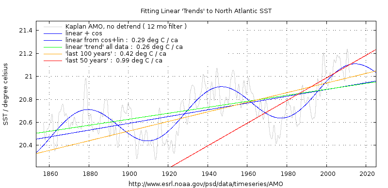 ?w=800
In general I think the whole thing suffers from being a trend analysis in the presence of a strong cyclic signal, as shown by Jevrejeva’s work.
You acceleration as linear fit to rate of change are biased by the presence of incomplete sections of the 60y cycle.
https://climategrog.wordpress.com/amo_trends/
You may also find this useful:
https://judithcurry.com/2016/03/09/on-inappropriate-use-of-least-squares-regression/
Thank you Greg, but as I see it, we cannot be sure that there are any cycles at all in play here.
If it had been a very strong cyclical compound, I would expect to see it in the graphs. To me it looks like pure random variations, although with autocorrelations of course. That is the reason I have used a simple running mean to smooth the graph.
/Jan
One of Jevrejeva’s papers:
http://nora.nerc.ac.uk/504181/
similar graphs here:
Jevrejeva 2014:
http://nora.nerc.ac.uk/504181/
So for example, if you fit a parabola from 1900 on you will get some spurious “acceleration” : it’s goint trough to peak. If you fit from 1870-1925 you will find “deceleration”.
Now trying to fit a smooth curve through the centre line of those diminishing oscillations, I’d say it’s been flat since 1950, possibly even on the point of a reducing rate of change by the end.
Sadly I don’t think there is enough detail to reproduce her method, and she does not supply the processed dataset. ( UK are much more possessive with their data than US based publicly funded science ).
Satellite data for sea level goes back to 1992. Here’s the overall rate from that data over the last ten years:
http://oi63.tinypic.com/2vinjnd.jpg
Here are the changes made to that data over a similar period:
http://oi58.tinypic.com/331k5ya.jpg
The satellite data has been thoroughly turned upside down and inside out to match up different satellite soundings. You now get “inverse barometer” adjustments, whether you like it or not so no means to see what effect it has ( why would you even want IB on a global figure !? ). You get speculative GAIA “corrections” whether you want it or not. The stated reason for this is that U.C. Bolder want GMSL to be a AGW metric instead of being SEA LEVEL metric. Strange.
In short is has been rigged for politically motived reasons and no longer of any scientific value. Since it is based on the idea of measuring mean sea level by looking at the reflections of the BOTTOM of the swell and guestimating the height of the swell, I doubt it has much objective use anyway.
Maybe some information about local/regional changes but for long term MSL change it’s a joke.
And starting with this year’s release they’ve dropped the “GIA Corrected” and “Inverse barometer Applied” notes. They want their graph to represent Ocean Volume, but you have to read the find print to find that out. I’m waiting for them to drop that too.
Thanks for the update Steve, I have not been back to Colorado site in few years, since they started rigging the data and GMSL started floating, ghost-like, above the waves.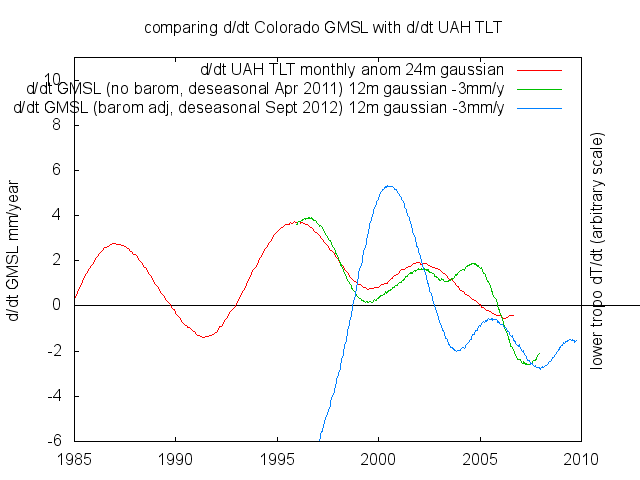
In 2011 , I found an interesting correlation between GMSL and UAH TLT. When I went back a year later to see how it had evolved, I found the whole thing was completely different. WTF?
At that point I realised it meant nothing objectively and was just yet another dataset that was no longer any use for climate study, run by zealots with an agenda, not scientists.
I didn’t see NYC’s Battery Park (PSMSL #12) Station Noted. Strange, this is one of the longest continuous records available, longer then Atlantic City.
http://www.psmsl.org/data/obtaining/rlr.monthly.plots/12.png
Thank you for the comment Bob
There are many long records available, but I chose to rely on the GLOSS stations only. There are about 2000 stations in PNAS, but only a small subset of them are in the GLOSS network.
I chose the GLOSS because what they write (Quote): “GLOSS aims at the establishment of high quality global and regional sea level networks for application to climate, oceanographic and coastal sea level research. The programme became known as GLOSS as it provides data for deriving the ‘Global Level of the Sea Surface’.
The Core Network is designed to provide an approximately evenly-distributed sampling of global coastal sea level variations. Another component is the GLOSS Long Term Trends (LTT) set of gauge sites (some, but not all, of which are in the GCN) for monitoring long term trends and accelerations in global sea level.”
(Quote end)
From this I take that the GLOSS subset of stations are regarded as the best ones for measuring long-term trends.
/Jan
If you look at the earh rotation curve, you do not see any acceleration.
Hm.
What do you actually mean with this comment Helmut?
/Jan
Think Helmut says
if there’s any accounting sea level rise
then it has an impact on earth’s rotatation curve
( I’d rather say: then it has an impact on earth’s rotation time )
Regards – Hans
But what roles are played by gradual geologic subsidence in tandem with sudden uplift? As an example, in 1855 in Wellington, New Zealand, a big earthquake uplifted the land such that we now have roads all around hilly coastlands because those shorelands were lifted out of the water by the quake. Since then, the land has slowly subsided — until the next uplifting earthquake which is feared. That slow subsidence is entangled with the so-called gradual sea-level rise because you can’t separate them instrumentally. This same scenario is playing out all over. Maybe “sea level rise” is mostly just normal geological subsidence.
It was really interesting to hear about the uplift and subsidence you experience in Wellington.
However, Although New Zealand is not the only place that experience tectonic movements, most of the stations are placed on more stable geological ground. The GLOSS project has high focus on establishing good reference points so we are certain that the global sea level rise is real, although land movements may cause some noise in the series.
Regards
/Jan
NZ Willy,
Your point is well worth making, perhaps not very relevant to this study, but over longer time scales it’s a factor that should have more consideration. There are few places on this planet that are truely geologically stable over the longer term. Thus the problem in finding sites for long term nuclear waste storage.
The earth is a dynamic place with uplift and subsidence being continuing ongoing processes. Not enough solid earth geological processes are considered in the long term sea level rise issue.
How do we measure from the center of the Earth’s core to the reference point of the tide gages to 0.1mm? Where is the graph of this reference point over the life of the tide gage to 0.1mm?
The gage measurement is ONLY as good as its reference point’s accuracy and STABILITY on the constantly shifting surface plate…..not to mention, of course, the effects of the constantly changing currents piling water up and sucking it out of the estuaries and harbors the gages are all mounted in.
How absurd it is to just ignore the MOVING REFERENCES.
Thank you for the comment Larry,
f we could measure all reference points to 0.1 mm accuracy, and could also nullify the effect of ocean currents, we would need only one tide gauge on the globe. If tide gauge at that that super reference point, which also was unaffected by changes in the Ocean surface, was rising by one millimeter we could be certain that the Ocean was indeed rising
But we cannot do that, and that is why we need many measurement points. When we have many independent sampling points it is possible to narrow the total uncertainty even if each measurement has a larger uncertainty.
This effect is well explained on page 6 (Statistical Analysis of Large Data Sets) from Penn university here: http://virgo-physics.sas.upenn.edu/uglabs/lab_manual/Error_Analysis.pdf
/Jan
For the folks who feel that graphs “say it all”, be sure to eyeball a graph of sea level over the past 10,000+ years. Sea level has risen 400+ feet, and several thousand years ago the incline hit an inflection point, where rate of sea level increase began dropping. We are enjoying a brief warming period between ice ages. In the past 1.3 m years, there have been 13 ice ages, average duration 90,000 years, each followed by a warmer period, average duration 10,000 years. It’s obvious that year to year, even decade to decade, sea level fluctuations create little more than miniscule bumps on that graph. One glance shows that sea level is topping out and this trend has very likely been repeated during past interglacial periods.
Our current warming (such as it is) began NOT in the mid 1800s, (“cherry-picked”) when co2 level began rising and our industrial revolution began. Our current warming began, by definition, at the bottom of the LIA, in the mid 1600s, two centuries before co2 began rising. Also, it would have taken another century before co2 level could have (assuming it can!) had any impact on the global temperature. That brings us to about 1950, so 300 years of natural warming. But wait! … from the 40s to the 70s was a period of mild cooling.
So the alarmists have hung their hats on a 2 decade warming period which stretches from about the mid 70s to 1998. (Both weather satellites show no additional increase in temperature from then, at least until after our current El Nino which cranked up about mid 2015. ) The atmospheric warming of the ocean contributed by human activity had to follow the 1970s. How much impact do you suppose that small temperature increase would have on the ocean given the enormous (by comparison) ocean heat capacity?
yep, then they fit an exponential growth that tiny segment and extrapolate it 100y beyond the data.
The craziest part is that they’ve been doing this shit for 30y and are still getting away with calling it “the science”.
iso quality material pro or con info re: Pacific Ocean rising along China and Russia,
not rising along N America West Coast.
It seems to me that when anyone starts claiming accelerating sea level rise there is a question that has to be answered before it’s cause can be attributed. ‘Where did the water come from?’
When I click on one of these graphs I should get an enlarged version of the graph, so that I can at least read the years on the horizontal axis.
Thank DennyOR. You find plots with more details here:
https://csensorg.wordpress.com
You may also make them yourself on csens.org
Good read, Jan Kjetil Andersen –
Thanks – Hans