Guest Post by Werner Brozek, Edited by Just The Facts
 - 1979 to Present")
Image Credit: Ken’s Kingdom
 - 1979 to Present")
Image Credit: RSS
As can be seen in the above graphs, the south polar region has been cooling for the whole satellite record. The cooling is not statistically significant, however over the complete time span of the satellite record of almost 37 years, it should not be happening if we have global warming. Since the cooling is over the whole satellite record, it could be much longer if we had earlier records.
It is understandable that if carbon dioxide is really the control knob, that all places on Earth would not warm at the same rate. It is also understandable that for short periods of time, there may be cooling in some areas where other factors have a stronger influence than carbon dioxide.
It is also understandable that if carbon dioxide goes from 0.028% to 0.040%, that the effect would be greatest at the poles where the additional carbon dioxide does not have to compete with 2% to 4% water vapor as may be the case in the tropics. Since very cold temperatures can hold very small amounts of water vapor, the relative affect of more carbon dioxide should be largest in the polar regions. But why are just the northern polar regions showing larger amounts of warming? It is not as if the carbon dioxide is upside down in the south. ☺
The time of almost 37 years is also significant. Sometimes, climate is defined as to what happened over the last 30 years. And some may feel that the global standstill of almost 19 years is not enough time to draw the correct conclusions. Since 37 years is above 30 years, this cooling over a relatively large part of the Earth requires an explanation. By the way, Ken’s Kingdom and RSS also show several other time periods of no slope for different parts of the Earth.
In the sections below, as in previous posts, we will present you with the latest facts. The information will be presented in three sections and an appendix. The first section will show for how long there has been no warming on some data sets. At the moment, only the satellite data have flat periods of longer than a year. The second section will show for how long there has been no statistically significant warming on several data sets. The third section will show how 2015 so far compares with 2014 and the warmest years and months on record so far. For three of the data sets, 2014 also happens to be the warmest year. The appendix will illustrate sections 1 and 2 in a different way. Graphs and a table will be used to illustrate the data.
Section 1
This analysis uses the latest month for which data is available on WoodForTrees.com (WFT). All of the data on WFT is also available at the specific sources as outlined below. We start with the present date and go to the furthest month in the past where the slope is a least slightly negative on at least one calculation. So if the slope from September is 4 x 10^-4 but it is – 4 x 10^-4 from October, we give the time from October so no one can accuse us of being less than honest if we say the slope is flat from a certain month.
1. For GISS, the slope is not flat for any period that is worth mentioning.
2. For Hadcrut4, the slope is not flat for any period that is worth mentioning.
3. For Hadsst3, the slope is not flat for any period that is worth mentioning.
4. For UAH, the slope is flat since May 1997 or 18 years and 4 months. (goes to August using version 6.0)
5. For RSS, the slope is flat since January 1997 or 18 years and 8 months. (goes to August)
The next graph shows just the lines to illustrate the above. Think of it as a sideways bar graph where the lengths of the lines indicate the relative times where the slope is 0. In addition, the upward sloping blue line at the top indicates that CO2 has steadily increased over this period.
Note that the UAH5.6 from WFT needed an offset to show the slope is zero for UAH6.0.
 - 1979 to Present")
When two things are plotted as I have done, the left only shows a temperature anomaly.
The actual numbers are meaningless since the two slopes are essentially zero. No numbers are given for CO2. Some have asked that the log of the concentration of CO2 be plotted. However WFT does not give this option. The upward sloping CO2 line only shows that while CO2 has been going up over the last 18 years, the temperatures have been flat for varying periods on the two sets.
Section 2
For this analysis, data was retrieved from Nick Stokes’ Trendviewer available on his website <a href=”http://moyhu.blogspot.com.au/p/temperature-trend-viewer.html”. This analysis indicates for how long there has not been statistically significant warming according to Nick’s criteria. Data go to their latest update for each set. In every case, note that the lower error bar is negative so a slope of 0 cannot be ruled out from the month indicated.
On several different data sets, there has been no statistically significant warming for between 11 and 22 years according to Nick’s criteria. Cl stands for the confidence limits at the 95% level.
The details for several sets are below.
For UAH6.0: Since December 1992: Cl from -0.014 to 1.694
This is 22 years and 9 months.
For RSS: Since February 1993: Cl from -0.010 to 1.633
This is 22 years and 7 months.
For Hadcrut4.4: Since December 2000: Cl from -0.013 to 1.326
This is 14 years and 9 months.
For Hadsst3: Since October 1995: Cl from -0.017 to 1.888
This is 19 years and 11 months.
For GISS: Since September 2004: Cl from -0.065 to 2.023
This is exactly11 years.
Section 3
This section shows data about 2015 and other information in the form of a table. The table shows the five data sources along the top and other places so they should be visible at all times. The sources are UAH, RSS, Hadcrut4, Hadsst3, and GISS.
Down the column, are the following:
1. 14ra: This is the final ranking for 2014 on each data set.
2. 14a: Here I give the average anomaly for 2014.
3. year: This indicates the warmest year on record so far for that particular data set. Note that the satellite data sets have 1998 as the warmest year and the others have 2014 as the warmest year.
4. ano: This is the average of the monthly anomalies of the warmest year just above.
5. mon: This is the month where that particular data set showed the highest anomaly. The months are identified by the first three letters of the month and the last two numbers of the year.
6. ano: This is the anomaly of the month just above.
7. y/m: This is the longest period of time where the slope is not positive given in years/months. So 16/2 means that for 16 years and 2 months the slope is essentially 0. Periods of under a year are not counted and are shown as “0”.
8. sig: This the first month for which warming is not statistically significant according to Nick’s criteria. The first three letters of the month are followed by the last two numbers of the year.
9. sy/m: This is the years and months for row 8. Depending on when the update was last done, the months may be off by one month.
10. Jan: This is the January 2015 anomaly for that particular data set.
11. Feb: This is the February 2015 anomaly for that particular data set, etc.
18. ave: This is the average anomaly of all months to date taken by adding all numbers and dividing by the number of months.
19. rnk: This is the rank that each particular data set would have for 2015 without regards to error bars and assuming no changes. Think of it as an update 40 minutes into a game.
| Source | UAH | RSS | Had4 | Sst3 | GISS |
|---|---|---|---|---|---|
| 1.14ra | 5th | 6th | 1st | 1st | 1st |
| 2.14a | 0.188 | 0.255 | 0.564 | 0.479 | 0.75 |
| 3.year | 1998 | 1998 | 2014 | 2014 | 2014 |
| 4.ano | 0.482 | 0.55 | 0.564 | 0.479 | 0.75 |
| 5.mon | Apr98 | Apr98 | Jan07 | Aug14 | Jan07 |
| 6.ano | 0.742 | 0.857 | 0.832 | 0.644 | 0.97 |
| 7.y/m | 18/4 | 18/8 | 0 | 0 | 0 |
| 8.sig | Dec92 | Feb93 | Dec00 | Oct95 | Sep04 |
| 9.sy/m | 22/9 | 22/7 | 14/9 | 19/11 | 11/0 |
| Source | UAH | RSS | Had4 | Sst3 | GISS |
| 10.Jan | 0.277 | 0.367 | 0.688 | 0.440 | 0.82 |
| 11.Feb | 0.174 | 0.327 | 0.660 | 0.406 | 0.88 |
| 12.Mar | 0.165 | 0.254 | 0.681 | 0.424 | 0.91 |
| 13.Apr | 0.087 | 0.175 | 0.656 | 0.557 | 0.75 |
| 14.May | 0.285 | 0.309 | 0.696 | 0.593 | 0.79 |
| 15.Jun | 0.333 | 0.391 | 0.730 | 0.575 | 0.78 |
| 16.Jul | 0.183 | 0.288 | 0.696 | 0.637 | 0.75 |
| 17.Aug | 0.276 | 0.390 | 0.740 | 0.664 | 0.81 |
| 18.ave | 0.223 | 0.313 | 0.693 | 0.537 | 0.81 |
| 19.rnk | 3rd | 6th | 1st | 1st | 1st |
If you wish to verify all of the latest anomalies, go to the following:
For UAH, version 6.0beta3 was used. Note that WFT uses version 5.6. So to verify the length of the pause on version 6.0, you need to use Nick’s program.
http://vortex.nsstc.uah.edu/data/msu/v6.0beta/tlt/tltglhmam_6.0beta3.txt
For RSS, see: ftp://ftp.ssmi.com/msu/monthly_time_series/rss_monthly_msu_amsu_channel_tlt_anomalies_land_and_ocean_v03_3.txt
For Hadcrut4, see: http://www.metoffice.gov.uk/hadobs/hadcrut4/data/current/time_series/HadCRUT.4.4.0.0.monthly_ns_avg.txt
For Hadsst3, see: http://www.cru.uea.ac.uk/cru/data/temperature/HadSST3-gl.dat
For GISS, see:
http://data.giss.nasa.gov/gistemp/tabledata_v3/GLB.Ts+dSST.txt
To see all points since January 2015 in the form of a graph, see the WFT graph below. Note that UAH version 5.6 is shown. WFT does not show version 6.0 yet. Also note that Hadcrut4.3 is shown and not Hadcrut4.4, which is why the last few months are missing for Hadcrut.
 - 1979 to Present")
As you can see, all lines have been offset so they all start at the same place in January 2015. This makes it easy to compare January 2015 with the latest anomaly.
Appendix
In this part, we are summarizing data for each set separately.
RSS
The slope is flat since January 1997 or 18 years, 8 months. (goes to August)
For RSS: There is no statistically significant warming since February 1993: Cl from -0.010 to 1.633.
The RSS average anomaly so far for 2015 is 0.313. This would rank it as 6th place. 1998 was the warmest at 0.55. The highest ever monthly anomaly was in April of 1998 when it reached 0.857. The anomaly in 2014 was 0.255 and it was ranked 6th.
UAH6.0beta3
The slope is flat since May 1997 or 18 years and 4 months. (goes to August using version 6.0beta3)
For UAH: There is no statistically significant warming since December 1992: Cl from -0.014 to 1.694. (This is using version 6.0 according to Nick’s program.)
The UAH average anomaly so far for 2015 is 0.223. This would rank it as 3rd place. 1998 was the warmest at 0.483. The highest ever monthly anomaly was in April of 1998 when it reached 0.742. The anomaly in 2014 was 0.188 and it was ranked 5th.
Hadcrut4.4
The slope is not flat for any period that is worth mentioning.
For Hadcrut4: There is no statistically significant warming since December 2000: Cl from -0.013 to 1.326.
The Hadcrut4 average anomaly so far for 2015 is 0.693. This would set a new record if it stayed this way. The highest ever monthly anomaly was in January of 2007 when it reached 0.832. The anomaly in 2014 was 0.564 and this set a new record.
Hadsst3
For Hadsst3, the slope is not flat for any period that is worth mentioning. For Hadsst3: There is no statistically significant warming since October 1995: Cl from -0.017 to 1.888.
The Hadsst3 average anomaly so far for 2015 is 0.537. This would set a new record if it stayed this way. The highest ever monthly anomaly was in August of 2014 when it reached 0.644. This is prior to 2015. The anomaly in 2014 was 0.479 and this set a new record. The August 2015 anomaly of 0.664 also sets a new record.
GISS
The slope is not flat for any period that is worth mentioning.
For GISS: There is no statistically significant warming since September 2004: Cl from -0.065 to 2.023.
The GISS average anomaly so far for 2015 is 0.81. This would set a new record if it stayed this way. The highest ever monthly anomaly was in January of 2007 when it reached 0.97. The anomaly in 2014 was 0.75 and it set a new record.
Conclusion
Different regions of the Earth are either warming at different rates or even cooling. Then the various regions contradict each other as to what is really occurring. With so much uncertainty, perhaps we should wait to really see what is really occurring before spending trillions on a problem that may not even exist?
Discover more from Watts Up With That?
Subscribe to get the latest posts sent to your email.
logic (gates)
A & B (AND, &, . )
0 & 0 = 0
0 & 1 = 0
1 & 0 = 0
1 & 1 = 1
A + B (OR)
0 + 0 = 0
0 + 1 = 1
1 + 0 = 1
1 + 1 = 1
only looking at input A or input B does not correlate with output, i.e. output can be 1 when A (or B) is 0 or 1 in both gates.
for several inputs i.e. say A,B,C,D,E, and perhaps many more for global temperature effects, the output could look something like…
A & (B+C) & (C&D+E) & (A&C+E) = 1
add into this that the input can be going up/increasing (1), going down/decreasing (0) or staying the same (?) adds more combinations. Output 1 is warming, 0 cooling (or ? staying same)
possible inputs:
distance from sun
sunspots
volcanic activity
deforestation
temperature (yes feedback)
ice/snow cover
soot from coal, oil
exotic gases
number of fish in the sea
oxygen level
co2 level
maybe number of oxygen breathing land based creatures
high energy cosmic radiation
number of ships
add more here….
conclusion
God knows!
” if carbon dioxide is really the control knob, that all places on Earth would not warm at the same rate.”
Has anyone done the experiment of using temperature records in the Sahara, the ‘Outback’, Gobi desert, Namib, etc. where water vapour is not a confounding factor to get a better estiimate of the effect of CO2 alone on temperature? This would be as close to an actual experiment as one could get on earth. Indeed, what do temperature records show in these places?
That sounds good. But what about these from the reply above yours:
“possible inputs:
distance from sun
sunspots
volcanic activity
deforestation
temperature (yes feedback)
ice/snow cover
soot from coal, oil
exotic gases
number of fish in the sea
oxygen level
co2 level
maybe number of oxygen breathing land based creatures
high energy cosmic radiation
number of ships”
Can I add:
Transient dust/gas clouds between the Earth and Sun.
Transits of the inner planets.
Eccentricities in precession.
Sorry, I did high altitude infrared astronomy in a previous life…
OMG! Now you have me doing it.
Seriously though, I wonder if you could point the Keck at where the solar system was during the last ice age to see if we may have spent a few hundred thousand years passing through some murky space? You wouldn’t know exactly where the muck had been going or how fast, but searching the general area might throw up a clam or two?
Number of fish in the sea? We’re not talking fish farts here are we? 🙂
Why stop there? See:
http://wattsupwiththat.com/reference-pages/research-pages/potential-climatic-variables/
by “Just The Facts”.
Well then, I’ll just step back into my chaos hole 🙂
I did notice no one seems to mention the possibility of the solar system traveling through extended periods of muck. Don’t I get a prize for that, or is it mentioned under a different heading?
Sorry! No prize for you. See the following from the above site:
“6. Outer Space/Cosmic/Galactic Effects;
http://en.wikipedia.org/wiki/Outer_space
http://en.wikipedia.org/wiki/Cosmos
http://en.wikipedia.org/wiki/Galaxy
including Asteroids;
http://en.wikipedia.org/wiki/Asteroid
Meteorites;
http://en.wikipedia.org/wiki/Meteorite
and Comets;
http://en.wikipedia.org/wiki/Comet”
Werner writes: “Sorry! No prize for you.”
You scoundrel. No prize? Al got a prize and he didn’t say anything original either! I demand a recount! Hanging chads! Empty food dishes at 5 p.m. All manner of slights! I’m calling the Queen of America. She’s a friend of mine you know and she gave me this scarf. You’re gonna be sorry about this…
🙂
“Sorry! No prize for you.”
Not even a Participation Medal?
Could it be that WUWT has higher standards?
Why would they do that? It doesn’t require extra time and expense to get there. And, they wouldn’t have much to do except sit around in a tent. Sounds so much more exciting to go to poles or some mountain and watch the ice melt. They probably started around the time valleys were packed with snow in France. Maybe they could take a voyage to prove how ice free the great lakes are in summer.
You just have to ask yourself what is the obvious reason they didn’t do that. They already know the answer. You don’t see them talking about that. It’s also much easier to verify. I can drive to any desert here. Much like Live Science had a picture of Pueblo, CO reservoir being dry on the same day as they were having a flood. Oh wow, why are they releasing water from the dams? ( I went to go look, proof of global warming so they say) I’m sure you were invited to go to Antarctica at taxpayer expense.
This is a chart of the annual average of day to day surface station change in min temp for N37-49,W104-120 the US Southwest deserts.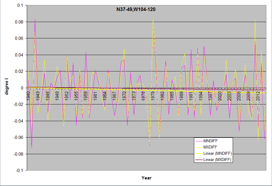
(Tmin day-1)-(Tmin d-0)=Daily Min Temp Anomaly= MnDiff = Difference
For charts with MxDiff it is equal = (Tmax day-1)-(Tmax d-0)=Daily Max Temp Anomaly= MxDiff
MnDiff is also the same as
(Tmax day-1) – (Tmin day-1) = Rising
(Tmax day-1) – (Tmin day-0) = Falling
Rising-Falling = MnDiff
Average daily rising temps
(Tmax day-1) – (Tmin day-1) = Rising
(Tmax day-1) – (Tmin day-0) = Falling
Beautiful work Werner. Well done.
Thank you!
Werner Brozek writes: “It is also understandable that if carbon dioxide goes from 0.028% to 0.040%, that the effect would be greatest at the poles where the additional carbon dioxide does not have to compete with 2% to 4% water vapor as may be the case in the tropics.”
Werner, when I read this I recalled a account of the Greenhouse Effect that described CO2 radiation and the mechanism of propagating accumulated heat to the upper atmosphere by molecular collision, then finally into radiant IR transmitted to space. In that description it was mentioned that CO2 may give up a photon by colliding with H2O or another GHG in the lower atmosphere, with high probability. A chain of collisions is then required to transfer the IR successively until eventually the radiation makes it into the stratosphere where it escapes.
If we assume a very low to nonexistent density of H20 in the Antarctic as you describe, what effect would that have on the rate of IR propagation into the stratosphere as compared with the tropics? It seems to me the rate may be increased by a lack of H20 in the Antarctic atmosphere, perhaps explaining the lack of effect increased CO2 densities in that region as you’ve observed?
Things are often much more complicated than we imagine! A few years ago, Ira Glickstein, PhD, had an interesting series on this topic. See:
http://wattsupwiththat.com/2011/05/07/visualizing-the-greenhouse-effect-light-and-heat/
The thing that really stood out for me in this treatment was the first comment, which describes the difference between transfer of IR by convection and transfer by stimulated emission. I don’t think either the article itself or the comment discuss the effect reduced H2O may have on the propagation rate of IR in the atmosphere, but the comment seemed relevant in a different way.
I hadn’t considered stimulated emission at all (which is a real oversight for me since I have a background in laser physics). Of course, a very large difference between the tropical and Antarctic region is direct insolation, with the Antarctic being the poor cousin of the tropics in that respect. It would stand to reason then that the relative dominant direction of Antarctic IR would be up rather than down when compared with the tropics. Very little direct IR is transmitted to the Antarctic, the majority of radiated heat will come from the Earth, not space. This would cause the dominant radiance to be towards space I would think?
If IR has a nearly equal probability of radiating up or down, or arguably a dominant probability of being radiated down (due to solar radiation) by stimulated emission in the tropics, we should observe greater heat retention in that region as compared with the Antarctic?
Regardless which radiation is dominant over Antarctica for whatever reason, the question in my mind is what affect should an additional 100 ppm of CO2 have on Antarctic temperatures?
Scott
October 24, 2015 at 9:29 pm
Seriously though, I wonder if you could point the Keck at where the solar system was during the last ice age to see if we may have spent a few hundred thousand years passing through some murky space? You wouldn’t know exactly where the muck had been going or how fast, but searching the general area might throw up a clam or two?
———————————————————————————————————-
We are looking back in time wrt to the solar journey thru the galaxy. And yes, we are finding smaller scale so called “murky regions of space.” Cloudlettes, mini clouds, measured in AU for size.
But because you asked, I googled Seth Redfield. And low and behold, something new again……from Redfield and Linsky. Hot off the press too, so to speak.
Evaluating the Morphology of the Local Interstellar Medium:
Using New Data to Distinguish Between Multiple Discrete Clouds
and a Continuous Medium
8 Sep 2015
Seth Redfield and Jeffrey L. Linsky
But you might find this article more interesting…
The local ISM in three dimensions: kinematics, morphology
and physical properties
http://sredfield.web.wesleyan.edu/papers/linsky14.pdf
Jeffrey L. Linsky · Seth Redfield
Received: 15 January 2014 / Accepted: 21 April 2014 / Published online: 13 May 2014
Abstract We summarize the results of our long-term program
to study the kinematics, morphology, and physical
properties of warm partially ionized interstellar gas located
within 100 pc of the Sun. Using the Space Telescope Imaging
Spectrograph (STIS) and other spectrographs on the
Hubble Space Telescope (HST), we measure radial velocities
of neutral and singly ionized atoms that identify comoving
structures (clouds) of warm interstellar gas. We have identified
15 of these clouds located within 15 pc of the Sun. Each
of them moves with a different velocity vector, and they have
narrow ranges of temperature, turbulence, and metal depletions.
We compute a three-dimensional model for the Local
Interstellar Cloud (LIC), in which the Sun is likely embedded
near its edge, and the locations and shapes of the other
nearby clouds…..
Wishing Dr. S., would do something with his blog. So much info, so little time.
Wonder what he though about;
The two-hearted Sun beckons new ‘mini ice-age’
“””Their predictions using the model suggest an interesting longer-term trend beyond the 11-year cycle. It shows that solar activity will fall by 60 percent during the 2030s, to conditions last seen during the Maunder Minimum of 1645-1715. “Over the cycle, the waves fluctuate between the Sun’s northern and southern hemispheres. Combining both waves together and comparing to real data for the current solar cycle, we found that our predictions showed an accuracy of 97 percent,” says Zharkova.
The model predicts that the magnetic wave pairs will become increasingly offset during Cycle 25, which peaks in 2022. Then during Cycle 26, which covers the decade from 2030-2040, the two waves will become exactly out of synch, cancelling one another out. This will cause a significant reduction in solar activity. “In cycle 26, the two waves exactly mirror each other, peaking at the same time but in opposite hemispheres of the Sun. We predict that this will lead to the properties of a ‘Maunder minimum’,” says Zharkova.”””
http://astronomynow.com/2015/07/09/royal-astronomical-societys-national-astronomy-meeting-2015-report-4/
Carla –
This is incredible stuff, exactly what I’d been thinking. It continues to amaze me that, if I know the right keywords, I can find most of the stuff I can think of has already been done by someone.
I haven’t read the paper a second time yet, but one section in particular caught my eye:
“If the Sun is indeed located inside of the LIC [Local Interstellar Cloud], then the Sun’s velocity away from the LIC in the upwind direction toward 36 Oph, the upper limit of N (HI) < 6 × 1016 cm− 2 at the predicted LIC radial velocity for this line of sight, and the assumption that n(HI) = 0.20 cm− 3 imply that the Sun will leave the LIC in less than 3700 years (Wood et al. 2000)."
I plan do follow this research to get a better idea of the absorption spectra of the LIC and investigate its effect on solar energy reaching the Earth (if any); it would seem there's a possibility it could change noticeably in the next 3700 years. It was exactly this situation that caused me to ask the question, and it looks as if Redfield & Linsky have been providing the answers.
Thanks very much for the lead,
Scott.
On a more personal note, I stayed at the conference center in Llandudno where the held the NAM2015 meeting back in 1978 when I was VP of my student union. Several fond memories of that place…
The solar magnetic flux model Zharkova presents is certainly interesting, it would be even more interesting if we knew the period of effect. She mentions a “longer-term trend beyond the 11-year cycle” that she predicts will peak again in 2030, but the news article doesn’t mention it’s period and leaves the reader to believe the last time this happened was during the Maunder Minimum (~1650), so maybe every 500 or so years? I’ll have to find a copy of the paper.
Wouldn’t it be a hoot if AGW really existed and the effect saved the planet from a 100 year freeze that killed off crops and destroyed civilization as we know it?
””…“If the Sun is indeed located inside of the LIC [Local Interstellar Cloud], …””
I think there is already reason to believe we are near the edge of the LIC and transitioning. There was a noticeable change in the direction of the incoming interstellar winds.
””…She mentions a “longer-term trend beyond the 11-year cycle” that she predicts will peak again in 2030,…”””
We do see a longer term trend in solar cycle. It is called the Gleissburg Cycle of approx. 100 years in which the solar cycle rises and falls. And also has a hemispheric component in which either the N. hemisphere leads in solar activity for several cycles then switches and S. hemisphere then leads in activity.
We now have simulations of what the effects of a variable 1 to 4 u gauss interstellar magnetic field would have on the shape and compression of the heliospheric bubble. Surprise, lower gauss produced S. hemispheric magnetic pressures on the nose of the heliosphere and magnetic tension on the N. hemispheric tail region downwind. With less activity due to magnetic reconnection between the two regimes of solar and interstellar. The same article also notes:
THE EFFECT OF NEW INTERSTELLAR MEDIUM PARAMETERS ON THE HELIOSPHERE AND ENERGETIC
NEUTRAL ATOMS FROM THE INTERSTELLAR BOUNDARY
“””…Finally, we note that within the spatial dimensions and resolution
of our steady-state simulations the heliospheric current
sheet is flat and “flips” to either the northern hemisphere
for the 2μG, 3μG, and 4μG cases, or the southern hemisphere
in the 1μG case…”””
http://iopscience.iop.org/article/10.1088/0004-637X/784/1/73;jsessionid=4C587630750ED5B32E876E478B64FA38.c4.iopscience.cld.iop.org
Published 2014 March 5 • © 2014. The American Astronomical Society
My understanding is the heliospheric current sheet is flat during solar maximum when all the sunspots (magnetic activity) are hanging out around the equator and the polar fields are near zero.
…”””Wouldn’t it be a hoot if AGW really existed and the effect saved the planet from a 100 year freeze that killed off crops and destroyed civilization as we know it?…”””
Too late, they say that if the sun doesn’t warm up the CO2 for us that uh it contributes to cooling..no win..
So much info so little time..
The polar puzzle..
I’m still stuck on the size, extent and more circular shape that the Southern hemispheres vortex displays each year, compared to the wobbly elongated Northern hemispheres vortex. With a prediction of even lower solar activity our earths own magnetosphere will not be experiencing as much friction and compressions during our orbit about the sun.
Here’s the Zharkova article, Scott.
PCs = principle components
SBMF = solar background magnetic field
PREDICTION OF SOLAR ACTIVITY FROM SOLAR BACKGROUND MAGNETIC FIELD
VARIATIONS IN CYCLES 21–23
Simon J. Shepherd1, Sergei I. Zharkov2, and Valentina V. Zharkova3
http://computing.unn.ac.uk/staff/slmv5/kinetics/shepherd_etal_apj14_795_1_46.pdf
From the conclusions sections;
Furthermore, by using the Eureqa technique based on a
symbolic regression, we managed to uncover the underlying
mathematical laws governing the fundamental processes of
magnetic wave generation in the Sun’s background magnetic
field. These invariants are used to extract the key parameters of
the PCs of SBMF waves, which, in turn, are used to predict the
overall level of solar activity for solar cycles 24–26.
We can conclude with a sufficient degree of confidence
that the solar activity in cycles 24–26 will be systematically
decreasing because of the increasing phase shift between the
two magnetic waves of the poloidal field leading to their full
separation into opposite hemispheres in cycles 25 and 26. This
separation is expected to result in the lack of their subsequent
interaction in any of the hemispheres, possibly leading to a lack
of noticeable sunspot activity on the solar surface lasting for a
decade or two, similar to those recorded in the medieval period.
Using the modulus summary curves derived from the principal
components of SBMF, we predict a noticeable decrease
of the average sunspot numbers in cycle 25 to ≈80% of that in
cycle 24 and a decrease in cycle 26 to ≈40% which are linked
to a reduction of the amplitudes and an increase of the phase
between the PCs of SBMF separating these waves into the opposite
hemispheres. We propose using the PCs derived from
SBMF as a new proxy for the solar activity which can be linked
more closely to dynamo model simulations.
Further investigation is required to establish more precise
links between the dynamo waves generated by both poloidal and
toroidal magnetic fields as simulated in the dynamo models and
the waves in the solar background (SBMF) and sunspot (SMF)
magnetic fields derived with the PC and symbolic regression
analysis presented in the current study which will be the scope
of a forthcoming paper……
magnetic waves are most interesting, seem to be ubiquitous…