Guest Post by Werner Brozek, Edited by Just The Facts:
 - 1979 to Present")
Some of you may have wondered why the title and the above plot are comparing different data sets. The reasons are that GISS and HadCRUT4.3 are very similar. As well, UAH6.0 is now very similar to RSS. However WFT does not have the latest UAH nor Hadcrut. So when you plot UAH on WFT, you actually are plotting version 5.5 and not even 5.6. Version 5.5 has not been updated since December 2014, however HadCRUT 4.2 has not been updated since July 2014, so those slopes are really off by a huge amount due to the fact that HadCRUT had record levels over the last year. But GISS and RSS are up to date on WFT.
The times of 58 months and 162 months were chosen to give a symmetric picture of shorter and longer terms where the slopes diverge between the satellites and ground based data sets.
In the next four paragraphs, I will give information for HadCRUT4.2 in July 2014, HadCRUT4.3 in April 2015, UAH5.6 in March 2015 and UAH6.0 in April 2015. The information will be
1. For how long the slope is flat;
2. Since when the warming is not statistically significant according to Nick Stokes’s calculation;
3. Since when the warming is not statistically significant according to Dr. McKitrick’s calculation where applicable;
4. The previous hot record year; and
5. Where each data set would rank after the given number of months.
For HadCRUT4.2 in July 2014, the slope was flat for 13 years and 6 months. There was no statistically significant warming since November 1996 according to Nick Stokes. Dr. McKitrick said there was no statistically significant warming for 19 years. The previous record warm year was 2010. As of July 2014, HadCRUT4.2 was on pace to be the third warmest year on record.
For HadCRUT4.3 in April 2015, the slope is not negative for any period worth mentioning. There is no statistically significant warming since June 2000 according to Nick Stokes. The previous record warm year was 2014. As of April, HadCRUT4.3 is on pace to set a new record. Note that on all criteria, HadCRUT4.3 is warmer than HadCRUT4.2.
For UAH5.6 as of March 2015, the slope was flat for an even 6 years. There was no statistically significant warming since August 1996 according to Nick Stokes. Dr. McKitrick said there was no statistically significant warming for 19 years, however this would be from about April 2014. The previous record warm year was 1998. As of March 2015, UAH5.6 was on pace to be the third warmest year on record.
For UAH6.0 as of April 2015, the slope is negative for 18 years and 4 months. There is no statistically significant warming since October 1992 according to Nick Stokes. The previous record warm year was 1998 as well. As of April, UAH6.0 is on pace to be the 8th warmest year. Note that unlike the HadCRUT comparison, UAH6.0 is colder than UAH5.6.
A year ago, Dr. McKitrick used HadCRUT4.2 and UAH5.6 to come up with times for no statistically significant warming on each of these data sets. In the meantime, HadCRUT4.2 has been replaced by HadCRUT4.3 which has been setting hot records over the past year. However UAH5.6 has been replaced with UAH6.0 which is much cooler than the UAH5.6 version. As a result, his times are no longer valid for these two data sets so I will not give them any more.
For RSS, Dr. McKitrick had a time of 26 years. From Nick Stokes’s time of November 1992 for last April to the present time of January 1993, there is very little change in the starting time, however we are now a year later. Therefore I would predict that if Dr. McKitrick ran the numbers again, he would get a time of 27 years without statistically significant warming.
For UAH5.6, Dr. McKitrick had a time of 16 years. However, Nick Stokes’s new time for UAH6.0 is from October 1992. Since this is three months earlier than the RSS time, I would predict that if Dr. McKitrick ran the numbers again, he would also get a time of 27 years without statistically significant warming for the new UAH6.0.
For Hadcrut4.2, Dr. McKitrick had a time of 19 years. At that time, Nick Stokes’s had a time since October 1996. However Nick Stokes’s new time for Hadcrut4.3 is from June 2000. It would be reasonable to assume that Dr. McKitrick would get 15 years if he did the calculation today.
In the sections below, as in previous posts, we will present you with the latest facts. The information will be presented in three sections and an appendix. The first section will show for how long there has been no warming on some data sets. At the moment, only the satellite data have flat periods of longer than a year. The second section will show for how long there has been no statistically significant warming on several data sets. The third section will show how 2015 so far compares with 2014 and the warmest years and months on record so far. For three of the data sets, 2014 also happens to be the warmest year. The appendix will illustrate sections 1 and 2 in a different way. Graphs and a table will be used to illustrate the data.
Section 1
This analysis uses the latest month for which data is available on WoodForTrees.com (WFT). All of the data on WFT is also available at the specific sources as outlined below. We start with the present date and go to the furthest month in the past where the slope is a least slightly negative on at least one calculation. So if the slope from September is 4 x 10^-4 but it is – 4 x 10^-4 from October, we give the time from October so no one can accuse us of being less than honest if we say the slope is flat from a certain month.
1. For GISS, the slope is not flat for any period that is worth mentioning.
2. For Hadcrut4, the slope is not flat for any period that is worth mentioning. Note that WFT has not updated Hadcrut4 since July and it is only Hadcrut4.2 that is shown.
3. For Hadsst3, the slope is not flat for any period that is worth mentioning.
4. For UAH, the slope is flat since January 1997 or 18 years and 4 months. (goes to April using version 6.0)
5. For RSS, the slope is flat since December 1996 or 18 years and 5 months. (goes to April)
The next graph shows just the lines to illustrate the above. Think of it as a sideways bar graph where the lengths of the lines indicate the relative times where the slope is 0. In addition, the upward sloping blue line at the top indicates that CO2 has steadily increased over this period.
 - 1979 to Present")
When two things are plotted as I have done, the left only shows a temperature anomaly.
The actual numbers are meaningless since the two slopes are essentially zero. No numbers are given for CO2. Some have asked that the log of the concentration of CO2 be plotted. However WFT does not give this option. The upward sloping CO2 line only shows that while CO2 has been going up over the last 18 years, the temperatures have been flat for varying periods on the two sets.
Section 2
For this analysis, data was retrieved from Nick Stokes’s Trendviewer available on his website. This analysis indicates for how long there has not been statistically significant warming according to Nick’s criteria. Data go to their latest update for each set. In every case, note that the lower error bar is negative so a slope of 0 cannot be ruled out from the month indicated.
On several different data sets, there has been no statistically significant warming for between 14 and 22 years according to Nick’s criteria. Cl stands for the confidence limits at the 95% level.
The details for several sets are below.
For UAH6.0: Since October 1992: Cl from -0.042 to 1.759
This is 22 years and 7 months.
For RSS: Since January 1993: Cl from -0.023 to 1.682
This is 22 years and 4 months.
For Hadcrut4.3: Since June 2000: Cl from -0.015 to 1.387
This is 14 years and 10 months.
For Hadsst3: Since June 1995: Cl from -0.013 to 1.706
This is 19 years and 11 months.
For GISS: Since November 2000: Cl from -0.041 to 1.354
This is 14 years and 5 months.
Section 3
This section shows data about January 2015 and other information in the form of a table. The table shows the five data sources along the top and other places so they should be visible at all times. The sources are UAH, RSS, Hadcrut4, Hadsst3, and GISS.
Down the column, are the following:
1. 14ra: This is the final ranking for 2014 on each data set.
2. 14a: Here I give the average anomaly for 2014.
3. year: This indicates the warmest year on record so far for that particular data set. Note that the satellite data sets have 1998 as the warmest year and the others have 2014 as the warmest year.
4. ano: This is the average of the monthly anomalies of the warmest year just above.
5. mon: This is the month where that particular data set showed the highest anomaly. The months are identified by the first three letters of the month and the last two numbers of the year.
6. ano: This is the anomaly of the month just above.
7. y/m: This is the longest period of time where the slope is not positive given in years/months. So 16/2 means that for 16 years and 2 months the slope is essentially 0. Periods of under a year are not counted and are shown as “0”.
8. sig: This the first month for which warming is not statistically significant according to Nick’s criteria. The first three letters of the month are followed by the last two numbers of the year.
9. sy/m: This is the years and months for row 8. Depending on when the update was last done, the months may be off by one month.
10. Jan: This is the January 2015 anomaly for that particular data set.
11. Feb: This is the February 2015 anomaly for that particular data set, etc.
14. ave: This is the average anomaly of all months to date taken by adding all numbers and dividing by the number of months.
15. rnk: This is the rank that each particular data set would have for 2015 without regards to error bars and assuming no changes. Think of it as an update 20 minutes into a game.
| Source | UAH | RSS | Had4 | Sst3 | GISS |
|---|---|---|---|---|---|
| 1.14ra | 6th | 6th | 1st | 1st | 1st |
| 2.14a | 0.170 | 0.255 | 0.564 | 0.479 | 0.68 |
| 3.year | 1998 | 1998 | 2014 | 2014 | 2014 |
| 4.ano | 0.483 | 0.55 | 0.564 | 0.479 | 0.68 |
| 5.mon | Apr98 | Apr98 | Jan07 | Aug14 | Jan07 |
| 6.ano | 0.742 | 0.857 | 0.835 | 0.644 | 0.93 |
| 7.y/m | 18/4 | 18/5 | 0 | 0 | 0 |
| 8.sig | Oct92 | Jan93 | Jun00 | Jun95 | Nov00 |
| 9.sy/m | 22/7 | 22/4 | 14/10 | 19/11 | 14/5 |
| Source | UAH | RSS | Had4 | Sst3 | GISS |
| 10.Jan | 0.261 | 0.367 | 0.690 | 0.440 | 0.75 |
| 11.Feb | 0.157 | 0.327 | 0.660 | 0.406 | 0.80 |
| 12.Mar | 0.139 | 0.255 | 0.680 | 0.424 | 0.84 |
| 13.Apr | 0.065 | 0.174 | 0.655 | 0.557 | 0.71 |
| Source | UAH | RSS | Had4 | Sst3 | GISS |
| 14.ave | 0.156 | 0.281 | 0.671 | 0.457 | 0.78 |
| 15.rnk | 8th | 6th | 1st | 2nd | 1st |
If you wish to verify all of the latest anomalies, go to the following:
For UAH, version 6.0 was used. Note that WFT uses version 5.5 however this version was last updated for December 2014 and it looks like it will no longer be given.
http://vortex.nsstc.uah.edu/data/msu/v6.0beta/tlt/tltglhmam_6.0beta2
For RSS, see: ftp://ftp.ssmi.com/msu/monthly_time_series/rss_monthly_msu_amsu_channel_tlt_anomalies_land_and_ocean_v03_3.txt
For Hadcrut4, see: http://www.metoffice.gov.uk/hadobs/hadcrut4/data/current/time_series/HadCRUT.4.3.0.0.monthly_ns_avg.txt
For Hadsst3, see: http://www.cru.uea.ac.uk/cru/data/temperature/HadSST3-gl.dat
For GISS, see:
http://data.giss.nasa.gov/gistemp/tabledata_v3/GLB.Ts+dSST.txt
To see all points since January 2014 in the form of a graph, see the WFT graph below. Note that Hadcrut4 is the old version that has been discontinued. WFT does not show Hadcrut4.3 yet. As well, only UAH version 5.5 is shown which stopped in December. WFT does not show version 6.0 yet.
 - 1979 to Present")
As you can see, all lines have been offset so they all start at the same place in January 2014. This makes it easy to compare January 2014 with the latest anomaly.
Appendix
In this part, we are summarizing data for each set separately.
RSS
The slope is flat since December, 1996 or 18 years, 5 months. (goes to April)
For RSS: There is no statistically significant warming since January 1993: Cl from -0.023 to 1.682.
The RSS average anomaly so far for 2015 is 0.281. This would rank it as 6th place. 1998 was the warmest at 0.55. The highest ever monthly anomaly was in April of 1998 when it reached 0.857. The anomaly in 2014 was 0.255 and it was ranked 6th.
UAH6.0
The slope is flat since January 1997 or 18 years and 4 months. (goes to April using version 6.0)
For UAH: There is no statistically significant warming since October 1992: Cl from -0.042 to 1.759. (This is using version 6.0 according to Nick’s program.)
The UAH average anomaly so far for 2015 is 0.156. This would rank it as 8th place. 1998 was the warmest at 0.483. The highest ever monthly anomaly was in April of 1998 when it reached 0.742. The anomaly in 2014 was 0.170 and it was ranked 6th.
Hadcrut4.3
The slope is not flat for any period that is worth mentioning.
For Hadcrut4: There is no statistically significant warming since June 2000: Cl from -0.015 to 1.387.
The Hadcrut4 average anomaly so far for 2015 is 0.671. This would set a new record if it stayed this way. The highest ever monthly anomaly was in January of 2007 when it reached 0.835. The anomaly in 2014 was 0.564 and this set a new record.
Hadsst3
For Hadsst3, the slope is not flat for any period that is worth mentioning. For Hadsst3: There is no statistically significant warming since June 1995: Cl from -0.013 to 1.706.
The Hadsst3 average anomaly so far for 2015 is 0.457. This would rank 2nd if it stayed this way. The highest ever monthly anomaly was in August of 2014 when it reached 0.644. The anomaly in 2014 was 0.479 and this set a new record.
GISS
The slope is not flat for any period that is worth mentioning.
For GISS: There is no statistically significant warming since November 2000: Cl from -0.041 to 1.354.
The GISS average anomaly so far for 2015 is 0.78. This would set a new record if it stayed this way. The highest ever monthly anomaly was in January of 2007 when it reached 0.93. The anomaly in 2014 was 0.68 and it set a new record.
Conclusion
Why are the new satellite and ground data sets going in opposite directions? Is there any reason that you can think of where both could simultaneously be correct? Lubos Motl has an interesting article in which it looks as if satellites can “see” things the ground data sets miss. Do you think there could be something to this for at least a partial explanation?
Updates:
RSS May: With the May anomaly at 0.310, the 5 month average is 0.287 and RSS would remain in 6th place if it stayed this way. The time for a slope of zero increases to 18 years and 6 months from December 1996 to May 2015.
WFT Update: A few days ago, WFT has been updated and now shows HadCRUT4.3 to date.
UAH5.5 has also been updated but it shows UAH5.6 and not UAH6.0, so it cannot be used
to verify the 18 year and 4 month pause for UAH6.0.
ugg. Any way to turn off the auto-play video ads? Obnoxious.
Adblock in Firefox could do?
Yes – go to firefox or mozilla to install (forgot which one)
Thanks for the tips. I am using Safari on an iPad, and that seems to complicate things…more research I guess!
Ghostery in Firefox is also good.
select “Click to run”
Just hit the mute button and keep scrolling down.
The latest version of Firefox has “reader view” that will display the post the with all of the extraneous page clutter stripped away. Unfortunately, you can’t see the comments in reader view, but it does make reading the text easier.
My ad blocker software suppresses them.
Also relevant to this discussion is the following observation:
http://realclimatescience.com/2015/06/data-tampering-on-the-other-side-of-the-pond/
As I commented there, there’s a publicly available full explanation for the changes out there somewhere, isn’t there?
Seems like HADCRUT 4 has been Karled.
Thank you! In addition, we also had earlier articles here:
http://wattsupwiththat.com/2014/10/05/is-wti-dead-and-hadcrut-adjusts-up-again-now-includes-august-data-except-for-hadcrut4-2-and-hadsst3/
http://wattsupwiththat.com/2014/11/05/hadcrut4-adjustments-discovering-missing-data-or-reinterpreting-existing-data-now-includes-september-data/
Has anyone taken a good look at the UHI around those added Chinese stations? It’s not like there hasn’t been major economic development in the country, after all…
There’s a whole lot of “no statistically significants” in that there above Werner, so it begs the question:
Over the time frames discussed above would there be ANY statistically significant difference between the log of the atmospheric CO2; say from Mauna Loa, and the best straight line linear fit to the same data ??
In other words; why would anybody want to plot something that couldn’t possibly show anything that is statistically significant ?
I venture that statistical significance, is significant only to persons who play the game of statistics.
It isn’t of any significance to the physical universe, which is not even aware that statistical mathematics even exists.
G
I have never seen this discussed anywhere. It would be something for Nick Stokes to comment on. I just sent him an email asking if he would like to respond.
I’m not sure whether the difference would be statistically significant. The CO2 curve is not well modelled by a random process. The deviations are mainly cyclic.
But in fact the difference between log and linear over the period in question is not great. The arithmetic mean (linear) of 280 and 400 is 340. The geometric mean (log) is 334.7.
“I venture that statistical significance, is significant only to persons who play the game of statistics.”
Statistical significance matters if you are trying to deduce something from observations. But often you aren’t. Exponential rise of CO2 is a reasonable descriptor; no principle really hangs on it. The log dependence of forcing on CO2 is a matter of radiative calculation.
Why are satellite and surface datasets different? Because they are measurements of different things.
From memory Cowtan and Way came up with a method for converting one to the other, at least in part.
Could you elaborate why temperature of lower troposphere has a hiatus, pause or plateau, which would not coincide (killing of money?) with surface pause?
Hugh,
I am not sure I understand your question – are you asking me to explain WHY they are different. I do not know, if I did I would try to write a paper about it.
Which periods from the UAH and RSS datasets do you think contain a “pause”. That is checkable.
Harry believes that the surface is warming, but that above the surface it’s not.
That’s why the cooked data from HADCRUT shows warming, but the satellite data doesn’t.
Yes, they do measure different things. But unless the adiabatic lapse rate is changing, there should not be huge differences over the long run.
Perhaps a better way of saying it is that they measure the “same thing” but take the measurements at different places.
The satellite measurements is most certainly a more uniformly distributed measurement of the atmosphere than are the ground station measurements which are predominately clustered around people and cities.
“there should not be huge differences over the long run”
What???
Lower throposphere should have about 2/3 of surface warming rate. Differece should be huge over the long run.
I could be wrong here, but I do not think they converted one to the other. I think they used satellite data where there was no surface data available and figured out what the Hadcrut data would have been if it were available. But now that I look at it this way, I suppose it is a conversion of sorts. The interesting thing is that Cowtan and Way must have had a formula such as a constant adiabatic lapse rate to even attempt this conversion. This just reinforces the idea that the two data sets should not be diverging in my opinion.
Werner Brozek.
I have never seen a scientific study saying the satellite and surface temperatures should track each-other. If there is such a study someone can post a citation.
The UAH and RSS estimates do not always track each other, either. I do know the methods they use to allow for unsampled regions and data contamination differ.
I do believe if base lines are aligned correctly and a longer trend is computed then satellite and surface temperatures track each other better.
Harry, you don’t need a study, just a knowledge of basic physics.
Unless the air column follows the adiabatic rate, it will become unstable. If, the air at the surface is warming faster than the air at altitude, then the atmosphere becomes unstable and quickly over turns. This is why you get afternoon thunderstorms in many places.
See Paul Homewood’s comment below:
“For those who argue that surface and satellites don’t necessarily follow each other, remember what the Met Office had to say in 2013, when discussing their HADCRUT sets:
Changes in temperature observed in surface data records are corroborated by records of temperatures in the troposphere recorded by satellites””
http://wattsupwiththat.com/2015/06/09/huge-divergence-between-latest-uah-and-hadcrut4-revisions-now-includes-april-data/#comment-1958564
As for the tracking, that was true before UAH6.0. Now they more or less agree.
Werner Brozek.
“Changes in temperature observed in surface data records are corroborated by records of temperatures in the troposphere recorded by satellites”
Well yes, as I said above if you align the baselines correctly and take longer trendlines they do match better. But on shorter time scales, they don’t – that is pretty obvious.
I still need a citation to the scientific literature. The stand-alone quote is ambiguous, context is required.
Werner Brozek.
The only reference I can find says this:
“Changes in temperature observed in surface data records are corroborated by measurements of temperatures below the surface of the ocean, by records of temperatures in the troposphere recorded by satellites and weather balloons, in independent records of air temperatures measured over the oceans and by records of sea-surface temperatures measured by satellites.”
In context he means the changes are “corroborated”. He doesn’t say they follow each other. So I am calling a straw man argument on this one.
The two data sets should not be diverging, period, unless everything we understand about atmospheric thermal dynamics is wrong. That is, I will add my “opinion” to Werner’s and point out that it is based on simple atmospheric physics taught in any relevant textbook.
This does not mean that the cannot and are not systematically differing; it just means that the growing difference is strong evidence of bias in the computation of the surface record. This bias is not, really surprising, given that every new version of HadCRUT and GISS has had the overall effect of cooling the past and/or warming the present! This is as unlikely as flipping a coin (at this point) ten or twelve times each, and having it come up heads every time for both products. In fact, if one formulates the null hypothesis “the global surface temperature anomaly corrections are unbiased”, the p-value of this hypothesis is less than 0.01, let alone 0.05. If one considers both of the major products collectively, it is less than 0.001. IMO, there is absolutely no question that GISS and HadCRUT, at least, are at this point hopelessly corrupted.
One way in which they are corrupted with the well-known Urban Heat Island effect, wherein urban data or data from poorly sited weather stations shows local warming that does not accurately reflect the spatial average surface temperature in the surrounding countryside. This effect is substantial, and clearly visible if you visit e.g. Weather Underground and look at the temperature distributions from personal weather stations in an area that includes both in-town and rural PWSs. The city temperatures (and sometimes a few isolated PWSs) show a consistent temperature 1 to 2 C higher than the surrounding country temperatures. Airport temperatures often have this problem as well, as the temperatures they report come from stations that are deliberately sited right next to large asphalt runways, as they are primarily used by pilots and air traffic controllers to help planes land safely, and only secondarily are the temperatures they report almost invariably used as “the official temperature” of their location. Anthony has done a fair bit of systematic work on this, and it is a serious problem corrupting all of the major ground surface temperature anomalies.
The problem with the UHI is that it continues to systematically increase independent of what the climate is doing. Urban centers continue to grow, more shopping centers continue to be built, more roadway is laid down, more vehicle exhaust and household furnace exhaust and water vapor from watering lawns bumps greenhouse gases in a poorly-mixed blanket over the city and suburbs proper, and their perimeter extends, increasing the distance between the poorly sited official weather stations and the nearest actual unbiased countryside.
HadCRUT does not correct in any way for UHI. If it did, the correction would be the more or less uniform subtraction of a trend proportional to global population across the entire dataset. This correction, of course, would be a cooling correction, not a warming correction, and while it is impossible to tell how large it is without working through the unknown details of how HadCRUT is computed and from what data (and without using e.g. the PWS field to build a topological correction field, as UHI corrupts even well-sited official stations compared to the lower troposphere temperatures that are a much better estimator of the true areal average) IMO it would knock at least 0.3 C off of 2015 relative to 1850, and would knock off around 0.1 C off of 2015 relative to 1980 (as the number of corrupted stations and the magnitude of the error is not linear — it is heavily loaded in the recent past as population increases exponentially and global wealth reflected in “urbanization” has outpaced the population).
GISS is even worse. They do correct for UHI, but somehow, after they got through with UHI the correction ended up being neutral to negative. That’s right, UHI, which is the urban heat island effect, something that has to strictly cool present temperatures relative to past ones in unbiased estimation of global temperatures ended up warming them instead. Learning that left me speechless, and in awe of the team that did it. I want them to do my taxes for me. I’ll end up with the government owing me money.
However, in science, this leaves both GISS and HadCRUT (and any of the other temperature estimates that play similar games) with a serious, serious problem. Sure, they can get headlines out of rewriting the present and erasing the hiatus/pause. They might please their political masters and allow them to convince a skeptical (and sensible!) public that we need to spend hundreds of billions of dollars a year to unilaterally eliminate the emission of carbon dioxide, escalating to a trillion a year, sustained, if we decide that we have to “help” the rest of the world do the same. They might get the warm fuzzies themselves from the belief that their scientific mendacity serves the higher purpose of “saving the planet”. But science itself is indifferent to their human wishes or needs! A continuing divergence between any major temperature index and RSS/UAH is inconceivable and simple proof that the major temperature indices are corrupt.
Right now, to be frank, the divergence is already large enough to be raising eyebrows, and is concealed only by the fact that RSS/UAH only have a 35+ year base. If the owners of HadCRUT and GISSTEMP had the sense god gave a goose, they’d be working feverishly to cool the present to better match the satellites, not warm it and increase the already growing divergence because no atmospheric physicist is going to buy a systematic divergence between the two, as Werner has pointed out, given that both are necessarily linked by the Adiabatic Lapse Rate which is both well understood and directly measurable and measured (via e.g. weather balloon soundings) more than often enough to validate that it accurately links surface temperatures and lower troposphere temperatures in a predictable way. The lapse rate is (on average) 6.5 C/km. Lower Troposphere temperatures from e.g. RSS sample predominantly the layer of atmosphere centered roughly 1.5 km above the ground, and by their nature smooth over both height and surrounding area (that is, they don’t measure temperatures at points, they directly measure a volume averaged temperature above an area on the surface. They by their nature give the correct weight to the local warming above urban areas in the actual global anomaly, and really should also be corrected to estimate the CO_2 linked warming, or rather the latter should be estimated only from unbiased rural areas or better yet, completely unpopulated areas like the Sahara desert (where it isn’t likely to be mixed with much confounding water vapor feedback).
RSS and UAH are directly and regularly confirmed by balloon soundings and, over time, each other. They are not unconstrained or unchecked. They are generally accepted as accurate representations of LTT’s (and the atmospheric temperature profile in general).
The question remains as to how accurate/precise they are. RSS uses a sophisticated Monte Carlo process to assess error bounds, and eyeballing it suggests that it is likely to be accurate to 0.1-0.2 C month to month (similar to error claims for HadCRUT4) but much more accurate than this when smoothed over months or years to estimate a trend as the error is generally expected to be unbiased. Again this ought to be true for HadCRUT4, but all this ends up meaning is that a trend difference is a serious problem in the consistency of the two estimators given that they must be linked by the ALR and the precision is adequate even month by month to make it well over 95% certain that they are not, not monthly and not on average.
If they grow any more, I would predict that the current mutter about the anomaly between the anomalies will grow to an absolute roar, and will not go away until the anomaly anomaly is resolved. The resolution process — if the gods are good to us — will involve a serious appraisal of the actual series of “corrections” to HadCRUT and GISSTEMP, reveal to the public eye that they have somehow always been warming ones, reveal the fact that UHI is ignored or computed to be negative, and with any luck find definitive evidence of specific thumbs placed on these important scales. HadCRUT5 might — just might — end up being corrected down by the ~0.3 C that has probably been added to it or erroneously computed in it over time.
rgb
rgbatduke, brilliant post. Worthy of being made a main article, if….
It is true that GISS increases it’s warming trend to counter the increasing Urban Heat Island effect.
That cannot possibly be true. It makes no sense.
Are you sure of that?
Good comments by rgb – thank you.
Also thanks to Werner Brozek, Richard Courtney and others – a worthwhile discussion.
For the record, in my January 2008 paper at http://icecap.us/images/uploads/CO2vsTMacRaeFig5b.xls
I used UAH5.2 and HadCrut3.
In Fig. 1 you can see an apparent warming bias in HadCrut3 vs. UAH5.2 of about 0.2C in three decades, or about 0.06-0,07C per decade.
A critic might suggest that warming bias is closer to 0.1C in three decades… whatever…
M Courtney
Yes, rgb is right about UHI adjustments.
But there are worse problems than that.
Temperature is an intrinsic property so it cannot be averaged according to the laws of physics. But temperature is averaged according to the laws of climate science, and those laws are problematic.
1.
There is no agreed definition of global average surface temperature anomaly (GASTA).
2.
Each team that produces values of GASTA uses its own definition of GASTA.
3.
Each team that produces values of GASTA alters its definition of GASTA most months and each such alteration changes its indications of past GASTA values.
4.
Whatever definition of GASTA is or could be adopted, there is no possibility of a calibration reference for measurements of GASTA.
I commend you to read this item especially its Appendix B.
Richard
Thank you very much rgb!
I also agree that this should be elevated to be a main article.
(If it is, this typo in the second paragraph should be fixed: “This does not mean that the cannot and are not systematically differing”
they cannot)
No. However, I’ve read a number of articles that are at least reasonably convincing that suggest that it is, some of them on WUWT or linked sites. One such article actually broke down the GISS UHI correction by station and showed that roughly a third of the UHI corrections decreased station temperatures, a third increased them, and a bunch in the middle showed no change. Sadly, I failed to link it and don’t remember who did it (but I have little reason to doubt what they stated). Indeed, articles openly published on the UHI effect by warmist sites directly state that it is the lack of any substantive change to the global anomaly upon applying the GISS correction that proves that UHI is a non-issue.
Other sites (again, referencing articles on WUWT in several cases by people who I believe to be both generally honest and reasonably competent) disagree:
http://www.greenworldtrust.org.uk/Science/Scientific/UHI.htm
or more recently:
http://wattsupwiththat.com/2014/03/14/record-daily-temperatures-and-uhi-in-the-usa/
Personally, I find it very suspicious that a correction that almost certainly should show some cooling effect ends up neutral when applied by GISS, and AFAIK HadCRUT just ignores UHI, and both warmist and skeptical sites seem to agree that the GISS correction is small, essentially neutral. NCDC disagrees, but claims that their (sometimes large) homogenization correction accounts for it and that it doesn’t explain CONUS warming over the last century. The WUWT article linked above (which admittedly focuses on the southeast) disagrees. So does the article on rural vs urban county warming in California. North Carolina (where I live) has been temperature neutral for over 100 years, with no significant trend.
That’s the odd thing about this “Global” warming. It’s not terribly global, even over a century of data, when you look at unadjusted data or data maintained by people who don’t use a model to turn it into a global product.
So no, I’m not certain, and yes, it is a shame because I’d love to be able to trust a global temperature record so that one could compare model predictions or forecasts to an objective standard. However, direct quotes of e.g. Phil Jones in climategate letters and Hansen’s obvious personal bias make it pretty clear that HadCRUT and GISS — their personal babies — have been built and maintained not by objective scientists but by strongly politically partisan scientists who have proven directly obstructive (in the case of Jones) when people interested in checking their data and methods attempted to do so. Yet simple red flags such as the obvious bias in corrections to the major temperature products over many version changes go ignored. If we are to believe them, all of the measurements made before 1950 or so caused daily temperatures to be overestimated, all of the measurements made after 1950 including contemporary ones (go figure!) cause them to be underestimated. Obviously, 1950 was a very good year for buying thermometers. Wish I had me one of them vintage 1950 mercury babies… then I’d know the temperature outside…
This is, to put it simply, extremely implausible. In particular it is difficult to understand how temperatures over the last three decades could possibly require additional upwards correction — from the 50’s or 60’s on (post world war II) weather reporting and weather stations have been built using proper equipment and paid, trained personnel and in much of that, electronic reporting that could not reasonably have a high or low systematic bias such as time of day.
The latest paper that is being skewered is simply the latest, clumsiest version of this. A major world meeting (G7) is going on to try to get agreement among the major world powers on global warming and the need to basically halt modern civilization in its tracks to prevent it at any or all human cost and at exactly the right moment a new paper appears that claims that the fact that there has been no statistically significant warming for at least 15 years (acknowledged even in AR5, which is not known for its objectivity on the issue) if not 18 to 20 years — basically the entire shelf life of the Assessment Reports themselves — is incorrect, that there really has been warming, and that the source of this warming is the underreporting of intake water temperatures on ships!
I’m still working on that one. Intake water drawn in by a ship has not been warmed by the engine in any ship that is under way. The water behind the ship might conceivably be warmed by the engine — if you sampled it at the precise spot where the cooling water was returned to the ocean and within seconds of doing so. After a few seconds, we have a simple mixing problem. Assuming cooling water with an exit temperature of 373 C (an overestimate) and ocean water at 273 C (an obvious underestimate) to get a 0.1 C temperature change in the latter we have to mix each liter of hot exhaust water with 1000 liters of ocean water. 1000 liters happens to be 1 cubic meter of ocean water. No matter how I mentally juggle the mixing of water in the wake of a major boat underway or during the laminar flow of water up from a forward intake to even a badly located temperature sensor (one e.g. sitting right on top of the engine itself) I don’t see much chance of a major warming relative to the true intake temperature (which is true SST). I absolutely don’t see how engine exhaust heat returned as water that is immediately mixed by the wake behind the boat is going to affect intake water temperatures in front of the wake, or for that matter behind the boat after the boat has travelled as little as a single meter. I’d want to see direct evidence, and I do mean direct, experiments performed on an ensemble of randomly selected actual ships underway on randomly selected parts of the ocean with reliable instruments in the sea in front of the intake valves compared to the intake temperature, before I’d even imagine such a correction to be globally accurate.
Worse, this paper argues that ARGO buoys are not measuring SST correctly, but corrected ship intake measurements do! Really? So we spent a gazillion dollars on ARGO to get systematically biased results? My recollection of ARGO is that it was motivated largely because ship-based data is highly unreliable and becomes more unreliable the further you go into the past until it is based on sampling buckets of water drawn up by hand using ordinary thermometers held up in the wind to take a reading by indifferent skippers along 19th century trade routes (giving us no samples at all in most of the ocean).
So what are the odds that this paper is a) apolitical; b) objective; c) timed by pure chance? I’d have to say “zero”. And we haven’t even gotten to the next actual climate summit. Expect yet another “adjustment” of the present and its nasty old inaccurate thermometers just in time to be able to claim that the hiatus is over.
The only problem is, these adjustments are going to serve no useful purpose but to increase the already glaring gap between surface temperatures and RSS/UAH (and the latest creates a new, bigger gap between it and even far-from-objective HadCRUT and GISSTemp, to add to their gap with RSS). At some point the scientists involved will have no choice but to address this gap, because there are simply too many ways to directly measure and challenge the individual temperatures at grid points to build the averages.
Also, the public dislikes being lied to or “fooled”. If the latest paper is torn to shreds in short order even by those that believe in global warming — as I think is not unlikely, as they are going head to head with all of the people with an interest in ARGO, so there is actual money and academic reputation on the line across a broad patch of scientists here who have used ARGO data and Hadley data at face value, all now being challenged — it is not at all unlikely that it will backfire.
I can hardly wait for September. Will we see HadCRUT4 and GISS magically sprout a 0.2 C jump in August (with RSS remaining stubbornly nearly unchanged)? Will ENSO save the day for warmists everywhere and convince China and India to remain energy poor for the rest of eternity, convince the US congress to commit economic hari kiri? Will past-peak solar activity start to have an impact through as-yet unverified means? Stay tuned, folks, and get out that popcorn!
rgb
It’s hard to keep up with this mini-thread, but:
Sadly, Richard, I just can’t get started properly on GASTA itself, but I feel your pain. The assertion that is implicit in GASTA is that we know the anomaly as a function of position and time worldwide all the way back into the indefinite past and across multiple changes of equipment and local environment to a precision ten times the precision we know the actual average temperature produced by the exact same thermometers. Thermometers, as you point out, are forced to maintain a constant reference. It would be embarrassing if a thermometer maker sold thermometers that showed water boiling at 110 C or water freezing at -5 C, so nearly all secular thermometers are very likely to be quality controlled across those points.
 more accurately than we know
  .
.
Then we get to a miracle of modern statistics. The assertion is basically that we know:
In words, this means that we know the local temperature anomaly at some site computed as the difference between its recorded temperature and a reference temperature computed using some base period. Somehow this number, averaged over the entire surface of the planet is more accurate that the direct estimate of the average temperature. I’m still trying to figure that one out. I’d very much like somebody to show me an independent, identically distributed set of “random” data, generated numerically from a common distribution, where any similarly defined anomaly in the data is known more accurately than the simple average of the data. Ordinarily I’d say that the sums are linear, the error in the reference temperature has to be added to the overall error obtained by any reaveraging of the monthly local data, and this difference will always be less accurate than the simple average.
But I could be mistaken about this. Stats is hard, and I’m not expert on every single aspect of it. I just have never seen a theorem supporting this in any stats textbook I’ve looked at, and it makes no sense when I try to derive it myself. But perhaps there is a set of assumptions that can justify it. I’d just like to learn what they are supposed to be.
In the meantime, we know global average surface temperature today no more accurately than 1 C (according to NASA) but we know the anomaly in the year 1850 to within around 0.3 C (according to HadCRUT4), which is also only around twice as imprecise as our knowledge of the anomaly today (according to HadCRUT4).
I have to say that I am very, very tempted to just state that this has to be incorrect in some really humongous, unavoidable way. I can see no conceivable way that our knowledge of the global anomaly in 1850 could possibly be only twice as imprecise as our knowledge today. If a Ph.D. student made such an assertion, I’d bitch-slap them and tell them to go try again, or be prepared to have their data and stats gone over with a fine-toothed comb. But it just sits there, on Hadley’s website, right there in their data file containing HadCRUT4, unchallenged.
Madness. Possibly mine, of course. But I’m willing to be taught and corrected, if anybody can direct me to a place where this sort of thing is derived as being valid.
rgb
Converting one to the other means making up numbers that were never a part of any observation anywhere by anybody. Sorta ike scotch mist !
g
The main purpose of Cowtan and Way was to refute the pause. They did this by infilling data at the poles, where there are few records, with what they thought the data should be. And voila! Pesky pause removed.
I am curious what their analysis would show with the new UAH6.0 that is very close to RSS now. Would the pause still be there?
Reg Nelson,
I don’t see any problem with a study that comes up with an estimate for unsampled regions. From memory that is why HadCRUT4 and GISTEMP differ as well.
I keep saying the IPCC never referred to the slowdown as a ‘pause’, they called it a hiatus. But I find the new found trust in the various global average temperature increase encouraging, far better than outright denial.
There is always a problem with estimating missing data.
Among other thing it dramatically increases your error bars.
The other is when the estimation is inherently invalid, such as taking land stations and stretching them across on ice covered ocean.
Data that do not exist cannot be created from “whole cloth” and “infilled”. No measurement=no data.
It seems to me that most people here trust the satellites that show no temperature increase.
Werner Brozek,
Correct. Satellite data is the most accurate.
That said, it should be noted that no dataset agrees completely with any others. There are reasons for those slight discrepancies. In the past, RSS and UAH have diverged by a tenth of a degree or so. But UAH 6 is almost identical now with RSS.
What is more important than a specific temperature point is the trend. For the past 18 ½ years there has been no trend in global T. Global warming has s stopped.
It may resume. Or not. Or the planet could cool. But readers should remember that the change in T over the past century is only about 0.7ºC. Geologically speaking, that is nothing. That is as close to no change as you can find in the temperature record.
Just prior to our current Holocene, temperatures changed by TENS of degrees — and within only a decade or two. That is scary; 0.7ºC is not. In fact, it is hard to find a century in the temperature record that has been as benign as the past century. Current global temperatures could hardly be any better.
Climate alarmists are desperately looking for something to show that there is a problem. So far, they have failed.
True. For one thing, UAH goes to 85 S but if I am not mistaken, RSS only goes to 70 S. However there is good agreement despite this. Presumably 70 S to 85 S is not much different than the rest of the earth.
Werner, this is my problem with some contributors here. I am deeply suspicious of satellite data, as it doesn’t directly record temperature. Surface temperature datasets are dubious for known reasons, but I am uneasy about satellite data being taken as ‘gospel’ on here by authors of articles, and contributors to those posts. Believing what you want to because it reinforces your belief is dangerous to your objectivity. We need 1,000 (worldwide) set of pylons, 100 metres up (away from influence) containing a Stevenson screen – and direct temperatures taken without any adjustments, run by solar cells, and the info beamed across the internet 24 hours a day. Imagine, no more fiddling, and no more arguing!
In the same way, does a mercury thermometer really record temperature or does it record the expansion of mercury in a glass tube that has certain markings on it? Different physical attributes can easily be quantified to represent temperature differences. I do not share this suspicion of yours although the mercury thermometer seems more straightforward to me. Nothing here is perfect, but we do the best we can with what we have.
TGOBJC,
What’s important for the purposes of the pause argument is not whether satellites measure the absolute temperature accurately, but whether or not they measure the changes in temperature from their previous measurements accurately. I would argue that they do so sufficiently accurately to establish that the rate of change for the past 18 years has been near enough to nil.
Additionally, any adjustments are made in a transparent manner and for transparent reasons, based on sound calculations. Compare that with the vast problems of ground and sea-based temperature measurements (calibration, siting, site changes, missing data) and the subsequent opaque and in many cases, downright questionable adjustments (TOBA, site changes, in-filling missing data, homogenising “nearby” stations, etc.). The result is such a vastly altered record as to massively reduce the confidence in even the comparability of previous readings with present readings, such that you may as well be comparing early 20th century apples with 21st century pork sausages.
TGOBJC, as I recall, the satellite readings of the lower troposphere (LT) are verified by balloon measurements of the LT, at least within measurement uncertainty.
If you buy one of the new 4K ultr-high definition television sets (from almost any vendor) you face the problem that there is virtually no interesting 4k software to show you.
Nobody broadcast the recent French Open Tennis event (way to go Serena) in 4K TV broadcasts; so HD is about all you can get (I don’t even pay to get any of that on my 26 inch TV).
BUT !! every one of those fancy sets can “upconvert” or “back fill” faux hi res interpolations between the HD data. Maybe they use Dr. Roy Spencer’s third order polynomial “just for amusement” algorithm.
Bottom line is that those 4K up conversions from HD create astonishingly good looking TV images, which are very pleasant to watch.
But of course they are quite fake pictures. Well the Louvre is full of “fake pictures”.
No the paintings aren’t forgeries; but they are some artist’s representation of a false reality, which many of us find quite wonderful in many ways.
I dare say, that all of these up conversions and backfilling of real data with false rubbish also creates beautiful pictures that some find pleasant to view.
But beautiful or not; they are still fake pictures, and really don’t add anything different from “an artist’s impression” of reality.
So we should not be taken in by fake 4K climate data; it isn’t an image of reality.
g
Well they are measuring different things and in different ways as well.
So if that’s the case “global temperature” seems to be a mythical creature like a Unicorn, that is not existing in reality or in any empirical sense.
Taking temperature readings from the center, four corners, and various elevations in my home and factoring out elevation, distance to stove, where most people congregate, heating elements, sunny days which heat upper elevations, etc. to determine an annual “Home Temperature” cannot be considered a temperature reading. It is a concept of “Home Temperature” based on measurements, which in the case of homes is useless and I wonder in terms of the earth if it is equally useless. Yeah I know if “Global Temperature” increases by x amount everything bad that can possibly go bad in the world will go bad. Unfortunately there is about as much evidence for that as evidence for the Rapture.
Regardless, the problem is the term “temperature” suggests an empirical measurement (like heating a an oven to 350 degrees) when “Global Temperature” is not an empirical measurement at all. It is a stew of measurements, calculations and theory, whose ingredients and seasoning are based entirely on the whims of the cook.
Alx,
I am surprised you know the difference between a hot day and a cold day, considering you do not trust thermometers.
Harry, did you take lessons in missing the point, or are you just naturally talented.
He said nothing about not trusting thermometers, he said that taking a handful of readings does not equate to knowing the “temperature” of the whole house.
Surface station average temperature is the average of Tmin,Tmax; which is al all honesty temporally extremely sparse, only 2 measurements / day, where the satellite takes measurements on 16 orbits per day. Surface station Temperature are also both spatially sparse and irregular resulting in the need for infilling, problems; satellite measurements not perfect are at least regular and are producing something much closer to what most people would think of when they think average.
The global Temperature is 288 K or 15 deg. C or 59 deg. F Kevin Trenberth et al says so, and it never changes any time or anywhere.
That should be compared to the climate Temperature (local phenomenon) from various places on earth where the reading can be from about -94 deg. C and about + 60 deg. C , and due to an argument by Galileo Galilei , there are an infinite number of places all over the earth, where you will be able to find ANY Temperature in that entire range.
No that does not work; you cannot have two different Temperatures for any single place at any single time, only one Temperature per instance please.
But given that for the real world, a one deg. C change in 150 years, at some place that nobody knows where it was measured, is not something to even mention; let alone worry about.
g
That is the average. It actually changes by 3.8 C between January and June. See:
http://theinconvenientskeptic.com/2013/03/misunderstanding-of-the-global-temperature-anomaly/
Hear, hear! It’s obvious to everyone that the heat is hiding in the deep atmosphere. Due to the very slow circulation it will reappear some 500 to 1000 years from now.
Cowtan and Way used a questionable method known as krigging to infill the high latitudes, and viola, the hiatus was gone. It’s kind of the same game GISS plays – most of GISS’s warming occurs where there are no reporting stations – their grid squares uses extrapolated data. Remove the estimated data and you remove almost all of the “warming”.
Kriging per se isn’t necessarily questionable — it is just error prone. If you have to krige, it cannot “produce” data, it’s just a way of smoothing over missing regions not unlike a cubic spline or other smooth interpolation. The questionable part is strictly the way it affects precision. Kriged data cannot reduce error estimates as if it is an independent and identically distributed sample from some distribution. It by its nature smooths out any peaks or valleys in the kriged region, and is perfectly happy to make systematic errors.
For example, if one kriged missing data in Antarctica using sea surface temperatures from a ring around the continent, one would make a really huge error, would one not? Because the SSTs are all going to be in the vicinity of 0 C, causing a krige of 0 C across Antarctica in winter, which is a wee bit of a joke. Nor can one place a single weather station at the south pole and krige between it and the surrounding ring — this would produce a smooth temperature field out to the warm boundary and is again a joke — the temperature variation between the sea and the land is enormous and rapid. Similar considerations involve the Arctic — kriging either way across different surface and (especially!) across the arctic circulation and local phenomena that strongly affect local temperatures is going to smooth away reality and replace it with a number, but one that has to have a huge error bar added to it that contributes just as much error to the final error estimate as having no data there at all because you can’t squeeze statistical blood from a stone! Missing information is missing.
rgb
See: John Christy et al.
Geophysical newsletter Vol 28, Jan 2001
“Differential Trends in Tropical Sea Surface and Atmospheric Temperatures since 1979”
“””””…..Missing information is missing.
rgb…..”””””
Well Robert, I Kringe every time I think of Kriging.
I would venture (lacking a handy rigorous proof) that Kriging can only be tolerated, if NONE of the “Kriged” faux data points causes the Kriged signal to suddenly acquire faux signal component frequencies that are above the Nyquist bandwidth limit corresponding to the pre-Kriged sampled data.
As I have (in effect) asserted elsewhere “Kriged pictures look prettier; but they are still false representations of reality.
g
James….use Ad Block Plus
Thank you VERY much! WUWT ads aren’t too bad because they allow you to skip them, but I absolutely detest some other sites, such as YouTube and my local news site, because either having to wait for complete ads to play or the stupid pop-ups – I’ve yet to see one of these that made me think “Hey – I need to buy that!”.
Anyway, I’ve installed Ad Block Plus and have so far had a most enjoyable morning, ad free!
UHI, plus data fabrication of surface records is, IMV, causing the divergence. There is significant evidence for this.
Nowhere in any of this is there any sign of an increase in acceleration of warming which is the basic premise of “human produced CO2 will cause a run away global warming catastrophe”. No acceleration of warming means the theory of man made climate destruction is wrong.
If accelerated warming occurred without the predicted spike in water vapor, wouldn’t that also disprove the AGW hypothesis?
You certainly couldnt get to the more alarming end of the claims without the feedbacks that were to cause 2/3 of the warming.
Even NOAA did not attempt to show an acceleration in warming. I do not agree with their analysis, but they were happy to show no hiatus by comparing 1950 to 1999 with 2000 to 2014. In my opinion, they should have compared 2000 to 2014 with 1975 to 1998.
The problem I see with this data analysis is that it ignores seasonality. It would seem that a better approach would be to take the average of the differences 12 months apart. In other words average [t(i+12) -t(i)].
This way you are comparing January with January and February with February etc.
Most of the parametric statistical tests used are invalid. However, with the suggested method, you can easily do a non-parametric test on the signs of these differences.
Good point Walt D. It would be … interesting to see annual ‘anomalies’ if years started in different months. Does 2014 ‘break a record’ if taken from March 1st to March 1st 2015? Shifting the ‘year’ by two months (or more, or less, forward or backwards) would expose the lottery we are basing ‘our’ treasure-shift upon.
Yes, shifting to different 12 month intervals can give slightly higher values than the January to December averages. If you want to clearly see this, plot what you want on WFT, then take a mean of 12.
Walt D.
I agree, it seems to make sense to annualise the temperature data. The season are a pretty obvious cycle.
Yet globally all seasons are occurring all the time. However the difference between the global mean of each season is informative. In January the earth experiences plus 90 watts per sq meter insolation yet the atmosphere cools on average.
If I’m not mistaken, Willis Eschenbach has searched in vain for a “seasonal” signature in “Global Temperature”, and so far found none, despite some quite intriguing methodologies.
Temperature change is not a global phenomenon; it is entirely local.
g
By using anomalies, we automatically compare Januaries with Januaries, etc. If we did not use anomalies, then all Januaries would be 3.8 C colder than all Julies on the average.
When you get down to such small fractions of a degree, they are meaningless relative to each other. I grant you, you may discover different seasons are warming or cooling at different rates if the size of the units permits definitive stats. Since we are examining global warming and the wiggles are in the noise, it’s best to do it the way its done here. We already have to much distraction with statistically insignificant data in climate science.
Yes, when you take a step back, warming rates of .01 deg C a year in the AGW era are insanely small. Yet, somehow, we are being told it will do all of this…
http://whatreallyhappened.com/WRHARTICLES/globalwarming2.html
I wonder how many of those bad things are contradictions of each other.
This is the kind of posting that makes the Team shiver with fright and impending trials LOL. Keep it up. Tony Heller does it every day.
UAH Update: With the May anomaly of 0.27, the 5 month average is 0.18 and this would rank in 6th place if it stayed this way.
Hadsst3 Update: With the May anomaly of 0.593, the 5 month average is 0.484 and this would set a new record if it stayed this way.
it’s what they call “the Paris effect”: the last ditched attempt by the numbskulls to try to con everyone that their modified data “proves” the world is/was/is going/will be going to/certainly will be going to … warm by a fraction of a degree.
How many climate change angels are dancing on the head of the dataset pin (you ask)? The answer is; cAGW CO2 hypothesis, says we should be seeing accelerated catastrophic warming, all observations and all data sets show no such warming rates, the cAGW hypothesis/theory is dead wrong (those angels aren’t dancing).
“With the May anomaly of 0.593”
When will people please stop printing temperatures to the thousandth of a degree? Is it supposed to make it look more accurate? Why not release .59325439777 as the absolute temperature anomaly? Now that would make me believe.
With the land/sea based measuring system, claiming an accuracy of 1C is way too optimistic.
Anomalies reported to resolutions higher than the instrument resolution are a joke. Three decimal place resolution for “adjustments” is hysterical.
None of the land data sets are worth a plug nickel. The extent to which they have been manipulated in one form or another renders them absolutely useless. Administrative adjustments, as Dr. Ole Humlum has shown, produce half of the “warming” we have seen.
And maybe ocean temps as well. Attempting to resolve incomplete and varying types of suspicious (can’t think of the right word) data with adjustments seems to be stretching for a result that can be regarded as scientific.
“questionable”, I think is the word you were looking for.
How about “worthless”?
Although for color I like the ” not worth a plug nickel” line.
Then again, they are only worthless from the perspective of doing objective scientific analysis.
For the purpose of political posturing, or for obtaining fat grants, or for attempting to prove a false hypothesis, the seem to have some value.
I can’t believe they are already working with HadCRUT4.3. Didn’t they move from HadCRUT3 to HadCRUT4 five years ago? Did they already modify the set twice since then? Or three times?
There have been several updates. And guess in which direction the latest numbers went? See:
http://wattsupwiththat.com/2015/06/09/huge-divergence-between-latest-uah-and-hadcrut4-revisions-now-includes-april-data/#comment-1958519
“…renders them absolutely useless”
Useless? They’re absolutely priceless!
Look at all of the “hottest whatever since whenever” press.
ClimSci(TM) might be interested in this webinar:
http://www.foresteruniversity.net/webinar-surviving-media-crisis.html
“Surviving a Media Crisis
“At some point we all find ourselves in the hot seat. And if you’re a public figure, that hot seat is likely in front of a media firing squad. Are you prepared to answer the tough questions? Are you ready for the media’s tricks? Do you have a plan in hand to manage your reputation? You should.”
It’s pretty obvious why these are diverging.
People who’s job depends evidence of temperature increasing are “adjusting” GISS and HADCRUT, particularly GISS. When your temperature readings represent a small fraction of 1% of the earth’s surface and you are compelled to interpolate, extrapolate, adjust for UHI, and otherwise torture the data you can get any answer that Obama wants. Heck, we’re only talking variations of around 1C for the whole shebang, so it’s easy to fiddle around and shave a tenth or two off here and there. Then all you have to do is withhold raw data and methods and who can challenge the result? Is anyone really surprised?
The Russians have a saying: The future is certain. It’s the past that keeps changing.
It’s far harder to muck with RSS or UAH and keep the tampering off the ‘radar’ so to speak. Also, RSS and particularly UAH are run by dirty dog skeptics (sorry Dr. Roy, you know I love you) so they are continuously under the microscope. Actually, it’s hard to imagine that our Imperious Leader has tolerated RSS and UAH divergence for so long, and one would expect a “purge of the unfaithful” to bring these results more in line with the thermometer measurements.
But hey, color me cynical.
The real difference between the surface temperature data sets and the satellite data sets is that the algorithms for calculating adjustments to the surface temperature data sets and the subsequent trends are publicly available. However, the algorithms for UAH are not released.
Not that you can blame the owners of this data set. The UAH longest available trends at each point in time have had to be raised time and time again as more errors are found in the data set, as a result of errors in the UAH calculation which have had to be identified by independent reviewers the hard way – without having access to the code.
http://d35brb9zkkbdsd.cloudfront.net/wp-content/uploads/2014/07/Christy-Spencer-638×379.jpg
After all, why give those wishing to independently check the UAH results any more assistance than you absolutely need to?
Have you seen this very extensive article:
http://www.drroyspencer.com/2015/04/version-6-0-of-the-uah-temperature-dataset-released-new-lt-trend-0-11-cdecade/
If it does not have what you are looking for, ask them for what it is that you need.
And just what is the Ministry of Truth doing while RSS and UAH perpetuate these thought crimes?
The Ministry of Truth is to busy re-writing history and public property (temperature data) to notice the RSS and UAH are committing the crime of non-corruption of public property, When they notice (or perhaps can grasp the concepts) then the just will be punished and the data adjusted.
For those who argue that surface and satellites don’t necessarily follow each other, remember what the Met Office had to say in 2013, when discussing their HADCRUT sets:
Changes in temperature observed in surface data records are corroborated by records of temperatures in the troposphere recorded by satellites”
https://notalotofpeopleknowthat.wordpress.com/2015/01/17/met-office-say-surface-temperatures-should-agree-with-satellites/
Well, except when they’re not!
Thank you! At what point will scientists wake up and smell the coffee?
Paul Homewood.
The only reference I can find says this:
“Changes in temperature observed in surface data records are corroborated by measurements of temperatures below the surface of the ocean, by records of temperatures in the troposphere recorded by satellites and weather balloons, in independent records of air temperatures measured over the oceans and by records of sea-surface temperatures measured by satellites.”
In context he means the changes are “corroborated”. He doesn’t say they follow each other. So I am calling a straw man argument on this one.
“Why are the new satellite and ground data sets going in opposite directions? ”
Don’t both GISS and HadCRUT get (at least some of) their input from NCDC?
How accurate is the measurement of global temperature? How about global ocean temperatures?
I haven’t seen a good article that addresses this based on real data…the monthly disparities in the different data sets.
Here is one way of looking at it. I took the Wood For Trees Index (WTI) components RSS UAH HADCRUT GISS… then I computed how much each month’s change was different from the mean monthly change.
Here are some results. First, the WTI had a monthly standard deviation of 0.09 deg C. So, that means there is about 5% chance that the monthly temp will change more than 0.18 deg.
UAH was most correlated to the mean each month (84%). Hadcrut was lowest (66%).
Over the last 60 months, the four data sets were an average of 0.06 degrees away from the mean of the four. In other words, the different data sets disagree by an average of 0.06 a month. If they were perfect, they wouldn’t disagree at all. (well, they would a bit because they do measure slightly different things).
So, seems to me that a rough measure of the measurement accuracy is about 0.06 deg for global temp. That’s a ballpark but I think it’s reasonable.
Ocean Temps…
I have read that the ARGO data measures the Ocean Temps with an error of 0.005°C. Considering the analysis above, I hope you are laughing at the absurdity of the ARGO accuracy claims. My gut says ocean error must be at least as high as air, but I could be wrong. But I’m sure it is vastly larger than 0.005 deg C.
This is all back of the envelope. I would love if people could add to this.
Are you aware of the fact that the WTI is totally out of date? It uses Hadcrut3 which has not been updated since May 2014. So there is no WTI since then either. And with record high temperatures since then on certain data sets, that makes a huge difference. As well, it used UAH5.5 and of course does not use the new UAH6.0 which would also make a huge difference.
I maintain my own WTI data set and did the calcs from that
Is there anything you want to make available for the rest of us to use? For example, I would really love to plot the NOAA numbers on a WFT type format, but WFT does not have NOAA.
“Is there anything you want to make available for the rest of us to use? For example, I would really love to plot the NOAA numbers on a WFT type format, but WFT does not have NOAA.”
The stat guys here at work did this all “back of envelope” so the data would need to be double-checked. But there is nothing magical about WTI. It’s just an average of the four main data sets…adjusted to a baseline.
I like to use it because it eliminates the cherry picking and arguing over which is better… sat vs ground. It just uses them all. Although not perfect as the many comments here point out, it is a nice consensus statistical assessment of the relative warming of the planet.
Could you please send me the URL for what you have so I can double check it? Thanks!
The Argo floats are calibrated before they are released. More to the point, the occasional float drifts ashore by chance. Here are the results of retesting the calibration of Argo floats after they have been in the water for a few years and retested.
http://api.ning.com/files/p0ZiZvXgHQgJ3GvAOz4p06LWIb0*vjZa*BuLBDKPYxkvlpeSIaNQMBeEFKGlICP3jdJRtIX1ApcKaelqe7YMMlOVlV*2a559/ArgoRecoveredFloatTestResults.jpg
Note the American float had been in the water for 3 years before checking the calibration. And it was still accurate to three ten-thousandths of a degree C.
Apart from the sensor accuracy and repeatability itself, there is every reason why the Argo float temperature sensor readings should be much more accurate than surface temperature thermometers. The Argo float is at a well away from the warming influence of the sun. And it is stationary – drifting with the current at that depth. And lastly the water has intimate contact with the whole of the float assembly and has plenty of time to come to thermal equilibrium.
The complexity with the Argo floats is that there are under 4,000 of them to cover all earth’s oceans, though they do take readings at depths between 0 and 2000m, so you get good vertical coverage down to 2000m.
It just goes to show how wrong gut feel can be.
ARGO shows cooling at most depths:
http://tumetuestumefaisdubien1.sweb.cz/ARGO-sea-temperature-max-max.PNG
climate pete:
Argo measures to 0.00001C???? That’s absurd.
3600 floats to cover 3.6 * 10^8 m^2. And you call that good coverage?
Your standards are amazingly flexible.
I agree with much of this and get the fact that measuring temp of water is in many ways easier than air. But there is a lot of other uncertainties. First, in the error chart above, all the errors for dT and dS and dp are in the same direction. The statistics on overall ARGO errors generally assumes a normal shaped distribution of the errors. But the chart above shows that they can all be in the same direction, leading to bias far greater than a bell shaped estimate. Then there is the problem of having just buoy for every 100,000 sq KM and the drifting of measurements.
So getting a representative overall ocean heat content measure is significantly more imprecise than the estimated error rate of a few thermometers.
I think I’m going to buy an Argo float to use as a benchtop multimeter. It seems that Argo floats can outperform the best 7½ digit multimeter that money can buy by a large margin. The Keysight (formerly Agilent, formerly Hewlett-Packard 34470A only manages to measure resistance (ie temperature if using a platinum resistance thermometer) to an accuracy of 40 parts per million after an hour warm-up in an environment within 1°C of the calibration temperature within 24 hours of calibration. After 2 years it’s accuracy is 170 parts per million after a 1 hour warm-up in an environment within 5°C of the calibration temperature.
To make measurements in a dynamic environment when far away from the calibration temperature makes Argo floats the best thermometers in the galaxy!
In reality, I suspect a lot of self-delusion is going on.
My gut feeling reading your chart is that the second float’s serial number is entered incorrectly. Call me superstitious if you like, but I doubt that Japan has released 2871011 argo buoys, so something is amiss.
I am still curious about the exceptional low uncertainty you indicate for the individual temperature measurements in each ARGO float. However, you also have an unquantified statement about vertical coverage. I guess it took you a few seconds to write: “so you get good vertical coverage down to 2000m”.
Sorry for not being able to debunk your claims at the same tremendous speed as you make them.
However here are some findings on the good vertical coverage:
“[52] In conclusion, our study has shown encouraging agreement, typically to within 0.5°C, between the Argo-based temperature field at 36°N and the corresponding field from a hydrographic section. Furthermore, the model analysis demonstrated that within the subtropical North Atlantic, sampling of the temperature field at the Argo resolution results in a level of uncertainty of around 10–20 Wm−2 at monthly timescales, falling to 7 Wm−2 at seasonal timescales. This is sufficiently small that it should allow investigations of variability in this region, on these timescales.”
On the accuracy of North Atlantic temperature and heat storage fields from Argo
Authors R. E. Hadfield, N. C. Wells, S. A. Josey, J. J-M. Hirschi
First published: 25 January 2007
1 ARGO float per 100,000 square km performing 1 measurement every ten days.
Even if the accuracy of each ARGO temperature sensor hold its specification of 0,005 °C. I think the uncertainty related to sparse sampling of a vast volume will be dominating the uncertainty budget for the uncertainty in determination of the average temperature of selected depths down to 2000 meters.
I think it is misleading to draw attention to the exceptionally low uncertainty of the temperature sensor when it has such a low contributions to total uncertainty.
“Argo floats drift freely at a predetermined parking depth, which is typically 2000 decibars, rising up to the sea surface every ten days by changing their volume and buoyancy. During the ascent they measure temperature, salinity, and pressure with a conductivity-temperature- depth (CTD) sensor module. They send the observed temperature and salinity data, obtained at about 70 sampling depths, to satellites during their stay at the sea surface, and then return to the parking depth. The floats’ battery capacity is equivalent to more than 150 CTD profiles, which determines their lifetime of about four years. The accuracy requirement of the float measurements in Argo is 0.005°C for temperature and 0.01 practical salinity units (psu) for salinity. The temperature requirement is relatively easy to attain, while that for salinity is not easy, due to drift of the conductivity sensor.”
(Ref: Recalibration of temperature and conductivity sensors affixed on Argo floats” JAMSTEC Report of Research and Development, Volume 5, March 2007, 31–39″ Makito Yokota et al)
Argo shows heating between 2004 and 2012.
dbstealey said
Argo floats take readings down to 2000m. All DBStealey’s Argo chart show layers from the surface down to particular depths, so the temperature of a higher layer is included in the average for the chart at the next depth down.
So what the charts show is a drop in temperature over 8 years of around 0.06 C for depths down to 20m. By the time you take averages for all layers down to 150m the trend is flat. The average of 0-200m shows an increase in 0.02 C. In other words, deeper layers are warmer and are more than offsetting the cooling trend at the surface.
It is not the layer at 200m alone which shows warming. It is the average of all layers from the surface down to 200m which shows warming.
The assertion that ARGO shows cooling at most depths is not right. Although this particular set of charts only goes down to 200m (194.7m), a chart supplied by dbstealey shows that from 0 to 2000m the oceanic trend is 0.02 C / decade
Although 2004 to 2012 is not quite a decade, the two trends (0-200m and 0-2000m) are pretty close (0.02 C over 8 years versus 0.02 C over 10 years).
The only possible conclusion is that dbstealey’s charts confirm Argo is showing warming around the 0.02 C / decade mark.
Are you kidding me? 0.02 C/decade. That is supposed to be statistically significant?
I don’t see how your response is valid. Certainly, if it is CO2 that is increasing, and that this will keep the radiation near the surface, then we cannot state that the consequence of all this extra surface warming, is a surface cooling. The very notion refutes itself.
That we can take an average here is not very germane. For if we state that the average is a valid view, then it is a valid view of averaging historical and present warming. Where historical can reach back up to a millenium, IIRC. But such a moving average isn’t relevant to what should be happening at near the surface, given our concern is with respect to what happens near the surface in the present.
If the so called warming is more than degree of magnitude less than your error bars, then you have not found a signal. Period.
And by which mechanism do you imagine that the energy get absorbed by CO2 in the atmosphere without warming it, then pass through the upper 150 meters of ocean while cooling it, and then start heating the deep oceans below 150 meters?
“And by which mechanism do you imagine…”
I think the last word there is on the right track re the thought process of his ilk.
This is the Warmista way…imagine it, then insist it must be true, then warn everyone it will be very very bad, then insist on it, shout down and insult any who disagree, stuff fingers in ears when being contradicted…
No need to get bogged down with rational arguments, evidence based science, or plausible mechanisms when one is a True Believer or the “Science” of Climastrology.
Mary Brown says:
How accurate is the measurement of global temperature? How about global ocean temperatures?
Good questions. The answer is that ARGO’s error bars are far wider than its claimed accuracy, so we don’t have a good answer.
But various other observations show ocean warming of around a quarter of a degree per century. That’s entirely natural, and it is simply a recovery from the Little Ice Age.
At ≈0.23ºC/century, that is entirely beneficial warming. More would be better. Without very sensitive instruments, no one could even tell. It would be like the 0.7ºC global warming (again natural) over the past century; without very sensitive instruments no one could even tell.
That shows how preposterous the “dangerous man-made global warming” (MMGW) scare is. The whole thing is a giant head fake: a scare that exists only in the frightened minds of the global warming crowd, which otherwise makes no difference at all.
There is no problem with MMGW. At all. There is NO problem. MMGW is a complete false alarm. On a list of 10 things to worry about, it isn’t even #11. It is more like #97, and only the first dozen matter.
So relax, Mary. They are trying to scare you with stories of a monster under the bed. But there is no monster, and there never was. The MMGW scare is a self-serving ploy, a hoax to get the public to open their wallets to the climate charlatans.
They can’t even come up with a measurement of MMGW. Could they be any less credible?
Imagine if the trajectories and course plots were determined the same way global temperature was determined. Get a half dozen or more ways to collect data and process it and then look at average, medians, and trends to plot the course to the moon. If this approach was indeed used for the first manned flight to the moon, our poor astronauts would still be traveling in some random direction out in the blackness of space.
Temperature is empirical, determining global temperature should not be as vague and uncertain as determining whether Sandy Koufax or Bob Gibson was the better baseball pitcher, but the point is, it is that vague and uncertain. Apparently what great statesmen and thinkers are forced to do is average Sandy Koufax and Bob Gibson together, create an imaginary best baseball pitcher and then bet their countries economies on the imaginary best baseball pitcher.
The reality is there is no discrete proven definition specifying what global temperature is and no entirely reliable and thorough method for recording it. So we have a bunch of different approaches that sometimes align, sometimes don’t, and are each constantly adjusted suggesting as of the date of their publication they are already immediately wrong.
BTW imagine how much more knowledgeable we would be if NASA devoted its dollars to studying our solar system instead of climate. With government spending on global warming 9 billion dollars annually, NASA would do well to dump GISS and become more useful.
22 Billion for 2015 or 2014
There is a bill in Congress to strip NASA of its climatic “responsibilities” and consolidate them in NOAA. But then NASA is also squandering tax dollars on promoting the glories of Islamic science rather than exploring and exploiting space.
I could set about verifying all the linear fits that have been reported here – but would I am sure get the same results, and I don’t use WFT. What I always wonder is why the climate analysis community (both “Us” and “The Establishment”) are so so keen on using linear models when any graphics software shows that the resemblance of climate data to a linear model is doubtful, to put it mildly. There are certainly data sets and periods,varying between months and a century where a linear model seems to be adequate or appropriate, but as a universal method for describing climate temporal dynamics I have considerable misgivings.
I agree. Lines cannot show the 60 year cycles for example. Lines just happen to be very convenient to compare slopes of various periods.
You say
Nick Stokes’ source here gives the same numbers:
http://moyhu.blogspot.com.au/p/temperature-trend-viewer.html
However Nick also has UAH6.0 and NOAA and other things that WFT does not have, so I value his additional things.
I’m right there with you. But there are two valid manners of rebutting an argument. The one is to rebut it based on the form of the argument (linear slopes), and the other is to rebut it based on the content of the argument (the slope is going the wrong way.)
The trick to using the latter, even when the form is nonsense, is that whoever is being rebutted must either acknowledge the validity of the outcome, discard the bad form, or hit the bully pulpit with cries to criminalize the people that demonstrated the original argument’s weakness.
There is another type of data set that receives little mention but I find it intriguing. Dr. Ryan Maue of WeatherBell keeps a running average of global temps that are used to initialize the GFS weather forecast models.
http://models.weatherbell.com/climate/cfsr_t2m_2005.png
So, the way I think this works is this… weather models are initialized very carefully several times a day. Data pours in from obs and is error-checked and smoothed in a grid over the entire globe. A global grid of 2m temps is created. This is then used as the starting point for the model run.
This multi-day, global 2m temp grid then becomes an alternative global temp data set.
I haven’t seriously considered the plusses/minuses of the use of this in climate change assessment. But my first instinct is that it would be more trustworthy than a bunch of coop stations with a mish-mash of measuring times and techniques and locations that have been adjusted repeatedly.
Thoughts ?
I don’t know if you are still listening, but this is not quite what they do in GCMs. There are two reasons for this. One is that a global grid of 2 million temperatures sounds like a lot, but it’s not. Remember the atmosphere has depth, and they have to initialize at least to the top of the troposphere, and if they use 1 km thick cells there are 9 or 10 layers. Say 10. Then they have 500 million square kilometers of area to cover. Even if the grid itself has two million cells, that is still cells that contain 250 square km. This isn’t terrible — 16x16x1 km cells (20 million of them assuming they follow the usual practice of slabs 1 km thick) are small enough that they can actually resolve largish individual thunderstorms — but is still orders of magnitude larger than distinct weather features like individual clouds or smaller storms or tornadoes or land features (lakes, individual hills and mountains) that can affect the weather. There is also substantial error in their initial conditions — as you say, they smooth temperatures sampled at a lot fewer than 2 million points to cover vast tracts of the grid where there simply are no thermometers, and even where they have surface thermometers they do not generally have soundings (temperature measurements from e.g. balloons that ride up the air column at a location) so they do not know the temperature in depth. The model initialization has to do things like take the surface temperature guess (from a smoothing model) and guess the temperature profile overhead using things like the adiabatic lapse rate, a comparative handful of soundings, knowledge of the cloudiness or whatever of the cell obtained from satellite or radar (where available) or just plain rules of thumb (all built into a model to initialize the model. Then there is the ocean. Sea surface temperatures matter a great deal, but so do temperatures down to some depth (more for climate than for weather, but when large scale phenomena like hurricanes come along, the heat content of the ocean down to some depth very much plays a role in their development) so they have to model that, and the better models often contain at least one if not more layers down into the dynamic ocean. The Gulf Stream, for example, is a river in the Atlantic that transports heat and salinity and moves around 200 kilometers in a day on the surface, less at depth, which means that fluctuations in surface temperature, fed back or altered by precipitation or cloudiness or wind, move across many cells over the course of a day.
Even with all of the care I describe above and then some, weather models computed at close to the limits of our ability to compute (and get a decent answer faster than nature “computes” it by making it actually happen) track the weather accurately for a comparatively short time — days — before small variations between the heavily modelled, heavily undersampled model initial conditions and the actual initial state of the weather plus errors in the computation due to many things — discrete arithmetic, the finite grid size, errors in the implementation of the climate dynamics at the grid resolution used (which have to be approximated in various ways to “mimic” the neglected internal smaller scaled dynamics that they cannot afford to compute) cause the models to systematically diverge from the actual weather. If they run the model many times with small tweaks of the initial conditions, they have learned empirically that the distribution of final states they obtain can be reasonably compared to the climate for a few days more in an increasingly improbable way, until around a week or ten days out the variation is so great that they are just as well off predicting the weather by using the average weather for a date over the last 100 years and a bit of sense, just as is done in almanacs. In other words, the models, no matter how many times they are run or how carefully they are initialized, produce results with no “lift” over ordinary statistics at around 10 days.
Then here is the interesting point. Climate models are just weather models run in exactly this way, with one exception. Since they know that the model will produce results indistinguishable from ordinary static statistics two weeks in, they don’t bother initializing them all that carefully. The idea is that no matter how then initialize them, after running them out to weeks or months the bundle of trajectories they produce from small perturbations will statistically “converge” at any given time to what is supposed to be the long time statistical average, which is what they are trying to predict. This assumption is itself dubious, as neither the weather nor the climate is stationary and it is most definitely non-Markovian so that the neglected details in the initial state do matter in the evolution of both, and there is also no theorem of which I am aware that states that the average or statistical distribution of a bundle of trajectories generated from a nonlinear chaotic model of this sort will in even the medium run be an accurate representation of the nonstationary statistical distribution of possible future climates. But it’s the only game in town, so they give it a try.
They then run this repurposed, badly initialized weather model out until they think it has had time to become a “sample” for the weather for some stationary initial condition (fixed date, sunlight, atmosphere, etc) and then they vary things like CO_2 systematically over time while integrating and see how the run evolves over future decades. The bundle of future climate trajectories thus generated from many tweaks of initial conditions and sometimes the physical parameters as well is then statistically analyzed, and its mean becomes the central prediction of the model and the variance or envelope of all of the trajectories become confidence intervals of its predictions.
The problem is that they aren’t really confidence intervals because we don’t really have any good reason to think that the integration of the weather ten years into the future at an inadequate grid size, with all of the cumulation of error along the way, is actually a sample from the same statistical distribution that the real weather is being drawn from subject to tiny perturbations in its initial state. The climate integrates itself down to the molecular level, not on a 16×16 km grid, and climate models can’t use that small a grid size and run in less than infinite time, so the highest resolution I’ve heard of is 100×100 km^2 cells (10^4 square km, which is around 50,000 cells, not two million). At this grid size they cannot see individual thunderstorms at all. Indeed, many extremely dynamic features of heat transport in weather have to be modelled by some sort of empirical “mean field” approximation of the internal cell dynamics — “average thunderstormicity” or the like as thunderstorms in particular cause rapid vertical transport of a lot of heat up from the surface and rapid transport of chilled/chilling water down to the surface, among other things. The same is true of snowpack — even small errors in average snowpack coverage make big differences in total heat received in any given winter and this can feed back to kick a model well off of the real climate in a matter of years. So far, it looks like (not unlike the circumstance with weather) climate models can sometimes track the climate for a decade or so before they diverge from it.
They suffer from many other ailments as well — if one examines the actual month to month or year to year variance of the “weather” they predict, it has the wrong amplitude and decay times compared to the actual climate, which is basically saying (via the fluctuation-dissipation theorem) that they have the physics of the open system wrong. The models heavily exaggerate the effect of aerosols and tend to overreact to things like volcanic eruptions that dump aerosols into the atmosphere. The models are tuned to cancel the exaggerated effect of aerosols with an exaggerated feedback on top of CO_2 driven warming to make them “work” to track the climate over a 20 year reference period. Sadly, this 20 year reference period was chosen to be the single strongest warming stretch of the 20th century, ignoring cooling periods and warming periods that preceded it and (probably as a consequence) diverging from the flat-to-slightly cooling period we’ve been in for the last 16 or so years (or more, or less, depending on who you are talking to, but even the IPCC formally recognizes “the pause, the hiatus”, the lack of warming for this interval, in AR5. It is a serious problem for the models and everybody knows it.
The IPCC then takes the results of many GCMs and compounds all errors by superaveraging their results (which has the effect of hiding the fluctuation problem from inquiring eyes), ignoring the fact that some models in particular truly suck in all respects at predicting the climate and that others do much better, because the ones that do better predict less long run warming and that isn’t the message they want to convey to policy makers, and transform its envelope into a completely unjustifiable assertion of “statistical confidence”.
This is a simple bullshit lie. Each model one at a time can have the confidence interval produced by the spread in long-run trajectories produced by the perturbation of its initial conditions compared to the actual trajectory of the climate and turned into a p-value. The p-value is a measure of the probability of the truth of the null hypothesis — “This climate model is a perfect model in that its bundle of trajectories is a representation of the actual distribution of future climates”. This permits the estimation of the probability of getting our particular real climate given this distribution, and if the probability is low, especially if it is very low, we under ordinary circumstances would reject the huge bundle of assumptions tied up in as “the hypothesis” represented by the model itself and call the model “failed”, back to the drawing board.
One cannot do anything with the superaverage of 36 odd non-independent grand average per-model results. To even try to apply statistics to this shotgun blast of assumptions one has to use something called the Bonferroni correction, which basically makes the p-value for failure of individual models in the shotgun blast much, much larger (because they have 36 chances to get it right, which means that even if all 36 are wrong pure chance can — no, probably will — make a bad model come out within a p = 0.05 cutoff as long as the models aren’t too wrong yet.
By this standard, “the set of models in CMIP5” has long since failed. There isn’t the slightest doubt that their collective prediction is statistical horseshit. It remains to be seen if individual models in the collection deserve to be kept in the running as not failed yet, because even applying the Bonferroni correction to the “ensemble” of CMIP5 is not good statistical practice. Each model should really be evaluated on its own merits as one doesn’t expect the “mean” or “distribution” of individual model results to have any meaning in statistics (note that this is NOT like perturbing the initial conditions of ONE model, which is a form of Monte Carlo statistical sampling and is something that has some actual meaning).
Hope this helps.
rgb
Mods
I ask you to bring the above post by rgb (at June 11, 2015 at 4:33 am) to the attention of our host with a view to the post being a main article.
In my opinion it is the best post on WUWT so far this year.
Richard
Oh, dear. If I thought it was going to be an article, I might have actually done a better job with my paragraphs (turning some of the long ones into maybe two or three:-) and might have closed a few unclosed parentheses.
Which reminds me, I’d better go change my underwear. You never can tell who is going to get to see it…;-)
rgb
Excellent explanation. Reposted this at Science Matters (I did put in more paragraphs for clarity).
https://rclutz.wordpress.com/2015/06/11/climate-models-explained/
Thanks RGB for the amazingly detailed response. I’m aware of the basics of the weather modelling process since I’ve working extensively at statistically post-processing GCM data for decades. You filled in some great info, esp how it relates to the differences between weather and climate GCMs.
So, seems to me a climate model, in a nutshell, does this…you take a weather model, simplify the initial conditions to make computation manageable, then decide on the answer you want to get, install those answers in the parameterizations of unknowns like convection, aerosols, water vapor, etc, then burn lots of coal making electricity to run the model to get the answer you programmed in to start with. That may be a bit cynical, but I can’t see how the process fundamentally differs. Since the predictability of this chaotic system trends asymptotically towards zero in the 1-3 week times frame, all you are left with is the original GIGO inputs, which are guesses, not physics.
But RGB, you didn’t really get to the point of my original post. Does a historical record of the wx model initializations make a valid climate database?
Data for the entire earth is collected, error-check, and smoothed into a 2m grid several times a day. This is a consistent, objective process and since it is not in the climate debate, it is “untampered”.
Seems to me, and apparently Dr. Maue, that the 2m GCM initializations are a valid historical record perhaps on par in accurate representation with satellites or land based measurements.
RGBatDuke
Let me add two small additions to this excellent summary of the Global Circulation Models’ original intent and fundamental method. When you read the textbook histories of the growth, political support and funding of the NCAR “computer campus” in Boulder by various politicians through the years, their bias in purpose – and thus their almost-certain bias in methodology and programming and error-checking (er, promulgation) becomes more evident.
The first circulation models were very limited in extent, intent and duration and event – but these models created the need for the original core routines in the boundary value selection, mass and energy transfer betwen cells, and the first-order differential equations chosen to define those transfers; and the evaluation of the specific constants used in those differential equations at the boundaries of each cell. Once the core is written, ever-larger areas and ever-longer timeframes are readily extended after computer processing power is purchased by the funding politicians. But the core routines need not be touched nor do they become more fundamentally accurate as each model is extended longer into the future over ever-widening areas, into ever-smaller cubes, only refined. Many of these “constants” are valid and are properly defined. But – are all of these properties correctly and exactly defined across every pressure, temperature, and phase change: as pressures reduce, temperatures increase or decrease, altitudes and latitudes and durations change during the 85, 285, or 485 years change?
The original models were written to study the particulate pollution in valley regions with unusual inversion patterns – most notably “plume” studies across LA basin, Pittsburgh and NY, and the Canadian nickel smelters just across the NY border. Once “running”, the political side of the funding equation and regulatory agencies used those results to both create, study and justify more regulations on these particulate plumes, but also to justify more funding for the “model research” and ANY other environmental study that might “use” the results of the models to justify even more “research”.
The self-feeding, self-funding “enviro-political-funding triumfervent so accurately predicted by President Eisenhower was born. It expanded into acid rain studies across the northeast, then the US and then Europe. It expanded (via the “circulation” mode of the now regional models for those who needed to study/regulate the newly-discovered Antarctic Ozone Hole, but only began feeding the CO2 machine after these earlier modeling “successes” by the laboratories who used each new regulation to create another computer lab, fund another super-computer aomplex at yet another university, and (obviously) support even more researchers looking for another easy-to-publicize (er easy-to-publish wow-factor) article for another journal.
The highly visualized, super-computer Finite-Element Analysis industry had arrived. It grew sideways of course immediately into engineering design, real materials and controls analysis, and entertainment – not at all expected by the original programmers by the way! But the basis of circulation models always remained not “weather models” but “regional particulate plume studies” that behaved like weather models into an assumed future.
today, I understand the GCM’s are not actually fed “starting parameters” from the beginnign, but rather are run from “near-zero” conditions for several thousands of cycles – until the “weather” they are trying to predict worldwide stabilizes across all cells in the model.
“Forcings” defining the original case (TSI, CO2 levels, particulates, volcano aerosols, etc) of each model are NOT changed through the standardization runs. (One assumes that each cell is then checked against the real world “weather” (pressure, wind, temperatures, humidity, etc) at each location of each cell to verify that “realty” is matched before the “experiment” is then run. Forcings are then changed (usually in the form of “What if CO2 is increased by this amount beginning at this period?” or “What if volcano aerosols had changed during this period in this way?”) and then the model runs are continued from the “standardization” cycles are then run forward into the future as far and as fast as funding permits.
But individual boundary values for each original cell are not NOT force-fed into the climate models on each cell at the beginning of each model run.
The result is then publicized (er, published) by the national ABCNNBCBS doting press with the funding political parties standing by with their press release already written and TV cameras ready.
No, I didn’t get the point, sorry. But that is a very interesting question indeed. Presumably one could almost instantly transform them into a global average temperature, further one that is “validated” to some extent by the success of the following weather predictions based on the entire smoothed field. Note well (also) that this would give one a consistent direct estimate of the actual global temperature, not the anomaly! Since I personally am deeply cynical about the whole “anomaly is more accurate than our knowledge of the average temperature” business, I’d be extremely interested in the result. It would also be very easy to subtract and generate an “anomaly” out of the timeseries of actual averages for comparison purposes.
One thing that people likely forget is that climate models produce actual global temperatures, not temperature anomalies! They have little choice! The radiative, conductive, convective, and latent heat transfers are all physics expressed not only in degrees, but in degrees absolute or kelvin. One has no choice whatsoever in their “zero”. This is why the fact that the model timesteps aren’t stable with respect to energy and have to periodically be renormalized (de facto renormalizing the temperature) is so unnerving. How is this even possible without a renormalization scheme that must be biased as it presumes a prior knowledge of the actual energy imbalance that one is trying to compute so it can be preserved while and indistinguishable numerical error is removed? In another thread (yesterday or the day before) I discussed this extensively in the context of solving simple orbital trajectory problem with 1-step Euler and then trying to remove the accumulating energy/angular momentum drift with some step-renormalization scheme. If one didn’t know that energy and angular momentum were strictly conserved by real orbits, how could one implement such a scheme?
So the other interesting thing is that these averages could be directly compared not to the “anomalies” of the GCM temperatures with their completely free parameter, the actual average temperature, that is already not in very good agreement across models(!) but to the actual average temperature as determined by the weather model initialization, computed with a reasonably consistent algorithm and, one might hope, with no dog in the race other than a desire to get next week’s weather as correct as possible, which will only work if the temperature initialization isn’t too far off from reality and maybe lacks a systematic bias. One could hope. At least a month to month, year to year time dependent systematic bias, since it may well be empirically that weather models perform better if the initialization temperature is slightly biased if they tend to over or under estimate cooling/heating.
Surely somebody has looked at this?
rgb
“Surely somebody has looked at this?”
rgb
////////////////////
Not that I’ve ever seen before but I’m just a spare time climate wonk. Dr. Maue’s web blog is the only place I’ve ever seen anything like it.
But like you say, weather modellers have a vested interest in getting the initial 2m temp field as correct as possible to make the best possible forecast. This is done objectively many times a day (used to be 4, may be 24 now). So, they are accidentally creating a very detailed and objective record of the climate.
Dr. Maue’s link again to his data…
http://models.weatherbell.com/temperature.php#!prettyPhoto
The stat geeks here at work use his “month to date” global temp anomalies to forecast where the final monthly figures will come in for UAH RSS HadCrut, GISS. Works quite well.
Interestingly, his global temp traces don’t show 1998 as the warmest ever. They have a period 2002-2007 as generally warmest, with cooling until 2011-2012 and a modest rebound warming since, still below 2002-2007 period. Eyeballing, it looks like about 0.35 deg C rise since 1979, which off the top of my head is similar to satellites.
Absolutely awesome site, I bookmarked it. I’d even sign up for it, but $200/year is an insane price — weather underground is $5/year. I did look at the temperature product though, and it is a) very fine grained; b) as you say, quite different in structure from all of the temperature series. In particular, it totally removes the ENSO bumps most of the other records have. This all by itself is puzzling, but IMO quite possibly reasonable. The other really, really interesting thing about the record is that it is remarkably flat across the early 80s where HadCRUT and GISS show a huge warming. Indeed, the graph is very nearly trendless. 0.1 C/decade at most, with the odd bump well AFTER the 1998 ENSO that appears to end AT the 2010 ENSO.
It would be enormously interesting to compare this to RSS, but even there RSS has the 1998/1999 bump and the 2010 bump, because those were largely troposphere/atmospheric warming phenomena. This temperature graph appears to really track something else entirely. No wonder Joe Bastardi is skeptical (he seems to be affiliated with this site).
rgb
As it related to the pause, why isn’t satellite data the gold standard? This is not a rhetorical question. Is there any reason to doubt that the satellites are far more accurate and precise than other approaches? Can we quantify this?
I’ve heard that the satellite data is accurate to +/- 0.01 C. Surely the chicken-bones-and-tea-leaves-adjusted-by-partisans data is less accurate.
Since the pause has accrued entirely during the satellite era, why would people use less accurate data as authority?
That is a good question. In all fairness, we need to acknowledge that we had UAH5.5, UAH5.6 and UAH6.0 during the past year. As you know, only 6.0 closely agrees with RSS.
However now that we have this agreement, this question should be given much more serious consideration.
It used to be said that RSS was an outlier. But not anymore.
The “chicken-bones-and-tea-leaves-adjusted-by-partisans data” are actually not data, but rather estimates of what the data might have been had they been collected timely from properly selected, sited, calibrated, installed and maintained instruments, thus rendering the “chicken-bones-and-tea-leaves” adjustments unnecessary.
If the satellite data is accurate to +/- 0.01 C, how can Christie and Spencer have just amended the most recent temperatures by upwards of 0.1 C?
http://www.drroyspencer.com/wp-content/uploads/V6-vs-v5.6-LT-1979-Mar2015.gif
The problem is that, while the sensors on the satellites are highly accurate, they do not actually measure lower tropospheric temperatures directly. You have to combine readings from different sensors, combine readings from different satellites, compensate for satellite orbital decay (except for some satellites which have physical thrusters to do this). And the number of satellites and overlaps is now huge :
http://www.drroyspencer.com/wp-content/uploads/MSU-AMSU-asc-node-times1.gif
and those in the sky at the same time cross the same point at different times, meaning you have to guess at the real temperature at that point before trying to stitch the two records together. Get any one of the overlaps wrong and you change the long term trend hugely.
Roy Spencer’s description at http://www.drroyspencer.com/2015/04/version-6-0-of-the-uah-temperature-dataset-released-new-lt-trend-0-11-cdecade/ of what needs to be done to convert the MSU readings on various channels to consistent temperatures includes the following :
In other words, they are applying judgement as to how to do it, which means the result is a long way from being objective. They could pretty much pick the result they wanted, then select a methodology to ensure that is the answer they get.
Great words. Now let’s see the UAH 6.0 code so that everyone can see whether the assumptions made are generally agreed to be justified themselves.
Have a good read of Spencer’s blog entry on the method, then decide for yourself whether you believe the results are repeatable to 0.01 C over the 17 generations of satellites!
Climate Pete,
Great words. So maybe you can explain why scientists from across the board — warmists, skeptics, alarmists, the IPCC, etc., etc., all now admit that global warming has stopped.
See, it’s like this, Pete:
Global warming stopped many years ago.
You are trying to force the facts to fit your beliefs, instead of following where the data, the evidence, and the observations lead.
No wonder your conclusions are wrong.
I most definitely believe the satellite data and not the agenda driven data you may care to choose.
In addition the satellite data is supported by radisonde data and independent temperature monitoring agencies as Weatherbell Inc.
The earth continues to warm
This means that more energy is received at the top of the atmosphere from the sun than is emitted into space from the top of the atmosphere. Most of the warming goes into the oceans.
Prior to the early 2000s deep ocean temperatures were measured from instruments lowered overboard from ships and platforms. Starting in 2000 a network of Argo floats has been deployed throughout the world’s oceans. The name was chosen from “Jason and the Argonauts” to be complementary to the Jason altitude measuring satellite. The Argo floats drift with ocean currents. Every 10 days they descend to 2000m then ascend to the surface, pausing and taking temperature and salinity readings. At the surface the readings are transmitted to a satellite, and the cycle repeats.
The following US National Oceanographic Data Center (NODC) chart uses Argo and other sources of ocean temperature readings.
http://e360.yale.edu/images/slideshows/heat_content2000m.png
The chart shows that between 1998 and 2012 the 5-year-smoothed energy content of the oceans from 0-2000m has risen from 5 x 10^22 (5 times 10 to the power 22) to 17 x 10^22 Joules relative to 1979. Since the earth’s area is 510 million square km = 5.1 x 10^14 square metres, and there are 442 million seconds in 14 years, then this rise equates to a rate of heating of 12 x 10^22 / (5.1 x 10^14 x 4.4 x 10^8) = 0.53 W/square metre continuously over the whole of earth’s surface.
There is a myth that global warming stopped in 1998, the year of a large El Nino event. The evidence put forward for this claim is usually the following RSS lower tropospheric temperature graph :
http://wattsupwiththat.files.wordpress.com/2015/04/clip_image002_thumb3.png
There are a number of fallacies associated with the claim. Firstly the temperature data set is cherry-picked – RSS is only one of two satellite temperature data sets, the other satellite data set, UAH (5.6 or 6.0), shows statistically significant warming since 1998 and the average of RSS and UAH shows warming. All the surface temperature data sets also show statistically significant warming since 1998.
Secondly, the use of lower tropospheric (or surface) temperatures is cherry picked out of all the many indications of continued warming which include total earth energy content, surface temperatures and the continuing reduction in upper stratospheric temperatures.
Thirdly, the use of a start date coinciding with the largest recent El Nino event, known to boost surface temperatures, is cherry picked to minimise the warming trend as much as possible.
Further the use of a simple temperature chart to claim global warming has stopped is misrepresentation. Before drawing conclusions from temperature trends, adjustments should be made for El Nino status, solar output and volcanic aerosols over the period, all of which are random external factors affecting temperatures which are independent of the underlying global warming. If you make those adjustments to control for the external factors then temperature charts also show significant warming since 1998.
The evidence of ongoing warming is clear, particularly from ocean heat content measurements.
CP sez: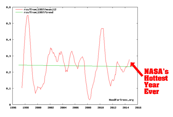
“The earth continues to warm”
Wrong.
That is an outlier then by even denying a hiatus. Even though GISS does not show a stop, it does show a hiatus here:
http://www.woodfortrees.org/plot/gistemp/from:1950/plot/gistemp/from:1950/to:2000/trend/plot/gistemp/from:2000/trend/plot/gistemp/from:1975/to:1999/trend
Just so everyone is clear on the terminology: “hiatus” and “pause” both mean the same thing: global warming has stopped.
Some folks cannot accept reality. Skeptics are here to help them.
The new Narrative is: “global warming never stopped.” That isn’t true, of course.
That is not correct. With the March data, 5.6 had no statistically significant warming since August 1996. However with the new 6.0 version, there is no warming at all since January 1997 as this post shows.
Just a point of clarification: I am not saying they are right, but the paper: Possible artifacts of data biases in the recent global surface warming hiatus
has these sentences: “The more recent trend was “estimated to be around one-third to one-half of the trend over 1951-2012.” The apparent slowdown was termed a “hiatus,” and inspired a suite of physical explanations for its cause…”
See my earlier article here:
http://wattsupwiththat.com/2015/04/09/rss-shows-no-warming-for-15-years-now-includes-february-data/
The 1998 El Nino is not relevant. The warming stopped before then and it also stopped after that.
Climate Pete,
There is a number of fallacies associated with your claims.
Firstly the temperature data set is not cherry-picked. RSS now agrees very well with UAH. All the surface temperature “data” sets also show no statistically significant warming from various periods, but are being “adjusted” to try to show it, but they can’t be as freely adjusted as past “records” because the satellites are watching.
Secondly, the use of lower tropospheric (or surface) temperatures is not cherry picked. It’s what IPCC has used to promote the repeatedly falsified, evidence-free hypothesis of man-made global warming via the GHE.
Thirdly, the start date is not cherry picked, but derived from a linear regression which extends back to before the super El Niño of 1997-98.
You assert that, “Further the use of a simple temperature chart to claim global warming has stopped is misrepresentation”. In that case, the UN’s IPCC misrepresents alleged “global warming” as well. (Which of course it does, in various ways.)
The evidence of ongoing warming is non-existent. In RSS and now maybe UAH (haven’t checked), the planet’s “now trend” is cooling.
My spreadsheet has data centrally averaged over 12 months and has detailed data up to the end of 2013. It shows a UAH 5.6 trend for 9/1997 to 7/2013 of 0.68 degrees C per century, with a 2 sigma confidence (around 95%) of 0.37 degrees C per century. That means the 95% range is 0.31 to 1.05 degrees C per century.
WFT shows the UAH 5.5 trend from 9/1997 does not change between end dates of mid 2013 and September 2015. So the confidence levels are not going to change much either. If anything the range will be lower.
So UAH 5.6 shows significant warming from 9/2015 to mid 2013 and will do the same to date.
I agree that the UAH 6.0 data set does not show warming any more over this period.
The same spreadsheet shows the surface temperature data sets Cowtan & Way and GISTEMP also show statistically significant warming from 9/1997 to mid 2013.
OK, I accept this argument from a thermodynamics standpoint. How accurately can we measure TOA energy in and energy out?
Cowtan and Way’s methodology is anti-scientific. Your spreadsheet for some unaccountable reason doesn’t agree with the statistical analysis of people who know what they’re doing.
I love that ocean heat content graph in joules. It’s how to lie with statistics on steroids. If you convert all those joules locked up in the top 2000m of ocean to temperature it turns out to be an increase of about 50 milli-Kelvins in 50 years or one thousandth of a degree C per year. The sea is insignificantly warmer than it was 50 years ago.
Oooooh! is all that heat going to come out and bite us in the near future?
Billy Liar June 9, 2015 at 2:12 pm
“I love that ocean heat content graph in joules. It’s how to lie with statistics on steroids. If you convert all those joules locked up in the top 2000m of ocean to temperature it turns out to be an increase of about 50 milli-Kelvins in 50 years or one thousandth of a degree C per year. The sea is insignificantly warmer than it was 50 years ago.
Oooooh! is all that heat going to come out and bite us in the near future?”
Good point. 🙂 Will it be possible for you to show us the input figures and the calculation?
“They could pretty much pick the result they wanted, then select a methodology to ensure that is the answer they get.”
A method well known to Warmistas. In fact, this seems to be the only way to arrive at a conclusion to a Warmista. No wonder you imagine that others do the same.
Climate Pete,
The catastrophic warming was supposed to be related to the warming of our atmosphere and not to the hardly noticeable warming of the deep oceans. Now that the oceans are taking up all the heat we no longer have to worry about all the land animals that were feared to get extinct because they couldn’t adapt or migrate fast enough. Also the fear that humans would suffer/die from more heat waves can now put to rest.The fish in the sea won’t notice a hundredth of a degree increase in water temperature. So where is the catastrophe? The rate of sea level rise? That also does seem to change much at all.
Are you serious? Have you even visited the RSS site and looked over their error analysis? As far as I can see, RSS claims a monthly precision using Monte Carlo and comparison with ground soundings of around 0.1 to 0.2 C, comparable to HadCRUT4. As I pointed out above, this means that there is a problem when they systematically diverge by more than their combined error.
This has just happened, and is the point of Werner’s figure above. Note that a systematic divergence doen’t have to be 0.2 C to be significant because we aren’t comparing single months. At this point it is something like 99.99% probable that one estimator or the other (or both) is in serious error. I gave several very good reasons in a comment above for being deeply suspicious of HadCRUT4 — one of them being a series of corrections that somehow always warm the present relative to the past over decades at this point, the same criterion you use above to cast doubt on UAH — another its admitted neglect of UHI in its land surface record, where most warming occurs.
For some time now, the trend difference between RSS and both HadCRUT and GISSTEMP has been more than disturbing, it has been statistical proof of serious error. RSS has the substantial advantage of “directly” measuring the temperature of the actual atmosphere, broadly averaged over specific sub-volumes. It automatically gets UHI right by directly measuring its local contribution to global warming of the atmosphere directly above urban centers. Land based thermometers that are poorly sited or sited in urban locations do the exact opposite — they do not average over any part of the surrounding territory and local temperatures can vary by whole degrees C if you move a thermometer twenty meters one way or another and can easily have systematic warming biases. It is not clear how any land based surface thermometer could have a cooling bias, unless it is placed inside a refrigerator, but I’m sure that one can imagine a way (HadCRUT and GISSTEMP both have successfully imagined it and implemented it as they cool past temperature readings with their “corrections” to relatively warm the present compared to the past).
Obviously, you think RSS is wrong and HadCRUT and/or GISSTEMP is right. Obviously, you think so because you are convinced a priori that CO_2 is warming the world at an alarming, dangerous rate, and that assertion is supported only by the adjusted surface data, not either the raw data or RSS. It also keeps the also growing divergence between the predictions of climate models and the actual temperature from being already so large as to completely eliminate any possibility that the models should be taken seriously (although to any statistician, they reached that point some time ago even for HadCRUT4) Compared to RSS, the divergence is truly inconsistent with the assertion that both RSS and the models are correct. RSS is a measurement. The models are obviously inadequate attempts to solve a nonlinear chaotic system at a useful accuracy. It is a no-brainer that the GCMs are badly broken.
You are entitled to your opionion, of course. My only suggestion is that you open up your mind to two possibilities that seem to elude you. One is that global warming is occurring, some fraction of it is anthropogenic, and that the rate of this warming is neither alarming nor likely to become catastrophic and overall has so far been entirely beneficial or neutral to civilization as a whole. The second is that there might, actually, be substantial bias, deliberate or not, in reported global temperature estimates. The problem of predicting the climate is a hard problem. There is — seriously — no good reason to think that we have solved it, and direct evidence strongly suggests (some would say proves beyond reasonable doubt) that we have not.
rgb
As RGB shows above, the satellite data is reinforced by the raw surface data being much closer to the satellite data. Additionally the tail cannot wag the dog. The oceans will always dominate the land, and the difference between land and ocean can only have very minor flux.
Furthermore, both satellite data sets show 1998 as being the warmest year ever by A LOT. Attention WERNER, it is inadequate to say the satellites show 2015 as the sixth warmest year. The difference between 1998 and 2014 and 2015 is huge, far beyond any possible error in the satellites. In a race when 2nd through 10th place is separated by a few hundredth of a second, but first place is in first by two tenths of a second, it is important to highlight the difference.
I am well aware of that. I do not believe there is the faintest hope of either satellite to get higher than third by the time the year is over. I plan to have more on this in 2 months when I plan to discuss the possibilities of records in 2015.
Thanks Werner. I appreciate your work. if you include the global graphics in comparing 1998 to any other year it is very clear visually as well.
So Climate Pete, are you ESL disadvantaged or what ?
How many times have readers at WUWT been informed, (told in no uncertain terms) that the “start date” for the Monckton graph of “no statistically significant Temperature change”, is in fact the date of the most recently released RSS measured data.
They use the most recently available for the start date, because next month’s data is not yet available to use; so it will be used next month.
It is the “end date” some 18 1/2 years ago, which is COMPUTED by the Monckton algorithm. It is not CHOSEN by anybody or any process or any thing.
So if you are not able to read Lord Monckton’s description for yourself, get some help on it, and stop repeating the nonsense that anybody cherry picks the 1987 date for any purpose. Planet earth set that time as an apparent end of the earlier period of global warming; not Monckton of Brenchley.
george e. smith,
Climate Pete can’t understand that concept. I’ve tried to explain it to him, to no avail. We start measuring from the latest data point, back to where global warming stopped. Right now, that is 18 ½ years. As time goes on, that number may or may not increase. But if global warming does not resume, soon it will be a full twenty years of temperature stasis. That’s very unusual in the temperature record. But facts are facts.
rgb says:
RSS has the substantial advantage of “directly” measuring the temperature of the actual atmosphere, broadly averaged over specific sub-volumes. It automatically gets UHI right by directly measuring its local contribution to global warming of the atmosphere directly above urban centers. Land based thermometers that are poorly sited or sited in urban locations do the exact opposite — they do not average over any part of the surrounding territory and local temperatures can vary by whole degrees C if you move a thermometer twenty meters one way or another and can easily have systematic warming biases…. RSS is a measurement…
Both RSS and UAH agree closely with thousands of radiosonde balloon measurements. Many $millions are spent annually on those three data collection systems. The people who reject them out of hand do so only because it doesn’t support their confirmation bias.
It’s amazing but true: Global warming stopped many years ago. The alarmist crowd just cannot accept that fact. So they argue incessantly, nitpicking and cherrypicking all the way. But eventually, Truth is too strong a force, and it will trump their Belief. It’s already happening.
Lord Monckton deals with no change whatsoever, or technically an extremely slight negative slope for 18 years and 6 months now.
The “no statistically significant Temperature change” is probably up to 27 years by now according to Dr. McKitrick. For the difference between the two, see my earlier article at: http://wattsupwiththat.com/2014/12/02/on-the-difference-between-lord-moncktons-18-years-for-rss-and-dr-mckitricks-26-years-now-includes-october-data/
I agree. No way they are within 0.01 deg. From the variability of all the temp data sets, I think a consensus product like Wood For Trees, get us within 0.06 deg. That’s just an estimate, but if it was less than that, then the different measuring methods would yield more consistent results with each other. But they don’t.
Mostly because they aren’t showing the warming many people believe must be there.
MarkW,
correct. This graph is reversed (cold on top; warm on lower part), but it shows reality:
Surface temperature anomalies averaged over medium periods of time are very consistent over long distance – with significant correlation within distances of up to 1000km. So while a surface thermometer measures temperature at only one point, the change over time is more widely applicable. This does not mean the temperatures are the same more widely.
See Spatial Correlations in Station Temperature Anomalies at http://www.smu.edu/~/media/Site/Dedman/Departments/Statistics/TechReports/TR260.ashx?la=en
As an example, take a location with a thermometer which registered an average temperature over 2000 or 10 degrees C and for 2010 of 10.1 degrees C, giving a trend of 0.1 C per decade. Assume a second location 100 miles away with no thermometer. We do not know the average temperature over 2000 or 2010, but we can say that the trend at this second location is likely to be close to 0.1 C per decade too.
This has clearly been verified with locations which are local to each other which both do have thermometers.
jquip said
Although we do not know the absolute temperature readings elsewhere, we do know that the spatial correlation of anomalies (temperature changes) persists up to quite large distances.
Hence the continuous coverage of the satellite temperature data sets is not a good reason for preferring them when working with temperature anomalies (changes over time), which means that the better accuracy of surface temperature data sets becomes a significant advantage for them when compared to the somewhat arbitrary temperature calculations of the satellite data sets.
Now you are just making it up as you go, Pete.
I can find many thermometers that are just a few miles apart that have dramatically different temperature profiles over the last few decades.
Your belief that you only need one thermometer every thousand miles or so is so absurd that only someone who is truly desperate could make it.
Sadly, you have me completely backwards. Strictly because the satellite sets have the naturally integrated coverage they do, they should be the preferred manner for working with anomalies. What one cannot state is that the construction of a mathemagical infilling algorithm is to be preferred over what is naturally radiating from the Earth and recorded in nearly all its EM glory.
Climate Pete
Just re-read that paper. It says noting of the sort, and its conclusion forcibly required more study to justify any such claim in the future. Undated, the type-written copy cites the “classic” papers on US stations used by Hansen, Jones, Briffa between 1978 and 1988. (And two others – also by Hansen in that time period. Correlation coefficients in the plots at the end are 1/2 to 3/4! (I won’t even quantify them by assigning a 1 digit decimal place), and two of the processes used by the original researchers reject negative relationships entirely!) Locations were “transferred” so even the basic longitude and latitudes were “moved” to squared-off locations, then not-quite-so-great circle distances were calculated: Even the distance numbers between stations were fudged.
Hansen, Briffa, and Jobes at the time desperately needed as much areas of the earth be covered by “red” (rising) temperature anomalies as possible. The extrapolation across 1000 km was his method.
Hansen’s premis has never been duplicated since. Has never been compared against the satellite “average” year-by-year changes since.
Mark W says:
I can find many thermometers that are just a few miles apart that have dramatically different temperature profiles over the last few decades.
You don’t even need a separation of a few miles.
At the last dinner Anthony hosted I passed out some calibrated thermometers to the attendees who wanted one. They were not cheap; they each had a certificate of calibration verifying accuracy to within 0.5ºC. That is very accurate for a stick thermometer. (I know something about calibration, having worked in a Metrology lab for more than 30 years. Part of the job was calibrating various kinds of thermometers.)
I purchased twenty-four thermometers. I kept them together, and every one of them showed exactly the same temperature, no matter what it was. Eventually I put a few around my house, outside. Within ten feet there was a variation of 3 – 4 degrees, and sometimes much more. As Mark says to ‘Climate’ Pete:
Your belief that you only need one thermometer every thousand miles or so is so absurd that only someone who is truly desperate could make it.
The only way to get a good idea of global temperatures is to have either lots of data points, or to have a snapshot of the whole globe, like satellites provide. Because there are so few thermometers in land-based measurements (and far fewer in the ocean), that data is highly questionable. That’s why satellite data is the best we have.
Essentially, the objection is that they are not thermometers. And that they require modelling and adjustments to produce a valid temperature regionally or for the globe. This is, of course, undeniably true. This is not a refutation of satellites however, so much as it is a confession that this is also true of terrestrially based thermometer products.
The trick is that the satellites trivially show the spatial variances that are directly related to temperature, without directly measuring the temperature itself. The terrestrial thermometers do directly measure temperature, but are completely blind to any region marginally away from the thermometer itself. Even a matter of a mere 20m. But the temperature given — arguably — needs correction as the reading gained includes the interaction of the thermometer with its environment. Rather than giving us the temperature we want, which would be the temperature if the thermometer wasn’t part of the environmnt.
This sounds silly, but it is a legitimate issue in interpreting results from terrestrial thermometers. Satellites don’t have this particular issue, even though they have others.
Essentially, if we take a ‘principle of indifference’ approach to things, then the criticisms about the temperature accuracy of the satellite products are exactly the same criticisms of the terrestrial records: They all require modelling, guestimations, and matters of taste. Of course, one cannot defame one product for one flaw and then proceed to use another product that has exactly the same flaw. Not without losing any sense of sanity or integrity, of course.
Where the two products differ is where they should excel in relation to one another. Without regard to adjusting the reading from a thermometer to gain a counterfactual temperature that would have existed if the thermometer didn’t — the satellite results do solve the infilling and interpolation problem for terrestrial sets. They provide a naturally integrated temperature dependent profile in their signal that spans all the places that actual thermometers are not.
As to whether or not anyone has used the satellite data to establish the error bounds on the terrestrial infilling and interpolation practices, I haven’t the foggiest. But I assume it has not been done, as otherwise the satellite data would be used for the construction of the infilling and interpolation.
Conversely, what I don’t know about the satellite data sets is if they are doing the previously mentioned process to convert their signals into temperature. If so, then there is simply no argument against using the satellite data sets. Likewise, there would no argument for using terrestrial based data sites as anything other than a calibration for the satellite data.
The surface data is fiddled, and the satellite data undergoes considerable manipulation to ascertain a result. Although I am a dyed-in-the-wool climate sceptic, I want to stay objective. I therefore have deep reservations about satellite data, and won’t accept it like many others here do. It’s not about accepting ‘something’, or the ‘best’ of a bad bunch. If they’re all useless, then don’t accept any – like I don’t. It’s like being asked to comment on who is the best politican.
No argument from me about your statements. I guess that makes us both filthy empiricists.
My guess: Surface stations are recording outgoing increasing heat at the source of the pump. Satellites, which are further away from the source record all the leaky, mixing atmospheric layers and gives us the average. In comparing surface sensors with “all layers” sensors we see a divergence. Meaning, we are losing heat somewhere, keeping the entire atmospheric heat content stable even though the source pump is pouring out more heat.
Remember, the greenhouse CO2 premise proposes that the troposphere should be getting hotter and hotter. Satellites say it ain’t happening. This could be why scientists are saying the increasing surface heat is somehow going down, not up, and is recycled into the deep ocean layers. Other scientists are unsure where that heat is escaping to. What is interesting is that there is no runaway re-radiating heat getting trapped in the atmosphere. Once that surface heat gets into all the layers of the atmosphere, it is not increasing there. That seems to me to point to a leak and I would look up before I look down.
+1
A couple of years ago, I came across an article posted on NASA, where a satellite showed that the ‘extra heat’ was escaping to space. From memory, either the date of the article was Dec. 2012 or it was posted Dec. 2012. A few months ago, I tried to locate it, but no luck. I have immense frustration on the NASA and NOAA sites.
The only explanation is that the upper troposphere is getting progressively dryer, while total precipitable water is of course increasing. Otherwise trend of satellite lower tropospheric temperature datasets would be some 20% higher globally than that of surface datasets, for moist lapse rate is smaller than dry one. It is obviously not the case.
BTW, balloon and satellite measurements do indicate that this is what’s happening.
So, while IR atmospheric depth is increasing in some narrow frequency bands due to well mixed GHGs, on average, integrated along the entire thermal spectrum it does just the opposite, because the upper troposphere is becoming ever more transparent in water vapor absorption bands.
It is a powerful negative feedback loop, which makes climate sensitivity to well mixed GHGs small.
At this point in time we can only speculate what the underlying mechanism might be. Perhaps with increasing surface temperature the water cycle is becoming more efficient, leaving more dry air above after precipitating moisture out of it.
Anyway, computational general circulation climate models are not expected to lend an explanation, because their resolution is far too coarse to represent cloud and precipitation processes faithfully and derive them from first principles.
Thank you! If someone were so inclined, they could probably write a whole post on this topic. GISS and Hadcrut would love you if you could totally explain the discrepancy by concluding that both satellite and other data sets could still be correct.
Chiefio has a great new thread on dryness and wetness and UV, here:
https://chiefio.wordpress.com/2015/06/06/its-the-water-and-a-lot-more-vapor/
Thank you! There is a lot here about changing humidity in the stratosphere, but I did not see anything to explain why satellite data for the lower troposphere should diverge from GISS.
Are you expecting computational general circulation climate models to lend an explanation and represent cloud and precipitation processes faithfully if you increase their resolution? Do you think that the models got the basic mechanism right but their resolution is to low? What is the basis for this expectation?
Wallensworth (posted above): I believe RSS is run by warmistas actually. That’s why its so valuable that it correlates with UAH (run by skeptics)
Shouldn’t the effects of El Nino be apparent on the satellite datasets by now?
“Effects”? Do you mean temperature? Yes, it appears May 2015 +0.27 anomaly (an increase of 0.21 from April) is an indication that El Nino is showing up in the satellite data.
It is, see here
http://www.drroyspencer.com/2015/06/uah-v6-0-global-temperature-update-for-may-2015-0-27-deg-c/#comments
RSS also went up from 0.175 to 0.310. However it was not enough to prevent an extra month from being added to the pause. The slope just became a bit less negative.
I do not know how the 18 years and 4 months will be affected for UAH. It will either stay at 18 years and 4 months or change by 1 month either way.
Attention WERNER, it is inadequate to say the satellites show 2015 as the sixth warmest year. The difference between 1998 and 2014 and 2015 is huge, far beyond any possible error in the satellites. In a race when 2nd through 10th place is separated by a few hundredth of a second, but first place is in first by two tenths of a second, it is important to highlight the difference.
https://bobtisdale.wordpress.com/2013/03/11/is-ocean-heat-content-data-all-its-stacked-up-to-be/
This data contradicts the points Climate Pete keeps trying to make. Climate Pete’s observations being very subjective.
Ocean heat, even if accepted as claimed, represents a 0.01 deg C or 0.02 deg rise in temp in 11 years. I get that water is dense and holds a lot of heat so spare me the lecture. But are we really going to conclude that catastrophic global warming is occurring based on an ‘estimate’ of 0.02 deg of ocean warming in a decade? Especially when many, many other data sources (satellite, wx models, balloons, sea level) disagree.
I suspect my average body temp increases by more than .02 deg when I take a single sip of morning coffee. It has taken the earth’s oceans 10 years to warm that much. Am I supposed to be afraid of that ? This is crazy.
Science or Fiction says on
June 9, 2015 at 3:01 pm
Good point. 🙂 Will it be possible for you to show us the input figures and the calculation?
Yes Mary – you are quite right.
The volume of the oceans is about 1.33 billion cu km
Therefore the mass of the oceans is about 1.33 * 10^21 kgs
To raise the temperature or 1 kg of water by 1 degree C needs 4180 joules
So to raise the oceans by 1 degree, multiply those 2 figures and you will need 5.5 * 10^24 joules
An increase in heat content of 5.5 * 10^22 joules will therefore raise the (average) ocean temperature by 0.01 degrees C
Not too scary
I like the idea of computing the energy in eV. At 6.24 e19 eV/J it makes the numbers look reallyscary – or the original number useless for getting a real feel.
No, you are mistaken, and besides, you aren’t saying it right. The thermal energy content of your body is (gracing you with a body mass of a mere 50 kg) on the order of 50×10^3 x 4 x 310 = 62 MJ. The thermal energy of a 1 gram sip of HOT coffee is 1 x 4 x 360 = 1440 J, but of that only 1 x 4 x 50 = 200 J count. Obviously, the sip of coffee does (on average) “warm you up” but by nowhere near a full 0.02 degree. You’d have to go out to a lot more significant digits than that.
So here’s the way it works in climate science. Presenting the warming in degree C is enormously not alarming, since none of us could detect a change in temperature of 0.02 C with our physiology if our lives depended on it. Presenting the warming as a fraction of the total heat content is not alarming, because one has to put too many damn zeros in front of the first zero, even if one expresses the result as a percent. So instead, let’s use an energy unit that is truly absurd in the context of the total energy content of the ocean, I mean “your body” — joules aren’t scary enough because 1440 isn’t a terribly big number, let’s try ergs, at 10^{-7} J/erg. Now your sip of coffee increased your body’s heat content by 1.44 x 10^10 ergs! Oh No! That’s an enormous number! Let’s all panic! Don’t take another sip, for the love of God, and in fact we’re going to have to ban the manufacture of coffee world wide in case coffee sipper increase their energy content by 5 x 10^10 ergs, which (as everybody knows) is certain to have a catastrophic effect on your physiology, major fever, could cause your cell’s natural metabolism to undergo a runaway warming that leaves you cooked where you stand like a Christmas Goose!
And yes, you said this quite right — you are supposed to be afraid of this, afraid enough to ban the growing or consumption of coffee, afraid enough to spend 400 billion dollars a year (if necessary) to find coffee substitutes that are just like drinking coffee (except for the being hot part), afraid enough to give your government plenipotentiary powers to work out any deal necessary with the United Nations or countries like Columbia that are major coffee exporters since the worldwide embargo on coffee will obviously impact them even more than a coffee-deprived workforce will impact us.
And consider yourself lucky! If they had used electron volts instead of ergs, the numbers would have looked like the graph above on a suitably chosen scale, because 1 ev = 1.6 x 10^{-19} joules, or 1440 J = 9 x 10^21 eV, just about 10^22 eV. Now that is really scary. Heck, that’s almost Avogadro’s Number of eV, and everybody knows that is a positively huge number. If we don’t ban coffee drinking right now you could end up imbibing 3, 4 even 5 x 10^22 eV of energy in a matter of seconds, and then it will be Too Late.
Now do you understand? Your body sheds heat at an average rate of roughly 100 W, and during that one small sip — if it takes 1 whole second to swallow — your energy imbalance was almost 1340 W! In comparison to 0.5 W/m^2 out of several hundred watts/m^2 total average insolation, if you took a 1 gram sip every hour (1440/3600 ~ 0.5 W) surely you can see that you would without any question die horribly in a matter of hours. In fact, you might as well go stick your head in a microwave oven, especially a microwave oven hooked up to a flashlight battery illuminating a couple of square meters, because that’s well known to be able to melt any amount of arctic ice.
Oh, one final comment. If you choose to present your body’s coffee-sip overheating in eV, be sure to never, ever, discuss probable error or the plausibility of being able to measure the effect against the body’s natural homeostatic, homeothermic temperature regulatory mechanisms without which you would die in short order coffee or not. Because 5 x 10^22 eV plus or minus 10^20 or 10^21 eV doesn’t have the same ring to it…
rgb
RGB,
Microergs would be even scarier still!
rgbatduke,
Thanks for posting what’s needed to be said for a long time. As usual, your comments make sense.
The alarmist brigade loves to use those big, scary numbers. To the science-challenged, that’s probably an effective tactic. It’s the “Olympic-sized swimming pools” argument (“Ladies and gents, that is the equivalent of X number of Olympic-sized swimming pools! Run for your lives!”)
Context is everything in cases like these. If the oceans continue to warm by 0.23ºC/century (if…), then on net balance it’s probably a win-win: the Northwest passage will eventually be ice-free, reducing ship transit times and fuel use; vast areas like Canaduh, Siberia, etc., will be opened to agriculture, and so on. What’s the downside? Bueller …?
But when they translate the numbers into ergs or joules, they can post really enormous numbers — which mean nothing different, except to the arithmetic challenged.
That isn’t science, it’s propaganda. Unfortunately, it works on some folks. But the rest of us know they’re trying to sell us a pig in a poke. Elmer Gantry would be impressed with the tactic.
“HadCRUT4.3 is warmer than HadCRUT4.2.”
Steven Goddard has an interesting take on the difference between versions 2 and 3
http://realclimatescience.com/2015/06/data-tampering-on-the-other-side-of-the-pond/
http://thefederalist.com/2015/06/08/global-warming-the-theory-that-predicts-nothing-and-explains-everything/
Can not be said any better. AGW is agenda driven and not based on true observational data.
No matter what way you look at it, what we see hear is the reality of just how ‘unsettled’ this self claimed ‘settled science’ really is .
Exactly! We don’t know. Unfortunately, there are poeple on both sides who think they do.
Ghost, we do know the benefits of increased CO2. We do know the world is not warming like the models predicted. We do know droughts and hurricanes and SL rise and all manner of disaster is not and are not increasing. We do know that energy is the life blood of every economy.
When we get into discussions of a fraction of a degree I always remember back in the 80s being told from many official sources that we could NEVER have accurately measured the earths temps, even in the modern era. The dataset was ONLY useful for longer term and clear trends. Did this stop being true at some point? Havent heard this mentioned in years. All this talk of single hottest years is 100% meaningless from what was being said back then. Also the “pause” is very clear and undeniable.
I have compared the global anomalies of the trend 1978-2015 for GISS and new UAH, Striking is the fact that GISS invents hot data where there are no observations like central Greenland and the high arctic

UAH:
GISS:
Hans are you sure about that? I thought there are stations, at least four? Is that wrong?
http://data.giss.nasa.gov/cgi-bin/gistemp/find_station.cgi?dt=1&ds=14&name=&world_map.x=314&world_map.y=17
yes but the stations are on the edge of greenland, GISS EXTRAPOLATES the data onto the icecap where UAH reports an OBSERVED negative trend.
Hans,
Telling point, but there are only three actually on Greenland, with two nearby in Canada.
So, Climate Pete says there is still AGW but hidden by random external factors that apparently never existed before. So man is causing GW, but we just can’t see it???? Huh!!!!!
“Why are the new satellite and ground data sets going in opposite directions? Is there any reason that you can think of where both could simultaneously be correct? ”
1. They measure different things.
2. They estimate and interpolate in different ways.
3. Both are constructed from differing instruments.
4. Both are heavily adjusted.
5. They measure at different times.
Could they both be “correct”?
That’s a silly question. they are both incorrect. both contain error. both are estimates. they estimate different things in different ways.
Comparing the two is vastly more complex than looking a wiggles on the page. Both wiggles are heavily adjusted, heavily processed, and hard to audit.
If that is the case, then there seems to be no justification for spending hundreds of billions of dollars to mitigate something we are not sure is even happening. Would you agree?
Raises hand uselessly. I live in California.
No.
your conclusion isnt supported by what I said.
we cannot measure the rain correctly.
we cannot measure sea level correctly
we cannot measure hurricane winds correctly.
none of these prevent us from taking action to adapt to floods drought and storms.
We should all take action to mitigate things that can affect us wherever we live. Whether or not we can prove that 15 floods per century may rise to 18 floods per century should really have no effect on how we ought to prepare for example.
“none of these prevent us from taking action to adapt to floods drought and storms.”
Floods, droughts, storms, earthquakes, volcanoes etc. have all happened in the past.
Catastrophic anthropogenic global warming has never happened. There is currently no evidence that it ever will. There are many predictions of CAGW, but then there have been many predictions of the end of the world, too.
Extraordinary claims require extraordinary evidence.
A fundamental principle within measurement, or estimation if you like, is to have a well defined measurand. I Think that temperature data products fails to meet this criteria.
I think that the measurand, the product, of the various temperature data products is not well defined. Even though it is not well defined, it is obvious that it keeps changing. Also, water temperature and air temperature seems to be combined without taking into account differences in mass and heat capacity.
When measurands are not well defined how are you supposed to compare the output from various temperature data products or test the output of climate models?
Science or Fiction
You say
Yes. Indeed, it is worse than you say for the following reasons.
1.
There is no agreed definition of global average surface temperature anomaly (GASTA).
2.
Each team that provides a version of GASTA uses a unique definition of GASTA.
3.
Each team that provides a version of GASTA changes its definition of GASTA almost every month with resulting alteration of past data.
4.
There is no possibility of a calibration standard for GASTA whatever definition of GASTA is adopted or could be adopted.
In case you have not seen it, I again link to this and draw especial attention to its Appendix B.
Richard
Thank you for the link. This makes me think that it is appropriate to draw attention to a quote by Karl R. Popper in his book “The logic of scientific discovery”.
“It is still impossible, for various reasons, that any theoretical system should ever be conclusively falsified. For it is always possible to find some way of evading falsification, for example by introducing ad hoc an auxiliary hypothesis, or by changing ad hoc a definition. It is even possible without logical inconsistency to adopt the position of simply refusing to acknowledge any falsifying experience whatsoever. Admittedly, scientists do not usually proceed in this way, but logically such procedure is possible.”
We could add that the the global warming theory is also not well defined. Exactly what is supposed to be warming? By how much?
Exactly the behavior Karl Popper warns about.
No, Mosh, they don’t measure “different” things. The surface measurements are a tiny subset of the satellites, the sats measuring the bulk of the atmosphere and the ground measuring, well, just above the ground. So the ground measurements are a tiny, 2-dimensional subset of the sats, volume-wise.
Yes, you know that, but the continual pushing of the “they are different” meme is dishonest.
The surface stations measure air temperature at 2meters. they measure TMIN and TMAX once a day.
Satellites measure BRIGHTNESS at the sensor. This measure is not a tmax or tmin measure. a single temperature in INFERRED from the radiance .
“AMSUs are always situated on polar-orbiting satellites in sun-synchronous orbits. This results in their crossing the equator at the same two local solar times every orbit. For example EOS Aqua crosses the equator in daylight heading north (ascending) at 1:30 pm solar time and in darkness heading south (descending) at 1:30 am solar time.
The AMSU instruments scan continuously in a “whisk broom” mode. During about 6 seconds of each 8-second observation cycle, AMSU-A makes 30 observations at 3.3° steps from −48° to +48°. It then makes observations of a warm calibration target and of cold space before it returns to its original position for the start of the next scan. In these 8 seconds the subsatellite point moves about 45 km, so the next scan will be 45 km further along the track. AMSU-B meanwhile makes 3 scans of 90 observations each, with a spacing of 1.1°.
During any given 24-hour period there are approximately 16 orbits. Almost the entire globe is observed in either daylight or nighttime mode, many in both. Polar regions are observed nearly every 100 minutes.”
The brightness is then transformed into a ESTIMATE of temperature kilometers above the surface.
This estimate depends on no less than…
A) idealized atmospheric profiles
B) a radiative transfer model for microwave.
In short, if you have Brightness at the sensor you have to run a physics model to estimate the temperature of the atmosphere that could have produced that brightness at the sensor.
An analogous problem might be this: Your vehicle gets hit by a bullet travelling 1000 fps. you know the enemy as a gun with a muzzle velocity of 3000 fps and you then can figure out how far away he was when he fired. In this case Distance is inferred from terminal velocity and laws of motion. In the case of satilletes temperature is inferred from brightness and the laws of radiative transfer.
Its those laws.. the laws of radiative transfer that tell us doubling c02 will add 3.71 watts to our system.
( all else being equal)
FYI
“The temperature of the atmosphere at various altitudes as well as sea and land surface temperatures can be inferred from satellite measurements. These measurements can be used to locate weather fronts, monitor the El Niño-Southern Oscillation, determine the strength of tropical cyclones, study urban heat islands and monitor the global climate. Wildfires, volcanos, and industrial hot spots can also be found via thermal imaging from weather satellites.
Weather satellites do not measure temperature directly but measure radiances in various wavelength bands. Since 1978 Microwave sounding units (MSUs) on National Oceanic and Atmospheric Administration polar orbiting satellites have measured the intensity of upwelling microwave radiation from atmospheric oxygen, which is proportional to the temperature of broad vertical layers of the atmosphere. ”
“Satellites do not measure temperature. They measure radiances in various wavelength bands, which must then be mathematically inverted to obtain indirect inferences of temperature.[1][2] The resulting temperature profiles depend on details of the methods that are used to obtain temperatures from radiances. As a result, different groups that have analyzed the satellite data have produced differing temperature datasets. Among these are the UAH dataset prepared at the University of Alabama in Huntsville and the RSS dataset prepared by Remote Sensing Systems. The satellite series is not fully homogeneous – it is constructed from a series of satellites with similar but not identical instrumentation. The sensors deteriorate over time, and corrections are necessary for orbital drift and decay. Particularly large differences between reconstructed temperature series occur at the few times when there is little temporal overlap between successive satellites, making intercalibration difficult”
or read:
Uddstrom, Michael J. (1988). “Retrieval of Atmospheric Profiles from Satellite Radiance Data by Typical Shape Function Maximum a Posteriori Simultaneous Retrieval Estimators”.
As I have said many times in the past week, and on different threads, we really shouldn’t be looking at satellite data. But you have people here (no need for me to name them) who think it is the only dataset to use! I have to smile though; if satellite data showed warming in excess of that of the surface, warmists would be using it! I’m absolutely positive about that – they would be hugging it and saying, ‘See, we told yer’. It’s a nonsense way of ‘recording’ temperature, no matter what it shows. We don’t have a reliable and unadulterated dataset. They’ve all been abused and altered beyond comprehension now. Science is the loser. As I said before, we need to start again, with 100-metre high towers, topped with Stevenson Screens, unadjusted data beamed live to the internet.
“As I said before, we need to start again, with 100-metre high towers, topped with Stevenson Screens, unadjusted data beamed live to the internet.”
That won’t solve anything. Then there will be the issue of blending the old data with the new and lead to a new round of cooling the past.
Mosh & Ghost,
I think you’re missing the point. Whether any particular data point is accurate is not the point. What is important is the trend.
Satellites cover (almost) the whole globe. Thus they can show temperature trends more accurately than land-based thermometers (or ARGO for that matter).
The central metric in the man-made global warming debate is the temperature trend. Satellite measurements do not show any real trend. If global T is up or down by a tenth of a degree or two, that is to be expected. Global temperatures are never absolutely flat. Naturally, temperatures will fluctuate.
The elephant in the room, as they say is the fact that despite a large rise in CO2, global temperatures have not responded as predicted. That means the CO2=AGW conjecture has something seriously wrong with it. What other conclusion could you arrive at?
I have no problem whatsoever in saying that, quite evidently, CO2’s effect on climate is nothing like we were warned (if at all, even!). I find predictions of doom absurd. As you say (and I have said myself, many times), despite ‘massive forcing’ the global temperature has hardly risen at all, if it has. It has made a mockery of CO2-induced warming. But I come back to satellites being a curious metric. If I said to you that the width of leeks growing in Norfolk have shown no trend at all in the past 18 years, they would still be a rotten tool to use in climatology. The trend doesn’t matter, satellites are still a rotten tool to use, given the peculiar way ‘temperature’ is arrived at. Trend just doesn’t come into it. dbstealey, you should really desist from welcoming RSS and UAH as a scientific way to indicate temperature and temperature trend. But it’s up to you.
Mr Ghost….
..
The chief scientist, and vice president of RSS Mr. Mears says…
” A similar, but stronger case can be made using surface temperature datasets, which I consider to be more reliable than satellite datasets (they certainly agree with each other better than the various satellite datasets do!). ” ( Reference: http://www.remss.com/blog/recent-slowing-rise-global-temperatures)
..
Now, that statement is significant coming from the man responsible for the RSS dataset.
That statement had various degrees of being true, depending on the time we are thinking about. For example, it is only recently that GISS and Hadcrut4.3 agree. But a few years ago, there was no comparison between Hadcrut3 and GISS. For example Hadcrut3 still has 1998 as the warmest year while it is about 5th for GISS.
As for the satellites, with UAH6.0 out now, it agrees with RSS.
So what is true today is the satellites agree with each other; NOAA, GISS and Hadcrut4.3 agree with each other; but the satellites do not agree with the latter three.
A question: Does Dr. Mears have any biases that could prompt the above statement?
“As for the satellites, with UAH6.0 out now, it agrees with RSS.”
…
Yes, the original data from the satellites has not changed at all, but the output from the algorithms used by UAH have been “adjusted”
…
Funny how this adjustment doesn’t seem to bother people all that much.
I find Carl Mears ideas on the ‘hiatus’ odd, to say the least. First of all, his “bad luck”! Random fluctuations in climate obviously exist, but not in any model, it appears. Can a random fluctuation really overcome massive CO2 forcing? No, not if CO2 is as dominanting to the climate system as we are told. I remember reading on realclimate that CO2 could even alter the effect from Milankovitch cycles, and thus stop an Ice Age. Yet it cannot overcome a ‘random fluctuation’? But much more importantly, what IS a random fluctuation in climate terms? I understand its role in statistics and sampling, but in a climate system? Secondly, his idea on trade winds. Unless I’m reading it wrong, there appears to be zero correlation between trade winds and warming…
http://www.nature.com/nclimate/journal/v4/n3/images/nclimate2106-f1.jpg
Ghost,
I agree with most everything you wrote there. I will still rely on satellite trends though, like most folks. Their measurements may not be 100% perfect, but they are more accurate than any alternative (except maybe for your 100 meter high towers. But that’ll never happen, will it? And see Mary Brown’s comment above. She’s right, you know.)
Satellite data is sufficient to show the trend — and there is no trend! For almost twenty years there has been nothing to speak of, either warming or cooling. The past century has been as flat as anything in the entire geologic record.
That’s where the alarmist crowd falls on their collective faces. They incessantly predicted runaway global warming, based on just a couple of years in the late ’90’s. But now that they have been decisively proven to be wrong, they cannot admit it. I wonder what it would take? Personally, I don’t think another Snowball Earth would be enough.
And J. jackson says:
The chief scientist… Mr. Mears…
Mr. Mears will be glad to know he’s been promoted from “Senior Scientist” to “Chief Scientist”.
That designation really smacks of the old ‘Appeal to Authority’ logical fallacy. Mears constantly denigrates skeptics with pejoratives like “Denialists” and “Deniers”. No ethical scientist would publicly label other scientists who simply have a different point of view with brainless and insulting terms like that. Those labels make it clear that Mears isn’t an ethical scientist, he’s just another self-serving politician. When we ask, “Cui bono?” the answer that comes back is: Mears.
Both NOAA and UAH made adjustments recently. The UAH adjustments made it more similar to the only other satellite data set, RSS. Why should that bother anyone? On the other hand, NOAA became an outlier with its adjustment to get rid of the hiatus. When adjustments push you away from all others rather than toward others, that is cause for serious soul searching.
Ghost,
What do you do about the variation in altitude? For the 71% of the planet’s surface that is close to mean sea level, no problem, but what about land, which varies in elevation from well below MSL to 29,000 feet above it? Apply some lapse rate?
And where do you place the towers? Do you avoid urban areas?
Even at just one per 1,000,000 sq km (the area of TX and NM combined), you’d still need 510 of them. Anchoring them in pack ice might present some engineering challenges.
But I’m for your suggestion. Until then however, the satellites and balloons are the best we have. The surface station “data” are worse than worthless and those responsible for perpetrating them should at least fired and more properly prosecuted for fraud, grand larceny and mass murder.
Moshers long post stated this…
This estimate depends on no less than…
A) idealized atmospheric profiles
B) a radiative transfer model for microwave.
============================
Mosher failed to point out that the satellites are calibrated against very accurate weather balloons. Mosher failed to point out that they measure far more of the atmosphere far more often and their methods have been far more consistent then the disparate means of surface measurements.
I guess the author doesn’t want any new readers. What else would account for his not defining acronyms or giving any background on these data series? Oh well, each tribe preaches to its own choir. Sad.
Is there any reason that you can think of where both could simultaneously be correct? Lubos Motl has an interesting article in which it looks as if satellites can “see” things the ground data sets miss. Do you think there could be something to this for at least a partial explanation?
There isn’t any. But it’s obvious why the ground stations spuriously diverge: They ignore station microsite bias and then homogenize the data, which forces the well sited ground stations to conform with their poorly sited counterparts.
The Satellite LT trends are an upper bound. They exceed surface trends by 10% to 40%, depending on latitude.
Please see the following which has everything you may want to know and more. If something is missing, please let me know.
http://wattsupwiththat.com/2015/05/14/april-2015-global-surface-landocean-and-lower-troposphere-temperature-anomaly-model-data-difference-update/
Sorry! The above is for Jake J.
Jake J,
Here’s a glossary:
http://wattsupwiththat.com/reference-pages/glossary
Nobody cares what the atmospheric Temperature is 100 metres above the ground.
Nobody really lies there or even visits there, so it isn’t of critical importance to living species. Maybe the Canada Geese, but not much of anything else.
And the last flock of geese of any extent I’ve seen. was more like 3,000 metres above the ground. I guess they heard about the 100 metre high towers and go up to avoid them.
Window cleaners for the CN tower may care. But perhaps more importantly, how are temperatures at the surfaces of mountains incorporated? The metres above sea level are more important for mountains than metres above sea level for a coastal city.
Thanks for the links. I think people well schooled in all of this forget how steep the learning curve is. Understandable, yet intensely frustrating to me at times.
Anthony the new automatic ad policy is pathetic. Have you lost faith in Social Security to resort to this nonsrnse
Anthony, you rent our eyeballs to see ads in return for money so you can keep this web site up and running, That way, WE don’t have to pay for it if we don’t want to. (Although I do kick in a Grant or Franklin every now and then.) Keep up the good work, we NEED you to stay in business.
The way the surface instrument temperature data is gathered, adjusted, massaged or manipulated, and all justified as being necessary, one can only suspect the outcome is meaningless.
It reminds me of the accounting world in which certain provisions at balance sheet date used to be determined traditionally using an historical calculation that actually represented a best case estimate. Then an accounting standard was introduced to ‘better calculate’ the provision by taking the historical estimate and applying to it at least three judgemental estimates in order to derive the final provision that supposedly showed a “true and fair view”.
Yet how can an estimate of an estimate of an estimate of the original estimate be more accurate than the original estimate in the first place? It can’t. Same with thermometer temperature raw data.
Of course it can be more accurate. It’s nothing like accounting.
NOAA scientologists are now looking at ways to correct spurious RSS and UAH trends with corrections from ship intake manifolds.
RSS already corrects their data with a GCM.. little known fact
There are models and then there are models.
GCM: Global Circulations Model
GCM: Global Climate Model
What do you mean?
Are all models wrong or are all model right?
Are all models useless or are all models useful?
I do not think that RSS is based on what can reasonably be referred to as a GCM.
I can hardly think of any electronic instrument which does not contain a model of some sort.
Do you think that RSS provide a consistent result within stated uncertainties or don’t you?
Can you elaborate your view?
Thanks, Werner Brozek. This is very informative article, good work.
Thank you! We can never let them think they are not being watched closely.
here is a document that Werner should read before he writes another word about UAH and before folks write another comment.
http://www1.ncdc.noaa.gov/pub/data/sds/cdr/CDRs/Mean_Layer_Temperatures_UAH/AlgorithmDescription.pdf
some exerps
“The satellite-observed quantity which is interpreted as a measure of deep-layer average
atmospheric temperature is the microwave brightness temperature (Tb) measured
within the 50-60 GHz oxygen absorption complex. For specific frequencies in this band
where the atmospheric absorption is so strong that the Earth’s surface is essentially
obscured, the rate of thermal emission by the atmosphere is very nearly proportional to
the temperature of the air. For example, the lower stratospheric temperature product
(TLS) is almost 100% composed of thermal emission from atmospheric molecular
oxygen.
In the more general case, the brightness temperature also depends upon the emissivity
of the object being measured, as well as its temperature,
….
As a result, the middle tropospheric temperature (TMT) and lower tropospheric
temperature (TLT) products have a component of surface emission “shining through”
the atmospheric layer being sensed which, depending upon the surface, may or may
not be directly proportional to temperature of that surface.
….
These sources of contamination have been found to be relatively small (but not totally
negligible) in the time-variations of the TLT and TMT products, so throughout this
document Tb variations will be assumed to be loosely proportional to temperature
variations.
The goal is to provide a long-term record of space- and time-averaged deep-layer
average temperatures for three atmospheric layers, while minimizing errors due to
incomplete spatial sampling, calibration, the varying time-of-day of the measurements,
contamination by surface effects on the measurements, and decay of the satellites’
orbits over time. The easiest part of this process is the actual calibration of the
instrument measurements, which in the absence of contaminating influences from the
Earth’s surface or hydrometeors in the atmosphere, provides Tb’s which are directly
proportional to air temperature, which is what we desire to measure.
…..
As discussed previously, decisions regarding limb correction procedures involving the
linear combination of many different channels, or computation of the TLT “pseudochannel”
from various view angles of AMSU channel 5, or how to interpolate the
gridpoint products, were optimized based upon how well two different AMSUs flying on
different satellites in different orbits agreed with each other in the resulting products.
Thus, the products and procedures used have been optimized to be fairly robust in a
statistical sense. Especially when regression is used for the development of a product
based upon a huge volume of satellite data, “over-fitting” of the regression equation
coefficients is quite common. This potential problem was indeed seen and avoided to
the extent possible.
Nevertheless, algorithms using remotely sensed data are never perfect. Thus, the
algorithm might or might not be sensitive to long-term changes in (say) surface
emissivity, or sensor changes, or satellite orbit changes, depending upon the nature and
severity of these various influences.
There has been little effort to explore all of the potential sources of these problems and
potential mitigation strategies. Instead, issues are addressed as they arise when
anomalies are seen in the products
Thank you! I did not read the 24 pages, but from the above, I am content to take the word of the RSS and UAH people that they know what they are doing. And with the recent alignment of UAH6.0 with RSS, that seems like a safe assumption for now.
Speaking for myself, it is very easy for me to miss a later reply post to earlier post if I have gone past that point in my earlier go around. On this thread, there are many excellent replies, however in case you may have missed it, I would very highly recommend the somewhat long but excellent reply by rgb near the beginning here:
http://wattsupwiththat.com/2015/06/09/huge-divergence-between-latest-uah-and-hadcrut4-revisions-now-includes-april-data/#comment-1959685
It goes to the very heart of the matter as to why there should not be a huge divergence between satellite data and the others.
Absolutely Werner, the facts you have shown, RGB’s excellent posts and the sateliite records show the truth. Mosher is an obfuscationist and spin merchant. He, Zeke and his bunch are not to be trusted on anything they say it regards to climate and temperature trend measurements. They have shown themselves to be unreliable.
UAH6.0 Update: With the May anomaly of 0.272 for UAH6.0, the pause there stays at 18 years and 4 months from February 1997 to May 2015.
(RSS has a pause of 18 years and 6 months from December 1996 to May 2015. GISS and Hadcrut4.3 do not really have a pause at all since it is only a few months.)
Even if the pause went away, 1998 would EASILY be the warmest year ever in the satellite data sets.
The new question would legitimately be; How long as it been since the earth experienced it warmest year since the little ice age?
That would certainly apply up to 2015. And that is a good argument that could be made should the pause disappear by November 30 in Paris. Granted, there was a very strong El Nino in 1998, and to mention this for 7 to 10 years after 1998 is perhaps fair game. But after 17 years, that argument starts sounding a bit lame in comparison to what CO2 would allegedly do.
True Werner, but also remember that 1998 was also a strongly positive AMO. I consider it likely that if we had the opposite of 1998, a very strong La Nina, as well as a strongly negative AMO, 100 percent of the warming in the satellite data base would vanish. Also consider that the period of the late 1990 was very low for volcanism. Add in a strong volcanic event, and we may even have cooling over the entire satellite record.
True, but with that they would have the excuse that it was not due to natural variation. But the ocean cycles alone are natural variations that would trump CO2.
Science or Fiction said :
Chris Schoneveld said :
The issue is not the warming that has gone on in the deep oceans. Neither is there an expectation that the heat already stored will come out and bite us – it won’t. The issue is whether more of the energy imbalance is going to start going into surface warming, and not virtually all of it into ocean warming. In the long run this is bound to happen.
The warming of the oceans 0-2000m just gives us yet another measure of the energy imbalance of the earth, and it boils down to 0.53 W/sq metre.
The maths behind this is simple and copied from a post above. The NOAA/NODC chart shows that between 1998 and 2012 the 5-year-smoothed energy content of the oceans from 0-2000m has risen from 5 x 10^22 (5 times 10 to the power 22) to 17 x 10^22 Joules relative to 1979. Since the earth’s area is 510 million square km = 5.1 x 10^14 square metres, and there are 442 million seconds in 14 years, then this rise equates to a rate of heating of 12 x 10^22 / (5.1 x 10^14 x 4.4 x 10^8) = 0.53 W/square metre continuously over the whole of earth’s surface.
Now the issue is that where the excess energy from the top-of-atmosphere goes varies from time to time. When there is a La Nina state then more of it goes into the ocean. When there is an El Nino state more of it goes into surface warming.
What would happen if all the heat providing the one thousandth of a degree per year warming of the top 2000m of the oceans had actually gone into atmospheric warming? Well the ocean is 4km deep on average, and has 4,000 times the heat capacity of the atmosphere, so the top 2000m has 2,000 times the heat capacity of the atmosphere. The heat which warms the top 2000m of the ocean by 1/1000th of a degree per year would warm the atmosphere by 2 degrees PER YEAR. If only 10% of the energy imbalance goes into atmospheric (and surface) warming then they would warm by “only” 0.2 degrees PER YEAR. Not every year, because not every year is an El Nino. But some years.
In other words, the energy imbalance is too high – and what proportion of that goes into surface warming is essentially random (with weather”) but is expected to average out to a few percent in the long term, even if you can put forward an argument it has been lower than normal over the last 20 years.
More CO2 means a higher energy imbalance – whether the surface happens to warm more at the time or not – and the energy imbalance has now been closed off in the last half dozen years. This means that the direct measurements and calculations of the additional heat coming in via the top of the atmosphere square off reasonably well with the heating which is going on in the ocean.
The very slight (tens of milli-Kelvins) of warming of the ocean has a direct effect on sea levels, though not catastrophic on its own. Glacier and ice sheet melting is generally more significant and the rate depends on surface warming.
Sooner or later the random elements of El Nino / La Nina and other weather effects mean a higher proportion of incoming heat will go into surface warming. If there were no energy imbalance there would never be a problem. However, there is an energy imbalance, so at the moment you should just keep your fingers crossed it virtually all keeps going into the ocean for a while. Though with the 2015 El Nino which appears to be growing in strength all the time, it is unlikely that we will escape without significant surfae warming for 2015 as a whole.
Pete,
There is no evidence that the “missing heat” is going into the ocean. It most likely just simply isn’t there.
The best supported conclusion from actual data, such as they are, is that the net GHG warming, if any, is simply too insignificant to be detected, given the large margin of error in the temperature “observations”, or balanced out by other human activities, also negligible.
I don’t know where you get that result from. The NOAA / NODC chart is supported by Argo float data from the fleet of up to 4,000 floats which have now been sampling ocean temperatures down to 2,000m since the early years of this century. The specification of the accuracy is 0.003 degrees C. And retrieved Argo floats recaptured after 1-3 years in the water beat that figure on subsequent retesting. The NOAA evidence is therefore statistically significant. By contrast, the number of samples of temperatures below 2,000m is too small to draw any significant conclusions from. This is apparent from the IPCC AR5 graph pair below :
http://www.ipcc.ch/report/graphics/images/Assessment%20Reports/AR5%20-%20WG1/Chapter%2003/Fig3-02.jpg
The highest NOAA number with all of their new revisions is 0.129 C/decade which happens to be from 1951 to 2012. I do not see this as a problem at all. Do you? Furthermore, heat cannot just go into the air without some being absorbed by the ocean which is an infinite heat sink for all intents and purposes.
It is only about 1000, not 4000. See my earlier article here: http://wattsupwiththat.com/2015/03/06/it-would-not-matter-if-trenberth-was-correct-now-includes-january-data/
Correction. The heat capacity of the ocean is around 1,600 times that of the atmosphere, not 4,000 times. The weight of the atmosphere is around the equivalent of the weight of 10m of water but the oceans are 4,000m deep (x400), and the specific heat of nitrogen is around 1kJ/kg/K whereas water is around 4x that value giving a total multiplier of x1,600. So the relevant paragraph above should read as follows :
“What would happen if all the heat providing the one thousandth of a degree per year warming of the top 2000m of the oceans had actually gone into atmospheric warming? Well the ocean is 4km deep on average, and has 1,600 times the heat capacity of the atmosphere, so the top 2000m has 800 times the heat capacity of the atmosphere. The heat which warms the top 2000m of the ocean by 1/1000th of a degree per year would warm the atmosphere by 0.8 degrees PER YEAR. If only 10% of the energy imbalance goes into atmospheric (and surface) warming then they would warm by “only” 0.08 degrees PER YEAR (or 8 degrees C per century). Not every year, because not every year is an El Nino. But some years are.”
Just for discussion sake, let us assume the 0.08 C/year is correct. You cannot then infer this is 8 C/century because as you say, not every year is an El Nino year. So even though 0.08 C/year converts to 8 C/century, if we assume that only every 5th year is an El Nino year, that then becomes 1.6 C/century. And 1.6 C/century is not alarming, but even that is higher than any number in the NOAA numbers.
Werner B,
Correct. 1.6º is not only un-alarming, it would be very beneficial. The Northwest Passage would be ice-free for most of the year, allowing much shorter transit times and the saving of fuel.
The Arctic would hopefully be ice-free, at least in summer. There’s no downside to that, either.
I am hoping for a 2º – 3º global temperature rise. It would be a net benfit to humanity and the biosphere. Huge areas like Canada, Mongolia, Siberia and Alaska would be opened to agriculture, driving down food prices and greatly helping the one-third of humanity that subsists on $2 a day or less.
But you’re wasting your time trying to convince “Climate” Pete of anything. His mind is made up, and truth be told, he’s hoping for a climate catastrophe so he can say, “I was right!”
He’s wrong. The catastrophe would happen if there was global cooling. Global warming is as beneficial as the rise in harmless CO2. We need more of both.
You may be right, but for the benefit of the few who may still be reading this post, we must reply in case they thought Pete may be on to something.
The “climatological probability” of an El Nino varies by time of year, but averages at least 30% (nearly 1 in 3). See continuous thin red line and key in the following :
http://iri.columbia.edu/wp-content/uploads/2015/06/figure1.gif
30% of 8 degrees C per century is 2.6 degrees C per century.
In other words, ocean warming down to 2,000m averaging only 1 milli-Kelvin per year is indicative of an energy imbalance which potentially could mean the earth warms something like 2.6 degrees C per century. That’s based on some straightforward maths.with some approximate assumptions.
You can debate the approximate assumptions, but the point is that a small figure for ocean temperature or CO2 rise is no guarantee that there is no problem.
True. There may be more El Ninos however the step change could be smaller than 0.08 C/year for each one. As a matter of fact, there may not even be a step change. Things may simply get back to the previous anomaly after the El Nino. But one thing is clear. We have never had a warming of 2.6 C/century for a period of at least 10 years. So why should we expect one in the future? And even if it does happen, it certainly would not happen over a period of a century. Do not forget the 60 year cycles.
” The specification of the accuracy is 0.003 degrees C.”
No one here really believes that. And of course even if it is true, it is almost irrelevant because the instrument error is dwarfed by the sampling error. We have one buoy per 100,000 Km2 and they are drifting around…and the results therefore must be “model adjusted”. And in the sample you posted, they all had a temperature measurement error in the same direction, suggesting the entire sample could have directionally biased estimates rather than randomly distributed errors which makes a statistical mess.
Do we really think we can estimate the temperature of the entire ocean within .01 deg C ? Even if we can, then the noise is as big as the signal and… poof… all those joules don’t really exist.
If the heat is this hard to find, then it’s simply not worth worrying about.
Joel,
I showed from your own source that the “now trend” (since 2004) is for a slow down in sea level rise. Before that, there was no significant difference between the early and late 20th century.
What part of “deceleration” don’t you understand?
Bear in mind also that we’re talking about big margins of error here. IOW, absolutely nothing for a sane person to worry about.
PS:
The blog cites the article.
This reply may be out of place.
What part of “deceleration” don’t you understand?
He doesn’t understand any of it.
Much of this would be true, could be true… except for one problem. It’s all based on 0.01 deg C of ocean warming, which most of us here think is laughably too small to mean anything of significance. No matter how many joules that is.
Also, if so much heat is being added to the oceans, then why the flat-lining of sea level, too? Warm water leads to thermal expansion. Plus ground water has now been shown to increase sea level. Yet, sea level rise rates are steady or declining, not accelerating.
So, the scary ocean heat remains the outlier in the data… and it’s all based on 0.01 or 0.02 of warming from a brand new measuring system (ARGO) with unknown real world error distribution. Not to mention we aren’t sure at all how ARGO aligns with previous data to get any kind of trend.
I also find it amusing that this .0.01 deg warming in 11 years has killed all the corals reefs.
Stealey says: “Yet, sea level rise rates are steady or declining,”
…
Citation for your false statement please.
http://sealevel.colorado.edu/files/2015_rel2/sl_ns_global.png
Joel,
There is effectively no difference in the rate of sea level rise between the first half of the 20th century and the last, and that rate has held steady or slowed in this century. This graph is missing the last decade or so, but illustrates this point. Your satellite data, BTW, is for scheiss. Tide gauges are better:
http://l.yimg.com/fz/api/res/1.2/VUJDvq0y832Oyj4eh6Dewg–/YXBwaWQ9c3JjaGRkO2g9NTYyO3E9OTU7dz04MDA-
sturgishooper
…
Reference: http://journals.ametsoc.org/doi/full/10.1175/JCLI-D-12-00319.1
…
“In the last two decades, the rate of GMSLR has been larger than the twentieth-century time mean, because of increased rates of thermal expansion, glacier mass loss, and ice discharge from both ice sheets (Church et al. 2011).”
…
2nd to last paragraph in section 8. “Discussion and conclusions”
J. Jackson says:
Citation for your false statement please.
Got your mind made up and closed tight? That’s OK, you’ve got company: Climate Pete has the same problem you have.
For others with open minds, here are just a few citations:
click1 [sea level rise moderating]
click2 [SL anomaly vs ENSO]
click3 [Long term chart; SL rise decelerating]
click4 [No acceleration in SL rise]
click5 [No acceleration]
click6 [Raw vs adjusted data]
click7 [Sometimes there is no acceleration; sometimes there is deceleration]
click8 [The SL trend over the 20th Century.]
click9 [SL anomaly trend, ’05 – ’08]
click10 [The definitive sea level analysis. The late, great John Daly shows a marker carved into rock in the early 1800’s. The sea level today is indistinguishable from back then. Who should we believe? Self-serving scientists? Or solid, irrefutable real world observations?]
And from Nature, raw (L) vs adjusted (R) SL rise:
http://www.nature.com/nclimate/journal/v4/n5/carousel/nclimate2159-f1.jpg
Joel,
Apparently you didn’t read the conclusion of the abstract of the paper you cited, which agrees with what I pointed out to you with the tidal gauge graph:
“The reconstructions account for the observation that the rate of GMSLR was not much larger during the last 50 years than during the twentieth century as a whole, despite the increasing anthropogenic forcing. Semiempirical methods for projecting GMSLR depend on the existence of a relationship between global climate change and the rate of GMSLR, but the implication of the authors’ closure of the budget is that such a relationship is weak or absent during the twentieth century.”
Link number 1 …spliced data….we’ve seen that trick before right ?
Link number 2 …. “detrended” …..look up the meaning of “detrended” ….it means the trend has been removed
Link number 3…..sourced from a blog……not very bright there DB
Link number 4 …I see why you like that picture….it has your hero in it.
Link number 5 …Another picture from a blog…….seriously, do you know what is considered a “primary source?”
Link number 6 … Not only does it come from a blog, but the X-axis goes to 2007 wand the referenced paper was published in 2000 ….You are funny DB
Link number 7 …. Nice solid trend in that picture….Oh, by the way, did you notice that the trend in that picture is much higher than the 20th century average? Thank you for that, it does show that recent acceleration is happening
Link number 8 …. Your “Proudman Institute” graph doesn’t show anything from the 21st century. You’d better get rid of that picture because it is outdated.
Link number 9 ….has no source citation….totally useless
Link number 10…. One data point proves what?
LInk number 11…….no citation there buddy…just pictures….try something like this… http://www.nature.com/nature/journal/v517/n7535/full/nature14093.html
You know DB…..throwing tons of $hit against the wall to see if any of it sticks is not how science is done.
I asked for a citation…..you know, a published article, and all you do is post pictures.
…
Do you even know what a CITATION is?
Let me make it simple for you DB
…
The rate of sea level rise for the 20th century is 1.7 mm ± 0.3 mm per year.
….
http://onlinelibrary.wiley.com/doi/10.1029/2005GL024826/abstract
…
Current measurements put the rise at 3.3 mm ± 0.4 mm per year.
…
http://www.nature.com/nclimate/journal/v5/n6/full/nclimate2635.html
….
That is called “acceleration”
Joel,
Sea level rise decelerated during the plateau in warming, ie from 2004:
http://joannenova.com.au/2013/11/sea-level-rise-slowed-from-2004-deceleration-not-acceleration-as-co2-rises/
sturgishooper
…
Please try to post a citation from the primary source, and not from a blog. Now carefully examine the blog post you posted. Note the time frame of the study, …..“r in the ten years from 1993-2003 than they have since. Sea levels are still rising but the rate has slowed since 2004. ”
….
Now, please find something that compares the 20th century average with the recent 21st century numbers. Remember….the longer your time frame the more accurate your trend determination.
sturgishooper says:
Sea level rise decelerated during the plateau in warming, ie from 2004…
That does no good for someone like Jackson, whose mind is closed tighter than a submarine hatch.
After Jackson posted only one graph purportedly challenging my statement that sea level rise is either decelerating, or not accelerating (and failing to refute it as usual), I posted thirteen links contradicting him. One was published by the journal Nature, which clearly shows that sea level rise is decelerating. Doesn’t matter to a True Believer. Just look at jackson’s response.
Jackson cannot accept anything that conflicts with his eco-religion. I could post a hundred links that demolish his belief system, but it wouldn’t do a bit of good. Because Jackson believes. That trumps anything logical or rational. As the great psychologist Dr. Leon Festinger wrote:
A man with a conviction is a hard man to change. Tell him you disagree and he turns away. Show him facts or figures and he questions your sources. Appeal to logic and he fails to see your point.
We have all experienced the futility of trying to change a strong conviction, especially if the convinced person has some investment in his belief. We are familiar with the variety of ingenious defenses with which people protect their convictions, managing to keep them unscathed through the most devastating attacks.
But man’s resourcefulness goes beyond simply protecting a belief. Suppose an individual believes something with his whole heart; suppose further that he has a commitment to this belief, that he has taken irrevocable actions because of it; finally, suppose that he is presented with evidence, unequivocal and undeniable evidence, that his belief is wrong. What will happen?
The individual will frequently emerge, not only unshaken, but even more convinced of the truth of his beliefs than ever before. Indeed, he may even show a new fervor about convincing and converting other people to his view.
That is J. Jackson to a ‘T’. Dr. Festinger describes jackson perfectly. Nothing can, or will change jackson. He is a religious convert to Greenism, and anything that contradicts his Belief will only make him double down, dig in his heels, and argue louder.
Out of 13 links contradicting jackson’s belief, he arbitrarily rejected every one of them! A rational person would find at least something worthwhile in a few of the links provided, even if they still disagreed. But not Jackson. Because he is not rational. His arguments are religion-based, not science-based.
Religious belief is based on emotion. Thus, no matter how many facts, evidence, measurements, or real world observations contradict what Jackson is trying to sell, he will find a way to reject everything that doesn’t align with his eco-religion. Earth to Jackson: the flying saucer isn’t late. It never existed in the first place. No matter what you believe.
Dbstealey says, “I poste thirteen links.”….yes, and not a single one of them was a citation of a published article in a scientific journal. Only a dolt posts links to pictures, a real scientists posts references to prior works of his/her fellow scientists. Thirteen pieces of carp ?….yup….not a single citation. Do you know what a citation is?
..
He writes “One was published by the journal Nature,” but did he post the citation of the article it was published in? Nope…….
..
Absent context, the picture is meaningless. But then, a good scientist would post the link to the article it was in.
…
Then DBSTEALEY starts posting stuff about “religion” but neglects to mention the fact that he is an adherent to the “ABC” religion.
…
Anything…
.
But….
.
Carbon….
…
PS
..
Dbstealey thinks that posting thirteen pieces of garbage will be significant.
.
I post two links to published scientific articles that together prove the acceleration of sea level rise.
…
Too bad for Mr. Stealey that hard data refutes his claims.
…
But ….that is how science works.
Lesson for the attack dog of this blog
…
When it comes to links, quality trumps quantity
See what I mean? Now I’m a “dolt” because I don’t buy into jackson’s silly green eco-religion. And anything that contradicts Jackson’s Belief system is automatically “garbage”. Just ask him, he’ll tell you. Expert that he is. heh
And three posts in a row! Jackson is letting it get to him that facts, evidence, and real world observations trump his religion. As far as being an attack dog, notice that I don’t refer to jacksons one link as “garbage”. I don’t call him a “dolt” and other names. I tell it like it is, and that gets to him. I suppose jackson thinks he’s the arbiter of what is “quality”. Lemme guess: “quality” is what he posts, and “garbage” is what I post. That about it? Earth to Jackson: readers here decide what is or isn’t quality. Not you.
Next, I could post the Nature submission that I got the chart from. Anyone can find it. But would it make any difference to a True Believer? Nope. Facts are irrelevant to jackson. Does anyone think that Jackson can be convinced by anything?? Nope. A new Ice Age could descend on planet earth with the midwest buried under a mile of ice again — and Jackson would still be saying exactly the same thing. Martyrs will die to be right, eh? Dr. Festinger has Jackson’s number. So do I.
It is obvious to the most casual observer that Jackson is obsessed with his “carbon” scare. He’s just like Chicken Little, running around in circles and clucking that the sky is falling.
It isn’t. It wasn’t even a tiny acorn. Dr. Festinger describes jackson perfectly. Everyone else sees it except Jackson himself. Very amusing, no? His responses are a combination of Chicken Little, and the little shepherd boy who cried “Wolf!” Jackson is a parody of the usual climate alarmist: rejecting anything and everything that doesn’t fit his wacky world view. He’s very amusing to the adults here. I look forward to his next irrational outburst. They’re very amusing.
Stealey says: “I could post the Nature submission that I got the chart from”
..
But you didn’t
…
That’s the point.
…
You were asked for a citation, and you failed to provide one.
…
Now wonder you lose arguments here.
G’night, jackson. I’ve had my fun with you. Maybe tomorrow I’ll school you on how to find the article the Nature chart came from. It’s a piece o’ cake when you know how.
But for now, I’ve had my amusement. Spinning up eco-religious folks like you is like pulling the wings off flies. Fun for a while, but I really crave intellectual stimulation, and you don’t provide any. When I can get you to post three wild-eyed comments in a row, I’m satisfied.
So goodnight, try to avoid your fevered dreams of eco-calamity. That’s all in your mind, not in the real world. The real world is just fine.
“Maybe tomorrow I’ll school you”
…
good luck with that pipe dream.
..
Maybe tomorrow I’ll teach you how to provide a citation when asked for one, instead of posting pictures of Homer Simpson.
When it comes to “schooling” maybe I could enlighten you to a few insights into the Constitution, specifically when it comes to Governor’s Moonbeam’s inability to expel immigrants due to the Supremacy Clause of the United States Constitution.
Joel D. Jackson
June 12, 2015 at 8:13 pm
Are you really so computer illiterate that you don’t know you can find the citations for DB’s graphs by right-clicking on them?
Why does this not surprise me?
sturgishooper
When you right click on his picture you get this
http://www.nature.com/nclimate/journal/v4/n5/carousel/nclimate2159-f1.jpg
This link http://www.nature.com/nclimate/journal/v4/n5/carousel
Gets you the home page of “Nature.com”
..
So…..why don’t you provide us the link to the article?
Joel,
I am also not surprised that you imagine immigration law is settled, just as you so wrongly suppose “climate science” settled:
http://immigration.findlaw.com/immigration-laws-and-resources/federal-vs-state-immigration-laws.html
If Jerry wanted to do so, he could make sure that alien criminal suspects in his jails were held on other charges, to include federal, until immigration officials arrived to deport them. He doesn’t because the last, best hope of anti-American Democrats is to change the electorate by letting more and more illegals vote illegally and by changing the demography of the US, to turn it into a banana “republic” ruled by a kleptocratic oligarchy with a puppet dictator, like Obama.
Joel,
It takes a computer literate person mere seconds to find the article:
http://www.nature.com/nclimate/journal/v4/n5/fig_tab/nclimate2159_F1.html
Consider yourself schooled:
Figure 1: GMSL trends during the 1994–2002 and 2003–2011 periods.
From The rate of sea-level rise
Anny Cazenave, Habib-Boubacar Dieng, Benoit Meyssignac, Karina von Schuckmann, Bertrand Decharme & Etienne Berthier
Nature Climate Change
4,
358–361
(2014)
doi:10.1038/nclimate2159
Received
16 October 2013
Accepted
04 February 2014
Published online
23 March 2014
GMSL trends during the 1994-2002 and 2003-2011 periods.
a, GMSL trends computed over two time spans (January 1994–December 2002 and January 2003–December 2011) using satellite altimetry data from five processing groups (see Methods for data sources). The mean GMSL trend (average of the five data sets) is also shown. b, Same as a but after correcting the GMSL for the mass and thermosteric interannual variability (nominal case). Corrected means that the interannual variability due to the water cycle and thermal expansion are quantitatively removed from each original GMSL time series using data as described in the text. Black vertical bars represent the 0.4 mm yr−1 uncertainty (ref. 2).
Thank you, thank you thank you thank you Mr sturgishooper
…
Now just for fun…..compare the GMSL from the 20th century to the 21st century.
…
You will find the acceleration.
…
Unfortunately the study you cite in Nature does not include any data prior to 1994
You seem to have ignored the data from 1900 thru 1994.
…
Oh well, if you wish to cherry pick your data, that is your prerogative.
..
Everyone knows that the longer the time span you examine, the closer to reality your trend line is.
…
See my above two links to compare the 20th century with the 21st.
PS sturgishooper
…
For the record, the Nature graphs are good.
…
They show the 21st century sea level rise very well
…
At 3.0 mm per year.
…
Now…..look at the average for the 20th centutry.
..
It was 1.7 mm per year
…
Do you need me to “school” you about ACCELERATION?”
Joel,
You’re welcome.
DB tomorrow will show you where you are wrong as to his graph.
I have already showed you repeatedly that sea level rise decelerated after 2004. Your objection was that I cited a blog, even though the blog contained a link to the study.
Must we hold your hand on every single source paper and walk you through what is literally child’s play?
No offense, but it appears that your grasp of science is on a par with your computer literacy. Seriously, any person of average intelligence in the developed world could have found DB’s source simply by Googling key words from the graphs.
Sorry, but the seas are not rising to obey the commands of the totally corrupted IPCC and its CACCA acolytes. Your anti-scientific cult is as false as creationism.
Not that continued rise in MSL at even the normal post-LIA rate (which has been higher than during the past decade) is in any way worrisome.
Joel,
No, the graphs don’t show that.
They show instead that the MSL “data” have been adjusted with extreme bias, although they have been mutated and metamorphosed less than the NOAA, NASA and HadCRU “surface” GASTA “record”.
So-called “climate science” is an almost thoroughly corrupted enterprise. Only the satellite and balloon observers remain as a bastion of genuine science. To his credit Mears practices good science despite his apparently sincere attachment to the “Cause”, which has of course been yet again falsified by the incorrectly so-called “Pause”.
Well…..I’m glad you get all of your information from blogs.
…
Do any of those blogs tell you that looking at a 10 year interval is significant?
…
You can tell me all you want about what happened post 2004, but you have failed to address the fact that in the 20th century the average sea level rise was 1.7 mm/yr. It’s 3.0 mm/yr now. Please look at longer time intervals before making unjustified assertions.
Actually, if you wish to do science, yes, you must post each and every source. If you ever did real science you would know that, and not ask such an ignorant question.
..
“Googling key words from the graphs.”
…
Oh…I see…..you’re a googler. No wonder you can’t fathom the intricacies of real science. Did you know that real scientists were able to do science before Google? Yes….they were…and, they did a pretty good job of it.
The seas are rising at 3.0 mm/yr. NOW
…
That’s a fact.
…
There are two reasons for it.
..
Melting glaciers.
…
And thermal expansion.
…
They are rising at 3.0 mm/yr now…….
.
Ther were rising at 1.7 mm/yr throughout the 20the century.
.
.
.
Thoes are the facts. that you need to come to grips with. Yes….the acceleration is there, and you can cherry pick any interval you want that shows otherwise, but you won’t be able to avoid the reality of what is happening.
PS sturgishooper
…
Do yourself a favor and read the abstract from the published article from Nature
.
.
Pay close attention to the part that says, ” thermal expansion are quantitatively removed from each original GMSL time series ” </b.
…
Thank you.
Joel,
Why would you suppose that I get all my information from blogs? I get most of it from observation of the world, as a successful private sector geologist. In my line of work, results count, unlike in government and academic “climate science”. Some of the rest I get from reading good scientific papers, references to which I sometimes find on scientific blogs.
I wonder where you get your misinformation.
It appears your only purpose is to ask for references, then when given them, to attack the way in which they were obtained. How can you live with yourself?
Joel,
OK, I have to reply to your other comment.
Read the article to see how “thermal expansion” was “calculated”. It’s just another means of “adjusting” the data to get the required result.
Your attempt to pretend to play a scientifically literate person on a blog is a miserable failure. Sorry, but you really should try to get a genuine job and work for a living. You’ll feel better about yourself and possibly be able to contribute to society and support yourself and maybe even a family some day.
” How can you live with yourself?”
…
Quite easily, especially when people who think they understand science post garbage as their references.
“I wonder where you get your misinformation.”
…
Check out the two links I provided that show the acceleration.
…
IF you don’t like them, I can provide additional supporting evidence. It all depends on what you want.
Joel,
If you knew anything at all about statistics, you’d see that your links do not show acceleration.
You have been shown valid study after study showing deceleration, associated with the cooling of the atmosphere observed by satellites and balloons, so you have neither a statistical nor physical leg upon which to stand.
That’s the end. Happily, your unfounded opinions don’t matter, and, thanks to my advice to officials responsible for budgets, mine do.
It’s deeply sad that you can live with yourself despite espousing the anti-scientific lies of those responsible for mass murder and the waste of trillions in treasure.
Hey sturgishooper.
…
Keep Googling for your info.
..
I prefer to deal with the guys that go out into the real world ad drill the ice cores, or the lake bed sediments. They’re more in tune with the reality of what is happening out there in the real world. I’m sure Google will eventually tell you all about the results they find.
FYI, there are not a lot of WiFi hot spots on the top of the Greenland ice sheet, so if we lose contact with you, you’ll know why.
..
Keep on Googling there buddy.
Joel,
I am a real world guy, unlike you.
Those who drill the ice cores have shown that the Holocene Optimum was hotter than the Minoan Warm Period, which was toastier than the Roman WP, which was balmier than the Medieval WP, which was warmer than the Modern WP. That means that for 5000 years the planet has been cooling, a trend uninterrupted by the Modern Warming.
Those who go out into the field to study soil radionuclides confirm that the Antarctic Ice Sheet quit retreating at least 3000 years ago.
Glaciers are growing. Sea ice is growing. Lake ice is growing. Snow cover is growing. GASTA is cooling. Planet Earth says you’re wrong as wrong can be.
Based upon actual field science, you have not a leg to stand on. Not even a toe.
You lose. Actual observational and experimental science wins.
sturgishooper says to J. Jackson:
Actual observational and experimental science wins… If you knew anything at all about statistics, you’d see that your links do not show acceleration.
Sturgis, Mr. Jackson knows nothing about statistics. He doesn’t know that GRACE is inaccurate, and that the most accurate sea level data comes from multiple tide gauge records. Jackson cannot accept any data that contradicts his Belief. Based on his comments, I don’t think the guy has any science background at all. I’ve offered to post my qualifications once again, if he will be so kind as to post his first; after all, I asked first, and repeatedly. I keep asking, but he won’t answer.
I regularly read comments here from readers who say they began as global warming alarmists, but by reading this site and others, they realized that even basic data was missing, such as any measurements of AGW. By thinking critically and being skeptical of baseless claims, they gradually became very skeptical of the ‘dangerous MMGW’ narrative. We see lots of comments like that. But I have yet to read a single one that says someone began as a skeptic of MMGW, and then gradually became an alarmist. And as we know, skeptics are the only honest kind of scientists.
I posted a very helpful link to John Daly’s excellent site, showing this. It is a picture of the high water mark carved into rock in the early 1800’s. Where is the mythical SL “acceleration”? There is none, in almost two hundred years. There’s not even much SL rise at all. I would helpfully recommend Daly’s site to Jackson, but for two things: first, he will refuse to read it, and second, since it contradicts his belief system he will reject it out of hand.
So, Sturgis, the guy is beyond our help. His mind is closed and riddled with confirmation bias. Only factoids that he believes in are acceptable. Everything else is automatically rejected. I’m sure Jackson finds comfort in his religious true belief; no critical thinking is necessary, just click on SkS or Hotwhopper, and Presto! Instant confirmation bias.
If someone refuses to accept an empirical observation like a high water mark carved into rock almost 200 years ago, that person is irrational. That marker is corroborated by dozens of tide gauges throughout the world, and they show no acceleration in the natural sea level rise since the LIA. To automatically reject such strong evidence displays a religious belief. This is the wrong site to argue religion, and anyway Jackson is now into the name-calling stage. I’ll engage Jackson again if he agrees to read the John Daly links I posted here. Otherwise, he’s barking up the wrong tree.
Stealey
..
GRACE doesn’t measure sea level.
..
Thanks for showing us how misinformed you are.
dbstealey said
dbstealey has mentioned a number of cold regions which might warm, and claims that this would help the one-third of humanity subsisting on $2 a day or less.
Unfortunately, most of the world’s poor live in parts of the world which are already warm, and where the agricultural problems are not cold, but drought. 2 degrees C of further warming causing increased drought would undoubtedly make the problems of some parts of Africa much worse.
So would the USA and Canada be prepared to pay for, say 1 billion of the world’s poorest 3 billion people who are likely to l be adversely affected by increased drought, currently living in places like Africa, to settle in Alaska and the vast spaces of the Yukon with full citizen rights of the USA and Canada?
And is dbstealey happy for US citizens to pay additional taxes to compensate coastal property owners in Miami as the projected less than 1 metre sea-level rise exposes them to increasing probability of devastating storm surges?
What about California, currently the market garden of the USA? Given the future precipitous drop in rainfall, with drought made somewhat more frequent already by climate change, who will be growing Californian raisins and tomatoes for the US market?
And yes, there are some big winners from climate change in the USA. One is the dengue mosquito which can now survive the lessened winter cold in around 50% of the US states. Another is a brain-eating amoeba which frequents ponds in which people might bathe. These guys are both licking their lips and rubbing their hands (metaphorically that is, amoebas don’t have these things) together in glee at the further expansion of their North American range brought about by another 1 degree C of warming in the US.
http://www.scientificamerican.com/article/dengue-fever-makes-inroad/
http://www.nbcnews.com/health/health-news/brain-eating-amoeba-lurks-warm-summer-water-n156551
Mary Brown says:
It’s all based on 0.01 deg C of ocean warming, which most of us here think is laughably too small to mean anything of significance. No matter how many joules that is.
Thanks for a good comment. The silly “joules” posts are no different from “olympic-sized swimming pool” comparisons. They are intended to be big, scary numbers. But in the scheme of things, it doesn’t matter.
And Climate Pete says:
…a small figure for ocean temperature or CO2 rise is no guarantee that there is no problem.
That’s just the argumentum ad ignorantium logical fallacy.
Who is making ‘guarantees’? We go by facts, evidence, empirical measurements, and observations. Based on all of those, there is no problem from the rise in CO2, which by any measure has been completely harmless, and a net benefit.
That is one of the central problems with the alarmist narrative: they say that just because something happened, it must be an alarming occurrence. As the rest of us know, that does not automatically follow.
If CP has evidence that CO2 is causing global harm, he needs to post it here. Otherwise, all he is doing is displaying his belief. That’s not science, is it?
Right now, the professionally sited thermometer in my front yard reads 86.4. The one in the back yard reads 87.6. That difference is greater than the sum total [of] all anthropogenic global warming in the history of earth.
Eays solution to your problem there Mary.
…
Record the readings for both of your thermometers for a 30 year span.
..
Take the average of all of the readings from each, and tell us what the trend is.
CP,
Why do you suppose more drought would occur from two degrees C higher GASTA?
For starters, the tropics won’t be affected much, according to the models, but the polar regions will.
Secondly, the models assume an increase in atmospheric H2O concentration as a positive feedback effect of more CO2, so there would be more water vapor available to condense and fall as rain.
Climate Pete says:
So would the USA and Canada be prepared to pay for, say 1 billion of the world’s poorest 3 billion people who are likely to l be adversely affected by increased drought, currently living in places like Africa, to settle in Alaska and the vast spaces of the Yukon with full citizen rights of the USA and Canada?
And is dbstealey happy for US citizens to pay additional taxes to compensate coastal property owners in Miami as the projected less than 1 metre sea-level rise exposes them to increasing probability of devastating storm surges? What about California…& etc.
Pete, WHAT are you talking about? Your response has nothing to do with whether some minimal warming like 2º – 3º would be beneficial or not. Your rant is completely emotion-based. Who (beside you) said anything about granting citizenship rights, or re-settling populations? And what ‘drought’?
Try to relax, and consider the basic points I made:
• a little global warming would be a net benefit, and
• The rise in CO2 has been completely harmless
I understand your need to deflect, because if you simply accepted those two bullet points the climate alarmists’ argument would be gutted.
Climate Pete
I’ve stood in downtown Miami looking at the “sea level” while standing on the “land” … A 1 meter rise threatens nothing. Does no harm.
Why would ANY California resident be threatened with a 1 meter sea level rise? Their coast line rises sharply from the sea: The sand itself rises more than 1 meter from wave front to top-of-tide water. The low flatlands and marshes and wetlands inside the north and south extremes of San Francisco Bay have no residents: They’ve been thrown off that land (can’t farm, can’t raise cattle or animals, can’t build anything, can’t fix dikes or dams or roads or farm the land) years ago by the eco-enviro’s who want their mudflats back! How the bloody blue blazes do you even ask that foolish a question? Who is feeding you your lines?
There is nothing but good from a global average temperature rise of 1-3 degrees worldwide. And, at best, only a 2% chance of even the much-benefit/little harm rise of 4 degrees in global average temperature. And, “IF” all the carbon restrictions and the deaths and the harm from that carbon restrictions were fully implemented 100% right now ….. There would be NO measurable change in global average temperatures anyway.
It might be worth adding that there isn’t a shred of actual evidence that a warming earth is a drier earth with more droughts. The worst droughts in history occurred in much cooler times. For example, there were some stupendous droughts in the southeast US during the heart of the LIA. Then there is California. Even today, they pray for El Nino — with its warming — to bring them rain, because La Nina cooling kicks CA into drought. For most of the Little Ice Age, California was literally a desert. So when you say that warming will cause drought, I’m afraid I will have to ask you to demonstrate that on the basis of some evidence that past warming increased rates of drought in some permanent, clearly resolved way. I don’t think you will be able to do this, any more than you will be able to produce evidence that warming has made the world stormier or that any of the other dire catastrophes that are supposed to be attendant on warming have exhibited the trend that you assert that they will with such certainty.
It is also a very simple fact that so far, the CO_2 added to the atmosphere has been an unadulterated blessing. CO_2 isn’t “harmless” — CO_2 is beneficial. Roughly a billion people worldwide are dining on the increased agricultural productivity associated with the extra 100+ ppm we have added over the last few hundred years. Plants grow faster and are more drought resistant. These facts are validated by innumerable greenhouse experiments — it isn’t even science any more, it is engineering and people add CO_2 to greenhouse atmospheres (the real kind used to grow plants) because the increased productivity pays for the hassle of adding it many times over.
The Earth’s biosphere has been starved for CO_2 for several million years (at least). During the Wisconsin, atmospheric CO_2 bottomed out just over the critical concentration where its partial pressure was inadequate to support at least some species of plants. If we understood the planet a hundred years ago as well as we understand it now (which admittedly isn’t very much) we might well have elected to bump CO_2 to 400 ppm deliberately, if not 500 ppm or even 600 ppm.
The same general issues are attendant on predictions of SLR. I have watched James Hansen — director of NASA GISS at the time — state on television that he thought SLR would be 5 meters by the end of the century. If one extrapolates current rates of SLR to 2100, one might see 30 to 40 cm, and that’s assuming that our current estimates are as accurate as they are claimed to be. An inch a decade is very close to the rate of SLR as measured by tide gauges over the last century (one could argue well within error bars of being identical) and last century was not catastrophic. Even sober and rational warmists have carefully distanced themselves from Hansen’s fantastic predictions (which have been repeatedly falsified by the mere passing of time, as well).
All I would suggest, Mr. C. Pete, is that you contemplate the merest possibility that with the head of NASA GISS making pronouncements of this nature, far beyond any possible reasonable bound, at the same time that he was the director of the national effort to mobilize a militant attack on CO_2, a man who would conspire to shut off the air conditioning on capitol hill the day in which he was going to present his warnings of doom, a man who truly believes with a religious fervor that is still openly apparent in his public statements and affairs, that there is a tiny chance that you are not seeing the orderly progression of science but instead a thinly disguised political/religious save-the-world movement masquerading as science, using the language of science to advance its own ends.
You also might want to confront the inescapable reality that the measures required to prevent the “catastrophe” Hansen and many, many others have relentlessly overpredicted from the moment of their first involvement to the present, but that is nevertheless supposed to catch up and cause global catastrophe in fifty, seventy, a hundred years (it doesn’t matter when as long as it is long enough in the future that the visible lack of catastrophe in the meantime won’t falsify their claims — any more) is causing a real-time global economic catastrophe right now. Why do you think India and China are more or less ignoring global warming? Because they have more immediate problems — the bringing of two billion people, nearly a third of the world’s population in their countries and the countries of their neighbors and trading partners out of 17th century poverty and at least up to a 20th century standard of living. And all poverty is at heart energy poverty.
Every measure that makes energy more expensive directly benefits only two groups. The first, by far, is the energy companies. They make a marginal profit, and given a state sanctioned monopoly selling a commodity with highly inelastic demand, if you want to make electricity and gasoline twice as expensive they will cheerfully sell it to you at that price and make twice as much money, plus all that they can rake off from the government itself developing inefficient energy resources. Don’t t’row me into dat briar patch, say b’rer energy company. They can do arithmetic as well as you or I, and can therefore see that coal and oil will be with us, making them ever more money, unless and until technological progress produces an economically viable, unsubsidized alternative that can work on demand. In the meantime, sure, make them as expensive as you like — they’ll just make more money from less coal.
The second is first world countries, developed countries. They have the wealth to afford to screw around with something as basic to every form of human endeavor and production as energy. In the US, people drop more on a rooftop solar project than a poor person in India might live on for years, and not be inconvenienced in the slightest. The decade or more required to amortize the investment doesn’t matter when you make far more than enough to live without the money invested. It also helps to maintain their competitive edge with third world countries, since when global energy prices rise, they can afford the rise (and indeed, don’t even experience the price rise as an additional real cost as it is carefully inflationary) but developing nations cannot and hence have to delay their development by decades more with their rising, energy hungry populations.
Don’t fool yourself into thinking that you, or Hansen, or anyone else involved in this mess is saving the world. They are not. You are simply playing your part in one of the most beautiful spontaneous schemes for preserving the economic status quo the world has ever seen, one that if China or India did buy in would have the sole effect of ensuring China’s continued relative poverty for at least another half century, India for even longer. Not unreasonably, China and India have publicly stated that they will build all the coal plants they can afford to build as long as coal is cheaper than the alternatives, because not to do so is to perpetuate not an imaginary catastrophe in 80 years but a real, ongoing, human catastrophe right now, the catastrophe of several hundred million people living in the 21st century without safe water supplies, sewage treatment systems, refrigeration, electric lights, and all of the other things you literally cannot imagine living without. Their contribution to the Earth’s “carbon budget” at this time is the charcoal or dried animal dung they burn in order to cook their daily food, often indoors in a poorly ventilated mud hut.
I grew up in India, and witnessed this world firsthand. If you want to experience it for yourself, go pull the main circuit breaker in your house, let the air out of the tires of your car, move your entire family into a single bedroom and abandon the rest of your house, and don’t forget to turn off the water main so the only bathroom you can use is pretty much your front or back yard. That won’t quite make it — you probably don’t live in the subtropics and hence have no clue as to what it is like to live there without air conditioning in the summer — but a week or two of living like that might give you a whole new appreciation for the urgency of dealing with the cow we have in the ditch right now, worldwide, before we start throwing trillions of dollars around that do nothing but enrich the rich, keep the poor from getting richer, and as a general rule won’t even solve the problem they are supposed to solve if the problem is a real one and not an elaborate case of scientific self-deception.
I’m all for investing money into research directed at improving our energy supply, and think that coal and oil are far too valuable to burn if we can possibly help it. But if the research is successful, we won’t have to do anything about CO_2 — burning carbon will be supplanted only when and if alternatives are economically cheaper and just as reliable and stable, not before. Because not even you are going to be crazy enough to vote yourself into energy poverty today to prevent a dubious “catastrophe” in a century. Energy poverty sucks.
rgb
RGB,
Another trenchant comment. Thanks for being here late on a Friday night in almost summer.
I didn’t know that you grew up in India. Ironic that Patchy Cootie hails from that neck of the jungle. My experiences in what used to be called the Third World (and might still be in some quarters) make me second your conclusions.
I hope that Pete and Joel, if they in fact be two different entities, will take your wise words to heart. It could be however that posting anti-scientific, anti-human palaver here is his/her/their job.
Seconded. The only shame is that RGB’s comment isn’t at the top of the thread. They’re always worth reading, even if the subject material has been covered before.
Thirded! Another great comment from Prof.rgb, who writes:
…all poverty is at heart energy poverty.
In one short sentence rgb condenses the whole debate: this isn’t about windmills, or global warming. It’s about the haves and the have-nots.
Just about every $billionaire has their ticket punched on the global warming express. If I didn’t know better, I’d suspect that they want to be one of the few ‘haves’.
The Economist reported on a psychology experiment, where people were asked if they would rather have an income of $300,000 a year, and everyone else in their neighborhood also had that income — or if they would rather have an income of $150,000 a year, while everyone else had half that income.
The result was overwhelming: most people would rather have the smaller income, if it meant they had more than their neighbors. Status is more important than having twice the income.
So that explains the billionaires. But what about the Climate Petes and the J. Jacksons? What do they get out of their anti-science acceptance of something with no measurements? What drives them to be so irrational and unquestioning?
Well, these people find global sea level rise is accelerating… a whopping 2mm per century. The rate was 7.5 inches of rise for the 20th century but that slowed to 7″ per century since 1970.
I’m still here waiting for that 20ft wave to wipe out half of Florida after that 0.01 deg C deep ocean heat melts all the glaciers.
……………………………………………………………………………………………………………………….
Trends and acceleration in global and regional sea levels since 1807
• S. Jevrejevaa, b,
• J.C. Moorea, c, d, , ,
• A. Grinsteda, e,
• A.P. Matthewsb,
• G. Spadaf
Abstract
We use 1277 tide gauge records since 1807 to provide an improved global sea level reconstruction and analyse the evolution of sea level trend and acceleration. In particular we use new data from the polar regions and remote islands to improve data coverage and extend the reconstruction to 2009. There is a good agreement between the rate of sea level rise (3.2 ± 0.4 mm•yr− 1) calculated from satellite altimetry and the rate of 3.1 ± 0.6 mm•yr− 1 from tide gauge based reconstruction for the overlapping time period (1993–2009). The new reconstruction suggests a linear trend of 1.9 ± 0.3 mm•yr− 1 during the 20th century, with 1.8 ± 0.5 mm•yr− 1 since 1970. Regional linear trends for 14 ocean basins since 1970 show the fastest sea level rise for the Antarctica (4.1 ± 0.8 mm•yr− 1) and Arctic (3.6 ± 0.3 mm•yr− 1). Choice of GIA correction is critical in the trends for the local and regional sea levels, introducing up to 8 mm•yr− 1 uncertainties for individual tide gauge records, up to 2 mm•yr− 1 for regional curves and up to 0.3–0.6 mm•yr− 1 in global sea level reconstruction. We calculate an acceleration of 0.02 ± 0.01 mm•yr− 2 in global sea level (1807–2009). In comparison the steric component of sea level shows an acceleration of 0.006 mm•yr− 2 and mass loss of glaciers accelerates at 0.003 mm•yr− 2 over 200 year long time series.
Steric = thermal expansion + salinity
HADSST3 results for May are now in, and the sea surface temperature warming anomaly is up:
Global +0.12C over last May,
NH +0.16C over last May.
That will show up also in air temperature estimates, since 71% of the earth’s surface is covered by oceans. For example, UAH TLT anomalies show Global oceans +0.06C over last May, but Global land -0.1C, so Global UAH is only up +0.02C over May 2014. (Note: UAH uses satellites to measure air temperatures many meters above land or ocean, while surface datasets like HADCRUT, BEST, GISTEMP use the measured SSTs in their global mean temperature estimates).
The Blob difference shows up in UAH in the NH results: NH anomaly is +0.07 over May 2014, with the same increase showing over land and ocean. Interestingly, UAH shows the North Pole cooler than a year ago, the TLT over the Arctic being -0.06 less than a year ago. The South Pole land air temps are a whopping -0.2C colder than last May.
More info here: https://rclutz.wordpress.com/2015/06/13/how-about-that-blob-june-13-update/
Considering we have had El Nino conditions since October, this is rather interesting.
GISS Update:
GISS for May was 0.71 so the average for the first 5 months is 0.77 and this puts it in first place ahead of last year’s record of 0.68.
Even though we have had an El Nino since October, May 2015 at 0.71 is below May 2014 at 0.79.
RACookPE1978 said
The problem does not start when the sea level gets to the land level, of course. Storm surges cause the problem, just like it did in New York.
According to this source 6 inches more of sea level rise would start to cause significant problems for Miami.
http://www.climatecentral.org/blogs/florida-and-the-rising-sea
And here are some maps.
http://wamp.ihrc.fiu.edu/wp-content/uploads/2012/05/Storm_Surge_Broward_Figure_01.jpg
I hope you do not own a waterfront property in Miami with a mortgage out to 2030.
“According to this source 6 inches more of sea level rise would start to cause significant problems for Miami.” %3Bhttp%253A%252F%252Fwww.pbase.com%252Fdonboyd%252Fimage%252F77354683%3B700%3B565
Well, we will likely get those 6″ by the year 2100 at current rates which don’t seem to be changing much.
This is what Miami looked like 85 years ago when sea level was about 6″ lower.
Mary Brown
Just to be clear.
The 0.02 deg C recent rise per decade (0.01 per decade over a longer period of time) in the deep ocean 0 – 2000m causes only a slight rise in sea levels and no other problems.
It can be used to calculate the energy imbalance of the earth as a whole – the additional net energy caused by CO2 entering at the top of the atmosphere. If any significant proportion of this additional energy starts to go into surface warming (including the sea surface) instead of heating the deep ocean then surface temperatures are going to go up by more than 2 degrees C.
The figure of concern for melting glaciers is the rate of sea surface warming, not deep ocean warming. And this is more like 0.9 degrees C per century. That’s what will melt the glaciers. Glaciers don’t care about temperatures 2km below the sea surface.
At 0.9 C/century, it does not look like we need to panic.
Unless you have looked into the matter properly your statement would be jumping to conclusions.
The maths has already demonstrated that a 1 milliKelvin (0.001 degrees C) rise per year in the ocean 0 – 2,000m heat content demonstrates a top-of-the-atmosphere energy imbalance sufficient to cause some number.
And climate scientists are very concerned by a rise in CO2 levels which currently represents only an additional fraction of 0.00012 of the atmosphere.
Small numbers are not necessarily meaningless if you examine the ramifications closely, though most people can be fooled by small numbers in a sound byte.
If we assume all heat in the ocean goes to the air instead, we are dealing with huge numbers. But things do not work like that. See my earlier post here:
http://wattsupwiththat.com/2015/03/06/it-would-not-matter-if-trenberth-was-correct-now-includes-january-data/
Yes, I get that deep ocean heat won’t melt glaciers directly. But we are being lectured that the warming hasn’t slowed, that the heat is hiding deep in the ocean, and when it comes out, we are all going to die just like they told us 25 years ago.
So the argument that we measured 0.01 deg rise in ocean temps in a decade in the deep ocean and that eventually will cause runaway surface warming reminds me of when Ali G met Donald Trump and tried to sell him on the idea of an ice cream glove to protect from dripping.
Skip ahead to 1:50 in the video and watch Ali G do the math.
https://duckduckgo.com/?q=ali+g+donald+trump&ia=videos&iai=8SaHW6Y7_Yg
“Dat is 34.6 million billion dollars from ice cream gloves”
“Dat is such a big numba it only fit this a way”
“We promote it wif da strongest possible image…naked woman on a horse.”
Start with a small and dubious number and multiply it times a huge world and you get a huge and very dubious number.
dbstealey said :
http://skepticalscience.com/global-warming-positives-negatives.htm
Lever Brothers CEO says climate change is costing his business $300m per year already. He thinks it is the biggest inhibitor to his corporate growth plans.
And unfortunately we are not on track for a “little” global warming. We are on track for a lot.
http://skepticalscience.com/global-warming-positives-negatives-advanced.htm
That one is more comprehensive.
If you want to go see the Great Barrier Reef while it still has most of its live coral intact then better do it now. And don’t buy a waterfront property in Miami.
Oh, and on a personal level I blame you personally for the fact I have to start mowing my lawn a month earlier than 20 years ago, and it now always goes brown in summer.
The really sad thing is that you probably aren’t kidding. You are capable of believing there is no drought in California and that the water table is really not dropping like a stone as a result of water extraction from acquifers.
Exactly how much of this is due to man? Since CO2 has not increased the temperatures in over 18 years of satellite data, how can it in turn cause other damages?
Unilever (Lever Brothers) believes just about all of it is due to man. Here’s a video from Paul Polman, the CEO – http://weather.climate25.com/project/paul-polman/
Unfortunately the satellites no longer measure surface temperatures very well. The new UAH 6.0 lower tropospheric temperature data set has deliberately changed the weighting of various channels to reduce the contribution from surface temperatures, bringing them more into line with the RSS dataset which also has a low weighting for the surface. The older UAH 5.6 had a stronger input from surface temeperatures.
Roy Spencer said in http://www.drroyspencer.com/2015/04/version-6-0-of-the-uah-temperature-dataset-released-new-lt-trend-0-11-cdecade/
It is surface temperatures which cause problems with drought for agriculture, not temperatures higher up. So the land surface temperature data sets are now more relevant that the latest version of UAH to discussion of agriculture.
In Nick Stokes viewer at http://www.moyhu.blogspot.com.au/p/temperature-trend-viewer.html the available land temperature datasets are all showing rises of more that 1 degree C per century over the last 18 years.
See the comment by rgbatduke here:
http://wattsupwiththat.com/2015/06/09/huge-divergence-between-latest-uah-and-hadcrut4-revisions-now-includes-april-data/#comment-1959685
“The two data sets should not be diverging, period, unless everything we understand about atmospheric thermal dynamics is wrong. That is, I will add my “opinion” to Werner’s and point out that it is based on simple atmospheric physics taught in any relevant textbook.”
So then it will take another century to reach 2 C above 1750. There is no unanimity that even this is bad. So even this is no cause for alarm.
“Lever Brothers CEO says climate change is costing his business $300m per year already. He thinks it is the biggest inhibitor to his corporate growth plans.”
…………………
That is ridiculous. He is either rent-seeking or making excuses for lack of performance or an ideological hack.
…………………
California drought? What does that have to do with CO2 ? Droughts have become less common in recent decades. Soon California will be blaming mudslides and heavy rain on AGW.
The Great Barrier Reef? It’s been there for a gazillion years, right? The reefs are having issues, but I it couldn’t possibly be from temperature. Nothing that hasn’t happened before in their long history.
Oh, and my friend just bought a South Beach condo. He asked me about rising sea levels, and I laughed and said “write the check”. I did warn him there will be terrible hurricanes, though…same as there always have been. Have good insurance and get the hell out.