 - 1979 to Present")
Image Credit: WoodForTrees.org
Guest Post By Werner Brozek, Edited By Just The Facts
You may have seen the following recent articles (1, 2 and 3) by Walter Dnes on his January Leading Indicator. The same idea can also be shown in a different way. Namely, we can compare this decade to the last decade and see how things are turning out. We have all read that the 2001 to 2010 decade was the hottest in recorded history. But what has happened since then? How does 2001 compare with 2011, and 2002 with 2012, and 2003 with 2013? And what will happen in 2014?
See the above graph that shows January 2001 to January 2004 and then from January 2011 to January 2014 for RSS. Compare the left red point with the left green point. Note that the left red point is higher than the left green point indicating that January 2001 was warmer than January 2011. As it turns out, 2001 was warmer than 2011. Now compare the right red point with the right green point. Note that the right red point is higher than the right green point indicating that January 2004 was warmer than January 2014. What logical predictions can be made here?
I am now going to provide 8 pairs of numbers, however the final number in the last pair will be missing until next January. The format of the numbers is as follows:
(Jan 2001, Jan 2011); (2001 anomaly, 2011 anomaly);
(Jan 2002, Jan 2012); (2002 anomaly, 2012 anomaly);
(Jan 2003, Jan 2013); (2003 anomaly, 2013 anomaly);
(Jan 2004, Jan 2014); (2004 anomaly, 2014 anomaly?).
For the RSS data, note that in every case, the second number is lower than the first. What do you predict for *?
(0.101, 0.080), (0.246, 0.143);
(0.359, -0.064), (0.315, 0.187);
(0.440, 0.439), (0.320, 0.218);
(0.311, 0.262), (0.202, *).
Information on the prior Januaries for the other 5 data sets can be found in Section 3 below.
Are there physical reasons to explain Walter Dnes January Leading Indicator? I can think of several. Perhaps you can add to this list.
1. By the laws of averages, half of all Januaries should be above the yearly average and half should be below. So with a number of high Januaries, the final anomalies would be higher than for a number of low Januaries.
2. Related to the above, if the January anomaly went from 0.4 to 0.3, and if we assume the previous year also had an average anomaly of 0.4, and with the chances being 50% for an anomaly of less than 0.3 for the new year, the odds are greater than 50% for an anomaly of less than 0.4.
3. The number in January may be so much higher or lower that it takes 11 months of normal values to partially negate the effect of the high or low January value. To use a sports analogy, two teams may be very equal, but one team has the jitters for the first 5 minutes and is down by 3 goals in this time. It is quite possible that the rest of the game is not long enough for this deficit to be overcome. Walter’s method is analogous to being allowed to predict the outcome of a game after watching the first 5 minutes.
4. According to Bob Tisdale, effects of El Nino or La Nina often show themselves in January so in those cases, it would be obvious why the rest of the year follows.
5. Any other cycle such as a sun that getting quieter every year would automatically be reflected in the anomalies for January and the rest of the year as well.
6. Can you think of others?
In the sections below, we will present you with the latest facts. The information will be presented in three sections and an appendix.
The first section will show for how long there has been no warming on several data sets.
The second section will show for how long there has been no statistically significant warming on several data sets.
The third section will show how January of 2014 compares with 2013 and the warmest years and months on record so far. In addition to what I have presented previously, I will compare the anomalies for January 2013 with those of 2014 as well as January 2004 with those of 2014
The appendix will illustrate sections 1 and 2 in a different way. Graphs and a table will be used to illustrate the data.
Section 1
This analysis uses the latest month for which data is available on WoodForTrees.com (WFT). All of the data on WFT is also available at the specific sources as outlined below. We start with the present date and go to the furthest month in the past where the slope is a least slightly negative. So if the slope from September is 4 x 10^-4 but it is – 4 x 10^-4 from October, we give the time from October so no one can accuse us of being less than honest if we say the slope is flat from a certain month.
On all data sets below, the different times for a slope that is at least very slightly negative ranges from 9 years and 1 month to 17 years and 5 months.
1. For GISS, the slope is flat since November 2001 or 12 years, 3 months. (goes to January)
2. For Hadcrut3, the slope is flat since August 1997 or 16 years, 6 months. (goes to January)
3. For a combination of GISS, Hadcrut3, UAH and RSS, the slope is flat since January 2001 or 13 years, 1 month. (goes to January)
4. For Hadcrut4, the slope is flat since January 2001 or 13 years, 1 month. (goes to January)
5. For Hadsst3, the slope is flat since December 2000 or 13 years, 2 months. (goes to January)
6. For UAH, the slope is flat since January 2005 or 9 years, 1 month. (goes to January using version 5.5)
7. For RSS, the slope is flat since September 1996 or 17 years, 5 months (goes to January). So RSS has passed Ben Santer’s 17 years.
(P.S. The anomaly for February for RSS has come in and the time is now 17 years and 6 months going from September 1996 to February 2014.)
The next graph shows just the lines to illustrate the above. Think of it as a sideways bar graph where the lengths of the lines indicate the relative times where the slope is 0. In addition, the sloped wiggly line shows how CO2 has increased over this period.
 - 1979 to Present")
When two things are plotted as I have done, the left only shows a temperature anomaly.
The actual numbers are meaningless since all slopes are essentially zero and the position of each line is merely a reflection of the base period from which anomalies are taken for each set. No numbers are given for CO2. Some have asked that the log of the concentration of CO2 be plotted. However WFT does not give this option. The upward sloping CO2 line only shows that while CO2 has been going up over the last 17 years, the temperatures have been flat for varying periods on various data sets.
The next graph shows the above, but this time, the actual plotted points are shown along with the slope lines and the CO2 is omitted.
 - 1979 to Present")
Section 2
For this analysis, data was retrieved from Nick Stokes’ Trendviewer page. This analysis indicates for how long there has not been statistically significant warming according to Nick’s criteria. Data go to their latest update for each set. In every case, note that the lower error bar is negative so a slope of 0 cannot be ruled out from the month indicated.
On several different data sets, there has been no statistically significant warming for between 16 and 21 years.
The details for several sets are below.
For UAH: Since February 1996: CI from -0.042 to 2.415
For RSS: Since November 1992: CI from -0.022 to 1.900
For Hadcrut4: Since October 1996: CI from -0.027 to 1.234
For Hadsst3: Since January 1993: CI from -0.016 to 1.812
For GISS: Since September 1997: CI from -0.014 to 1.299
Section 3
This section shows data about January 2014 and other information in the form of a table. The table shows the six data sources along the top and other places so they should be visible at all times. The sources are UAH, RSS, Hadcrut4, Hadcrut3, Hadsst3, GISS. Down the column, are the following:
1. 13ra: This is the final ranking for 2013 on each data set.
2. 13a: Here I give the average anomaly for 2013.
3. year: This indicates the warmest year on record so far for that particular data set. Note that two of the data sets have 2010 as the warmest year and four have 1998 as the warmest year.
4. ano: This is the average of the monthly anomalies of the warmest year just above.
5. mon: This is the month where that particular data set showed the highest anomaly. The months are identified by the first three letters of the month and the last two numbers of the year.
6. ano: This is the anomaly of the month just above.
7. y/m: This is the longest period of time where the slope is not positive given in years/months. So 16/2 means that for 16 years and 2 months the slope is essentially 0.
8. sig: This the first month for which warming is not statistically significant according to Nick’s criteria. The first three letters of the month is followed by the last two numbers of the year.
9. Jan14: This is the January 2014 anomaly for that particular data set.
10.Jan13: This is the January 2013 anomaly for that particular data set.
11.diff: Here I simply indicate if the difference between the January 2014 number is negative or positive with respect to the January 2013 number. A negative difference indicates 2014 will be forecast to be cooler than 2013 and vice versa. See Row 1 for the 2013 rank.
12.Jan14: This is a repeat of the January 2014 anomaly for that particular data set. I am repeating row 9 for clarity as row 12 will now be compared to row 13.
13.Jan04: This is the January 2004 anomaly for that particular data set.
14.diff: Here I simply indicate if the difference between the January 2014 number is negative or positive with respect to the 2004 number. A negative difference indicates 2014 will be forecast to be cooler than 2004 and vice versa.
15.04rk: Here I give the rank in 2004 for each particular data set.
16.rnk: This is the rank that each particular data set would have if the anomaly for January 2014 were to remain that way for the rest of the year. Of course it will not, but think of it as an update 5 minutes into a game. Due to different base periods, the rank is more meaningful than the average anomaly.
| Source | UAH | RSS | Had4 | Had3 | Sst3 | GISS |
|---|---|---|---|---|---|---|
| 1. 13ra | 7th | 10th | 8th | 6th | 6th | 6th |
| 2. 13a | 0.197 | 0.218 | 0.486 | 0.459 | 0.376 | 0.60 |
| 3. year | 1998 | 1998 | 2010 | 1998 | 1998 | 2010 |
| 4. ano | 0.419 | 0.55 | 0.547 | 0.548 | 0.416 | 0.66 |
| 5. mon | Apr98 | Apr98 | Jan07 | Feb98 | Jul98 | Jan07 |
| 6. ano | 0.662 | 0.857 | 0.829 | 0.756 | 0.526 | 0.93 |
| 7. y/m | 9/1 | 17/5 | 13/1 | 16/6 | 13/2 | 12/3 |
| 8. sig | Feb96 | Nov92 | Oct96 | Jan93 | Sep97 | |
| Source | UAH | RSS | Had4 | Had3 | Sst3 | GISS |
| 9.Jan14 | 0.235 | 0.262 | 0.506 | 0.472 | 0.341 | 0.70 |
| 10.Jan13 | 0.504 | 0.439 | 0.450 | 0.392 | 0.292 | 0.63 |
| 11.diff | neg | neg | pos | pos | pos | pos |
| 12.Jan14 | 0.235 | 0.262 | 0.506 | 0.472 | 0.341 | 0.70 |
| 13.Jan04 | 0.184 | 0.311 | 0.516 | 0.504 | 0.359 | 0.56 |
| 14.diff | pos | neg | neg | neg | neg | pos |
| 15.04rk | 12th | 11th | 11th | 7th | 9th | 13th |
| Source | UAH | RSS | Had4 | Had3 | Sst3 | GISS |
| 16.rnk | 4th | 6th | 4th | 5th | 11th | 1st |
(P.S. The RSS anomaly for February is in and it has a value of 0.162. When averaged with the January anomaly of 0.262, it comes to 0.212 and this would make 2014 rank 11th if it stayed this way.)
What can we conclude from the two sets of differences above? Below, I will assume that Walter Dnes’ qualitative prediction holds true and give the results.
For UAH, the final rank would be colder than 7th but warmer than 12th.
For RSS, the final rank would be colder than 11th.
For Hadcrut4, the final rank would be colder than 11th but warmer than 8th.*
For Hadcrut3, the final rank would be colder than 7th but warmer than 6th.*
For Hadsst3, the final rank would be colder than 9th but warmer than 6th.*
For GISS, the final rank would be warmer than 6th.
*Obviously we cannot have any contradictions. As Walter explained, there is a lot of noise in these numbers. To find the true prediction, we need to find the place that January 2014 fits on the best fit line. The January 2004 numbers were closer to the line on Walter’s graphs, so they would give the most reliable estimate in my opinion. Note that my numbers are for version 5.5 for UAH and I have numbers for Hadsst3 that Walter does not have, so I cannot comment on those. However it seems as if the odds favour cooling according to Walter.
See the following graph:
 - 1979 to Present")
All graphs have been offset so they start at 0.4 for January 2004. So to see if 2014 is expected to be colder or warmer than 2004, see if the final point, namely January 2014, is above or below 0.4. But keep in mind this is only a qualitative estimate.
If you wish to verify all of the latest anomalies, go to the following:
For UAH, version 5.5 was used since that is what WFT used.
http://vortex.nsstc.uah.edu/public/msu/t2lt/tltglhmam_5.5.txt
For RSS, see: ftp://ftp.ssmi.com/msu/monthly_time_series/rss_monthly_msu_amsu_channel_tlt_anomalies_land_and_ocean_v03_3.txt
For HadCRUT4, see: http://www.metoffice.gov.uk/hadobs/hadcrut4/data/current/time_series/HadCRUT.4.2.0.0.monthly_ns_avg.txt
For HadCRUT3, see: http://www.cru.uea.ac.uk/cru/data/temperature/HadCRUT3-gl.dat
For HadSST3, see: http://www.cru.uea.ac.uk/cru/data/temperature/HadSST3-gl.dat
For GISS, see: http://data.giss.nasa.gov/gistemp/tabledata_v3/GLB.Ts+dSST.txt
To see all points since January 2013 in the form of a graph, see the WFT graph below:
 - 1979 to Present")
As you can see, all lines have been offset so they all start at the same place in January. This makes it easy to compare last January 2013 with January 2014.
Appendix
In this part, we are summarizing data for each set separately.
RSS
The slope is flat since September 1996 or 17 years, 5 months. (goes to January) So RSS has passed Ben Santer’s 17 years.
For RSS: There is no statistically significant warming since November 1992: CI from -0.022 to 1.900.
The RSS anomaly for January is 0.262. This would rank it in 6th place if it stayed this way. 1998 was the warmest at 0.55. The highest ever monthly anomaly was in April of 1998 when it reached 0.857. The anomaly in 2013 was 0.218 and it is ranked 10th.
(P.S. The anomaly for February for RSS has come in and the time is now 17 years and 6 months going from September 1996 to February 2014. Also, when the February anomaly of 0.162 is averaged with the January anomaly of 0.262, it comes to 0.212 and this would make 2014 rank 11th if it stayed this way.)
UAH
The slope is flat since January 2005 or 9 years, 1 month. (goes to January using version 5.5)
For UAH: There is no statistically significant warming since February 1996: CI from -0.048 to 2.415.
The UAH anomaly for January is 0.235. This would rank it in 4th place if it stayed this way. 1998 was the warmest at 0.419. The highest ever monthly anomaly was in April of 1998 when it reached 0.662. The anomaly in 2013 was 0.197 and it is ranked 7th.
Hadcrut4
The slope is flat since January 2001 or 13 years and 1 month. (goes to January)
For Hadcrut4: There is no statistically significant warming since October 1996: CI from -0.027 to 1.234.
The Hadcrut4 anomaly for January is 0.506. This would rank it in 4th place if it stayed this way. 2010 was the warmest at 0.547. The highest ever monthly anomaly was in January of 2007 when it reached 0.829. The anomaly in 2013 was 0.486 and it is ranked 8th.
Hadcrut3
The slope is flat since August 1997 or 16 years, 6 months. (goes to January)
The Hadcrut3 anomaly for January is 0.472. This would rank it in 5th place if it stayed this way. 1998 was the warmest at 0.548. The highest ever monthly anomaly was in February of 1998 when it reached 0.756. One has to go back to the 1940s to find the previous time that a Hadcrut3 record was not beaten in 10 years or less. The anomaly in 2013 was 0.459 and it is ranked 6th.
Hadsst3
For Hadsst3, the slope is flat since December 2000 or 13 years and 2 months. (goes to January).
For Hadsst3: There is no statistically significant warming since January 1993: CI from -0.016 to 1.812.
The Hadsst3 anomaly for January is 0.341. This would rank it in 11th place if it stayed this way. 1998 was the warmest at 0.416. The highest ever monthly anomaly was in July of 1998 when it reached 0.526. The anomaly in 2013 was 0.376 and it is ranked 6th.
GISS
The slope is flat since November 2001 or 12 years, 3 months. (goes to January)
For GISS: There is no statistically significant warming since September 1997: CI from -0.014 to 1.299.
The GISS anomaly for January is 0.70. This would rank it as 1st place if it stayed this way. 2010 was the warmest at 0.66. The highest ever monthly anomaly was in January of 2007 when it reached 0.93. The anomaly in 2013 was 0.60 and it is ranked 6th.
Conclusion
According to Walter’s criteria, the message seems to be rather mixed as to whether we will have cooling or warming this year. At times, the qualitative indication is opposite to the quantitative indication. This shows that there is quite a bit of noise in the data. Overall, there seems to be a greater indication of cooling. My inclination is to trust the quantitative number in these cases to give the best indication as to where we are headed.
I would say that unless a very strong El Nino develops fairly quickly, there will be little change this year and the length of the period of no warming will continue to increase. As well, the period of no statistically significant warming will also increase this year unless we have an El Nino. Do you agree?
Yes, if nothing erupts or something hits us from space, ENSO will tell the future of global temperatures, I think.
Thank you, Herr Brozek. for sharing ALL THAT EXCELLENT DATA and for your long hours of devoted and MIGHTY effort to promote the cause of TRUTH.
Janice
Chris Y — APPLAUSE! APPLAUSE! Well done (at 8:45pm).
***********************************************************
Hi, Mr. Valencia! #(:)) — still grateful.
Janice Moore says:
March 9, 2014 at 9:40 pm
You are welcome!
Herr Brozek! — smile.
Dear bush bunny,
Please enlighten your lecturer.
There was no year 0 and we generally use CE – common era, and BCE -before the common era – these days. You can use BC or AD if you wish though. And note that it’s BCs that go backwards , not Ads.
Anyway, if anybody had been using the current western system of dates at the time the first year would have been Year 1 [or Year 0001], from January 1 to December 31. The first century therefore was from the start of Year 0001 to the end of Year 0100. The fifth century was from the start of Year 0401 to the end of Year 0500. The 20th century was from the start of Year 1901 to the end of 2000. I believe there was a bit of discussion about this 14 years ago.
And to more pertinent topics….
The Australian weather bureau has a neutral outlook for La Nina – El Nino for 2014
http://www.bom.gov.au/climate/enso/
While suggesting that conditions slightly, possibly, perhaps, maybe favour the development of an El Nino.
AndyL says: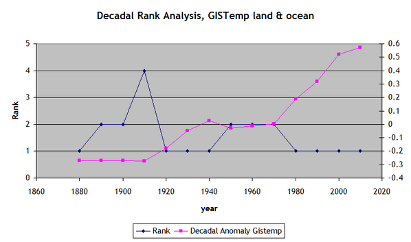
 :large
March 9, 2014 at 1:12 pm
So which ten year period was the warmest, according to official figures?
How high up the list of ten year periods was the most recent such period (2004-2013?)
Coming out of the LIA, which was the coldest period in 5,000 years, you would expect the current year to be the warmest, since you are on an uptrend. In fact, as you move forward in time since 1880, 8 of 14 or 57% of ALL decades are ranked #1. 36% are ranked as #2. Likewise, 62.9% of ALL years are in the top 10, and 14.4% of all years since 1880 are ranked #1. 18 of the last 18 years have been in the top 10 (that is a long stretch, mostly because temperatures were rising, and then just went flat, so almost everything in the last 18 years is among the warmest).
Here is the decade chart:
Here is the individual rank and run chart: http://naturalclimate.wordpress.com/2012/01/27/268/ If you look at that one for a few minutes, you’ll see how those conclusions are drawn.
So, to answer your question, almost all of them are the warmest (or were).
But how long can that last? Now we’re starting to reach the downtrend created by the peaks of the HCO and MWP. So, if we are really in a long term downtrend since the HCO, and if I draw lines across the peaks, these represent the peak natural variations one would expect to still remain on the same trend. Meaning I don’t think we will exceed those peaks, although with some warming, we may actually do just that and stabilize the downtrend… If you look at this chart, you can see what I mean. Do you think we’ll exceed upward past the trend? I say, not much if at all, because the average temp is usually (almost always) below the peaks.
[Clarify what the term HCO means please. Mod]
NZ Willy says:
March 9, 2014 at 5:14 pm
Kudos to Merrick (March 9, 2014 at 2:10 pm) for his most interesting post which shows that THERE WAS A YEAR ZERO !!!!! Hoo boy, what a riposte to the pedants. Thanks, Merrick! :-))
=====================================
I accept that Pol Pot had a Year Zero; I’m not quite so sure about the rest of the world.
goldminor says:
March 9, 2014 at 7:28 pm
That appears to be good work.
If the lag time for ocean retention of solar input variations can be pinned down to 30 years + or – one year or so then maybe we can get some predictive skill sufficient to rebut or verify the proposition.
The solar input variations to the oceans would, in the first place, be a result of solar changes affecting global cloudiness as per my New Climate Model.
Col Mosby says: @ur momisugly March 9, 2014 at 1:09 pm
Most misleading of all to most folks is the phrase “in recorded history.” Most folks probably
assume that is the period in which written human records exist, not since weather data has
been systematically recorded. Big difference.
>>>>>>>>>>>>>
And the misleading was done on purpose. An actual data could easily have been used and would be more in keeping with science.
So much for “Communicating Science” it is more about revitalizing the propaganda.
AndyL says:
March 9, 2014 at 1:12 pm
So which ten year period was the warmest, according to official figures?
How high up the list of ten year periods was the most recent such period (2004-2013?
>>>>>>>>>>>>>>>>
Around 1935 to 1945 before they got rid of the “Blip”
When mathematicians do sums, sometimes the results must be precisely accurate & correct & not just an estimate. For example, landing men on the Moon. Those same NASA people decided to see by how much the global temperature would increase, if the total quantity of recoverable oil, gas and coal on the planet were burned.
We know that since since August 1997 until January 2014 or 16 years, 6 months the rise in global temperature was 0.2°C, just one fifth of a degree C, so far. So, how hot could it get & will that heat stave of the coming glacial period in 10 years?
http://www.breitbart.com/Breitbart-London/2014/03/08/Earth-is-safe-from-global-warming-say-the-men-who-put-man-on-the-moon
So, we’re going to freeze!
From a global perspective, 2014 will continue to see warming, albeit statistically insignificant warming.
MOD: “HCO” = Holocene Climate Optimum, IMO
Stephen Wilde says:
March 10, 2014 at 5:24 am
————————————
Thanks Stephen. This could be the Rosetta Stone of climate. It makes sense in that it was the Sun all along. Every little shift in the MEI can be pinned to 30 years earlier in the solar cycle chart, when using Dr Svalgaard,s chart. If you use Dr Hathaway,s current chart only a portion can be seen as connecting. Yet even then it still connects with all of the major MEI events. The small events do not show.
PPPS:
Here’s another subtle but pointed billboard-campaign idea. It should be run after a lengthy or substantial period of global cooling that alarmists and the media have spun as being consistent with—if not actually proof of—global warming:
Image: Big Brother (the well-known guy with the scowl and the crew cut)
Caption: Cool Is Warm!
Sub-caption: And Don’t You Forget It!
I think a serious mistake in reasoning (and basic math) has been made here. Mr. Brozek states, ” By the laws of averages, half of all Januaries should be above the yearly average and half should be below”.
Unless I’m missing something, this statement is incorrect. It is a description of the mathematical median, not the mean (average). For example, consider 100 samples where 99 of them are 0, and 1 is 10000. The average in this case will be 10000/100 = 100. Obviously 99 of the samples fall below the average, and 1 is above it.
Given this mistake, I’m not sure how to interpret the author’s first point.
PPPPS:
Or maybe, “Cool Is the new Warm”
davideisenstadt says:
March 9, 2014 at 8:40 pm
Kate Forney says:
March 9, 2014 at 1:14 pm
yeah, it always a blast when people confuse mean for median…and its not like the information is hard to find…..
David Waller says:
March 10, 2014 at 11:37 am
I think a serious mistake in reasoning (and basic math) has been made here. Mr. Brozek states, ” By the laws of averages, half of all Januaries should be above the yearly average and half should be below”.
Unless I’m missing something, this statement is incorrect. It is a description of the mathematical median, not the mean (average). For example, consider 100 samples where 99 of them are 0, and 1 is 10000. The average in this case will be 10000/100 = 100. Obviously 99 of the samples fall below the average, and 1 is above it.
Given this mistake, I’m not sure how to interpret the author’s first point.
You may have missed what I wrote here:
wbrozek says:
March 9, 2014 at 6:42 pm
I will repeat my reply again in case you missed it. Please let me know how I could have rephrased it clearer.
I apologize to every one for not being clearer. What I was trying to get at is related to the saying: “An apple does not fall far from the tree.”
To paraphrase Walter Dnes’ post, if the future January is warmer than the one you are comparing it with, then the anomaly of that future year will also be warmer than the one you are starting with.
So I will start by taking 31 cold years on Hadcrut4: 1900 to 1930.
I found that 16 Januaries were higher than the yearly average and 13 were lower with 2 virtual ties.
Now I will take 30 warm years: 1984 to 2013.
I found that 14 Januaries were higher than the yearly average and 15 were lower with 1 virtual tie.
Now here is, in effect,what I was trying to say. If you take any January from 1900 to 1930 and compare it to any January from 1984 to 2013, the Januaries from 1984-2013 will all be higher than the Januaries from 1900-1930. According to my paraphrase of Walter, every year from 1984-2013 should then be warmer than any year from 1900-1930. And indeed that is the case. So besides saying what I did, I should also have added that the January anomalies are never far from the annual average. Sorry about the confusion!
Just to repeat. I was NOT talking about the possibility that one January may have been 100 C above the yearly anomaly and with possibly 99 Januaries being 1 C below the yearly anomaly. I was strictly talking about the NUMBER of January anomalies that are either HIGHER or LOWER than the YEARLY average for each respective year.
In other words, if you take the 160 yearly anomalies from the Hadcrut4 record and compare them to the January for that year, about 80 Januaries will be above the yearly average and 80 Januaries will be below the yearly average.
Lots of discussions above, many of them valuable.
But …. (You knew there was a “but” coming didn’t you?) 8<) … why not "test" a Dec+ Jan or Nov + Dec + Jan prerequisite?
If the El Nino (or La Nada or La Nina) condition is coming from any particular specific earth condition (or any not-usual combination of conditions) at any one latitude or area in the Pacific, then would not a longer precursor be more likely to produce a valid post-cursor?
Too long a pre-condition? No valid results, because there is no "if then, that occurs" series of events. Reasonable restriction.
Too short a pre-condition? The "result" is already underway, so there is no prediction possible. Reasonable restriction.
It is like looking for the relationship between snowfall or extreme cold conditions and a "cold front" or (in Texas) a "blue norther" … If you wait until the cold, very clear days after the cold front, you already "know" a cold front has passed, and you "know" that very dry air and very cold air has arrived. If you wait before that cold air arrives, you may miss the cold fronts that don't get so far south that they hit your city.
Well this says that Global cooling is likely to continue. No more flat line, now downhill!
http://climatedatablog.files.wordpress.com/2014/02/uah-global.png
and CET fell off a cliff and hasn’t reached bottom yet.
http://climatedatablog.wordpress.com/cet/
David in Cal says:
March 9, 2014 at 12:25 pm
If we take “decade” to mean any 10 year period, then the most recent decade is 2004 – 2013. And, this decade is not the warmest decade on record.
There’s no need to stick to calendar decades, or even whole years. The monthly figures are available for all these data-sets, so we can just look for the hottest 120-month period in each of them. As you might expect, they’re all different, though with the exception of RSS, only slightly so.
Here they are: The anomalies aren’t the same, because they use various different periods for the zero anomaly, so I have included the most recent 120-month figure for comparison (up to Feb 2014, except for Hadcrut4 which is to January}
GISS Jan 2002 to Dec 2011, anomaly 0.59, latest 120-month anomaly 0.58
RSS Oct 1997 to Sep 2007, anomaly 0.27 latest 120-month anomaly 0.23
UAH Oct 2001 to Sep 2011, anomaly 0.19, latest 120-month anomaly 0.187
HadCr Jan 2001 to Dec 2010 anomaly 0.48, latest 120-month anomaly 0.46
And if you define “decade” as being the most recent 120-month period, in all cases it is the warmest on record, when compared with other “decades” which ended exactly 10 years, 20 years, 30 years ago, etc
Incidentally, the 2 land-based data sets, which go back into the 19th century, both show the 1930’s as being about 0.6 to 0.7 deg C cooler than today. I have absolutely no idea how accurate that may be.
chris y on March 9, 2014 at 8:45 pm
Great poem!
I haven’t read all the comments; some one might have already noticed this… The early naughts that you are using contain the 2002-2003 El Niño where as most of the early 10s are more in La Niña or neutral conditions. Is that what you meant to compare? ENSO?
Actually, I am surprised they are as similar in over magnitude as they are.
trafamadore says:
March 10, 2014 at 5:27 pm
Is that what you meant to compare? ENSO?
My intention this time was to indicate what has been happening to temperatures in the recent past and what may be happening in the future based on the anomalies for January. As for why things are happening, I will leave that for others to ponder. Have you seen:
http://wattsupwiththat.com/2014/02/10/the-reason-for-the-pause-in-global-warming-excuse-37-in-a-series-trade-winds/