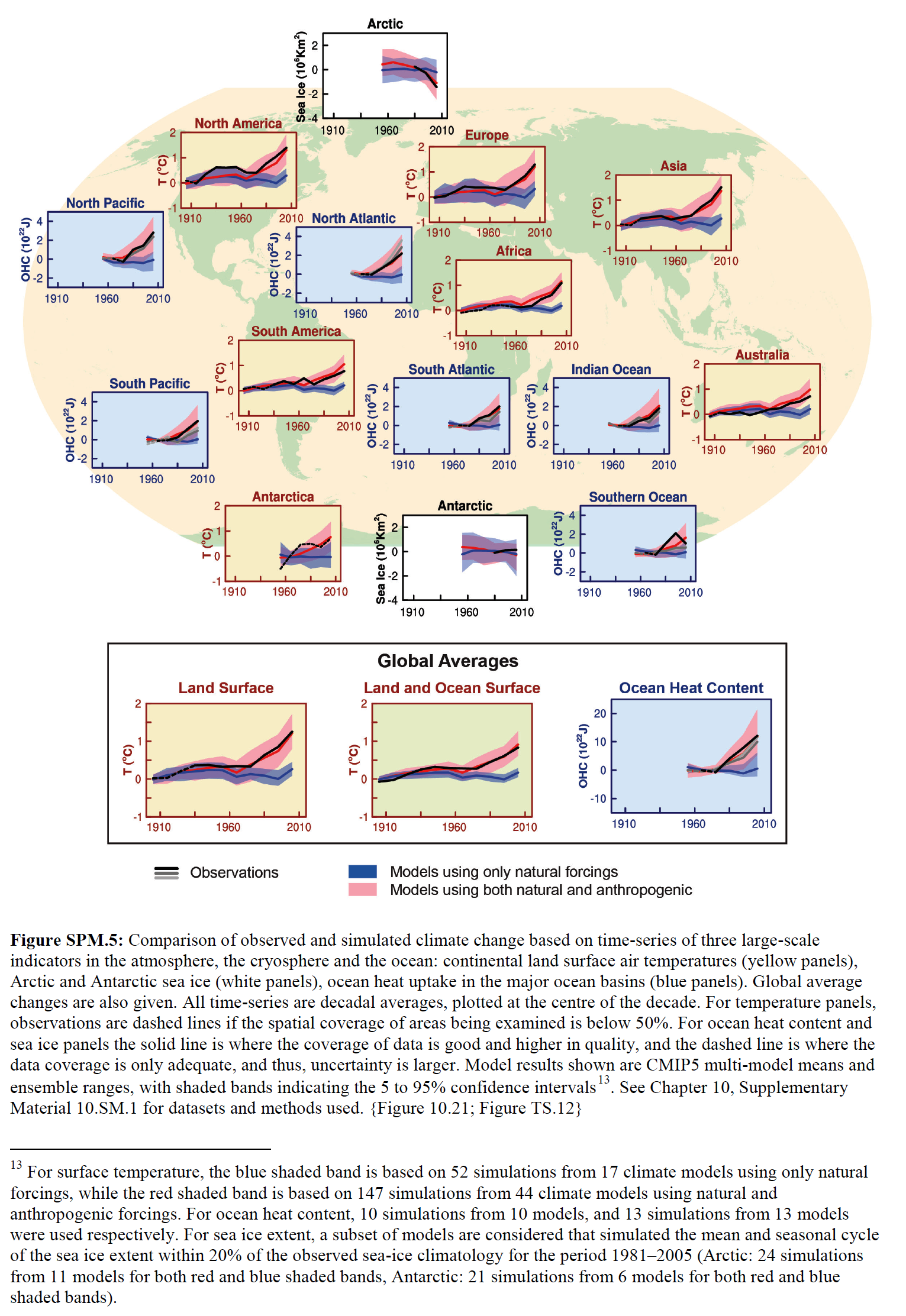
The IPCC appears to be ready to make the same presentation of climate model failures as they have in past reports. Figure SPM.5 from the leaked draft of the Summary for Policymakers for the IPCC’s 5th Assessment Report shows the same fatally flawed tactic of presenting model simulations based on only natural (solar and volcanic aerosol) forcings versus those based on anthropogenic and natural forcings. It looks as though the IPCC is content with highlighting the models’ failures to properly simulate natural coupled ocean-atmosphere processes that can cause surface temperatures to warm — or to stop that warming without notice.

Figure SPM.5 from the leaked draft of the Summary for Policymakers for the IPCC’s 5th Assessment Report
Larger copy is here.
Additionally, note the (blue) ocean heat content graphs. They’re showing ocean heat content data for the Southern Ocean as far back as the 1970s, yet there are only a handful of temperature and salinity samples at depth there before the start of the ARGO era in 2003. Consider this too: there are only a few sea surface temperature measurements in the Southern Ocean before the satellite era of sea surface temperature data, which started in 1982. Altogether, there is little observations-based ocean temperature data before those benchmarks in the Southern Hemisphere, south of about 30S.
And I’m sure you can find other flaws in that bogus illustration.
Once again, the IPCC is presenting misleading illustrations. No surprise there.
As we saw here, http://wattsupwiththat.com/2013/09/18/claim-similuated-satellite-data-back-to-1860-proves-global-warming-caused-by-humans/, all they need is a good looking model to sell the emperor his new clothes.
Have you ever seen this:
http://news.nationalgeographic.com/news/2012/05/120531-groundwater-depletion-may-accelerate-sea-level-rise/
I think it is more significant that the coverage it has received as rising ocean levels are touted as the most serious damage caused by global warming. The difference with the ground water issue is the left can’t regulate it because there isn’t enough water to go around.
amongst other things the graphs stop way before 2013 and seem to be very smoothed. This,of course, would have nothing to do with “hiding the pause”
Another flaw is that they don’t use the same number of simulations and the same models to compare natural models to the full models. See footnote 13 below the charts.
How is it that the full models appear to track observations so closely now? Something doesn’t smell right.
Can anyone provide some background and details on the thier understanding of the model adjustments over the years…from all of the reviews of models published and adjustments that I have seen in the last couple of years, I get the sense that the natural “forcings” are still not well understood so the models are contiually adjusted in the natural forcings to make the model output fit the theories of the amount of CO2 forcing expected….I was wondering if anyone, here on WUWT, or elsewhere, has done a review of this over the major models and adjustments over the last 20 years. It appears more and more that the models are just circular reasoning….natural forcings adjusted to match the AGW Co2 theory and amplitudes?…of course the models still fail for the last 15+ years, but there is so much twisting of data and graphs….
I thought warming of the Arctic was a benchmark of AGW via CO2 and the graph above shows cooling for the model + human input. Did I miss something?
Has anyone checked to see if any of those taxpayer-funded super computers have been used on the sly to run game theory models of maximizing institutional funding in the face of adverse reality from cooling evidence in actual observations? A plug and play system of statement inserts and non-peer reviewed components could be modeled with such a system.
The whole “look” of SPM5 would probably make it suitable as an introduction to graphs for average 1st Graders.
Figure SPM5
Another thought:
The IPCC hasn’t grasped all of the ramifications of the climate model failure to anticipate the warming stoppage. If the public and policymakers hadn’t already figured out that illustrations like the IPCC’s Figure SPM.5 were baseless before the warming stoppage, they will now.
The charts stop in 1996!!! This is up to date? They are ignoring the “pause” completely.
(pssssst.)
(hey you. . .)
(yeah, you.)
(. . .the flooding in Colorado last week was caused by global warming)
http://www.democracynow.org/2013/9/18/the_1_000_year_flood_did
Why do all the graphs stop well before 2010? Is this another case of Hiding the Decline?
edcaryl
I guess if you can’t explain the pause you can try ignoring it. The IPCC crew are just stupid enough to think it may work.
Patchy must be very pleased with his acolytes cutting their graphs off around ten years ago. After all, it would be voodoo science to show the public and policymakers the last decades data.
So, if the flooding in Colorado was caused by global warming, what caused the flooding in Colorado 37 years ago? What caused the flooding that cut the Grand Canyon …. 36,000 years ago? 35,000,000 years ago?
They stop in 1996? Are you sure? Clearly they stop prior to 2010. I must look into this.
AR4 pg 11. This is the same study reported in AR4. The data ends at 2005. Is still does in AR5. No new information or data was added to the graphs. It’s a shampoo, rinse, and repeat maneuver.
http://www.ipcc.ch/pdf/assessment-report/ar4/wg1/ar4-wg1-spm.pdf
“It” still does…
It does look like they stopped prior to 2000. That’s blatantly dishonest.
I’ll bet that the with and without anthropogenics models that begin to diverge with the availability of good observed data around 1980 show that the without models are closer to the observed than the with. I’ll go even further to say they should tune their models with and without CO2 with data before 1980 and see which model comes closer to the truth after 1980.
DOA
It seems like ocean heat content charts above end at about the time good data from ARGO starts. It looks like they focus on only poor data. That way they can make anything they want out of it.
================================================================
(pssssst.)
(hey Jai. . .)
(yeah, you.)
(. . .What Indian tribe kept flood records for Boulder Colorado 1,000 years ago?)
(Oh! And “rain” is “weather”. Not “climate”. Didn’t you get the memo?)
Mods: Make “Indian tribe” “American-Indian tribe” if that will get the comment out of moderation.