Dear WMO:
Thanks for furnishing the lovely graph of global temperature anomalies in your WMO Statement on Status of the Global Climate in 2012. I’ve reproduced it here.
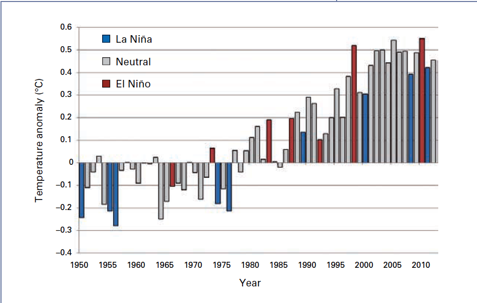
The caption for it reads:
Figure 4. January–December global land and ocean surface temperature anomalies (relative to 1961–1990) for the period 1950–2012; years that started with a moderate or strong La Niña already in place are shown in blue, years that started with a moderate or strong El Niño already in place are shown in red; other years are shown in grey.
If you’re not aware, persons see the following three periods in that graph.

Just thought you’d be interested. That’s what I see, and I suspect many other persons see the same three periods in the graph. And that means no matter what you’ve written in the rest of that report, what people will see and take away from your report is that global surface temperatures warmed for a couple of decades, starting around the mid-1970s. Then surface temperatures stopped warming a decade and a half ago.
The graph that you’ve provided as part of your press release is worse. The funky blue shading at the bottom of the 2012 bar will make persons wonder what you’re trying to show with it. One thing is for sure: it draws the eye down. Odd that you should do that when you’re struggling to show global warming.

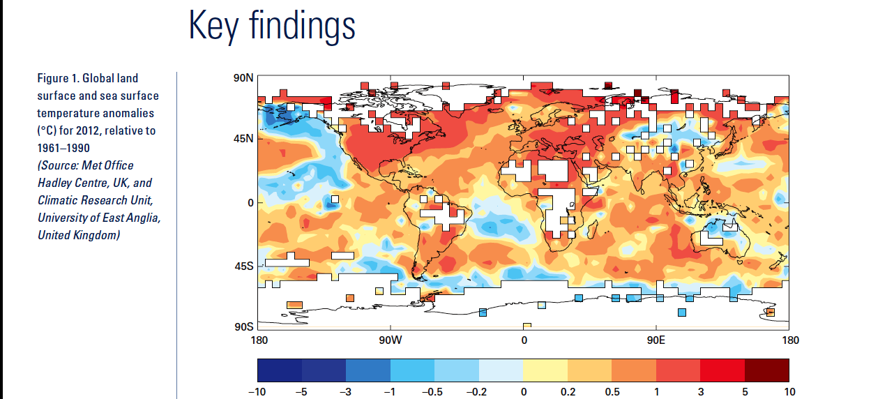
A question: The WMO recommends that the base years used for anomalies be updated every 10 years. Many organizations, such as NOAA, comply with that recommendation. They now use 1981 to 2010 as the base years for anomalies for many of their datasets. Is there any reason you continue to use 1961-1990, other than to make the temperature anomaly map look warmer? Also, the non-linear color-coded scaling of the contour intervals is very awkward.
Last, earlier this year I prepared an illustrated essay that discusses global warming. It’s titled “The Manmade Global Warming Challenge”. The preview is here [4MB] and the full essay is here [42MB]. It’s easy to read and understand. I thought you might be interested in a copy.
Sincerely,
Bob Tisdale
atarsinc says: “Have you done longterm analysis that could show whether or not LaNina/ElNino effects “zero out” over time?”
The instrument temperature record indicates that ENSO acts as a recharge-discharge oscillator, with La Niñas acting as the recharge phase and El Niños acting as the discharge phase, so that complicates answering your question.
That aside, there are periods when the frequency, duration and magnitude of El Niño and La Niña events are more equal based on an ENSO index, like from the mid-1940s to the mid-1970s when ENSO was slightly skewed toward La Niña, and in that period, surface temperatures didn’t warm.
Then again, ENSO indices only represent the impacts of ENSO on the variables being measured and the impacts of ENSO on other variables can be quite different. Example: Referring to the SOI or NINO3.4 sea surface temperature anomalies, the 1995/96 La Niña was a rather weak La Niña, but looking at ocean heat content for the tropical Pacific, the 1995/96 La Niña was freakishly strong:
http://oi46.tinypic.com/sqtslz.jpg
If you want to assume for the sake of discussion that an ENSO index represents ENSO, then you could use a running total to answer your question:
http://bobtisdale.wordpress.com/2012/12/11/el-nino-southern-oscillation-myth-2-a-new-myth-enso-balances-out-to-zero-over-the-long-term/
But as noted in the post, the shape of the curve depends on the choice of base years and the sea surface temperature dataset.
Another way to view the skewness toward El Niño or La Niña is to smooth an ENSO index like NINO3.4 sea surface temperature anomalies with a 121-month filter. Then the choice of base years isn’t as important because they only shift the curve up or down. 1950-1979 Base Years:
http://i40.tinypic.com/33mbytg.jpg
And 1900-2000 Base Years:
http://i43.tinypic.com/4lrmns.jpg
BTW, Trenberth found 1950-79 was a more appropriate choice of base years:
http://www.cgd.ucar.edu/cas/papers/clivar97/en.dfn.html
atarsinc says: “In other words, are ENSO effects a radiative forcing, or are they simply a climate oscillation?”
There are persons who attempt to find agreement between solar variations and ENSO indices, but I haven’t seen anything convincing. Many researchers believe it’s simply random variability—chaos. And since there are so many things (different types of weather events) that are known to have triggered ENSO events, and for a multitude of other reasons, I would tend to agree it’s chaotic.
Against all GHE predictions we have rising CO2 concentrations with stalled temperature. If a theory is wrong change the theory not the data. So far the warmists have done the latter but kept the former.
Idiots.
as far as I read the graph correctly: no warming should read max warming
It looks like it has warmed since the start of your no warming period around the year 2000. It also looks like it has been warming since 2008 and 2011 How could this be if there has been no warming?
Reich.Eschhaus says:
May 3, 2013 at 2:03 pm
Open letter? Why? Seriously, some minor issues and then you want them to pay attention to a presentation of yours. I wonder how many presentations the WMO gets every day unsolicited.
_______
Why? Because Mr. Tisdale wanted to share his opinion with both the WMO and the readers of his blog and WUWT. It’s called “free speech”.
sceptical:
At May 4, 2013 at 4:24 am you ask
It is a matter of confidence or – if you prefer – uncertainty.
You are making the same mistake as Kasuha.
It does not matter what you think “it looks like” because your view may be distorted.
It only matters what the data says.
All data has uncertainty. So-called ‘climate science’ uses the low confidence limits of 95% for determination of acceptable certainty.
Warming is a rise of temperature over a period. This – according to ‘climate science’ is determined by a linear trend. If the trend is positive then there is warming, and if the trend is negative then there is cooling.
But if the trend does not differ from zero at 95% confidence then there is no discernible warming or cooling (at 95% confidence).
There are various time series of global temperature (RSS, UAH, GISS, HadCRUTx), Depending on which data set is chosen there has been no warming for at least more than 16 years (GISS) or at most just over 23 years.
Richard
Any use of non-satellite data after 1980 is questionable to say the least. The historic data has been adjusted by biased researchers. You can see that in the WMO chart where the cooling from 1950-1975 is removed. Without those adjustments we would see a perfect match for the phases of the PDO.
Now, here is a better view of the nearly 17 years with no warming:
http://www.woodfortrees.org/plot/rss/from:1996.8/to/plot/rss/from:1996.8/to/trend/plot/rss/from:1996.8/to:2005/trend/plot/rss/from:2005/to/trend
It demonstrates the pause actually consists of a slight warming until 2005 while the PDO was still warm. Since then it switched to cool mode and the planet has cooled along with it … with continued cooling in the latest April satellite data.
Also, we now know for a fact that Antarctica is gaining ice. This latest paper using 67 ice cores shows large increases in ice.
http://hockeyschtick.blogspot.com.au/2013/02/new-paper-finds-antarctica-has-been.html
This refutes the claims that land ice melting is the cause of increased sea ice around Antarctica. And, with that refutation the alarmists can no longer claim losses of sea ice in the Arctic have any meaning relative to GHGs. It would need to affect both poles equally. The warm AMO now becomes the only reasonable cause for the Arctic losing sea ice.
Finally, the lack of a hot spot and the 14 year lack of measureable increases in downward LWIR provide experimental evidence that the entire global warming theory is bogus.
http://journals.ametsoc.org/doi/abs/10.1175/2011JCLI4210.1?journalCode=clim
@ur momisugly richardscourtney
“If you cannot afford the new spectacles you require then there are some good charities willing to help….”
“because your view may be distorted…”
you are really too negativ richardscourtney;
if somebodys view is distorted and if somebody is in need of spectacles, it is for sure the author of the article with his artificial break-up of the graph of the WMO and the false so called “no warming” years during the years of maximum warming (circa +0,5 degree Celcius)
well, you don’t even need spectacles: Open your eyes!
aetheressa writes: “Snarkiness?? *gasp* Why, it’s almost as if Bob Tisdale were….mortal! A brilliant mortal who has taken enough snark from the batcrap crazies in the past to earn a complete pass should he determine to compose an entire Broadway musical filled with snark, but a mortal nonetheless.”
Easy to sneer, God knows I do enough of it myself. The question is, is that the most effective way to communicate, assuming that your goal is to do more than gratify those who are already on your side. I don’t think it is.
As always, opinions can and do vary.
Richard M: You referred to the PDO a number of times in your comment. Unfortunately, the PDO doesn’t represent the sea surface temperatures of the North Pacific north of 20N.
http://oi40.tinypic.com/504ex2.jpg
If you were to say that the cooling of the sea surface temperatures in the North Pacific since 2005 impacted global temperatures, I would have to agree.
The PDO is actually inversely related to the sea surface temperature anomalies of the North Pacific:
http://bobtisdale.wordpress.com/2010/09/14/an-inverse-relationship-between-the-pdo-and-north-pacific-sst-anomaly-residuals/
Last, there is no mechanism for the PDO to vary global temperatures, The mechanism in the Pacific is ENSO. The PDO (the spatial pattern of sea surface temperatures in the extratropical North Pacific) is an aftereffect of ENSO and the sea level pressure of the North Pacific.
Regards
maarten:
re your silly post addressed to me at May 4, 2013 at 6:44 am.
I refer you to my post at May 4, 2013 at 5:11 am which explains your error.
To save you bother, here is a link which jumps straight to my response.
http://wattsupwiththat.com/2013/05/03/open-letter-to-the-world-meteorological-organization-wmo/#comment-1296966
Richard
@ur momisugly richardscourtney May 4, 2013 at 7:17 am
as far as I am concerned, sceptical’s point of view is not so stupid to call his vieuw “distorted”
maarten:
re your post to me at May 4, 2013 at 7:23 am
We differ. So what?
I accept what the data indicates and what the data cannot indicate.
And any perception of a pictorial representation of the data is distorted if it does not agree with what the data indicates and what the data cannot indicate.
You refuse to agree that. Your disagreement is your right, but it does not make you right.
Richard
Interesting the WMO report manages to have 2 pages on Sea Ice with 3 pictures depicting the Arctic over one and a half pages, and somewhere hidden is a small paragraph about the Antarctic ice.
Why not give them the importance as per their ice coverage or ice mass? or at least equal?
I used to think that 1998 was the warmest year to date but the WMO graph shows that it has been beaten twice. Is this generally accepted or has the raw data been “homogenised” to downgrade 1998?
Bob,
Thanks for the reply. I followed the links you provided and found an interesting post entitled “Is there a Cumulative ENSO Climate Forcing?” There was also a “Part Two”. I thought that, at last, I would find the answer I was looking for.
But I didn’t see an answer to the question posed in the title. Or perhaps I should say no explicit answer. I did notice that in a previous post you mentioned parenthetically that “ENSO isn’t a forcing, but that’s neither here nor there.”
Bob, could you answer the question you posed, “Is there a Cumulative ENSO Climate Forcing?”
A Yes or No, would be most welcome; if that’s possible in this case.
Thanks again for taking the time to address commenters questions. It’s very much appreciated. JP
” Then surface temperatures stopped warming a decade and a half ago.”
The surface stopped warming not the temperature. You can warm the air or water not the temperature.
Reich.Eschhaus says:
May 3, 2013 at 2:03 pm
Open letter? Why? Seriously, some minor issues and then you want them to pay attention to a presentation of yours. I wonder how many presentations the WMO gets every day unsolicited.
…
—————————————————
Full support, Reich!
Bob is barely unserious with his “open letter”.
This is certainly NOT a way to convince anybody.
Reich.Eschhaus
Oh Dear!, here’s my escalator, the one that John Cook removed from Scomical Science within one minute of it being posted, is it just possible you can see what Cook was so afraid of?
http://tinyurl.com/cx62ssj
Alex:
Your post concludes saying
I agree. Your post “is certainly NOT a way to convince anybody”.
But, of course, one anonymous troll does not support another anonymous troll with the intention of convincing anybody.
Personally, I would prefer that all anonymous trolls clear off and stop disrupting threads with meaningless drivel.
Richard
And for those who will not follow the link:-
Bob, after chastising me for something I never said, you said :
“Last, there is no mechanism for the PDO to vary global temperatures, The mechanism in the Pacific is ENSO. The PDO (the spatial pattern of sea surface temperatures in the extratropical North Pacific) is an aftereffect of ENSO and the sea level pressure of the North Pacific. ”
Look closely at what you said. First you said there is “no mechanism” and then you said “The PDO is an after effect of ENSO …”. That is, you specified a mechanism.
If you go back and read what I said you’ll see I never stated the PDO was related to ocean temperatures. You must have assumed I meant that and I apologize if I wasn’t clear. What I did was point out was the PDO correlates to changes in global temperatures. My assumption is the same as yours … the mechanism is, primarily, changes in ENSO. Since the reason for the changes in ENSO is, as yet, unknown, I will continue to use the PDO as a general index for conditions in the Pacific that lead to changes in global temperatures. Hopefully, more will be learned in the future and we will be able to pinpoint the base mechanism/s.
I think we agree more than we disagree.
@ur momisugly richardscourtney / May 4, 2013 at 7:34 am
there are two problems: first there is a difference in interpretation of the temperature graph of the WMO; some people (including Tisdale) see a stalling of the increase of the average worldtemperature, and some (including me) do not;
the other problem is a matter of semantics: here I againn differ from you:
you call a positive change in temperature warming, and a negative change cooling;
but: no change in temperature is no warming says Tisdale (and you);
howcome? because this is odd, while it is also no cooling;
so to be clear: no change in temperature should be called (according to your argumentation):
no warming / no cooling;
any other formulation is manipulative, tisdale has to change explanatory remarks in his graph;
let me put it differently:
a car can increase its velocity: we call that accelaration;
when the car goes slower it is called decelaration;
when the car is not changing its velocity it is neither accelarating nor decelarating, however it is still having some velocity;(don’t step out of the car!)
you understand the analogy? well, please propose the right expression for cruising or speeding in climate matters;
Maarten:
At May 4, 2013 at 3:13 pm you ask me
I do not know why I am required to provide the definition: it seems to me that e.g. the WMO should do it.
However, since asked I will provide my own. Global temperature varies and, therefore, the present lack of discernible warming or cooling is certain to end with either global warming or global cooling.
Therefore, what can be said is:
There has been no global warming or global cooling discernible at 95% confidence for at least the last 16 years according to all the pertinent data sets.
Richard
richardscourtney says:
May 4, 2013 at 1:20 pm
Richard, do you think that name calling and snide remarks reflect well on you as a person? Is this how you want people to see you? JP