Last week I asked Bob Tisdale to take a hard look at potential correlations between the AMO and Arctic sea ice extent, and he rose to the challenge – Anthony
Guest post by Bob Tisdale
This post presents reference graphs and a discussion of the effects of the Atlantic Multidecadal Oscillation on Arctic sea ice loss.
I was asked to show if and how well the Atlantic Multidecadal Oscillation (AMO) Index data correlates with the NSIDC Northern Hemisphere Sea Ice Extent data. I decided to carry the comparisons farther by also including high-latitude Northern Hemisphere temperature variables: land surface temperature anomalies, lower troposphere temperature anomalies, and a couple of sea surface temperature anomaly subsets. It should really come as no surprise that the high-latitude sea surface temperature anomalies in the Northern Hemisphere correlate best with Arctic sea ice extent anomalies. When the ice melts, it exposes the ocean surface. The surface temperature of the Arctic Ocean is warmer than ice so it will present a positive anomaly in areas where the sea ice hasn’t melted in the past. That is, where the freezing point of sea water serves as the base-period temperatures for anomalies, the surface temperature anomaly of any newly exposed water will be positive.
And I elected also to discuss the Atlantic Multidecadal Oscillation, its impacts, how it’s influenced by major El Niño events and how it’s misrepresented.
WHAT’S ALL THE HUBUB, BUB?
In a warming world, there are many expected responses. Among them, sea level will rise, glaciers will melt, and seasonal Arctic sea ice extent, area and mass will dwindle. Regardless of the source of the warming, those things will happen as global temperatures rise. I’m always amazed with the frenzy that accompanies a “new record” level in some variable, like the recent happenings with Arctic sea ice. While there is no proof mankind is responsible for the warming Arctic temperatures and loss of sea ice, there are, nonetheless, the typical baseless claims that we have caused it and we have to do to something about it.
The only place anthropogenic global warming definitely exists is in climate models. They must be FORCED by greenhouse gases in order to make the simulated oceans and atmosphere warm. The instrument temperature record shows the oceans and surface temperatures have warmed, but those records cannot be used to prove manmade global warming exists. On the other hand, as I have been showing for more that 3 ½ years, the instrument temperature record can be used to show that most if not all of the warming was caused by natural variables, and as a result, the observational data can be used to invalidate the climate models. If you’re not familiar with my work, refer to my recent post titled A Blog Memo to Kevin Trenberth – NCAR.
With that in mind, all of the following graphs show that high latitude surface temperatures have warmed and that sea ice extent has decreased, but there is no evidence that mankind is responsible for it. More on that later. And that brings us to…
POOR CORRELATION DOES NOT MEAN THERE IS A LACK OF CAUSATION
Of the variables we’ll compare to sea ice extent, high latitude land surface air temperatures correlate worst. Does this mean that warming land surface air temperatures don’t contribute to the variations in sea ice extent? No. Does it mean the loss of sea ice does not cause changes in land surface air temperatures? No. It simply means sea ice extent and land surface air temperatures are varying on different schedules to the many variables the impact them.
On the other hand, does the relatively high correlation between Arctic sea ice extent and Arctic sea surface temperature indicate the loss of sea ice is more closely related to the warming sea surface temperatures? No. The higher correlation, as noted earlier, is also caused by the fact that sea ice loss results in a greater surface area of open ocean where sea surface temperatures can be measured, and since that water is warmer than the freezing point of sea water, the anomalies in newly opened areas of ocean will have positive anomalies compared to the freezing point, which is the reference for the anomalies.
However, since water has more mass than air, a one deg warming of adjoining sea surface temperatures will have a greater impact on sea ice than a one deg warming of Arctic air. Therefore, since Arctic sea ice is exposed to the North Atlantic, the additional warming of the North Atlantic associated with the Atlantic Multidecadal Oscillation is a major contributor to Arctic sea ice loss regardless of the correlation between the two datasets.
DATA PRESENTATION
All monthly anomaly data in the sea ice comparisons have been standardized; that is, each dataset has been divided by its standard deviation. Since we’re using satellite-based Reynolds OI.v2 for sea surface temperature data, all of the graphs start in November 1981. All of the datasets end in August 2012. The temperature data have also been inverted to accommodate the inverse relationship between sea ice extent and temperature. Base years of 1982 to 2011 were used for anomalies to better align the sea ice data and temperature data when the latter were inverted—the exception is the AMO data. The title blocks of the graphs include the correlation coefficients of the NSIDC Northern Hemisphere sea ice extent and the respective temperature dataset. They have been determined with no lags between the datasets.
ATLANTIC MULTIDECADAL OSCILLATION INDEX
The NSIDC sea ice extent anomalies are compared to the inverted ESRL Atlantic Multidecadal Oscillation Index data in Figure 1. The correlation coefficient is poor at -0.57. There are some periods when the two curves align, and there are others when they don’t. Why doesn’t it correlate better? Arctic sea ice is impacted by North Atlantic sea surface temperatures along one exposure. Sea ice loss on the other side of the Arctic basin is impacted by other variables. Also, the Atlantic Multidecadal Oscillation represents the sea surface temperature anomalies of the entire North Atlantic, not just the portion that comes into contact with Arctic sea ice. We’ll discuss the impact of the Atlantic Multidecadal Oscillation on temperatures in the high latitudes of the Northern Hemisphere and on sea ice extent later in the post.

Figure 1
HIGH LATITUDE LAND SURFACE AIR TEMPERATURE AND LOWER TROPOSPHERE TEMPERATURE ANOMALIES
Figures 2 and 3 compare sea ice extent anomalies to GHCN-CAMS land surface air temperature (LSAT) anomalies and UAH lower troposphere temperature (TLT) anomalies, for the latitudes of 60N-90N. Like the AMO index data, some of the annual and seasonal variations in the curves align, and there are others that don’t. Keep in mind that lower troposphere temperature anomalies represent the temperatures at about 3,000 meters above sea level. Also, the TLT data does stretch across as far north as 85N over the Arctic Ocean, while the land surface air temperature data does not. The correlation coefficient for the land surface air temperature anomalies and sea ice extent is about -0.49, while for the lower troposphere temperatures it’s slightly higher at -0.57. Neither one is very good.

Figure 2
[removed]

Figure 3
HIGH LATITUDE SEA SURFACE TEMPERATURE ANOMALIES
As noted earlier, the best wiggle match presented in this post occurs between the high latitude (60N-90N) sea surface temperature anomalies and the Arctic sea ice extent, Figure 4. The correlation coefficient is -0.85. That’s pretty good for two climate-related variables.

Figure 4
For those interested in that hotspot in the Northwest Atlantic that’s been happening for the past few months, refer to Figure 5. It represents the sea surface temperature anomalies for that portion of the North Atlantic and Arctic Ocean, with the coordinates of 45N-90N, 80W-25W. The best we can say, though, is that the hotspot in the North Atlantic coincided with the high seasonal ice loss this year.

Figure 5
Referring back to our discussion of the Atlantic Multidecadal Oscillation, if we look at the sea surface temperature anomalies for the high latitudes of the North Atlantic (60N-90N, 80W-40E), we see a much improved correlation (-0.71 instead of -0.57 for the AMO). See Figure 6. And again, the North Atlantic directly impacts only one exposure of the Arctic sea ice. With that in mind, the correlation is very good.

Figure 6
NOTES ON THE ATLANTIC MULTIDECADAL OSCILLATION AS PRIMARY CAUSE OF HIGH LATITUDE WARMING AND SEA ICE LOSS
Note: The data is not standardized in the following graphs. They present temperature anomalies.
Many of the posts I’ve written about the Atlantic Multidecadal Oscillation (aka AMO) include a link to the RealClimate glossary about it, where they write:
A multidecadal (50-80 year timescale) pattern of North Atlantic ocean-atmosphere variability whose existence has been argued for based on statistical analyses of observational and proxy climate data, and coupled Atmosphere-Ocean General Circulation Model (“AOGCM”) simulations. This pattern is believed to describe some of the observed early 20th century (1920s-1930s) high-latitude Northern Hemisphere warming and some, but not all, of the high-latitude warming observed in the late 20th century. The term was introduced in a summary by Kerr (2000) of a study by Delworth and Mann (2000).
GISS climate models indicate the majority of the total warming of global surface temperatures over the past 30 years, about 85% (Figure 7), is in response to the warming of the oceans, so one might conclude the additional variability of the North Atlantic has played a major role in the warming of the high latitudes of the Northern Hemisphere. Figure 7 is from Chapter 8.11 of my book Who Turned on the Heat? The data presented in it is from the NASA Goddard Institute for Space Studies (GISS) ModelE Climate Simulations – Climate Simulations for 1880-2003 webpage, specifically Table 3. Those outputs are based on the GISS Model-E coupled general circulation model. They were presented in the Hansen et al (2007) paper Climate simulations for 1880-2003 with GISS modelE.

Figure 7
With that in mind, and referring back to the RealClimate glossary discussion, can we then assume that the multidecadal variability of the North Pacific could also be used to describe “some, but not all, of the high-latitude warming observed in the late 20th century”? Refer to Figure 8. Both datasets in it have been detrended and smoothed with 121-month running-average filters. The intent of Figure 8 is to show that there is a multidecadal signal in the North Pacific, north of 20N, that is not represented by the Pacific Decadal Oscillation index data—that the multidecadal variations in the North Pacific can run in and out of synch with the Atlantic Multidecadal Oscillation—and that the strength of the multidecadal signal in the North Pacific is almost as strong as in the North Atlantic. The multidecadal variations in the North Pacific are normally presented in abstract form as the Pacific Decadal Oscillation, so they are typically overlooked in discussions of the multidecadal variations in Northern Hemisphere land surface air temperatures.

Figure 8
The normal misconception, misinterpretation, misunderstanding, misrepresentation of the Atlantic Multidecadal Oscillation is that it is a form of natural variability that occurs on top of the manmade global warming of the rest of the oceans. The Wikipedia definition of the Atlantic Multidecadal Oscillation begins:
The Atlantic multidecadal oscillation (AMO) was identified by Schlesinger and Ramankutty in 1994.
The AMO signal is usually defined from the patterns of SST variability in the North Atlantic once any linear trend has been removed. This detrending is intended to remove the influence of greenhouse gas-induced global warming from the analysis.
There is no “influence of greenhouse gas-induced global warming” evident in the sea surface temperature records for the past 30 years. We’ve discussed and illustrated this in numerous posts here at Climate Observations over the past 3 ½ years. After the processes El Niño-Southern Oscillation, this was the primary topic of discussion of my book Who Turned on the Heat? – The Unsuspected Global Warming Culprit, El Niño-Southern Oscillation. Here’s an overview:
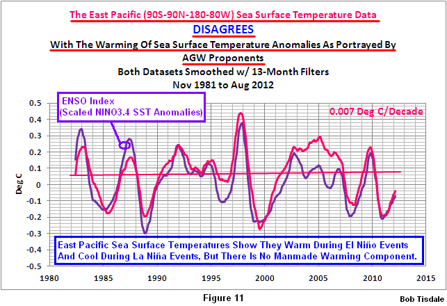
We know that the East Pacific has not warmed in 30 years. Refer to Figure 11 from the post A Blog Memo to Kevin Trenberth – NCAR. I’m going to borrow a few graphs from my recent book.
The South Atlantic-Indian-West Pacific dataset covers the ocean basins not represented by the East Pacific and North Atlantic. The sea surface temperature anomalies of the South Atlantic-Indian-West Pacific only warm during and in response to the strong El Niño events of 1986/87/88 and 1997/98. See Figure 9. There may also have been an upward shift in response to the 2009/10 El Niño but it’s a little early to tell. As you’ll note, the South Atlantic-Indian-West Pacific data cools between the major El Niño events. The trends are negative.

Figure 9
Why are there upward shifts in response to those major El Niño events? Because the South Atlantic-Indian-West Pacific sea surface temperature anomalies do not cool proportionally during the La Niña events that followed them. We can show this by detrending the South Atlantic-Indian-West Pacific data and comparing them to NINO3.4 sea surface temperature anomalies, which are a commonly used index that represents the frequency, strength and duration of ENSO events. Figure 10 is from the blog post here. If the South Atlantic-Indian-West Pacific data cooled proportionally during those La Niña events, its curve would be similar to the East Pacific data, which shows no warming in 30 years.

Figure 10
So far, we have found no evidence of an “influence of greenhouse gas-induced global warming” in the ocean basins that are outside of the North Atlantic. Would the “influence of greenhouse gas-induced global warming” exist only in the North Atlantic? That’s extremely unlikely. Therefore, we can dismiss the consensus opinion that the global oceans are warmed by anthropogenic greenhouse gases.
Let’s take a look at the North Atlantic data. As expected, it shows warming trends between the major El Niño events, Figure 11. But notice how the trend line for the latter period is located above the trend line for the earlier period. That means there was an upward shift in response to the 1997/98 El Niño event.

Figure 11
We can also detrend the North Atlantic sea surface temperature anomalies and compare them to scaled NINO3.4 data to illustrate the cause. The North Atlantic sea surface temperature anomalies also do not cool proportionally in response to the La Niña events that follow the major El Niño events. So the non-linear response of the North Atlantic (and the AMO) to ENSO is a significant portion of the additional warming of the North Atlantic and the subsequent natural sea ice loss in the Arctic.

Figure 12
SHAMELESS PLUG
I’ve referenced my recently published e-book (pdf) a number of times in this post. The book is about the phenomena called El Niño and La Niña and its long-term effects. It’s titled Who Turned on the Heat? with the subtitle The Unsuspected Global Warming Culprit, El Niño Southern Oscillation. I do not specifically discuss the loss of Arctic sea ice in the book, but as discussed in this post, those losses are primarily a response to the natural warming of the global oceans.
The book is intended for persons (with or without technical backgrounds) interested in learning about El Niño and La Niña events and in understanding the natural causes of the warming of our global oceans for the past 30 years. Because land surface air temperatures simply exaggerate the natural warming of the global oceans over annual and multidecadal time periods, the vast majority of the warming taking place on land is natural as well. The book is the product of years of research of the satellite-era sea surface temperature data that’s available to the public via the internet. It presents how the data accounts for its warming—and there are no indications the warming was caused by manmade greenhouse gases. None at all.
Who Turned on the Heat? was introduced in the blog post Everything You Every Wanted to Know about El Niño and La Niña… …Well Just about Everything. The Updated Free Preview includes the Table of Contents; the Introduction; the beginning of Section 1, with the cartoon-like illustrations; the discussion About the Cover; and the Closing.
Please buy a copy. (Paypal or Credit/Debit Card). It’s only US$8.00.
SUMMARY
Since there is no evidence of a manmade component in the warming of the global oceans over the past 30 years, the natural additional warming of the sea surface temperature anomalies of the North Atlantic—above the natural warming of the sea surface temperatures for the rest of the global oceans—has been a major contributor to the natural loss of Arctic sea ice over the satellite era. Add to that the weather events that happen every couple of years and we can pretty much dismiss the hubbub over this year’s record low sea ice in the Arctic basin. Personally, I’d find it comical—if the desperation on the parts of AGW proponents wasn’t so evident. That makes it sad.
SOURCES
With the exception of the ESRL Atlantic Multidecadal Oscillation Index, the data presented in this post is available through the KNMI Climate Explorer.
Discover more from Watts Up With That?
Subscribe to get the latest posts sent to your email.
LazyTeenager says: “Cobblers! It’s not about logical proof. It’s about a scientific theory, a prediction that arises from that theory, the observation that is consistent with the prediction and the conclusion that this represents evidence to support the theory.”
Cobblers? Thanks for the laugh, LazyTeenager.
You’ve been around here long enough to understand the bases for my comment. The post even goes on the explain it. The sea surface temperature record contradicts the hypothesis (not theory) of anthropogenic global warming. Therefore, the hypothesis is flawed. As they used to say long before your time, “Back to the old drawing board”. That applies to AGW. It’s time for them to revise it and put an end to the alarmist nonsense.
If the oceans are rising, then why do the British Admiralty charts from surveys 200-300 years ago, drawn by the likes of Cook, Bligh, Vancouver and Flinders show no significant change in sea levels over that time?
After all, peoples lives worldwide depend on these charts. If global sea level rise was ongoing and measurable, why is it not shown on the charts? These charts do show lat and long corrections.
Jonathan Day: Thank you for your comment on this thread. However, I believe you’ve overlooked the part of the post beyond the correlation of sea ice extent with temperature variables. That was really the thrust of this post. The correlation graphs were provided as references.
There is no evidence of an anthropogenic component in the satellite-era sea surface temperature records. This tends to negate any attempts by the climate science community and anthropogenic global warming proponents to attribute the reduced sea ice extent to manmade greenhouse gases and other anthropogenic forcings–until such time they can reconcile those deficiencies with the simulated oceans in the models.
Regards, and thanks again.
michel says: “…We are however in the middle of a natural crucial experiment on Arctic ice. If it continues to decline for another 5-10 years at the same rate, we will know something quite unusual is going on. If the trend reverses and heads north again, we’ll be able to conclude for sure that AGW is dead in the water.”
I don’t think either statement is true. Natural cycles could be totally responsible for ice decline/increase. Thirty years of satellite observations is a very, very short time relative to the Earth’s known climate cycles, ice ages, etc. And, of course, that “hidden heat” is a story made up to account for why the Earth isn’t currently heating. Hiding heat is like trying to smuggle a lit candle out of a church in a bucket of ice.
Paul Vaughan says: “Bob, how does Reynolds OI.v2 deal with frozen and alternating frozen/unfrozen areas?”
For example, let’s look at the base periods. If the grid we’re looking at includes sea ice during some Januarys but open ocean during others, like some areas of the North Atlantic, then the January climatology would be the average of the measured sea surface temperatures when there was open ocean and the freezing point of water (1.8 deg C) for the years when there was ice present.
edcaryl says: “But ice can’t drive soot.”
That’s a classic. Thanks.
LazyTeenager says: “Apparently Bob doesn’t understand the process of science at all.”
Based on your statement, it’s obvious Bob understands science far, far better than you do.
Hi Bob, great work. But would you mind putting the air temperature on the graphs? I am arguing with some people over at http://arstechnica.com/science/2012/09/arctic-melt-bottoms-out-at-new-record-low/ That ice melt is best done from below, not above; that CO2 dense air still does not melt at the same rate as warmer water. (0.024 vs 0.58 thermal convection, respectively)
Very interesting work that requires more than one reading for an amateur to fully comprehend.
My simpler mind notices some minor spelling errors that Bob would like to correct: on several graphs “anomalies” is rendered as “anomailies”.
IanM
Andrew says: “…The simplistic idea (and so this is probably not in any of the models!) is that the Arctic, being surrounded by land mass, will have more variability in ice extent due to land mass related parameters (blocking patterns?)….”
True. Also, Arctic maximum ice extent (area) is largely constrained by geography. At points of constraint (shorlines), additional ice has no place to go except downward, where it’s hard to measure. Thus variability in extent tends to be limited on the upside, unrestrained on the downside.
Jason says: “Hi Bob, great work. But would you mind putting the air temperature on the graphs?….”
Good idea!
“…CO2 dense air still does not melt at the same rate as warmer water. (0.024 vs 0.58 thermal convection, respectively)”
Please clarify. Air doesn’t melt, it’s a gas. What are those numbers? What is “CO2 dense air?” [Air density is almost constant at a given temperature, even with 0.04% CO2 content.]
LazyTeenager: I believe my reply to you is in the spam filter. If it doesn’t appear in a couple of hours, I’ll post it again.
Jason says: “But would you mind putting the air temperature on the graphs?”
Land surface air temperature records end at the shoreline, so how would anyone know what the temperature of the air is over the Arctic sea ice? TLT is measured at 3000 meters above sea level so you can’t use it either.
In other words, everyone is speculating in the argument.
Ian L. McQueen: I hate typos on graphs. Thanks.
LazyTeenager says:September 25, 2012 at 4:29 am
Does this mean that Bob believes the oceans are warmed by natural green house gases and are not warmed by green house gases produced by man?
Nope! Care to explain your hypothesis that the atmosphere with 0.1% of the heat capacity of the oceans warms the latter?
Why are we always told to look at the minimum? If we chose instead to look at the maximum, we’d conclude that we’re almost back to the 30y average. It’s just more cherry-picking.
If we look at the ice extent data and fitler out the annual variation we get a true picture of what has been happening since 2007… and it’s a sea change.
http://i50.tinypic.com/24enw2c.png
The plumetting melting stopped in 2007. There was a significant [recovery] and a regression, that still leaves a net regain of ice extent. When did you last see that info presented anywhere?
Also there is a return to the cyclic behaviour that was typical before the plunge.
The key difference since 2007 is much larger annual swing in ice extent (probably due to thinner ice coverage) . Only looking at one end of these large swings and saying “OMG , it’s worse than we thought” is stupid or dishonest.
It is no more legitimate than to look at the max and claim all is back to normal.
The skeptic world seems to have been conned into following this obsession with the ice minimum which , while dramatic, is not representative of Arctic climate.
Bob says: “There is no evidence of an anthropogenic component in the satellite-era sea surface temperature records. This tends to negate any attempts by the climate science community and anthropogenic global warming proponents to attribute the reduced sea ice extent to manmade greenhouse gases and other anthropogenic forcings”
So what does the “trend” that you remove in your detrending operation represent?
What was the magnitude of the trend you removed?
That is a significant temperature gradient, you cannot just arbitrarily remove it just because Excel has a “detrend” button.
Jason says:
September 25, 2012 at 7:57 am
……………
Either ice melts from underneath (note the melt marks) or an oversize penguin climbed at the top (this is Antarctic iceberg) and the iceberg lost its balance.
Under Figure 2 I think you misspelled HHHHHHHHHHHHHHHHHHHHHH.
[Removed, Tisdale will need to replace that text line. Mod]
It is important to note that is it ONLY “land” surface temperatures in the LOWER Arctic that are increasing over the past 60 years of increasing CO2 levels: that is, surface temperatures over the Arctic land areas between 65 and 75 north latitudes are increasing.
Air temperatures at 80 north latitude since 1959 (that same time frame) in the summertime (the only time when sunshine is present to be absorbed) have been steady, and slightly more negative the past few years as CO2 has gotten even higher.
But, since ALL plant life over ALL the earth is now growing 13% to 27% faster, higher, and thicker due to that same increase in CO2, it is reasonable to attribute that increase in temperature to the increased albedo due to that CO2-inspired tundra and forest tree growth.
More CO2 -> more growth across the land areas in the Arctic -> more energy absorbed in those areas -> higher air temperature in the land-covered Arctic regions.
But, no change in sea surface temperature, no change in air temperature further north at 80 north. And, of course, there is essentially no sea ice below 80 north at time of minimum extents. (See DMI temperatures at 80 north, sea ice page, WUWT)
Elizabeth says:
September 24, 2012 at 11:48 pm
This is real science thank you
—
How can this possibly be real science. Bob Tisdale is not an officially accredited climate scientist.
michel says:
September 24, 2012 at 11:54 pm
—
A trend that continues for the next 5-10 years, could just be the influence of the AMO. You need to extend out at least 20 years.
LazyTeenager says:
September 25, 2012 at 4:14 am
—-
I had a theory that you were going to say that.
The problem with your claim is that while the observations do partially match what was predicted by one of the many global warming models. The same observation is better explained by other theories that do not rely on the magical gas.
I was most intrigued by the areas in several of your graphs that show “divergence”, and was wondering where the proof was for the text that implied a “causation”. . . . . particularly a causation associated with volcanic eruptions. Since I believe that Willis E. hit the nail on the head when he postulated that equatorial tropical storms “boil off”/ dissipate/ regulate excess heat absorbed by the oceans, I wonder if you could correlate the timing of these apparent “divergence” periods to an upswing in major tropical storms for those oceans that “lost” heat, and a downward trend in tropical storms for those oceans that retained the heat. I also wonder about the actual movement of large masses of “heated” water transporting this heat. If the transport occurs on to landfall, can it not be concluded that many “landfall” events during any given tropical storm season have the net effect of “removing” heat from the oceans, and wouldn’t that be the major difference between tropical heat transport in the Atlantic vs the Pacific?
The other thing to keep in mind about Arctic temperatures is that the volcanoes appear to have twice the impact here as the global values (this might be a coincidence or it might be polar amplification showing up).
Mount Pinatubo and El Chichon appear to show up in the temperature record and when combined with the AMO, we get a much greater correlation.
ENSO, AMO, Volcanoes, Solar and CO2 Model versus UAH North Pole Ocean temperatures (note the ENSO does not reach significance in this model but I left it in anyway).
http://s17.postimage.org/k6nwfo8lb/UAH_North_Pole_Ocean_Model_Aug_2012.png