UPDATE: problem solved, see below.
I wonder if NSIDC actually looks at their own output from day to day? I know that sounds harsh, but the reality is that bloggers keep finding their errors and pointing them out to them, while at the same time the head of NSIDC Dr. Mark Serreze refuses to apologize for his comment “I have yet to lose any sleep over what is talked about in WattsUpWithThat or any other similar blog that insists on arguing from a viewpoint of breathtaking ignorance.“
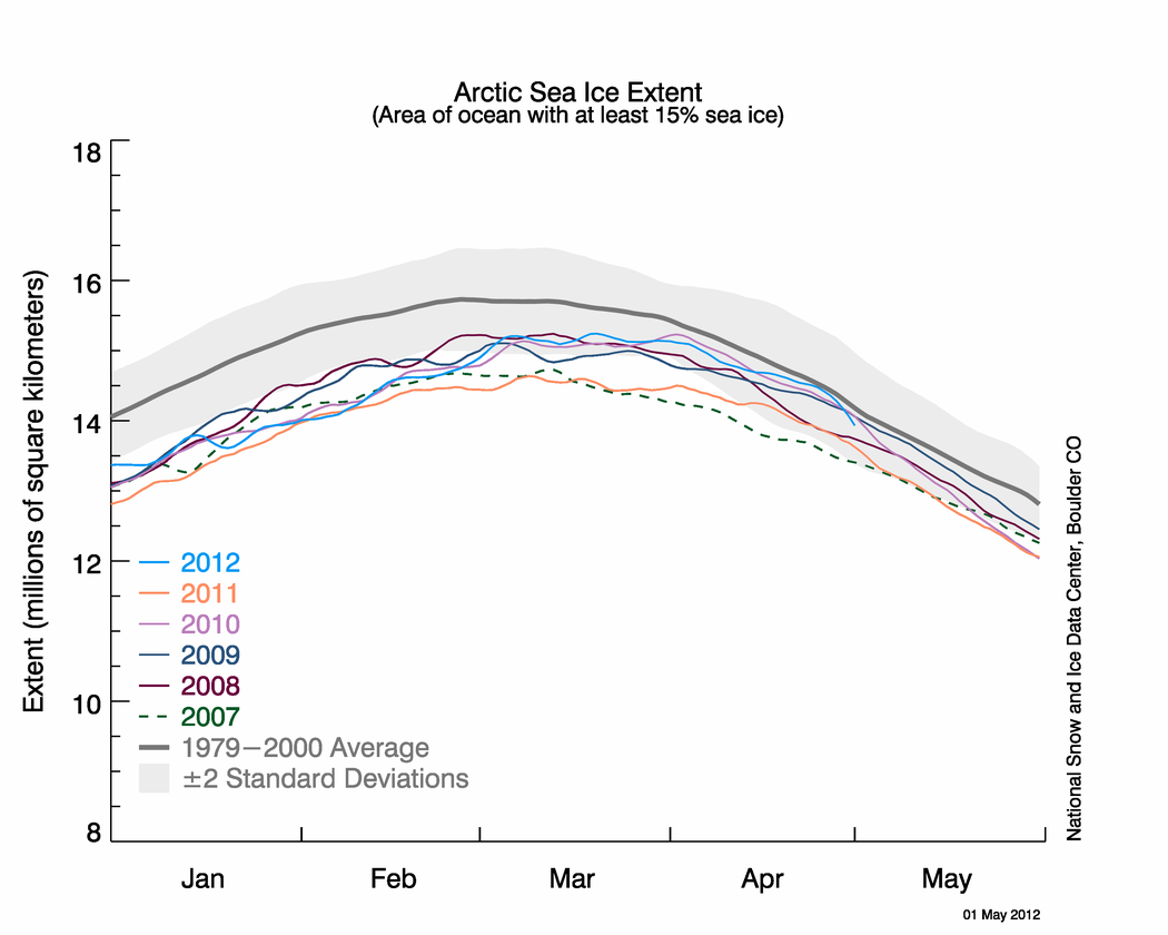
Last night I published NSIDC’s April Sea Ice Update along with an NWS report about record Bering Sea Ice. Simon F. was first to spot it within minutes.
Simon F. says:
There appears to be another glaring error on the NSIDC page about arctic sea ice. Look at these two images: http://nsidc.org/data/seaice_index/images/daily_images/N_stddev_timeseries.png & http://nsidc.org/arcticseaicenews/files/2012/05/Figure2.png – How come one practically touches the mean and the other never gets close?
I figured I’d wait until morning to see if NSIDC fixed the issue themselves. Nope. Let’s look at those graphs.

http://nsidc.org/data/seaice_index/images/daily_images/N_stddev_timeseries.png
OK, nothing wrong with this one. Note how the sea ice kisses the normal line. NSIDC alludes to this in their April Summary saying: Arctic sea ice reaches near-average extent in April

http://nsidc.org/arcticseaicenews/files/2012/05/Figure2.png
Hmmm….the blue line no longer kisses the normal line.
Since these graphs have the same scale, doing an overlay is easy.

It seems the average line has shifted. WUWT?
Why do bloggers keep having to point out NSIDC’s errors in their public presentations to their scientists? This is the second time in a month such errors have been spotted by bloggers, prompting NSIDC to do a correction last month.
NSIDC fixes their Arctic Sea Ice graphing problem
NSIDC’s oops moment – uncoordinated changes make for an interesting 24 hours
And of course the first time we pointed out a glaring error, that the satellite sensor failed, I was told it wasn’t worth blogging about.
Errors in publicly presented data – Worth blogging about?
NSIDC pulls the plug on Arctic Sea Ice Graphs
No good deed goes unpunished I suppose.
UPDATE: 9:15AM PST
I’ve heard from Dr. Walt Meier at NSIDC, and they are working to fix the problem. He sends his thanks for spotting the problem. – Anthony
UPDATE2: 2:30PM PST.
This came in earlier today at 12:32, but I was busy with other issues. The problem has been solved. Walt Meir writes:
We’ve corrected the image.
Thank you again for bringing it to our attention. It’s always good to have multiple eyes on things like this since we’re not an operational center and don’t always catch things, especially when we’re busy with other responsibilities.
Here is the corrected Figure 2 image:

Willis Eschenbach:
re your post at May 5, 2012 at 11:16 pm
Well said! Hear, hear!
Richard
It’s nice to be polite and to give people the benefit of the doubt and ascribe their inaccurate data to human error and I’m not a statistician, but when the “errors” are all somehow made in favour of the Alarmist’s hypothesis…..
Once is an accident. Twice is coincidence. Three times is enemy action.
My willingness to take Meier’s response at face value would be much enhanced if there were any instances of him taking unprompted corrective action on record. Are there? Or does he just do a quick soft-shoe routine when fingered?