See update below: New comparison graph of US temperatures in 1999 to present added – quite an eye opener – Anthony
There’s been a lot of buzz and conflicting reports over what the BEST data actually says, especially about the last decade where we have dueling opinions on a “slowing down”, “leveling off”, “standstill”, or “slight rise” (depending on whose pronouncements you read) of global warming.
Here’s some media quotes that have been thrown about recently about the BEST preliminary data and preliminary results:
“‘We see no evidence of it [global warming] having slowed down,’ he told BBC Radio 4’s Today programme. There was, he added, ‘no levelling off’.” – Dr. Richard Muller
In The Sunday Mail Prof Curry said, the project’s research data show there has been no increase in world temperatures since the end of the Nineties:
‘There is no scientific basis for saying that warming hasn’t stopped,’ she said. ‘To say that there is detracts from the credibility of the data, which is very unfortunate.’ – Dr. Judith Curry in The Sunday Mail
Climatologist Dr. Pat Michaels in an essay at The GWPF wrote:
“The last ten years of the BEST data indeed show no statistically significant warming trend, no matter how you slice and dice them”. He adds: “Both records are in reasonable agreement about the length of time without a significant warming trend. In the CRU record it is 15.0 years. In the University of Alabama MSU it is 13.9, and in the Remote Sensing Systems version of the MSU it is 15.6 years. “
In the middle of all those quotes being bandied about, I get an email from Burt Rutan (yes THAT Burt Rutan) with a PDF slideshow titled Winter Trends in the United States in the Last Decade citing NCDC’s “climate at a glance” data. This is using the USHCN2 data, which we are told is the “best”, no pun intended. It had this interesting map of the USA for Winter Temperatures (December-February) by climate region on the first slide:

Hmmm, that’s a bit of a surprise for the steepness of those trend numbers. So I decided to expand and enhance that slide show by combining trend graphs and the map together, while also looking at other data (summer, annual). Here’s a breakdown for CONUS by region for Winter, Summer, and Annual comparisons. Click each image to enlarge to full size to view the graphs.
Winter temperatures and trends °F, 2001-2011. Note that every region has a negative trend:

Summer temperatures and trends °F, 2001-2011. Note that 5 of 9 regions have a negative summertime trend:

And finally here is the Annual yearly mean temperature trend for the last decade. Since 2011 is not yet complete for annual data (though is for Winter and Summer data), I’ve plotted the last decade available, from 2000-2010:

Only 1 of 9 regions has a positive decadal trend for the Annual mean temperature, the Northeast.
This data is from USHCN2, from the National Climatic Data Center (NCDC). Note that I have not adjusted it or even self plotted it in any way. The output graphs and trend numbers are from NCDC’s publicly available “Climate At A Glance” database interface, and these can be fully replicated by anyone easily simply by going here and choosing “regions”:
http://www.ncdc.noaa.gov/oa/climate/research/cag3/cag3.html
I find the fact that summer temperatures were negative in five of 9 regions interesting. But most importantly, the trend for the CONUS for the past 10 years is not flat, but cooling.
The trend line for the contiguous lower 48 states looks like this for the same period when we plot the Annual mean temperature data for 2001-2010 (we can’t plot 2011 yet since the year isn’t complete):
![]()

And if we back it up a year, to 2000, so that we get ten full years, we get this:

So according the the National Climatic Data Center, it seems clear that for at least the last 10 years, there has been a cooling trend in the Annual mean temperature of the contiguous United States. Pat Michaels in his GWPF essay talks about 1996 :
A significant trend since these periods began is not going to emerge anytime soon. MSU temperatures are plummeting and are now below where they were at this time of the year in the 2008 La Nina. NOAA is predicting an extreme La Nina low in 2012. If the 1976-98 warming trend is re-established in 2013, post-1996 warming would not become significant until 2021.
So when you run the NCDC “climate at a glance” plotter from 1996 for the USA on Annual mean temperature data for the contiguous United States for 15 years of data, you get this, flatness:

Warming, for the USA seems pretty “stalled” to me in the last 10-15 years. Bear in mind that BEST uses the same data source for the USA, the USCHN2 data. Granted, this isn’t a standard 30 year climatology period we are examining, but the question about the last 10 years is still valid. “Aerosol masking” has been the reason given by the Team. Blame China.
For the inevitable whining and claims of cherry picking that will come in comments, here’s the complete data set from NCDC plotted from 1895. I added the 1934 reference line in blue:

Interestingly, we’ve had only two years that exceeded 1934 for Annual mean temperature in the United States and they were El Niño related. 1998 and 2006 both had El Niño events.
While the United States is not the world, it does have some of the best weather data available, no pun intended. Given the NCDC data for CONUS, it certainly seems to me that warming has stalled for the United States in the last decade.
UPDATE: 11/06/2011 8AM PST
When I wrote the post above, I had concerns that the 1998 and 2006 peaks might not have actually exceeded 1934. I didn’t have the energy to explore the issue last night. This morning looking anew, I recalled the GISS Y2K debacle and recovered the graphs from Hansen’s 1999 press release. This was originally part of “Lights Out Upstairs” a guest post by Steve McIntyre on my old original blog. Just look at how much warmer 1934 was in 1999 than it is now. Much of this can be attributed to NCDC’s USHCN2 adjustments.
=============================================================
Steve wrote then:
In the NASA press release in 1999 , Hansen was very strongly for 1934. He said then:
The U.S. has warmed during the past century, but the warming hardly exceeds year-to-year variability.Indeed, in the U.S. the warmest decade was the 1930s and the warmest year was 1934.
This was illustrated with the following depiction of US temperature history, showing that 1934 was almost 0.6 deg C warmer than 1998.
From a Hansen 1999 News Release: http://www.giss.nasa.gov/research/briefs/hansen_07/fig1x.gif
However within only two years, this relationship had changed dramatically. In Hansen et al 2001 (referred to in the Lights On letter), 1934 and 1998 were in a virtual dead heat with 1934 in a slight lead. Hansen et al 2001 said
The U.S. annual (January-December) mean temperature is slightly warmer in 1934 than in 1998 in the GISS analysis (Plate 6)… the difference between 1934 and 1998 mean temperatures is a few hundredths of a degree.
From Hansen et al 2001 Plate 2. Note the change in relationship between 1934 and 1998.
Between 2001 and 2007, for some reason, as noted above, the ranks changed slightly with 1998 creeping into a slight lead.
The main reason for the changes were the incorporation of an additional layer of USHCN adjustments by Karl et al overlaying the time-of-observation adjustments already incorporated into Hansen et al 1999. Indeed, the validity and statistical justification of these USHCN adjustments is an important outstanding issue.
============================================================
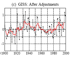
I’ve prepared a before and after graph using the CONUS values from GISS in 1999 and in 2011 (today).

GISS writes now of the bottom figure:
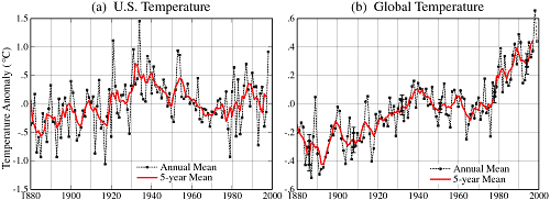
Annual Mean Temperature Change in the United States
Annual and five-year running mean surface air temperature in the contiguous 48 United States (1.6% of the Earth’s surface) relative to the 1951-1980 mean. [This is an update of Figure 6 in Hansen et al. (1999).]
Also available as PDF, or Postscript. Also available are tabular data.
So clearly, the two graphs are linked, and 1998 and 1934 have swapped positions for the “warmest year”. 1934 went down by about 0.3°C while 1998 went up by about 0.4°C for a total of about 0.7°C.
And they wonder why we don’t trust the surface temperature data.
In fairness, most of this is the fault of NCDC’s Karl, Menne, and Peterson, who have applied new adjustments in the form of USHCN2 (for US data) and GHCN3 (to global data). These adjustments are the primary source of this revisionism. As Steve McIntyre often says: “You have to watch the pea under the thimble with these guys”.
============================================================
UPDATE2: 10:30AM PST 11/07/2011 – Dr. Pat Michaels writes in with an update.
Anthony–
The post on Muller is a little long in the tooth but I do need to correct something.
The comment was that I said NOAA was predicting an “extreme” La Nina in 2012. That was true when I wrote it, but since then the October 31 forecast has come out and I used that in my most recent posting on this at the Cato site:
http://www.cato.org/pub_display.php?pub_id=13827
Here’s the relevant portion from the text:
We are currently experiencing another — for now — moderate La Niña, or the cold phase of El Niño. Satellite temperatures, as of this writing, have dropped below where they were in the previous La Niña of 2008, so 2011 isn’t going to be particularly warm compared to the average of the last 15 years.
In addition, the latest forecast from the Department of Commerce’s Climate Prediction Center is for the current La Niña to become stronger and persist through at least the first half of 2012:

Consequently, 2012, like 2011, is not likely to be particularly warm when compared to the last 15 years.
The NCDC tool is quite useful. It is this shows that the Texas summer this year has been the “hottest” on record.
However closer analysis shows temperatures never reached the levels of 1980. What pushed the average up was the fact that the heatwave lasted a couple of weeks longer. This is really quite an important distinction.
http://notalotofpeopleknowthat.wordpress.com/2011/10/17/texas-summer-2011how-hot-was-it-really/
Those of us using this site have known the facts of this article for years. However, every leftists pushing the opposite better get down on their knees NOW and start praying to their silly Gods of AGW that Herman Cain or Rick Perry never makes it to the White House because Perry says he’s coming with a wrecking ball to corrupt Washington pushing this idiocy with the likes of that 70 year old codger Mann and his minions – or no nonsense Cain taking no prisoners along the way. ALL the green crap and the funding of that green crap where ever it is ongoing in the US funded by government is – DOA by either Cain or Perry! Who said there was no GOD?
Here’s a story in today’s Seattle Times that doesn’t mesh with this thread’s account of declining temperatures in the PNW. Is it getting warmer on the ridges? Or is the spread of rust mostly to blame, not warmer temperatures? If someone knows, they should go to this story and contribute to the comments (90 strong at the moment), and linking back to this thread.
“And they wonder why we don’t trust the surface temperature data. In fairness, most of this is the fault of NCDC’s Karl, Menne, and Peterson, who have applied new adjustments in the form of USHCN2 (for US data) and GHCN3 (to global data). These adjustments are the primary source of this revisionism. As Steve McIntyre often says: “You have to watch the pea under the thimble with these guys”.”
I don’t think they care one bit if people trust the surface temp data or not. We have been around this block a dozen times or more. I have read every scrap of the science literature I could find about these adjustments. I understand like most of you what they are doing. I still don’t understand how they can call it science? Over the past couple of years I have written dozens of essays. published on my blog, looking at this through the lens of Popperian Philosophy. The bulk of these adjustments are still not science and never were. I strongly suspect never will be either.
Several points……
1— Al Gore and friends should be happy campers as they have single handedly stopped global warming as evidenced by the resulting long cooling phase. Gore, himself, believes the threat is over..As proof, he purchased and is living in a beachfront home in California. So much for the ocean rising.. There must be another Nobel Prize waiting for him in the wings.
2— Muller, basing his AGW flip-flop using the same creative climate data that was presented in the first place is very similar to the examiners that gave AIG, Enron, and a slew of other financial houses a clean bill of health based on each organization’s own skewed records. That turned out well, as we all know.
Can someone make a blinkie of those last two graph??
Be a lot easier to compare.
No they aren’t, because they can’t cause widespread melting and sea-level rise, which is the main threat from CAWG.
Dave Summers says:
November 5, 2011 at 6:19 pm
“I believe that you will find, as I did when I looked, that the recent rise in temperatures along the Eastern Seaboard, including the Northeast came after a decline in their average temperatures from 1950 to 1965 approximately. (See posts on the topic at Bit Tooth Energy and on one of the effects of that drop on the black capped chickadee .”
Great analysis you did Dave. And I say that as a birder (for almost 50 years). However, while the weather related trend in BC Chickadees does make complete and predictable sense, I would emphasize that Christmas Bird Count data is rather mushy because there are so many variables in how they are conducted from year to year. Moreover, the winter distribution and survival of birds like them has been influenced by the increasing number of bird feeders. Nonetheless, even with those problems that data is at least as reliable as most of the adjusted junk data we get from the AGW Team – and probably more reliable than any pre-1900 temperature data.
Good that you pointed out how many bird species are doing fine or much better than fine. The eco-crisis industry never seems to mention that, for obvious reasons.
On the point about Ripening tomatoes. Up until about two years ago we grew so many tomatoes we were eating Italian and tomato soups for months. since then most have been green. Also the tomatoes have suffered from tomato blight. Still on the bright side we have mountains of green tomato chutney.
steven mosher says:
November 6, 2011 at 11:28 am
“You should note for completeness that the methods GISS used changed between 1999 and 2010.”
Funny. So that junk adjusted data is even worse than we thought. Can’t even compare junk to junk now? And I’m sure they changed their methods simply to ensure their accuracy. LOL.
I think the tomato survival index would be more valuable than GISS data.
Alternatively you can just ask folks how the tomatoes in the garden have worked out… 🙂
I live in the UK, and I’ve now officially given up on tomatoes after wasting my time those past 4 summers. 🙁
Garethman replies:
As someone who practises self sufficiency can I also add Sweetcorn, French beans Peaches to the crops that I can no longer grow in Wales since the deterioration in our summer climate. Many people believe in substantial global warming. My crops disagree and have voted with their feet. This year I went back to the more traditional crops of cabbage, potatoes, parsnips and other roots and had a good crop. Don’t deny the deteriorating climatic conditions, adapt and you wont go far wrong.
Any trend can be reversed with enough adjustments. Publish a few papers on new methods and voila! A cooling trend becomes a warming trend.
Mark my words. GISS isn’t going to get any rest until they’ve figured this one out.
Our grandchildren won’t know what tomatoes are.
“Tomatoes of our Grandchildren.”
I’d like to add my two seeds to the garden warming index. In New Mexico we had a very late cold spell that froze most of the water pipes where I live. To top that off, Texas lost electrical power and the natural gas dropped off too. The late spring meant the ground was too cold to germinate the seeds and the air was too cold to spur the tomato plants. Since 5 years ago I had a bumper crop of tomatoes, the climate has changed. At my elevation this cooler winter and spring is bad for farming outdoors. I would be happy volunteer to be a tomato watcher next year by having one in the ground outside and one in the green house inside. I’ll try to select two identical plants and monitor growth by width and height until fall.
The warmists have been using aerosols as an excuse for the flattening of temperature trends over the last ten years. Personally I don’t think they could find their aerosol with both hands but that’s another issue. If instead, you’re a suspicious sod like me, then you might conclude that a large chunk of the century trend was induced by over enthusiastic ‘adjustments’ to the record. Unless you keep making additional adjustments this trend will disappear, just as it has done.
I think we are better off trusting the model predictions. If we let ourselves get distracted by these unreliable real world measurements we may get ourselves become complacent.
Hexe Froschbein says:
November 5, 2011 at 6:10 pm
Kudos to Hexe. Never in the history of the blogosphere has a thread been so way laid.
Since we are on the subject of local tempertures..I’m trying to find DAILY temp data for Hutchinson MN, Chaska MN, and or Chanhassan MN. Where do I find them?
Can I get them back to 1950 or 1940? The reason, I have a data set that goes back to 1820 (Fort Snelling, MN) I’d like to use the Hutch, Chan or Chaska as the 1950 on, as I know it will represent the “real” regional temps, SANS the UHI of the Mpls, St. Paul Int. Airport. (Please see http://www.surfacestations.org, and don’t LAUGH TOO HARD at where the OFFICAL Temp for Mpls has been coming from since WWII onward!)
Any clues WUWT folks?
Max
PS: You can use the THREESPOT, and thats located AT AOL. (Can you figure the Email from that?)
Obviously there are some multi-decade issues from the data. Why not overlay the AMO on this data so we can extend the discussion in meaningful ways?
richard verney says:
November 6, 2011 at 11:54 am
. However, I can foresee that some local ecosystems could be adversely affected by such a temperature increase.
========================================
Richard, they would just move…..that’s where they came from in the first place
Does this mean that the initial temperature rise was Urban Heat Island effect and the removal of temperature measurement stations in cool places?
Now that all this is in place there will be no more temperature rises?
[snip. You know why. ~dbs, mod.]
I did well with chilis here in Ottaw, 500 miles Southh of Londoin UK, but the tomatoes were woeful.
That the north east is warming is fact. I live in NB, Canada and the winters are shorter, warmer, and start later. This is because of a warmer northern Atlantic Ocean. I’m in favour of warmer temperatures. It’s unfortunate that the rest of the planet has to cool for climate scientists to admit that they were wrong. Actually, they’re still not all admitting it. It’s a shame and an eye opener for anyone that was still on the fence.
BTW, are we not still in an ice age? We just happen to be in an interglacial period. Imagining if the ice age was ending. What would the climate scientists say? More likely though is that the interglacial will end eventually and go back to the ice age.
Cool Climate Tomato Growers,
I confess. I am tomato snob. There are few gastronomic delights as satisfying as a vine ripened tomato, picked sun warm from the vine and eaten immediately, with essential slurps to capture the gushes of tomato juice before it evades capture! I grew up on farm in on Green Lake, Wisconsin, where we raised many fruits and vegetables for a family run ‘road side stand’. In the ’60s and 70s, we successfully grew large volumes of tomatoes there.
Here’s a thought that occurred to me, as I read the ‘tomato posts’ above:
Tomatoes love ‘ground’ heat; i.e. warmer soil, especially on cool nights. Using an electric or gas clothes dryer to dry our washed clothes produces waste heat that is usually exhausted outside. Hmmmmm….Why not ‘marry up’ these 2 projects and utilize that waste heat?
Suggest burying a PVC pipe (same size as dryer duct) under your tomato bed… and connect it to the dryer exhaust duct on the outside of the house with a piece of flex ducting. Drying your clothes in the evening would add heat to the ground, when it is needed. If the weather is sufficiently warm for the tomato plants, just disconnect the duct. If a gas dryer is used, the added CO2 in the exhaust might be put to good use inside a green house or similar row cover! Probably ought to drill some drain holes in the bottom of the PVC tube (or use a PVC drain tile?!) to allow the condensing moisture from the dryer exhaust to drain into the soil.
At all times, be sure to use a generous layer of dry ground cover, like wheat or oats straw, under the tomato plants, to prevent direct contact of the plant leaves and fruit with the soil. This will reduce the black spot fungus attacks on the fruit.
Pollination can be an issue as well. I have on occasion used a q-tip swab to gently transfer pollen between plants and individual flowers, when the plants produced sufficient flowers but were not setting fruit!
Yeah – I know…. Amazing, what a guy will do to get a real ripe tomato, right? };>)