UPDATE: Tamino weighs in, see the update at the end of this post. –
One of the great things about WUWT is that it attracts commenters with a wide range of skill sets, who can often contribute far and beyond what we even see from our government sources. I’ve lamented the lack of updates from the University of Colorado sea level website, and when I got no response to emails, I decided to make a rare phone call and ask why. The answer I got from Dr. R. Steven Nerem was:
“This new website design won’t work with our current format, so if you can just be patient and wait a couple of weeks we’ll have it online.”
Not content to wait, and prodded by another commenter in an online tussle, CA and WUWT regular Roman M decided to find out himself. The results speak for themselves, quite a drop in the latest JASON-1 datapoint, with a general slight downturn in the JASON1-2 data since late 2009:

Here’s the dialog on how this came about, from RomanM’s comment here:
===============================================================
“… and am very curious to see what the most recent data looks like.”
So why not go and look at it?
Excellent suggestion. I did exactly that.
First, I went to the Aviso web site and found the place where one can generate sea level graphs. I generated the “Reference” version (“Reference” products are computed with the T/P-Jason-1-Jason-2 serie for the time series and with merged datasets for the maps) with the options: inverted barometer, seasonal removed and without isostatic adjustment. I got a graph with some points and a line drawn through it (which I have also saved at this location.

Quick-look of selected data. Click on “download the image”
to retrieve the image in high resolution
or on “download the data” to get the data.
Since it appeared that the “data” was rather sparse and since I enjoy playing with numbers, I chose to download the data. I assume that you didn’t try this, because to my surprise, I got the message:
550 /pub/oceano/AVISO/indicators/msl/MSL_Serie_MERGED_Global_IB_RWT_GIA_Adjust.txt: No such file or directory
Must be a glitch, I thought! After a period of time with the same type of message appearing EVERY time that I tried to download data for a variety of variables, I got the idea that perhaps (as you suggested in an earlier comment) “somebody forgot to update it, or has been busy with other things, or the person who originally did it has left and nobody else was interested” at Aviso as well. must be a lot of that going around in the climate science community, right? 😉
Anyway, not to be defeated so easily, I managed to actually locate some updated results (into January 2011) at NOAA in NetCDF format. I drew what was purportedly the same graph from that data and got something that was quite different.

I have other graphs, but I will just show one more using all of the satellites. This one used real data, not the processed results chosen by Aviso and not even shared by them.

=============================================================
Another curiosity:
The other reason things have gone quiet may be an unprecedented swing in the Jason 2 calibration curve.
http://sealevel.colorado.edu/calibration.php
I don’t know if they have published any findings on why it jumped by 10 mm at the end of 2009 but if it has skipped again maybe they are frantically trying to tidy things up before publishing data.
==============================================================
He has a point, have a look at this calibration curve published on the (CU sealevel website) for JASON1 and 2:

Compare that to the curve from the previous TOPEX A and B satellites:

Curiouser and curiouser.
To be fair, and to compare to what RomanM plotted I’ll also show the similar ensemble graph provided by NOAA, which uses smoothed data points:
 ================================================================
UPDATE:
Oh this is funny. Having been hilariously self pwned before for not reading what’s actually in a blog post, Grant Foster, aka “Tamino”, aka “Open Mind” writes a critique of this blog post complaining that because the post discussed the most recent data that still hasn’t been updated at the CU Sealevel website, and points out the dip at the end, that we are “pretending sea level rise doesn’t exist”. Here’s his graph to drive his point home.
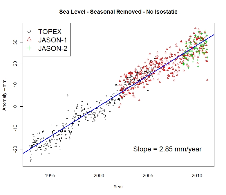
 Here’s the funny part, above in my original post, you’ll count three graphs. One from Roman M., here and one from NOAA, here, both with trend lines for the full length of the data set, both clearly labeled with sea level rise rates of 2.85mm and 2.8mm per year respectively. Then there’s the one from AVISO/CNES/LEGOS, with the red smoothed average line and nice big blue linear trend line and 2.96mm per year rise rate labeled on it.
Gosh, how can anyone miss three graphs with positive trend lines and rates?
Mr. Foster doesn’t even have a sea level rise rate on his graph, ignores the graphs with trend lines and trend rates, and discussion on calibration of JASON 1-2, and yet we are the ones here “pretending (sea level rise) doesn’t exist”? Mr. Foster must be stuck in one of those “Smug Loops” that Steve McIntyre writes about today.
Too funny.
This reminds me of a previous incident where another “smug loop” type situation occurred, where I pointed out some outliers in sea ice satellite data and was told by NSIDC that it was “not worth blogging about“. Days later, they had to fess up to admitting they missed an equipment problem and took their whole dataset output offline to fix it.
Discover more from Watts Up With That?
Subscribe to get the latest posts sent to your email.
All this is too complicated and open to all sorts of shenannigans. Drift problems, calibrations etc etc
To measure sea level rise, I suggest they do what I did during the recent Queensland floods. I drove a long stake into the ground and measured the water rise every half hour. So maybe they should send a ship out to the “doldrums” in the tropics and drive a long stake into the ocean floor.
Don’t forget to put millimetre notches into the stake. I used my Swiss Army Knife. 🙂
Sea level rise measuring problems fixed.
Latitude,
I suspect that R Gates is recharging his talking points over at ‘skeptical’ science.☺
Smokey: What are you talking about? Do you honestly think R Gates cannot be conned . . . .or Obama for that matter . . . . pa leeze . . . . Even they depend on
ex perts . . . . I don’t know how to wire a three way electrical switch . . . .but, I know it can be done.
Hockey Schtick says:
April 17, 2011 at 11:59 am
If you’re interested in the process by which satellite altimetry readings become MSL data this document does a pretty good job of covering the myriad details
http://www.osdpd.noaa.gov/ml/ocean/J2_handbook_v1-4_no_rev.pdf
It’s the data products handbook for JASON 2. The multitude of corrections and fudge factors involved are discussed in some depth. I would note that many, if not most, are not empirical but are model based and have their own subset of fudge factors employed in their construction.
Of particular interest is sec. 2.3.1 including this
“Generally speaking OSTM/Jason-2 has been specified based on the Jason-1 state of the art, including improvements in payload technology, data processing and algorithms or ancillary data(e.g: precise orbit determination and meteorological model accuracy). The sea-surface height shall be provided with a globally averaged RMS accuracy of 3.4 cm (1 sigma), or better, assuming 1 second averages.”
The table of error budget values that follows is also worth a look, particularly the line for significant wave height, which seems to indicate that, when significant waves are present, they can’t read the surface height to closer than 0.4 to 1 METERS. Aviso has daily graphs of SWH available
http://bulletin.aviso.oceanobs.com/html/produits/aviso/welcome_uk.php3
If you peruse a random selection of those in light of that SWH error, maybe you can come back and explain to me how they can claim centimeter level accuracy when they can’t resolve most of the ocean surface most of the time to closer than a half meter. Personally, I suspect that even a half meter is hopelessly optimistic.
It’s simple as a wood wedge. All the water rushed into the Mediterranean lately, increasing its level by up to 20 cm and causing dramatic sea level drop elsewhere.
I say this is all rather embarrassing what?
I will try ones best with the imminent delivery of a new 6L V8 internal combusting thingy………
Ta.
Does anyone know where I can find the Envirosat data set?
Any chance that that abrupt plunge indicates an instrument failure? As much as I would like to believe the information, such a rapid change tweaks my little grey cells.
IanM
John of Kent says:
Now that IS an inconvenient truth! Sea level dropping 🙂
Sea level is not dropping. A quick look at the graphs will show that just before 2000 there was a similar plateau. It will be a miracle if the trend reverses long-term (it’s been rising for centuries and nothing else miraculous has happened).
Going on-line and saying “sea level is dropping” is unjustified with the current data. It makes you look a fool. I don’t mind that, but I do mind when other climate sceptics have to explain that not all of us are that stupid. And I do mind when some undecided person decides to check out the “dropping sea level” and doesn’t find it, so decides the alarmists must be right.
We can be fairly sure sea level isn’t rising with greater and greater speed, as predicted by the doom-mongers. But no more. That’s enough, of course, but let’s not oversell it.
The graph shows 20 years of sea level data. During that time the rate of rise is essentially constant. The ups and downs within those 20 years correspond very well with the ENSO.
This graph: http://www.appinsys.com/GlobalWarming/SeaLevel_ENSO.jpg compares the ENSO (MEI) with the sea level.
Mike Haseler says:
April 17, 2011 at 11:55 am
“We’ve got to use the precautionary approach which clearly means that if there is the slightest hint of a doubt regarding the honesty or integrity of those involved producing such figures we should immediately assume the worst: that they are a bunch of lying scoundrels who couldn’t be trusted not to sell a chewed banana.
Or have I misunderstood the precautionary approach?”
You are spot on. But the name is The Precautionary Principle. Lisa Jackson puts all her weight behind the use of the Precautionary Principle at all times and places; so, yes, indeed, you must always apply it to Warmista. It shows them how much we respect them.
I am still at a loss here . . . I do not understand why this variation is important?
it’s mm’s . . . .so for me . . . if it is real cloudy it (the mm) could be in the air . . .
My theory is that the earthquake in Japan opened up a big hole in the earth and a lot of sea water poured in, thus lowering the level. /snark
I’m sure any “sharp downticks” will be averaged (massaged) out in the graph used for the public. I wouldn’t be surprised if the are waiting for an uptick in order to hide that sharp downtick. Better to make it a small downtick…
Laurie Bowen,
I know how to wire a three-way light switch.
See if you can draw one: two switches operating one light, using two wires. Each switch turns the light on and off independent of the other switch. It’s an excellent IQ test.☺
Jimbo says:
April 17, 2011 at 1:06 pm
“Get ready for IF the rate of sea level increases then all coral island atolls are doomed. We have been waiting since 1980 and diddly.”
I have been waiting for my dream house in the Maldives. But prices keep going up, not down. When are these people going to realize that the Maldives will be flooded in no time? The Warmista need to do more advertising in the Maldives, darn it!
On a more serious note, actually it doesn’t matter to science whether the sea level rises or falls because there is not one existing scientist who can offer physical hypotheses which explain sea level change or which can serve to predict sea level change. At this time, there is no science of sea level rise.
Oh, just for those who are reading words such as ‘hypothesis’ and ‘prediction’ for the first time. A stated belief that sea levels will rise in the future is neither a hypothesis nor a prediction. The neatest way to learn the semantics of scientific method is to read some history and explanation of Kepler’s Three Laws. Galileo used those three hypotheses to predict the phases of Venus, among other things.
Smokey: Not my point. . . . I can drive a car but, I can’t rebuild a transmission . . .
but, I know it can be done . . . the point I am “trying” to make is that we all have to depend on “experts” but even experts can be tricked . . . or conned . . . . Pollyanna here (that’s me) would like to think R Gates is now a sceptic . . . not to be had twice . . . oh . . . and I still can’t wire a three way switch . . . properly . . .
Dave Wendt says:
April 17, 2011 at 2:20 pm
Hockey Schtick says:
April 17, 2011 at 11:59 am
Do you want to pull the rug this soon? It is so much fun to watch them spin and spin as they hope to create a web that will catch a science.
Make two drawing, one with the light at the end, and another with the light in the “middle.”
Do we need to add a new word to the warmist dictionary … risefall. Without a doubt AGW causes risefall.
Rather than an earthquake causing a big hole, I’d propose an AGW induced micro black hole. The CO2 increase has started creating these black holes all over the world’s oceans. We’re doomed.
If you scan across the graph there are many times at which the data behaved similarly before lurching up again. It would be an extremely brave individual who would dare to make a prediction that sea levels would stabilize or continue to fall.
Sea level rise is mostly the result of thermal expansion. The oceans take an extremely long time to reach thermal equilibrium. The process does not react quickly to changed conditions. The oceans still have not reached thermal equilibrium since global temperatures rose at the end of the last ice age and a continued steady and gradual rise in sea level can be expected from that factor alone.
The lack of `accelleration’ in the graph however is indeed a failed prediction of climate science and the recent dip only serves to make that lack more glaringly apparent.
Fred: Ok . . . I’ll go with it . . “Make two drawings, one with the light at the end, and another with the light in the “middle.”
. . all done . . . . Light still doesn’t work . . .
The sea level is falling because of a black hole made by japan’s failing reactors and we are all doomed
Question : If the tide rises by 10mm in an area where there is a maximum of1 metre of movement between tides, what rise should be expected where the between tide movement is a maximum of10 metres?
“Local sea level has dropped since 1990s
…According to Reinhard Flick, a researcher at the Scripps Institution of Oceanography, who studies tides, sea level and coastal impacts, the average sea level at La Jolla measured with the Scripps Institution of Oceanography tide gauge was 81.8 centimeters for the 1980s (1980-1989), 84.6 cm for the 1990s and 82.9 cm for the 2000s (relative to mean lower low water, the point of reference used on tide tables).
Therefore, local sea level was 1.7 centimeters lower on average in the decade of the 2000s than during the decade of the 1990s…..” April 4, 2011 San Diego Union