Guest post by David Middleton
INTRODUCTION
Anyone who has spent any amount of time reviewing climate science literature has probably seen variations of the following chart…

A record of atmospheric CO2 over the last 1,000 years constructed from Antarctic ice cores and the modern instrumental data from the Mauna Loa Observatory suggest that the pre-industrial atmospheric CO2 concentration was a relatively stable ~275ppmv up until the mid 19th Century. Since then, CO2 levels have been climbing rapidly to levels that are often described as unprecedented in the last several hundred thousand to several million years.
Ice core CO2 data are great. Ice cores can yield continuous CO2 records from as far back as 800,000 years ago right on up to the 1970’s. The ice cores also form one of the pillars of Warmista Junk Science: A stable pre-industrial atmospheric CO2 level of ~275 ppmv. The Antarctic ice core-derived CO2 estimates are inconsistent with just about every other method of measuring pre-industrial CO2 levels.
Three common ways to estimate pre-industrial atmospheric CO2 concentrations (before instrumental records began in 1959) are:
1) Measuring CO2 content in air bubbles trapped in ice cores.
2) Measuring the density of stomata in plants.
3) GEOCARB (Berner et al., 1991, 1999, 2004): A geological model for the evolution of atmospheric CO2 over the Phanerozoic Eon. This model is derived from “geological, geochemical, biological, and climatological data.” The main drivers being tectonic activity, organic matter burial and continental rock weathering.
ICE CORES
The advantage of Antarctic ice cores is that they can provide a continuous record of relative CO2 changes going back in time 800,000 years, with a resolution ranging from annual in the shallow section to multi-decadal in the deeper section. Pleistocene-age ice core records seem to indicate a strong correlation between CO2 and temperature; although the delta-CO2 lags behind the delta-T by an average of 800 years… 
Ice cores from Greenland are rarely used in CO2 reconstructions. The maximum usable Greenland record only dates as far back as ~130,000 years ago (Eemian/Sangamonian); the deeper ice has been deformed. The Greenland ice cores do tend to have a higher resolution than the Antarctic cores because there is a higher snow accumulation rate in Greenland. Funny thing about the Greenland cores: They show much higher CO2 levels (330-350 ppmv) during Holocene warm periods and Pleistocene interstadials. The Dye 3 ice core shows an average CO2 level of 331 ppmv (+/-17) during the Preboreal Oscillation (~11,500 years ago). These higher CO2 levels have been explained away as being the result of in situ chemical reactions (Anklin et al., 1997).
PLANT STOMATA
Stomata are microscopic pores found in leaves and the stem epidermis of plants. They are used for gas exchange. The stomatal density in some C3 plants will vary inversely with the concentration of atmospheric CO2. Stomatal density can be empirically tested and calibrated to CO2 changes over the last 60 years in living plants. The advantage to the stomatal data is that the relationship of the Stomatal Index and atmospheric CO2 can be empirically demonstrated…

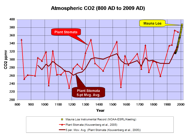
When stomata-derived CO2 (red) is compared to ice core-derived CO2 (blue), the stomata generally show much more variability in the atmospheric CO2 level and often show levels much higher than the ice cores…

Plant stomata suggest that the pre-industrial CO2 levels were commonly in the 360 to 390ppmv range.
GEOCARB
GEOCARB provides a continuous long-term record of atmospheric CO2 changes; but it is a very low-frequency record…

The lack of a long-term correlation between CO2 and temperature is very apparent when GEOCARB is compared to Veizer’s d18O-derived Phanerozoic temperature reconstruction. As can be seen in the figure above, plant stomata indicate a much greater range of CO2 variability; but are in general agreement with the lower frequency GEOCARB model.
DISCUSSION
Ice cores and GEOCARB provide continuous long-term records; while plant stomata records are discontinuous and limited to fossil stomata that can be accurately aged and calibrated to extant plant taxa. GEOCARB yields a very low frequency record, ice cores have better resolution and stomata can yield very high frequency data. Modern CO2 levels are unspectacular according to GEOCARB, unprecedented according to the ice cores and not anomalous according to plant stomata. So which method provides the most accurate reconstruction of past atmospheric CO2?
The problems with the ice core data are 1) the air-age vs. ice-age delta and 2) the effects of burial depth on gas concentrations.
The age of the layers of ice can be fairly easily and accurately determined. The age of the air trapped in the ice is not so easily or accurately determined. Currently the most common method for aging the air is through the use of “firn densification models” (FDM). Firn is more dense than snow; but less dense than ice. As the layers of snow and ice are buried, they are compressed into firn and then ice. The depth at which the pore space in the firn closes off and traps gas can vary greatly… So the delta between the age of the ice and the ago of the air can vary from as little as 30 years to more than 2,000 years.
The EPICA C core has a delta of over 2,000 years. The pores don’t close off until a depth of 99 m, where the ice is 2,424 years old. According to the firn densification model, last year’s air is trapped at that depth in ice that was deposited over 2,000 years ago.
I have a lot of doubts about the accuracy of the FDM method. I somehow doubt that the air at a depth of 99 meters is last year’s air. Gas doesn’t tend to migrate downward through sediment… Being less dense than rock and water, it migrates upward. That’s why oil and gas are almost always a lot older than the rock formations in which they are trapped. I do realize that the contemporaneous atmosphere will permeate down into the ice… But it seems to me that at depth, there would be a mixture of air permeating downward, in situ air, and older air that had migrated upward before the ice fully “lithified”.
A recent study (Van Hoof et al., 2005) demonstrated that the ice core CO2 data essentially represent a low-frequency, century to multi-century moving average of past atmospheric CO2 levels.

It appears that the ice core data represent a long-term, low-frequency moving average of the atmospheric CO2 concentration; while the stomata yield a high frequency component.
The stomata data routinely show that atmospheric CO2 levels were higher than the ice cores do. Plant stomata data from the previous interglacial (Eemian/Sangamonian) were higher than the ice cores indicate…

The GEOCARB data also suggest that ice core CO2 data are too low…

The average CO2 level of the Pleistocene ice cores is 36ppmv less than GEOCARB…

Recent satellite data (NASA AIRS) show that atmospheric CO2 levels in the polar regions are significantly less than in lower latitudes…


So… The ice core data should be yielding lower CO2 levels than the Mauna Loa Observatory and the plant stomata.
Kouwenberg et al., 2005 found that a “stomatal frequency record based on buried Tsuga heterophylla needles reveals significant centennial-scale atmospheric CO2 fluctuations during the last millennium.”
Plant stomata data show much greater variability of atmospheric CO2 over the last 1,000 years than the ice cores and that CO2 levels have often been between 300 and 340ppmv over the last millennium, including a 120ppmv rise from the late 12th Century through the mid 14th Century. The stomata data also indicate higher CO2 levels than the Mauna Loa instrumental record; but a 5-point moving average ties into the instrumental record quite nicely…

A survey of historical chemical analyses (Beck, 2007) shows even more variability in atmospheric CO2 levels than the plant stomata data since 1800…

WHAT DOES IT ALL MEAN?
The current “paradigm” says that atmospheric CO2 has risen from ~275ppmv to 388ppmv since the mid-1800’s as the result of fossil fuel combustion by humans. Increasing CO2 levels are supposedly warming the planet…

However, if we use Moberg’s (2005) non-Hockey Stick reconstruction, the correlation between CO2 and temperature changes a bit…

Moberg did a far better job in honoring the low frequency components of the climate signal. Reconstructions like these indicate a far more variable climate over the last 2,000 years than the “Hockey Sticks” do. Moberg also shows that the warm up from the Little Ice Age began in 1600, 260 years before CO2 levels started to rise.
As can be seen below, geologically consistent reconstructions like Moberg and Esper are in far better agreement with “direct” paleotemperature measurements, like Alley’s ice core reconstruction for Central Greenland…

In fairness to Dr. Mann, his 2008 reconstruction did restore the Medieval Warm Period and Little Ice Age to their proper places; but he still used Mike’s Nature Trick to slap a hockey stick blade onto the 20th century.
What happens if we use the plant stomata-derived CO2 instead of the ice core data?

We find that the ~250-year lag time is consistent. CO2 levels peaked 250 years after the Medieval Warm Period peaked and the Little Ice Age cooling began and CO2 bottomed out 240 years after the trough of the Little Ice Age. In a fashion similar to the glacial/interglacial lags in the ice cores, the plant stomata data indicate that CO2 has lagged behind temperature changes by about 250 years over the last millennium. The rise in CO2 that began in 1860 is most likely the result of warming oceans degassing.
While we don’t have a continuous stomata record over the Holocene, it does appear that a lag time was also present in the early Holocene…

Once dissolved in the deep-ocean, the residence time for carbon atoms can be more than 500 years. So, a 150- to 200-year lag time between the ~1,500-year climate cycle and oceanic CO2 degassing should come as little surprise.
CONCLUSIONS
-
Ice core data provide a low-frequency estimate of atmospheric CO2 variations of the glacial/interglacial cycles of the Pleistocene. However, the ice cores seriously underestimate the variability of interglacial CO2 levels.
-
GEOCARB shows that ice cores underestimate the long-term average Pleistocene CO2 level by 36ppmv.
-
Modern satellite data show that atmospheric CO2 levels in Antarctica are 20 to 30ppmv less than lower latitudes.
-
Plant stomata data show that ice cores do not resolve past decadal and century scale CO2 variations that were of comparable amplitude and frequency to the rise since 1860.
Thus it is concluded that:
-
CO2 levels from the Early Holocene through pre-industrial times were highly variable and not stable as the Antarctic ice cores suggest.
-
The carbon and climate cycles are coupled in a consistent manner from the Early Holocene to the present day.
-
The carbon cycle lags behind the climate cycle and thus does not drive the climate cycle.
-
The lag time is consistent with the hypothesis of a temperature-driven carbon cycle.
-
The anthropogenic contribution to the carbon cycle since 1860 is minimal and inconsequential.
Note: Unless otherwise indicated, all of the climate reconstructions used in this article are for the Northern Hemisphere.
References
Anklin, M., J. Schwander, B. Stauffer, J. Tschumi, A. Fuchs, J.M. Barnola, and D. Raynaud, CO2 record between 40 and 8 kyr BP from the GRIP ice core, Journal of Geophysical Research, 102 (C12), 26539-26545, 1997.
Wagner et al., 1999. Century-Scale Shifts in Early Holocene Atmospheric CO2 Concentration. Science 18 June 1999: Vol. 284. no. 5422, pp. 1971 – 1973.
Berner et al., 2001. GEOCARB III: A REVISED MODEL OF ATMOSPHERIC CO2 OVER PHANEROZOIC TIME. American Journal of Science, Vol. 301, February, 2001, P. 182–204.
Kouwenberg, 2004. APPLICATION OF CONIFER NEEDLES IN THE RECONSTRUCTION OF HOLOCENE CO2 LEVELS. PhD Thesis. Laboratory of Palaeobotany and Palynology, University of Utrecht.
Wagner et al., 2004. Reproducibility of Holocene atmospheric CO2 records based on stomatal frequency. Quaternary Science Reviews 23 (2004) 1947–1954.
Esper et al., 2005. Climate: past ranges and future changes. Quaternary Science Reviews 24 (2005) 2164–2166.
Kouwenberg et al., 2005. Atmospheric CO2 fluctuations during the last millennium reconstructed by stomatal frequency analysis of Tsuga heterophylla needles. GEOLOGY, January 2005.
Van Hoof et al., 2005. Atmospheric CO2 during the 13th century AD: reconciliation of data from ice core measurements and stomatal frequency analysis. Tellus (2005), 57B, 351–355.
Rundgren et al., 2005. Last interglacial atmospheric CO2 changes from stomatal index data and their relation to climate variations. Global and Planetary Change 49 (2005) 47–62.
Jessen et al., 2005. Abrupt climatic changes and an unstable transition into a late Holocene Thermal Decline: a multiproxy lacustrine record from southern Sweden. J. Quaternary Sci., Vol. 20(4) 349–362 (2005).
Beck, 2007. 180 Years of Atmospheric CO2 Gas Analysis by Chemical Methods. ENERGY & ENVIRONMENT. VOLUME 18 No. 2 2007.
Loulergue et al., 2007. New constraints on the gas age-ice age difference along the EPICA ice cores, 0–50 kyr. Clim. Past, 3, 527–540, 2007.
DATA SOURCES
CO2
Etheridge et al., 1998. Historical CO2 record derived from a spline fit (75 year cutoff) of the Law Dome DSS, DE08, and DE08-2 ice cores.
NOAA-ESRL / Keeling.
Berner, R.A. and Z. Kothavala, 2001. GEOCARB III: A Revised Model of Atmospheric CO2 over Phanerozoic Time, IGBP PAGES/World Data Center for Paleoclimatology Data Contribution Series # 2002-051. NOAA/NGDC Paleoclimatology Program, Boulder CO, USA.
Kouwenberg et al., 2005. Atmospheric CO2 fluctuations during the last millennium reconstructed by stomatal frequency analysis of Tsuga heterophylla needles. GEOLOGY, January 2005.
Lüthi, D., M. Le Floch, B. Bereiter, T. Blunier, J.-M. Barnola, U. Siegenthaler, D. Raynaud, J. Jouzel, H. Fischer, K. Kawamura, and T.F. Stocker. 2008. High-resolution carbon dioxide concentration record 650,000-800,000 years before present. Nature, Vol. 453, pp. 379-382, 15 May 2008. doi:10.1038/nature06949.
Royer, D.L. 2006. CO2-forced climate thresholds during the Phanerozoic. Geochimica et Cosmochimica Acta, Vol. 70, pp. 5665-5675. doi:10.1016/j.gca.2005.11.031.
TEMPERATURE RECONSTRUCTIONS
Moberg, A., et al. 2005. 2,000-Year Northern Hemisphere Temperature Reconstruction. IGBP PAGES/World Data Center for Paleoclimatology Data Contribution Series # 2005-019. NOAA/NGDC Paleoclimatology Program, Boulder CO, USA.
Esper, J., et al., 2003, Northern Hemisphere Extratropical Temperature Reconstruction, IGBP PAGES/World Data Center for Paleoclimatology Data Contribution Series # 2003-036. NOAA/NGDC Paleoclimatology Program, Boulder CO, USA.
Mann, M.E. and P.D. Jones, 2003, 2,000 Year Hemispheric Multi-proxy Temperature Reconstructions, IGBP PAGES/World Data Center for Paleoclimatology Data Contribution Series #2003-051. NOAA/NGDC Paleoclimatology Program, Boulder CO, USA.
Alley, R.B.. 2004. GISP2 Ice Core Temperature and Accumulation Data. IGBP PAGES/World Data Center for Paleoclimatology Data Contribution Series #2004-013. NOAA/NGDC Paleoclimatology Program, Boulder CO, USA.
VEIZER d18O% ISOTOPE DATA. 2004 Update.
Ferdinand Engelbeen says:
January 1, 2011 at 1:33 pm
“The trend of accumulation of the emissions and the trend of accumulation in the atmosphere show an incredible good correlation.”
Only on an extremely superficial level, in the same way that any two slopes are always proportional to one another. It’s mere tautology. You have to dig deeper. As I have stated time and again, you MUST find the same fine structure in both the input and output for there to be a plausible, causal relationship. There is no such fine correlation here.
Ferdinand Engelbeen says:
January 1, 2011 at 2:05 pm
“I still wonder why so many brilliant persons have such a problem with the basic logic of a mass balance…”
Indeed. Someone is wrong. Guess who? This is not addition and subtraction in a static ledger. It is a dynamic system with many sources and sinks, which are not anywhere close to being as well understood and quantified as you assume. In your example, you have assumed a closed system in which all quantities are known. But, suppose you are being taxed in proportion to your income and, after April 15th, it turns out you only got 25 euro/day from that source, yet you’ve got the equivalent of 50 euro/day accumulated in your account. Now, you wonder, where did that additional 25 euro/day come from, and some smart guy named Ferdinand says, “dude, you were making 100 euro/day, so that’s where it came from.”
Mike Jonas says:
January 1, 2011 at 1:16 pm
“However frustrated you may get, the “Engelbeen model” of civility is worth following.”
This conversation has been going on a long time in this forum (i.e., WUWT). I have tried. But, it is like trying to assure kindergarteners that Superman is a fictional character, and there is no way a person can actually fly just by thinking about it very hard. Or, trying to convince teenagers that there really aren’t ghosts. Or, UFO conspiranoids that the Earth really is a microscopic needle in a universal haystack, and the odds of aliens having visited are virtually nil. I cannot convince them because they do not understand the concepts necessary to believe me. In the land of the blind, the one-eyed man is a raving lunatic who keeps talking about some crazy visions he has, whatever “vision” means. And, they will only believe him that a typhoon is on the horizon when they start to feel the winds and the rain, but by then, it is too late to do anything but be swept away by the storm.
This is a good movie which portrays a similar situation. On a superficial level, it looks to all the world an open and shut case. They have two ‘youts’, driving a vehicle of the same exact color and with the same tires, who were observed entering and leaving the Sack O’Suds at the same time. Then,Vinny notices the tire marks have some very specific structure, and the whole case unravels. Grab some popcorn and enjoy.
Bart says:
That is ridiculous. There is no reason why the two slopes should remain proportional to each other as both change over time. Why, as the rate of fossil fuel emissions has risen over time has the rate of increase of atmospheric concentration of CO2 risen in the same way? (Yes, to see it most clearly…especially if you actually try to plot “derivative” quantities like the rate of concentration increase rather than simply the concentration itself, you have to low-pass filter the CO2 concentration data a bit to remove the annual cycle and the important effects of climate variations on CO2 uptake on the monthly to a couple year scales…But it is still an amazing coincidence!)
Bart says:
January 1, 2011 at 3:59 pm
Only on an extremely superficial level, in the same way that any two slopes are always proportional to one another. It’s mere tautology. You have to dig deeper. As I have stated time and again, you MUST find the same fine structure in both the input and output for there to be a plausible, causal relationship. There is no such fine correlation here.
Well, here a last attempt to convince you.
I have made a series composed of halve an increasing “emission”, and a trendless sine wave about halve the amplitude of the endpoint of the emission. While the full trend is caused by the “emissions”, the year by year increase doesn’t resemble much of it, simply because the noise introduced by the sine wave suppreses the correlation with the real cause of the trend.
Here the data with graphs:
http://www.ferdinand-engelbeen.be/klimaat/em_sin.xls
or the data as textfile (.csv), without graphs:
http://www.ferdinand-engelbeen.be/klimaat/em_sin.scv
The “accumulated” trends show the perfect match between the “emissions” and the increase:
http://www.ferdinand-engelbeen.be/klimaat/klim_img/acc_sine_1.jpg
but the year by year trends show a very poor correlation between the emissions and the increase:
http://www.ferdinand-engelbeen.be/klimaat/klim_img/acc_sine_2.jpg
Thus while in this case correlation is causation, looking at the “fine structure” gives a wrong answer, as good as is the case for the real emissions and increase in the atmosphere… Just try to find a frequency response (of a straight line!) from the “emissions” with the increase in the above example.
Looking at the derivative of a trend (as is the case if you look at the year by year emissions/increase) doesn’t tell you anything about the cause of the trend.
Indeed. Someone is wrong. Guess who? This is not addition and subtraction in a static ledger. It is a dynamic system with many sources and sinks, which are not anywhere close to being as well understood and quantified as you assume. In your example, you have assumed a closed system in which all quantities are known.
Again, I never assumed a static system. There are a lot of unkown exchanges with other reservoirs within a year, a magnitude higher than the emissions. That has not the slightest interest, as we know quite exactly the result at the end of the year: a net loss of half the emissions (in quantity). Thus whatever the movements within a year, nature is a net sink for CO2.
The same with your tax refund:
If you add 100 euro each morning and the end result is an increase of 50 euro at the end of the day, even if you had an additional 25 euro/day from tax reduction, that only shows that you have spend an extra 25 euro every day, and still have 50 euro more expenses than own income. And without the own 100 euro each morning, you would have had a loss of 50 euro per day (if you don’t adjust your expenses…). Even if you kept your expenses at the same level with the additional 25 euro per day, the net result at the end of the day would be an increase of 75 euro, still 25 euro more expenses than income. Still you own income is fully responsible for the increase at the end of the day and nothing else. Only if your wallet has 105 euro more at the end of the day than the day before, there is a real contribution of 5 euro from something else than your own income…
Again, it is about human emissions against the net movements of nature, the total effect of all natural flows.
This conversation has been going on a long time in this forum (i.e., WUWT).
I think the difference between us is that I try to understand what the other is proving, even if I disagree, I try to argue with new arguments, without arguments from authority. You have a lot of experience in a specific field, my strength is that I have experiences in lots of fields, be it less specific, but a very good insight in combining knowledge of different fields.
My impression is that you don’t see the (causation) wood for the (frequency) trees, as you are overfocused on the lack of correlation in the year-by-year changes. My (sometimes bad!) experience with multivariate processes has learned me that a lack of correlation is not always a lack of causation, especially if the noise caused by other variables is quite high. E.g. it takes some 25 years before one can be more or less sure of the sea level changes of a few mm from a gauge whitin the noise of several meters caused by (spring) tides… I am pretty sure that no “fine structure” can be found linking the real increase in sea level with the increase of the gauge. Despite that, the sea level rise (in most cases) is real…
The more for the increase of CO2 in the atmosphere: the trend now is far beyond the noise, if you look at the accumulation, not at the year by year changes. Even if correlation of two (near) straight lines doesn’t prove causation (but it certainly doesn’t disprove it), in this case all available evidence supports that the emissions are the cause of the increase…
Bart says:
January 1, 2011 at 4:20 pm
This is a good movie which portrays a similar situation. On a superficial level, it looks to all the world an open and shut case. They have two ‘youts’, driving a vehicle of the same exact color and with the same tires, who were observed entering and leaving the Sack O’Suds at the same time. Then,Vinny notices the tire marks have some very specific structure, and the whole case unravels. Grab some popcorn and enjoy.
Except that in the real case there is a lot of evidence that one of them is the murderer, but their tire track was overriden by a big SUV, so the police thinks they are not involved…
Made a few (minor) errors in the data and graphs of the example, the data and graphs now are corrected…
Ferdinand Engelbeen says:
January 2, 2011 at 4:07 am
“Except that in the real case…a big SUV…”
There were no SUV in this movie. You really need to see this movie. The denouement was much more complicated than what you imagine, and is very analogous to our discussion here.
Ferdinand Engelbeen says:
January 2, 2011 at 3:40 am
You are using the wrong tools. You need frequency domain analysis. You will never see everything that is going on in the time domain. It is not a “straight line”, it only looks that way on the surface. Detrend the lines, then perform PSDs on the residuals. In the PSDs, you will see dozens of harmonic components at various frequencies. This is the “fine structure” of which I speak. The harmonics in the emissions data do not appear in the measured data. It follows that either A) the atmosphere acts as an extremely efficient low pass filter to attenuate those harmonics or B) the atmosphere is not sensitive to CO2 emissions across the board. The latter is far and away the more likely case.
Bart says:
January 2, 2011 at 10:54 am
All what I ask you is to use a frequency domain analyses on the synthetic “emission + noise” example that I have made for you. It resembles what really happens with CO2 in the atmosphere, the only difference is that you may be sure in this case that the full trend is from the “emissions”, as I have made it that way and the noise has no trend at all (except for an avoidable begin and/or endpoint bias).
If the analyses shows that the “increase” is directly related to the “emissions”, then we may agree that that type of analyses is adequate to solve the problem of attribution of cause and effect. If not, then we need another method…
Ferdinand – where are you getting your CO2 emission data? It looks nothing like this.
Bart says:
January 2, 2011 at 3:08 pm
Ferdinand – where are you getting your CO2 emission data? It looks nothing like this.
Of course not, as I made it up as a syntheic, simple, smooth, slightly increasing “emission”/year. The result is a synthetic increase in the atmosphere, composed of halve the yearly “emission” + trendless noise from a sine wave.
I just want to see if the frequency analyses does link the cause of the upgoing trend to the (synthetic) “emission”, which I don’t think, as the “emission” trend has near no frequency at all, while the composite result has a high frequency from the sine wave…
The real CO2 emission data are here:
http://www.eia.doe.gov/iea/carbon.html
I’m not sure what you are looking for. A PSD of the detrended “accum” signal falls off smoothly at -40 dB/decade. A PSD of the detrended “accum_em” signal has half the power but looks the same except for a spike at 0.16 year^-1.
Looking at them, if I were told the latter was the output of a system being driven by the former, I would say there was another independent process adding to it. If, on the other hand, I were told the former was the output of a system being driven by the latter, I would say “not likely”.
Seems my earlier comment has disappeared. Maybe I forgot to put in my info. If it somehow magically appears later, forgive me for restating it. What I said was along the lines of:
I’m not sure what you are getting at. If I do a PSD of the “accum” data, I get a smoothly decreasing slope of -40 dB/decade. If I do a PSD of the “accum_em” data, I get the same qualitative result (same form, 1/2 the power) with a spike at 0.16 year^-1 (about a 6 year period).
If I were told the latter was the output of a system driven by the former, I would adduce there was an additional unmodeled input with a 6 year period. If I were told the former was the output of a system driven by the latter, I would say “not likely.”
The reason I came back was to explain that mental exercise. If I have the spike on the output, but not on the input, there is another process. If I have the spike on the input but not the output, then that part of the input has to have been filtered out by the system, rather effectively (which rarely happens spontaneously in nature), or I’ve got the wrong input driving the system, the latter conclusion of which is much more likely.
One of the bothersome things about arguing back and forth like this is that, you are not even attacking the weak point in my argument. So, let me do the service of playing your part and do that.
Weak Point: Yes, but, the emissions data is not certain, and the cyclical inputs you are seeing could be spurious.
Counterpoint: True, but that would call into question the reliability of the entire emissions record. How do we know which parts are spurious and which are not?
On this:
“Yes, but, the emissions data [are] not certain, and the cyclical inputs you are seeing could be spurious.”
We are talking about perhaps a dozen or more spikes which show up in the emissions PSD, but not in the measurement PSD, so every one of them would have to be spurious. I tend to suspect the emissions data are not particularly precise, but I don’t distrust them that much.
Joel Shore says:
January 1, 2011 at 8:31 pm
“But it is still an amazing coincidence!”
Only in the same way that a magician’s disappearing trick is “amazing”. Or, perhaps, in the amazing way the specious reasoning in this puzzle, which was making the rounds earlier
thislast year, purports to demonstrate how an economic “stimulus” works.It is an illusion brought on by your state of mind, because linear-looking trends in integrated data are not only not as unlikely as you have been conditioned to believe, but are in fact quite likely.
Bart says:
January 2, 2011 at 6:00 pm
I’m not sure what you are getting at. If I do a PSD of the “accum” data, I get a smoothly decreasing slope of -40 dB/decade. If I do a PSD of the “accum_em” data, I get the same qualitative result (same form, 1/2 the power) with a spike at 0.16 year^-1 (about a 6 year period).
Isn’t it the opposite? The “accum_em” data are only the accumulation of a slightly increasing “emission” without any variability at all, while the “accum” series is the accumulation of half the “emission” + a sine wave (indeed with an about 6 years period).
Bart says:
January 2, 2011 at 6:00 pm
Some comment on:
Weak Point: Yes, but, the emissions data is not certain, and the cyclical inputs you are seeing could be spurious.
Counterpoint: True, but that would call into question the reliability of the entire emissions record. How do we know which parts are spurious and which are not?
That were not the weak points that I had in mind at all. The emissions are quite certain, as calculated from fossil fuels sales (taxes!) and burning efficiency. And the cyclic outputs are real too: mainly caused by temperature changes.
The weak point is that you don’t take into account the differences in variability of the variables involved:
There is very little variation in the year by year emissions, in the order of +/-0.4 GtC, without a clear frequency (maybe some 40 years if you go from one major economic crisis to the next, but even then). The effect of the variability of the other variable(s), mainly temperature, is in the order of +/- 2 GtC, or a fivefold the variability of the emissions, this completely suppressing the effect of the variability of the emissions. Worst case as I produced, is that there is no variability at all in the emissions, so all variability is from the other variable(s).
In this case, looking at the frequency of the residuals doesn’t help to clear the attribution of cause and effect. In my opinion, it doesn’t help at all if you look for the origin of a trend, but start to detrend the trend and only look at the variability around the trend…
Bart says:
January 2, 2011 at 11:19 pm
It is an illusion brought on by your state of mind, because linear-looking trends in integrated data are not only not as unlikely as you have been conditioned to believe, but are in fact quite likely.
It is very unlikely that any natural cause would show such a linear response, integrated or not. Here the temperature-CO2 trend integrated over the past near 50 years:
http://www.ferdinand-engelbeen.be/klimaat/klim_img/temp_co2.jpg
compared to the emissions – CO2 trend over the same period:
http://www.ferdinand-engelbeen.be/klimaat/klim_img/acc_co2_1960_2006.jpg
There are lots of spurious correlations between integrated variables, but that doesn’t mean that every such correlation by definition is spurious…
Ferdinand Engelbeen says:
January 3, 2011 at 8:27 am
“The emissions are quite certain, as calculated from fossil fuels sales (taxes!) and burning efficiency.”
People don’t cheat on taxes? Efficiencies do not vary?
“There is very little variation in the year by year emissions, in the order of +/-0.4 GtC, without a clear frequency…”
That is simply incorrect. But again, you will not be able to see it in a time domain plot. There is a reason Fourier analysis is used so widely in engineering disciplines. It really works. Try it.
For example, through Fourier analysis, I can show that the accumulated Co2 emissions at the link I provided very closely follows the following quadratic plus periodic expansion with t = time since 1958 in years:
C = A*( -1 + 2.9937*t + 0.059546*t^2 + 2.0847*cos(0.20944*t + 0.59063) + 0.97556*cos(0.2992*t + 1.4507) + 0.37059*cos(0.4161*t + 3.0854) + 0.080103*cos(0.55116*t + 1.7641) + 0.19865*cos(0.69046*t + 2.85) + 0.043587*cos(0.87266*t – 1.4495) + 0.059123*cos(1.0217*t – 3.1232) + 0.029266*cos(1.232*t – 2.6294) + 0.014691*cos(1.5708*t + 1.7792) + 0.019549*cos(1.848*t + 2.6659) + 0.017115*cos(2.0601*t – 0.30909) )
where A is the appropriate proportionality factor. The polynomial terms could just be a fit to a portion of a larger cycle or cycles. The periodic terms have periods (in years) of
3
3.4
4
5.1
6.2
7.2
9.1
11
15
21
30
The error in the expansion over the interval 1959-2006 is about 0.01%.
If you do a similar decomposition of the measured data, you will find major harmonics at periods of (in years)
0.25
0.33
0.5
1
3.6
8.5
21
The only one which is common is the 21 year one, and it is relatively small.
Ferdinand Engelbeen says:
January 3, 2011 at 8:41 am
“It is very unlikely that any natural cause would show such a linear response, integrated or not.”
Any time series with a large mean compared to its variation about the mean will integrate into a nearly linear graph. This is too basic to be arguing over.
Please note, in the expansion above, the frequencies are in reverse order of the list, e.g., in the last term, the frequency 2.0601 corresponds to a period of 2*pi/2.0601 = 3 years.
The expansion for MLO measured data I get is
C = B*( 1 + 0.0032006*t + 2.9249e-005*t^2 + 0.0018552*cos(0.2992*t – 2.1391) + 0.0011578*cos(0.7392*t + 2.4275) + 0.00083587*cos(1.7453*t – 0.93748) + 0.0090819*cos(6.2832*t – 1.6924) + 0.0025457*cos(12.5664*t + 1.0631) + 0.00036225*cos(18.8496*t + 1.9666) + 0.0002946*cos(25.1327*t – 1.3672) )
for a proportionality factor B.
I misspoke before. The 21 year term is not particularly small in either expansion, but it is the only one which shows up in both places. And, we cannot say for sure that it IS the same period in both, because there are limits to how well we can estimate the periods.
Bart says:
January 3, 2011 at 10:01 am
People don’t cheat on taxes? Efficiencies do not vary?
Cheating on taxes is a national sports here, but that only underestimates the emissions. And efficiencies get better when people realize that that saves money. Thus ultimately that underestimates the natural sinks which need to get larger to obtain the measured endresult.
Bart,
I will try to summarize the differences between us here:
Humans currently emit some 8 GtC/year as CO2, some 4 GtC/year increase of CO2 in the atmosphere is measured.
– According to me that is sufficient evidence that humans are the cause of the increase, based on the mass balance. According to you that is not sufficient.
– Analyses of the trends show a high correlation (and a logical causation), but most peak frequencies in the emissions don’t show up in the atmospheric trend.
– Basic objection against frequency domain analyses is that the peaks in the emissions are spurious (not my most important objection). Can be, as the variability around the trend is small and the error margin probably higher. On the 8 GtC/yr emissions the error margin probably is -0.5/+1.0 GtC, backpropagated over time as % of the emissions. On the increase in the atmosphere, the error margin of the measurements is +/- 0.4 GtC (+/- 0.2 ppmv) absolute.
– My objection is that the emissions are frequencyless and that any peak is either spurious or small and single (stochastic) and that any frequencies deduced from such peaks are spurious.
– The lack of frequency response in the atmospheric trend in my opinion is mainly caused by the fact that the natural variation in sink rate is quite huge compared to the variability of the emissions and may override most if not all peaks caused by the variability of the emissions. According to you, the lack of frequency response proves that the atmospheric trend is not caused by the emissions.
Does that give a good oversight?
Well, the emissions are are unequivocally NOT frequencyless. The frequency spikes are very coherent and obvious. I am not grasping at any straws here. You would do yourself a service if you were to perform the analysis yourself before dismissing it. If the emissions data are even remotely accurate, then humanity is not responsible for the increase in atmospheric CO2. Period. Full stop.
What we have here is a suspect (humankind) who was seen at the scene of the crime, and had motive, means and opportunity. However, a fingerprint was left behind, and that fingerprint simply does not match the suspect’s fingerprints.
“- My objection is that the emissions are frequencyless and that any peak is either spurious or small and single (stochastic) and that any frequencies deduced from such peaks are spurious.”
Thinking a bit on this, I realized that you made this assertion without doing any analysis whatsoever. As though your evidenceless assertion carried as much weight as my painstaking analysis.
“The lack of frequency response in the atmospheric trend in my opinion…”
This is just more evidenceless assertion. It is an opinion based on complete lack of knowledge about how systems work.
“According to you, the lack of frequency response proves that the atmospheric trend is not caused by the emissions.”
No, not “according to me”. According to everything we know about how systems respond based on all the acquired human knowledge on the subject to date. This is a reversion on your part to magical thinking, like surmising that a volcano eruption is due to the non-sacrifice of the village virgin to the Gods, and putting it on an equal footing with my explanation that it is caused by the Poisson distributed timing of pressure buildup in the mantle.
Your “opinions” do not have the weight of my informed knowledge in any way, shape, or form. Your method is, at root, entirely faith based.
Wow, it is not because I have not the means (anymore) to make a frequency analyses, that I can’t recognise the reaction of a simple first order physical process to a disturbance (what the increase of CO2 in the atmosphere in fact is or seems to be).
But there is some hope: I have seen that it is possible to load a statistical analyses package with the Excel program I have bought myself some years ago (at least I hope it may be loaded for the home version).
Again, as already said, you know a lot about frequency analyses, but you don’t understand that a simple sum like a mass balance renders any frequency analyses which shows that the emissions are not the cause of the increase in the atmosphere to where it belongs: the waste bin. Thus there is a problem either with the data, the method or both.
That has nothing to do with “belief” in any form, but with experience in real systems in real factories, which not always (mostly not) behave as expected from pre-building analyses/models…