Guest post by David Middleton
INTRODUCTION
Anyone who has spent any amount of time reviewing climate science literature has probably seen variations of the following chart…

A record of atmospheric CO2 over the last 1,000 years constructed from Antarctic ice cores and the modern instrumental data from the Mauna Loa Observatory suggest that the pre-industrial atmospheric CO2 concentration was a relatively stable ~275ppmv up until the mid 19th Century. Since then, CO2 levels have been climbing rapidly to levels that are often described as unprecedented in the last several hundred thousand to several million years.
Ice core CO2 data are great. Ice cores can yield continuous CO2 records from as far back as 800,000 years ago right on up to the 1970’s. The ice cores also form one of the pillars of Warmista Junk Science: A stable pre-industrial atmospheric CO2 level of ~275 ppmv. The Antarctic ice core-derived CO2 estimates are inconsistent with just about every other method of measuring pre-industrial CO2 levels.
Three common ways to estimate pre-industrial atmospheric CO2 concentrations (before instrumental records began in 1959) are:
1) Measuring CO2 content in air bubbles trapped in ice cores.
2) Measuring the density of stomata in plants.
3) GEOCARB (Berner et al., 1991, 1999, 2004): A geological model for the evolution of atmospheric CO2 over the Phanerozoic Eon. This model is derived from “geological, geochemical, biological, and climatological data.” The main drivers being tectonic activity, organic matter burial and continental rock weathering.
ICE CORES
The advantage of Antarctic ice cores is that they can provide a continuous record of relative CO2 changes going back in time 800,000 years, with a resolution ranging from annual in the shallow section to multi-decadal in the deeper section. Pleistocene-age ice core records seem to indicate a strong correlation between CO2 and temperature; although the delta-CO2 lags behind the delta-T by an average of 800 years… 
Ice cores from Greenland are rarely used in CO2 reconstructions. The maximum usable Greenland record only dates as far back as ~130,000 years ago (Eemian/Sangamonian); the deeper ice has been deformed. The Greenland ice cores do tend to have a higher resolution than the Antarctic cores because there is a higher snow accumulation rate in Greenland. Funny thing about the Greenland cores: They show much higher CO2 levels (330-350 ppmv) during Holocene warm periods and Pleistocene interstadials. The Dye 3 ice core shows an average CO2 level of 331 ppmv (+/-17) during the Preboreal Oscillation (~11,500 years ago). These higher CO2 levels have been explained away as being the result of in situ chemical reactions (Anklin et al., 1997).
PLANT STOMATA
Stomata are microscopic pores found in leaves and the stem epidermis of plants. They are used for gas exchange. The stomatal density in some C3 plants will vary inversely with the concentration of atmospheric CO2. Stomatal density can be empirically tested and calibrated to CO2 changes over the last 60 years in living plants. The advantage to the stomatal data is that the relationship of the Stomatal Index and atmospheric CO2 can be empirically demonstrated…

When stomata-derived CO2 (red) is compared to ice core-derived CO2 (blue), the stomata generally show much more variability in the atmospheric CO2 level and often show levels much higher than the ice cores…

Plant stomata suggest that the pre-industrial CO2 levels were commonly in the 360 to 390ppmv range.
GEOCARB
GEOCARB provides a continuous long-term record of atmospheric CO2 changes; but it is a very low-frequency record…

The lack of a long-term correlation between CO2 and temperature is very apparent when GEOCARB is compared to Veizer’s d18O-derived Phanerozoic temperature reconstruction. As can be seen in the figure above, plant stomata indicate a much greater range of CO2 variability; but are in general agreement with the lower frequency GEOCARB model.
DISCUSSION
Ice cores and GEOCARB provide continuous long-term records; while plant stomata records are discontinuous and limited to fossil stomata that can be accurately aged and calibrated to extant plant taxa. GEOCARB yields a very low frequency record, ice cores have better resolution and stomata can yield very high frequency data. Modern CO2 levels are unspectacular according to GEOCARB, unprecedented according to the ice cores and not anomalous according to plant stomata. So which method provides the most accurate reconstruction of past atmospheric CO2?
The problems with the ice core data are 1) the air-age vs. ice-age delta and 2) the effects of burial depth on gas concentrations.
The age of the layers of ice can be fairly easily and accurately determined. The age of the air trapped in the ice is not so easily or accurately determined. Currently the most common method for aging the air is through the use of “firn densification models” (FDM). Firn is more dense than snow; but less dense than ice. As the layers of snow and ice are buried, they are compressed into firn and then ice. The depth at which the pore space in the firn closes off and traps gas can vary greatly… So the delta between the age of the ice and the ago of the air can vary from as little as 30 years to more than 2,000 years.
The EPICA C core has a delta of over 2,000 years. The pores don’t close off until a depth of 99 m, where the ice is 2,424 years old. According to the firn densification model, last year’s air is trapped at that depth in ice that was deposited over 2,000 years ago.
I have a lot of doubts about the accuracy of the FDM method. I somehow doubt that the air at a depth of 99 meters is last year’s air. Gas doesn’t tend to migrate downward through sediment… Being less dense than rock and water, it migrates upward. That’s why oil and gas are almost always a lot older than the rock formations in which they are trapped. I do realize that the contemporaneous atmosphere will permeate down into the ice… But it seems to me that at depth, there would be a mixture of air permeating downward, in situ air, and older air that had migrated upward before the ice fully “lithified”.
A recent study (Van Hoof et al., 2005) demonstrated that the ice core CO2 data essentially represent a low-frequency, century to multi-century moving average of past atmospheric CO2 levels.

It appears that the ice core data represent a long-term, low-frequency moving average of the atmospheric CO2 concentration; while the stomata yield a high frequency component.
The stomata data routinely show that atmospheric CO2 levels were higher than the ice cores do. Plant stomata data from the previous interglacial (Eemian/Sangamonian) were higher than the ice cores indicate…

The GEOCARB data also suggest that ice core CO2 data are too low…

The average CO2 level of the Pleistocene ice cores is 36ppmv less than GEOCARB…

Recent satellite data (NASA AIRS) show that atmospheric CO2 levels in the polar regions are significantly less than in lower latitudes…


So… The ice core data should be yielding lower CO2 levels than the Mauna Loa Observatory and the plant stomata.
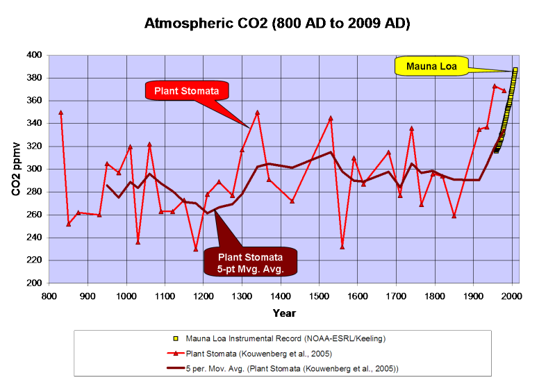
Kouwenberg et al., 2005 found that a “stomatal frequency record based on buried Tsuga heterophylla needles reveals significant centennial-scale atmospheric CO2 fluctuations during the last millennium.”
Plant stomata data show much greater variability of atmospheric CO2 over the last 1,000 years than the ice cores and that CO2 levels have often been between 300 and 340ppmv over the last millennium, including a 120ppmv rise from the late 12th Century through the mid 14th Century. The stomata data also indicate higher CO2 levels than the Mauna Loa instrumental record; but a 5-point moving average ties into the instrumental record quite nicely…

A survey of historical chemical analyses (Beck, 2007) shows even more variability in atmospheric CO2 levels than the plant stomata data since 1800…

WHAT DOES IT ALL MEAN?
The current “paradigm” says that atmospheric CO2 has risen from ~275ppmv to 388ppmv since the mid-1800’s as the result of fossil fuel combustion by humans. Increasing CO2 levels are supposedly warming the planet…

However, if we use Moberg’s (2005) non-Hockey Stick reconstruction, the correlation between CO2 and temperature changes a bit…

Moberg did a far better job in honoring the low frequency components of the climate signal. Reconstructions like these indicate a far more variable climate over the last 2,000 years than the “Hockey Sticks” do. Moberg also shows that the warm up from the Little Ice Age began in 1600, 260 years before CO2 levels started to rise.
As can be seen below, geologically consistent reconstructions like Moberg and Esper are in far better agreement with “direct” paleotemperature measurements, like Alley’s ice core reconstruction for Central Greenland…

In fairness to Dr. Mann, his 2008 reconstruction did restore the Medieval Warm Period and Little Ice Age to their proper places; but he still used Mike’s Nature Trick to slap a hockey stick blade onto the 20th century.
What happens if we use the plant stomata-derived CO2 instead of the ice core data?

We find that the ~250-year lag time is consistent. CO2 levels peaked 250 years after the Medieval Warm Period peaked and the Little Ice Age cooling began and CO2 bottomed out 240 years after the trough of the Little Ice Age. In a fashion similar to the glacial/interglacial lags in the ice cores, the plant stomata data indicate that CO2 has lagged behind temperature changes by about 250 years over the last millennium. The rise in CO2 that began in 1860 is most likely the result of warming oceans degassing.
While we don’t have a continuous stomata record over the Holocene, it does appear that a lag time was also present in the early Holocene…

Once dissolved in the deep-ocean, the residence time for carbon atoms can be more than 500 years. So, a 150- to 200-year lag time between the ~1,500-year climate cycle and oceanic CO2 degassing should come as little surprise.
CONCLUSIONS
-
Ice core data provide a low-frequency estimate of atmospheric CO2 variations of the glacial/interglacial cycles of the Pleistocene. However, the ice cores seriously underestimate the variability of interglacial CO2 levels.
-
GEOCARB shows that ice cores underestimate the long-term average Pleistocene CO2 level by 36ppmv.
-
Modern satellite data show that atmospheric CO2 levels in Antarctica are 20 to 30ppmv less than lower latitudes.
-
Plant stomata data show that ice cores do not resolve past decadal and century scale CO2 variations that were of comparable amplitude and frequency to the rise since 1860.
Thus it is concluded that:
-
CO2 levels from the Early Holocene through pre-industrial times were highly variable and not stable as the Antarctic ice cores suggest.
-
The carbon and climate cycles are coupled in a consistent manner from the Early Holocene to the present day.
-
The carbon cycle lags behind the climate cycle and thus does not drive the climate cycle.
-
The lag time is consistent with the hypothesis of a temperature-driven carbon cycle.
-
The anthropogenic contribution to the carbon cycle since 1860 is minimal and inconsequential.
Note: Unless otherwise indicated, all of the climate reconstructions used in this article are for the Northern Hemisphere.
References
Anklin, M., J. Schwander, B. Stauffer, J. Tschumi, A. Fuchs, J.M. Barnola, and D. Raynaud, CO2 record between 40 and 8 kyr BP from the GRIP ice core, Journal of Geophysical Research, 102 (C12), 26539-26545, 1997.
Wagner et al., 1999. Century-Scale Shifts in Early Holocene Atmospheric CO2 Concentration. Science 18 June 1999: Vol. 284. no. 5422, pp. 1971 – 1973.
Berner et al., 2001. GEOCARB III: A REVISED MODEL OF ATMOSPHERIC CO2 OVER PHANEROZOIC TIME. American Journal of Science, Vol. 301, February, 2001, P. 182–204.
Kouwenberg, 2004. APPLICATION OF CONIFER NEEDLES IN THE RECONSTRUCTION OF HOLOCENE CO2 LEVELS. PhD Thesis. Laboratory of Palaeobotany and Palynology, University of Utrecht.
Wagner et al., 2004. Reproducibility of Holocene atmospheric CO2 records based on stomatal frequency. Quaternary Science Reviews 23 (2004) 1947–1954.
Esper et al., 2005. Climate: past ranges and future changes. Quaternary Science Reviews 24 (2005) 2164–2166.
Kouwenberg et al., 2005. Atmospheric CO2 fluctuations during the last millennium reconstructed by stomatal frequency analysis of Tsuga heterophylla needles. GEOLOGY, January 2005.
Van Hoof et al., 2005. Atmospheric CO2 during the 13th century AD: reconciliation of data from ice core measurements and stomatal frequency analysis. Tellus (2005), 57B, 351–355.
Rundgren et al., 2005. Last interglacial atmospheric CO2 changes from stomatal index data and their relation to climate variations. Global and Planetary Change 49 (2005) 47–62.
Jessen et al., 2005. Abrupt climatic changes and an unstable transition into a late Holocene Thermal Decline: a multiproxy lacustrine record from southern Sweden. J. Quaternary Sci., Vol. 20(4) 349–362 (2005).
Beck, 2007. 180 Years of Atmospheric CO2 Gas Analysis by Chemical Methods. ENERGY & ENVIRONMENT. VOLUME 18 No. 2 2007.
Loulergue et al., 2007. New constraints on the gas age-ice age difference along the EPICA ice cores, 0–50 kyr. Clim. Past, 3, 527–540, 2007.
DATA SOURCES
CO2
Etheridge et al., 1998. Historical CO2 record derived from a spline fit (75 year cutoff) of the Law Dome DSS, DE08, and DE08-2 ice cores.
NOAA-ESRL / Keeling.
Berner, R.A. and Z. Kothavala, 2001. GEOCARB III: A Revised Model of Atmospheric CO2 over Phanerozoic Time, IGBP PAGES/World Data Center for Paleoclimatology Data Contribution Series # 2002-051. NOAA/NGDC Paleoclimatology Program, Boulder CO, USA.
Kouwenberg et al., 2005. Atmospheric CO2 fluctuations during the last millennium reconstructed by stomatal frequency analysis of Tsuga heterophylla needles. GEOLOGY, January 2005.
Lüthi, D., M. Le Floch, B. Bereiter, T. Blunier, J.-M. Barnola, U. Siegenthaler, D. Raynaud, J. Jouzel, H. Fischer, K. Kawamura, and T.F. Stocker. 2008. High-resolution carbon dioxide concentration record 650,000-800,000 years before present. Nature, Vol. 453, pp. 379-382, 15 May 2008. doi:10.1038/nature06949.
Royer, D.L. 2006. CO2-forced climate thresholds during the Phanerozoic. Geochimica et Cosmochimica Acta, Vol. 70, pp. 5665-5675. doi:10.1016/j.gca.2005.11.031.
TEMPERATURE RECONSTRUCTIONS
Moberg, A., et al. 2005. 2,000-Year Northern Hemisphere Temperature Reconstruction. IGBP PAGES/World Data Center for Paleoclimatology Data Contribution Series # 2005-019. NOAA/NGDC Paleoclimatology Program, Boulder CO, USA.
Esper, J., et al., 2003, Northern Hemisphere Extratropical Temperature Reconstruction, IGBP PAGES/World Data Center for Paleoclimatology Data Contribution Series # 2003-036. NOAA/NGDC Paleoclimatology Program, Boulder CO, USA.
Mann, M.E. and P.D. Jones, 2003, 2,000 Year Hemispheric Multi-proxy Temperature Reconstructions, IGBP PAGES/World Data Center for Paleoclimatology Data Contribution Series #2003-051. NOAA/NGDC Paleoclimatology Program, Boulder CO, USA.
Alley, R.B.. 2004. GISP2 Ice Core Temperature and Accumulation Data. IGBP PAGES/World Data Center for Paleoclimatology Data Contribution Series #2004-013. NOAA/NGDC Paleoclimatology Program, Boulder CO, USA.
VEIZER d18O% ISOTOPE DATA. 2004 Update.
Some extra thought, as I have little time now (family health problems): can you analyse two parts of the emissions series and see if the frequencies match? If they don’t match, then there is a problem with the variancy of the emissions data, which may be spurious (accuracy of the inventories not high enough for frequency analyses)…
Ferdinand,
there’s a free statistics and data analysis spreadsheet package Kyplot (later versions commercialized) that according to this download website:
http://www.pricelesswarehome.org/WoundedMoon/win32/kyplot.html
does various analyses of time series. It also reads datafiles made in Excel.
I use it for basic statistical functions, as it produces neat table of min, max values, SE, SD and mean when I select the dataset column and hit “descriptive statistics” without the necessity to ask for all of these values separately as in Excel.
“…a simple sum like a mass balance renders …”
But, it DOESN’T, Ferdinand. The mass balance tells you next to nothing, because you do not have a closed set of sources and sinks. You can have an amount A going in, and amount B going out, and the total is
T = A – B
You note T is rising, so you conclude A is contributing to the rise.
But, there is another source C of which you are currently unaware so the total is
T = A – B + C
T is increasing, so all you know is A + C is greater than B. But, that tells you nothing about A, just about A + C. For all you know, A = B, and all the increase is completely from C.
It has to be this way, i.e., there has to be an unaccounted source. Why? Because WE KNOW A is not a significant contributor to T, because we cannot see its fingerprint in T.
Forget statistical analysis. Statistical analysis tools are built up based on assumptions which only hold for specific kinds of signals. A linear regression, for example, assumes data which are linear, corrupted by independent, uncorrelated noise. This is not uncorrelated noise. It is a bunch of coherent sinusoidal oscillations.
…”family health problems”…
I regret any discomfort and hope these have been resolved.
“…can you analyse two parts of the emissions series and see if the frequencies match…”
They do, but with less resolution at the lower frequency end, as one would expect. But, I do not agree that would bespeak a problem with the emissions data, in any case. It is reasonable that transient events, e.g., WWII, could impart their own specific imprints. But, that imprint still has to show up in the output.
I think the key thing here is that you need to back off a little from the certainty that you have that it is unlikely for two quantities to integrate into superficially similar-looking curves. I will see if I can work up an example for you, but the basic thing is, for any two curves with shallow curvature, it is always possible to make them look similar via translation and scaling alone. Well, wait, I can do it right here. Let one series be
X = t + 0.1*t^2
and another be
Y = t + 0.2*t^2
Plot it out from t = 0 to 100. Big difference, eh?
Now, plot
Z = -17.266+1.9145*X
and plot Y. Wow! Z looks just like Y! How did I do that? I simply did a linear regression on Y versus X. Least squares curve fits are, as I have mentioned, amazingly robust.
Bart says:
January 6, 2011 at 1:51 pm
T = A – B
You note T is rising, so you conclude A is contributing to the rise.
But, there is another source C of which you are currently unaware so the total is
T = A – B + C
T is increasing, so all you know is A + C is greater than B. But, that tells you nothing about A, just about A + C. For all you know, A = B, and all the increase is completely from C.
We have been many times over this, but again:
T = A – B + C
The important point in this case is that A is greater than T. That means, whatever other increase is at work (even magnitudes larger than A), B is larger in absolute value than C, thus any increase of C (by one of its components) is compensated by an increase in B:
T = A – (B – C)
where B is the sum of all natural sinks (B1 + B2 + B3 +…) and C is the sum of all natural sources (C1 + C2 + C3 +…) and B larger than C.
This is the case for at least the past 50+ years of accurate measurements, even taken into account the uncertainty of the emission estimates and the atmospheric CO2 measurements. Except for one year (1973), where the emissions and increase in the atmosphere are borderline equal within the uncertainty of the data.
Of course you can say that one of the natural incoming flows (C1 or C2 or… e.g. ocean temperature driven) is the cause of the increase, but then you are mixing part of the natural + human emissions + natural sinks together at one side and one natural emission at the other side. But we are comparing the influence of the human emissions with the total of what nature does: nature is a net sink for CO2, at least in the past 50+ years. And that is the only point which counts.
Thus A is not only contributing to the rise, it is the only cause of the rise. But the speed of the rise is modulated by other (natural) variables, mainly temperature. This may contribute to the (integrated) total rise, but as we know from the (far) past, the contribution is limited to about 8 ppmv/°C, thus the temperature increase from the LIA to the current warm period of about 1°C has had a maximum contribution of 8 ppmv of the 100 ppmv rise since 1850 (or 60 ppmv since 1959).
There are far more indications that the emissions are really the cause of the increase, but that is more than enough discussed…
I regret any discomfort and hope these have been resolved.
My wife was recently diagnosed with a very rare combination of immune deficiency and lung fibrosis (but luckily not an aggresive form – yet). The first attempt to add immunoglobulines (a mix obtained from blood samples of other persons) failed, due to an allergic reaction. But the second attempt yesterday did succeed. So there is hope, but still quite scaring…
Because WE KNOW A is not a significant contributor to T, because we cannot see its fingerprint in T.
Regardless if the emissions are a small or the only contributor to the increase, the fingerprint should be visible, as all emissions go into the atmosphere by definition. 8 GtC/yr is significant, even if the main atmospheric exchanges with other reservoirs are around an order of magnitude higher, but the net year by year variability of the total is only +/-3 GtC. But there may be reasons why the fingerprint is missing:
Most of the emissions are over land where most of the exchanges between vegetation and atmosphere occur. These exchanges are local/regional and huge and may suppress the differences caused by the emissions, before the resultant CO2 levels reach the bulk of the atmosphere, where the background measurements like Mauna Loa are done. See e.g. a few days in the summer at Giessen (Germany) where local/regional traffic, and vegetation and to a lesser extent industry show huge day/night differences, due to night inversion and plant respiration and daylight photosynthesis. Despite that the daylight traffic/industry releases are quite higher than at night time, the daylight levels are below background, suppressing any addition from human sources:
http://www.ferdinand-engelbeen.be/klimaat/klim_img/giessen_background_zero.jpg
Thus the emissions during daylight may not even reach the background atmosphere.
Detailed measurements at Diekirch (Luxemburg) show the influence of wind and traffic, including many interesting patterns:
http://meteo.lcd.lu/papers/co2_patterns/co2_patterns.html
Thus the fingerprint of the human emissions may not show up, while still the cause of the increase, because the variability is suppressed by confounding variables and heavy filtering.
X = t + 0.1*t^2
Y = t + 0.2*t^2
Z = -17.266+1.9145*X
I am very well aware of spurious correlations, but in this case, there is:
– reason for a cause and effect relationship.
– a mass balance which doesn’t allow a second (natural) addition, whithout compensation for the same amount as extra natural sink.
– no known natural cause.
– all known natural variables vary in a much more stochastic way, not as smooth as seen in this case.
– any other natural variable which should give the same performance should have the same starting point and the same increase rate a (rather fixed) % of the emissions.
EW says:
January 6, 2011 at 4:51 am
Ferdinand,
there’s a free statistics and data analysis spreadsheet package Kyplot (later versions commercialized) that according to this download website:
Thanks a lot, looks promising and even works on the newer versions of Windows (the horrible Vista in my case). Will take a few days to learn the tricks again…
“The important point in this case is that A is greater than T. That means, whatever other increase is at work (even magnitudes larger than A), B is larger in absolute value than C, thus any increase of C (by one of its components) is compensated by an increase in B:”
You could just as easily say:
“The important point in this case is that C is greater than T. That means, whatever other increase is at work (even magnitudes larger than C), B is larger in absolute value than A thus any increase of A (by one of its components) is compensated by an increase in B:”
i.e., the problem is symmetric in A and C.
“Thus the fingerprint of the human emissions may not show up, while still the cause of the increase, because the variability is suppressed by confounding variables and heavy filtering.”
Very unlikely. Almost perfect filtering like that rarely arises spontaneously in nature.
Very sorry about your wife’s condition. I hope it stays manageable. What a drag it is getting old.
Bart says:
January 7, 2011 at 9:42 am
You could just as easily say:
“The important point in this case is that C is greater than T. That means, whatever other increase is at work (even magnitudes larger than C), B is larger in absolute value than A thus any increase of A (by one of its components) is compensated by an increase in B:”
The difference is that in such a case any increase of the human emissions need to be compensated by a natural sink, as there are near no human sinks (except some attempts to reforestation). Thus even if you mix up human emissions with natural sinks, nature as a whole is a net sink for CO2 and adds nothing to the total amount of CO2 in the atmosphere.
Very unlikely. Almost perfect filtering like that rarely arises spontaneously in nature.
In this case, there is a lot of filtering at work: even when the main exchanges are 90 GtC (oceans) and 60 GtC (vegetation) back and forth over the seasons, these streams are countercurrent and the real variability over the seasons is 5-10 GtC, a magnitude lower. For the emissions, the filtering starts already in the next nearby tree…
But anyway, if the frequency of the human emissions doesn’t show up in the increase in the atmosphere, that shows that the variability is filtered out (if the variations are not spurious) and it also shows that one can’t say that the lack of fingerprint proves that the emissions are not the cause of the increase.
Bart says:
January 7, 2011 at 9:44 am
Very sorry about your wife’s condition. I hope it stays manageable. What a drag it is getting old.
Thanks, until now it is manageable, much will depend of the evolution of the lung fibrosis…
Ferdinand,
Like Bart, I am sorry to hear about your wife’s sickness and hope the treatment is very successful.
Bart says:
Well, I guess robustness is in the eyes of the beholder. Sure, if you start out with two functions of very similar form…and then you look at them over a scale where one of the two terms dominates the other except when the function is very small on that scale, then linear regression can work wonders. However, I played around with your example and found:
(1) The amazing agreement of the regression becomes considerably less amazing (although still pretty good) if you restrict things (i.e., both the plot and the regression) to t over the range 0 to 15, so neither the linear nor quadratic term are completely dominant.
(2) However, once you start making modifications to one of the functions, it really starts to get worse in a hurry. For example, keep X the same but try Y = t + 0.15*t^2 + 0.015*t^3 over the interval t = 0 to 10 or Y = exp(0.35*t) – 1 over that same interval.
And, of course, this is still limiting ourselves to Y functions that have a positive slope and a positive curvature…which already makes us ask the question of why during the period when we have been increasing fossil fuels emissions, has the carbon dioxide concentration decided to behave in this general way? What a happy coincidence!
Finally, one should note that linear regression is easier if the coefficients don’t have any constraints on the basis of physical understanding. However, it seems strange to me that not only has CO2 concentration decided to behave like a function of very similar shape to emissions but it has chosen to do so in a way where the rate of rise makes physical sense (e.g., it corresponds to 1/2 the emissions remaining in the atmosphere rather than rising at 10X that rate) and that other empirical evidence and modeling allow us to understand at least roughly how the biosphere and ocean mixed layer are taking up the other half.
So, is conceivable just on the basis of pure chance that one could have a spurious correlation? Sure…It is conceivable but hardly likely. And, additional physical understanding and empirical evidence basically tell us that the correlation is not in fact spurious in this case.
“Thus even if you mix up human emissions with natural sinks, nature as a whole is a net sink for CO2 and adds nothing to the total amount of CO2 in the atmosphere.”
You are arguing in circles, my friend.
“…that shows that the variability is filtered out…”
One other thing I just realized… such a low bandwidth filter would have considerable phase lag, i.e., lengthy delay between emissions and measurement. On the order of perhaps 20 years or more. But, it goes directly into the atmosphere and is measurable then, you say? Well, then, there is no filtering going on. You cannot have both heavy, low-pass filtering and immediate response in a causal system.
I think we’ve gone about as far as we can here. Until next time…
Joel Shore says:
January 7, 2011 at 11:47 am
“…why during the period when we have been increasing fossil fuels emissions, has the carbon dioxide concentration decided to behave in this general way? What a happy coincidence!”
It either had to have positive or negative curvature. For crying out loud, flip a coin. It came up heads? BFD.
BTW: I think the fit over 0-15 looks just as good as the fit between accumulated emissions and measurements.
Bart says:
But, why is it going up at all…Or, why is it not just going up and down with no pronounced trend or why is it not cyclical? And, why does the rate of increase just happen to be some reasonably-sized fraction of what we are emitting?
Bart says:
January 7, 2011 at 2:29 pm
You are arguing in circles, my friend.
Nothing circular here. Whatever mix you make, nature as a whole is a net sink for CO2. Not only vegetation (as proven by the O2 balance) but also the oceans (as proven by long time measurements over the oceans). That are the only fast and huge natural sources/sinks known (volcanoes have a very limited contribution), but even if there were other extra natural sources, these need to be compensated by (an)other natural sink(s), or you would see an increase larger than the emissions alone. You can’t explain the less than emissions increase in the atmosphere with any increase in net emissions from natural flows.
But, it goes directly into the atmosphere and is measurable then, you say? Well, then, there is no filtering going on. You cannot have both heavy, low-pass filtering and immediate response in a causal system.
I think it is even simpler: the variability around the trend for the years that the emission estimates are somewhat better (and we have accurate measurements) is too small: the residuals around a simple polynomial 1959-2006 all are less than the error in the estimates of the emissions (-0.24 to +0.49 GtC, 2010 higher at +0.70 GtC for an error range in the estimates -0.5 to +1.0 GtC). The same for the atmospheric measurements: if we may assume that half the variability is left in the atmosphere, then all emission induced variability is within the accuracy of the measurements (+/- 0.4 GtC).
Thus the frequency seen in the emissions may be completely spurious and the measurements in the atmosphere are simply not accurate enough to detect the frequencies caused by the emissions, even if these are not spurious. In addition, the variability (and frequencies) of other (natural) variables also suppresses/overrides the much smaller variability of the emissions.
2010 higher at +0.70
must be
2006 higher at +0.70
Joel-
“Or, why is it not just going up and down with no pronounced trend or why is it not cyclical?”
How do you KNOW it isn’t? We only have good data since 1958 (no, I do not trust the ice core data at all – we have no direct confirmation of it, no way to “close the loop” on those observations).
“And, why does the rate of increase just happen to be some reasonably-sized fraction of what we are emitting?”
Why not? “Reasonably sized” is a rather large portion of the available distribution, so it’s not like it’s some fantastically unlikely occurrence. Or, do you think the fraction is consistent with some hypothesized model? Consistency with some particular hypothesis is not proof of that hypothesis, and models are malleable.
Ferdinand –
“I think it is even simpler…”
It cannot be in this universe based on mathematical laws we know hold. A low bandwidth system must have significant phase delay. There is just no way around it.
The only out I see is that the emissions data could be very flawed, and the cyclical correlations almost entirely spurious. But, if the data are that flawed, how can we rely on them at all?
I do not expect to sway you two to my POV. I just hope to make you consider that what you have assumed to be “certain” may not be so much a slam dunk as you have thought. Time will tell…
Joel –
A note on this: “For example, keep X the same but try Y = t + 0.15*t^2 + 0.015*t^3 over the interval t = 0 to 10 or Y = exp(0.35*t) – 1 over that same interval.”
This is a matter of scale. The curve might look like that with time measured in, say, centuries. But, if we are looking at slowly progressing processes, within a “very small” region, the series will be linear (the basis of differential calculus, you know), and in a somewhat larger region, quadratic (the basis of optimization via Newton iteration). We often model complex functions over short durations via Taylor series expansion, keeping the dominant terms, which tend first to be linear, then quadratic, then cubic, etc… That two signals tend to be quadratic over a given interval does not strike me as particularly weird, but rather common.
Bart says:
January 8, 2011 at 12:21 pm
How do you KNOW it isn’t? We only have good data since 1958 (no, I do not trust the ice core data at all – we have no direct confirmation of it, no way to “close the loop” on those observations).
There is a 20 year overlap between ice core CO2 data and direct measurements at the South Pole. Different ice cores (with quite different average temperature and accumulation speed) show the same CO2 levels (+/- 5 ppmv) over the same gas age periods. Stomata data show a similar change in CO2 level in the past century (as far as these are reliable). coralline sponges show a d13C decrease completely parallel with the CO2 level changes…
The only out I see is that the emissions data could be very flawed, and the cyclical correlations almost entirely spurious. But, if the data are that flawed, how can we rely on them at all?
The emission data are not flawed, they only have an error margin which is larger than the cyclic part of its behaviour. Or better said the other way out: the supposed cyclic parts are within the error margins of the estimates. The same for the atmospheric measurements. The cyclic behaviour is too small to be detected within the accuracy of the measurements or simply spurious. No need for huge filtering (but the huge countercurrent flows do that already over months, not years).
I just hope to make you consider that what you have assumed to be “certain” may not be so much a slam dunk as you have thought. Time will tell…
If all available evidence points in the same direction and every alternative explanation fails one or more observations, there is little doubt left that the proposed cause and effect is real.
“Different ice cores (with quite different average temperature and accumulation speed) show the same CO2 levels (+/- 5 ppmv) over the same gas age periods.”
I.e., a the data were calibrated to match over those overlapping periods, probably with some variety of least squares algorithm, and these methods, as we have discussed, are robust. It says little about how well they truly correlate. It says nothing about how the historical record matches. You accept these unsubstantiated declarations without necessary due diligence, Ferdinand.
“..they only have an error margin which is larger than the cyclic part of its behaviour.”
Which is substantial in comparison their apparent (but not necessarily real) secular components, too.
“The same for the atmospheric measurements.”
You really are clutching at straws, here. These are precise measurements.
“If all available evidence points in the same direction and every alternative explanation fails one or more observations…”
But, your explanation fails on the spectral fingerprint front. You just like it better. It is a completely subjective preference. And, you put undue and unmerited weight on the superficial similarity of scaled and translated integrated components.
We’re arguing in circles. I thought maybe I had made some headway, but this discussion appears to be a waste of your time and mine. Until we meet again…
Clarifications:
It says little about how well they truly correlate over such a short time (20 years being a mere hiccup in time). It says nothing about how the historical record matches due to spatial and temporal filtering within the layers.
The pattern is pretty clear, Ferdinand. You are a True Believer in data and analyses which reinforce your POV, no matter how shaky the foundations. You are skeptical of any which oppose it, no matter how well grounded.
On this: “The pattern is pretty clear…”
Just to head you off in case you want to try to turn the tables and accuse me of the same thing, remember, it was I who gave you the argument (in post at January 2, 2011 at 6:00 pm) which you are trying to use now to discount the emissions data.
Bart says:
I understand Taylor Series expansion. But, even if you restrict oneself to the consideration of data since 1958, you have about a 4-fold increase in the slope of the data, with the slope of at least one of the data sets starting from zero. So, over such a range, it is not at all surprising that a linear fit to the slope (i.e., a quadratic fit to the data) might not be so adequate.
And, like I said, there is no a priori reason why the CO2 level in the atmosphere should be rising at all, let alone with a positive second derivative, and let alone with both the positive slope and positive second derivative over the entire record.
Does it at all bother you that basically every serious scientist in the world who has looked at this disagrees with your conclusions, including many who do not believe that AGW is a big concern? It seems to me that one could always do what you have done, which is basically to just take the data to some point where something “breaks” (likely because you are taking the data beyond the point where it is reliable and you are ignoring complications such as the fact that this is a spatial-temporal and not just a temporal problem) and then elevate this over all the other wealth of data that should tell you that you are wrong, wrong, wrong. In fact, it is exactly what people have done when they don’t like the implications of some aspect of modern science.
Bart says:
January 8, 2011 at 4:42 pm
I.e., a the data were calibrated to match over those overlapping periods
No, the gas age timing is calculated (and measured for several high accumulation cores), the CO2 levels in gas inclusions are measured, not calibrated in any way. There is only an increasing smoothing inversely correlated with accumulation speed.
Which is substantial in comparison their apparent (but not necessarily real) secular components, too.
The error margin of the emission estimates are about -6 to +12% of the emissions. This is substantial for the variability around the trend, but of minor interest for the trend itself.
You really are clutching at straws, here. These are precise measurements.
The atmospheric measurements are very precise, +/- 0.4 GtC on a level of 800 GtC present in the atmosphere. But even then, the +/- 0.4 GtC (+/- 0.2 ppmv) is on the monthly averaged “cleaned” data where all non-background outliers (Mauna Loa: +/- 4 ppmv) were removed.
Even if the variability of the emissions around the trend is real, the result would be +/- 0.1 ppmv, largely within the accuracy of the measurements.
The pattern is pretty clear, Ferdinand. You are a True Believer in data and analyses which reinforce your POV, no matter how shaky the foundations. You are skeptical of any which oppose it, no matter how well grounded.
If all (logical) evidence points into one direction (even if I would like the opposite result: if there is no connection between the rise of CO2 and the emissions, then AGW fails completely) and one observation fails, it is best to have an extra look into that observation if there are no problems with it (as good as it is best to look at the probems of all observations).
In this case it seems that the spectral fingerprint is too faint to be observed (and largely overprinted by another fingerprint – temperature in this case).
remember, it was I who gave you the argument (in post at January 2, 2011 at 6:00 pm) which you are trying to use now to discount the emissions data.
As I reacted a day earlier:
I am pretty sure that no “fine structure” can be found linking the real increase in sea level with the increase of the gauge [because the noise is much larger than the signal in this case].
And as I reacted on the same day:
There is very little variation in the year by year emissions, in the order of +/-0.4 GtC, without a clear frequency (maybe some 40 years if you go from one major economic crisis to the next, but even then). The effect of the variability of the other variable(s), mainly temperature, is in the order of +/- 2 GtC, or a fivefold the variability of the emissions, this completely suppressing the effect of the variability of the emissions.
Maybe what I said was not clear enough: the frequencies of the emissions you see may be completely spurious or not, but the variability of other variables on the output is much larger and may suppress the result of the variability of the emissions (of which the result is within the error range of the measurements). Anyway, the fingerprint of temperature on the increase speed is clear, but doesn’t tell us anything about its influence on the increase itself. And it may overprint the fingerprint of the emissions variability.
As said, I need a few days to learn the Kyplot program and then come back with further analysis…
Ferdinand – “…may suppress the result of the variability of the emissions ….”
But, that variability of the emissions has a definite proportion to the “dc” component, which purportedly integrates into the secular increase. It is more than large enough that it should be seen above the noise floor of the measurement data. That is why I expressed my expansions in a form in which you could easily see the relative proportions of the coefficients.
Joel –
“Does it at all bother you that basically every serious scientist in the world who has looked at this disagrees with your conclusions, including many who do not believe that AGW is a big concern?”
Argument from authority is the last refuge of scoundrels. If you do not have confidence in your own abilities, then you shouldn’t be in the game.
“In fact, it is exactly what people have done when they don’t like the implications of some aspect of modern science.”
Ah, so you are the fearless defender of Science against me, the lowly Flat-Earther? Because, the depth of a person’s intellect is proportional to the speed with which he abdicates his capacity for independent, rational thought?