Source: Mantua, 2000
The essay below has been part of a back and forth email exchange for about a week. Bill has done some yeoman’s work here at coaxing some new information from existing data. Both HadCRUT and GISS data was used for the comparisons to a doubling of CO2, and what I find most interesting is that both Hadley and GISS data come out higher in for a doubling of CO2 than NCDC data, implying that the adjustments to data used in GISS and HadCRUT add something that really isn’t there.
The logarithmic plots of CO2 doubling help demonstrate why CO2 won’t cause a runaway greenhouse effect due to diminished IR returns as CO2 PPM’s increase. This is something many people don’t get to see visualized.
One of the other interesting items is the essay is about the El Nino event in 1878. Bill writes:
The 1877-78 El Nino was the biggest event on record. The anomaly peaked at +3.4C in Nov, 1877 and by Feb, 1878, global temperatures had spiked to +0.364C or nearly 0.7C above the background temperature trend of the time.
Clearly the oceans ruled the climate, and it appears they still do.
Let’s all give this a good examination, point out weaknesses, and give encouragement for Bill’s work. This is a must read. – Anthony
Adjusting Temperatures for the ENSO and the AMO
A guest post by: Bill Illis
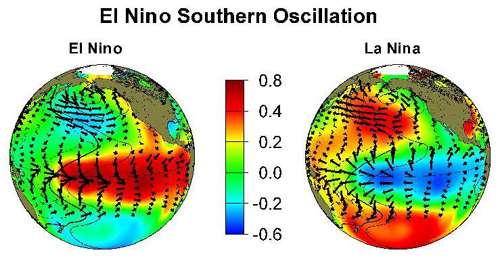
People have noted for a long time that the effect of the El Nino Southern Oscillation (ENSO) should be accounted for and adjusted for in analyzing temperature trends. The same point has been raised for the Atlantic Multidecadal Oscillation (AMO). Until now, there has not been a robust method of doing so.
This post will outline a simple least squares regression solution to adjusting monthly temperatures for the impact of the ENSO and the AMO. There is no smoothing of the data, no plugging of the data; this is a simple mathematical calculation.
Some basic points before we continue.
– The ENSO and the AMO both affect temperatures and, hence, any reconstruction needs to use both ocean temperature indices. The AMO actually provides a greater impact on temperatures than the ENSO.
– The ENSO and the AMO impact temperatures directly and continuously on a monthly basis. Any smoothing of the data or even using annual temperature data just reduces the information which can be extracted.
– The ENSO’s impact on temperatures is lagged by 3 months while the AMO seems to be more immediate. This model uses the Nino 3.4 region anomaly since it seems to be the most indicative of the underlying El Nino and La Nina trends.
– When the ENSO and the AMO impacts are adjusted for, all that is left is the global warming signal and a white noise error.
– The ENSO and the AMO are capable of explaining almost all of the natural variation in the climate.
– We can finally answer the question of how much global warming has there been to date and how much has occurred since 1979 for example. And, yes, there has been global warming but the amount is much less than global warming models predict and the effect even seems to be slowing down since 1979.
– Unfortunately, there is not currently a good forecast model for the ENSO or AMO so this method will have to focus on current and past temperatures versus providing forecasts for the future.
And now to the good part, here is what the reconstruction looks like for the Hadley Centre’s HadCRUT3 global monthly temperature series going back to 1871 – 1,652 data points.

I will walk you through how this method was developed since it will help with understanding some of its components.
Let’s first look at the Nino 3.4 region anomaly going back to 1871 as developed by Trenberth (actually this index is smoothed but it is the least smoothed data available).
– The 1877-78 El Nino was the biggest event on record. The anomaly peaked at +3.4C in Nov, 1877 and by Feb, 1878, global temperatures had spiked to +0.364C or nearly 0.7C above the background temperature trend of the time.
– The 1997-98 El Nino produced similar results and still holds the record for the highest monthly temperature of +0.749C in Feb, 1998.
– There is a lag of about 3 months in the impact of ENSO on temperatures. Sometimes it is only 2 months, sometimes 4 months and this reconstruction uses the 3 month lag.
– Going back to 1871, there is no real trend in the Nino 3.4 anomaly which indicates it is a natural climate cycle and is not related to global warming in the sense that more El Ninos are occurring as a result of warming. This point becomes important because we need to separate the natural variation in the climate from the global warming influence.

The AMO anomaly has longer cycles than the ENSO.
– While the Nino 3.4 region can spike up to +3.4C, the AMO index rarely gets above +0.6C anomaly.
– The long cycles of the AMO matches the major climate shifts which have occurred over the last 130 years. The downswing in temperatures from 1890 to 1915, the upswing in temps from 1915 to 1945, the decline from 1946 to 1975 and the upswing in temps from 1975 to 2005.
– The AMO also has spikes during the major El Nino events of 1877-88 and 1997-98 and other spikes at different times.
– It is apparent that the major increase in temperatures during the 1997-98 El Nino was also caused by the AMO anomaly. I think this has lead some to believe the impact of ENSO is bigger than it really is and has caused people to focus too much on the ENSO.
– There is some autocorrelation between the ENSO and the AMO given these simultaneous spikes but the longer cycles of the AMO versus the short sharp swings in the ENSO means they are relatively independent.
– As well, the AMO appears to be a natural climate cycle unrelated to global warming.

When these two ocean indices are regressed against the monthly temperature record, we have a very good match.
– The coefficient for the Nino 3.4 region at 0.058 means it is capable of explaining changes in temps of as much as +/- 0.2C.
– The coefficient for the AMO index at 0.51 to 0.75 indicates it is capable of explaining changes in temps of as much as +/- 0.3C to +/- 0.4C.
– The F-statistic for this regression at 222.5 means it passes a 99.9% confidence interval.
But there is a divergence between the actual temperature record and the regression model based solely on the Nino and the AMO. This is the real global warming signal.

The global warming signal (which also includes an error, UHI, poor siting and adjustments in the temperature record as demonstrated by Anthony Watts) can be now be modeled against the rise in CO2 over the period.
– Warming occurs in a logarithmic relationship to CO2 and, consequently, any model of warming should be done on the natural log of CO2.
– CO2 in this case is just a proxy for all the GHGs but since it is the biggest one and nitrous oxide is rising at the same rate, it can be used as the basis for the warming model.
This regression produces a global warming signal which is about half of that predicted by the global warming models. The F statistic at 4,308 passes a 99.9% confidence interval.

– Using the HadCRUT3 temperature series, warming works out to only 1.85C per doubling of CO2.
– The GISS reconstruction also produces 1.85C per doubling while the NCDC temperature record only produces 1.6C per doubling.
– Global warming theorists are now explaining the lack of warming to date is due to the deep oceans absorbing some of the increase (not the surface since this is already included in the temperature data). This means the global warming model prediction line should be pushed out 35 years, or 75 years or even 100s of years.
Here is a depiction of how logarithmic warming works. I’ve included these log charts because it is fundamental to how to regress for CO2 and it is a view of global warming which I believe many have not seen before.
The formula for the global warming models has been constructed by myself (I’m not even sure the modelers have this perspective on the issue) but it is the only formula which goes through the temperature figures at the start of the record (285 ppm or 280 ppm) and the 3.25C increase in temperatures for a doubling of CO2. It is curious that the global warming models are also based on CO2 or GHGs being responsible for nearly all of the 33C greenhouse effect through its impact on water vapour as well.

The divergence, however, is going to be harder to explain in just a few years since the ENSO and AMO-adjusted warming observations are tracking farther and farther away from the global warming model’s track. As the RSS satellite log warming chart will show later, temperatures have in fact moved even farther away from the models since 1979.

The global warming models formula produces temperatures which would be +10C in geologic time periods when CO2 was 3,000 ppm, for example, while this model’s log warming would result in temperatures about +5C at 3,000 ppm. This is much closer to the estimated temperature history of the planet.
This method is not perfect. The overall reconstruction produces a resulting error which is higher than one would want. The error term is roughly +/-0.2C but the it does appear to be strictly white noise. It would be better if the resulting error was less than +/- 0.2C but it appears this is unavoidable in something as complicated as the climate and in the measurement errors which exist for temperature, the ENSO and the AMO.
This is the error for the reconstruction of GISS monthly data going back to 1880.

There does not appear to be a signal remaining in the errors for another natural climate variable to impact the reconstruction. In reviewing this model, I have also reviewed the impact of the major volcanoes. All of them appear to have been caught by the ENSO and AMO indices which I imagine are influenced by volcanoes. There appears to be some room to look at a solar influence but this would be quite small. Everyone is welcome to improve on this reconstruction method by examining other variables, other indices.
Overall, this reconstruction produces an r^2 of 0.783 which is pretty good for a monthly climate model based on just three simple variables. Here is the scatterplot of the HadCRUT3 reconstruction.

This method works for all the major monthly temperature series I have tried it on.
Here is the model for the RSS satellite-based temperature series.

Since 1979, warming appears to be slowing down (after it is adjusted for the ENSO and the AMO influence.)
The model produces warming for the RSS data of just 0.046C per decade which would also imply an increase in temperature of just 0.7C for a doubling of CO2 (and there is only 0.4C more to go to that doubling level.)

Looking at how far off this warming trend is from the models can be seen in this zoom-in of the log warming chart. If you apply the same method to GISS data since 1979, it is in the same circle as the satellite observations so the different agencies do not produce much different results.

There may be some explanations for this even wider divergence since 1979.
– The regression coefficient for the AMO increases from about 0.51 in the reconstructions starting in 1880 to about 0.75 when the reconstruction starts in 1979. This is not an expected result in regression modelling.
– Since the AMO was cycling upward since 1975, the increased coefficient might just be catching a ride with that increasing trend.
– I believe a regression is a regression and we should just accept this coefficient. The F statistic for this model is 267 which would pass a 99.9% confidence interval.
– On the other hand, the warming for RSS is really at the very lowest possible end for temperatures which might be expected from increased GHGs. I would not use a formula which is lower than this for example.
– The other explanation would be that the adjustments of old temperature records by GISS and the Hadley Centre and others have artificially increased the temperature trend prior to 1979 when the satellites became available to keep them honest. The post-1979 warming formulae (not just RSS but all of them) indicate old records might have been increased by 0.3C above where they really were.
– I think these explanations are both partially correct.
This temperature reconstruction method works for all of the major temperature series over any time period chosen and for the smaller zonal components as well. There is a really nice fit to the RSS Tropics zone, for example, where the Nino coefficient increases to 0.21 as would be expected.

Unfortunately, the method does not work for smaller regional temperature series such as the US lower 48 and the Arctic where there is too much variation to produce a reasonable result.
I have included my spreadsheets which have been set up so that anyone can use them. All of the data for HadCRUT3, GISS, UAH, RSS and NCDC is included if you want to try out other series. All of the base data on a monthly basis including CO2 back to 1850, the AMO back to 1856 and the Nino 3.4 region going back to 1871 is included in the spreadsheet.
The model for monthly temperatures is “here” and for annual temperatures is “here” (note the annual reconstruction is a little less accurate than the monthly reconstruction but still works).
I have set-up a photobucket site where anyone can review these charts and others that I have constructed.
http://s463.photobucket.com/albums/qq360/Bill-illis/
So, we can now adjust temperatures for the natural variation in the climate caused by the ENSO and the AMO and this has provided a better insight into global warming. The method is not perfect, however, as the remaining error term is higher than one would want to see but it might be unavoidable in something as complicated as the climate.
I encourage everyone to try to improve on this method and/or find any errors. I expect this will have to be taken into account from now on in global warming research. It is a simple regression.
UPDATED: Zip files should download OK now.
SUPPLEMENTAL INFO NOTE: Bill has made the Excel spreadsheets with data and graphs used for this essay available to me, and for those interested in replication and further investigation, I’m making them available here on my office webserver as a single ZIP file
Downloads:
Annual Temp Anomaly Model 171K Zip file
Monthly Temp Anomaly Model 1.1M Zip file
Just click the download link above, save as zip file, then unzip to your local drive work folder.
Here is the AMO data which is updated monthly a few days after month end.
http://www.cdc.noaa.gov/Correlation/amon.us.long.data
Here is the Nino 3.4 anomaly from Trenbeth from 1871 to 2007.
ftp://ftp.cgd.ucar.edu/pub/CAS/TNI_N34/Nino34.1871.2007.txt
And here is Nino 3.4 data updated from 2007 on.
http://www.cpc.ncep.noaa.gov:80/data/indices/sstoi.indices
– Anthony
Brendan H says:
I suspect you do not know what it means by a model matches the theory nor do you understand the opportunities for errors in the model that cause it to depart from reality and the theory.
Can someone explain what this means with respect to surface temps lagging ocean temps? Do these lag times seem less than what was previously supposed? Does this model have any forecasting ability? I have always thought that the lag would be much smaller than was previously supposed since the oceans are so shallow when compared to Earth’s diameter. Does this work bear out that assumption? What does this work mean as far as heat being “in the pipeline”? Have you found the hiding place of the “missing heat”?
Thanks,
Mike Bryant
Yes, it’s crazy the Indian ocean data goes only to 2004. I’m sure it has been tracked since then.
Brendan H wrote:
Except that there’s no way to know if a model reached the “right” conclusion for the “right” reasons. There are probably thousands of ways one could theoretically match the known temperature record, but you’d never know which was the “right” way without fully understanding, and being able to perfectly model, ALL the parameters. And then you have to know ALL the causes and effects. Running 47 different models hundreds of times and picking the ones that “match” isn’t evidence of anything except chance.
Bill Illis http://holocene.meteo.psu.edu/shared/articles/MannLees1996.pdf The version I saw was scanned in. It has some interesting points you may wish to look at.
To Carl Wolk,
I noted in my write-up that there is some interaction between the AMO and the ENSO.
When you use the higher frequency figures over longer time periods without smoothing, however, (which I need to use to build a monthly model), you see that the longer-term cycles of the AMO and this new Antarctica DW index are reasonably independent of the ENSO.
There are some periods where the ENSO seems to have a lasting impact on the AMO, the 1997-98 El Nino for example. But there are many more periods where the two series are moving in opposite directions and where there is no impact or no lasting impact from a La Nina or an El Nino.
Here is a scatter plot of the higher frequency data with the ENSO regressed on the AMO. Obviously the relationship is much more complex than this scatter indicates but it does give you a general idea of why I am concluding they are independent.
http://img296.imageshack.us/img296/8033/ensoversusamoub1.png
The ENSO on AMO regression also leaves an error term which mostly preserves the original AMO cycle. (It is not quite the same, however, as some of the spikes are slightly reduced and the 1997-98 El Nino moves out a few months versus the original series.)
http://img296.imageshack.us/img296/6748/amoerrorrz7.png
There is less interaction with the other index I created/just made-up/have no basis to actually use/but does actually explain SH temps.
http://img296.imageshack.us/img296/3463/antdwerrorly1.png
I wonder if Bob and yourself could try damping down the smoothing and use a longer time series to see if there is a higher frequency more definitive relationship.
As some have noted I need to run some autocorrelation tests on the independent variables but I think relationship is too complicated to address properly and I need to do stationarity tests. There are 1652 data points, how many lags do I have to test? Do I need to do that for the Hadcrut3 observation dataset? GISS, RSS etc? I am running this method on all the temp series and the only issues to come up so far is the SH temps which I believe I have addressed and there is too much variation in the US lower 48 and the Arctic to produce reasonable results. I took quite a few statistics classes but it has been a long time since I have used any of it.
@ur momisugly Jeff Alberts (04:37:16) :
Fair enough, but by the same token, you can or should eliminate those models that don’t “match” the observed data or whose “match” is significantly poorer than others and that is what I find so interesting about Bill Illis’ efforts in that his simple and elegant model appears fit the observed data better than the “consensus” models.
To John Pittman
Thanks for the link to the Michael Mann paper. He did better work before he got into tree rings. I think he might have got into them as a result of the work he did on this paper. He needed check to see if the frequency repetitions occur farther back in time as well and he had to use “proxies” for that.
Well, I tried some of this out on my data and, sure enough, it is in here as well. (I saw some of this before when I was trying to test the lags and when I got to about 25 years, a cycle started appearing but I thought it was just a fluke. Nope, Mann got the same thing.)
These cycles show up in the Hadcrut3 dataset and in my residuals as well when I adjust out the impact of the ocean variables.
Since the numbers are so close to what would occur with the solar cycle, I played around with 5.5 year lags, 11 years, 22 years and 44 years. All these are in both datasets.
My skill set does not allow me go much beyond this.
Applying the rest of the techniques in Mann’s paper are in the same boat.
Fair enough, but by the same token, you can or should eliminate those models that don’t “match” the observed data or whose “match” is significantly poorer than others and that is what I find so interesting about Bill Illis’ efforts in that his simple and elegant model appears fit the observed data better than the “consensus” models.
But in that sense Bill’s effort isn’t a model (certainly not a predictive one). What he’s trying to demonstrate is that the temperature history can be fitted by a collection of observed anamolies for the ocean basin oscillations plus a warming trend which he accounts for by GHG. That basically doesn’t allow prediction, after all he’s just taken the anomalies without assigning cause (volcanos for example), if he were able to predict the ENSO, AMO etc. then that would be a model. It does suggest that the system could be modelled with a rather small number of regions though. It begs the question of what is left out, for example what happens if aerosols/albedo are added?
Looks like a very high sensitivity to solar changes despite the fact that we are very puzzled as to why that should be so.
Then combine solar with oceanic variation and who needs CO2 ?
Interesting that Bill sees episodes when ENSO and AMO are moving in opposite directions.
Just what I suggested in my various articles but additionally one has to consider all the global oceanic oscillations simultaneously and then work out the net effect.
Granted that most of the time the netted out effect of just ENSO and AMO would be sufficient (but not always).
Bill’s good work is a substantial first step in the right direction. Incorporate his numbers into the models and perhaps a little predictive skill might emerge.
To Phil and everyone.
The model does have a little predictive power.
First, there is the 3 month lag in the ENSO.
The ENSO had been cycling up from the La Nina depths until August but now it has gone neutral to slightly negative. This should provide for stable temps over the next three months (there is a slight decline but its too small to get into).
And the AMO might be cycling down now (the forecasts that are available show this as well). This would be a 20 to 30 year down cycle so it worthwhile watching the data as it comes out.
The Antarctic DW area is definitely cycling down now and it has been since 1990 or so. There is quite a bit of variation in this index so it would have to be tracked for several months at a time to see a trend though.
And well, CO2 is still increasing at a slightly exponential rate (although Methane and CFCs appear to have flatlined now) so there could continue to be increasing temps from global warming (0.00066C per month) but the rate will be a little slower than past numbers. That is an interestingly small number isn’t it.
This model says 0.455C anomaly for Hadcrut3 in November (up from 0.440C in October but the model was over by 0.013C in October so it could just stay at 0.440C). That is without an AMO or Ant DW change.
Thanks for the reply, Bill. If I interpret what you are are saying, the rate of change of temperature does not relate to rate of cgange in atmospheric CO2.
This suggest to me that CO2 is not a major climate forcer:-)
Don
Hi Bill,
It was the consensus models that I think need your numbers. I accept that your model now has some predictive value.
As regards the more or less neutral ENSO at present you still detect a small downward movement notwithstanding that.
Assuming that other negative oceanic influences are not the reason I would guess that the residual small decline is solar induced one way or another but I accept that the mechanism for such sensitivity to small solar changes is currently a puzzle.
I spoke to the Chief Exec of the RMetS recently and he agreed that a continuing fall in global temperatures notwithstanding a neutral ENSO might be significant. Although he did not say so I took that to mean that such a continuing fall would point to causes other than CO2 as the primary climate driver.
Brendan H:
There are several flaws in your reasoning, but one is so clear that I think an explanation of it is sufficient to enable you to understand that your argument is not correct.
You say to me:
“If a climate theory is a claim about what the climate does, and if the model describes the theory, then by your own logic the model attempts to show what the climate does.”
Yes, a climate model “attempts” to show what the climate does. But there can be no way of knowing if the model does “show what the climate does”. At best, all that can be said is the model seems to provide outputs that compare to “what the climate does”.
What the climate does is reality. And what the model does is what it has been designed to do.
As I said,
a theory is an idea, a model is a representation of the idea, and reality is something else.
Evidence concerning reality is provided by observing reality. And evidence concerning the performance of any scientific model is provided by comparing the output of the model to reality.
The output of a model can be taken as an indication of what evidence may be found if reality is examined. But it can only be accepted that a model provides such an indication when – and only when – the model has been shown to represent reality.
In other words, models do not provide evidence of reality (unless, of course, you believe in astrology).
I hope the matter is clear to you now.
Richard
Richard S Courtney says:
We can gain confidence in a model when it correctly predicts out-of-sample results, and the more it predicts, and the more accurately it does so, the more confidence we can have in it.
And the AMO might be cycling down now (the forecasts that are available show this as well). This would be a 20 to 30 year down cycle so it worthwhile watching the data as it comes out.
Really, looking at this pattern I’d expect it to be more likely to stay up for another 20 years!
http://en.wikipedia.org/wiki/Image:Amo_timeseries_1856-present.svg
That’s the point, you’re not making predictions, you’re guessing.
I may not have been clear about the ENSO 3.4 region numbers so here they are for the last several months:
Feb -1.860
Mar -1.080
Apr -0.850
May -0.580
Jun -0.320
Jul 0.110
Aug 0.140
Sep -0.200
Oct -0.260
We were coming out of La Nina quite rapidly in the spring, then it stalled at neutral in the summer but has gone back into slightly negative temps over the past few months.
With the 3 month lag, we will be affected in November by the change that happened from July to August. But these are very small numbers for the Nino region. It can be +/- 3.0C. The regressed coefficient says the impact is 0.07 * the change of 3 months ago, so in other words, a very small number. The total decline in the next 3 months will be 0.026C (by January).
[I know it is a little hard to accept this 3 month lag but this is the general consensus in the community and it really seems to occur in the data.]
Regarding the solar impact, we are at the bottom of the solar cycle right now and last month it appeared as though we might be coming out of it and heading into solar cycle 24.
But there have been no new sunspots lately and I just had a look at the solar irradiance numbers and there is a continuing decline in the numbers again. Scary down according to Virgo. SORCE is not down so much but it is down too.
Up above, I said there was likely a solar cycle influence in my numbers. I don’t know how to tease it out properly but it is in there. It might actually be a little bigger than people think in fact.
To Phil,
Yeah, I’m guessing about the AMO but the Wiki graphic has a smoothing in it which makes it harder to see what is really going on.
This is the unsmoothed data (and I added some extra months so it is easier to see the recent trend).
http://img505.imageshack.us/img505/3448/newestamoxh6.png
Maybe it isn’t going down but it could be. The longer-term reconstructions show the cycles are not as regular as the current chart makes it look like.
Phil,
Can you repost those graphs of transmission in the presence of 380 and 760ppm of CO2 since the links you provided earlier don’t work.
Or better still, can you tell us how you generated them? Did you need an account? I checked out the site and it seems you need an account if you want to run graphs using multiple gasses …
Does anyone know if there are any studies on the earth’s albedo variation and the contribution of cloud and snow/ice cover to that variation?
I wonder if albedo variation provides for a greater insolation variance than few watts/m2 that each doubling in CO2 is supposed to cause?
Bill you may want to read some of this.
http://hadobs.metoffice.com/hadcrut3/HadCRUT3_accepted.pdf
AN interesting part….
The distribution of known adjustments is not symmetric — adjustments are more likely to be negative than positive. The most common reason for a station needing adjustment is a site move in the 1940-60 period. The earlier site tends to have been warmer than the later one — as the move is often to an out of town airport. So the adjustments are mainly negative, because the earlier record (in the town/city) needs to be reduced [Jones et al., 1985, Jones et al., 1986]. Although a real effect, this asymmetry is small compared with the typical adjustment, and is difficult to quantify; so the homogenisation adjustment uncertainties are treated as being symmetric about zero.
Richard Sharpe (15:25:27) :
Phil,
Can you repost those graphs of transmission in the presence of 380 and 760ppm of CO2 since the links you provided earlier don’t work.
OK I’m sorry the images disappeared!
Norm posted the following earlier, however because Norm is a geophysicist with some experience his opinion was felt by some to be authoritative. Here’s some data to refute his handwaving.
Here it is for earth conditions:
http://i302.photobucket.com/albums/nn107/Sprintstar400/CO2spectra.gif
Here’s a comparison of some spectral lines for Martian and Earth conditions:
http://i302.photobucket.com/albums/nn107/Sprintstar400/Mars-Earth.gif
A bit more than “almost no appreciable effect”!
Yes you do need an account to do the full calculations.
Bill Illis:
In response to your question about stationarity tests, you need to perform these tests on every variable in your model (dependent and independent).
The number of lags to use in your test is a judgment call based on the nature of the variable and your knowledge of climate theory. You must ask yourself this question: if an auto-regressive process were present in the data, over how many months would it be reasonable for such a process to last? Another way to look at it is to ask yourself: when considering the temperature anomaly for October 2008, how many previous months of temperature anomalies could reasonably be expected to be correlated with October 2008? The answer depends on how long certain random events will typically affect temperatures upwards or downwards for extended periods.
I am not a climate expert, so I don’t want to suggest a specific number of lags. However, based on the construction of your model (which includes the ENSO lagged by 3 months) you will likely need a minimum of 3 lags in your stationarity test for each variable, probably more.
Phil. you said, “That’s the point, you’re not making predictions, you’re guessing.”
From thesaurus.com:
Main Entry: PREDICTION
Part of Speech: noun
Definition: declaration made in advance
Synonyms: of event anticipation, augury, cast, conjecture, crystal gazing, divination, dope, forecast, forecasting, foresight, foretelling, fortune-telling, GUESS, horoscope, hunch*, indicator, omen, palmistry, presage, prevision, prognosis, prognostication, prophecy, soothsaying, surmising, tip, vaticination, zodiac
You could also accurately say, “That’s the point, you’re not guessing, you’re making predictions.”
Mike