
from: Modern Mechanix, September 1929
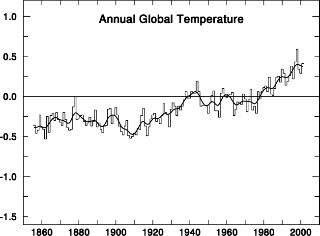
Over on Climate Audit, Steve McIntyre did a post about what HadCRU recently did to announce an “error” in their temperature series due to the significantly colder temperatures worldwide in January and February 2008. They made a bold front page announcement about it which you can see here and at left.

They announced:
We have recently corrected an error in the way that the smoothed time series of data were calculated. Data for 2008 were being used in the smoothing process as if they represented an accurate estimate of the year as a whole. This is not the case and owing to the unusually cool global average temperature in January 2008, the error made it look as though smoothed global average temperatures had dropped markedly in recent years, which is misleading.
Steve reports:
For their influential graphic showing smoothed temperature series, they used a 21-point binomial filter (this is reported) extrapolating the latest number for 10 years. This obviously places a lot of leverage on January and February temperatures. As has been widely reported, January and February 2008 temperatures are noticeably lower than last years.
He also made a graph to show the differences before and after HadCRU made the adjustments to their data:

Michael Ronayne pointed out to me today that this is not the first time HadCRU has modified their online graphs. In happened before in 2000 as the late John Daly reported:
CRU found that even with their disputed surface record, there was a sharp cooling in both hemispheres from a peak in 1998, but their global graph did not reflect this – instead it shows a resumed warming.
Daly created a blink comparator style graph to show the before and after change of the adjustment HadCRU made to the record:
Click for original graph
Back at Climate Audit, in comments, somebody asked some pointed questions about why this happens, suggesting less than honorable motives. Steve McIntyre doesn’t think so and writes:
The point is that these institutions seem far more alert to errors causing something to go down than to errors that cause something to go up.
I agree, and would attribute it to “expectation bias” on the part of the HadCRU data gatekeepers. Since they are English, I’ll use the tea analogy.
You are making tea. You put water to boil on the stove, light the fire, and set the teakettle on the burner, see that all is well, and go about your business.
You look over from your desk, you see the burner going, the kettle is making the pops and creaks as the metal expands due to increasing temperature. All is well, the temperature is rising.
In two minutes, and you begin to hear the chorus of small bubbles forming on the bottom. No need to look over, all is well. The temperature is rising.
In another minute, you hear bubbles, no need to look to see thin wisps of steam rising from the spout, all is well. The temperature is rising, water should be ready soon.
30 seconds later, the whistle begins, and you know the heating process (AGW) went perfectly. The water temperature went up as expected and there was no need to check the kettle or the stove during the process because the end result was expected based on the starting set of conditions.
But if the burner had gone out, just before the whistle, you wouldn’t notice it, for some time, until you realize the whistle never came. Then you’d get up from your chair to do something about it. Ah, the burner went out, the water is cold, we’ll move it to another burner that isn’t faulty.
All is well.
Expectation bias in temperature rise, the Lipton Tea of climate science.
To expand on a famous Ronald Reagan quote:
– For the GOP, every day is July 4th,
– For Dems, every day is April 15th,
– AND FOR AL GORE EVERY DAY IS APRIL 1ST !!
I think your tea-pot analogy is pretty close, except I don’t think this is really an ‘error’ at all
– the problem with dealing with deal points when filtering with multi-tap filters is so basic, and so well known, I don’t for a minute think that HadCRU were unaware of it
– it’s just that up to now, the (basic, simple, easy) solution they had produced the results they wanted/expected
– so they had no need to think of a better solution
– however, as soon as it produced results that didn’t fit with their expectations, they felt the need to find a solution that did produce results closer to their expectations
So, in the tea-pot analogy, you’re using an electric kettle, but you know that the wiring is faulty, but, what the heck it seems to work for now. Then one day it stops working, so you decide to use some duck-tape, and patch the wiring until it starts to give you the results you want again (i.e. heats the water)
Edit: I meant to say
” the problem with dealing with end-points…”
Thanks!
So, it’s all good, until the data doesn’t show what they want it to show, huh?
One of your graphs from a couple of weeks ago illustrates the step change in the HADCRUT data following the 97-98 El Nino and that it’s still there.
http://wattsupwiththat.files.wordpress.com/2008/02/giss-had-uah-rss_global_anomaly_12avg_1979-2008.png
When I first noticed it, it appeared the 97-98 El Nino caused a rise in global temperature that the subsequent series of La Ninas were not able to overcome. But the other three indices don’t have the step. Another one does, however, have indications that the 97-98 El Nino is still impacting high-latitude temperatures. It’s noticeable when you compare North Pole to the other northern hemisphere temperatures.
From UAH MSU data:
http://tinypic.com/fullsize.php?pic=zswazc&s=3&capwidth=false
And for those interested in the claims that the recent polar amplification is a result of greenhouse gases, here’s a graph that illustrates the amplification comes and goes over the instrument temperature record.
http://tinypic.com/fullsize.php?pic=29xgbh1&s=3&capwidth=false
“Expectation bias in temperature rise…”
“Informational cascades” in, “Oh… yeh… of course. I’d been thinking-“
Well don’t!
The above scenario also suggest (very strongly) that the “gatekeepers” are nothing more than high priced clerks (bureaucrats) who aren’t all that concerned with the seriousness of their actions.
I recall my days in the Navy when the Engineman/Boilerman on watch was charged with taking the hourly cooling water input temperatures. Little did we realize those very readings would be used in later years for establishing baselines from which today’s temperatures would be compared. The readings were sloppy and quite often just “dittoed” from one hour to another… at the end of the four hour watch. This sloppiness wasn’t just confined to our ship, it was epidemic. We would have made great candidates for HadCRU
Jack Koenig, Editor
The Mysterious Climate Project
http://www.climateclinic.com
One of the sub-plots in the book Jurassic Park by Michael Crichton was that the computer systems in the park monitored the dinosaurs by counting them. When the correct numbers of dinosaurs were accounted for, the computers stop counting and reported that all was well. As it was know that the dinosaurs could not reproduce no one programmed the computers to look for additional dinosaurs.
I have been working with some very advanced computer systems for over 45 years now and I am always amazed at how trusting people are of the results they generate. As long as the dinosaurs of Dr. Phil Jones et al were moving in the expected direction no one questioned the computer’s results. But I should not complain, cleaning up the aftermath keeps food on my family’s table and I get to play with a lot of interesting toys.
Mike
Their adjustments will continue month after month after month as the temperature record demonstrates that the January and February 2008 “abnormal” lows were no flash in the pan.
Yeah well…. I drink coffee….. an’ it’s th’ fruitcakes I worry about….
; ) *wink*
LOL
Anthony,
It appears
“…a graph to show the differences to show the before and after …”
should read
“…a graph to show the differences before and after …”
REPLY: Thanks for the catch, I have two young children who often tug on me while I’m writing posts, they come first, and sometime when I get back to writing I miss such things.
MattN : So, it’s all good, until the data doesn’t show what they want it to show, huh?
Yeah, that’s how I see it. All you have to do is understand where their money comes from. With skin in the game, what do you expect.
Interesting analogy, but the Brits HATE Lipton tea. It’s like raving about McDonald’s salads or Dunkin’ Donuts’ croissants. Yeeach.
To extend the analogy, 30 years ago, HadCRU’s parents were making iced tea.
REPLY: Well I thought about using Earl Grey, but this is an American blog. It could have been worse, I could have said Lipton Instant Tea 😉
I agree with the folks at HadCRU that the method they use for smoothing is “misleading”. Anytime you use a noncausal filter on real time data you will get misleading results because some value for the future data must be estimated.
I don’t agree that the smoothed values were in “error”. Instead, I would suggest they don’t yet have the smoothed values. The actual smoothed values won’t be known until the (currently future) data is in.
It is appropriate to state that the actual data is not yet known and let the data do the talking rather than correcting an “error”. Another possibility is to forgo displaying smoothed data points for the current time and only display the points that cannot change in the future because the data used to calculate those points is already measured.
The HADCRU is notorious for “tweaking” its PAST temperatures in the sense that you can easily imagine. Its global temperature graphs are in the successive IPCC report so it’s very easy to see the craftmanship.
For example this gif animation .
Say can give the temperature they want since raw station’s data and correction codes are not disclosed, despite several FOI complaints.
Bob Tisdale
How do you know that it was the El Nino that caused the warming? I think it it was the other way around, i.e. the warming caused the El Nino.
In Basil and Anthony’s Evidence of a Solar Imprint, they show in Figure 2 how the temperature trend correlates with solar cycles.
And notice how the Major ENSO events of 1876-78, 1891, 1925-26, 1982-83, and 1997-98 all occurred when the temperature Trends in Figure 2 are at, or very near, an upper peak.
Because temperature trends correlate so well with solar cycles, then it follows that the sun drives the temps – the El Ninos don’t. The El Ninos thus are generated by the temperature trends. In simple terms: The sun drives the temperature, which in turn drives the El Ninos. I think Figure 2 and the El Nino data confirm this.
El Ninos simply just don’t come out of the blue. They need heat to be born.
I keep hearing that El Ninos cause temperature spikes. You hear so often that 1998 was warm because of a strong El Nino. Nonsense!
Look at Figure 2. The 1998 El Nino occurred at the peak of the Temperature Trend, which occurred at the high point of sunspot cycle 23.
The big El Nino could not have caused the temperatuure to spike in 1998.
Does anyone have a different opinion?
Dan beat me to it – and as a Brit myself, I’d say PG Tips or Tetley would have been more characteristically British.
I had fun reading this tea analogy post, which I find a wonderful and amusing illustration of confirmation bias. Also enjoyed Michael Ronayne’s Jurassic Park reference.
I don’t have a science or maths background, more of a humanities background with a side interest in psychology; thus the technical stuff tends to go over my head, but I can readily appreciate posts that touch on the psychology of climate-related science.
I would like to say thanks to Anthony for his time and effort spent maintaining this blog; hopefully your work will help to counteract the alarmists and doomsayers who are trying to stampede us all.
The tea analogy fails to deal with motive. HADCRUT is motivated to produce data sets and analysis that supports the AGW hypothesis. The better analysis come from business fraud based on accounting records. HADCRUT cooked the books.
While I tend to shy away from conspiracy theories, April 1st is a good day to let my guard down. Doesn’t it seem suspicious that Hadley adjusted the data just before a new month’s datum is available? Assume March’s anomaly is more negative than the last few. That will depress the curve for either smoothing algorithm, but the old one will would still run below the “corrected” version. So, can we read the tea leaves and conclude that the March anomaly will be really cold? A warm anomaly could wipe out a whole year’s cooling, to misquote a misquote.
More realistically, I prefer Coaldust’s suggestion they don’t yet have the smoothed values. It might be fun to play with different smoothing algorithms, I bet there are good examples where you could demonstrate anything you wanted.
BTW, the phrase “Garbage in, garbage out” may apply to Lipton tea, but in today’s AGW science the real problem comes from “Garbage in, gospel out.”
Heck, we should be happy they even made the correction in the first place. They might just have easily run the old graph with a teeny asterik and a line of fune print on the bottom of the page.
Pierre Gosselin, We have had El Ninos and La Ninas outside of the temperature spikes. Perhaps it is not “the warming caused the El Nino,” but rather the warming strengthened the El Nino. The difference is whether or not an El Nino is a terrestrially caused event or if, as you suggest, it is borne from solar cycles.
John M Reynolds
For those that believe in fairy tales
http://www.greenpowerconferences.comcorporateclimateresponse/CCRLondon
Alex Cull,
Normally people who are into the humanities flock to the AGW alarmism side, as many, I guess, are not so technically well equipped to understand all the data, graphs, etc. It’s so much easier for many people to simply believe “CO2 goes up, then temps go up!”, and skip learning the science.
I’m curious. Which argument(s) convince(s) you that it’s all hysteria?
I really would like to know.
jmrSudbury
Perhaps it is so with the minor El Ninos. But the major el Ninos all seem to correlate well with the temperature trend peaks of Fig 2. Granted I haven’t looked at the small El Ninos and Ninas, as they are quite frequent.
Perhaps the small ones are caused in part by terrestial factors. But the major ones, I was surprised to see, correlate very closely with solar activity.
Then again, I also only looked back to 1878, and I should go further back to see if the correlation pans out.
Anthony,
In a recent look at the Michigan micro-climate, I ran a simple decadal tracking of February mean temperatures.
1900 ____16.3
1910 ____17.9 <—
1920 ____16.5
1930 ____26.9
1940 ____21.7
1950 ____20.0
1960 ____21.3
1970 ____18.3 <—
1980 ____17.6
1990 ____24.0
2000 ____26.8
2008 ____18.4 <—
It seems to me that there is a tendency… not an absolute rule… for the winters to follow the larger oscillations of the weather patterns. So, the 2008 downturn may be indicative of an overall downturn in the cool/warm/cool/warm cycles experienced during the 20th century.