UGA study ranks US cities based on the urban heat island effect on temperatures

From the UNIVERSITY OF GEORGIA
Highlights
- Urban heat island (UHI) intensities were estimated for the fifty most populous cities in the USA using PRISM climate data.
- The urban morphologies of the cities were quantified using spatial metrics and the NLCD 2006 land use/land cover dataset.
- The statistical analyses suggested that highly contiguous dense and sprawling urban development both enhance the UHI effect.
- City contiguity should be considered when devising strategies for UHI intensity mitigation.
- More discontiguous city configurations, especially if achieved by introducing urban green spaces, will likely reduce UHIs.
Athens, Ga. – Inner cities as well as suburbs show distinctly warmer temperatures–known as the urban heat island effect–than rural areas as a result of land use and human activities, which can affect rainfall, air quality and public health.
A University of Georgia study using a new method for calculating urban heat island intensities clarifies the conflict on whether urban density or sprawl amplify these effects more. It also provides a ranking of the top urban heat island cities among the 50 largest metropolitan statistical areas.
The urban heat island effect describes how the spatial configuration of cities, the materials in them (such as asphalt), lack of vegetation and waste heat can modify temperature.
The study, published in the journal Computers, Environment and Urban Systems, identifies Salt Lake City, Miami and Louisville as the top three urban heat island cities in the U.S.
Urban morphology–the patterns of a city’s physical configuration and the process of its development–has long been associated with the formation of urban heat islands. By examining the UHI intensities of 50 cities with various urban morphologies, the researchers evaluated the degree to which city configuration influences the UHI effect.
“The overall goal of our study was to clarify which urban form–sprawl or more-dense development–is most appropriate for UHI mitigation,” said the study’s lead author Neil Debbage, doctoral student in the Franklin College of Arts and Sciences’ department of geography.
The study establishes a method for estimating UHI intensities using PRISM–Parameter-elevation Relationships on Independent Slopes Model–climate data, an analytical model that creates gridded estimates by incorporating climatic variables (temperature and precipitation), expert knowledge of climatic events (rain shadows, temperature inversions and coastal regimes) and digital elevation.
The use of spatially gridded temperature data, rather than urban versus rural point comparisons, represents a new method for calculating a city’s canopy heat island intensity. The results identify the spatial contiguity of developed areas as a significant factor influencing the magnitude of the heat island effect.
“Not just whether cities have high-density development, but how the built infrastructure is connected–and disconnected by green spaces–has a great impact on heat island intensity,” said study co-author Marshall Shepherd, the UGA Athletic Association Distinguished Professor of Geography and Atmospheric Sciences.
“We found that more contiguous sprawling and dense urban development both enhanced UHI intensities. In other words, it does not appear to be a simplistic either-or situation regarding sprawl or density,” Debbage said.
The researchers hope the results can help influence local governments and city planners in the formulation of effective codes and policies to mitigate the urban heat island effect.
“It’s crucial to work toward a better understanding of the complex processes at the intersection of urbanization, climate and human health,” Shepherd said. “Current and future cities will be modified or designed with weather and climate in mind, and research at UGA will play a key role.
###
The study on “The Urban Heat Island Effect and City Contiguity” is available at http://www.sciencedirect.com/science/article/pii/S0198971515300089.
Abstract
The spatial configuration of cities can affect how urban environments alter local energy balances. Previous studies have reached the paradoxical conclusions that both sprawling and high-density urban development can amplify urban heat island intensities, which has prevented consensus on how best to mitigate the urban heat island effect via urban planning. To investigate this apparent dichotomy, we estimated the urban heat island intensities of the 50 most populous cities in the United States using gridded minimum temperature datasets and quantified each city’s urban morphology with spatial metrics. The results indicated that the spatial contiguity of urban development, regardless of its density or degree of sprawl, was a critical factor that influenced the magnitude of the urban heat island effect. A ten percentage point increase in urban spatial contiguity was predicted to enhance the minimum temperature annual average urban heat island intensity by between 0.3 and 0.4 °C. Therefore, city contiguity should be considered when devising strategies for urban heat island mitigation, with more discontiguous development likely to ameliorate the urban heat island effect. Unraveling how urban morphology influences urban heat island intensity is paramount given the human health consequences associated with the continued growth of urban populations in the future.
Discover more from Watts Up With That?
Subscribe to get the latest posts sent to your email.
How can the UHI effect be negative?
We need a re-name pronto. Urban Change Island just doesn’t flow off the tongue.
Urban Forcing?
Ah my young apprentice, the Forcing is strong within you
Mods … what happened to the Comments section in the previous article … “Proof-positive that AGW is not science… “World court should rule on climate science to quash sceptics, says Philippe Sands…” ???
If land use changes in a way that reduces the local temperature then you have negative UHI. I’m surprised there is so much negative UHI in the eastern U.S. How does Boston and Las Vegas have similar UHI? Makes me skeptical of the results, as does the obscure “city” outlines. The “city” of Las Vegas is apparently bigger than West Virginia.
I wondered the same thing – I can only assume (without time to read the paper) that it is suggesting that certain urban environments act as some form of heat soak (or sink) for the atmospheric temperature thereby lowering it? Weird! Will have to read it later!
won’t bother now – some blighter wants $41 from me to read it!
Doesn’t the negative area include Death Valley????
There is some discusson here suggesting the growth of trees and green areas may be relevant. https://diggingintheclay.wordpress.com/2012/05/13/examining-urban-heat-islands-part-2/
Without a city, Vegas would be barren desert wasteland. With the city, there is irrigation, golf courses, trees, waterfalls at casinos, gardens. I can see how the urbanization creates cooling there.
Las Vegas and Salt Lake City are both cities built in deserts. Why would one have a high UHI and the other a low value? Also, the urban areas in Utah (Wasatch Front) run north to south, but the areas highlighted go east to west and include Tooele County, which is mostly salt flats and Uintah County, which mostly mountains. This doesn’t make sense.
Anything is possible with models.
Good question, I was looking at the map and was scratching my head. They’ve got San Diego and Las Vegas as negative.
False temperature readings !!
How you may ask? If GISS is trying to make an adjustment…. so clearly if UHI is negative, we have to add a number to the temperature readings to “correct” them , making the temperature hotter, confirming the models !
;-}
It would be more funny if it weren’t so true.
May the Forcing be with you
Me likes, I’m stealing that one!
That’s the first thing I thought. It appears as though they are calculating the difference between the urban area, and the surrounding area, which is partially from UHI effects, but can also be from other effects such as land/sea breezes, different elevations, etc.
I doubt this paper would have been accepted in its current form if a meteorologist had reviewed it.
A very heavily irrigated Urban Area with a high density of trees relative to its surroundings would be plausible.
But it strains credibility that even the thickest of urban forests can counteract the high density of asphalt and concrete roads, parking lots, roof areas, glass boxed high-rises, and stupendous use of electrical and fossil fueled energy.
I live in West University, Texas, and tree rich enclave of Houston (Inner loop, SW of downtown). When you fly into Hobby on a clear night, right side window seat, West U is a black lake within a sea of city lights. The comparison is striking.
If cities are bright at night, then it is hard to believe they are anything but strong positive Heat Islands.
“If cities are bright at night, then it is hard to believe they are anything but strong positive Heat Islands.”
This observation is worth a Nobel Prize in Climatology. We don’t need to do anything more than look at a nighttime photo of the earth or any part of it. The brighter the artificial light the greater the heat island effect It is direct and obvious.
“If cities are bright at night, then it is hard to believe they are anything but strong positive Heat Islands.”
I think that night lighting is actually one way that urbanization is detected for anti-UHI adjustments.
I was wondering the same thing, about negative UHI. I live near one of the negative UHI cities but outside the metro area. This is the Raleigh-Durham, NC metro area. Looking at the map, I clearly recognize that each section is divided into counties. The best I can figure is that the UHI effect is averaged over entire counties and some of those counties in the metro area can have a lot of non-developed areas.
RDU is divided into several counties: Wake (Raleigh), Durham, Orange (Chapel Hill), Franklin, and Johnston. Wake and Johnston counties are very large. East and southwest of Raleigh but still in Wake county, there is still plenty of farmland. Franklin county, which borders Wake and Durham counties to the northeast and east respectively, is very rural for almost off the county, a lot of farmland. Johnston county is mostly rural too, except along a highway 70 and I-95 corridor. Northern Durham and southern Orange county are also lacking in subdivisions.
So, taking it all into account, if you average the UHI effect over all the counties in the metro area, it might actually result in a negative. If you consider only the places within a certain distance from the main cities in the metro area, I would bet there would be no negative UHI.
Clearly some GerryManndering going on to come up with a new algorithm. They didn’t like the UHI effect, so they have come up with a new, more expansive definition.
With LA and New York City being the most negative?
Don’t know what LA’s story is but I’m not surprised to see NYC negative. New York City may be a dense metropolis but it is also geographically unique, a giant 95% gravity fed evaporation tank. Its supply system brings in 1.2 billion USG/day of cool water through large underground pipes. City pressure can supply the first six stories of buildings by gravity alone. Everything about New York is huge, including the ~36 million gpd lost to leaks.
The intense greenhouse effect of water vapor and a never ending scream of trapped solar energy re-re-re-re-re-radiating between ground and troposphere has made NYC the hellish burning slag of molten metal it is today. Thank God for night time, when the beds solidify long enough to get a few hours’ rest.
For example, NYC has the Atlantic Ocean winds which sweep in definitely in winter which is tremendously cold because of it but also much of summer! I lived in Park Slope, Brooklyn, 40 years ago and was a member of the tree planting committee.
It was very hot there back then but look at today: very, very heavily treed streets with tons of shade everywhere! We planted many thousands of trees. Go to Bed-Stuy and you see few to no trees and the streets get very hot.
Go to Park Slope and Prospect Park and it is cool, with the ocean winds sweeping the place thanks to it being the highest point in Brooklyn and much of Long Island. There are many microclimates in NYC also like Coney Island where I lived for five years, too.
Some of the surface stations were in air-conditioned rooms rather than near the AC’s exhaust vents?
Take the -1.37, make it positive and add it to the other categories and would look about right. Based on experience here, looks like these numbers might have been adjusted like the rest of the temp data set to reflect a “no problem” on the globull warming meme.
I’m guessing they wanted negatives to roughly balance the positives. That would allow net UH to be discounteded as a cause of any rising world temperature. Every rise MUST be attributed to a GHG. And mostly to CO2.
The entire study probably hinges on how “we………..quantified each city’s urban morphology with spatial metrics.”
… and abracadabra!
UHI is negative in several circumstances. In some desert communities.
(google negative UHI for the relevant papers )
In areas where the urbanscape has vegetation and the rural land is Bare
In areas where the city sucks water from the surrounding rural area ( Oke did a study on this )
bare ground as a land class is actually warmer than urban land ( on average )
https://stevemosher.wordpress.com/2012/10/11/pilot-study-small-town-land-surface-temperature/
Basically it s a myth that UHI is always positive and always large.
Evaporation can counter a portion of the UHI, but then you have higher humidity, which especially in desert areas keeps the region hotter at night. Regardless, adding all that concrete, asphalt and massive heat sources will easily swamp the small affect of evaporation.
Once again Mosher has myth and reality reversed.
Steve, thanx for the link to your site. If I read the chart correctly, only a tiny fraction of the cities studied showed a negative UHI effect, and only during winter days. Right? If so, the huge majority of cities studied (large and small in size) showed moderate to very large, positive UHI effect.
Mark
“Evaporation can counter a portion of the UHI, but then you have higher humidity, which especially in desert areas keeps the region hotter at night. Regardless, adding all that concrete, asphalt and massive heat sources will easily swamp the small affect of evaporation.
Once again Mosher has myth and reality reversed.”
wrong.
start by reading all the papers this guy wrote
http://web.cecs.pdx.edu/~sailor/CV.pdf
Start with this one
http://link.springer.com/article/10.1007/s00704-008-0017-5
And you will see that urban areas ( portland in this case ) very often have areas of negative UHI
The point is when you hear the word “city” you think Concrete. Sorry, every city is not Hong Kong
The variablity is huge. Google LCZ sailor and Oke work
“Steve, thanx for the link to your site. If I read the chart correctly, only a tiny fraction of the cities studied showed a negative UHI effect, and only during winter days. Right? If so, the huge majority of cities studied (large and small in size) showed moderate to very large, positive UHI effect.”
No. Part of the problem is the monolithic view people have of “cities”
when you actually look at temperature across a city ( Like SF) you will find a wide range of temps from
negative UHI to postive UHI.
you people dont actually look.
I lived in the big blue (negative) Metro Boston UHI effect area I can attest that Steve is correct. The only trees left in New England are growing out of the asphalt in the cities. Cars are constantly running into them. The rest of New England is a beautiful sand desert.
Is a sarc tag needed ?
Steve Mosher, Funny, the UHI map from U of G shows San Francisco as a large positive UHI intensity. So, by your logic, the North Pacific High channeled cool air through the Golden Gate would be the cause for a non-existent negative UHI in San Francisco? The Zhang and Imhoff study referenced at your site (which I commented on, prior to your jerk-like snark) studied 45 NE US cities (you think they may have looked at Boston?), and found insignificant negative UHI, only in the 1-10 km2 size, and only during winter days. The U of G paper is likely bunk.
“you people don’t actually look”. Wrong once again.
I agree, Steven Mosher, that UHI can be negative and that the UHI is complex. But nationwide, it’s obvious that UHI is net positive in a big way. The adjustments that have UHI as a net negative strike me as absurd. Like someone said…just look at a night IR satellite pic.
It would not be too difficult to model the UHI vs geography on a city by city basis. Then roll back the geography and land use with time and calculate model temperature 10, 20, 50 years ago. Then you would have a scientific basis for temperature adjustments. This, of course, would make the past warmer, which is a “no-no” which is probably why it hasn’t been done.
Dang it, ISvalgaard beat me to that question….
Also curious; “The results indicated that the spatial contiguity of urban development, regardless of its density or degree of sprawl, was a critical factor that influenced the magnitude of the urban heat island effect.”
How can “spatial contiguity” not be geometrically related to urban development density?
air conditioning, duh!
/sarc
In desert landscapes we have created more green spaces and planted non-native trees everywhere.
However, with the California drought, they are encouraging the use of rock-scapes. Walking by these homes during the day, the heat coming off can be pretty intense.
CO2 is 400 ppm everywhere you go. CO2 can’t cause temperature differentials. Constants can’t cause change. These climate “scientists” should be forced to explain how 400 ppm in the city can cause a temperature differential with the 400 ppm rural areas. How can a constant 400 ppm cause such temperature differentials. Also, those temperature records are made during the daytime. How does CO2 cause daytime temperature records when CO2 is transparent visible light, the light that warms the day.
Was that sarcasm? Or do you really not know what the Urban Heat Island is?
Yes, I know what the urban heat island effect. It is leading to an inflated global temperature. In no way can the urban heat island effect be caused by CO2. It is caused by viable light heating up asphalt and concrete. You have warming, but it isn’t due to CO2.
A grand total of nobody has ever claimed that UHI is caused by CO2. CO2 may play a very small role in it, but it is not the primary cause. That has always been thought to be buildings, concrete and the heat created by energy use in cities.
People making these adjustments need to be prosecuted. One arrest and all this nonsense will stop.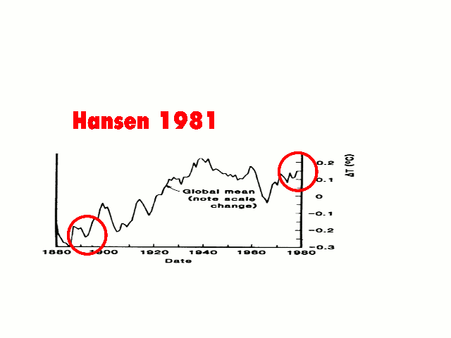
https://stevengoddard.wordpress.com/2015/09/17/noaa-massively-ramps-up-their-temperature-fraud-ahead-of-paris/
You have posted this plot several times, but I consider the presentation to be extremely unhelpful.
One could study/review the graphed data in detail if they were set out as two separate graphs one below the other. The flashing presentation does not assist one in ascertaining the size of adjustments and how uniform these are over the period in question.
Agreed. It os impossible to look at the graphs and independently come to any sort of conclusion.
Tonyb
I agree, but by concentrating it becomes clear that the past has been steadily cooled.
Magical, time-traveling CO2 molecules must steal heat from the more distant past and transport it to the present and recent past.
Perhaps if the animation could be slowed down and presented along with the static graphs the point would be better made?
Here is what was published in the 1970s.
http://realclimatescience.com/wp-content/uploads/2015/09/ScreenHunter_10202-Aug.-26-16.20.gif
http://data.giss.nasa.gov/gistemp/2002/2002fig1_s.gif
http://data.giss.nasa.gov/gistemp/graphs_v3/Fig.A2.gif
co2islife, thanks for the static charts. Who’d have guessed that things were better when Hansen was doing the fiddling!
Not just the GISS, the cooling rate between the 1940’s and 1970’s for the northern hemisphere was over twice more than now back in 1981 compared with HADCRUT4 NH.
http://i772.photobucket.com/albums/yy8/SciMattG/NH%20temperatures%201982_zpsplh6gz9e.png
The latest HADRCUT4 has also warmed the last decade around 0.1 c with one particularly month in 2007 0.39 c warmer than HADCRUT3. Even for the NH that takes one hell of a shift to warm one month almost 0.4 c warmer. Even the strongest El Nino’s detected it recent decades have failed to do that.
HADCRUT4 NH has also copied some of GISS cooling historic tricks with especially cooling between 1936 and 1942. It is also noticeable around 1997/98 strong El Nino has also cooled a little. The period between 1948 and 1968 has also been particularity warmed plus the period between 1990 and 1996.
Each of the adjustments you reference improves the argument for a warmist. They cooled this very hot 1930s and warmed the cooling trend through the 60s. The super El Niño of 97/98 was dampened which helps with those pesky “no warming in X number of years” complaints
I have never seen an adjustment that made the overall trend look less appealing for a warmist.
I suppose it’s all just coincidence
Amazingly, the same sort of thing happened with the hockey stick. The MWP. And LIA just disappeared and recent data spiked straight up
The non-normal distribution of temperature error adjustments is a truly amazing coincidence. In light of that, perhaps some of these adjustments should be double checked.
co2islife: I agree that you might put these one above the other in a static graph. But anyone who cannot see what is going on in these graphs, and shows their lack of spatial recognition in print, is simply brain addled (not quite dead), as several carpers below. As for the threat of jail, etc. to “skeptics”, when this scam is finally exposed as the doing of either criminals or idiots, I want them incarcerated for life, either in prison (Joe Arpaio’s would be a fitting setting) or in an asylum. AND, their cushy federal retirement benefits taken away, permanently.
I’m really uncomfortable with calling for scientists to be arrested. Quite a few alarmists, like Robert Kennedy I believe, have called for “deniers” to be arrested.
Let’s just work steadily to have free and open science.
GISS unaccountable changes when corrected lead to something like this.
http://i772.photobucket.com/albums/yy8/SciMattG/GISS-corrected_zpsrgqsents.png
Notice 1998 is now back to the warmest year in the data set and supports satellite data much closer.
The only two forwarding addresses on the website are yours and Ed’s. Do you want me to add other Committee members? If so, I will need their addresses.
Jasper
Did they find anything different with their models not found before?
Picking out the UHI in climatic temperature records – so easy a 6th grader can do it!
Anthony Watts / December 9, 2009
http://wattsupwiththat.com/2009/12/09/picking-out-the-uhi-in-global-temperature-records-so-easy-a-6th-grader-can-do-it/
UHI from Denver all the way into the Rockies?
The Rockies part makes it negative with all the trees. Another way of torturing data to get the desired results.
The light blue color is quite useless as it includes the zero. It has both Positive and negative values.
I have news for you. The urban area in Utah looks nothing like it’s depicted on the map above. There is nothing 15 miles west of downtown Salt Lake City and the cities to the north and south along the Wasatch Front except desert and mountains. Why does the heat map extend west to the border of Nevada?
You bring up a good point. Look at the two orange spots off the coast of California. Those are the two largest Channel Islands and have not changed their urbanization in recent memory. It looks like the delineations were done along county lines because the islands are administratively part of Los Angeles County with demonstrable UHI. West of Salt Lake City is the Great Salt Lake (for readers not familiar with the area), but could the lake be administratively part of a county with UHI and mapped as such?
That would be Las Vegas. However Las Vegas is not as big as the splotch shown on the map.
The map has a resolution at the county-level. Most of the large area extending west to the Nevada border is Tooele County; the smaller “peninsula” reaching east appears to be Salt Lake County and Summit County. I assume the data employed was aggregated by county, and that most of the UHI in Tooele was in the east part of the county, influenced by Salt Lake City.
It must be by county. Most of Tooele county west of the Great Salt Lake consists of miles and miles of barren salt flats. The only possible UHI would be along the very eastern edge of the county.
I was fascinated by that huge area west of the Colorado that is mostly desert but with a band of well irrigated farmland bordering the river. I really don’t know what to make of what the map is trying to represent here. The whole area is a micro climate mess as any Motorcyclist living there could tell you.
I am pretty sure that the narrative of the press release does not correlate very well with the paper. I would not be surprised if some of the issues being pointed out are a byproduct of the methodology that is addressed in the paper.
The (press release?) states that their model used …climatic variables (temperature and precipitation), expert knowledge of climatic events (rain shadows, temperature inversions and coastal regimes) and digital elevation.
Can someone who is willing to scale the pay wall tell how they handled wind?
Wind (or “breezes”) is mentioned for Miami. A possible reason for the higher UHI there than elsewhere is given as “potentially attributable to the tall skyscrapers along the coastline creating a wall effect, which would impede sea breezes from ventilating the city”.
There is also a more general comment: “Climatological factors, such as wind speed and aridity, are also known to influence UHI intensities, but insignificant relationships were exhibited for the annual averages, with p-values of 0.97 and 0.79, respectively. However, when the monthly UHI intensities in 2010 were compared to the corresponding monthly wind speed and aridity values for each city individually, several significant correlations were discovered.” I can’t find where those “correlations” are explored further.
There’s a lovely comment about the general use of statistics which should be meditated on by all AGWists. It reads: “For the estimated parameters to be unbiased, all relevant independent variables must be included in the model. Determining if all pertinent variables are incorporated is difficult, due to the infinite number of potential independent variables, and typically relies heavily on theoretical justification. Generally, a certain degree of specification bias is unavoidable in regression analysis since all relevant independent variables often cannot be included due to data limitations.”
Finally, the paper found an average 0.37degC effect of UHI on minimum temperatures in 2010. While it doesn’t take this information further (its aim is to influence city planning), surely there must now be an assessment of thermometer siting to ensure that this figure has not (ahem) inadvertently been added to the record over the past 50 years or so? It would be a shame if the 50% of the rise that wasn’t due to data tampering turns out to be due to ignoring UHI 🙂
Thanx.
js
That’s the “digital elevation” bit – a wet finger held up in the wind
They didn’t actually measure the UHI. They used a computer model. Actually going out and measuring UHI is too simple; it clearly isn’t sufficient for qualify for a PhD.
Perhaps data from surfacestations.org could be used to calculate a more reasonable figure for UHI for at least some sites.
… estimating UHI….
…. Independent Slopes Model….
… gridded estimates…
oh, my eyes hurt.
Yep.
“UHI intensities were estimated …”
Why not just go and measure them?
Of course, silly me, that would just prove something, and you can’t just prove something, you have to leave room for more frau….. , er …. scientific investigation.
So what is your methodology for measuring UHI? Do you have some magical UHI meter?
Whether you like it or not, any UHI effect metric would be a derived quantity. They all need a fantasy value to use as a reference, i.e. the temperature that would have existed if the area was not urbanized. Deriving this fantasy value will always involve a model.
“Fantasy value?” How about a comparison to rural stations? Oh, wait…
“…The use of spatially gridded temperature data, rather than urban versus rural point comparisons, represents a new method for calculating a city’s canopy heat island intensity…”
It totally makes sense. If you have a dense enough grid you can produce a set of isotherms and nail the UHI. You could do a pretty credible job with about 1000 sensors …
I’ve seen at least one science fair project where the student produced a temperature profile by driving from one side of town to the other, taking temperatures all the way.
A profile or a set of isotherms will demonstrate UHI quite nicely. No need for any unattainable references, no need for models.
The reason they use models is that they are much cheaper than doing physical measurements. Unfortunately they suffer from huge bogosity.
Michael Jankowski, you totally missed my point and that is, no matter what method is used, it is still based on a model. That is because the reference values do not actually exist in the real world but only in a fantasy world were the areas in question have not been urbanized. Therefor they must be deduced via a model. This is not a bad thing. It just is.
One thing to note is that most cities are in low areas such as valley floors.
commieBob, looking at isotherms is NOT measuring the UHI effect. At best, it can be used to conclude that there is some UHI effect. That is all. It of itself does not produce a number representing the quantity of the UHI effect. Measuring presupposes a metric and a reference point. That reference point does not exist and thus must be deduced. If you use your beloved isotherm analysis, you still depends on a model to deduce a reference point. Maybe you do not understand what a model is?
You’re straying into ad hominem territory. Be careful, everyone will think you’re a troll whether you have a serious point or not.
Im guessing that big blue area from Nevada into California is due to Las Vegas. Lots of people leaving the doors open in the casinos and free AC is wafting across the desert.
Irrigation, I think. That’s the only thing that makes any sense for the creation of a negative UHI.
Maybe, but that big blue area in southern cal looks like San Bernadino county which is mostly barren desert and darn little irrigation. Oh wait, isn’t that the location of that solar furnace boondoggle? Maybe it cools the air off while incinerating birds and bats.
It’s actually environmental heat absorption caused by the gravity bending Z-radiation reactors in Area 51.
Yes, a recent survey of UFO experts confirms this, 97% of them believe this is the cause — Science Settled.
So… little green men are behind it? I knew it!
Wow! This is incredible. Their map shows Las Vegas and Denver metropolitan areas significantly cooling temperatures. I have spent time over the last two decades in both cities. The UHI effect is remarkably obvious in Las Vegas. It is also obvious in Denver.
Perhaps the author’s should follow the Idsos’ method and have simultaneous temperature & CO2 measurements made in the cities and in the surrounding less urbanized areas.
“Their final conclusion, therefore, is that the warming induced by the urban CO2 dome of Phoenix is possibly two orders of magnitude smaller than that produced by other sources of the city’s urban heat island (lower soil moisture levels and enhanced absorption of solar energy by urban surface materials, for example). Hence, although the presence of man and his alteration of the local environment are indeed responsible for high urban air temperatures (which can sometimes rise as much as 10°C above those of surrounding rural areas) and high urban near-surface atmospheric CO2 concentrations (which can sometimes top 600 ppm), the high urban near-surface air temperatures are not the result of a local CO2-enhanced greenhouse effect.” http://www.co2science.org/subject/u/summaries/phxurbanco2dome.php
I confirm 600 ppm is possible. I have measured 1100 ppm in a city.
As with Climate, their models bear no relation to real life UHI as measured by thousands of people and shown on weather forecasts every day.
I have to be deeply skeptical of most, but not all, of the blue areas. Land use change can, no doubt, cause regional cooling. Take a desert, irrigate it, plant it with trees or farms, repeat for fifty years and you can cool the land relative to the desert it was before — perhaps. I say perhaps because desert is actually very dry, and water is a major greenhouse gas, so even though daytime temperatures are very high, nighttime temperatures are often very low, so that the land could easily be cooler than land (or tropical ocean) at exactly the same latitude where it is humid night and day.
However, one of those blue patches is right on top of where I live, and I have to say that I doubt it. There is a pronounced, readily observable UHI effect in the triangle area of NC. It is clearly visible in a glance at the temperature variations reported on personal weather stations on e.g. Weather Underground’s pages. One can see anywhere from 1 to 2 C warmer temperatures throughout Durham than are observed in the countryside a short distance outside of the city. One can also see it very clearly in the temperatures reported by the local airports (often used as the “official” sources for local temperatures. When I arrived in Durham 42 years ago, RDU airport had a single terminal and serviced a handful of (mostly propeller-driven) aircraft a day. It was in the middle of countryside that stretched over twenty miles between Raleigh and Durham (with Chapel Hill at that time still literally being a tiny college town with 90% of its population being the transient student population of UNC-CH). Today, there is very little actual “countryside” between the cities. RDU is flanked by I-40 (all 8 to 10 lanes of it), I-540 (8 more lanes) and US-70 (only 4 to 6 lanes), all of them jammed during rush hour, with major shopping centers flanking it on two sides. Morrisville was a tiny stoplight sized town back then, now it is a major suburban bedroom community with wall to wall shopping. Cary was a “blink and you’ve missed it” community back then (a population of around 8000 in 1970) — SAS hadn’t even moved in yet as its founder was still in school down the road a bit — and now it has a population of around 140,000. They have literally cut down entire forests and turned them into suburban housing, multiacre shopping centers, golf courses, and of course roadways everywhere.
I recently drove out of Durham down NC 55 towards Cary and was shocked to see that I drove out of Durham and into Cary with no boundary at all in between. When my sister lived in Cary only fifteen or so years ago, we had to drive through twenty minutes of countryside to reach the edge of Cary.
There is — in my considered opinion — no way in hell that the UHI effect in the triangle area is negative. The only thing that could “fool” a stupidly done study into thinking that is that they have also built two huge impoundments — Falls Lake and Jordan Lake — that collectively cover 40 square miles of the area. Temperatures measured out on the water are, no doubt, moderated by the fact that woodland has been replaced by water and of course the water never gets as hot as the surrounding air even in midsummer. However, that is equally obviously silly when considering UHI. It is a completely independent effect from UHI, and does not in any way either significantly alter the temperatures in the surrounding woodlands, let alone the temperature even a very few miles away from the lakes, nor does it have anything whatsoever to do with the generally growing gap between urban center and the surrounding mixed-use forest and farmland and with the sprawling expansion of that urban center.
rgb
Duke… it is a model, Apparently they combine temperature and precipitation, who know how, to estimate UHI.
FWIW, after 20 years of land surveying, and a love of the outdoors.
I’ve learned that mosquitos love low lying swampy areas in the morning, youth is indeed wasted upon the youth, and leafy suburban neighborhoods are much cooler than the new subdivisions being built on farmland that offer no hope of any shade.
The map from NASA/GODDARD SPACE FLIGHT CENTER has the opposite data for the Miami area among other areas:
Funny. Where I am from, the “Vegetated Land” is the “Urban Land”.
Yep, it does often seem that a lot of “vegetables” live in (and are elected to national office from) the most over-crowded metropolitan areas.
But this graphic map from our friends at U of GA seems extremely crude. There are a lot of microclimates bundled into these MSAs. I can just about see in my mind’s eye, my grand-father’s 500+ acres, other farms, and several parks of several hundred wooded acres each, in the midst of one of them, lumped together with the HQ towers and manufacturing plants of a dozen or more sizable corporations.
I still take this chart with a grain of salt due to the basic nature of the calculation (which is an estimate of what the temperature should be, a dangerous prospect at the best of time), but it’s conclusions make sense, clustered around population centers and snaking around highways (heck, you can see I-30 clear as day from Atlanta almost all the way to El Paso). Compared to the initial chart at the top of the page, which just disagrees with basic sense.
I can’t tell you what the mass of the moon is off the top of my head, but I can tell you that anything answer you give less than a trillion tons is certainly wrong without calculator or reference materials.
thats SUHI..
They need to define “connected”.
Green spaces imply that there is no UHI at an airport.
But it seems unlikely that London Heathrow would beat London Greenwich for the record hottest thermometer reading if that was that was the case.
Woolly terms lead to fluffy thinking.
UHI is obviously of interest to people living in cities, but is surely of no interest to climatology, as all US cities will have nearby rural stations that can be used instead for making the necessary doom laden statements about warming.
I would quantify UHI by comparing city temperatures to those from the nearby rurals.
Stop making common sense. The climate police will come and take you away….:-)
On Drudge this afternoon, there is yet another article about climate scientists demanding that sceptics be prosecuted.
MarkW, that will never happen. Warmists are frightened to debate their topic. They’re hardly likely to turn up in court to argue it in front of a judge.
What we need are the Green Police, able to issue on the spot fines:
Billy, that was how the pre-Obama justice system worked. In the new improved justice system, the prosecutor skips the judicial phase and goes directly from indictment to the sentencing phase.
Much more efficient.
Isn’t that one of the $18 billion cars?
That map they show looks like a middle school science fair exhibit. Nowhere near complete or resolute enough,
What, you mean like where the blob representing Salt Lake City includes mostly the Bonneville Salt Flats?!? One can only imagine what underlying data were used. At least it’s not as bad as one paper I saw that showed the entire West Desert (Flats and surrounding area) as high tree-planting potential (because it didn’t currently have any trees – no kidding!). Not great scrutiny of the results in either case. Sheesh!
My urban heat Island is cover by hundreds of acres of soy, corn, winter wheat and forests.
Just read the Abstract and you would be welcome to conclude that these guys can not know anything of importance since they have to communicate it in the most spatially displaced diarrheic dumbfounding drivel ever invented! Beyond that…yeah Parks are nice in an urban environment and make it more livable for human beings whether it has any impact on the “heat island” effect or not.
The climate modelling is divorced from reality yet again. I was an avid cyclist and motorcyclist for many years and the UHI ( before I knew what that was) effect was obviousand palpable for many Cities. I always knew when I was approaching a City ( especially on a cool evening) by the increasing air temperature – even before the fields gave way to urban buildings. It is hard to believe that the UHI is any less than 2 or 3 degrees Celsius for any sizeable City. I suggest that we send these Phd students out with bicycles and thermometers to get a grasp of reality…
Worldwide, UHI is reported as 2-3 degree C HIGHER in EVERY city in every daily weather forecast. New York (and many other cities) report +5 to +8 degrees F higher.
This paper is nonsense.
The Atlanta region is a dense forest – there are no roads where you can see the horizon for the pine trees and hills sprouting up in every unplowed, unmowed square meter of ground. But its “color” shows less than 1 degree HUI for the counties as far as 50 miles to the AL border. And across that border, these “digital modelers” have the central part of the state of Alabama (an even smaller urban area bisected by only two major highways) as one integrated mass of “urbanity” …
Can you imagine the UHI in ancient Rome with all those folks crammed into the colosseum and cooking fires going all over town? The smell and air quality would probably bring anyone to appreciate the the relatively clean air in modern cities.
Uhi in ancient Rome is well documented. It was a city that had a million inhabitants and eventually stretched for some ffty miles
The richer inhabitants escaped to the hills in summer and there was a well established network of ice sellers and umbrella sellers. Beech trees disappeared as temperatures rose.
After the great fire Nero was entreated to rebuild thE city in tall blocks with narrow streets in order to provide shade.
Our bbc weather forecasters daily refer to British cities being up to 4 or 5 degrees warmer than the countrside. I have never ever heard them say that any city will be cooler than its surroundings.
Tonyb
Note well the absurd color scale used in the map.
The light blue encompasses the values Negative 0.43 to POSITIVE 0.16 deg C.
The white (the same as the “unmeasured areas” is from Positive 0.17 to 0.51.
For shame!
Hmm…looks like the middle of Lake Erie has a maximum “UHI intensity”.
Looks like the methodology was borrowed from the logic used to create congressional districts.
Here is the full paper.
https://dl.dropboxusercontent.com/u/75831381/Debbage%20UHI.pdf