Last week I asked Bob Tisdale to take a hard look at potential correlations between the AMO and Arctic sea ice extent, and he rose to the challenge – Anthony
Guest post by Bob Tisdale
This post presents reference graphs and a discussion of the effects of the Atlantic Multidecadal Oscillation on Arctic sea ice loss.
I was asked to show if and how well the Atlantic Multidecadal Oscillation (AMO) Index data correlates with the NSIDC Northern Hemisphere Sea Ice Extent data. I decided to carry the comparisons farther by also including high-latitude Northern Hemisphere temperature variables: land surface temperature anomalies, lower troposphere temperature anomalies, and a couple of sea surface temperature anomaly subsets. It should really come as no surprise that the high-latitude sea surface temperature anomalies in the Northern Hemisphere correlate best with Arctic sea ice extent anomalies. When the ice melts, it exposes the ocean surface. The surface temperature of the Arctic Ocean is warmer than ice so it will present a positive anomaly in areas where the sea ice hasn’t melted in the past. That is, where the freezing point of sea water serves as the base-period temperatures for anomalies, the surface temperature anomaly of any newly exposed water will be positive.
And I elected also to discuss the Atlantic Multidecadal Oscillation, its impacts, how it’s influenced by major El Niño events and how it’s misrepresented.
WHAT’S ALL THE HUBUB, BUB?
In a warming world, there are many expected responses. Among them, sea level will rise, glaciers will melt, and seasonal Arctic sea ice extent, area and mass will dwindle. Regardless of the source of the warming, those things will happen as global temperatures rise. I’m always amazed with the frenzy that accompanies a “new record” level in some variable, like the recent happenings with Arctic sea ice. While there is no proof mankind is responsible for the warming Arctic temperatures and loss of sea ice, there are, nonetheless, the typical baseless claims that we have caused it and we have to do to something about it.
The only place anthropogenic global warming definitely exists is in climate models. They must be FORCED by greenhouse gases in order to make the simulated oceans and atmosphere warm. The instrument temperature record shows the oceans and surface temperatures have warmed, but those records cannot be used to prove manmade global warming exists. On the other hand, as I have been showing for more that 3 ½ years, the instrument temperature record can be used to show that most if not all of the warming was caused by natural variables, and as a result, the observational data can be used to invalidate the climate models. If you’re not familiar with my work, refer to my recent post titled A Blog Memo to Kevin Trenberth – NCAR.
With that in mind, all of the following graphs show that high latitude surface temperatures have warmed and that sea ice extent has decreased, but there is no evidence that mankind is responsible for it. More on that later. And that brings us to…
POOR CORRELATION DOES NOT MEAN THERE IS A LACK OF CAUSATION
Of the variables we’ll compare to sea ice extent, high latitude land surface air temperatures correlate worst. Does this mean that warming land surface air temperatures don’t contribute to the variations in sea ice extent? No. Does it mean the loss of sea ice does not cause changes in land surface air temperatures? No. It simply means sea ice extent and land surface air temperatures are varying on different schedules to the many variables the impact them.
On the other hand, does the relatively high correlation between Arctic sea ice extent and Arctic sea surface temperature indicate the loss of sea ice is more closely related to the warming sea surface temperatures? No. The higher correlation, as noted earlier, is also caused by the fact that sea ice loss results in a greater surface area of open ocean where sea surface temperatures can be measured, and since that water is warmer than the freezing point of sea water, the anomalies in newly opened areas of ocean will have positive anomalies compared to the freezing point, which is the reference for the anomalies.
However, since water has more mass than air, a one deg warming of adjoining sea surface temperatures will have a greater impact on sea ice than a one deg warming of Arctic air. Therefore, since Arctic sea ice is exposed to the North Atlantic, the additional warming of the North Atlantic associated with the Atlantic Multidecadal Oscillation is a major contributor to Arctic sea ice loss regardless of the correlation between the two datasets.
DATA PRESENTATION
All monthly anomaly data in the sea ice comparisons have been standardized; that is, each dataset has been divided by its standard deviation. Since we’re using satellite-based Reynolds OI.v2 for sea surface temperature data, all of the graphs start in November 1981. All of the datasets end in August 2012. The temperature data have also been inverted to accommodate the inverse relationship between sea ice extent and temperature. Base years of 1982 to 2011 were used for anomalies to better align the sea ice data and temperature data when the latter were inverted—the exception is the AMO data. The title blocks of the graphs include the correlation coefficients of the NSIDC Northern Hemisphere sea ice extent and the respective temperature dataset. They have been determined with no lags between the datasets.
ATLANTIC MULTIDECADAL OSCILLATION INDEX
The NSIDC sea ice extent anomalies are compared to the inverted ESRL Atlantic Multidecadal Oscillation Index data in Figure 1. The correlation coefficient is poor at -0.57. There are some periods when the two curves align, and there are others when they don’t. Why doesn’t it correlate better? Arctic sea ice is impacted by North Atlantic sea surface temperatures along one exposure. Sea ice loss on the other side of the Arctic basin is impacted by other variables. Also, the Atlantic Multidecadal Oscillation represents the sea surface temperature anomalies of the entire North Atlantic, not just the portion that comes into contact with Arctic sea ice. We’ll discuss the impact of the Atlantic Multidecadal Oscillation on temperatures in the high latitudes of the Northern Hemisphere and on sea ice extent later in the post.

Figure 1
HIGH LATITUDE LAND SURFACE AIR TEMPERATURE AND LOWER TROPOSPHERE TEMPERATURE ANOMALIES
Figures 2 and 3 compare sea ice extent anomalies to GHCN-CAMS land surface air temperature (LSAT) anomalies and UAH lower troposphere temperature (TLT) anomalies, for the latitudes of 60N-90N. Like the AMO index data, some of the annual and seasonal variations in the curves align, and there are others that don’t. Keep in mind that lower troposphere temperature anomalies represent the temperatures at about 3,000 meters above sea level. Also, the TLT data does stretch across as far north as 85N over the Arctic Ocean, while the land surface air temperature data does not. The correlation coefficient for the land surface air temperature anomalies and sea ice extent is about -0.49, while for the lower troposphere temperatures it’s slightly higher at -0.57. Neither one is very good.

Figure 2
[removed]

Figure 3
HIGH LATITUDE SEA SURFACE TEMPERATURE ANOMALIES
As noted earlier, the best wiggle match presented in this post occurs between the high latitude (60N-90N) sea surface temperature anomalies and the Arctic sea ice extent, Figure 4. The correlation coefficient is -0.85. That’s pretty good for two climate-related variables.

Figure 4
For those interested in that hotspot in the Northwest Atlantic that’s been happening for the past few months, refer to Figure 5. It represents the sea surface temperature anomalies for that portion of the North Atlantic and Arctic Ocean, with the coordinates of 45N-90N, 80W-25W. The best we can say, though, is that the hotspot in the North Atlantic coincided with the high seasonal ice loss this year.

Figure 5
Referring back to our discussion of the Atlantic Multidecadal Oscillation, if we look at the sea surface temperature anomalies for the high latitudes of the North Atlantic (60N-90N, 80W-40E), we see a much improved correlation (-0.71 instead of -0.57 for the AMO). See Figure 6. And again, the North Atlantic directly impacts only one exposure of the Arctic sea ice. With that in mind, the correlation is very good.

Figure 6
NOTES ON THE ATLANTIC MULTIDECADAL OSCILLATION AS PRIMARY CAUSE OF HIGH LATITUDE WARMING AND SEA ICE LOSS
Note: The data is not standardized in the following graphs. They present temperature anomalies.
Many of the posts I’ve written about the Atlantic Multidecadal Oscillation (aka AMO) include a link to the RealClimate glossary about it, where they write:
A multidecadal (50-80 year timescale) pattern of North Atlantic ocean-atmosphere variability whose existence has been argued for based on statistical analyses of observational and proxy climate data, and coupled Atmosphere-Ocean General Circulation Model (“AOGCM”) simulations. This pattern is believed to describe some of the observed early 20th century (1920s-1930s) high-latitude Northern Hemisphere warming and some, but not all, of the high-latitude warming observed in the late 20th century. The term was introduced in a summary by Kerr (2000) of a study by Delworth and Mann (2000).
GISS climate models indicate the majority of the total warming of global surface temperatures over the past 30 years, about 85% (Figure 7), is in response to the warming of the oceans, so one might conclude the additional variability of the North Atlantic has played a major role in the warming of the high latitudes of the Northern Hemisphere. Figure 7 is from Chapter 8.11 of my book Who Turned on the Heat? The data presented in it is from the NASA Goddard Institute for Space Studies (GISS) ModelE Climate Simulations – Climate Simulations for 1880-2003 webpage, specifically Table 3. Those outputs are based on the GISS Model-E coupled general circulation model. They were presented in the Hansen et al (2007) paper Climate simulations for 1880-2003 with GISS modelE.

Figure 7
With that in mind, and referring back to the RealClimate glossary discussion, can we then assume that the multidecadal variability of the North Pacific could also be used to describe “some, but not all, of the high-latitude warming observed in the late 20th century”? Refer to Figure 8. Both datasets in it have been detrended and smoothed with 121-month running-average filters. The intent of Figure 8 is to show that there is a multidecadal signal in the North Pacific, north of 20N, that is not represented by the Pacific Decadal Oscillation index data—that the multidecadal variations in the North Pacific can run in and out of synch with the Atlantic Multidecadal Oscillation—and that the strength of the multidecadal signal in the North Pacific is almost as strong as in the North Atlantic. The multidecadal variations in the North Pacific are normally presented in abstract form as the Pacific Decadal Oscillation, so they are typically overlooked in discussions of the multidecadal variations in Northern Hemisphere land surface air temperatures.

Figure 8
The normal misconception, misinterpretation, misunderstanding, misrepresentation of the Atlantic Multidecadal Oscillation is that it is a form of natural variability that occurs on top of the manmade global warming of the rest of the oceans. The Wikipedia definition of the Atlantic Multidecadal Oscillation begins:
The Atlantic multidecadal oscillation (AMO) was identified by Schlesinger and Ramankutty in 1994.
The AMO signal is usually defined from the patterns of SST variability in the North Atlantic once any linear trend has been removed. This detrending is intended to remove the influence of greenhouse gas-induced global warming from the analysis.
There is no “influence of greenhouse gas-induced global warming” evident in the sea surface temperature records for the past 30 years. We’ve discussed and illustrated this in numerous posts here at Climate Observations over the past 3 ½ years. After the processes El Niño-Southern Oscillation, this was the primary topic of discussion of my book Who Turned on the Heat? – The Unsuspected Global Warming Culprit, El Niño-Southern Oscillation. Here’s an overview:
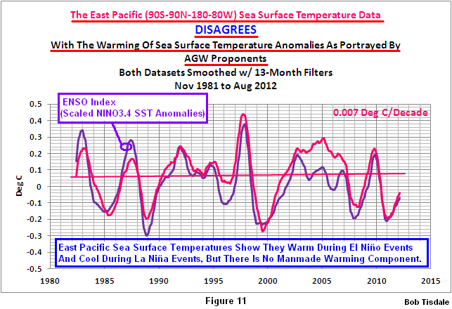
We know that the East Pacific has not warmed in 30 years. Refer to Figure 11 from the post A Blog Memo to Kevin Trenberth – NCAR. I’m going to borrow a few graphs from my recent book.
The South Atlantic-Indian-West Pacific dataset covers the ocean basins not represented by the East Pacific and North Atlantic. The sea surface temperature anomalies of the South Atlantic-Indian-West Pacific only warm during and in response to the strong El Niño events of 1986/87/88 and 1997/98. See Figure 9. There may also have been an upward shift in response to the 2009/10 El Niño but it’s a little early to tell. As you’ll note, the South Atlantic-Indian-West Pacific data cools between the major El Niño events. The trends are negative.

Figure 9
Why are there upward shifts in response to those major El Niño events? Because the South Atlantic-Indian-West Pacific sea surface temperature anomalies do not cool proportionally during the La Niña events that followed them. We can show this by detrending the South Atlantic-Indian-West Pacific data and comparing them to NINO3.4 sea surface temperature anomalies, which are a commonly used index that represents the frequency, strength and duration of ENSO events. Figure 10 is from the blog post here. If the South Atlantic-Indian-West Pacific data cooled proportionally during those La Niña events, its curve would be similar to the East Pacific data, which shows no warming in 30 years.

Figure 10
So far, we have found no evidence of an “influence of greenhouse gas-induced global warming” in the ocean basins that are outside of the North Atlantic. Would the “influence of greenhouse gas-induced global warming” exist only in the North Atlantic? That’s extremely unlikely. Therefore, we can dismiss the consensus opinion that the global oceans are warmed by anthropogenic greenhouse gases.
Let’s take a look at the North Atlantic data. As expected, it shows warming trends between the major El Niño events, Figure 11. But notice how the trend line for the latter period is located above the trend line for the earlier period. That means there was an upward shift in response to the 1997/98 El Niño event.

Figure 11
We can also detrend the North Atlantic sea surface temperature anomalies and compare them to scaled NINO3.4 data to illustrate the cause. The North Atlantic sea surface temperature anomalies also do not cool proportionally in response to the La Niña events that follow the major El Niño events. So the non-linear response of the North Atlantic (and the AMO) to ENSO is a significant portion of the additional warming of the North Atlantic and the subsequent natural sea ice loss in the Arctic.

Figure 12
SHAMELESS PLUG
I’ve referenced my recently published e-book (pdf) a number of times in this post. The book is about the phenomena called El Niño and La Niña and its long-term effects. It’s titled Who Turned on the Heat? with the subtitle The Unsuspected Global Warming Culprit, El Niño Southern Oscillation. I do not specifically discuss the loss of Arctic sea ice in the book, but as discussed in this post, those losses are primarily a response to the natural warming of the global oceans.
The book is intended for persons (with or without technical backgrounds) interested in learning about El Niño and La Niña events and in understanding the natural causes of the warming of our global oceans for the past 30 years. Because land surface air temperatures simply exaggerate the natural warming of the global oceans over annual and multidecadal time periods, the vast majority of the warming taking place on land is natural as well. The book is the product of years of research of the satellite-era sea surface temperature data that’s available to the public via the internet. It presents how the data accounts for its warming—and there are no indications the warming was caused by manmade greenhouse gases. None at all.
Who Turned on the Heat? was introduced in the blog post Everything You Every Wanted to Know about El Niño and La Niña… …Well Just about Everything. The Updated Free Preview includes the Table of Contents; the Introduction; the beginning of Section 1, with the cartoon-like illustrations; the discussion About the Cover; and the Closing.
Please buy a copy. (Paypal or Credit/Debit Card). It’s only US$8.00.
SUMMARY
Since there is no evidence of a manmade component in the warming of the global oceans over the past 30 years, the natural additional warming of the sea surface temperature anomalies of the North Atlantic—above the natural warming of the sea surface temperatures for the rest of the global oceans—has been a major contributor to the natural loss of Arctic sea ice over the satellite era. Add to that the weather events that happen every couple of years and we can pretty much dismiss the hubbub over this year’s record low sea ice in the Arctic basin. Personally, I’d find it comical—if the desperation on the parts of AGW proponents wasn’t so evident. That makes it sad.
SOURCES
With the exception of the ESRL Atlantic Multidecadal Oscillation Index, the data presented in this post is available through the KNMI Climate Explorer.
Thanks, Anthony.
I have been meaning to ask a question. This is about as good a time as any.
With the really shallow angle of the Sun at high latitudes, radiant warming of the region is pretty low compare to the tropics. When sea-ice is lost, and the water is open to the sky, how fast is energy radiated to space as compared to when there is an insulating cover of ice? Does that have an impact on the overall energy budget? My gut feeling says it does, but that’s outside my field of knowledge.
Have you seen this article from LANL on arctic temperature and AMO? http://www.lanl.gov/source/orgs/ees/ees14/pdfs/09Chlylek.pdf Figure 3 seems to show a clear correlation of AMO with temperatures around the arctic circle, although the AMO seems to follow rather than lead.
“…That is, where the freezing point of sea water serves as the base-period temperatures for anomalies, the surface temperature anomaly of any newly exposed water will be positive….”
Positive temperature anomalies are often taken by climate “science” as indicating warming, when they actually represent more heat exposed to 4ºK deep space temperatures, instead. It’s like saying Denver must be gaining population because we counted more people in its bus stations this year than we did last year.
North Atlantic is the main area of my interest and may have grasped some basics of its behavior. Misconceptions in the science literature and otherwise are abundant.
If some ocean areas have not warmed over the last 30 years then I assume this contradicts any argument that CO2 is acting globally on water. Since Antarctic ice extent is not decreasing, and looking at last 30 years slightly increasing, then this also indicates that globally ice is not declining as you would expect (if CO2 was thought to be the culprit). The simplistic idea (and so this is probably not in any pf the models!) is that the Arctic, being surrounded by land mass, will have more variability in ice extent due to land mass related parameters (blocking patterns?). Also, having ocean currents flushing through Bering and Greenland seas would also in my mind be the most obvious candidate for significant ice extent variations. When we have completed the next cycle of the AMO (around 2030?) , and have approx 50 years satellite data, then I think we can conclude with confidence whether Arctic ice extent is in significant decline. I would be a worried man if my income, and more importantly scientific reputation, was linked to the idea that CO2 is the major player. Luckily for me I don’t have any scientific reputation to worry about!
Just a bit off topic:
1 millimeter = 0.0393700787 inches/yr
3 millimeter = 0.1181102361 inches/yr
10yr @ur momisugly 3 millimeter per year = 1.181102361 inches per decade
100yr @ur momisugly 3 millimeter per year = 11.81102361 inches per century
Arctic and glacial melt is adding 3mm a year to rising oceans, according
to NOAA !
Satellites trace sea level change
By Jonathan Amos Science correspondent, BBC News, 24 September 2012
See:
http://www.bbc.co.uk/news/science-environment-19702450
…and now back to your regularly scheduled AMO/Arctic Sea Ice thread.
This is real science thank you
Andrew, there are two counter arguments offered. I’m not saying they are right, just that this is what is said.
The first is that there is stored heat someplace in the oceans. Pielke has argued forcefully that there is not and cannot be, but that is the argument – it is warming, and the warming is in the oceans, just below where its being measured. It has been thought of.
The second is that the models show Arctic and Antarctic ice behaving differently so the rise in the latter does not refute them. In addition, the Antarctic rise is relatively small, whereas the Arctic loss is large.
I am not persuaded that there is anything to worry about in the Arctic, but there are counters to the arguments you’re offering. The main issue is the length of the trend. We only have proper data of the same sort for the satellite era, and to splice this onto conjectures about the extent and depth of the last several hundred years does not seem any more legitimate than splicing modern temperature readings onto the hockey stick proxies.
We are however in the middle of a natural crucial experiment on Arctic ice. If it continues to decline for another 5-10 years at the same rate, we will know something quite unusual is going on. If the trend reverses and heads north again, we’ll be able to conclude for sure that AGW is dead in the water.
GeoLurking says:
September 24, 2012 at 9:38 pm
I’d also wondered that and add to it latent heat of evaporation transferred away from the sea.
Nearly 3 years ago I wrote a short article (with one or two later additions) about some unusual aspects of the Arctic temperature and the relationship with the AMO.
http://www.vukcevic.talktalk.net/NFC1.htm
It is easy to dismiss my observations, but then it is hardly likely to be understood what is going on there by just looking at the surface and ignore the rest.
The catastrophists’ latest obsession with Arctic sea ice extent is understandable as there is very little other ‘good’ news for them around.
Following on from Sean above, on the face of it there does seem a strong correlation between Arctic air temperature and the AMO cycle:
http://climate4you.com/images/70-90N%20MonthlyAnomaly%20Since1900.gif
http://upload.wikimedia.org/wikipedia/commons/1/1b/Amo_timeseries_1856-present.svg
We are still looking at a very small time scale, yet there are lots of papers on the historical behaviour of ice in the Arctic, just a small sample here:
Anomalies and Trends of Sea-Ice Extent and Atmospheric Circulation in the Nordic Seas during the Period 1864–1998 Issn: 1520-0442 Journal: Journal of Climate Volume: 14 255-267 Authors: Vinje, Torgny:
http://journals.ametsoc.org/doi/pdf/10.1175/1520-0442(2001)014%3C0255%3AAATOSI%3E2.0.CO%3B2
“It is not until the warming of the Arctic, 1905–30, that the NAO winter index shows repeated positive values over a number of sequential years, corresponding to repeated northward fluxes of warmer air over the Nordic Seas during the winter. An analog repetition of southward fluxes of colder air during wintertime occurs during the cooling period in the 1960s. Concurrently, the temperature in the ocean surface layers was lower than normal during the warming event and higher than normal during the cooling event.”
“The August ice extent in the Eastern area has been more than halved over the past 80 yr. A similar meltback has not been observed since the temperature optimum during the eighteenth century. This retrospective comparison indicates accordingly that the recent reduction of the ice extent in the Eastern area is still within the variation range observed over the past 300 yr.”
Taurisano, A., Boggild, C.E. and Karlsen, H.G. 2004. A century of climate variability and climate gradients from coast to ice sheet in West Greenland. Geografiska Annaler 86A: 217-224.
“the temperature data show that a warming trend occurred in the Nuuk fjord during the first 50 years of the 1900s, followed by a cooling over the second part of the century, when the average annual temperatures decreased by approximately 1.5°C.” Coincident with this cooling trend there was also what they describe as “a remarkable increase in the number of snowfall days (+59 days)”
Climate variation in the European Arctic during the last 100 years Hanssen-Bauer, Inger, Norwegian Meteorological Institute, Co-Author Førland, Eirik J. (CliC International Project Office (CIPO) 21 June 2004)
“Analyses of climate series from the European Arctic show major inter-annual and inter-decadal variability, but no statistically significant long-term trend in annual mean temperature during the 20th century in this region. The temperature was generally increasing up to the 1930s, decreasing from the 1930s to the 1960s, and increasing from the 1960s to 2000. The temperature level in the 1990s was still lower than it was during the 1930s. In large parts of the European Arctic, annual precipitation has increased substantially during the last century.”
These days we sweat over whether the next satellite data point will be a positive or a negative anomaly, in relation to a norm which is based on the average of the last 33 years, to prove or disprove whether CO2 is cooking the planet.
in australia, this Reuters’ BoM story has suddenly appeared in just a single Fairfax newspaper in Sydney. mind you, every second para has a somewhat contradictory message:
25 Sept: SMH: Reuters: Chance of El Nino’s return ebbs, BoM says
Tropical Pacific Ocean temperatures indicating the onset of an El Nino have eased over the last two weeks, reducing the chance of the weather event emerging, the Australian Bureau of Meteorology said today…
Pacific Ocean temperatures had cooled in the last fortnight, while other indicators remained in neutral territory, it said…
Japan’s weather bureau said on September. 10 its climate models indicated the El Nino phenomenon was under way and there was a high chance it would last until the northern winter…
http://www.smh.com.au/environment/climate-change/chance-of-el-ninos-return-ebbs-bom-says-20120925-26j01.html
meanwhile, further north in Brisbane, this Fairfax newspaper was reporting just yesterday that, because BoM was predicting El Nino, there was no need continue with the previous State Govt’s decision to keep the dam at 75% level (lobbied by the new State Govt when in Opposition). talk about confusing, especially for the thousands of locals who are still considering taking out a class action lawsuit over the degree of flooding they believe was caused last year because the Dam was allowed to stay full when heavy rains had been forecast by BoM. the fact this dam is so huge, it holds enough water for years, if not decades, according to some so-called experts, only makes these mixed messages from BoM more worrying:
24 Sept: Brisbane Times: Daniel Hurst: Situation normal: outlook makes Wivenhoe release unlikely
Brisbane’s Wivenhoe Dam is unlikely to be drawn down to 75 per cent capacity as a precaution for the wet season, after the Newman government received an expert briefing that widespread flooding was unlikely this summer.
According to a Bureau of Meteorology briefing to the state cabinet today, southeast Queensland has a 50 per cent chance of exceeding the median rainfall from October to December.
This means the region is likely to be on track for average rainfall.
BOM Queensland regional director Rob Webb told cabinet the last two years were wetter than average, but this summer the state could expect typical periodic flood events but not as widespread as in recent years…
Global conditions indicated neutral conditions, bordering on El Nino. This contrasts with La Nina conditions when widespread flooding is more likely.
Wivenhoe Dam is currently at 99 per cent of its full drinking water supply level. In addition to the space devoted to drinking water storage, the dam has space for holding water in the event of a flood…
http://www.brisbanetimes.com.au/queensland/situation-normal-outlook-makes-wivenhoe-release-unlikely-20120924-26gux.html
Thanks, Bob, for another thoughtful, informative and interesting post – as ever.
A couple of minor typos:
Para. 5 – “have been showing for more that 3 ½ years” [more than 3 ½ years]
Para. 7 – “the many variables the impact them” [that impact them]
Im sure you’ll remember your proofreaders when the next cheque from Big Oil arrives. 🙂
Bob Tisdale reckons
While there is no proof mankind is responsible for the warming Arctic temperatures and loss of sea ice
———–
Cobblers! It’s not about logical proof. It’s about a scientific theory, a prediction that arises from that theory, the observation that is consistent with the prediction and the conclusion that this represents evidence to support the theory.
Apparently Bob doesn’t understand the process of science at all.
I’m a scientist at the National Centre for Atmospheric Science (NCAS) in the UK. My main area of research is the variability and predictability of sea ice cover. I think this is a fascinating area of research and I’m glad Bod Tisdale has written about this in this blog.
However, I am concerned that the lack of any mention of peer reviewed literature in this makes it seem like this is not an area of research in the climate community and that we only talk about the influence of man on the climate. Rather the contrary, in the decadal prediction and predictability community (of which NCAS is a contributing organisation) we focus on the “internal” or “natural” variability in the climate system of which the AMO is major component. In this sense, predictability refers to memory in the earth system which could be utilised for forecasting. It has long been known that every climate variable evolves with a signal composed of an internal variability part and externally forced part (human influenced, solar etc.). The question is how to separate the two.
A number of peer-reviewed studies have focussed on the role of the AMO and sea ice cover including the following:
http://iopscience.iop.org/1748-9326/7/3/034011 (open access)
http://journals.ametsoc.org/doi/full/10.1175/2011JCLI4002.1 (paywall)
In the analysis of Day et al. (2012) we find that about 5-30% of the decline in September sea ice extent since the 70s is due to the AMO leaving the rest unaccounted for.
Whilst I think that Bob’s analysis is interesting, I have a couple of concerns.
Though the correlation analysis indicates that the AMO and sea ice extent are related, it does not, as the article states, imply that anthropogenic climate change has not had an influence. For example there is evidence that the AMO may be modified by changes in the concentrations of man-made aerosols e.g. Booth et al. 2012 (Nature).
My other concern is that the period of analysis here only uses sea ice/AMO data from a 30 year period. The AMO has a period of 65-80 years which makes it hard to see if they are varying on the same time scales, the trend over 30 years could simply be coincidental. Also both time series in Fig 1 have an ambient trend. This means that to calculate significance of correlation you have to take into account the autocorrelation somehow, which doesn’t appear to have been stated.
At a recent conference in Bergen, Martin Miles and others presented work looking at historical sea ice observations and AMO proxies back to the 1600s which looked pretty convincing, though I don’t expect this will be published for some months.
Therefore, we can dismiss the consensus opinion that the global oceans are warmed by anthropogenic greenhouse gases.
———
Does this mean that Bob believes the oceans are warmed by natural green house gases and are not warmed by green house gases produced by man?
Livina & Lenton might get some ideas about funding-purse-string-loosening northern latitude SST bifurcation if they see 2007+ in Bob’s Figure 4 ( http://bobtisdale.files.wordpress.com/2012/09/figure-42.png ).
Background:
1. Judith Curry recently drew attention to Livina & Lenton’s “recent bifurcation in Arctic sea-ice cover”. See Aslak Grinsted’s comment here ( http://judithcurry.com/2012/09/16/reflections-on-the-arctic-sea-ice-minimum-part-i/#comment-240690 ).
2. Tallbloke covered Climate Etc. comments on the arctic sea ice bifurcation blunder at The Talkshop ( http://tallbloke.wordpress.com/2012/09/18/livina-lenton-consenseless-conclusion-complete-cock-up/ ).
Bob, how does Reynolds OI.v2 deal with frozen and alternating frozen/unfrozen areas?
we find that about 5-30% of the decline in September sea ice extent since the 70s is due to the AMO
Jonathan Day, I suspect you may be missing a positive feedback in your percentages. When the Arctic warms it slows the movement of warm tropical air to the north pole due to a smaller temperature gradient. Of course, this also means the areas between the tropics and the north pole also warms. In addition, this also leads to warming of the land and oceans areas. Hence, you have a warmer flow from the great lakes to the north Atlantic, warmer river flows into the arctic and a warmer gulf stream. All of these factors enhance the AMO warming effect.
I believe it is possible that as much as half of AGW may be the result of the combination of these events. Given other natural variability, like Bob’s ENSO hypothesis, and it’s not unreasonable that absolutely no warming comes from changes in the atmospheric GHG content.
Jonathan Day (September 25, 2012 at 4:20 am) wrote:
“I’m a scientist at the National Centre for Atmospheric Science (NCAS) in the UK. My main area of research is the variability and predictability of sea ice cover. I think this is a fascinating area of research and I’m glad Bod Tisdale has written about this in this blog.
[…]
At a recent conference in Bergen, Martin Miles and others presented work looking at historical sea ice observations and AMO proxies back to the 1600s which looked pretty convincing, though I don’t expect this will be published for some months.”
Thanks for sharing this.
Jonathan Day says:
September 25, 2012 at 4:20 am
…………….
Hi Dr. Day
Thanks for the comments. Read your article, seen your video, we don’t need to agree about causes and consequences to be able to exchange our views.
You mentioned natural variability, peer review, earth system memory, proxies and the AMO reconstruction to 1600.
I have looked at all of those, natural variability in the North Atlantic, read number of peer-reviewed papers including Dr. Mann’s AMO, found that the system memory is approximately 15 years, and used a geomagnetic proxy for reconstructing the (de-trended) AMO, albeit only from 1700.
What did I get?
Comparing to the Mann’s and Gray’s reconstructions my result is of higher resolution and more in agreement with the accepted AMO data sets:
http://www.vukcevic.talktalk.net/AMO-recon.htm
in more detail for 1880-2011
http://www.vukcevic.talktalk.net/GSC1.htm
But would it pass peer review?
I doubt it, for simple reasons: done by an outsider, doesn’t require a single reference except two or three widely available data sets, and further more the physics of it could be clearly stated at the back of a postcard.
Interested?
I doubt that too, but your comment is welcome.
Richard M (September 25, 2012 at 5:18 am) wrote:
“Jonathan Day, I suspect you may be missing […]”
What he may be missing is this:
http://i40.tinypic.com/16a368w.png
http://wattsupwiththat.files.wordpress.com/2011/10/vaughn4.png
I refer Jonathan Day to Jean Dickey’s (NASA JPL) 1997 & 2007 publications for a background primer.
The question is: what drives what? Ice can drive temperature as well as temperature driving ice. But ice can’t drive soot.
http://notrickszone.com/2012/08/27/arctic-ice-loss-temperature-or-soot/
Steve C says: “Im sure you’ll remember your proofreaders when the next cheque from Big Oil arrives.”
Next? But yes, I’ll remember.
Thanks. I fixed the typos on the cross post at my blog.