A Critique of the October 2009 NCAR Study Regarding Record Maximum to Minimum Ratios
Guest post by Bruce Hall, Hall of Record
This is a critique of the October 2009 NCAR publication regarding increasing ratio of new daily maximum temperatures to new daily minimum temperatures.
The NCAR [National Center for Atmospheric Research] study titled “The relative increase of record high maximum temperatures compared to record low minimum temperatures in the U.S.” was published October 19, 2009.
“Abstract
The current observed value of the ratio of daily record high maximum temperatures to record low minimum temperatures averaged across the U.S. is about two to one. This is because records that were declining uniformly earlier in the 20th century following a decay proportional to 1/n (n being the number of years since the beginning of record keeping) have been declining less slowly for record highs than record lows since the late 1970s. Model simulations of U.S. 20th century climate show a greater ratio of about four to one due to more uniform warming across the U.S. than in observations. Following an A1B emission scenario for the 21st century, the U.S. ratio of record high maximum to record low minimum temperatures is projected to continue to increase, with ratios of about 20 to 1 by mid-century, and roughly 50 to 1 by the end of the century.”
The following is a graphic representation of the study from the UCAR website:
“This graphic shows the ratio of record daily highs to record daily lows observed at about 1,800 weather stations in the 48 contiguous United States from January 1950 through September 2009. Each bar shows the proportion of record highs (red) to record lows (blue)for each decade. The 1960s and 1970s saw slightly more record daily lows than highs, but in the last 30 years record highs have increasingly predominated, with the ratio now about two-to-one for the 48 states as a whole.”
While this study does use sound methodology regarding the data it has included, it falls short of being both statistically and scientifically complete. Hence, the conclusions from this study are prone to significant bias and any projections from this study are likely incorrect.
Study’s Methodology
“We use a subset of quality controlled NCDC US COOP network station observations of daily maximum and minimum temperatures, retaining only those stations with less than 10% missing data (in fact the median number of missing records over all stations is 2.6%, the mean number is 1.2%) . All stations record span the same period, from 1950 to 2006, to avoid any effect that would be introduced by a mix of shorter and longer records. The missing data are filled in by simple averages from neighboring days with reported values when there are no more than two consecutive days missing, or otherwise by interpolating values at the closest surrounding stations. Thus we do not expect extreme values to be introduced by this essentially smoothing procedure. In addition our results are always presented as totals over the entire continental U.S. region or its East and West portions, with hundreds of stations summed up. It is likely that record low minima for some stations are somewhat skewed to a cool bias (e.g. more record lows than should have occurred) due to changes of observing time (see discussion in Easterling, 2002, and discussion in auxiliary material), though this effect is considered to be minor and should not qualitatively change the results. Additionally, at some stations two types of thermometers were used to record maximum and minimum temperatures. The switch to the Max/Min Temperature System (MMTS) in the 1980s at about half the stations means that thermistor measurements are made for maximum and minimum. This has been documented by Quayle et al. (1991), and the effect is also considered to be small. To address this issue, an analysis of records within temperature minima and within temperature maxima shows that the record minimum temperatures are providing most of the signal of the increasing ratio of record highs to record lows (see further discussion in auxiliary material).” [lines 82-102 NCAR publication]
Comments
The NCAR Study contains at least two biases:
- The selection of 1950 through 2006 significantly biases the outcome of this study because the U.S. was entering a cooling period in the 1960s and 1970s which creates the illusion of unusual subsequent warming from 1980 through 2006.
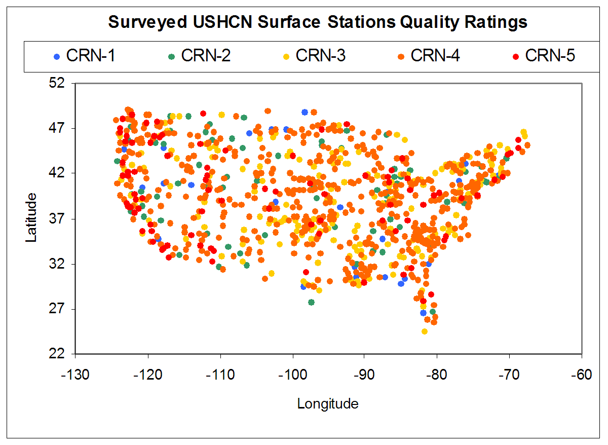
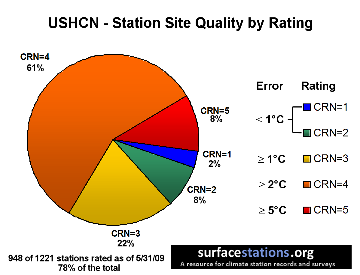
- During the last decade, a large reduction of rural reporting stations in the U.S. has biased records toward urbanized and urbanizing areas. Land use changes as well as deterioration of urban siting versus NOAA standards [http://www.surfacestations.org/] have resulted in a bias toward over-reporting/erroneous reporting of high temperature records and an under-reporting of low temperature records.
The charts below show the results of nearly 4/5ths of the U.S. weather stations and demonstrate a significant bias toward errors greater than +2°C or about three times the total trend reported for global warming. This instrumentation issue as well as the bias toward urbanization contribute to significant doubt about the conclusions that can be reached concerning temperature trends in the second half of the 20th century.

Reference for site ratings: NOAA’s Climate Reference Network Site Handbook Section 2.2.1
Reality Check
As stated earlier, this critique does not question the statistical methodology applied for that data used in the study. Rather it challenges the underlying selection of the data and the quality of the data.
The most obvious deficiency to anyone familiar with tracking U.S. temperature records is the omission of data from the 1880s through the 1940s. By selecting a period of cooling as the starting point, the NCAR study “stacks the deck” in favor of a warming trend. This is the same problem with the 1880s as a starting point for the longer term trend, but due to shorter cyclical variations within the 130 years longer trend data are somewhat tempered. There is no full climate cycle in the NCAR study.
To demonstrate this point, we will compare the record of statewide monthly temperature records for the longer period with the approximately 60-years of data used in the NCAR study. Obviously, comparing monthly statewide records to daily single point records can be argued a case of apple seeds and watermelons, but from an analytical perspective it is reasonable, as shall be shown.
The real difference is that we are comparing area climates with micro climates. Area climate monthly data maximum and minimum records will rarely be affected by spurious readings whereas micro climate daily data is wholly dependent upon very specific proper siting and quality control, including avoidance of external heat sources, issues that have been raised at the Surface Stations website.
In February 2007, I published an analysis titled, “Extreme Temperatures – Where’s The Global Warming” and a subsequent data update in January 2009 titled “Where Is The Global Warming… Extreme Temperature Records Update January 2009.” Dr. Roger Pielke, Sr. provided suggestions and a review in his weblog, “Climate Science.” In February 2009, these data were summarized graphically with this animation and data table in a posted titled, “Decadal Occurrences Of Statewide Maximum Temperature Records”:
Each state can have only 12 statewide, monthly records for the 13 decades tracked here… hence, they are “all-time” records for a state for a month.
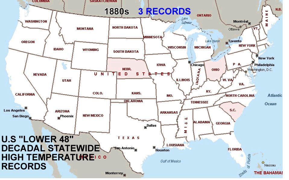
Range goes from 0 [white] to 8 [dark red]. Indiana had the highest frequency of records in one decade with 8 still standing from the 1930s. See the table below for the actual count by decade. Old records are replaced if tied or surpassed by subsequent readings.
The 1930s experienced the highest number of maximum extreme temperatures for which records have not been tied or surpassed subsequently. While the late 1990s did have a very brief hot period associated with El Nino, the 1990s were a rather ordinary period for extreme temperatures in the contiguous 48 states.
I have excluded Alaska and Hawaii from this animation because they are distinct and separate climate zones. For the record, however, Alaska’s decade of most frequent high temperature records was the 1970s with 4. Hawaii’s decade of most records was the 1910s. Those data are included in the table below.
The 1990s were only particularly hot, as reflected in these records, in New England and Idaho. These selective areas were far more restricted than the geographically widespread heat of the 1930s.
This animation goes to the heart of my arguments regarding global warming as it is reflected in U.S. temperature data.
- The trendline used by those claiming a long term warming begins in a very cool climate period. Consequently, any trend from that point will be upward.
- The late 1990s were an aberration and not indicative of the general climate oscillations presented in these records.
Click on image below for larger view.

Each state can have only 12 maximum or minimum all-time monthly records. The methodology requires that any instance where a previous record is tied or exceeded, the old record in replaced by the newer record. Therefore, this approach has a slight bias toward more recent records due to the “tie goes to the later” rule.
Comparison of Statewide Monthly Temperature Records with the NCAR Study
Going back to the NCAR graphic we can see a trend which may correspond to their conclusion:
For later in the 21st century, the model indicates that as warming continues (following the A1B scenario), the ratio of record highs to record lows will continue to increase, with values of about 20 to 1 by mid-century, and roughly 50 to 1 by late century.
Two factors contribute to this increase as noted by Portman et al (2009a): 1) increases in temperature variance in a future warmer climate (as noted in the model by Meehl and Tebaldi, 2004), and 2) a future increasing trend of temperatures over the U.S. (model projections shown in Meehl et al., 2006). Since the A1B mid-range scenario is used, a lower forcing scenario (e.g. B1) produces reduced values of the ratio in the 21st century, and a higher forcing scenario (e.g. A2) produces greater values. The model cannot represent all aspects of unforced variability that may have influenced the observed changes of record temperatures to date, and the model over-estimates warming over the U.S. in the 20th century. The future projections may also reflect this tendency and somewhat over-estimate the future increase in the ratio. Under any future scenario that involves increases of anthropogenic greenhouse gases and corresponding increases in temperature, the ratio of record high maximum to record low minimum temperatures will continue to increase above the current value.

Before the direct comparison to the statewide monthly records, let us look at their extrapolation [FROM THE NCAR STUDY – “is projected to continue to increase, with ratios of about 20 to 1 by mid-century, and roughly 50 to 1 by the end of the century.”] [my graphic]:

Before we can judge the extrapolation of maximum to minimum ratios in this study, we should understand how the data used by NCAR fits into the “big picture.”
Let us look at the statewide monthly maximum and minimum records by decade beginning in 1880. Those records are used to calculate a ratio of maximum and minimum records by decade and then compared with the NCAR study ratios.
 [click above table image for larger view]
There are two aspects of this comparison that jump out to the reader:
- The 1930s were, by far, the hottest period for the time frame. The ratio of maximum to minimum temperatures is greater in the 2000s, but the absolute number of monthly statewide extreme records is far less significant making the ratio far less significant.
- The general pattern of ratios for the monthly records follows reasonably closely to the pattern of the daily individual location records, on a decadal basis.
Now let us take the two data sets and plot the ratios and see what conclusions we might draw remembering that in absolute terms, the 1930 had a much higher frequency of maximum temperature extremes than the 1990s or 2000s or the combination of the last two decades.

If you were to only look at the ratios of maximum to minimum monthly temperature records, it would be understandable to draw the conclusion that, while there was a cyclical pattern to the ratios, the ratios were increasing exponentially toward a much hotter environment.
It is only when you compare the absolute number of all-time records that you appreciate that ratios as a measure of global warming may be quite deficient. You should also note a significant divergence in the numerical trend of record high monthly versus daily records.

Keep in mind that there are significant biases toward recording daily warmer temperatures due to the closure of thousands of rural stations and expansion of urban areas into previously rural or suburban areas, creating enormous “heat sinks,” that prevent night time temperatures from dropping to the extent that they would in a nearby rural setting. Hence more stations reporting greater frequencies of maximum temperatures and fewer minimums.
Conclusion
The oscillating or cyclical nature of our climate is completely overlooked when one takes a small time frame such as the 1950s through 2006 and extrapolates a full century beyond. Even 130 years of data, starting from a relatively cold period, gives a very brief look at climate history for the U.S. and certainly one that is not sufficient to extrapolate a general warming trend, much less an accelerating one.
In the face of the recent decline in new all-time monthly statewide maximum records, it is more probable that we may be facing a cyclical decline in our overall temperature and that something similar to the 1960s and 1970s may be a far more realistic projection. Our most recent winters have been particularly colder than long-term averages and minimal sunspot activity may be another harbinger of this normal cyclical variation in our relatively stable climate.
For more information about this and related topics, please check out the following blogs:
The authors have contributed ideas and advice for this post.
Great job, thank you for debunking yet another hockey stick.
As this partly demonstrates, the NCAR presentation is bordering on charlatanism. Let us do a ‘thought experiment’. If the decade of the 2010s is a mild one (not a wild one like the 1930s) with very few temperature extremes, yet on average slightly cooler than the 2000s, it is conceivable that NO minimum records will be broken, and only one or two maximum records broken. Even though the decade would be slightly cooler overall than the previous decade, so one could be seeing 20 years of cooling, the ratio would go to infinity because of division by zero. So the 60 year ratio sequence becomes 0.77, 0.78, 1.14, 1.36, 2.04, INFINITY…Now, that’s some hockey stick!
Frankly, I find it difficult to take any data from a “COOP” station seriously.
I am very curious about the US combined record from high quality USHCN stations, which Anthony promised to publish next year.
The purpose of the NCAR study is to highlight the importance of Copenhagen. The timimg is not coincidental. The bias is not unintentional.
The carelessness of the cribbing is amazing. A high school student (assuming they are still taught basic math and science) could figure out this study is junk.
Is this NCAR nonsense what we’re paying billions of dollars for?
Could someone explain to me why this focus on just the frequency of the records and not the magnitude of the records. Shouldn’t there be some kind of weighting? Or is it assumed that statistically the magnitude of the warm and the low records cancel each other out? For instance, is it assumed that certain extreme high temperature records are always compensated by extreme cold records of the same magnitude but with the opposite sign? Or could there be an imbalance for whatever reason? Or put in an other way: there may be a high frequency of warm records that are beating previous records by an average of only 0.1 degree whereas there may be a lower frequency of cold records but which are beating a previous ones by 0.5 degree.
Bruce’s final graphic says it all.
This is an excellent piece of work which exposes just another bogus attempt to prove climate warming by cherry picking a trend using data from from a non-linear system. When will climate scientists come clean and tell Joe Public that trends are meaningless in a dynamic chaotic system – and annualised global averages mean even less.
Although perhaps I’m doing them an injustice, and they are just plain ignorant about how our climate works?
There we go. Now we will be talking about minimum/maximum temperature record anomalies… why not talk about climate science abnormalities instead?
If they were still on the global cooling/coming ice age shtick, the headline would be “fewest number of record high temperatures since the 1880’s”. But seriously, this is a fabulous example of how to lie with statistics, and should the book of that name ever be updated and reprinted, this is a much-include example.
Oops – “must-include”.
UAH and RSS data show that the past decade has been warmer than the previous few decades.
I think the bottom graph says it all, if that was published in the report I doubt it would have gained much attention. Of note, is how similar the 2000’s are compared to the 1880’s, stunning!
Temps are going up, no matter how cold it gets.
1/n suggests pink noise to me. Similar to 1/f noise in electronics.
Robert Wood of Canada (14:58:16) :
> 1/n suggests pink noise to me. Similar to 1/f noise in electronics.
Not the same. Suppose we’re tracking low temperature records (hey,
high temperature records get too much attention! Suppose further that
the temperature is a random process.
In the first year, n=1, and the probablility of setting a record is 1/1. This is sort of by definition, but it’s the only special case.
In the second year, n=2, and probablility of setting a record is 1/2. In the 10th year, 1/10, etc.
By looking at the ratio of high records to low records, the random stream would continue with a 1::1 ratio indefinitely, and hence a warming or cooling trend will stand out as a change in the ratio.
Also, it’s one heck of a good way to hide the really extreme decades, the general loss of station coverage and probably a couple other things that some people might want to hide.
It seems to me that if the stations are biased toward warmer overnight lows and we have global warming, there would tend to be few, if any, record lows and a constant or increasing number of record highs. However, if the stations are biased because of siting and there is a stable or decreasing trend in temperatures, we would see fewer record highs and record lows. The record highs would not exist and the new record lows would be masked by station bias. The trend would be towards fewer records overall. But, hey, that’s just me.
The “urban heat island” effect is often mentioned in the climate debate. And there are many, many urban heat islands in the world today. You could in fact talk about “urban heat archipelagos” in many parts of the world. So my question is – could some part of global warming be attributed to these? Is it possible that the world is warming because we are, well, heating it?
Off thread:
Re Anthony’s WUWT third year anniversary celebrations.
As my fire works display in Melbourne is being over shadowed by a global celebration, the Leonid Meteor Shower, I’ve decided to postpone. (The charcoal BBQ still goes ahead!)
I don’t know why we seem to keep going on about this. The NCAR results are pointless and tell us absolutely nothing beyond the indication that the record is woefully short. Whether or not a particular temperature exceeds a previous record is mere happenstance — even if the underlying data were 100% accurate. This study’s findings may have been significant if there had been a long spate without any records broken and then suddenly more record events began to appear.
IMO the only valid critique can be summed up in two words: “so what?”
DAV (06:05:45) “The NCAR results are pointless […]”
Keep in mind that Meehl has to:
a) survive the swarm of alarmist-sharks in his pool.
b) maintain funding for his solar / terrestrial hydro-cycle research.
Meehl seems sophisticated enough to maintain the required “cordial” relations by exercising (administratively) “appropriate restraint” & careful timing of announcements regarding his solar-terrestrial findings. He may be the picture of a sufficiently-non-threatening inside-player wielding actual power (as opposed to the screaming-protester-type, throwing rocks at the ivory tower from outside). We may not know for many years what his true game is… and we may never know. If he is really smooth, we may just be left to read between the lines in his solar-terrestrial papers.
As for these abstract simulation-studies based on nonsense-assumptions:
Academics are very fond of them for their “cute effect” (which is one proven way to attract academic attention, so long as you do not resort to it too often). It is worth noting that academics don’t always take “cute” research seriously (in physical terms), but they like it anyway because it stimulates computational ideas [and that is hard stuff, even when CDOs (convenient dramatic oversimplifications) are made]. Spending a decade around math & stats departments was helpful in learning the “tricks of the trade” – lots of coy smiles from clever players I assure you …& lots of fooled grad students who don’t recognize academic gaming right in their faces – you can build an elaborate world with a strategic false assumption – and the troops are conditioned to accept all assumptions without question …and the smart players sit through presentations with a big grin on their faces, not blowing their colleagues’ cover.
Ric Werme (18:05:17) “Suppose further that
the temperature is a random process.”
You lost me right there (…as I pause to remember the various & countless devout & reverent tones in which I have heard that religious phrase [“suppose further that…”] preached & sung …and as I recall naively-uncritical students obediently taking notes, during the indoctrination they received to blindly swamp & undermine the world with unrealistic modeling assumptions).
NCAR Press Release – November 12, 2009 – “Record High Temperatures Far Outpace Record Lows Across U.S.”
http://www.ucar.edu/news/releases/2009/maxmin.jsp
“The study team analyzed several million daily high and low temperature readings taken over the span of six decades at about 1,800 weather stations across the country, thereby ensuring ample data for statistically significant results.”
Comment:
Measures of statistical significance rest upon untenable (in this context) assumptions of randomness, which rip & tear at the body of truth.
There is a deeply-rooted epidemic in our statistical schooling.
This is epistemological.