We would like to continue to take advantage of the brain trust in our audience to refine and harden the articles on the Everything Climate , one article at a time.
Please continue to contribute input to improve and tighten up both the Pro and Con sections, etc.)
We will start with one article at at time and if this works well, it will become a regular feature.
So here’s the Next one. Please give us your input. If you wish to email marked up word or PDF documents, use the information on this page to submit.
Pro: Climate Models Have Been Demonstrated to be Accurate.
By Alan Buis,
NASA’s Jet Propulsion Laboratory
An animation of a GISS (Goddard Institute for Space Studies) climate model simulation made for the United Nations’ Intergovernmental Panel on Climate Change Fourth Assessment Report, showing five-year averaged surface air temperature anomalies in degrees Celsius from 1880 to 2100. The temperature anomaly is a measure of how much warmer or colder it is at a particular place and time than the long-term mean temperature, defined as the average temperature over the 30-year base period from 1951 to 1980. Blue areas represent cool areas and yellow and red areas represent warmer areas. The number in the upper right corner represents the global mean anomaly.
Credit: NASA’s Goddard Institute for Space Studies
There’s an old saying that “the proof is in the pudding,” meaning that you can only truly gauge the quality of something once it’s been put to a test. Such is the case with climate models: mathematical computer simulations of the various factors that interact to affect Earth’s climate, such as our atmosphere, ocean, ice, land surface and the Sun.
For decades, people have legitimately wondered how well climate models perform in predicting future climate conditions. Based on solid physics and the best understanding of the Earth system available, they skillfully reproduce observed data. Nevertheless, they have a wide response to increasing carbon dioxide levels, and many uncertainties remain in the details. The hallmark of good science, however, is the ability to make testable predictions, and climate models have been making predictions since the 1970s. How reliable have they been?
Now a new evaluation of global climate models used to project Earth’s future global average surface temperatures over the past half-century answers that question: most of the models have been quite accurate.
In a study accepted for publication in the journal Geophysical Research Letters, a research team led by Zeke Hausfather of the University of California, Berkeley, conducted a systematic evaluation of the performance of past climate models. The team compared 17 increasingly sophisticated model projections of global average temperature developed between 1970 and 2007, including some originally developed by NASA, with actual changes in global temperature observed through the end of 2017. The observational temperature data came from multiple sources, including NASA’s Goddard Institute for Space Studies Surface Temperature Analysis (GISTEMP) time series, an estimate of global surface temperature change.
The results: 10 of the model projections closely matched observations. Moreover, after accounting for differences between modeled and actual changes in atmospheric carbon dioxide and other factors that drive climate, the number increased to 14. The authors found no evidence that the climate models evaluated either systematically overestimated or underestimated warming over the period of their projections.
“The results of this study of past climate models bolster scientists’ confidence that both they as well as today’s more advanced climate models are skillfully projecting global warming,” said study co-author Gavin Schmidt, director of NASA’s Goddard Institute of Space Studies in New York. “This research could help resolve public confusion around the performance of past climate modeling efforts.”

Con: Global Ocean Temperatures are Warming at Only ~50% the Rate of Climate Model Projections
Dr. Roy Spencer, a climate scientist from the University of Alabama, Hunstville examined the claims of accuracy of climate models by comparing them to actual measured temperatures.
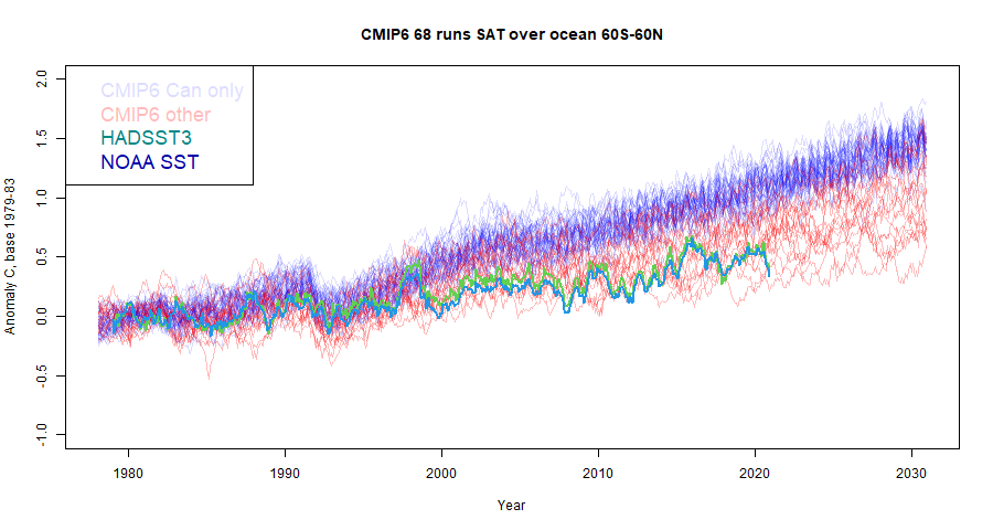
The plot below (Fig. 1) shows the monthly global (60N-60S) average ocean surface temperature variations since 1979 for 68 model simulations from 13 different climate models. The 42 years of observations we now have since 1979 (bold black line) shows that warming is occurring much more slowly than the average climate model says it should have.

In terms of the linear temperature trends since 1979, Fig. 2 shows that 2 of the top-cited ocean temperature datasets have warming trends near the bottom of the range of climate model simulations.

Deep Ocean Warming Could Be Mostly Natural
A related issue is how much the deep oceans are warming. As I have mentioned before, the (inarguable) energy imbalance associated with deep-ocean warming in recent decades is only about 1 part (less than 1 Watt per sq. m) in 300 of the natural energy flows in the climate system.
This is a very tiny energy imbalance in the climate system. We know NONE of the natural energy flows to that level of accuracy.
What that means is that global warming could be mostly natural, and we would not even know it.
I’m not claiming that is the case. I am merely pointing out the level of faith that is involved in the adjustments made to climate models, which necessarily produce warming due to increasing CO2 because those models simply assume that there is no other source of warming.
Yes, more CO2 must produce some warming. But the amount of warming makes all the difference to global energy policies.
Seldom is the public ever informed of these glaring discrepancies between basic science and what politicians and pop-scientists tell us.
Why does it matter?
It matters because there is no Climate Crisis. There is no Climate Emergency.
Yes, irregular warming is occurring. Yes, it is at least partly due to human greenhouse gas emissions. But seldom are the benefits of a somewhat warmer climate system mentioned, or the benefits of more CO2 in the atmosphere (which is required for life on Earth to exist).
But if we waste trillions of dollars (that’s just here in the U.S. — meanwhile, China will always do what is in the best interests of China) then that is trillions of dollars not available for the real necessities of life.
Prosperity will suffer, and for no good reason.
I would tend to rate Dr Spencer much more highly than GISS, as GISS has credibly been accused of the cooking the records to fit their models, cooling the past to better fit CO2 levels as a driver of temperature.
GISS is not involved in Roy’s analysis. It is CMIP6 models compared with ERSST.
Strange that there are 18 -ve votes on this comment without a single one of those persons posting a logical or factual criticism of Nick’s comment.
Boo, Nick Stokes, boo ! Why bother with facts.
Now let me guess. Are any of the 63 runs from 13 models anything to do with GISS?
For example: ‘CMIP6.CMIP.NASA-GISS.GISS-E2-1-G.1pctCO2’ ???
You miss the point. The GISS/model comparison is fabricated and Dr. Spencer’s analysis is based on established relationships. Nick’s comment depreciated/discounted Dr. Spencer’s analysis. To that is what the commenters were responding.
They are saying there has been…1.7 degrees F (not C) of warming since 1970??? Am I reading this correctly? Why is the graph not labeled as “Figure 1”?
Since both pro and con are comparing models to data products, not raw measurements, any critique performed needs to address the adequacy/accuracy of the data product to ensure it is an appropriate reflection of the reality the models are supposed to forecast.
Charles, three possible comments, all in my ebooks, which you now have permission to lift images from and then reproduce, with attribution, here.
Your to do to rewrite the thing with these potential adds.
Highest regards.
The only food crop emergency is the one due to taking food from the mouths of starving populations to burn it road vehicles in developed countries in order bourgeois socialists to pretend that this is somehow “saving the planet”.
Despite ethanol rotting the rubber hoses, rubber seals and diaphragms on my motorcycles, I can not even buy a true octane product in Europe now, that has not been polluted with ethanol made from someone else’s lunch.
I make it out to be about 1.8 F or exactly 1 C increase in 50 years. That’s 0.2 C per decade, about what the RSS satellites are predicting, and about 50% higher than the 0.14 C per decade that UAH is showing. Assume 70 years for doubling and that gives you 1.4 C per doubling–NOT the 3 C from the model mean.
UAH shows +0.18C/decade over land and +0.14C/decade over sea since their satellite measurements started in 1979. These are lower than RSS but Roy Spencer argues that UAH has good agreement with radiosones. RSS revised their measurements upwards a couple of years ago
Sorry, my error. UAH has +0.12C/decade over the oceans which gives an average for land and sea of +0.14C/decade
0.14C per decade matches the 1910 to 1940 warming rate.
1860 – 1880 0.16 C a 20 year rate per decade
1910 – 1940 0.15 C a 30 year rate, includes the dirty ’30’s
1975 – 1998 0.16 C a 20 year rate.
Trends source: Interview by the BBC with Phil Jones of the Hadley Center for Climate Change at East Anglia University
http://news.bbc.co.uk/2/hi/8511670.stm
How do you get a precision of 0.01C when there were only about 100 thermometers in the Southern Hemisphere until after the 2nd World War 1945?
You trust HADCRUT Phil Jones after climate gate in a BBC interview of all things? The magic tree Briffra used was in Yamal https://en.wikipedia.org/wiki/Yamal_Peninsula
How would NASA’s analysis turn out using satellite temperature data?
How well do the hindcasting computer models match the temperature profile of the world’s regional surface temperature charts? Answer: Not at all.
The fact is the computer models don’t reproduce the temperature profile of regional temperature charts, all they reproduce is the bastardized temperature record profile of the fraudulent, instrument-era Hockey Stick charts. You can tell if it’s a fraudulent temperature chart if the chart does not show the Early Twentieth Century as being as warm as it is today. All regional charts show it was just as warm in the recent past as it is today, which means we are not experiencing unprecedented warmth today, as the alarmists claim.
So claiming the computer models perfectly hindcast the fraudulent Hockey Stick temperature profile is evidence that the computer models are junk science, because the Hockey Stick temperature profile is fraudulent science that does not represent reality, so the computer models don’t represent reality, either.
The “hotter and hotter” temperature profile of the fraudulent Hockey Stick chart does not resemble any unmodified, regional surface temperature chart from anywhere in the world. The Hockey Stick chart is all alone. It’s the only thing the alarmists can point to that shows any warming, and it’s all fraudulent, and it’s all deliberate fraud created in a computer.
These alarmists can read a regional surface temperature chart as well as anyone, yet they ignore them and act like they don’t exist and they do so in order to sell the lie that CO2 is overheating the Earth’s atmosphere. They could’t make that claim looking at a regional surface temperature chart. That’s why they don’t look, and they don’t want you to look, either. They want you to stay mesmerized by the lie of the Hockey Stick temperature profile.
CAGW is a lie, and these people know it’s a lie, and yet they keep on lying.
Meanwhile, CO2 is UP, and Temperatures are Down. Let’s see them lie their way out of that.
Here’s a bogus, fraudulent Hockey Stick chart:
As you can see, it makes it appear that temperatures have been steadily climbing for decades, and that the temperatures are now the warmest in human history.
This is the Huge Lie that is being used to sell the Human-caused Climate Change scam.
As you can see, the hot part of the middle of the 20th century has been cooled to insignificance using alarmist computer tricks and shows to be much cooler than the current day, yet any regional surface temperature chart will show that this temperature profile does not repesent reality.
NASA’s James Hansen said that in the U.S., 1934 was the hottest year and was 0.5C warmer than 1998, which makes it 0.4C warmer than 2016. But you couldn’t tell any of that from looking at the bogus Hockey Stick chart.
Here’s Hansen’s U.S. chart circa 1999:
This U.S. temperature profile certainly does not resemble the fraudulent Hockey Stick profile. It shows the Early Twentieth Century was just as warm as it is today. All the other regional surface temperature charts have a temperature profile very similar to the U.S. chart. NONE of them look like the “hotter and hotter” Hockey Stick chats.
The Hockey Stick charts are computer-generated lies meant to sell the Human-caused Climate Change scam. It’s their only selling point and it’s all made up in a computer.
Here’s a couple of regional surface temperature charts from different parts of the world, that show it was just as warm in the Early Twentieth Century as it is today.
I’ll limit myself to two charts as I believe posting more than that in one post causes the moderator to have to look at it, and we want to save them some unnecessary work, 🙂
Australia’s regional chart:
China’s regional chart:
They both show that it was just as warm in the Early Twentieth Century as it is today. They look nothing like the bogus, bastardized Hockey Stick charts.
The alarmists have created a scary false reality in which many of the people of the world are living.
By combining land and ocean data, GISS makes it impossible to compare any one time period to another in order to obtain scientifically usable information. Ocean temperature evolution (at any particular depth) does in no way resemble that of any atmospheric layer.
Both at sea and on land, temperature measurement instrumentation type, accuracy, location and coverage have changed significantly over time. Added to sea/land temperature incompatibilities, those changes ensure that the GISS land/sea combined chart is meaningless.
Good posts Tom Abbott, thank you.
CAGW has always been a lie, a fraud. I first published that CAGW was a false crisis in 2002, but I knew that in 1985, based on paleoclimatology. For a while, we thought the warmists were just technically mistaken, but their thuggish Leninist tactics exposed in the Climategate emails and their vile cancel culture soon made it obvious that they were deliberately lying.
The warmists have been lying since the beginning, circa 1970. To end 2020 they have made 48 scary climate failed predictions that have fully expired – the odds against that are 1 in ~283 trillion – no rational person or group could be this wrong, this obtuse, for this long – they know they are lying – they’ve known all along.
Thoughts from 2015:
https://wattsupwiththat.com/2015/11/23/weekly-climate-and-energy-news-roundup-206/#comment-1651447
This is worth reading:
Richard Lindzen, Will Happer and Patrick Moore:
http://icecap.us/index.php/go/joes-blog/prominent_scientists_declare_climate_claims_ahead_of_un_summit_irrational_b/
MIT Climate Scientist Dr. Richard Lindzen: ‘Demonization of CO2 is irrational at best and even modest warming is mostly beneficial.’ – ‘When someone says this is the warmest temperature on record. What are they talking about? It’s just nonsense. This is a very tiny change period.’
Princeton Physicist Dr. Will Happer: ‘Policies to slow CO2 emissions are really based on nonsense. We are being led down a false path. To call carbon dioxide a pollutant is really Orwellian. You are calling something a pollutant that we all produce. Where does that lead us eventually?’
Greenpeace Co-Founder Dr. Patrick Moore: ‘We are dealing with pure political propaganda that has nothing to do with science.’
Thoughts from 2013:
https://wattsupwiththat.com/2013/10/10/the-sun-does-it-now-go-figure-out-how/#comment-1121415
[excerpt]
The popular debate in climate science suggests that this science is in its infancy. I further suggest that the majority of climate science has taken a giant step backwards in recent decades due to egregious political interference and scientific misbehaviour.
Notwithstanding all the wonderful data available especially since ~1979, we have an “ECS mainstream debate” that ASSUMES THAT CO2 SIGNIFICANTLY DRIVES TEMPERATURE and centres on the question of “climate sensitivity to atmospheric CO2” (“ECS”) that questions whether ECS is greater or less than 1 (that is, are there positive or negative feedbacks to increasing atmospheric CO2).
Since CO2 (changes) clearly LAGS temperature (changes) at all measured time scales, this ECS mainstream debate requires that, in total, “the future is causing the past”, which I suggest is demonstrably false.
To be clear, I suggest that atmospheric CO2 does NOT significantly drive Earth temperatures, and Earth temperatures clearly drive atmospheric CO2.
This does not preclude the possibility that the observed increase in atmospheric CO2 is primarily caused by some factors (natural and/or humanmade) other than temperatures, but such increase in CO2 is insignificant to Earths’ temperatures.
In summary, in climate science we do not even agree on what drives what, and it is probable that the majority, who reside on BOTH sides of the ECS mainstream debate, are BOTH WRONG.
It is also possible that I am wrong on this point ( possible, but not probable :-} ).
Regards to all, Allan
I don’t think that Climate Sensitivity (CS, ECS or TCS) even exists in practical reality. Atmospheric CO2 changes lag temperature changes at all measured time scales. (MacRae, 2008). Humlum et al (2013) confirmed this conclusion.
Kuo et al (1990) and Keeling (1995) made similar observations in the journal Nature, but have been studiously ignored.
Think about that: Kuo was correct in 1990, and for 31 years climate science has ignored that conclusion and has been going backwards!
Climate Sensitivity to CO2 is a fiction – so small, if it exists at all, it is practically irrelevant.
“The future cannot cause the past.” Here is the proof, from my 2008 paper:
https://www.woodfortrees.org/plot/esrl-co2/from:1979/mean:12/derivative/plot/uah6/from:1979/scale:0.18/offset:0.17
In the modern data record, the lag of atmospheric CO2 changes after atmospheric temperature changes is ~9 months. This is an absolute disproof of the CAGW hypothesis, which states that increasing CO2 drives temperature. “The future cannot cause the past.”
In my 2019 paper below I explained why the lag is ~9 months – it is basic calculus, the 90 degree (1/4 cycle) lag of the derivative and its integral, which is the ~3 year ENSO period.
My 2008 paper remains very important. My 2008 conclusion was duplicated and expanded by Humlum et al in 2013, for which I am grateful.
My 2008 paper has been cited by Ed Berry in his 2020 book and related paper, which is at the cutting edge of climate science.
“CLIMATE MIRACLE: THERE IS NO CLIMATE CRISIS – NATURE CONTROLS CLIMATE”
amazon.ca/Climate-Miracle-climate-crisis-controls-ebook/dp/B08LCD1YC3/
“CARBON CYCLE MODEL SHOWS NATURE CONTROLS CO2 LEVEL”
edberry.com/blog/climate/climate-physics/preprint3/
All warmists and most skeptics argue about the magnitude of climate sensitivity to increasing CO2, and whether the resulting CO2-driven global warming will be hot and dangerous or warm and beneficial. Both groups are probably wrong, because global cooling is happening now, even as CO2 concentration increases.
There is a high probability that the mainstream debate is wrong – a waste of decades of vital time, tens of trillions of dollars of green energy nonsense and millions of lives. Vital energy systems have been compromised, damaged with intermittent, unreliable wind and solar generation – a debacle.
Cheap abundant reliable energy is the lifeblood of humanity – it IS that simple. The green sabotage of our vital energy systems, whether innocent or deliberate, has cost lives and could cost very many more.
Scientific details here:
CO2, GLOBAL WARMING, CLIMATE AND ENERGY June 15, 2019
https://wattsupwiththat.com/2019/06/15/co2-global-warming-climate-and-energy-2/
Repeating, “The future cannot cause the past.”
Regards, Allan
There’s not a lot of satellite data prior to 1960’s so that will not help in hiding the atmospheric temps of the 1930’s
All the models are fundamentally flawed.
Comments for the attached K-T diagram.
Upwelling 396 W/m^2 is 54 W/m^2 more than the gross 342 that arrived from the sun,
157 W/m^2 more than the net 239 after albedo,
236 W/m^2 more than the net 160 to the surface.
Rather egregious violations of 1st law conservation of energy.
The up/down/“back” 333 W/m^2 100% efficient loop leaves no energy behind
to warm the atmosphere and leaves no energy behind to warm the surface.
A 100% efficient perpetual energy loop violates thermodynamics.
The 333 W/m^2 (S-B 277 K, 4 C) downwelling from the cold troposphere, -40 (ALL directions S-B 167 W/m^2) to -60 C (ALL directions S-B 117 W/m^2), to the warm, 16 C, surface without the addition of work violates thermodynamics.
And as noted the -40/-60 troposphere cannot “back” emit at 333 W/m^2.
Not that it matters since the 396 W/m^2 is a theoretical ideal BB calculation with
ZERO physical reality and removing it from the diagram does not affect balance.
Nick apparently feels that quantum mechanics as described by the Planck curve is fundamentally flawed and the “caloric” method should be used. However these were updated, circa 1980’s engineering undergrad curriculums, to explain to students how photons from cold microwave ovens and cold lasers could heat things up…..
Both of those devices plug into an electrical power outlet.
They are not powered out of thin air hocus pocus created by a “what if” S-B calculation.
Photons from a microwave do not transfer heat. I can place a ceramic cup in a microwave turn on the it on and the cup will not heat. The air in a microwave barely gets warm.
Energy is transferred to molecules like water that rotate causing heat within an item. There were cold spots in older microwaves and that is why the plates rotate now for more even heating.
“The heat is produced by the microwaved object and not the appliance.”
Photons are so poorly understood that they should be omitted from any education curriculum. They are energy quanta. They only exist by virtue of the E-M field. Energy is unidirectional at any point in space and time.
Energy is emitted in all directions at the characteristic impedance of the media but once that object’s field equilibrates with all other objects in the field then the energy only goes from the high energy source to the lower energy sink. They are not like guns spraying bullets in every direction but more like pressure vessels with interconnecting hoses with fluid flowing one way from the highest pressure to the lowest pressure.
Viewing photons as being sprayed in all directions is the same as vieweing that there is fluid flowing in both directions in the pipe between two tanks but one flow is bigger than the other. That is what is being done when the difference terms in the S-B equation are separated.
So true. The only part that matters from the energy balance is what occurs at the top of the atmosphere.
The “field” of climate science is filled with silly religious beliefs.
The so-called CO2 forcing is based on IR absorption in a US standard atmosphere.
Try to get MODTRAN to produce anything like the 180W/sq.m OLR from a tropical ocean surface at 303K.
Ice in the atmosphere plays the dominant role and reflection trumps absorption and re-emission by a good margin. When the ocean is its warmest that ice over the oceans results in net heat loss of 4.2W/sq.m/cm of water in the atmosphere. A very powerful cooling agent.
I don’t think these two articles are helpful to even a well-educated person, much less the average person, in helping them determine whether or not either approach is correct in its model evaluation. The main problem is that it is all but impossible, just from the articles, to know or figure out why they disagree so significantly.
To make these articles truly helpful, there needs to be a third part with the headline something like, “Why these two approaches to model evaluation are so different,” and then for the content, in layman’s language as much as possible to explain the primary reasons for their different assessments. Different actual temperature series? OK, what are they and why do they differ? If each temperature series were used with the other’s model results, what would happen? And/ or, do the two model sets/ means differ? If so, why and how?
Maybe there are other aspects of each analysis that are an important reason why different conclusions are drawn. If so, what are they and how do they affect each analysis?
Right now, all I get is the equivalent of an argument between two ten year olds: “Does too!” “Does not!”
I agree with meisha. no basis for preferring Hausfather over Spencer or viceversa. Apples and oranges too. Not helpful .what about including Christy work showing mid stratosphere comparison,and any direct contradictory evidence to that
Another example.
Try the annotated version.
The atmosphere is bounded by space at TOA and by the earth’s surface at the bottom. The Sun’s input is considered to be 100 at TOA.
Energy into the atmosphere as a % of Sun radiation at TOA:
Absorbed fraction of sun’s energy = 22.9
Absorbed fraction of earth’s energy = 104.4
Sensible heat = 5.0
Latent heat = 23.5
TOTAL ABSORBED 155.8
Energy out of the atmosphere as a % of Sun radiation at TOA:
Emitted by atmosphere at TOA = 49.6
Emitted by clouds = 8.8
Back Radiation to earth’s surface = 97.7
TOTAL EMITTED 156.1
ROUNDING ERRORS 0.3
The math seems to work out fine. This just shows that GHGs do result in energy retention by the atmospheric system. Nick, you seem to have left out the 42.7% Sun input to the surface in your “loop” analysis.
I think it would be very helpful to show a summary of model forecast by date of forecast (the date on which the models were run). I appreciate that it’s a lot of work and I’m not volunteering for it(!). A major possible reason for discrepancy between the pro and con graphs is the different dates of forecast. It might be very informative to see the average model forecasts to say 2050 made in say 1979, 1984, 1989, etc against the measured temperatures. Averages only, to avoid clutter. I suspect that it would show decreasing slope in later forecasts, but maybe not?
“the date on which the models were run”
All models in the CMIP series use a fixed date to switch from historic forcings to scenario. The last fig in the pro case marks this as 2000.
Comparing the PRO and CON graphs is hard!
The PRO uses CMIP4 models to hindcast 1970-2000 and forecast to 2020, in deg. F, against GISS surface temps, with anomaly base 1980-1999 (20 years).
The CON uses CMIP6 models to hindcast 1979-2021 and forecast to 2030, in deg. C, against ERSSTv5 ocean surface temps, with anomaly base 1979-1983 (5 years).
I presume the PRO uses a common base for its simulations and GISS data, and similarly for the CON data, but perhaps this is wrong. Can we get the data on a common time base by just shifting by a constant temp difference or does the spatio-temporal variation between bases make this inaccurate?
Can we use Earth surface temps (perhaps both GISS and UAH data) consistently in either F or C? And display ERSSTv5 data as well, so we can see:
– how the CMIP4 and CMIP6 simulations compare to each other,
– how the observed temp products compare to each other, and
– how the simulations compare to the observations?
The study uses 17 models (out of how many?) developed between 1970 and 2007. It will be fun to see what the various estimated future CO2 concentrations are in the various models. Any bets on how similar or dissimilar they are to RCP8.5? Any bets as to how those concentrations compared to the ones used in the then-hyped model run outputs? Using different scenarios at different times for different audiences would be propaganda – no?
Every run of the models during that period should be documented and presented.
The model owners and operators have a bad habit of running the model repeatedly. After which they select runs that they then “average”.
Decades ago I subscribed to a financial service that had a graph that predicted stock market changes,. Every month it was adjusted to accurately predict the past. Unfortunately it could never predict the future. My concern is that these climate models have the same problem. That the basic theory and parameters are so little understood that they have ended up hind casting the climate and are perfectly useless for predicting the future.
Past performance is no guarantee of future performance…
This persistent adjustment is from a scientific perspective a conjuring trick – If you have ever used a satellite navigation system to get somewhere, it makes an estimate of your time of arrival at your destination. It keeps on adjusting this ETA and surprise, surprise, when you get to your destination the estimate is spot on (not its original estimate however).
To claim successful predictions from persistently adjusted models is nonsense ! They will always get you to where you are ! Just like SatNav does.
I find it totally unsurprising that computer models crafted about the premise that CO2 causes warming do in fact predict warming from CO2 increases. Especially when such modelling ignores most all other sources and causes of warming. Abracadabra !
The most common causes of satnav ETA adjustments are rest stops, food stops, fuel stops and traffic. Our 8 hour (predicted) trip to Ohio typically takes ~9 hours because of the accumulation of such issues, which are not factors in the satnav ETA calculation.
sounds like a hurricane prediction to me Ken….and shock and awe….they are always spot on at land fall
“Decades ago I subscribed to a financial service that had a graph that predicted stock market changes,. Every month it was adjusted to accurately predict the past. Unfortunately it could never predict the future. My concern is that these climate models have the same problem.”
But the past the climate computer models are “accurately” predicting are not representative of the real temperature history. The computer models are accutately predicting temperatures that only exist in a computer model, not in reality. Reality doesn’t look anything like these computer models.
My concern is the ease at which the past gets changed to suit the upward trend of the models.
This has become common practice for climate modellers. Absurd cooling of the past to maintain a warming trend.
Attached shows so much past cooling in the Nino34 region that the 1998 El Nion simp[ly could not have occurred.
I have pointed this out to climate prognosticators in Australia and the UK and their only response is that their models are middle of the road. They are long past reality.
You have chosen a pretty bad example to claim models are inaccurate in prediction. First and obvious is that the period 1979-2020 is not testing a prediction, and it is not of global warming, but SST.
But there are two major flaws in what was done. I have described them in a post here. They are
1. The post uses KNMI data, saying it is for 68 runs from 13 models. But if you go to the KNMI page, you can see that 50 of those runs came from one model, CanESM5. And that has the highest sensitivity of all the models. This plot shows the response of Roy’s chosen variable TAS, as in fig 1, but this time with CanESM5 runs shown in faint blue, and others red. As you see, the blue are at the top, and if you compare with just the red (the other 12 models), you see a very different picture.
2. The post matches with the wrong variable, TAS, which is the near surface air temperature. He is comparing with measured SST. But the models return a true SST variable, TOS. This has not yet been posted at KNMI, but some data has been at a repository at University of Melbourne. If you use the correct variable, it looks like this:
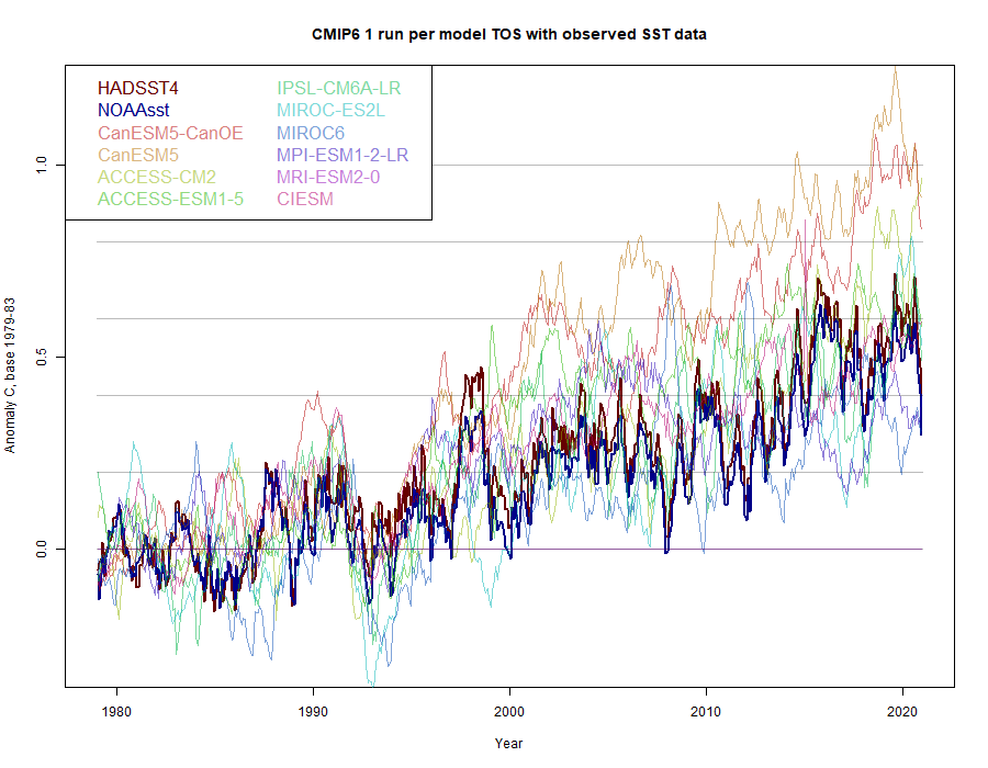
Again the two CanESM groups listed are at the top. I have compared with two major global SST indices, HADSST4 and NOAAsst. The picture is now very different. If the obs were models, you’d say they were mid-range, perhaps just a little below average, but probably right on if you exclude the CanESM runs. There is no indication of model inaccuracy, and certainly not by a factor of two.
A couple of links didn’t come through. The post describing the first graph is here
And the KNMI page is here
At the link: I’m not sure what the acronyms mean (TOS TAS etc.) but if I’m reading the graph’s correctly most if not all the observations are at the lower end of the latest model spread, definitely below the ensemble mean.
From what I’ve read the CMIP6 models spread is wider that the previous CMIP5 so apparently the modellers have ‘learnt nothing and forgotten nothing’.
“are at the lower end of the latest model spread, definitely below the ensemble mean”
Yes, that can happen. It’s unlikely that observations come out dead centre, and about equally likely that they will be above or below. The point is that they are well within the range, which doesn’t refute the models.
“From what I’ve read the CMIP6 models spread is wider”
It is early days. One very “warm” model CanESM5 has produced a lot of runs early. See how it settles down as data comes in.
The observations are not “well within the range.” It takes Super El Ninos to drive observations anywhere above the bottom of the range.
Also, please remember that the “experts” in the UN IPCC AR5 had to arbitrarily lower the CMIP5 projections because they were running so far above observations. CliSci models are not sufficient reason to fundamentally alter our society, economy and energy systems. Marxism fails.
It seems quite obvious to my eyes that the observations are within the range of model results. A bit below the mean but not on the lowest end. If you want to claim that the models have “gotten it wrong” you have to show that observations fall outside of the range of model results.
If your bank said your account was “300 +/- 100”, and you know it is actually 385, how reliable is your bank?
Now what if your bank said your account was “400 +/- 100” and you had that same 385?
In modeling, precision of the baseline matters. Gaussian distributions are important, and when you’re out on the tail-end of a distribution, it means your underlying assumptions that drive the mean are probably wrong – and you’re letting tolerance save you.
In the first case I would say the balance falls quite obviously within the bank’s margin of error, and we can probably learn something from studying why it’s on the lower end of their range. In neither case would I say the banks estimates have been refuted.
Are your eyes calibrated for statistical significance, which you have previously shown a preference for?
The “range of model results” does not reflect any physical properties; the global average temperatures of the different models vary by 3C. And each group of modelers tune individual models to get an ECS that “seems about right” (their statements) based upon their individual ‘noble cause’ estimations.
Outside the late 20th Century ‘tuning period,’ individual model hindcast and forecast outputs vary by huge ranges; large enough to be scientifically risible. If one model says 1940’s average temperature anomalies was ‘observed + 0.5C’ and other says it they were ‘observed – 0.5C,’ why would I believe the models’ average ‘equals observed’ proves the models are accurately representing the actual physics of global climate?
Numerous analyses by qualified scientists, modelers and mathematicians show that observed climate metrics consistently trend along the very bottom of the range of modeled metrics. Cherry picking models, forcings, time frames, etc. to prove models are accurate is evidence of scientific malpractice; they are done to convince, not to inform, average people. They are sophisticated lies.
The range of model results encompasses the observations, therefore the observations do not refute the model results. Agree or disagree?
I disagree. The huge range of model results invalidate the accuracy of most models. Each model is an independent entity; one cannot use their range to prove anything about their collective accuracy.
If I throw 20 darts at a dartboard, the range of scores will not tell you anything about the collective accuracy of the darts as each is an independent entity, but it will certainly tell you something about the dart thrower’s grasp of the mechanics of dart throwing.
What does it say about the individual skills of 20 different dart throwers? Especially if there are 20 different dartboards?
Weekly
You are basically arguing that if you double the radius of the dart board, and all the darts hit the board, it is a demonstration of the skill of the thrower.
I’m not making a commentary about model accuracy at all, but commenting on the fact that if your darts are hitting the board you can’t claim that the darts aren’t hitting the board, no matter how large the board is.
The goal is to hit the bulls-eye, not the board! The measure of success is how close the throws are to the bull eye. Being poorer than a random selection of points on the board is a very poor aim indeed!
Deleted
Nick
I have been reading your post for as long as I can remember, I frankly can’t take it any more, if you want to play games and eliminate the model runs that are on the high side that’s fine but they are the same ones that climate the scare nuts use to prove the world is in danger. You know as well as anyone it’s not and that the warming is neither dangerous nor frankly harmful. RGB said it many times, if we could have run away warming then why hasn’t it ever happened before, simple it can’t. We have had run away cooling though and that is the life and society killer. Please just stop, you are fooling yourself and you are way too smart to let that continue. There are millions and millions of kids living with debilitating anxiety worrying about this nonsense, the harm that is being done is real and it’s time to stand up and be counted.
Reality will prevail.
There is a desperate attempt to mask the obvious and the innocent, uneducated wokeful keep the belief alive.
There is only so much past cooling and failed doomsday forecasts that any generation can handle.
On the other hand, eventually the world will need to wean off fossil fuels and that challenge cannot be underestimated. You only have to look at the hopeful wokes who believe wind and solar are viable.
China has about 30 years of known coal reserves. Hopefully that will improve with more exploration but it does put some urgency on finding an alternative.
Actually, the observations are running along the bottom of the red curves. The models still fail.
It’s because the two variables being compared are different things – the models are showing surface air temperature and the observations are of sea surface temperatures. You need to look at the second graph to see an apples to apples comparison.
You are trying to deflect away from the accuracy claim. Both of your graphs show a range in the models that is about 5 times the range of measured temperatures. Averaging model values that are inaccurate to begin with results in nothing approaching accuracy.
Example: Would you accept this from your stock broker? Why are climate forecasts any less important than stock forecasts?
Lastly, the regional breakdowns I have seen from these models are worse than a joke. If models can not accurately show regions, i.e., parts, how can the sum add up to an accurate whole? That’s like saying I know the final speed of an object but I have no idea of the mass or acceleration involved.
The precision of the models is questionable due to the tuning needed to keep them in the same ball park even though they are incoherent. However their accuracy is unknown due to the propagation of the uncertainty in them. https://www.frontiersin.org/articles/10.3389/feart.2019.00223/full
I’ve written a number of posts on why the temperature databases and averages from them are subject to measurement uncertainty. The propagation of that uncertainty should be carried through to the calculations of anomalies but climate scientists have any number of mathematicians who incorrectly choose to use the error of the mean as a measure of accuracy and precision. It is ridiculous and any good tool and die maker or master machinist would tell you the same thing.
Jim
Back about 1996 I was working for the city of Scottsdale on a NASA grant, as the remote sensing team leader. Our task was to apply satellite remote sensing to urban problems, particularly trying to accurately estimate the impervious percentage of the city. We were using thematic classifiers of Landsat imagery. There was a flap when a subcontractor working for a nearby university, which shall go un-named, came up with an estimate that exactly matched the number I had obtained from manual photo-interpretation, 50%. I had shared my results with the city’s hydrologist, which he then apparently shared with others. Anxious to get more funding from NASA, and without checking with me, the managers of the grant put up on the city website that they had achieved 100% accuracy. This, when state-of-the-art thematic classifiers more typically provided something in the neighborhood of about 65% accuracy for Landsat classification of urban areas.
The point of the introduction is that there is an infinite number of ways to arrive at the number, which are all wrong. That is, potentially, the pervious and impervious could be reversed and still get 50%. As an example, patches of creosote bush often classified as dark asphalt paving, because of the large shadow component. More likely, some number of the pixels will be mis-classified and balance each other out, but still be wrong. This is critical because the hydrology computer models use hydrologic basins, not the the whole city.
A proper classification analysis takes into account errors of omission and errors of comission, at the pixel level, and a table is constructed showing two accuracy measures.
This brings us back to your remark, “If models can not accurately show regions, i.e., parts, how can the sum add up to an accurate whole?” They can sum up, but there is no guarantee that next time they will! That is, random errors can cancel each other, but there is little predictive value unless the sub-parts are accurate. As I have remarked before, the greatest sin in science is to be right for the wrong reason.
Fine and dandy Nick, but HADSST4/NOAAsst are close by fudging parameters to get them close. Their values for aerosol forcing/TCS are way too high, countering each other.
“Their values for aerosol forcing/TCS are way too high, countering each other.”
I don’t know what you think HADSST4 and NOAAsst are, but they have do not involve aerosol forcing or TCS. They are observed temperature indices.
I think he meant that UN IPCC CliSciFi modelers have been using aerosol forcing to match the adjusted datasets. I speculate that the new shift to playing with cloud feedback parameters in CMIP6 is related to people catching onto the aerosol forcing scam in parametrization.
I don’t take kindly to gamesters lightly playing with millions of lives and trillions of dollars. These are the stakes that CliSciFi practitioners so lightly throw out on the table. Evil at any level.
A challenge for Nick Stokes;
Take a look at all the model predictions for the Nino34 region then compare with the NOAA/NCEP SST data for the same region.
Then tell me why the models all show an upward trend where there is none and cannot be one!
Hausfather is a member of the religious climate team and not trustworthy.
It’s pretty hard to run a pro/con argument if you dismiss any pro presenter on that basis
I agree with you, Nick.
Of course, it’s also pretty hard to have a pro/con debate when sceptics are de-platformed and the media enter into agreements to suppress dissent from the warming narrative.
That would be true unless the pro presenter is a obvious decades-long apparatchik. Like you-know-who.
I have mixed feelings about that, Nick. Personal attacks are always unacceptable. Having said that, the CliSciFi team has a dismal record in total honesty. From Climategate to other revelations of bias, people rightly question the objectivity of many of those involved in the climate change game. Having said that, if you don’t agree that Michael Mann is an odious person, I can’t go along with you.
In the PRO (GISS) section the animation shows the current anomoly as 0.77C while the chart shows about 1.2C. There are different baseline periods for all the data presented so difficult to compare between them. I do think is should be pointed out that Roy Spencer’s chart is for sea surface temperatures not air temperatures. To properly compare models to observations all data presented should for the same thing. Also, when model data is shown the RCP (8.5, 4.6, 2.4?) should be indicated.
Also think the NASA/GISS animation is deceptive as it does not indicate where historical data ends and model projections begin. If all is model results, the “tuning” period should be clearly marked as it is forced to match observations and hence does not demonstrate model prediction skill.
Even if that NASA video was correct, which it’s absolutely not.
Is it even useful to make the visual for a 3 degree temperature range go from blue to red/black?
Can the average human even feel a three degree temperature difference? Let alone over their lifetime?
I think a more useful colour scheme would be those actually felt, say, the difference between winter and summer, So about a 20 degree range between blue and red.
But we know why they don’t use useful temperature ranges..
It sure was cold back in the 1900’s and 1930’s haha
It’s actually a 6° range. And that just happens to be the difference between now and the coldest of the glaciation.
Don’t know where you get 6 degrees from.
Video started at -0.3 degrees, finished at 2.3 degrees.
So a 2.6 degree range.
The color scale, which was commented on, goes from -3° to 3°.
Why?
Charles (and Anthony,)
Why do we continue to flog the alarmists with wet noodles, when we have hammers and mauls at our disposal!? Arguing model accuracy is an interesting technical problem that MOST of the public isn’t interested or well schooled in! By allowing the Climate Media Complex to continue to lie about the current state of the planet and how it compares to the past we cede them way too credibility, which they have not earned in any way!
The globe is in an Ice Age! CO2 levels are STILL too close to starvation levels for most plants, and the natural processes that deposit carbonates as shells or rocks have not diminished a bit! We should be asking alarmists how THEY propose to deal with these REAL problems, not let them control the argument and make moderate warming that may be entirely natural AND beneficial be painted as an apocalypse!
Graphs like Global Surface Temperature Anomoly (Hansen,2008) and Cycles of Global Climate Change (Nahle, 2009) practically make our arguments for us! That Jim Hansen could produce a graph like he did in 2008 and still be an alarmist shows his questionable character, and there are probably dozens of other charts and graphs that could be used in presentations to the public. They don’t know the recent geologic history of the Earth and anyone who looks closely at the last 50 or 60 million years has got to wonder what the big fuss is all about!
Alarmists need to be asked why they want to spend TRILLIONS of dollars on actions that may endanger or KILL all life on Earth! I don’t think that there is a convincing answer to that!
I agree. Ordinary people are unlikely to be moved by graphs like the ones above. However, they are far from stupid, and can use their own senses and memories to disprove the CAGW idiocy. Unlike the Guardian/CNN fanclub, they know when the elites are lying to them.
We really need to rub the Alarmists’ noses in all their failed predictions of Climate Disaster.
I couldn’t agree more. AM!
I have found heating and cooling degree days to be a better argument especially when dealing with folks familiar with HVAC. Ask them if they have had to review their current and future systems to take CAGW into account!
It goes back to the sum of the parts questions. Most locations have local and regional info on heating/cooling degree days. Look and see what changes have occurred in local locations.
“Alarmists need to be asked why they want to spend TRILLIONS of dollars on actions that may endanger or KILL all life on Earth! “
Kill all like on earth…..Sorry that’s just BS talk. Tell me who the alarmist is now?
It is no more BS talk than the predictions from the CAGW folks. We KNOW what will happen should CO2 fall to 150 ppm. Do you think 220 ppm is far away enough from 150 ppm to be confident of all life on earth disappearing?
It’s BS for either side to say “all life on earth will die” and no reasonable person in this debate says that. Life will carry on no matter what we do, the concern is the quality of that life for some who inhabit this earth may be affected.
Gads –nonsensical ! The PRO talks about air temperature and uses only Hausfather’s single evaluation of models against one single GAST data set.
The CON section talks about Sea Surface Temperatures — which are questionable (not sure if we are talking Sea Surface Skin Temps from satellites or actual 0-10 meter sea surface water temperaturs).
In any case, the comparison is APPLES and LEMONS.
Kip
I agree. This is a classic example of ‘apples & lemons!’ Both comparisons should use the same metric of Earth’s temperature. Because most of the catastrophic claims are related to what land-air temperatures are going to do, I think that should be the metric for comparisons.
Bulk atmospheric temperatures and humidity provide the only level playing field comparing apples to apples. One can jiggle observations of any other metric.
No observed tropospheric hot spot. An observed tropospheric 42-year temperature trend of only 0.14 C/decade, during a cyclical warming period. UN IPCC climate models are bunk.
Use heating/cooling degree days. Less likely hood of jiggering the values.
Kip,
True, but I think the greater difference is that PRO tests a prediction, while the CON tests hind-casting.
I do think this PRO/CON series needs to give more attention to whether the two are talking about the same thing.
Of course mathematical computer models are accurate. The same software is also innaccurate. With computer models, you run a simulation many times, changing inputs and refining calculations, producing a wide variety of results. Wait until your next real world sample time, then select the results from the list that match somewhat closely with the measurement. Then you refine the model and run again.
This isn’t reliable prediction. Nothing in the NASA article says that they didn’t do it that way. A scientifically and statistically honest study must show their work, must be auditable, and must be reproducible. Is the model software source code (with change log, design documentation, and comment) available to audit or protected as copyright/proprietary? Is the software organization certified under ISO (or other) standard? Is the software organization under third-party supervision? Where are the failed trial runs and system test records kept? Our loving government masters graciously require these standards for other government agency software contractors. NASA doesn’t have a great record on this account.
The IPCC projection they picked was billed as an unlikely, low extreme. This is also gaming the result.
But it is nice to hear that even NASA verifies that Global Warming is really likely closest to, but less than, the best possible warming scenario. It is even possibly in the “noise” for data sampling, given the error in precision of readings, light sampling, and variability in the interpretation of recorded data. Good news all around.
Why does Zeke’s model/data comparisons end in 2017? Why not 2018? 2019? 2020? Do the models continue with significant warming after 2017? It appears we have another plateau post 2017. I’m going to continue to read and analyze this post.
Zeke’s paper appeared in 2019
The post only said it had been approved for publication. It did not say that it had been published.
It was. It appeared Dec 2019
Without an agreement, or at least a proposed definition on the meaning of accuracy, we are in the realm of arguing about how many angels can line-dance on the stem of a thermometer.
Generally, something in the area of +/- 10% is accepted as a good working-approximation. However, when one can say that a measurement is less than +/- 1%, it is getting into the area of what most would consider accurate, such as a high-precision resistor. Alarmists claim that they can measure the average global temperature to 0.01 deg C; that implies a standard deviation of about 0.005 deg C. Therefore, I’d suggest that a working definition of “accurate” to be a Business-as-Usual scenario providing a forecast that is within +/-0.01 deg C of the measured temps, which is two standard deviations.
If you want to work with anomalies instead of measured temperatures, then I’d suggest a forecast in the range of +/- 5% as the definition of “accurate.”
An alternative metric for accurate temperatures might be an OLS linear regression on the Business-as-usual scenario forecast that has a slope within +/- 5% of the observations, during the forecast interval.
The agreement for the historical, tuning phase is irrelevant to the accuracy of forecasts to be used for policy decisions. However, I suspect that it won’t meet the 5% criteria.
CliSci models miss the documented early 20th Century warming period.
They miss it on purpose. Because the Early 20th Century warming doesn’t fit the alarmist’s “hotter and hotter” narrative. They can’t claim we are living in the warmest times in human history if they admit it was just as warm in the Early 20th Century. It blows up their “unprecedented warmth” claims and demonstrates that CO2 is not controlling the Earth’s temperatures.
I agree. What we have are mathematicians driving the scenarios who have no real world experience in physical measurements. Numbers can have any length of decimal places with no problem. Get one to tell you a PHYSICAL reason for the number of decimal places they use.
Show this to any tool and die maker and they will laugh their heads off.
The results of the referenced GISS AR4 (CMIP3?) model should be compared to various longer term and satellite era actual data sets. IIRC, CMIP3 model average forecasts diverged by factors of 2 or 3 from actuals, depending on the metric chosen. I do not have the skill sets required for that work. Anybody else?
Beware of the Pros [/s] dicking around with adjusting model outputs after the fact to compensate for changes in model input assumptions.
Two thoughts…
1. Egads! This almost reads like a debate. I’m told by experts time for that is over!
2. Whatever the Pro folks are smoking, I may want some if that.
It is late, and I don’t have time to chase it down before I go to bed. However, the observations (red line) in the first graph, don’t look like the comparisons to model ensembles I have seen. There is something wrong here!
Clyde, the “observations” in the first graph come from GISTEMP. You can see how much credibility these “observations” have by looking at 1998 in the red line.
I thought that I had found what I was looking for here:
https://science.house.gov/sites/republicans.science.house.gov/files/documents/HHRG-114-SY-WState-JCristy-20160202.pdf
Unfortunately I get a 404 error and automatically directed to a current (2021) committee meeting! It appears to have been removed.
However, should you want to see the graphic, it can be found at Will Happers talk at https://www.youtube.com/watch?v=jIMpjh_7-bw starting at 31:00
We should not give a crap about a correlation claimed as causation in the natural science, i.e. a highly adjusted surface temp anomalies by an agency and comparing those anomalies to that same agency’s own model outputs. i.e. , NASA/GISS is a self-licking ice cream cone.
The CMIP 3/5 ensembles have made very specific predictions about GHG effects as a signature/fingerprint to look for. That prediction of GHG effect is a fingerprint of warming in a specific location in the mid-troposphere. That prediction has been falsified by both ensembles’s own predictions of a mid-tropospheric tropical hotspot ( @ur momisugly 5km – 10 km alt, 8 km median) that is not observed by 3 decade+ of both weather balloon (radiosonde) data or by satellite (AMSU) measurement. This is an epic hypothesis failure that the climate scam community (NASA/GISS, et al) must gloss-over to keep the scam running.
When your hypothesis makes a prediction that is utterly and unequivocably not observed, science says the hypothesis must be chucked to the waste bin. In climate science case, data is simply altered now to keep the hypothesis viable for a few more years, and thus the climate scam chugging along, with socialist/marxists politicans enabling the climate charlatans and propaganda coming from NASA.
“a highly adjusted surface temp anomalies by an agency and comparing those anomalies to that same agency’s own model outputs”
I point this out endlessly, but GISS do not adjust temperatures. They use NOAA’s GHCN V4 adjusted (and ERSST). I also point out that I do my own calculation with unadjusted GHCN V4 and get very similar results to GISS (April was cool).
“unequivocably not observed”
It is observed
Nick, read Joel’s second paragraph.
Tom Karl’s 2015 adjustments to ERSST has been shown to be in error. They will eventually have to revisit the use of nighttime marine air temperatures (NMAT) to adjust SST; the divergence is becoming significant.
Joel didn’t say GISS adjusted temperatures; he simply pointed out that the anomalies were adjusted. You do admit in your second sentence that the anomalies are adjusted.
This (occasionally struggling) layman agrees with Dave Fair (and Joel’s second paragraph):
“The CMIP 3/5 ensembles have made very specific predictions about GHG effects as a signature/fingerprint to look for. That prediction of GHG effect is a fingerprint of warming in a specific location in the mid-troposphere. That prediction has been falsified by both ensembles’s own predictions of a mid-tropospheric tropical hotspot ( @ur momisugly 5km – 10 km alt, 8 km median) that is not observed by 3 decade+ of both weather balloon (radiosonde) data or by satellite (AMSU) measurement. This is an epic hypothesis failure that the climate scam community (NASA/GISS, et al) must gloss-over to keep the scam running.” (My emphasis)
It’s been stated in plain English and implied in the specificity of the prediction: no mid-troposphere hotspot, no AGW. End of! There is no climate emergency. There is no evidence that temperatures ~2°C above some plucked-out-of-the-air “pre-industrial” global temperature (which was never measured at all, let alone to the accuracy climate “science” believes possible) are anything other than beneficial. There is no real-world evidence that atmospheric CO2 concentrations affect temperature or that up to three or four times current levels would be anything other than beneficial.
To suggest, insist or predict otherwise is not scientific. The models themselves and their owners continue to prove that. They are simply playing computer games and pretending that the outcome has relevance to the real world. It doesn’t.
Nick points out that the tropospheric warming has been observed.
But, the ‘Hot Spot’ has not, Captain Obvious!
Misdirection, W_r. Minor warming is not the modeled significant warming.
“Joel didn’t say GISS adjusted temperatures; he simply pointed out that the anomalies were adjusted.”
He said
“a highly adjusted surface temp anomalies by an agency and comparing those anomalies to that same agency’s own model outputs”
“by an agency”, “that same agency”. Are you saying that same agency isn’t GISS?
“They use NOAA’s GHCN V4 adjusted ...” ‘Adjusted’ means ‘adjusted’ where I come from.
You really calculated that April was cool?
Yes. According to Nick, down 0.165C from March and the coolest April since 2013. Did you not follow the link?
I think the models quite accurately predict future adjustments to the climate datasets.
The GHG Hypothesis has also been comprehensively falsified by the observation of declining temperatures between 1940 and 1980, at a time when CO2 was rising rapidly, and by the ice-core record, which shows that temperatures have always changed before atmospheric CO2.