This post comes a couple of weeks after the post EXAMPLES OF HOW AND WHY THE USE OF A “CLIMATE MODEL MEAN” AND THE USE OF ANOMALIES CAN BE MISLEADING (The WattsUpWithThat cross post is here.)
INTRO
I was preparing a post using Berkeley Earth Near-Surface Land Air Temperature data that included the highest-annual TMAX temperatures (not anomalies) for China…you know, the country with the highest population here on our wonder-filled planet Earth. The graph was for the period of 1900 to 2012 (FYI, 2012 is the last full year of the local TMAX and TMIN data from Berkeley Earth). Berkeley Earth’s China data can be found here, with the China TMAX data here. For a more-detailed explanation, referring to Figure 1, I was extracting the highest peak values for every year of the TMAX Data for China, but I hadn’t yet plotted the graph in Figure 1, so I had no idea what I was about to see.

Figure 1
The results are presented in Figure 2, and they were a little surprising, to say the least.
NOTE: Monthly TMAX data from Berkeley Earth are described as the “Mean of Daily High Temperature”. Conversely, their TMIN data are described as the “Mean of Daily Low Temperature”. [End note.]
Because of elevated highest-annual TMAX temperatures (not anomalies) in the early part of the 20th Century, the linear trend for that subset was basically flat at a rate of 0.006 deg C/decade, as calculated by MS EXCEL. (Yeah, I know, too many significant figures, so go ahead and read it to yourself as 0.01 deg C/decade, or 0.0 deg C/decade, if you’d prefer.)

Figure 2
Yup, that’s right. In addition to the Contiguous U.S. (Figure 3), China also had high surface temperatures in the first half of the 20th Century. (Splain that, oh true-blue believers of human-induced global warming.)

Figure 3—(It’s from an upcoming post. Stay tuned.)
THE PROBLEM WITH USING ANOMALIES
So I felt this would provide a great opportunity to present illustrations to confirm what many of us understand: The use of temperature anomalies in scientific studies can provide wrong answers…very wrong answers. That is, wrong answers to surface temperature-related questions can be caused by using temperature anomaly data instead of temperature (not anomalies) data. (Or as members of the climate science community like to call them “absolute temperatures”, assumedly to help differentiate them from anomalies. Maybe climate scientists should simply state “temperatures, not temperature anomalies” instead of “absolute temperatures”, which riles purists. Then again, “temperatures, not temperature anomalies” grows tiring when you’re reading and writing it.)
How wrong are the answers if you use anomalies, you ask? Figure 4 presents the highest annual TMAX temperature anomalies (not actual temperatures) for China, along with the annual July temperature anomalies (not actual temperatures), both for the term of 1900 to 2012. The highest annual TMAX temperature anomalies (not actual temperatures) for China show a noticeable warming rate of 0.12 deg C/decade, when, in reality, no long-term warming of the actual highest annual TMAX temperatures existed during that period.

Figure 4
Referring to the Berkeley Earth TMAX webpage for China, July shows the highest value of the monthly temperature conversion factors listed. As also shown in Figure 4, the July TMAX temperature anomalies for China give a better answer, but still not the correct one. Obviously, the highest annual TMAX temperatures for China don’t always occur in July.
THE PROBLEMS CARRY OVER TO THE GLOBAL NEAR-SURFACE LAND AIR TMAX TEMPERATURE DATA
For the sake of illustration, I ran through the same process with the GLOBAL near-land surface air TMAX temperature data from Berkeley Earth. The same basic problems exist with the global highest annual TMAX anomaly data, but the July TMAX trend values are correct. See Figures 5 and 6.

Figure 5
# # #

Figure 6
AND THEN THERE’S THE BERKELEY EARTH TAVG TEMPERATURE DATA
While we’re on the subject, do not go looking for “Mean of Daily High Temperature” (TMAX) answers using average monthly (TAVG) temperature data, Berkeley Earth’s standard near-surface land air temperature anomaly dataset. The TAVG data are the wrong data to use from Berkeley Earth when looking for TMAX answers.
This warning also carries over to the standard NCDC/NCEI or CRUTEM4 near-surface land air temperature anomaly data. They’re not TMAX datasets. If you want a TMAX dataset other than the one from Berkeley Earth, see the “Monthly observations” webpage at the KNMI Climate Explorer. They have a couple. (Thanks, Geert Jan.)
That’s it for this post. It gave me the opportunity to present Figures 2 and 3 in advance of the post I’m preparing.
Enjoy yourself in the comments below, and have a great rest of your day.
STANDARD CLOSING REQUEST
Please purchase my recently published ebooks. As many of you know, this year I published 2 ebooks that are available through Amazon in Kindle format:
- Dad, Why Are You A Global Warming Denier? (For an overview, the blog post that introduced it is here.)
- Dad, Is Climate Getting Worse in the United States? (See the blog post here for an overview.)
And please purchase Anthony Watts’s et al. Climate Change: The Facts – 2017.
To those of you who have purchased them, thank you. To those of you who will purchase them, thank you, too.
Regards,
From a layman’s perspective isn’t this discussion really about whether one crude approximation is better than another crude approximation? (I understand they are the best we have.)
If I wanted an accurate “average” of an individual station wouldn’t I plot the CONTINUOUS temperature over a 24 hour period and then divide by the area under the curve? (forgive me; been a long time since I studied differential calculus). Plots with the same min/max but different curve shapes would give different averages.
And if we want to know if the earth is heatingup what is the significance of “averaging” 3 temperatures; one over an ocean, one over a desert and one over a rain forest? If we are measuring heat isn’t that as silly as my measuring the temperature at the tip of a matchstick and the temperature of my bathwater and trying to get meaning from the average of the two? (that of course is an extreme example.)
Yes you would, but then you would only have data for the period since totally automatic Stations have been in use.
All of the previous data only had two actual values recorded, the Min and the Max per day.
So to compare the old Thermometers with modern electronic stations they only use max & min, that however brings about a problem, especially in the max reading as electronic devices react much quicker to temperature changes than the old mercury thermometers.
This has been shown to be true by various people in Australia looking at the BOM dataset.
I agree about it not measuring heat.
Agreed. Thus the consequence is that we only have “data”, that to a certain extent is inaccurate and theoretically incorrect, to determine whether the planet, on a Kelvin scale, has made a very small relative change.
The point is, how do we know those fundamental inaccuracies are not more meaningful than these Talmedic like discussions concerning min/max methods of temperature recording?
Of course I’m stretching the point, but sometimes we seem to get lost in the trivia or the abstract.
“From a layman’s perspective isn’t this discussion really about whether one crude approximation is better than another crude approximation? (I understand they are the best we have.)”
One crude approximation shows the 1930’s to be as warm or warmer than current temperatures. This would show that today’s warmth also happened in the recent past and is not unprecedented and does not require any CO2, just as the warmth of the 1930’s did not require CO2 to reach its temperature plateau.
I’ll go with the crude approximation that shows the 1930’s as equal in warmth to today. Then we can stop wasting our time building windmills and ruining economies and we can get on with living our lives without the scaremongering about CO2 causing unprecedented heating of the Earth’s atmosphere. CO2 is nowhere to be seen and is unnecessary to account for current warming..
Nothing to see here! It’s not any warmer now than in the past. “Hotter and Hotter” is BS (Bad Science).
This is the one thing that always bugged me about agw cagw etc.
why use anomaly figure- and not showing the tmax tmin numbers
the anomaly is supposed to be the diverance from the baseline to the average of the daily temp.
why has no one(that i know of) done a study that instead of running the anomaly….run a study that
just checks tmax vs tmax” base years” and tmin vs tmin “base years”
would it be because we would get an answer that would confuse the heck out of people because if we look at the tmax trends it seems to be -basically- flat(~going by what was presented here about 0.6c per century).
while the tmin trend different than the tmax.
in an ideal -rural undeveloped world- tmax trend should be the same as the tmin trend
but a developed world- due to increased impervious areas (heat sinks/urban heat “islands”) the tmin trend would be affected more than the tmax due to the fact that heat sinks release heat slower than areas without said sinks.
Vegematic Science, “slicing and dicing” actual thermometer readings is not science. Adding and subtracting stations farther North and South and then comparing the averages is not science. Interpolating, which is actually extrapolating when there is no thermometer near where you have claimed to have created new “Data,” is not science.
Once a number is recorded, changing it for any purpose would have gotten you thrown out of my engineering school…
Somewhere between a blazing inferno and a large popsicle, the Earth will ultimately reach its desired temperature, regardless of how we bipeds do things. Do more people live near the Equator, or near the polar regions? Most folks I know tend to like warm better than cold.
Anomalies from an arbitrary baseline is not data. I always cringe when anomaly and “data set” is used in the same sentence as if either word is an appropriate title referring to first order data. Anomalies are a statistical calculation with two risks: 1) Anomaly calculations from raw data are a necessary step when calculating significance because you have to compare to some arbitrary or idealized data set. In classical scientific methods, charting raw data then allows descriptive statistics such as mean, median, mode, range, and trend. Anomaly calculations can lead to false positives known as making the elephant’s trunk wriggling due to too many parameters being imposed on the data. 2) Anomaly calculations are used when uncontrollable variables have contaminated your plots. Which puts the researcher at high risk of false positives, commonly known as putting lipstick on a pig.
With so many uncontrolled variables in temperature sensor data sets, the best we can hope for are descriptive statistics. Bob has demonstrated this in perfect fashion.
To go beyond that level is data mining for a biased purpose. Which is what I believe CO2 AGW researchers have done when they push their anomaly calculations beyond what that calculation can accurately prove. That said, solar sourced climate change proponents and researchers make the same mistake.
The caution then with temperature data is don’t mine it. If you do, you can find angels dancing on the head of a pin in significant numbers.
If an anomaly is smaller than the measurement error of the data used to calculate it, have you just found an angel.
“Anomalies from an arbitrary baseline is not data.”
so if you set zero at the freezing point of water…..
This article is pretty useless to me since the author does not explain why absolute temperatures and renormalized temperatures should give a different trend. Unless we have an explanation for that I just learn that the anomalies that we are being presented do not correspond to the idea of anomalies that we typically have. Unless I am being told what explains the difference I don’t see how we can conclude that anomaly data “are more wrong” than the averages of absolute data.
Seems like there’s a clear explanation for the difference between the two trends.
The first graph for china plots the highest annual raw TMAX, so it will have its greatest value only in the summer.
The second graph for china plots the highest annual TMAX Anomaly, so it can have its greatest value during any month of the year, even in winter.
Considering that global warming has its largest footprint in the winter and much less in summer, it’s no wonder that the raw TMAX shows no trend while the TMAX anomaly does show a trend consistent with winters getting warmer over time. It’s not that anomalies are erroneous per se, as evidenced by the flat trend on the July China TMAX anomaly chart. It’s just in this case the two methods are capturing certain aspects of max temperature in different ways.
That said, I agree with the author’s overall premise over his series of posts that we shouldn’t just focus on anomalies but also look at the raw temperatures because it does give a different perspective.
Bob Vislocky, you began your comment with, “Seems like there’s a clear explanation for the difference between the two trends.”
There is, and I stated it in the post: Obviously, the highest annual TMAX temperatures for China don’t always occur in July.
I just didn’t bother to publish the graph that confirmed my statement:
Cheers,
Bob
The problem with absolute temperatures is that they are harder to manipulate. In 1997 the world warmest year ever according to NOAA at that time was 62.5 deg F, still published on their annual summary page. In the 2016 world temperature summary that was said to be the warmest year ever it was listed at 58.7 deg F on NOAA’s site when adding the anomaly to the base temp of 57 deg F.
The 1951 to 1980 world ave temp was listed in the New York Times as being 59 deg F in the 1990’s but suddenly changed to 57 deg F at a later date. How can we do science with such large changes in data? Of course now we only see anomalies since 1998 for good reason? Let me know if I am missing something.
Anthony,
The reason is different data sets are used for the different years. If you average temperatures across the set you will get a different results depending on where the bulk of the stations were located in that specific data set.
Why they published those figures is strange though. It probably fit the agenda at the time…
Utter Bull.
Either the Temperature was 62.5F or it wasn’t, if it wasn’t why did they say it was, why did they say that 1995 was only slightly cooler and 1998 was even warmer?
They have cooled the past to increase the trend, full stop.
Link for the last comment. https://www.ncdc.noaa.gov/sotc/global/199713
Anthony, I have been asking this question for years and never, ever had a satisfactory answer.
1995, 1997 and 1998 were all far warmer than they say current temperatures are.
To me, the main benefit of anomalies over ‘raw’ data is that anomalies let you see relevant changes over time more easily. ‘Raw’ data doesn’t always do that in an effective way, in my view. By ‘relevant changes’ I mean changes that can actually affect you.
As a simple analogy, I’ll use human body temperature expressed in degrees Celsius (C). A healthy human body temperature is in the region of 36.5 to 37.5 deg C. Go much more than 0.5 C above or below that and you will start to feel unwell.
Let’s switch to anomalies now, and say that the average of 36.5 to 37.5 = 37; so call 37 C the new ‘average’, or the new ‘zero’. If your body temperature rises to, say, 37.3C then you are +0.3C warmer than ‘average’. No biggie. Still within the healthy range. It’s just an expression of how ‘anomalous’ your current temperature is compared to a long term ideal, or ‘average’.
So is it easier to notice these small but possibly important changes in body temperature if we plot them as anomalies or on an ‘absolute’ scale? Lets plot it out.
The following charts use *exactly* the same base data. Chart 1 shows a simulated rise in human body temperature from ‘normal’ to ‘fever’ over a period set in 20 minute segments based on the C temperature scale (food poisoning say). Fig. 2 shows the same data on an analogy scale. Which do you think imparts the most relevant information?
Fig. 1: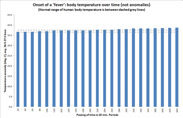
Fig. 2: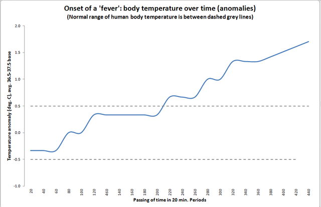
Sorry, does not compute, to achieve the same effect just start the actual temperature garph scale at 36.0C and us the same sized scale.
When the earth’s temperature varies +/- 50C 0.1C change is laughable.
A C Osborn
In other words turn it into a virtual ‘anomaly’ but give it a different name? Bob usually starts his non-anomaly charts at zero C.
Until recently Earth’s long-term *global average temperature* hadn’t varied by much +/- 0.5 C over the past ~10,000 years. The rise above ‘pre-industrial’ is currently around 1.0 C, not 0.1 C.
IMHO,anomalies are misleading in terms of global temperatures .
IMHO There is no real ‘average'( which can be ‘manufactured from data figures& any data one may choose ‘ ,&is used for con venience) .
Surely to measure any real warming or temperature increases we need( as accurately as possible ),actual readings .
For instance , in the last 30 years has any temperature that has been recorded any where , exceeded any previous recorded temperatures anywhere on earth ,eg Death Valley, etc. which has some of the highest recordings .??
A couple of years ago or so ,I remember reading on here ,a good article on averages,means,etc &what they mean, &how they can be misleading . Unfortunately i cannot remember the authors name .