One of the main lines of evidence used by the Obama administration to justify its global warming regulations doesn’t exist in the real world, according to a new report by climate researchers.

Guest essay by Michael Bastasch, reprinted with permission
Researchers analyzed temperature observations from satellites, weather balloons, weather stations and buoys and found the so-called “tropical hotspot” relied upon by the EPA to declare carbon dioxide a pollutant “simply does not exist in the real world.”
They found that once El Ninos are taken into account, “there is no ‘record setting’ warming to be concerned about.”
“These analysis results would appear to leave very, very little doubt but that EPA’s claim of a Tropical Hot Spot (THS), caused by rising atmospheric CO2 levels, simply does not exist in the real world,” reads the report by economist James Wallace, climatologist John Christy and meteorologist Joseph D’Aleo.
“Also critically important, even on an all-other-things-equal basis, this analysis failed to find that the steadily rising atmospheric CO2 concentrations have had a statistically significant impact on any of the 13 critically important temperature time series analyzed,” they wrote.
When EPA released its CO2 endangerment finding in 2009, it used three lines of evidence to bolster its argument that greenhouse gases threatened human health through global warming.The crux of EPA’s argument rested on the existence of a “tropical hotspot” where global warming would be most apparent. That is, there should be enhanced warming in the tropical troposphere — the “fingerprint” of global warming.
EPA’s endangerment finding is the legal basis for agency global warming regulations, including the Clean Power Plan (CPP) now being fought over in federal court. CPP aims to cut power plant carbon dioxide emissions 32 percent by 2030 and could cost $41 billion a year, according to independent estimates.
D’Aleo and his colleagues looked at the data and controlled for El Ninos and La Ninas. What they found was that once natural oceanic warming and cooling events are accounted for, there’s no warming trend.
“El Nino is not by any means new,” D’Aleo told The Daily Caller News Foundation. “The El Ninos and La Ninas do not occur at a regular frequency but tend to cluster as we showed in our paper.”
Tropospheric temperatures are mainly measured by satellites and weather balloons, which collect data from the lowest few miles of the atmosphere. Satellites already show only slight warming since 1979, but they are sensitive to El Ninos and La Ninas.
Removing El Ninos and La Ninas from tropospheric temperatures creates “temperature time series each having a flat trend.” Basically, D’Aleo and his colleagues found oceanic warming events are responsible for virtually all the warming since 1977 when El Ninos became more frequent and stronger.
On the flip side, the recent “hiatus” in global warming can be explained by more frequent La Ninas, according to D’Aleo.
“It is an accepted fact that El Ninos bring global warmth and La Ninas cooling,” D’Aleo said. “It is thus not at all surprising that the period from 1947 to 1977 brought cooling, 1977 to 1997 warming and we had a flat trend from 1997 to current.”
With El Ninos and La Ninas adjusted out of the data, only volcanoes are left — base on EPA assumptions — to impact the climate, and D’Aleo’s report acknowledges “it was still possible that the volcanic activity was hiding CO2’s impact.”
Volcanic aerosols can have a cooling effect on global average temperature; the 1991 eruption of Mt. Pinatubo caused a dip in satellite temperature data that lasted for a couple years.
“The temperature data measurements that were analyzed were taken by many different entities using balloons, satellites, buoys and various land based techniques,” reads the report. “Needless to say, if regardless of data source, the results are the same, the analysis findings should be considered highly credible.”
Climate scientists have been debating for years over the existence of the “tropical hotspot.”
Christy, who co-runs the premier satellite temperature dataset at the University of Alabama in Huntsville with climatologist Roy Spencer, has presented evidence that climate models overpredicted warming in the tropical troposphere.
Ross McKitrick, an environmental economist at the University of Guelph in Canada, also ran the numbers and found climate models overestimated warming in the tropical troposphere.
McKitrick provided evidence of a phase shift in 1977 from dominant [La] Ninas to El Ninos — just like D’Aleo, Christy and Williams found.
“Over the 55-years from 1958 to 2012, climate models not only significantly over-predict observed warming in the tropical troposphere, but they represent it in a fundamentally different way than is observed,” McKitrick wrote in a 2014 study.
Originally published at The Daily Caller
From the paper:
The Tropical Hot Spot– CONCLUSION
The analysis above has shown many times over that the THS simply does not exist. Recall from Section IV:
The proper test for the existence of the THS in the real world is very simple. Are the slopes of the three trend lines (upper & lower troposphere and surface) all positive, statistically significant and do they have the proper top down rank order?
And that, quoting from Section XVI above:
Adjusting for just the ENSO impacts via only MEI variables, NOT ONE of the Nine (9) Tropical temperature time series analyzed above were consistent with the EPA’s THS Hypothesis.
That is, adjusting for just the natural ENSO Impacts over their entire history; all tropical temperature data analyzed above have non-statistically significant trend slopes -which invalidates the THS theory.
In short, if on an-other-things-equal basis, CO2 in fact has had a Statistically Significant impact on tropical temperatures, its impact has been offset by other Non ENSOrelated
Natural Variables over the past 55 plus years. In fact, some climate scientists effectively now claim that, while the THS apparently cannot be found in the trend slopes of the relevant empirical temperature data, the CO2-generated warming has to be hiding somewhere yet to be found. This “Missing Heat” subject has been boiling up for some time and this heat has so far
not been found.
Nevertheless, alarmist scientists are still claiming record-setting warming in the Contiguous U.S. and globally caused by rising CO2 levels. If true, this CO2 -caused missing heat has to be warming the planet by a currently unknown mechanism operating somehow outside the tropics. Therefore, this analysis moved on to test this new, never formally claimed before, hypothesis by ENSO adjusting the relevant Temperature data.
“…only the atmospheric CO2 levels are deemed anthropogenic, that is, impacted by human activity such as the burning of any fossil fuel. The three other explanatory variables are considered “natural” variables. By natural is meant that each of the variables’ values are not impacted by human activity.”
“GAST = F1(CO2, SA, VA, ENSO)”
Let me see. If temperatures are explained by the MEI then they could be explained by the MEI and not necessarily CO2. Their assumption seems to be that ENSO is not affected by CO2. To put it another way, if the MEI correlates with temperature, CO2 is pushed more to the sidelines.
It doesn’t matter to me that ENSO is chaotic and not too predictable. But is it all natural? If ENSO is impacted by CO2 we’d have:
CO2 > ENSO > GAST
Or is it:
ENSO > GAST
If it is:
CO2 + ENSO > GAST
Then I think the test done needs to be changed some.
ENSO has been around for thousands of years, anthropogenic carbon dioxide, not so much. QED, natural, not impacted by the evil gas.
Here is my email of earlier today set to the authors of the report: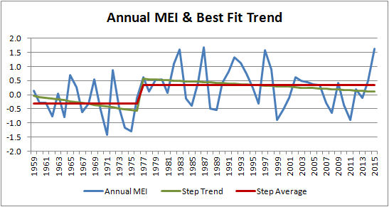

———————————————–
Subject: Comments on “On the Existence of a “Tropical Hot Spot “& the Validity of EPA’s CO2 Endangerment Finding”
I read your research paper with interest, website here. https://thsresearch.wordpress.com/
Unfortunately, the section VIII contains misleading graphs in that the red lines on the three graphs are labeled “trends” whereas they are two horizontal line segments. The term “trend” implies it is a best fit regression line of the data including a slope, rather than a horizontal line through the average of the data.
Figure VIII-1 shows the tropical 200 mb balloon temperature anomaly with horizontal red lines from 1959 to 1976 and from 1977 to 2015. This curve is labeled “Step Trend”, implying that the 2 line segments are regression best fits, but they are not.
Figure VIII-2 shows a red line consisting of two horizontal red lines, each through the average of the data point corresponding to the two line segments, but the curve is labeled “Step Trend”.
I created a graph of the MEI with horizontal lines through the data average and trend lines for the two segments separated by the 1977 climate shift, shown below.
The Annual MEI and the red curve are identical to Figure VIII-2, but I labeled the red curve “Step Average”, indicating the the line is showing only the average values, not trends. The green curves are the Excel calculated best fit lines, indicating declining trends.
Page 23 says “Below the Annual MEI Step Trend rose by 0.66 in 1977.” The actual rise based on the horizontal red lines is 0.645.
Figure VIII-3 is a graph the the tropical 200 mb balloon temperatures, with the title “MEI trend adjusted”. However, this section doesn’t explain how the temperature data was adjusted by the MEI trends, or even show what the MEI trends were. The NOAA MEI data page says “Bimonthly MEI values (in 1/1000 of standard deviations), starting with Dec1949/Jan1950, thru last month. … All values are normalized for each bimonthly season so that the 44 values from 1950 to 1993 have an average of zero and a standard deviation of “1”.”
The MEI data are in unitless values of “standard deviation”, while the balloon data are in units of ºC. The MEI values must be converted to units of ºC to determine the adjustment, but the paper does not explain how this was done. In fact, it was not done as explained below.
This figure has a horizontal red line through the data a value exactly 0 ºC, but the curve is labeled “Adjusted AV3 Trend”, implying that it is the best fit regression line through the data. It is not.
I recreated the figure shown below.
Instead of showing a horizontal red line, I show the linear trend in black. This is not a valid trend as the MEI adjustment in invalid.
The “purple” curve is actually a blue MIE Adjusted temperature curve with a thinner width red curve on top of it. I digitized the MEI adjusted temperature data from figure VIII-3. The red curve labeled “T+step” is the 200 mb temperature data adjusted by adding a constant value of 0.507 ºC from 1950 to 1976, which is the 200 mb temperature step change from the average of 1959-1976 to the average of 1979-2015 temperatures. I also subtracted 0.09 ºC from the temperature date from 1959 to 2015 to make the average value over the total period sum to zero. The red curve is mostly within the blue curve, so you can see that I have reproduced what you have done.
The MEI adjustment is invalid because you did not use the MEI data to make the MEI adjusted temperature data, contrary to the title of the figure. You simply adjusted the 1959-1976 temperature data upward by the amount of the 1976 temperature shift based on the horizontal lines.
The paper says at the bottom of page 25 “Adjusted Tropical 200 mb and 150 mb temperatures do not have a statistically significant trend line slope. -suggesting that CO2, taken together with all other omitted variables, is not the cause of the rise in this Tropical Balloon temperature data.” Readers are mislead to believe that the horizontal line is a trend line, which is not shown. I would think to make this claim the paper should show the trend and its statistical significance. The analysis does not support your conclusion. Dr. Roy Spencer published a paper that shows the effect of ENSO on temperature rise. Accounting for ENSO he determines the equilibrium climate sensitivity (ECS) is 1.3 ºC indicating the the temperature rise can’t be explained only by ENSO, see here. ECS us actually less than 1.3 ºC as Spencer’s analysis does not take into account other causes of climate change, including the millennium scale natural warming from the Little Ice Age, and the 65-year ocean oscillations.
Possible typo:
Page 19 of the full report say “The results are as depicted in the Figure VII-4 and Table VII-1 below.”
However, the figure and table are labeled Figure VI-4 and Table VI-1, respectively. (Section VII has no figure or table.)
Regards,
Ken Gregory
Friends of Science http://www.friendsofscience.org/
Fourteen years of providing independent
climate science information
In response, Joe d’Aleo wrote in part:
Please go back and read the preface that explains what Jim an econometrician with 50 years experience in data analysis actually did. … He used the Cumulative MEI which shows the cumulative effect of El Nino and La Nino (strength and duration). It correctly showed the cooling to 1977, warming to 1997 then stasis.
I replied,
The preface doesn’t not refute anything I wrote. Figure VIII-3 did not use MEI nor cumulative MEI. I accurately reproduced the figure, see below without using MEI information.
50 years experience is not an excuse for publishing misleading graphs.
CO2 is not a source of energy so for it to cause global warming, added CO2 would have to cause an increase in the insulation properties of the atmosphere. One measure of the atmosphere’s insulation properties would be the natural lapse rate. An increase in the lapse rate would signify that the thermal resistance of the atmosphere was increasing and a decrease would signify that the thermal resistance of the atmosphere was decreasing. If CO2 did actually cause global warming then the increase in CO2 over the past 30 years should have caused at least a noticeable increase in the natural lapse rate in the troposphere but that has not happened. To date there is no real evidence that CO2 has any effect on climate.
No scientist has claimed that CO2 is an energy source.
The lapse rate is the negative of the change in temperature per change in altitude, which is currently about 6.5 C/km. An increase in the lapse rate would cause a tropical cool spot in the mid-troposphere, rather than the predicted hot spot. The predicted decrease in the lapse rate causes the hot spot in models, but not in reality. Since greenhouse warming occurs in the mid-troposphere and the surface temperatures responds to that warming via the decreasing lapse rate, the lapse rate change is a negative feedback. That is, if the lapse rate declines from 6.5 to 6.0 C/km, the surface would warm slower than the mid-troposphere. But this is not a measure of the thermal resistance. The value of the greenhouse effect IS the measure of the thermal resistance, which is the difference between the effective radiating temperature as measured from the top of the atmosphere, and the surface temperature. According to CERES satellite data, and the HadCRUT4 data (which is contaminated by urban warming), the transient climate response (TCR) (to double CO2, about 130 years) is 0.74 C +/- 0.5 C. See here:
https://friendsofscience.org/assets/documents/CERES/CERES_Climate_Sensitivity.pdf
Correcting for urban warming, the TCR is 0.3 C [0 – 0.8 C]
However, using the IPCC greenhouse forcing, Steven’s aerosol forcing, HadCRUT4.4 and correcting for millennium scale warming from the Little Ice Age and UHI, the TCR is 0.85 C [likely 0.7 – 1.1 C].
See https://friendsofscience.org/assets/documents/AB_Climate%20Plan_Economic_Impact_Gregory.pdf
It depends on what data you trust the most. In any case, using the high numbers, the net social benefit of carbon dioxide emissions is 17 US$/tonneCO2, that is benefits are much greater than alleged harmful effects.
How temperature changes with altitude is a measure of the insulating effects of the atmosphere. Derived from first principles, the lapse rate is a function of the heat capacity of the atmosphere and the pressure gradient and has nothing to do with the LWIR absorption properties of so called greenhouse gases. The initial calculations of the climate sensitivity of CO2 were to great by a factor of 20 because of the fact that the doubling of CO2 would cause a slight decrease in the dry lapse rate which is in itself a cooling effect, was ignored. There is no radiant greenhouse effect anywhere in the solar system, even on Venus.
For the ‘hot spot’ model forecasts of enhanced CO2 warming to be validated, the temperature trend in the tropical troposphere 9 – 12 km must be shown to warming at double to triple the surface rate (hence ‘hot spot’):
http://www.climate4you.com/images/EquatorSurface300hPa200hPaDecadalTempChange%20BARCHART.gif
Diagram showing observed linear decadal temperature change at surface, 300 hPa and 200 hPa, between 20oN and 20oS, since January 1979. Data source: HadAT and HadCRUT4. Click here to compare with modelled altitudinal temperature change pattern for doubling atmospheric CO2. Last month included in analysis: December 2012. Last diagram update: 4 May 2013 (Climate4you).
And this is why this AGW theory is plain old wrong.
The authors make the following statement: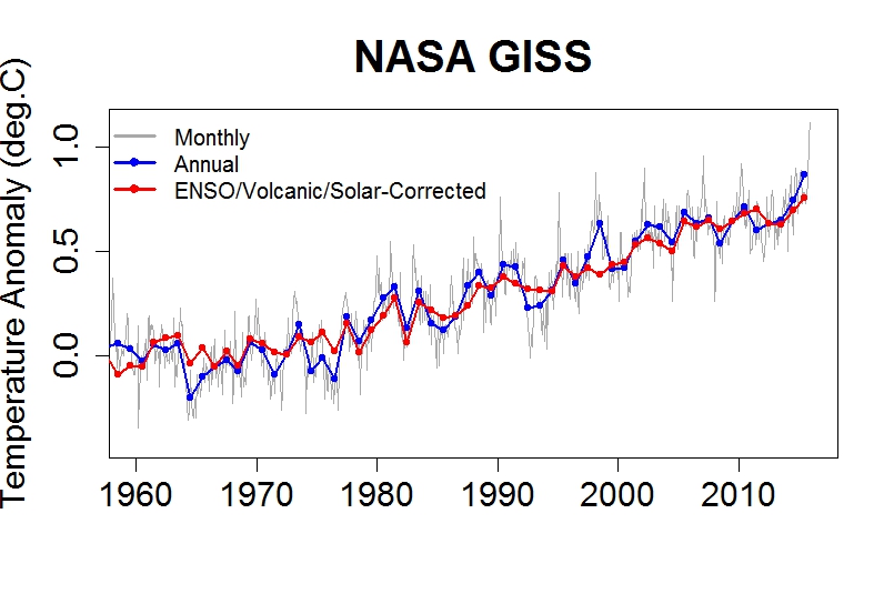
“Strictly speaking, the ENSO-adjusted temperatures represent the estimated combined impact of CO2 as
well as the two natural variables, solar and volcanic activity. For example, Volcanic Activity could be hiding CO2’s impact. So, for example, if GAST, or any other temperature time series, has a statistically significant, positive linear trend slope and ENSO-Adjusted GAST does not, then the positive trend slope in GAST can be totally explained by the natural ENSO impacts alone.”
However it has been shown that ENSO-adjusted temperatures do show a positive linear trend slope:
http://www.realclimate.org/images/gistemp_mei_correct.jpg
It has also been shown that when adjustments for volcanic activity and solar variation are added positive linear trend slopes still result:
As the authors say in their report:
“Since the Atmospheric CO2 concentration levels are independent of ENSO variable values, removing only the ENSO-related impacts on the temperature time series does not require the specification of a more complicated (i.e., multi-equation) climate model and therefore the use of simultaneous equation parameter estimation techniques – for that matter, neither does removing SA or VA impacts.”
GISStemp is no longer a valid data set,due to numerous adjustments in recent years.
But RSS and UAH are?
Despite their “numerous adjustments”
There is a difference Toneb,but will you care to understand it?
Sunsettommy September 23, 2016 at 6:37 am
GISStemp is no longer a valid data set, due to numerous adjustments in recent years.
Some adjustments are necessary, just as the adjustments were necessary for the satellite measurements, those measurements aren’t even of the same quantity as they were before the adjustments.
In any case the same adjustments can be made on the satellite measurements with the same result.
“There is a difference Toneb,but will you care to understand it?”
No difference at all.
Unless you invoke conspiracy my friend.
What is it about the two sat data records that are more *believable*?
Even though in the case of UAH there is no account of the latest *adjustments* available for peer-review.
Even their Wiki page has not been updated to include V6 beta even though is says updated 16th Sept 2016!
There are multiple data records available for the surface – all saying the same thing. Are they all fraudulent or is just one enough??
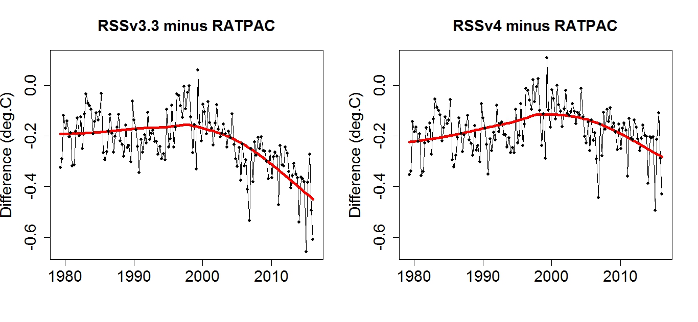
Additionally UAH is drifting away from RATPAC sonde data sine 2000 (change of sensor on new sat)….
Just as RSS is STILL even after
changes from V3.3 to v4.0
The surface record has been homegenised for good reason. Those reasons can be found easily, as can the raw data.
Toneb September 23, 2016 at 7:41 am
But RSS and UAH are?
Despite their “numerous adjustments”
Yes, because RSS and UAH don’t need to adjust because of ridiculous, “bucket ship” data.LOL
Is it really that difficult for your to understand? Seriously, is it?”
You can’t adjust GISTemp for El Ninos or La Ninas because there is no ENSO signal remaining in GISTemp. Its been changed to a straight line going up.
Now, it wasn’t always that way. From 2005. And note of course we are talking about “TROPICS” here, the topical hotspot.
http://data.giss.nasa.gov/gistemp/2005/2005_fig2.gif
“Yes, because RSS and UAH don’t need to adjust because of ridiculous, “bucket ship” data.LOL
Is it really that difficult for your to understand? Seriously, is it?””
No on the contrary – I find it very easy to understand.
Your prefference and distorted, myopic view of the two data sources, that is.
On the one hand we have SURFACE data (where we live) and the other hand we have data from a large slice of the atmosphere that includes (in the case of TMT) – the cooling stratosphere.
On the one hand we have data that is measured by a thermometer in thousands of locations that has both raw and homegenised data sets available that show **er all difference in the period since CO2’s +ve forcing overtook aersol’s -ve and actually warm the past.
http://4.bp.blogspot.com/-opy7LoBO__w/VNoo9u5ynhI/AAAAAAAAAg4/_DCE5Rzm9Fw/s700/land%2Bocean%2Braw%2Badj.png
On the other we have a single instrument (both RSS and UAH use the same sat/sensors).
The instrument is moving in orbit and measures brightness. This has to be modelled by a complex algorithm (that in the case of UAH v6 bet is currently secret). The algorithm includes a mdel BTW. The satellite drifts and this has to be estimated. The sensor is calibrated against REAL WORLD radiosonde (except it isn’t v RATPAC and both RSS and UAH are currently too cold).
From RSS:
“A method is chosen based on an optimized second harmonic adjustment to produce a new version of the RSS dataset, version 4.0. The new dataset shows substantially increased global-scale warming relative to the previous version of the dataset, particularly after 1998. The new dataset shows more warming than most other midtropospheric data records constructed from the same set of satellites. It is also shown that the new dataset is consistent with long-term changes in total column water vapor over the tropical oceans, lending support to its long-term accuracy.
Would you be so sanguine if they were too WARM?
Therin lies the reason I find your position very easy to understand my friend.
Toneb claims to be a meteorologist and when asked the name of the law of thermodynamics for solving atmospheric and gas mix temperature, couldn’t do it.
He’s another fake physics and mathematics bumbler who can’t predict which way a thermometer will go, prompted with correct answers ahead of time.
He even thinks the stratosphere is cooling. It isn’t cooling, it hasn’t cooled any for the past decade, at least.
He’s a science darkener, preaching about the GHE that makes him unable to predict or even know the names of the laws he claims to be an expert on.
The stratosphere and it’s alleged cooling: fake. Toneb thought that sh** is real.
http://planetaryvision.blogspot.com/2015/09/stratosphere-not-cooling-as-predicted.html
He even thinks the stratosphere is cooling. It isn’t cooling, it hasn’t cooled any for the past decade, at least.
It certainly is, check out RSS MSU results for the stratospheric layers C10 and above, C12 has a slope of -0.477K/decade for example.
“Other climate models differ in their assessment of future El Niño events. Some suggest the ENSO cycle will become more intense, others say it will weaken, and some find there will be little change. According to Schmidt, “There is a very large variation in ENSO statistics (frequency/magnitude) over time, and so detecting a shift due to climate change is very challenging. Models as a whole are all over the shop, and so it doesn’t fill one with great confidence.””
http://blogs.ei.columbia.edu/2016/02/02/el-nino-and-global-warming-whats-the-connection/
So it is unknown if CO2 changes ENSO.
ENSO is suggested to impact the Greenhouse Effect:
A Hiatus of the Greenhouse Effect
http://www.nature.com/articles/srep33315
Facts will not deter the true believers.
I ran my Nino 3.4 Index, AMO, Volcanoes (AOD Index) and Ln (CO2) model on the average of HadAT, UAH and RSS Tropics temperatures and the monthly model provides an extremely good fit.
The Nino 3.4 (lagged 3 months) coefficient is 0.288 which means the ENSO runs the Tropical troposphere. Think of February 2016 when a coefficient of 0.288 * 2.95C (Nino 3.4 lagged 3 months) = 0.85C of temperature impact by itself.
Here is the model (just regressing all these variables against the temperature in the Tropics troposphere). Why would this be so darn close across the whole 58 years and 690 individual months including ALL of the individual up and downs?
http://s16.postimg.org/iynkqumyd/UAH_RSS_Had_AT_Tropics_Model_Aug16.png
And the left-over Ln (CO2) warming trend is basically NOTHING. 0.029C per decade ??? By the year 2100, we only get a total warming of 0.35C at this rate. There is certainly NOT a tropical hotspot. It is warming less than anywhere else. If anything, there is tropical cooling spot.
http://s15.postimg.org/dw2h9wpff/UAH_RSS_Had_At_Tropics_Warming_Aug16.png
When looking at a chart of sunlight TOA and surface, there’s only one class of gases reducing energy to the surface. Green House Gases.
There’s more to this.
There’s also a large bar, going from the bluest light to the reddest light, where the entire sunlight spectra are simply not reaching the planet
This removal of white class light is also: solely by green house gases, this being primarily water of course which has it’s noted white clouds, snow in them, ice crystals, etc.
There’s a reduction to the planet surface by oxygen which is why daylight skies are blue.
The Green House Gases are refractory in nature. They deflect light to space that never reaches the surface.
This reduction in surface energy density is cooling. There’s no such thing as putting refractory media between a fire and something it’s warming, and the reduction of light to the surface of that object create higher temperature.
In other words there’s no way to make more source-dependent light come out of an object by placing more refractory media between it and the fire illuminating it.
The entire GHG/AGW scam is a gigantic fraud. If any of it were real, ***the people who believe in it wouldn’t be the ones in the early 21st century blamed for trashing science worse than anyone alive has known.***
We all say this, scientists across every field of endeavor: it’s all fake, and all it’s proponents are incompetent kooks; and it proves itself true again and again, day in – day out.
“Ross McKitrick, an environmental economist at the University of Guelph in Canada, also ran the numbers and found climate models overestimated warming in the tropical troposphere.”
Hm. Climate models do automatically consider an ‘increased backradiation’ with increased CO2 at the top of the atmosphere, all other things being equal. If I correctly remember it was something like +3.5°C per doubling of CO2. To this added ‘feedbacks’…
This is not how the physics happen in the atmosphere, the increase in CO2 would mainly only shorten the heat exchange path at the bottom of the atmosphere between the surface and the first 10-20 meters of air. Even if considering a broadening of the waveband through Doppler effect, it is still at the surface.
With this difference in mind it is clear why climate models get automatically a hot spot in the troposphere and why it never happens in real life…
Ooops, sorry where is my mind.. it was 3.5 W/m2 not °C