Guest Post by Professor Robert Brown of Duke University and Werner Brozek, Edited by Just The Facts:
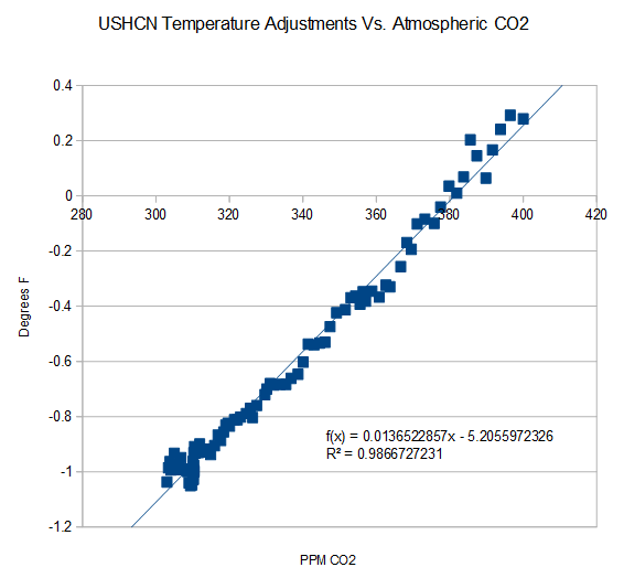
Image Credit: Steven Goddard
As can be seen from the graphic above, there is a strong correlation between carbon dioxide increases and adjustments to the United States Historical Climatology Network (USHCN) temperature record. And these adjustments to the surface data in turn result in large divergences between surface data sets and satellite data sets.
In the post with April data, the following questions were asked in the conclusion: “Why are the new satellite and ground data sets going in opposite directions? Is there any reason that you can think of where both could simultaneously be correct?”
Professor Robert Brown of Duke University had an excellent response the this question here.
To give it the exposure it deserves, his comment is reposted in full below. His response ends with rgb.
Rgbatduke June 10, 2015 at 5:52 am
The two data sets should not be diverging, period, unless everything we understand about atmospheric thermal dynamics is wrong. That is, I will add my “opinion” to Werner’s and point out that it is based on simple atmospheric physics taught in any relevant textbook.
This does not mean that they cannot and are not systematically differing; it just means that the growing difference is strong evidence of bias in the computation of the surface record. This bias is not really surprising, given that every new version of HadCRUT and GISS has had the overall effect of cooling the past and/or warming the present! This is as unlikely as flipping a coin (at this point) ten or twelve times each, and having it come up heads every time for both products. In fact, if one formulates the null hypothesis “the global surface temperature anomaly corrections are unbiased”, the p-value of this hypothesis is less than 0.01, let alone 0.05. If one considers both of the major products collectively, it is less than 0.001. IMO, there is absolutely no question that GISS and HadCRUT, at least, are at this point hopelessly corrupted.
One way in which they are corrupted with the well-known Urban Heat Island effect, wherein urban data or data from poorly sited weather stations shows local warming that does not accurately reflect the spatial average surface temperature in the surrounding countryside. This effect is substantial, and clearly visible if you visit e.g. Weather Underground and look at the temperature distributions from personal weather stations in an area that includes both in-town and rural PWSs. The city temperatures (and sometimes a few isolated PWSs) show a consistent temperature 1 to 2 C higher than the surrounding country temperatures. Airport temperatures often have this problem as well, as the temperatures they report come from stations that are deliberately sited right next to large asphalt runways, as they are primarily used by pilots and air traffic controllers to help planes land safely, and only secondarily are the temperatures they report almost invariably used as “the official temperature” of their location. Anthony has done a fair bit of systematic work on this, and it is a serious problem corrupting all of the major ground surface temperature anomalies.
The problem with the UHI is that it continues to systematically increase independent of what the climate is doing. Urban centers continue to grow, more shopping centers continue to be built, more roadway is laid down, more vehicle exhaust and household furnace exhaust and water vapor from watering lawns bumps greenhouse gases in a poorly-mixed blanket over the city and suburbs proper, and their perimeter extends, increasing the distance between the poorly sited official weather stations and the nearest actual unbiased countryside.
HadCRUT does not correct in any way for UHI. If it did, the correction would be the more or less uniform subtraction of a trend proportional to global population across the entire data set. This correction, of course, would be a cooling correction, not a warming correction, and while it is impossible to tell how large it is without working through the unknown details of how HadCRUT is computed and from what data (and without using e.g. the PWS field to build a topological correction field, as UHI corrupts even well-sited official stations compared to the lower troposphere temperatures that are a much better estimator of the true areal average) IMO it would knock at least 0.3 C off of 2015 relative to 1850, and would knock off around 0.1 C off of 2015 relative to 1980 (as the number of corrupted stations and the magnitude of the error is not linear — it is heavily loaded in the recent past as population increases exponentially and global wealth reflected in “urbanization” has outpaced the population).
GISS is even worse. They do correct for UHI, but somehow, after they got through with UHI the correction ended up being neutral to negative. That’s right, UHI, which is the urban heat island effect, something that has to strictly cool present temperatures relative to past ones in unbiased estimation of global temperatures ended up warming them instead. Learning that left me speechless, and in awe of the team that did it. I want them to do my taxes for me. I’ll end up with the government owing me money.
However, in science, this leaves both GISS and HadCRUT (and any of the other temperature estimates that play similar games) with a serious, serious problem. Sure, they can get headlines out of rewriting the present and erasing the hiatus/pause. They might please their political masters and allow them to convince a skeptical (and sensible!) public that we need to spend hundreds of billions of dollars a year to unilaterally eliminate the emission of carbon dioxide, escalating to a trillion a year, sustained, if we decide that we have to “help” the rest of the world do the same. They might get the warm fuzzies themselves from the belief that their scientific mendacity serves the higher purpose of “saving the planet”. But science itself is indifferent to their human wishes or needs! A continuing divergence between any major temperature index and RSS/UAH is inconceivable and simple proof that the major temperature indices are corrupt.
Right now, to be frank, the divergence is already large enough to be raising eyebrows, and is concealed only by the fact that RSS/UAH only have a 35+ year base. If the owners of HadCRUT and GISSTEMP had the sense god gave a goose, they’d be working feverishly to cool the present to better match the satellites, not warm it and increase the already growing divergence because no atmospheric physicist is going to buy a systematic divergence between the two, as Werner has pointed out, given that both are necessarily linked by the Adiabatic Lapse Rate which is both well understood and directly measurable and measured (via e.g. weather balloon soundings) more than often enough to validate that it accurately links surface temperatures and lower troposphere temperatures in a predictable way. The lapse rate is (on average) 6.5 C/km. Lower Troposphere temperatures from e.g. RSS sample predominantly the layer of atmosphere centered roughly 1.5 km above the ground, and by their nature smooth over both height and surrounding area (that is, they don’t measure temperatures at points, they directly measure a volume averaged temperature above an area on the surface. They by their nature give the correct weight to the local warming above urban areas in the actual global anomaly, and really should also be corrected to estimate the CO_2 linked warming, or rather the latter should be estimated only from unbiased rural areas or better yet, completely unpopulated areas like the Sahara desert (where it isn’t likely to be mixed with much confounding water vapor feedback).
RSS and UAH are directly and regularly confirmed by balloon soundings and, over time, each other. They are not unconstrained or unchecked. They are generally accepted as accurate representations of LTT’s (and the atmospheric temperature profile in general).
The question remains as to how accurate/precise they are. RSS uses a sophisticated Monte Carlo process to assess error bounds, and eyeballing it suggests that it is likely to be accurate to 0.1-0.2 C month to month (similar to error claims for HadCRUT4) but much more accurate than this when smoothed over months or years to estimate a trend as the error is generally expected to be unbiased. Again this ought to be true for HadCRUT4, but all this ends up meaning is that a trend difference is a serious problem in the consistency of the two estimators given that they must be linked by the ALR and the precision is adequate even month by month to make it well over 95% certain that they are not, not monthly and not on average.
If they grow any more, I would predict that the current mutter about the anomaly between the anomalies will grow to an absolute roar, and will not go away until the anomaly anomaly is resolved. The resolution process — if the gods are good to us — will involve a serious appraisal of the actual series of “corrections” to HadCRUT and GISSTEMP, reveal to the public eye that they have somehow always been warming ones, reveal the fact that UHI is ignored or computed to be negative, and with any luck find definitive evidence of specific thumbs placed on these important scales. HadCRUT5 might — just might — end up being corrected down by the ~0.3 C that has probably been added to it or erroneously computed in it over time.
rgb
See here for further information on GISS and UHI.
In the sections below, as in previous posts, we will present you with the latest facts. The information will be presented in three sections and an appendix. The first section will show for how long there has been no warming on some data sets. At the moment, only the satellite data have flat periods of longer than a year. The second section will show for how long there has been no statistically significant warming on several data sets. The third section will show how 2015 so far compares with 2014 and the warmest years and months on record so far. For three of the data sets, 2014 also happens to be the warmest year. The appendix will illustrate sections 1 and 2 in a different way. Graphs and a table will be used to illustrate the data.
Section 1
This analysis uses the latest month for which data is available on WoodForTrees.com (WFT). All of the data on WFT is also available at the specific sources as outlined below. We start with the present date and go to the furthest month in the past where the slope is a least slightly negative on at least one calculation. So if the slope from September is 4 x 10^-4 but it is – 4 x 10^-4 from October, we give the time from October so no one can accuse us of being less than honest if we say the slope is flat from a certain month.
1. For GISS, the slope is not flat for any period that is worth mentioning.
2. For Hadcrut4, the slope is not flat for any period that is worth mentioning.
3. For Hadsst3, the slope is not flat for any period that is worth mentioning.
4. For UAH, the slope is flat since March 1997 or 18 years and 4 months. (goes to June using version 6.0)
5. For RSS, the slope is flat since January 1997 or 18 years and 6 months. (goes to June)
The next graph shows just the lines to illustrate the above. Think of it as a sideways bar graph where the lengths of the lines indicate the relative times where the slope is 0. In addition, the upward sloping blue line at the top indicates that CO2 has steadily increased over this period.

When two things are plotted as I have done, the left only shows a temperature anomaly.
The actual numbers are meaningless since the two slopes are essentially zero. No numbers are given for CO2. Some have asked that the log of the concentration of CO2 be plotted. However WFT does not give this option. The upward sloping CO2 line only shows that while CO2 has been going up over the last 18 years, the temperatures have been flat for varying periods on the two sets.
Section 2
For this analysis, data was retrieved from Nick Stokes’ Trendviewer available on his website <a href=”http://moyhu.blogspot.com.au/p/temperature-trend-viewer.html”. This analysis indicates for how long there has not been statistically significant warming according to Nick’s criteria. Data go to their latest update for each set. In every case, note that the lower error bar is negative so a slope of 0 cannot be ruled out from the month indicated.
On several different data sets, there has been no statistically significant warming for between 11 and 22 years according to Nick’s criteria. Cl stands for the confidence limits at the 95% level.
The details for several sets are below.
For UAH6.0: Since October 1992: Cl from -0.009 to 1.742
This is 22 years and 9 months.
For RSS: Since January 1993: Cl from -0.000 to 1.676
This is 22 years and 6 months.
For Hadcrut4.3: Since July 2000: Cl from -0.017 to 1.371
This is 14 years and 11 months.
For Hadsst3: Since August 1995: Cl from -0.000 to 1.780
This is 19 years and 11 months.
For GISS: Since August 2003: Cl from -0.000 to 1.336
This is 11 years and 11 months.
Section 3
This section shows data about 2015 and other information in the form of a table. The table shows the five data sources along the top and other places so they should be visible at all times. The sources are UAH, RSS, Hadcrut4, Hadsst3, and GISS.
Down the column, are the following:
1. 14ra: This is the final ranking for 2014 on each data set.
2. 14a: Here I give the average anomaly for 2014.
3. year: This indicates the warmest year on record so far for that particular data set. Note that the satellite data sets have 1998 as the warmest year and the others have 2014 as the warmest year.
4. ano: This is the average of the monthly anomalies of the warmest year just above.
5. mon: This is the month where that particular data set showed the highest anomaly. The months are identified by the first three letters of the month and the last two numbers of the year.
6. ano: This is the anomaly of the month just above.
7. y/m: This is the longest period of time where the slope is not positive given in years/months. So 16/2 means that for 16 years and 2 months the slope is essentially 0. Periods of under a year are not counted and are shown as “0”.
8. sig: This the first month for which warming is not statistically significant according to Nick’s criteria. The first three letters of the month are followed by the last two numbers of the year.
9. sy/m: This is the years and months for row 8. Depending on when the update was last done, the months may be off by one month.
10. Jan: This is the January 2015 anomaly for that particular data set.
11. Feb: This is the February 2015 anomaly for that particular data set, etc.
16. ave: This is the average anomaly of all months to date taken by adding all numbers and dividing by the number of months.
17. rnk: This is the rank that each particular data set would have for 2015 without regards to error bars and assuming no changes. Think of it as an update 25 minutes into a game.
| Source | UAH | RSS | Had4 | Sst3 | GISS |
|---|---|---|---|---|---|
| 1.14ra | 6th | 6th | 1st | 1st | 1st |
| 2.14a | 0.170 | 0.255 | 0.564 | 0.479 | 0.75 |
| 3.year | 1998 | 1998 | 2014 | 2014 | 2014 |
| 4.ano | 0.483 | 0.55 | 0.564 | 0.479 | 0.75 |
| 5.mon | Apr98 | Apr98 | Jan07 | Aug14 | Jan07 |
| 6.ano | 0.742 | 0.857 | 0.832 | 0.644 | 0.97 |
| 7.y/m | 18/4 | 18/6 | 0 | 0 | 0 |
| 8.sig | Oct92 | Jan93 | Jul00 | Aug95 | Aug03 |
| 9.sy/m | 22/9 | 22/6 | 14/11 | 19/11 | 11/11 |
| Source | UAH | RSS | Had4 | Sst3 | GISS |
| 10.Jan | 0.261 | 0.367 | 0.688 | 0.440 | 0.82 |
| 11.Feb | 0.156 | 0.327 | 0.660 | 0.406 | 0.88 |
| 12.Mar | 0.139 | 0.255 | 0.681 | 0.424 | 0.90 |
| 13.Apr | 0.065 | 0.175 | 0.656 | 0.557 | 0.74 |
| 14.May | 0.272 | 0.310 | 0.696 | 0.593 | 0.76 |
| 15.Jun | 0.329 | 0.391 | 0.728 | 0.580 | 0.80 |
| Source | UAH | RSS | Had4 | Sst3 | GISS |
| 16.ave | 0.204 | 0.304 | 0.685 | 0.500 | 0.82 |
| 17.rnk | 4th | 6th | 1st | 1st | 1st |
If you wish to verify all of the latest anomalies, go to the following:
For UAH, version 6.0 was used. Note that WFT uses version 5.6. So to verify the length of the pause on version 6.0, you need to use Nick’s program.
http://vortex.nsstc.uah.edu/data/msu/v6.0beta/tlt/tltglhmam_6.0beta2
For RSS, see: ftp://ftp.ssmi.com/msu/monthly_time_series/rss_monthly_msu_amsu_channel_tlt_anomalies_land_and_ocean_v03_3.txt
For Hadcrut4, see: http://www.metoffice.gov.uk/hadobs/hadcrut4/data/current/time_series/HadCRUT.4.4.0.0.monthly_ns_avg.txt
For Hadsst3, see: http://www.cru.uea.ac.uk/cru/data/temperature/HadSST3-gl.dat
For GISS, see:
http://data.giss.nasa.gov/gistemp/tabledata_v3/GLB.Ts+dSST.txt
To see all points since January 2015 in the form of a graph, see the WFT graph below. Note that UAH version 5.6 is shown. WFT does not show version 6.0 yet.

As you can see, all lines have been offset so they all start at the same place in January 2015. This makes it easy to compare January 2015 with the latest anomaly.
Appendix
In this part, we are summarizing data for each set separately.
RSS
The slope is flat since January 1997 or 18 years, 6 months. (goes to June)
For RSS: There is no statistically significant warming since January 1993: Cl from -0.000 to 1.676.
The RSS average anomaly so far for 2015 is 0.304. This would rank it as 6th place. 1998 was the warmest at 0.55. The highest ever monthly anomaly was in April of 1998 when it reached 0.857. The anomaly in 2014 was 0.255 and it was ranked 6th.
UAH6.0
The slope is flat since March 1997 or 18 years and 4 months. (goes to June using version 6.0)
For UAH: There is no statistically significant warming since October 1992: Cl from -0.009 to 1.742. (This is using version 6.0 according to Nick’s program.)
The UAH average anomaly so far for 2015 is 0.204. This would rank it as 4th place. 1998 was the warmest at 0.483. The highest ever monthly anomaly was in April of 1998 when it reached 0.742. The anomaly in 2014 was 0.170 and it was ranked 6th.
Hadcrut4.4
The slope is not flat for any period that is worth mentioning.
For Hadcrut4: There is no statistically significant warming since July 2000: Cl from -0.017 to 1.371.
The Hadcrut4 average anomaly so far for 2015 is 0.685. This would set a new record if it stayed this way. The highest ever monthly anomaly was in January of 2007 when it reached 0.832. The anomaly in 2014 was 0.564 and this set a new record.
Hadsst3
For Hadsst3, the slope is not flat for any period that is worth mentioning. For Hadsst3: There is no statistically significant warming since August 1995: Cl from -0.000 to 1.780.
The Hadsst3 average anomaly so far for 2015 is 0.500. This would set a new record if it stayed this way. The highest ever monthly anomaly was in August of 2014 when it reached 0.644. The anomaly in 2014 was 0.479 and this set a new record.
GISS
The slope is not flat for any period that is worth mentioning.
For GISS: There is no statistically significant warming since August 2003: Cl from -0.000 to 1.336.
The GISS average anomaly so far for 2015 is 0.82. This would set a new record if it stayed this way. The highest ever monthly anomaly was in January of 2007 when it reached 0.97. The anomaly in 2014 was 0.75 and it set a new record. (Note that the new GISS numbers this month are quite a bit higher than last month.)
If you are interested, here is what was true last month:
The slope is not flat for any period that is worth mentioning.
For GISS: There is no statistically significant warming since November 2000: Cl from -0.018 to 1.336.
The GISS average anomaly so far for 2015 is 0.77. This would set a new record if it stayed this way. The highest ever monthly anomaly was in January of 2007 when it reached 0.93. The anomaly in 2014 was 0.68 and it set a new record.
Conclusion
Two months ago, NOAA was the odd man out. Since GISS has joined NOAA, HadCRUT4 apparently felt the need to fit in, as documented here.
Steve Goddard should give the technical specs for his graph(s), exactly which source datasets were used and the details of the processing used to produce those graphs. This is because (1) that kind of pedantry is expected in publications, and (2) SG has an early history of getting things wrong, which is why he was put off WUWT originally. He may have risen above that, but I’d need to verify anything I used from him.
He’s done that time and time again on his blog. Search for it, and you’ll find it. For example:
https://stevengoddard.wordpress.com/ushcn-code/
Well, that’s good to see. That reference should have been included in the article, methinks.
“He’s done that time and time again on his blog. “
Yes. And it is always the same C++ code (well, one for GHCN, one for USHCN). And all it seems to do (no description supplied) is read the USHCN data and put it into .csv files. That is the output of the linux script. The actual processing seems to happen in Excel spreadsheets, not supplied.
Thanks, about time someone actually did that. Wasn’t hard, was it, if you knew where it was. A whole pile of us didn’t know where it was and couldn’t find it.
Peter.
I’ve looked at SG’s USHCN code but I’m not good with C++. There’s a lot a repetitive code in the “main” module — but that’s not necessarily bad. But the code doesn’t seem to generate the final adjustments-CO2 graph. But it may be that when the csv files are produced, that the subsequent graphing is trivial. So I can’t audit this. If much is being made of this, it’s certainly worth for someone to replicate SG’s processing to audit & confirm the results. Sorry I can’t do better here.
The C++ code seems to output some generic statistics about the datasets – record high, low, and plain averages. But there is no geographic information handled (lat/lon). And no other datasets, like CO2. The comment says it is “Code for parsing and processing daily USHCN data”, and that is about it. It does that for each of the raw, TOBS and final files separately, so there is no way after averaging to match raw and final to get individual station adjustments.
I agree with Nick here. SG’s documentation is entirely inadequate. He should provide full step-by-step details of his processing. It’s not good enough to show a result, it must be replicable.
I’ve replicated his work in another language. Despite the 1970s data formats it’s a fairly trivial exercise.
Well, do present it then.
OK, let’s back up a little.
If what the graph at the top of this post shows is correct, that proves data tampering, right?
And if not, RGB (for whom I have a lot of respect, based on his previous posts and comments) is playing a joke on us, no?
I’m as skeptical about warmism as anyone, but my horse sense tells me there’s something wrong with that graph.
A really basic question, and I feel like a simpleton asking it… where does USHCN get its “raw” data from? GISS? Hadcrut? Somewhere else? And why does the body of the article not even mention USHCN after the first paragraph?
Has anyone tried a similar exercise with GHCN?
Neil Lock asks:
where does USHCN get its “raw” data from?
This link may help:
http://www.surfacestations.org
Look at the errors in most of the station data:
http://www.surfacestations.org/Figure1_USHCN_Pie.jpg
Or you could go the StevenGoddard.com
Nick Stokes writes: “Anomalies are in fact local. It is the discrepancy relative to an observed average for that site – often confused. It is the statistical practice of subtracting the mean.”
That is correct but as a consequnce one should never then apply “Pairwise Homogenization Algorithm (PHA) Adjustments” which destroy that statistical spread. This automated algorithm which both NOAA and Berkeley use to “correct” the data has the effect of fixing a warming trend. It is the underlying reason why trends continue to rise. Yes their are some rational reasons why older data need adjusting due to station moves etc. but this homogenisation applied globally is simply wrong.
To give one example – Santiago, Chile
http://clivebest.com/world/pics/station-855740.png
Red curves shows NOAA corrections for Santiago – resulting in 1.2C of apparent warming. Even CRU (green) did not meaure that. Blue are the raw measurements.
The Urban Heat Island(UHI) effect in reality mostly ‘cools’ the past in all land temperature series. This may seem counter-intuitive but the inclusion of stations in large cities has introduced a long term bias in normalised anomalies. The reason for this bias is that each station gets normalised to the same eg. 1961-1990 period independent of its relative temperature. Even though we know that a large city like Milan is on average 3C warmer than the surrounding area, it makes no difference to the apparent anomaly change. That is because all net warming due to city growth effectively gets normalised out when the seasonal average is subtracted. As a direct result such ‘warm’ cities appear to be far ‘cooler’ than the surrounding areas before 1950. This is just another artifact of using anomalies rather than absolute temperatures.
Great example of why adjustments require enormous vetting and sanity checks, long before they should be considered valid inputs to multi-trillion-dollar global policymaking.
The effort to make climate change seem less a past occurrence and more a current ONLY occurrence required the same kinds of adjustments to not only the data set, but to reconfigure what paleo-data to put IN the data set.
To wit, when climate is cold in the North, and extends further into lower latitudes, equatorial heat will shift South of the equator, where few paleo-sources of proxies are available. Therefore the conclusion is often that past climate change was regional only, not global like it is being touted to occur today. Same is true for warm periods. It is possible that the extreme cold of Antarctica was marching towards the Northern Hemisphere during the Medieval Warm Period, but alas, there are few paleo-sources of proxies to draw from.
Those that deal with past climate anomalies likely fail to appreciate that while one hemisphere experiences extremes in one direction, the other hemisphere may trend in the opposite direction. I wonder if a data set that simply records change (regardless if up or down) from a century scale climatological average would capture the global complex nature of major climate regime shifts of whatever cause during the span of time when human species walked the Earth, to a better degree than what we currently see from research. My hunch is that it would show that our current warming trend is a tiny blip in comparison.
Interesting to see all the sincere discussion of the temperature data manipulation here.
The real deal is at Tony Heller’s website. Tony did the analysis, code-crunching, data research a long time ago, uncovering the depth of the depravity of the manipulators.
His website is quite well-organized, with categories provided in the heading of the home page.
Note that, due to hosting issues, there are two versions of his site. The original has the best compilation of his historical postings. The header of the original site includes links to his data methodology, as well as other categories.
Here is the original:
https://stevengoddard.wordpress.com/
Since March of 2015, Heller posts on his new site, Real Climate Science:
http://realclimatescience.com/
I looked at both of your links. The first one has a “UHCN code” header that shows where some source code is. No excel spreadsheets though.
The second one has no links to source code or data.
Why don’t you just post the actual deep link? Or can’t you find it?
Peter,
I don’t know tje specifics of what you want.
If you want something that you cannot find, ask Tony.
He has an open thread on his website, called “Tips and Suggestions.”
https://stevengoddard.wordpress.com/tips-and-suggestions/
Post your request there.
could someone ,somewhere, tell me exactly where it is physically warming ,not warming due to adjusted data . it sure aint australia or the united states by the looks of things. http://joannenova.com.au/2015/08/the-bom-homogenizing-the-heck-out-of-australian-temperature-records/#comment-1737152
bit chilly… here too. Tomorrow’s high to be 73F, low 57F and that is in usually-hot-hot-hot-Oklahoma in August!, the hottest month of the year. Electric bill’s a crashing, only two days above 100F this entire summer, 101F and 102F, and that is quite weird here if you are young and can only remember the past couple of decades. When I was young, there I go, showing my age ;( , it was more like we are now experiencing.
I am like you… where’s the frik’n global warming ?? After digging through all of the data for eight years, and the record manipulations, it becomes more than apparent… it never existed at all except for the very normal ±≈0.5°C oscillation spread across every six decades or so.
Nobel laureate Ivar Giaever’s speech at the Nobel Laureates meeting 1st July 2015, who is not the typical rent seeking “scientist” or extreme left wing ideologue.
***I don’t approve of the youtube poster’s title, e.g. “climate hoax”
awesome video
Truly. Win Nobel Prize. Retire. Become a skeptic and resign from the American Physical Society as soon as possible,
Nobel laureate resigns from American Physical Society to protest the organization’s stance on global warming http://wattsupwiththat.com/2011/09/14/nobel-laureate-resigns-from-american-physical-society-to-protest-the-organizations-stance-on-global-warming/
Always important to remember the non grant seekers/non pal reviewers/non political favor seekers and ideologues!
::::::::::::::::::::::::::::::::::::::::::::::::::::::::::::::::::::::::::::::::::::::::::::::::::::::::::::::::::::::::::::::::::;
Hal Lewis: My Resignation From The American Physical Society – an important moment in science history,,,
Sent: Friday, 08 October 2010 17:19 Hal Lewis
From: Hal Lewis, University of California, Santa Barbara
To: Curtis G. Callan, Jr., Princeton University, President of the American Physical Society
6 October 2010
Dear Curt:
When I first joined the American Physical Society sixty-seven years ago it was much smaller, much gentler, and as yet uncorrupted by the money flood (a threat against which Dwight Eisenhower warned a half-century ago).
Indeed, the choice of physics as a profession was then a guarantor of a life of poverty and abstinence—it was World War II that changed all that. The prospect of worldly gain drove few physicists. As recently as thirty-five years ago, when I chaired the first APS study of a contentious social/scientific issue, The Reactor Safety Study, though there were zealots aplenty on the outside there was no hint of inordinate pressure on us as physicists. We were therefore able to produce what I believe was and is an honest appraisal of the situation at that time. We were further enabled by the presence of an oversight committee consisting of Pief Panofsky, Vicki Weisskopf, and Hans Bethe, all towering physicists beyond reproach. I was proud of what we did in a charged atmosphere. In the end the oversight committee, in its report to the APS President, noted the complete independence in which we did the job, and predicted that the report would be attacked from both sides. What greater tribute could there be?
How different it is now. The giants no longer walk the earth, and the money flood has become the raison d’être of much physics research, the vital sustenance of much more, and it provides the support for untold numbers of professional jobs. For reasons that will soon become clear my former pride at being an APS Fellow all these years has been turned into shame, and I am forced, with no pleasure at all, to offer you my resignation from the Society.
It is of course, the global warming scam, with the (literally) trillions of dollars driving it, that has corrupted so many scientists, and has carried APS before it like a rogue wave. It is the greatest and most successful pseudoscientific fraud I have seen in my long life as a physicist. Anyone who has the faintest doubt that this is so should force himself to read the ClimateGate documents, which lay it bare. (Montford’s book organizes the facts very well.) I don’t believe that any real physicist, nay scientist, can read that stuff without revulsion. I would almost make that revulsion a definition of the word scientist.
So what has the APS, as an organization, done in the face of this challenge? It has accepted the corruption as the norm, and gone along with it. For example:
1. About a year ago a few of us sent an e-mail on the subject to a fraction of the membership. APS ignored the issues, but the then President immediately launched a hostile investigation of where we got the e-mail addresses. In its better days, APS used to encourage discussion of important issues, and indeed the Constitution cites that as its principal purpose. No more. Everything that has been done in the last year has been designed to silence debate
2. The appallingly tendentious APS statement on Climate Change was apparently written in a hurry by a few people over lunch, and is certainly not representative of the talents of APS members as I have long known them. So a few of us petitioned the Council to reconsider it. One of the outstanding marks of (in)distinction in the Statement was the poison word incontrovertible, which describes few items in physics, certainly not this one. In response APS appointed a secret committee that never met, never troubled to speak to any skeptics, yet endorsed the Statement in its entirety. (They did admit that the tone was a bit strong, but amazingly kept the poison word incontrovertible to describe the evidence, a position supported by no one.) In the end, the Council kept the original statement, word for word, but approved a far longer “explanatory” screed, admitting that there were uncertainties, but brushing them aside to give blanket approval to the original. The original Statement, which still stands as the APS position, also contains what I consider pompous and asinine advice to all world governments, as if the APS were master of the universe. It is not, and I am embarrassed that our leaders seem to think it is. This is not fun and games, these are serious matters involving vast fractions of our national substance, and the reputation of the Society as a scientific society is at stake.
3. In the interim the ClimateGate scandal broke into the news, and the machinations of the principal alarmists were revealed to the world. It was a fraud on a scale I have never seen, and I lack the words to describe its enormity. Effect on the APS position: none. None at all. This is not science; other forces are at work.
4. So a few of us tried to bring science into the act (that is, after all, the alleged and historic purpose of APS), and collected the necessary 200+ signatures to bring to the Council a proposal for a Topical Group on Climate Science, thinking that open discussion of the scientific issues, in the best tradition of physics, would be beneficial to all, and also a contribution to the nation. I might note that it was not easy to collect the signatures, since you denied us the use of the APS membership list. We conformed in every way with the requirements of the APS Constitution, and described in great detail what we had in mind—simply to bring the subject into the open.
5. To our amazement, Constitution be damned, you declined to accept our petition, but instead used your own control of the mailing list to run a poll on the members’ interest in a TG on Climate and the Environment. You did ask the members if they would sign a petition to form a TG on your yet-to-be-defined subject, but provided no petition, and got lots of affirmative responses. (If you had asked about sex you would have gotten more expressions of interest.) There was of course no such petition or proposal, and you have now dropped the Environment part, so the whole matter is moot. (Any lawyer will tell you that you cannot collect signatures on a vague petition, and then fill in whatever you like.) The entire purpose of this exercise was to avoid your constitutional responsibility to take our petition to the Council.
6. As of now you have formed still another secret and stacked committee to organize your own TG, simply ignoring our lawful petition.
APS management has gamed the problem from the beginning, to suppress serious conversation about the merits of the climate change claims. Do you wonder that I have lost confidence in the organization?
I do feel the need to add one note, and this is conjecture, since it is always risky to discuss other people’s motives. This scheming at APS HQ is so bizarre that there cannot be a simple explanation for it. Some have held that the physicists of today are not as smart as they used to be, but I don’t think that is an issue. I think it is the money, exactly what Eisenhower warned about a half-century ago. There are indeed trillions of dollars involved, to say nothing of the fame and glory (and frequent trips to exotic islands) that go with being a member of the club. Your own Physics Department (of which you are chairman) would lose millions a year if the global warming bubble burst. When Penn State absolved Mike Mann of wrongdoing, and the University of East Anglia did the same for Phil Jones, they cannot have been unaware of the financial penalty for doing otherwise. As the old saying goes, you don’t have to be a weatherman to know which way the wind is blowing. Since I am no philosopher, I’m not going to explore at just which point enlightened self-interest crosses the line into corruption, but a careful reading of the ClimateGate releases makes it clear that this is not an academic question.
I want no part of it, so please accept my resignation. APS no longer represents me, but I hope we are still friends.
Hal
This seems relevant – a Berkeley Earth discussion about how close USHCN and BE are despite different methods:
http://rankexploits.com/musings/2012/a-surprising-validation-of-ushcn-adjustments/
The problem I see is they are both optimizing for spatial correctness and then doing time comparisons to see a trend. This is wrong. If you want to compare temperatures over a long period of time, you should be optimizing for time correctness and ignoring spatial correctness.
If you wanted to look at temperatures over time (i.e. trends), you could:
(1) Eliminate all stations that don’t have a contiguous healthy record
(2) Time-interpolate stations with some short term (e.g. < 3 years) missing records. This is fine if you are comparing on multi-decadal scales.
If you wanted to compare over the time dimension, you shouldn't be doing spatial interpolation…
It's like the Heisenberg Uncertainty Principle – you can measure the location of a particle, or you can measure its momentum, but you can't measure both at the same time. Also same thing with a signal artifact – you can measure its frequency, or you can measure its location, but doing both at the same time is difficult and you can't get both exactly, only some compromise.
I probably should go write a proof of this proposition… but it feels correct. Choose one – time correctness or spatial correctness. You can't have both.
Peter
Peter Sable:
You’re entirely correct in pointing out that accurate determination of temporal, rather than spatial, variations in temperature should be the main objective of studies to detect climate change. After all, the land surface is fractal and non-homogeneous in materials of composition, making the determination of spatially-averaged temperature highly problematic. The all-important low-frequency components of variability that determine the “trend” tend, however, to be highly coherent over distances of several hundred kilometers on the continents, thereby allowing fairly sparsely sampled locations to be used quite effectively as areal averages. It’s precisely the lack of such coherence between BEST and adjusted USHCN that calls into question both btime series.
The option (1) is the correct choice. Throw away station data that has long gaps or large known errors.
Agreed with rgb – good work Sir.
Below is my post from 2009 – a very cold year (btw, more cold years to follow).
Note that in 2008 I calculated the “Warming Bias Rate” = [UAH – Hadcrut3]/time ~= 0.2C / 3 decades of ~0.07C/decade.
Now from rgb above the Warming Bias Rate = [UAH – Hadcrut4]/time = [0.685 – 0.204] / ~3.5 decades = ~0.14/decade or TWICE THE WARMING BIAS RATE OF JUST 6 YEARS AGO.
OMG it’s getting worse! We’re all gonna burn up from phony global Warming Bias Rate measurements! 🙂
Actually we will just squander trillions more on ridiculous green energy scams that are not green and produce little or no useful energy.
The good news (actually not so good) is we’ll all be “saved” by imminent natural global cooling, which should start by about 2020, maybe sooner.
People will look back at this brief warm period with great fondness, and wonder at all the false global warming hysteria.
We should be keeping a log of names of all the warmist fanatics and their organizations, and preparing a major civil RICO lawsuit – contact me if you have the money to fund it.
Regards to all, Allan
http://wattsupwiththat.com/2009/05/19/comparing-the-four-global-temperature-data-sets/#comment-134269
I think this is a good, rational analysis of recent temperatures.
Comparing UAH and Hadcrut3 from 1979 to 2008 I get ~0.20 to 0.25C greater warming in Hadcrut3, or ~0.07 per decade, essentially identical to the above for the most recent ~decade (0.11 – 0.04 = 0.07C). See Fig. 1 at
http://icecap.us/images/uploads/CO2vsTMacRae.pdf
I have assumed that this difference is due to UHI, etc., as per McKitrick and Michaels recent paper and Anthony et al’s excellent work on “weather stations from hell” (or less critically, “weather stations from heck” – after all, we haven’t summarized third-world weather stations yet, have we?).
What is perhaps equally interesting is that there has been no net warming since ~1940, in spite of an ~800% increase in humanmade CO2 emissions.
See the first graph at
http://www.iberica2000.org/Es/Articulo.asp?Id=3774
I find all this anxiety about humanmade global warming to be rather undignified, to say the least. It is the result of the current state of innumeracy in the general populace, and says more about the hysterical tendencies of those who advocate for CO2 reduction than it does about the science itself, which provides no evidence for their irrational fears.
Then there are those darker types who would seek to profit from these irrational fears, and have chosen to exacerbate rather than calm the disquiet of the general populace.
In summary, the current movement to curtail CO2 emissions is unsupported by science, but is strongly supported by scoundrels and imbeciles.
Regards to all, Allan :^)
Engineers are trained to handle data. “Climate Scientists” apparently are not! This concept of a worldwide or nationwide “average temperature” is significantly flawed. Were I or any of my classmates tasked with producing such a number, we would select widely spaced, continuous records from around the country and/or the world, average them, and report. None of us would call it the Average Temperature of the United States, or the World, because it isn’t. None of us would adjust one single datum, much less produce an algorithm to “adjust” all of them.
Nick Stokes and his ilk pretend they have knowledge they simply do not have, as Professor Brown points out. The Great Unwashed seem to believe it, as Main Stream Media gives it lots of ink, but this does not make it true.
Gridding??!! “Kriging??!!” “Phantom stations??!!” Reporting an average to the .01 degree C when the data was taken to whole degrees? Ludicrous. The most offensive is the Arctic extrapolation over 1200 km and varying latitude, but the entire operation is a “mug’s game.”
“Were I or any of my classmates tasked with producing such a number, we would select widely spaced, continuous records from around the country and/or the world, average them, and report. None of us would call it the Average Temperature of the United States, or the World, because it isn’t. None of us would adjust one single datum, much less produce an algorithm to “adjust” all of them. ”
Such a consistent database does not exist. Many of the adjustments are warranted. The data was not collected to study the problem of climate change but it is all we have.
For example, Time of Day (TOB) adjustments are perfectly acceptable. The problem is, in the wrong hands, only adjustments like TOB that make the past colder are done. Ones like UHI are not or are distorted. Data homogenization techniques make painting the obs box every 10 years lead to global warming.
There is, BTW, a pristine set of data sensors in the USA for this problem. It was set up in 2004. It shows no warming. But the time frame is short and it is only in the USA.
Also, I have no problem calling it the “average temperature” That is what it is. The estimated average temperature (anomaly) of the planet at 2m above the surface. What is so wrong with that ?
Because it is not USA or World Average Temperature. It would be the average of five spots, or 500, or even 5000 if there were 5000 long continuous records, but even 5000 would not be a national or world average. Take a walk, notice that the temperature changes every few yards. I live in Chicago, on the Lakeshore, where a thermometer 2 miles offshore at the water intake can be 30 degrees F different from the airport twelve miles away…
Heller’s latest analysis of a specific fraudulent “homogenized” “problematic adjustment of raw termperature data.
http://realclimatescience.com/wp-content/uploads/2015/08/ScreenHunter_10102-Aug.-17-08.52.gif
https://stevengoddard.wordpress.com/2015/08/17/hiding-the-decline-in-north-carolina/
We need an independent verification and reproduce-ability of the Steven Goddard graph that begins this article. Has anyone tried to reproduce this data or have the raw data ?
Comparison of the different warming rates of the different data sets shown graphically here…
http://postimg.org/image/6g8w8v07d/
Thank you for that! It is interesting to note that while the slope for UAH6.0 is positive for 5, 10, 15 and 20 years, it is actually negative for some times in between for example from April 1997 to February 1998 and for all of 2009.
Another scorcher from Monsieur Heller today.
Data from the government “scientists” and academic “climate researchers”:
http://realclimatescience.com/wp-content/uploads/2015/08/ScreenHunter_2717-Aug.-18-09.34.gif
https://stevengoddard.wordpress.com/2015/08/18/in-climate-science-government-fraud-is-essential-to-enable-academic-fraud/
Dr. Brown says:
The date 1850 rings a bell. What was happening in the decade around 1850?
Ice cores from the Freemont Glacier show it went from Little Ice Age cold to Modern Warming warm in the ten years between 1845 and 1855.
So much for CAGW.