Guest Post by Professor Robert Brown of Duke University and Werner Brozek, Edited by Just The Facts:
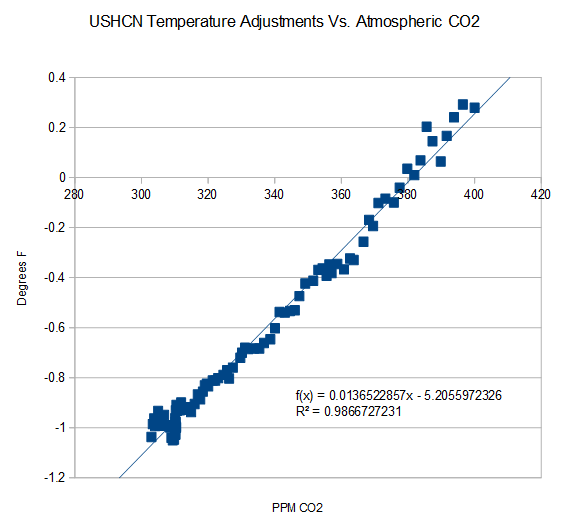
Image Credit: Steven Goddard
As can be seen from the graphic above, there is a strong correlation between carbon dioxide increases and adjustments to the United States Historical Climatology Network (USHCN) temperature record. And these adjustments to the surface data in turn result in large divergences between surface data sets and satellite data sets.
In the post with April data, the following questions were asked in the conclusion: “Why are the new satellite and ground data sets going in opposite directions? Is there any reason that you can think of where both could simultaneously be correct?”
Professor Robert Brown of Duke University had an excellent response the this question here.
To give it the exposure it deserves, his comment is reposted in full below. His response ends with rgb.
Rgbatduke June 10, 2015 at 5:52 am
The two data sets should not be diverging, period, unless everything we understand about atmospheric thermal dynamics is wrong. That is, I will add my “opinion” to Werner’s and point out that it is based on simple atmospheric physics taught in any relevant textbook.
This does not mean that they cannot and are not systematically differing; it just means that the growing difference is strong evidence of bias in the computation of the surface record. This bias is not really surprising, given that every new version of HadCRUT and GISS has had the overall effect of cooling the past and/or warming the present! This is as unlikely as flipping a coin (at this point) ten or twelve times each, and having it come up heads every time for both products. In fact, if one formulates the null hypothesis “the global surface temperature anomaly corrections are unbiased”, the p-value of this hypothesis is less than 0.01, let alone 0.05. If one considers both of the major products collectively, it is less than 0.001. IMO, there is absolutely no question that GISS and HadCRUT, at least, are at this point hopelessly corrupted.
One way in which they are corrupted with the well-known Urban Heat Island effect, wherein urban data or data from poorly sited weather stations shows local warming that does not accurately reflect the spatial average surface temperature in the surrounding countryside. This effect is substantial, and clearly visible if you visit e.g. Weather Underground and look at the temperature distributions from personal weather stations in an area that includes both in-town and rural PWSs. The city temperatures (and sometimes a few isolated PWSs) show a consistent temperature 1 to 2 C higher than the surrounding country temperatures. Airport temperatures often have this problem as well, as the temperatures they report come from stations that are deliberately sited right next to large asphalt runways, as they are primarily used by pilots and air traffic controllers to help planes land safely, and only secondarily are the temperatures they report almost invariably used as “the official temperature” of their location. Anthony has done a fair bit of systematic work on this, and it is a serious problem corrupting all of the major ground surface temperature anomalies.
The problem with the UHI is that it continues to systematically increase independent of what the climate is doing. Urban centers continue to grow, more shopping centers continue to be built, more roadway is laid down, more vehicle exhaust and household furnace exhaust and water vapor from watering lawns bumps greenhouse gases in a poorly-mixed blanket over the city and suburbs proper, and their perimeter extends, increasing the distance between the poorly sited official weather stations and the nearest actual unbiased countryside.
HadCRUT does not correct in any way for UHI. If it did, the correction would be the more or less uniform subtraction of a trend proportional to global population across the entire data set. This correction, of course, would be a cooling correction, not a warming correction, and while it is impossible to tell how large it is without working through the unknown details of how HadCRUT is computed and from what data (and without using e.g. the PWS field to build a topological correction field, as UHI corrupts even well-sited official stations compared to the lower troposphere temperatures that are a much better estimator of the true areal average) IMO it would knock at least 0.3 C off of 2015 relative to 1850, and would knock off around 0.1 C off of 2015 relative to 1980 (as the number of corrupted stations and the magnitude of the error is not linear — it is heavily loaded in the recent past as population increases exponentially and global wealth reflected in “urbanization” has outpaced the population).
GISS is even worse. They do correct for UHI, but somehow, after they got through with UHI the correction ended up being neutral to negative. That’s right, UHI, which is the urban heat island effect, something that has to strictly cool present temperatures relative to past ones in unbiased estimation of global temperatures ended up warming them instead. Learning that left me speechless, and in awe of the team that did it. I want them to do my taxes for me. I’ll end up with the government owing me money.
However, in science, this leaves both GISS and HadCRUT (and any of the other temperature estimates that play similar games) with a serious, serious problem. Sure, they can get headlines out of rewriting the present and erasing the hiatus/pause. They might please their political masters and allow them to convince a skeptical (and sensible!) public that we need to spend hundreds of billions of dollars a year to unilaterally eliminate the emission of carbon dioxide, escalating to a trillion a year, sustained, if we decide that we have to “help” the rest of the world do the same. They might get the warm fuzzies themselves from the belief that their scientific mendacity serves the higher purpose of “saving the planet”. But science itself is indifferent to their human wishes or needs! A continuing divergence between any major temperature index and RSS/UAH is inconceivable and simple proof that the major temperature indices are corrupt.
Right now, to be frank, the divergence is already large enough to be raising eyebrows, and is concealed only by the fact that RSS/UAH only have a 35+ year base. If the owners of HadCRUT and GISSTEMP had the sense god gave a goose, they’d be working feverishly to cool the present to better match the satellites, not warm it and increase the already growing divergence because no atmospheric physicist is going to buy a systematic divergence between the two, as Werner has pointed out, given that both are necessarily linked by the Adiabatic Lapse Rate which is both well understood and directly measurable and measured (via e.g. weather balloon soundings) more than often enough to validate that it accurately links surface temperatures and lower troposphere temperatures in a predictable way. The lapse rate is (on average) 6.5 C/km. Lower Troposphere temperatures from e.g. RSS sample predominantly the layer of atmosphere centered roughly 1.5 km above the ground, and by their nature smooth over both height and surrounding area (that is, they don’t measure temperatures at points, they directly measure a volume averaged temperature above an area on the surface. They by their nature give the correct weight to the local warming above urban areas in the actual global anomaly, and really should also be corrected to estimate the CO_2 linked warming, or rather the latter should be estimated only from unbiased rural areas or better yet, completely unpopulated areas like the Sahara desert (where it isn’t likely to be mixed with much confounding water vapor feedback).
RSS and UAH are directly and regularly confirmed by balloon soundings and, over time, each other. They are not unconstrained or unchecked. They are generally accepted as accurate representations of LTT’s (and the atmospheric temperature profile in general).
The question remains as to how accurate/precise they are. RSS uses a sophisticated Monte Carlo process to assess error bounds, and eyeballing it suggests that it is likely to be accurate to 0.1-0.2 C month to month (similar to error claims for HadCRUT4) but much more accurate than this when smoothed over months or years to estimate a trend as the error is generally expected to be unbiased. Again this ought to be true for HadCRUT4, but all this ends up meaning is that a trend difference is a serious problem in the consistency of the two estimators given that they must be linked by the ALR and the precision is adequate even month by month to make it well over 95% certain that they are not, not monthly and not on average.
If they grow any more, I would predict that the current mutter about the anomaly between the anomalies will grow to an absolute roar, and will not go away until the anomaly anomaly is resolved. The resolution process — if the gods are good to us — will involve a serious appraisal of the actual series of “corrections” to HadCRUT and GISSTEMP, reveal to the public eye that they have somehow always been warming ones, reveal the fact that UHI is ignored or computed to be negative, and with any luck find definitive evidence of specific thumbs placed on these important scales. HadCRUT5 might — just might — end up being corrected down by the ~0.3 C that has probably been added to it or erroneously computed in it over time.
rgb
See here for further information on GISS and UHI.
In the sections below, as in previous posts, we will present you with the latest facts. The information will be presented in three sections and an appendix. The first section will show for how long there has been no warming on some data sets. At the moment, only the satellite data have flat periods of longer than a year. The second section will show for how long there has been no statistically significant warming on several data sets. The third section will show how 2015 so far compares with 2014 and the warmest years and months on record so far. For three of the data sets, 2014 also happens to be the warmest year. The appendix will illustrate sections 1 and 2 in a different way. Graphs and a table will be used to illustrate the data.
Section 1
This analysis uses the latest month for which data is available on WoodForTrees.com (WFT). All of the data on WFT is also available at the specific sources as outlined below. We start with the present date and go to the furthest month in the past where the slope is a least slightly negative on at least one calculation. So if the slope from September is 4 x 10^-4 but it is – 4 x 10^-4 from October, we give the time from October so no one can accuse us of being less than honest if we say the slope is flat from a certain month.
1. For GISS, the slope is not flat for any period that is worth mentioning.
2. For Hadcrut4, the slope is not flat for any period that is worth mentioning.
3. For Hadsst3, the slope is not flat for any period that is worth mentioning.
4. For UAH, the slope is flat since March 1997 or 18 years and 4 months. (goes to June using version 6.0)
5. For RSS, the slope is flat since January 1997 or 18 years and 6 months. (goes to June)
The next graph shows just the lines to illustrate the above. Think of it as a sideways bar graph where the lengths of the lines indicate the relative times where the slope is 0. In addition, the upward sloping blue line at the top indicates that CO2 has steadily increased over this period.

When two things are plotted as I have done, the left only shows a temperature anomaly.
The actual numbers are meaningless since the two slopes are essentially zero. No numbers are given for CO2. Some have asked that the log of the concentration of CO2 be plotted. However WFT does not give this option. The upward sloping CO2 line only shows that while CO2 has been going up over the last 18 years, the temperatures have been flat for varying periods on the two sets.
Section 2
For this analysis, data was retrieved from Nick Stokes’ Trendviewer available on his website <a href=”http://moyhu.blogspot.com.au/p/temperature-trend-viewer.html”. This analysis indicates for how long there has not been statistically significant warming according to Nick’s criteria. Data go to their latest update for each set. In every case, note that the lower error bar is negative so a slope of 0 cannot be ruled out from the month indicated.
On several different data sets, there has been no statistically significant warming for between 11 and 22 years according to Nick’s criteria. Cl stands for the confidence limits at the 95% level.
The details for several sets are below.
For UAH6.0: Since October 1992: Cl from -0.009 to 1.742
This is 22 years and 9 months.
For RSS: Since January 1993: Cl from -0.000 to 1.676
This is 22 years and 6 months.
For Hadcrut4.3: Since July 2000: Cl from -0.017 to 1.371
This is 14 years and 11 months.
For Hadsst3: Since August 1995: Cl from -0.000 to 1.780
This is 19 years and 11 months.
For GISS: Since August 2003: Cl from -0.000 to 1.336
This is 11 years and 11 months.
Section 3
This section shows data about 2015 and other information in the form of a table. The table shows the five data sources along the top and other places so they should be visible at all times. The sources are UAH, RSS, Hadcrut4, Hadsst3, and GISS.
Down the column, are the following:
1. 14ra: This is the final ranking for 2014 on each data set.
2. 14a: Here I give the average anomaly for 2014.
3. year: This indicates the warmest year on record so far for that particular data set. Note that the satellite data sets have 1998 as the warmest year and the others have 2014 as the warmest year.
4. ano: This is the average of the monthly anomalies of the warmest year just above.
5. mon: This is the month where that particular data set showed the highest anomaly. The months are identified by the first three letters of the month and the last two numbers of the year.
6. ano: This is the anomaly of the month just above.
7. y/m: This is the longest period of time where the slope is not positive given in years/months. So 16/2 means that for 16 years and 2 months the slope is essentially 0. Periods of under a year are not counted and are shown as “0”.
8. sig: This the first month for which warming is not statistically significant according to Nick’s criteria. The first three letters of the month are followed by the last two numbers of the year.
9. sy/m: This is the years and months for row 8. Depending on when the update was last done, the months may be off by one month.
10. Jan: This is the January 2015 anomaly for that particular data set.
11. Feb: This is the February 2015 anomaly for that particular data set, etc.
16. ave: This is the average anomaly of all months to date taken by adding all numbers and dividing by the number of months.
17. rnk: This is the rank that each particular data set would have for 2015 without regards to error bars and assuming no changes. Think of it as an update 25 minutes into a game.
| Source | UAH | RSS | Had4 | Sst3 | GISS |
|---|---|---|---|---|---|
| 1.14ra | 6th | 6th | 1st | 1st | 1st |
| 2.14a | 0.170 | 0.255 | 0.564 | 0.479 | 0.75 |
| 3.year | 1998 | 1998 | 2014 | 2014 | 2014 |
| 4.ano | 0.483 | 0.55 | 0.564 | 0.479 | 0.75 |
| 5.mon | Apr98 | Apr98 | Jan07 | Aug14 | Jan07 |
| 6.ano | 0.742 | 0.857 | 0.832 | 0.644 | 0.97 |
| 7.y/m | 18/4 | 18/6 | 0 | 0 | 0 |
| 8.sig | Oct92 | Jan93 | Jul00 | Aug95 | Aug03 |
| 9.sy/m | 22/9 | 22/6 | 14/11 | 19/11 | 11/11 |
| Source | UAH | RSS | Had4 | Sst3 | GISS |
| 10.Jan | 0.261 | 0.367 | 0.688 | 0.440 | 0.82 |
| 11.Feb | 0.156 | 0.327 | 0.660 | 0.406 | 0.88 |
| 12.Mar | 0.139 | 0.255 | 0.681 | 0.424 | 0.90 |
| 13.Apr | 0.065 | 0.175 | 0.656 | 0.557 | 0.74 |
| 14.May | 0.272 | 0.310 | 0.696 | 0.593 | 0.76 |
| 15.Jun | 0.329 | 0.391 | 0.728 | 0.580 | 0.80 |
| Source | UAH | RSS | Had4 | Sst3 | GISS |
| 16.ave | 0.204 | 0.304 | 0.685 | 0.500 | 0.82 |
| 17.rnk | 4th | 6th | 1st | 1st | 1st |
If you wish to verify all of the latest anomalies, go to the following:
For UAH, version 6.0 was used. Note that WFT uses version 5.6. So to verify the length of the pause on version 6.0, you need to use Nick’s program.
http://vortex.nsstc.uah.edu/data/msu/v6.0beta/tlt/tltglhmam_6.0beta2
For RSS, see: ftp://ftp.ssmi.com/msu/monthly_time_series/rss_monthly_msu_amsu_channel_tlt_anomalies_land_and_ocean_v03_3.txt
For Hadcrut4, see: http://www.metoffice.gov.uk/hadobs/hadcrut4/data/current/time_series/HadCRUT.4.4.0.0.monthly_ns_avg.txt
For Hadsst3, see: http://www.cru.uea.ac.uk/cru/data/temperature/HadSST3-gl.dat
For GISS, see:
http://data.giss.nasa.gov/gistemp/tabledata_v3/GLB.Ts+dSST.txt
To see all points since January 2015 in the form of a graph, see the WFT graph below. Note that UAH version 5.6 is shown. WFT does not show version 6.0 yet.

As you can see, all lines have been offset so they all start at the same place in January 2015. This makes it easy to compare January 2015 with the latest anomaly.
Appendix
In this part, we are summarizing data for each set separately.
RSS
The slope is flat since January 1997 or 18 years, 6 months. (goes to June)
For RSS: There is no statistically significant warming since January 1993: Cl from -0.000 to 1.676.
The RSS average anomaly so far for 2015 is 0.304. This would rank it as 6th place. 1998 was the warmest at 0.55. The highest ever monthly anomaly was in April of 1998 when it reached 0.857. The anomaly in 2014 was 0.255 and it was ranked 6th.
UAH6.0
The slope is flat since March 1997 or 18 years and 4 months. (goes to June using version 6.0)
For UAH: There is no statistically significant warming since October 1992: Cl from -0.009 to 1.742. (This is using version 6.0 according to Nick’s program.)
The UAH average anomaly so far for 2015 is 0.204. This would rank it as 4th place. 1998 was the warmest at 0.483. The highest ever monthly anomaly was in April of 1998 when it reached 0.742. The anomaly in 2014 was 0.170 and it was ranked 6th.
Hadcrut4.4
The slope is not flat for any period that is worth mentioning.
For Hadcrut4: There is no statistically significant warming since July 2000: Cl from -0.017 to 1.371.
The Hadcrut4 average anomaly so far for 2015 is 0.685. This would set a new record if it stayed this way. The highest ever monthly anomaly was in January of 2007 when it reached 0.832. The anomaly in 2014 was 0.564 and this set a new record.
Hadsst3
For Hadsst3, the slope is not flat for any period that is worth mentioning. For Hadsst3: There is no statistically significant warming since August 1995: Cl from -0.000 to 1.780.
The Hadsst3 average anomaly so far for 2015 is 0.500. This would set a new record if it stayed this way. The highest ever monthly anomaly was in August of 2014 when it reached 0.644. The anomaly in 2014 was 0.479 and this set a new record.
GISS
The slope is not flat for any period that is worth mentioning.
For GISS: There is no statistically significant warming since August 2003: Cl from -0.000 to 1.336.
The GISS average anomaly so far for 2015 is 0.82. This would set a new record if it stayed this way. The highest ever monthly anomaly was in January of 2007 when it reached 0.97. The anomaly in 2014 was 0.75 and it set a new record. (Note that the new GISS numbers this month are quite a bit higher than last month.)
If you are interested, here is what was true last month:
The slope is not flat for any period that is worth mentioning.
For GISS: There is no statistically significant warming since November 2000: Cl from -0.018 to 1.336.
The GISS average anomaly so far for 2015 is 0.77. This would set a new record if it stayed this way. The highest ever monthly anomaly was in January of 2007 when it reached 0.93. The anomaly in 2014 was 0.68 and it set a new record.
Conclusion
Two months ago, NOAA was the odd man out. Since GISS has joined NOAA, HadCRUT4 apparently felt the need to fit in, as documented here.
“RSS sample predominantly the layer of atmosphere centered roughly 1.5 km above the ground, and by their nature smooth over both height and surrounding area (that is, they don’t measure temperatures at points, they directly measure a volume averaged temperature above an area on the surface.”
1. They dont measure temperature directly.
2. The sensor sits in space. It is hit by photons that have left the atmosphere.
3. That creates a BRIGHTNESS at the sensor.
4. based on this brightness at the sensor you can then INFER a temperature at various altitudes
a) This INFERENCE is based on multiple simplifying assumptions
b) This INFERENCE is based on microwave radiative transfer models.
c) start your reading with this paper
http://journals.ametsoc.org/doi/pdf/10.1175/1520-0450%281983%29022%3C0609%3ASSOUTM%3E2.0.CO%3B2
5. The satellite data May be compared to in situ radiosonds. The global coverage is miniscule
some sample problems
http://nsstc.uah.edu/users/john.christy/christy/2009_ChristyN_Australia.pdf
If folks want to read an intelligent review they can start here. Its 144 pages long
focus on pages surrounding 40 if you dont have the patience to learn
http://www.scottchurchdirect.com/docs/MSU-Troposphere-Review01.pdf
What is the point of writing such drivel? No scientific instrument measures temperature “directly”. *All* temperature measurements are INFERRED. So what? When I measure temperature using a mercury thermometer I INFER the temperature by the amount of expansion of the mercury in the glass tube.
What is the point of such a discussion other than a transparent effort to attempt to rubbish a data set that indicates the work you defend has problems? Pathetic.
“When I measure temperature using a mercury thermometer I INFER the temperature by the amount of expansion of the mercury in the glass tube.”
A mercury thermometer has far fewer variables that can affect the accuracy of the measurements than a satellite measurement. That’s the difference.
And so does a GPF receiver. But it’s completely irrelevant so long as the process has been validated. That’s the difference.
That should have read, “GPS” not “GPF”. A microprocessor also has far more variables to consider than an abacus in terms of the technology that went into it, but the microprocessor is still more accurate.
Final example. Which has more “variables” to consider, a mechanical clock or an atomic clock? (By “variables” one assumes one means which is the more complex to build.) Also, which is the more accurate?
The measurement of time must be INFERRED from the design of the device. No measurement instrument directly measures anything whether that is temperature, time, air pressure, etc. All measurements are INFERRED. More complex devices are typically MORE accurate, not less accurate. That’s why they are made more complex to begin with. What a surprise…
The game Mosher is playing is to try obfuscate by implying that complex = less accurate. That is not true. It’s not even true is simplistic cases. It’s a dumb thing to try to imply.
you think?
dontcha think that there are a myriad of sources for error in thermometer readings?
accuracy of the temperature scale itself…
variance in registration of the scale on the thermometer?
variance in amount of mercury or whatever inside the thermometer?
angle of viewing the thermometer?
rounding error from the continuous nature of the thermometers’ data to the discrete nature of a recording of a specific temperature?
the fact that thermometers measure the temperature of a point in space for all intents and purposes, not an area?
>>More complex devices are typically
>>MORE accurate, not less accurate.
Like the Harrison H4 chronometer.
The most complex and the most accurate chronometer of its day.
for folks to lazy to read.. here is a unformated version
“If the surface and troposphere are indeed strongly coupled to each other thermally, then discrepancies between
their temperature trends are indeed puzzling. At the very least, we would have to say either that uncertainties in MSU
and radiosonde records are more uncertain than we imagined, or that there are regional and/or global interactions
between the two that AOGCM’s are not getting. Most of the climate simulation models used over the last decade or so
Located at:
http://www.scottchurchdirect.com >> Climate Change >> Troposphere Temperatures
41 of 144
assume thermal coupling across atmospheric vertical layers and have been less well characterized regarding things
might interfere with this coupling (e.g. water vapor, sea level pressure, or deep convection cells). So it is not surprising
that they predict similar surface and upper air temperature trends. But if the troposphere is even partially decoupled
from the surface, either regionally or globally, then surface and upper air trends may well diverge (NRC, 2000).
Recently, several lines of research have emerged suggesting that this may well be the case. One of the most
promising has been the work of Kevin Trenberth and David Stepaniak of the National Center for Atmospheric Research
(Boulder, CO) on the earth’s global radiation budget. Trenberth and Stepaniak studied the earth’s energy budget and
the way solar energy input to the atmosphere and surface are redistributed globally. Among other things, they found
that important zonal and poleward energy transports occur in the tropics and extra-tropics that redistribute latent heat
mush more strongly in these directions than vertically, decoupling the surface from the troposphere in these regions.
The finding are particularly significant because it is primarily in these regions that lapse rates are much higher than
expected from models, and the surface and troposphere trends are most noticeably different, and uncertain, in the
various datasets. There are two mechanisms at work here which strongly couple vertical and poleward heat transport
providing an almost seamless energy balance that connects outgoing long-wave radiative cooling with annual variation
of solar atmospheric heating. Radiative cooling of the earth at the top of the atmosphere is globally uniform. But
because the earth’s rotational orbital plane is tilted with respect to its solar orbital path (the ecliptic plane), the
weighting of solar heating will shift in a meridional (north – south) direction annually – which is, of course, why there
are seasons at higher latitudes. This requires a poleward energy transfer that must balance. Trenberth and Stepaniak
showed that this balance has two components which favor a poleward transfer of latent heat that largely decouples the
surface from the troposphere, particularly in the tropics and extra-tropics (Trenberth & Stepaniak, 2003a,b). They
found that in lower latitudes the dominant mechanism of latent heat transport if the overturning of Hadley and Walker
cells. In the upward cycle of these cells the dominant diabatic heat transfer occurs from the convergence of moisture
driven by the cell motion itself. This results in a poleward transport of dry static energy that is partially, but not
completely balanced by an equatorial transport of latent heat, leaving a net poleward transport of moist static energy.
In the subtropics, the subsidence warming in the downward branch of these cells is balanced by cooling that arises
from the poleward transport of energy by transient baroclinic eddies. These eddies are broadly organized into storm
tracks that covary with global stationary atmospheric waves in a symbiotic relationship where one feeds the other. The
relatively clear skies in the subtropics feed this cycle by allowing for strong solar absorption at the surface which feeds
the latent heat transport cycle through evaporation, and in return, this is compensated by subsurface ocean heat
transport that is itself driven by the Hadley circulation winds. The relationship between these cycles and how they
exchange energy is shown in Figure 35.
For their analysis of the magnitudes of these effects, Trenberth and Stepaniak used overall energy transports
derived from reanalysis products for the period 1979-2001 from the National Centers for Environmental Prediction–
National Center for Atmospheric Research (NCEP–NCAR) as derived by Kalnay et al. (1996) and used in Trenberth et
al. (2001). These were deemed to be most consistent with the overall heat budget as determined from Top of
Atmosphere (TOA) and ocean measurements (Trenberth and Caron 2001; Trenberth & Stepaniak, 2003a). Other
complimentary heat budget data from the Southampton Oceanographic Centre (SOC) heat budget atlas was also used
to characterize ocean surface heat transfer (Josey et al. 1998, 1999). Trenberth and Stepaniak noted that this data
had considerably uncertainties due to sampling error and systematic biases from bulk flux parameterizations, but they
were careful to use them only with relevant physical constraints that limited the impact of these uncertainties on their
results (Trenberth et al., 2001; Trenberth and Stepaniak, 2003b). TOA data was taken mainly from Earth Radiation
Budget Experiment (ERBE) satellite measurements of TOA radiation (Trenberth 1997). Precipitation estimates were
taken from the Climate Prediction Center (CPC) Merged Analysis of Precipitation (CMAP) precipitation estimates (Xie
and Arkin, 1997).
Figures 36 and 37 show typical zonally average annual magnitudes of the energy transfers involved in these
various processes in the tropics and extra-tropics for the North Pacific (Fig. 34), and the South Pacific (Fig. 35) for the
ERBE period February 1985–April 1989. It can be seen that the net effect is to give the earth’s energy budget has a
strong poleward component in the tropics and extra-tropics that redistributes a significant portion of surface reradiated,
convective, and latent heat poleward rather than vertically. This should at least partially decouple surface temperature
trends from upper troposphere trends in these regions in ways not accounted for in previous AOGCM’s. Given that this
effect is most evident in the tropics and extra-tropics, we should expect that heat transfer processes that would
ordinarily bring the troposphere up to the same temperature as the surface will be at least partially diverted, leaving the
troposphere cooler (or perhaps under some circumstances, warmer) in these regions than would otherwise be
Located at:
http://www.scottchurchdirect.com >> Climate Change >> Troposphere Temperatures
42 of 144
expected. The fact that it is the tropics and extra-tropics that display the largest discrepancies between UAH and RSS
analyses lends further support to this theory. There are still considerable uncertainties in the magnitudes of some of
the heat transfer budgets in this process, and more work needs to be done to fully characterize it (Trenberth &
Stepaniak, 2003a,b), so the degree to which this process contributes to discrepancies between various MSU analyses
and the surface record needs further examination.
The important point here is that the existence of such a mechanism means that we should expect at least some
disconnect between surface and troposphere warming rates in these regions. Even if this disconnect proves to be of
considerable magnitude, it would not present any issues for the long-term surface record, which we must remember, is
robust and well characterized independent of the troposphere record (NRC, 2000; IPCC, 2001). As it is today, MSU
products, and to a lesser extent radiosonde products, vary between those that predict little if any disconnect and can
be comfortably reproduced by state-of-the-art AOGCM’s (Mears et al., 2003; Prabhakara et al., 2000; Vinnikov and
Grody, 2003) and those that show relatively large, statistically significant disconnects (Christy et al., 2003). The truth is
likely to be somewhere in-between. For our purposes, it is enough to emphasize that demonstrable differences
between surface and tropospheric temperature trends do not invalidate either record. “
” This should at least partially decouple surface temperature
trends from upper troposphere trends in these regions in ways not accounted for in previous AOGCM’s. ”
upper Troposphere yes, but lower troposphere there’s very limited decoupling. The discrepancy of a few years ago was enough to hand-wave (as described above). But today, the continued a increasing divergence with each new revision (as RGB put it):” the divergence is already large enough to be raising eyebrows, …”
Finally, the MSU Troposphere decoupling explanation fails to even touch on the obvious positive warming effect, systematic corrections (as discussed by RGB) continuing to be applied in ever more magnitude in past measurements by those government agencies.
+1 It also does not provide either a mathematical derivation or a physical derivation for the gross adjustments made to all surface records or why UHI is a negative and not positive adjustment.
This would be easier to accept if there were not all of the adjustments that only the surface records underwent according to the top graphic for this article.
Considering that the troposphere is dimensionally a very thin layer on the earth’s surface, the idea of the tropospheric temperature being even partially decoupled from the surface temperature seems far fetched as an explanation of the divergence between the surface temperature records and the satellite temperature record. But considering that we are talking about some fabulous history of global average temperature and a minuscule alleged anomaly of less than 1C miraculously extracted from crappy data totally unsuited to the purpose, I find it difficult to credit any of the global temperature reconstructions. Essentially, these people are modern day alchemists trying to turn lead into gold.
I’m going to be blunt here. If I were your employer, you would not be allowed nowhere near any kind of Internet forum, and you would be terminated if you disobeyed that prohibition. You are arrogant and condescending, making the people for whom and with whom you work look really, really bad. Do them and yourself a favor, and us too, and absent yourself from public Internet discussions for a good long while.
P.S. I see now that you are a member of Phi Beta Kappa with a degree in English: these facts are undetectable from your writing on this forum. (I am but a lowly member of Sigma Tau Delta with a B.S. in Math and Computer Science.)
Sorry for my rant.
I don’t have a problem with someone having an English degree that is self taught in maths and science, so long as they are good at what they do. But Mosher makes some amazingly stupid comments here on a regular basis, and while that’s not evidence that he doesn’t know what he’s doing, it’s not confidence inspiring either.
ELCore (@ur momisuglyOneLaneHwy),
WUWT would seem dreary w/o Moshpit.
He tends to perturb the attendants @ur momisugly the skeptic’s prom.
John
Typical Mosher, once again missing the obvious while copy and pasting mostly non cogent details, and at the same time insulting folk in general.
First the divergence papers you are quoting refer mostly to regional, NOT GLOBAL divergences, and second, those reports are more then ten years old, So NOT RELATED TO THE CURRENT RECORD DIVERGENCE, which is unphysical, far more global then in the past when those papers were written, and does not in the least conform to ANY CAGW theory. Both surface and troposphere data sets cannot be right.
Also Mr Mosher once again utterly fails to mention how thoroughly the satellites are measured and calibrated against weather balloons, which are unaffected by UHI, homogenization issues, station moves, and ever increasing ignoring of official stations in the data base.
The satellite data sets show 1998 as the warmest year by a LARGE margin, about .3 degrees C. This easily exceeds their error margins, and by NASAs owns methodology 100 percent demonstrates that 1998 was warmer then 2014 and 2015. Further Mr. Mosher negates to mention that CAGW theory postulates that the troposphere should warm MORE THEN THE SURFACE.
In a previous comment on a different topic Mosher hand waved away the sat divergence by educating us with the information that nobody lives in the middle troposphere. Hence these data sets could safely be dismissed as irrelevant. (Well, that is the obvious implication of the comment, anyway.) You really can’t make up stupid like that.
Nop one lives in the ocean either. Or in the Arctic Ocean or on Antarctica. And yet these places are used to make the total warming what it is.
Mr. Mosher also likes to point out that the satellites do not use an actual thermometer!
Sophistry of the first order.
All methods of measuring temperature rely on some or another physical characteristic of some material.
I really am getting sick of the straw men and logical fallacy arguments.
Just looking at Mr. Mosher’s comment, it is too lazy of an effort to even pay much attention to.
Forbearance in the face of condescension is one thing, but from someone who has never, in my experience, shown any real trace of being in a position, intellectually or educationally, to condescend…it even more galling.
No one is obligated to suffer such people cheerfully or reservedly.
Steven (and others): One can write a Word macro to convert a paragraph full of line breaks to one without. It simply does a search and replace to convert carriage returns to spaces. It’s easy–after one’s learned how to write macros.
You don’t even need a macro. You just do:
Find …….. §p **
Replace … sp
And do a replace all.
Mosh is simply the height of egotisical rudeness. He thinks he is so wonderful and superior, when he is actually the worst poster on this site – with the least to say and no ability whatsoever to explain what he means. I have said before that 50% of science is communication, which means that Mosh would probably be quite a dab-hand with a cart and broom….
** The characters for a line-return differ, from package to package.
Since you should have have least minimal technical computer skills, could you please edit your posts after you copy and paste them for formatting before hitting the “post comment ” button????
Most of your stuff is annoying to read anyway, but the horrible formatting doubles it.
so the tropospheric hotspot will be above the poles ?
Mosh.
Jezz, mate, have you still not learned how to do a global change to a Word or Pages file, to get rid of all the line-returns. You are either stupid or lazy. Yeah – lazy, the very term you accuse everyone else of being.
Besides, which is the more complex, with the most uncertainty,
a. 10,000 surface thermometers, each with their own siting, instrumental, interfere, scalar, measurement, urbanisation, and data compilation issues.
b. A single thermometer viewing the entire world.
R
When are they going to stop adjusting past temperatures? As long as they continually adjust the temperature data, it is an admission that the data are wrong; otherwise, there would be no need to “correct” it.
Those who uses current data sets such as GISS, Hadcrut, or Hadsst for scientific purposes are only fooling themselves. They have to know that the data they are using will be corrected, perhaps many times, in the future. So what they are using now is wrong and cannot produce valid results. There is no scientific purpose for a temperature data set that is constantly changing. It is useful only for propaganda purposes. I suppose they know that. They just don’t want to admit it because that would destroy the propaganda value, too, and make it useless for any purpose.
Entire bodies of ecology, ag science, microbiology-epidemiology, and social sciences are riding IPCC’s RCP8.5 (CO2 business as usual emissions) model ensemble-fueled gravy train of “if that, then this could happen.
Imagine the impact of insisting the raw data,as measured, be listed in each one of those papers detailing doom by heat.
Of course this would then force detailed explanations of the adjustments and their validity.
Climatology can not go there.
As the reader would mostly dismiss such speculation as nonsense.
Climate Science really is not, only in the social sciences does such baseless speculation claim to be adhering to the scientific method.
Must be a whole Post Normal method.
As a taxpayer can I pay my share in Post Normal dollars?
Steve McIntyre suggested that Climatology should try using the same standard that mining engineers are held to, we wish.
Imagine a mine assessment using climatologies methods.
Or – imagine that medical companies operated by climatologies methods.
Many countries has laws against quackery to avoid medical harm to people caused by unreliable scientific methods.
Unfortunately, the existing laws cannot prevent quackery within climate science.
Reblogged this on CraigM350 and commented:
Professor Brown comments later in this article
Why was NCDC even looking at ocean intake temperatures? Because the global temperature wasn’t doing what it was supposed to do!. Why did Cowtan and Way look at arctic anomalies? Because temperatures there weren’t doing what they were supposed to be doing!
From talking with meteorologists and communications with the UK Met Office this does sadly seem to be the case. Their investigations are not geared towards what is but rather why rather why it is not matching forecasts. Josh had it spot on…
I love this cartoon. Posting to all my FB friends and foes.
Karl Popper did a great work demonstrating why inductivism and justificationism are utterly flawed.
I see so many good reasons why the modern scientific method; Karl Popper´s empirical method, should always be applied. Good scientists know that their theory are merited by the severity of the tests they have exposed it to, and not at all by the unlimited amount of possible good reasons why a theory could, or should be correct. Here are some quotes from Poppers work I personally find very essential. I think these quotes also helps to become aware of some shortcomings in climate science:
“A scientist, whether theorist or experimenter, puts forward statements, or systems of statements, and tests them step by step. In the field of the empirical sciences, more particularly, he constructs hypotheses, or systems of theories, and tests them against experience by observation and experiment.”
“The .. empirical method .. stands directly opposed to all attempts to operate with the ideas of inductive logic. It might be described as the theory of the deductive method of testing, or as the view that a hypothesis can only be empirically tested—and only after it has been advanced.”
“But I shall certainly admit a system as empirical or scientific only if it is capable of being tested by experience. These considerations suggest that not the verifiability but the falsifiability of a system is to be taken as a criterion of demarcation. In other words: …. it must be possible for an empirical scientific system to be refuted by experience.”
“it is still impossible, for various reasons, that any theoretical system should ever be conclusively falsified. For it is always possible to find some way of evading falsification, for example by introducing ad hoc an auxiliary hypothesis, or by changing ad hoc a definition. It is even possible without logical inconsistency to adopt the position of simply refusing to acknowledge any falsifying experience whatsoever. Admittedly, scientists do not usually proceed in this way, but logically such procedure is possible”
“the empirical method shall be characterized as a method that excludes precisely those ways of evading falsification which … are logically possible. According to my proposal, what characterizes the empirical method is its manner of exposing to falsification, in every conceivable way, the system to be tested. Its aim is not to save the lives of untenable systems but … exposing them all to the fiercest struggle for survival.”
“All this glaringly contradicts the programme of expressing, in terms of a ‘probability of hypotheses’, the degree of reliability which we have to ascribe to a hypothesis in view of supporting or undermining evidence.”
(Which is exactly what IPCC largely does in their work by their invention of degrees of agreement and by expressing their subjective confidence. The IPCC report is a grand monument over inductivism and justificationism.)
“The Logic of Scientific Discovery” It is well worth a read. The first part of the book is easy reading and enlightening on Popper´s empirical method. I think that scientific minds will find it soothing. http://strangebeautiful.com/other-texts/popper-logic-scientific-discovery.pdf
never has there been a better example of a cartoon doing a far better job than a thousand words could ever hope to .
+1 🙂
Werner Brozek /Rgbatduke/ Just The Facts,
Werner Brozek (& Just The Facts) , that is a great question; and rgbatduke, that is a wonderfully stark answer.
Perhaps we should start to develop a matrix like this to keep track of assessments of the various temperature work products? This is just a quick concept of a matrix.
John
https://okulaer.wordpress.com/2014/10/28/what-of-the-pause/
Thank you! However it is a bit dated since UAH version 6 has gotten rid of the glaring disagreements. See:
http://vortex.nsstc.uah.edu/data/msu/v6.0beta/tlt/tltglhmam_6.0beta3.txt
Glad to see others catching on to the established fact that global SAT indices are manufactured by reverse-engineering the desired connection to CO2 via unconscionable systematic “adjustments” of actual measurements. Without such devices, the CAGW meme would fall apart even in the minds of novices.
So Berkeley Earth is in on the conspiracy too? Richard Muller?
In fact, SAT adjustment makes very little difference.
As always Nick you ignore the very large changes to the surface record post the early 1980s when global data sets showed a .3 degree global cooling subsequent to the 1940s high. yes the ice age scare was real, and was consensus science at the time… https://stevengoddard.wordpress.com/1970s-ice-age-scare/
BTW, since the use what is essentially the same adjusted data, it is not a surprise they look similar.
The troposphere not warming is completely contrary to CAGW physics. This is the true strength of this post. Do you wish to debate that point?
Please Mr Nick S, show us where in the entire body of the iPCC and all papers written on CAGW, there is a prediction the troposphere will not warm at all for twenty years, but the surface will set new records every year.
Since Professor Richard Muller thoroughly trashed Michael Mann, he has not had much to say in the Climate field, other than an op-ed in WSJ. His daughter, Mosher’s boss, on the other hand, a true fanatic, continues to push to destroy modern civilization. Mosher does as he is told, clearly needs this job, leave him alone poor fellow…
“In fact, SAT adjustment makes very little difference.” Then why do it?
You are, as far as I can tell, talking about what happens in a single multi-stage adjustment process. As David A notes August 14, 2015 at 9:46 pm, there have been large changes to the record over time.
For instance, look at Hansen’s Figure 4 from his 1999 paper “GISS analysis of surface temperature change”, on page 36. Compare that with the current corresponding graph at the GISTEMP webpage.
In the current version, the anomaly for 1900 is almost -0.2°C; that for 1999 is almost +0.6°. That’s a change of nearly +0.8°C. But in the 1999 version, the anomaly for 1900 is just slightly below 0.0°, and the anomaly for 1999 is just slightly below 0.4°C. That’s a change of only about 0.4°C.
Over a span of about 15 years, GISS altered the temperature record to effectively double the change in temperature from 1900 to 1999.
http://data.giss.nasa.gov/gistemp/graphs_v3/Fig.A.gif
I forgot the other link.
http://pubs.giss.nasa.gov/docs/1999/1999_Hansen_etal_1.pdf
Nick Stokes:
Through indiscriminate kriging of UHI-corrupted station data into the countryside and over-zealous “scalpeling” of intact records, BEST produces a bogus trend in SAT that is no less egregious than that introduced by conscious mimicking of CO2 data. Because neither you nor any of the index manufacturers have any professional concept of vetting field data to exclude UHI effects nor any realistic spectral specification of natural variability, your claims of innocent adjustments are based on exercises in circular reasoning.
Through indiscriminate “kriging” of UHI-corrupted station data into the countryside and over-zealous use of “scalpeling” of intact records to achieve “homogeneity,” BEST introduces a bogus trend into its global SAT index that is no less egregious than that produced by conscious mimicking of the CO2 record. Because neither you nor any of the index manufacturers have any professional concept of vetting station records to exclude UHI effects nor any spectral specification of natural variability, your claims of minor, innocent adjustments are based upon circular reasoning.
No, Berkeley Earth is also wrong in assuming non-correlated gaussian distributions when conducting statistical tests (e.g. when adjusting station readings, or testing their algorithm).
In the BE paper on how they do the adjustments, they fail to cite a significant finding that autocorrelation breaks most standard changepoint detection methods. Temperature time series are auto-correlated. So BE is likely adjusting far too much.
BE’s paper:
ftp://ftp.ncdc.noaa.gov/pub/data/ushcn/papers/williams-etal2012.pdf
Paper that shows how bad changepoint detection techniques fail on autocorrelated data (section 4, in particular Table 1)
http://journals.ametsoc.org/doi/pdf/10.1175/JCLI4291.1
Peter
Moderator:
If comments, such as mine of Aug. 15 at 1:36pm, did not disappear without a trace upon submission WUWT, you would not get duplicate re-writes.
Just about says it all.
Thanks Dr. RGB for the straightforward no nonsense assessment.
For everyone ‘too lazy’ to read this…just keep your eye out for the word ‘marketing’.
Steven M. Mosher, B.A. English, Northwestern University (1981); Teaching Assistant, English Department, UCLA (1981-1985);
Director of Operations Research/Foreign Military Sales & Marketing,
Northrop Corporation [Grumman] (1985-1990); Vice President of Engineering [Simulation], Eidetics International (1990-1993);
Director of Marketing, Kubota Graphics Corporation (1993-1994);
Vice President of Sales & Marketing, Criterion Software (1994-1995); Vice President of Personal Digital Entertainment, Creative Labs (1995-2006);
Vice President of Marketing, Openmoko (2007-2009); Founder and CEO, Qi Hardware Inc. (2009);
Marketing Consultant (2010-2012); Vice President of Sales and Marketing, VizzEco Inc. (2010-2011); [Marketing] Advisor, RedZu Online Dating Service (2012-2013); Advisory Board, urSpin (n.d.);
Team Member, Berkeley Earth 501C(3) Non-Profit Organization unaffiliated with UC Berkeley (2013-Present)
Sure but what exactly is he marketing here?
Snark and incoherence?
Why do you bother?
Moshers’s comments speak well enough for him. Scroll on by.
And your point is? Christopher Monckton has a degree in journalism, and has been a journalist, run a shirt shop and been a political adviser for much of his career. Yet I don’t see his lack of scientific credentials criticized here.
His comments are logical, and is mathematical acumen is very high.
“His comments are logical, and is mathematical acumen is very high” and, more importantly, he follows the party line for Whats Up.
Chris,
When you cannot refute Lord Monckton’s science, you do the usual ad hominem attack.
There is no better evidence that Lord M is correct — and that you’ve got nothin’ to counter him.
@trafamadore: That may be. But you omitted the fact that the WUWT ‘party line’ follows science — unlike you. Who do you follow? Algore?
dbstealey says: ” you omitted the fact that the WUWT ‘party line’ follows science”
you forgot the sarc tag. People might think you were serious.
trafamadore,
So Algore is your Messiah!
Based on your abysmal batting average (‘there was no consensus that contradicted Galileo’; and your having no understanding of the Constitution; and ‘The mining company caused the yellow river, not the EPA’; and “Tisdale is more worried about the demise of his little hiatus” — “little”, after almost twenty years of ‘hiatus’; and “climate scientist Peter Gleick” [heh, as if]; and “Eco warriors use carbon to move around so they can get people to stop using carbon.”)… why should anyone assign any credibility to any of your posts?
Practically every comment you make is scientific nonsense, ad-hom attacks, appeals to corrupt authorities, or just simpleminded cheerleading for a failed conjecture (CO2 causes dangerous man-made global warming).
If you’re ever out of work, you can get a job as a parrot.
db and “get a job as a parrot.”
Well, I get to parrot real scientists; you get to parrot their polar opposites, Tisdale and lordy Monkton. Sounds good to me.
PS. Did Monkton really run a shirt shop?
trafamadore,
You think running a business is a criticism. I doubt you could run a lemonade stand successfully.
As for your guy Mann, he claims to be a Nobel Prize winner.
One is ethical, and one is a fakir.
If you’re going to quote his credentials, do them fully. Monckton has a M.A. in Classics from Cambridge, his first degree.
charles nelson,
I’ve met Steven Mosher several times. He’s really a nice guy. Smart, too, I guess. But I can never get over the fact that someone who earned a degree in English cannot write a correct, coherent sentence. What’s up with that? Are degrees at NU handed out to anyone with a pulse?
[Correct. Fake email address. ~mod.]
Mods, no doubt these comments are from “David Socrates”, the banned site pest. Please check email address, WhoIs, etc. Thanks.
Follow the money. Research grants, political contributions, university positions, consultancies, government jobs, etc. These are your real causal variables when it comes to climate science.
Research grant money is given out in many fields – medical research, oceanography, geology, etc. Why don’t “follow the money” problems occur in these fields?
An interesting question.
The problem with the bit of climate science that has to do with the future and is most “political” is that unlike most other sciences it isn’t falsifiable within the the time frames that most funders operate on.
Of course fads and fashions make blind alleys fundable for a while, but the great day of reckon tends to come within a couple of funding cycles and everyone moves on. Climate science has a longer time frame before judgement day, but I think they had better be unequivocally delivering the goods before the end of the decade or the funding tide will start to go out.
Sure…end of the decade. What is another $150 billion in our tax dollars?
We should begin to get some truth by then, huh?
Most people need to “deliver the goods” long before hundreds of billions are tossed to them.
Menicholas think it as tax breaks for a religion. Equally unfalsifiable but the established churches get taxpayer resources as long as they manage to keep enough voters on board.
The point is that the funding issue is a political issue not a scientific one.
I’ll probably now be banned at William M. Briggs.
“Research grant money is given out in many fields – medical research, oceanography, geology, etc. Why don’t “follow the money” problems occur in these fields?”
=============================================================
Those fields do not allow statist the necessary excuse to tax the very air you breath and expand political power over others life’s that CAGW offers. Political statist, like vampires drawn to blood, flock to the CAGW me-me.
Why don’t “follow the money” problems occur in these fields
==============
they most certainly do occur in medical research. or do you think the current epidemic of obesity and diabetes in the US is due to “no willpower”? apparently no one thought to ask what would happen if you fed people the same diet used to fatten cattle.
fields like oceanography, geology, etc. have no money so there is nothing to follow.
Science used to be a vocation (still is in many fields) but it is in the process of being commoditised, corrupted and “bought and sold by (insert appropriate qualifier) gold”
Here is a really nice example of the corruption of science by money http://whistleblower.org/actonel Who dares to doubt that this is being repeated throughout academia? How many potential whistle blowers prefer to keep quiet and retain their jobs? Tip of the iceberg?
Perhaps the differences between this and the climate science world are that (a) it was really, really blatant; (b) an actual bribe was offered in plain sight; (c) it was a singular event at one time and one place and (d) it was done by big bad pharma, whom we all know are ruled by money, money and money (but not necessarily in that order). The whole public-sector research-grant-giving tenure-granting environment is much more fuzzy and seems to work by unspoken and unwritten rules that have more in common with religious orthodoxy and political correctness than heavy-handed threats and orders. Also, money is a tool rather than a raison-d’être.
I wish someone would show me how to insert a hyperlink. Techno-klutz here is a twentieth-century guy adrift in the 21st. Perhaps I should stick to looking at rocks, but I’m captivated by the transparent absurdity of the whole global-warming industry and can’t keep away from reading about it.
re: “Why don’t “follow the money” problems occur in these fields?[ medical research, oceanography, geology, etc. ]Chris
By Jove Chris you got it! Corruption is ubiquitous.
Dan Kurt
First of all, I once knew a goose and it would resent being compared to a climate agitator.
Second, the problem pointed out here is EASILY corrected, We just need to tweak the satellite data since it is obviously the problem. Probably orbital decay or time drift – we can find something that works in the favor of AGW. I mean, these guys are so CREATIVE.
(I am sorry, but I have lost my faith that science is self-correcting anymore… They have gotten away with this nonsense for over 20 years now.)
Anthony knows which are the good stations in the US. How about a continually updated chart for those and compare that to the USCRN chart.
Mr Goddard really needs to post the source data and code. It’s bad for the skeptic side to follow the same bad practices as the CAGW side. Nick Stokes has tried to reproduce the adjustment and can’t, and he posted source and data. He has a valid looking falsification. Do you want this falsification of Goddard to continue to be valid or not?
Bull.
Bull.
I’ll grant you posted that at 1:17am, but you might want to explain why you said that?
Posting source code and data is SOP for the Open Atmospheric Society. It’s not SOP for the warmists. Let’s do better than them.
Goddard/Heller posts source code and data. He might not for a repeating chart, which he uses often, but certainly does with the first instance.
So how many hours do you want me to spend on search engines and manually searching SG’s website? I’ve already blown 20 minutes so far. Now multiply that by the number of readers.
If he’s posted it, why not just link to it every time? It’s easy, and saves a lot of hassle by the readers.
I’m surprised that nobody has mentioned that the Global Warming Policy Foundation is carrying out an investigation into the integrity of the official global surface temperature records. It was announced in April.
NQUIRY LAUNCHED INTO GLOBAL TEMPERATURE DATA INTEGRITY
http://www.thegwpf.org/inquiry-launched-into-global-temperature-data-integrity/
Yes, we talked about it here at length.
Wonder how it is going, Thanks for the link Roy!
The Monty Hall problem, aka two boys and sibling problem, (re Marylinn vos Savan) might shed some light on why thousands of highly intelligent professors of Mathematics, no less, can make probability/logical errors.
And be absolutely sure they are right when wrong like a layman.
I remember that one! I, uh, didn’t get it right, but then I don’t have a Ph.D.
https://en.wikipedia.org/wiki/Monty_Hall_problem
Since 70% of The GISS and HadCRUT measurements are based on water temperatures 1,5 m or so below the surface why should they be comparable with the LT temperatures .? The ALR is not applicable, I guess, between water and air.
LT? ALR?
LT=Lower Troposphere (?)
ALR=Atmospheric Lapse Rate (??)
Adiabatic Lapse Rate
My apologies. I didn’t realize that not all readers are familiar with the abbreviations for Lower Troposphe and Adiabatic Lapse Rate
Interesting post.
I am glad to see that there are those willing to point out the obvious fact that modern “climate science” is built on top of pure hoax. (I would use the F-Word but it is a “trigger word” here)
When I learned about the earth’s weather machine and climate it was the beginning of the 70s and we held to the US Standard Atmosphere Model that was developed by real scientists during the space race with the USSR. Sometime during the late 80s we decided, without any proof at all, that the then current model needed to be junked and we should use an ancient model resurrected by two of the worse scientists of modern times. (I’ll not name them at this time — guess)
So, OK, perhaps the modern theory is correct, after all a lot of rent-seeking minions of the state, and people who recieve very generous gifts from the state, claim that the debate on the underling theory is over. If the theory were, indeed, correct then one would think that the data would not need to be “adjusted” (what a weasel (2) word for what really is going on) every day. We can never just up and say what the temps were in 1931 for example. Why the hell not?
Why not? Well, I think it is because we went down the rabbit hole when we claimed that CO2 did any warming at all. Certainly that theory must be held to in all aspects of public life or you are a crank or worse. Someday, this too shall pass. And when it does, it would be nice if Karma gave me a little justice upon the criminals large and small in this affair. (alas, at my age I’ll most likely not live to see it)
(1) http://hockeyschtick.blogspot.com/2014/12/why-us-standard-atmosphere-model.html
(2) some of my favorite pets were weasels, I don’t mean to belittle weasels by comparing them to “climate scientists)
As I recall, Mark, there was no debate. The opening line in the conversation was a politician, who has taken exactly one science class in his life, declaring that the debate was over!
(BTW, I seem to recall his professor in that class said he was not a bright student and barely passed.)
US Standard Atmosphere Model
====================
I’ve had a quick read through the article on the US Standard Atmosphere Model and the Greenhouse Equation. Fascinating. Truly.
In effect the 33C greenhouse effect is due to the atmosphere lapse rate. the midpoint of the mass of the atmosphere is slightly more than 5km elevation, and at this point the atmospheric temperature is 255K, which is the temperature calculated for solar radiation reaching the earth.
The 33c of warming is thus the 5km x 6.5c/km wet lapse rate. Which implies that the only way to change the average temperature of the earth is to change the solar radiation reaching the earth or to change the amount of water condensing in the atmosphere.
ferdberple above – “or to change the amount of water condensing in the atmosphere” sounds a bit like Willis Eschenbach and his tropics evaporation theory to maintain global temperatures within a narrow range.
interesting observation. as temperatures rise, as more water evaporates from the ocean and condenses in the atmosphere, the wet lapse rate will decrease, to say 6, the greenhouse effect is reduced to say 30C, decreasing surface temperatures by 3C, reducing the temperature.
quite the opposite of what the IPCC predicts. They believe that radiation will increase the surface temperature due to the greater amount of water in the atmosphere increasing the greenhouse effect.
“…Willis Eschenbach and his tropics evaporation theory…”
Evaporation and condensation into sunlight-reflecting clouds.
Since there is trillions of dollars of expenditures planned to combat CO2 emission, one would think that spending 0.00001 trillion on a couple more temperature satellites would be a useful spend.
I guess that’s only for those who want the real answer.
It must be genetic! Maybe I can get a grant to study the possibility that there is a human gene that both predisposes a person to work for government AND exhibit a unique susceptibility to CO2 whereby an increasing level decreases their propensity to tell the truth? Hmm… I guess I should add up the projected costs to conduct my research before submitting my proposal –
Paper: $1.00
Pencil: $0.25
Polygraph: $744.99 (Stoelting-UltraScribe-The-Arthur-VI-Polygraph-Lie-Detector on Ebay)
No need for a polygraph, which warps statistics, not unlike “settled science”, eg, green house theory, global warming, global wierding, climate change, extreme weather, climate chaos et al.
In the real world, there is a direct correlation between more science/engineering education and skepticism of extreme green house theory effects, to a point, that is until your job is directly dependent on pal review/grant seeking/rent seeking and politics; hence. the mendacious warmists’ arguments above
Unfortunately due to poor change control and tracking practices, the data stewards of these temperature records will never be able to adequately respond to this claim.
Reblogged this on Real Science.
My response to the ridiculous FUD Nick Stokes has been posting here.
http://realclimatescience.com/2015/08/fixing-nick-stokes-fud/
Ouch. That’s gonna leave a mark…
Nick has posted source code and data. You haven’t. The closed data/closed source habits are something the warmists do, It’s not something skeptics should be doing.
In the age of hyperlinks, Dropbox, Amazon S3, github, etc, it’s pretty easy to cite your code and data.
Peter
Actually, he has done so repeatedly over an extended period of time. Just because your cursory glance at his site didn’t instantly reveal it, doesn’t mean what you say is right. You are wrong.
you missed the part about “in the age of hyperlinks”. If he’s posted it , link to it! it is trivial. I do it every time I publish a graph. It’s very easy and removes a lot of doubt and removes a counter argument. For extremely little work.
It’s like writing bad English. sure your audience might figure it out, but why make them go the struggle and misunderstanding?
You said, “You haven’t” in relation to Tony’s source code and data. Nick Stokes doesn’t do that every time he comments on a blog. Nor does Tony. If you made more than a modicum of effort, you’d find what you were looking for. As it turns out, you didn’t. You’re statement is provably false. Be man enough to admit it.
Peter, Don’t be the clown of the day. Tony H has always pointed to the source of his data. If you don’t find it because the source has changed the link then look for it or ask Tony.
Search engine is failing. Browsing SG’s website is failing. I don’t have Tony’s email address. In fact mostly I know about SG’s productions, not Tony’s.
How many hours do I need to spend to satisfy you that it’s hard to find it? I’m already on 30 minutes. So far I’ve found UHSCN’s ftp server, which is good for data but I can’t tell if it’s the same data SG/Tony/Whoever is using and it doesn’t include source code…
Making it hard for your audience is bad communication. I believe you are caught in your own bubble and can’t clearly communicate outside of it, you’re assuming your audience knows everything you know. It’s a common problem, but you should correct it if you want your views to prevail.
Calling names when someone can’t find and item on the WWW is childish and counterproductive. When I was a Unix admin back in my unwise youth we always use to say “RTFM” when someone wanted help, but it was always rude and stupid to do so because the poor schlub didn’t know which manual to look at. So instead, Windows took over much of the world instead of Unix… (Nowadays I send them a hyperlink and say “Here’s TFM”). So again if you want your views to prevail you need to make it easy for the consumer of your analysis to believe you.
As it is, I think Nick Stokes is correct that over half of the alleged adjustments are bad analysis on SG/Tony/Whoever’s part. Because he explained why and provided data and source code. So how’s it working winning over people to your side? Not so well is it? And I’m a prettty strong skeptic of CAGW. But I’m also a strong skeptic of bad rhetoric.
https://en.wikipedia.org/wiki/Rhetoric
Peter
Cui bono…follow the money.
I was beginning to feel sorry for Nick Stokes. He obviously does a lot of work in this area and much of his stuff is very convincing to a layman like myself. I also think that he is a true believer and not a paid follower.
But then I read Steven Goddard’s response, to which he has pointed us above.
How does Mr. Stokes explain that USHCN records show that the percentage marked with an “E” has more than doubled in less than fifteen years? And why has he not attempted to defend or even explain the strange mistreatment of UHI, which has been denounced not only by the authors but by a number of knowledgeable bloggers on this site?
“How does Mr. Stokes explain that USHCN records show that the percentage marked with an “E” has more than doubled in less than fifteen years?”
The USHCN was set up in 1987. At the time, it consisted of selected stations that were currently reporting and seemed likely to continue. With USHCN, for historic reasons, the NOAA unwisely calculates an average absolute temperature for the US. That requires that you keep the same stations in the set, else the result depends on whether the changing composition of the stations was drifting warm or cool. So when stations do drop out, they use an estimated value to complete the calculation.
So in 1987 there were 100% stations reporting, and a good percentage continued for some time. But over 30 years, volunteer observers grow old, move, or whatever. The percentage drops.
Sounds like Goddard/Heller’s FUD description to me. How can USHCN assign estimated temperatures to reportedly 50% of stations and claim the accuracy they do. Seems to me we are getting nearer the truth. Kudos to Nick Stokes for at least admitting this point Goddard/Heller has been making repeatedly.
“reportedly 50% of stations “
Reported by whom? It isn’t 50%.
The fact is that they have, in recent years, 800-900 stations reporting each month. That is still a lot, and gives good accuracy. Infilling is just a device to get the best estimate of the average, based on that number and with a method consistent with what was done before. It doesn’t add information. NOAA has, incidentally, recently adopted a new approach.
Pollsters do something similar. If they have too few men in their sample, despite trying for the right number, they don’t give up. They adjust by upweighting. One way of doing this is to “fabricate” extra men in the count, who respond like the average of the other men. It’s a convenient method if you are correcting across several categories. It doesn’t create extra information – it just corrects a bias.
So when stations do drop out, they use an estimated value to complete the calculation.
=====================
you’ve got to be kidding.
only a numskull that has no idea of statistics would come up with that sort of solution. You cannot hope to preserve the stations. They are not static. They will change over time as will their surroundings. It is a nonsense to try and adjust the readings to try and compensate, to the point of inventing readings for stations that no longer exist.
What will we learn next? That ARGO invents readings for floats that stop working?
so the percentage now is around 50%. you feel this is acceptable?
“so the percentage now is around 50%. you feel this is acceptable?”
Why don’t you actually try to find out what it is? It’s just a matter of counting. And no, it isn’t around 50%.
In any case, about a year ago NOAA switched to a different method based on fine gridding.
“That requires that you keep the same stations in the set, else the result depends on whether the changing composition of the stations was drifting warm or cool. ”
Umm, what? You imply that recorded temperatures are inaccurate due to other recorded temperatures, and that you, or anyone, know(s) what said recorded temperatures Should Have Been? No you do not, and in terms of handling data, this is an obscenity! You are condemned to doing Professor Brown’s taxes for life, as well as his offspring…
That explanation is the most idiotic I’ve ever heard of. This really is the worst kind of junk science.
My thanks to Nick Stokes for replying to my first point. His explanation also provides an explanation as to why Mr. Goddard is correct in stating that getting on for 50% are estimates. I am always impressed with Mr. Stokes knowledge and diligence. Where I differ with him is that I do not believe that any series where even 10% of the raw data is “homogenised” is valid. It may be useful but to base any serious credence on it cannot be justified. There is too much scope for bias, even if that bias is unwitting.
Mr. Stokes points out below that pollsters use the same techniques. That is probably why none of the polls in this year’s Israeli election (including the exit polls) got anywhere close to forecasting Netanyahu’s majority And why, more significantly, all the polls in Britain were so inaccurate that even allowing for their “margin of error” none got anywhere near to correctly forecasting a small but significant Conservative majority.
So, to put this in terms of another trial I’m quite familiar with — a physician enrolls 100 patients in a study of whether or not eating plums prevents hangnails. Initially, on average, there is no average hangnail-preventative response to plum-eating, but the physician perseveres, thinking that perhaps the benefit only appears over time. However, many of his original enrollees get tired of eating plums, or die from plumorrhea, or start to eat apricots instead. After a few years he has only 50 patients left.
Does he:
a) Do the best he can with those 50 patients as a sample of 50 patients; or
b) Fill in estimated values for the response of patient hangnails to plums, perhaps by finding the patient who lives closest to a drop-out and just using their data twice?
I have to agree with Fred on this one. This is where I seriously question the competence of the people involved. Solution b) isn’t just wrong, it is (in the case of medicine) illegal. You can’t claim N = 100 for the results of a ten year study of plums and hangnails when only 50 patients complete the study, and nothing you can do to “estimate” the data for the missing patients can reduce the error estimate on the base of 50 that remains. The information on those patients is just plain missing. It is gone. We don’t know what happened, or would have happened, to them, had they continued in the study. The whole point of the study is to determine the very probability you would use to perform the estimate.
Then, there are the nearly infinite opportunities for confirmation bias to creep in when making the estimate. In any patient population, some patients will have a positive hangnail response, and some of them will be living in an extrapolable cluster. All the physician has to do is find a population that is “drifting negative” as patients drop out and extrapolate the positive hangnail cluster to this missing members in this population and Surprise! The whole population is suddenly showing a positive response to the hypothesis that plums prevent hangnails, and at N=100 at that! The physician beats the dread p = 0.05 margin, headlines blare “Eat your plums, as they have been proven to prevent hangnails” and it takes forty damn years before somebody does a proper large scale study that proves, conclusively, that there isn’t the slightest positive response, that hangnails occur completely independent of the levels of plum consumption across not only the population but across all sub-populations. In the meantime the physician is given a permanent research position at a teaching hospital, runs a special plum clinic for hangnail sufferers, and retires, wealthy and lauded for his contributions to medicine — chances are decent he’s dead long before somebody figures out what was going on.
I’d even throw in c) compute the yearly averages with the enrollees you have left, but adjust the error estimates as you go so that the certainty of your result properly diminishes as you reduce the number of supposedly independent and identically distributed samples drawn from the population of plum-eaters.
I also looked at Goddard’s description of his methodology and his approach. Interestingly, it is an approach that if anything should show a strong warming bias from the UHI, as AFAICT he is taking a flat average of all reporting stations, and over time reporting stations should almost invariably become more urban as the population of the US has steadily increased in both number and density and (especially) energy consumption and land use changes. I agree that one should be very suspicious if adjusting and selecting and infilling data produces a result that significantly departs from a flat average, given only a reasonable density distribution of reporting sites and independent of the changing details of those sites. The whole point of averages is that those details should be no more likely to warm than to cool, that holding the base of the tape measure a little bit high should balance the times it is held a little bit low, the times it is read by somebody that always rounds up will probably be balanced by times it is read by somebody that always rounds down.
Finally, I still can see no reason whatsoever that the adjustments relative to a flat average should follow a linear trend relative to CO2. Again, one would expect the opposite, that a careful treatment of UHI would produce a shift in all more recent flat-average temperatures down at a rate proportional to CO2, simply because CO2 production is proportional to energy use and population and hence the UHI.
rgb
Bob, you take my breath away.
I am trying my best, and hoping against hope, to get this insight out into the wider world. It is important and it is real. There is no way that the adjustments to the anomalies should so perfectly track the changing CO2.
Tony Heller, Steve Goddard, has done an important thing and you and Werner have helped enormously in bringing this into the light. Let’s see how far it runs.
“Solution b) isn’t just wrong, it is (in the case of medicine) illegal. You can’t claim N = 100 for the results of a ten year study of plums and hangnails when only 50 patients complete the study, and nothing you can do to “estimate” the data for the missing patients can reduce the error estimate on the base of 50 that remains”
That’s nonsense. Where did they claim N=100? They simply apply a technique for computing an average – in this case a spatial integral. There is no claim that it reduces the error estimate – it reduces bias. Goddard’s technique doesn’t. If you want to see this in full glory, see here. Goddard later patched that one up, but it is the method that is wrong. And it is the problem that NOAA’s infilling approach avoids.
There is no issue with infilling in principle. The whole concept of a US average is based on infilling. You have 8 million sq km of ConUS, and you need a space average, and have about 1000 stations. In that average everything outside those stations is assigned a value imputed from the data you have. That is how integration is done. Then you add it up. In filling simply makes it a two-stage process, basically for arithmetic convenience.
rgb’s plum eaters are not a good example here. People dropping out of medical trials is an obvious issue and medical statistics has a bunch of techniques for dealing with the problem – censored data as it is known. They would not apply to temperature data of course, where the questions are rather different!
Nick Stokes is, of course, right that there is nothing wrong with interpolation/in-filling of temperature data in principle. But climate researchers seem to process very complicated data – incomplete, spherical time series – with what might be called reckless abandon. Questions which call for careful analysis seem to get ignored if results meet a certain agenda – Karl being a good case in point. Interpolation of data is a notoriously thorny issue. For example, the comparatively easy problem of interpolating market option prices has caused all sorts of difficulties. Taking a somewhat extreme case in temperature interpolation, it seems doubtful that the krigers have much idea about the functions they are using to interpolate temperatures over large parts of the planet. This is just a guess of course, but since the relevant mathematics is deep into a straight mathematics degree, one of which I am pretty confident.
Flat averaging IS the same thing as infilling, except not taking any spatial location into account. It’s more wrong than kriging*
Imagine I have 4 stations, A, B, C, D. I get reports on year 1 from A and B, and reports for year 2 on C and D.
In Goddard’s method (AFAICT, lacking source code) year1 = A/2 + B2. year2 = C/2 + D/2. The trend for the two years is thus C/2 + D/2 – A/2 – B/2. This means that A and B filled in for C and D in the first year and C and D filled in for A and B the second year.
What spatial averaging (kriging) does is make it so that we don’t average let’s say Buffalo and San Diego stations. If San Diego is missing, maybe they use Los Angeles, which will have less error than using Buffalo as San Diego and LA have more similar weather.
What SG is doing effectively is using Buffalo and 900 other stations to substitute for years when San Diego is missing. That’s more wrong than kriging.
I think what’s happening with the adjustments that correlate with C02 is UHI. The adjustments for missing rural stations are probably using urban stations. Since urbanization and C02 are correlated, so the adjustments are correlated. I have to download a pile of data and get a resource of urbanization index to prove this hypothesis.
In the end other posters are right though. Kriging or averaging, the data is just GONE. The error bars on this are huge. Heck, just the fact that a fractal surface is undersampled I’ve found increases the standard error of xbar by about 2x, because the distribution is not normal (it’s got kurtosis). Like almost all disciplines, I’m sure climatologists are assuming normalitly when in fact the data isn’t normally distributed…
https://www.dropbox.com/sh/jzoxwyqbf3qs2j5/AAAysSOjhsYDuSvOu5_mbCiHa?dl=0
If you are interested in an octave/matlab monte carlo simulation of undersampled autocorrelated surfaces.
Peter
* you might be amused that my spell checker is trying to autocorrect “kriging” to “rigging”…
This age of cheap calculators boggles my mind. Apparently you have to have “source code” to add up 2 sets of figures, take an average of each and then report the difference. Guess I am old. We used to do that with pen and paper.
Nick, you’re just digging the hole deeper. I downloaded the data and wrote my own scripts to check long ago, 40-50% of the latest month’s values were marked with an E. This is trivial for anyone with programming experience to verify.
I work with complex data adjustments in the real (business) world every day, where bad results cost people jobs and put companies out of business. Steve is absolutely correct — you must first compare the simple averages and ask why the adjustments, whatever their justification, have the effect they do. It’s a basic sanity check, and if you can’t explain why the adjustments form a hockey stick, no one should take your data seriously.
And every adjustment adds uncertainty. This is true whenever you touch the data. Yes, even if not doing the adjustment means you remove Buffalo one year and San Diego the next (missing data generally doesn’t have a bias). The more complex the adjustment, the harder it is for a human to evaluate whether the adjustment even makes sense, let alone adds bias. One very quickly arrives at a point where the data modellers can make the modelled data fit their biases.
There are serious problems with the modelled, officially reported US data — NCDC said these past few Great Lakes winters were average, yet we have had record ice. The measured temperatures (and the simple averages) say these were cold years.
I have to get back to work that people will voluntarily pay for, but the upshot is that there is no reason to think Steve’s simple average of measured temperature data is any less accurate than what is officially reported.
Question – Why? Based on Steven Goddard’s graph of ’USHCN Temperature Adjustments Vs Atmospheric CO2′, why is there a systematic warming bias in the USHCN organization and also why is there a systematic warming bias in the GISS and HADCRUT organizations (those two orgs develop surface temperature time series products based on USHCN temperature products)?
My question is why does there exist a systematic warming bias within those 3 government sponsored scientific focused organizations?
I think one reasonable answer is that, as organizations, they hold the opposite of the view that climate science is an attempt to achieve objective understanding/knowledge of reality; rather, organizationally they view climate science as a means for producing work products that show there is global warming.
Why do they have that view of climate science? I think the organizations have it because the leadership and general membership of the organizations learned a certain fundamental view of all science in college that requires science to be like that; learned it in courses that justified a subjective philosophy of science.
The issue is a philosophical one. So that is where the intellectual battle must be fought for climate science.
John