Guest Post by Professor Robert Brown of Duke University and Werner Brozek, Edited by Just The Facts:
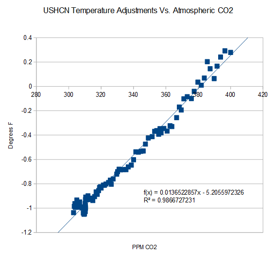
Image Credit: Steven Goddard
As can be seen from the graphic above, there is a strong correlation between carbon dioxide increases and adjustments to the United States Historical Climatology Network (USHCN) temperature record. And these adjustments to the surface data in turn result in large divergences between surface data sets and satellite data sets.
In the post with April data, the following questions were asked in the conclusion: “Why are the new satellite and ground data sets going in opposite directions? Is there any reason that you can think of where both could simultaneously be correct?”
Professor Robert Brown of Duke University had an excellent response the this question here.
To give it the exposure it deserves, his comment is reposted in full below. His response ends with rgb.
Rgbatduke June 10, 2015 at 5:52 am
The two data sets should not be diverging, period, unless everything we understand about atmospheric thermal dynamics is wrong. That is, I will add my “opinion” to Werner’s and point out that it is based on simple atmospheric physics taught in any relevant textbook.
This does not mean that they cannot and are not systematically differing; it just means that the growing difference is strong evidence of bias in the computation of the surface record. This bias is not really surprising, given that every new version of HadCRUT and GISS has had the overall effect of cooling the past and/or warming the present! This is as unlikely as flipping a coin (at this point) ten or twelve times each, and having it come up heads every time for both products. In fact, if one formulates the null hypothesis “the global surface temperature anomaly corrections are unbiased”, the p-value of this hypothesis is less than 0.01, let alone 0.05. If one considers both of the major products collectively, it is less than 0.001. IMO, there is absolutely no question that GISS and HadCRUT, at least, are at this point hopelessly corrupted.
One way in which they are corrupted with the well-known Urban Heat Island effect, wherein urban data or data from poorly sited weather stations shows local warming that does not accurately reflect the spatial average surface temperature in the surrounding countryside. This effect is substantial, and clearly visible if you visit e.g. Weather Underground and look at the temperature distributions from personal weather stations in an area that includes both in-town and rural PWSs. The city temperatures (and sometimes a few isolated PWSs) show a consistent temperature 1 to 2 C higher than the surrounding country temperatures. Airport temperatures often have this problem as well, as the temperatures they report come from stations that are deliberately sited right next to large asphalt runways, as they are primarily used by pilots and air traffic controllers to help planes land safely, and only secondarily are the temperatures they report almost invariably used as “the official temperature” of their location. Anthony has done a fair bit of systematic work on this, and it is a serious problem corrupting all of the major ground surface temperature anomalies.
The problem with the UHI is that it continues to systematically increase independent of what the climate is doing. Urban centers continue to grow, more shopping centers continue to be built, more roadway is laid down, more vehicle exhaust and household furnace exhaust and water vapor from watering lawns bumps greenhouse gases in a poorly-mixed blanket over the city and suburbs proper, and their perimeter extends, increasing the distance between the poorly sited official weather stations and the nearest actual unbiased countryside.
HadCRUT does not correct in any way for UHI. If it did, the correction would be the more or less uniform subtraction of a trend proportional to global population across the entire data set. This correction, of course, would be a cooling correction, not a warming correction, and while it is impossible to tell how large it is without working through the unknown details of how HadCRUT is computed and from what data (and without using e.g. the PWS field to build a topological correction field, as UHI corrupts even well-sited official stations compared to the lower troposphere temperatures that are a much better estimator of the true areal average) IMO it would knock at least 0.3 C off of 2015 relative to 1850, and would knock off around 0.1 C off of 2015 relative to 1980 (as the number of corrupted stations and the magnitude of the error is not linear — it is heavily loaded in the recent past as population increases exponentially and global wealth reflected in “urbanization” has outpaced the population).
GISS is even worse. They do correct for UHI, but somehow, after they got through with UHI the correction ended up being neutral to negative. That’s right, UHI, which is the urban heat island effect, something that has to strictly cool present temperatures relative to past ones in unbiased estimation of global temperatures ended up warming them instead. Learning that left me speechless, and in awe of the team that did it. I want them to do my taxes for me. I’ll end up with the government owing me money.
However, in science, this leaves both GISS and HadCRUT (and any of the other temperature estimates that play similar games) with a serious, serious problem. Sure, they can get headlines out of rewriting the present and erasing the hiatus/pause. They might please their political masters and allow them to convince a skeptical (and sensible!) public that we need to spend hundreds of billions of dollars a year to unilaterally eliminate the emission of carbon dioxide, escalating to a trillion a year, sustained, if we decide that we have to “help” the rest of the world do the same. They might get the warm fuzzies themselves from the belief that their scientific mendacity serves the higher purpose of “saving the planet”. But science itself is indifferent to their human wishes or needs! A continuing divergence between any major temperature index and RSS/UAH is inconceivable and simple proof that the major temperature indices are corrupt.
Right now, to be frank, the divergence is already large enough to be raising eyebrows, and is concealed only by the fact that RSS/UAH only have a 35+ year base. If the owners of HadCRUT and GISSTEMP had the sense god gave a goose, they’d be working feverishly to cool the present to better match the satellites, not warm it and increase the already growing divergence because no atmospheric physicist is going to buy a systematic divergence between the two, as Werner has pointed out, given that both are necessarily linked by the Adiabatic Lapse Rate which is both well understood and directly measurable and measured (via e.g. weather balloon soundings) more than often enough to validate that it accurately links surface temperatures and lower troposphere temperatures in a predictable way. The lapse rate is (on average) 6.5 C/km. Lower Troposphere temperatures from e.g. RSS sample predominantly the layer of atmosphere centered roughly 1.5 km above the ground, and by their nature smooth over both height and surrounding area (that is, they don’t measure temperatures at points, they directly measure a volume averaged temperature above an area on the surface. They by their nature give the correct weight to the local warming above urban areas in the actual global anomaly, and really should also be corrected to estimate the CO_2 linked warming, or rather the latter should be estimated only from unbiased rural areas or better yet, completely unpopulated areas like the Sahara desert (where it isn’t likely to be mixed with much confounding water vapor feedback).
RSS and UAH are directly and regularly confirmed by balloon soundings and, over time, each other. They are not unconstrained or unchecked. They are generally accepted as accurate representations of LTT’s (and the atmospheric temperature profile in general).
The question remains as to how accurate/precise they are. RSS uses a sophisticated Monte Carlo process to assess error bounds, and eyeballing it suggests that it is likely to be accurate to 0.1-0.2 C month to month (similar to error claims for HadCRUT4) but much more accurate than this when smoothed over months or years to estimate a trend as the error is generally expected to be unbiased. Again this ought to be true for HadCRUT4, but all this ends up meaning is that a trend difference is a serious problem in the consistency of the two estimators given that they must be linked by the ALR and the precision is adequate even month by month to make it well over 95% certain that they are not, not monthly and not on average.
If they grow any more, I would predict that the current mutter about the anomaly between the anomalies will grow to an absolute roar, and will not go away until the anomaly anomaly is resolved. The resolution process — if the gods are good to us — will involve a serious appraisal of the actual series of “corrections” to HadCRUT and GISSTEMP, reveal to the public eye that they have somehow always been warming ones, reveal the fact that UHI is ignored or computed to be negative, and with any luck find definitive evidence of specific thumbs placed on these important scales. HadCRUT5 might — just might — end up being corrected down by the ~0.3 C that has probably been added to it or erroneously computed in it over time.
rgb
See here for further information on GISS and UHI.
In the sections below, as in previous posts, we will present you with the latest facts. The information will be presented in three sections and an appendix. The first section will show for how long there has been no warming on some data sets. At the moment, only the satellite data have flat periods of longer than a year. The second section will show for how long there has been no statistically significant warming on several data sets. The third section will show how 2015 so far compares with 2014 and the warmest years and months on record so far. For three of the data sets, 2014 also happens to be the warmest year. The appendix will illustrate sections 1 and 2 in a different way. Graphs and a table will be used to illustrate the data.
Section 1
This analysis uses the latest month for which data is available on WoodForTrees.com (WFT). All of the data on WFT is also available at the specific sources as outlined below. We start with the present date and go to the furthest month in the past where the slope is a least slightly negative on at least one calculation. So if the slope from September is 4 x 10^-4 but it is – 4 x 10^-4 from October, we give the time from October so no one can accuse us of being less than honest if we say the slope is flat from a certain month.
1. For GISS, the slope is not flat for any period that is worth mentioning.
2. For Hadcrut4, the slope is not flat for any period that is worth mentioning.
3. For Hadsst3, the slope is not flat for any period that is worth mentioning.
4. For UAH, the slope is flat since March 1997 or 18 years and 4 months. (goes to June using version 6.0)
5. For RSS, the slope is flat since January 1997 or 18 years and 6 months. (goes to June)
The next graph shows just the lines to illustrate the above. Think of it as a sideways bar graph where the lengths of the lines indicate the relative times where the slope is 0. In addition, the upward sloping blue line at the top indicates that CO2 has steadily increased over this period.

When two things are plotted as I have done, the left only shows a temperature anomaly.
The actual numbers are meaningless since the two slopes are essentially zero. No numbers are given for CO2. Some have asked that the log of the concentration of CO2 be plotted. However WFT does not give this option. The upward sloping CO2 line only shows that while CO2 has been going up over the last 18 years, the temperatures have been flat for varying periods on the two sets.
Section 2
For this analysis, data was retrieved from Nick Stokes’ Trendviewer available on his website <a href=”http://moyhu.blogspot.com.au/p/temperature-trend-viewer.html”. This analysis indicates for how long there has not been statistically significant warming according to Nick’s criteria. Data go to their latest update for each set. In every case, note that the lower error bar is negative so a slope of 0 cannot be ruled out from the month indicated.
On several different data sets, there has been no statistically significant warming for between 11 and 22 years according to Nick’s criteria. Cl stands for the confidence limits at the 95% level.
The details for several sets are below.
For UAH6.0: Since October 1992: Cl from -0.009 to 1.742
This is 22 years and 9 months.
For RSS: Since January 1993: Cl from -0.000 to 1.676
This is 22 years and 6 months.
For Hadcrut4.3: Since July 2000: Cl from -0.017 to 1.371
This is 14 years and 11 months.
For Hadsst3: Since August 1995: Cl from -0.000 to 1.780
This is 19 years and 11 months.
For GISS: Since August 2003: Cl from -0.000 to 1.336
This is 11 years and 11 months.
Section 3
This section shows data about 2015 and other information in the form of a table. The table shows the five data sources along the top and other places so they should be visible at all times. The sources are UAH, RSS, Hadcrut4, Hadsst3, and GISS.
Down the column, are the following:
1. 14ra: This is the final ranking for 2014 on each data set.
2. 14a: Here I give the average anomaly for 2014.
3. year: This indicates the warmest year on record so far for that particular data set. Note that the satellite data sets have 1998 as the warmest year and the others have 2014 as the warmest year.
4. ano: This is the average of the monthly anomalies of the warmest year just above.
5. mon: This is the month where that particular data set showed the highest anomaly. The months are identified by the first three letters of the month and the last two numbers of the year.
6. ano: This is the anomaly of the month just above.
7. y/m: This is the longest period of time where the slope is not positive given in years/months. So 16/2 means that for 16 years and 2 months the slope is essentially 0. Periods of under a year are not counted and are shown as “0”.
8. sig: This the first month for which warming is not statistically significant according to Nick’s criteria. The first three letters of the month are followed by the last two numbers of the year.
9. sy/m: This is the years and months for row 8. Depending on when the update was last done, the months may be off by one month.
10. Jan: This is the January 2015 anomaly for that particular data set.
11. Feb: This is the February 2015 anomaly for that particular data set, etc.
16. ave: This is the average anomaly of all months to date taken by adding all numbers and dividing by the number of months.
17. rnk: This is the rank that each particular data set would have for 2015 without regards to error bars and assuming no changes. Think of it as an update 25 minutes into a game.
| Source | UAH | RSS | Had4 | Sst3 | GISS |
|---|---|---|---|---|---|
| 1.14ra | 6th | 6th | 1st | 1st | 1st |
| 2.14a | 0.170 | 0.255 | 0.564 | 0.479 | 0.75 |
| 3.year | 1998 | 1998 | 2014 | 2014 | 2014 |
| 4.ano | 0.483 | 0.55 | 0.564 | 0.479 | 0.75 |
| 5.mon | Apr98 | Apr98 | Jan07 | Aug14 | Jan07 |
| 6.ano | 0.742 | 0.857 | 0.832 | 0.644 | 0.97 |
| 7.y/m | 18/4 | 18/6 | 0 | 0 | 0 |
| 8.sig | Oct92 | Jan93 | Jul00 | Aug95 | Aug03 |
| 9.sy/m | 22/9 | 22/6 | 14/11 | 19/11 | 11/11 |
| Source | UAH | RSS | Had4 | Sst3 | GISS |
| 10.Jan | 0.261 | 0.367 | 0.688 | 0.440 | 0.82 |
| 11.Feb | 0.156 | 0.327 | 0.660 | 0.406 | 0.88 |
| 12.Mar | 0.139 | 0.255 | 0.681 | 0.424 | 0.90 |
| 13.Apr | 0.065 | 0.175 | 0.656 | 0.557 | 0.74 |
| 14.May | 0.272 | 0.310 | 0.696 | 0.593 | 0.76 |
| 15.Jun | 0.329 | 0.391 | 0.728 | 0.580 | 0.80 |
| Source | UAH | RSS | Had4 | Sst3 | GISS |
| 16.ave | 0.204 | 0.304 | 0.685 | 0.500 | 0.82 |
| 17.rnk | 4th | 6th | 1st | 1st | 1st |
If you wish to verify all of the latest anomalies, go to the following:
For UAH, version 6.0 was used. Note that WFT uses version 5.6. So to verify the length of the pause on version 6.0, you need to use Nick’s program.
http://vortex.nsstc.uah.edu/data/msu/v6.0beta/tlt/tltglhmam_6.0beta2
For RSS, see: ftp://ftp.ssmi.com/msu/monthly_time_series/rss_monthly_msu_amsu_channel_tlt_anomalies_land_and_ocean_v03_3.txt
For Hadcrut4, see: http://www.metoffice.gov.uk/hadobs/hadcrut4/data/current/time_series/HadCRUT.4.4.0.0.monthly_ns_avg.txt
For Hadsst3, see: http://www.cru.uea.ac.uk/cru/data/temperature/HadSST3-gl.dat
For GISS, see:
http://data.giss.nasa.gov/gistemp/tabledata_v3/GLB.Ts+dSST.txt
To see all points since January 2015 in the form of a graph, see the WFT graph below. Note that UAH version 5.6 is shown. WFT does not show version 6.0 yet.

As you can see, all lines have been offset so they all start at the same place in January 2015. This makes it easy to compare January 2015 with the latest anomaly.
Appendix
In this part, we are summarizing data for each set separately.
RSS
The slope is flat since January 1997 or 18 years, 6 months. (goes to June)
For RSS: There is no statistically significant warming since January 1993: Cl from -0.000 to 1.676.
The RSS average anomaly so far for 2015 is 0.304. This would rank it as 6th place. 1998 was the warmest at 0.55. The highest ever monthly anomaly was in April of 1998 when it reached 0.857. The anomaly in 2014 was 0.255 and it was ranked 6th.
UAH6.0
The slope is flat since March 1997 or 18 years and 4 months. (goes to June using version 6.0)
For UAH: There is no statistically significant warming since October 1992: Cl from -0.009 to 1.742. (This is using version 6.0 according to Nick’s program.)
The UAH average anomaly so far for 2015 is 0.204. This would rank it as 4th place. 1998 was the warmest at 0.483. The highest ever monthly anomaly was in April of 1998 when it reached 0.742. The anomaly in 2014 was 0.170 and it was ranked 6th.
Hadcrut4.4
The slope is not flat for any period that is worth mentioning.
For Hadcrut4: There is no statistically significant warming since July 2000: Cl from -0.017 to 1.371.
The Hadcrut4 average anomaly so far for 2015 is 0.685. This would set a new record if it stayed this way. The highest ever monthly anomaly was in January of 2007 when it reached 0.832. The anomaly in 2014 was 0.564 and this set a new record.
Hadsst3
For Hadsst3, the slope is not flat for any period that is worth mentioning. For Hadsst3: There is no statistically significant warming since August 1995: Cl from -0.000 to 1.780.
The Hadsst3 average anomaly so far for 2015 is 0.500. This would set a new record if it stayed this way. The highest ever monthly anomaly was in August of 2014 when it reached 0.644. The anomaly in 2014 was 0.479 and this set a new record.
GISS
The slope is not flat for any period that is worth mentioning.
For GISS: There is no statistically significant warming since August 2003: Cl from -0.000 to 1.336.
The GISS average anomaly so far for 2015 is 0.82. This would set a new record if it stayed this way. The highest ever monthly anomaly was in January of 2007 when it reached 0.97. The anomaly in 2014 was 0.75 and it set a new record. (Note that the new GISS numbers this month are quite a bit higher than last month.)
If you are interested, here is what was true last month:
The slope is not flat for any period that is worth mentioning.
For GISS: There is no statistically significant warming since November 2000: Cl from -0.018 to 1.336.
The GISS average anomaly so far for 2015 is 0.77. This would set a new record if it stayed this way. The highest ever monthly anomaly was in January of 2007 when it reached 0.93. The anomaly in 2014 was 0.68 and it set a new record.
Conclusion
Two months ago, NOAA was the odd man out. Since GISS has joined NOAA, HadCRUT4 apparently felt the need to fit in, as documented here.
Wow, the lapse rate mentioned for a change. The fact that we have a lapse rate should have given plenty opportunity to disprove the whole Greenhouse Effect completely. Top of The Grand Canyon compared to the bottom of it. Flat plains of Peru. The planet of Venus. The atmosphere of Jupiter.
WOW. R^2 = 0.98 Unprecedented in climate science.
Give those guys a Michelin star, Best. Data cooking. Ever.
Even better when the response should be proportional to the log(CO2). I guess they forgot to tell them that.
Every differentiable function looks roughly linear when you view it closely enough. One would have to plot the graph on a logarithmic scale to see if it truly seems to deviate from theory. Further, the logarithmic response is for a simple green-house effect, not the feedbacks.
The plot shows the adjustments, not to anomalies. One wouldn’t expect the adjustments to correspond in anyway with CO2, would one? If so, what is the physics that says the adjusment should vary with CO2?
No, that would not be expected.
Physics says that extra CO2 should cause some warming, but the extra warming should come without adjustments and not because of adjustments.
It’s clear from the graph that there is a correlation, but what is the direction of causation? Does CO2 cause data adjustment, or does data adjustment cause CO2?
RoHA:
Co2 causes everything! It is the magical molecule from hell that gives us all life and yet is evil beyond words.
Adjustments are known to be anthropogenic – no one argues about that.
CO2 rises are generally acknowledged to be anthropogenic.
However just because two things have a common cause there is no reason to believe they will be correlated as shown here.
RoHa August 15, 2015 at 4:32 am
It’s clear from the graph that there is a correlation, but what is the direction of causation? Does CO2 cause data adjustment, or does data adjustment cause CO2?
The adjustment is increasing the CO2 level (since the CO2 level would have no impact on computer software).
We can stop lethal CO2 levels and over 7.5°C of CGAGW by 2100 by making temperature data adjustment illegal with criminal and civil penalties.
We could have prevented 0.23°C of warming by RIFing (firing) the data adjusters in 2008. We should fire them now and save ourselves while there is still time.
Please. Remember your rules for rounding and significant figures. .
.
rgb
Lets just call it an even 1.00000000000 and break for lunch and a few drinks, eh?
Menicholas
August 14, 2015 at 1:26 pm
Lets just call it an even 1.00000000000 and break for lunch and a few drinks, eh?
_________________________
No, it’s 2 sig figs. Skip the drinks and go back to school, eh?
But is OK, I think.
Hey RD, this is called a joke.
I can explain to you why it is a joke, but it might take a while, since you seem to have been born with nary an ounce of humor in your entire soul.
You see, the climate establishment has long and widely been accused of not know the fist thing about sig figs…yadda yadda yadda… the horse says “No, it was the donkey!”
BTW, I have not had a drink in 13 years (part of the joke…), have never left “school” and also had already eaten lunch.
Are you laughing yet?
Alcoholism is no joke Menicholas. I’m glad you got sober!
Madoffian accounting providing life support for a Lysenkoist theory.
These folks just love to correct things in the wrong direction. UHI is not removed, it is increased! Sea surface temperatures are corrected to conform with the most convenient but least reliable measurements. Reminds me of the man behind the curtain frantically pulling levers to generate a ferocious but utterly false image designed only to terrify the children. Alice was not fooled.
Dorothy, or to be more precise still… Toto.
Even a dog can sniff out corrupt AGW! 😉
“corrupt AGW”
Redundant?
post-modern science.
Always a pleasure to hear from rgb.
One of my favourite posters too.
@rgb
So you are basically stating that all major providers of temperature series of either
1 being incompetent
2 purposefully changing the data to match their belief.
1. How can so many intelligent educated people be so incompetent. This seems very unlikely. Have you approached the scientists concerned and shown them where they are in error. If not, Why not?
2. This is a serious accusation of scientific fraud. As such have you approached any of the scientists involved and asked for an explanation? If not, why not? You are, after all, part of the scientific community.
Can you give reasons why you think 1000s of scientists over the whole globe would all be party to this fraud. I do not see climate scientists living in luxury mansions taking expensive family holidays – perhaps you know differently?. What manages to keep so many scientists in line – are there families/careers/lives threated to maintain the silence. why is there no Julian Assange or Edward Snowden, willing to expose the fraud?
“Bias” doesn’t mean a personal failing.
In science it can mean something that skews the results away from the true mean.
The example rgb gave, the effect of Urban Heat Islands (UHIs), is such a bias.
And the idea that no-one ever makes a genuine mistake is as silly as that genuine mistake that UHIs cool the record as they expand.
“Intent” is a very important aspect of the law. Does it apply here or not?
intent does apply to the legal charge of fraud. Without intent, all you’re left with is sloppy, not careful work by a team of data scientists and statisticians. Becoming known for sloppy poor work by your peers in science is a path to lost funding and ostracization. That’s all assuming politics and ideologies are not in play. The social sciences have a long and sad history of bias against those not of a personal Liberal view point. Sadly, that has taken firm root in Climate Science as Drs. Soon, Legates and others can attest to.
Excellent questions SergeiMK. I hope that time will tell.
At least the fabrication of the surface temperature record is now in the peer-reviewed literature. No more “It’s only on blogs”.
Karl et al., (2015) was a seminal paper on how to fabricate the surface temperature record. Nobel Prize stuff (Peace Prize that would be).
You forgot:
3. subject to confirmation bias and, due to their beliefs, unwittingly biasing the results.
or my favorite,
4. loyal to their corrupt political bosses and doing their part in the scam.
Oh, and there aren’t 1,000’s of scientists involved in the scam. A few dozen well-placed ones would suffice.
Given the quotes about Mann in Steyn’s book, just a few bully ones.
Let me add another possibility-
5. Just not actually doing any critical examinations of the data sets or their adjustments themselves. If you are an average scientist whose research or job does create a personal need or desire or reason to question what an “official “report says, you’re going to take what it declares as fact and move on.
Example- if you’re an ocean scientist whose work doesn’t rely heavily (or at all) on CO2 in the atmosphere, or land and satellite data, you might have no clue what those data sets show. If you are writing a paper or doing research where that information is required in some fringe way, you pull up the latest data from your preferred source, jot down the numbers, and give it no further thought.
It doesnt require a vast network of incompetent OR conspiring people to create mass delusion. It takes a very small number of well placed individuals who are either incompetent/conspiring or both, and a passive audience who simply believes they are neither one.
The same idiotic sheep who believe that the Koch brothers are responsible for misleading the majority of the general public are the exact same people who mock and deny the idea that a few scientists could possibly be misleading the majority of scientists!
THEIR conspiracy theory is perfectly sound and logical. But the exact same theory turned against them is absurd and borders on mental illnesses!
Correction-“if you are an average scientist….does NOT create a personal need….”
Well serge, I am hoping for a hero like Snowden (an insider) to inform the world of the shenanigans in the Alarmist community.
However, it is fraud, IMO. Any critical thinking human that isn’t biased by their politics knows it is fraud. There are so many culprits to choose from, but I will give two: ClimateGate and my favorite, the Hockey Schtick.
The reasons that the 1000s of scientists are party to the fraud is called $$$$$. Just because you want $$$$ for research, doesn’t mean you’re a thief, it means you do what’s necessary to get to the trough. When getting to the trough means writing that the world is ending, that’s what you write. The threat of not receiving funding, tenure, recognition is enough to ensure their silence. Demonstrably they are changing the data. The disparity between the satellite data and the surface data demonstrates that clearly.
Assange or Snowden? Ah, there is WUWT, without which we would still be thinking that NOAA’s measurements were all top quality instead of the siting nightmare they generally are. Without which the Climategate papers would have remained hidden on a few cognoscenti sites, without which the work that exposed Mann’s extremely inept hockeystick would have languished.
“Just because you want $$$$ for research, doesn’t mean you’re a thief.”
Once the money has been green-laundered (through whichever grant-providing organization) – it’s all good, and the rest of us barely felt it leaving our wallets.
Give Tony Heller and Paul Homewood their due, as well. Fair is fair.
Tony gets no respect, and I placed his graphs and ideas on this site any times before anyone picked up the ball and ran with it.
without which the work that exposed Mann’s extremely inept hockeystick would have languished.
No that was down to Steve Mc and JeanS. BUT I am very appreciative of the work done at WUWT and have contributed on the odd occasion.
All true as it may be Mr. Ricahds.
But that was then.
This is now.
People are human. When the data don’t support the hypothesis, one might actively look for things that could justify adjusting the data in the right direction. That’s more convenient that discarding the hypothesis.
But one doesn’t look (as aggressively) for things that might make the data look “worse”.
This is bias.
It gets worse. When a large group of folks, committed to a cause, are driving the process, a powerful groupthink sets in and they all reinforce each other and ultimately amplify the effect. Less than sound science is “forgiven” and justified because the groups motives are “oh so noble”.
These people are not, in general, acting out of stupidity or malicious intent. They actually believe they “saving the world” and the groupthink reinforces that on a daily basis.
BTW, great paper from Prof. Brown.
Mike S. Belief by scientists. I’ll go with Rod’s statement “Oh, and there aren’t 1,000’s of scientists involved in the scam. A few dozen well-placed ones would suffice.” In addition, it is the governments of the western developed countries that are encouraging not only these few dozen, but the Uni’s and Science org’s via prostitution by the gov’t funding.
Kokoda,
add to the “a few dozen well-placed” is the fact that senior team leaders in those key sections get to select and edit who is on the team. Ensures only those loyal to cause are retained, have access to discussions, allowed meeting attendance, and promoted within the team.
A further observation is that the author list on the Karl, et al, 2015 Science paper is a pact of omerta. If evidence of purposeful data fraud is ever released (by an insider with access and knowledge) and Mr Karl’s reputation goes down, then they all go down (ruined reputations).They are in the gang for life, and its a reputational death sentence if they betray that fielty. And hence Mr Karl put the names of those “with knowledge” as authors, where the have to sign and acknowledge to the journal editor their parts in the submitted manuscript.
IOW the group think is “The ends justifies the means”?
A further observation is that the author list on the Karl, et al, 2015 Science paper is a pact of omerta. If evidence of purposeful data fraud is ever released and Mr Karl’s reputation goes down, they all go down with him (ruined reputations) as each author has to submit a signed attestation to the Science editors for their role and review of the manuscript once it is accepted for publication.
So the Karl et al, 2015 authors are in the gang for life, and its a reputational death sentence if they betray that fielty.
Rah, I think it may be closer to “He who pays the piper calls the tune.”
“So you are basically stating that all major providers of temperature series of either”
No-one is saying that. Because the satellite and weather balloon sets don’t aren’t being criticized. Do you have an answer for why the data sets that havent been subject to thousands of adjustments aren’t matching up to those that are?
“Mark Buehner
August 14, 2015 at 7:50 am
Do you have an answer for why the data sets that havent been subject to thousands of adjustments aren’t matching up to those that are?”
+1
@sergeiMK
Do you have a plausible explanation for the increasing divergence of surface and satellite records? Unless you do, you can’t escape the choice.
Actually, you don’t need to choose — there is no contradiction between incompetence and intentional data distortion. The climate science “community” seems to be overrun with people who are good with numbers and computers, but not with actual science. These people engage too much in data adjusting, mangling, and redigesting, and too little in designing novel experimental strategies and measurements to actually test, and potentially falsify, their hypotheses.
Perhaps too many of them grew up in the virtual world of computers, software and videogames and graduated from schools where everybody got trophies and nobody ever failed or was told they’re wrong. They can’t cope with being wrong and have built up defense mechanisms to avoid ever having to admit failure.
And lets set aside any accusations of bias, much less fraud. How do you explain the first graph in this post? All things being equal, shouldn’t adjustments to the dataset tend to even out between positive and negative over time? Or more simply- why is it that the farther back in time you go, the more net negative adjustments there are, while the farther forward, the more positive adjustments? Is there an explanation for that?
The first graph is not Time vs Adjustments, it’s Co2 Vs adjustments. Since Co2 is increasing, it’s similar to adjustments over time, but the adjustements over time graph would be much more noisy. The fact that this is less noisy, shows that it is more likely the actual source of adjustments: they are not just adding upward trends, they are tuning it to Co2.
Time and CO2 for the past 65 to 100 years are virtually identical.
It was, IMO, the genius of Tony Heller to translate the time side of the graph into CO2 concentration. This cuts through the murk, and says two things at once in a way which is more impactful than either at a time.
The graph is not appreciably different if done from a time perspective. In fact, do you know that it would be noisier?
Was the sawtooth CO2 graph used, or the smoothed chart? It maters not anyway…the genius is using CO2 which makes it plain what the desired effect of the adjustments is.
One cannot separate out that this was contrived. If it was not, there is no chance of the graph looking as it does.
All of the Climategate and other emails, in which collusion was not just implied but discussed openly, together with the top graph, makes in obvious to anyone who is willing to be honest exactly what has occurred.
Given the methodic harassment of those raising critical questions.
How likely do you think it is that someone will risk their job, career or professional position and give voice to an argument against misconduct?
Here´s a comment which seems to be from an insider:
“Supposedly, NOAA has a policy protecting scientist from retaliation if they express their scientific opinions on weather-related matters. Never the less, we who don’t buy into the AGW hypothesis are reluctant to test this. Just look at how NOAA treated Bill Proenza for being an iconoclast. So we scurry along the halls whispering to each other, “The Emperor has no clothes.” ”
http://wattsupwiththat.com/2015/07/15/thanks-partly-to-noaas-new-adjusted-dataset-tommorrow-theyll-claim-that-may-was-the-hottest-ever/#comment-1985842
This is quite a whopper of a straw man argument for so early in the morning.
What makes you think that 1000s of scientists all over the globe are in charge of producing temperature datasets? Could it actually be that 1000s of scientists all over the globe are looking at the data produced by a handful of guys and drawing conclusions from that? Since GISS and HadCRUT both use data accumulated from NOAA, could it be that any problems with the GISS and HadCRUT datasets are due to bad raw data going in (of course compounded with most likely poor algorythms). Do 1000s of climatologists need to be living in mansions for it to be a sign that they are on the take? Or could it be continued employment is enough to persuade them that global warming is a real concern? Do 1000s of people control who gets funding or is it simply a few government types deciding where the cash goes? What kind of person wants to be a climatologist these days – could it be that a high number of “save the world” environmentalists are now drawn to the field? Why do people insist there needs to be a giant conspiracy when a relatively small number of activists and carpetbaggers could be leading the CAGW charge?
Was it just a relatively small number of activists and carpetbaggers who produced what we are constantly reminded are “thousands of peer reviewed papers” which draw their conclusions with such universal aphorisms as “modeled, could, might, may, possibly, projected” and so forth? Or, is the entire process of paid research and grants through (mostly) universities, corrupt from top to bottom?
addenda: Aphorism was the wrong word to use in this context- should have been “descriptive term”, or some such.
BJ, that is some serious gathering of points to counter the Serg mis direction above. Thanks !
Did you catch Paul Homewood and (Steve Goddard) Tony Heller’s research into this starting last year.
Massive Temperature Adjustments At Luling, Texas.
” How can so many intelligent educated people be so incompetent? This seems very unlikely”
I don’t really have an answer to this question but anyone who follows the news for any length of time can tell you this is not a rare event. So-called educated people believe all sorts of nonsense. Look at how many educated people went along with the post financial crisis solution to essentially “go into more debt to get back on our feet.” By the millions, educated people vote for idiots whose ideas fall apart with just a modicum of scrutiny. And certainly the history of science shows us that wrong turns and misunderstandings are apparently unavoidable. Not sure what in this world could lead someone into thinking that incompetence is “unlikely!”
Frankly, I’m amazed that things work as well as they do on this earth!
Things that work have been largely done by engineers. Not only could they create instant disasters if they didn’t practice their craft diligently, skillfully and honestly. Mind you, they have the right kind of incentive. There are Engineering Acts in provinces (Canada) and states (US and other) in which an engineer can be disciplined all the way up to being barred from practice for not exercising good practice. They are specifically charged with a duty to public and worker health safety in their work and are obliged to refuse a request, even from a client, to alter design in anyway that compromises this. Further, they are obliged to report to their association where they detect unaccepable engineering practice, incompetence or fraud on the part of an engineer (usually they speak to the engineer in question or his supervisor first to point out these things).
It is past time in this age of moral degradation to put these kinds of controls on scientists. We can no longer rely on the honesty and goodwill that science used to possess in simpler times (yes there were bad apples before, but with calculation methods at their disposal, it wasn’t difficult to scrutinize and rectify such work). Further, an upgrade of education for professors, graduates and undergraduates alike (they opened the doors and lowered standards because they received funding based on enrollment). And a corrupt funding process for research: first, we simply don’t need 10s of billions of dollars for away too many people doing the same job. The honey pot that climate science has been, resulted in a dozen different agencies in a government doing the same work, with the same equation (singular) for a third of a century. An association to control quality of work a la engineering would also prevent the coercion and bullying of young scientists into supporting a status quo. The hiring process should also be politically blind.
The practice of climate science in the main is a disgrace. To use a word properly for once, it isn’t sustainable.
Could political correctness have anything to do with it?
one should never confuse religion (faith) with science. CAGW is a religion. In the realm of science, one often finds a bit too much faith and not enough skepticism. Also, there is timidity present when one does an experiment and finds their results differ from earlier experiments. A case in point was Millikan’s oil drop experiment used to determine the charge of the electron. Apparently, Millikan’s air viscosity data was a little off and resulted in a slightly lower value. Subsequent duplication of the experiment gradually brought the number into better agreement with what we know now. However, it appears that people doing these subsequent experiments were afraid to go to the value their experiment should have provided. https://en.wikipedia.org/wiki/Oil_drop_experiment in the section about psychological effects in scientific methodology
+1
It is past time in this age of moral degradation to put these kinds of controls on scientists.
=================
Unfortunately the courts are doing their best to ensure that engineers are exempt from public safety concerns.
As a result of precedent (below), an engineer that is for example hired to examine a bridge or nuclear reactor and discovers that it is at grave risk of failure, has no responsibility to inform the public. Rather the courts have ruled that engineer’s responsibility is limited to informing the company that hired him/her.
As such, the public can take no confidence in any structure or machine has been examined by engineers, because the engineers are only responsible to the company that hired them. The company that hired the engineers may have simply buried the engineer’s report because its findings would adversely affect the company’s bottom line.
http://cenews.com/article/8359/structural-engineersmdash-legal-and-ethical-obligation-to-the-public-how-far-does-it-extend
sergeiMK – Haven’t you noticed that climate science takes action (almost) only when the data don’t match their expectations of warming? What I’m saying is, that if the data don’t comport with their expectations, then they do another study and that, miraculously, causes the (massaged) data, to show more warming. See Cowton and Way. GISS adjustments over time. There are more.
But, OTOH, if the data confirm the expected warming, no additional studies are done.
Such as, up until 1996 while the temperature increase was closely tracking the CO2 increase, nobody felt any need to revise, homogenize, or otherwise alter historical data. The data (they felt) supported their hypotheses.
But for about 18 years now, the data has not supported their hypotheses, and the fervor to alter data (going back to the 1880’s!) has been increasing every year. After all, their lavishly-funded hypotheses couldn’t be wrong, could they? To admit such would have shut off the gravy train.
Sorry, Sergei, but you’re missing the big picture here, which begins with whether you feel the surface records are accurate or not. If you believe they are, you must state your case why. If you believe they are not, you must also state why. If the latter case, then you must first offer your own explanation as to how the scientists could have gotten it wrong.
Only after you’ve gone through these elementary – and eminently reasonable – steps, do you have much standing to make your demands of rgb. To take the position, implicitly or explicitly, that the records’ accuracy is not relevant is a non-starter, as everything in this post depends on that basic issue.
Many of the major providers of temperature series are bought and sold by inept, corrupt governments and green organizations, encouraged by usefool tools/fools, such as Pope..
1 being incompetent.– Definitely not incompetent, definitely conniving.
2 purposefully changing the data to match their belief. — Definitely data manipulation. Anything for a Grant buck and to contribute to the greatest fraud/theft in human history.
Will these people/scumbags ever face justice???
I don’t think “purposefully changing the data to match their belief” necessarily means fraud (at least not in the sense of advancing a known falsehood). More likely is that these are true believers who understand that science requires that the data match their belief. When it doesn’t, they conclude that it’s the data that must be wrong, not the belief. So they find ways to make the data “right.”
I tend to agree with you Jeff. However, then calling them “scientists” is a misnomer. They are merely the religious.
Jeff.
A kinder gentler Machine gun man, will still wilfully kill.
So kinder gentler data massaging / manipulation is still fraud and definitely not scientific!
Pol pot, Stalin, Hitler. etc.. were all true believers so the killing and mayhem match their belief, did that make it right?
Scientific data fraud is still fraud full stop!
Really! To hand wave away any suggestion of willful manipulation with the intent to deceive is just ridiculous. Jeff and Phil, you are making a decision to let them off the hook.
Ted is 100% correct.
Frantic Researchers “Adjusting” Unsuitable Data.
SergeiMK:
According to your analysis of RGB’s and Werner’s article they are either accusing the keeper’s of the land temperature series of incompetence, unlikely, or fraud, getting more likely.
RGB and Werner Brozek with the aid of Steven Goddard have only calculated the odds that the land temperature series divergence with the satellite temperature series are natural or unnatural.
There was not a claim that 1000’s of scientists are in a conspiracy.
However, if you bother to brush up on your climategate emails, you’ll quickly learn that a few small teams running certain land temperature series are fully immersed and complicit in the global warming scam.
It doesn’t needs 1000s or hundreds involved, it only needs a few willing to use any means to accomplish their goals; which are not the goals most people desire.
Take a good long look at the consensus climate team. Read their email discussions. Take notice of their less than charitable condescending opinions of others along with their egos, self superiority and elitist notions.
Look through their history of vicious public and private denunciation of any one who opposes them or, God forbid, entertains new thoughts of skepticism.
Finally, read the article above again and then explain to yourself just how did the land temperature series get so bastardized.
Remember, all of the owners and operators of temperature land series that have strong divergence issues have already admitted adjusting the temperature data bases; not just once, but repeatedly. Sounds like data rape to me.
All I can say is this. Look at Goddard’s plot above, taken in good faith (that is, I haven’t recomputed or checked his numbers and am assuming that it is a correct representation of the facts).
It is, supposedly, the sum total of USHCN changes from all sources (as I understand it) as a function of carbon dioxide concentration, which means, since it goes back to maybe 280 ppm, that it spans a very long time interval. Over this interval, carbon dioxide has not increased linearly with time. It hasn’t even increased approximately linearly with time. It is following a hyperexponential curve (one slightly faster than exponential) in time.
Here’s what statistics in general would have to say about this. Under ordinary circumstances, one would not expect there to be a causal connection of any sort between what a thermometer reads and atmospheric CO_2 concentration . Neither would one expect a distribution of method errors and their corrections to follow the same nonlinear curve as atmospheric CO2 concentration over time. One would not expect correctable errors in thermometry to be smoothly distributed in time at all, and it would be surprising, to say the least, if they were monotonic or nearly monotonic in their effect over time.
Note well that all of “corrections” used by USHCN boil down to thermometric errors, specifically, a failure to correctly correct for thermal coupling between the actual measurement apparatus in intake values and the incoming seawater for the latest round, errors introduced by changing the kind of thermometric sensors used, errors introduced by moving observation sites around, errors introduced by changes in the time of day observations are made, and so on. In general one would expect changes of any sort to be as likely to cool the past relative to the present as warm it.
Note well that the total correction is huge. The range above is almost the entire warming reported in the form of an anomaly from 1850 to the present.
I would assert that the result above is statistically unlikely to arise by random chance or unforced human error. It appears to state that corrections to the temperature anomaly are directly proportional to the atmospheric CO2 at the time, and we are supposed to believe that this — literally — unbelievably good functional relationship arose from unbiased mechanical/electrical error and from unforced human errors in siting and so on. It just so happens that they line up perfectly. We are literally supposed to look at this graph and reject the obvious conclusion, that the corrections were in fact caused by carbon dioxide concentration through selection biases on the part of the correctors. Let’s examine this.
First of all, let me state my own conclusions in the clearest possible terms. Let the null hypothesis be “USHCN corrections to the global temperature anomaly are not caused by carbon dioxide levels in the atmosphere”. That is simple enough, right? Now one can easily enough ask the following question. Does the graph above support the rejection of the null hypothesis, or does it fail to support the rejection of the null hypothesis?
This one is not rocket science, folks. The graph above is very disturbing as far as the null hypothesis is concerned, especially with an overall correction almost as large as the total anomaly change being reported in the end.
However, correlation is not causality. So we have to look at how we might falsely reject this null hypothesis.
Would we expect the sum of all corrections to any good-faith dataset (not just the thermometric record, but say, the dow jones average) to be correlated, with, say, the height of my grandson (who is growing fast at age 3)? No, because there is no reasonable causal connection between my grandson’s height and an error in thermometry. However, correlation is not causality, so both of them could be correlated with time. My grandson has a monotonic growth over time. So does (on average, over a long enough time) the dow jones industrial average. So does carbon dioxide. So does the temperature anomaly. So does (obviously) the USHCN correction to the temperature anomaly. We would then observe a similar correlation between carbon dioxide in the atmosphere and my grandson’s height that wouldn’t necessarily mean that increasing CO2 causes growth of children. We would observe a correlation between CO2 in the atmosphere and the DJA that very likely would be at least partly causal in nature, as CO2 production produces energy as a side effect and energy produces economic prosperity and economic prosperity causes, among other things, a rise in the DJA.
So the big question then is — why should a thermometric error in SSTs be time dependent (to address the latest set of changes)? Why would they not only be time dependent, but smoothly time dependent, precisely over the critical period known as “The Pause” where the major global temperature indices do not indicate strong warming or are openly flat (an interval that humorously enough spans almost the entire range from when “climate change” became front page news)? Why would changes in thermometry be not only time dependent, but smoothly produce errors in the anomaly that are curiously following the same curve as CO2 over that same time? Why would changes in the anomaly brought about by changes in the time of measurement both warm the present and cool the past and — you guessed it — occur smoothly over time in just the right hyperexponential way to match the rate the CO2 was independently increasing over that same interval. Why would people shifting measurement sites over time always manage to move them so that the average effect is to cool the past and warm the present, over time, in just the right way to cancel out everything and produce and overall correction that isn’t even linear in time — which might be somewhat understandable — but nonlinear in time in a way that precisely matches the way CO2 concentration is nonlinear in time.
That’s the really difficult question. I might buy a monotonic overall correction over time, although that all by itself seems almost incredibly unlikely and, if true, might better have been incorporated by very significantly increasing the uncertainty of any temperatures at past times rather than by shifting those past temperatures and maintaining a comparatively tight error estimate. But a time dependent correction that precisely matches the curvature of CO2 as a function of time over the same interval? And why is there almost no scatter as one might expect from error corrections from any non-deliberate set of errors in good-faith measurements?
In Nicholas Nassim Taleb’s book The Black Swan, he describes the analysis of an unlikely set of coin flips by a naive statistician and Joe the Cab Driver. A coin is flipped some large number of times, and it always comes up heads. The statistician starts with a strong Bayesian prior that a coin, flipped should produce heads and tails roughly equal numbers of times. When in a game of chance played with a friendly stranger he flips the coin (say) ten times and it turns up heads every time (so that he loses) he says “Gee, the odds of that were only one in a thousand (or so). How unusual!” and continues to bet on tails as if the coin is an unbiased coin because sooner or later the laws of averages will kick in and tails will occur as often as heads or more so, things will balance out.
Joe the Cab Driver stopped at the fifth or sixth head. His analysis: “It’s a mug’s game. This joker slipped in a two headed coin, or a coin that it weighted to nearly aways land heads”. He stops betting, looks very carefully at the coin in question, and takes “measures” to recover his money if he was betting tails all along. Or perhaps (if the game has many players) he quietly starts to bet on heads to take money from the rest of the suckers, including the naive statistician.
At this point, my own conclusion is this. It is long since time to look carefully at the coin, because the graph above very much makes it look like a mug’s game. At the very least, there is a considerable burden of proof on those that created and applied the corrections to explain how they just happened to be not just monotonic with time, not just monotonic with CO2, both of which are unlikely in and of themselves but to be monotonic with time precisely the same way CO2 is. They don’t shift with the actual anomaly. They don’t shift with aerosols. They don’t shift with some unlikely way ocean temperatures are supposedly altered and measured as they enter an intake valve relative to their true open ocean value verified by e.g. ARGO (which is also corrected) so that no matter what the final applied correction falls dead on the curve above.
Sure. Maybe. Explain it to me. For each different source of a supposed error, explain how they all conspire to make it line up j-u-u-s-s-s-t right, smoothly, over time, while the Earth is warming, while the earth is cooling and — love this one — while the annual anomaly itself has more apparent noise than the correction!
An alternative would be to do what any business would do when faced with an apparent linear correlation between the increasing monthly balance in the company presidents personal account and unexplained increasing shortfalls in total revenue. Sure, the latter have many possible causes — shoplifting, accounting errors, the fact that they changed accountants back in 1990 and changed accounting software back in 2005, theft on the manufacturing floor, inventory errors — but many of those changes (e.g. accounting or inventory) should be widely scattered and random, and while others might increase in time, an increase in time that matches the increase in time in the president’s personal account when the president’s actual salary plus bonuses went up and down according to how good a year the company had and so on seems unlikely.
So what do you do when you see this, and can no longer trust even the accountants and accounting that failed to observe the correlation? You bring in an outside auditor, one that is employed to be professionally skeptical of this amazing coincidence. They then check the books with a fine toothed comb and determine if there is evidence sufficient to fire and prosecute (smoking gun of provable embezzlement), fire only (probably embezzled, but can’t prove it beyond all doubt in a court of law, continue observing (probably embezzled, but there is enough doubt to give him the benefit of the doubt — for now), or exonerate him completely, all income can be accounted for and is disconnected from the shortfalls which really were coincidentally correlated with the president’s total net worth.
Until this is done, I have to side with Joe the Cab Driver. Up until the latest SST correction I was managing to convince myself of the general good faith of the keepers of the major anomalies. This correction, right before the November meeting, right when The Pause was becoming a major political embarrassment, was the straw that broke the p-value’s back. I no longer consider it remotely possible to accept the null hypothesis that the climate record has not been tampered with to increase the warming of the present and cooling of the past and thereby exaggerate warming into a deliberate better fit with the theory instead of letting the data speak for itself and hence be of some use to check the theory.
This is a great tragedy. I, like most physicists including the most skeptical of them, believe that a) humans have contributed to increasing atmospheric CO2, quite possibly all of the observed increase, possibly only some of it; b) increasing CO2 should cause all-things-being-equal some warming shift in global average temperature with a huge uncertainty as to just how much. I’d love to be able to fit the log curve to reliable anomaly data to be able to make a best estimate of the climate sensitivity, and have done so myself, one that shows an expected temperature change on doubling of around 1.8 C. Goddard’s graph throws that sort of very simple, preliminary step of any investigation into chaos. How can I possibly trust that some, perhaps as much as all of the temperature change in the reported anomaly is representative of the actual temperature when the range of the applied corrections is as great as the entire change in anomaly being fit and when the corrections are a perfect linear function of CO2 concentration? How can I trust HadCRUT4 when it discretely adds a correction to latter day temperature estimates that are well out there into its own prior error estimates for the changed data points? I can’t trust either the temperature or the claimed error.
The bias doesn’t even have to be deliberate in the sense of people going “Mwahahahaha, I’m going to fool the world with this deliberate misrepresentation of the data”. Sadly, there is overwhelming evidence that confirmation bias doesn’t require anything like deliberate dishonesty. All it requires is a failure in applying double blind, placebo controlled reasoning in measurements. Ask any physician or medical researcher. It is almost impossible for the human mind not to select data in ways that confirm our biases if we don’t actively defeat it. It is as difficult as it is for humans to write down a random number sequence that is at all like an actual random number sequence (go on, try it, you’ll fail). There are a thousand small ways to make it so. Simply considering ten adjustments, trying out all of them on small subsets of the data, and consistently rejecting corrections that produce a change “with the wrong sign” compared to what you expect is enough. You can justify all six of the corrections you kept, but you couldn’t really justify not keeping the ones you reject. That will do it. In fact, if you truly believe that past temperatures are cooler than present ones, you will only look for hypotheses to test that lead to past cooling and won’t even try to think of those that might produce past warming (relative to the present).
Why was NCDC even looking at ocean intake temperatures? Because the global temperature wasn’t doing what it was supposed to do!. Why did Cowtan and Way look at arctic anomalies? Because temperatures there weren’t doing what they were supposed to be doing! Is anyone looking into the possibility that phenomena like “The Blob” that are raising SSTs and hence global temperatures, and that apparently have occurred before in past times, might make estimates of the temperature back in the 19th century too cold compared to the present, as the existence of a hot spot covering much of the pacific would be almost impossible to infer from measurements made at the time? No, because that correction would have the wrong sign.
So even like the excellent discussion on Curry’s blog where each individual change made by USHCN can be justified in some way or another which pointed out — correctly, I believe — that the adjustments were made in a kind of good faith, that is not sufficient evidence that they are not made without bias towards a specific conclusion that might end up with correction error greater than the total error that would be made with no correction at all. One of the whole points about error analysis is that one expects a priori error from all sources to be random, not biased. One source of error might not be random, but another source of error might not be random as well, in the opposite direction. All it takes to introduce bias is to correct for all of the errors that are systematic in one direction, and not even notice sources of error that might work the other way. It is why correcting data before applying statistics to it, especially data correction by people who expect the data to point to some conclusion, is a place that angels rightfully fear to tread. Humans are greedy pattern matching engines, and it only takes one discovery of a four leaf clover correlated with winning the lottery to overwhelm all of the billions of four leaf clovers that exist but somehow don’t affect lottery odds in the minds of many individuals. We see fluffy sheep in the clouds, and Jesus on a burned piece of toast.
But they aren’t really there.
rgb
“Humans are greedy pattern matching engines” – off topic, but I’ve been waiting forever for someone to reduce humanity to a regular expression. Can I make your quote into a bumper sticker?
Karl et al 2015 decision to adjust more accurate buoy ss temperatures with less accurate intake temps (rather than vice versa, which would’ve had a cooling effect) “sealed the deal” for me that it is not simply confirmation bias, but willful corruption for The Cause.
“that is, I haven’t recomputed or checked his numbers and am assuming that it is a correct representation of the facts”
You should. Or even try to figure what it means. 1.8&def;F in USHCN ajdustment? That needs checking.
I presume that it means USHCN adjustment of some data (relative to what?) at some point in time (when) graphed vs the progression of CO2 rather than progression in time. Who calculated the unadjusted average? Goddard? How? Is unadjusted area weighted in the same way as adjusted? Is the difference a reflection of just comparing two different sets of stations?
“Note well that all of “corrections” used by USHCN boil down to thermometric errors, specifically, a failure to correctly correct for thermal coupling between the actual measurement apparatus in intake values and the incoming seawater for the latest round,”
This is bizarre. There is no SST component in USHCN.
“Goddard’s graph throws that sort of very simple, preliminary step of any investigation into chaos. How can I possibly trust that some, perhaps as much as all of the temperature change in the reported anomaly is representative of the actual temperature”
Start by asking why you trust Goddard’s graph.
Excellently argued. However, my take is a bit more dire. It has long been clear that most of the warming reported over the last 100 years was spurious and due to biased adjustments. Nevertheless, before seeing Goddard’s graph, I would have agreed that the adjustments might have been made in good faith.
But I can no longer believe this now. It is simply inconceivable that an uncoordinated sequence of more or less honest mistakes would produce the almost perfect correlation in this graph. The adjustments must have been carefully calibrated to enhance the correlation between CO2 and temperatures. This graph is a smoking gun.
Maybe we should instead start by asking why we trust adjustments made by people getting paid to produce a certain result?
“All I can say is this….”
Followed by 28 or so paragraphs of increasing length.
Do not get me wrong, I loved reading it all…but this is funny!
Robert, one reason we conclude that there is conscious mendacity going on is because with each successive update to the “data”, they apparently warm the present and cool the past. So that implies that a given day’s temperature data get bumped up first, then up again a few more times, and then … after a while they start to get bumped down. And then, it’s pretty much down-down-down from there on out.
So my current null hypothesis is that the only conceivable rationale for such changes is to conform the data to a predetermined, pre-desired result of “warming”. In order to falsify my hypothesis, I submit that you have to come up with some other conceivable rationale for such an insane pattern of changes. UHI clearly doesn’t fit the bill, because the actual UHI effect in a particular location doesn’t go in one direction in one period of time, and then swerve around and careen in the opposite direction later on. Neither does time of observation bias. And if there’s anything else, I don’t believe they’re disclosing it, which means that under the rules of Modern Science, we are required to consider the results completely spurious until whatever it is, is adequately documented and explained. And unless that ever happens (which is about as likely as all those thermometers sprouting wings and flying away), we must assume for all practical purposes that the reason for the ludicrous adjustments is to defraud the public.
Lastly I’d point out that you’ve shifted the goalposts a bit on what is necessary for confirmation bias. You write, “All it requires is a failure in applying double blind, placebo controlled reasoning in measurements.” You neglected to mention that it’s possible for such a “failure” to occur on purpose, but you seemingly want us to conclude that since it could have all just been incompetence and the most extreme stupidity, that we should assume it was unless we know otherwise. I assume no such thing, because this matter is no longer a nice, folksy earth-science project. It is far into the realm of forensic accounting and criminal investigation, and so I try to approach it in that way, considering the amount of money and other resources that are on the line.
Sincerely,
Richard T. Fowler
You should. Or even try to figure what it means. 1.8&def;F in USHCN ajdustment? That needs checking.
_______________________________
Better yet show why Nick Stokes other than it’s in your personal interest to challenge skeptics, eg, you are paid to do so, no?
Nick Stokes says “Start by asking why you trust Goddard’s graph.”
++++++++++++++++++++++++++++++
Why not show why you do not trust Goddard’s graph?
“Why not show why you do not trust Goddard’s graph?”
Skeptics! You have no link to the original. You have no idea what version of USHCN he is talking about. You have no idea how the graph was made, or the basis for it. But you trust it, because it looks as you would like.
My version is here. The adjustment is nowhere more than half what Goddard claims. I explain how I calculated it. I give the code. I show a complete breakdown by states.
And here I show why the major adjustment, TOBS, is readily quantified and absolutely required.
Nick Stokes,
I don’t see a whole lot of difference between Goddard’s chart and yours:
http://www.moyhu.org.s3.amazonaws.com/GHCN/ushcn/US.png
The shape of the rise is just about the same, no? Both graphs are low in mid-century, and rise from there. That is the issue, it’s not about not a fraction of a degree. No one knows the planet’s temperature as accurately as they claim.
Have either of you asked Tony Heller himself?
I will.
Right now.
Fifth graph from the top, DB:
https://stevengoddard.wordpress.com/maps-and-graphs/
Nick Stokes
August 14, 2015 at 4:18 pm
“Why not show why you do not trust Goddard’s graph?”
Skeptics! You have no link to the original. You have no idea what version of USHCN he is talking about. You have no idea how the graph was made, or the basis for it. But you trust it, because it looks as you would like.
+++++++++++++++++++++++
No, I take neither for granted but I’m experienced enough to believe it’s in your personal financial and ideological interest to assert such.
I feel better about being skeptical than I would about being unconcernedly and unanalytically credulous.
Note well, Nick Stokes ignored my assertion that he is paid to refute skeptics on skeptic climate blogs. I will not be surprised when his back channel emails are discovered and published in a climate gate like scenario.
Nick Stokes description of adjustments are as of 2014, does not account for the 2015 adjustments. I assume Tony Heller’s does but the good point is made by Nick that we do need have more clarity how the Goddard plot was determined.
Prof. Brown says: “I’d love to be able to fit the log curve to reliable anomaly data to be able to make a best estimate of the climate sensitivity, and have done so myself, one that shows an expected temperature change on doubling of around 1.8 C. Goddard’s graph throws that sort of very simple, preliminary step of any investigation into chaos.”
I’m with you on that one! Surface data is so intermittent and scattered and needs so much processing to be morphed into a global average that the result says more about the processing that it does about the observations. It’s sort of like making a good cheddar from milk; with more processing you get Velveeta ™. So-called “global means” from surface data are meaningless.
I got around that issue by looking at MSU satellite temperatures, which do sample the entire globe (except for a dot at each pole). If I take 36 years of that, subtract out the volcanic effects of el Chichon and Pinatubo, I get a Climate Sensitivity of 0.7C (more at http://www.esrl.noaa.gov/gmd/publications/annual_meetings/2015/posters/P-48.pdf
given at the “2015 NOAA ESRL GLOBAL MONITORING ANNUAL CONFERENCE”
http://www.esrl.noaa.gov/gmd/publications/annual_meetings/2015/ )
Taking that result at face value means the “Adjustments” more than triple the actual climate effect of increasing CO2.
Thank you! I hope he responds.
“Note well, Nick Stokes ignored my assertion that he is paid to refute skeptics on skeptic climate blogs.”
Yes, it is yet another assertion here put with no evidence or basis whatever, and should be ignored. It is of course totally untrue. And no-one would pay to refute such a muddle as this.
Seems Climate Audit disagrees with your factless dismissal. Whether it is true or not may be in doubt. However, the no evidence part is patently false.
Robert,
Thank you very much for this excellent analysis.
There’s one obvious point that is true, irrespective of any details of the actual adjustments.
As you pointed out, the adjustments are similar to the actual overall trend. In other words, a large part of the trend comes from the adjustments and not from the raw data.
Surely, if such enormous adjustments are really required, then the original data is worthless and therefore the entire surface record is worthless. Is there any other science that would allow this to happen? Thank goodness for the satellite and weather balloon records.
I think this may well be the biggest scientific fraud in history. But quite possibly it is not conscious or organised fraud. As you point out, it can arise out of huge numbers of decisions over many years. Those decisions will be strongly influenced by any unconscious bias.
However, if the evidence of wrongful adjustment is strong enough, and the scientists continue to ignore it, then it does become conscious fraud.
Chris
Heller’s graph is veeery disturbing. I’d like to see a peer reviewed paper on this, anyone volunteers?
Frankly, rgb explained in great detail how you can accidentally end up with high correlation between the two. What one needs is just a complicated system with lots of potential, detectable or estimateable biases and scientists who calculate the expected result using a CO2 graph. It’s the bias which kicks in by peeking at the result before locking your answer.
Hugh:
You ask
A group of us produced such a paper many years ago. Please see here and especially its Appendix B.
However, as as that link and my post to sergeiMK report, it is not possible to publish such a paper (n.b. my post to sergeiMK is still in moderation and I have linked to where I anticipate my post will appear if it comes out of moderation).
Richard
Sure. I’m trying to think about how to make it recursive, since a regular expression can be fed into a pattern matching engine to make it greedy…;-)
richardscourtney
August 15, 2015 at 4:54 am
Thank you! The above caught my eye. With the major adjustments over the last 3 months, the next group may have the same problem. History is repeating itself.
We apparently see “cooling bias” where there is none as well, such as with the MMTS stations. Assuming that the MMTS units were properly selected and calibrated, then compared with the Stevenson Screens, any bias would logically be attributed to the Stevenson Screens, rather than to the newly calibrated MMTS units.
rgb says:
For such a few, common words, that explains a whole lot.
Werner Brozek:
You quote from here where it says
and you comment on that by saying
True, but in the context of “Heller’s graph” I think this quotation from the link is more important.
Richard
Mr. Brozek,
“Thank you! I hope he responds.”
See his initial response, his explanation and response to Mr. Stokes, and his reblog of this WUWT post:
https://stevengoddard.wordpress.com/2015/08/14/time-to-connect-the-dots/#comment-535580
https://stevengoddard.wordpress.com/2015/08/15/fixing-nick-stokes-fixing-nick-stokes-fud/
https://stevengoddard.wordpress.com/2015/08/15/problematic-adjustments-and-divergences-now-includes-june-data/
Thank you! However what I was thinking of was this:
http://www.thegwpf.org/inquiry-launched-into-global-temperature-data-integrity/
Thank you!
Nick Stokes
August 14, 2015 at 4:18 pm
Skeptics! You have no link to the original. You have no idea what version of USHCN he is talking about.
====
ROTFLMAO…you do not have any idea what you just said!!!
Who are you talking to?
Nick Stokes
I inferred it was directed at Stokes.
You inferred correctly.
You need to rethink the 1000s of scientists all over the world. There is absolutely no eveidence for your statement.Whereas, 31000 scientist did sign a letter refuting the premise of significant AGW.
“Whereas, 31000 scientist did sign a letter refuting the premise of significant AGW.”
No, that is incorrect. Medical doctors are not scientists unless they are directly involved in medical research. The same is true for mechanical engineers, civil engineers, nuclear engineers, and software engineers. Oh, and what gives these disciplines the background to judge research papers in atmospheric sciences?
If a petition saying vaccines were harmful were signed by mechanical engineers, civil engineers, and software programmers, would you believe it just because they are “scientists” to use your terminology?
Chris, you are completely mischaracterizing The Petition Project.
everyone can have a gander for themselves and decide based on the actual truth.
http://www.petitionproject.org/
How about you show us the petition of people who swear publically by the conclusions and methodology of the Warmista Brotherhood?
Chris, leave us nuclear engineers out of your list. We understand both radiation transport and Navier-Stokes. And, I might add, the Courant–Friedrichs–Lewy condition.
As a Physicist BSc MSc would it be OK if I signed it. Chris might I suggest that you look at the qualifications of IPCC “scientists” first. I think you might be shocked.
Chris,
Give it up. The true ‘consensus’ is heavily on the side of skeptics of dangerous man-made global warming. The OISM Petition required only a few months to collect more than 31,000 co-signers; it was limited to U.S. scientists, co-signers must have earned a degree in one of the hard sciences, and each hard copy with their signature had to be mailed in — no emails accepted.
As I’ve challenged your kind repeatedly in the past: post the names of even ten percent of alarmist scientists who contradict the OISM statement.
Can’t do it? No one else could, either. So I’ll make it ten times easier: post the names of just one percent of people with degrees in the hard sciences who have ever contradicted the OISM statement.
See how ‘consensus’ works? The term is pretty meaningless in science. But the numbers here completely destroy the alarmist claim that they have any sort of consensus at all. In reality, they are a small, loud clique of self-serving folks who have been crying “Wolf!” for decades. But there is no wolf, and there never was.
[Snip. Fake email address. ~mod.]
Menicholas, exactly how have I mischaracterized the petition? The petition site itself shows the disciplines of the signatories. Here are the numbers for some of the ones I mentioned: Medicine – 3,046; nuclear engineers – 223; computer science 242. Civil is not shown, I guess it falls under Engineering. I looked at the curriculum of a pre med student. There is virtually nothing in the course load that would give them an understanding of atmospheric physics. For engineering majors (of which I am one), there is typically no more than 1 year’s worth of Physics, which does not delve into atmospheric sciences. So exactly how have they been given the tools to judge the merits of papers on climate change?
As far as a petition saying that AGW is real, since when does the validity of scientific research rely on petitions? Is that how we moved forward on vaccines, or space research, or advances in civil engineering? Of course not.
dbstealey said: “The OISM Petition required only a few months to collect more than 31,000 co-signers; it was limited to U.S. scientists, co-signers must have earned a degree in one of the hard sciences, and each hard copy with their signature had to be mailed in — no emails accepted.”
First off, as I noted above, a degree in the hard sciences does not qualify someone to be knowledgeable on atmospheric physics. I have a BSEE and MSEE from a Pac-12 university, there was no course content on atmospheric physics in the curriculum. Zero. Someone with an engineering degree MAY immerse themselves enough to be knowledgeable, but it is by no means a certainty.
Secondly, even if you decide that ALL engineers/doctors/programmers are qualified to vote on this topic, how do you know their degrees are valid? Just because they wrote it on a card? Most universities in the US do not allow online access to the names and fields of their graduates for confidentiality reasons. So there is no way to even validate the accuracy of many of the submitted cards, other than blind trust.
Chris,
I am not going to argue with you about it. It speaks for itself.
Everyone can judge whether you fairly represented what the petition does and does not demonstrate.
Again, where is the petition from the people who claim to have a consensus?
If you cannot show one, what does that tell you?
What does that tell everyone?
As to the person who claims that some people attempting to discredit the petition by sending in fake submittals, that issue was dealt with and is explained on the site.
Menicholas said “I am not going to argue with you about it. It speaks for itself. Everyone can judge whether you fairly represented what the petition does and does not demonstrate.”
Since I took data directly from the site, I would be very surprised if someone can demonstrate that I misrepresented it. Are there some medical doctors who are avid climatologists in their spare time? I am sure there are, but I highly, highly doubt it is more than 5% of the total numbers.
“Again, where is the petition from the people who claim to have a consensus? If you cannot show one, what does that tell you? What does that tell everyone?”
What it tells me is that science consensus is not done through an open petition. Can you name me one scientific area where the use of an open petition was a key factor in assessing which position was correct? Even 1?
For years, there was a claim by warmistas that the only people who doubted any aspect of the CAGW alarmist meme were a few fringe kooks, cranks, and uneducated nitwits, plus a few conservatives who just argued against any literal cause on general principle, and some scientists who were paid by the oil companies to make stuff up.
The petition debunked this notion in short order.
In case you were unaware, a large chunk of warmista jackassery consists of making one ridiculous claim after another, and the above was one of them.
Every such new claim has ben disproven.
In most cases, the exact opposite of what was claimed turns out to be the actual truth.
Of course, if you are now trying to imply that the petition was produced because it was skeptics who were saying that science is advanced by a process of voting, then you are either uninformed, new to this whole issue, or just tossing out a fake argument.
Please excuse my many typos.
In my comment time stamped 11:51, it should read: “…any liberal cause…”
BTW, as DB rightly points out, go ahead and subtract out whichever groups you want.
The remainder is still a large group.
And this is by no means a complete list of people in this country with relevant degrees or knowledge who would sign had they known about it, or if they felt free to do so.
Many people could or would not because of the often drastic consequences of taking a public anti-CAGW stance, or simply did not know about it. I would guess it represents a small fraction of those who feel this way.
I wonder…do you happen to think that the smartest or most informed people are working in fields of inquiry for which they are the most intuitively gifted or knowledgeable in the country or the world?
I for one happen to know for a fact that this is not the case.
Many working in the climate science field are barely, or not at all, of a scientifically literate educational or mental level, IMO.
And many who publish are not even trained in anything related to climatology or even an Earth science.
So there is that, which alone makes what you are saying inconsequential.
If you would like a list of such people who are nonetheless hugely prominent and oft quoted, and somehow considered “experts”, I am sure many here would be happy to provide you with such.
Then again, if you need such a list, you need to do a LOT more reading on the subject.
Chris says:
What it tells me is that science consensus is not done through an open petition. Can you name me one scientific area where the use of an open petition was a key factor in assessing which position was correct? Even 1?
Thank you. There is not much difference between what you label an “open petition” and what the alarmist crowd labels a “consensus”. The only real difference is that the consensus is heavily on the side of the OISM statement, not on those opposing it. And the Petition was a “key factor” in scuttling the Kyoto treaty, therefore it was accepted that the OISM’s conclusions were correct.
Next, you ask:
Are there some medical doctors who are avid climatologists in their spare time?
Misdirection. Your original comment was that MD’s are on the list without having an education in one of the hard sciences. That is wrong.
A medical doctor can only be on the OISM petition if he/she earned a degree in one of the hard sciences. If they got their MD via a bachelor’s degree in English Lit or Sociology, they are ineligible. And there are almost no “climatologists” anywhere, who earned a degree in “Climatology”. Very few universities offer such a degree, and the ones that do haven’t offered it for very long.
Your argument that climatologists are the only ones who can really understand the subject is complete nonsense. Climatology is not a priesthood. Anyone with basic knowledge of physics, math, chemistry, geology, or related fields is as capable of understanding the discussion as a ‘climatologist’. In fact, if you use Michael Mann as an example, there are plenty of people who know far more about the subject. Mann’s treemometers are widely ridiculed, and for good reason.
Next, you asssert that…
…a degree in the hard sciences does not qualify someone to be knowledgeable on atmospheric physics.
More nonsense. Anyone with a degree in the hard sciences is fully capable of understanding ‘atmospheric physics’. To destroy that silly argument, I note that Prof. Richard Lindzen, author of twenty dozen published, peer reviewed papers on global warming, climate change, and other climate-related subjects, was the head of M.I.T.’s Atmospheric Sciences department for many years. FYI, Dr. Lindzen does not agree at all with the ‘dangerous man-made global warming’ scare. He says it is politics, not science. He also agrees with the OISM statement, saying that CO2 is harmless, and beneficial to the biosphere. Who is the authority we should listen to? You? Or Dr. Lindzen?
Next, I asked you to post the names of just one percent of the OISM’s numbers, showing people with degrees in the hard sciences who have ever contradicted the OISM statement. You avoided answering. That is only about 310 names, vs the OISM’s 31,000. It is pretty clear that the OISM statement is the general consensus, and that those contradicting it are a very small clique of self serving rent-seeking scientists. If I’m wrong, post the names of 300 scientists who contradict the OISM’s statement. I don’t think you can come up with even a hundred names.
The alarmist contingent’s consternation over the OISM Petition is evident. Ever since the Kyoto Protocol failed, largely due to those scientists, the climate alarmist crowd has been trying to attack the Petition. Your talking points appear to be copied straight from various alarmist blogs.
Those arguments have completely failed. First it was the claim that the ‘Spice Girls’ were co-signers. Then it was ‘Mickey Mouse’, and similar fictional characters. But since every co-signer is listed online, those claims were easy to debunk. And your claim that a graduate’s degree is somehow top secret is nonsense. Those folks are proud of their education, and the schools are proud of their alumni. They don’t try to hide it.
Next, I note that your attacks on the OISM Petition never question its conclusions: that the rise in CO2 is harmless, and beneficial to the biosphere, and that human emissions have never been shown to cause global harm. You are continuing to deflect from the statement’s conclusions by using ad-hom attacks, because the real world has supported the OISM statement — and it is busy falsifying the climate alarmist predictions, not one of which has ever come true.
So, Chris, if you would like to discuss the science aspect of human CO2 emissions, I’ll be happy to oblige. It would be in your best interest, because you have decisively lost the argument that there is anything wrong, underhanded, or improper about the original OISM Petition.
Hi mark,
You’re asking the wrong person because I don’t know who is and who isn’t qualified. But the point is moot because following the failure of the Kyoto Protocol in 1997, the OISM organization stopped accepting new co-signers.
A few years ago I wrote them and asked for a card. They replied that they were no longer adding names to the list. That’s why the total number of co-signers has remained at 31,487.
Exactly DB.
That list would be enormous if it was not a one time effort.
Any idea how long it did collect?
Menicholas,
As I recall, it took about a year or maybe a little less. It was circulated leading up to the meeting in Kyoto, and a few names were added afterward. Then the list was closed to new signers. But that’s just my recollection.
In any case, I agree the list would be enormous if it had been left open to new co-signers. That statement has stood the test of time. It is as true now as it was in 1997.
I think that if that same statement was opened to anyone with a degree in the hard sciences, and offered worlwide for a few years, there would probably be many millions of co-signers.
Menicholas said: “Of course, if you are now trying to imply that the petition was produced because it was skeptics who were saying that science is advanced by a process of voting, then you are either uninformed, new to this whole issue, or just tossing out a fake argument.”
No, what I am saying is that this doesn’t prove anything, other than the fact that 31,000 people signed the petition. There are roughly 10M people with engineering degrees in the US, 1M doctors and 1-2M software engineers. So 31,000 out of 12M, or .26% of the total, have signed the petition.
[This site pest is simple to ID. It is the banned Socrates/beckleybud spammer. ~mod.]
dbstealey said: “Thank you. There is not much difference between what you label an “open petition” and what the alarmist crowd labels a “consensus”. The only real difference is that the consensus is heavily on the side of the OISM statement, not on those opposing it. And the Petition was a “key factor” in scuttling the Kyoto treaty, therefore it was accepted that the OISM’s conclusions were correct.”
No, the AGW believer consensus was arrived at by the peer reviewed research of 1000s of climate scientists around the world. That is a completely different methodology than a survey sent to people who have technical backgrounds. Regarding the Kyoto treaty – number 1, where is your evidence that this played a KEY role in the vote? Second, the voting down of something due to a petition does not make a petition correct. That’s a laughable assertion.
[This site pest is simple to ID. It is the banned Socrates/beckleybud spammer. ~mod.]
dbstealey said” “A medical doctor can only be on the OISM petition if he/she earned a degree in one of the hard sciences. ”
Wrong. I randomly chose one name from the list of MDs on the petition. Alan V. Abrams, MD. I googled him – he received is BA from Harvard. Not a BS degree, and BA. So that is not a hard sciences undergrad degree.
“Your argument that climatologists are the only ones who can really understand the subject is complete nonsense. Climatology is not a priesthood. Anyone with basic knowledge of physics, math, chemistry, geology, or related fields is as capable of understanding the discussion as a ‘climatologist’.”
I didn’t say it was a priesthood. And yes, people who don’t have climatology degrees can become knowledgeable. But the can word is “can”. The petition authors have provided zero proof that the signatories have any acquired expertise in climatology.
So, once again, I fully agree that someone lacking a degree in atmospheric sciences CAN become proficient, such as Dr. Lintzen, but possession of a hard sciences degree does not in any way indicate that someone HAS become proficient in climatology. If you cannot understand or acknowledge that distinction, it is a waste of time to continue this discussion.
“Your talking points appear to be copied straight from various alarmist blogs.”
Lol, nice try. I think and write for myself.
“You are continuing to deflect from the statement’s conclusions by using ad-hom attacks, because the real world has supported the OISM statement — and it is busy falsifying the climate alarmist predictions, not one of which has ever come true.”
I am not deflecting from the petition statement, not in any way. The real world is not supporting the OSIM statement – perhaps in your WUWT bubble it is, but not elsewhere.
Here’s an example. Shell just withdrew from ALEC, the most important lobbying organization in the US for legislative action, due to ALEC’s denial that AGW is an issue. Here is Shell’s position on climate change: “At the same time CO2 emissions must be reduced to avoid serious climate change. To manage CO2, governments and industry must work together. Government action is needed and we support an international framework that puts a price on CO2, encouraging the use of all CO2-reducing technologies. Shell is taking action across four areas to help secure a sustainable energy future : natural gas, biofuels, carbon capture and storage, and energy efficiency.”
Even the largest oil companies in the world say AGW is real and is occurring.
mark,
Somewhere on the OISM website I read that an M.D. must have a degree in the hard sciences in order to co-sign. I also told you that no more co-signers have been accepted since around the end of the ’90’s, so the question is moot. Furthermore, nothing is stopping you from doing your own homework, instead of constantly pestering others to do it for you. My comments speak for me, not for anyone else. And I sure don’t do homework for anyone badgering me.
You’re just deflecting from the fact that I have proven beyond doubt that the so-called ‘consensus’ is totally on the side of skeptics of ‘dangerous man-made global warming’. The false belief that there is any ‘consensus’ of alarmists that outnumbers scientific skeptics has been shown to be nothing but hot air. You’ve lost the ‘consensus’ argument. It was never true.
Your side lost the science debate, too: either produce testable measurements quantifying the fraction of man-made global warming (MMGW) out of total global warming, or you’ve got nothin’. In that case, suck it up. Because you don’t have data, all you have are conjectures; opinions.
**************************************
Chris says:
…what I am saying is that this doesn’t prove anything… There are roughly 10M people with engineering degrees in the US…&blah, blah, etc.
Chris, are you really unable to comprehend a few simple facts? You want someone to “prove” something for you. But proof is for mathematics. You don’t get to say you’ve ‘proved’ a hypothesis or a conjecture. In science, nothing is proven no matter how much supporting evidence is presented. But it’s easy to falsify a conjecture or a hypothesis.
All it takes to falsify a conjecture like ‘dangerous MMGW’ is one contrary fact. Such as this fact: CO2 has risen steadily for decades, but global T has remained flat. That falsifies your debunked CO2=dangerous MMGW’ conjecture. It’s a dead duck. Sorry about that.
Next, you drag out that old canard (another dead duck), pretending that the OISM Petition must be compared with everyone in the country; maybe everyone in the world… do I hear ‘everyone ion the Solar System’?
Wrong. Doesn’t work like that, as statistician William Briggs has regularly pointed out. The only subset you may compare the 31,487 OISM co-signers with is another subset of equally qualified individuals, who have taken a position contradicting the OISM statement. Briggs can be contacted on his blog on the sidebar here. Ask him if your so-called “methodology” is anything but rank nonsense. Go ahead, I’ll wait here. Report back.
Finally, I have repeatedly challenged you to produce, not 10% (3,148) of the number of OISM scientists who say the OISM statement is wrong, but only 1% (314) names of scientists who state that the OISM statement is wrong. Or even a hundred!
You can’t even get a hundred named scientists who have ever stated that the OISM statement is wrong, compared with 31,487 who have publicly signed their names to that statement. Instead, you constantly hide out from answering my challenge. You change the subject, and move the goal posts, and fabricate baseless, unrelated assertions, and you garble statistics, and in general, you reply as if you’ve got nothin’. Instead of answering, you misdirect, avoid and deflect. Because you’ve got nothin’.
Face it, Chris, we’ve seen all your same debunked, tired, falsified, desperate, illogical arguments before. You’ve said nothing original in this thread, you just parrot the misinformation you’ve been spoon-fed by people like John Cook. Try to think for yourself for a change.
Now, if you want to discuss the science behind the OISM statement instead of deflecting again, then as usual I am always ready for that. You can start with the same challenge I gave ‘mark’ above:
Either produce measurements quantifying the fraction of man-made global warming (MMGW) out of total global warming, or you’ve got nothin’.
Answer that, if you if you really believe that the real world supports you. Quantify MMGW with a verifiable, testable measurement. If you can, you will be the first, and on the short list for a Nobel Prize.
The fact is that global warming from all causes has stopped, and not one scary prediction from the climate alarmist contingent has ever come true. Your side is a combination of Chicken Little and the Boy Who Cried “WOLF!!”. You have ended up with zero credibility, because you try to argue without empirical facts, observations, and evidence showing either the predicted runaway global warming, or that any other alarmist prediction has ever happened.
The rest of your comment is anti-science propaganda, straight out of SkS. Quoting Big Oil as your “authority” is amusing, but it is no more credible than any of your other repeatedly falsified beliefs. What, you think they don’t have a self-serving interest in this debate??
[This site pest is simple to ID. It is the banned Socrates/beckleybud spammer. ~mod.]
mark,
The problem is that you lost the original argument, so now you’re tap-dancing. I made a statement. If you think you can prove it’s wrong, have at it.
And I note that the alarmist contingent continues to avoid science, and instead keeps concentrating on deflection, ad-homs, etc.
That’s because Planet Earth is decisively proving your ‘dangerous MMGW’ conjecture is nothing more than amusing nonsense. It did not happen as predicted. Therefore, it was WRONG. Falsified. Next…
…And still waiting for those testable, verifiable measurements quantifying the fraction of MMGW, out of global warming from all sources including the natural recovery from the LIA.
No wonder you’re hanging your hat on ad-homs and deflection. You haven’t got any MMGW measurements. Really, you’ve got nothin’.
And about those fictional alarmist scientists on record as contradicting the OISM statement. Got fifty? Got twenty? Got a dozen?
Nope. You’ve got nothin’.
[This site pest is simple to ID. It is the banned Socrates/beckleybud spammer. ~mod.]
dbstealey,
I’ll ignore your initial paragraph about proof since Mark thoroughly covered that. To summarize, I guess it’s not ok for me to use the word prove, but it is perfectly ok for you to.
You then say “All it takes to falsify a conjecture like ‘dangerous MMGW’ is one contrary fact. Such as this fact: CO2 has risen steadily for decades, but global T has remained flat. That falsifies your debunked CO2=dangerous MMGW’ conjecture. It’s a dead duck. Sorry about that.”
False, your statement is not true. First off, as is acknowledged on this site, your statement about T vs CO2 is not true for the other temperature data sets besides RSS. Secondly, even for RSS data, T is clearly rising, and has continued to rise after pauses of several years up to 2 decades. So your refutation is a dead duck. Sorry about that.
“Next, you drag out that old canard (another dead duck), pretending that the OISM Petition must be compared with everyone in the country; maybe everyone in the world… do I hear ‘everyone ion the Solar System’?”
Interesting, when the 97% of climate scientists say AGW is real was posited, the refutation was based on the fact that only a very small % of all climate scientists were surveyed. Yet when I apply the same logic to the OSIM claim, you say that technique is not valid. Sorry, you can’t have it both ways.
“The only subset you may compare the 31,487 OISM co-signers with is another subset of equally qualified individuals, who have taken a position contradicting the OISM statement.”
False, that is an untrue statement. First, OSIM never has published how many cards were sent out, so we don’t even know how many possible respondents declined to sign the card. That of course is a critical factor, which is ignored by you and the OSIM people. Secondly, as I have made clear above, the respondents do not have demonstrated expertise in climatology. Say I put out a petition on cancer vaccines, and get 31,487 engineers, software programmers and chemists to sign it. Do you really believe for 1 second that my petition should carry more weight with the AMA and the conclusions of cancer vaccine researchers? That’s the analogy that you are proposing. It’s absolutely preposterous.
“Finally, I have repeatedly challenged you to produce, not 10% (3,148) of the number of OISM scientists who say the OISM statement is wrong, but only 1% (314) names of scientists who state that the OISM statement is wrong. Or even a hundred!”
838 actual experts in climatology as opposed to your expert medical doctors, etc. Here you go: https://www.ipcc.ch/pdf/ar5/ar5_authors_review_editors_updated.pdf
” Quoting Big Oil as your “authority” is amusing, but it is no more credible than any of your other repeatedly falsified beliefs. What, you think they don’t have a self-serving interest in this debate??”
How specifically is Big Oil’s interest served by taking this position? How is their position served by advocating for a carbon tax?
“Answer that, if you if you really believe that the real world supports you. Quantify MMGW with a verifiable, testable measurement. If you can, you will be the first, and on the short list for a Nobel Prize.”
I’ve posted this 3 times to you in the past, and every time you’ve ignored it: http://newscenter.lbl.gov/2015/02/25/co2-greenhouse-effect-increase/
Chris says:
even for RSS data, T is clearly rising, and has continued to rise
Total baloney. Your baseless assertion is debunked by reality. Here is RSS data, overlaid with rising CO2:
http://www.woodfortrees.org/plot/rss/from:1997/plot/rss/from:1997.9/trend/plot/esrl-co2/from:1997.9/normalise/offset:0.68/plot/esrl-co2/from:1997.9/normalise/offset:0.68/trend
Your confirmation bias gives you a way to cherry-pick factiods that are provably false. The chart above demonstrates the extent of your religious eco-belief. Global warming stopped more than 18 years ago. The “pause” is accepted by the IPCC, but not by you?? Satellite data — the most accurate data there is — conclusively fasifies the “dangerous man-made global warming” conjecture, your eco-Belief notwithstanding.
Next, if you actually believe Cook’s “97%” nonsense, why argue? I can’t change your religion. But rational folks have so thoroughly deconstructed that bogus propaganda meme that anyone who still believes in it is beyond help. You couldn’t find 97% of Italians who agree the Pope is Catholic. But “97%” of scientists say that MMGW is gonna getcha? That’s so silly it’s only value is in giving skeptics something to larf at.
Next, the deluded belief in the “consensus” is typical of people who cannot refute the repeatedly falsified “dangerous MMGW” conjecture. The “consensus” (for whatever that’s worth in science; not much) has always been heavily on the side of scientific skeptics — the only honest kind of scientists. So go on believing in that fairy tale if it fills a psychological need, but I note that you always tap-dance around my challenge to produce more named scientists who contradict the OISM’s statement than the number of OISM co-signers. That is the only way you could credibly claim that there is a ‘consensus’ supporting climate alarmism.
But you can’t even produce 10% of the OISM numbers. You can’t even produce one percent of their number! You can’t even name a lousy hundred scientists who contradicted the OISM’s TENS OF THOUSANDS of co-signers. That is beyond pathetic. But your eco-belief will never change because religion is emotion-based. The rest of us know that 30,000+ vs less than 100 ends the argument. Case closed. You lost. Deal with it.
Next, your Berkeley link is one big FAIL. It is merely an opinion, obviously rigged for grant trolling. There is no testability, only their assertions. I have repeatedly challenged you to produce verifiable, testable measurements quantifying the percentage of MMGW. But all your link does is assert that they have found something — but there are no MMGW percentages shown, as usual. The reason is obvious:
If we had a verifiable measurement quantifying MMGW, then we would also have the climate sensitivity number. With that, we would be able to show precisely how much global warming would result from the current emission of CO2.
But as we know, every such prediction has failed miserably. Rather than the predicted accelerating (runaway) global warming, global warming has STOPPED. That is yet another fact that decisively falsifies the MMGW conjecture. Of course, your religion won’t allow you to see that. But just about everyone else understands it. When the Real World repeatedly debunks a conjecture, that conjecture is kaput. It was wrong from the get-go. You just can’t admit it.
So enough with the silly press release claims. They are bogus because they cannot accurately predict global warming. As we know, that is the climate alarmist crowd’s most glaring failure. All their endless predictions of runaway global warming due to human CO2 emissions have been flat wrong. That’s why rational folks are laughing at your greenie religion. You believe in it, but it is no more science than Scientology.
The central fact is this: accelerating global warming was predicted for many years. That has not happened. The predictions were wrong. All of them. In any other field of science, the side making predictions that have turned out to be 100.0% wrong would be laughed into the astrology camp. But only because of the immense taxpayer loot propping it up — and the small supporting clique of eco-religious True Believers — the repeatedly debunked MMGW hoax is still alive. Barely. But it’s on its last legs, and fading fast, as anyone who reads the public’s comments under mass media articles about “climate change” can see. Even a few years ago those comments expressed concern. But no more. Now when there is an article about global warming, the comments are about 90% ridicule. The MMGW scam is on life support now, for one central reason: Planet Earth is debunking your belief system. You were wrong, end of story.
mark said:
RE: Dave’s Petition
I finally got around to reading that link. It is 100% speculation, nothing more. There is no solid evidence showing that any of the ‘Spice Girls’ names, or any other fake names, were ever on the OISM list. That is asserted repeatedly as fact. But it is no more than the writer’s opinion. He does not back it up with evidence — only with links to others, who have the same opinion.
Now, it’s possible, even likely that a few true believer eco-activists tried that. Dr. Robinson is like a red cape to a bull; your gang would no doubt try and cause him trouble by submitting fake names. But the list has been vetted, and there are no fake names as far as I can see. Prove me wrong. Show me a ‘Spice Girls’ name, or ‘Mickey Mouse’, or anything similar.
Next, Chris alleges that one particular MD has no science degree. But after wasting ten minutes searching for his CV including his degrees, I couldn’t find it. If Chris has it, post it here. Show all of the good doctor’s degrees. His complete educational CV will do.
You two are desperately grasping at straws. Out of more than thirty thousand scientists, if even 1% of the names were fake (and I know of no one who claims there were ever more than a handful of fake names in the OISM list), then that still leaves more than thirty thousand scientists — versus what? You can’t even come up with a few dozen names of alarmist scientists who have publicly contradicted the OISM statement.
Do you really want to pick this hill to die on? If I were trying to make the alarmist case, I would steer well clear of the OISM Petition. It did its job on Kyoto, and the statement is every bit as accurate today as it was in 1997. I note that you two will ‘say anything’ as usual — but you refuse to debate the statement itself. All of your comments are ad hominem attacks, or minor nitpicking items unrelated to what the OISM statement said, or links to others who have no more evidence of their beliefs than you have. Your endless deflection, nitpicking and misdirection is tedious, and it shows you’ve lost the basic science debate.
Therefore, I will be happy as always to discuss the statement itself. My long-held position is that CO2 is harmless, and it is beneficial to the biosphere. More is better. It has been up to twenty times higher in the past, without causing runaway global warming (or any measurable global warming for that matter). It is measurably greening the planet. Yes, CO2 causes global warming. But almost all of its warming effect took place within the first ≤100 ppm. But now, at ≈400 ppm, any warming from added CO2 is far too minuscule to measure; thus, your inability to produce measurements of AGW.
If you still continue to argue periperal issues that have nothing to do with the OISM statement itself, it will be clear to everyone that you’ve lost the debate. Why not man up for a change, and try to defend your ‘dangerous MMGW’ belief system? I think it’s because you know that the facts and evidence will bury your beliefs. But hey, give it a try.
[This site pest is simple to ID. It is the banned Socrates/beckleybud spammer. ~mod.]
Too bad you moderators can’t identify ALL of the posts.
…
Too bad you can’t plug the security hole either.
[Reply: When we start registration w/password, you will have to spam elsewhere. In the mean time, it’s a pleasure to delete all the comments you’ve wasted part of your life writing. ~mod.]
dbstealey said: “Total baloney. Your baseless assertion is debunked by reality. Here is RSS data, overlaid with rising CO2:….. Your confirmation bias gives you a way to cherry-pick factiods that are provably false. The chart above demonstrates the extent of your religious eco-belief. Global warming stopped more than 18 years ago. The “pause” is accepted by the IPCC, but not by you?? Satellite data — the most accurate data there is — conclusively fasifies the “dangerous man-made global warming” conjecture, your eco-Belief notwithstanding.”
Before the RSS pause, climate skeptics said that conclusions could not be drawn on AGW since the time periods for which we have good temperature data (roughly 30 years) was too short. Then, all of a sudden, once the recent RSS trend was noticed, a short period is just fine to draw conclusions. Hmmmmmm.
Anyways, for trends involving large, complex systems like the earth, longer periods are better indicators.
And the trend for RSS is clearly going up: http://www.woodfortrees.org/plot/rss/from:1980/plot/rss/from:1980/trend/plot/esrl-co2/from:1980/normalise/offset:0.68/plot/esrl-co2/from:1980/normalise/offset:0.68/trend
Are there pauses? Sure, just like there was from 1986 to 1998. But the long term trend is definitely increasing. It is incredibly simplistic to assume that the temperature trend for a complex system like the earth, where 92% of solar insolation goes into the oceans, and which also has lots of natural factors like El Ninos, PDO, etc, would rise at a nice steady rate with no pauses.
“Next, your Berkeley link is one big FAIL. It is merely an opinion, obviously rigged for grant trolling. There is no testability, only their assertions. I have repeatedly challenged you to produce verifiable, testable measurements quantifying the percentage of MMGW. But all your link does is assert that they have found something — but there are no MMGW percentages shown, as usual.”
It’s not an opinion, it’s actual data, that was verified at 2 sites, one in Alaska, the other in Oklahoma. Who appointed you chief scientific authority for the planet? The last time I looked, nobody did. So saying that AGW is falsified if exact MMGW percentages cannot be calculated is untrue.
Regarding the 97% claim by Cook, I made no mention of that, so I have no clue where you pulled that from. Regarding a list of scientists that comprises at least 1% of OSIM, I gave you a list of 838. I guess you didn’t bother to read it. Regarding Dr, Abrams, I don’t see how you could’ve spent 10 minutes looking for it without success, I found it easily in 30 seconds: http://vivo.med.cornell.edu/vivo/display/cwid-ava2002
“Now when there is an article about global warming, the comments are about 90% ridicule. The MMGW scam is on life support now, for one central reason: Planet Earth is debunking your belief system.”
Huge parts of the Western US are burning, plus a 2 month delay in the Indian monsoons, plus unusually severe heatwaves in many other places – yeah, Planet Earth is sure debunking my claims.
For one thing, they’re all using the same “peer-reviewed” methods. (I’m more or less quoting the response of a BOM official after people in Australia began making the same points about the Australian temperature record.)
Do you believe that the divergence between surface and troposphere temperatures is real, perhaps telling us something significant about the world climate (albeit, I believe, contradicting all the basic models of climate processes)? And do you think this is more likely than the possibility that people are using dubious techniques to ‘fix’ the temperature record? If not, then the only alternative is something along the lines you suggest. (This is really a version of Hume’s argument against miracles.)
Incidentally, some results from psychology would suggest that the idea of “purposefully” changing the data is problematic, since there is no question that people can evade facts or impose biases on them (e.g. vis-a-vis the so-called ego defence mechanisms). And in the little Global Village that constitutes climate science this could occur in a concordant fashion across the globe.
Yeah, I haven’t really gone there in this thread, but as Werner pointed out above, it really is a serious question, isn’t it? Especially since the latest round of adjustments to the global temperature record increase the divergence still more, as they are (if I recall correctly) confined to the comparatively recent past in order to “bust” the “pause”. Or to correct an actual error in the way global temperatures have been computed.
The point you make (and that follows from this last observation as well) is that there is no comfortable solution here. If surface temperatures diverge from lower troposphere temperatures, either the adiabatic lapse rate is changing, which seem very, very unlikely to me, or else one or the other is simple wrong. Note well, the LTT’s are constantly and consistently checked by soundings, so it seems unlikely that a change in the ALR would go unnoticed or unremarked on. I haven’t been able to make much sense of the way error estimates are constructed for UAH/RSS — it appears to be some sort of monte carlo jackknife but I’d probably have to attend a talk or something explaining it to understand it without way more effort than I have time for (bear in mind I have a full time day job and then some, this is a HOBBY of sorts for me, not a profession) but I can make no sense at all for the error estimates for the surface anomalies.
Here is a remarkable fact. If we plot GISS and HadCRUT4 from 2000 to the present:
http://www.woodfortrees.org/plot/hadcrut4gl/from:2000/to:2015/plot/gistemp/from:2000/to:2015
one can clearly see that they differ by around 0.2 C. The problem with this is that the 95% confidence interval published for the HadCRUT4 data is around 0.1 C. At this point, one needs to do some sort of bitch-slap of somebody, somewhere, because if we were to (say) formulate a null hypothesis like: “Both GISS and HadCRUT are accurate representations of the surface temperature anomaly within their mutual error estimates” we would instantly reject it — in fact, after a glance at this graph we would never even formulate it. We would simply conclude that the publishers of the graphs have no clue as to what an error estimate or confidence interval really is, because I can tell you right now that it is larger than 0.2 C in 2015, probably much larger given the substantial overlap (non-independence) of the two computations of the same thing. One can easily observe this a second way by noting how much parts of the anomalies change as new adjustments are added to the series. The adjustments themselves are order of the supposed error.
Now, I’m sure they can make an argument that their errors are computed using some algorithm, although it is very doubtful under the circumstances that the algorithm is correct, because statisticians are usually pretty conservative and common-sensical about this sort of thing and do things like check their answer compared to the similarly computed answers obtained by another group and going back to the error drawing board when the two differ by more than the computed 95% confidence interval or more than twice the standard error (which is basically not meaningfully computable as an error estimator for this problem in the first place as there is no way the data is iid and with non-independent data with both spatial and temporal autocorrelation standard error estimates will always be artificially too small as they will presume more independent samples than are actually present).
The point is that it is obvious — and I do mean obvious — that there are issues with the major temperature anomalies quite aside from the adjustments that are made — and not made — to the actual thermometry. The issue of a fair assessment of error is perhaps the most serious one, because in my opinion (which could be wrong, but is not without foundation) the keepers of these indices are not fairly presenting the actual uncertainty in the global anomaly over time. This allows a near infinity of errors great and small to be made regarding just how reliable our knowledge is of, e.g., the total climate sensitivity. It also permits one to cherrypick indices — pick the anomaly that is the most exaggerated (but claims itself to be precise enough that the difference is meaningful!) and ignore the fact that another produces a less exaggerated result and also claims itself to be precise enough that the difference is meaningful. Precision is basically irrelevant here. What matters is accuracy, and it is perfectly obvious that none of the anomalies are particularly accurate, simply because they don’t agree anywhere close to within their nominal precision.
This problem is serious enough in 2015. It is an absolute joke in 1850. It goes beyond serious. Claims for “confidence” of temperature estimates in 1850 aren’t worth the pixels used to represent them, and a pixel ain’t worth much.
They really like to confuse things by having different base periods. Unlike Hadcrut4, the base for GISS is a very cool time so their anomalies are higher for that reason alone. But even so, when plotting the slope line for Hadcrut4 and GISS and by off setting them so they start at the same place, they still differ by 0.07 from 2000 to the present.
However there is another complication. Namely Hadcrut4 underwent adjustments recently and the latest is now Hadcrut4.4, but WFT only shows Hadcrut4.3 that ended in May.
See: http://www.woodfortrees.org/plot/gistemp/from:2000/plot/gistemp/from:2000/trend/plot/hadcrut4gl/from:2000/offset:0.1084/plot/hadcrut4gl/from:2000/trend/offset:0.1084
On the other hand, one does get a difference of about 0.2 by plotting Hadcrut3 versus GISS from 1997 and getting the slope. (However Hadcrut3 stopped in May 2014.)
http://www.woodfortrees.org/plot/gistemp/from:1997/plot/gistemp/from:1997/trend/plot/hadcrut3gl/from:1997/offset:0.09552/plot/hadcrut3gl/from:1997/trend/offset:0.09552
If surface temperatures diverge from lower troposphere temperatures, either the adiabatic lapse rate is changing, which seem very, very unlikely to me, or else one or the other is simple wrong.
BINGO. Full House.
One or the other…or BOTH!
Most likely both, IMO.
They are so bad, what is the probability that one happens to be correct?
I for one cannot count that low.
“Especially since the latest round of adjustments to the global temperature record increase the divergence still more, as they are (if I recall correctly) confined to the comparatively recent past in order to “bust” the “pause”.”
The adjustment that really affected the divergence was the change from UAH5.6 to UAH6. Surfaces measure changes are trivial by comparison. UAH went in one adjustment from a trend as high or higher then surface to one much lower.
So RSS, beloved of Lord M, has been consistent. But if the difference between troposphere and surface does not just reflect the difference between two different places, then which is likely to be wrong? The UAH jump is one pointer. Dr Mears of RSS is another:
“A similar, but stronger case can be made using surface temperature datasets, which I consider to be more reliable than satellite datasets”
Well yes and no. Yes because the change was huge for UAH, but GISS and Hadcrut4 have many small changes each year or sooner and they add up to a larger change. Compare the latest Hadcrut4 with Hadcrut3 below.
http://www.woodfortrees.org/plot/hadcrut3gl/from:1997/plot/hadcrut3gl/from:1997/trend/plot/hadcrut4gl/from:1997/plot/hadcrut4gl/from:1997/trend
Also keep in mind that WFT only has Hadcrut4.3 and not Hadcrut4.4.
OK. The slope goes from 0.20 to 0.76 C/cen. And now plot in the same way the difference between UAH 5.6 and RSS over the same period. This is basically the difference removed in just one adjustment:
Here it is RSS has slope -0.025 C/Cen, UAH 1.0 C/Cen
Thank you! You make a good point. However I would not call a ratio of 0.56 to 1.025 as trivial.
Werner Brozek says, August 15, 2015 at 8:49 am:
“On the other hand, one does get a difference of about 0.2 by plotting Hadcrut3 versus GISS from 1997 and getting the slope. (However Hadcrut3 stopped in May 2014.)
http://www.woodfortrees.org/plot/gistemp/from:1997/plot/gistemp/from:1997/trend/plot/hadcrut3gl/from:1997/offset:0.09552/plot/hadcrut3gl/from:1997/trend/offset:0.09552 “
This is how the two compare from 1970 till ‘today’ (aligned at the beginning):
Once again, note how I’ve down-adjusted HadCRUt3 from Jan’98 on. I explain the reason why here:
http://wattsupwiththat.com/2015/08/14/problematic-adjustments-and-divergences-now-includes-june-data/#comment-2007217
If you have a specific objection, please state it, Sergei.
Dr. Brown did not make general statements of a personal nature, or use a mishmash of logical fallacies in his analysis.
However, you did.
So state your objection to the posted information.
Sergei…
I think you have left out the option that very view control the data, maybe a handful, and the pressure of keeping a job or getting funding the rest are afraid to and have no need to speak up. We all know how vindictive the Administration is as thy pour their wrath on anyone who disagrees or questions anything. Just look at Senator Mendez if you hare not aware of the tactics.
A whistleblower released definitive evidence, emails between climate “researchers” and keepers of temperature records in the US and Europe. The whislteblower’s release of emails was colloquially known as “Climategate.”
The evidence also included the computer code used to create hockey-sticks and other fraudulent travesties.
You must have missed it.
Here’s a good overview: https://cei.org/op-eds-and-articles/chris-horner-climate-gate-e-mails-released-whistleblower-not-hacker
As to the question of why insiders to the climate scam do not speak up and blow the whistle–think of the Mafia, Catholic clergy sex abuses, Penn State football’s winking at the decade-long boy-raping going on its locker rooms, or other secrets of illegal activities conducted by groups which generate cash and prestige for their members.
The insiders usually only begin to talk when they are sitting in an interview room with the FBI. The feds offer them a choice: tell the truth and get a slap on the wrist, or keep quiet and face decades in prison.
There is another way–the False Claims Act. It provides incentives to whistleblowers with knowledge of fraudulent claims made to receive federal grants. The vast majority of “climate researchers” receive federal grants. The FCA allows whistleblowers to bring civil suits, on their own, against the fraudsters, and then to share in funds clawed back.
Until the FBI starts making arrests, the False Claims Act is the only way we’ll bust this scam.
http://onwardstate.com/2010/01/14/former-cia-agent-investigates-climategate/
Sadly, the people who sign the paychecks which fund the justice system are the same people who are paying to get the claims of catastrophic warming.
“Sadly, the people who sign the paychecks which fund the justice system are the same people who are paying to get the claims of catastrophic warming.”
The beauty of the False Claims Act is that it puts much more power in the hands of citizens and skilled trail lawyers. The power comes from our ability to share in the funds clawed back from the scammers.
So, we are not just at the mercy of the 100% political Attorney General. If we can find a whistleblower (grad student slave in Mann’s department?) who has access to internal communications between the scammers (a la ClimateGate), with smoking guns, then we can begin the process.
If everyone here worked their connections to spread the word about the False Claims Act and the potential rewards for whistleblowers, we could make a much bigger impact than arguing the facts with each other.
Details here: http://www.whistleblowersblog.org/
Yeah, but we got an election coming up.
sergeiMK:
1. Educated people are very often incompetent in impressively grotesque manners. Nearly every time they step outside the core competency, in fact. But even moreso as educated people in their fields understand the need of social graces. Either to not state that the Emperor is naked. Or to believe that it is impossible that the Emperor is naked, because all of their colleagues are highly educated. It’s necessary credulity for paying the bills.
2. It is not an accusation of fraud at all. An R-squared of 0.99 is. Which most folks would call a ‘scientific result.’ Indeed, most science folks would call an R-squared of 0.99 a ‘law.’ You could call it the Second law of GHG, or the First Law of Politically Funded Science, or…
But to ask why so many would be ‘party’ to it? See the answer to your first point for the second part of the answer to your second. Thing is, if we’d get the science community back to skepticism and away from pal review, we’d have less credulity, better science, and the Emperor would be properly attired in fact rather than social fancy.
sergeiMK:
You unfairly ask rgb
Your question is unfair because a group of us repeatedly tried all that years ago with no success. Please read this.
rgb is doing all he can to publicise the issues so people know about them and, therefore, are enabled to care about them. I for one am grateful to him for that.
Richard
ME TOO
ME TOO +10.
“Can you give reasons why you think 1000s of scientists over the whole globe would all be party to this fraud. I do not see climate scientists living in luxury mansions taking expensive family holidays – perhaps you know differently?. What manages to keep so many scientists in line?”
First, only the “attribution” scientists would be party to this fraud–and they are only 20% or less of the total number of scientists writing on the topic. The others (Impacts and Remedies) take the formers’ calculations on faith.
Second, there is a recruitment bias going on. People entering the climatology field tend to be environmentally minded folks, or at least with a sensitivity to nature, who went into the field (once it had become politicized) because it had become politicized. They wanted to provide findings supporting the urgency of the crisis.
Third, there is an indoctrination bias. Warmism is gospel in grad school and textbooks. Many of the chairs in climatology were, I suspect, endowed by do-good donors (e.g., Heinz) and foundations who wanted to prevent man from ruining his environment–and fighting climate change seemed like a good way to do so.
are there families/careers/lives threated to maintain the silence. why is there no Julian Assange or Edward Snowden, willing to the fraud?
====================
1. threated – yes they are threatened. Judith Curry for example went from being the darling of the IPCC to an outcast for daring to speak out as a result if Climate-gate. There are many other examples.
2. expose – yes, the Climate-gate papers exposed the corruption of climate science. However, both Assange and Snowden have immense legal and personal safety problems as a direct result of their moral stance as whistle-blowers. This is an extremely chilling message to anyone else thinking of blowing the whistle. The message is clear. Blow the whistle and your life as you know it is over.
Yes, Dr. Curry has made some amends, for sure. But she had an awful lot of atoning to do after the disgraceful way she spoke to and about Dr. Gray. Even leaving aside her lead on the smug assurances to all who would listen that the world was now in a new normal, back in 2005, and large and ferocious and ever greater numbers of hurricanes were a fact, not a prediction, and were here to stay.
It can barely be overstated how awful she was to him. Even if he did not turn out to be nearly 100% correct, and she EXACTLY 100% dead wrong.
Besides for all that, a ore vivid example of real world irony would be difficult to dream up…but it actually happened, as about one minute after these dire predictions we entered was, has been, and still is the quietest period of hurricanes in the Atlantic basin EVAH!
(And by evah, I mean in all of the recent past and recorded history…just what it always means.)
a very good question, one that I have been gnawing on for some time, it is obviously happening so WHY are these 1000’s of scientists remaining quiet or worse supporting it (although the majority are remaining quiet in the hope thqt they never get the spotlight shined on them and have to state their position). Of course the continuation of their funding might have a small effect, plus they might want their career to continue (ask Willie Soon) but how do they sleep at night knowing that they are at least complicit by their silence in this fraud, why hasnt even one scientist come forward? Also why hasnt some opportunist politician stepped up and stated a contrary (visionary) view? or could that be (in the tradition of Yes Minister) “Very Couragious”
Senator Inhofe from Oklahoma wrote the book “The Greatest Hoax: How the Global Warming Conspiracy Threatens Your Future”. I have read it and it is excellent.
We have to hope the Republicans get in next time.
The first graph, if correct, is either a staggering coincidence or staggering evidence of fraud
I don’t know if the correlation data is actually correct and I would not take “Steven Goddard” at face value without double checking his work.
Serge,
If there is a correlation of adjustments to CO2 as indicated any legitimate scientist would have to question the adjustments. That simply makes no sense. There are 5 or 6 seperate adjustments made to the data. Some of the adjustments overlap with each other in purpose. The adjustment process has been secret until recently. There has been virtually no peer review. I woouldn’t be surprised if the writers of the adjustment algorithms play with the algorithms adjusting the parameters until they get the maximum adjustment to enhance global warming. Now all they need to do is shoot the satellites so they don’t have this “check” that shows their funny manipulations are as fraudulent as the hockey stick graph. It’s extremely unlikely that there would be this divergence between satellites and land measurements and even more obvious something is wrong if the adjustments are greater when CO2 is higher. On top of that the land data is obviously very sparse and cannot be that accurate. There are only 3 stations from 75 to 90 S lattitude. The whole continent of africa is barely covered in sections as are large swaths of russia and canada.
Further to pile inaccuracy on inaccuracy the ARGO buoys are spaced out over the oceans in about the same denisty as in antarctica. There is no way the land/argo data can compare to satellites. How could the balloon data also be wrong? Any sensible scientist would conclude something is wrong with the adjustments. It’s your guess as much as mine but the fact there is no obvious error doesn’t mean there isn’t error. There is simply no logical reason why this divergence should exist. Something is wrong. Until we figure out why the land record should be discarded and all adjustments removed.
One reason why UHI is positive adjustment is because they select the base period as 1979 for UHI. So, a huge amount of “UHI” is locked into what they consider “before UHI.” As a result when they look at past temperatures close to cities they see they were going up too fast since they assume there was no UHI then. They therefore need to adjust those temps down to make them “realistic” and similarly after 1979 temperatures in many cities don’t go up as much as outlying areas of the cities so the cities need to be adjusted up to compensate.
They need to go back to an earlier period before significant UHI happened.
You also ascribe to scientists in climate an objectivity which is clearly missing. Their is a pressure to follow the “known” facts. Articles are written with boilerplate text which says they believe in global warming like Nazi’s would demand Heil Hitler. I’m not joking. There is an obvious sense of fear if you challenge the status quo. It is apparent in every article you read on the subject. They always state in the article especially if the article diminishes the science behind the “consensus” they have to always add: We believe in catastrophic global warming and this article does not mean that man isn’t destroying the environment, that catastrophic global warming isn’t happening even if the article seems to indicate problems in the theory. We believe. We believe. Don’t fire us. Don’t call us deniers. For these biolerplate addtions they are allowed to print their article.
I am sure in many cases they add these kinds of statements because they are politically motivated to start with.
Using data from WFT. Taking the 12 month average from 1958.2 of CRUTEM3 NH and 12 month average of CO2 levels from 1958.2, gives a linear fit with a slope of 0.0156 K/ppm with R2=0.82. In the graph above for the adjustments to USHCN the slope is 0.0137 K/ppm with a R2=0.99.
If this was finance we would have a conviction.
Could the unbiased country based readings be eliminated because they are “outliers”? What would that do then?
It would still show that the globe is warming
Nik,
It would cause yet more warming.
Tony Heller and Paul Homewood have documented instances of this exact thing occurring.
Could the unbiased country based readings be eliminated
=================
This is exactly what the homogenization algorithm is designed to do. it eliminates the rural temperatures because they don’t match the more numerous urban temperatures. As urbanization increases, more and more rural temperatures become “outliers” and are eliminated via homogenization, until all that is left is urban temperatures.
Because the proposed actions to a perceived climate crisis will be have such huge opportunity costs, every presidential candidate should have a trusted science adviser capable of forming a rational policy in this area.
I would further propose that a package of supporting documents should be assembled and supplied to each adviser, and on the top of that package I would recommend this post. This is a correlation which absolutely must be investigated before any decisions are codified which will require world-wide confiscation of wealth and the vast environmental impacts required for the meaningful implementation of “renewable” energy sources.
The concept of CAGW hinges upon observed surface temperature changes that fall within the range of the adjustments as shown in the first chart above. Until this correlation can be explained rationally, the science can hardly be considered settled.
Fantastic work!
“…every presidential candidate should have a trusted science adviser capable of forming a rational policy in this area.”
That isn’t the way politics works. A ‘rational policy’ is not considered. The policy provided is determined by the ideology of the political party in charge.
Hence the wise policy of wanting government to be small.
Smaller is better. Smaller and smarter is best.
and
Why? A government of the people, by the people, and for the people, should track with population size.
This short-sighted and illogical insistence on smaller government, willy-nilly, has affected genuine science research, for one. Can’t do what Dr. Gray suggested as the proper way for government to conduct science research: fund put both sides of an undetermined but publicly contentious scientific issue and let the scientists iron it out before activists, advocates, and misinformed journalists make the decision for an ignorant public.
The population size in Lincoln’s time was 1/10 what it is now. The federal government has shrunk so much we have the same size government as 1956. The size of government today should reflect what we, the people, are trying to accomplish. Of course, that sounds almost Pollyanna-ish to say, it’s so corrupted. It’s not size that matters, it’s need.
Instead, to make up for the shortfall in proper government, we have private military contractors doing what active military could and should do (for better pay), and charging exponential fortunes for it. Look at the mess Snowden told us about, did you see his slide of the global private contractors handling our private US citizen data outside of US jurisdiction?
Remember the 83 million customers hacked at JP Morgan Chase last year? We were told it was such a sophisticated operation that it could be the Russian government, and therefore required more sanctions? Well, three weeks ago they arrested two Israelis (ISR), one Israeli-American (FL), and another guy (FL) for the job. NSA outsourced major intel work to private Israel firms according to Snowden’s slide. How do we know one of those employees couldn’t compromise our banking system armed with NSA treats?
I don’t want government small, I want it cleaned up and made effective. The Clinton admin’s failure to regulate mortgage banks (which are not regulated by the federal Bank Charter Act, only by the NY Federal Reserve, another Greenspan-era tweak) caused the subprime crisis. The FBI warned Congress in open testimony in September 2004: FBI warns of mortgage fraud ‘epidemic’.
Seeks to head off ‘next S&L crisis’, and NY Fed Prez Timmy Geithner ignored warning testimony from the Director of the Criminal Division at FBI headquarters in DC, broadcasted and published by CNN. It was his YOB (job). Then Obama put him this ne’er-do-well in charge of the henhouse as Secretary of the Treasury instead of putting him in jail.
Small is not the issue. Accountability is.
Are there any statistics on the surface temperature reading stations that are urban versus rural? IOW, are the temperature reading stations primarily urban in ratio?
Even determine what is “rural” s not easy, as UHI can happen in a small town say growing from 500 people to 3,000, or growing from 3,000 to 10,000. Among many odd things about the homogenization process is the fact that what stations in the data base get used change monthly, with up to fifty percent of the official stations data not being used.
If that is the result of the homogenization process, then that is hardly the collection of data in a scientific way.
In any event, the recording stations should be placed in areas that are not affected by the UHI effect. Surely such a task is not insurmountable.
Jim, that no such effort is underway, even though the technology obviously exists to put these recording stations at regularly spaced rural locations, tells us that an objective and unbiased surface record is not desired.
It is not like climate science is on a tight budget!
Every jackass study any nitwit can dream up is funded generously.
The climate alarmists are getting really desperate. It is well known that IOP (Inst of Physics) leans to climate alarmism but upto know they have allowed some critical comments on Posts at physicsworld.com but they have removed comments of mine on two different posts and immediately closed comments. The most recent was at http://physicsworld.com/cws/article/news/2015/aug/07/new-sunspot-analysis-shows-rising-global-temperatures-not-linked-to-solar-activity were I made a short comment (originally number 13) agreeing with the first comment by Dr John Duffield. The second comment was in reply to Letitburn (no11) and became comment 14. This latter comment included some facts about the Stefan Boltzmann (S-B) equation straight out of Perry’s Chemical Engineering Handbook. It would appear that IOP can not allow anyone to present facts which do not support their theory.
Dr Brown you are correct about UHI.. I note it just about everyday with the the outside air thermometer on my Japanese car. Certainly the majority of those calling themselves climate scientists in the alarmism camp are incompetent and have little or no understanding of heat&mass transfer, However, there are also some of those incompetents with political agenda (eg some at GISS) who are falsify data.
I have made the same observation with regard to central Edinburgh and the immediate hinterland to the east (south adds in a fairly quick 150 metre ascent to confuse matters). In mid-evening in winter the difference can be anything up 5²C.
That should of course read 5°C!
On cold winter nights the difference is even larger.
Ask any farmer or learned meteorologist.
These are now referred to as “cold pockets” or “agricultural areas”. They are mostly places with few structures or paving, and farmers put their thermometers where they will be warned of how cold it is near the crop, not on the side of their barn or driveway to their house.
When I had a plant nursery, and used to have to stay up all night every night in winter or risk losing everything, I was also in college studying several subjects relevant to climate and weather, including climatology and meteorology. I am an amateur astronomer and that keeps me outside at night as well.
I was also very interested in what I saw regarding microclimates around the growing areas.
I undertook for several years straight to place thermometers by the dozen all over the place at our farm.
Including a few expensive ones, and a few high/low ones. (As an aside, I found even cheap thermometers costing a dollar or two were usually very close to the most expensive ones.
But the main thing I noticed was the huge variation in temps around any structure at all, or any paved surface, or even under and near large trees (Florida live oaks retain their leaves year round). I mean large. I was not in the habit of writing down the readings, but looking at dozens of thermometers, sometimes every fifteen minutes, night after night for years on end…I can tell you I got a real sense of some things which are not commonly known, or widely discussed.
Aside from the microclimate aspects of all of this nearly obsessive temp watching, was a sense of how wide was the variation in how fast temps could fall at sunset, depending on humidity levels (absolute humidity levels, measured by the dew point), and of how a veil of cirrus streaking overhead could stop and reverse a falling temp trend in minutes, by up to five degrees almost instantly.
/end pointless ramble
Not pointless “at all. GISS and USHCN commonly do not use up to 50 percent of their stations, and they claim that adjusting stations within 1200 K of “chosen” stations is perfectly legitimate.
A simple drive down the Calif central valley with constant change (often less then ten minutes later) in T of up to 2 degrees or more up and down as one drives, illustrates the absurdity of this practice. Your post takes these changes to an area far smaller.
Menicholas says:
“As an aside, I found even cheap thermometers costing a dollar or two were usually very close to the most expensive ones.”
(This comment is an aside, too. Thermometer calibration interests me. Part of my Metrology carreer involved calibrating thermometers of all types; mercury, electronic – RTD, platinum resistance, J/K/R thermocouple, etc., along with many other weather related instruments.)
You need to spend a minimum of about $30 to get a good scientific stick thermometer with a calibrated accuracy of ±0.5ºF. (that is very good accuracy, btw). Drugstore thermometers might be that accurate, but you’re taking a chance.
Several years ago I bought a couple dozen calibrated thermometers for an experiment. They came connected in a plastic strip, side by side. Before I separated them I moved them to different locations, both inside and outside the house. Every one of them read exactly the same, from about 50ºF – 80ºF, so I think the accuracy and linearity were correct.
If you’re going to buy a drugstore stick, put all of them together on the shelf and leave them a while. Then pick the one(s) in the center of the group’s temperature range. You will always find some that read higher or lower than the average; reject those outliers. Of course that’s not calibrating, but what you really want is a benchmark to observe the temperature trend. Temperatures around the outside of a house can vary by several degrees, within even ten feet. So place the thermometer permanently, in a shaded area away from heat sources, etc.
The important metric is the trend. That’s more important than the temperature at any one point in time. A cheap drugstore thermometer will show the trend if you record the temp at the same time every day.
For anyone who thinks calibrating a stick thermometer is simple and easy, see here:
http://pugshoes.blogspot.com/2010/10/metrology.html
Anthony also wrote an article on this a few years ago:
http://wattsupwiththat.com/2011/01/22/the-metrology-of-thermometers
While I do not recall specifically doing so, I am sure I would have riffled through the whole display of thermometers on the shelf at store I bought them at, and chosen ones that were in agreement with each other. The cheap ones I used were alcohol in glass. Bimetal were known (by me anyway) to be balky, especially outside, and did not last due to corrosion. Electronic ones were not widely available or inexpensive back then.
That was back in the 1980’s when I first bought them, and I remember paying somewhere near $40 for a mercury high low thermometer. It was a type with two separate columns. I would place a cheap one next to a good one to compare values. Every once in a while I recall gathering them all up and putting them in a row, and at least once placing them in ice water to check them. I was mostly concerned with how they did at low temps, near freezing and below.
I also found that if they got out of whack, it was usually due to the glass moving in the case with the graduations on it. Cheap ones do not have the numbers marked in the glass…usually just one or two marks that are then lined up on the case. It would be easy for an observant person to then adjust them.
I seem to recall at least one lab exercise where each student had to calibrate a mercury in glass thermometer using ice water and boiling water ( I am supposing they do something similar with commercial or home use thermometers.) and then mark the graduations, then use that thermometer to perform some careful analysis. I think it may have been a analytical chemistry lab. Or maybe P.Chem.
But I do not really remember. I took a lot of science classes. Just about all I studied.
I got mostly all A’s in my chemistry classes. Grade in Analytical Chemistry (In some school known as Qualitative and Quantitative Analysis) was based almost solely in accuracy of results. They give you an ore sample (or whatever…each week was something new and difficult, as I recall), you tell them what it’s concentration of metal is, etc.
You had to know exactly what you were doing, AND be very careful, AND have steady hands AND a good eye, or else you could not do well in chemistry labs, most especially A.C.
“Not pointless “at all. ”
Thank you David.
I suppose I was referring to my tendency to tell a longer version of a story than is strictly required to make a point.
I’m sure the satellite record will be next. “Who controls the past controls the future. Who controls the present controls the past.” George Orwell, 1984
I think they will wait for the satelites to fail and then not relaunch new ones. With them gone they will be able to adjust to their monies content
What happened to the CO2 satellites reports on concentrations around the globe?
Let us hope that somebody in position sees this risk, checks that there are no such plans and has the scientific integrity to stop any such attempts or misconducts. Karl Popper; the master mind behind the modern scientific method, Popper´s empirical method; has warned us about such risks:
“it is still impossible, for various reasons, that any theoretical system should ever be conclusively falsified. For it is always possible to find some way of evading falsification, for example by introducing ad hoc an auxiliary hypothesis, or by changing ad hoc a definition. It is even possible without logical inconsistency to adopt the position of simply refusing to acknowledge any falsifying experience whatsoever. Admittedly, scientists do not usually proceed in this way, but logically such procedure is possible –
“… the empirical method shall be characterized as a method that excludes precisely those ways of evading falsification .. ”
“According to my proposal, what characterizes the empirical method is its manner of exposing to falsification, in every conceivable way, the system to be tested. Its aim is not to save the lives of untenable systems but … exposing them all to the fiercest struggle for survival.”
(Karl Popper – The Logic of Scientific Discovery)
Thank you! A voice of reason.
Nothing but “adjustments” across the board!
I have a real problem with these “adjustments” and continue to try to get a better view of what the actual temperature record would look like if you were able to remove them. It is more than apparent that the adjustments being applied are very linear in nature so it should be quite easy to remove them if you can get a starting date and the proper slopes.
I just took the information that Tony Heller provided, the plots NOAA/GISS publish of these adjustments and it appears that they began just prior to 1940, probably to commemorate Guy Callendar’s “ground-breaking” paper (http://www.theguardian.com/environment/blog/2013/apr/22/guy-callendar-climate-fossil-fuels
) blaming OMG-it-is-CO2! in April 1938 right at the previous temperature peak in the dust bowl days, so, I will accept that as being very close to the correct inflection date. Adjustments prior to 1938 seem to be a magnitude smaller. The slope is a SWAG estimate from the best information I have been able to gather. If you have a better record of the adjustments, download HadCRUT4 or other dataset and reverse those out, would love to see.
Here is my best stab at that view:
http://i60.tinypic.com/346kjlg.png
I will not rule out that the slopes I used in that plot above may even be too conservative, ask yourself, is today as warm as recorded in the late 30’s? I say no way, so that plot is only partially corrected. Forgot to include that in my comment above.
Tony has written posts with charts showing the number of days at all stations above 90 degrees, or 100 degrees, etc
They all show that back then, hot days were far more common.
It is impossible to believe that hot days have become less common, by a large amount, and yet it is overall hotter now.
Ludicrous, in fact.
Sadly, that isn’t a completely crazy graph, although I’d argue that we can’t really correct the correction by selectively removing corrections. One source of bias is to ignore corrections that should be there but go “the wrong way”, like UHI, or to find a way of making UHI not produce a warming bias but rather a cooling one (present relative to past). UHI correction alone is likely order of 0.1 to 0.2 C from 1850 to the present — in my opinion — and is very difficult to estimate or compute precisely. That is, it is readily apparent — I can see it literally driving my car around town and watching the built in thermometer go up and down as I drive into a shopping center parking lot or drive down a suburban road or drive further down a rural road — easily 1 to 2.5 C over a distance of 4 or 5 miles. You can see it beyond any question represented in the network of personal weather stations displayed on e.g. Weather Underground’s weather maps — one could probably take this data per city and transform it into a contour “correction map” surrounding urban stations, although since the temperature can shift 1+ C over a few hundred meters, this is going to be really difficult to transform into something accurate and meaningful.
The problem is only half with the data and how an anomaly is built in the first place. A large problem is in the way error is absurdly underestimated. HadCRUT4, in particular, has unbelievably absurdly small total error estimates for the 19th century, unbelievably small error estimates for the first half of the 20th century, and merely somewhat too small ones for the last 50 or 60 years. That they are too small is evident from how much they just shifted due to a previously unrealized “correction” to sea surface temperatures. Whether or not the correction is justified, the fact that it was capable of making as large a change as it did simply means that the error estimates were and remain far too small for even the contemporary data give the enormous uncertainties in the methodology and apparatus.
However, if I were to fit the graph you generate to obtain a good-faith estimate of total climate sensitivity, it would end up being only around half of what I get now fitting HadCRUT4 without the newest correction. But I still wouldn’t have any faith in the result, because the acknowledged error bars on the 1800s points is around 0.2 to 0.3 C, and it should really be 2 to 3 times this large. We really don’t have a good, defensible idea of what the global average temperature was in 1850 compared to today. Seriously. Antarctica was completely unmeasured. The Arctic was impossible to visit. Siberia was the wild west. The Wild west was the wild west. South America was unvisited jungle. Stanley had not yet found Livingstone in Africa. China was all but closed. Japan was closed. Australia was barely explored. Huge tracts of ocean were unvisited by humans except for pirates and whalers. Global trade, mostly, wasn’t, and what there was proceeded along narrow “trade routes” across the ocean and along coasts.
Yet we know the global temperature anomaly in 1850 to within 0.3 C!
Or, maybe not. Maybe we are just kinda making that up.
rgb
Yes Robert, you must take that with a grain of salt. i wish there was available better datasets of the very adjustments that have been made, some HadCRUTs, some NCDCs, and all categorized by UHI adjustments, homogenization adjustments, site adjustments, TOb adjustments, etc, and part of what I assumed above may not really apply or there may even be more, but who really knows? To me that is the real sad point, no one person can decipher it all the way back to the original.
But it is so curious isn’t it just how tiny a per-month accumulative adjustment completely changes your entire mental view from impeding-catastrophe to nothing-to-worry-about-at-all.
Also, you besides being a physicist are very versed in computing as I picked up visiting your site quite a while ago and if this upward bias on the adjustments would be in error this just brings back a very, very dumb mistake I made some forty years ago and have never forgotten it to never repeat again. In code, something as innocent as round(T*1e4+0.5)/1e4 or such would be so fatal, in that case it forgot what such code does to negatives, like accumulative monthly ±anomalies. If so, there would appear a very tiny bias. Sorry but I look at such instances and that is always foremost in my mind, why so consistently upward nearly linear?. Surely not.? There is one piece of code, proprietary and unavailable and private, that all temperature records passing through NCDC must go through, and such missing steps, blank holes, has always made me suspicious ever since I became aware of that while reading about adjustment steps. Ancient code back when you had to do such things as rounding yourself in code.
Well, bear in mind that (depending on which “adjusted” dataset you use) e.g. HadCRUT4 shows only 0.8 C (or maybe by now it is 0.9 C after the latest adjustments) temperature increase over 165 years. I haven’t posted this graph yet on this thread, but it is worth doing at least once: C/year, and the acknowledged errors are not IMO believable in 1850 and are not consistent across the different anomaly indices in 2015 and hence aren’t believable there as well). Prior to 1850 and on into the proxy-inferred past, our accurate knowledge evaporates into “nearly useless for answering this question” quite rapidly.
 compared to the already evident apparently natural 0.1 C oscillation plus the substantial 0.2 to 0.3 C interannual noise. The CMIP5 MME mean is supposed to be an “acceptable” fit (personally, I think it sucks, but that is just me):
 than that belonging to the MME mean would also be acceptable as an estimate, say one with less than 1 C per doubling of CO2. I simply present the best fit to HadCRUT4 as it is.
http://www.phy.duke.edu/~rgb/Toft-CO2-PDO.jpg
So yeah, subtracting a linear trend of 0.8/165 = 0.005 C/year is enough to flatten the entire warming to nothing. Alternatively, the total warming observed in HadCRUT4 corresponds to a linear trend of 0.005 C/year, or half a degree per century. It would be a great time to digress on just how large secular temperature change rates are or have been in pre-thermometric past (not that we know or can resolve changes like this even with thermometry — the acknowledged error bars in HadCRUT4 make this something like
We have a more or less fixed body of thermometric data to work with to infer the global temperature over the past 165 to 200+ years. We cannot carry this back any farther than 1724 as there were no thermometers at all before this date, and practically speaking we are going to have a hard time building a global anomaly or temperature with any useful accuracy (not precision, ACCURACY) before 1900 if not later. To put it bluntly, the confidence intervals indicated on the HadCRUT4 graph are not credible as any sort of measure of accuracy and are highly dubious as measures of some sort of internal precision on data that in 1850 had to be kriged over something like half (or more) of the terra or oceana incognita globe with enormously sparse samples.
Anyway, as the graph above clearly shows, I am not in any way “denying” the high probability that human produced CO2 is likely causing some warming. I can give you a best fit number — 1.8 C per doubling of CO2 according to the graph above, with substantial error bars. There are numerous reasons to have large error bars. Obviously one can draw a number of curves like the blue line that aren’t too expensive in
http://www.phy.duke.edu/~rgb/Toft-CO2-vs-MME.jpg
So presumably a smooth log CO2 curve with a much lower sensitivity with no worse a
But this fit is pointless if I cannot trust the data I’m fitting! And right now, I’m having a very hard time trusting it. Its error estimates are, as I showed above, some sort of meaningless internal precision, not accuracy, because HadCRUT4 differs from GISS LOTI by over twice their error bar over extended ranges outside of the reference interval used to define “anomaly”. Steve Goddard’s plot at the top — or the many other plots of this sort that he presents of the effect of successive adjustments to various climate records on his website — do not add to this confidence. Neither does Nick’s version of the same data — which does have a more believable range but which also still looks like it has very much the curvature of cCO2 over time. Goddard does show — I think — how he gets the data he plots against CO2 on his website as the difference between USHCN 2.5 and a much earlier HCN version. This might explain the discrepancy, as Nick is likely just tallying changes in the USHCN series. In any event, the curve plotting the difference is in good agreement as to the range and has almost exactly the same shape as the fit I showed above (or below, can’t remember) to cCO2 over time, so it is very likely that this is the result that is being plotted above. It would without any doubt be good for Goddard to provide details on how he computes it, though.
As to whether or not it is reasonable to use the subtraction he uses — I don’t see why not. For one thing, even if it does exaggerate the range, the range isn’t the point. The point is the linear correlation on a scatter plot. I suspect Nick would obtain a very similar linear correlation if he were to build a scatter plot of his own data against measured and/or extrapolated CO2. It might not be as perfect as Goddard’s, but I’ll bet it produces an R^2 that is still far, far too high for comfort. There are secondary pieces of information that suggest corruption of the HCN averages. Goddard isn’t the only person to observe these — I’ve discovered a number of them myself mousing around. But also on his site is a lovely set of graphs showing things like the distribution of the years where state high and low temperature records were set. These are results that do not necessarily depend on time of day adjustments, and really should not be particularly sensitive to thermometry — they provide the envelope of the temperature outliers over the field of measurements. The 1930’s are the hands-down winners in the state high (and a near winner in low) temperature record setting process. The present is utterly unremarkable, although the 1990’s were hotter than “normal”.
Note well that if anything, state high temperature records should be biased towards the present! We have more measuring sites (any of which could register a local record). We have more UHI warming with bigger cities and plenty of terribly sited weather stations to contribute a peak. And even so the 1930’s dominate. This makes it — in my opinion implausible that the current decade is, in fact, the warmest on record in the United States.
If the United States — surely one of the best measured countries in the world — is in error for whatever reason by enough to promote the post-2000 interval up past the 1930s (but somehow in a way that has set almost no new state high temperature records in the last 15 years) then it seems pretty reasonable that the global temperature anomaly is corrupted by at least this amount as well, probably because of the use of the same incorrect adjustments and/or neglect of adjustments that would ameliorate the problem.
So, Nick, is there a glib explanation for why the vast majority of state high temperature records were set before 1970, with at least 1/4 of them in the 1930s alone, with only a tiny handful in the “warmest ever” 2000-2015 interval? Or if you don’t like per state, look at the surface area of the states with high temperature records pre-1970. Again, there may be a good explanation, but this is very much a problem, a substantial inconsistency that adds to the reasons to doubt the accuracy of the adjustments. So it isn’t just the — is it fair to say “surprising”? — correlation between adjustments computed any way you like as long as the methodology is well defined and not unreasonable — and atmospheric CO2? Isn’t it odd that many state records — NC’s, for example — show no warming trend at all over the last century? Are we special? Or is it just the case that our records haven’t been adjusted enough yet?
I will repeat it yet again. Adjusting data before using it to prove a point is always dangerous, sometimes necessary, and if the point is not proven before the adjustment and is proven after the adjustment (and you were trying to prove the point — you have a grant, tenure, a career at risk if you don’t) something that historically, empirically has been shown time and again to be a Really Bad Idea. At the very least, your error estimates need to be extremely generous post adjustment because you need to include the possibility that your adjustment was biased by your desire — your need — to prove your point.
Double blind, placebo controlled. Having the data adjusted and analyzed by a third party who doesn’t even know what the data is supposed to represent. Showing what the raw (unadjusted) data shows, as a sanity check on what you are “proving” with the adjusted data. And yes, plotting the adjustments against the principle variable you are trying to correlate with a result to see if they are just plain too perfectly in agreement with that point to (probably) be real.
At the very least there is a substantial burden of proof not just to show that each adjustment made could somehow be justified, but that no adjustments that would have confounded the point being demonstrated were omitted (and that’s a tough one to show, with UHI sitting there all naked and unaccounted for or unbelievably accounted for, and likely other adjustments to consider as well), and how it just so happens that when one adds up all of the corrections, they are in a perfect linear relationship with that primary variable. Correlation may not be causality, but with a correlation this good, you’d better be prepared to prove that it isn’t even inadvertently causal, because the point you want/need to make depends as much or more on the adjustment as it does anything in the unadjusted data!
That’s the killer, right? If half the TCS estimate goes away with unadjusted data, I’d argue that the lower bound of TCS is even smaller than the unadjusted estimate. You just don’t get to adjust and increase precision at the same time, at least not according to information theory or empirical practice. And “scientists” make this mistake all the time, which is why we are just now learning that eating fat and dietary cholesterol doesn’t increase your blood cholesterol, so bacon and ice cream and eggs — in moderation, as there is still a connection to total calories and obesity — is no longer a sin. That’s what happens to an entire branch of science, for as long as decades, once somebody sets out to prove a point and gets to select the data to use to do so.
rgb
He has replied at the very end here:
http://wattsupwiththat.com/2015/08/14/problematic-adjustments-and-divergences-now-includes-june-data/#comment-2007846
UHI correction alone is likely order of 0.1 to 0.2 C from 1850 to the present — in my opinion — and is very difficult to estimate or compute precisely.
Following the daily weather forecasts as I do I know that Mets regularly state a difference in temp between countryside and town of upto 10°C
“Goddard does show — I think — how he gets the data he plots against CO2 on his website as the difference between USHCN 2.5 and a much earlier HCN version.”
No, he doesn’t. You really should find out what he does. USHCN has a set of 1218 stations. In their published measure, they average all of those, estimating missing data using historic and neighbor data.
In any recent month, 800-900 report (some delayed), and 300-400 are missing. Goddard averages (with different weighting etc) the 8-900 that do report, and subtracts that average from the NOAA’s different average of 1218. The entire discrepancy is attributed to adjustment.
But it isn’t. The main thing is the difference in stations. We’re talking of averaging absolute values. If the 8-900 were on average cooler or warmer places than the 1218, that difference goes into the “adjustment”. And they easily can be. Not only does the US have big climate differences N-S etc, but even big seasonal differences go into an annual average.
In this post, I did a simple demonstration. You can set up the averaging to show the alleged adjustment difference. Part is the actual difference between adjusted and unadjusted for stations that actually report. And some, SG’s excess, is the difference between adjusted data for stations that do and don’t report. If you recalculate that replacing actual monthly data by the unadjusted longterm average for that station, you get a very similar result. It isn’t due to adjustment, or even weather. It’s due to the changing subset of stations and their differences in average climate.
Looks a lot like this one:
from here:
https://stevengoddard.wordpress.com/hansen-the-climate-chiropractor/
Fact is, Hansen himself said in the late 1990s that there was nothing unusual going on with temp trends.
But then it became more important to make everything point to CO2 for all of history. Remember, it was a little while after the ice core graphs made it appear that CO2 caused temps to rise, and this was shown to be the reverse of what occurred. So around that time the alterations to the record really got cranking. What is breathtaking is how far they have had the gall to carry it.
All the way to what is reported here, so blindingly obvious it should be enough to lead to congressional investigations.
Well, gee…
From 2000 to 2008 there was massive data corruption that wasn’t well tracked.
However since 2008 Climate4you has been tracking adjustments:
http://www.climate4you.com/images/GISS%20Jan1910%20and%20Jan2000.gif
We know the CO2 effect (from the 22 PPM = 0.2 W/m2 study) was about 1.05 W from 1900 to today or about 0.28°C..
We know that CGAGW was about 0.23°C or about 0.85 W/m2.
All non-GHG anthropomorphic effects are about 1 W/m2 (if you make the assumption that the 3% urban land surface is asphalt not grass you get 1.65 W/m2).
There is easily about 1 W/m2 of solar intensity increase on average in the 20th century.
So the 20th century warmed about 1°C as reported. about 0.75°C as measured, and about 0.5°C in reality if measured in the pristine areas.
Another 1/4°C of CO2 warming in the 21st century isn’t going to make a lot of difference. More people will make the planet a little warmer regardless of how much CO2 they produce. There doesn’t seem to be any way to achieve dangerous temperatures from GHG alone. The 9 year or less methane lifetime makes the methane release scares a SYFY channel fantasy.
And further while it is easy to demonstrate over $1 Trillion per year in CO2 benefits from more food, fish, and forest (55% increase since 1900), the documented evidence of damage from more CO2 or warming is insignificant – cold is still killing more people than warming.
PA August 14, 2015 at 7:42 am says;
We know the CO2 effect (from the 22 PPM = 0.2 W/m2 study) was about 1.05 W from 1900 to today or about 0.28°C..
We know that CGAGW was about 0.23°C or about 0.85 W/m2.
And how do we know this?
Umm, I going to assume you don’t visit climate sites much because everyone who is current on the climate picture would be aware of the study.
http://www.nature.com/nature/journal/v519/n7543/full/nature14240.html
“Here we present observationally based evidence of clear-sky CO2 surface radiative forcing that is directly attributable to the increase, between 2000 and 2010, of 22 parts per million atmospheric CO2. The time series of this forcing at the two locations—the Southern Great Plains and the North Slope of Alaska—are derived from Atmospheric Emitted Radiance Interferometer spectra3 together with ancillary measurements and thoroughly corroborated radiative transfer calculations4. The time series both show statistically significant trends of 0.2 W m−2 per decade (with respective uncertainties of ±0.06 W m−2 per decade and ±0.07 W m−2 per decade)”
http://4.bp.blogspot.com/-fhAyxChHhd8/UvtUmT6Ib6I/AAAAAAAAM8E/8XA3LRUiUmU/s1600/ping.png
The forcing is 0.2 W/m2 +/- 0.06 W/m2 for 22 PPM. It is what it is. For global warmers to claim more forcing they would have to actually measure it instead of model it. The past performance of climate models indicates that warmers really don’t know what they are doing. Any claims by global warmers that aren’t backed by empirical measurement should be rejected out of hand.
If global warming climate scientists continue to insist that models trump empirical measurement we should have a wave of RIFfing and debarring in the climate science field and have more sensible scientists take their place.
IPCC CO2 only forcing equation is Fco2 = 5.35 * ln (C/C0) = 0.31°C
TSR is basically Ftsr = 2 * 5.35 * ln (C/C0) = 0.62°C
Since this was an 11 year study the TSR should be applicable. So the IPCC TSR (and by implication the IPCC ECS) is three times too high.
Seeing such automatic adjustments, and observing that they are continuing month after month, year after year with multiple stations being cooled in the past .01 degrees at a time with no announcements as to why, one wonders if the computer code is forever active, further homogenizing the already homogenized past, each change necessitating in the code a requirement for additional changes, always in the same general direction.?????.
Well, yeah.
If you take the 0.23°C and math it out GISS is adjusting temperatures around 4°C per century per century.
There are 85 years between 1915 and 2000, they have been adjusting temperatures for 7 years (that climate4you has been tracking).
Rate of change = 0.23 * (100/7) * (100/85)
So by 2100 there will be about a 7.50°C difference between 1900 and 2100 based on adjustments alone.
Warmers can dance around this all this want and justify it until the cows come home. It is dishonest and deceptive and if we continue to tolerate it things will get worse. Warmers should be given until the end of 2015 to get their adjustments in. Any adjustments to increase the trend after 2015 to the pre 2010 temperature record should result in RIFfing or debarring the individuals involved.
If we end this practice now, we can stop over 1500% of the 2100 “global warming”.
i like calebs method of physically showing that extrapolating uhi effect results in the warmest ice in the universe 🙂 https://sunriseswansong.wordpress.com/2015/08/13/the-hudson-bay-sea-ice-embarrassment/
Well…
This is getting so old it has lost the humor it used to have. When NOAA and other groups declare ice covered water is warmer than open water in previous years there is a serious problem.
The solution is to require that government presentation of data meet engineering standards. NOAA or the universities would have to conform to an ASME standard or submit a request for one. Publishing non-conforming data should be prohibited by law (IE result in termination or debarring).
Publishing this absurd data and charts that misrepresent reality has gone on long enough.
The correlation plot is indeed impressive, but “Atmospheric CO2” is really just a proxy for time. We know that over time Atmospheric CO2 has increased to the (shudder) 400 ppm range. What the plot really shows is increasing positive temperature corrections over time, thus increasing desperation to show global warming … whatever that is.
Remember, there is no need of IPCC if there is no CC. How many panelists have spent the majority of their careers looking for supporting evidence of catastrophic, global, anthropogenic climate change?
No, it’s not. That’s what is so damning. Atmospheric CO2 follows a very nonlinear function of time. Here is a very simple/smooth fit to atmospheric CO2 over time, showing where it interpolates Mauna Loa data in the recent past and showing how it compares to ice core data (which I mistrust for a variety of reasons, but which are used to provide a decent estimate of a starting concentration: — that is, they would have made them fit a log function of the concentration. Humans can’t do log functions in their heads, though, but we’re gangbusters in “selecting” things that might produce a linear monotonic fit. We can do this without even trying. We probably did.
http://www.phy.duke.edu/~rgb/cCO2oft.jpg
This curve is nothing at all like a linear function of time. What Goddard showed — presuming that he fit the corrections to time, inverted it, and plotted the corrections against CO2 at the time using a curve like this one, or the actual data (I do not know for sure what his methodology was and am taking it on good faith that he did the right thing to match the temperature correction to the CO2 concentration at the time being corrected) — is that the corrections themselves make a curve almost identical to this, identical within a bit of noise, when plotted against time.
So what are the odds that required corrections to good-faith records of past temperatures, kriged and infilled as necessary to cover the globe with an increasingly sparse record as one moves back in time, will end up falling within a single scale factor on precisely the same nonlinear function of time as the carbon dioxide concentration in the atmosphere? It not only isn’t likely, it isn’t even right. If it were deliberate, they would have fit the corrections to
It would be very interesting to apply Goddard’s methodology to the other two major indices — to the total corrections, per year, applied by HadCRUT4 and GISSTEMP to the underlying data. I’m guessing all three have applied very similar corrections, and that they all three will “magically” turn out to closely match the correction to the CO2 concentration at the time, augmenting the (probably real) log linear warming that was occuring with a linear function of CO2 concentration.
Even if one does consider the changes as monotonic functions of time, one has precisely the same problem, only it is less obvious. What are the prior odds that any given set of measurements made over a span of time using fairly consistent instrumentation would need to be corrected in a way that is a) a nearly perfectly monotonic function of time; b) monotonic in precisely the opposite direction that one would expect due to the most obvious source of correction, the correction due to the increase of the world’s population by a factor of 15 or so and its GDP and average per capita energy consumption by a factor of 1500 or so? I’d say fairly low, actually.
But I’d be happy to be proven wrong, not by “justifying” the corrections made but by justifying the omission of the corrections not made (such as the UHI correction) and explaining how it worked out that they all lined up on CO2 concentration by accident!
It’s possible, of course. Just unlikely!
rgb
“I’m guessing all three have applied very similar corrections, and that they all three will “magically” turn out to closely match the correction to the CO2 concentration at the time”
This makes no sense even in terms of the conspiracy theory being promoted. Suppose people really were conspiring to bring temperatures into line with CO2. There is no arithmetic reason to suppose that the adjustments would be proportional to CO2. In fact, if they were, that would imply that the unadjusted were also proportional to CO2, which would render the “faking” unnecessary.
I run a program, TempLS, which works from posted monthly data, and can use either adjusted or unadjusted GHCN. It makes very little difference.
“In fact, if they were, that would imply that the unadjusted were also proportional to CO2”
That makes no sense and is not at all true.
Sigh. This is the problem with using anomalies. You forget that you are really considering temperatures in the ballpark of 288 K. And then, we are considering the deltas in the anomalies. On a scale of 288 K, the temperatures themselves are almost not changing at all — their relative growth is around 1/3% over 165 years, including all adjustments. Now why, exactly, should the adjustments not only be proportional to this 1/3% change but of the same order as (a significant fraction of) the 1/3% change and not be proportional to the 288 K actual temperature being adjusted and noisy, uncorrelated with CO2 at all?
That’s the thing — thermometers don’t read “anomalies”. Anomalies are inferred, by means of a complex procedure wish loads of room for error, because we can’t compute the global average temperature itself to within an accuracy of one whole degree K! and we know it. It is asserted (de facto) in HadCRUT4 that the error is reduced to 0.1 C by the 2000’s, even though GISS LOTI differs from HadCRUT4 by around 0.2C over most of that interval. So the accuracy of the anomaly is no better than 0.2 C in the 21st century, and more likely is order of 0.3 C or (given the substantial overlap in data used and methodology) larger still. The inference of an anomaly — especially in the more remote past — requires the assumption of a certain kind of stationarity in the climate. But of course, the object of the exercise is to show that the climate is not stationary due to CO2. Which means that past anomaly computations cannot even be consistent because we have literally no way of going back and measuring ENSO events and ocean temperatures in the 19th century.
But anyway, yeah, I thought of the possibility that you might expect the corrections to co-vary with the temperature. Then I remembered that the corrections should co-vary with the temperature at scale, not at the entirely artificial scale of the anomaly. In fact, it is precisely the fact that they should not covary at the scale of the anomaly, as a substantial fraction of the total anomaly, that is being pointed out.
Let’s put this in perspective, shall we?
You are measuring the height of a tree growing outside of my house using an ordinary tape measure. Every day you get one of my sons to hold the tape at the bottom of the rootbase and you try to guestimate the height of the tree based on the highest position of the highest leaf. My sons are indifferent help in this sort of thing, so sometimes they put the end of the tape in one place, sometimes another. After a few weeks of measuring, you change tape measures and suddenly the tree seems a bit higher, so you compare the two and find that one tape measure reads a centimeter more than the other.
Now, what are the odds that, when you try to adjust for the change in tape measure, when you try to compute a correction “per son” based on observed variations in the day to day measurements and tiny patterns — millimeter scale patterns — you think you detect in the measurement based on how much wind there was at the time flipping the leaf around and so on — that of the total two centimeter growth observed in the tree at the end of the day, one centimeter of that growth is due to the variations described and proceeds at exactly the same rate as the actual growth of the tree from 20.00 meters to 20.02 meters? The errors in holding the tape are distributed relative to 20 meters, not relative to the 1-2 centimeters of eventual growth. Even if a different son held the tape, differently, for each of three weeks of measurement (with the tape measure used changed as well at the end of week 2) it would be a hellacious coincidence to end up with a smooth correction that perfectly matched the growth anomaly of the tree.
That’s why the safest thing to do in most of these cases is not to measure, or infer, anomalies, and to minimally correct for even things like changing sons or changing tape measures. The former conceals the fact that the base of your errors is the height of the tree, where the day to day “anomaly” is mostly noise at this scale. The problem with the latter is that the strength of statistics done right is that in most cases, measurement errors balance out, and that it is very difficult to be able to conclusively show that they don’t and correct for one error without risking failing to correct for a compensating error. Better just to accept fact that you can barely resolve the growth of the tree relative to your ability to accurately measure its height, let alone infer it growth rate from such a short series of measurements of bouncy leaves at the top relative to a starting point you cannot see (you can’t see where my sons held the tape from on top of the ladder, so you have really no idea if they were consistently resting it on a root the first week, but not the last, etc.
rgb
rgbatduke, this paper seems related to your three detailed comments. Within you mentioned specifically the US temperature record accuracy and I thought you just might gain a little from this paper if you have not already come across it:
http://www.int-res.com/articles/cr/17/c017p045.pdf
Particularly Figure 1, pretty close to my plot upthread, eh? Oh, the way it was (and thanks for your detailed pov). Also btw, upon thinking back I do believe it is Karl that hold the patent on that code-that-all-t’s-must-pass-through at NCDC creating GHCN that all datasets call their base due to one of his prior papers back in the 90’s. Could be mistaken but think that is at least close.
the strength of statistics done right is that in most cases, measurement errors balance out
===============
we find that to be true in data warehousing. the errors balance out in the aggregate because they are randomly distributed. it is only when you try and drill down to a specific item that the errors are revealed.
however, as soon as you try and correct a specific class of error the error distribution is not longer random – because you haven’t randomly corrected the errors – and the errors no longer balance out.
thus while corrected data is likely more accurate when you are looking at specific temperature, it will tend to be less accurate when you are looking at it in aggregate. which is a surprising, counter-intuitive result.
rgbatduke:
Your ‘three sons and two tape measures analogy’ is brilliant!
Thankyou! I intend to use it with, of course, proper attribution.
Richard
“That’s the thing — thermometers don’t read “anomalies”.”
Actually they do. Fahrenheit read anomalies relative to a mixture of ice/alcohol; Celsius to the freezing point of water. Neither knew anything about absolute zero. That didn’t matter to them.
Anomalies are in fact local. It is the discrepancy relative to an observed average for that site – often confused. It is the statistical practice of subtracting the mean.
The son/tree analogy fails, because you are not considering the tree as a sample from a population of trees, measured by many other sons. Yes, you may have difficulty with that one measure. But it is still well established that trees do grow. In fact, tree measuring will be improved by the use of anomalies. Don’t measure from the ground. Plant a calibrated stake, and mark the historic observations, and difference. Put up a Stevenson screen to keep out the wind while you measure. It won’t be perfect, but after looking at a few trees for a while, you’ll figure that on average they grow.
Menicholas
“That makes no sense and is not at all true.”
Here’s the math. Suppose you measured T, it wasn’t proportional to CO2, so you tried to correct it so that it is:
T + Adj = A*CO2 for some constant A
And you then find that for some B
Adj = B*CO2
Subtracting
T = (A-B)*CO2
ie the original T was proportional to CO2.
The conspiracy theory doesn’t even make arithmetic sense.
All you have shown is that the adjustments MUST follow CO2 in order for the math to work, which is the exact issue with the adjustments. The adjustments should have nothing to do with CO2 as that is not what they are for. It is merely reinforcing a circle jerk that has the conclusion chasing the data.
Fudged data is easier to hide when expressed as an anomaly……
Wow. Draw your curve, then plot your points.
Theory before data. Then make sure the theory wins.
On the face of it, any theoretically justifiable adjustments should be independent of the CO2 level.
What is the P-value that the Figure 1 relationship is random? 0.000…001? How many zeros are after the decimal point?
@sergeiMK: Do not take the word of posters here!!!!!
Trace the data back to as close to its original source as possible, analyse it yourself (download, pop into excel etc).
Then see which view seems reasonable.
I am quietly confident that views such as those of RGB et al will agree with your research.
However, you raise interesting points with, currently no clear answers.
But it is illuminating to view the near past in scientific ‘findings’.
Fat: bad/now good,
eggs: bad/now good,
Red wine: bad/now good,
Only this morning on my BBC news channel, a report from a Prof. Tim Benton is enjoying wall to wall coverage of his new report saying that
“Researchers say extreme weather events that impact food production could be happening in seven years out of ten by the end of this century.”
even though if ***YOU*** download and plot the satellite temperature records, there has been no temperature increase for at least 18 years, so no possibility of a change in the extremity level of weather events.
Now, the good Prof B. sprinkles words in such as could, might and may, which makes his paper worthless, why would he conclude that weather events are getting worse, if as we can all see that the temperature is effectively constant?
I think that when this bad science episode has finished, there will be much research done into why scientists behaved the way they are, much research!
I have argued before that HadCRUt’s version 3 actually matches global surface temps pretty well against those of the lower troposphere (1979-2014):
http://woodfortrees.org/graph/hadcrut3gl/from:1970.5/to:1998/compress:3/plot/hadcrut3gl/from:1998/offset:-0.064/compress:3/plot/rss/to:2005.67/offset:0.13/compress:3/plot/rss/from:2005.67/offset:0.16/compress:3
That is, after you’ve corrected for the obvious (but never amended, or even mentioned by the UKMO or UEA) calibration error across the 1997-98 seam between two different sources of HadSST2 data, which led to a spurious jump in the mean global sea surface temperature level of about +0.09K:
GISS has managed to lift their global temperature series about 0.2K above “Reality” (HadCRUt3gl) since 1970. Most of it happened post 1998:
http://woodfortrees.org/graph/gistemp/from:1970/compress:3/plot/hadcrut3gl/from:1970/to:1998/offset:0.1/compress:3/plot/hadcrut3gl/from:1998/offset:0.036/compress:3
Is there a dataset of temperatures collected only by radiosond (weather balloons)? if the RSS is, as asserted, validated against a metric in which “Lower Troposphere temperatures … sample[s] smooth over both height and surrounding area (that is, they don’t measure temperatures at points, they directly measure a volume averaged temperature above an area on the surface. )They by their nature give the correct weight to the local warming above urban areas in the actual global anomaly, and really should also be corrected to estimate the CO_2 linked warming, or rather the latter should be estimated only from unbiased rural areas or better yet, completely unpopulated areas like the Sahara desert (where it isn’t likely to be mixed with much confounding water vapor feedback).”
If so, how far back do the records go? What percent of the global area is sampled?
See the following showing balloon data and satellite data.
http://wattsupwiththat.com/2015/05/29/when-will-climate-scientists-say-they-were-wrong/
Does anybody have any idea whats going on with http://www.tempdatareview.org/ ?
Very good question.
And where is Senator Inhofe’s promised review of GISS/NOAA homogenization of surface temperature records? I would have thought he would have started to have a conclusion prior to Paris December. Perhaps they are still digesting the Karl paper before launching the enquiry.
One of the reasons to add a cooling adjustment to the past is correct: As cities grow, their official thermometers are moved out of town.
Really ?
Wait..logic alert. An “official thermometer” is placed in position A, in Billy Bob’s backyard in a town of 20 people. It takes accurate measurements. 20 years later, position A:
1-is in the middle of a sprawling metropolis, a concrete jungle.
2.-is now position B, because “as the city grew, the thermometer was moved out of town”.
In either future scenario, what logical reasoning creates a need to “add a cooling adjustment to the past” if the temperature recorded in Billy Bob’s backyard 20 years ago was ACCURATE?
No not true. More stations have been moved to airports.
Bogus claim Donald L. Klipstein.
Isn’t odd that you did not back up your claim with citing any official thermometers getting moved out of town.
There is more reliance on thermometers installed at the local airport, but only afew airports are actually ‘out of town’; even then those ‘out of town’ airports usually establish their own extensive areas of mortar, masonry, asphalt and large sources of heat.
They are what? Where is hell’s name did you get that from? Look at Anthony’s surface station work before blurting out such nonsense. You will save yourself a little embarassment
Troll alert! Donald L. Klipstein.
Donald
One of the reasons to add a cooling adjustment to the past is correct: As cities grow, their official thermometers are moved out of town.
That would seem to be a simple way to correct for UHI, and the best response just to leave the data as is.
Why isnt anyone talking about the fact that super duper atmospheric experts at NASA launched a “state of the art” satellite last year designed to measure exactly how much CO2 was spewing into the air and where that CO2 came from, and yet OCO2 only produced ONE report in December of 2014 that hinted strongly that NASA et al were WRONG. Why no more press releases talking about the latest, up to datest OCO 2 data?
Anyone?
Seems everyone will just have to wait… further adjustments ongoing. Such fine artwork takes time to sort and render with the desired public impact.
NASA OCO-2 team is placing the Level 2 CO2 measurements on the data portals. the data is mostly broken into 15 day chunks. The files are anywhere from 150 Mbytes to over 900 Mbs. But to use that data requires some pretty serious workstation power and the right data tools and the right technical skillset. Probably only a very select few groups has those. My guess is some manuscripts science papers have been written but are being held up for “unknown reasons.”
But you are Correct in the observation that the one OCO-2 picture released last December pretty much destroyed the pre-OCO2 modelled pictures of the Northern Hem vs. Souther Hemisphere CO2 assumed sources.
But to use that data requires some pretty serious workstation power and the right data tools and the right technical skillset.
=====================
which obviously already exist because they quickly produced the first report.
the absence of any further reports suggest that the someone in authority did not like the results.
There so many different aspects related to the disagreement between a group that thinks we are warming at an alarming rate and those that think the warming has been modest(or flat the past 16 years).
The battle taking place is over how extreme(or not) the temperature increase will be and the catastrophic effects(or not) caused by the increase in CO2.
The biased opinions, come from humans viewing CO2 as either, pollution or a beneficial gas.
The same humans apply the effects on other creatures so they line up with the effects on everything.
In one camp, CO2 only has negative effects. Every report/study shows the negative consequences on climate, weather, the oceans and all life.
As an operational meteorologist that predicts global crop production and US energy use, I can say with absolute certainty, that in my field of expertise, the increase in CO2 has been beneficial to world food production and less energy use(overall).
Also, there have been less violent tornadoes, severe storms and hurricanes(but probably more flooding events). With the reduced meridional temperature gradient and increase in precipital water from slightly warmer air, this makes sense too.
Without question, life on this planet always does worse when the planet gets colder and does better when it gets warmer. One side is tragically missing some key elements and focusing with tunnel vision on everything negative that can be construed, sometimes theoretically and speculatively in order to pile up the negatives with no positives.
The proven law and maybe the most important one for much of life on this planet is this:
Sunshine +H2O +CO2 +Minerals = O2 +Sugars(food)
If CO2 were at 1,500 parts per million, going above the upper limit of benefits to photosynthesis, it would make sense to reduce it. However, we are at JUST 400 ppm and have quite likely rescued life on this planet from dangerously low levels of CO2, if we were in fact at just 280 ppm before the Industrial Revolution.
Going well below 280 ppm CO2 would have been catastrophic to life. Going well above 400 ppm(doubling for instance) will mostly bestow additional benefits.
But don’t believe me, ask life on this planet. Look around at the planet greening up and tell me it isn’t already providing the answer.
This is not to say that we are doing a good job as stewards of the planet. We waste natural resources(especially water) and pollute. Our government subsidies and pushes environmentally ruinous policies(corn grown for ethanol) and instead vilifies the hugely beneficial gas, CO2.
We waste the most money and resources trying to stop the positive contribution and don’t address the real negative ones with gusto.
Think about the meeting coming up in December. It’s all about CO2 emissions. Why isn’t it about a billion+ people on this planet not having fresh water with that number projected to increase as we suck ground water/aquifers dry? Why isn’t it about corn ethanol causing massive pollution and wasting of natural resources/land? There are many important environmental issues that should be getting top billing but we don’t hear about…………..because our governments have their agenda and the cult/ideology/religion is based on a religious faith that ignores realities stated above.
This is true brainwashing and bears no resemblance to the scientific method.
nice insights. thx.
The surface and lower troposphere are not perfectly linked. There are places that sometimes or often have surface temperature too cool for convection to the main part of the lower troposphere. This happens mostly at nighttime or in polar regions. As snow and ice coverage decreases, the local surface temperature can increase more than that of the atmosphere a couple km above. As increase of greenhouse gases reduces surface cooling at nighttime resulting in higher nighttime temperatures, this has little effect on temperatures a few km aloft. According to radiosonde datasets, since 1979 the lowest 100 or so meters of the troposphere has warmed .02-.03 degree/decade more than the lower troposphere as a whole. Have a look in figure 7 of http://www.drroyspencer.com/2015/04/version-6-0-of-the-uah-temperature-dataset-released-new-lt-trend-0-11-cdecade/#comments
HadCRUT3 indicates 1979-onward warming being .03 degree/decade more than UAH V.6.0 does and is probably reasonably honest.
Unfortunately, Hadcrut3 ended in May 2014. However like the satellites, it had 1998 as the warmest year to the end. However GISS has 1998 in a 3 way tie for eighth place now.
What a stunning correlation between USHCN Temperature Adjustments and Atmospheric CO2! It inspires this simple calculation:
The slope of 0.0136522857 degrees F per PPM of CO2 converts to 0.007585 degrees C per PPM CO2.
As CO2 increases 26 percent, from 317 PPM to 400 PPM, the Adjustments goes up 0.626 degrees C.
An increase of 26 percent, or a factor of 1.26, is the cube root of a doubling of CO2.
A doubling of CO2, then, leads to an Adjustment increase of 3 times 0.626, or 1.88 degrees C.
This gives us another value of that holy grail of climatologists, the Climate Sensitivity to a doubling of CO2. In this case, the Climate Adjustment Sensitivity to a CO2 doubline is 1.88 degrees C, nicely within the IPCC estimates.
Nicely? I’d say it’s BARELY within the the IPCC estimates according to AR5. The sensitivity range according to AR5 is 1.5C-4.5C
You’re talking it’s within the range by 0.38C. Maybe that’s why they dropped the lower end estimate contained in AR4 from 2 to 1.5…..:)
If its 1.88dC, we can all take a giant sigh of relief, particularly the doomers. The nasty scenarios rely on much higher sensitivities. Anything under 2dC gives us a nice pleasant glide path to mitigate any negative effects over many decades and centuries, while enjoying the many benefits of a slightly warmer climate.
DOn’t forget I’m talking about the Climate ADJUSTMENT sensitivity, which is added on to any observed (real) climate sensitivity to up it into the model range. Methinks the real sensitivity, based on MSU satellite readings, is about 0.7C. Here’s a poster on that:
http://www.esrl.noaa.gov/gmd/publications/annual_meetings/2015/posters/P-48.pdf
given at the “2015 NOAA ESRL GLOBAL MONITORING ANNUAL CONFERENCE”
http://www.esrl.noaa.gov/gmd/publications/annual_meetings/2015/
Unviolated surface data might give a similar result if a global average could be computed from it, but the sad truth is that surface coverage of the planet is so intermittent and scattered that an average is meaningless.
DOn’t forget I’m talking about the Climate ADJUSTMENT sensitivity
==================================
I feel hotter already