472 Years – CET Extended Graph – Tony Brown – Graph Background

600 Years Arctic Temperature – Overpeck et al. 1997

1,100 Years – Ljungqvist et al

1,100 Years Ljungqvist et al

1,100 Years Kirby Kirkby 2007

1,100 Years – Lamb – IPCC Assessment Report 1 – Graph Background

1,205 Years – M.L. Khandekar et al. 2005, K.J. Kreutz et al. 1997, Keith Briffa and Timothy J, Osborn 2002

2,000 Years – “Loehle and McCulloch 2008 Graph Background

2,000 Years – J. Esper et al.

2,000 Years Christiansen

2,000 Years Christiansen

2,100 Years – Law Dome O18

2,500 Years – GISP2 – Alley, 2000

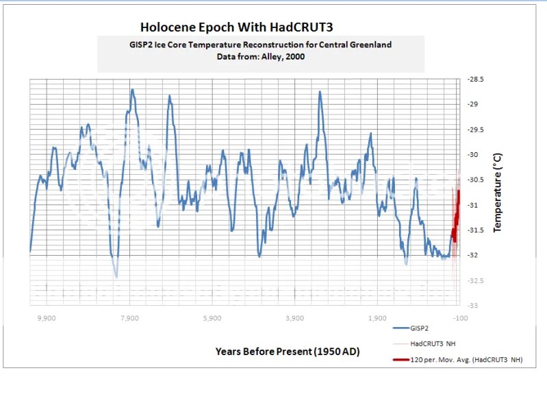
3,000 Years – GISP2 – Alley, 2000, Moberg, Keigwin & HadCRUT3

4,000 Years – GISP2 – Alley, 2000

10,000 Years – Vostok – Petit et al., 1999

10,000 Years – Vostok

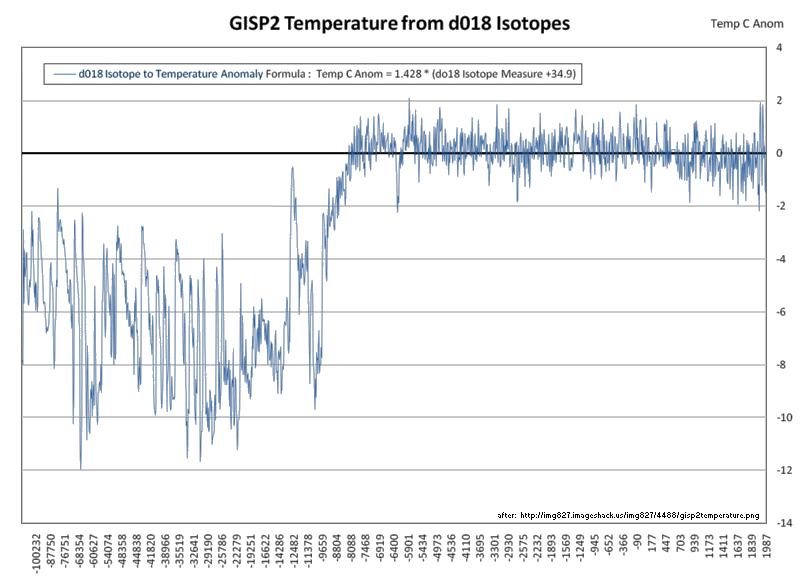
10,000 Years – GISP2 – Alley, 2000
10,000 Years – GISP2 – Alley, 2000

10,000 Years – GISP2 – Alley, 2000, Ljungqvist et al and HadCRUT3

10,000 Years – GISP – Alley, 2000 – Vostok – Petit et al., 1999 – Click for Animation – Disputed Graph – The x axis labels should read Years Before Present (1950 AD)

10,000 years – GISP2

10,700 years – GISP2 – with CO2 from EPICA DomeC

20,000 Years – GISP2 – Cariaco – Dome C

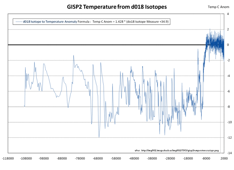
110,000 Years – GISP2
110,000 Years – GISP2 – Vostok

120,000 Years – GISP2
120,000 Years – Byrd Station – Camp Century

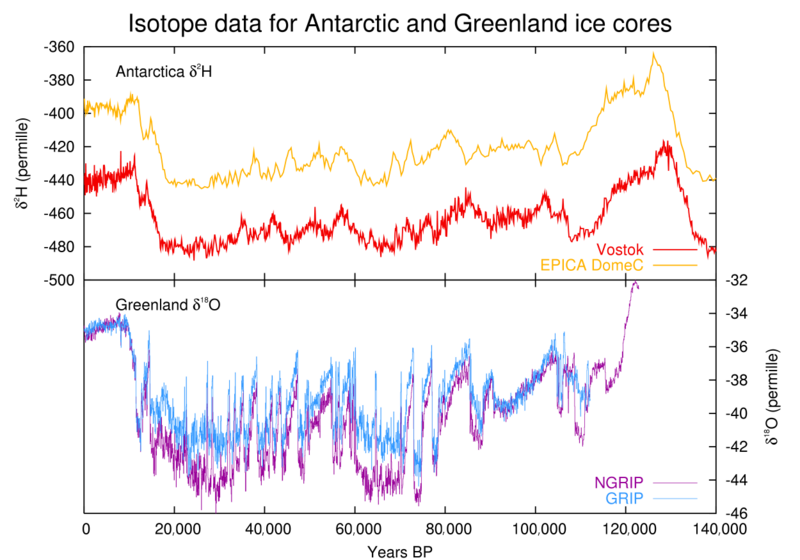
135,000 Year – NGRIP-extended, NEEM, Epica DomeC Antarctica and the estimated Global temperature

140,000 Years – Vostok – Petit et al., 1999

140,000 Years – C Dome

140,000 Years – Vostok – EPICA Dome C – GRIP – NGRIP
150,000 years Taylor Dome -Ross, Antarctica E. J. Steig, et al 1999:

400,000 Years – Vostok – Petit et al., 1999

400,000 Years – Vostok – Petit et al., 1999

420,000 Years – Vostok – Petit et al., 1999

423,000 Years – Vostok

450,000 Years – EPICA Dome C – Vostok

450,000 Years – EPICA Dome C – Vostok

450,000 Years

740,000 Years – EPICA Dome C

750,000 Years Rate of Change of Ice Volume and June 65N Insolation

800,000 Years Orbital and Millennial Antarctic Climate Variability

800,000 Years (Click the Pic and zoom in)

800,000 Years Orbital and Millennial Antarctic Climate Variability

1,000,000 Years

5,500,000 Years Antarctica/Vostok Temperature

5,500,000 Years Antarctica/Vostok Temperature – Reversed

65,000,000 Years

65,000,000 Years

108,000,000 Years – Cramer et al., 2011

540,000,000 Years

543,000,000 Years Area of Continents Flooded, Concentration of CO2 and Temperature Fluctuations

545,000,000 Years

570,000,000 Years

600,000,000 Years – C. R. Scotese and R. A. Berner

750,000,000 Years

4,500,000,000 Years

Disputed/Incorrect Graphs
2,000 Years – Incorrect Graph The data in this graph should only extend to 1935, not 1980. Per “Correction to: A 2000-YEAR GLOBAL TEMPERATURE
RECONSTRUCTION BASED ON NON-TREE RING PROXIES” by Craig Loehle, Ph.D. and J. Huston McCulloch, “With the corrected dating, the number of series for which data is available drops from 11 to 8 in 1935, so that subsequent values of the reconstruction would be based on less than half the total number of series, and hence would have greatly decreased accuracy. Accordingly, the corrected estimates only run from 16 AD to 1935 AD, rather than to 1980 as in Loehle (2007). The paper is listed here and a comment addressing the issue can be found here.

10,000 Years – Incorrect Graph – GISP2 – Alley, 2000 The x axis label, “Years Before Present (2000 AD)”, should read Years Before Present (1950 AD)

10,000 Years – Incorrect Graph – GISP2 – Alley, 2000 The x axis label, “Years Before Present (2000 AD)”, should read Years Before Present (1950 AD)

10,000 Years – Incorrect Graph – GISP2 – Alley, 2000 – The x axis label should read Years Before Present (1950 AD)

12,000 Years – Vostok – Disputed Graph: Graph is based upon this article, however per this comment, the article provides no explanation or quantitative support for the line fitted to the graph

Falsified Graphs
10,000 Years – Falsified Graph GISP2 – Alley, 2000 The graph presents model output as “GISP site temp”, erroneously refers to “recent direct measurement” and mixes incompatible data sets,.Graph Background

10,000 Years – Falsified Graph GISP2 – Alley, 2000 The graph mixes incompatible data sets and the x axis label, “Years Before Present (2000 AD)”, should read Years Before Present (1950 AD)

(Please note that WUWT cannot vouch for the accuracy of the data/graphics within this article, nor influence the format or form of any of the graphics, as they are all linked from third party sources and WUWT is simply an aggregator. You can view each graphic at its source by simply clicking on it.)
While a good combo overall, one link is broken but could be fixed.
For 1,100 years Kirkby 2007, this page presently has:
“Figure 2 http://desmond.imageshack.us/Himg707/scaled.php?server=707&filename=kirkby1.jpg&res=land“
The above does not work because it is missing 3 letters, by having the link as:
http://desmond.imageshack.us/Himg707/scaled.php?server=707&filename=kirkby1.jpg&res=land
What does work is instead adding ing to the end, as follows:
http://desmond.imageshack.us/Himg707/scaled.php?server=707&filename=kirkby1.jpg&res=landing
C3 Headlines has a lot of charts at his blog site worth looking into.Maybe you send an e-mail to him about including some of his charts into your Paleoclimate page?
http://www.c3headlines.com/chartsimages.html
I have been wanting this. Kathleen Parker of the Washington Post described the Republicans as “pathetically inarticulate”. We need to get together a good presentation, mainly visual with graphs, that shows the paleoclimate and goes forward to the issues of present temperature and CO2. Most people do not follow the science closely, but really need to know what is happening. I have not heard anyone mention the very important observation that the temperature of our interglacial is decreasing, that each warming, from the Minoan forward, has a lower temperature; this should be alarming.
People who vote need to have a clear, concise knowledge given to them so that they can vote the science and not the hysteria. I’ll look through my stuff and send it.
Thank you
http://services.english-heritage.org.uk/ResearchReportsPdfs/012_2012WEB.pdf Figure 19 gives 9000 years of Central Southern England temperature (and rainfall for 20,000 years in Fig 20)
To quote the report:
“Interestingly, the changes predicted for the 4000-4500BP period by the Bridge CGM are actually quite similar to the predictions of future climate change in the UK (Wilby et al 2006), which implies that we are moving back to a 4000-4500BP climate in the UK”..
To the first anonymous raeder,Do have brain left in your skull?? If yes, please start working with it and start thinking…….CY has committed a crime, he misled the whole population of HK, the governement, fooled all of us…And the senior civil servants have worked together to cover up the truth in order to exempt him from criminal prosecution or being blamed for dishonesty. This helped him win the chief Executive election early this year. Look, the whole governement biased against his former opponent of the Chief Executive election, Mr Tong Ying Ning, Henry, who was being blamed for unauthorized building inside his house.Please remember by your brain that CY denied, during the election campaign, he had unauthorized buildings/ constructions inside his house . This signifies that the standard of justice is decaying and corruption by a whole group of people masterminded by CY Leung. I remember the last Governer of HK under the rule of Britan, Mr Chris Patten,who warned that HK would be eventually killed by some local people instead of Beijing directly. See, the first anonymous raeder, if you have brain and hopely have eyes, please take a look at all of these deliberate attacks to system of Law and Administration of HKG. It is so scary and frightening!! I am so shock that you cannot see, instead you view it as a personal attack by the rich in HK or political rivals. HK is dying, people of HK are being killed. Sigh……
May I add a graph, labelled “Past 740 kyrs Dome-Concordia ice core temperature reconstructions”.
It’s buried in Wikipedia and omitted from any reference to where it concerns.
http://en.wikipedia.org/wiki/File:0Master_Past_740000yrs_temperatures_CO2_icecore_Dome_C_150dpi.png
Here is one I found.
http://www.atmos.washington.edu/1998Q4/211/project2/moana.htm
Hope it helps.
Good graph and lots of climate info for 2 billion years worth of geologic history at paleogeographer Chris Scotese’s website:
http://www.scotese.com/climate.htm
Scotese refers to todays world as an “Ice house” climate compared to most of geologic history.
Darn that Isthmus of Panama for closing and helping to give us the current ice ages!
This was posted here recently, but here is the original link to
Source: http://ds.data.jma.go.jp/tcc/tcc/news/press_20120202.pdf
Where the graph was posted a few weeks ago
http://wattsupwiththat.com/2013/01/31/japans-cool-hand-luke-moment-for-surface-temperature/
The beauty of this recent ( 1890-2011) global temperature record is the constant linear slope, no acceleration, no hockey sticks. Same slope before big industrialization/fossile fuel of 0.68C/centuary. Maybe the Japanese global temperature is less adjusted.
The 11,000 years GISP2 Temperature Since 10700 BP with CO2 from EPICA DomeC
Graph shows CO2 levels @ ~260 ppm levels at 0 year. What year is 0 in hat graph?
I would suggest including Shaviv and Veizer 2003. They provide a graphic that is substantially the same as 545,000,000 year chart offered at C3Headlines. They also argued for a linkage between major climate shifts and cosmic ray flux. Ironically a copy can be found here:
http://stephenschneider.stanford.edu/Publications/PDF_Papers/shaviv-veizer-03.pdf
What is the lag time in the reflection of air temperature trend changes in ice cores? How should ice core temperature data be presented when it is used to comment about changes is air temperatures? What constitutes a valid use of ice core temperature data when making public statements about current and future climate conditions?
The only thing that we can conclude from these graphs is that we are experiencing a rapid increase in temperature over a short period of time,
The IPCC 1st Assessment Report Graph should at least be relegated to the disputed graphs sections. There are a number of reason that I can elaborate. Briefly: 1. it was give as just a ‘sketch’. 2. Its sources are poor and invalid – based on Lamb’s estimations for Central England.
berniel says: April 10, 2013 at 8:57 pm
The IPCC 1st Assessment Report Graph should at least be relegated to the disputed graphs sections. There are a number of reason that I can elaborate. Briefly: 1. it was give as just a ‘sketch’. 2. Its sources are poor and invalid – based on Lamb’s estimations for Central England.
Steve McIntyre had a good thread on this graph.
http://climateaudit.org/2008/05/09/where-did-ipcc-1990-figure-7c-come-from-httpwwwclimateauditorgp3072previewtrue/
which I’ve added to the graph for reader’s reference:
1,100 Years – Lamb – IPCC Assessment Report 1 – Graph Background
I also reviewed Skeptical Science’s take on the IPCC graph;
http://www.skepticalscience.com/print.php?r=338
and I don’t see any references to Lamb’s “poor and invalid” sources within either thread. Please post links to references supporting your assertions about Lamb’s “poor and invalid” sources.
The top graph on the page does not match its title:
472 Years – CET Extended Graph – Tony Brown – Graph Background
The article linked to under ‘Tony Brown’ on Judith Curry’s blog contains many graphs, this is not one of them.
The graph itself contains an error of attribution. It claims to be based on US meteorology data, but the actual source URL given is to the Australian Bureau of Meteorology. The URL does link to a time series of what appears to be temperature anomaly data. However, the person who produced the chart has obscured the values by seemingly adding a constant to them, perhaps 15. This is nowhere in the source data. The actual data vary in a range of -0.6 to 0.6, and the chart would be more valuable to this page if it was redrawn from the data at the URL.
Looking around on the Australian BOM site, I haven’t been able to find an indication of which anomaly time series this is supposed to be, So the chart, even if redrawn to a proper scale, would be of little value for users of this page.
My suggestion – do not use this chart on this page. Choose one of the charts in the long post referred to in the title, for example
http://curryja.files.wordpress.com/2011/12/12.jpg
Best of luck!
dvunkannon says: April 15, 2013 at 12:32 pm http://catallaxyfiles.com/ – Click the pic to view at source[/caption]
The top graph on the page does not match its title:
472 Years – CET Extended Graph – Tony Brown – Graph Background
The article linked to under ‘Tony Brown’ on Judith Curry’s blog contains many graphs, this is not one of them.
The graph itself contains an error of attribution. It claims to be based on US meteorology data, but the actual source URL given is to the Australian Bureau of Meteorology. The URL does link to a time series of what appears to be temperature anomaly data. However, the person who produced the chart has obscured the values by seemingly adding a constant to them, perhaps 15. This is nowhere in the source data. The actual data vary in a range of -0.6 to 0.6, and the chart would be more valuable to this page if it was redrawn from the data at the URL.
Looking around on the Australian BOM site, I haven’t been able to find an indication of which anomaly time series this is supposed to be, So the chart, even if redrawn to a proper scale, would be of little value for users of this page.
My suggestion – do not use this chart on this page. Choose one of the charts in the long post referred to in the title, for example
http://curryja.files.wordpress.com/2011/12/12.jpg
Best of luck!
You are absolutly correct, that was the wrong graph. I was working on several things at once and inadvertantly overwrote the graph on this page with a graph someone had posted in another thread, i.e.:
[caption id="" align="alignnone" width="542"]
Your critique of this graph is valuable and I will link to it if anyone uses this graph again.
I see a lot of graphs representing ice core data. There are other climate records that exist besides isotopic reconstructions. One hole in an ice sheet in a single hemisphere, no matter how far back it goes, is not representative of global average temperature. Also, many of the events that are pointed out in those graphs have ranges associated due to error and or geographic location. They are not single data points on a line.
You have put forth a grate effort supporting your hypothesis that anthropogenic climate change is not occurring. I am going to pose the next logical question.
I would assume you acknowledge CO2’s properties as a greenhouse gas. You must have some type of theory or hypothesis as to what is mitigating the effects of releasing millions of years of stored carbon as CO2 into the atmosphere over an unequivocally short timescale. You must have quite a bit of evidence to support this theory to be so emphatic. My advice would be to not keep this to yourself. Instead of spending your time attacking “alarmists”, a better use of your energy and resources would be to explain your theory, and educate the rest of the scientific community, as well as the public, as to why there is no reason for concern. I am posing this as a serious question. Please elaborate.
Looking at records that are more than 200 yrs old in a system that is many millions of years is helpful to know where we are in terms of the planet’s history, not just the industrial revolution’s. I would estimate that 97% of people on the street would have not a clue that 90% of the last 100 thousand years had most of the northeast USA either under ice glaciers or too cold to inhabit. The same is true for the last several million years. The last 10,000 years is a warm spike. All that I just mentioned has little to do with CO2 since temperature changes, particularly downward ones lead the adjustment in CO2. My explanation on that is C02 only exists in the atmosphere as life keeps it from the oceans since the life cycle is much quicker than the rate that CO2 can be collected by the ocean. Although we are warm now compared to 100 years ago or 500 years ago we are not warmer than 1000 years ago and cooler than many times before that. My worry is that most warming periods ended in the past by now and descended back to ice age normal. This is what alarmed scientists in the early 1970s.
d,
Did you view the charts above? For example, this chart is one of several that shows something interesting: both hemispheres track global temperatures very closely. Therefore, the question of ‘geological location’ is answered. Furthermore, in each hemisphere there are a number of ice core bores, and they all agree with each other.
Regarding CO2 as a ‘greenhouse gas’, most folks would agree that CO2 has had some effect on global temperature. However, that effect is too small to measure. Why? Because most of the warming effect has taken place within the first 20 ppm of atmospheric CO2. At current concentrations, even a large CO2 increase will not measurably raise global temperatures. We see that despite the 40% rise in CO2, that global warming has stopped for the past fifteen or more years.
The “carbon” scare is fueled primarily by government grants. CO2 [AKA: “carbon”] is actually a very minuscule forcing agent. There are no verifiable, testable measurements of global temperature change due to CO2 — and anthropogenic CO2 is only a small fraction of the total, so human emissions are not a factor.
Anyone who adheres to the Scientific Method must agree that the “carbon” scare is based on assertions and conjectures, but not on measurable data, because there is none. But I for one appreciate your asking the question. The more the answers are explained, the better decisions the public can make.
The graph hosted at http://www.greenworldtrust.org.uk/ appears to have gone walk about. Actually all of their linked stuff appears to have gone away.
I have 4 PDF files of summaries by area and time of the last 10K years of history around the Arctic Circle, by Amanda Graham, BA, Dipl. NOST, MA, of Yukon College. They make a quick reference and would be a good addition to this page. Contact me and I will send them to you. I’ve had them for six years and cannot find the link I procured them from.
En los locales en los que se ejerza la actividad clasificada en este epígrafe, la deducción a que se refiere la letra c) de la regla 14.1.F de la Instrucción del impuesto será en todo caso del 20 . Epígrafe 653.4.- Comercio al por menor de materiales de construcción y de artículos y mobiliario de saneamiento. Epígrafe 654.2.- Comercio al por menor de accesorios y piezas de recambio para vehículos terrestres.
Wandering magnetic poles control global climate change. Watts up with that? Read and study, then engage in a discussion: https://www.harrytodd.org
It is unlikely that such a single factor would “control” climate change, given we have direct radiation input from the sun. It would be worth studying previous major magnetic shifts for correlation to other climate shifts. And directing people to “Read and study” a single blog of your own is presumptuous.
How are these graphs possible? Are they all fakes? These are what I remember from school when I was studying paleontology – but this is very different from everything that is presented by anyone in the IPCC or what Al Gore presented. Why is that? Who is right? Would Al Gore lie?
Well first, Al Gore is not a scientist of any kind. All he can do is report on the work of others. Second, his family is heavily invested in oil, “carbon credits,” and real estate. Given that, he is very likely to have a bias that affects his own bottom line. Whether or not such rises beyond favoritism to outright lying would take a court case to determine.
Note, though, that Mann was unable to refute charges of falsifying his data, and Gore relies a lot on Mann.
Melt ponds play a major role in the absorption of solar insolation. Absorption by a water surface is a strong function of solar elevation and so it is solar elevation at high northern latitudes during the summer which determines albedo and melt rates. The stable stratification of melt ponds in the range 0oC to 4oC allows storage of heat from summer to summer while the positive feedback between pond area and heat uptake leads ultimately to exponential growth followed by catastrophic collapse. All five Terminations occurred at times of peak or increasing Annual Water Surface Absorbed Insolation, a better match than previous models.
http://fluidcatastrophe.net/?page_id=675
The General Assembly of the European Geosciences Union ( EGU ) takes place in Vienna, Austria, from 3-8 May 2020. Applicants must contact an SSC member at least two weeks before the deadline to explain the meeting plan and how it is relevant to PAGES.
Increasingly, the sources of these graphs (on many of the WUWT data pages) are disappearing. Either the domain doesn’t pay their bills, or the government agency hides the data that was once available. And the WayBack Machine (archive.org) doesn’t always retrieve the graph.
Before this becomes even more problematic, can we get the most endangered graphs hosted locally? Otherwise, these data pages may become increasingly of less value.