Regular WUWT contributor Willis Eschenbach has been plotting the official death rate data from the Coronavirus almost daily. We will continue to add to this page as needed and as Willis makes updates.
Read the note from Willis, or Skip to Latest Plot:
My thanks to Anthony for thinking of making this a page to follow the history of these plots. I’ll be updating them daily, unless mischance and coincidence intervene, sometime just before midnight GMT, which is when the Worldometers data page refreshes for the new day.
Note that the data changes throughout the day, and there are various sources of data, so there may be some variation between your data and mine at any given instant.
For those interested in how I’ve done it, I put the R computer code online, download it by clicking here. There are two files, “Willis Functions.R” and “Coronagraph.R”. The “Willis Functions” file loads a bunch of libraries, so you may have to download one or more. It also contains the code for a host of things I use over and over, such as the lines with the black background that I like to use for clarity in my graphs.
The R code goes and gets the HTML source document for the Worldometer page. It then parses the document to obtain the various historical figures. These don’t include the most recent day, so I download and parse another page for those figures and tack them on the end.
Finally, a plea to all those in charge. The economic damage from the current insane “shelter-in-place” regulations is going to be huge—lost jobs, shuttered businesses, economic downturn, stock market losses. This doesn’t count the personal cost in things like increased suicides and domestic and other violence. Think pissed off young men out of a job and on the street.
And on the positive side, as my graph clearly shows, the South Koreans have managed to contain the virus. How did they manage that?
First, they test widely, then use confirmatory tests to avoid wasting time on false positives.
Then they trace all contacts of infected people and test them, and identify and quarantine SICK people, not HEALTHY people.
My oft-infuriating good friend Steven Mosher is living in Korea at the moment. He said that when one person in an apartment building gets ill, they test the whole floor plus a couple of floors above and below where the person lives.
When a guy in a call center got the virus, he said, they tested all 250 people working there. Heck, those jokers even have phone-booth style testing facilities to increase the number of tests per day … they are on it.
In this manner, using testing, tracing, and quarantining the ill rather than the healthy, they’ve been able to control the spread very well. As of today (2020-03-20) they have only 94 deaths in the whole country and leveling out (see below) and they’re NOT locking down the entire population and destroying their economy like we are.
Let’s emulate success, folks. I don’t mind learning from experience, but generally, I prefer to learn from other people’s experiences, and we have Europe and South Korea to learn from.
Here’s the crazy, bull goose looney part no one is talking about. The US government is about to spend a trillion dollars of your and my tax money to prop up the economy whose wheels have just been taken off by the insane shelter-in-place orders of the US government. Sen. McConnell unveiled a roughly $1 trillion stimulus package on Thursday to help “mitigate the economic pain that tens of millions of Americans are already feeling”.
That trillion dollars won’t put the wheels back on. It won’t get us rolling again. It just pays us for the losses already suffered.
Do you ever think how many ventilators and hospitals and test kits and testing personnel we could buy for A TRILLION DOLLARS OF YOUR AND MY GAD FARKING TAX MONEY!!
Typical ventilator cost US$25,000, in normal times. Say you have to pay double in scarce times. Say we want a half million of them, big number, more than we’ll ever need, but why not? How much of our trillion pinche dollars of tax money remains?
Ninety-seven percent. We’ve bought a half million ventilators and have hardly dented the pile.
My point is simple. If we’re going to spend a trillion, let’s put out wartime prices with war-time high-speed bidding processes. Say that the government will pay double the peacetime costs for ventilators and mobile field hospitals and beds and the like. Focus on American made. Phone-booth testing sites? Koreans can make them? Americans can make them. Buy all that the Koreans willl sell, plus encourage US manufacturers can make them by putting tariffs on them.
Seriously … wouldn’t putting a trillion of our hard-earned dollars into that be far, far better than doling it out in dribs and drabs, in grants and loans, a bit here, an overhead cost there? Because here are two ugly truths.
Ugly Truth 1) Some good-sized proportion of the population worldwide is going to get the coronavirus. Only question is when.
Ugly truth 2) Remember that trillion dollars to pay for the losses occurred so far during the nationwide lockdown? You know how long the lockdown has been going on?
One week. One. Stinking. Week. And it’s already cost A TERABUCK OF OUR TAXPAYER MONEY. And the government is talking about it lasting a month?!? Madness of the highest order.
A trillion to prop up one week? What say we suffer an attack of sanity, cancel next week’s lockdown, and put the trillion we just saved in just one stinking week into ventilators and beds and field hospitals?
Because it will hit, and the only question is how prepared we’ll be when it hits. All this stick-your-head-in-the-sand is doing is delaying it. Why? Well, theoretically so that we can be medically prepared for it with enough beds and ventilators and the like. Which is a very good reason. Gotta have more beds and ventilators than you have sick people. Medical preparation is what we want to achieve.
Given that being medically prepared is the over-riding issue, how about we
a) stop this mad stay-at-home failed experiment,
b) get America back to work,
c) continue with all the precautions we spent all this time learning, wash my hands, don’t touch my face, no sex with fruit bats, go back to disposable plastic grocery bags, social distancing, and most importantly, spend that trillion we just saved on d) …
… you know … urgently, four-alarm urgently, wartime production urgently, getting medically prepared for the wave that we’re damn sure is going to break? Buy field hospitals. Pre-position them. Stockpile ventilators. How many field hospitals does the Army have? Put them all on standby to be rushed to an overloaded city. Buy test kits. Pay double pre-war prices for everything if some people can provide it in a crazy rush. GET READY … and critically …
END THE AMERICAN LOCKDOWN!!! We cannot afford a dead economy costing us a trillion a week.
Best to all,
w.
PS—Further discussion of the economic aspect of the coronavirus epidemic, as well as of other extraneous and forbidden topics, is going on over at my blog, Skating Under The Ice.
CONTACTING ME: Twitter @weschenbach, or at my blog, “Skating Under The Ice“. Click on “Tips and Notes” at the top of the page.
Source of data: https://www.worldometers.info/coronavirus/#countries
LATEST PLOT
IMPORTANT NOTE: I use a logarithmic scale for the deaths, because on that scale exponential growth, the scary fast kind of growth, plots as a straight line. This lets us know when the increase in deaths is slowing down.
2020-07/07
So I thought I’d take a look once again at the most basic of numbers, the number of deaths. I find that there are several patterns. First, there are countries and states that went up fast, dropped fast, and are now near zero. Here are some examples.


(I’ve removed the one-day addition of ~ 1800 deaths to the NJ record, which also was showing up in the US record, as we don’t know when they occurred.)


Then we have some that peaked, dropped some, and have been either dropping slowly or running more or less horizontal.


Some seem to be at or just past their peak …


And finally, there are a few that are still rising … of course, these are the ones that get all the media attention.


And what about the planet as a whole? Here’s that graph:

Onward, ever onward …
w.
2020-07/01
Yes, it has been a while since I posted here. I have not been idle. Instead Ive been looking for some way to make sense of the corona numbers, and guess what?
I can’t do it. Here’s why. There are four important numbers in the game—positive tests, negative tests, hospitalizations, and deaths. Each has its own problems.
The positive and negative tests used to refer just to detecting active cases. Now, however, we have test for both active cases and antibody tests to determine if someone has ever had the virus … and unfortunately, there’s no distinction in the data between these totally different tests.
Hospitalizations were no problem when only corona patients were in the hospitals. But now that elective and other procedures are happening again, say some young guy goes in for a vasectomy. He gets tested, he’s not an active case but he has antibodies. So guess what? His hospitalization is now a COVID hospitalization. So they test his wife and two kids. They had it too, asymptomatic, but they’re now three more positive tests.
Then there’s the problem of repeat testing of people who have the disease. If someone gets six tests, then it’s reported as six separate cases even though it’s only one case.
Finally, the deaths. The CDC in its infinite stupidity has said to categorize a death WITH coronavirus the same as a death FROM coronavirus. They’ve also said that if a physician even SUSPECTS, not that corona caused the death but suspects that corona somehow contributed to the death … mark it as a death from coronavirus.
This has led to goofy results like positive test percentage going up while hospitalizations are going down, and the like.
And despite looking for some way around all of that, I’ve not been able to figure out how to overcome all of those changes that have occurred since I started posting the graphs. Garbage in, garbage out, as they say.
So I’ve decided to declare that, while my work may not be done here, I’ve done all that I can here.
My profound thanks for all of the support that I’ve received. If I can make further sense out of this data goatrope I may post more graphs, but until then … a couple of last ones.


Stay well, stay healthy, stay happy,
w.
2020-06-22
In which I take a look at a bunch of states that are supposed to be in trouble from easing lockdowns … but first, the usual.


Not seeing the dreaded second peak yet, but hey, I was born yesterday …
Stay safe,
w.
2020-06-21
Not much interesting for a bit, but today, Arizona is a puzzle. First, the countries:


We now have four South American countries that have earned a spot in the top fourteen graph shown above. We’ll see where they end up.
Next, here are the states:

Still no sign of any jump in positive test percentage from the mostly peaceful beatings, arson, and riots … and since the median incubation period is only five days, we’re not going to see any jump.

Finally, here’s the Arizona mystery in a nutshell—positive tests rising, hospitalizations rising … but deaths falling or level. The positive percentage started rising around May 15.

The rise in positive tests is closely followed by the number of hospitalizations, viz:

But the deaths never got the memo …

Four possible causes, off the top of my head.
1) The virus is mutating to a less lethal version. Several epidemiologists have suggested this might happen.
2) The demographics have shifted, with more younger people getting infected. I’ve seen news reports to this effect but didn’t pay much attention.
3) Improvements in treatment regimens have improved outcomes.
4) Bad data. All corona data is always suspect.
Best to all, stay healthy,
w.
2020-06-16
A day off, a day on. Still no sign of any uptick in positive test percentages from the protestolooting …
w.


And for fun, here’s Wyoming …

2020-06-14
Today I looked at a variety of countries and states. First, as usual, the overviews:


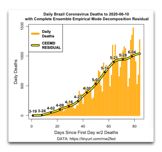
I see that Peru, Brazil, and Ecuador have all made it up into the top scoring countries …

Next, some daily deaths curves. First countries. Ecuador, Mexico and Brazil look like they might be at or near the peak.


Peru and Colombia, on the other hand, not so much …


Next, states. There’s been a lot of talk about a second spike in deaths … might happen in a few places, but not in most states.


Here in California they’ve just decreed that my barber, a charming Thai woman, can go back into business … if she hasn’t starved by now.
w.
2020-06-13
Yeah, I know, I didn’t post for two days. So sue me, I was getting tired of fighting the good fight and people responding with “but muh cases!
Folks, cases are MEANINGLESS. Double the testing and you’ll double the cases. Halve the testing and … well, you do the math.
So here are some real numbers—deaths, and percentages of positive tests.


Sweden still refuses to play ball with the doom merchants …

There have been no spikes from the protestoriots …

And despite lots of hype about Arizona and Texas … deaths continue to decline.


And the beat goes on … here, the night wind off the ocean brings the smells of adventures past and adventures future … stay well, dear friends.
w.
2020-06-10
Still waiting for the second peak …
Still no “second peak” from the riots …

Sweden continues to confound …

And while most of Europe and the industrialized states have passed their peak, there are still countries out there who have not done so …


That’s all the news that’s fit to print …
w.
2020-06-09
Countries, states, individual countries, states with riots, the hits just keep on happening.


Next, a comparison of a couple of countries. First the UK:


Well past the peak in the UK, with no sign in positive test percentage, the leading indicator of any bounce in the hospitalizations and deaths.
You can see that leading indicator quite well in the data from Israel …

As you can see, the positive tests bottomed out on the 20th of May. Now, here are the Israeli deaths.
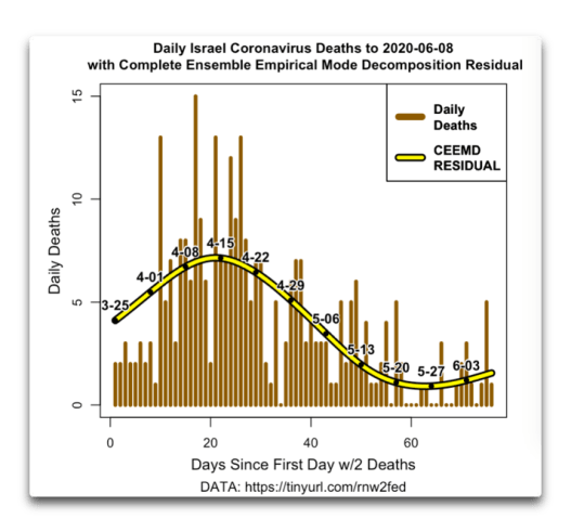
Following the bottoming of the positive test percentage on May 20th, the Israeli deaths bottomed out about a week later, on May 26th.
(However, before you start getting all concerned about Israel, look at the units on the left side. They’ve gone from one death per day on average, all the way up to 1.5 deaths per day on average …)
Finally, having seen how well the percentage of positive tests work as a leading indicator of deaths, here’s another look at some of the US states which had large riots.

No spike in infections after all this rioting with little pretense of masks and none of “social distancing”? Can we finally admit that the fat lady has sung and it is time to END THE AMERICAN LOCKDOWN NOW! The facts are obvious to everyone but politicians and idiots … but I repeat myself.
My best to everyone, apologies to Mark Twain,
w.
2020-06-08
The usual. And California.
Now, it seems to me that the countries that have done the worst, the ones that for whatever reason are hit the hardest by the virus, all peak out in the region of 4,000 – 7,000 deaths per ten million. The only places worse than that are the US states where the government (usually the Governor) mandated that hospitals transfer COVID-19 patients to the nursing homes. Hard to believe, but it happened. That’s pushed the deaths in New York, Connecticut, and New Jersey up around 15,000 per ten million, the highest I’m aware of anywhere.


Deaths have peaked in almost every state, as well as in the US as a whole.
End the American Lockdown NOW!
w.
2020-06-07
The usual, plus some thoughts on the elusive “second peak”.


The latest interesting turn in the coronamania is the emergence of the protests and riots involving tens of thousands of people in close proximity to each other with lots of screaming and yelling and chanting. Bizarrely, it’s lead to epidemiologists abandoning science by saying that social distancing is sooo last month when it comes to riots … I’ve heard of situational ethics, but situational science??
A county near me has issued official regulations. They limit “social gatherings” to 12 people, and “protests” to 100 people … like the virus could tell the difference. Seems like if you and 50 folks want to have a picnic, just tell the CoronaConstables that you’re protesting the lack of Vitamin D in the underprivileged …
In any case, lots of folks have said that there would be a “second peak” in the COVID cases due to the near-total lack of social distancing in big groups in dozens and dozens of cities across the US.
Me, I’ve said since before the start of the protests/riots that the US lockdown did little to slow the spread of the virus … and that as a result, breaking the lockdown wouldn’t make much difference. So we are getting to test that bigtime.
Now, the earliest warning that we will have of a second peak will be a change in the percentage of positive tests for the virus. If we’ve been getting e.g. five positive tests per hundred tests and we suddenly start getting seven positive tests per hundred tests, that’s not good. In some cases, this will show the disease even before the onset of symptoms.
So here is the percentage of positive tests for six of the states that have seen the largest public protests and raids.

There is a common misunderstanding that we wouldn’t be able to see any change in the tests earlier than fourteen days. But that’s not what the CDC says. I quoted it on the chart so folks won’t be confused. It says that by the end of the first five days, fully half of the people will show symptoms. And if that were the case, now that we’re twelve days out from the first protest, it should be clearly visible in the chart above.
And the beat goes on … stay well, dear friends,
w.
2020-06-06
Still looking for the dreaded spike in the rate of positive tests … JHU is late again, it’s the weekend.


Here are the rates of positive tests for a half-dozen states that had large riots/protests. Still nobody headed for the sky.

Here are the daily death totals and the positive test percentages for Florida and Georgia. People have been watching these states because they were the first to suspend the lockdowns. Deaths are a “trailing indicator” of the spread of the illness. On the other hand, the rise or fall of the percentage of positive tests is a leading indicator—it would be the first indicator of an upcoming rise or fall in the spread of the virus. First, Georgia.


No particular sign of any spike, and in neither state has the medical system been overwhelmed.
w.
2020-06-05
Seems the riots have rendered the coronavirus incapable of spreading … or at least we’re not seeing the dreaded “spike” in cases, hospitalizations, and deaths.


Like the cops say at the scene of yesterday’s accident, “Move along, folks, nothing to see here” … here’s another day’s worth of the states where the most intense rioting and protesting went on (and in some cases is still going on).

Not spiking that I can see.
Stay healthy,
w.
2020-06-04
With all the protests and riots, I take a look at the most sensitive indicator of an upcoming spike—the percentage of positive tests. First, here are the countries and the states.


Next, here are the positive test fractions for those US states where we’ve seen large riots/protests, with people jamming the streets. Here’s that data:

Ten days since the first riots/protests, and not a single twitch in the percentage of positive tests. If there’s gonna be a second peak, it’s not visible yet.
Onwards, stay well,
w.
2020-06-03
I finally got fed up with Worldometer and I changed my data source for my country data to Max Roser’s wonderful site, Our World In Data. Curiously, almost no visible difference from the Worldometer data. Here’s that chart:
Next, the Johns Hopkins data is below. Note the difference in the vertical and horizontal scales from the graph above. Nowhere are the deaths greater than a tenth of one percent of the population.

And the states. Here, New York, New Jersey and Connecticut are all above 1% …

And a couple other charts …


That’s all the news that’s fit to print, as they say … stay well, everyone.
w.
2020-06-02
The Worldometer site is giving me grief. They’ve changed the format, but only for certain pages. A week ago it was Netherlands and France. Then when I’d rewritten my code and got it running again, today it’s doing the same thing to Germany and Sweden. Grrr … fortunately, JHU data is back on line. So for the moment I’m down to two graphs about total deaths. However, there’s a bunch more, looking at the percentage of positive tests.


Not much new there, the inexorable march continues. However, there’s lots of interest in the percentage of positive tests. IF the country testing data is accurate, the percentage of positive tests will be the first warning of any “second peak”. Here, without much in the way of commentary, are a whole variety of different countries. Alphabetical, because why not?


The Czechs seem to be in a bit of a holding pattern.


Iceland has tested the widest. They also have the smallest percentage of positive confirmed tests of any country.

Unlike all of the previous countries, the spread of the virus and the load on the Mexican medical systems has not peaked.


To date, most of those countries, including the UK and the US, are not showing signs of the dreaded “second peak”. Me, I rate it as “infreqent” and “doubtful”. I predict we’ll see flareups in various places, but very few countries will see a significant second peak.
… but of course, only time will tell.
Regards,
w.
2020-06-01
New month. Usual plots, plus a rumination about excess deaths.


People have been saying that we can use what are called “excess deaths” to see how many corona deaths have occurred. The Financial Telegraph just put out the first dataset of excess deaths. Here are excess deaths as a percentage of coronavirus deaths.

As you can see, excess deaths won’t help us because the numbers are all over the map, with excess deaths ranging from 60% to almost 300% of corona deaths.
Stay healthy,
w.
2020-05-31
Last day of the month. Corona news totally eclipsed by rioting and looting. Probably just as well. JHU hasn’t updated their data. Here’s country and state data …


Next, the most sensitive forerunner of any “second peak” would be an uptick in the percentage of positive tests. So here is that graphic for the top twelve states with the highest death rates:

No clear indication of any “second peak” in that data.
Next, are there countries that should not open up yet? Sure, those where the deaths haven’t peaked. Remember that deaths are a trailing indicator, so when they have peaked, it means we’re also past the peaks in cases and in hospitalizations. Here are some countries that perhaps shouldn’t open up quite yet:


Onwards, ever onwards … stay well, dear friends.
w.
2020-05-30
JHU data is late again, so here’s the countries and the states, plus a look at winners and losers.


Here are the top thirty countries by deaths per capita …

And here are the states, with a vertical black/yellow line showing the worst major country by death rate, Belgium.

Finally, here’s one of the reasons that the US has so many deaths … because no less that 41% of deaths are in nursing homes. Even in progressive California the government can’t get it together to protect nursing homes, and as a result OVER HALF of California deaths are in nursing homes.
I put this on the State Governors and governments. The Feds don’t regulate nursing homes, the states do. Here’s a look at the problem.

End the American lockdown NOW.
w.
2020-05-29
The covid story continues …


I’ve put in the updated projections for total deaths for New York and the US.

The graph above shows that Sweden (red/black line) and the US (orange/black line) are running right in parallel. However, this may not continue. The model that has tested best projects the following:


Note that because of the lockdown in the US and not in Sweden, the US is projected to stay at about the current number of daily deaths until September. In Sweden, on the other hand, daily deaths are projected to drop steadily down near zero by September.
And as a result, the projected deaths per million by September are as follows:
United States – 611 deaths per million.
Sweden – 612 deaths per million.
Tied …
I guess we’ll know by September whether this model is any better than the others.
w.
2020-05-28
Not much tonight …


My conclusion?

Get plenty of sleep, stay healthy,
w.
2020-05-27
The usual graphs, plus a look at what the death rate correlates with. First, the countries.


Sweden and the US have been running almost exactly parallel for six weeks … here are the US states.

No big changes, no “second peaks”.
Now, I said above that I’d been looking at the correlation of the coronavirus death rate per capita and a variety of other possibly related variables. Here are those results.

As you might imagine, the largest correlation is with total cases per capita. After all, without cases, you don’t have deaths …
Next is age. There are three categories: median age, 65 and over, and 70 and over. All three of them correlate with total deaths per capita. Not only that, but the older the group, the better the correlation. This supports the observed connection.
Next is tests per thousand. Again this would be expected to correlate with deaths—no tests, no cases, no deaths.
Next in amount of correlation is female smokers. That would make sense on its own, but curiously, male smokers are negatively correlated. Go figure.
Next, wealthy countries report higher death rates, and very poor countries report lower death rates … odd, huh? But note that this does NOT mean that wealthy countries actually have higher death rates. It means that wealthy countries have more tests, which leads to more reported cases and more reported deaths.
The one big surprise to me was that population density wasn’t a significant factor in the death rate. But then I realized that many countries have big cities and lots of country in between … with the deaths occurring mostly in the cities.
Finally, the huge elephant in all of this are the largely preventable deaths in the nursing homes. This is a new feature, in that flu preferentially infects and kills the young. Recent estimates are that in the US, a stunning 40% of all deaths have been in nursing homes. So however bad you think it is out in the larger world, it’s only two-thirds that bad …
To close out, here’s the correlation matrix for all of the above variables. Blue is positively correlated, and red is negatively correlated

Lots of interesting things in there … older median age is associated with more female smokers and more hospital beds. Hmmm.
Best to all, rock and roll, it’s cooled down after a warm afternoon and we’re going to take a walk in the forest around our house.
w.
2020-05-26
A closer look at California, along with the usual graphs:


I note that Peru has displaced Brazil in the graph above of per capita deaths.

Now, for California. Here’s the daily death toll.

As you can see above, deaths peaked at about the first of the month, a while ago now. And below is confirmed cases (positive tests) as a percentage of total tests.

If we were going to see a “second peak” here, the first sign would be that number, the percentage of positive tests, increasing. And despite the state removing restrictions starting on May 4th … still no sign of the second peak.
Finally, I kept seeing people saying “But Los Angeles County is still in trouble, so we can’t remove the lockdown”. So I got the county data. Here are the daily deaths for four major population areas—LA, Santa Clara, Sacramento, and San Diego counties.

LA County deaths peaked at about the same time as the statewide deaths. Next, here’s Santa Clara County, with one of the highest per-capita death rates in the state. It was one of the earliest places hit … and also one of the earliest dates of the peak deaths.

Finally, the city and county of San Diego and the capital county and city of Sacramento


Continuing the lockdowns in California at this point is all pain and no gain. We’re past the peak deaths everywhere; our economy is in the crapper; millions are unemployed; cities, counties, and the state are hemorrhaging cash; businesses are closing never to open again; and people are wondering why they can buy at giant businesses but not at small stores.

End the lockdowns now, wherever the deaths and the weight on the hospital system have peaked. And that’s most everywhere.
Stay well, wash hands, no hanky-panky with pangolins, and remember—the virus can only spread five and a half feet (1.85 m) at a time.
w.
2020-05-25
Well, I came up with what I think is a sensitive measure of the progress of the disease … more on that below. Here are the countries.

Sweden and the US continue to run in parallel … go figure. I note that Brazil has overtaken Germany in the top death rate countries shown above.

People keep claiming that without the anti-social distancing and shelter-in-place the US would have a million deaths. My guess is that the death rate in New York/New Jersey is the absolute worst case scenario. And that rate for the US as a whole would give us about 340,000 deaths (right scale).
Anyhow, like I said, I had an interesting idea regarding determining if we’re headed for a “second wave” of cases and deaths.
My thought was that we can look at daily cases, not in isolation, but comparison to the number of daily tests. So here’s that graphic for New York and New Jersey.


In both states, the percentage of positive tests started out around 50%, and over time it steadily dropped to around 5%.
Now, when the “suffer-in-place” regulations are removed, IF that releases a “second wave” of infections the first sign should be an increase in the number of cases found per test.
In that regard, here are two states that have removed a number of regulations, starting about a month ago. In Florida and Georgia people have been saying that we’re seeing high numbers of cases (positive tests) … but is that so?

Hmmm … some ups and downs lately, but it’s under 3% positive. Here’s Georgia:

Same as Florida. Here are some more states of interest:


Michigan is a curious case. An astounding 81% of the deaths have occurred in the nursing homes … so I’m not sure what to make of it going horizontal at 5%.
Overall? I’m not seeing any signs of the much heralded “second wave” … I’ll be keeping an eye on this measure, however.
Stay healthy,
w.
2020-05-24
Johns Hopkins data is now two days behind … here’s the other:


Finally, although I usually don’t pay much attention to cases, people have claimed over and over that because Georgia started removing the shelter-in-place almost 5 weeks ago, that the Georgia cases should be through the roof … but instead, it’s bad news for those who, like the mainstream media, crave bad news.

Did I mention that the emergency is over and that it is time to END THE AMERICAN LOCKDOWN NOW??
Yeah, I thought I might have …
Best to all,
w.
2020-05-23
Yep. I took yesterday off. Here’s today’s news. I say again, the emergency is OVER.

End all of the lockdowns NOW!


The peak is passed. There is no peak to flatten. IF (and it’s an open question) the lockdowns ever did anything, it’s done. The game is over.


Best to all,
w.
2020-05-21
Usual graphs, plus a look at peaks. This time it’s country peaks, not state peaks like yesterday.


And here are a few selected countries, starting with the hardest hit.


And here’e Sweden … still defying the critics.

Stay well, dear friends.
w.
2020-05-20
Another day locked down. Another day of each mayor and each county supervisor and each state governor producing a new bunch of “emergency” measures. In one state, you can go on the wet beach but not on the dry beach.
To date, I’ve seen little actual evidence that western-style lockdowns have done much. I went out into the world today. We’re still under nominal house arrest here in California. Only supposed to leave for essential travel, which mine obviously was.
The freeway was about 80% of normal traffic. I stood on the overpass looking at the unending line of cars rolling by, and I busted out laughing at the idea that the virus was somehow being slowed down. The only thing getting slowed down is the economy.
Which brings us to the graphs. I’ve put up the usual ones. I’ve also included a wide range of US states, including the northeast hot-spots of New Jersey, New York, Connecticut, DC, and Massachusetts.


And here are the top 30 states in terms of deaths/capita.

Here are the top six states in order:


As you can see, we’re well past the peak in deaths (and thus in load on the hospitals) in all six states. Here are some more:


My conclusion?
It’s now too late to “flatten the peak”. The peak is in the past. It’s time to end the American lockdown.
w.
2020-05-19
Late night here, just getting to the corona graphs and watching “Deadliest Catch” on TV. I’ve fished commercially up there in the Bering Sea, so it’s like a trip back in time for me. Anyhow, here’s the countries:

Getting crowded up there at the top …

The states …

And a number of daily death totals. UK, Germany, & US still falling, Sweden still proving its critics wrong, Florida and Georgia still have no sign of a “second peak”.


And lastly … Illinois appears to be truly past the peak.

Best to everyone, don’t let the ‘rona getcha …
w.
2020-05-18
There’s an interesting new model in town, see it here. In the world of graphs, here are the countries …


And the US states …

What else? Looks like Illinois has finally turned the corner.

And Georgia (the state, not the country) has had no second spike in deaths despite starting re-opening four weeks ago.

Sweden continues to confound its critics …

… and deaths in the UK continue to drop. They’re now half what they were at the peak. End the UK lockdown!

Sunshine after three days of rain, I’ve been out charging my solar batteries.
Best to all, stay healthy,
w.
2020-05-17
Another day, another 5,000 deaths. However, despite continuing deaths, most countries and states are well past the peak load on the medical systems. Which means we can no longer “flatten the curve”, so we should END THE LOCKDOWN!
I found and fixed the problem with getting the Worldometer data, so here is the correct situation.


I stated above that we are “past the peak”. Below are some plots to demonstrate that. First a few countries.


Next are a few US states. Note that Florida and Georgia reopened early, and as I predicted, have seen no sign of the dreaded “second peak”.


Seems like Illinois is finally coming to the party. And to round out the circle, here’s the world …

Folks, at this point further lockdowns and “shelter in place” nonsense is all pain and no gain … END THE AMERICAN LOCKDOWN NOW!
Stay strong,
w.
2020-05-16
Yeah, missed a day, life is like that sometimes. Also my usual source, Worldometer, has changed a couple things so I need to check and possibly rewrite the code for that plot for the UK and Netherlands … in any case, here are the graphs.


I note that Florida and Georgia, the first two states to start loosening the regulations, are still dropping in the death count.


And the US overall continues to drop …

My best to you, stay well,
w.
2020-05-14
First, here’s a link to my post called Attention Citizens! The COVID19 Emergency Is Over, wherein I look at the peaks in the death rates of various countries and US states.
Next, the graphs:


Florida looks like it may be passing the peak. Georgia deaths continue dropping. These are the two earliest states to start relaxing the lunatic lockdowns. There is no sign of any “second peak” in either state.


Finally, deaths in the US are continuing to drop.

Best to all, stay safe,
w.
2020-05-13
Just the facts, ma’am …


And here are the states …

Best to all, stay healthy,
w.
2020-05-12
Fell asleep in front of the TV last night so this posting is a bit late … here are the countries.


Here’s the US and the states …

And here are a bunch of countries …


And finally, here’s the world without China. I took China out because their figures are a) huge and b) untrustworthy. As a result they would bias the conclusions if we include them.

So … what do those countries have in common? Well, remember the famous “peak” that was supposed to be flattened by the shelter-at-home and other orders? You may recall, that was the justification for the lockdowns around the world, to “flatten the peak”
Well, each and every country shown above, along with the world itself, is a month or so past that peak … you can do the math about continuing the lockdowns now that the peak is beyond the possibility of further flattening.
Next, an unexplained oddity—not only are all of those countries past their peak, but they all hit that peak within about one week of each other, around the middle of April. And that is despite very, very different lockdown measures. Why? Me, I see it as a measure of the infectivity of the disease—it races to the peak ignoring anything but the strongest South Korean style measures … but hey, what do I know, I was born yesterday.
Best to all, stay well, and End The American Lockdown Now!!
w.
2020-05-11
The convergence continues …


Here are the US states …

And a few more graphics of interest, all of them showing the changes in daily deaths over time. I start with Sweden …


And assuming that the lockdowns did much, here are some states that should end lockdown …


And again IF lockdown makes a difference, here are some states that shouldn’t end lockdown quite yet …


Florida has been aggressive in removing lockdowns, we’ll see if there’s some new peak or spike …
Always more to learn. Speaking of which, Matt Ridley has a very insightful post here regarding what we do and don’t know about the virus.
Rain here today, glorious rain …
Stay well,
w.
2020-05-10
The countries that are doing the worst mostly seem to be converging on something like 3,000 to 6000 deaths per 10 million population. I see this as a significant finding, in that it rules out extreme scenarios. For example, someone said today that without various social distancing and lockdowns the US would have over a million deaths.
But that would be about 30,000 deaths per ten million, which is way off of the top of the chart below. I’m sorry, but that is highly improbable.


Even the hardest hit state, New York, is far below 30,000 per 10 million population.

The beat goes on, hug those you love, stay well,
w.
2020-05-09
Here are the countries:


And the states …

Plus a few bonus graphs …


My best to all,
w.
2020-05-08
Yeah, I skipped a day, so sue me. I didn’t have much new to say. Here’re today’s graphs:


And for your bonus graph, we have:

2020-05-06
First the countries …


I find it both hilarious and depressing that at this late date, the IHME model has DOUBLED their estimate of US deaths …
w.
2020-05-05
Just the usual. I see that the IHME model has totally revised their predictions for the nth time. I’ll show that tomorrow.


2020-05-04
Made the graphs yesterday, posting them today.


I see that Ecuador has replaced Germany in this graph of the countries with the highest death rates … next, here are the US states:

Stay safe, stay well, end the American Lockdown now! It’s not helping.
w.
2020-05-03
And so it goes … seems like a whole lot of countries are converging on the same finish line. Different cultures, different lockdown levels, and headed for the same outcome. Go figure.


2020-05-02
It sure looks like the US is going to bust through the IHME projected level …


Here in the US, a few states are having problems, and the rest, well, not so much.

Regards to all,
w.
2020-05-01
May Day. I hope that lots of folks just go back to work on Monday. Here is the situation:


My source for the third graph hasn’t updated their data.
I’ve been looking at county-level data here in California where I live. Fifty-eight counties, and more than half of the deaths are in one county—Los Angeles.
I’ve written a bit more on the situation here in my county at my blog here.
w.
2020-04-30
The inexorable march of death continues.


Here in California, there never was an emergency. We always have had twice or more the ICU beds we needed. Our problem is that our Governor has gone power-mad. Here are his claims about California hospital bed needs compared to reality.

See here for a look at how far the state is from an “emergency”.
Governor Newsom’s latest claim to power is to try to close all of the beaches statewide.
As far as I’m concerned, the Governor gets emergency powers when there is an emergency. In California there is no emergency, nor is one forecast. Accordingly, at present he should have zero emergency power.
2020-04-29
Here are the latest figures. Most countries are generally approaching their full number of dead.


I got to thinking about the extremely unequal distribution of the deaths in the US. So I got the county-by-county data and plotted it up. First, here are the counties with the greatest number of raw deaths.

As you can see, the disparity is huge. In fact, out of the almost 3,000 US counties, a full quarter of the deaths have occurred in just one county. One. New York City and County, New York.
And it’s not just because of the difference in population. Here is the same data but this time by deaths per one million population:

If you leave out the New York/New Jersey/Connecticut complex, the rest of the US is actually doing quite well.
So I’d say, as I’ve said all along, END THE AMERICAN LOCKDOWN NOW!
w.
2020-04-28
I’m getting the sense that the air is starting to go out of the unreasoning fear of COVID-19.


Me, I just wish I lived near to the Palomino Room, where there are some brave patriots ignoring the governmental, and I do mean mental, nannies …
w.

2020-04-26
Sunday. Things are slow on Sunday. In any case, here are the cases.


Next, the states:

2020-04-25
Seems like many Western countries are headed for the same place.


Not seeing much in the US data to say that we should keep the lockdown in place …
w.
2020-04-24
Let’s see. Germany and that disparate group continue to separate from the herd. I doubt that anyone knows why.

And the US and Sweden continue on the same path. Here’s the second look at the countries:

And the states …

Slowly and steadily, it’s burning its way through the population.
w.
2020-04-23
No surprises. The beat goes on.

Below, you can see that the US and Sweden (red/black line) continue on the same path.

Finally, the US and selected states:

“Projected” deaths are projected by the IHME model. It looks like the US will surpass the IHME projected number (horizontal red/black line) but not by a lot.
Have we reached the peak in the US deaths? Unclear …

Best to all,
w.
2020-04-22
Easing along. Germany still doing well. US and Sweden still running right in parallel.


The states continue on their path.

Best to all,
w.
2020-04-20
A few insights from the latest graphs. Countries:

Korea continues to be the only real winner. However, it’s becoming evident that unlike the other countries on this graph, one country seems to have actually flattened the curve. That country is Germany, in white in the graph above.
More insight comes from the other country graph below:

In the chart above, we can see that Germany is one of a group of four countries that have separated themselves from the pack. Be interesting to know what they’re doing right.
Finally, here are the states:

It looks like New York, as well as the US as a whole, will slightly exceed the IHME projections.
Finally, Sweden. For a while now folks have said the test will be Sweden, which has done little in the way of social distancing etc. You can see Sweden in both the graphs above. In addition, let me recommend Hans Rosler’s always-excellent “Our World In Data” site. The graphic below shows the US in red, Sweden in blue, from here.

Best regards to everyone, stay healthy,
w.
2020-04-19
Some perspective compared to other severe flu pandemics.

Not seeing the reason behind destroying our economy … moving on, here’s the current situation for the countries.

And here is the same data, but aligned when they hit 10 deaths per ten million.

I note that the US is moving right in sync with Sweden … this is of interest because Sweden did little in the way of lockdown.
Finally, here’s the situation of the US states.

It’s not clear whether either the US or New York will top out at the values projected by the IHME model.
Best regards, stay safe,
w.
2020-04-18
Weekend, so some countries not reporting …

And the US states:

2020-04-17
Well, let me start with a different chart this time. Deaths per 1 million by US state.

[Original map incorrect, replaced by the one above.]
Here are the countries.

And the alternate view of the same data.

As you may recall, I said that Sweden would NEVER have the deaths projected by the IHME model used by the US government. As shown above, on the 11th (6 days ago) they said 13,000 deaths. On the 14th (3 days ago), they said 18,000 deaths. Here’s the same graph as above, but with a standard non-logarithmic y-axis.

You can see why I’ve said since the start that the Swedish death tolls would NEVER get that high. It’s been a joke … but sadly, likely a joke that people based policy decisions on.
And the funny part? As of today, they have a new estimate for Sweden’s projected death toll. Wait for it … 5,890 deaths. Less than a third of what it was three days ago. I say they won’t make it that far. That’s still well above Italy.
Next, let me recommend a most excellent graph by Max Roser at Our World In Data. In response to my request, he made an interactive graph showing every country aligned at the same stage of the disease. I’ve highlighted US and Sweden on it here, go take a look.
Finally, US States …

I have little idea how valid these numbers are now that the CDC has said that anything even suspected of being related to COVID should be counted as a COVID death.

Best to everyone,
w.
2020-04-16
Let’s start with the Worldometer data. Here’s the overview:

That big kink in the US data represents a strange change. For the first time at least that I’ve noticed, the data has been changed after the fact. Yesterday, it showed two days that were somewhat higher than normal. Today, they changed the past to one really large day … grrr …

I suspect that this has to do with the CDC instruction that if the powers that be SUSPECT that COVID just MIGHT have in some way CONTRIBUTED to a death, the CDC says to call it a COVID-19 death … madness.
I fear that once the dust settles the data on this question will be so bad that nobody will be able to say whether the lockdowns did anything.
Here’s the next chart …

Note that in the dataset above, there is no big jump in the US data … go figure. Finally, here’s the various high-death countries aligned when they hit 10 deaths per ten million …

2020-04-15
The story goes on … here are the three daily graphs. Still no breakout from Sweden as the IHME model predicts (top red horizontal line)


The IHME has actually increased their prediction of Swedish deaths (horizontal red/black dotted line at top). Madness.

2020-04-14
A curiosity today. The other day I noted that Sweden would be how we could judge if the lockdowns were having an effect. The IHME model was finally giving lowered death estimates for most countries, but not for Sweden. I said that this was because Sweden hasn’t put many lockdown-style interventions on the country, and the model was way overestimating the effect of those interventions on other countries death totals.
In any case, on the 11th of the month, the IHME model predicted over 13,000 deaths in Sweden.
I said that was preposterous. And I put a red line way up top on my charts, the projected deaths for Sweden, to show just how far out of the ordinary (ordinary for this pandemic, that is) that would be.
So today I thought “well, maybe they’ve lowered their estimate”, so I took another look at the link above … and to my amazement, I find they’ve doubled down on the matter. Now they’re saying over 18,000 deaths in Sweden.

So … I’ve had to expand my graph vertically to add a new line, dotted red, for the new increased estimate …

Meanwhile, out of modelworld and back in the real world, Sweden is doing quite well, thank you very much. I’ve highlighted Sweden’s trail in red/black. Note that Sweden is on the same path as Switzerland, which has had lots of interventions & quarantine regs. And on the same path? The US, and Ireland.
Not much other news. Here’re the countries:

And the states plus the US:

Of all of the areas I’ve looked at, New York state has the highest number of deaths per 10 million, more than Italy, more than Spain.
And it’s interesting that Louisiana and Connecticut, which originally were doing as badly as New York, are not going to end up way up there in the stratosphere.
Best to all, health is wealth,
w.
2020-04-13
It being Monday, the countries and states are back to recording coronavirus deaths. Looking around I noted the following most interesting and what I’d certainly call good news. First, the two hardest-hit industrialized countries, Italy and Spain, are both well past their peak daily death count.


Netherlands has peaked as well. With France, the evidence is not so clear-cut.


The UK appears to have peaked as well. (I had another graph here, but someone pointed out there was an error in it. This is the correct one).

The US as well seems to have peaked. And presumably because those countries have all peaked, so has the world count … at least for the moment.


Finally, why have deaths in the US peaked? It’s because the states with the highest death counts, New York, New Jersey, and Louisiana, have all peaked.


So all that’s left are the usual graphs of the countries and the states. Here you go:

And the record of the states.

Conclusions? Well, I’d say that many places we’re over the first hump and going down the back side of the peak. Me, I think this is great news. If the coronavirus were a workweek, we just got past humpday Wednesday and it’s now 10 AM Thursday. Good news.
Next up? Let’s get the world back to work. People say “but if we let up on government interventions we might see a second hump”? First, it’s not clear that the kind of half-hearted self-quarantine of the western industrialized nations did a whole lot. Second, we’re much better prepared for the second wave if it comes. Third, the disease has already killed many of the most vulnerable. Fourth, we can always go back into hiding …
Me, I say the same I’ve said all along. END THE AMERICAN LOCKDOWN. The government pulled the wheels off of the economy. We’re past the peak danger, let’s put the wheels back on that sucker and go to work. We can still do the usual handwashing and all the rest, but people need a paycheck!
People talk a lot about the victims of the virus. For me, the prototypical victim is a single mom with two kids. After her husband took up with a woman at work and left her with the kids, she could only find work as a waitress. She’s in luck, the tips are good, she’s been holding it together … until now. Now, she is sitting at home with no job and no food for the kids, and she can’t sleep at night wondering when they’ll turn the electricity off.
Restart America now … there are far too many people in similar situations.
w.
2020-04-12
Not a whole lot of change today. Tomorrow is supposed to be peak medical resource use day for California. The IHME model says that New York and the US as a whole are already past that date. Might be true for both, we’ll know more by Tuesday. Weekends the data collection is … sporadic.

I’m still concerned by the CDC saying that any case where it is SUSPECTED that COVID-19 merely MIGHT BE INVOLVED in the death is enough to classify it as COVID-19 related …

Setting that aside, here’s the country data:

Sweden still not cooperating with the IHME model …
And here’s the US state data:

END THE AMERICAN LOCKDOWN!
w.
2020-04-11
I noticed an oddity today.
The IHME coronavirus model was predicting numbers that were too large across the board—cases, deaths, bed need. The latest update is much smaller.
I suspect they’ve done this, not by changing disease characteristics in the model, but instead by simply assuming that the social distancing is being much more effective than they had assumed.
How will we know if this is the case?
Sweden.
In Sweden, they’ve done almost nothing to slow the spread—no “stay at home” order, no educational facilities closed, no non-essential services closed, no travel limits.
And I note that the IHME projected deaths for Sweden are still high—extraordinarily high in fact, at 13,211 deaths per ten million of population.
This is FOUR TIMES the per capita deaths we’ve seen in Italy, and 7 times projected US deaths. 13,211 per ten million is well off the charts. I’ve had to expand the vertical range of my charts to fit that in.
Me, I doubt those claim of deaths in Sweden very greatly. That number is way too high.
Time will tell. If Sweden does not do anywhere near that badly, we’ll know for sure that it was NOT the social distancing etc. making the difference and decreasing the death and case numbers in the IHME model. If Sweden doesn’t streak for the sky, then instead of social distancing it was some other unknown assumption incorrectly inflating the cases and death numbers. If Sweden ends up in the same range as everyone else, it will mean that the IHME model is getting largely right answers but for the wrong reasons.
Let’s see how this will age … my prediction is that the IHME has overweighted whatever social distancing effect there might be in order to give lower numbers. It’s a simple adjustment to the model.
I say that’s why the IHME prediction for Sweden is still so high, and finally, I predict that the deaths in Sweden won’t even begin approach the IHME model prediction given at the link below and shown as a horizontal red line in my graphics.
The evolution of Sweden is shown in the charts below. I’ve added a red horizontal line to show today’s IHME prediction for Sweden. I don’t think it will come anywhere near that. Note that Sweden doesn’t report on weekends, leaves “jogs” in their record.

I’ve shown the Swedish path with the red/black line. If they are headed for the red line way up at the top as the IHME model is claiming, they’re not showing any sign of it. Here’s another view of what Sweden is doing.

No report from Germany today. And if Sweden wants to beat everyone to the red finish line at the top, they’ve left it until late … here’s the US states.

Like Sweden, some states like Colorado and California don’t seem to be reporting yet this weekend.
Stay well,
w.
2020-04-10
The wave is well and truly breaking upon us in the US. New York is two days past projected peak resource use, and one day past projected peak daily deaths.

California is modeled to hit peak hospital resource use on Monday. The US as a whole is modeled to be at peak daily deaths today, and to hit peak hospital resource use tomorrow.

I guess we’ll know very soon if the model is right, but the omens look good … anyhow, here’s the state and the country graphs.


I’ve added a couple of horizontal lines, solid and dashed red. The solid red is the most recent IHME model projection of US deaths. The dashed red line is where the US deaths have to peak in order to achieve the modeled death projections.
One more graphic. This one shows the different countries aligned when they hit 10 deaths per 10 million inhabitants.

US is in the middle of the pack (red/black line), right on track with Sweden where there have been almost no government lockdowns. Go figure.
Stay well,
w.
2020-04-09
Let me start with a look at the 14 US states that are short of ICU beds. The other 36 states, about 70% of the total, have an excess of ICU beds.

Six states with shortages in the tens. Four states with shortages in the hundreds. And four states with shortages in the thousands. Curious.
I’ve been reading from several sources that covid is more like altitude sickness than it’s like bad flu. Some doctors have had success setting the ventilators to deliver high oxygen at lower pressures. Research continues.

Here’s the alternate view of the countries, aligned at 10 deaths per ten million.

And finally US deaths. I’ve added two lines. The solid red horizontal line is the new IHME model projected number of deaths, which is 60,415.

My rule of thumb is that total deaths will be about twice the deaths up to the point when the daily death rate peaks and starts to decrease. The dashed red and black level is when the daily deaths should peak IF were going to hit the 60,000 number.

2020-04-08
Not much change … slow and steady growth, gradually decreasing slope. Sweden is still in the middle of the pack.

Onwards … here are the states.

New York and New Jersey are still more than half of the US deaths …
Meanwhile, the new guidelines from the CDC say to record COVID as the cause of death if you assume that COVID could have contributed to the death … alarmism on steroids.
COVID-19 should be reported on the death certificate for all decedents where the disease caused or is assumed to have caused or contributed to death.
Best to all,
w.
2020-04-07
Well, the bad news is that Netherlands and Germany and UK all got a big bunch of deaths, so they’re still going up.
The IHME model is now predicting total death levels by country … so I’ve added their prediction for Italy to the charts. Here’s the chart with all the countries aligned.

Hmmm … if the US hits Italy levels that will be about 100,000 deaths. Speaking of which, here’s the state data. I added the Italy projection to this one as well.

I was surprised to see that New York looks to exceed Italy on a per capita basis …
Finally, here’s the country chart.

Everybody seems to be in the slow bend mode, moving pretty much in parallel.
Still on lockdown in the forest with my dearest lady and my daughter, son-in-law, and granddaughter. Family together in the hard times, at least we can walk around the neighborhood.
Stay well, my friends,
w.
2020-04-06
Well, things are looking up a bit. The model used by the US gov’t has dropped expected US deaths from 90,000+ to 80,000 plus. And a few countries have seen drops in daily numbers … might be temporary, might not. To be seen.

Here are the country numbers …

Seems like everyone is starting to curve to the right, meaning the progression is slowing. Here are the US state numbers.

Regards to all, stay well,
w.
2020-04-05
Well, I made up a couple of extra plots for your delectation, in addition to the countries and the US states. First, a plot of this year’s numbers of pneumonia deaths:

Not sure what to make of that. Dr. Roy Spencer said the CDC has said that data is incomplete, but there’s nothing about it on their webpage, and I just downloaded the data today.
Next, here’s an update on a plot I did a bit ago, with all of the countries aligned at the day when they hit 10 deaths per ten million population.

As you can see, the differences in the various health measures implemented by the different countries have made very little difference. Go figure … seems the infectiousness of this virus is enough that such measures don’t do much.
Next, here are the daily deaths for Italy and Spain:


Looks like both of those have passed the peak death time, which is good news. Now for my usual graphs, first the countries.

It appears that Germany, the UK, the US, and France have started to bend the curve. Again, good news. Finally, the states.

The countries that are over the red line seem to be starting to bend as well … we’ll see how that plays out in the next week or so, the crunch time is approaching fast.
2020-04-04
Sweden has been in the news today because they have little in the way of lockdown measures … and their economy is humming along. See here for a discussion.
In response, I’ve added Sweden to my chart in place of Belgium, which was mostly hidden by Spain …

As you can see, there’s little difference between Sweden and its European neighbors … I’d say that the coronavirus doesn’t pay attention to the inadequate lockdowns of the Western world.
And here are the states … the march goes on, although Louisiana does seem to be bending some.

2020-04-03
Here is today’s graph. As you can see, Belgium, Netherlands, Belgium, and Italy have continued to fall away from the straight line growth that characterizes the exploding exponential growth of the first part of the spread of infection. On the other hand, the UK, France, and the Us are still growing fast.

Italian deaths continue to drop. It appears that their infection has peaked.

Here in the states, the inexorable march to the peak hospital needs continues …

There’s an excellent website with what seems to me to be a good model here … it currently says that deaths in the first wave will be as follows:
Total US - 93,765             Alabama - 7,334
Alaska - 151                  Arizona - 1,380
Arkansas - 562                California - 5,161
Colorado - 2,135              Connecticut - 1,092
Delaware - 163                District of Columbia - 220
Florida - 6,937               Georgia - 2,916
Hawaii - 376                  Idaho - 397
Illinois - 2,789              Indiana - 1,083
Iowa - 1,367                  Kansas - 627
Kentucky - 815                Louisiana - 1,934
Maine - 368                   Maryland - 1,691
Massachusetts - 2,357         Michigan - 3,235
Minnesota - 1,061             Mississippi - 1,098
Missouri - 1,283              Montana - 270
Nebraska - 448                Nevada - 921
New Hampshire - 338           New Jersey - 2,129
New Mexico - 526              New York - 16,090
North Carolina - 1,597        North Dakota - 171
Ohio - 1,886                  Oklahoma - 1,312
Oregon - 551                  Pennsylvania - 1,562
Rhode Island - 265            South Carolina - 1,060
South Dakota - 206            Tennessee - 3,259
Texas - 6,128                 Utah - 586
Vermont - 58                  Virginia - 3,073
Washington - 1,233            West Virginia - 495
Wisconsin - 926               Wyoming - 142
Gotta say, doesn’t seem to me like cutting those state deaths by 10% or so by a lockdown and destroying the US economy in the process as a good deal, but hey, I was born yesterday.
2020-04-02
Here’s the countries plot. The state data source has changed and I can’t be bothered to track it down and fix my code. I also include a plot below showing your chances of dying if you get Covid-19 and are otherwise healthy. More tomorrow.


OK, finally got the state data sussed.

2020-04-01
Here’s the countries plot.

Still little change in the US, UK, or Germany. The other European countries have all started slowing down, and all at something like the same rate. Seems like the lockdowns are not having much effect, as I discuss here.

The data source added early data for Washington to the mix, so the Washington line and the US line (which is the total of the individual states) are both shifted. However, the shapes are unchanged, as is the time until the states and the country get up to the blue line.
Jogs, like we see in the yellow Colorado record, are typically days when there was no report from that state for some reason.
Regards to all,
w.
2020-03-31
Here are the two usual plots, with a third one below.

As you can see, most of the graphs are starting to bend as the spread of the virus slows.

In the US, however, things are not so rosy … New Jersey is now above the red line where the hospitals start having trouble.
Finally, I wanted to see just how similar all of the trajectories of growth were. I was getting the sense that the different interventions and lockdown weren’t having much effect. So I aligned the country death records all at the time when they got to 10 deaths per 10 million population. Here’s that result:

It appears that short of a total police-state style of tracking and tracing every person in the country, as is practiced in South Korea, the various interventions and lockdowns aren’t doing a whole lot …
Stay well, dear friends.
w.
2020-03-30
Here are today’s charts, along with a couple others I made up today. I have removed China and Iran and replaced them with Germany and Belgium.

I find it interesting that the slope of the lines as they cross the line at 100 deaths per ten million is the same everywhere but Korea … it suggests that in Western countries, the different social mores and habits and different family structures and living habits and diets and variations in population density and different amounts of “social distancing” aren’t making any significant difference in the increase in the deaths.
Me, I don’t think that the current US lockdown is doing much except destroying the economy.
Next, here are the US states:

Not a lot of changes … next, here are daily deaths around the planet:

Hmmm … we’ll watch that one. Finally, here is a look at the US death statistics.

This chart makes it obvious that to date, at least, the problem is not the total number of deaths. The problem is that they are concentrated in a few states, overloading their medical systems.
With the flu, it’s distributed fairly evenly across the US. Every town and hamlet gets some. But the coronavirus is not like that at all. New York, Louisiana, New Jersey, they’re all getting hit hard … and to date, not one death in Wyoming.
Finally, lest you think I’ve lost the plot because I say end the lockdown, here are 12 eminent medical people saying the same thing.
w.
2020-03-29
Things are fairly unchanged. There is a hopeful blip on the US path. The pressure on the states medical system increases.


The slight downward kick of US deaths that is visible in the countries plot is not seen in the states plot. The state plot uses a totally different dataset, and the US line is the sum of the deaths in all states.
2020-03-28
I’ve added a red line at an arbitrary value of three times the maximum monthly flu season deaths. It represents a hospital load danger zone. When countries or states go over that line their hospitals are getting stretched thin. Here’s that chart for the countries.

With more time since the start, we can see the accomplishment of the Koreans. Since about day 15 their death rate has been rising exponentially, as indicated by the straight line, but at a much slower rate. Compare it with the exponential rate in France, for example.
And here is the situation in the US.

The three states whose total deaths are over the red area, which are Washington (WA), New York (NY), and Louisiana (LA), are all having problems with their hospital loads.
I’ve updated the R computer code for the countries chart to reflect the ugly fact that worldometer keeps changing their page structure.
Wash your hands, don’t touch your face, no making merry with naked pangolins, wear a mask, stay well dear friends,
w.
2020-03-27
Well, the conditions are not much different today.

I’ve added the Netherlands. Curiously, their trajectory is just about identical to that of Spain.
Oh, yeah. I added US deaths to the scale on the right, to give an idea of the speed of exponential growth …
In the US, conditions seem unchanged. All states are in the earlier stage of the spread, the basically exponential growth period where the numbers double every few days.

And here’s the number of days that it’s taking the deaths to double:

That’s what I call … too fast …
w.
2020-03-26
Well, the blag-snagging corn-flappers over at Johns Hopkins University took down their historical state data … so I had to find another source and totally re-write my R code to recreate the state graph. Finally done, and I’m a happy boy. Here it is …

And here’s the latest one for the countries …

Looks like Iran, Italy and Spain are working their way slowly down. France and the US not so much …
2020-03-25
Sorry for the late post, here’s the latest. Italy and Iran continue to bend. Spain and UK, maybe. France and US … not good.
Late here, 11 PM. Life in lockdown is peaceful. Our daughter, her husband, and our 7-month grand-daughter came to enjoy the lockdown in our forest, it’s been wonderful.
Stay well, all,
w.

2020-03-24
I mentioned yesterday that I’d have more on Italy today. My post, entitled The Italian Connection, published this morning.
Next, I finally found some US state data, and made up a new plot for the US states. I kept the X and Y scales the same as in my previous graphs so that they can be compared. I also added an interesting calculation—IF the growth rates don’t change, how long until the coronavirus deaths in each state hits the typical US flu death level, which is about 1,000 deaths per ten million population. Here’s that graph.

YIKES! Time is already short. However, there’s a bit of good news from other countries, including Italy

Both Italy and Iran, as well as the UK to a lesser degree, appear to be bending a bit … good news. It means the spread is slowing down.
However, the same can’t be said for the US, Spain, and France. We’re all still straight-lining it … not good.
2020-03-23
Here’s the latest graph. I’ve removed Hubei Province since it’s gone quiet, and I’ve added France to the mix. Italy is still in the lead, more on that tomorrow.

I also made up a new plot, this one showing the percentage of the population infected. CAVEAT: The total number of cases is, inter alia, a function of the amount of testing. So these numbers are an indication, not hard and fast.
I was surprised to see Iceland and Luxembourg beating Italy out for the top spot. Note also that even in the worst-hit country only two people per thousand (0.2%) have coronavirus …
w.

2020-03-22
I’ve added a few things to the plot. One is the data for Hubei Province in China. That’s where Wuhan, the epicenter of the epidemic, is located. Some 96% of all Chinese cases have occurred in that province. Because it has a much smaller population than China, deaths per 10 million is much larger. I put it up to see how bad it could get and to my surprise … Italy is worse …
I also added California, to see if I could find any reduction in cases from the insane “shelter-in-place” orders that are killing our economy. Early days for seeing any changes yet, we’re only a few days in. California data is cadged from Wikipedia, if someone has a better source let me know, either on Twitter @weschenbach or at my website “Skating Under The Ice“. Click on “Tips and Notes” at the top of the page.
Finally, I added a blue band across the top, which shows the US Centers for Disease Control (CDC) estimate of the deaths from flu. Their range is from 22,000 to 55,000. As you can see, Italy is up in that range.
I also calculated how long it would take the US to get up to the middle of the flu range, which would be 38,000 deaths. Using the recent steepest section of the US data and assuming no change in the US rates (large assumptions both), I calculate it at eighteen days. And for the world, again using just the recent fast-rising section, I calculate it will reach that range in forty days.
Now, there are lots of things that can bend those curves downwards or upwards … so my estimates are not hard numbers. But it’s better than a wild guess.
Here’s the graph:

2020-03-21
After I put the two-letter abbreviations for the countries in response to a request from a colorblind web friend, someone said that “CH” is the official code for Switzerland … so I’ve put in the full names to avoid confusion. Much clearer that way. I’ve also added the time to avoid confusion due to the minute-by-minute updating of the data from the various countries.

3-20-20:


3-19-20:
Here’s my latest daily update of coronavirus deaths. Case statistics are meaningless because of differences in testing. I’ve added the UK. Good news and bad news. Bad news, after two days of declining deaths Italy went up. Good news, only 11 deaths in the US. [UPDATE: US numbers have changed, and I’ve added Spain to the mix.]

3-18-20:
Here’s today’s coronavirus update. Deaths in Italy are down for the second day, so their curve is starting to bend. Not so for Iran or the US, where daily deaths are still rising. However, the US started later than the others, so it’s still early days.

3-17-20:
Here’s an update on the current coronavirus situation. Since my last graph I added Iran and the World to the mix …

3-14-20:

You must be logged in to post a comment.