From Dr. Roy Spencer’s Global Warming Blog
by Roy W. Spencer, Ph. D.
Overview
A relatively new global dataset of urbanization changes over the 40 year period 1975-2014 based upon Landsat data is used to determine the average effect urbanization has had on surface temperatures. A method is presented to compute the magnitude of the Urban Heat Island (UHI) effect on temperatures using the example of summertime 09 UTC (early morning) Integrated Surface Database (ISD) hourly data (mostly from airports) over the period 1973-2022 by comparing urbanization differences to temperature differences from closely-spaced weather stations. The results for the eastern U.S. lead to a 50-year warming trend 50% less than that from the official NOAA homogenized surface temperature dataset. It is likely that the daytime reductions in temperature trends will be less dramatic.
Background
Over the U.S., summertime warming in the official NOAA surface temperature record has been less than in all of the climate models used to guide national energy policy. That discrepancy could be even larger if spurious warming from increasing urbanization remains in surface temperature trends. While NOAA’s homogenization procedure has largely removed the trend differences between closely-spaced rural and urban stations, it is not clear whether the NOAA methodology actually removes increasing Urban Heat Island (UHI) effects since it’s possible it simply adjusts rural warming to match urban warming.
Anthony Watts has spearheaded a years-long effort to try to categorize how well-sited the USHCN network of temperature-monitoring stations is, and has found that the best-sited ones, on average, show temperature trends considerably lower than the official trends from NOAA. The well-sited thermometers are believed to have minimized the influence of local outbuildings, sidewalks, HVAC systems, parking lots, etc, on the trends. But economic growth, even in rural areas, can still lead to gradual spurious warming as the area outside the immediate vicinity of the thermometer undergoes growth. The issue is important enough that other methods of computing land-based temperature trends should be investigated. To that end, John Christy and I have been discussing ways to produce a new dataset of surface temperatures, with a largely independent set of weather stations and a very different data-adjustment philosophy.
Many readers here know I have been experimenting off an on over the years with U.S. surface thermometer data to try to determine how much U.S. warming trends have been affected by increasing urban influences. I have been trying to use datasets that can be applied globally, since it is impractical to visit and examine every weather observation site in the world. So far, I had been limited to using population density as a proxy for urbanization, but I have never been convinced this is good enough. The temperature data I use are mostly independent of the max/min data utilized by NOAA, and come from mostly airports. In the U.S., ASOS (Automated Surface Observing System) and AWOS data make up the bulk of these measurements, which are taken hourly, and which NOAA then does light quality control on and provides for a global network of stations as the Integrated Surface Database (ISD).
The Global Human Settlement (GHS) Datasets
Recently I became aware the EU’s European Commission Global Human Settlement Layer project which has developed global, high-resolution datasets quantifying the increasing influence of humans on the terrestrial environment. Of these Global Human Settlement (GHS) datasets I have chosen the “Built-Up” dataset layer of manmade structure densities developed from the Landsat series of satellites since 1975 as being the one most likely to be related to the UHI effect. It is on a global latitude/longitude grid at 30 second (nominal ~1 km) spatial resolution, and there are four separate dataset years: 1975, 1990, 2000, and 2014. This covers 40 of the 50 years (1973-2022) of hourly ISD I have been analyzing data from. In what follows I extrapolate that 40-year record for each weather station location to extend to the full 50 years (1973-2022) I am analyzing temperature data for.
Has Urbanization Increased Since the 1970s?
I feel like the starting point is to ask, Has there been a measurable increase in urbanization since the 1970s? Of course, the answer will depend upon the geographical area in question.
Since I like to immerse myself in a new dataset, I first examined the change in satellite-measured “Built-Up” areas in two towns I know well, at the full 1 km spatial resolution. My hometown of Sault Ste. Marie, Michigan (and area with very little growth during 1975-2014), and the area around Huntsville International Airport, which has seen rapid growth, especially in neighboring Madison, Alabama. The changes I saw for both regions looked entirely believable.
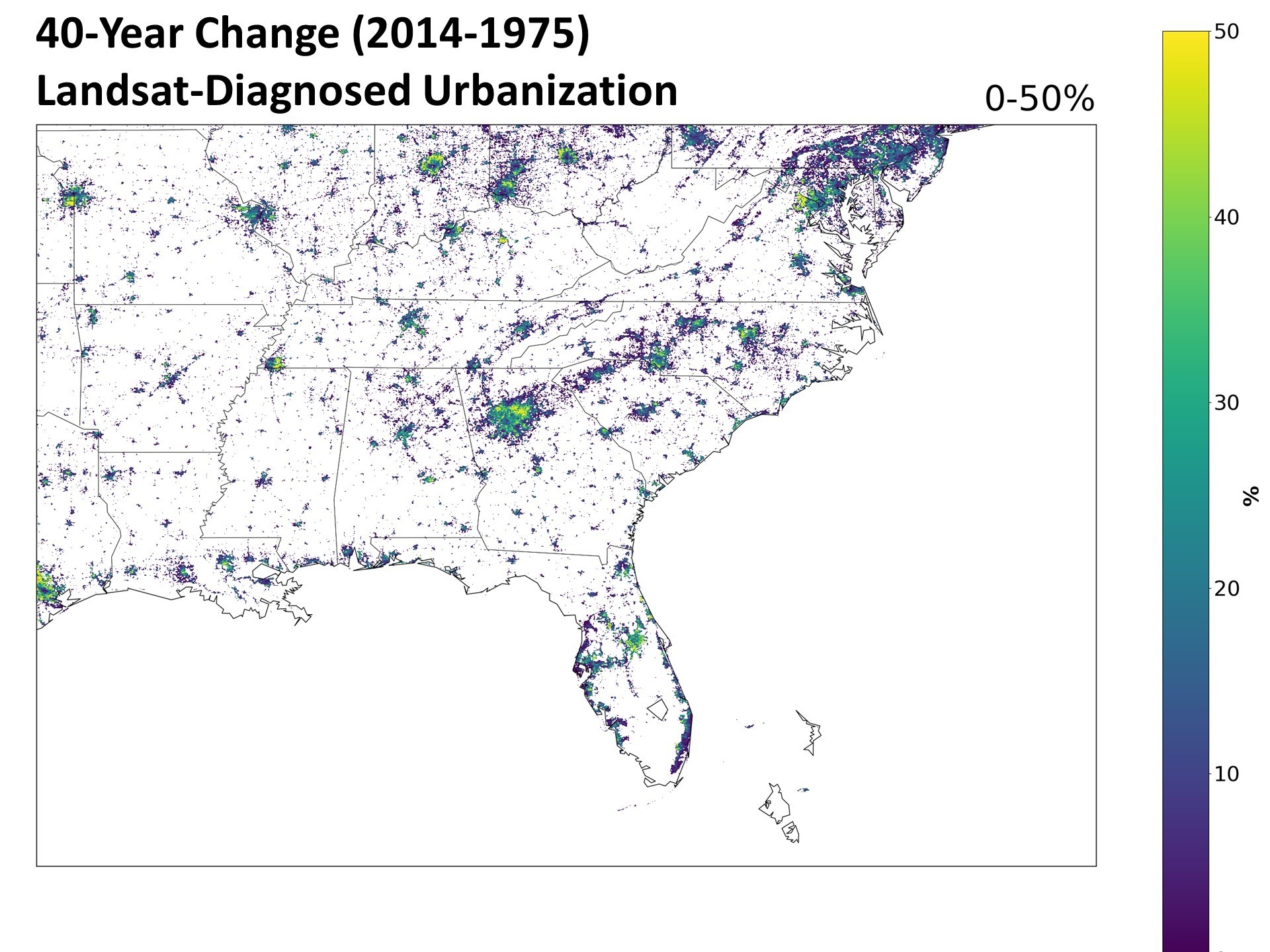
Next, I asked Danny Braswell to plot an image of the 40-year change in urbanization from this dataset over the southeast U.S. The result is shown in Fig. 1.

Close examination shows that there has been an increase in manmade structures nearly everywhere that human settlements already existed. I was somewhat surprised to see that these increases are also widespread in Europe, so that we can expect some of the results I summarize below might well extend to other countries.
Quantifying the Urbanization Effect on Surface Air Temperature
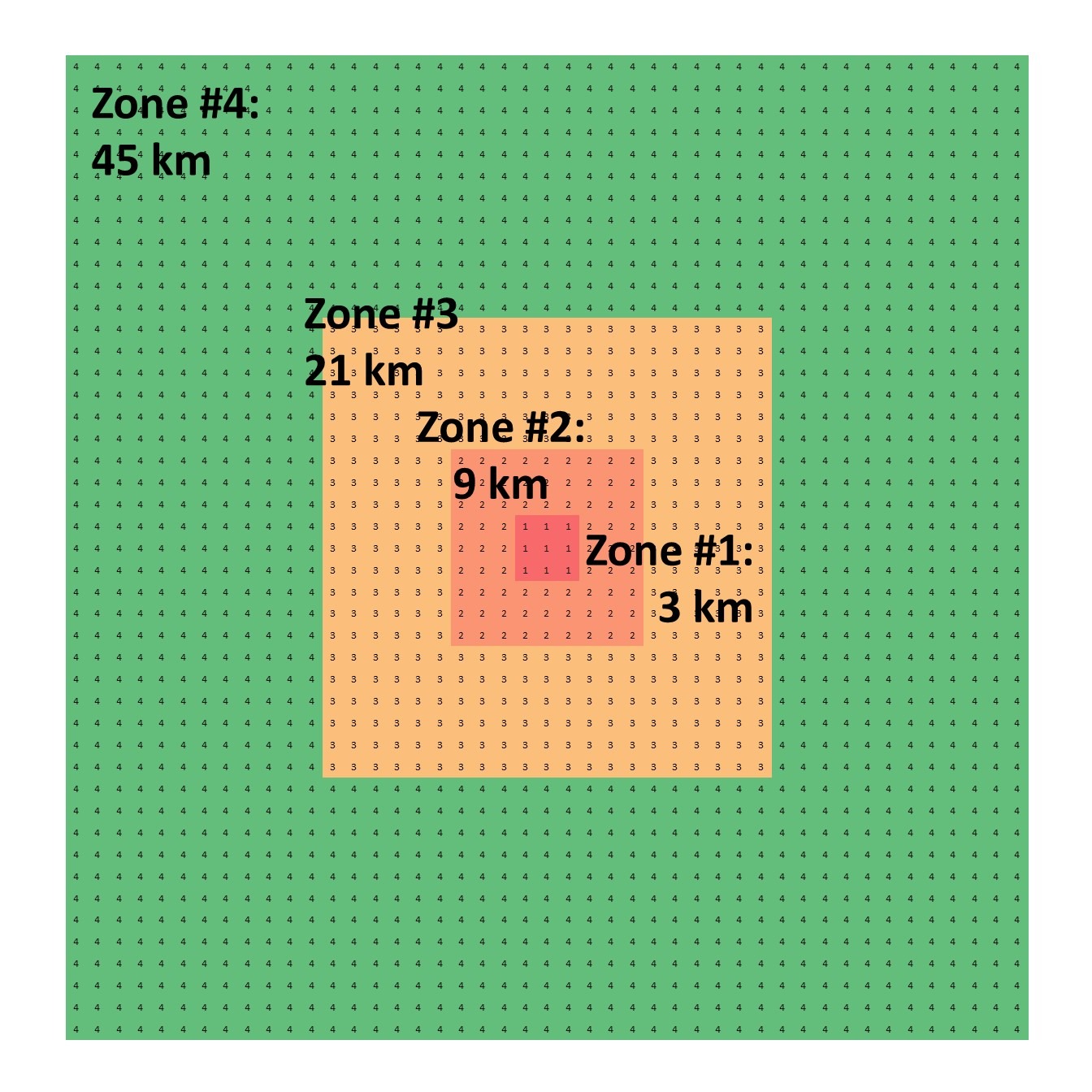
I took all hourly-reporting weather stations (ASOS and AWOS), mostly from airports, in the ISD dataset and for all stations having data at least as far back as 1973. I computed the temperature differences at 09 UTC (close to the daily minimum temperature time) between stations no more that 50 km apart, as well as differences in the Landsat Built-Up values (0 to 100). The Built Up datasets are from 4 separate years: 1975, 1990, 2000, and 2014. I used five years of temperature data centered on those four Landsat years for a total of 20 years of August average 09 UTC temperatures to compare to the corresponding four years of urbanization differences. After considerable experimentation, I settled on the four spatial averaging zones shown in Fig. 2 to compute those urbanization differences. This allows a determination of the magnitude of the UHI influence as a function of distance from the thermometer station location.

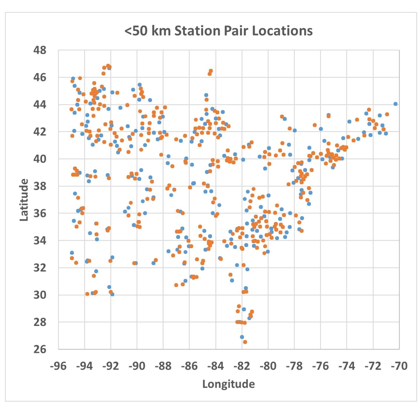
The station pairs used in the analysis are shown in Fig. 3 (sorry for the lack of state boundaries).

When the temperature differences are computed between those station pairs, they can be plotted against the Zone-average differences in urbanization as measured from Landsat. An example for Zone #3 is shown in Fig. 4, where we see the difference in closely spaced station temperatures is indeed related to the difference in Landsat-based urbanization, with some differences in temperature reaching 4 to 5 deg. C (up to 10 deg. F).
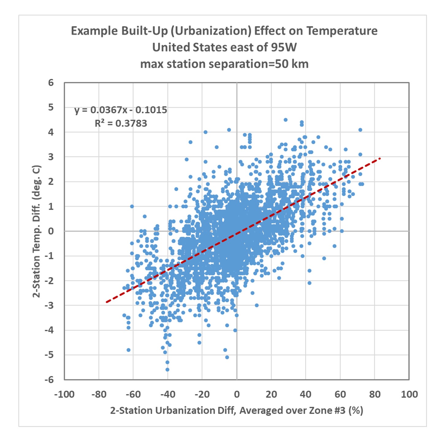
The actual algorithm to adjust temperatures uses not just the zone shown in Fig. 4, but all four zones of average Built-Up values in a multiple regression procedure. The resulting coefficients were:
Zone #1: +0.050 deg. C per 10% urbanization difference
Zone #2: +0.061 deg. C per 10% urbanization difference
Zone #3: +0.172 deg. C per 10% urbanization difference
Zone #4: +0.081 deg. C per 10% urbanization difference
The sum of these coefficients is 0.37 deg. C/per 10%, which is essentially the same as the regression coefficient in Fig. 3 for a single zone. The difference is that by using 4 averaging zones together, the correlation is improved somewhat (r=0.67 for the multiple regression), and we also get to see what regions of urbanization have the most influence on the temperatures. From the results above we see all of the averaging zones are important, with Zone 3 contributing the most to explaining the UHI effect on warming, and the 3×3 km zone closest to the thermometer has the last amount of information. Note that I have no information regarding the microclimate right next to the thermometer site (as Anthony uses), so if heat generating equipment was added in the vicinity of the thermometer over the 40 year period 1975-2014, that would not be quantified here and such spurious warming effects will remain in the temperature data even after I have de-urbanized the temperatures.
Application of the Method to Eastern U.S. Temperatures
The resulting regression-based algorithm basically allows one to compute the urban warming effect over time over the last 40-50 years. To the extent that the stations used in the analysis represent all of the eastern U.S., the regression relationship can be applied anywhere in that region, whether there are weather stations there or not.
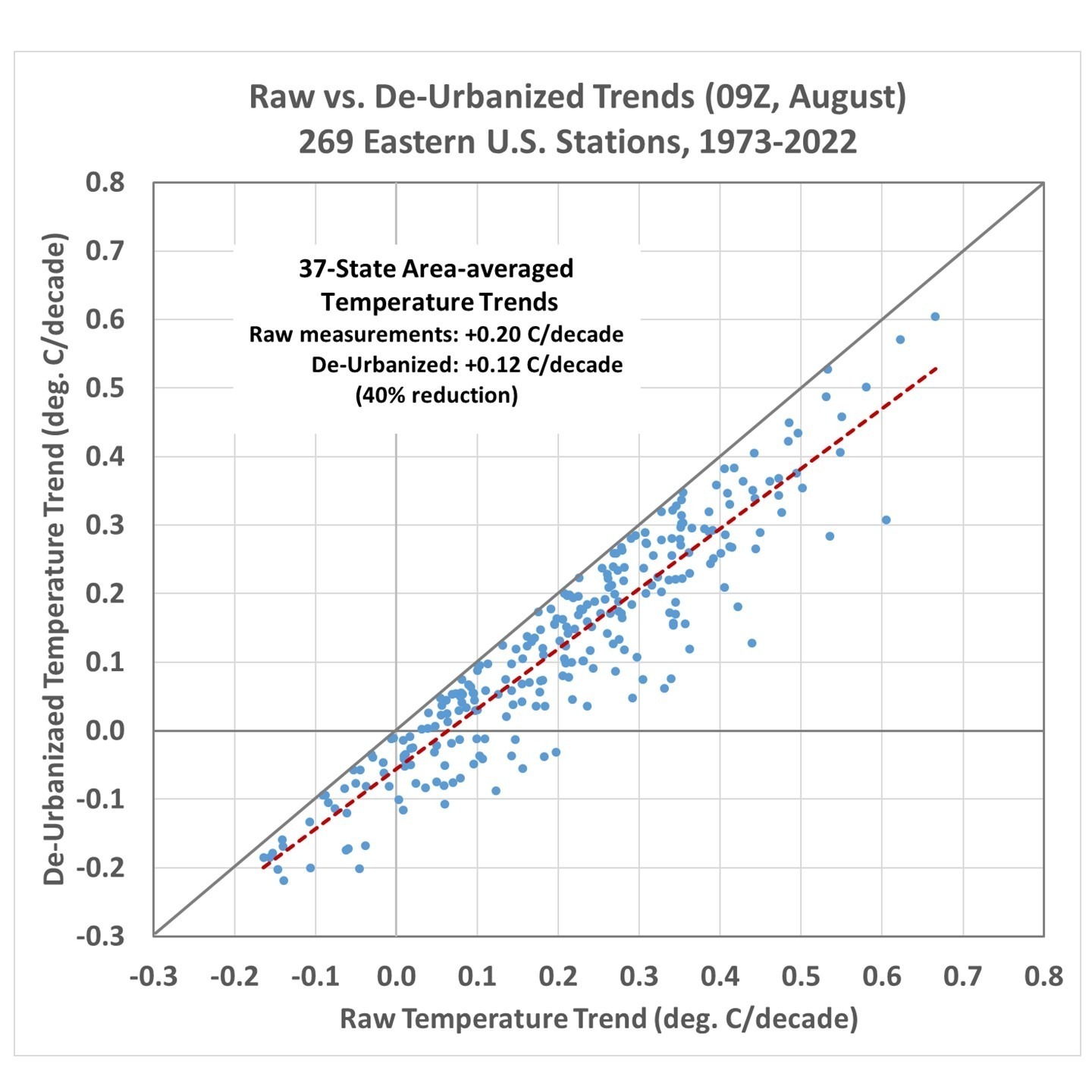
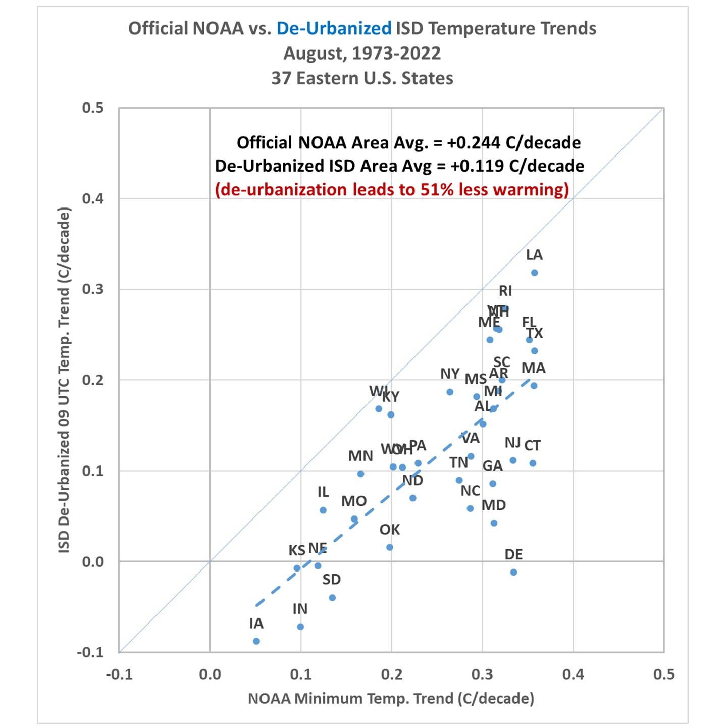
I applied the method to 269 stations having sufficient data to compute 50-year trends (1973-2022) for August 09 UTC temperatures, and Fig. 5 shows the raw temperature trends versus the de-urbanized temperature trends. When stations in each of the 37 states are averaged together, and the state averages are area-weighted, there is a 40% reduction in the average temperature trend for those 37 states.

For the reasons stated above, this might well be an underestimate of the full urbanization effect on eastern U.S. temperature trends.
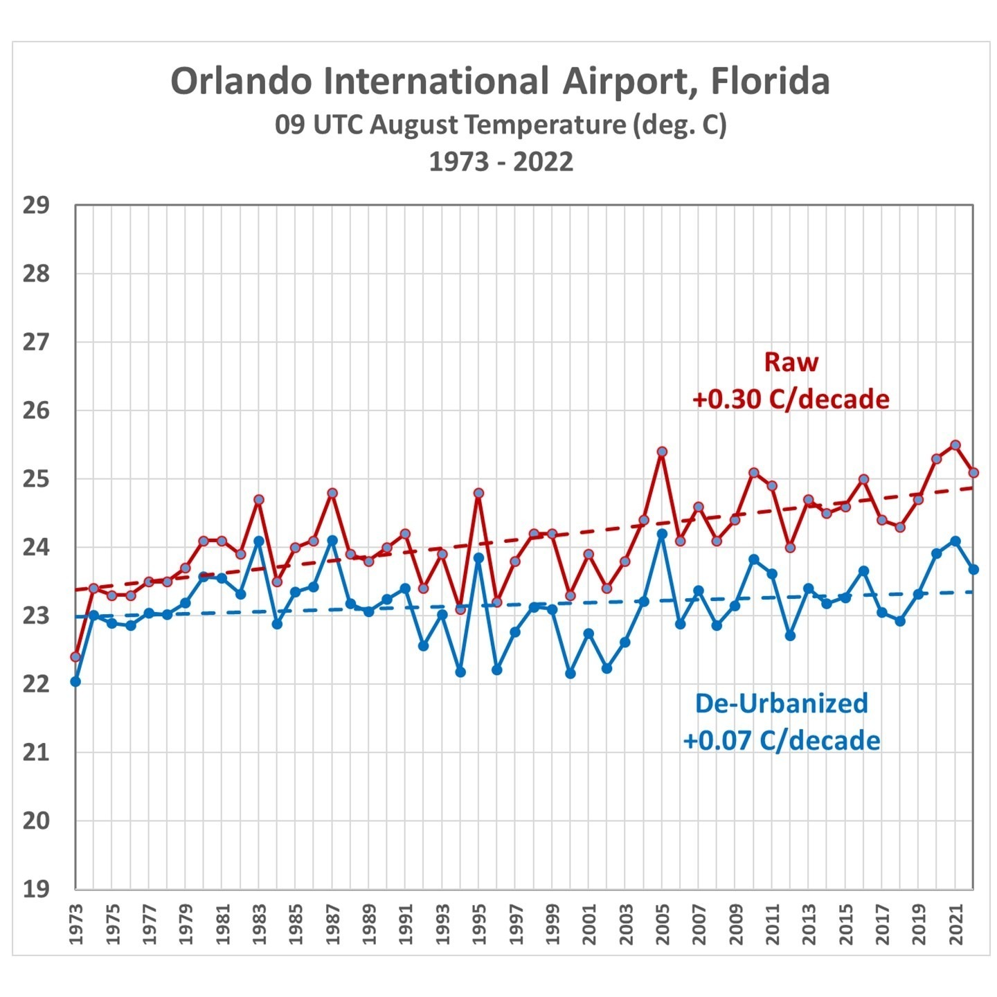
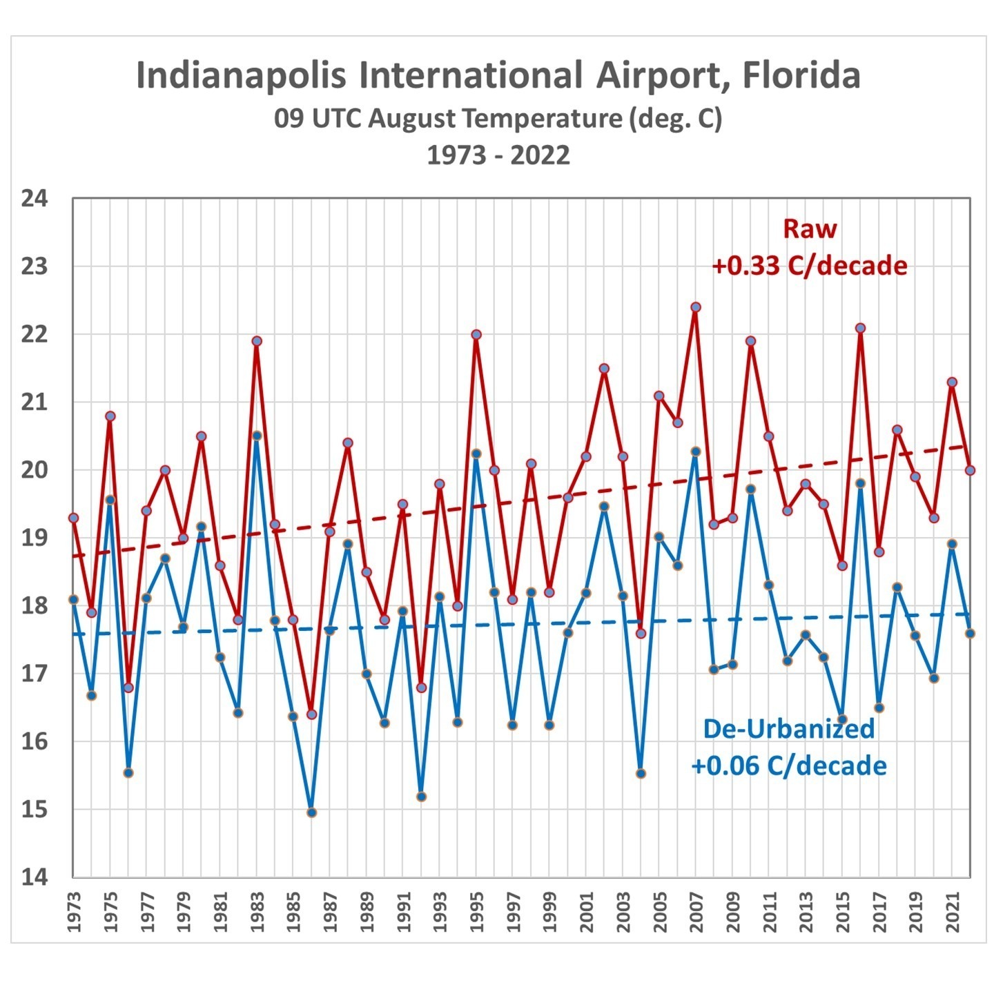
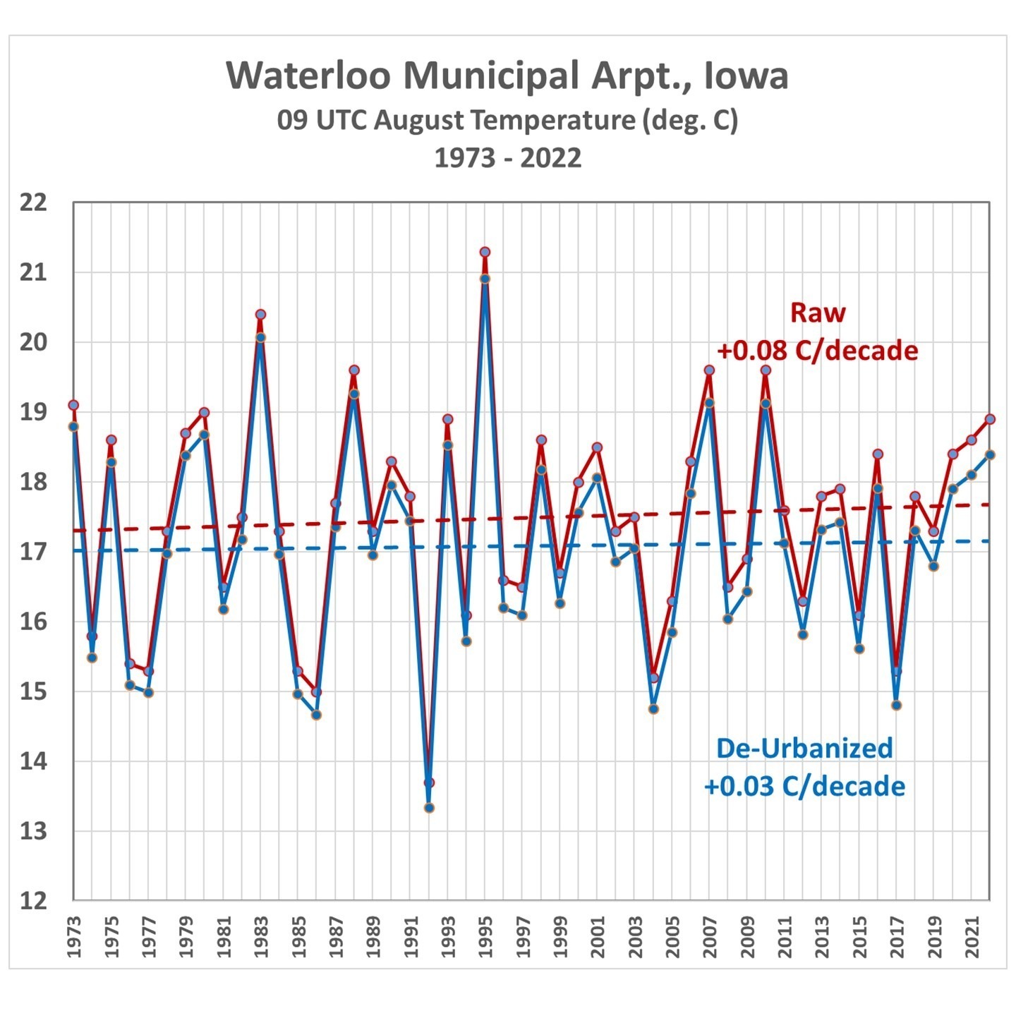
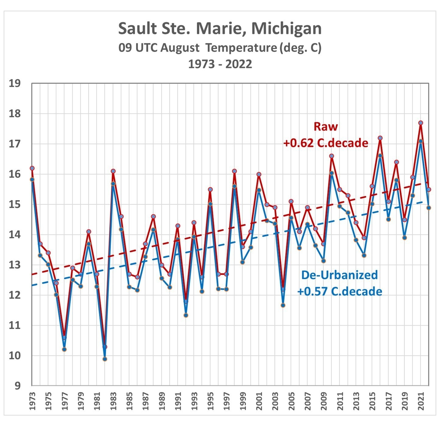
We can examine the temperature at some individual stations. For example, Figs. 6, 7, 8, and 9 show the raw versus de-urbanized temperatures at Orlando, Indianapolis, Waterloo (IA), and Sault Ste. Marie, (MI). Since I am only dealing with a single month (August) there are no seasonal effects to remove so we can plot actual temperatures rather than temperature anomalies.


Fig. 8. Waterloo, IA average August 09 UTC temperatures, 1973-2022, from raw hourly measurements and after Landsat-based de-urbanization adjustment.

(As an aside, while I was in the University of Michigan’s Atmospheric and Oceanic Science program, I worked summers at the Sault weather office, and made some of the temperature measurements in Fig. 9 during 1977-1979.)
How Do These Trends Compare to Official NOAA Data?
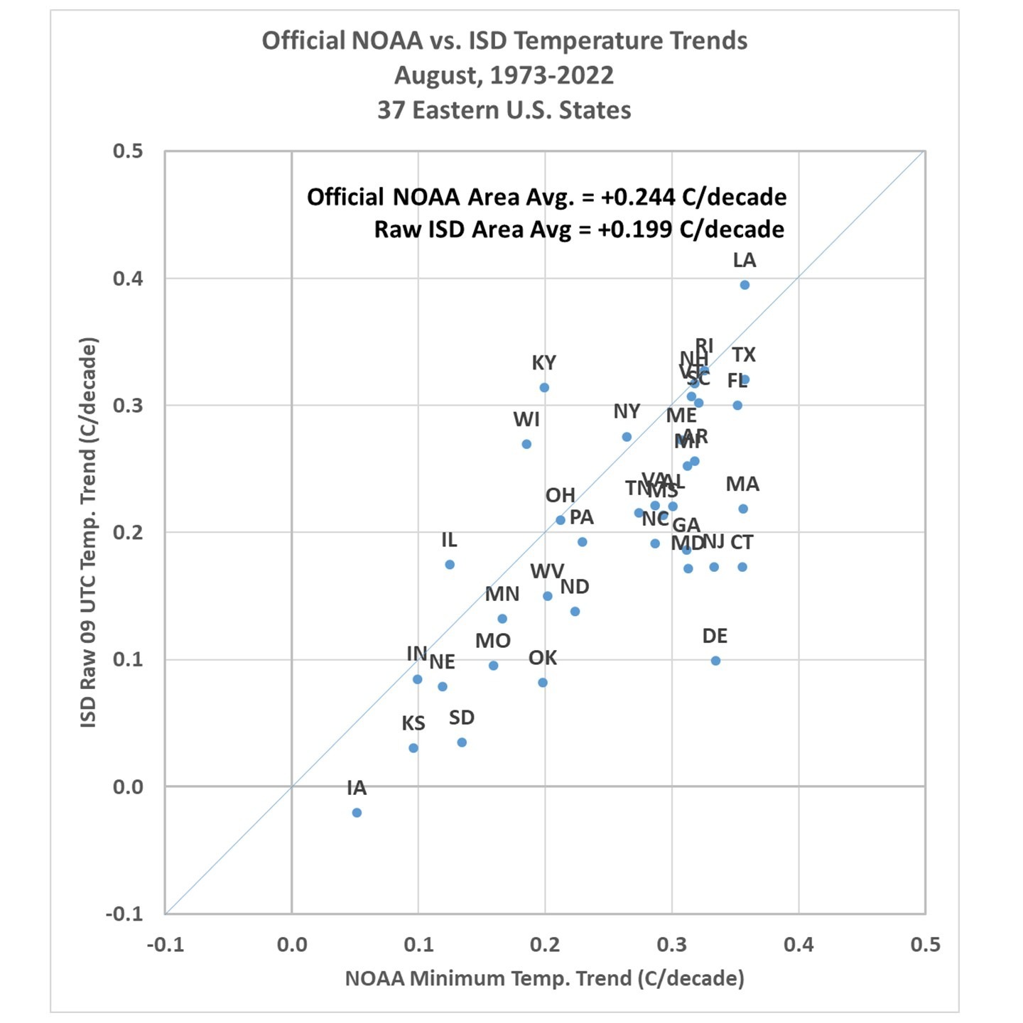
The statewide-average temperatures from NOAA’s Climate at a Glance website were compared to the corresponding statewide averages computed here. First let’s look at how the raw ISD trends compare to the NOAA-adjusted data (Fig. 10).

Note the official NOAA temperatures have an average trend higher than the raw ISD data trend (they are mostly independent data sources): +0.244 C/decade vs. +0.199 C/decade. Once the de-urbanization procedure is applied to the individual ISD stations, the results show an average trend fully 50% below that produced by the official NOAA product (Fig. 11).

Summary and Conclusions
There is much more I could show, but from the analysis I’ve done so far I believe that the Landsat-based “Built-Up” (urbanization) dataset, which extends back to the 1970s, will be be useful for “de-urbanizing” land-based surface temperature datasets, in the U.S. as well as in other countries. The methodology outlined here is straightforward and the regression statistics are robust (the regression coefficients are all significant, at the 3-sigma level or better).
The urbanization effect on surface temperature trends for August at 09 UTC (near the time of daily minimum temperature) results in a 50% reduction in those trends over the last 50 years. From some preliminary looks I have had at the data from other months and times of day I’d say this will likely be the upper limit of de-urbanization adjustments. So, it is likely that trends in daytime temperature near the time of the daily maximum will not be reduced nearly as much as 50%.
But given the fact that all CMIP6 climate models produce U.S. summer temperature trends greater than the NOAA observations means the discrepancy between climate models and observations is even larger than currently suspected by many of us. John Christy and I believe it is time for a new surface temperature dataset, and the methodology outlined above looks like a viable approach to that end.
Just tell it like it is. Why can’t they do that?
If temperatures are rising or falling, just tell us without “adjusting” the past or the present.
Then prove, prove, that Man is the cause and not just natural variations?
Is that lever to political clout worth the suffering, economically and actually, worth it? (People will die this winter because “Green Dreams” will cut off their heat.)
Are those promoting it so soulless that they think it is “worth it”?
A… another wicked solution to a purportedly hard problems, including: renewable profits, social progress, democratic dependence, etc.
Good questions
I think we all know the answers
Good use of global datasets – well done.
So humans are the cause of “global” warming. Or at least local warming.
Not much human activity in the Southern Ocean and it is cooling.
This is a question for every climate scientist – What is the average global surface temperature? That is where the consensus fails. They all agree that Earth goes to hell with 1.5C rise from 1850 level but cannot agree on the current global temperature.
There is no “global temperature”.
There is a manifestly ridiculous numerical construct based on very very inadequate, overly-adjusted readings from thousands of differently-calibrated sensors.
Medicine-man stuff has more to offer.
That is close to the point I was making. If there was such a reading then there would be a value that can be agreed.
If you ask 10 climate scientists what the global average temperature is now you would not get a single meaningful answer. But they can all guarantee that another 0.5C is the point of no return.
Tru dat Rick.
youjust made it subjection. agreement has nothing to do with it. scientists disagrred about the speed of light for centuries. that didnt mean it didnt exist.
most people including climate scientists fundamentally misunderstan what a global average is.
its not a reading or a measurement. its technically a prediction. mathmatically its a prediction.
a prediction like 15.34C which means you predict that
IF you randomly select 1000 locations on the surface and measure with a perfect instrument. 15.34C will minimize your prediction error.
its a prediction.
when i say the LIA was cooler what do i mean?
i mean. pick any spot you like, 250 years ago that same spot was cooler
when i tell you the sun is warmer than the earth. i mean
pick any spot on either the temp of the sun will be warmer.
the average solar temp is greater than the average earth temp.
if i tell you the average swede is taller than the average chinese what does that MEAN?
operationally?
you guys think averages means add numbers and divide by n.
nope
there is no global temperature. the sun isnt hotter than the earth.
global temp in the LIA was not cooler.
global average is the global expectation! the temperature we expect to sample
if we sample a random x,y, 0 elevation.
thats what we mean by global temp. the EXPected value we will record with a perfect instrument to an arbitarily precise figure if we sample at any surface location
Interesting new approach. Would like to see all of US, and separately Europe.
After some years of struggling with UHI, and microsite issues as revealed by the surface stations project, I concluded in essay ‘When Data isn’t’ in ebook Blowing Smoke that the surface temp data wasn’t fit for climate purpose and not fixable via homogenization—no matter what NOAA and NASA claim.
That left two ‘sparse’ poor alternatives. 1. The new pristine CRN network, but it’s record is short. 2. Use just the good surface stations; but that is just the US, not the world.
And one good coverage inference alternative, the methodologically transparent UAH satellite lower troposphere record, which is both long enough and global. And it shows major forward divergence (less warming by about half) from CMIP4, 5, 6 hot running models despite their being tuned to best hindcast.
Satellite data is a sufficiently long record from a team whose only agenda is science
Is it significant, that the de-urbanised trend is very close to your long term trend for the satellite LT data?
Highly.
I had not even looked yet, so I don’t know…. I guess because I didn’t expect them to be that close.
Davidf. This was my thought as well. If Dr. Spencer performed this analysis on a global basis, I would be very interested to see how the results compare with the satellite record.
I would call it an independent path and therefore a reasonable reality check. The fact they are so close adds weight to both. It also retracts from the model outputs generated by the IPCC. They match nothing except (to a certain extent) each other.
It is a fine piece of work and deductive thinking.
Roy! I’m so glad you are finally acknowledging you friend Anthony Watts incredibly important research on NOAA temperature monitoring stations. I’ve always thought that your Warmist philosophy was too skewed to the Climate Alarmists. I was a Navy pilot with the Naval Oceanogrsphic Office during the mid 1970s and did a lot of Arctic, Antarctic, deep ocean eddy current, worldwide Vector Magnetic mapping, and hurricane research flying. But, particularly for the Arctic and Vector Magnetic research flying, I remember so many remote temperature monitoring stations that were available during the 1970s that simply disappeared over the next couple of decades. In many cases, NOAA simply dropped dozens of perfectly good (high quality, met NOAA standards) remote monitoring stations from the database and simply replaced them with computer generated data between two or more urban Heat Islands–invariably plugging in values that were much higher than reality to push a political global warming narrative!
I’ve always considered Anthony’s surface stations project to be important, and have told him so several times over the years. He knows this.
That is James Hansen’s doing, as well as the “adjustments” plus “Infilled data” from smudging two thermometers up to 1,200 km apart for their global temperature data base.
UAH did their “smudging” up to 4170 km apart [Spencer & Christy 1992].
It would be an interesting project to look t just the data north of 50 N for the Cold War period when there was the DEW Line in the arctic. Since they moved the NWS Office from the Soo to Gaylord, which station’s data did you use?
We rely on faith in the context of claims for which there is no sufficient sensory evidence. Such is the nature of climate change. I am not certain anymore that scientific arguments can persuade on this issue. The subject seems to align more closely with social, psychological and emotional factors. On the subject of values and morality, more-so than evidence and logic.
“social, psychological and emotional factors”
In other words, a religious cult.
Sales 101
Let me propose that an entirely new method be used. If one examines the temperature curve during the daytime, it approximates a sine wave. The average of a sine curve from 0 to pi = about (064 • Tmax). The curve from sunset to Tmin is an exponential decay. More investigation will be needed to determine the appropriate value for determining what the “average” should be. I would guess somewhere between 0.5 and 0.65. This would provide a much better average temperature than the current mid-range value of Tmax – Tmin.
It is time we began to move on from twice daily temperature readings to something where the upgrade to hourly, minute, and second availability of temperatures exerts some more accurate scientific measurement capabilities on the subject of climate science. It might even teach some people about basic calculus.
I should point out that tide gauges don’t attempt to catch every wave and ripple. They purposely build dampening into the gauges to physically perform a low-pass filter.
But in the case of a sine, one only needs to know the peak of the positive cycle to calculate an average or mean value of the sine wave from 0 to π.
Don’t get me wrong, I only used “average” because of tradition! If I had my druthers we would move to a system like heating/cooling degree days where temps are integrated to obtain a useful summary of the entire curve, both during the day and at night.
Here is a very good site.
https://www.degreedays.net/calculation
It:
1. Uses integration for the totals rather than some bastardized mid-range.
2. Recognizes and discusses accuracy/uncertainty
3. Makes one choose an optimum temperature
4. Better view of heat/cold over a total day rather than a simple mid-range
Jim, this is so wrong… And I’m sure many people have already pointed this out to you. The average is not the midrange value between Tmax and Tmin, and this is not how they calculate it. In the old days they used max-min thermometers, so these two values were the only ones they essentially had. Nowadays they have a set of readings with a uniform time interval, like 1 hour or 30 mins, or even less. Now this is a sampling of a curve that usually looks like a sine wave but it is not, and they don’t use any ad hoc approximation (0.64Tmax and the like). The simple sample-average is actually a very good approximation of the daily average at that particular point, etc.
Good to see this subject talked about. I have been critical of the global datasets starting in 1991-92
http://www.warwickhughes.com/cru86/
It is well proven that tiny townships under 1,000 population have easily measurable UHI in calm conditions and flatish terrain. Such as –
Two degrees C Urban Heat Island in small village of Barmedman, NSW, Australia
http://www.warwickhughes.com/blog/?p=575
FWIW, on the BBC WX forecasts here in Scotland it is common, particularly in winter, for the forecaster to say that “the temperatures shown are for built up areas and will probably be several degrees lower in the countryside.”
My own personal experience of ten years living in rural France agrees with you, villages of 600-1000 people 7km (4 miles) apart with scattered farms between. Cyclying round on still afternoons in summer and every village was noticably warmer than the surrounding countryside.
The corollary is that on days with a bit of a breeze that warmth would be distributed into the surrounding countryside and I’ve no idea, but would like to know, if that has a measurable impact and over what area.
Temp stations have two problems in the urban environment. One is the local heat sources around the immediate area of the station such as parking lots and air conditioners. The second is the UHI effect which again reflects local heat sources vs weather. I was thinking along the same lines as this comment. The UHI should be considered a broad heat source not only to the local area but potentially the surrounding rural areas, depending on wind direction and other weather conditions. If an area has a preferred direction from the urban station to the rural station, they are both elevated. It is really all about tracking the energy flow, not the measured temperatures alone. As mentioned in a later comment, starting with wet bulb measurements would help. It is a difficult problem, but doable. Maybe starting with one or two urban areas and doing a thorough analysis to see where that leads. Depends on if your goal is to get better answers or is what we have good enough for the politics that mostly fund these efforts. Hurray for the guys that like to tinker around like in this article on their own.
I live in a medium sized city and have noted for years the thermometer out my window is usually 5 degrees warmer than what I hear reported on the radio from the airport on the outskirts of town. Even that measuring station has some of the siting issues Anthony has written about.
GISTEMP global surface temperature observations from 1979 show warming faster than the satellite UAH observations but RSS satellite is warming faster than both.
https://www.woodfortrees.org/plot/gistemp/from:1979/trend/offset:-0.13/plot/uah6/trend/offset:0.35/plot/rss/trend/offset:0.2
UAH global land only trend is almost identical to GISTEMP global land + sea surface.
https://www.woodfortrees.org/plot/uah6-land/trend/offset:0.5/plot/gistemp/from:1979/trend:-0.2
A lot depends on data processing and interpretation apparently.
RSS specifically corrected their dataset to match GISTEMP.
Old news.
Compiler of RSS Carl Mears has stated: “surface temperature datasets, which I consider to be more reliable than satellite datasets” apparently because “they certainly agree with each other better than the various satellite datasets do!”. https://www.remss.com/blog/recent-slowing-rise-global-temperatures/
Which is a bit rich, he is perfectly entitled to describe his series (RSS) as unreliable if he wishes but not to similarly cast doubts on the UAH series.
He’s talking about “various satellite datasets” here. He’s saying they’re all less reliable than surface datasets. No exception was granted to UAH that I saw. And I happen to agree with him. I did a type A evaluation of the uncertainty of RSS/UAH and HadCRUT/GISTEMP/BEST/ERA. The satellite datasets were ±0.16 C as compared to the surface datasets of ±0.07 C.
BTW…don’t hear what I didn’t say. I didn’t say satellite datasets like UAH are unreliable or useless.
Yes that is what my critical comment was about.
Did you interpret that as “various satellite datasets except UAH”?
Bdgwx,
That figure of 0.07 was laughed out of court by comments to the WUWT article by Tom Berger and me a fortnight ago.
Dominant message: you cannot use the statics of repetitive measurements of a single population for these routine daily near-surface temperatures. You are sampling a different population at each weather station. The uncertainty is more like +0.7/-0.4 deg C.
This bigger uncertainty is supported by practical people doing actual measurements.
The tiny value you quote is a pure mathematics construct that cannot be attained in practice, even in the special laboratory conditions of national standards laboratories working with water tank stability and thermometer performance. I have asked them. You also can, if you continue to disbelieve.
Geoff S
GS said: “That figure of 0.07 was laughed out of court by comments to the WUWT article by Tom Berger and me a fortnight ago.”
You mentioned my type A evaluation of uncertainty for HadCRUT/GISTEMP/BEST/ERA in an article? Can you post a link to that article? I’d like to review it if you don’t mind.
GS said: “Dominant message: you cannot use the statics of repetitive measurements of a single population for these routine daily near-surface temperatures.”
The GUM says you can. In fact the GUM calls this a type A evaluation.
GS said: “You are sampling a different population at each weather station.”
Not even close.
GS said: “The uncertainty is more like +0.7/-0.4 deg C.”
So why do HadCRUT, GISTEMP, BEST, and ERA agree with each to within 0.07 C 95% of the time?
GS said: “The tiny value you quote is a pure mathematics construct that cannot be attained in practice”
And yet that was the result of the type A evaluation of uncertainty. I encourage you to download the data, put them on a common baseline, and perform the type A evaluation per GUM section 4.2. If you get a significantly different result let me know.
ATheoK said: “RSS specifically corrected their dataset to match GISTEMP.”
We can test that hypothesis with a Pearson correlation coefficient test. If RSS corrected their dataset to match GISTEMP then we should expect an R^2 = 1.0. I actually get R^2 = 0.84. As a point of comparison the test of correlation between UAH and RSS yielded R^2 = 0.89. In other words, RSS matches better to UAH than it does GISTEMP.
Here is a composite of 8 datasets including 2 satellite, 1 radiosonde, 1 reanalysis, and 4 traditional.
Thanks for the analysis.
It is a brilliant paper. The local example here is in Bendigo, Australia where BOM moved the weather station from a site on a hill next to the Bendigo Gaol which received a lot of the prevailing westerly to the airport that was in a depression and a rain shadow. An abrupt leap in average temperature readings took place.
The siting of the local weather station raises an interesting point. . Last summer I did a traverse across Bendigo and noted a car temperature change of 2C. For the return journey, the temperature reverted to that of the reading at the start of the trip. Rough and ready for sure but it did raise an interesting issue. How representative is the site of an automatic weather station when variations such as this can be readily observed?
That brings me to the next point. Should there be a greater emphasis on wet bulb temperatures (recording energy) rather than on a plethora simple temperature recordings (recording heat).
As far as I can see there are few attempts at developing energy trends – is this too difficult?
Dr Spencer, I like you reasoned approach to find out how much UHI is effecting the temperature records. You mentioned “I have been trying to use datasets that can be applied globally, since it is impractical to visit and examine every weather observation site in the world.” I think that there should be enough money to do exactly that (examine every weather station). Somewhere I remember NOAA or NASA saying there were about 32,000 temperature measurement stations. If we redirected the $400 Billion the “Inflation Reduction Act” directed to green energy, that would fund grants of 12.5 million dollars per station for enterprising grad students. Of course, Anthony Watts and his crowd-sourced surface stations voluteers should get funded the $12.5 billion for their efforts already undertaken. We’re just spending the money in the wrong place.
In the 1970s, there were no buildings in Philadelphia taller than the brim of William Penn’s hat.
Now, the city is beset by ever more skyscrapers.
Dr Spencer, the exaggerated trends you show are less, sometimes much less than the warming of semi-enclosed water bodies. For example, sea surface temperatures at the fashionable Sharm el Sheikh resort are rising at twice the average warming rate of the world ocean.
I lack the skills to extend that observation to the world datasets, but surely there must be some significance in the fact. The fastest warming water body I’ve seen is the Sea of Marmora.
Those trying to counter the hysteria of COP27 might wonder what is happening to warm the North Sea, Lake Michegan, Lake Tanganyika, the Eastern Mediterranean etc so rapidly. My suggestion is that oil and surfactant spills are lowering albedo and reducing evaporation. Phytoplankton blooms fed by sewage and farming run off may be a factor.
Science and data are not enough – this is a battle against ideologically driven propaganda. As our rulers cavort in the Red Sea it would be good to teach them something of the complex reality that means they swim in strangely warm waters.
JF
I don’t understand the purpose of this work
First of all, there is no UHI for the oceans, 70% of the planet
There is some UHI for some of the land surface weather stations
But the increase of UHI would be very hard to measure — you’d have to sample individual urban stations and compare them with nearby rural stations over a long period of time. But the rural stations could have a UHI effect from economic growth in their vicinity. And an urban station could have no change in UHI over many decades. This gets very complicated.
Instead of worrying about small changes of UHI, over long periods of time, at some land weather stations, how about the BIG problems with surface temperature “data”:
Infilling
Frequent adjustments and readjustments to raw data
Big changes to historical data (1940 to 1975 cooling almost “disappeared”)
Claims to know a global average with few Southern Hemisphere measurements, especially before World War II
Finally, even if historical temperature data were extremely accurate, why would that matter? CAGW scaremongering is not based on historical temperature data. Predictions are for a much faster rate of global warming than past observations. Past observations don’t seem to matter.
Not UHI but water bodies can experience LPW, local pollution warming. I’ve no idea how significant it is but it is definitely a thing.
JF
(who is beginning to sound like David Icke, so have a look at Ruf and Evans Cygnss data.)
Richard,
Maybe there is no UHI over the oceans, but that is not the problem.
The problem is that there has been no temperature measurement over the oceans until recent times.
There are many “measurements” that are guesses or extrapolations, sometimes over vast distances.
What methodology do you suggest to detect UHI from numbers that are guesses?
Geoff S
This article is quantitative enough to be submitted to a journal. Actually WUWT is almost a journal and its peer review environment is a hell of a lot better than the “pal review” process used by today’s journals.
There is probably a figure out there for the energy consumed (to degrade to heat in most cases) per square mile of built up area there could be a simple correlation between heat created and temp increase
Great work Roy! Indeed there is a critical need for land surface temperature data set that reliably accounts for urbanization effects.
Am I wrong in thinking we can filter out a lot of the UHI effect by using only Tmax, rather than trying to compute Tavg? My guess is UHI will have a much bigger impact on Tmin due to heat retention than it will on Tmax.
Why do we want to filter out the UHI effect in the first place?
Because it inserts a demonstrably false bias in the temperature record which has resulted in terrible, wasteful policy decisions that have negatively affected energy costs and security. Your mileage may vary.
Perhaps you can show how that works exactly with a trivial example. Consider a 3×3 grid where each cell has a temperature of 15 C and where each cell is completely rural. Then 100 years later 8 cells remained rural with a temperature of 17 C and 1 cell urbanized with a temperature of 19 C. What is the warming rate? What is the bias (or error) in that warming rate caused by the urbanized cell? How did the urbanized cell cause the error?
Well done Dr Spencer. It’ll be ignored by the corporate climatic-scare industry, but perhaps eventually your methods may catch on or guide others.
We have data sets from space older than that, from Nimbus 1, 2, and 3. The High Resolution Infrared Radiometer had a 8 km resolution at the time. We updated their data to CSDF-4 format.
This is why I don’t think government should be in charge of things. If a private organization did this kind of sloppy dishonest work they would be out of business in a heartbeat if not taken to court for malpractice or fraud or whatever. Who is responsible for regulating and checking the government’s work? The government. No one should be trusted to self regulate, this example is proof positive why it is a bad bad idea.
Fascinating, Dr. Spencer, what a couple of guys can do vs the entire might of the Federal government. Other than Leftist propaganda, what the hell are we paying those people in NOAA and NASA for? We ought to do an Elon Musk and get rid of at least 50% of them. Another smart move would be to scatter all agency headquarters throughout the U.S. into small and medium sized cities, along with their employees. Leave DC as the center of government, not a collection of Deep State vipers.
It’s definitely much warmer from D.C to Boston since 1970. The area has seen massive population growth and has urbanized into a megalopolis. Air conditioning and lighting have advanced dramatically since the late 1970’s and black top is everywhere. I live 8 miles outside of Reading PA in in the wooded hills. It is always 6 degrees cooler and in the summer hot months, it can be 10-11 degrees cooler than Reading. Reading is a black top and roof top heat parabola. Light travels much farther than radiant heat but light is a good measurement of the growth of Urbanization. In Arlington VA in the 1970’s the Milkyway could be seen on any clear night. Now there are very few isolated areas on the East Coast the Milkyway can be seen. There is obviously a heat sink bias in the land station temp measurement. What about the Satellite atmospheric temperature measurement?
the problem is station location data is not good enough to do this analysis roy
Mosh:
What do you mean, “ station location data is not good enough to do this analysis”? Since you haven’t specified, I’ll respond to what I think you might have meant… Clearly, the data I presented shows there is considerable UHI signal *averaged over all station pairs*. It’s not meant to be optimized for every location, only meant to quantify and remove the *average* UHI temperature effect for a specific region.
A few very detailed UHI studies have been done for major cities (e.g. Atlanta, Minneapolis), but if we have to wait for detailed, high-resolution studies of every city and town to be done, we will never have a way to correct land-based temperature trends for UHI effect.
What I show is a relatively simple method that can be applied anywhere in the world where there are a sufficient number of closely-spaced stations with different levels of urbanization to get a relationship.
-Roy