By Thomas Berger and Geoffrey Sherrington.
…………………………………………………..
Please welcome co-author Tom Berger, who has studied these Australian temperature data sets for several years using mathematical forensic investigation methods. Many are based around the statistics software SAS JMP.
Please persist with reading this long essay to the end, because we are confident that there is a mass of new material that will cause you to rethink the whole topic of the quality of fundamental data behind the climate change story. I found it eye-opening, starting with this set of temperatures from the premier BOM site at Sydney Observatory. Supposedly “raw” data are not raw, because identical data are copied and pasted from July 1914 to July 1915.

This has happened before the eyes of those who created the homogenised version 22 of ACORN-SAT, released late in 2021. It signalled the opening of a Pandora’s Box, because this is not the only copy and paste in the Sydney “raw” data. See also June 1943 to June 1944 (whole month), December 1935 to December 1936 (whole month, but 2 values missing in 1935 have values in 1936).
Tom has argued to me that –
“The strategy of getting people to respect the scientific way is a lost cause I am afraid. The idea is to show various things and let them come to the conclusion by themselves!!! This is vital.”
This goes against my grain as a scientist for many years, but doing what open-minded scientists should do, we shall accept and publicise Tom’s work. Tom is suggesting that we go more towards countering propaganda, so let us do that by starting with the topic of “raw” temperature measurements. This leads to what “adjusted” temperatures can do to intellectual and mathematical purity. Then Tom will introduce some methodologies that we are confident few readers have seen before.
For these temperatures, “raw” data is what observers write down about their daily observations. I have visited the Library of the Bureau of Meteorology in Melbourne and with permission, have photographed what was shown as “raw” data. Here is one such sheet, from Melbourne, August 1860. (I have lightly coloured the columns of main interest.)
http://www.geoffstuff.com/melborig.jpg
The next month, September 1860, has quite different appearance, suggesting monthly tidy-up processes.
http://www.geoffstuff.com/nextmelborig.jpg
Those who have taken daily measurements might feel that these sheets are transcriptions from earlier documents. I do. The handwriting changes from month to month, not day to day. Transcriptions are fertile ground for corrections.
Apart from adjustments to raw data, “Adjusted” data as used in this essay almost always derives from the ACORN-SAT homogenisation process used by BOM. This has four versions named in shorthand as V1, V2, v21 and v22 for Version 1, version 2. Version 2.1 and version 2.2. Maximum daily temperatures and minima are abbreviated as graph labels in the style minv22 or maxraw, to show but 2 examples. Most of the weather stations are named by locality like nearest town, with the ACORN-SAT stations listed in this catalogue.
http://www.bom.gov.au/climate/data/acorn-sat/stations/#/23000
The ACORN-SAT adjustment/homogenisation process is described in several BOM reports such as these and more –
http://www.bom.gov.au/climate/change/acorn-sat/documents/About_ACORN-SAT.pdf
http://www.bom.gov.au/climate/data/acorn-sat/documents/ACORN-SAT_Report_No_1_WEB.pdf
Without the truly basic, fundamental, raw evidence such as original observer sheets that I have sought without success, I now turn to Tom for his studies of available data to see what more is found by forensic examination.
………………………………………………………………………..
Australian Climate Data used for creating trends by BOM is analysed and dissected. The results show the data to be biased and dirty, even up to 2010 in some stations, making it unfit for predictions or trends.
In many cases the data temperature sequences are strings of duplicates and replicated sequences that bear no resemblance to observational temperatures.
This data would be thrown out in many industries such as pharmaceuticals and industrial control. Many of the BOM data handling methodologies are unfit for most industries.
Dirty data stations appear to have been used in the network to counter the scarcity of the climate network argument made against the Australian climate network. (Modeling And Pricing Weather-Related Risk, Antonis K. Alexandridis et al)
We use a forensic exploratory software (SAS JMP) to identify plausibly fake sequences, but also develop a simple technique to show clusters of fabricated data. Along with Data Mining techniques, it is shown causally that BOM adjustments create fake unnatural sequences that no longer function as observational or evidential data.
“These (Climate) research findings contain circular reasoning because in the end the hypothesis is proven with data from which the hypothesis was derived.”
Circular Reasoning in Climate Change Research – Jamal Munshi
BEFORE WE BEGIN – AN ANOMALY OF AN ANOMALY.
A persistent myth:
“Note that temperature timeseries are presented as anomalies or departures from the 1961–1990 average because temperature anomalies tend to be more consistent throughout wide areas than actual temperatures.” –BOM (link)
This is nonsense. Notice the weasel word “tend” which isn’t on the definitive NASA web site. BOM is attempting to soften the statement by providing an out. Where weasel words such as “perhaps”, “may”, “could”, “might” or “tend” are used, these are red flags that provide useful areas for investigation.
Using an arbitrarily chosen average of a 30 year block of temperatures, an offset, does not make this group “normal”, nor does it give you any more data than you already have.
Plotting deviations from this arbitrarily chosen offset, for a limited network of stations gives you no more insight and it most definitely does not mean you can extend analysis to areas without stations, or make extrapolation any more legitimate, if you haven’t taken measurements there.
Averaging temperature anomalies “throughout wide areas” if you only have a few station readings, doesn’t give you any more an accurate picture than averaging straight temperatures.
THINK BIG, THINK GLOBAL:
Looking at Annual Global Temperature Anomalies: Is this the weapon of choice when creating scare campaigns? It consists of averaging nearly a million temperature anomalies into a single number. (link)
Here a summary graph from the BOM site dated 2022 (data actually only to 2020).

The Wayback website finds the years 2014 and 2010 and 2022 from the BOM site. Nothing earlier was found. Below is the graph compiled in year 2010.

Looking at the two graphs you can see differences. These infer that there has been warming, but by how much?
Overlaying the temperature anomalies compiled in 2010 and 2020 helps.

BOM emphasise that their adjustments and changes are small, for example:
“The differences between ‘raw’ and ‘homogenised’ datasets are small, and capture the uncertainty in temperature estimates for Australia.” -BOM (link)
Let’s test this with a hypothesis: Let’s say that every version of the Global Temperature Anomalies plots (2010, 2014, 2020) has had warming added significantly at the 95% level (using the same significance levels as BOM).
The null or zero hypothesis is that the distributions are the same, no significant warming has taken place between the various plots.
Therefore, 2010 > 2014 <2020.
To test this we use:
A NONPARAMETRIC COMBINATION TEST.
This is a permutation test framework that allows accurate combining of different hypotheses. It makes no assumptions besides the observations being exchangeable, works with small samples and is not affected by missing data.
Pesarin popularised NPC, but Devin Caughey of MIT has the most up to date and flexible version of the algorithm, written in R. (link). It is also commonly used where a large number of contrasts are being investigated such as in brain scan labs. (link)
“Being based on permutation inference, NPC does not require modelling assumptions or asymptotic justifications, only that observations be exchangeable (e.g., randomly assigned) under the global null hypothesis that treatment has no effect. ” — Devin Caughey, MIT
After running NPC in R, our main result:
2010<2014 results in a p value = 0.0444
This is less than our cut-off of p value = 0.05 so we reject the null and can say that the Global Temperature Anomalies in the plots 2010 and 2014 have had warming significantly added to the data, and that the distributions are different.
The result of 2020 > 2014 has a p-value = 0.1975
We do not reject the null here, so 2014 is not significantly different from 2020.
If we combine p-values using hypothesis (2010<2014>2020 i.e. increases in warming in every version) with NPC, we get a p-value of 0.0686. This just falls short of our 5% level of significance, so we don’t reject the null, although there is evidence supporting progressive warming on the plots.
The takeaway here is that Global Temperature Anomalies plots have been significantly altered by warming up temperatures between the years 2010 and 2014, after which they stayed essentially similar. The question is, do we have an actual warming or a synthetic warming?
I SEE IT BUT I DON’T BELIEVE IT….
” If you are using averages, on average you will be wrong.” — Dr. Sam Savage on The Flaw Of Averages
As shown below, the BOM have a propensity to copy/paste or alter temperature sequences, creating blocks of duplicate temperatures or duplicate sequences lasting a few days or weeks or even a full month. They surely wouldn’t have done this with a small sample such as these Global Temperature Anomalies, would they?

Incredibly, there is a duplicate sequence even in this small sample. SAS JMP calculates the probability of seeing this at random given this sample size and number of unique values, is equal to seeing 10 heads in a row in a coin flip sequence. In other words, unlikely, but possible. For sceptics, more likely this is the dodgy data hypothesis.
Dodgy sequences exist in raw data when up to 40 stations are averaged, they are also created by “adjustments”.
THE CASE OF THE DOG THAT DID NOT BARK
Just as the dog not barking on a specific night was highly relevant to Sherlock Holmes in solving a case, so it is important with us knowing what is not there.
We need to know what variables disappear and also which ones suddenly reappear.
“A study that leaves out data is waving a big red flag. A
decision to include or exclude data sometimes makes all the difference in the world.” — Standard Deviations, Flawed Assumptions, Tortured Data, and Other Ways to Lie with Statistics, Gary Smith.

A summary of missing data from Palmerville weather station in North Queensland shows the process of how data is deleted or imputed by various versions of BOM software. Looking at minimum temps, the initial data the BOM works with is raw, so minraw has 4301 missing temps, then after minv1 adjustments there are now 4479 temps missing, a loss of 178 values.
After version minv2 adjustments, there are now 3908 temps missing, so now 571 temps have been imputed or infilled.
A few more years later technology has sufficiently advanced for BOM to bring out a new minv21 and now there are 3546 temps missing — a net gain of 362 temps that have been imputed/infilled. By version minv22 there are 3571 missing values and 25 values now go missing in action.
Keeping in mind BOM had no problem with massive data imputation of 37 years as in Port Macquarie, where no data existed, data was created along with outliers and trends and fat tailed months (no doubt averaged from the 40 station shortlist the BOM software looks for). It’s almost as if the missing/added in values help the hypothesis.
Data that is missing NOT at random is commonly called MNAR (missing not at random) and it creates a data bias.
Like this from Moree station, NSW:

One third of the time series disappears on a Sunday! The rest of the week the values are back. Version minv1 is permanently deleted – apparently after the raw was created, BOM didn’t like the first third of the data for minv1 and deleted it. Then they changed their minds with all the other versions and created data – except for Sunday, of course.
Mildura likes to be different, though, and has Monday as the magically disappearing data day:

Nhill on a Sunday (below left) is different to a Monday (below right)…..

Which is different to Tuesday – Saturday (below). Although, if you notice, there is still a slice of missing data at around 1950. But why push a good thing with all this data imputation; leaving some gaps makes it all look more authentic.

MISSING TEMPERATURE RANGES.
Scatterplots are amongst the first things we do with exploratory data work. The first thing you notice with BOM data is that things go missing, depending on the month or decade or day of the week. Complete ranges of temperature can go missing for many, even most of the 110-year ACORN-SAT time series.
Palmerville for example:

The long horizontal gaps or “corridors” of missing data show complete ranges of temperatures that do not exist for most of the time series. Here, it takes till about 2005 to get all the temperature ranges to show. The other thing to notice is that adjustments that follow the raw, make things worse.

Above – same for November.

The disturbing trend here is that adjustments often make things worse — data goes missing, temperature ranges go missing, fake sequences are introduced:

Looking at the raw, which came first, you can see how a duplicated sequence came to be after “adjustments”. The result is an obviously tampered temperature sequence.
In the Charleville example below, comparing 1942 to 1943, we can see single raw value in 1942 being deleted from 1943 and a single minv2 value being changed slightly between the years …. but a long duplicated sequence is being left as it was.

There are two types of sequences of interest here:
1 – A run of duplicated temperatures.
2 – A sequence of temperatures that is duplicated somewhere else.
There are hundreds and hundreds of these sequences over most of the ACORN-SAT time series. Sydney even has two and a half months copy/pasted into another year, as we have seen. Computers do not select “random” data that is just one calendar month long, again and again – people do that.
The probability of seeing these sequences at random are calculated by SAS JMP software to be from unlikely to impossible. Even simulating data with auto correlation using Block Bootstrap methodology shows the impossibility of the sequences.
The result are fake temperature runs which fail most observational data digit tests, such as Benford’s Law for anomalies, Simonsohn’s Number Bunching tests (www.datacolada.com), and Ensminger+Leder-Luis bank of digit tests (Measuring Strategic Data Manipulation: Evidence from a World Bank Project By Jean Ensminger and Jetson Leder-Luis)
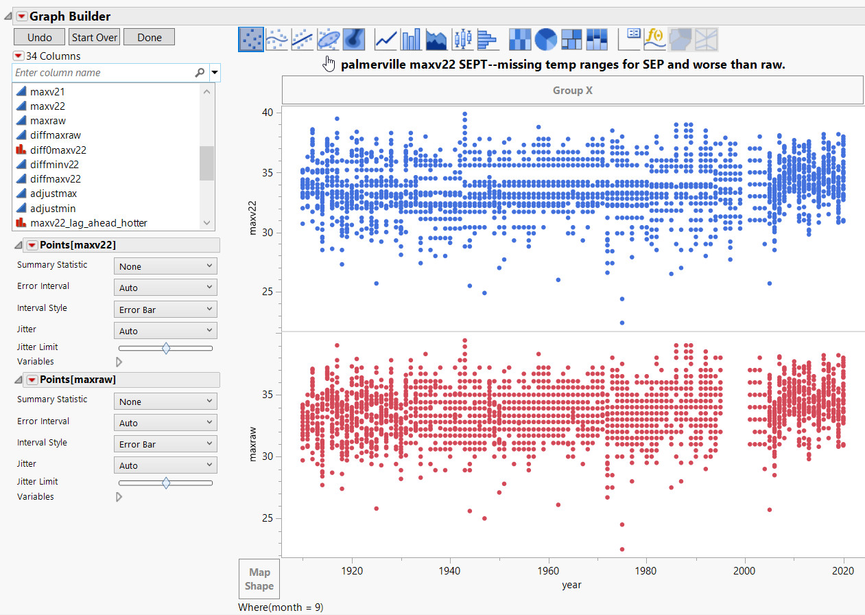
Palmerville examples are below. The left hand duplicated sequences are a very devious way of warming — a warmer month sequence is copied into a colder month.
BOM is obviously having trouble getting clean data even in 2004.

Palmerville ranks among the worst Acorn sites for data purity. Very many of the temperature observations are integers, in whole numbers, nothing after the decimal. From the ACORN-SAT station catalogue,
“The same observer performed observations for 63 years from 1936 to 1999, and was the area’s sole remaining resident during the later part of that period. After manual observations ceased upon on her departure in 1999, observations did not resume until the automatic station was commissioned.”
The stations at Melbourne Regional (1856-2014 approx) and Sydney Observatory (1857-Oct 2017 approx) are assumed here to represent the highest of BOM quality. (link)
Temperature ranges go missing for many years too, they just never appear until the 2000’s in many cases. And this can happen after adjustments as well.
Below – Let’s stay with Palmerville for all the August months from 1910 to 2020. For this we will use the most basic of all data analysis graphs, the scatterplot. This is a data display that shows the relationship between two numerical variables.

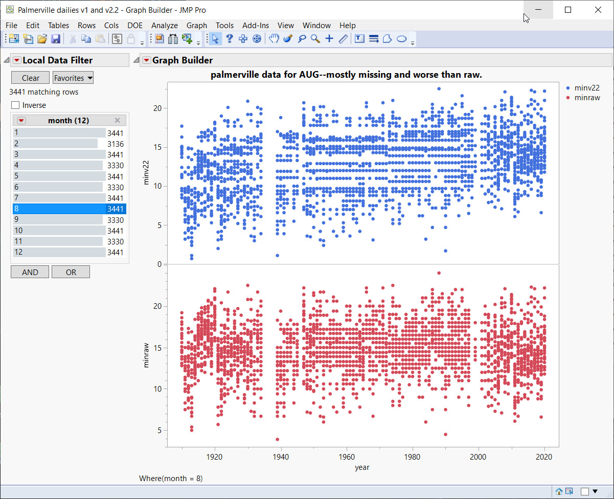
Above — This is a complete data view (scatterplot) of the entire time series, minraw and minv22. Raw came first in time (bottom in red) so this is our reference. After adjustments from minv22, entire ranges have gone missing, the horizontal “gutters” show missing temperatures that never appear. Even at year 2000 you see horizontal gaps where decimal values have disappeared, so you only get whole integer temps such 15C, 16C and so on.
The BOM station catalogue notes that the observer departed in 1999 and for the AWS “The automatic weather station was installed in mid-2000, 160 m south-east of the former site, but did not begin transmitting data until July 2001.” So, there seems to have been no data collected between these dates, From whence did it come, to show in red on the graph above?
Raw has been adjusted 4 times with 4 versions of state-of-the-art BOM software and this is the result – a worse outcome.

January has no clean data, massive “corridors” of missing temperature ranges until 2005 or so. Again, the data is worse after the adjustments.

March data is also worse after adjustments. They had a real problem with temperature from around 1998-2005.
Below — Look at before and after adjustments. These are very bad data handling procedures and it’s not random, so don’t expect this kind of manipulation to cancel errors out.

SUNDAY AT NHILL = MISSING DATA NOT AT RANDOM
A BIAS IS CREATED WITH MISSING DATA NOT AT RANDOM.(LINK).
Below – Nhill on a Saturday has a big chunk of data missing in both raw and adjusted.

Below: Come Sunday, voila …. thousands of raw temperatures now exist, but adjusted data is still missing.

Below – Wait, there’s more – now it’s Monday, and just like that, thousands of adjusted temperatures appear!

Below — Mildura on a Friday.

Below — Mildura on a Sunday:

Below — Mildura on a Monday:

Above – On Monday, a big chunk disappears in adjusted data. Strangely the thin strip of missing raw data at around 1947 is infilled in minv2.2.
This kind of data handling is indicative of many other problems of bias.
SYDNEY DAY-OF-WEEK EFFECT.
Taking all the September months in the Sydney time series from 1910-2020 shows Friday to be at a significantly different temperature than Sunday and Monday.
The chance of seeing this at random is over 1000-1:

Saturday is warmer than Thursday in December too, this is highly significant.

NEVER ON A SUNDAY.
Below — Moree on a Monday to Saturday looks like this.

Below — But then Sunday in Moree happens, and a third of the data disappears! (except for a few odd values).

A third of the time series goes missing on Sunday! It seems that the Greek comedy film Never On A Sunday with Greek prostitute Ilya attempting to relax Homer (but never on a Sunday) has rubbed off onto Moree.
ADJUSTMENTS CREATE DUPLICATE SEQUENCES OF DATA
Below — Sydney shows how duplicates are created with adjustments:
The duplicated data is created by the BOM with their state-of-the-art adjustment software, they seem to forget that this is supposed to be observational data. Different raw values turn into a sequence of duplicated values in maxv22!

A SLY WAY OF WARMING:
Last two examples from Palmerville, one showing a devious way of warming by copying from March and pasting into May!

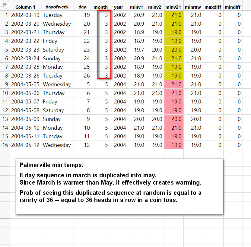

“Watch out for unnatural groupings of data. In a fervent quest for publishable theories—no matter how implausible—it is tempting to tweak the data to provide more support for the theory and it is natural to not look too closely if a statistical test gives the hoped-for answer.”
— Standard Deviations, Flawed Assumptions, Tortured Data, and Other Ways to Lie with Statistics, Gary Smith.
“In biased research of this kind, researchers do not objectively seek the truth, whatever it may turn out to be, but rather seek to prove the truth of what they already know to be true or what needs to be true to support activism for a noble cause (Nickerson, 1998).”
— Circular Reasoning In Climate Change Research, Jamal Munshi
THE QUALITY OF BOM RAW DATA
We shouldn’t be talking about raw data, because it’s a misleading concept……
“Reference to Raw is in itself a misleading concept as it often implies some pre-adjustment dataset which might be taken as a pure recording at a single station location. For two thirds of the ACORN SAT there is no raw temperature series but rather a composited series taken from two or more stations.” — the BOM
“Homogenization does not increase the accuracy of the data – it can be no higher than the accuracy of the observations.” (M.Syrakova, V.Mateev, 2009)
The reason it’s misleading is because BOM continues to call the data “raw” when it’s a single average of many stations; the default shortlist on the BOM software is 40 stations. This is the weak form of the Flaw of Averages (Dr. Sam Savage, 2009), so this single composite number is likely to be wrong.
At the data exploratory stage, one of the first things to do is at the distribution with a histogram. This is where the problems start:


The repeats/frequency of occurrence is on the Y axis, the raw temps are on the X axis. The histogram shows you how often certain temperatures occur. It is immediately evident that there is a problem; there appear to be two histograms overlayed on each other. The spiky one is very methodical with even spacing. It’s soon obvious this is not clean observational data.
It tuns out that the cause of these spikes is Double Rounding Imprecision where Fahrenheit is rounded to say 1 degree precision, then converted to Celsius and rounded to 0.1 C precision creating an excess of decimal 0.0’s and a scarcity of 0.5’s (with this example); different rounding scenarios exist where different decimal scarcities and excesses were created in the same time series!
The below image comes from the referenced paper and shows various rounding/converting/rounding protocols. For instance, looking at the first set of numbers, 0.5C and 2.0F, this scenario means that Fahrenheit was rounded to 2 degrees precision, converted then rounded to 0.5C precision. All these scenarios were investigated in the paper, but what affects the BOM data specifically is the 6th from the bottom protocol – rounding to 1.0F precision, converting and then rounding to 0.1C precision. This causes excess decimal 0’s and no 0.5’s

The paper–
“Decoding The Precision Of Historical Temperature Observations” — Andrew Rhimes, Karen A McKinnon, Peter Hubers.
The BOM Double Rounding Errors that exist are caused by this particular protocol, and it can easily be seen below when decimal frequency per year is compared to years. The decimal frequency per year use is key to seeing the overall picture:

This shows Yamba and clearly shows a shortfall or scarcity of 0.5 decimal use from 1910-1970, and the excess use of 0.0 and 0.5 decimals from 1980-2007 or so. It’s obvious looking at most country stations that decimal problems exist long after decimalisation in the 70’s, and in some cases problems exist up to 2010.
Look at Bourke below for example.

These different Double Rounding Error scenarios put records in doubt in some cases (see above paper), as well as causing the time series to be out of alignment. As can be seen, BOM has not corrected the Double Rounding Error problem, even though simple Matlab correction software exists within the above paper.
Marble Bar, below, shows the exact same problem, uncorrected Double Rounding Errors creating a scarcity of 0.5 decimal use. Again, at around 2000 there are an excess 0.0 and 0.5 decimals in use. From the BOM station catalogue for Marble Bar,
“The automatic weather station opened in September 2000, with instruments in the same screen as the former manual site (4020). The manual site continued until 2006 but was only used in ACORN-SAT until the end of 2002 because of deteriorating data quality after that.”

Getting back to the spiky histograms, here is how they are formed:

Using SAS JMP dynamically linked data tables, selecting specific data points, links these selections with all the other data tables, showing how the spikes are formed—
The scarcity of 0.5 decimals creates a lower level histogram (see above plot) whereby the data points drop down to a lower level, leaving spaces and spikes. This is causing the strange looking histograms and is a tip off that the data are not corrected for Double Rounding Errors. Virtually all BOM country stations examined have this problem.
ADJUSTMENTS, OR TWEAKING TEMPERATURES TO INCREASE TRENDS.
“For example, imagine if a weather station in your suburb or town had to be moved because of a building development. There’s a good chance the new location may be slightly warmer or colder than the previous. If we are to provide the community with the best estimate of the true long-term temperature trend at that location, it’s important that we account for such changes. To do this, the Bureau and other major meteorological organisations such as NASA, the National Oceanic and Atmospheric Administration and the UK Met Office use a scientific process called homogenisation.” — BOM
The condescending BOM quote under the header prepares you for what is coming:
A whole industry has been created in adjusting “biases”. BOM has used the SNHT algorithm with a default list of 40 shortlisted stations to average into a single number. Using a significance level of 95% means that 1 in 20 “steps” or “biases” is a false positive.
Using different versions of software in an iterative manner on the same data without using multiplicity corrections to account for luck in finding this “bias”, leads to errors and biases in data.
“Systematic bias as long as it does not change will not affect the changes in temperature. Thus improper placement of the measuring stations result in a bias but as long as it does not change it is unimportant. But any changes in the number and location of measuring stations could create the appearance of a spurious trend.” –Prof Thayer Watkins, San Jose University.
There are no series that can be classified, unequivocally, as homogeneous, so it is not possible to build a perfectly homogenous reference series.
As well, SNHT does not provide any estimate of confidence levels of adjustments.
We are meant to believe that moving a station or vegetation growth or any other bias that is formed leads to these types of adjustments:

A “step change” would look like the arrow pointing at 1940. But look at around 1960–there are a mass of adjustments covering a large temperature range, it’s a chaotic hodge-podge of adjustments at different ranges and years. If we only look at 1960 in Moree:

BOM would have us believe that these chaotic adjustments for just 1960 in this example, are exact and precise adjustments needed to correct biases.
More adjustment scatterplots:


A more likely explanation based on the Modus Operandi of the BOM is that specific months and years get specific warming and cooling to increase the desired trend.
Now looking at the scatterplots you can clearly see that adjustments are not about correcting “step-changes” and biases. Recall, as we saw above, in most cases the adjustments make the data worse by adding duplicate sequences and adding other biases. Bedford’s Law also shows less compliance with adjustments indicating data problems.
Certain months get hammered with the biggest adjustments, and this is consistent with many time series —


And some adjustments depend on what day of the week it is:


Adjusting by day of week means the Modal Value, the most common temperature in the timeseries, will also be affected by this bias – and hence also the mean temperature.

“Analysis has shown the newly applied adjustments in ACORN-SAT version 2.2 have not altered the estimated long-term warming trend in Australia.” –BOM
“…..pooled data may cancel out different individual signatures of manipulation.” — (Diekmann, 2007)
It is assumed that the early temperatures have the same Confidence Intervals as the more recent temperatures, which is obviously wrong.
Individual station trends can certainly be changed with adjustments, especially with seasons, which BOM software evaluates:


Below we look at values that are missing in Raw but appear in version 2.1 or 2.2.
This tells us they are created or imputed values. In this case the black dots are missing in raw, but now appear as outliers.
These outliers and values, by themselves, have an upward trend. In other words, the imputed/created data has a warming trend (below).

In summary, adjustments create runs of duplicate temperatures, and also create runs of duplicated sequences that exist in different months or years. These are obvious “fake” temperatures – no climate database can justify 17 days (or worse) in a row with the same temp for example.
Adjustments are heavily done in particular months and can depend on what day of the week it is.
Adjustments also cause data to vanish or reappear along with outliers. Data Analysis Digit Tests (Simonsohn’s or Benford’s or Luis-Leder World Bank Digit tests) show that generally the raw data becomes worse after adjustments! As well, complete temperature ranges can disappear even up to 80 years or more.
This data would be unfit for most industries.
THE GERMAN TANK PROBLEM.
In World War II, each manufactured German tank or piece of weaponry was printed with a serial number. Using serial numbers from damaged or captured German tanks, the Allies were able to calculate the total number of tanks and other machinery in the German arsenal.
The serial numbers revealed extra information, in this case an estimate of the entire population based on a limited sample.
This is an example of what David Hand calls Dark Data. This is data that many industries have, never use, but leaks interesting information that can be used. (link)
Now, Dark Data in the context of Australian Climate data would allow us extra insight to what the BOM is doing behind the scenes with the data …. that maybe they are not aware of. If dodgy work was being done, they would not be aware of any information “leakage.”
A simple Dark Data scenario here is very simply done by taking the first difference of a time series. (First differencing is a well-known method in time series analysis).
Find the difference between temperature 1 and temperature 2, then the difference between temperature 2 and temperature 3 and so on. (below)

If the difference between two consecutive days is zero, then the two paired days have the same temperature. This is a quick and easy way to spot paired days that have the same temperature.
Intuition would expect a random distribution with no obvious clumps. Block bootstrap simulations, which preserve autocorrelation, confirm this. For example, some tested European time series have evenly distributed paired days.

Above is deKooy in the Netherlands with a fairly even distribution. Sweden is very similar. Diff0 in the graph refers to the fact that there is zero difference between a pair of temps when using the First Difference technique above, meaning that the 2 days have identical temperatures. The red dots show their spread.
Let’s look at Melbourne, Australia, below:

The paired days with same temperatures are clustered in the cooler part of the graph. They taper out after 2010 or so (fewer red dots). Melbourne data were from different sites, with a change in 2014 approx. from BOM Regional Office site 86071 to the Olympic Park site, 2 km away, 86338.
Below is Bourke, and again you can see clustered red dot data.
From the BOM Station Catalogue –
“The current site (48245) is an automatic weather station on the north side of Bourke Airport … The current site began operations in December 1998, 700 m north of the previous airport location but with only a minimal overlap. These data are used in ACORN-SAT from 1 January 1999.”

Below is Port Macquarie, where there is extremely tight clustering from around 1940-1970.

This data is from adjusted ACORN-SAT sources, not raw data. Varying with adjustments, in many cases there are very large difference before and after adjustments.
The capital cities vary around 3-4% of the data being paired. Country station can go up to 20% for some niche groups.
The hypothesis is this: The most heavily clustered data points are the most heavily manipulated data areas.
Also, some of the red dot clusters can be correlated visually with site changes noted in the catalogue.
Let’s look at a very dense spot at Port Macquarie, 1940-1970.

It is immediately apparent that many days have duplicated sequences. Even though these are shorter sequences, they are still more than you would expect at random, but also note the strange systematic spacing and gaps below.
More from Port Macquarie, BOM station catalogue:
“There was a move 90 m seaward (the exact direction is unclear) in January 1939, and a move 18 m to the southwest on 4 September 1968.The current site (60139) is an automatic weather station at Port Macquarie Airport … The current site (60139) is located on the southeast side of the airport runway. It began operations in 1995 but has only been used in the ACORN-SAT dataset from January 2000 because of some issues with its early data. A new site (60168) was established on the airport grounds in October 2020 and is expected to supersede the current site in due course.”
The example below is for the early 1950s.

Here we have gaps of 1 and 3 between the sequences.
Below we have gaps of 8 between sequences.

Below — now we have gaps of 2, then 3, then 4, then 5. Remember, most time series have many of these “fake” sequences!

Proving Causality
CO2 and warming is based on correlation, but we all know correlation does not mean causation.
Tony Cox is a leading expert in Causal Analysis and has a software toolbox to test causality.

Using CART Decision Trees and a few more recent algorithms, we test which variables are causal when looking at paired days with the same temperature.
If we use Bourke minimum temperatures over the whole time series, and set as a target “MIN Paired Days, Same Temp”, rules are created by CART to find predictive causal links:
/*Rules for terminal node 3*/
if
MAXpaired days same temp <= 0.06429 &&
MINadjustments > -0.62295 &&
MINadjustments <= -0.59754
terminalNode = 3;
This is saying that if the maximum temp paired days same temp is less than 0.06429 AND adjustments on MIN temps are between -0.62295 AND -.59754, then node 3 is true and a highly predictive cluster of 50% has been found.
NOTE—paired days same temp for MAX series and adjustments by BOM have been picked up as predictive causal!
Port Macquarie MIN temp time series.
Target — MINpaired days same temps
/*Rules for terminal node 3*/
if
MAXadjustments > 0.53663 &&
MAXpaired days same temps <= 0.02329
terminalNode = 3;
class prob= 20%

The ROC curve above for Port Macquarie shows a very predictive model, the most predictive causal variables being MAX paired days same temps with large Max adjustments being causal for predicting MIN Paired Days, Same Temps!
Below is the CART tree output for finding the target in Palmerville:
MIN paired days, same temps.

Here it finds days of the week and years predictive causal. You read the tree by going down a branch If True and read the probability of the cluster being true.
In these cases, and several more that have been tested, the predictive causal result of the target Minimum Paired Days With Same Temps is day of week, year and magnitude of adjustments!
Recall, Paired days, Same Temps were indicative of duplicated or “fake runs” of temperatures. The higher the cluster concentration, the more sequences found.
Clearly the data has serious problems if day of the week is significant during modeling. BOM adjustments are also causal for creating clusters of “fake” sequences.
__________________________________________________
Tom’s part ends here, Geoff resumes.
Here are some questions that arise from Tom’s work.
Why did we have to do this basic quality control investigation of the BOM’s primary raw temperature data in citizen scientist mode?
Was BOM already aware of the large number od cases of corrupted and/or suspicious data, but continued to advise that raw data were essentially untouched except for the removal of typos and a few obvious outliers?
Noting that both “raw” and “ACORN-SAT” data have inherent problems, how can one say that distributions derived from numbers like these have validity?
Therefore, how can one justify a distribution-based argument to allow use of the Central Limit Theorem when so many distributions are tainted?
Can one apply the Law of Large Numbers validly to data that are invented by people and that are not observations?
How does one estimate measurement uncertainty with data that are invented by people?
Where is the Manual for estimation of confidence in imputed values? Is it accurate?
Are observations if this type even fit for purpose?
Why was the BOM given a “free pass” by experts who studied the value of ACORN-SAT? Why did they fail to find data irregularities?
Is it possible to “re-adjust” these millions of observations to ensure that they pass tests of the type described here?
Or should the BOM advise that only data since (say) 1st November 1996 be used in future? (This was when many BOM weather stations changed from manual thermometry to electronic AWS observations).
Are there other branches of observational science that also have problems similar to these, or is the BOM presenting a special case?
We really had to shorten this long essay. Would WUWT readers like to have a Part Four of this series, that shows much more about these temperatures?
IN CONCLUSION.
We do not in any way criticise the many observers who recorded the original temperature data. Our concern is with subsequent modifications to the original data, recalling that Australia’s Bureau of Meteorology (BoM) has a $77million Cray XC-40 supercomputer named Australis. One day of keystrokes on Australis can plausibly modify the patient, dedicated work of many people over many decades, such as the original observers.
Your answers to these questions are earnestly sought, because there is a major problem. In the science of Metrology, there is frequent description of the need to trace measurements back to primary standards, such as the 1 metre long bar held in France for length measurements. In the branch of Meteorology that we examine, we have tried but failed to show the primary data. Therefore, emphasis has to be put on unusual patterns and events in the data being used at the present time. That is what Tom has done. A very large numbers of irregularities exist.
The data used at the present time is packaged by the BOM and sent to global centres where estimates are made of the global temperature. Tom showed at the start of this essay how the BOM has displayed and presumably endorsed a global warming pattern that has become warmer by changes made during the 21st century.
Is that displayed warming real, or an artefact of data manipulation?
That question is fundamentally important because global warming has now led to concerns of “existential crisis” and actions to stop many uses of fossil fuels. There are huge changes for all of society, so the data that leads to them have to be of high quality.
We show that it is of low quality. That is for Australia. What is known about your own countries?
It is important enough for we Australians to demand again that independent investigations, even a Royal Commission, be appointed to determine if these temperature measurements, with their serious consequences, are fit for purpose.
(END)
Thank you for reminding me to check
https://data.giss.nasa.gov/gistemp/tabledata_v4/GLB.Ts+dSST.txt
to see how many changes they made since last month. That usually occurs around the 15th of the month and yields several hundred changes to the 1700 monthly entries since January 1880. Too bad, it’s not out yet. Last month they made 326 changes and 545 the month before that.
No, I didn’t read all of:
“Uncertainty Of Measurement of Routine Temperatures–Part Three”
I liked the photo copies of the old records and the fact that they were transcriptions. And did I see that days of the week had their own built in bias? That was a really good catch. Who da thunk it?
Steve Case,
There are many different descriptions of forensic examination mentioned, in the hope that people in other countries will try them to see what is in their data, You do not know until you look. The software is relatively easy to use. Not just days of the week, there are examples of imputed data and copy/paste from one place to another and rounding errors and more.
Geoff S
Geoff, this obviously represents a lot of hard work, and asking for a summary of what is a complex and nuanced explanation of irregularities is probably unfair. But for laymen like me, this is far too long and dense for me to get through without some help. It would be very helpful to have an explanation upfront of what you are proving, so that we understand what we are looking for as we read the following detailed exegesis.
Thanks. I enjoy and appreciate your work, just having a little trouble following this.
Dave,
This is only a part of a longer story. We had to cull to get it even this short.
We wanted to give some meat to the general reader, but particularly wanted to show data and new methods to mathematicians, metrologists, meteorologists and data analysts in general.
This is new information from new approaches, much more than just another fiddle at the fringes of a fundamental problem. Thanks for your input. Geoff S
Might something like
forensic analysis shows that much of the claimed observational temperature data is very likely to have been be created (in clumsy ways) rather than be actual recordings of instruments;
in addition
many of the admitted adjustment are revealed to be done in quite biased ways
be a short summary of what has been presented?
That’s why the gods gave us coffee and cigarettes. You read until the smoke from your ears start obscuring your view, then you get a fresh cup and start over.
Or, in this particular case, you just keep on plodding, by the end even an idiot like me had enough data to have a screaming fit of laughter at that stupid Monday that keeps forgetting what the weather was like on Sunday.
But yeah, I spend way too much time on this friggin’ site. Somebody ought to make a law…
Last month they made 326 changes and 545 the month before that.
Is that what they mean by “climate change”?
See my post above, they made 432 changes in September.
With all the temperature revisions, the past climate keeps changing. As a result. it must be just as hard to estimate the past climate as it is to estimate the future climate.
Some time today, GISTEMP published Their Land Ocean Temperature Index for September
https://data.giss.nasa.gov/gistemp/tabledata_v4/GLB.Ts+dSST.txt
There were 432 changes made to the data since their August update.
From about 2010 to 2014 I kept a monthly sampling of some 35 stations from the GISS website with long historical records. It was just a sampling of stations, to get a representative sample of GISS.
Then every month I compared the datasets from month to month as the data were posted.
Every month some of those 35 stations had some temperature changes. By extrapolation, about 10 percent of all GISS data changed every month. This was over a period of years. There was no obvious pattern to the changes. It just looked like about 10 percent of the stations were exposed to some editing of past data. No pattern, just some stations one month, then other stations changed in other months. Some months were more extensive changes. Comparing December 2011 to January 2012 there were was a large amount of editing, and errors in many of the stations. Groups of data for months or years would vanish, then the next month those data would re-appear with some changes from the Dec 2011 data.
January 2012 was very obviously a rush job to change much of the GISS data, then those responsible became confused and restored the earlier data.
I still have some of that data. Some of the files were lost years later when I switched machines. Still have akureyri, Amundsen-Scott, Anthony, Bartow, Beaver City, Bridgehampton, Byrd station, Calvinia, Concordia, Crete, Davis, Ellsworth, Franklin, Geneva, Gothenburg, Halley, Hanford, Hilo, Honolulu, Jan Mayen, Kodiak, Kwajalein, La Serena, Lakin, Lemar, Lebanon, Loup City, Marysville, Mina, Minden, Mukteshwar, Nantes, Nome, Norfolk Island, Nuuk, Orland, Red Cloud, Scott Base, St. Francis, St. Helena Island, St. Paul, Steffenville, Talkeetna, Thriuvanantha, Truk, Valladolid, Vostok, Wakeeny, Yakutat, and Yamba.
It was just to see how much past data changed. After that it was just obvious that the GISS data were useless fabrications. In 2016 and 2018 I saved the December data for most of the stations on my list, but that was when the whole effort began to look pointless.
I have no idea what has happened since 2018 as it was just an experiment for me. The GISS have no interest to me whatever. The only temperature data I follow now is the USCRN set.
Outside that, I would say there are no reliable historical surface temperature data anywhere in the world on the internet. To find reliable past temp data, you would have to get access to the original paper records for each station if they still exist.
There was no obvious pattern to the changes. It just looked like about 10 percent of the stations were exposed to some editing of past data.
__________________________________________________
That depends on what you’re looking for. If you saved NASA’s Land Ocean Temperature Index (LOTI) files from past years and did a comparison, an obvious pattern emerges. Here’s today’s LOTI that was just released:
https://data.giss.nasa.gov/gistemp/tabledata_v4/GLB.Ts+dSST.txt
If you compare the J-D Annul Mean (Column 14) from an older report it will look like the comparison of the December 2011 LOTI with December 2021 LOTI below. Each plot is the simple difference divided by100 to yield °C as noted at the bottom of each LOTI report. The pattern of cooling the past and warming the present can’t be denied.
My process was comparing stations month to month, side by side in a spreadsheet setup to look for changed values. There was no quantification.
Just looking for changes, for example Akureyri January 1886 shows a value of -10.4 in the dataset downloaded in 2012. By 2016 the same month was -10.0 degrees. As of now, Akureyri Jan 1886 is still -10.0 but that’s just one example.
There was no tabulation of numbers of changes or the direction, just surprised to see so many every month.
Ten percent of the subset of the GISS I was watching was being altered EVERY month.
A brazen crime.
All you need to do is save the data monthly (or yearly) depending on how much effort can be maintained. It takes some time to scan a thousand temp values for every individual station every month. 100 years of data times 12 months is 1200 values. For ONE station. And I was looking at 35 stations every month.
Yes saving station data as you describe would be a daunting task. Once a month saving of NASA’s LOTI is relatively easy.
Steve, was it Mosher or somebody else that said the adjustments to a particular dataset (NOAA? NASA? Berkley Earth? or all of them?) warmed the past? He was deriding skeptics for ragging on adjustments since they worked in our favor.
How many changes for vaccine trials?
For drug trials in general?
With biomed in general?
Wow, that is a lot of data to go through in one sitting.
I wonder if Greta or AOC have studied it in detail…….
Rod Evans,
Yes, a long read to show many types of irregularity and how to detect them. This will be breaking new ground for many readers, but do stick with it and think about the data from your own country. We have seen very few analyses of this type, so who knows what will be found. Geoff S
Geoff, I read it through to get a general idea as to the techniques used and the overall conclusions. It is very clear-cut what was done and the results are creditable. I don’t do that sort of stuff anymore and will probably just leave it at that.
There is a far simpler approach to dealing with the alarmists.
Measured temperature = man made change + natural change + measurement error.
They claim measurement errors are effectively zero and unbiased. Let them have that.
Now ask, where’s are the graphs of either
a) Natural change
b) Man made change
What’s telling is that there are no such graphs. What they however claim is that measured temperature is all man made change, now. That’s the same claim as saying natural change has completely stopped. That’s the reason you cannot get graphs for a or b above. If they existed people would ask, why has natural change stopped, and they have no explanation.
Well said…and the day of the week anomalies correlate well with job performance of tax funded government workers.
Meggs,
These new analyses show that the day of week effect is man made, not natural. It is created by people interfering with data that was not supposed to be fiddled. They have now been caught fiddling in most convincing ways, as we show in some detail. Geoff S
1940 to 1975 used to have a lot of global cooling, based on data available in 1975. Almost all of that global cooling has disappeared. We’ve known about arbitrary global average temperature “revisions” for decades.
My guess would be that someone felt they were improving the apparent time-series record by replacing missing day-of-the-week data with an interpolation or duplication, not anticipating anyone would check it as thoroughly as you and Thomas have done.
“The road to Hell is paved with good intentions.”
Those performing the adjustments did not have good intentions.
When I was at secondary school I was responsible for recording our school Stevenson screen data for several years, needless to say Saturday and Sunday data was missing. Someone back checking the data would find some puzzling anomalies in January/February 1963. That was the worst winter since 1947 and frequently the weather was so bad the buses were unable to make the trip to school so there were lots of missing days, often the coldest days.
When I was asked how many people worked in my Federal Division I said: Oh, about half.
A graph of any temperature data set going back to, say, 1850 will show the natural ups and downs.
Geoff,
The final three paragraphs here make the point succinctly.
Australia and the US need independent verification of the BOM and equivalent US State and Federal temperature data recording organisations to ensure there is no data manipulation.
The work by Anthony Watts and his team is well known.
Dr. Jennifer Marohasy and Journalist Graham Lloyd in The Australian forced BOM to publish in September 2017 an internal Report entitled “Review of the Bureau of Meteorology Weather Stations” (BOM 2017).
To quote Scott Hargreaves’ paper “A Descent into Sceptics’ Hell” ( Eighth Circle:raw temperature records) in Climate Change: The Facts 2020 –
“The Report begins by explaining that the Bureau has 695 automatic weather stations spread across Australia and that the data from this network underpins all of the services the Bureau delivers.
The Report goes on to admit that two of those stations are not fit for purpose- Goulburn Airport and Thredbo.
The Bureau subsequently accepted that many weather stations across Victoria, Tasmania and ACT were also not relaying temperatures below -10 degrees C. ( Lloyd 2017a- ‘More BOM Weather stations put on Ice’, The Australian,3 August 2017).”
The Review was forced by Dr. Marohassy who had evidence to prove that a strict limit of -10C had been enforced by BOM (Lloyd 2017b- “BOM opens Cold Case into Temperature Records”,The Australian,1August 2017.)
Lastly Graham Lloyd finished his series with ‘Temperatures plunge after BOM orders Fix’,The Australian,4 August 2017(Lloyd 2017c).
The full sad saga appears in Dr.Marohassy’s paper “Rewriting Australia’s Temperature Record” also in Climate Change: The Facts 2020.
As Scott Hargreaves concludes-
There is no independent evidence that BOM applies the gold standard of external assurance by a reputable authority.
As a result he concludes that “no reliability can be placed on any claim to ‘record hot days’ or on any accelerated warming trend or anything similar”.
Herbert
Thank you, quite familiar with this earlier work. The expert investigation you mentioned is linked in our article. It now appears incompetent.
To our knowledge, what we show here is not yet known – or if it is, it is not publicised. Essentially everyone thought the raw data was immaculate. This article shows that irregularities are widespread to a degree that demands official investigation. Geoff S
A good write up! Lots to think about. A good introduction to the software that is new to me – SAS JMP. Shame it’s not free, not to worry I will have to do it in R.
I wonder what the UK data would show?
I also wonder if your treatment was applied to all national datasets, what it would show.
Keep up the excellent work.
Steve R,
Why not move past wondering about Great Britain data and look at it. We give the methods in some detail, with a lot of graphic illustrations. Get your computer mates involved and computing. My ordinary ten year old personal computer was quite adequate. Regard it as a way to pass your coming cold winter. Geoff S
One thing you can be certain of – they know their conclusions, they just have to beat the data into shape to support them.
Beatings will continue until narrative compliance improves. 😉
The link here did not work properly: “information that can be used. (link)”
It was the dark data on tanks
Steve, worked fine when I tested it just now. Geoff S
Oh well, still not working for me. The link I get when I hover on the word ‘link’ is
http://www.elastictruth.com/2021/11/In%20World%20War%20II,%20each%20manufactured%20German%20tank%20or%20piece%20of%20weaponry%20was%20printed%20with%20a%20serial%20number.%20Using%20serial%20numbers%20from%20damaged%20or%20captured%20German%20tanks,%20the%20Allies%20were%20able%20to%20calculate%20the%20total%20number%20of%20tanks%20and%20other%20machinery%20in%20the%20German%20arsenal.
Which is quite a long ref
The blog opens for me, but there is a note at the top, “Sorry, the page you were looking for in this blog does not exist.”
“This data would be thrown out in many industries such as pharmaceuticals and industrial control.”
Exactly. For example, I served 28 years in the U.S. pharmaceutical industry beginning in the early 1980’s when the concept of process validation was being defined and implemented, quite justifiably, by the FDA. This is the background of concern for the quality of data and for the validity of modeling that has motivated my comments on WUWT for years now.
Not only this record of “raw” data, but all the climate models, would be thrown out if pharmaceutical industry standards were honestly applied.
“We show that it is of low quality. That is for Australia. What is known about your own countries?”
In the U.S., the USHCN (United States Historical Climatology Network) list of 1,218 stations and station data is available from NOAA ( https://www.ncei.noaa.gov/pub/data/ushcn/v2.5/ ) Finalized monthly averages by station are available for Tmax, Tmin, and Tavg. The “FLs” data files include a flag “E” when the value is estimated rather than calculated from reported raw values. So a while back I analyzed the history to separate “E” flagged values from “not E” values to determine whether the “E” and “not E” values looked similar or dissimilar to each other, and whether the effect on the finalized record looked similar or dissimilar.
Please see the results for Tavg for 1895 through 2021 for the month of July. The plots give the straight mean of the station values for all (FLs), estimated (“E”), and not flagged (“not E”), and the differences. Clearly, the “E” and “not E” populations of values differ. The effect of the “E” values is to cool the early past and warm the recent years in the FLs (finalized after pairwise homogeneity adjustment.)
https://drive.google.com/drive/folders/1nBKn8NgO1iZwOk94XisExAIUWdOYZxPw?usp=sharing
I would welcome comment. This is just one way to look at it.
I had a quick look at just your first two files and at first blush there is quite a difference, isn’t there? One of the problems with the adjustments to temperature records is the impossibility of blinding the data from the adjusters. As the adjusters are government employees, and government employees are predominantly Democrats, and Democrats want evidence of a climate problem, well….there we are. Potential for biased adjustment and no way, or at least no easy way, to figure the magnitude of bias.
If one were to go to the effort to put “blanks” in the data the way chem field samples are sent to a lab — constant values substituted over the years to see what adjustments get made to them, then one has to worry that these “blanks” would become unblinded. Person A would hint to person B, etc.
Thanks for taking the time to look at the first two plots. I hope you have time to check out the others. If the adjustments and estimated values were purely for technical reasons to improve the quality of the resulting record, there should have been little difference between “E” and “Not E”, as I see it. So I attempted to bypass the scientific arguments in favor of the adjustment algorithms and just look at the result to see if it looks credible and unbiased. To me, it looks suspect.
David D,
Suggestion — for the moment, forget what you already know about this. You are assuming that some of your data are original and some are adjusted simply because someone told you this. The problem is that the tellers have not tested their original numbers enough to find out if it has already been fiddled..
We show you example after example of hitherto unknown or unadmitted problems in the core Australian data. We give you methods and links.
The next step for your countries is to organise, conduct and publicise similar forensic examinations.
This is deadly serious national interest material needing urgency. Geoff S
Thank you for this response. You make an excellent point, that even what is represented as “raw” data by NOAA should not be assumed to be an intact record of readings. Kudos to you and to Tom.
It is really only important because many trillions of $ are riding on it, along with imposed restricted lives of billions of people. Otherwise it would only matter to data geeks.
“I would welcome comment.”
The first, obvious, comment is that USHCN is obsolete. It was replaced in March 2014 by ClimDiv. It’s true that if you dig you can find a file where they still keep calculating and posting the adjusted numbers. But they aren’t used in any index (or for anything else). The use of estimated values was peculiar to the old USHCN.
The other thing is that you are comparing raw with the estimated adjusted. Adjusted means adjusted for homogeneity, and in the US the big one is TOBS, since volunteers were free to change the time of observation.
“…you are comparing raw with the estimated adjusted.”
No. My plots compare “E” and “Not E” from the FLs record (finalized after all adjustments) of monthly Tavg by station. “Not E” does not mean “raw.” It originates with actual reported raw daily data, but the values have already been processed for time-of-observation and pairwise homogeneity.
(Note – I referred to “raw” in my response to Geoff S above, thinking of the records of daily data similar to what is analyzed in the head post for Australia.)
Even if not directly used for the newer ClimDiv database, this USHCN station data is still maintained up to date and shows the bulk results of the processing methods, as I see it.
For those interested, here is the definition of the “E” flag from the readme file at the data source site I linked.
“E = The value is estimated using values from surrounding stations because a monthly value could not be computed from daily data; or, the pairwise homogenization algorithm removed the value because of too many apparent inhomogeneities occuring close together in time.”
I agree with Kevin. I looked at several of your graphs. It is apparent that adjustments have had an effect on temperatures in the past. There is no excuse for that. We are spending trillions based on data that is not fit for purpose. No other scientific endeavor would allow this kind of fiddling with DATA. Each and every change should be documented with the reason for the change. A computer algorithm willy nilly changing things don’t suffice.
These kinds of test that the authors have done are obviously known in the scientific community and climate science’s ignorance of them is not an excuse. It quite honestly is a indictment of how scuzzy the whole process has become. It is one reason that UAH is more believable than any surface data set. It removes the ability to have any number of people introduce their own biases into “correcting” the data.
Thank you for taking a look. I am working on additional ways to make this point. One difficulty is the proliferation of stations in the GHCN daily data for the U.S., from which the current ClimDiv dataset is derived. It’s not clear how to follow the trail of raw station values to the adjusted and gridded results. This is more transparent for USHCN. But even so, I did this “E”/”Not E” analysis only on the finalized record, taking advantage of the meaning of the E flag.
Back in my younger days when I worked my way through college at Lockheed Missiles and Space Company, any and ALL changes to blueprints had to have a written Engineering Change Order (ECO), which specified what was being changed and why. Similarly, it was company policy to Accept No Verbal Order (ANVO); to get anything changed an ANVO was required. This established an audit trail and responsibility for everything.
Government organizations would do well to similarly require audit trails and justifications for all changes to the raw data.
That was standard practice for both the power company and the telephone company I worked for. One of my younger brothers worked for several different companies doing contract work for the FAA. They *all* required such Change Orders from the FAA for even minimal changes at places like air traffic control centers – primarily to justify the extra charges to the FAA for making the changes but also to have a good record of current configuration.
You hit the nail squarely. The way changes are being made illustrates what an amateur organization with no accountability does. People who defend it are also amateurs that have never had jobs with accountability.
Changing information to replace data in order to CREATE, out of whole cloth, long term data sequences is what people with no accountability will do. The lack of transparency is indicative of organizations who are not confident in their actions.
Advocating for the use of averages without quoting the variance of the distribution used to calculate them is another indication of amateurs at work. I can’t believe REAL scientists let this occur without challenging it.
Readings taken from instruments are data, anything else are estimates.
YES! This underscores that not only is the “data” of the instrument temperature record unfit for the purpose of measuring changes to the “climate,” most of what is being presented as the “instrument temperature record” IS NOT EVEN DATA any more.
The central question here “Do concepts like the central limit theorem apply to data that is made up and not raw readings?” is no. Yet a stab at how bad it can be is answered by the propagation of uncertainty. In effect one familiar with the data can decide how much uncertainty may be contributed by messing about with raw, censored, erroneous data. Only a little of this is contributed by the usual errors and uncertainty of readings themselves.
The problem is not unlike determining the expected uncertainty of a measured value contributed by the construction and operation of an instrument for which there is only one copy in existance and for which the “central limit theorem” could not possibly apply.
“The central question here “Do concepts like the central limit theorem apply to data that is made up and not raw readings?” is no.”
Well, it would help if people would get their concepts sorted. What is meant here is the Law of Large Numbers. But neither the CLT or the LoLN say anything about “raw readings”.
One temperature measurement at each weather station does not qualify for the “law of large numbers”
They start by averaging each station over a month. But these are a statistical theorems, and relate to the consequences of adding or combining numbers that can be both positive and negative. They quantify the effects of cancellation. These are no special provisions about where the numbers came from – only their distribution.
and therein resides the conceptual gulf between the mathematicians and the metrologists.
These are mathematical theorems being cited.
Statistical, actually. And they have applicability requirements.
No, mathematical – statisticians use them. But what are those “applicability requirements”. You won’t find anything about “raw readings”. You can’t work that into a mathematical proof.
“Raw” figures are indeed a red herring, but as you pointed out, the underlying distribution is important.
We could discuss the overlap between mathematics itself and heavily mathematical fields, but that is best done on a pleasant afternoon over a couple of cold stubbies.
You’ve been given the applicability requirements multiple times – over and over and over and over again.
Each individual measurement represents an independent, random variable whose variance is equivalent to its uncertainty interval.
When you combine those random, independent variables their variance adds, their variances don’t cancel!
Do you *really* want proof of the fact that the variances add? I’ve got at least five statistics textbooks that will provide that proof. Are you going to call all the authors wrong?
The “applicability requirements” are that the same thing is measured by the same instrument, and that the distribution at least be approximately normal. The air temperature of a moving parcel of air, replaced by another parcel, does not meet the requirement of being a single thing being measured. Clearly, different stations use different thermometers. If the time-series has a trend, then one is dealing with non-stationary data, which is not normal and the mean and variance are changing with time.
“These are mathematical theorems being cited.”
So what? Gauss’ Law doesn’t apply to a falling object.
If the data is not a normal distribution then measurement uncertainty doesn’t cancel and you can’t use the standard deviation as a metric for uncertainty of the average.
Here’s a statistical theorem for you: When combining random, independent variables their variances add.
Why do you always want to ignore that theorem?
Each and every measurement is of a different thing. Why do we have to keep on going over this? Thus the measurement uncertainty of the averaged daily measurements is the sum of the individual measurement uncertainties. The uncertainty of the average is *NOT* the standard deviation of the stated values of the measurements but is the *sum* of the measurement uncertainties of each individual data element.
Full cancellation of the individual measurement uncertainties *ONLY* occurs for multiple measurements of the same thing and even then only when the measurements form a normal distribution around a true value. That is not always true and it should be proven before making that assumption. Any systematic bias in the measurements will prevent a normal distribution around a true value even for multiple measurements of the same thing.
THERE IS NO TRUE VALUE FOR MULTIPLE MEASUREMENTS OF DIFFERENT THINGS. Thus the measurement uncertainties cannot fully cancel and should be added in quadrature – root-sum-square.
This has been shown to you multiple times and you’ve been given references from at least three different experts on the subject. Yet you continue to push the same meme — all measurement error cancels when you average any kind of measurements.
Nick,
As a mathematician, you have the ability and experience to discern whether the math we show here are appropriate, meaningful. You could have experienced past data on some topic that were so bad that it was not worth the effort to continue with analysis. Maybe you can use your skills to comment on the significance of the many new findings we present.
Should BOM continue to use the historical temperature and derivatives like ACORN-SAT that we show to host math irregularities not previously known or admitted in public?
This is not a social question or one influenced by ideology or belief. It is a clinical question about the quality of numbers in data. Geoff S
“Maybe you can use your skills to comment on the significance of the many new findings we present.”
Sorry, Geoff, it is just so hard to see what it really signifies. You start out with a month in Sydney that is duplicated in 1915. Two Julies. OK, somebody goofed. But there is a huge amount of data; this is not so surprising. GHCN has tests for duplication, but mainly of consecutive months.
Then there is the handwriting analysis of Melbourne 1860. OK, it looks like someone made a tidy copy of September. But the copy also looks like 1860 handwriting. So what should BoM do? Reject the data?
Then Tom’s stuff, which I really cannot see the point of. It seems to just demonstrate that adjusted data has been adjusted.
And so it goes on. In Palmerville, you find that a sequence of days in March 2002 is the same as one in May 2004, and say that is too improbable. Well, again the dataset is huge, and if you look hard enough, you’ll find oddities. But then you put on the conspiracy hat and say that by slipping March into May, they are boosting the heat. But you don’t know that that is how it went. It could equally be May duplicated into March.
Then there is stuff on day of the week effect – well, it’s a pity people took days off, but why is it a bias? OK, you say in another example that some pairings of days have significant differences, but it isn’t a proper significance test. You just list p values, but there are a lot of possible combinations, so low p values are going to turn up.
And so on. This is small bore stuff.
Nick,
Thank you for this response. It is really big bore stuff if you have the patience to read the detail and think about it. Tom shows that allegedly “raw” data has been adjusted many times, not just ACORN-SAT stuff. This is new information AFAIK. It is plausible that some of the adjustments were done decades ago and then forgotten about. We see a smoking gun in 1860 data, but we photographed only a score of sheets of “raw” data so we do not know the extent. That is a worrysome high hit rate. Did this lead to a routine, entrenched practice of cleansing data that persists to this day?
Was the Sydney duplication shown for 1914-15 then in 1935-36, again in 1943-44, done in the 1940s? Same style, points to same person after 1944. We cannot answer that nearly so easily as BOM who curate the records.
There are many cases where months to years of missing data have been infilled with sporadic or all “imputed” data, a.k.a. guesses. Surely there reaches a point where enough is enough.
For example, one has to exercise judgement about using some statistics like Law of Large Numbers when too much of the input is invented, not measured. Invented data are not a subset of a real population, only a mental one.
The days of the week problem are not from observers taking days off. If they did that, there would be missing data. The problem arises because a person invented numbers and slipped them in. Computers do not know how to favour adjustments on Sundays unless a person so instructs. And so on. There is a rather large amount of invented and adjusted data here, that reduces the validity of the data and increases its uncertainty in ways that might not be possible to estimate in hindsight by conventional stats. Every one of the 112 ACORN-SAT sites now has adjustments that mangle distributions, as Tom shows, yet people rely on statistics involving distributions. There is severe kurtosis in many cases.
You ask “So what should BoM do? Reject the data?”
Yes, decidedly, many stations are so bad that they are beyond resurrection except in the Biblical sense. Many irregularities created by homogenisation are so crude that the whole ACORN-SAT idea should cease forthwith.
Geoff S
Geoff,
” We see a smoking gun in 1860 data”
That’s absurd. It is very clear that someone in about 1860 made a copy of that September data. There could be many reasons; none involve an attempt to bolster AGW. You need to realise that there will often be copies of station data. The head office will maintain a copy of the logged data at the stations, probably back then communicated by telegraph. OK, Melbourne would not need to make such a copy, but may well do so to have a consistent set of records. Or maybe the original for that month was messed up, but the copy was good.
By small bore I mean that none of these issues would make the slightest difference to any calculated index. Your eight days in Palmerville, copied from March 2002 to May 2004, would not make the slightest difference to anything. That is one reason why the conspiracy stuff is so absurd. Who would do that? If you really want to tamper with data to create warming (no-one does), there is no need to copy a few at a time, with negligible effect.
“By small bore I mean that none of these issues would make the slightest difference to any calculated index.”
Of course they do! Each and every guessed at infill increases the uncertainty of the overall product. The measurement uncertainty associated with these indexes is already so high that they are not useful products, increasing that uncertainty just makes their uselessness even worse.
Nick,
Please read more carefully. Photos of sheets were discussed here because BOM staff said a. they were original raw data and b. the original raw data had not been altered except for typos and occasional plausible outliers. Those photos do not easily fit that description. Forensics uses clues to build a scenario to test.
More importantly, you assert that none of these issues would make the slightest difference to any calculated index. That is unsustainable. To detect a difference, you need two values. For a significant difference, one value at least has to be known. We have shown that the raw values, rather than being known to be observations, are a mix of obs and guesses. In an extreme hypothetical to show the mechanism, your assertion would be up the creek if all of the raw data had been humanly and hiddenly increased by 50%. The concept of being able to be traced to a standard also applies. The standard cannot contain blatant guesswork.
Finally, in response to your point about who would bother with a few deliberate fiddles with no real effect, that question is unrelated to this article. We have shown that a lot of data previously represented as pristine, has man-made adjustments that ideally should be absent for authenticity and credible analysis. Also, that bias is present in the analyses, as graphed for the global composites of different dates.
So far, we have overall bias, made, misrepresented data origins, strange correlations with days of week, rounding bias, selective deletions of data from time to time, hitherto little reported issues re distributions, acceptance of unlikely probabilities. That is on raw data, before starting on ACORN-SAT. What more do you want? Geoff S
Nick’s entire premise here, along with almost all climate crisis advocates, is that infilling with an average value won’t affect the average.
That assumption is based on the meme that all measurement uncertainty cancels and disappears when you take an average.
If each measurement is of the form “stated value +/- uncertainty” then when uncertainty ==> zero all that is left is the stated values. Then the standard deviation of the stated values can be used as the uncertainty of the average. It’s a direct violation of the addition of variances when combining random, independent variables.
Of course the more stated values you have that are of the average value the lower the standard deviation of the stated values and the lower the uncertainty of the average value becomes.
Why do you suppose you *NEVER* see a variance stated for any of the averages that are calculated? Be they daily, weekly, monthly, or annual averages? It’s because the averages are always assumed to be 100% accurate with zero variance!
The point that Stokes and all his disciples will never admit to.
“Forensics uses clues to build a scenario to test.”
You are using feeble stuff to build a conspiracy theory. So BoM staff told you that? Maybe they were just mistaken. More likely they quite reasonably considered that a fair copy of the data from the time was reasonably described as raw data. After all, most of what is here called raw data from those times is in ascii or floating point digital.
But the main thing is, there is nothing there in your “smoking gun”.
Stokes is down to screaming “disinformation!”, just like the Marxstream Media.
Doesn’t need a conspiracy. Only needs incompetence and confirmation bias.
No Nick,
“Maybe” they were NOT mistaken. There were two of us asking BOM for this type of raw data, as raw as it gets. Both of us asked several questions about this authenticity and what type of original data we sought.
We appreciate your responses, but they are better without hypotheticals that did not happen. Geoff S
This is important to science. Without it, you can never prove anything is accurate. It is one reason you never see variance or measurement uncertainty calculated nor quoted. The implication is that the data and any conclusions drawn from it is entirely and completely accurate with no possibility of there being an actual range associated with it.
Think about it. If all science followed what climate science does with their data, there would never be any doubt about measurements and no reason to even have a field called metrology. Statistical averages is all you would ever need. We would know the speed of light out to what, 10 decimal places, accurately? It’s always amazed me how we can determine temperatures from 1850 to the thousandths digit yet we can’t measure insolation any more accurately than integer digits!
Here are a couple of references I like to use.
Microsoft Word – SIGNIFICANT FIGURES (chem21labs.com)
“If we express a number beyond the place to which we have actually measured (and are therefore certain of), we compromise the integrity of what this number is representing.”
link no longer available but taken from a Washington University at St. Louis chemistry course instruction.
This is applicable to your note on temperature conversions. The minimum uncertainty of a recorded °F temperature is ±0.5 degrees. This uncertainty doesn’t go away when converting to degrees Centigrade. In fact, the uncertainty should be almost doubled since 212/100 is 2+, which would result in a about a ±1 degree uncertainty of an integer C degree. Resolution of your measuring device does mean something.
Even Jim can make a mistake 🙂
There is a freezing point offset of 32 degrees, so 1 degree C is 1.8 degrees F. That gives 0.5 degrees F being approximately 0.3 degrees C (or 0.3K). Working the other way. 0.5 degrees C is 0.9 degreesF.
Jim isn’t the only one who can make mistakes 🙁
The above should have been worded “C degree” rather than “degree C”, which is ambiguous at best and just plain wrong at worst.
That also applies to “F degree” and “degree F”
Yes you are correct. I just got carried away! My abject apology.
That is not an unreasonable course of action. At the very least, they should acknowledge that the duplicated values are suspect and assign a larger uncertainty to the duplicate record and any derivative calculations.
My query that you quote concerned Geoff’s claim that the fact that seemingly someone (in about 1860) had made a neater copy of the original data sheet somehow disqualifies the data. There is no evidence that anything is wrong with the data.
They didn’t just make a cleaner copy! They mad a cleaner copy of the wrong data!
No, there is nothing in the text to say the data was wrong. Just that it had been transcribed.
The issue is how many times can one come up with a run of heads in a coin toss before one becomes suspicious that it is not a “fair coin.”
A mean value has no use if you can not also associate it with a Standard Deviation/Variance. You are trying to defend a monthly average based on daily averages. What is the Standard Deviation for the daily temp average? What is the propagated Standard Deviation for the monthly averages when combining daily averages? How about annual Standard Deviations?
Don’t even begin to discuss anything else until you can provide this information. Arguing about averages when there is no knowledge of the variance in the data is useless. An average of 50 degrees is meaningless without knowing what the distribution it was calculated from is known! Even worse is displaying a Global Average without also putting out the Standard Deviation of the distribution used to calculate it.
Which of those months does not have a temperature trend?
Right on que. Nick, you are obfuscating. What do climate scientists do with these measurement staistics? They are not just about stating a mean that they can claim must be close to the true population mean. No, that is much too weak a statement for their (your) purposes. They are trying to convince us that the mean is accurate in some absolute sense or quantifyingly close to some value which we can compare to the same measurement at some later time. They are going to be skating around the normal distribution or something related to it.
Look, you are objecting to something that is not even my central point, and you are doing so just for sake of saying “No you’re wrong!” My point is that a person sufficiently familiar with the data and process can use propagation of uncertainty to make a statement about reliability.
And, citing the CLT or the LLN as justification for improving the precision of the estimate of a population mean does not apply to non-stationary data. The precision cannot be improved if the mean is a moving target.
Mostly what is talked about here is the global average for a single month.
The mean for the month of October here in Kansas has changed significantly from the first of the month with Tmax values in the upper 80’s to Tmax values in the 60’s.
In other words a moving target. And you want us to believe that the global weather isn’t just as variable over the period of a month?
ROFL!
No, the monthly average is not a moving target.
As Tim pointed out, October in Kansas has a trend over a period of a month. Monthly temperature data, as a general rule, does not meet the requirement of stationarity. By some fluke, a month might not have a trend, but that is the exception rather than the rule.
The monthly average of a non-stationary measurement is meaningless without the variance associated with that average. Actually, even with the variance I’m not sure it’s useful. At any point during the measurement period is the trend up or down? Not even the variance will tell you that.
Climate is the ENTIRE temperature profile at a location. The average tells you nothing about the entire profile. The average loses data every single time you apply it. All different kinds of temperature profiles can give you the exact same average value. If it is the temperature profile that determines the climate then how can the average value tell you what climate profile is applicable?
You didn’t answer my question about which month of the year did not have a trend.
Accurately and succinctly put!
The next version of ACORN will attempt to iron out these patterns now that they have been so clearly identified. The homoginsising software just needs to be a bit smarter. Basically reverse engineer the data sets to remove the oddities of conditioned data.
The BoM headline in 30 years will be that 2052 was the 98th warmest year in the last hundred years. That will be the headline. No one knows what the average temperature of Australia actually is. But a good number could guess that 2016 was the warmest year in the last hundred years.
What I know for sure is that green hydrogen will be canned by then. Australia may be still trying to get higher penetration of wind and solar but China will be mostly nuclear powered. Europe will be bankrupt or going full tilt on nuclear; maybe both.
What it comes down to is – who is interested? The BoM are the authority. They write the press releases and a cheering press embellishes their fairy tale.
Reality will prevail. It is happening right now in Europe. No business or individual should be depending on government to supply their energy needs at reasonable cost. That is now a dead concept. Insulate yourself as best you can from rising cost of energy. It is baked in and cannot be unbaked.
Hi Rick,
That reverse engineering scenario had occurred to us. It seems possible but hard. There are several more forensic methods on file that we have not shown here. The article is already long. Maybe we can show that there is no place to hide because ingenuity will keep pace for the data detectives. Geoff S
As someone who collects field data this makes me shudder.
JCM,
Same for Tom and me.
I have handled or had management responsibility for possibly millions of field samples and hundreds of thousands of chemical analyses personally over the decades. With that geochemical experience, I find it hard to accept that there are such huge irregularities in these temperature numbers. As I have often said, these temperature adjustments acclaimed as being good as any in the world would have put me at risk of jail in the geochemical context. Geoff S
Queue Nitpick Nick Stokes with a comment about a word not spelled correctly so that somehow invalidates the whole thing or
a Mosher word salad driveby
Wow! Just the first two examples of data sheets seem to indicate that the ‘original’ raw data was copied a month at a time by someone in the form of an office drudge, whose goal was simply to turn out a data sheet that looked neater than the originals, and didn’t necessarily reflect the care that an observing scientist would take to get the numbers right.
Let’s get a time machine and go fire the bastards!
And in MOST of the English speaking world, Fire crews kept the records because they were 24/7 occupied by professionals.
These people were not “scientists”, just competent people who could read a thermometer, rain gauge and even swing a psychrometer and read from and fill values into a chart.
They could also tell time to do the readings at pretty much the same time every day as instructed.
From the above post and comments it doesn’t appear modern government scientists can even maintain records without corrupting them.
Remember, every temperature “measurement” isn’t. It’s a proxy.
Simply incredible—well done Geoff and Tom. To think that all of this tomfoolery and fakery is done to prop up the preconceived notion that “climate change is an existential threat” (quoting the current president of the IEEE as well as many others who simply adopt it without any consideration).
I am somewhat confused. Your narrative in the first part says the temperatures are copied from July 2014 to July 2015 but the table shows July 1914 and July 1915.
MK,
Please read more closely. I wrote the introduction with the Sydney copy and paste example from the 1900s. Tom wrote about the global graphs of the 2000 era labelled by BOM.
I feel I have read PhD theses with less data and less useful data than we provide. It not light recreational reading. Geoff S
Apologies, Mike,
My first answer was wrong. I made a date error in the red text at the top of the table. Thank you for reporting it. The proper dates compare July in 1914 and 1915. Geoff S
This should have been an easy to read summary of this very long report.
One important point:
Predictions of CAGW climate doom are not based on past temperature measurements. Whether the measurements are accurate or not, they do not justify predictions of rapid dangerous warming (CAGW) that has never happened before. The CAGW prediction has been wrong for over 50 years.
as this ole hillbilly posted years ago, we do NOT have the ability to arrive at a single temperature for the globe with the precision they claim we can…..they say one year was thousandths of a degree warmer than another year and we do NOT have the ability to arrive at that level of precision…..the entire thing about humans causing climate change is utter INSANITY
This should be on Part 2, but comments seem to be closed there.
My understanding is that applying the Law of Large Numbers to temperature series cannot be valid, since for the LOLN to be correctly it must be for multiple measurements of the same physical phenomenon, e.g. the length of the same table, taken multiple times.
The temperature in Topeka on Tuesday is not the same phenomenon as the temperature in Omaha on Wednesday. Any data artifact created using multiple temperature readings that differ in time or location is going to have a larger uncertainty than the original raw data elements.
If I have this wrong, please let me know.
Some of my own thoughts from my studies.
A website called PROBABILISTIC WORLD (https://www.probabilisticworld.com/law-large-numbers/) has a simple definition for this law. “The law of large numbers is one of the most important theorems in probability theory. It states that, as a probabilistic process is repeated a large number of times, the relative frequencies of its possible outcomes will get closer and closer to their respective probabilities.” This theory predicts that after a sufficiently large number of trials the frequency of each possibility will converge to it’s expected probable outcome. The number of trials will need to be very large however. For coins, in the thousands, and for dice, the tens of thousands. This is known as the weak Law of Large Numbers. Can this weak LLN be applied to measurements? It can under certain conditions. Basically, you must measure the same thing multiple times with the same device. What occurs when this happens? What is the distribution of the measurements? What happens is that there will be more of the measurements in the center and fewer and fewer as you move away from the center. In other words a normal or Gaussian distribution. The center becomes the statistical mean and is called the “true value”. Why is this? Because small errors in making readings are more likely than large errors.
The strong LLN deals with the average of random variables. The strong law says the average of sample means will converge to the accepted value. However, in both cases these laws must meet what is known as Independent and Identical Distributions (iid). What does this mean? The use of “random variables” is a dead giveaway that “samples” of a population are the key. Independent means that each choice of a member of a sample is not affected by a previous choice. What does identically distributed mean? Each sample must have the same distribution as the population.
Now that you have samples what do you do? The strong Law of Large Numbers (LLN) says to find the mean of each sample X1, X2, …, Xn and then find the average of all the different sample means. This will give you the “mean of the different sample means”. This is generally called an “expected value” for the population mean.
What is left? To find the Standard Error of the sample Means (SEM). This is the standard deviation of the individual sample means distribution. It tells you the interval around the expected value of the population mean where the true population mean may lay.
The most important thing about this is that the SEM can be calculated with the following formula.
SEM = σ/√N
Where σ is the population standard deviation and,
N is the sample size of each random variable.
This can be rearranged to calculate the “expected” population standard deviation.
σ = SEM x √N
Too many here expect that “N” is the number of samples. It is not. It is the size of the sample. Neither does the SEM have anything to do with the precision of the mean. That is determined by the precision and significant digits of the data.
Jim Gorman,
Thank you for that comment.
It seems to me that one way to help to clarify competing views about temperatures might not have been tried yet.
Have you ever seen a comparison – say for a global average temperature – where the simple arithmetic mean of all of the temperature readings, in as raw a form as available, is compared with the result of an elaborate construct like is promoted at present? Choose a day, see how the 2 numbers agree.
That would be a simple test to see if data adjustment has introduced a bias into the original thermometry. Of course, the estimated uncertainty of each of the final numbers should also be given.
I realise that our article was long and complex and required a deal of thought, so I am trying to simplify its diverse findings and comments from readers into a few numbers that most people can grasp easily. I have not seen such a comparison before. Thoughts?
Geoff S
Geoff,
A difficult question. Let me cogitate a while.
Wow! There is a lot here to wade through! Won’t get it done in a few weeks, let alone a few days.
I would only make a couple of comments.
Tim G,
You propose that it does not matter if data is actual raw, observed. Some of our concern is that what was considered to be raw has now been found to have a multitude of human adjustments. The real raw matters because of the need to trace back to a primary standard. We do not know if the actual, real, raw records exist now. The BOM might know. Geoff S
I understand what you are doing – it’s basically identifying fraudulent data as far as I’m concerned.
My point is that even if you have the actual unadulterated raw data it isn’t useful for the purpose that the climate crisis advocates are using it for. The measurement uncertainty is large enough that you can’t actually identify what the differences truly are. Just a long term average will have an uncertainty interval wide enough that it is useless for calculating anomalies. If the long term average has an uncertainty interval of +/- 1.0C then how do you accurately identify an anomaly of +0.05C? The anomaly would have to be greater than +1.0C (for instance) in order for it to lie outside the uncertainty interval.
Just consider averaging a daily Tmax and Tmin to get a mid-range value. If each has a measurement uncertainty of +/- 0.5C then the mid-range value will have an uncertainty of +/- 0.7C. Average 30 of those and the uncertainty grows by root-sum-square and becomes something like +/- 4.0C.
The climate crisis advocates will tell you that all that uncertainty just cancels and the average of the stated values becomes 100% accurate. That is wrong and shows that none of them understand basic metrology at all. Not even the GUM supports what they do.
So, the data is no good. Only climate models matter.
Not too many years back there was an announcement that The official Canadian climate agency declared that 100 years or so of temperature measurements were unfit for purpose and had therefore replaced the observations with the “data” from a climate model. Aside from the comments to that article, I’ve seen no further mention of this since. Was the announcement true or a spoof?
AndyHce,
Thank you for your comment. I have not followed Canadian data closely. Here is a 2019 report that has some details. Geoff S
https://skepticalscience.com/Canadas-ClimateData.html
Only the future temperatures are certain, the past temperatures are constantly changing.
Well done!
Good for you to take up weapons of persuasion. This is a battle, a battle for science.
You take up the banner laid down in 2011 by Hal Lewis after his resoundingly robust stand for truth:
(from his 6 October 2010 letter in which he resigns from the APS (American Physical Society) – bolding mine)
… the global warming scam, with the (literally) trillions of dollars driving it, that has corrupted so many scientists, and has carried APS before it like a rogue wave. It is the greatest and most successful pseudoscientific fraud I have seen in my long life as a physicist. Anyone who has the faintest doubt that this is so should force himself to read the ClimateGate documents, which lay it bare. (Montford’s book organizes the facts very well.) I don’t believe that any real physicist, nay scientist, can read that stuff without revulsion. …
***
… This is not fun and games, these are serious matters involving vast fractions of our national substance, and the reputation of the Society as a scientific society is at stake. …
***
… fraud on a scale I have never seen, and I lack the words to describe its enormity. Effect on the APS position: none. None at all. This is not science; other forces are at work. …
***
This scheming at APS HQ is so bizarre that there cannot be a simple explanation for it. …
***
I think it is the money … . Your own Physics Department (of which you are chairman) would lose millions a year if the global warming bubble burst. … .
I want no part of it, so please accept my resignation.
…
Hal
(Source: https://wattsupwiththat.com/2010/10/16/hal-lewis-my-resignation-from-the-american-physical-society/ )
Until my comment, labeled “spam,” just now, is approved, here is the subject of the bulk of it:
Hal Lewis (October 1, 1923 – May 26, 2011)
http://upload.wikimedia.org/wikipedia/commons/thumb/2/2e/HaroldLewis1980.jpg
?? That image was copied from a WUWT article (Hal Lewis obituary). Sigh. Oh. Well.
Second attempt to post this comment (after it posted successfully right off the bat on “Test”)
Well done!
Good for you to take up weapons of persuasion. This is a battle, a battle for science.
You take up the banner laid down by Hal Lewis in 2011 after his resoundingly robust stand for truth:
(from his October 6, 2010 letter in which he resigns from the APS (American Physical Society) – bolding mine)
… the global warming scam, with the (literally) trillions of dollars driving it, that has corrupted so many scientists, and has carried APS before it like a rogue wave. It is the greatest and most successful pseudoscientific fraud I have seen in my long life as a physicist. Anyone who has the faintest doubt that this is so should force himself to read the ClimateGate documents, which lay it bare (Montford’s book organizes the facts very well.) I don’t believe that any real physicist, nay scientist, can read that stuff without revulsion. …
***
… This is not fun and games, these are serious matters involving vast fractions of our national substance, and the reputation of the Society as a scientific society is at stake. …
***
… fraud on a scale I have never seen, and I lack the words to describe its enormity. Effect on the APS position: none. None at all. This is not science; other forces are at work. …
***
This scheming at APS HQ is so bizarre that
there cannot be a simple explanation for it. …
***
I think it is the money … . Your own Physics Department (of which
you are chairman) would lose millions a year if the global warming bubble burst. … .
I want no part of it, so please accept my
resignation.
…
Hal
(Source: https://wattsupwiththat.com/2010/10/16/hal-lewis-my-resignation-from-the-american-physical-society/
)
In many cases the data temperature sequences are strings of duplicates and replicated sequences that bear no resemblance to observational temperatures.
This data would be thrown out in many industries such as pharmaceuticals and industrial control. Many of the BOM data handling methodologies are unfit for most industries.
nonsense. in industry we deal with duplicates all the time.
lets see.
ive done engineering test data on stalth aircraft
parts in automotive industry
temperature
machine performance in bitcoin
NONE of the data is perfect which is why we have automated QA to find a couple dozen errors like duplicate records. in temperture records.
when sceptics crow about raw data like it is pristine then dont know that most raw data in all indusrey is rather crappy.
been there done that
There used to be a role called “proof reader”.
Hi Steven,
Me too, been there, done that.
But I never invented strings of numbers and attempted to pass them off as measured. My objection is to “invented” duplicates, like copy and paste.
If you were an accountant, would you use that method for the balance sheet of a client?
Geoff.
Or for navigation of a satellite, ship, or missile?
Canceling the downvote by the Stokes groupie—for which I will no doubt receive a downvote.
I notice that you never mention the fact that some data is always scrubbed because it is unfit for purpose. Were the data on the stealth aircraft always perfect? Not one failure of a sensor, transducer, measuring device or recorder ever failed and gave wrong data? Don’t try to fool folks who have worked with data gathering in the real physical world. When a failure occurs the data is scrubbed and NEW DATA IS OBTAINED. Whoops, with temperatures there is no way to get new data is there? No wonder data is infilled, homogenized, and massaged until it screams. No wonder LONG records are filled with adjusted data so that the LONG records can be assembled from short data runs and can be claimed to be indicative of what has occured.
As Tim mentioned, do you think the engineers on moon/mars/asteroid landings get to go back and massage the test data from rockets and other controllers until the data is changed enough to show that the flight can be done? Do you think physicists get to go back and change data when they are searching for subatomic particles so they can tell the world, “look what we found”! We are looking to spend more that all the moon landings combined cost in order to rid ourselves of fossil fuels. Don’t you think the data should be as robust as these things?
Well buy yourself the T shirt.
When you make silly assumptions about what other people know you just make yourself look stupid, or arrogant, or both. Just sayin’.
Some further analysis of the pre-metrification influence of Fahrenheit temperature rounding at Metrication influence on Australian temperature trends.
The evidence is strong that a greater proportion of F rounding (about 51% of all pre-1972 temperatures at ACORN stations) was truncated rather than evenly distributed, resulting in artificial cooling of historic temperatures.
Hi Chris,
Was saving your rounding work for Part Four as this part was already too long. We used your excellent web page data for input to JMP as it tabulated the daily versions of raw and the 4 ACORN-SAT versions. Thanks. Geoff S
Perhaps what you have stumbled on is a documented case of deja vu. 🙂
CS,
Ho ho, we need some light relief. Geoff S
I thought that BOM allowed their politics bias the way that they scrutinised their methodology to create artificial warming, more or less, subconsciously. Then on a few freezing August mornings in 2014 at Mildura, I noticed that it was -2.3°C for three days, just above the August record of -2.4°C. That is a one in 10 000 chance. Possible but suspicious when they make a big deal of more heat records being broken than cold. The fourth day was much colder.
Indeed, time-series data almost always have a trend for environmental parameters, and are not amenable to being normalized as suggested by the Central Limit Theorem. That is, time-series data is invariably non-stationary and violates the requirement of the same thing being measured multiple times by the same instrument to justify assuming normality and claiming increased precision in the estimate of an average.
I’m sure someone here will try to correct me but l see no reason for adjustments to temperature records. The temperatures must be forever preserved as originally recorded. If you don’t have record for an area say we don’t have a record for that area, don’t create one and add it the list. This is corruption at the highest level and it needs to stop.
Bob,
We are also showing evidence of previously undetected or unadmitted corrections to data described as uncorrected, the fundamental data on which all stories have to be built.
I agree that homogenisation is not needed because (a) the original observations can be used unchanged where there are enough of them in a given place and (b) by omitting unsafe data from the calculations of “global everage” which itself is an unsafe concept and (c) by realising that homogenisation introduces more uncertainty than it removes. Geoff S
Part of the problem with the global average is that if you don’t have actual measurements for an area, be it a small or large area, then those areas will implicitly assume the average value of the measurements you do have.
Think of it this way: if you have only one temperature measurement station for the entire globe then every place on that globe is going to implicitly assume the average value of that one measurement station. If you have two stations then the entire globe is going to assume the average temp of those two stations. And on and on and on ad infinitum.
Now, is that implicitly assigned average value accurate? Probably not. Temperatures depend on a large number of factors which can be different over distances as small as a mile (think land use – fields of soybeans vs large pastures).
So much of the globe was never measured in the 19th and early 20th centuries that only a few places on the globe are being used to determine an average value for the entire globe for that period. Even today there are vast areas of the globe that are not measured and which are just arbitrarily assigned an average value be it from homogenization, pure guesswork, or by just allowing those areas to take on a value implicitly.
The satellites purport to sample the temperature of the entire globe but still suffer from their samples being sparse from a global point of view. That’s along with the samples being taken at different times under varying conditions (such as cloud cover). The satellites should provide a better *metric* but that metric shouldn’t be confused with a “global temperature” because it isn’t measuring the global temperature.
This doesn’t even begin to address the issue of measurement uncertainty, be it for land stations, sea floats, or satellite devices.
The BOM should be thoroughly embarrassed and feel compelled to respond to these complaints.
But then, neither Biden or the DNC felt any compulsion to remove the cloud hanging over the legitimacy of the 2020 election and were satisfied to let the MSM carry their water by calling any accusations of election fraud “lies,” despite there being no thorough bi-partisan investigation that reached that conclusion. I expect that the BOM will similarly attempt to ignore this.
“Why did we have to do this basic quality control investigation of the BOM’s primary raw temperature data in citizen scientist mode?”
A better question is: “Would the BOM have allowed the raw data out if it realised that it showed how very corrupt they are?”
Or, how incompetent they truly are.
Hanlon’s Razor: “Never attribute to malice that which is adequately explained by stupidity.”
We authors seem not to have conveyed the amount and scope of unusual information, largely because there was so much to condense.
Insufficiently Sensitive commented earlier “Wow! Just the first two examples of data sheets seem to indicate that the ‘original’ raw data was copied a month at a time by someone in the form of an office drudge, whose goal was simply to turn out a data sheet that looked neater than the originals and didn’t necessarily reflect the care that an observing scientist would take to get the numbers right. Let’s get a time machine and go fire the bastards!”
Well, IS, there were not only two transcribers. Look at 5 consecutive monthly sheets from 1860.
Do you see 5 different transcribers? Geoff S
http://www.geoffstuff.com/lasonhand.jpg
I hate typos. Sorry.
http://www.geoffstuff.com/jasonhand.jpg
You hit on one of the biggest fallacies of the warmsters: “We know the raw data is not perfect, but it is the best we have.” The assumption here is that the “best we have” equates to “fit for purpose.” That assumption must be challenged continuously until they prove it is fit for purpose – if they can.