Durham, NH
Executive Summary:
The recent UN report urgently calling for immediately disaster risk reduction measures is based on incorrect analysis and even simple computational errors.
A tool for analyzing nonlinear “kinks” in time-series data is developed and presented and used to identify “current trends” in disaster frequency that are very different from the long-term trends claimed by the United Nations Office for Disaster Risk Reduction.
Introduction:
Recently the United Nations Office for Disaster Risk Reduction issued a 256-page report subtitled, “Transforming Governance for a Resilient Future.” The report calls for immediate “rewiring” of multinational governance structures to prepare for a forecasted nearly “tripling of extreme weather events” between 2001 and 2030, and a rapid increase in general disasters globally, “from around 400 in 2015 to 560 per year by 2030.” The report lays out urgent measures to take to deal with these increasing disasters, calling for massive investment and international cooperation, along with rewriting rules by which we live.
The “Challenge” facing all of mankind is laid out in several key graphs, shown both in the paper and, in a more colorful form, on the UN website summarizing the paper. That is, the entire paper is based on the premise that disasters are increasing in frequency and severity, and mankind is at risk unless we take massive action to make preparations.
The foundational graph describing the problem is reproduced below, taken from the UN website.

As should be immediately apparent to any skilled data analyst, the least-squares linear regression presented does not represent the underlying data well. Specifically, the “error” in the graph (the deviation of the estimated value from the actual values) increases dramatically after the late 1990s. This indicates that linearity of the data breaks down sometime around the late 1990s, so forecasts based largely on earlier data become invalid.
Fortunately, the website includes a link to the data used to generate this rather alarming graph, allowing for independent analyses.
While it is tempting to draw a line from the data around 1998 diagonally downward and conclude “Disasters are actually becoming less common!” such an approach lacks rigor, and is as susceptible to the same type of sophomoric mistakes and biases that led to the creation of this graph. A more rigorous statistical approach is needed to determine when it is inappropriate to treat a data set as “linear,” and when it would be more appropriate to split the data set more than one line for estimation separately.
In response, I have created such a technique, which I term “kink analysis.” The kink analysis technique will be described in detail in the second half of this paper, and discussion regarding this tool (which is highly applicable to analyzing trends in climate data as well) is welcomed. The tool developed for the this “kink analysis” was then applied to the data presented by the UN to determine whether or not their application of linear regression to forecast future disaster rates was reasonable.
Kink Analysis Applied to the UN Disaster Data Set
Total Global Disasters
Applying the kink analysis tool (described in detail below) to the data on disasters from the UN report produced the following, with implications that are extremely dissimilar from the UN conclusions:

Here the blue line is the raw data, the brown line is the estimate from the UN, and yellow lines show the kinked trends implied by the data.
Statistically, the presence of the kink is extremely significant, at p<0.000005. The kink was found to exist somewhere near year 2004, but the confidence limits on the actual year of the kink are not yet defined (meaning that a search for the mechanism to explain this kink should be focused on a few years before or after 2004). Introduction of the kink reduces the pooled standard error by 58% vis-à-vis the standard error of the simple linear regression that appears in the UN report. The reduction of the standard error, paired with the statistical significance of the difference in slopes of the two lines (before and after the kink), indicate that the kinked model is far better at explaining the data than the linear model.
The most important finding here is that, in stark contrast to the claims by the UN report, frequency of disasters appears to be declining. While the UN report, based on their flawed application of a simple linear regression model claims ominously that “if current trends continue, the number of disasters per year globally may increase from around 400 in 2015 to 560 per year by 2030 – a projected increase of 40%,” the kink analysis indicates that current trend is quite different from what is presented, and disasters per year will most likely decrease to 158 per year, a decrease of more than 60%, back to the level of 1980. (While, of course, a declining trend cannot continue indefinitely, and at some point must slow and stop, the point remains that the alarmist UN claim regarding the “current trend” is completely misleading, and the panicked report demanding immediate action is wholly misguided.)
Occurrence of Drought
The UN report also forecasts expected drought by the year 2030, presenting the following chart, claiming that drought will be up “from an average of 16 drought events per year during 2001–2010 to 21 per year by 2030.”

The year to year variability is much higher in this data set, with some apparent cyclicality. Perhaps due to the greater variability, the kink analysis yields only slightly significant results, which are not to be trusted. I include the graph below just for the sake of completeness.

The results here are not substantially different from the results published by the UN.
Extreme Temperature Events
The UN report also includes a graph indicating increasing “extreme temperature events,” claiming that such events will “almost triple 2001 and 2030.” (It should be noted that, according to the UN data, while in 2001 the actual number of extreme temperature events was reportedly 23, they predict only 28 such events in 2030, an increase of only 13%. 13% is NOT “almost triple.” Even if we give the author the benefit of the doubt and note that the trend line was at 14 in 2001, still the predicted 28 events in 2030 cannot be termed “almost triple.” While the profusely illustrated report filled with charts and graphs causes one to believe the conclusions written in the report, simple arithmetic errors like this strain credibility.)

While the UN report shows a steadily rising trend, the kink analysis tells a very different story.

While the significance is only weak (at p=0.083, with a total reduction in pooled standard error of only 17.4% vis-à-vis the simple linear regression), again the “current trend” is downward, indicating the most likely future trend will be downward. Indeed, despite claiming that the number of extreme temperature events will triple between 2001 and 2030, in seven of the last eight years the number of extreme temperature events has been less than that of 2001 (averaging 36% fewer extreme temperature events than in 2001). While the downward trend found in the current data is not sustainable (as the projection of this trend to 2030 would result in a number less than zero), the statistics support a continued downward trend, so the best estimate for 2030 is not “tripling” the frequency from 2001, as claimed by the UN report, but rather a substantially lower frequency than the frequency in 2001.
Conclusion
The motivation for the UN’s urgent call to action is laid out on their web site that summarizes the “Transforming Governance for a Resilient Future” report. The motivation for calls for action is captured by the three graphs given above that the report claims to show increasingly frequent disasters that require that we change “governance systems” (including “reworking financial systems” to enable more governmental control). Fortunately, it appears as though the UN analyses of risk, based on their graphs, are completely incorrect. The urgency for dramatic action called for by this report is based entirely on analytical errors and even stark computational errors. Thus this UN report is not to be trusted, and must be dismissed. The lack of statistical (and even calculating) skills seen in this report calls into doubt other UN studies and statistical reports.
Part II
Kink Analysis
The basic question is this – is it possibly to rigorously identify whether or not there is a “kink” in a time-series data set (such as in the UN data presented above), along with the location of the kink. While often data analysts have “eye-balled” the existence of reversals of trends (in climate data, for example), for an analysis to be rigorous it must be objective, and thus subjective factors that sometimes reflect the biases of the analyst must be removed. Thus the question becomes that of, “Can a ‘kink’ in a time-series be identified through an objective statistical method?”
The technique set forth below was developed in response to this question:
- Assume that a change point (a “kink point”) may exist in the data set. For each point in the data set (termed a “candidate kink point”), split the data set at that point (with the candidate split point present in both data sets that are produced), and run regressions on the data before and after the candidate kink point, constraining the junction between the two line segments to be continuous. (In this paper, I use least-squares linear regression, using Octave, with some data transformations to ensure that the two line segments are continuous with each other.)
- For each candidate kink point, calculate the pooled estimation error for the entire data set. (Because each line segment includes the candidate kink point, the error at the candidate kink point itself is counted twice, providing a penalty for the use of this point, thereby preventing overfitting.)
- Select the candidate kink point that minimizes the total error. At this point, the amount of reduction in pooled estimation error (vis-à-vis a single linear regression) can be calculated easily, showing how the kinked-line model more closely matches the data set than a single linear regression.
- Use a t-test to calculate whether the two line segments have different slopes, and accept the candidate kink point as being an actual kink point if the t-test indicates that the difference in slopes of the line segments produced are statistically different.
Do this by finding the standard error in the estimate of each slope using the standard equation:

Then calculate the t statistic as follows, again using the well-known equation:

5. Check for two-tail significance of the t-statistic using degrees of freedom = total number of data points in the set minus 3. (Typically when comparing slopes of two lines one would consume 4 degrees of freedom in the lines, but the join is constrained to be continuous at the candidate point, so only 3 degrees of freedom are consumed.)
6. Accept the line is “kinked” if t-value is highly significant (p<0.01), consider that a kink may exist if the t-value is weakly significant (p<0.10), and reject the line being “kinked” otherwise.
I wrote an Octave/Matlab program to carry out the calculations described above, and tested it on simulated data sets of linear data with superimposed Gaussian noise. In 20 trials, the program produced results that would be expected, with one spurious kink found at the p=0.10 level, one spurious kink found at the p=0.05 level, and no spurious kinks found at the p=0.01 level.
Conversely, when simulated data sets with kinked signals with superimposed Gaussian noise were tested, the kinks were found with strong statistical significance despite substantial noise. Two examples are given below.
Example 1: Large Data Set (2000 points)
A signal as shown below was used as the foundation.

To this, a Gaussian noise signal was added, and the result was run through the kink analyzer to see if the signal would be found.
Despite the extreme noise, still the kink (which would actually be imperceptible to the eye) was discovered (at p=.005), to produce a kinked regression line closely matching the hidden input signal.

The location of the kink was somewhat incorrect (at 1550 instead of 1500).
With less noise, however, the location of the kink was identified more accurately.

Here the existence of the kink is somewhat perceptible to the human eye, but completely beyond question statistically, with a p value of 7e-24.
Example 2: Smaller Data Set (200 Points)
On a similar kinked data set as used above, Gaussian noise was applied, followed by kink analysis. The result is shown below.

Although the kinked nature of this data set is not visible to the eye, the analysis was still able to identify that there was a kink (although it was calculated to be near point 124 instead of point 150).
With less noise, the location of the kink is identified more accurately.

Limitations:
This technique will identify a curved line (such as a logarithmic curve) as having a kink. Also, at this point I have no statistical method by which to place a confidence interval on the location of the kink.
Conclusion:
It is anticipated that this technique will be applied to policy analysis, looking for changes in trends in climatology, crime statistics, etc., where policy interventions and other factors cause trends to change over time (rendering simple linear regression inappropriate).
I never knew that I liked kink so much. Kinky.
His kink analysis is most interesting. Unfortunately it produces an erroneous answer.
I have it from the highest authority that the world ends on May 15, 2031.
Of course we are doomed. Why would anybody think otherwise?
Yah,but… statistically speaking, we all died in 1987, TonyL. So I don’t know why there’s all the fuss.
Why that date? High Priestess Greta’s birthday or what?
Pretty silly to track “drought events” as a meaningful stat – it’s clearly not. How deep a drought? How widespread a drought? How long a drought? Obviously droughts are not created equal.
It is no more meaningful to track the number of drought events than it is to track the number of wars as a stat for the human condition. How “big” and violent are the wars? How many people were killed, wounded, starved, or imprisoned as a result of one war vs another? How long did the war last? Clearly the impacts of World Wars One and Two dwarfed other wars in the 20th century such as the Russo-Japanese War, the Boer War, the Spanish Civil War, etc.
One of the core tenets of statistical science is that a given statistical measurement or data point must represent a sample population of like events. If not, then the resulting statistical model and results are invalid and meaningless.
So to meaningfully measure and track and analyze droughts and their effects, one would need to create a multi variate stat considering all the many dimensions of droughts. Which is of course way too complex a challenge for the simplistic minded, scientifically ignorant warmunists. They possess one dimensional minds.
“One of the core tenets of statistical science is that a given statistical measurement or data point must represent a sample population of like events.”
Is a temp measure (or time series of such) at a point 200 miles east of Hawaii a reasonably representative data point when compared to a temp data point in Fairbanks, for the purpose of creating a global mean, for the purpose of discussing a global anomaly?
The temperature profile, be it daily or monthly, approximates a sine wave. For points that are separated by an impacting factor, e.g. distance, this creates two sine waves that are separated by a phase angle.
e.g. sin(x) and sin(x+a) where a is the phase difference and is:
a = f(distance, elevation, humidity, pressure, etc)
distance is a vector quantity dependent on both latitude and longitude. (think as-the-crow-flies)
The correlation of two sine waves with a phase difference is cos((a).
Restricting the phase factor to only distance, this works out to a distance of about 50 miles having a correlation factor of 0.8. For anything less than this (i.e. more distance between points) it becomes increasingly difficult to justify the temperatures of the two locations being correlated.
For me, this is why homogenization and infilling of temperatures creates such a poor data set. I have tracked temperatures north and south of the Kansas River for several years, including between two airports, and it is not uncommon for both to have max and min temperature differences of 1F or more (0.5C ??). At any point during the day the temperature difference remains. The airports are less than 20 miles apart as-the-crow-flies. Of course part of the difference in temps could be due to calibration error but this in itself leads to questioning the ability to infill or homogenize temperatures among points without also accounting for the uncertainty intervals of the contributing points.
How about tracking number of hurricanes? How big, what duration, what track, landfalling?
Yes, that is the same with hurricanes that obviously are not all created equal either.
A more representative multi-variate measurement of hurricane effects was put forward some years ago by the climate skeptics and true climate experts. It is based upon the total energy released by each hurricane, which takes into account the integration of wind speeds over time and distance, the areas covered by those wind speeds, the speed of the hurricane eye, the length of time that the hurricane existed. This can be further distinguished by how much of the hurricane’s energy release took place over land vs. sea.
So the warmunists simply ignore all that and focus on how many hurricanes are detected in a given year, notwithstanding the fact that with modern satellite sensing, we detect virtually 100% of all hurricanes that ever form, while before sat sensing, a significant number of hurricanes were never detected and recorded. So that biases the data in favor of recent years over historical records.
Conceptually you could include a weighting factor for each occurrence. Not sure what this would do to the statistical analysis. It could easily increase the variance of the data set and thereby the standard deviation. Of course that might also be closer to reality!
The way to approach this is similar to how the climate skeptics came up with a representative method of measuring the effects of hurricanes, as in total energy released, as I described above in my response to Retired Engineer Jim.
For droughts, one could create a multi-variate model with real world data input taking into account the severity of the drought in terms of deficit in precipitation depth, integrated over the area covered by the drought, and integrated over the timeframe of the drought, to come up with a net precipitation deficit in cm per square km per month.
Of course, that’s way too complicated for the one dimensional thinkers who populate the world of warmunism. Hence, they just count up the number of droughts and leave it at that.
that’s what makes it perfect. The Warmists can just move the goalposts a little in terms of what constitutes a drought. remember last week when they \said it might rain and it didn’t? that was a crisis!
Quite a kinky post!
Just as an aside ‘social’ appears 281 times and ‘gender’ 65 times in the 236 page UN report.
At first, I thought your comment was wildly off-topic. So I reviewed the post.
Well, how about that. This is another UN social engineering paper, this time dressed up as a Climate Armageddon paper. WOKE!
And of course, everything, including Climate Armageddon is Raysis, You Raysis! At least here in the US.
Why are we still a member of that thing?
someone should devise a “woke” rating for climate papers now. Objective, systematic identifiers could score a paper using words, phrases, and calls to governance changes.
0 wokes is what technical or scientific paper should be of course. I don’t think it could be a normalized woke scale rating either (0-100 say), because as we all know, there are no upper limits to how woke the Left can get.
👀 Totally woke!
As Buzz Lightyear would say, “To infinity and beyond!”
The use of the words “social” and “gender”, when plotted as a time series, has a kink located some years ago.
Good catch!
Dr Smith,
An impressive piece of work.
You need to investigate the variation in δLOD that occurred around 2005 to find the answer to your question.
The AGW “narrative” has gone from “maybe” to “for sure” and few are contradicting it because it could mean the end of their employment/credibility despite the facts they produce. Climate Change is nothing more than Marxist propaganda and the sooner people realize it the sooner we can get back to reality.
The word “fact” is one of the most misused words in the language, especially regarding climate change.
Sorry it is a fact the climate is always changing the unanswered question remains how much and what way. I do not have a clue on that correct question. What I do know you can’t trust someone who change the data. Funny it looks to me they have cooled the past and warmer the now. Ten years from now what was measure today will wrong then. After all measurement must be adjusted to fit the narrative.
if you could combine a step analysis with a kink, the first graph would be even better.
You would probably end up with something like this..
My guess: the kink in b.nice’s plot indicates the year when UN CHANGED the definition of “extreme weather events”…
If my hypothesis is true, then a very interesting conclusion can be drawn: the human action is actually reducing “extreme weather events”!
(I know that my conclusion is flawed. As a matter of fact, it is flawed because I tried to follow UN’s reasoning: humans are the ONLY cause of “extreme weather events”.Thus, assuming the UN’s stated causality of the observations, and with a more rigorous statistical analysis that leads to the identification of an error in the collection of data, it can be shown that the conclusion to be reached is just the opposite to the one stated in UN’s propaganda).
I think you are likely right. A stepwise discontinuity in data (when the underlying “truth” is based on a mechanism that is likely to be continuous) is often indicative of a change in measurement/reporting system. The meaning of a change is slope, however, may indicate a real change in the system being measured.
Ah, yes, the start of the next ice age clearly shown.
Thanks. I agree that this is what the chart would look like if you removed the constraint that the two line segments join up continuously,, and indeed the first time I looked at the data, this is the chart I drew. However, because the underlying reality is likely continuous, I wrote the tool to constrain the curve to be continuous. Of course, is it quite likely that there are TWO kinks, an upward one followed by a downward one.
Here is the “double-kinked” regression I promised. https://imgur.com/a/GcSl73s This was generated automatically by looking at each pair of kink candidates and finding the pair that produced the lowest cumulative error. The reduction of cumulative error was substantially LESS than in the single-kink analysis (given the penalty of counting error twice at kinks), and the statistical significance of the middle line was completely lacking (because it was so short, so had few degrees of freedom). Nevertheless, the difference in slopes between the first and third lines was extremely significant.
“Bottom line” is that a line of whatever kind drawn on a graph of highly variable data is useless for predictive purposes….and is simply statistician-types playing with numbers trying to find a trend that is equally useless for predictive purposes…. or story spinner types trying to mind bend their audience….
Deaths from climate disasters has gone down by 98% in the last 100 years. That should make their claim hollow. Death rate from climate disasters is now much less than from smoking.
Of all causes of deaths listed in Our World in Data, natural disasters is last at ..01% of all deaths’
Warren, I completely agree with your quoted remark above. However, I’m troubled by the fact that my highly-evolved pattern recognition device, closely coupled to a neuronic natural intelligence, (aka Mark I Eyeball) suggests to me that there is indeed a break at about 1998 rather than 2004. What happens if you don’t include the kink-point in both slopes? That is, use end-points of n-1 and n+1?
You later remark,
I might be fooling myself, but I think that I can discern the “imperceptible” kink. The advantage your technique has is that I don’t have to convince someone else of what I think I see.
I think that you are definitely on to something important and useful. However, I’d be happier if your results agreed better with what both of us think we see in the data.
I totally agree about how humans have a very advanced capability to recognize patterns (in a host of areas, not just graphs). The problem is that the patterns we recognize tend to reflect the priors that we bring with us to apply to the problem. Climate panickers see climate disaster everywhere (resulting in the graph published by the UN). Climate skeptics tend to do the same thing, finding cooling trends when they might not really exist. This is why we need an objective tool
I think a TWO kink model would produce more what we see when we look at the graph. I will write a tool to produce an objective two-kink model and post the results here in the comments.
Kink analysis is something very familiar to psychologists…
Extrapolation is the assumption that things will keep doing what they have done in the past. Anyone who wasn’t born yesterday should realize the bogusness of extrapolation.
Projecting a trend line is what our beloved Monckton would call intellectual baby talk.
Lord preserve us from linear trends, and, worse, linear extrapolation. We were warned about this in first-year engineering courses. Would that these Climate Scientists (TM) had heard that warning, and heeded it.
I have often wanted to use my method to cure linear thinkers of their “disease”- duct tape
their faces to a hooded oscilloscope so they can watch AC current go up & down & up &
down & .. . About 10 mins. of this should tattoo that concept permanently on their brains!
There are the benighted idiots who think they can predict the stock market if they can just find the correct formula. Losing their shirts probably permanently cures them of any illusions they had about the value of extrapolation.
I like it! They need to learn to love the oscillation.
“Extrapolation is the assumption that things will keep doing what they have done in the past. Anyone who wasn’t born yesterday should realize the bogusness of extrapolation.”
Agree and would add further that there is no single definition of what trend is. A trend line of a time series is simply a model of the data. It of course says nothing about causality. We can define trend any way we wish and then see if the data meets our definition of trend.
So if a model of our data doesn’t say anything about causality, what is it good for? In fact a trend line is only useful for predicting a future data point. If the trend model makes good predictions then it is a good model. If it makes poor predictions, it is a poor model. So I would disagree slightly that a trendline is useless for predicting the future. Instead, that is all it is good for- provided you test the prediction against reality. But even if our trend model makes good predictions, it still says nothing about causality!
see the great discussion of trend by statistician William Briggs here
Linear regression were originally used to validate linear functional relationships between two variables. If the function relating them is linear a linear regression of the data will fit the data. Think PV = NRT. Exponential functions require an exponential regression. Think how gravity and time relate to speed.
Unless time is actually a variable that is involved in a linear function, think v = d/t, then a linear regression of some variable, think temperature, against time tells you nothing about a relation. I’ve never seen a paper that attempts to develop a functional relationship between temperature and time. Anything that might relate time to heat and absorbed energy is wiped out with the first calculated average of daily temperature.
That is why a trend of temp vs time will never show the functional relationship, i.e., cause, between temp and CO2. It is why if you plot CO2 vs temp, you can’t find a function. You can have multiple temps for the same CO2 concentration. That’s a dead give away there are multiple variables involved. Anyone proclaiming CO2 is the boogie man problem is a faker.
Those who like to extrapolate trends that they perceive in data are highly prized casino customers.
Instead of wasting time and money on doomsday predictions, perhaps the UN could look into the dust-up in the Ukraine, where appears threats from Russia, to begin the MAD (Mutually Assured Destruction) scenario. Perhaps that might be a bigger threat than whatever in 2030, or 2050, or even 2100.
There are a lot of people with a finger in that pie already.
This post is according the UN report more credit than it deserves, as Born Lomborg has pointed out the overall data trends are largely an artifact of an increase in the disaster reporting rate:
“… the disaster database’s own experts explicitly warn amateurs not to conclude that an increase in registered disasters equates to more disasters …”.
The main post above does finally dismiss the UN report as worthless, I admit being miffed by the comment that my comment (6:39) was ‘wildly off-topic’.
If you read TonyL’s comment, he initially thought your comment was‘wildly off-topic’. Upon
further review, he then wholeheartedly agreed with your comment, as I do, too. Great
analytical tool that reveals the truth about supposedly technical articles!!!
How do you identify the number of kinks? This works well if you assume one kink, but do you have a method of rigorously evaluating different numbers of kinks?
Eric: Not answering for the author, but it seems you could redo his analysis on each to the two data segments identified in the initial kink analysis which might then reveal additional (sub?) kinks.
I think that what is also needed is a ranking or index of kinkiness so that comparisons can be made, and similarly one can decide when to ignore adding more kinks.
While it is easy to write programs that will identify more kinks (either through iterating to find kinks in each of the lines produced from an earlier kink analysis, or finding combinations of multiple kinks that reduced the total estimation error), the right answer must depend on the pattern of the variance. The UN graph that triggered this investigation is very informative, in that there was little variance on the left side of the original graph, followed by a region of predominantly positive variance, followed by a region of predominantly negative variance. This is the pattern that would be expected for either a single downward kink, or an upward kink followed by a downward kink, justifying application of a tool to find the kink(s). If the pattern of the variance remains constant, then a search for the kink is not justified, I think.
I am struggling trying to formalize this intuition into the next version of the tool, however.
Dr. Smith,
Could you please make your Matlab code to identify kinks available?
I work with timeseries and it would be very practical to have it, at least to play around a bit and see what I get in my data.
The Kink analysis appears to be meaningless. Note the stated limitation:
This technique will identify a curved line (such as a logarithmic curve) as having a kink. Also, at this point I have no statistical method by which to place a confidence interval on the location of the kink.
In fact a curved line would have an infinite number of kinks and in fact one at every point. And if expand the program to search for more than one kink it is almost certainly going to find them. If you have non-linear data then clearly the more straight lines you use to fit it the better the fit is going to be.
An interesting first step might be a better description than “meaningless”. The author described experiments with random data overlayed with noise, which seems a reasonable test – so it looks like the author has something of interest.
I agree there might be an issue with identifying the correct number of kinks. I also asked a question above about how to identify the right number of kinks. Why don’t we let the author answer?
The problem is that we are looking at a trend which is indeed linear up to a turning point. At the turning point, and for quite a lot of points after it, the fit to a straight line will still be excellent. But for policy purposes using it as a projection of the future will be a disaster.
The problem is going to appear in its worst form when dealing with a series which has long term cycles, and where the reversals are sudden. The longer the cycle the worse the problem.
You & Eric have hit on the problem of using past data to predict the future when what
causes them to occur isn’t known. This is the case for events referred to as natural
disasters. Until the underlying science is known, it’s a disaster to use past stats for
future predictions.
In fact, the kinked trend has exactly the same defect. If we don’t know what caused the turn, we cannot use a linear fit of the segment after the kink to predict what will happen next.
But at least you can identify that “something” happened. You may not know what happened and may not be able to forecast the future past the “occurrence” but at least you have evidence that “something” happened. It is then incumbent upon those trying to justify the forecast of the future using a linear regression.
Just based on pure life experience as a planning engineer for a major telephone company, linear regression gives way too much weighting to historical data compared to recent data, at least as far as linear regression is concerned. Demographic changes can happen in a very short time period, changing from linear growth to decreasing growth. It is impossible to pinpoint *when* this happens, it just becomes more and more evident over time.
Weather and climate are at least as subject to changing trends as demographics. It is important to catch these changing trends as quickly as possible. This “kink” analysis could be very useful for this.
The old saying “the more things change the more they stay the same” just isn’t true for a *lot* of things.
Yes. This is why the analysis is embarrassingly wrong.
Interrupted time series would be better.
Properly, an ARIMA should be done.
Don’t just consider extrapolation. Linear fits can be very useful, where the r^2 value tells one how much of the variance in the dependent variable is explained by the independent variable. In other words, the goodness of the fit. If one is trying to determine the probable value of the dependent variable at a time that was not sampled, then using the kink approach will give better results than using all the data.
Of course, Isick, a simple linear fit doesn’t fit a curved line either, but you climate alarmists do it all the time.
The fault is fitting a straight line (linear) to non-linear data.
Exactly!
Your comments appear to be meaningless.
But you still keep making them.
His comments are meaningless, in fact I don’t even think they are even his I think they are a group
Your last sentence must be correct. However the critical thing is that the data is non-linear. If the data is non linear, what are we doing fitting a straight line to it and using that as the basis for predictions which are then used to generate policies?
I learn something every day. Kink analysis looks to be useful. Who knew?
I use a similar tehnique to find the turning points in series which eyeball as having turning points. The technique is to get a least-squares optimum set of continuous straight-line segments, where optimisation is for both x and y at each line-end. One advantage is that the line-ends don’t have to be on the x or the y of any data point. It looks nice, and might be useful, but if the real nature of the data is not really linear along each segment then it isn’t very meaningful. So mostly, it isn’t very meaningful.
This was actually taught in Calc 101 in the late 60’s and early 70’s at least. It’s called “piecewise analysis” for results that have obvious discontinuities in the data. You don’t have to have an artificially constructed continuous function. You just jump past it!
I think what was described as piece-wise analysis may be more recently called segmented analysis
How the data are handled depends on the purpose of manipulations. If you are looking to explain cause and effect, then finding the single best function that fits the data may provide insight on the relationship(s). However, linear interpolation is often done between two points just because it is expedient and often sufficiently accurate. The same thing is true here. If dealing with fits to two linear sections provides superior interpolation over a single line, then use it!
Do you update the probability test for the increase in free parameters ie degrees of freedom?
Fitting a single line you have 2 free parameters (m & c), fitting two lines you would have 5 (2 gradients, 2 intercepts and the kink year). In your approach I think you have 4 parameters because the lines are constrained to be continuous.
Aikaike Information Criterion (AIC) is sometimes used to account for the number of free parameters.
I think that there are many packages that do “segmented regression”
Could you please do a kink analysis op arctic summer sea ice extent?
The kink will be in 2007ish
I agree.
Bob I am not asking for an eye ball
Anyone who claims that anything meaningful can be deduced from 50 years of climate data is deranged.
Absolutely correct, the trend is over the last 10,000 and the end point is pretty well known.
As the Globe is warming at the benign rate of only 1.3degsC a century, we can’t expect any phenomenal change to be significant,
Be careful: You are extrapolating a 0.13 ℃/decade trend based on 42+ years of data. The fact that that trend happened over a period of warming in an approximately 70-year cycle would seem to indicate it is overstated by some unknown amount.
This is interesting from the standpoint of showing that pure linear regression is waste of time on multiple periodic waveforms that have different varying phase differences and different varying amplitudes that all combine.
Even one sine wave has relatively linear portions, with both negative and positive slopes. Start adding other waves with varying periods and amplitudes and you get some real funky waveforms. Yet, they are still built from periodic waves.
I believe Old Man Winter hit the nail squarely. Sit in front of an oscilloscope for a while and you’ll realize that periodic waveforms combine into something that goes up and then goes down. Trying to do a linear regression to extrapolate is a waste of time and money.
I don’t think anyone uses analog computers anymore, but that is what we used when I was in school to analyze periodic waveforms from circuits that had non-linear response. It would be interesting to make one up as a model and add all the different cycles involved in climate/weather to see what happens. You could even put drifting oscillators that vary in frequency on a random basis in place to see how the waveform varying.
Fourier decomposition!
The time series used as examples all seem to be strongly autocorrelated. You can’t rely on a test statistic if the underlying data aren’t, e.g., independent. The presence of autocorrelation should be tested for, and if true, be adjusted for.
https://en.wikipedia.org/wiki/Independence_(probability_theory)
Including the error of the kink point twice is agood approach to penalizing that point, but that penalty becomes much less effective as the size of the data set grows. Including bracketed points around the kink point might improve the impact of the penalty and how big that bracket is might be related to the uncertainty of the kink point location.
Dr Smith — An interesting and well done paper. I find it encouraging that your kink analysis seems to work satisfactorily in the presence of huge amounts of random noise. I think maybe the problem of dealing with data exhibiting exponential growth or decline — which I suspect to be quite common — could be solved by using a logarithmic y axis. Unfortunately, I’m not aware of any similar trick for dealing with cyclic data.
But I’m extraordinarily bad at math. Maybe someone who is better at it (most of the population of the planet) has some thoughts on that.
Poor-quality “historical measurements” attributed (and not proven) to the global temperature records has driven all sorts of homogenisation by various official weather bureaus.
But the UN does not even bat-an-eyelid about the poor-quality historical measurements of disaster records. They clearly need to homogenise the historical records to increase the number of such disasters that were “poorly recorded” pre-1998.
But when NZ’s Uni of Auckland are organising your peer-review, not many hard questions are likely to be asked. They’ll allow anyone and everyone CC to have a kindergarten star.
Here’s something you might find enlightening.
Step 1: generate 1000 artificial time series consisting of nothing but noise.
Step 2: run your “kink analysis” on all of them, and note the p-value of the best-fit kink for each.
Step 3: ponder, why did you get so many apparently “statistically significant” results, some with overwhelming significance, when you *know* the time series are just noise (you made ’em)?
Has Watts been honored by a visit from the great Grant Foster?
Could be useful for finding stock market reversals. If applying this to nasdaq I wonder what it would show
The UN already has the solutions for the problems they create. Next they bring in the fear mongering to bait us into accepting their solutions – while we watch them do nothing to tackle the real problems that actually do exist but do not serve to control us.
Here is a real KINKY graph: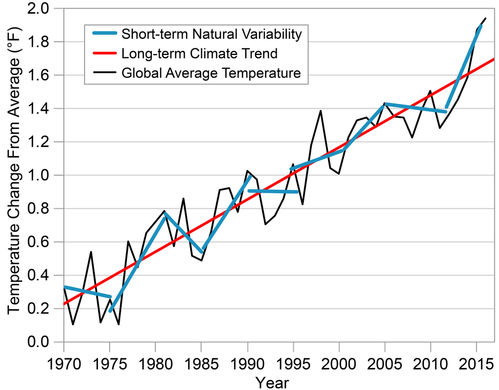
massive investment
===≠=============
Beaurocrats and politicians call government spending without a return (without profit) an investment. Every one else calls it an expense or a loss.
Only governments ask the shareholders (citizens) of companies (countries) to bail them out each year.
Everyone else is expected to balance their budgets and turn a profit. Politicians never learn how.
This may add support.
REGRESSION KINK
DESIGN:
THEORY AND PRACTICE
David CardDavid S. Lee
Zhuan PeiAndrea Weber
Working Paper 22781http://
http://www.nber.org/papers/w22781
NATIONAL BUREAU OF
ECONOMIC RESEARCH
1050 Massachusetts Avenue
Cambridge, MA 02138
October 2016
As this has been discussed at length in the “Weakening Warming Trend Of The Last 40 Years Is Apparent” comments section, in relation to Monckton’s pause analysis, I thought I try to implement the algorithm used here on UAH data.
My result is a kink in March 2012. I haven’t checked if it would pass the significance test.
.